ABSTRACT
ATKINS, RACHEL MARIE. An Eye-tracking Study on Expert/Novice differences during Climate Graph Reading Tasks: Implications for Climate Communication. (Under the direction of Dr. Karen S. McNeal)
The communication of climate change information is often a difficult task due to the
interdisciplinary nature of the topic in addition to the challenges of communicating these
topics with their intended audiences. Two aspects of communication that can be within the
control of the communicator (often a science researcher) include the choice of content and
method in which science is communicated. Graphs are a common representation used by
scientists to communicate evidence of climate change. In order to present this information
effectively, it is important to understand how novices (e.g., the general public) navigate this
data differently than experts. In this study, students viewed graphs displaying climate change
information to determine their gaze patterns while viewing and answering questions. These
were compared to gaze patterns of scientific experts (geoscience graduate students).
According to gaze and fixation data, experts focus more attention on task-relevant areas of a
graph (legend, axes, data trends, etc.) than novices who focus their attention information such
as graph title and understanding the question. Novice students who performed high on the
pre-assessment performed more expert-like on measured metrics than their peers who
performed lower on the pre-assessment.
Results from this study suggest that in order to close the communication gap between
experts and novices while viewing climate change graphs instructors can: 1) provide
opportunities for students to increase their knowledge of graph reading and climate content,
summary data and/or direct viewer attention to data elements either through visual emphasis
© Copyright 2016 Rachel Marie Atkins
An Eye-tracking Study on Expert/Novice differences during Climate Graph Reading Tasks: Implications for Climate Communication
by
Rachel Marie Atkins
A thesis submitted to the Graduate Faculty of North Carolina State University
in partial fulfillment of the requirements for the degree of
Master of Science
Marine, Earth and Atmospheric Sciences
Raleigh, North Carolina
2016
APPROVED BY:
_______________________________ _______________________________
Dr. Karen S. McNeal Dr. David A. McConnell
Committee Chair
DEDICATION
I dedicate my thesis to my family. To my mother who takes my daily morning phone calls
and encourages me when I need it most. To my father who is often a man of few words, but
can always make me laugh with single-worded texts. And to my sister, Amanda, my forever
friend who is always there for a laugh, encouragement or just a “checking-in” conversation.
Without the love and encouragement from my family, moving to a new state by myself and
completing these two years of intense coursework, teaching and research would not have
BIOGRAPHY
Rachel grew up in Clarence, NY and left for the first time to pursue her bachelor’s
degree in Geological Sciences and Adolescent Education at SUNY Geneseo. Throughout her
undergraduate career, she was pushed to her limits with field trips in cold, rainy New York
weather hiking through streams, looking at rocks and mapping a lot of geology. For some
reason, this provided her a type of academic excitement she had never before experienced.
While intellectually challenging, her undergraduate geology courses were among the most
interesting, engaging and captivating courses she had ever taken. After finishing her
undergraduate courses she was exposed to the enchanting mountainous landscape of the
western United States in the summer of 2013 and completely fell in love with geology all
over again. After experiencing what one of her professors called “the best, worst time you’ll
ever have” at field camp, she completed her student teaching the following fall and received
her NYS Earth Science teaching certification and decided to take on the next intellectual
challenge – graduate school. After searching for geology programs, she stumbled upon Karen
McNeal’s research group that combined her interests for teaching and research. While there
ACKNOWLEDGMENTS
This research was funded in part by EarthLabs Climate (NSF-DRK12) grants
DUE-1019721, DUE-1019703, DUE-1019815. Any opinions, findings, and conclusions or
recommendations expressed in this material are those of the authors and do not necessarily
reflect the view of the National Science Foundation.
I would also like to thank Anne Gold for helping to develop the pre-test for this study,
Sarah Luginbuhl for providing the modified graphs and the Southeast Climate Science Center
TABLE OF CONTENTS
LIST OF TABLES ... viii
LIST OF FIGURES ... ix
INTRODUCTION ...1
Climate literacy ...1
Graph reading and interpretation ...2
Eye tracking as a method for climate topics ...4
Research questions ...5
METHODS ...6
Population ...6
Experimental design...7
Instrumentation ...8
DATA ANALYSIS ...10
Variables ...10
Metrics ... 11
Quantitative analysis ...11
Qualitative analysis ...13
RESULTS ...14
Statistical results ...14
Heat map results ...16
DISCUSSION AND CONCLUSIONS ...19
LIMITATIONS AND FUTURE WORK ...21
REFERENCES ...23
APPENDICIES ...28
LIST OF TABLES
Table 1. Metrics and variables summary ...36
Table 2. Summary of graphs and questions ...37
Table 3a. Total visit duration statistical summary ...38
Table 3b. Difference in visit duration statistical summary ...40
Table 4. Expert and novice qualitative responses to questions ...42
LIST OF FIGURES
Figure 1. CI model (modified from Freedman and Shah, 2002) ...45
Figure 2. Global Greenhouse Gas Concentration graph (GGG) ...46
Figure 3. Sea Level and Global Temperature Change graph (SLGT) ...47
Figure 4. Temperature Anomaly in the Contiguous 48 States graph (TA48) ...48
Figure 5. Worldwide Temperature Anomaly and Carbon Dioxide Concentration graph (WWTA) ...49
Figure 6. Tobii TX300 Eye tracker setup ...50
Figure 7. Total time spent viewing graphs based on graph type ...51
Figure 8. Difference in fixation durations (data-title/question) based on graph type ...52
Figure 9. Total time spent viewing graphs based on question type ...53
Figure 10. Difference in fixation durations (data-title/question) based on question type .54 Figure 11. Total time spent: heat maps showing differences in total attention allocation between experts (A) and novices (B) ...55
INTRODUCTION
Climate Literacy
Climate change has received a lot of attention in recent years partially due to increased knowledge and understanding of Earth’s climate system and the influence of
natural and human induced perturbations and resulting feedbacks, the sophistication of
climate models and remote sensing techniques, and improved understanding of the impacts
on the planet and human lives. The Environmental Protection Agency (EPA) defines climate
change as “…any significant change in the measures of climate lasting for an extended
period of time. In other words, climate change includes major changes in temperature,
precipitation, or wind patterns, among other effects, that occur over several decades or
longer” (EPA, 2016).One of the most commonly used measures for climate change is global
warming. The EPA defines global warming as “the recent and ongoing rise in global
average temperature near Earth's surface. It is caused mostly by increasing concentrations
of greenhouse gases in the atmosphere. Global warming is causing climate patterns to
change. However, global warming itself represents only one aspect of climate change”
(EPA, 2016). The average temperature of our planet has increased 1.5 degrees F over the past
100 years and is projected to increase another 0.5 to 8.6 degrees F over the next century
(EPA, 2016). This projected increase in temperature is alarming due to the potential harmful
impacts on water supplies, agriculture, power and transportation systems, the natural
environment, and human health and safety (EPA, 2016; USGCRP, 2016; IPCC, 2016). Over
97% of scientists publishing about climate topics are in agreement that the current global
scientific agreement about the increase in temperature and evidence indicating anthropogenic
(human-caused) effects on our climate, there is less agreement about anthropogenic climate
change among non-scientist Americans than among non-scientists in most other countries
(Weber and Stern, 2011). Worldwide, level of education is the most accurate predictor of
climate change awareness (Lee et al., 2015). Additionally, the public’s concern (Leiserowitz,
2005) and risk perceptions (Kahan et al., 2011) vary with level of knowledge about climate
science (Leiserowitz et al., 2010). However, depending on cultural worldview, increased
knowledge may or may not increase peoples risk perceptions of climate change. A study conducted by Kahan et al. (2012) found a correlation between an individual’s cultural
worldview and their perceived risk of climate change. For example, people aligned their
climate risk perceptions with their peers who shared the same societal views (Kahan et al.,
2012). Moreover, political and religious affiliations often impact an individual’s knowledge
and perceptions about climate change (McNeal et al., 2014c). Many students hold misconceptions about the underlying processes of Earth’s climate system (Sterman and
Sweeney, 2002; Shepardson et al., 2009; Lombardi and Sinatra, 2010; Neibert and
Gropengiesser, 2013; McNeal et al., 2014b). For example, students will often mistake
singular weather events as climatic representations (Lombardi and Sinatra, 2010). The
dynamics of the greenhouse effect are also commonly misunderstood along with the impacts
that the greenhouse effect has on climate (Rebich and Gautier, 2005; Gautier et al. 2006;
Shepardson et al., 2009; Libarkin et al., 2015). Deep time, as it relates to the past and future,
is also among the topics in which students either fail to acknowledge or misunderstand
time understanding is of particular importance when understanding the differences between
weather and climate along with interpreting graphs depicting rates of change over long
periods of time.
Graph reading and interpretation
While researchers work diligently to understand our climate and better predict how it
will behave in the future, the communication of this research is typically not tailored to
non-scientists (Somerville and Hassol, 2011). However, much work in climate change
communication has been conducted to help scientists to tailor climate change messages
(Bostrom et al., 2013) and research has shown that the use of imagery can be an effective
way to promote understanding the importance of climate change along with one’s feelings
about being able to prevent its negative effects from occurring (efficacy) (O’Neill et al.
2013). Graphs have been found to be the most effective way of communicating the climate
consensus of researchers (van der Linden et al., 2014). Concepts related to the essential
principals of climate change literacy such as changes in sea level, temperature and
greenhouse gas concentrations over long periods of time (NOAA, 2009) are frequently
communicated using graphs (Winn, 1987). While some perceive a graphical representation of
information to be easier to interpret, it can also trigger relatively complex cognitive
processing if not designed appropriately (Carpenter and Shah, 1998; Huang et al., 2009,
Korner, 2011). Greater differences in graph comprehension have been observed between
more and less experienced individuals, particularly when more complex graphs are used
in interpreting them during classroom learning, it is important to understand how their
intended audiences navigate these graphs.
Freedman and Shah (2002) proposed that three components affect graph construction
and interpretation; visual features, domain knowledge of the interpreter and interpretation
propositions (outcomes) (Figure 1). Visual features, such as format and color, have less of an
influence than other components on skilled graph viewers as they can make associations
more readily. An individual’s overall ability to construct or interpret a graph is also
influenced by their graph skills (i.e. their familiarity with x and y axes locations, familiarity
with type of graph displayed, etc.). Domain knowledge, as it relates to appropriate content
knowledge and experience with graphs, is automatically activated in experts, which makes
overall graph construction and interpretation more fluid (Freedman and Shah, 2002).
Domain knowledge and visual features both affect an individual’s ability to form meaningful
interpretations of the data. Novices tend to describe general trends and ignore anomalous
data, while experts identify more specific patterns and focus on anomalies because
explanation is activated in experts (Freedman and Shah, 2002). This combined top-down
(knowledge-driven)/bottom-up (stimulus-driven) approach is also supported by Fabrikant et
al. (2010). Korner (2011) suggested that graph reading occurs sequentially in distinct stages
with little information processing occurring during the initial viewing, during which the
viewers are orienting themselves with the information provided. An expert-expert study by
Roth and Bowen (2010) demonstrated that when the expert was familiar with the content
displayed in the graph, they were able to focus more immediately on the task or main idea.
may overlook potential problem areas for non-scientists. It is recommended that graphs used
for communication contain summary statistics (averages) over empirical data and convey a
simple message (Spence and Lewandowsky, 1990). It is also suggested that novices engage
in frequent practice graphing real-world data to gain more expertise; the more students are
exposed to data and graphing, the more expert-like they become (Curcio, 1987; Wang et al.,
2012). Peebles and Cheng (2003) recommend that rather than choosing a representation that
is familiar to the intended audience, it is preferable to choose the representation that best
displays the data. For example, instead of attempting to display complex radial data on a
simpler bar or line graph, Peebles and Cheng (2003) recommend maintaining the radial graph
structure, reducing data to be as simple as possible and provide scaffolding in the form of
supplementary text or arrows highlighting key features of this graph. Once overcoming the
initial unfamiliarity with the representations, these strategies may lead to greater benefits and
comprehension of graphs by the viewer (Peebles and Cheng, 2003). It is also advisable to use
the appropriate graph type to represent the provided data and to cater to the goal of the
interpreter (Peebles and Cheng, 2003). Line graphs are appropriate for identifying
quantitative trends, whereas bar graphs best represent relative relationships between data
(Freedman and Shah, 2002).
Eye tracking as a method for climate topics
Eye movements are a relatively involuntary response that can be measured and
analyzed to determine engagement with a visual stimulus. Eye tracking has been used as a
method for investigating questions in a variety of domains. It has been used to understand
and Scheiter, 2010), hierarchical map navigation (Korner, 2004) and decision-making
(Muldner et al., 2009). Eye tracking has also been applied to graph reading and
comprehension studies. An expert-novice study conducted by Yen et al. (2012) revealed that
the viewing patterns of college science students did in fact differ from non-science students
when comprehending questions and looking at various areas of science-related graphs.
Finding that science students spent more time reading the question than non-science students,
they suggest that science students spent more time “interpreting the questions thoroughly” (p.
334). Linear graphs have also been shown to be easier to interpret than radial graphs as visual
paths while scanning circular rings has been shown to be more likely to lead readers to an
incorrect answer (Goldberg and Helfman, 2011).
Eye tracking has been applied to various climate-related topics. Ho et al. (2013)
explored how prior knowledge affects viewing of climate text and graphics. Students with
higher levels of prior knowledge focused longer periods of attention on areas of interest than
students with low prior knowledge. Beattie and McGuire (2012) investigated view patterns of
individuals while viewing iconic images of climate change based on their levels of implicit
and explicit attitudes towards the environment. They discovered that there is a correlation
between implicit attitudes towards the environment and view time of positive and negative
images of climate change. Specifically, they found that individuals had strong positive
implicit attitudes towards low carbon footprint products were more likely to focus their
attention on negative images of environmental damage and climate change than on positive
images. McNeal et al. (2014a) used eye tracking to understand how students navigated and
finding that students engaged mainly with text, not the images and had a particularly difficult
time engaging with graphs depicting change over time. However, they also found that the
majority of participants found charts, graphs and questions embedded in text to be most
useful. They also found that attention to text decreased over time, suggesting that a reduction
of text might increase overall engagement.
Research questions
This study employs an exploratory design to understand how introductory Earth
Systems Science students (novices) visually navigate climate change graphs. Novice eye
movements were compared to experts who had more experience viewing these types of
graphs. Questions we investigated in this study included: 1) How do expert and novice eye
movements differ while engaging with climate change graphs? 2) How does the amount of
time experts and novices spend when viewing climate change graphs differ? 3) To what
extent do expert and novice qualitative interpretations of climate change graphs differ?
METHODS
Population
The 58 participants in this study consisted of 45 undergraduates (categorized as
‘novices’) and 13 graduate students (categorized as ‘experts’). Once obtaining human
subject’s research approval from the Institutional Review Board (IRB), undergraduate
students were recruited from an introductory Earth Systems Science course at North Carolina
State University. Our novice participants consisted of 57.8% male and 42.2% female with a
(42.2%), sophomore (26.7%), junior (11.1%), senior (13.3%) and fifth-year senior (6.7%).
Ethnicities included white/Caucasian (86.7%), black/African/African American (6.7%),
Asian/Asian American (2.2%) and other (4.4%). Experts were all 23 (23.1%) or older
(76.9%), masters (38.5%) or PhD (61.5%) students, 38.5% male, 61.5% female and 100%
white/Caucasian. Graduate students were either geology or atmospheric science students
from the Marine, Earth and Atmospheric Sciences department at NC State University with at
least a year of graduate experience prior to participating in this study. The researcher gave
brief recruitment presentations to two lectures of undergraduates enrolled in different
sections of introductory Earth Systems Science taught by different instructors asking students
to participate in an eye-tracking study outside of class. Participants received compensation in
the form of two $10 Amazon gift cards after completion of the pre-test and a 20-30 minute
eye-tracking study.
Experimental Design
This study used four different graphs of varying type and complexity. Six questions
were asked for each graph. Participants were asked to view graphs and answer questions
using the concurrent verbal protocol (Bojko, 2013). Graphs all contained climate content and
were modified slightly from their original Environmental Protection Agency (EPA)
published version for consistency in color, line thickness and overall readability. The topics
of the four graphs covered global greenhouse gas concentrations, sea level and global
temperature change, temperature anomalies in the US, worldwide temperature anomalies and
The first graph included in this study was entitled Global Greenhouse Gas
Concentrations Over Time (GGG), was a line graph that displayed three separate variables on
two separate y-axes using different scales (Figure 2). The second graph showed Sea Level
and Global Temperature Change over Time (SLGT) and was a combined bar and line graph
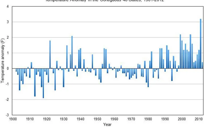
with two separate y-axes using different scales (Figure 3). The third graph was Temperature
Anomaly in the Contiguous 48 States (TA48) and was a bar graph with a single y-axis, but
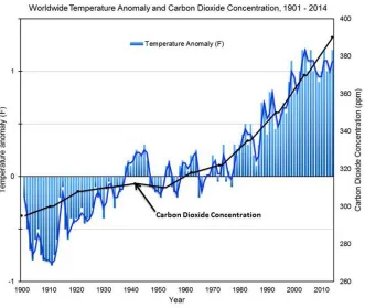
displayed anomalies instead of the raw data (Figure 4). The final graph was World Wide
Temperature Anomaly and Carbon Dioxide Concentrations over Time (WWTA), was also a
combined bar and line graph with two separate y-axes using different scales and also
displayed anomalies (Figure 5). Graph names and abbreviations summarized in Table 2.
A total of six questions were asked during the viewing of each graph of varying
difficulty (Curcio, 1987; Friel et al. 2001). The first two questions asked of each graph were
the same, “What is the main idea of this graph?” and “What trends do you see in this graph?”
respectively. The last four questions were unique to each graph, but followed the same
format among graphs. The third and fourth questions required the participant to use the data
in the graph provided to formulate their answer. The last two questions asked participants to
extrapolate the data provided or apply prior knowledge about the topic presented to answer
the question.
Participants were given an overview of the study before beginning. They were all
aware that eye tracking was taking place and that their body movements needed to be limited
in order to prevent disruption of data collection. The researcher explained that they would be
period without a task. Once questions appeared on the screen, participants were asked to
think out loud as they attempted to answer questions. There was no time limit to each
question task. The participant advanced at his or her own pace to allow for complete thought
development and graph exploration. The researcher was present in the room in order to
answer any questions during the study. Experts and novices were not informed of research
questions prior to the study. Individuals were also not told which group (expert or novice)
they belonged to before data collection.
Instrumentation
Eye tracking data was collected using a Tobii TX300 eye tracker (Figure 6) attached
to a 23-inch computer monitor, collecting at 300 Hz. Calibration was completed before each
trial to ensure accuracy and precision as well as consistency among participant trials.
Participants sit ~65cm from the monitor and gaze at the computer screen to view the
provided graphs with an unobstructed view and aside from being told about the eye tracking,
are often unaware that their eye movements are being tracked. This allows for the researcher
to capture relatively natural eye movements. The system allows for corrective lenses to be
worn without affecting results in most cases. A calibration was performed for each
participant. The accuracy of their eye movements are displayed as green lines with the length
of those lines representing the amount of offset between each samples gaze point and the
center of the calibration dot on the screen where the participant was asked to look. If
calibration lines were outside of the acceptable grey accuracy circle around each calibration
This study used a graphing pre-test instrument to determine prior knowledge about
graph reading, interpretation and construction. All students in each class completed the
pre-test prior to the announcement of an eye-tracking study opportunity. Two questions were
asked about participant confidence with graph reading and interpretations using a Likert-type
scale. Three questions were asked about prior experience with graphs and data interpretation,
also using a Likert type scale. The final item assessed was graph reading and construction
performance. Participants were asked to identify key parts of graphs (x- and y-axis,
independent/dependent variables) and construct two separate graphs of differing complexity
based on provided data. These pre-tests were scored out of 34 possible points with scores
ranging from 32.35% to 89.29% and an average score of 69.81%. Novices were grouped into low (≤64.52%, n=12), moderate (64.52% < x < 76.47%, n=20) and high performers
(≥76.47%, n=13). Experts had an average score of 81.22% (n=13). Prior to implementation,
both the eye tracking study design and pre-test were reviewed for content validity by two
additional researchers, a climate science expert and a geoscience education researcher.
Additionally, two previous iterations of this study were piloted with 16 experts and 10
novices. Modifications were made each time based on preliminary results of participant
performance, ability to understand tasks, and test item comprehension.
DATA ANALYSIS
Eye tracking data can be analyzed using a variety of quantitative and qualitative
approaches. Numerical values recorded in the Tobii Studio software can be analyzed using a
qualitatively using heat maps that display the location and duration of fixations in space. Two
aspects of eye movements that are most often studied include saccades and fixations.
Saccades are the short periods of rapid eye movement between fixations that redirect
participant gaze from one fixation to another (Ramat et al., 2008). These can occur up to four
times in a second and participants are effectively blind while they occur (Land, 2011).
Fixations are the points between saccades where the eye is nearly stationary for a relatively
long period of time (~70-100ms). These eye movements are of particular interest as it is
during these points during viewing that processing takes place (Bojko, 2013). In addition to
eye-movements, qualitative responses from think-out-loud tasks were collected and analyzed.
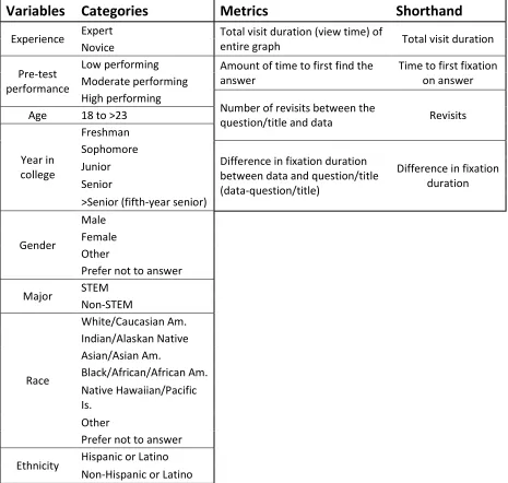
Variables
A number of variables were used for analysis in this study (table 2). The first
variable, defined by experience, was ‘expert versus novice’. Experts were defined as
geoscience graduate students with at least a year of graduate school experience. We
recognize that in some contexts graduate students may be considered pseudo-experts or
informed novices in their field of study, but for the purposes of this study they are referred to as ‘experts’. The novice population consisted of introductory students enrolled in an Earth
Systems Science course. A second variable used for analysis was performance on the
pre-test. Novice pre-test scores were categorized into low, moderate and high performing groups.
Other variables included age, participant’s year in college and gender.
Metrics
Four different eye-tracking metrics were used for this study (Table 2). These included
first fixation on answer), number of revisits between the title/question and the graph data and
the difference in fixation duration between the title/question and the graph data.
Quantitative Analysis
Quantitative data for this study was analyzed using Tobii Studio 2012 Microsoft
Excel 2013, and SPSS version 23.0. Tobii Studio has the ability to export the quantitative
results from the eye-tracking data based on metrics chosen by the researcher. For example, if
the interest is in the time it takes for a participant to first fixate on an answer, the researcher
must first define the specific area of interest (AOI) in the Tobii software for the answer. Once AOI’s have been identified, they are selected and fixation data are exported to excel based on
the metric of interest. Fixations can be defined using dispersion-based or velocity-based
algorithms, however, for the purpose of this study, we used the Tobii I-VT
(Velocity-Threshold Identification) fixation filter. This uses the average of the left and right eyes and
identifies a fixation when eyes move slower than 30 degrees/second over a period of at least
20ms. Eye movements with duration times of less than 60ms were filtered out as
non-fixations as they resemble saccades. Missing data was interpolated using last observed data to
fill in a straight line for missing data points for up to 75ms gaps. This 75ms value is shorter
than an average blink.
Before analysis, data was first cleansed for missing or inaccurate data (Bojko, 2013).
In this study, four participants were completely removed due to their low sample percentages
(<70% of their eye movements were captured by the eye tracker). Therefore, a total of 41
participants were used for quantitative analysis. A low sampling rate can be caused by a
view of the eye tracker with their eye with hand gestures, dry contacts or scratched lenses
that prohibit the eye tracker from determining the location of the eye for a period of time.
The four participants removed did not differ significantly in demographics from the rest of
the participants. All were white/Caucasian males with low, middle and high pre test scores
and consisted of a freshman, junior and fifth-year seniors. Once these participants were
removed, individual data points that were outside 3 standard deviations of the mean for each
metric were also filtered out. The remainder of the data was included in analysis.
Kolmogorov-Smirnov tests were performed to determine normality of data. For
analysis of expert/novice data, independent sample t-tests were used for normally distributed
metrics and Mann-Whitney U-tests were used when metric data was not normal. ANOVA
tests for normally distributed metrics and Kruskal-Wallis tests were used to determine
significance for data that were not normally distributed for these variables.
Qualitative Analysis
The eye tracker records an x and y coordinate for each fixation that can be graphed
and overlain on the image being viewed. These images are called heat maps and are used
frequently in eye tracking research as a way to visualize participant attention. While heat
maps can be helpful for visualization of data and quick analysis, one must be cautious when
using them for analysis for many reasons. The first problem arises when using a heat map for
comparison of two unequal groups. In order to accurately compare two groups, an equal
number of individuals must be used for each visual. Heat maps used for this study were
novices to compare to the 13 experts. Researchers must also use caution when comparing
results of untimed tasks. When an unlimited amount of time is given to view an image, a
participant who takes longer to complete the task will have recorded more fixations than a
participant who viewed for less time. This was controlled for in our study by using relative
fixation duration. This normalizes the absolute number of fixations for the total number of
fixations of that participant, making comparison between participants possible.
The analysis of qualitative responses was completed using a computer program called
NVivo. All participants were included in the qualitative analysis, regardless of their eye
tracking results. Recordings ranged in length from 5.18 to 25.45 minutes (M=10.16,
SD=4.02, n=45) for novices and 7.85 to 15.30 minutes (M=11.15, SD=2.57, n=13) for
experts. Transcripts were uploaded and organized within the program using manual coding to
group responses into nodes. Common words used by participants were identified by the
researcher and used to create a text search query. Results from this query were used to make
inferences about expert and novice populations. In addition to the common words identified
from NVivo, researchers also used direct quotes from participants to understand contextual
differences between expert and novice responses.
RESULTS
Statistical results
This study used four different graphs, six different questions, two different
populations (e.g., expert and novice) and a variety of variables (e.g., gender, year in school,
including 1) ‘time to first fixation on answer AOI’, 2) ‘revisits between data and
title/question’, 3) ‘total fixation duration on graph’ and 4) ‘difference in fixation duration on
the data vs. title/question’. Upon analysis, ‘time to first fixation on answer AOI’ and ‘revisits
between data and title/question’ had little to no significance. Variables collected for each
participant included expert/novice status, gender, major (STEM, non-STEM), pretest
performance, race, ethnicity, age and year in school (Table 2). Gender, age and year in school
did not yield significant differences. In addition, major (STEM, non-STEM), race and
ethnicity did not have enough diversity within the sample pool for statistical data analysis.
The analysis of expert/novice and pre-test score variables against ‘difference in
fixation duration’ and ‘total visit duration’ resulted in significant results. Graph components
were sectioned into question type and graph type. Graph type involved analyzing all data
based on which of the four graphs was being displayed. Question type involved analyzing
data based on which type of question was being displayed. Q1 was an open-ended question
asking the participant to describe the main ideas of the graph. Q2 was also open ended, but
asked for an identification of trends in the graph. Q3 questions (a and b) asked a question
aimed at having the participant perform a visual lookup on the graph for an answer. Q4
questions (a and b) asked the participant to apply prior knowledge about a topic to the graph
or extrapolate data shown.
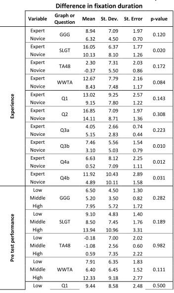
Significant differences were found between experts and novices when viewing the
Sea Level and Global Temperature (SLGT) and Worldwide Temperature Anomaly (WWTA)
graphs. Experts spent more total time viewing the graphs (SLGT, p=0.014; WWTA,
the title/question part of the graph (SLGT, p=0.020; WWTA, p=0.084) (Figure 8). While the
GGG and TA48 graphs did not yield significant differences, they yielded similar trends. Less
statistical significance was found when participants were compared based on pretest
performance for total time, however, the Worldwide Temperature Anomaly (WWTA)
(p=0.050) graph continued to be significant, along with Global Greenhouse Gas
Concentration (GGG) (p=0.016) by difference in pre-test performance groups. Participants
who performed high on the pretest tended to spend the most time on the graphs. While only
two graphs, WWTA and GGG, were significant, it is important to note that this trend
persisted throughout the majority of the graphs.
Expert/novice differences also persisted when looking at question type. Experts spent
more time viewing the graphs during Q1 (p=0.070), Q4a (p=0.088) and Q4b (p=0.049)
(Figure 9) than novices. While not all comparisons between expert and novices were
statistically significant for each question, the majority of the data followed this trend.
Question 3a (p=0.099) showed the opposite trend where novices spent more time on the
graph then experts, potentially due to the difficulty level of the question which seemed to
take novices much longer to comprehend. Experts also had significantly greater fixation
duration differences for Q3b (p=0.010), Q4a (0.012) and Q4b (0.031) (Figure 10). No
significance was found when examining groups separated by pretest scores under the
difference in fixation duration metric, however, the majority of the data for this variable and
metric also showed similar trends, but was not statistically significant. Statistics are
summarized in Tables 3a and 3b.
Figures 11 and 12 show heat maps comparing viewing patterns of experts and
novices. Novice heat maps were normalized for participant numbers by selecting the median
13 participants based on performance for each graph and metric to compare to the 13 experts.
These heat maps agree with quantitative results reported above. Figure 11 shows the
differences between experts and novices while viewing Q4b of the WWTA graph. Experts
spent significantly more attention on the data trend line than novices (Figures 11a and 11b),
where novices allocate more attention on the question. Figure 12 shows heat maps for
fixation durations of experts and novices normalized for total time spent by participants on
the selected graph. Figure 12b indicates that novices spend relatively similar fixation
durations on the title/question and data. Conversely, experts (Figure 12a) are spending more
of their fixations on the data, possibly viewing it as more important.
NVivo Results
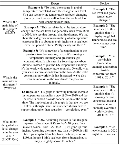
In Table 4, examples 1-4 show expert and novice responses grouped by graph type.
Generally, expert responses tended to be much longer, which is in agreement with
eye-tracking data. When asked about the main idea of the graphs, expert responses showed
enhanced synthesis of ideas about the graph and its contents using words that were not
provided in the description of the graph or its contents to describe the behavior and
relationships among data more often. The majority of the novice answers were very similar,
if not identical to the provided title.
Examples 5-8 show expert and novice responses grouped by question type. These
results are also consistent with the eye-tracking data, which has experts spending more time
in crucial prior knowledge and apply skills allowing them to extrapolate accurately. When
extrapolating, experts tended to take into consideration (or at least comment on) an increase
in rate when calculating their extrapolated values. Novices tended to use a more constant rate
or not comment on this at all. When answering questions asking to apply prior knowledge,
experts tended to list multiple examples and elaborate more. Novices mentioned single
examples and included popular topics such as global warming and polar bears more
frequently.
To determine if there truly was a difference in linguistics between our expert and
novice responses, we utilized NVivo to do a text search query, telling us the frequency in
which words were used. After review of participant responses, it was evident that certain
terms were recurring among participants. We selected a subset of these words to determine
the frequency in which they were used throughout responses. Selected words are grouped
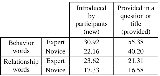
into two categories, words that focus on the behavior of data (behavior) and words that focus
on the relationships within and across data (relationship). Additionally, some common words
included those provided by the researcher in either a question or graph title (provided), while
some were newly introduced to the study by participants (new), therefore, we also broke
these words into separate categories. Newly introduced behavior words (new, behavior)
included oscillating, constant, rapid, varies, variation, rate and exponential. Newly introduced
relationship words (new, relationship) included correlate, exponential, normal, baseline,
comparison, affect, effect and correspond. Words that were provided by the researcher
dealing with data behavior (provided, behavior) included trend, positive, negative, increase,
data (provided, relationship) included cause, impact, positive and negative. All participants
were run using a text search query within NVivo, including synonyms (n=58, experts = 13,
novices = 45). We found that on average, experts used all of these words more often than
novices. Particularly notable are the differences between the two populations and their usage
of words describing how the data is behaving (behavior). The differences are most significant
for behavior words provided by the researcher (experts = 55.38, novices = 40.20), followed
DISCUSSION AND CONCLUSIONS
Research Question #1: How do expert and novice eye movements differ while engaging with climate change graphs? We observed differences between experts and novices using the following metrics, total visit duration (view time) of the entire graph and
difference in fixation duration between the title/question and graph data.Novice students
who performed highest on the pretest displayed eye movements that were more expert-like
than those who scored moderately or poorly on the same assessment. This is consistent for
both graph-type and question-type results. These results are also consistent with findings
from Ho et al. (2014) where they found that higher prior knowledge correlated to longer
fixation durations. Little to no differences were seen using the ‘number of revisits’ and ‘time to first fixation on answer’ metrics. We believe this is due to the exploratory nature of this
study. As these metrics were not the only focus of this study, these metrics were not
controlled for and may have been influences by other factors.
Research Question #2: How does the amount of time experts and novices spend while viewing climate change graphs differ? The results of this study indicate that experts spend more time viewing graphs than novices. Experts spent more time on questions 1, 4a
and 4b. Question 1 asked participants about the main idea of the graph. Expert explanations
tended to be longer because they were providing more depth and breadth in their answers.
The quantitative findings were supported by qualitative participant responses. Questions 4a
and 4b asked participants to explain or make inferences based on information not provided
on the graphs. Longer responses to these questions could be attributed to the fact that experts
questions. These results are in agreement with Freedman and Shah (2002) where novices
provided simple explanations (generally shorter in length), describing general trends, rather
than describing more specific patterns as did the experts. Furthermore, in a similar study with
science and non-science student populations, science students tended to spend more time
viewing graphs than the non-science students (Yen et al., 2012), supporting the results of this
study.
It is important to note that graphs with consistent significance were SLGT and
WWTA, both of which had similar characteristics that differed from the other two graphs.
The TA48 and GGG graphs were simple bar and line graphs, respectively, with both
containing simple axes. Conversely, SLGT and WWTA were both combined bar-line graphs
displaying different, but complementary information. Our data indicate that differences
between experts and novices become more evident when viewing these more complex
graphs. A similar finding was also observed in a study by Maltese et al. (2015).
While differences on the order of seconds may not seem like a lot, these differences
are extremely important when capturing the initial attention of a viewer. There is a period of
120ms in which a viewer’s transient attention can be captured and drawn towards a visual
stimulus (Megna et al., 2012).
Research Question #3: To what extent do expert and novice qualitative
interpretations of climate graphs differ? As discussed previously, expert responses tended to be longer because they were providing more in-depth explanations of data while
we also saw differences in experts and novice responses where experts tended to describe
general trends, while experts identified more specific patterns and focus, agreeing with
Freedman and Shah (2002). Not only were expert responses longer and more descriptive,
they also more frequently used more vivid language to describe the behavior of data (i.e.
oscillating, rate, exponential, etc.) as well as the relationships among and between data (i.e.
correlate, comparison, correspond, etc.).
From our study, for novices to become more expert-like while reading graphs, they
need to spend more time viewing them with guided practice emphasizing task-relevant data
(Curcio, 1987; Wang et al., 2012). Graph interpretation becomes easier with practice reading
and interpreting complicated graphs (Freedman and Shah, 2002). Implications to teaching
and learning from our results suggest that it would be beneficial to emphasize the importance
of attention to data and data extraction. In order to direct attention away from task-irrelevant
information such as the title, it would be beneficial for students to formulate their own title to
encourage them to voice their own ideas about what the graph is trying to convey. We are in
support of the CI model proposed by Freedman and Shah (2002) and have modified their
model to apply to climate graph interpretation challenges. Figure 1 includes the modified
model for metrics assessed in this study and can be used for future research directions We
recommend the following efforts be made to encourage students to become more expert-like
while viewing, constructing and interpreting graphs, where instructors should 1) provide
opportunities for students to increase their knowledge of graph reading and climate content
(Freedman and Shah, 2002), 2) offer scaffolding and training aimed to help students direct
2012) 3) implement changes to graphs that simplify empirical to summary data (Spence and
Lewandowsky, 1990) and/or direct viewer attention to data elements either through visual
emphasis (i.e. arrows, highlighting, etc.) or adjoining text.
LIMITATIONS AND FUTURE WORK
Limitations of this study include: the concurrent verbal protocol used may have
influenced view times, which could attribute to experts taking longer to answer the questions.
While this study tested for graph reading skill, it did not assess climate literacy and prior
climate knowledge of expert or novices. Furthermore, the influence of worldview and
political affiliation was outside of the scope of the current study. Lastly, this study was
quasi-experimental in design where our population was a sample of convenience from a large
enrollment introductory science course at a major university and our expert pool was
composed of local graduate students in residence at the same university.
As this project was exploratory in nature, the results and limitations of this study
suggest that further experimental research is needed. Any of the aspects of Figure 1, such as
those included under domain knowledge, visual features, and graph skills could be further
investigated through a carefully controlled study as influencers of viewer interpretation
outcomes. Suggestions for future work include an exploration of the following as they effect
performance. The influence of graph type including bar graphs versus line graphs, the
combination of bar and line graphs, and the effect of graph complexity. The influence of the
inclusion of a concurrent versus retrospective verbal protocol in the eye-tracking study
influence of the type of climate content covered (i.e. greenhouse gases, sea level rise, etc.) as
some concepts may draw more heavily on prior knowledge or misconceptions than others.
Furthermore, future research may focus on the influence of climate literacy on the
interpretation and reading of climate graphs, the effect of graph modifications and addition of
supplementary text and the effect of graph reading ability and climate literacy among a larger
variety of populations (i.e., pre-service teachers, the public, K-12 students). Finally, future
studies may choose to test for the influence of worldview and political affiliation on
REFERENCES
Beattie, G. and McGuire, L. 2012. See no evil? Only implicit attitudes predict unconscious eye movements towards images of climate change. Semiotica, 192:315-339.
Bostrom, A., Böhm, G., and O'Connor, R. E. 2013. Targeting and tailoring climate change communications. Wiley Interdisciplinary Reviews: Climate Change, 4:447-455.
Bojko, A. 2013. Verbal protocols and eye tracking, In Justak, M. and Wade, E., eds., Eye tracking the user experience. Louis Rosenfeld, p. 107-119, 191-213
Carpenter P.A. and Shah P. 1998. A model of the perceptual and conceptual processes in graph comprehension. Journal of Experimental Psychology: Applied, 4: 75–100.
Cook, J., Nuccitelli, D., Green, S.A., Richardson, M., Winkler, B., Painting, R., Way, R., Jacobs, P., and Skuce, A. 2013. Quantifying the consensus on anthropogenic global warming in the scientific literature. Environmental Research Letters, 8.
Curcio, F. R. 1987. Comprehension of mathematical relationships expressed in graphs. Journal for Research in Mathematics Education, 18:382–393.
Environmental Protection Agency (EPA). 2016. Climate change science. Available at www3.epa.gov/climatechange/science/ (accessed 19 February 2016).
Fabrikant, S. I., Hespanha, S. R. and Hegarty, M. 2010. Cognitively inspired and
perceptually salient graphic displays for efficient spatial inference making. Annals of the Association of American Geographers, 100:13–29.
Freedman, E.G. and Shah, P. 2002. Toward a model of knowledge-based graph comprehension. Diagrammatic Representation and Inference, 2317:18-30.
Friel, S. N., Curcio, F. R. and Bright, G. W. 2001. Making sense of graphs: Critical factors influencing comprehension and instructional implications. Journal for Research in Mathematics Education, 32:124–158.
Gautier, C., Deutsch, K. and Rebich, S. 2006. Misconceptions about the greenhouse effect. Journal of Geoscience Education, 54:386-395.
Goldberg, J. and Helfman, J. 2011. Eye tracking for visualization evaluation: Reading values on linear versus radial graphs. Information Visualization, 10:182-195.
and Mathematics Education, 12: 525-554.
Huang W., Eades P., and Hong S. 2009. Measuring effectiveness of graph visualizations: a cognitive load perspective. Inform Visual, 8:139–152.
Intergovernmental Panel on Climate Change (IPCC). 2014. Fifth Assessment Report. Available at http://www.ipcc.ch/ (accessed 1 March 2016).
Kahan, D. M., Jenkins-Smith, H., and Braman, D. 2011. Cultural cognition of scientific consensus. Journal of Risk Research, 14:147-174.
Kahan, D.M., Peters, E., Wittlin, M., Slovic, P., Ouellette, L.L., Braman, D. and Mandel, G. 2012. The polarizing impact of science literacy and numeracy on perceived climate change risks. Nature Climate Change, 2:732-735
Körner, C. 2004. Sequential processing in comprehension of hierarchical graphs. Applied Cognitive Psychology, 18:467–480.
Körner, C. 2011. Eye movements reveal distinct search and reasoning processes in comprehension of complex graphs. Applied Cognitive Psychology, 25:893–905.
Land, M.F. 2011. Oculomotor behaviour in vertebrates and invertebrates, In Liversedge, S.P., Gilchrist, I.D., and Everling, S., eds, The Oxford Handbook of Eye Movements. Oxford University Press, p. 3-15.
Lee, T.M., Markowitz, E.M., Howe, P.D., Ko, C.Y. and Leiserowitz, A.A. 2015. Predictors of public climate change awareness and risk perception around the world. Nature Climate Change, 5:1014-1020.
Leiserowitz, A. A. 2005. American risk perceptions: is climate change dangerous?. Risk Analysis, 25:1433–1442.
Leiserowitz, A., Smith, N. and Marlon, J. R. 2010. Americans’ knowledge of climate change. Yale University. New Haven, CT: Yale Project on Climate Change Communication. http://environment.yale.edu/climate/files/ClimateChangeKnowledge2010.pdf
Libarkin, J. C., Kurdziel, J. P. and Anderson, S. W. 2007. College student conceptions of geological time and the disconnect between ordering and scale. Journal of Geoscience Education, 55:413-422.
Lombardi, D. and Sinatra, G.M. 2010. College students’ perceptions about the plausibility of human-induced climate change. Research in Science Education, 42: 201-217.
Maltese, A. V., Harsh, J. A. and Svetina, D. 2015. Data visualization literacy: Investigating data interpretation along the novice-expert continuum. Journal of College Science Teaching, 45:84-90.
McNeal, K. S., Libarkin, J. C., Ledley, T. S., Bardar, E., Haddad, N., Ellins, K. and Dutta, S. 2014a. The role of research in online curriculum development: The case of EarthLabs climate change and earth system modules. Journal of Geoscience Education, 62:560-577.
McNeal, K. S., Spry, J. M., Mitra, R. and Tipton, J. L. 2014b. Measuring student Engagement, knowledge, and perceptions of climate change in an introductory environmental geology course. Journal of Geoscience Education, 62:655-667.
McNeal, K.S., Walker, S.L. and Rutherford, D. 2014c. Assessment of 6- to 20-grade educators' climate knowledge and perceptions: results from the climate stewardship survey. Journal of Geoscience Education, 62:645-654.
Megna, N., Rocchi, F. and Baldassi, S. 2012. Spatio-temporal templates of transient attention revealed by classification of images, 54:39-48.
Muldner, K., Christopherson, R., Atkinson, R. and Burleson, W. 2009. Investigating the utility of eye-tracking information on affect and reasoning for user modeling. In Houben, G. J., McCalla, G., Pianesi, F., and Zancanaro, M., eds., User modeling, adaptation and personalization, p. 138-149.
Niebert, K. and Gropengiesser, H. 2013. Understanding and communicating climate change in metaphors. Environmental Education Research, 19:282-302.
National Oceanic and Atmospheric Administration (NOAA). 2009. Climate literacy: the essential principles of climate science. Available at
http://oceanservice.noaa.gov/education/literacy/climate_literacy.pdf (accessed 2 March 2016).
O,Neill, S.J., Boykoff, M., Niemeyer, S. and Day, S.A. 2013. On the use of imagery for climate change engagement. Global Environmental Change, 23:413-421.
Rayner, K. 1998. Eye movements in reading information processing: 20 years of research. Psychological Bulletin, 124:372-422.
Rayner, K. 2009. Eye movements and attention in reading, scene perception and visual search. The Quarterly Journal of Experimental Psychology, 62: 1457-1506.
Ramat, S., Leigh, R.J., Zee, D.S., Shaikh, A.G. and Optican, L.M. 2008. Applying saccade models to account for oscillations, In: Kennard, C. and Leigh, R.J., eds, Progress in Brain Research. Volume 171, p. 123-130.
Rebich, S. and Gautier, C. 2005. Concept mapping to reveal prior knowledge and conceptual change in a mock summit course on global climate change. Journal of Geoscience Education, 53:355-365.
Roth, W.M. and Bowen, G.M. 2010. When are graphs worth ten thousand words? An expert expert study. Cognition and Instruction, 21: 429-473.
Shepardson, D. P., Niyogi, D., Choi, S. and Charusombat, U. 2009. Seventh grade students' conceptions of global warming and climate change. Environmental Education Research, 15:549-570.
Somerville, R.C.J and Hassol, S. J. 2011. Communicating the science of climate change. Physics Today, October: 48-53.
Spence, I. and Lewandowsky, S. 1990. Graphical perception. In J. Fox & J. S. Long, eds., Modern methods of data analysis, p. 13-57.
Sterman, J.D. and Sweeney, L.B. 2002. Cloudy Skies: assessing public understanding of global warming. System Dynamics Review, 18:207-240.
Trumbo, J. 1999. Visual Literacy and Science Communication. Science Communication, 20:409 -425.
U.S. Global Change Research Program (USGCRP). 2016. Understand Climate Change. Available at http://www.globalchange.gov/climate-change (accessed on 1 March 2016).
van der Linden, S.L., Leiserowitz, A.A., Feinberg, G.D. and Maibach, E.W. 2014. How to communicate the scientific consensus on climate change: plain facts, pie charts or metaphors? Climatic Change, 126:255-262.
Wang, Z.H., Wei, S., Ding, W., Chen, X., Wang, X. and Hu, K. 2012. Students’ cognitive reasoning of graphs: Characteristics and progression. International Journal of Science Education, 34:2015-2041.
Weber, E. U. and Stern, P. C. 2011. Public understanding of climate change in the United States. American Psychologist, 66:315-328.
Winn, B. 1987. Charts, graphs, and diagrams in educational materials. In Willows, D., and
Houghton, H. A., eds., The Psychology of Illustration, 1:152-198.
Yen, M.H., Lee, C.N., and Yang, Y.C. 2012. Eye movement patterns in solving scientific graph problems, In Cox, P.T., Plimmer, B., Rodgers, P., eds., Diagrammatic Representation and Inference. Volume 7352 of the series Lecture Notes in Computer
Appendix A.
Graph Proficiency Questionnaire
1) Your name: ____________________________________
2) How confident are you...
Very Confident
Somewhat confident
Somewhat unconfident
Very unconfident ... with interpreting scientific graphs?
3) How good are you at...
Novice Advanced
beginner Competent Proficient Expert ...interpreting scientific
graphs?
Never Once a Year or Less Several Times a Year Once a Month 2-3 Times a Month Once a Week 2-3 Times a Week Daily ...construct graphs using paper and pencil? ...interpret existing graphs? ...use computers for data analysis? ...use computers for graphing data?
...use Excel for data analysis?
...use Excel for graphing data? ...do other graphing or graph reading tasks?
Please describe other graphing or graph reading tasks:
Never Once a Year or Less Several Times a Year Once a Month 2-3 Times a Month Once a Week 2-3 Times a Week Daily ...read Wikipedia articles about a science topic?
...read internet articles or blogs about a science topic?
...read science
magazines?
...read science research articles?
...read science
text books?
...do other
science reading?
Please describe other science reading:
7) Circle the x-axis or axes on the following graph:
8) What is an independent variable? I am not sure.
9) Circle the independent variable on the following graph:
10) What is a dependent variable? I am not sure.
____________________________________________________________
11) Circle the dependent variable on the following graph:
12) Please graph the participant data in the table below from the hypothetical online MEA 100 section. Make sure the graph is complete.
2012 2013 2014 2015
Participants in online MEA 100
243 251 193 355
13) Please graph the student data in the table below from a previous study. Make sure the graph is complete.
2014 2015
Left-handed
Right-handed
Ambidextrous
Left-handed
Right-handed
Ambidextrous
Number of Students
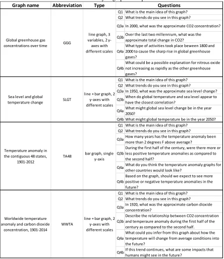
Table 1. Summary of graphs and questions Graph name Abbreviation Type
Q1 What is the main idea of this graph? Q2 What trends do you see in this graph?
Q3a In 2000, what was the approximate CO2 concentration?
Q3bOver the last two millennium, what was the approximate total change in CO2?
Q4a
What type of activities took place beween 1800 and 2000 to cause the sharp rise in global greenhouse gases?
Q4b
What could be a possible explanation for nitrous oxide not increasing as rapidly as the other greenhouse gases?
Q1 What is the main idea of this graph? Q2 What trends do you see in this graph?
Q3a In 1950, what was the approximate sea level change? Q3bWhen do global temperature and sea level appear to
have the closest correlation?
Q4aWhat might global sea level change be in the year 2050?
Q4b What might global temperature be in the year 2050? Q1 What is the main idea of this graph?
Q2 What trends do you see in this graph?
Q3aHow many years has the temperature anomaly been more than 2 degrees F above average?
Q3b
During the first half of the century, were there more or less positive temperature anomalies as compared to the second half?
Q4aWhat do you think the temperature anomaly graphs for other countries would look like?
Q4b
Based on the graph, should we expect to see more positive or negative temperature anomalies in the future?
Q1 What is the main idea of this graph? Q2 What trends do you see in this graph?
Q3aIn 1920, what was the approximate carbon dioxide concentration?
Q3b
Describe the relationship between CO2 concentration and temperaure anomaly during the first half of the century as compared to the second half.
Q4a
What could you infer from this graph about how the temperature will change from average conditions into the future?
Q4bIf this trend continues, what are some impacts that humans might see in the future?
Questions
Worldwide temperature anomaly and carbon dioxide
concentration, 1901-2014
WWTA
line graph, 3 variables, 2 y-axes with different scales
line + bar graph, 2 y-axes with different scales
bar graph, single y-axis
line + bar graph, 2 y-axes with different scales Global greenhouse gas
concentrations over time GGG
Sea level and global
temperature change SLGT
Temperature anomaly in the contiguous 48 states,
1901-2012
Table 2. Variables and metrics summary
Variables Categories
Metrics
Shorthand
Experience Expert Total visit duration (view time) of
entire graph Total visit duration Novice
Pre-test performance
Low performing Amount of time to first find the answer
Time to first fixation on answer Moderate performing
High performing
Number of revisits between the
question/title and data Revisits Age 18 to >23
Year in college
Freshman Sophomore
Difference in fixation duration between data and question/title (data-question/title)
Difference in fixation duration Junior
Senior
>Senior (fifth-year senior)
Gender
Male
Female
Other
Prefer not to answer
Major STEM
Non-STEM Race White/Caucasian Am. Indian/Alaskan Native Asian/Asian Am. Black/African/African Am. Native Hawaiian/Pacific Is. Other
Prefer not to answer
Ethnicity Hispanic or Latino
Table 3a. Total visit duration statistical summary
Total visit duration metric
Variable Graph or
Question Mean St. Dev. St. Error p-value
Exp er ie n ce Expert
GGG 27.65 7.52 2.09 0.326
Novice 25.77 8.14 1.27
Expert
SLGT 29.11 7.69 2.13 0.014
Novice 23.33 9.90 1.55
Expert
TA48 25.35 8.18 2.27 0.895
Novice 24.41 6.27 0.98
Expert
WWTA 29.98 8.25 2.29 0.099
Novice 26.45 9.63 1.50
Expert
Q1 29.78 9.74 2.70 0.070
Novice 24.58 9.15 1.43
Expert
Q2 25.60 7.64 2.12 0.132
Novice 22.56 9.53 1.49
Expert
Q3a 17.47 3.40 0.94 0.099
Novice 20.47 6.00 0.94
Expert
Q3b 31.81 6.71 1.86 0.270
Novice 30.16 9.17 1.43
Expert
Q4a 30.59 9.90 2.75 0.088
Novice 25.26 9.07 1.43
Expert
Q4b 32.87 10.72 2.97 0.049
Novice 27.09 12.80 2.00
Pr e t es t pe rfo rman ce Low GGG
27.18 6.25 1.80
0.016
Middle 22.47 7.91 1.86
High 29.63 8.79 2.65
Low
SLGT
23.20 5.62 1.62
0.123
Middle 20.75 8.00 1.89
High 27.71 14.68 4.43
Low
TA48
26.18 5.49 1.58
0.143
Middle 22.23 4.45 1.05
High 26.07 8.67 2.61
Low
WWTA
26.49 6.57 1.90
0.050
Middle 22.93 6.85 1.61
High 32.17 13.62 4.11
Middle 21.30 7.97 1.88
High 26.31 11.09 3.34
Low
Q2
22.43 8.54 2.46
0.378
Middle 19.95 7.08 1.67
High 26.99 12.81 3.86
Low
Q3a
22.05 6.26 1.81
0.320
Middle 19.19 5.85 1.38
High 20.86 6.07 1.83
Low
Q3b
32.31 7.18 2.07
0.036
Middle 26.64 6.76 1.59
High 33.59 12.68 3.82
Low
Q4a
25.73 6.12 1.77
0.081
Middle 22.47 8.26 1.95
High 29.73 11.99 3.79
Low
Q4b
24.35 5.79 1.67
0.073
Middle 23.18 10.03 2.36
Table 3b. Difference in fixation duration statistical summary
Difference in fixation duration
Variable Graph or
Question Mean St. Dev. St. Error p-value
Exp er ie n ce Expert
GGG 8.94 7.09 1.97 0.120
Novice 6.32 4.50 0.70
Expert
SLGT 16.05 6.37 1.77 0.020
Novice 10.13 8.10 1.26
Expert
TA48 2.30 7.31 2.03 0.172
Novice -0.37 5.50 0.86
Expert
WWTA 12.67 7.79 2.16 0.084
Novice 8.43 7.48 1.17
Expert
Q1 13.02 9.25 2.57 0.143
Novice 9.15 7.80 1.22
Expert
Q2 16.85 7.09 1.97 0.308
Novice 14.11 8.71 1.36
Expert
Q3a 4.05 2.66 0.74 0.223
Novice 5.15 2.83 0.44
Expert
Q3b 7.46 5.56 1.54 0.010
Novice 3.10 5.03 0.79
Expert
Q4a 6.63 8.12 2.25 0.012
Novice 0.52 7.09 1.11
Expert
Q4b 11.92 10.43 2.89 0.031
Novice 4.89 10.11 1.58
Pr e t es t pe rfo rman ce Low GGG
6.50 4.50 1.30
0.282
Middle 5.20 3.50 0.82
High 7.95 5.72 1.72
Low
SLGT
9.10 4.83 1.40
0.189
Middle 8.50 7.45 1.76
High 13.94 10.96 3.31
Low
TA48
-0.18 7.00 2.02
0.982
Middle -1.08 2.56 0.60
High 0.59 7.35 2.22
Low
WWTA
7.91 6.35 1.83
0.111
Middle 6.40 6.45 1.52
High 12.33 9.18 2.77
Middle 7.68 7.65 1.80
High 11.23 11.23 2.23
Low
Q2
13.93 7.58 2.19
0.130
Middle 11.63 5.87 1.38
High 18.35 12.27 3.70
Low
Q3a
5.59 2.80 0.81
0.741
Middle 4.78 3.20 0.75
High 5.27 2.35 0.71
Low
Q3b
4.40 5.10 1.47
0.128
Middle 1.30 3.10 0.73
High 4.62 6.78 2.04
Low
Q4a
-0.77 3.55 1.02
0.742
Middle -0.47 5.59 1.32
High 3.54 10.97 3.31
Low
Q4b
2.47 6.74 1.95
0.395
Middle 3.23 8.07 1.90