UCL CENTRE FOR ADVANCED SPATIAL ANALYSIS
WORKING
PAPERS
SERIES
Paper 39 - Dec 01
Examining Different
Approaches to Mapping
Internet Infrastructure
Centre for Advanced Spatial Analysis University College London
1-19 Torrington Place Gower Street
London WC1E 6BT
[t] +44 (0) 20 7679 1782 [f] +44 (0) 20 7813 2843 [e] [email protected] [w] www.casa.ucl.ac.uk
EXAMINING DIFFERENT APPROACHES TO MAPPING INTERNET INFRASTRUCTURE Martin Dodge & Rob Kitchin
http//www.casa.ucl.ac.uk/paper39.pdf
Date: December 2001
ISSN: 1467-1298
Examining different approaches to mapping Internet infrastructure
Martin Dodge, Centre for Advanced Spatial Analysis, University College London
Rob Kitchin, Department of Geography, National University of Ireland, Maynooth
Introduction
Maps and visualizations have long been used as a way of making the world more comprehensible. Mapping provides a means by which to classify, represent and communicate information about areas that are too large and too complex to be seen directly. Well designed maps are relatively easy-to-interpret, and constitute concentrated databases of information about the location, shape and size of key features of a landscape and the connections between them. Moreover, the process of spatialisation, where a spatial, map-like structure is applied to data where no inherent or obvious one exists, can provide an interpretable structure to large databases of abstract information (Couclelis 1998). In essence, maps and spatialisations exploit the mind’s ability to more readily see complex relationships in images, providing a clear understanding of a phenomena, reducing search time, and revealing relationships that may otherwise not been noticed. We illustrate the power of a mapping strategy by focusing on its utility in comprehending Internet infrastructure, although as we detail elsewhere, mapping and spatialisation can be used to develop an understanding of a wide range of Internet uses and content (Dodge and Kitchin 2000a, 2001).
Internet infrastructure, and its use, is often taken for granted because, unlike roads or railways, it is largely invisible: buried underground, snaking across ocean floors, hidden inside wall conduits, or floating unseen in orbit above us. Indeed, given its invisibility it is easy to assume that it is as ethereal and virtual as the information and communication that it supports. Consequently, there are a number of elements to Internet infrastructure that we presently have little systematic knowledge about, such as the form and function of backbone networks and their subsidiaries, network routing and traffic conditions, user demographics, marketing penetration and ownership, the physical location of computer servers (hosts) and Internet addresses, connectivity, and bandwidth. The mapping of these elements we believe
serves a number of useful functions providing important insights into who owns and controls infrastructure, who has access to the Internet, how the system can be surveyed, and how and from where the Internet is being used. This is vital information for the planning of new provision and the setting of policy and regulatory guidelines.
At a basic level, the maps provide a spatialised inventory and census of where
Internet nodes and routes of connection are located, and in specific cases the traffic that flows through networks and their user profiles. Maps of network infrastructure can show clearly how computers are physically wired together to create complex networks that operate over several spatial scales, building into global scale systems. Depending on scale these maps can be used by engineers to install and maintain the physical hardware of the networks, by system operators to manage networks more effectively, and by marketing and business development departments to demonstrate the size and penetration of networked services.
and is fractured along lines of wealth, class, race, gender and so on (Norris 2001, NTIA 2000, Warf 2001).
Perhaps not unsurprisingly given its varied nature, maps of Internet infrastructure come in a variety of forms both in terms of what is mapped (e.g. network structure or traffic flows) and how it is mapped. The cartographic designs employed are various. Many examples use conventional approaches of shaded or symbol maps on a familiar geographic framework (these are often produced using standard GIS packages). However, other significant examples stretch the notion of a ‘map’ using more diagrammatic approaches, for example showing the topology of network connections laid out in a non-geographic, abstract coordinate space. Some of the maps are interactive interfaces using the medium of the map to allow users to access and query the data in novel ways. Some of the most potentially powerful and interesting ‘new breed’ of infrastructure maps are dynamic in nature, constructed with live data gathered from the Internet every time the map is requested by a user.
In the remainder of the chapter we provide a review of some different projects that have sought to map Internet infrastructure, dividing our discussion into four sections, themed by map purpose: (i) maps for operational Internet management; (ii) maps for Internet marketing; (iii) maps for Internet policy and planning; (iv) maps for academic Internet analysis. Our selection of projects is limited by space, so we have chosen projects that are we feel have particular salience in relation to Internet infrastructure policy and planning, either for the public sector or commercial companies, and importantly are publicly available for wider analysis2. The maps are produced by many different people, ranging from interested individuals, to academic research
groups, consultants and commercial analysts, through to government regulators and network operators and marketing departments at ISPs.
Maps For Operational Internet Management
Managing large-scale and geographically distributed network infrastructure is a challenging and demanding task. Network managers need to insure the fast and uninterrupted flow of gigabytes of data traffic from multiple origin points to many destinations. It requires skill and attention to identify, correctly diagnose and rectify faults in hardware and the complex software systems that control data traffic routing. This is made more challenging by the fact that (1) many ISPs have service agreements with customers that specify a minimum network performance and reliability at the 99.9% mark (or higher), which amounts to acceptable outages equivalent to just 4.4 hours per year; (2) there are significant issues of cooperation between ISPs due to the decentralized and distributed nature of the global Internet. In relation to the latter point, it is often forgotten that the Internet is not a homogeneous single network, but rather a network composed of networks, each of which is owned and operated by separate (often competing) companies and organizations. This means that there is no central command or overall management of the Internet. Consequently, it is often the case that operational network problems, due to hardware failure or misconfiguration of software within one ISP, can impact widely elsewhere in the Internet; a major event at a strategic location on the Internet can have widespread impacts across many networks and affect tens of thousands of users who may be many miles from the event its self3. These network problems can be caused by natural events such as hurricanes or earthquakes or man-made, like malicious distributed denial-of-service attacks and network viruses, as well as the accidental ‘back-hoe’ incidents that cut
major backbone fibre-optic cables (Barrett 1999, Delio 2001). There are also the problems of handling unexpected surges in traffic in response to high profile news events (Ewalt 2001, Manjoo 2000).
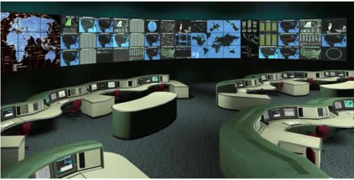
In tackling these operational challenges, maps of network architecture and performance can be vital tools for managers and engineers. Maps can summarise and present complex, rapidly changing data on the operational state of a network in a single visual image, providing an easy-to-interpret overview of the system and thereby aiding problem diagnosis and solving. For example, in NOCs (network operations centers) of large ISPs just a handful of skilled operations are responsible for keeping a complex and geographically distributed hardware infrastructure running smoothly and maps are essential (see Figure 1) (Koutsofios et al. 1999, Wei et al. 2000). As a New York Times
story noted on the huge stress on the US telecommunications systems immediately following the attacks of the 11th September 2001, “By watching computerized maps of the United States, [operators] can tell in an instant whether there are any jams in long-distance traffic.” (Guernsey, 2001).
Figure 1: View of AT&T’s large NOC with large wall displays showing network maps.
However, the detailed network monitoring maps and tools used by operators in NOCs are not made public for reasons of security and commercial confidentiality. Also, most of these maps are not designed as general purpose maps that can be read by the general-public. Instead, they are specialized management tools that require skilled interpretation. That said, some Internet networks, particularly those serving the research and education communities, do make summary network performance data publicly available using map interfaces. These interfaces are popularly referred to as ‘network weather maps’. These maps represent public-spirited information dissemination tools, providing network customers (usually universities and labs) with useful information, especially to identify trouble spots, as well as having a marketing function (see next section).
Figure 2: ‘Weather map’ of the traffic load on the core links of the Abilene network.
(Courtesy of the Abilene Network Operations Center, Indiana University, <http://hydra.uits.iu.edu/~abilene/traffic/>)
Figure 3: ‘Weather map’ of network load for the NORDUnet network.
These two maps are also illustrative of the two major cartographic archetypes employed to represent computer networks – showing linkages and nodes either as a logical schematic or on a geographic base with a familiar template of cities and administrative boundaries. These maps can often be highly generalised, with for example the network architecture shown as straight lines, although they are topologically correct (as with conventional subway maps).
In addition to single network maps, there are also some attempts to provide dynamic ‘weather’ maps of Internet wide performance. For example, Matrix.Net’s Internet Weather Report (IWR) 4 presents maps of network latency
Figure 4: One frame from the animated Internet Weather Map.
(Courtesy of Matrix.Net, <http://www.matrix.net>)
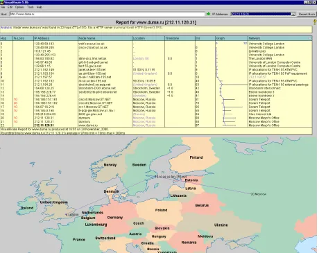
approximate locations of this routing hardware can also be plotted on a map to give a geographic traceoute, an example of which is given in Figure 6.
Figure 5: Traceroute listing of real-time Internet route taken by data between a PC in the Washington DC area and a web server located just outside Dublin, Ireland.
Tracing route to walnut.may.ie [149.157.1.115]
over a maximum of 30 hops:
1 <10 ms 10 ms <10 ms 209-9-224-225.sdsl.cais.net [209.9.224.225]
2 30 ms 90 ms 50 ms 172.20.0.1
3 <10 ms 10 ms 10 ms fe7-7.core1.mcl.cais.net [63.216.0.77]
4 <10 ms 20 ms 10 ms pos3-2.core1.wdc.cais.net [63.216.0.69]
5 10 ms 10 ms 10 ms pos3-0.core2.wdc.cais.net [63.216.1.14]
6 20 ms 30 ms 30 ms pos5-3.core.pitt.cais.net [63.216.1.62]
7 40 ms 130 ms 30 ms pos5-0.core1.pitt.cais.net [63.216.6.13]
8 50 ms 40 ms 60 ms pos5-3.core.det.cais.net [63.216.7.58]
9 40 ms 40 ms 40 ms pos5-0.core1.det.cais.net [63.216.8.13]
10 50 ms 70 ms 50 ms pos5-2.core.chi.cais.net [63.216.8.58]
11 90 ms 81 ms 70 ms uunet.a3-0.4.core2.chi.cais.net [63.216.9.65]
12 60 ms 70 ms 60 ms 0.so-5-1-0.XL1.CHI2.ALTER.NET [152.63.67.242]
13 50 ms 60 ms 80 ms 0.so-7-0-0.XR1.CHI2.ALTER.NET [152.63.67.130]
14 150 ms 60 ms 121 ms 0.so-3-0-0.TR1.CHI2.ALTER.NET [152.63.15.86]
15 80 ms 100 ms 70 ms 126.at-4-0-0.IR1.NYC9.ALTER.NET [152.63.1.121]
16 80 ms 70 ms 90 ms so-1-0-0.IR1.NYC12.ALTER.NET [152.63.23.62]
17 131 ms 140 ms 190 ms so-5-0-0.TR1.LND9.Alter.Net [146.188.15.49]
18 130 ms 141 ms 170 ms pos0-1.cr2.dub2.gbb.uk.uu.net [158.43.253.58]
19 141 ms 120 ms 160 ms ge0-0-0.gw4.dub2.gbb.uk.uu.net [158.43.152.6]
20 130 ms 151 ms 120 ms 158.43.111.102
21 161 ms 180 ms 140 ms Oswald-f1-1.dublin.core.hea.net [193.1.195.137]
22 151 ms 200 ms 170 ms Uther-g1-0-0.dublin.core.hea.net [193.1.195.242]
23 211 ms 180 ms 190 ms nuim-kinnegad.atm.link.hea.net [193.1.194.22]
24 161 ms 200 ms 160 ms walnut.may.ie [149.157.1.115]
Figure 6: An example of a geographic traceroute using the VisualRoute utility. The Internet route is between London and Russian Duma website in Moscow.
Maps For Internet Marketing
A large number of infrastructure maps of the different Internet networks have been produced primarily for the purposes of marketing. Indeed, a cursory examination of most any ISP websites will reveal ‘high-gloss’ marketing maps. This is, perhaps, not surprising as maps have long been created in the service of marketing and promotion (Tyner 1982, Monmonier 1991). Geographic maps can be seen in some senses as the natural visual representation of transportation and communications networks, able to effectively show potential customers how a particular network could expedite their travel needs. As a consequence, there is a long (dis)honourable tradition of promotional maps being used to highlight the advantages of the latest transportation network such as canals, oceanic shipping lines, railroads, highways and of course airlines (cf. Ackerman 1993, Fleming 1984).
While these maps do provide a selective picture, a reflection of what the company wants to emphasize, they also allow academic researchers and others to chart the range and make-up of each companies network, to document different kinds of provision at a range of scales, and importantly to note how this
has changed over time. For example, Gorman and Malecki (2000), Moss and
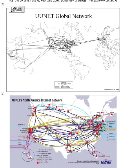
Townsend (2000), Wheeler and O’Kelly (1999) have undertaken useful analysis of the geography of Internet network topology based on data gathered, in part, from ISP marketing maps. This can be illustrated in reference to an analysis of UUNet’s (part of Worldcom) infrastructure. Growing at over self-report rate of
1000 per cent per year 5 a longitudinal study of their maps at a variety of scales
allows us to see the company’s strategy for delivering infrastructure services and to project the likely consequences this strategy on issues such as the digital divide, urban-regional restructuring, local and regional economic development, and so on (see Figure 7). What is clear from these maps is that UUNet is a global supplier of network services, but that the network is confined to the three main pan-regional trading zones (North America, Europe, Asia), and to the principle cities (hubs) in these regions who are most likely to hold potential customers. Lower level cities have lower capacity linkages, and other potentially less profitable areas and cities are bypassed all together (e.g. most of middle America).
5 The 1000 per cent figure might well be apocryphal and has been disputed, see for example Odlyzko
Figure 7: Example marketing map showing the Internet network of UUNET, one of the largest providers. (a) UUNET global network as of first quarter 1997, (b) US network from June 2000,
(c) the UK and Ireland, February 2001. (Courtesy of UUNET, <http://www.uu.net/>)
(a)
(c)
Maps For Strategic Planning And Policy
examples where maps have been used, we suspect that their full potential is not yet being realized (this is based on the fact that we could locate relatively few examples of where maps had been used as key analytical resources). This under-usage is, we suspect, because there is a perception that the Internet is somehow non-material in substance, due to its mode of interaction, and the relative invisibility of infrastructure. In addition, data to create useful maps is often closely guarded by service providers and its use restricted from the public domain, and other forms of data generation are costly and technically difficult. In order to structure our analysis we have divided our discussion into two related themes. The first concerns the planning and development of infrastructure, the second, regional development, the attraction of inward investment, and the monitoring and addressing of inequalities.
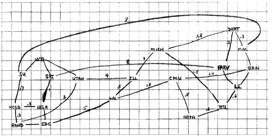
At one level, maps have been used in the planning, development and expansion of network infrastructure at a variety of scales from individual buildings to global networks. Planning the optimum topology for a communications network to efficiently interconnect geographically dispersed locations is an exacting task. Maps help visualize complex network topologies and how new configurations will look and operate. Figure 8 is a ‘back of the envelope’ hand drawn sketch map
from the early planning of ARPANET6, plotted by the project manager Larry
Robert in the late 1960s. It shows the projected topological routing of the fledgling Internet between nodes. Figure 9 shows the fibre-optic cable routing in downtown Philadelphia, a city home to 270 technology firms in 2001, 60 per cent of whom were located in the center city, requiring high-speed Internet connections. Many of these companies are members of ePhiladelphia Technology Alliance an organization dedicated to creating and fostering a vibrant
6 ARPANET pioneered wide-area packet-switching networking and laid much of the foundations
technology community within the city. By mapping companies in relation to cable-routing the city can adequately provide network connections and plan extensions that will hopefully attract in new customer. At a larger-scale, countries are crisscrossed by many interconnected networks. An important function for ISPs is to easily and efficiently interconnect and exchange local traffic at neutral peering points. Figure 10 shows two examples of national-level maps tracking the Internet infrastructure in the Republic of Korea produced by
Korean Network Information Center, based in Seoul 7. Analysts at KRNIC have
produced a whole series of maps over the past five years using topological graphs representations. The two maps clearly reveal the tremendous growth in the number of ISPs, their interconnections and capacity of links within and external to Korea. The maps are valuable policy and research resource creating a census of the growing complexity of the links between ISPs and their capacity.
Figure 8: A ‘back of the envelope’ style sketch map for network topology planning.
(Courtesy of Hafner and Lyon 1996, page 50.)
Figure 9: Fibre-optic routes in central Philadelphia.
(a)
Figures 10: Topology maps of ISP interconnections in the Republic of Korea from (a) May 1995 and (b) October 1999.
(Courtesy of the Korean Network Information Center, < http://www.nic.or.kr/>)
community groups seek to maximise their connectivity within optimal constraints (e.g. profit). Maps are a potentially important tool for illustrating high-capacity internet infrastructure to potential inward investors and encouraging economic development. Examples include the ‘Bandwidth Bay Fiber Network Mapping’ 8 by the City of San Diego (Abouna 2001; Figure 11) and the ‘Georgia High-Speed Telecommunications Atlas’ 9 in the state of Georgia,
USA (French and Jia 2001; Figure 12).
Figures 11: Map of the Internet fibre-optic networks and wired buildings in downtown San Diego from the Bandwidth Bay system.
(Courtesy ofSan Diego Geographical Information Source, <http://www.bandwidthbay.org/main.htm> )
8 <http://www.bandwidthbay.org/main.htm>
Figures 12: Map of the commercial networks infrastructure in Georgia, USA.
(Courtesy of Center for Geographic Information Systems, <http://maps.gis.gatech.edu/telecomweb/index.html> )
concerned that planned high-speed Internet delivery systems are available, at affordable costs, to all members of a community, in particular, lower income communities or those in more sparsely populated rural areas. Clearly, here, the geography of access is crucial and one strategy open to regulators to make visible inequalities ‘on the ground’ is to make use of maps which show spatial patterns of broadband Internet availability. Figure 13 provides two examples, at different scales, from a recent Federal Communications Commission report on broadband Internet access. The first map shows the number of broadband providers for zipcode areas across the whole of the US, while the second map focuses just on the local geography of DSL coverage in Los Angeles county, California.
These maps were part of a large report on the FCC regulatory monitoring of providers to insure that they meet the provision of the 1996 Telecommunications Act to encourage the deployment of advanced telecommunications capability to all Americans in a reasonable and timely fashion. The general conclusion of the report, supported by the tables and maps, was that commercial providers were generally meeting targets with 59% of the US zip codes (which represent 91% of the resident population) showing evidence of high-speed Internet access. However, they also issued one crucial caveat:
(Courtesy of the Federal Communications Commission, <http://www.fcc.gov/broadband/>)
In addition, in the US the Census Bureau, the Department of Commerce’s National and Information Administration, and the Economics and Statistics Administration generate official statistics on Internet and telecommunications access at national and regional scales that are analyzed for their economic policy potential by a range of groups, including local and state government and commercial companies. For example, the Progressive Policy Institute uses a range of these data in formulating their ‘New Economy Index’ reports11. The
self-stated aims of these reports is to “…offers policy makers a framework for economic development strategies aimed at promoting fast, and widely shared economic growth and prosperity.” Maps are used prominently throughout the report and Figure 14 shows an example mapping the online population, from
The Metropolitan New Economy Index (April 2001) for the top 50 metropolitan regions in the US. These are grouped into 4 percentile groups. Other maps in the report rank the regions according to 16 indicators that are used to create an overall index of economic competitiveness in the information economy.
Figure 14: Map of the top 50 US metropolitan areas in terms of online population .
(Courtesy of Progressive Policy Institute, < http://www.neweconomyindex.org/>)
Likewise, Mark Krymalowski has been analysing data at the country level, plotting the geographical distribution of .DE domain registrations in Germany12.
Figure 15: Per capita measure of .DE domains in German counties.
(Courtesy of Mark Krymalowski and DENIC, <http://www.denic.de>)
Figure 16: Maps of the global diffusion of the Internet connectivity at the national level by network infrastructure from (a) 1991 and (b) 1997.
(Courtesy of Larry Landweber and the Internet Society, <http://www.cs.wisc.edu/~lhl/maps/>)
These maps provide a partial, but useful, picture of global Internet diffusion through the 1990s. The first map, from 1991, shows that a large number of countries, particularly in the Americas and in Northern Europe, had full Internet connectivity. However, an equally large measure of the world’s nations are shaded yellow, indicating that they had no international Internet connectivity. In fact, this category included well over half the nations of the world, though these were clearly concentrated in the less developed regions of Africa and central Asia. By 1997, the majority of the nations of the world were shaded blue. The Internet, as measured by Landweber's survey, was so widespread that the exceptions really stand out. (It was at this point that tracking diffusion at this scale using Landweber’s criteria became redundant and, hence, this is the last map in the series). The yellow shaded exceptions were nations suffering from extreme poverty, war and civil conflicts (such as Afghanistan and Somalia) or from external geopolitical isolation (e.g. Libya, North Korea, Burma, Iran and Iraq).
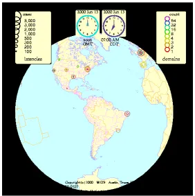
numerous cables connect the densely ‘wired’ regions of North America and Western Europe. Another vital measure for Internet global policy is understanding the trends in uneven geographic distribution of computers connected. Figure 18 is a proportional symbol map from Matrix.Net, a leading Internet monitoring company based in Austin, Texas, shows host computers as of January 2000. The number of hosts is aggregated for major cities and countries and then represented on the map by the coloured circles.
Figure 17: World map of submarine fibre-optic cables.
Figure 18: Maps of the number of hosts connected to the Internet, January 2000.
(Courtesy of Matrix.Net, <http://www.matrix.net/>)
Maps For Academic Internet Analysis
It has been widely argued by academics that the ICTs are transformative technologies that are having significant impacts on social, economic and political life, engendering widespread changes (e.g. Castells 2000, 2001, Graham and Marvin 2001, Kitchin 1998). The process of mapping has been used to comprehend three different sorts of projects aimed at furthering our understanding of these changes in relation to infrastructure: urban-regional restructuring; the digital divide; measuring the Net.
Figure 19: The number of domain names in (a) the Bay / Silicon Valley area of California, (b) San Francisco, 1999.
(Courtesy of Matthew Zook, <http://www.zooknic.com/>)
number of mapping projects have been instigated (see Dodge and Kitchin 2000a, 2001) and here we discuss three in brief.
Figure 20 displays an ‘arc map’ of Internet traffic flows between fifty nations, from February 1993. The colour, thickness and height of the arcs are used to encode the traffic statistics for particular inter-country routes (Becker et al.
Figure 20: Interactive visualization of Internet traffic in the SEENET3D network analysis application. (Courtesy of Stephen Eick, Visual Insights)
Figure 21: 3D arcs on a globe representation of the Internet MBone network.
(Courtesy of Tamara Munzner and IEEE, <http://www-graphics.stanford.edu/papers/mbone/>)
The final example is the Internet Mapping Project being undertaken by Hal Burch and Bill Cheswick at Lumeta Corporation (formerly at Bell Labs) (Branigan et al. 2001)13. Their project maps the topology of thousands of
interconnected Internet networks to provide perhaps the best currently available large-scale overview of the core of the Internet in a single snapshot. They map the Internet in an abstract space (i.e. using a process of spatialisation), thus disregarding the actual location of nodes in physical space. Data is gathered by using the Internet to measure itself on a daily basis, surveying the routes to a large number of end-points (usually Web servers) from their base in New Jersey, USA. The resulting spatialisation maps how hundreds of networks connect together to form the core of the Internet. Figure 22 shows the structure of the Internet from December 2000, representing nearly 100,000 network nodes. This highly complex spatialisation takes several hours to generate on a typical PC. The layout algorithm uses simple rules, with forces
of attraction and repulsion jostling the nodes into a stable, legible configuration. There are many permutations in the algorithm to generate different layouts and colour-codings of the links according to different criteria (such as network ownership, country). In the example shown, links have been colour-coded according to the ISP, seeking to highlight who 'owns' the largest sections of Internet topology. This project is ongoing and the data is archived and available to other researchers to utilise. Over time, it is hoped that the data will be useful for monitoring growth and changes in the structure of the Internet. The experience gained in mapping the Internet is also being applied commercially, using network scanning and visualization techniques to chart the structure of corporate intranets to identify security weaknesses and unauthorized nodes.
Figure 22: Map of the Internet topology by Hal Burch and Bill Cheswick.
Conclusions
We have argued in this chapter that mapping can be used as a significant tool of analysis for managing Internet infrastructure, developing and implementing policy, and understanding the information economy. Maps can be used to reveal the range, extent and density of Internet infrastructure in relation to real-world geography at a variety of scales.
Second, good maps require skilled construction. Maps necessarily depict a selective distortion of that which they seek to portray because they employ processes of generalisation and classification. Weak cartographic technique – and poor judgment on how best to generalise and classify - can lead to poorly constructed maps that have low communicability. At present, many of the maps of Internet infrastructure are not being created by trained cartographers. This means that many have poor cartographic design standards, using inappropriate styles or poorly chosen categorization. Consequently, many maps are lacking in legibility and some maybe misleading.
Third, due to a combination of the first two issues, many maps can propagate severe interpretation problems centered around issues of ecological fallacy. In regards to maps of infrastructure, ecological fallacy relates to the aggregation of data within spatial units – otherwise known as the Modifiable Areal Unit Problem (Openshaw 1984). The presentation of aggregated data can give the impression that all phenomenon within an area are similar, when in fact there could be significant variation. This can lead to inappropriate conclusions about that area. This is perhaps best revealed when the same data is mapped onto differing sets of spatial units (e.g., wards, districts, counties, states), as this can produce significantly different patterns across scales. Ecological fallacies are quite common (see Landweber example above), particularly when using secondary ‘off-the-shelf’ data such as that published by the World Bank, OECD, and International Telecommunications Union for example, because the data often relates to a particular scale (e.g. nations) but has no sub-scale variability. Consequently, there is little choice but to map it at the scale collected (see Dodge and Kitchin 2000b for a fuller discussion).
the maps are selective and subjective presentations of their underlying data, telling the ‘story’ their creators have designed them to tell – even if created in a so-called scientific fashion decisions have to be made over scale, symbols, layout, category classes, and what to map and what to omit. In many cases this ‘story’ will be benign, in others it will be carefully constructed. For example, maps used for marketing purposes are essentially pieces of corporate propaganda designed to highlight the range and scope of services on offer, communicating to a potential customer that they offer the ‘right’ network for them. As such, it is necessary to think about who the map was made for, by whom, why it was produced, and what are the implications of its message and use.
---
Martin Dodge works as a computer technician and researcher in the Centre for Advanced Spatial Analysis (CASA), at University College London. He maintains the Cyber-Geography Research web site at <http://www.cybergeography.org>, which includes the Atlas of Cyberspaces. With co-author Rob Kitchin, he has also written the books Mapping Cyberspace (Routledge, 2000) and Atlas of Cyberspace (Addison-Wesley, 2001). Email: [email protected]
Rob Kitchin is a Senior Lecturer in Human Geography at the National University of Ireland, Maynooth. He is the author of Cyberspace (Wiley, 1998) and the co-author of Mapping Cyberspace (Routledge, 2000) and Atlas of Cyberspace
References
Abbate, J., 1999, Inventing the Internet (MIT Press: Cambridge, Mass.).
Abouna, A.G., 2001, “A tour of the bandwidth bay fiber network map”,
Proceedings 2001 ESRI International User Conference, 9-13 July 2001, San Diego, USA.
<http://www.esri.com/library/userconf/proc01/professional/abstracts/a963.h tml>
Ackerman, J., 1993, “Blazing a well worn path: Cartographic commercialism, highway promotion and automobile tourism in the United States, 1880-1930”,
Cartographica, Vol. 30, No. 1, pages 1O-20.
Barrett, R., 1999, “Fiber Cuts Still Plague ISPs”, Interactive Week, 4th June
1999. <http://www.zdnet.com/zdnn/stories/news/0,4586,406174,00.html>
Becker, R.A., Eick, S.G. and Wilks, A.R., 1995, “Visualizing Network Data”,
IEEE Transactions on Visualization and Computer Graphics, Vol. 1, No. 1, pages 16-28.
Branigan, S., Burch, H., Cheswick, B. and Wojcik F., 2001, "What Can You Do with Traceroute?", Internet Computing, September/October 2001, Vol. 5, No. 5, page 96.
Castells, M., 2000, The Rise of the Network Society, 2nd edition, (Blackwell:
Oxford).
Castells, M., 2001, Internet Galaxy: Reflections on the Internet, Business and Society, (Oxford University Press: Oxford).
Cox, K.C., Eick, S.G. and He, T., 1996, “3D Geographic Network Display”, ACM Sigmod Record, Vol. 25, No. 4, pages 50-54.
Couclelis, H., 1998, “Worlds of information: The geographic metaphor in the visualisation of complex information”, Cartography and Geographic Information Systems, Vol. 25, pages 209-220.
Cukier, K.N., 1999, “Bandwidth Colonialism? The Implications of Internet Infrastructure on International E-Commerce”, Proceedings of INET’99 Conference. <http://www.isoc.org/inet99/1e/1e_2.htm>
Delio, M., 2001, “From Code Red to Code Dread”, Wired News, 1st August 2001.
Dodge, M., 2000a, "Mapping Where the Data Flows", OnTheInternet, April 2000. <http://www.isoc.org/oti/dodge.html>
Dodge, M., 2000b, “Mapping the Global Spread of the Net”, Mappa.Mundi Magazine, 4th April 2000. <http://mappa.mundi.net/maps/maps_011/>
Dodge, M., 2001, Atlas of Cyberspace website, Centre for Advanced Spatial Analysis, University College London. <http://www.cybergeography.org/atlas/>
Dodge, M. and Kitchin, R., 2000a, Mapping Cyberspace (Routledge: London).
Dodge, M. and Kitchin, R., 2000b, “Exposing the ‘Second Text’ of Maps of the Net”, Journal of Computer-Mediated Communication, June 2000, Vol. 5, No. 4.
Dodge, M. and Kitchin, R., 2001, Atlas of Cyberspace (Addison-Wesley: London).
Ewalt, D.M., 2001, “Attacks Lead To Internet Slowdowns”,
InformationWeek.com, 12th September 2001.
<http://www.informationweek.com/story/IWK20010912S0013>
FCC, 2000, Availability of High-Speed and Advanced Telecommunications
Services, Federal Communications Commission, Order Number 00-290, August
2000, Washington DC.
<http://www.fcc.gov/Bureaus/Common_Carrier/Orders/2000/fcc00290.pdf>
Fleming, D.K., 1984, “Cartographic Strategies for Airline Advertising”,
Geographical Review, Vol. 74, pages 76-93.
French, S.P. and Jia, X., 2001, “Georgia High-Speed Telecommunications Atlas: An ArcIMS Implementation”, Proceedings 2001 ESRI International User Conference, 9-13th July 2001, San Diego, USA.
<http://www.esri.com/library/userconf/proc01/professional/abstracts/a259.h tml>
Fry, C., 1999, GIS in Telecommunications, In Longley, P., Goodchild, M., Maguire, D., Rhind, D. (Eds.) Geographical Information Systems, Volume 2: Management (John Wiley and Sons: New York ), pp. 819-826.
Gorman, S.P. and Malecki, E.J., 2000, “The networks of the Internet: an analysis of provider networks in the USA”, Telecommunications Policy, Vol. 24 No. 2, pages 113-134.
Guernsey, L., 2001, “An Unimaginable Emergency Put Communications to the Test”, The New York Times, 20th September, 2001.
<http://www.nytimes.com/2001/09/20/technology/circuits/20INFR.html>
Hafner K. and Lyons M., 1996, Where Wizards Stay up Late: The Origins of the Internet (Simon and Schuster: New York).
Holderness, M., 1998, “Who are the world’s information-poor?”, In Loader, B.D. (Ed.) The cyberspace divide (Routledge: London), pages 35-56.
Kitchin, R., 1998, Cyberspace (John Wiley: Chichester).
Koutsofios, E.E., et al., 1999, “Visualizing Large-Scale Telecommunications Networks and Services”, Proceedings of IEEE Visualization’99, October 1999, pages 457-461.
Manjoo, F., 2000, “Net Traffic at All-Time High”, Wired News, 8th November 2000. <http://www.wired.com/news/business/0,1367,40043,00.html>
Monmonier, M., 1991, How to Lie with Maps (The University of Chicago Press: Chicago).
Moss, M.L. and Townsend, A., 1997, “Tracking the Net: Using Domain Names to Measure the Growth of the Internet in U.S. Cities”, Journal of Urban Technology, December 1997, Vol. 4, No. 3, pages 47-59.
Moss, M. and Townsend, A., 2000, “The Internet backbone and the American metropolis”, The Information Society, Vol. 16, pages 35-47.
Munzner T., Hoffman E., Claffy K. and Fenner B., 1996, “Visualizing the Global Topology of the MBone”, Proceedings of the 1996 IEEE Symposium on Information Visualization, October 28-29 1996, San Francisco, CA, pp 85-92, 1996. <http://graphics.stanford.edu/papers/mbone/>
Norris P., 2001, Digital Divide: Civic Engagement, Information Poverty, and the Internet Worldwide (Cambridge University Press: Cambridge, UK).
NTIA, 2000, Falling Through the Net: Toward Digital Inclusion, report by the National Telecommunications and Information Administration, US Department of Commerce, October 2000, Washington DC.
<http://www.ntia.doc.gov/ntiahome/digitaldivide/
Nua, 2001, How Many Online?
OECD 2001, Communications Outlook 2001 (Organisation for Economic Co-operation and Development: Paris).
Openshaw, S., 1984, The Modifiable Areal Unit Problem. Concepts and Techniques in Modern Geography 38, (Geo Books: Norwich).
Odlyzko, A.M., 2000, “Internet growth: Myth and reality, use and abuse”,
Information Impacts Magazine, November 2000.
<http://www.cisp.org/imp/november_2000/odlyzko/11_00odlyzko.htm>
Petrazzini, B. and Kibati, M., 1999, "The Internet in Developing Countries",
Communications of the ACM, Vol. 42, No. 6, pages 31-36.
Quarterman, J.S., Carl-Mitchell, S. and Phillips, G., 1994, “Internet Interaction Pinged and Mapped”, Proceedings of INET’94 Conference, June 1994, Prague. <http://www.isoc.org/inet94/papers/522.ps.gz>
Rickard, J., 1996, “Mapping the Internet with Traceroute”, Boardwatch Magazine, December 1996.
Salus, P.H., 1995, Casting the Net: From Arpanet to Internet and beyond...
(Addison Wesley: New York).
Sternberg, R., 2001, "Internet Domains and the Innovativeness of Cities/Regions - Evidence from Germany and Munich". Paper presented at ESRC CITIES Competitiveness and Cohesion Programme Workshop, Oxford University, 28-30th March 2001.
<http://cwis.livjm.ac.uk/cities/JSworkshop/Sternberg.pdf>
TeleGeography, 2001, Packet Geography 2002, (TeleGeography, Inc.: Washington DC).
Tyner, J.A., 1982, “Persuasive cartography”, Journal of Geography, Vol. 81, pages 140-144.
Warf, B., 2001, "Segueways into cyberspace: multiple geographies of the digital divide", Environment and Planning B: Planning and Design, January 2001, Vol. 28, No. 1, pages 3-19.
Wei, B., et al., 2000, “Visualization Research with Large Displays”, IEEE Computer Graphics and Applications, July/August 2000, pages 2-6.
Zook, M.A., 2000, “The Web of Production: The Economic Geography of Commercial Internet Content Production in the United States”, Environment and Planning A, Vol.32, pages 411-426.