Worcester Polytechnic Institute
DigitalCommons@WPI
Computer Science Faculty Publications
Department of Computer Science
5-1-2004
Value and Relation Display for Interactive
Exploration of High Dimensional Datasets
Jing Yang
Worcester Polytechnic Institute
, [email protected]
Anilkumar Patro
Worcester Polytechnic Institute
, [email protected]
Shiping Huang
Worcester Polytechnic Institute
, [email protected]
Nishant Mehta
Worcester Polytechnic Institute
, [email protected]
Matthew O. Ward
Worcester Polytechnic Institute
, [email protected]
See next page for additional authorsFollow this and additional works at:
http://digitalcommons.wpi.edu/computerscience-pubs
Part of the
Computer Sciences Commons
This Other is brought to you for free and open access by the Department of Computer Science at DigitalCommons@WPI. It has been accepted for inclusion in Computer Science Faculty Publications by an authorized administrator of DigitalCommons@WPI.
Suggested Citation
Yang, Jing , Patro, Anilkumar , Huang, Shiping , Mehta, Nishant , Ward, Matthew O. , Rundensteiner, Elke A. (2004). Value and Relation Display for Interactive Exploration of High Dimensional Datasets. .
Authors
Jing Yang, Anilkumar Patro, Shiping Huang, Nishant Mehta, Matthew O. Ward, and Elke A. Rundensteiner
Value and Relation Display for Interactive Exploration of High Dimensional
Datasets
Jing Yang, Anilkumar Patro, Shiping Huang, Nishant Mehta, Matthew O. Ward and Elke A. Rundensteiner Computer Science Department
Worcester Polytechnic Institute Worcester, MA 01609
{yangjing,anil,shiping,nishantm,matt,rundenst}@cs.wpi.edu∗
ABSTRACT
Traditional multi-dimensional visualization techniques, such as glyphs, parallel coordinates and scatterplot matrices suffer from clutter at the display level and difficult user navigation among di-mensions when visualizing high dimensional datasets. In this pa-per, we propose a new multi-dimensional visualization technique named a Value and Relation (VaR) display, together with a rich set of navigation and selection tools, for interactive exploration of high dimensional datasets. By explicitly conveying the relation-ships among the dimensions of a high dimensional dataset, the VaR display helps users grasp the associations among dimensions. By using pixel-oriented techniques to present values of the data items in a condensed manner, the VaR display reveals data patterns in the dataset using as little screen space as possible. The navigation and selection tools enable users to interactively reduce clutter, navigate within the dimension space, and examine data value details within context effectively and efficiently. The VaR display scales well to datasets with large numbers of data items by employing sampling and texture mapping. A case study reveals how our proposed ap-proach helps user interactively explore a high dimensional dataset with a large number of data items.
CR Categories: H.5.2 [Information Interfaces and Presentation]: User Interfaces—Graphical user interfaces H.2.8 [Database Man-agement]: Database Applications—Data mining
Keywords: Multi-dimensional visualization, pixel-oriented, mul-tidimensional scaling, high dimensional datasets.
1 INTRODUCTION
High dimensional datasets are common in applications such as dig-ital libraries, bioinformatics, simulations, process monitoring, and surveys. Automatic analysis tools are widely used for analyzing high dimensional datasets. For example, automatic dimension re-duction approaches, such as Principal Component Analysis (PCA) [9] and Multidimensional Scaling (MDS) [14], are used to project high dimensional datasets into lower dimensional spaces. Subspace clustering algorithms, such as CLIQUE [1], are used to detect data clusters from high dimensional datasets.
However, due to the dimensionality curse [4], i.e., the lack of data separation in a high dimensional space, finding lower sional projections, data clusters and other trends from high dimen-sional datasets is much harder than it is from low dimendimen-sional datasets. Thus graphically presenting the high dimensional datasets and then allowing the human to apply his or her perceptual abilities and domain knowledge to make sense of the data is an important
∗This work was supported under NSF grant IIS-0119276.
approach to both analyzing high dimensional datasets and assess-ing and understandassess-ing the results of automatic analysis tools.
Traditional multi-dimensional visualization techniques, such as glyphs [2], parallel coordinates [8] and scatterplot matrices [5], do not scale well to high dimensional datasets. For example, a dataset containing 200 dimensions will generate star glyphs and parallel co-ordinates composed of 200 axes and a scatterplot matrix containing 40,000 plots. These large numbers of axes and plots not only clut-ter the screen but also make it difficult for users to navigate among different dimensions. They make it difficult for users to accom-plish exploration tasks such as understanding relationships among dimensions and detecting data clusters and outliers.
In this paper, we propose a new multi-dimensional visualization technique named a Value and Relation (VaR) display. By explicitly conveying the relationships among the dimensions of high dimen-sional datasets in conjunction with data values, the VaR display greatly helps users grasp the relationships among the dimensions and navigate within the dimension space, as well as detect data clus-ters and outliers in different subspaces composed of subsets of the dimensions. The VaR display uses pixel-oriented techniques [13] to utilize the screen space efficiently. It also provides a rich set of navigation and selection tools to enable users to reduce clutter and interactively explore high dimensional datasets.
First, by graphically presenting each dimension of a high dimen-sion dataset as a glyph in a 2D space, the VaR display conveys the relationships among the dimensions through the positions of the glyphs. The positions of the glyphs are generated using Multidi-mensional Scaling (MDS) [14] according to the pair-wise relation-ships among the dimensions. MDS is a technique that maps loca-tions in high dimensional space to posiloca-tions in a low dimensional space. It is widely used in visualization applications to convey rela-tionships among data items within a multi-dimensional dataset. For example, [19] used MDS to map data items in a document dataset to a 2D space and generated a Galaxies display as a spatial representa-tion of relarepresenta-tionships within the document collecrepresenta-tion. The VaR dis-play uses MDS in a different way in that it maps dimensions rather than data items in a dataset to a 2D space according to relationships among the dimensions. In Figure 1a, each dimension of the Sky-Server dataset (361 dimensions, 50,000 data items) is mapped to a dot and positioned in the 2D space using MDS. Closely related dimensions have positions adjacent to each other. We call such a display a Galaxies-like display. It reveals the relationships among the dimensions.
Second, besides the relationships among the dimensions, the VaR display conveys values of the data items using pixel-oriented techniques [13]. Pixel-oriented techniques are visualization meth-ods that map values of data items to pixels and arrange pixels to convey relationships. We use pixel-oriented techniques to map val-ues of the data items within a single dimension to pixels and ar-range them into a “glyph” (“subwindow”, as termed in other pixel-oriented techniques [10]). For each dimension a glyph can be gener-ated. Then we replace the dots in the Galaxies-like display by their
Figure 1: The VaR Display. (a) A Galaxies-like display where each dimension is mapped to a dot and positioned using MDS according to the relationships among the dimensions. (b) The dots in (a) are replaced by glyphs that present values of the data items to form a VaR display. The dataset is the SkyServer dataset (361 dimensions, 50,000 data items), which was extracted from the Sloan Digital Sky Server (SDSS) data [6].
respective glyphs to produce the VaR display. Figure 1b shows the VaR display of the SkyServer dataset generated by replacing the dots in Figure 1a by glyphs. In such a VaR display, the positions of the glyphs reveal the relationships among the dimensions, while the textures of the glyphs reveal data patterns in the dimensions.
Third, we provide a rich set of navigation and selection tools for the VaR display. Navigation tools help users reduce clutter in the display and interactively explore the dataset. They include inter-actions such as overlap reduction, zooming and panning, distortion, comparing, and refining. Selection allows human-driven dimension reduction, i.e., users select subsets of dimensions from the VaR dis-play and then a space composed of the selected dimensions can be further explored using the VaR display as well as other multi-dimensional visualization techniques. Automatic and manual se-lection tools of the VaR display make sese-lection both flexible and easy to use.
The VaR display can be used for the following purposes:
Visually Exploring High Dimensional Datasets: The VaR dis-play allows users to interactively explore high dimensional datasets with large numbers of data items. It visually reveals both the data item relationships and dimension relationships within a high dimensional dataset.
Guiding Automatic Data Analysis: The VaR display can assist users in (1) assessing and understanding the result of some types of automatic data analysis algorithms and (2) manually tuning the parameters used in those algorithms for better re-sults. For example, by visually presenting the relationships among the dimensions and the values within the dimensions, the VaR display helps users understand the result of an auto-matic dimension reduction approach. The VaR display also helps users assess the result of an automatic subspace cluster-ing algorithm by visually presentcluster-ing the clusters.
Human-Driven Dimension Reduction: The VaR display allows users to interactively select dimensions of interest and further explore these dimensions using VaR displays as well as other multi-dimensional visualization techniques. For example, a user can select a group of closely related dimensions from the VaR display, project the dataset into the subspace composed of the selected dimensions, and view the projection using par-allel coordinates [8].
The remainder of this paper is organized as follows. Section 2 describes how to generate a VaR display and discusses optimization problems in the VaR display generation. Section 3 presents the nav-igation and selection tools for the VaR display. Section 4 describes the techniques used to scale the VaR display to datasets with large numbers of data items. Section 5 presents a case study of the VaR display. Section 6 reviews related work while Section 7 presents our conclusions and future work.
2 VAR DISPLAYGENERATION
The following steps are necessary for generating a VaR display for a high dimensional dataset:
• Step1: Build a distance matrix that captures the correlation
between each pair of dimensions in the dataset.
• Step2: Apply MDS on the distance matrix to get a set of
po-sitions in a 2D space, where each position corresponds to a dimension.
• Step3: Create a glyph for each dimension: map values of the
data items within a single dimension to pixels. Each value is represented by the color of a pixel. Arrange the pixels into a “glyph” that corresponds to the single dimension. Among different glyphs, pixels corresponding to values of the same data items are arranged in the same positions in the glyphs.
• Step4: Place the glyphs in their corresponding positions
cal-culated in Step2.
In a VaR display, each glyph represents one dimension of the displayed dataset. The positions of the glyphs reveal the relation-ships among the dimensions. The colors of pixels within the glyphs reveal data patterns in the dimensions. Thus relationships among dimensions can be examined in detail by comparing the textures of the glyphs.
There are many possible ways to implement the four steps of the VaR display generation. The goal is to find a solution that can provide users with the largest amount of information. The major optimization problems in these steps are how to get a good set of positions for the glyphs and how to arrange the pixels within the glyphs to reveal useful information. These two problems are dis-cussed in the following sections.
Figure 2: Ordering of Pixels. Pixels in the glyphs are ordered by values of data items in different dimensions in (a) and (b). (a) It is clearly visible that the dimensions in the top of the display are closely related since their glyphs have similar patterns. (b) It is clearly visible that the dimensions in the bottom left of the display are closely related. The dataset is the Census-Income-Part dataset (42 dimensions, 20,000 data items), which is a subset of the Census-Income dataset extracted from the Census Bureau database [15].
2.1 Glyph Position Optimization in VaR Display
To get a good set of glyph positions, we first need to identify the fac-tors that affect the glyph positions. A distance matrix records the correlation between each pair of dimensions in the dataset. There are many different correlation measures [3]. Thus we can get vari-ous distance matrices for the same dataset based on the correlation measures chosen. Different distance matrices will lead to different sets of positions generated by MDS. Given that MDS techniques have been widely studied and are mature techniques, we expect that the positions generated by MDS convey the distance matrix with a reasonable quality. Thus the correlation measure is one major factor that affects the positions of glyphs in a VaR display.
Second, one needs to make clear what are good glyph positions. We argue that a good VaR display should have the following prop-erties: it helps users locate similar dimensions, and it helps users identify dissimilar dimensions. According to this argument, the dis-tances between glyphs should be as well distributed as possible in a good VaR display. In other words, the variance, i.e., the average squared deviation from the mean, of the non-diagonal elements in the distance matrix should be as large as possible. Thus the glyph position optimization problem can be expressed as follows: Find a correlation measure so that the variance of all non-diagonal el-ements of the distance matrix reaches a maximum. We name the variance of the non-diagonal elements of the distance matrix the
variance criteria of the glyph position optimization problem.
It is impossible to get an optimal solution to this problem since there are infinite possible correlation measures. Thus we use a heuristic approach to calculate a distance matrix based on the fact that in a large-scale dataset, two dimensions might be closely re-lated in part of the data items rather than in all data items. The al-gorithm for calculating the distance matrix is described as follows:
• Step1: Normalize the values within each dimension; • Step2: For each pair of dimensions, build a histogram of
the value differences of all data items between the two di-mensions. Suppose the number of bins in each histogram is
numBins;
• Step3: For i = 1 to numBins do:
– For each pair of dimensions calculate a distance accord-ing to its histogram: sort the bins in the histogram ac-cording to the number of data items falling into them in
a decreasing order. Take the first i bins. The distance is one minus the percentage of data items falling into these i bins.
– Build a distance matrix Matrixi using the calculated
distances. Calculate the variance of its non-diagonal el-ements Vari.
• Step4: Find the maximum variance Varj from Vari (i=
1, ...,numBins). Output Matrixj.
This calculation is based on the assumption that the more data items concentrate in a certain number of bins of a histogram, the closer the two dimensions are. The algorithm loops from 1 to numBins to find the number of bins that generates the maximum variance.
For a large-scale dataset stored in a low-speed memory, compu-tational cost can be ignored with regard to external I/O cost. Thus the time complexity of this algorithm is analyzed as follows: Step1 is a common step needed for most correlation measures and needs two I/Os of the dataset. Step2 requires one I/O of the data set with each data item accessed once to build the histograms. Step2 can be performed in the second I/O of Step1 and thus its cost can be ig-nored. The dimensionality is usually much smaller than the number of data items in a large-scale dataset. NumBins is usually chosen to be much smaller than the number of data items. Thus the his-tograms can be stored in a high-speed memory. Thus step3 and Step4 are computations without external I/Os. So the total cost of the algorithm is two I/Os of the dataset.
We have run a series of experiments to compare the variance cri-teria calculated using the presented algorithm with that calculated using a global Euclidean similarity measure [3]. The experiments were run on 10 real datasets whose dimensionalities range from 4 to 361 and the numbers of data items range from 256 to 95130. The results showed that the variance calculated using the presented al-gorithm is 45% to 95% larger than that calculated using the global Euclidean similarity measure for the tested dataset in all experi-ments.
2.2 Pixel Arrangement in Glyphs
Pixel arrangement is an important issue for pixel-oriented tech-niques [10]. Proposed solutions include spiral arrangement, space-filling curves, and axes techniques among many others [10]. As an
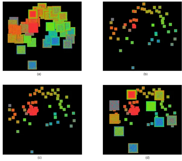
Figure 3: Extent Scaling, Automatic Shifting and Distortion. (a): A VaR display with glyphs seriously overlapped. (b) Overlap is reduced by decreasing the size of the glyphs. (c) Overlap is further reduced by automatic shifting. Notice that several glyphs appear in the center of the display which are previously non-visible in (b) due to overlaps. (d) Some glyphs are enlarged to examine detail within context. The dataset is the Ticdata2000 dataset (86 dimensions, 5,822 data items), which contains information on customers of an insurance company [16].
initial layout, we used a simple spiral arrangement [12]. Given an order of the data items, the pixels are placed from the center of a square to the outside of the square spirally according to the order.
Initially, we order the data items by their values in one dimen-sion. Such a dimension is called a “base dimension”. Figure 2 shows that selection of the base dimension greatly affects the infor-mation conveyed by a VaR display. Patterns existing in dimensions closely related to the base dimension are more explicitly presented than those existing in other dimensions.
In the VaR display, a base dimension is automatically selected when the VaR display is initially presented to the user. The selection criteria is that the base dimension should be a dimension that has the largest number of closely related dimensions so that patterns of the largest number of dimensions is better conveyed in the initial view of a VaR display.
Since “closely related” is a subjective measure, a heuristic ap-proach is used to find the initial base dimension. The base dimen-sion is chosen to be the dimendimen-sion that has the smallest total dis-tance to all other dimensions in the disdis-tance matrix. The user can always select another dimension as the base dimension using the manual pixel reordering tool provided by the VaR display (see Sec-tion 3.1).
3 INTERACTIVETOOLS IN THEVAR DISPLAY
A rich set of navigation and selection tools has been developed for the VaR display. Layer reordering, manual relocation, extent scaling, dynamic masking and automatic shifting help users reduce clutter of the display. Zooming and panning, distortion, compar-ing, and refining help users learn information about the dataset. While automatic and manual selection tools allow users to perform human-driven dimension reduction by selecting subsets of dimen-sions for further exploration using the VaR display as well as other multi-dimensional visualization techniques.
3.1 Navigation Tools
Different from all the other pixel-oriented techniques, where each pixel is assigned a unique position on the screen, our VaR display allows overlaps among the glyphs. Overlaps emphasize close re-lationships among the dimensions because glyphs overlap only if their dimensions are closely related. However, overlaps can prevent a user from seeing details of a glyph overlapped by other glyphs. We provide the following operations to overcome this problem:
Showing Names: By putting the cursor on the VaR display, the dimension names of all glyphs covering the cursor position
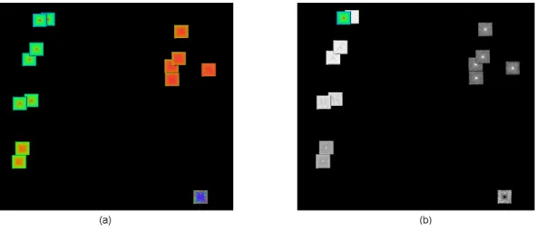
Figure 4: Comparing. (a): Original VaR display. The base dimension is in the top left of the display. (b): Comparison mode. The value differences between the base dimension and all other dimensions are visualized. The bigger the value difference, the darker a pixel is. Similar dimensions are clearly visible since they are brighter than dissimilar ones. The dataset is the AAUP salary dataset (14 dimensions, 1,161 data items).
are shown in a message bar. Thus a user can be aware of the existence of glyphs hidden by other glyphs.
Layer Reordering: With a mouse click, a user can force a glyph to be displayed in front of the others. In this way he/she can view details of a glyph originally overlapped by other glyphs.
Manual Relocation: By holding the control key, a user can drag and drop a glyph to whatever position he/she likes. In this way a user can separate overlapping glyphs.
Extent Scaling: Extent scaling allows a user to interactively de-crease the sizes of all the glyphs proportionally to reduce over-laps, or to increase them to see larger glyphs. Figure 3b gives an example of extent scaling.
Dynamic Masking: Dynamic masking allows users to hide the glyphs of unselected dimensions from the VaR display. In Figure 5, the glyphs of unselected dimensions are hidden us-ing dynamic maskus-ing.
Automatic Shifting: This operation automatically reduces the overlaps among the glyphs by slightly shifting the positions of the glyphs. We borrowed a simple distortion algorithm for re-ducing glyph overlaps from [18] to implement this operation. There are many more advanced overlap reducing algorithms we can use [11, 20]. Figure 3c gives an example of automatic shifting.
Other navigation tools provided by the VaR display include:
Distortion: Users can interactively enlarge the size of some glyphs while keeping the size of all the other glyphs fixed. In this way users are allowed to examine details of textures of the enlarged glyphs within the context provided by the other glyphs. Figure 3d gives an example of distortion.
Zooming and Panning: Users can zoom in, zoom out and pan the VaR display. For example, in order to reduce overlaps, some-times the size of the glyphs has to be set very small when there are a large number of dimensions. Zooming into the display will enlarge the glyphs so that the user can have a clear view of the texture of the glyphs.
Manual Pixel Reordering: As discussed in Section 2.2, we allow users to select a dimension based on which the data items are sorted. Glyphs will have different textures with different base dimensions, thus different patterns of the dataset will be re-vealed. Figure 2 was generated using manual pixel reorder-ing.
Comparing: It is important to allow a user to compare the values of the data items in one dimension with those in other dimen-sions so that the relationship between a dimension and other dimensions can be revealed in a more intuitive manner. We allow users to switch to a comparison mode. In comparison mode, except the glyph of the base dimension, the pixels of all other glyphs will be colored according to the differences be-tween the values of the base dimension and their dimensions. Figure 4 shows an example of the comparison operation.
Refining: With a subset of dimensions, refining is an operation that relocates glyphs by MDS using relationships among only the dimensions within the subset while ignoring their relation-ships to dimensions outside this subset. A display that visual-izes glyphs with the relocated positions is called a refined VaR display of this subset of dimensions. A display that visualizes all glyphs of the dataset is called the original VaR display. Re-fining is different from zooming in that zooming keeps the rel-ative positions of the glyphs in the original VaR display, while refining does not. In the refined VaR display, the positions of the glyphs are decided only by the relationships among the subset of dimensions without being influenced by other di-mensions. Thus the glyph positions in the refined VaR display reflect the relationships among the subset of dimensions more accurately than in the original VaR display.
3.2 Selection
Selection tools enable users to select dimensions of interest for fur-ther exploration using ofur-ther multi-dimensional visualization tech-niques. They can also be used as a filter to reduce the number of glyphs displayed in a VaR display since we allow users to hide glyphs of unselected dimensions using dynamic masking (see Sec-tion 3.1). The selecSec-tion tools we provide to users include an au-tomatic selection tool for closely related dimensions, an auau-tomatic selection tool for well separated dimensions, and manual selection.
Figure 5: Automatic Selection of Separated Dimensions. Unselected dimensions are hidden using Dynamic Scaling. Selected dimensions in (a)(b)(c)(d) are generated using the automatic selection with the same assigned dimensions and an increasing correlation threshold. The dataset is the OHSUMED dataset (215 dimensions, 298 data items), which contains the word-counts of a medical abstract collection [7].
The automatic selection tool for related dimensions takes a user-assigned dimension and correlation threshold as input. Users can set the assigned dimension by clicking its glyph and set the threshold through a slide bar. The tool automatically selects all di-mensions whose correlation measures to the input dimension are smaller than the threshold by traveling through the distance matrix. Using this tool a user is able to select a set of closely related dimen-sions.
The automatic selection tool for separated dimensions takes a user-assigned dimension and correlation threshold as input and returns a set of typical dimensions that describe the major features of the dataset. The assigned dimension will be included in the re-turned set of dimensions. Between each pair of dimensions in the result set, the correlation measure is larger than the threshold. For any dimension that is not in the result set, there is at least one di-mension in the result set such that the correlation measure between it and the unselected dimension is smaller than the threshold. Us-ing this tool, a user is able to select a set of dimensions to construct a lower dimensional subspace revealing the major features of the dataset without much redundancy. Figure 5 shows an example of automatic selection for separated dimensions in a high dimensional dataset.
The following algorithm can be used for automatic selection of separated dimensions:
• Step1: Set the assigned dimension as “selected” and all other
dimensions as “unselected”.
• Step2: Find all unselected dimensions whose distances to
all existing selected dimensions are larger than the threshold. Mark them as “candidate”.
• Step3: If there is no candidate dimension, go to Step4. Else,
set one candidate dimension as “selected” and other candidate dimensions as “unselected”. Go back to Step2.
• Step4: Return all dimensions marked as “selected”.
Manual selection allows a user to manually select a dimension by clicking its corresponding glyph. The user can unselect a dimen-sion by clicking the glyph again. The combination of manual and automatic selection makes the selection operation both flexible and easy to use.
4 SCALING TODATASETS WITHLARGENUMBERS OFDATA
ITEMS
We have implemented a fully working prototype of the VaR display and its interaction tools in XmdvTool [17], a public-domain visu-alization system. In order to scale the VaR display to datasets with large numbers of data items, we have integrated sampling and tex-ture mapping techniques into our approach. These techniques allow
Figure 6: Approximation. (a): All 16,384 data items are displayed. The glyphs are shown in their original sizes. (b): A sample of 5,000 data items is displayed. The glyphs are magnified to the same sizes as in (a) using texture mapping. It can be seen that the corresponding glyphs in the two displays have very similar patterns. The dataset is the Out5d remote sensing dataset (5 dimensions, 16,384 data items).
the VaR display to handle datasets with large numbers of data items efficiently.
The prototype stores datasets in an Oracle9i database server and dynamically requests data from the server when needed. When gen-erating a VaR display for a dataset containing a large number of data items, we use a random sampling approach to reduce response time for fetching data items from the server. In particular, users can set a maximum number of data items. When the number of data items contained in a dataset exceeds it, random sampling is performed on the dataset to only fetch the maximum number of data items. Figure 6 shows two VaR displays of a dataset with and without sampling. It can be seen that the corresponding glyphs in the two displays have very similar patterns.
Secondly, in order to reduce the response time of user interac-tions for large-scale datasets, we store all glyphs as texture objects in OpenGL. Thus unless we need to regenerate the texture of the glyphs, each glyph can be refreshed, repositioned, or resized on the screen by simply redrawing the texture objects, mapping the tex-ture objects to different positions on the screen, or mapping them to areas of different sizes. All these operations can be efficiently performed in hardware.
Both the above two approaches cause information loss in the VaR display. When random sampling is performed, data items not in the sample are not visually presented to the user. When the texture objects are mapped to screen areas that are not exactly their orig-inal sizes, magnification or minification happens so that the pixels visualized are only approximations of the original pixels. How-ever, information loss is exchanged for the reduction of clutter in the display and the reduction of response time of user interactions, which are very important for a visual exploration task. Moreover, approximation is usually acceptable in a visualization system. Fur-thermore, users can always get the information accurately by set-ting the sampling threshold to a number larger than the number of data items contained in the dataset, and set the size of the glyphs to exactly the size of the texture objects.
5 CASESTUDY
We conducted a case study on the Census-Income-Part dataset, which contains 42 dimensions and 20,000 data items. Its VaR dis-play is shown in Figure 2. We accomplished the following tasks by interactively exploring the dataset through the VaR display:
• We are able to detect groups of closely related dimensions
us-ing three methods: (1) lookus-ing for glyphs clustered together in the VaR display; (2) looking for glyphs with similar pat-terns; (3) selecting dimensions closely related to a dimension of interest using the automatic selection tool for related di-mensions. Using these three methods together helps us get results quickly and intuitively. Figure 2b shows a group of closed related dimensions in the bottom left of the display. By checking the dimension names we found that these are all dimensions recording people’s migration and moving status in the last year.
• We are able to find data clusters in a subset of the dimensions
from similar patterns of the graphs. For example, in Figure 2b, within each glyph in the bottom left of the display, pixels in the center area have different color from that in the outer area. Then we determine that data is divided into two clusters in those dimensions, which are the people who did not move in the last year and people who moved in the last year.
• We are able to find well separated dimensions of the dataset
using three methods: (1) looking for glyphs well distributed in the display; (2) looking for glyphs with significantly dif-ferent patterns; (3) selecting well separated dimensions using the automatic selection tool for separated dimensions. Using these three methods together helps us get results quickly and intuitively.
• We are able to find dimensions with special patterns. For
example, there were several dimensions with lots of values mapped to red in the VaR display. According to the color code we found that those dimensions contain a high rate of missing values. We then can remove them from the display.
Through the case study we found that the VaR display and its navigation and selection tools could help users discover interesting patterns in a high dimensional dataset with a large number of data items effectively and efficiently.
6 RELATEDWORK
Multidimensional Scaling (MDS) [14] is an iterative non-linear op-timization algorithm for projecting multi-dimensional data down to a reduced number of dimensions. It is often used to convey rela-tionships among data items of a multi-dimensional dataset. In our
approach, MDS is used in a different way in that it is used to convey relationships among dimensions rather than data items.
Pixel-oriented visualization techniques [13, 10] are a family of multi-dimensional display techniques that map each data value to a pixel on the screen and arrange the pixels in such a way as to convey relationships. They generate condensed displays and may reveal clusters, trends, and anomalies visibly. The VaR display is differ-ent from existing pixel-oridiffer-ented visualization techniques because it uses positions of the subwindows (glyphs in the VaR display) to accurately convey the relationships among the dimensions. In ad-dition, many interactions of the VaR display, such as extent scaling and comparing, have not previously been applied to pixel-oriented techniques.
The VHDR [22] and DOSFA approaches [21] explicitly con-vey the relationships among the dimensions of a high dimensional dataset using a dimension hierarchy. They allow users to interac-tively navigate and select dimensions from it. The VaR display is different from them in that it uses MDS to convey the relationships among the dimensions in a richer, more accurate fashion. In addi-tions, the VaR display conveys values of data items, while VHDR and DOSFA do not.
Sampling has been used in pixel-oriented techniques. VisDB [12] allows users to interactively change the number of data items displayed on the screen using sampling. The VaR display uses sam-pling in particular to limit the number of data items fetched when generating the glyphs in order to reduce I/O cost.
7 CONCLUSION
The major contributions of this paper are:
• A new method for the display of high dimensional datasets,
the VaR display, has been proposed and developed. The VaR display not only conveys values of the data items to the users, but also explicitly conveys relationships among the dimen-sions of a high dimensional dataset.
• A rich set of navigation tools for the VaR display has been
im-plemented to allow users to interactively explore the dataset displayed. These interaction tools help users identify pat-terns hidden in a high dimensional dataset effectively and ef-ficiently.
• Selection tools for the VaR display have been developed to
enable users to interactively select dimensions of interest from the VaR display for further exploration.
• Criteria and algorithms for the distance matrix generation and
the base dimension selection have been created for generat-ing a relatively informative VaR display among many possible ones.
• Sampling methods and texture mapping have been used to
en-able the VaR display to efficiently scale to datasets with large numbers of data items.
In the future, we plan to explore different pixel arrangement ap-proaches for constructing the glyphs of the VaR display, develop techniques to allow users to compare data between values of a group of dimensions with other dimensions rather than a single dimen-sion, and evaluate the effectiveness and efficiency of the proposed approach using more formal experiments and user studies.
8 ACKNOWLEDGMENTS
We gratefully thank Dr. Daniel A. Keim, who gave many valuable suggestions for this work.
REFERENCES
[1] R. Agrawal, J. Gehrke, D. Gunopulos, and P. Raghavan. Automatic subspace clustering of high dimensional data for data mining applica-tions. Proc. ACM SIGMOD International Conference on Management of Data, pages 94–105, 1998.
[2] D.F. Andrews. Plots of high dimensional data. Biometrics, 28:125– 136, 1972.
[3] M. Ankerst, S. Berchtold, and D.A. Keim. Similarity clustering of dimensions for an enhanced visualization of multidimensional data. Proc. IEEE Symposium on Information Visualization, pages 52–60, 1998.
[4] K. Beyer, J. Goldstein, R. Ramakrishnan, and U. Shaft. When is “nearest neighbor” meaningful? Lecture Notes in Computer Science, 1540:217–235, 1999.
[5] W.S. Cleveland and M.E. McGill. Dynamic Graphics for Statistics. Wadsworth, Inc., 1988.
[6] J. Gray, A. Szalay, A. Thakar, P. Z. Zunszt, T. Malik, J. Raddick, C. Stoughton, and J. vandenBerg. The SDSS SkyServer - public ac-cess to the Sloan Digital Sky Server data. Technical Report MSR-TR-2001-104, Microsoft, 2001.
[7] W. Hersh, C. Buckley, T. Leone, and D. Hickman. Ohsumed: An interactive retrieval evaluation and new large text collection for re-search. Proc. ACM SIGIR Conference on Research and Development in Information Retrieval, pages 192–201, 1994.
[8] A. Inselberg. The plane with parallel coordinates. Special Issue on Computational Geometry, The Visual Computer, 1:69–97, 1985. [9] J. Jolliffe. Principal Component Analysis. Springer Verlag, 1986. [10] D.A. Keim. Designing pixel-oriented visualization techniques:
The-ory and applications. IEEE Transactions on Visualization and Com-puter Graphics, 6(1):1–20, January-March 2000.
[11] D.A. Keim and A. Hermann. The gridfit algorithm: an efficient and effective approach to visualizing large amounts of spatial data. Proc. IEEE Visualization, pages 181–188, 1998.
[12] D.A. Keim and H.-P. Kriegel. Visdb: Database exploration using multidimensional visualization. IEEE Computer Graphics & Appli-cations, 14(5):40–49, 1994.
[13] D.A. Keim, H.-P. Kriegel, and M. Ankerst. Recursive pattern: a tech-nique for visualizing very large amounts of data. Proc. IEEE Visual-ization ’95, pages 279–286, 1995.
[14] J.B. Kruskal and M. Wish. Multidimensional Scaling. Sage Publica-tions, 1978.
[15] U.S. Census Bureau. The census bureau database. http://www.census.gov/ftp/pub/DES/www/welcome.html, 1997. [16] P. van der Putten and M. van Someren. Coil challenge 2000: The
insurance company case. Technical Report Technical Report 2000-09, Leiden Institute of Advanced Computer Science, 2000.
[17] M.O. Ward. Xmdvtool: Integrating multiple methods for visualizing multivariate data. Proc. IEEE Visualization, pages 326–333, 1994. [18] M.O. Ward. A taxonomy of glyph placement strategies for
multidi-mensional data visualization. Information Visualization, 1(3-4):194– 210, 2002.
[19] J.A. Wise, J.J. Thomas, K. Pennock, D. Lantrip, M. Pottier, A. Schur, and V. Crow. Visualizing the non-visual: Spatial analysis and inter-action with information from text documents. Proc. IEEE Symposium on Information Visualization, pages 51–58, 1995.
[20] A. Woodruff, J. Landay, and M. Stonebraker. Constant density visu-alization of non-uniform distributions of data. Proc. ACM Symposium on User Interface Software and Technology, pages 19–28, 1998. [21] J. Yang, W. Peng, M.O. Ward, and E.A. Rundensteiner. Interactive
hierarchical dimension ordering, spacing and filtering for exploration of high dimensional datasets. Proc. IEEE Symposium on Information Visualization, pages 105–112, 2003.
[22] J. Yang, M.O. Ward, E.A. Rundensteiner, and S. Huang. Visual hi-erarchical dimension reduction for exploration of high dimensional datasets. Eurographics/IEEE TCVG Symposium on Visualization, pages 19–28, 2003.