Research Proposal
A Detailed Comparison of Information
Visualization Tools Using a Reference
Data Set
Eva Wohlfart
[email protected]
February 2007
Contents
Contents
1 Introduction 4
2 Examples for Visualizing Temporal Data 4
2.1 Flow-Based Approaches . . . 4 2.2 Glyph-Based Approaches . . . 5 2.3 Approaches Using Other Metaphors . . . 6
3 Used Categorization 6
4 Software Tools 7
5 Project Schedule 9
5.1 Descriptions of Work Packages . . . 9
Time is a complex dimension, especially when trying to visualize it. This proposal describes a number of approaches to visualize temporal data and outlines the catego-rization which will be applied to several information visualization systems. A project schedule is presented, followed by a short description of the systems to be categorized. Finally, the proposed research questions are introduced.
1 Introduction
1 Introduction
”Time is the most valuable thing a man can spend” - Diogenes put it in a nutshell. Time has always been one of the most important things for mankind, although no one can control the time he’s given. Because of this fact time is a very complex dimension, not only for those who philosophize about it, but also for the attempt to grasp and visualize it. Many approaches to solve this problem have been published in recent time, creating the need to categorize not only the methods to visualize time-oriented data but also the information visualization tools available on the market. Because of the difficulty of comparing such tools no agreement on a common categorization has been reached. The upcoming master’s thesis will use a recently published categorization to do a detailed comparison of several visualization tools, focusing on the temporal aspects of data. Special emphasis will be put on the problems and possible improvements of currently available information visualization tools and the evaluation of the employed categorization.
In this proposal, some examples for visualizing data containing temporal information will be given first. Then, the categorization going to be used in the master’s thesis will be covered shortly. An outlined schedule for the project will be presented, followed by a short description of the information visualization tools to be examined using the same categorization as in the master’s thesis. Finally, the proposed research questions will be introduced.
2 Examples for Visualizing Temporal Data
Many approaches for the visualization of time-oriented data have been published in recent years. Due to the complexity of considering many aspects of time, most of them solve only specific problems. The visualization techniques presented in the next sections introduce two ways of seeing time: Either as a continous flow or as the sequence of discrete events. Some of them even combine these two concepts.
2.1 Flow-Based Approaches
The Internet offers a relatively new form of interaction: wikis. The key characteristic of those platforms is the opportunity of every reader to become an author. Launched in 2001, Wikipedia is one of those websites. Since then, its number of articles has grown vastly. Even though an archiving system for storing and viewing the changes for every article exists, the examination of version changes still remains cumbersome. A visualization technique called history flow [4] has been designed to solve this problem and to improve the analysis of such collaborative systems.
The basic idea of this technique is simple: Each version of an article is shown as a vertical line, with length proportional to the length of the text. A different color is
2 Examples for Visualizing Temporal Data
assigned to every editor, and each part of the version line is colored according to its au-thor. When someone for example deletes a passage and adds a new paragraph, the new version line will be shortened by the length of the deleted text, and the new paragraph will be given the color of its author and inserted at its position. To illustrate the relation of consecutive versions corresponding segments are visually linked.
Another system that handles temporal data as a kind of ”flow” is ThemeRiver [5], as its name implies. In contrast to history flow, the visualization is not focused on documents, but on themes. Every theme has an assigned color, and the width of the corresponding current at a point in time in the river represents the strength of the theme. If the occurrence of a theme increases over time, the current widens and vice versa. In addition to the ThemeRiver itself, the prototype visualization contains a time line and labels for theme currents. On top, important events are shown as labels asssociated with a point on the time line. Thus the finding of correlations between the occurence or widening of a theme and subsequent events is simplified.
Because of the fact that the underlying data is not continous but discrete the true boundaries of the currents must be interpolated. Therefore the theme river can only be used as an overview. If the user zooms in farther than the data resolution supports, the visualization loses credibility. A small usability evaluation showed that users find the metaphor of the river easy to understand and more intuitive than a histogram. But they mentioned as well that the tool is less useful for identifying minor trends because narrow currents are hardly visible.
2.2 Glyph-Based Approaches
Glyph-based approaches show discrete events depicted as glyphs containing several items representing different variables. Such a view of time is appropriate for visualizing soft-ware management data, since the versions of softsoft-ware can be seen as discrete snapshots in time. During the management of software projects a huge amount of data is created. Visualizations can help project managers to detect patterns among sets of software ar-tifacts and to find differences between them.
The simplest way of illustrating time-oriented information is a time-series plot - a line chart with time on the x-axis and the value of a variable on the y-axis. Thetimewheel glyph [3] combines several of those charts and rotates them around a circle. Thus, trends can easily be discovered - ”prickly fruits” indicate increasing trends, whereas ”hairy fruits” signify tapering trends. One timewheel-”fruit” is associated with one software release, and a number of releases can be compared by arranging the ”fruits” in parallel. Similar to the timewheel, the3D wheel glyph [3] rotates visualizations of data around a circle, but time is encoded by the height dimension. Each variable is displayed as a slice of a base circle, and the radius of the slice encodes the variable’s size. An object with a sharp apex implies an increasing trend, while objects that balloon out indicate tapering trends.
3 Used Categorization
A different approach to visualize software project data is pursued with the infobug glyph [3]. Each body part of the infobug - wings, head, tail and body - depicts one important class of software data. For example, the y-axis of the two wings encodes the time and the wings’ x-axes represent the number of code lines and the number of errors. Due to the fact that more code lines usually lead to more errors, symmetrical wings are the expected result. Non-symmetrical wings may indicate poor testing of the component or architectural problems of the code.
Patients in intensive care units (ICU) are monitored every second. The created data is combined with manually collected data and stored in a computer based patient data management system. Such systems allow a physician to display a complete review of the patient’s condition, shown in form of spreadsheets and x-y-plots. This way of visualization is appropriate for extracting a specific value of a parameter at a specific point in time, but not to get a summary of the patient’s data or to find the essential changes of a patient’s state. A display system calledVIE-VISU [1] has been developed to ease the fast acquisition of a patient’s condition. The system uses a structured metaphor graphic object which consists of triangles and rectangles, each symbol’s size or color representing a parameter. One object depicts the patient information of one hour and 24 objects are arranged in standard display, showing a whole day.
2.3 Approaches Using Other Metaphors
In clinical practice, the medical staff uses standardized health care procedures. Such guidelines contain many variables and conditions to achieve the desired goal. One vi-sualization for such guidelines is AsbruView [2]. Three-dimensional running tracks are used as a metaphor for the therapy plans, with the time on the x-axis, depth representing plans on the same level of decomposition and height representing the division of plans into subplans. At the beginning of the track, a ”no entrance with exceptions”-sing and a turnpike illustrate preconditions which have to come true to start the plan. If this happens, a traffic light on top of the plan turns green. The yellow light encodes the suspend-condition which means the plan is halted until the light turns green again. Red light means abort of the plan. The exact amount of time a plan needs to be carried out is not known in advance, but it always has a minimum and maximum duration. These time-annotations are visualized with two horizontal bars below the ’running track’, the shorter bar belonging to the minimum duration.
3 Used Categorization
To compare the given visualization tools a meaningful categorization will be used. This categorization builds upon three criteria: time, data and representation [6]. The time axis can be made up of time points or time intervals. Each composition implies other relationships between the elements in time, and influences the validity of data: If an
4 Software Tools
application uses time points, data are only valid at discrete points in time, which should be reflected in the visualization itself. The structure of the time axis can be linear, cyclic or branching. Linear time sees time as an ordered collection of temporal events, while each element of a cyclic time axis is proceeded and succeeded by another element, like the four seasons of the year. Branching time allows for alternative scenarios by offering the possibility to follow a temporal primitive by more than one element. A fourth temporal category is mentioned in addition: multiple perspectives. In branching time only one path of time will actually happen, whereas multiple perspectives facilitate concurrent views on time.
Considering the criterion data, we can distinguish abstract and spatial data. In con-trast to spatial data, abstract data have no inherent spatial structure. The number of associated data values is another categorization criterion: Multivariate data bears the challenge to detect correlations, whereas univariate data is handled easier. Visualizing the raw data is useful in many scenarios, but complex and large-scale data sets introduce the need to derive data abstractions tailored to the needs of the users. Overview+detail views containing aggregated data values are one example for such data abstractions.
The third criterion deals with the representation of time-oriented data. Static rep-resentations show still images of points in time. They enable the user to concentrate on the visualized information and to compare parts of the time axis. Dynamic repre-sentations use the physical dimension time to visualize the information and change over time. They are well suited to give an overview to the general development over time, but especially with long time lines, users are often unable to follow all changes in the visual representation. The presentation space can be two- or three-dimensional. 2D Views are often considered as sufficient for data visualization and analysis. 3D Views bring the opportunity to encode more information, but involve problems like occlusion and back faces not seen by the user.
4 Software Tools
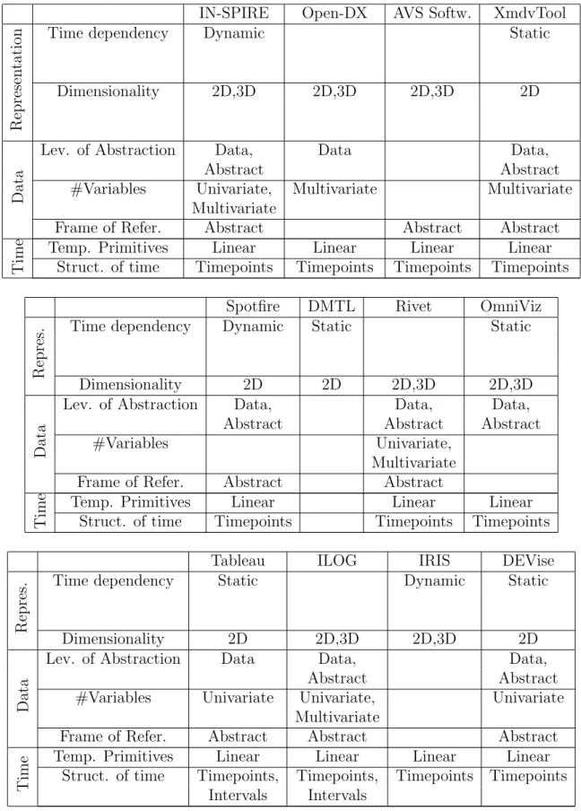
The following tables show the software tools which will be compared in the master’s thesis and contain also a short description according to the used categorization. This categorization will be carried out in more detail during the work with the tools.
4 Software Tools
IN-SPIRE Open-DX AVS Softw. XmdvTool
Represen
ta
tion
Time dependency Dynamic Static
Dimensionality 2D,3D 2D,3D 2D,3D 2D
Da
ta
Lev. of Abstraction Data, Data Data, Abstract Abstract #Variables Univariate, Multivariate Multivariate
Multivariate
Frame of Refer. Abstract Abstract Abstract
Time
Temp. Primitives Linear Linear Linear Linear Struct. of time Timepoints Timepoints Timepoints Timepoints
Spotfire DMTL Rivet OmniViz
Repres.
Time dependency Dynamic Static Static
Dimensionality 2D 2D 2D,3D 2D,3D
Da
ta
Lev. of Abstraction Data, Data, Data, Abstract Abstract Abstract #Variables Univariate,
Multivariate Frame of Refer. Abstract Abstract
Time
Temp. Primitives Linear Linear Linear Struct. of time Timepoints Timepoints Timepoints
Tableau ILOG IRIS DEVise
Repres.
Time dependency Static Dynamic Static
Dimensionality 2D 2D,3D 2D,3D 2D
Da
ta
Lev. of Abstraction Data Data, Data, Abstract Abstract #Variables Univariate Univariate, Univariate
Multivariate
Frame of Refer. Abstract Abstract Abstract
Time
Temp. Primitives Linear Linear Linear Linear Struct. of time Timepoints, Timepoints, Timepoints Timepoints
5 Project Schedule
CViz IVC GeoVista Prefuse
Repres.
Time dependency Dynamic Static Static Static
Dimensionality 2D 2D,3D 2D,3D 2D,3D
Da
ta
Lev. of Abstraction Data Data, Data, Data, Abstract Abstract Abstract #Variables Univariate Univariate Univariate Univariate Frame of Refer. Abstract Abstract Spatial Abstract
Time
Temp. Primitives Linear Linear Linear Linear Struct. of time Timepoints Timepoints Timepoints Timepoints
InfoVis Piccolo.java Jung GraphViz
Repres.
Time dependency Static Static Static
Dimensionality 2D 2D 2D,3D 2D
Da
ta
Lev. of Abstraction Data, Data Data Data Abstract
#Variables Univariate Univariate Univariate
Frame of Refer. Abstract Abstract Abstract Abstract
Time
Temp. Primitives Linear Linear Linear Struct. of time Timepoints Timepoints Timepoints
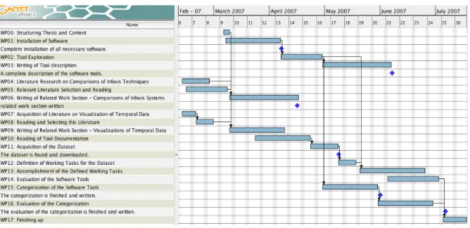
5 Project Schedule
In the figure below the single steps of the project plan, including important milestones, are shown.
5.1 Descriptions of Work Packages
To give a better insight into the single work steps, a description of every single task will be given in the following. Milestones which should be reached in time are described if existent.
Work Package (WP) 00: Structuring thesis and content
Description: A document containing an outline of the thesis structure will be written. All parts along with a description of their contents will be covered. Therefore, a clear structure of the master’s thesis will be available for the subsequent work.
5 Project Schedule
Figure 1: Project plan WP 01: Installation of Software
Objectives: Acquire and install the needed software
Description: During this phase, all the necessary software will be collected and installed. The availability of the related manuals will be assured to aid in the work packages con-cerning tool exploration and documentation reading (WP 02, 10). Also, possible in-stalling problems will be determined.
Milestones: Complete installation of all necessary software. WP 02: Tool exploration
Objectives: Get familiar with the tools
Description: During this phase, the possibilities of every tool will be explored. Possibly available example datasets will be used to see which visualizations are used by the tools and how they complement each other. This phase is specifically important to get a feel for the workflow of every visualization tool and to simplify the subsequent work with the tools (WP 13,14).
WP 03: Writing of Tool description
Objectives: Write a detailed description of the software tools
Description: After the practice with every tool and the reading of the related documen-tation a description of the tools’ facilities will be given. The description will include informations about which data types can be visualized with the tool and which visual-izations are used to visualize the data. Furthermore, the interface and its components will be described, along with the possible user interactions.
5 Project Schedule
WP 04: Literature Research on Comparisons of InfoVis Techniques/Tools Objectives: Acquire relevant scientific papers
Description: Several Internet resources will be checked for other scientific papers con-cerning comparisons or categorizations of InfoVis techniques and tools. Both techniques and tools are relevant because categorizations of InfoVis techniques are often also appli-cable to whole tools that use several visualizations.
WP 05: Relevant Literature Selection and Reading
Objectives: Go through the papers and separate the wheat from the chaff :)
Description: The found papers will be read and then divided in groups based on their content. Important parts will be marked to be considered later in writing of the related work section (WP 06). Not relevant papers will be sorted out.
WP 06: Writing of Related Work Section Considering other Comparisons of InfoVis Techniques or Tools
Objectives: Describe other comparisons of InfoVis techniques or tools
Description: Relevant papers containing comparisons of InfoVis tools or techniques will be described. The structure of this section will be based on the groups chosen during the reading phase. Differences to the categorization to be used in the master’s thesis will be kept in mind for the evaluation of the categorization in WP 16.
Milestones: The Related Work section is completed.
WP 07: Acquisition of Literature on Visualization of Temporal Data Objectives: Get Literature Collection from Wolfgang Aigner
Description: Wolfgang Aigner did a detailed literature research on currently known vi-sualizations of temporal data. Therefore only some e-mail communication is needed to acquire his collected literature. Also, the focus of the literature research for the master’s thesis lies on comparisons of InfoVis tools.
WP 08: Writing of Related Work Section Considering Visualizations of Temporal Data Objectives: Describe approaches to visualize time-oriented data Description: As prepa-ration for the work with the InfoVis tools relevant papers concerning the visualization of temporal data will be presented. The respective sections from the proposal will be integrated into this part.
WP 09: Writing of Related Work Section Covering Visualizations of Temporal Data Objectives: Describe possibilities of visualizing temporal data
Description: Using literature collected during literature research, current approaches to visualize temporal data will be presented. The paragraphs about visualizations of time-oriented data already included in this proposal will be integrated in this section. The knowledge of these visualizations will be used in the work with the InfoVis software tools.
5 Project Schedule
WP 10: Reading of Tool Documentation
Objectives: Discover Facilities of the Tools and Obtain Information on the Needed Dataset Format Description: The documentation for each tool will be collected and read through to get information on the capabilities of the software tools. Each software tool will be analyzed on the possible format of read-in data (needed for WP 11). Possible problems to use one dataset for all 23 tools will be determined. This phase is specif-ically important for the simplification of the subsequent work with the tools (WP 13,14). WP 11: Acquisition of the Dataset
Objectives: Find a suitable dataset to be used in the comparison Description: The In-ternet will be searched for available datasets containing temporal information which can be used for the subsequent tool comparison. A suitable dataset will be selected and downloaded. After that, the dataset will be explored with some InfoVis tools to get familiar with it.
Milestones: The dataset is found and downloaded. WP 12: Definition of Working tasks for the Dataset
Objectives: Specify a limited set of working tasks to be accomplished during the com-parison
Description: Based on already read literature on comparisons of InfoVis tools some working tasks will be defined. Different user tasks should be covered, like for example exploring the data, finding a specific point in time or filtering out items. The actual composition of the working tasks will depend on the selected dataset (WP 11).
WP 13: Accomplishment of the Defined Working Tasks
Objectives: Carry out the working tasks with every software tool
Description: Each software tool will be used to load and visualize the chosen dataset. The previously defined working tasks will be carried out with special focus on the dif-ferences between the tools in presentation and available user interactions.
WP 14: Evaluation of the Software Tools
Objectives: Compare the tools considering their user support in carrying out the work-ing tasks
Description: After the accomplishment of the working tasks the software tools will be evaluated. This evaluation will include information on which visualizations are used by the tools and how they complement each other. Special emphasis will be put on mecha-nisms to help the user in the process of information retrieval and exploration. Problems of the software tools will be pointed out and possible improvements will be suggested. WP 15: Categorization of the Software Tools
6 Research Questions
Description: After working with every software tool the categorization will be applied to any of the used software tools. Familiarity with each tool will be important to correctly assign the particular parts of the categorization criteria. Therefore this phase depends on WP 02.
Milestones: The categorization is finished and written. WP 16: Evaluation of the Categorization
Objectives: Evaluate the usefulness and applicability of the used categorization
Description: The application of the categorization will be reflected and possibly occurred problems will be pointed out. Problems in the use of the categorization that occurred will be described. Possible improvements or changes to enhance the categorization will be presented.
Milestones: The evaluation of the categorization is finished and written. WP 17: Finishing up
Objectives: Put all the parts together and proof-read the master’s thesis
Description: In this final phase the single parts written previously will be put together. Abstract and Introduction will be added to the master’s thesis, along with some parts considering discussion of the work done. The finished master’s thesis will also be proof-read to eliminate possibly existing errors in spelling or wording.
6 Research Questions
During the project, the following research questions should be answered: Focusing on the visualizations of time-oriented data:
- How are current InfoVis systems dealing with time-oriented data? - How do they support the user in exploring and filtering the data? - Is there special support for large datasets available?
- Where lie the problems of currently available visualization applications? - What would be possible improvements?
Focusing on the used categorization:
- Is the categorization applicable and useful?
- Were there any problems using the categorization in practice?
- Are there any changes that could enhance the quality or accuracy of the catego-rization?
References
References
[1] W. Horn, C. Popow, L. Unterasinger (1998). ”Metaphor Graphics to Visualize ICU Data over Time”. Intelligent Data Analysis in Medicine and Pharmacology, Work-shop Notes of the ECAI’98 WorkWork-shop, Brighton, UK.
[2] R. Kosara, S.Miksch, Y.Shahar, P. Johnson (1998). ”AsbruView: Visualization of Time-oriented, Skeletal Plans”. Proceedings of the 4th International Conference on Artificial Intelligence Planning Systems 1998, pp 11-18, Pittsburgh Pennsylvania, USA, Menlo Park, CA.
[3] M. C. Chuah, S. G. Eick (1998). ”Information Rich Glyphs for Software Manage-ment Data”.IEEE Computer Graphics and Applications, Vol. 18, No 4, pp 24-29. [4] F. B. Viegas, M. Wattenberg, K. Dave (2004). ”Studying Cooperation and Conflict
between Authors with History Flow Visualizations”. Proceedings of the SIGCHI conference on Human factors in computing systems, Vol. 6, No. 1, pp 575-582, Vienna, Austria.
[5] S. Havre, B. Hetzler, L. Nowell (1999). ”ThemeRiver TM: In Search of Trends, Patterns, and Relationships”. IEEE Transactions on Visualization and Computer Graphics, Vol. 8, No. 1, pp. 9-20.
[6] W. Aigner, S. Miksch, W. M¨uller, H. Shumann, C. Tominski (2006). ”Visualizing Time-Oriented Data - A Systematic View”.