Central Washington University
ScholarWorks@CWU
Computer Science Faculty Scholarship
College of the Sciences
2018
Deep Learning of 2-D Images Representing n-D
Data in General Line Coordinates
Dmytro Dovhalets
Central Washington University, [email protected]
Boris Kovalerchuk
Central Washington University, [email protected]
Szilárd Vajda
Central Washington University, [email protected]
Răzvan Andonie
Central Washington University, [email protected]
Follow this and additional works at:
https://digitalcommons.cwu.edu/compsci
Part of the
Artificial Intelligence and Robotics Commons
This Article is brought to you for free and open access by the College of the Sciences at ScholarWorks@CWU. It has been accepted for inclusion in Computer Science Faculty Scholarship by an authorized administrator of ScholarWorks@CWU. For more information, please contact
Recommended Citation
Dovhalets, Dmytro; Kovalerchuk, Boris; Vajda, Szilárd; and Andonie, Răzvan, "Deep Learning of 2-D Images Representing n-D Data in General Line Coordinates" (2018).Computer Science Faculty Scholarship. 1.
ISASE-MAICS 2018
Deep Learning of 2-D Images Representing n-D Data in General Line
Coordinates
Dmytro Dovhalets, Boris Kovalerchuk, Szil
árd Vajda, Răzvan Andonie
*Computer Science Department
Central Washington University, Ellensburg, WA, USA
{dmytro.dovhalets, boris.kovalerchuk, szilard.vajda, razvan.andonie}@cwu.edu
* also with Electronics and Computers Department, Transilvania University, Brașov, Romania
Abstract: While knowledge discovery and n-D data visualization procedures are often efficient, the loss of information, occlusion, and clutter continue to be a challenge. General Line Coordinates (GLC) is a rather new technique to deal with such artifacts. GLC-Linear, which is one of the methods in GLC, allows transforming n-D numerical data to their visual representation as polylines losslessly. The method proposed in this paper uses these 2-D visual representations as input to Convolutional Neural Network (CNN) classifiers. The obtained classification accuracies are close to the ones obtained by other machine learning algorithms. The main benefit of the method is the possibility to use the lossless visualization of n-dimensional data for interpretation and explanation of the discovered relationships besides the classical classification using statistical learning strategies.
Keywords: Machine learning, CNN, General Line Coordinates, lossless visualization, multidimensional data.
1. INTRODUCTION
Many procedures for n-D data analysis, knowledge discovery and visualization have demonstrated efficiency in the past. However, the loss of information, occlusion, and clutter in visualizations of n-D data continue to be a challenge for visual knowledge discovery. The dimension scalability challenge for visualization of n-D data is present at a low dimension of n = 4. Since only 2-D and 3-D data can be directly visualized in the physical 3-D world, visualization of n-D data becomes more difficult with higher dimensions as there is greater loss of information, occlusion and clutter. General Line Coordinates (GLC) [Kovalerchuk, 2018] visualize multidimensional data losslessly. There is no dimension reduction or loss of information during the visualization process. The n-dimensional data points are projected onto 2-D graphs without losing any information in the process, in contrast to (for instance) Self Organizing Maps. One of the methods from GLC is the GLC-Linear (GLC-L) [Kovalerchuk, Dovhalets, 2017, Kovalerchuk, 2018]. GLC-L projects multidimensional data into polylines that allow seeing the high dimensional data in a regular 2-D space. The use of GLC-L to visualize a single n-2-D point at a time produces its polyline, which can be interpreted as an image. The process is repeated for every given n-D point creating a set of images of n-D points from different classes. Transforming numeric multidimensional datasets into 2-D graphs (images) using GLC-L provides a unique lossless transformation of data. Visualizing only one n-D data instance at a time eliminates clutter and provides a clean visualization for all the data points.
Those artificially created images can be used later for classification if needed. Users can compare these images side-by-side for extraction of possible rules, features and relations, --with the condition that the number of images is relatively small and the patterns are recognizable by humans. Feeding these images to a CNN in a supervised
learning paradigm allows automating this classification task for even larger datasets.
The proposed conversion of a numeric Machine Learning (ML) classification task to an image recognition
task opens a unique new opportunity for resolving long-standing ML challenges of: (1) giving explanation to the discovered ML models, and (2) controlling overfitting and
overgeneralization of ML models. This opportunity follows from the advantages of the visual analysis of multidimensional data as outlined below.
Explainable models often are too complex for domain experts, e.g., a decision tree with 50 layers and hundreds of nodes. Such large trees way exceed the magical number 72 of the Miller's law that is a limit on human capacity for processing information [Miller, 1956]. Thus, complex numeric ML models such as CNN must be “degraded” to the level of human understanding.
In contrast, humans recognize images with much larger number of features than 72. The face recognition by humans is one of such examples. It is quick and often
preattentive due to parallel processing capabilities of the human visual system, in contrast with the sequential processing of the numeric information.
Thus, we suggest visual explanation of ML models on numeric data as an alternative to the traditional explanation in natural language or mathematical forms, that we call textual explanation, for short.
Fig. 1 shows an example of a possible way of visual explanation. Here, 9-D breast cancer data [Lichman, 2013] of benign and malignant cases is linearly separated (with over 96% accuracy) with distinct visual patterns using the GLC-L visualization method [Kovalerchuk, Dovhalets, 2017]. While the natural language description of these distinct patterns is not obvious, their visual distinction is way more clear. The angles at the bottom of the figure (see Fig. 1) indicate the contribution of each of the 9 attributes (dimensions) to the separation of classes. For SVM (Support Vector Machines), visual explanation
can be in the form of visualized support vectors from opposing classes that SVM algorithm finds on images and uses for classification. More examples of visual explainable patterns for numeric classification tasks are provided in [Kovalerchuk, 2018].
The visual explanation can be accompanied by a textual explanation, with an approximate linguistic description of differences of these visual patterns that can be generated by using fuzzy linguistic variables. Next, Fig. 1 can be used to construct the exact linear discrimination model as it is generated in [Kovalerchuk, Dovhalets, 2017].
More generally, the visual explanation approach can be viewed as a part of the new paradigm of Computing With Images (CWI) [Kovalerchuk, 2013] that augments traditional numeric computations and Zadeh’s Computing With Words (CWW) [Zadeh, 2012] concept.
Our goal is to combine visual representation of multi-dimensional data with the powerful deep learning technology. Our novel approach uses deep learning (CNN) architectures to classify not the original data points, but rather the 2-D images generated by the GLC-L method. In other words, we use lossless visualization of images as intermediary data representations. We apply this two-step process on standard data benchmarks to validate the proposed method. In our experiments, we compare our results with the ones obtained by applying the CNN model on the original data.
2. OUR METHOD: GLC-L + CNN
Originally, GLC-L was designed to visualize a linear function F(x). Each attribute xi from n-D point
x=(x1,x2,..,xn) is mapped to a line segment, and the line
segments are stacked one on the top of each other with angles Qi computed from the coefficients C=(c1,c2,…,cn)
of the linear function F. The length of the line is the value of the attribute. A large value produces a longer line segment than a smaller one. The coefficients C are normalized in the range [-1,1], producing a new set of
coefficients K= (k1, k2, …,kn): ki= ci/cmax producing a new
linear function:
y = k1x1+ k2x2 + k3x3 + ... + knxn (1)
In GLC-L the angles are, Qi = arccos(ki). For experiments
with CNN, we can generate angles Qidirectly because the
goal is wider than just a linear function. The segment is going to the right for positive ki and to the left for the
negative ki.
Automatic search for the best coefficients can be optimized to separate better cases of opposing classes by a random search algorithm. It scans the search space for different sets of coefficients on the training dataset and the best coefficients are then evaluated on the test dataset.
3. DATA TRANSFORMATION
The transformation process consists of (1) choosing a random set of coefficients (with respective angles), and (2) transforming the data using those coefficients. Using the same set of randomly chosen coefficients to visualize each data instance separately with GLC-L allows creating a set of artificial images. The image captures of the visualizations inherit their corresponding labels from the original data. Once the data are transformed and images are created, the newly rendered images are entered into a machine learning algorithm for training and testing. This process is repeated n times to find the best set of coefficients (angles) using a random search strategy for finding of the best coefficients set (angles).
For the best coefficient set, a second testing set is required to test properly them on independent data to avoid overfitting. For this purpose, the system takes in a dataset, shuffles it and splits it into two new sets for each iteration. The first set (set-1) is 80% of the original data and the second set (set-2) is the remaining 20% of the samples. For the experimental setup, a 10-fold cross validation is applied on set-1 during the search of best coefficients. Set-2 is used to test the system after the best coefficients are established.
The data transform has many parts, which could be optimized, including the architecture of the CNN itself. Optimization of hyper-parameters of the CNN are out of
Figure 2: Visualization of 4-D data with GLC-L. The data attributes x1-x4 are all positive numbers with the value of 1. Having the same values for all attributes makes all of the line segments to be equally long. The first angle Q1 is negative, which turns the line to the left, and the other angles Q2-Q4 are positive, turning the line to the right.
Figure 1: Wisconsin Breast Cancer dataset representation using
GLC-L. Instances from one class are projected above in blue, while instances from the other class are below in red.
scope for this study. Experiments were focused on how different parts of the data transform system effect the data transformation while evaluating the artificially created images on the same CNN. Experiments were performed to understand how image size of the artificially created images, line thickness and the size of search of random coefficients affects classification. These experiments were all done on the same dataset using the same data split for training and testing subsets. The split for the subsets was 80% for the training set, 10% for the validation set and 10% for the testing set.For all experiments with different line thicknesses and sizes of the artificially created images, the same coefficients were used.
3.1 Line Thickness
The thickness of the line directly corresponds to how many pixels are being used in the created image. Having a thin line corresponds to a small number of pixels actually being used in the image representation. Having more pixels used corresponds to having more information in the image. We conducted experiments to test the last statement with different line widths and their effect on classification. The value t, which controls the width of the line, was the only variable being changed in these experiments. For each experiment, five different runs were performed, and their average is reported as the test accuracy. A run consists of selecting coefficients, transforming the data and classifying the transformed data with a CNN.
The experiments 1-3 conducted with line thickness at t
= 0.1, t = 1.0 and t = 2.0, respectively. Fig. 3 shows examples of how different t values change the line thickness and the visualization itself.
Table 1 contains the results of experiments conducted to test the impact of the line thickness on the classification accuracy using a CNN. There is a dramatic improvement in accuracy going from t = 0.1 to t = 1.0. After that there is not much gain in classification accuracy going to t = 2.0. These experiments show that the thicker lines produce greater accuracy (see Table 1 for more details).
3.2 Size of Artificially Created Images
Four different experiments were conducted to see the effect of the size of artificially created images on CNN classification accuracy. In these experiments, only the size of images was varied. The CNN input dimension was matched to the image size, but all other hyper-parameters remained unchanged. For each of the 4 experiments 5 different runs were performed, and the average of the 5 runs is reported on the test accuracy. Having images larger than 100x100 makes the accuracy drop significantly. Accuracy such as 51.75% and 48.24% is the result of the CNN not being able to converge during training. This is due to the parameters of the CNN. The hyper-parameters were tuned manually by trial runs and checking on much smaller images. Optimization of hyper-parameters for a CNN is out of scope for this study and it the topic of the future studies..
Figure 3: Projection Line Thickness with different t values. Image 1, 2 and 3 were randomly saved from the experiment. 4th column shows the t value used in the corresponding row.
Table 1: Accuracy results using different line thickness. Run # t =0.1 t =1.0 t =2.0 1 48.24% 71.92% 71.05% 2 72.80% 71.92% 73.68% 3 75.43% 70.17% 71.05% 4 48.24% 74.56% 72.80% 5 71.92% 76.31% 73.68%
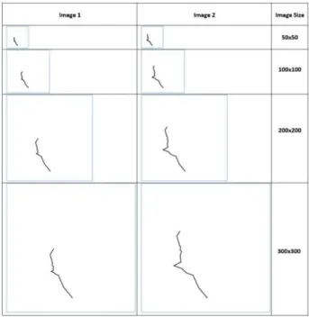
Figure 4: Examples of different image sizes used in
experiments. Larger images produce much more detailed line.
Table 2: Accuracy dependence on the image size for data sets.
Run # 50x50 100x100 200x200 300x300 1 74.56% 71.92% 51.75% 51.75% 2 65.78% 71.92% 48.24% 51.75% 3 74.56% 70.17% 51.75% 51.75% 4 72.80% 74.56% 72.80% 51.75% 5 76.31% 76.31% 75.43% 48.24% Average 72.80% 72.97% 59.99% 51.05%
Experiments were also performed to show that an extensive search is not needed for satisfactory results. For this set of experiments the number of epochs was the only variable being changed. Three different experiments were conducted with 5 runs for each experiment. In the first experiment, the number of epochs was set to 1, i.e., only one set of randomly selected coefficients was used to do the transformation and evaluation of the system. For the second and third experiments, the number of epochs was set to 20 and 100, respectively, i.e., 20 and 100 different sets of randomly chosen coefficients to transform the data were evaluated on producing the highest classification accuracy.
Table 3 contains the experimental results for the random search algorithm, which is used for selecting coefficients. The last row has the averages of the 5 runs for each of the experiments with different number of epochs used. There is a small improvement going from epochs 1 to epoch 20. Experiment with 20 epochs had CNN models trained on 20 different representations of data, rather than just 1. However, based on our experiments, going to 100 epochs does not further improve the results.
The random search experiments show that the search for coefficients does not have to be large. There is abundant amount of linear functions, which can be used for the transformation of data. While a linear function may exist, that produces the best separation of data, it is not required for data transformation.
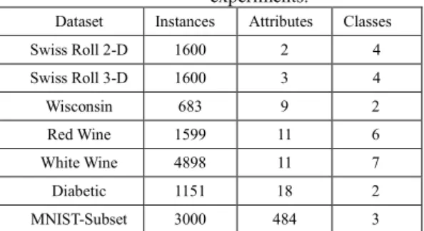
4. DATA SETS
This section, describes the used datasets and preprocessing done to them. These datasets vary in number of classes, number of instances, and number of attributes per instance. Several of these datasets are from the UCI Machine Learning Repository [Lichman, 2013].
Table 4 summaries these datasets.
The Swiss Roll dataset [Surendran, 2014] is a benchmark used to test dimensionality reduction algorithms. It has 1600 instances equally spread out among 4 classes. There are two subsets of the Swiss Roll Dataset: 2-D and 3-D.
The Wisconsin Breast Cancer (WBC) dataset is from the UCI ML repository. It consists of 699 instances with 11 attributes. We removed instances with missing values. The resulting 683 instances contain 444 benign cases and 239 malignant cases. The dataset is normalized to [0, 1] interval.
The wine quality data are also from the UCI ML repository. It is composed of red wine and white wine datasets with 1599 and 4898 instances, respectively. Both subsets have 11 attributes. Red wine quality has 6 unbalanced classes, with most of the instances belonging only into 2 classes. White wine quality dataset has 7 classes, and it is unbalanced too. Both subsets are normalized to [0,1] interval in each attribute.
Diabetic Rectionopathy Debrecen Dataset is also from the UCI ML repository. These data belong to two classes with and without signs of Diabetic Rectionopathy (DR, no DR). The data contain 1151 instances with 18 attributes. The classes are balanced with 540 instances with no signs of DR and 611 instances with signs of DR. Each attribute is normalized to [0,1] interval.
To test the robustness of the data transform method on high dimensional data, a subset of Modified National Institute of Standards and Technology (MNIST) database was used. This subset consists of 1000 instances from each digits 0, 1 and 2, totaling in 3000 instances. The original images are 28x28 pixels (784 dimensions). To avoid the curse of dimensionality, we removed the padding around the images by cropping only the digit portions, resulting in images of size 22x22 pixels (484 dimensions).
5. EXPERIMENTAL RESULTS
For classification, we used several CNNs to evaluate the transformation of numerical data with lossless visualization provided by the GLC-L considering CNN classifiers as one of the most powerful image classification tools [Zisserman, 2014]. For a fair comparison of performance of the data transform system on artificially created images, we conducted two sets of experiments for each dataset. In the first one, the raw numerical data are the CNN input. In the second one, the data transformed with GLC-L are the CNN input. All over the experiments, the hyper-parameters of the CNN remained the same. For the data transformation system, we used the following setting in final experiments:
t value of 1.0;
size of artificial images 50x50;
20 epochs with the data transformation system;
10-fold cross validation.
The experiments were carried out on the CWU supercomputer (IBM Power8), taking advantage of the GPU clusters. The system was implemented in Python, using the Keras CNN implementation. To compare the
Table 4: Quick overview of the datasets used in the experiments.
Dataset Instances Attributes Classes Swiss Roll 2-D 1600 2 4 Swiss Roll 3-D 1600 3 4 Wisconsin 683 9 2 Red Wine 1599 11 6 White Wine 4898 11 7 Diabetic 1151 18 2 MNIST-Subset 3000 484 3
Table 3: The accuracy variation for different epochs and runs. Run # Epochs=1 Epochs=20 Epochs=100
1 64.03% 66.78% 66.78% 2 68.42% 71.05% 65.78% 3 68.42% 64.03% 69.29% 4 63.15% 73.68% 68.42% 5 67.54% 69.29% 65.78% Average 66.31% 68.96% 67.21%
classification of the two sets of experiments two different CNN architectures had to be used. We used a regular CNN architecture to classify artificially created images and constructed 1-DC convolutional neural network to classify vectorial (non-image data). They use the same Adam optimizer [Kingma, 2017] with the learning rate set to 0.0001. Both networks were set for 1000 training epochs with an early stopping checkpoint. The training will stop if the validation accuracy for training is not improved over 100 epochs. The 1-DC CNN architecture used to numerical data is the following:
1
-D Convolutional Layer with 64 output channels, filter length of 2 and rectified linear unit (RELU) activation Drop out layer with fraction of input units to drop set to 0.4
Fully Connected Layer with 1024 output nodes and RELU activation
Fully Connected Layer with number of output nodes equal to the number of classes, with a softmax activation
The architecture of the CNN used for classification of images is the following:
Convolutional Layer with 64 output channels, a kernel shape of 2x2, stride of 2x2 and RELU activation
Convolutional Layer with 64 output channels, a kernel shape of 2x2, stride of 2x2 and RELU activation
Pooling layer with pooling size of 2x2
Drop out layer with fraction of input units to drop set to 0.4
Convolutional Layer with 128 output channels, a kernel shape of 2x2, stride of 2x2 and RELU activation RELU Convolutional Layer with 128 output channels, a kernel shape of 2x2, stride of 2x2 and RELU activation
Pooling layer with pooling size of 2x2
Drop out layer with fraction of input units to drop set to 0.4
Fully Connected Layer with 256 output nodes and RELU activation
Drop out layer with fraction of input units to drop set to 0.4
Fully Connected Layer with number of output nodes equal to the number of classes, with a softmax activation
The selection of these settings are the results of several trial runs. As we mentioned above, the optimization of the network architecture is out of the scope of the current research.
The original MNIST-Subset was not used in the 1-DC CNN because they are already images. Instead, they were evaluated with the CNN architecture used for classification of the artificially created images. Table 5
contains results for 7 datasets for the raw input data with 1-DC CNN and for transforming numerical data with GLC-L and classifying images with a regular CNN. The results for 1-DC CNN are reported using 10-fold cross
validation. The results for "Transform + CNN" are the average of 20 runs using the data transformation system with CNN trained in 10-fold cross validation.
For CNN classification, the angles between lines in polylines that represent n-D points were selected as follows. We generated ten different sets of angles {Qi} to
produce polylines, and computed the accuracy of CNN classification of polylines for each {Qi}. The best
accuracy among these {Qi} is reported. We also conducted
an experiment with WBC data and MNIST-subset polyline images contracted to 25x25 pixels, in order to test if the low resolution of image would be sufficient to get high accuracy scores. This experiment has shown that CNN is capable to find patterns with significant noise produced by lowering the image resolution. The resulting accuracies of 98.54% for WCB and 89.83% for MNIST-subset are similar to the accuracy rates obtained for the higher resolutions. Next, it opens the opportunity to get CNN model faster by decreasing images to 25x25 pixels.
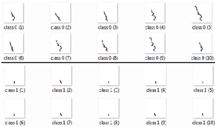
Fig. 5 shows samples of polylines found for the CNN with the best accuracy on WBC polylines. In Figure 5, humans immediately discover two related features: length and height of the top point of the curve as discrimination features. These features help to explain the high accuracy of CNN on WBC data, even with the drastic decrease of the resolution to 25x25 pixels. These features are robust to the decrease of resolution. The high accuracy and presence of such simple features gave us an insight to search for a simpler classification rule understandable by a human. The first idea is to check the accuracy of
Table 5: Comparison of the results considering several data collections and two types of CNNs. Dataset 1-DC CNN Transform + CNN Swiss Roll 2-D 72.50% 97.43% Swiss Roll 3-D 96.18% 97.55% Wisconsin 96.92% 97.22% Red Wine 60.65% 60.93% White Wine 55.91% 60.76% Diabetic 73.75% 69.04% MNIST-Subset 99.53% 92.93%
Figure 5: Random samples of WBC data visualized in GLC-L
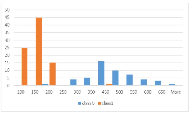
classification using only the Y coordinate of the top point of each polyline.
Fig. 6 shows the distribution of this feature. It confirms this simple hypothesis. With a threshold at 250, practically all cases below this threshold are in class 0 and all the rest are in class 1. It means that attributes of WBC data with larger values and located more vertically in the figure contribute more for the sample to be in class 1. This classification rule is similar conceptually to the linear classification rule described in [Kovalerchuk, Dovhalets, 2017] for WBC data.
It shows that when complimentary simple rules exist they can be found by multiple methods. It allows getting more confidence in such discovered rules and making ensembles of them in the attempt to improve the total accuracy. For data with more complex models, CNN and other neural networks on artificial images open the opportunity to discover such models in images. It also allows tracing the network to find understandable features that led to the model similar to described in [Mao et al, 2014].
6. CONCLUSION
Our proposed approach shows how to use lossless 2-D visual representation of multi-dimensional data for deep learning on CNN architectures. It allows getting: (1) classification accuracy comparable with those obtained by the CNN on data non-converted to images as Table 5
shows, (2) visual insight on efficient classification features as Fig. 5 shows, and (3) visual insight on simplification and explanation of the discovered models for the domain experts who are not data scientists as
Figure 6 shows.
In addition to classification and visualization, GLC-L allows better understanding of the data, which a dataset in its raw representation is lacking. It is reached by interpreting vector data as an image. The benefits of using the image classifiers such as CNN are that they exploit the spatial representation of the pixels in the image (via convolution) by mimicking the human visual cortex. In the future, this conversion opens a new opportunity for resolving long-standing ML challenges of model
explanation, controlling model overfitting and overgeneralization. Both can come from the combination of computational tools suggested in this paper and the unique human perceptual abilities to digest easier a larger number of features and outliers in the visual form than in the numeric form. The idea of GLC visual approach for controlling over-fitting and overgeneralization in ML is to allows a domain expert to see n-D data in 2-D as it is shown in Fig. 1 and then to limit the areas where the possible n-D points can be located in these visualizations [Kovalerchuk, 2018]. The combination of GLC-L and CNN can expand this possibility by visually controlling the areas around the polylines uses by CNN for classification.
REFERENCES
[1] Kingma DP, Ba J. Adam: a method for stochastic optimization, arXiv:1412.6980, 2017.
[2] Kovalerchuk B. Visual Knowledge Discovery and Machine Learning, Springer Nature, 2018
[3] Kovalerchuk, B., Dovhalets, D., Constructing Interactive Visual Classification, Clustering and Dimension Reduction Models for n-D Data, Informatics, 4(23), 2017, http://www.mdpi.com/ 2227-9709/ 4/3/23,
[4] Kovalerchuk, B., Quest for rigorous intelligent tutoring systems under uncertainty: Computing with Words and Images, In: IFSA/NAFIPS-2013, 685- 690.
[5] Lichman, M. UCI Machine Learning Repository, http://archive.ics.uci.edu/ml, 2013.
[6] Mao J, Xu W, Yang Y, Wang J, Yuille AL. Explain images with multimodal recurrent neural networks. arXiv:1410.1090. 2014 Oct 4.
[7] Miller, G. A. The magical number seven, plus or minus two: Some limits on our capacity for processing information. Psychological Review. 63 (2): 81–97. [8] Simonyan K, Zisserman A. Very deep convolutional
networks for large-scale image recognition. arXiv:1409.1556. 2014.
[9] Surendrani, D. Swiss Roll Dataset, 2014.
http://people.cs.uchicago.edu/~dinoj/manifold/swissr oll.html
[10] Zadeh L. A. Computing with words: Principal concepts and ideas, Springer, 2012.
Figure 6: Distribution of values of Y coordinate of the top