AESTHETIC DATA VISUALIZATION AS A RESOURCE FOR EDUCATING CREATIVE DESIGN
From Information Visualization over Ambient Display to Data Art
ANDREW VANDE MOERE
The University of Sydney, Australia
Abstract. Data visualization is usually considered an expert field reserved for the computer science or data analysis specialist. In contrast, in this paper we argue that the approaches and theories from data visualization can form a rich contextual resource for teaching creative design principles to students. A conceptual data mapping model is proposed that describes a continuum between ‘traditional’ data visualization applications and more artistically inclined works of ‘visualization art’. This model is useful to clarify conceptual relationships between different visualization design approaches, ranging from traditional data representation applications over to ambient displays to visualization art experiences. This exchange of insights from related scientific and artistic fields forms the foundation for potential collaboration initiatives in research or educational contexts. Subsequently, this aesthetic data visualization model is explained and illustrated by various student works accomplished in several creative design visualization course units.
1. Introduction
Visualization aims to represent data graphically in order to exploit high-bandwidth human perceptual and cognitive capabilities. Accordingly, a visual representation generally aims to empower humans to detect patterns and derive interferences out of visual form. Two important visualization categories exist. Scientific visualization is concerned about the accurate or more effective simulation of data that has a natural geometric structure. Typical examples include the visual depiction of human anatomy, weather patterns or the dynamic behavior of materials. Conversely, data visualization deals with so-called abstract data, which has no physical presence in reality, such as measurements in economic, networking or social sciences.
Information aesthetics is an emerging field that analyzes the aesthetics of information access as well as the creation of new media works that beautify information processing (Manovich 2001). Its practice consists of data representation and interfacing applications that are situated between the realm of functional data visualization, and the more subjectively loaded nature of fine arts. One should note that many ‘traditional’ data visualization algorithms, solutions and visual styles demonstrate levels of genius and creativity. However, until today, the field has shown little understanding of typical creative design considerations such as the subjective value or purpose of visual aesthetics, intrigue or pleasure. Tensions seem to exist between the ‘traditional’ data visualization field, typically focused on developing high-end applications for research and commercial enterprises, and more ‘artistic’ approaches, which aim for a non-expert audience attending art exhibitions or browsing theme-specific websites. Although both fields investigate new ways of representing data, misunderstandings tend to arise when respective works are reviewed with identical assessment criteria. Therefore, a basic understanding about the commonalities and inequalities between both fields is required to better appreciate their motivation, purpose and significance, to facilitate accurate reviewing processes, and to allow for a more useful exchange of relevant knowledge that would benefit both.
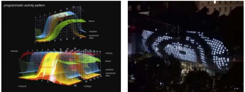
Currently, several design schools have integrated sophisticated data visualization themes in their educational and research curricula, of which the most prominent examples probably include MIT’s Sociable Media Group, NYU’s Interactive Telecommunications Program or IVREA’s Interaction Design Institute. Even in the field of architecture, one can observe conceptual data visualization influences, ranging from infographical representations arising from site analysis studies to large-scale data-driven building facades that reflect information ambiently in public space, as shown in Figure 1. The focus on data visualization within a creative design education context is meaningful in at least three ways. Firstly, the intrinsic use of real world data provides students with a genuine purpose and relevant design context. As the designed object conveys ‘real’ (versus arbitrary, mock-up or random) data that contains some sort of relevant measurements, an intrinsic creditability to the designed artifact is provided. Secondly, the development of visually attractive and directly tangible objects arising from highly abstract themes and concepts seems to challenge and motivate typical design students. Accordingly, ‘inventing’ a new visualization method can be contextualized as a typical design process that should comply to Vitruvius’ basic principles: a ‘good’ visualization needs to be functional (utilitas), effective (firmitas) as well as beautiful (venustas). And lastly, the tight integration of data within the design process provides the opportunity of rich design rationale interpretations.
Figure 1. Data visualization influences in architecture. Left: a data visualization used for an architectural site analysis (van Berkel and Bos 1999), Right: modal.patterns, a large-scale interactive façade that translates text data into abstract
visual and audio animation sequences (Gaviria 2006).
For instance, a seemingly meaningless object tends to be understood differently by onlookers once it is clear its design is based on data: as its ‘purpose’ is revealed, people typically wish to decrypt any ‘hidden’ data patterns, and to reveal its visual presence in the context of the data attributes. Accordingly, by merging artistic and functional design considerations, students are challenged to consider the purpose of aesthetics, and the emotional connotations provoked by purely functional objects.
Based on the natural tension between data visualization and visualization art, this paper aims to describe the virtue of data visualization as a resource for educating creative design principles. It relates the qualitative differences to a simplified model of data mapping, and illustrates the spectrum between both fields in the context of several creative design student works.
2. Data Visualization versus Visualization Art
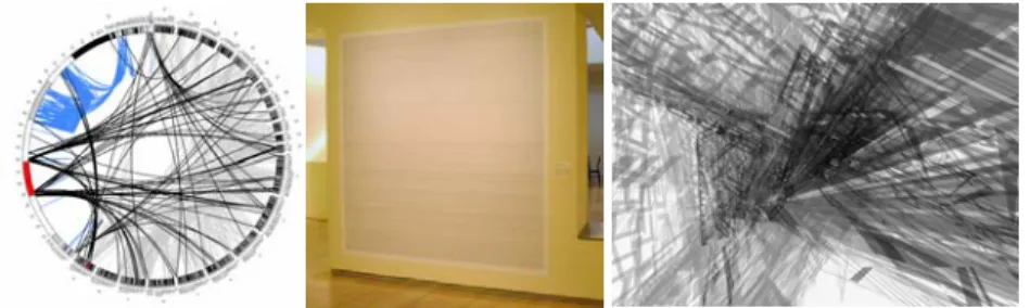
This section defines some of the qualitative differences between data visualization, an established academic field inspired by the fields of computer science, psychology, semiotics, graphic design, cartography and art, and what we coin as ‘visualization art’, an emerging field that is more inspired by interactive art, new media, graphic design and social sciences. As shown in Figure 2, even for the same dataset (i.e. genetic code), different visualization techniques exist, each with their own unique purpose, and each using creative design principles differently. While traditional data visualization allows for the interactive exploration of genes and their functional relationships, more aesthetic approaches aim for overwhelming the audience with the huge size or almost randomness character of the collection of genetic code.
Figure 2. From Data visualization over Visualization Design to Visualization Art. Left: Circos, a visualization of functional relationships within a genome (Krzywinski 2006), Middle: 13 million letters of genetic code of Chromosome 21 on a single poster (Fry 2002), Right: DNA space, a generative artwork animation
using a DNA sequence as a dynamic data structure (stanza 2003). 2.1. DATA VISUALIZATION
Data visualization most often is described as “…the use of computer-supported, interactive, visual representations to amplify cognition” (Card, Mackinlay and Shneiderman 1999). Computing facilitates the automatic creation of visualizations, away from time-intensive hand-drawn methods. Interactivity allows users to form individual hypotheses on-the-fly, which can then be tested and reformulated in an iterative, and therefore necessarily interactive, way. Importantly, according to this definition, data visualization has a single purpose: to increase the human understanding of data. Data visualization therefore focuses on methods that reveal patterns hidden inside the dataset, such as the similarities between different multiple data items, those that are significantly different, and the detection of specific tendencies or trends. Data visualization thus specifically looks in the data to derive useful information, meaning or knowledge, and potentially allows for the detection of their underlying principles. Data visualization research is generally treated as a typical engineering issue, without any consideration whether such techniques can also be used for creative design purposes. Instead, its research aims to optimize functional requirements, for instance whether users can understand the representations effectively, that is the accuracy and completeness with which users achieve specific tasks, and efficiently, that is the resources expended in relation to the effectiveness criterion, such as the required time or computational power (van Wijk 2006). 2.2. INFORMATION AESTHETICS
In recent years, a stream of mainly young and self-motivated people is experimenting to visualize fashionable real-world datasets in ‘artistic’ ways (Judelman 2004; Vande Moere 2005). Independent from institutional or commercial pressure, their visualizations demonstrate the initiative,
enthusiasm, interest and skill to tackle complex issues that were previously reserved for the visualization researcher or developer. Captured in the relative limited fame of online weblogs or art exhibitions, their contributions seem to be somewhat ignored by the academic world. Why have these more creative data visualizations apparently become fashionable recently?
In the information society of today, people are literally surrounded by data. Each single email message, phone conversation or purchase is tracked, recorded and stored. Data is continuously accumulated, almost never deleted. It has become clear that our modern society generates data faster than technology can analyze it. While many sophisticated technologies exist for generating, communicating, filtering, storing and querying data, it is still an open question how this information can be best represented for humans to understand. In spite of ultra-fast networks and increasingly huge displays, only few visualization techniques have been shown to successfully communicate insight. This problem has become a natural challenge that initiated several research projects and commercial ventures, and equally forms an ultimate challenge and motivation for a creative designer.
Recently, several software tools have been marketed that are specialized in the creation of high-end visual applications. Ranging from free, community-supported open-source initiatives (e.g. Processing, vvvv) to commercial enterprises (e.g. MAX/MSP Jitter, Virtools, Macromedia Flash), these authoring tools are becoming increasingly affordable, more powerful, better supported and easier to use. The concept of “visual programming”, the process of connecting so-called “programming blocks”, allows the on-the-fly creation of complex computer programs. In fact, visual programming has finally allowed software development to resemble to sketching, a typical design activity which is inherently elaborate and cyclic (Lawson 1997). By hiding low-level technical and programmatic complexities, these new software tools facilitate the creation of sophisticated data-driven visualizations by people not necessarily schooled in computer science or software development principles.
Typical creative professions, either by self-learning or by education, have become ever more proficient in typical computer science skills, including programming techniques, database management and computer graphics principles. Accordingly, creative design is increasingly borrowing from the newest developments in computer science research.
Relatively large and complex, but also interesting datasets have become increasingly accessible. Naturally, most used datasets originate from fields that trickle human curiosity, ranging from social networking (e.g. del.icio.us, Technorati), socially and environmentally relevant statistics offered by governmental (census data, Bureau of Statistics) and non-governmental organizations (e.g. Gapminder, Greenpeace), or even Right to Information
Acts (e.g. Enron email traffic log) and involuntary corporate leaks (e.g. AOL search, credit card financial information).
Online content creation and sharing has matured in so far that the efforts of independent visualization developers are relatively easily distributed and recognized in online newsgroups, forums, weblogs, wikis, portals or other content curation aggregators. At the same time, several reputable companies such as online news (e.g. CNET, digg.com), search engines (e.g. Google Trends), and shopping portals (e.g. Browse Goods) have started to integrate novel visualization approaches in their web interfaces. These developments are noteworthy, as they illustrate the recent shift of visualization outside of specialist business applications, reaching into the popular (online) culture. 3. Data Mapping
3.1. THE DATA MAPPING PROCESS
As mentioned before, data visualization focuses specifically on the representation of so-called abstract data, which is characterized by its lack of physical presence. Such datasets are mostly of technological nature and invented by humankind, ranging from stock market quotes over functional DNA sequences to sensor reading logs. Exactly because such datasets have no intrinsic visual form, a metaphor is required to translate its values into a representation that can be more easily comprehended by humans. It is exactly the invention of such elegant metaphor that forms an interesting problem from a creative design perspective. Following steps can be recognized in the use of data mapping metaphors (North 2005):
- Data Mapping. Data mapping applies a set of predefined rules to the numerical and textual values contained in the dataset. These rules define exactly how specific data attributes are represented. Typically, each data item (e.g. database row) within a dataset corresponds to a unique visual entity, such as a point, line, polygon or 3D object. Each visual entity is then manipulated (e.g. position, direction, color, size, shape) according to the specific data values it represents. Users can then observe the resulting constellation of transformed visual entities, and detect apparent visual patterns (e.g. outliers, clusters, tendencies) that reflect meaningful phenomena in the data. Typically, each data visualization technique is uniquely characterized by an original set of data mapping rules.
- Visual Transfer. This phase considers the transmission of the resulting visualization from the presentation medium, via the eye, to the human brain. It focuses on how humans visually perceive the world, and thus considers aspects from cognitive studies, such as human perception, color theory, visual bandwidth or Gestalt Laws. The optimization of visual
transfer aspects directly influences the data visualization performance, i.e. whether it can be easily perceived and understood.
- Inverse Data Mapping. Before a user can interpret the resulting representation, one needs to ‘understand’ the used data mapping rules. This means a user ‘inverses’ the data mapping rules that were applied: visual attributes, such as position, color, size and shape, are ‘reverted’ into meaningful mental constructs: objects close by each other are seen as ‘related’, those with an equal color are considered from the same category, and so on. What are essentially a collection of visual entities and attributes is ‘interpreted’ as meaningful information, producing insight where there was none before.
3.2. FROM DATA VISUALIZATION TO VISUALIZATION ART
The abstraction of a data mapping metaphor can vary between intuitive and immediately understandable versus obtuse and ambiguous. In this paper, we argue that the main difference between a functionalistic and an artistic data visualization is its data mapping approach. Accordingly, ‘traditional’ data visualization is concerned with the accurate depiction of small patterns, seeking insights ‘within’ the dataset. Visualization art, in contrast, exploits the representational power of data to communicate insights ‘about’ the dataset, often transcending any meaningful patterns that might occur in it. Accordingly, data visualization tends to use data mapping metaphors that depict the dataset objectively, using a metaphor that is immediately inversable to meaning hidden inside the dataset. Visualization art tends to use concepts that deal with the dataset as a whole, using metaphors that can be imaginative and so ambiguous that inversing becomes unpredictable, potentially to the extent of being arbitrary. However, the ambiguity of visualization art deliberately puts the responsibility of interpretation (and misinterpretation) by the viewer instead of the designer (Gaver, Beaver and Benford 2003), forcing onlookers to focus on the meaning of the dataset (or the data mapping itself), instead of revealing detailed, expert information that might be hidden inside the data itself. One should note that this conceptual model is based on the phenomenal observation of a visualization artifact, which can differ with what the developer had actually intended. 4. Data Mapping in Creative Design Education
The data visualization context in educating creative design is demonstrated by the illustrations of this section, which are primarily based on coursework student works produced between 2004-2006 at the Key Centre of Design Computing and Cognition at the University of Sydney. These figures show how data visualization can be used to introduce students with a wide range of design challenges, ranging from expert tools to interactive art works.
4.1. DATA VISUALIZATION
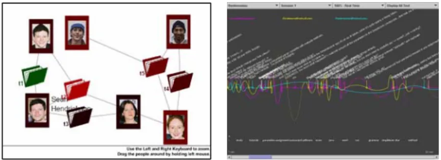
Figure 3. infodesign course results. Left: Activity Health Display displaying active collaboration between people and the according stress levels (Author: Jason Green).
Right: online chat text visualization based on keywords (Author: Andrea Lau). Data visualization is specifically used for ‘complex’ datasets, typically containing a very large amount of data objects, which have multiple data dimensions that might change over time. Its purpose is to increase the understanding the phenomena present in the dataset, so users can derive useful information, make informed decisions or communicate knowledge about it. The design of an appropriate data mapping metaphor is mostly motivated from task performance considerations, with a strong focus on the accurate and objective depiction of data values. Few research approaches have even proposed automated techniques that recommend the most effective data visualization method according to specific dataset characteristics (Bergman, Rogowitz and Treinish 1995; Healey, Amant and Elhaddad 2000). The integration of creative design aspects is mostly neglected, except of some attention to “usability” or “user experience” effects. While some evaluations might question users whether they find the visualizations ‘enjoyable’ to use, any aspect of deliberate creative or aesthetic design seems to be considered as an superficial add-on, mostly to convey the aspect of coolness or novelty. Accordingly, only few visualization approaches have reported a collaboration with designers or artists (Healey and Enns 2002; Keefe, Karelitz, Vote et al. 2005). Their outcomes show a strong appreciation of the typical creative design process and the focus on re-questioning of what is considered as common knowledge. However, as shown in Figure 3, design-influenced data visualization can be easily used within the context of professional applications, and might seem most beneficial in terms of user experience.
In short, data visualization is concerned about specific patterns hidden in abstract datasets (‘what’, object), for the purpose of increasing insight in the data (‘why’, purpose), using the method of data mapping rules that can be interactively manipulated by users (‘how, methodology).
4.2. VISUALIZATION DESIGN
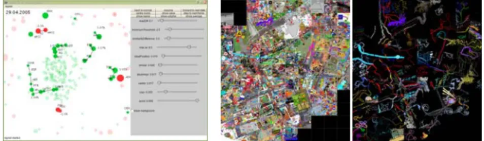
Figure 4. Left: infoboids, a self-organizing visualization design using the concept of swarming to convey the dynamic nature of the New York Stock Exchange over time (Authors: Andrea Lau and Andrew Vande Moere), Right: infoscape course results, a collaborative geographical map of the University campus created by 100 students. Visualization design tends to represent data in a more iconographic way, devoting as much emphasis on the beautification as on the clarification of the dataset. By doing so, specific data simplifications often occur. Details might get lost, so that the resulting visual representation might only highlight a few dataset aspects instead of conveying the complete dataset. For instance, a typical visualization design might specifically depict the sheer size of a dataset, rather than inventing an effective way to overcome this specific complexity. Accordingly, the data mapping integrates design considerations as an inherent quality that emphasizes specific, predefined data characteristics and engages users by its visual aesthetics. In Figure 4, two such visualization designs are shown. On the left, infoboids combines the self-organizing nature of swarming to illustrate the dynamic characteristics of a Stock Market dataset. Companies that experience similar stock market quote changes over time flock closely together, while dissimilar companies are repulsed. On the right, the infoscape landscape depicts the collaborative efforts of more than 100 undergraduate students that ‘captured’ abstract features discovered on our university campus on a shared map. These particular visualizations differ from traditional data visualization in their intended purpose: non-expert users can feel compelled by the relatively simple but intriguing visual metaphors and consider investigating them over a longer period of time than professional data visualization tools. These applications still represent complex datasets, but invite onlookers for exploration and interpretation.
Visualization design is concerned about extrapolating specific data dimensions, for the purpose of highlighting specific data patterns (while diminishing others), using data mapping techniques that integrate aesthetics, have limited interaction, but still are relatively easily understandable.
4.3. AMBIENT DISPLAY / INFORMATIVE ART
Figure 5. infostudio course results. Left: a large-scale ambient installation showing real-time network traffic flowing through the Architecture building (Authors: Mitchell Page et al.), Right: a spatial plant-like projection conveying real-time
shopping behavior (Authors: Huong Nguyen et al.)
Ambient display is an emerging visualization direction that aims to communicate information in the periphery of human attention. Ambient displays are generally meant as architectural, physical interfaces between people and information, positioned in public spaces such as an office or a hallway, translating data in a calm, non-intrusive experience (Wisneski, Ishii, Dahley et al. 1998). Because ambient displays are used in a public context, creative design is exploited for functional purposes, for instance to adapt the physical design to the physical environment or usage context (Mankoff, Dey, Hsieh et al. 2003). Creative design is required in order to merge the display in the physical surroundings, in order to augment the acceptability of the general public, and to be able to entice the audience repeatedly over long periods of time. An ambient display data mapping is unique in that it deliberately ‘hides’ data behind a metaphor that requires time and effort to understand. Because of its size and context, an ambient display often hasarchitectural qualities (see Figure 5). For instance, an ambient display can consist of a complex wallpaper pattern that adapts to dynamic data streams in real time, such as network traffic or shopping habits. Here, students experience the relevance of real data, and learn how it can be represented in a non-intrusive way within a spatially relevant context. Creative design considerations become an integral part of the display, and ultimately determines whether the information representation is boring and undecipherable, or in contrast, pleasant and intriguing to learn and discover over a long period of time.
In short, ambient display is concerned about relatively simple datasets with few data dimensions, for the purpose of informing people in a non-intrusive way within a physical context, using non-interactive data mapping techniques that are potentially not immediately understandable, but highly enjoyable. This ambiguous approach aims to appeal human curiosity and
allows for multiple, potentially conflicting interpretations (Gaver, Beaver and Benford 2003). It is different from common data visualization in that data shifts to the background, and patterns are more subtly depicted. The quality of such display depends on how it is adapted to its surroundings and is able to intriguingly ‘reveal’ information over a long period of time. 4.4. VISUALIZATION EXPERIENCE
Figure 6. infodevice course results. Left: Data Scratching, exploring time-varying data by Video Jockeying (Author: Sheryl Soo), Middle: Dino, an egg-shaped device that moves in reaction to emotions during online chat conversations (Author: James Kim), Right: FeelMouse, a computer mouse that alters temperature depending on
textual emotions (Author: Irene Chen).
Some data depictions focus beyond the visual sense, and instead attempt to stimulate alternative human senses, such as touch, smell, taste or sound. Such visualization experiences or non-visual visualizations can even be used in addition to the visual sense, and explore novel ways of conveying and interacting with information. As shown in Figure 6, such approaches can encompass new human-computer interaction interfaces such as a DJ turntable as a way to ‘scratch’ through time-varying data, or physical objects that move, wiggle or change temperature depending on human emotions communicated during online chat conversations. These visualizations are not concerned with depicting exact dataset values or meaningful patterns such as in the previous visualization categories, but rather exploit the use, presence and context of data to convey a specific dataset-related message: here, to ‘playfully browse’ time-varying data in a similar way to mixing music, or using complex motion typologies of physically moving objects or the cold/hot temperature alterations of a computer mouse as ways to ‘more naturally’ communicate human emotions than just static visual diagrams. This approach shows how educating creative design can act as a real research medium, as students explore new interaction or presentation media using the latest technological advances through the process of designing. Consequently, the presence of data is exploited as a relevant design context to communicate a strong, artistic message that is related to the dataset’s
meaning. Instead of revealing patterns ‘in’ data, a visualization experience is thus more concerned about conveying the underlying meaning of the data in a thought-provoking way.
In short, a visualization experience is concerned about providing a (often multi-sensory) experience based on a creative design exploration, for the purpose of communicating a relevant conceptual theme that is related to what the data, seen as a holistic, socially relevant entity represents. It uses novel and often partly interactive data mapping techniques that are engaging and enjoyable. The quality of a visualization experience is generally dependent on its artistic expression, its originality and the relevance of the design rationale in the context of the chosen dataset.
4.5. VISUALIZATION ART / DATA ART
Figure 7. infodemo course results. Left: a 3D animation based on data retrieved from a music group fan website called “Thursday” (Author: Sean Pieres), Right: recursive visual patterns based on real-time weather information (Author: Andrew
Wallace).
As the most ‘extreme’ form of data visualization, data art or visualization art foregoes any consideration of useful interpretation or understanding. Instead, data is used as an abstract textual or numerical source, similar to binary code or a matrix of parameters that control an algorithm. Data mapping is interpreted as a pure, literal form of translation, without consideration whether the outcome is understandable or even accurately perceivable. As shown in Figure 7, data art can be used to introduce students with complex generative programming algorithms of 3D animation effects, at which typically arbitrary numerical values are replaced with ‘real’ values from well-chosen data streams. For real-time, time-varying data, each program execution becomes unpredictable and emergent, and might even be different from what the designer originally had intended. Potential applications might include software screensavers, aesthetic public displays or music video animations.
The inherent connotations to the expectations and qualities of traditional visualization make these works stand out from other generative art works:
although such visualizations are not concerned about patterns or meanings of the dataset, onlookers nevertheless expect such sort of purpose. Such approaches ultimately aim to reveal the ‘essence’ deeply hidden inside data: by revealing that seemingly random visual effects are actually induced by real data, onlookers start to interpret it differently, and become motivated to search (unsuccessfully) for the occurrence of any visual patterns.
Visualization art is thus concerned about providing a (often multi-sensory) user-engaging experience based on explorative creative design considerations, for the purpose of inducing a generative process that resembles a data mapping algorithm, by literally (and potentially non-effectively) translating data values into visual form. The quality of such works is based on how visual patterns are correlated with data phenomena, the occurrence of emergent effects, originality and dataset relevance. 5. Conclusion
In this paper, we described different forms of data representation according to their data mapping focus, hereby identifying the qualitative differences between functional, traditional data visualization to the more purely aesthetic forms of visualization art. It identified the rich potential of data visualization as a broad and freely interpretative resource for teaching creative design. This data mapping model enables teachers and students to exploit the various interpretations of data visualization to introduce different forms of creative design, ranging from functional, objective considerations in professional tool development to critical, artistic statements in generative new media art. In addition, it has been shown that data visualization can provide for a real-world and relevant design context, enables the creation of immediate and tangible artifacts, and can provide a rich platform of interpretation, similar to art but mostly with some sort of identifiable intended real-world purpose. A better understanding of the qualities related to the different data mapping categories allows for artistically motivated works to be more correctly interpreted and appreciated, so they can be more accurately reviewed and assessed according to their intended purpose and creative design rationale.
By integrating creative design considerations in data visualization applications, valuable tools can be developed that address the emotional experience and mental engagement of users, instead of solely focusing on traditional task effectiveness metrics. As an increasing number of independent and self-motivated data visualization works are emerging, especially in the fields of ambient display, sociable media, Internet applications and info-aesthetic visualizations, creative design education should seize this opportunity to school a new generation of data-aware
visualization specialists that can make our information society a more sustainable and enjoyable place to live in.
Acknowledgements
We would like to thank all the students who participated in the different creative design data visualization courses at the Key Centre of Design Computing of the University of Sydney, and especially those that authored the projects that were used as illustrations in this paper.
References
Bergman, LD, Rogowitz, BE and Treinish, L: 1995, A rule-based tool for assisting colormap selection, inProceedings Visualization ’95, pp. 118–125.
Card, SK, Mackinlay, JD and Shneiderman, B: 1999, Readings in Information Visualization: Using Vision to Think, Morgan Kaufmann, San Francisco, CA.
Fry, B2002. Genomic Cartography: Chromosone 21. International Center of Photography, New York.
Gaver, WW, Beaver, J and Benford, S: 2003, Ambiguity as a Resource for Design, in
Conference on Human Factors in Computing Systems (SIGCHI), ACM, pp. 233-240. Gaviria, AR2006. modal.patterns at Kunsthaus Graz. Graz, Austria.
Healey, CG, Amant, RS and Elhaddad, MS: 2000, ViA: a Perceptual Visualization Assistant, inAIPR Workshop: 3D Visualization for Data Exploration,SPIE, pp. 2-11.
Healey, CG and Enns, JT: 2002, Perception and Painting: A Search for Effective, Engaging Visualizations, IEEE Computer Graphics & Applications 22(2): 10-15.
Judelman, G: 2004, Aesthetics and Inspiration for Visualization Design: Bridging the Gap between Art and Science, inInternational Conference on Information Visualisation (IV'04).IEEE, London, UK, pp. 245 -250.
Keefe, DF, Karelitz, DB, Vote, EL and Laidlaw, DH: 2005, Artistic Collaboration in Designing VR Visualizations, IEEE Computer Graphics & Applications 25(2): 18 -23. Krzywinski, M: 2006,Circos - Circularly composited genome data and annotation generator
http://mkweb.bcgsc.ca/circos/January.
Lawson, B: 1997, How Designers Think, Architectural Press
Mankoff, J, Dey, A, Hsieh, G, Kientz, J, Lederer, S and Ames, M: 2003, Heuristic Evaluation of Ambient Displays, inACM Human Factors & Computing Systems, pp. 169-176. Manovich, L: 2001,Information and Formhttp://www.manovich.net/ia/,January 2007. North, C: 2005, Information Visualization, inHandbook of Human Factors and Ergonomics,
John Wiley & Son, New York, pp. 1222-1246.
stanza: 2003,Generative DNA Spacehttp://www.genomixer.com/dnaspace/,January 2007. van Berkel, B and Bos, C: 1999, Move - UN Studio, Architectura & Natura, Amsterdam. van Wijk, JJ: 2006, Views on Visualization, IEEE Transactions on Visualization and
Computer Graphics 12(4): 421-432.
Vande Moere, A: 2005, Form follows Data: the Symbiosis between Design and Information Visualization, inCAADfutures, OKK Verlag, Vienna, Austria, pp. 31-40.
Wisneski, C, Ishii, H, Dahley, A, Gorbet, M, Brave, S, Ullmer, B and Yarin, P: 1998, Ambient Displays: Turning Architectural Space into an Interface between People and Digital Information, inWorkshop on Cooperative Buildings (CoBuild '98), pp. 22-32.