Modeling visualization tools and applications
on the Web
Editor(s):Name Surname, University, Country
Solicited review(s):Name Surname, University, Country
Open review(s):Name Surname, University, Country
Ghislain Auguste Atemezing
a,∗,∗∗, Raphaël Troncy
aaEURECOM, Campus SophiaTech Multimedia Communications Department 450 route des Chappes, 06410 Biot,
France.
E-mail: [email protected]
Abstract.Publishing data on the Web is getting more and more adoption within the umbrella of Open Data. Governments and local authorities are giving access to their data free of charge, although sometimes in heterogeneous formats. Linked Data prin-ciples enables the use of common model to make things interlinked on the Web. While this is true for publishers, consumers are involved in this loop of publication by building visualizations using (re)-existing tools from the information visualization community (InfoVis). However, there is a need to describe applications built with those tools in order to easily discover ap-plications on the Web. Besides, Open Data events usually contain application contests helping to showcase the usefulness of data, without structured data available in the web-pages. The contribution of this paper is three-fold. First, a review of tools for creating applications is provided, with a classification based on domains. Second, the DVIA vocabulary is proposed to annotate applications with a common semantics. Third, a design and implementation of a universal plugin to generate RDF data from application contests is described in detail.
Keywords: visualization, ontology, visualization tools, Linked Data, Open Data contests, applications
1. Introduction
According to [16] the main goal of information sualization is to translate abstract information into a vi-sual form that provides new insight about that informa-tion, in a clearly and precise form. In the traditional in-formation visualization field, data classification, either quantitative or categorical, is useful for the purpose of visualization, and can make differences between tools. For example, hierarchical faceted metadata is used to build a set of category hierarchies where each dimen-sion is relevant to the collection for navigation. The resulting interface is known as faceted navigation, or guided navigation [15]. However, visualizing struc-*Corresponding author. E-mail: [email protected] **The authors would like to thank Alexis Troberg for implement-ing the universal Javascript plugin
tured data in RDF by taking advantage of the underly-ing semantics is challengunderly-ing both by for the publishers and the users. For one hand, publishers need to build nice visualizations on top of their 4-5 stars datasets. On the other hand, lay users don’t need to understand the complexity of the semantic web stack in order to quickly get insights of the data. Thus, adapting visual tools for exploring RDF datasets can bridge the gap between the complexity of semantic Web and simplic-ity in information exploration. In this paper, we survey tools for visualizing structured data (section 2.1) and RDF data section 2.2). We then provide a classification of the tools for creating applications in the context of LOD (cf. section 2.3), along with the way applications are describe on the Web. Section 4 describes Linked Data applications, followed by the relevant informa-tion to describe applicainforma-tions built on top of govern-ment open datasets (section 4.2). Section 3.2 reviews
two catalogs of applications currently available on the Web. Section 5 proposes a model for capturing appli-cations in Open Data contests, with an implementation of a JavaScript plugin to leverage the use of semantics in webpages announcing application events. Section 6 briefly concludes the paper.
2. Survey on visualization tools
In this section, we describe also visualization tools that natively do not take as input RDF data for two reasons:
– those tools are relatively “popular” for
analyz-ing data exposed by the government and agen-cies (most of them in XLS, CSV) as they quickly make it easy to the users to build chart maps and compare with other datasets. One widely applica-tion is in the data journalism where facts are an-alyzed by those tools without waiting for the se-mantic publication of the data
– Also these tools have many options for
visualiz-ing data and are not totally adapted in the Seman-tic Web community.
2.1. Tools for visualizing structured data
In this section, we review tools that are used to visu-alize structured data and RDF data. The former cate-gories can be extended to support RDF, while the latter tools are trying to cover visualization charts/graphs as much as possible.
2.1.1. Choosel
Choosel [13] is built on top of GWT and the
Google App Engine (the backend can be modified to run on any servlet container). The client-side frame-work facilitates the interaction with visualization com-ponents, which can be wrappers around third party components and toolkits such as the Simile Timeline, Protovis and FlexViz. Choosel can integrate compo-nents developed using different technologies such as Flash and JavaScript. It is possible to implement vi-sualization components that are compatible with the Choosel visualization component API. These visual-ization components can then be used to take advantage of Choosel features such as management of view syn-chronization, management of selections, and support for hovering and details on demand.
2.1.2. Many Eyes
Many Eyes[22] is a website that provides means to visualize data such as numbers, text and geographic information. It provides a range of visualizations in-cluding unusual ones such as “treemaps” and “phrase trees”. All the charts made in Many Eyes are interac-tive, so it is possible to change what data is shown and how it is displayed. Many Eyes is also an online com-munity where users can create groups (such as “Ebola Crisis” or “Kobane War”) to organize, share and dis-cuss data visualizations. Users can also comment on visualizations made by others, which is a good way to improve their work. The authors claim that it is useful because it users can build quick and easily visualiza-tions from their own data, with the possibility to share them. is quick and easy to make and share great look-ing and fun to use visualizations from your own data. Data input formats are XLS, Plain text and HTML. The output formats are PNG or embeddable. However, us-ing Many Eyes make public your data and the visual-izations created with it. The license is proprietary of IBM.
2.1.3. D3.js
D3.js [4] is a JavaScript library for manipulat-ing documents based on data. D3 uses HTML, SVG and CSS. D3 combines powerful visualization compo-nents, plugins1 and a data-driven approach to Docu-ment Object Model (DOM) manipulation. D3 solves problems of efficient manipulation of documents based on data. Thus, avoids proprietary representation and affords flexibility, exposing the full capabilities of web standards such as CSS3, HTML5 and SVG. D3 sup-ports large datasets and dynamic behaviors for interac-tion and animainterac-tion.
D3 intention is to replace gradually Protovis2, which
is another tool to build customs visualizations in the browser, created by the same authors and which is no longer under active development. Although D3 is built on many of the concepts in Protovis, it improves sup-port for animation and interaction. The difference be-tween D3 and Protovis is in the type of visualizations they enable and the method of implementation. While Protovis excels at concise, declarative representations of static scenes, D3 focuses on efficient transforma-tions: scene changes. This makes animation, interac-tion, complex and dynamic visualizations much easier to implement in D3. Also, by adopting the browser’s
1https://github.com/d3/d3-plugins 2http://mbostock.github.com/protovis/
native representation (HTML & SVG), D3 better inte-grates with other web technologies, such as CSS3 and other developer tools .
2.1.4. Google Visualization API
The Google Visualization API3establishes two
con-ventions to expose data and visualize it on the web: (1) a common interface to expose data on the web and (2) a common interface to provide data to vi-sualizations [9]. Because the Google Visualization API provides a platform that can be used to create, share and reuse visualizations written by the devel-oper community at large, it provides means to create reports and dashboards as well as possibility to ana-lyze and display data through the wealth of available visualization applications. Many kinds of visualiza-tions are available. Google Visualization accepts data in two different ways: a direct construction as well as a JSON literal object, instantiated via the object google.visualization.DataTable. In the latter, the structure of this JSON format is the conven-tion that Google API data sources are expected to
re-turn. So, agoogle.visualization.DataTable
can be created using the results of an AJAX response. It is possible to retrieve and visualize RDF data. As long as the URL retrieved returns Google Visualiza-tion JSON, you can create a DataTable and give it
to the visual construct todraw(). The results of a
SPARQL query can be converted to the Google Visu-alization JSON using an XSL like the one used at RPI for data.gov]. A sample performing these steps is pre-sented in the Tetherless World Constellation, named SparqlProxy4 . It performs these steps for a client with a single HTTP request. By providing the URL of a sparql endpoint to be queried (using service_uri), a query (using query or query-uri), and a specification for return format as Google Visualization JSON (using output=gvds).
All the visualizations are based on the type of the columns/fields of the data. While this is normal for tab-ular data, it is not the case for data exploiting seman-tics. In Linked Data, vocabularies are used for model-ing datasets in RDF, thus makmodel-ing it difficult to reuse di-rectly those tools. There is a need to build more generic tools that exploits the semantics and reuse the visual tools aforementioned.
3https://developers.google.com/chart/
interactive/docs/reference
4http://data-gov.tw.rpi.edu/ws/sparqlproxy.
php
2.2. Tools for visualizing RDF data
Regarding the tools for visualizing Linked Data, the paper [10] analyses in detail the current approaches used to browse and visualize Linked Data, by identi-fying requirements for users classify into two groups: tech-savvy and lay-users. As the authors extensively surveyed more generic Linked Data browsers, with text-based presentation and visualization options, they provide some recommendations according to the size of the data such as fine-grained analysis among others. However, they do not target their study on tools that can easily help building visual Semantic Web-based applications. However, our approach is to study the tools used to build innovative applications for detect-ing the components that could be reusable across dif-ferent domain y/o scope.
2.2.1. Linked Data API
The Linked Data API (LDA) [23], provides a con-figurable way to access RDF data using simple REST-ful URIs that are translated into queries to a SPARQL endpoint. The API layer is intended to be deployed as a proxy in front of a SPARQL endpoint to support:(i) Generation of documents (information resources) for the publishing of Linked Data; (ii) Provision of sophis-ticated querying and data extraction features, without the need for end-users to write SPARQL queries and (iii) Delivery of multiple output formats from these APIs, including a simple serialization of RDF in JSON syntax.
ELDA5is a java implementation of the LDA by Epi-morphics. Elda comes with some pre-built samples and documentation, which allows us to build the specifi-cation to leverage the connection between the back-end (data in the triple store) and the front-back-end (visu-alizations for the user). The API layer helps to asso-ciate URIs with processing logic that extract data from the SPARQL endpoint using one or more SPARQL queries and then serialize the results using the format requested by the client. A URI is used to identify a sin-gle resource whose properties are to be retrieved or to identify a set of resources, either through the structure of the URI or through query parameters.
2.2.2. Sgvizler
Sgvizler[25] is a javascript which renders the result of SPARQL SELECT queries into charts or html elements. The name and tool relies queries against 5http://www.epimorphics.com/web/tools/elda.
SPARQL endpoints using visualizations based on
Google Visualization API, SPARQLer , Snorql6 and
Spark7. All the major chart types offered by the Google
Visualization API are supported by Sgvizler. The user inputs a SPARQL query which is sent to a designated SPARQL endpoint. The endpoint must return the re-sults back in SPARQL Query Rere-sults XML Format or SPARQL Query Results in JSON format. Sgvizler parses the results into the JSON format that Google prefers and displays the chart using the Google Visual-ization API or a custom-made visualVisual-ization or format-ting function. Sgvizler needs, in addition to the Google Visualization API, the javascript framework jQuery to work. One of the drawback of Sgvizler that it is up to the user to test the query and embed it into the HTML page.
2.2.3. Facete
Facete [26] is an exploration tool for (geograph-ical) Linked Data datasets on the Web. Also called “Semmap”, the application allows the user to explore the specific slice of data named ’facet’ of a Linked Data endpoint in a graphical way, available athttp: //144.76.166.111/facete/. The facet is cre-ated by defining a set of constraints on properties in the database. Once the facet is defined, the informa-tion in the facet can be clicked-through in a tabular in-terface and visualized on a map. The user can choose a SPARQL endpoint and graph for listing the content and visualize the dataset. The application is divided in three main views:
1. Selection: A tree-based structure of the dataset. It shows all items’ properties and sub-properties. 2. Data: shows a tabular representation of the data in the facet. All properties that have been marked with an arrow symbol in the facet tree are shown as columns. The columns contain the property values for every item according to the selected filter criteria.
3. Geographical: A map view showing a represen-tation of the elements in the facet with geo-coordinates available.
2.2.4. VisualBox
Visualbox8 is another tool that aims at facilitating
the creation of visualizations by providing an editor for SPARQL queries and different visual tools to
visu-6http://dbpedia.org/snorql/
7http://code.google.com/p/rdf-spark 8http://alangrafu.github.io/visualbox/
alize the data. Visualbox is derived from LODSPeaKr [14] mainly based on the Model- View - Component (MVC) paradigm. A visualization is created in a Com-ponent consisting of one or more SPARQL queries (models), and usually one (but sometimes more) tem-plates (Views). Visualbox is target to users that have at least some basic knowledge of SPARQL and an under-standing of RDF, and runs the query on the server side. Visualbox uses Haanga9, a template engine that
pro-vides a syntax for creating templates by defining mark-ers in a document (usually a HTML page) of the form variable that later will be compiled and replaced by values taken from a data source. One of the drawback of Visualbox is the impossibility to extend with custom visualization nor enable third party filters. Currently, it implements visualization filters for D3.js (5), Google Maps, Google Charts(6) and TimeKnots library (Time-Line with events)10.
2.2.5. Payola
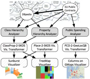
Payola [18] is a web framework for analyzing and visualizing Linked Data, and enables users to build in-stances of Linked Data visualization Model (LDVM) pipelines [5]. LDVM is an adaptation of the Data State Reference Model (DSRM) proposed by Chi [7] ap-plied to visualizing RDF and Linked Data. It extends DSRM with three additional concepts that are reusable software components:
– Analyzers: They take as input compatible datasets, and perform adapted SPARQL queries: hierarchi-cal dataset, geocoordinates dataset, etc.
– Visualization transformers: They can be any software component that transform data between different formats or perfom aggregations for bet-ter visualization. They are generally SPARQL CONTRUCT queries, with the input signatures corresponding to the FROM clauses and their output data samples corresponding to the CON-STRUCT clauses.
– Visualizers: They consume RDF data and pro-duce a visualization a user can interact with. They are visual tools libraries consuming data in
RD-F/JSON11
Basically a user builds different instances of LDVM based on the datasets used in the analyzers and
trans-9http://haanga.net
10https://github.com/alangrafu/timeknots 11https://dvcs.w3.org/hg/rdf/raw-file/
Fig. 1. Sample application of analyzers and visualizers in a LDVM pipeline.
formers. Figure 2.2.5 depicts a sample of a LDVM pipeline applied to two different datasets publised as LOD.
2.3. Related work and discussion
There are currently many projects aiming at visu-alizing (RDF) Linked Data. A survey by Dadzie and Rowe [11] concluded with the fact that many visual-ization tools are not easy to use by lay users. In [17], there is a recent review of some visualizations tools that can be summarized as follows:
– Vocabulary based visualization tools:these tools
are built for specific vocabularies and that help in visualizing data modelled according to those vocabularies, such as CubeViz [24], FOAF
ex-plorer12 and Map4rdf [12]. They aim at
visual-izing data modelled respectively withdq,foaf
andgeo+scovo.
– Mashup tools:they are used to create mashup
vi-sualizations with different widgets and some data analysis, such as DERI Pipes [20]. Mashup tools can be integrated into the LD wizard to combine different visual views.
– Generic RDF visualization tools:they typically
support data browsing and entity rendering. They can also be used to build applications. In this
cat-12http://foaf-visualizer.gnu.org.ua/
egory, we can mention Graphity13, lodlive14 and Balloon Synopsis15.
While these tools are often extensible and support spe-cific domain datasets, they suffer from the following drawbacks:
– They are not easy to set up and use by lay users.
Sometimes, users just need to have a visual sum-mary of a dataset in order to start exploring the data. Our approach to this challenge is to provide such a lightweight javascript-based tool that sup-ports a quick exploration task.
– They do not make recommendation based on
categories. A tool similar to our approach is
Facete16[26] which shows a tree-based structure
of a dataset based on some properties of an end-point more target at geodata. A tabular view en-ables to visualize slices of data and a map view can be activated when there is geo data. Our ap-proach aims to be more generic, offering more views (tabular, map, graph, charts, etc.) according to a systematic analysis of what are the high level categories present in a dataset.
The outcome of this state-of-the-art can then be used to assess different visual tools in the process of cre-ating web-based visualizations. Some criteria can be used for assessing visual tools, such as (i) usability , (ii) visualization capabilities, (iii) data accessibility, (iv) deployment and (v) extensibility. In [1], the read-ers can find more details on this survey. Table 1 gives an overview of the selected tools studied based on the following features:
– Data Formatsfor the format of data taken as input
by the tool;
– Data Access, for the way to access the data from
the tool, such as web service, sparql endpoint, etc.
– Language code, the programming language used
to develop the tool;
– Type of Views, the different views potentially
ac-cessible when using the tool;
– Imported Libraries, the external libraries
avail-able within the tool,
13https://github.com/Graphity/ graphity-browser 14http://en.lodlive.it/ 15https://github.com/schlegel/ balloon-synopsis 16http://cstadler.aksw.org/facete/
– Licensefor the Intellectual Properties rights of the tool,
– SemWeb Compliant, whether the tool can be
eas-ily transposed or compliant with structured data; and
3. Describing applications on the Web 3.1. Motivation
As many initiatives on Linked Open Data is grow-ing, tools and technologies are getting more and more mature to help pro-consumers to leverage the lifting process of the data. At the same times, standardiza-tion bodies such as W3C are helping in providing best practices to publish Open Government Data by using appropriate vocabularies, taking care of stability in the URIs policies, and making links to other datasets. It is the case for instance of the Government Linked Data
Working Group17 which has released best practices
and vocabularies to help governments publishing their data using Semantic Web technologies. Having a look at different proposals of the Life Cycle of Government Linked Data, one of the last stage is “Publication” where the data is released according to the 4-5 stars principles18, with a given access to a SPARQL end-point. However, for a better understanding of the data, one of the next step is usually to generate visualiza-tions through intuitive visual tools(charts, graphs, etc.) that will benefit to citizens, data journalists and other public authorities to improve the quality of their deci-sions. Currently, one way of creating new applications is to look around previous initiatives to see what type of application exists already and make something sim-ilar according to a given dataset and domain. Another
approach is by organizing contests where the
chal-lenges are to mash up unexpected datasets with clear and beautiful visualizations. Such approach is harder as developers also try figure out which tool and library is used for different applications. What if we describe applications according to the facets/views, datasets, vi-sual tools used to build them? How are the types of in-formation that can help create a vocabulary for anno-tating web-based visualizations online ?
17http://www.w3.org/2011/gld/ 18http://5stardata.info/
3.2. Catalogs of applications
We provide below two use cases of the current de-scription of applications developed by datasets pub-lished on the Web. We expose also the limitation of the approaches as they don’t fully make use of semantics for more discovery of visual tools, datasets used to de-veloped such applications.
3.2.1. Open Data Service
The Open Data Service at the University of Southamp-ton19 has a register of all the applications devel-oped using their datasets. A catalog of the
Appli-cations using the data is available at http://id.
southampton.ac.uk/dataset/apps. Each ap-plication is described by giving three main categories of information:
– The available distributions corresponding to the
different formats HTML, RDF/XML and RDF/-TURTLE ;
– Dataset information, which defines the type, the
number of triples, license information, the pub-lisher and the publication date.
– The provenance, such as files used to generate the dataset for building the application, as well as the script itself.
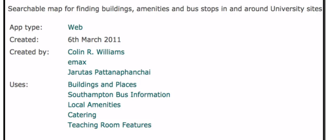
Currently, some vocabularies are used to model the catalog, such asDCATvocabulary [19] and proprietary vocabularies. Each application is then described the type (Web, mobile Web, android, etc. ), the authors, the date of creation and the datasets used to build the application. Figure 3.2.1 depicts the HTML view of a Web application for a searchable map for finding build-ings within the University sites. This initiative seems to be isolated. Thus, there is a real need to have a common layer of semantics for describing such appli-cations. This would benefits the interoperability and more discovery of applications on the Web.
3.2.2. RPI Applications
Another approach from the researchers at the Rens-selaer Polytech Institute20is to put at the bottom of the
static page of a demo/application showcasing the
ben-efits of Open Data fordata.gov21some basic
meta-data (description, URL to meta-dataset, author), and also a link to the SPARQL query used for generating the ap-plication. As this information is human-readable and
19http://data.southampton.ac.uk/apps.html 20http://data-gov.tw.rpi.edu
Table 1
Survey of some tools used for creating visualizations on the Web.
Tools Data Formats Data Access Language
Views Libraries License SemWeb App
Choosel XLS, CSV API GWT
Text/Map/Bar chart Time (Simile)/Protovis/Flexvis Open No
Fresnel RDF - RDF
Property/Labels Welkin/IsaViz/Haystack/CSS Open Yes
Spark RDF-JSON SPARQL PHP
Charts/Tabular - Open Yes
LDA RDF SPARQL Java/PHP
- - Open Yes
SemWeb Import RDF SPARQL Netbeans
Graph Node - CECILL-B Yes
Many Eyes XLS/Text/HTML API Java/Flash
Charts/Trees/Graphs/Maps - IBM No
D3.js CSV/SVG, GeoJson API JavaScript
Charts/Trees/Graphs/Maps Jquery/sizzle/colorbrewer Open Maybe
Facet RDF-JSON SPARQL JavaScript
Map, Facet view JQuery/ dynatree Open Yes
Sgvizler RDF-JSON SPARQL JavaScript
Map/Line chart, Timeline/Sparkline Google visualization API Open Yes
Visual Box RDF SPARQL PHP/Django
Map/Charts/ Timeline/Graphs Google charts/TimeKnots/D3.js Open Yes
Map4rdf RDF-JSON SPARQL Java/GWT
Facet/Map OSM Layers, Google Maps Open Yes
Exhibit JSON Exhibit Data dump JavaScript
Map/Tile/Thumbnail/Tabular/Timeline - Open Yes
Google Visualization API JSON/CSV API JavaScript
Charts/ Charts/Maps/Dashboard AJAX API Open Possible
Fig. 2. Metadata information provided for a Web application built with different datasets at the Open Data Service portal.
can help, the main drawback is the lack of a machine-readable version, using semantics to discover and
con-nect different demos and datasets with authors. A more vocabulary can leverage the issue by annotating such
applications to help discovering and aggregating other similar applications in other Open Data initiatives.
4. Describing and modeling applications
According to [6], visualizationis “the use
of computer-supported, interactive visual
representa-tions to amplify cognition”. So the unique object of
vi-sualization is developing insights from collected data. That justify why each time a new dataset is released, users always expected some showcases to play with the underlying datasets. It is true that many public open initiatives uses incentives actions likechallenges,
datahack-dayorcontest, etc. to find innovative
appli-cations that actually exhibit the benefits of datasets published. Visualizations play crucial role as they can easily find errors in a large collection; detect patterns in a dataset or help navigate through the dataset. 4.1. Typology of applications
Jeni Tennison22 defines in her blog23 three cate-gories of applications using online data:
1. data-specific applications, which are constructed
around particular data sets that are known to the developer of the application; hence the visualiza-tions obtained are of data-specific applicavisualiza-tions.
Examples are the famous applications of“Where
does my money go”in Greece24or UK25. Those
applications are also called“mashups”.
2. vocabulary-specific applications, which are
con-structed around particular vocabularies, wher-ever the data might be found that uses them.
Ex-amples here are FaceBook Social Graph API26,
IsaViz [21], among others.
3. generic applications, which are constructed to
navigate through any RDF that they find; e.g., Tabulator [3], OpenLink Data Explorer27.
As most mash-sups are data-specific applications, it is important and necessary to know what information the dataset contains. This could be achieved by giving
22http://www.theodi.org/people/jeni 23http://www.jenitennison.com/blog/node/126 24http://publicspending.medialab.ntua.gr/en/ index.php 25http://wheredoesmymoneygo.org/ 26https://developers.facebook.com/docs/ plugins/ 27http://ode.openlinksw.com/
the meaning of some properties or classes of the vocab-ularies used to create the dataset. Hence, what the data publisher needs to do very often is to make sure that the data they publish is documented. However, what is seeing in practice, is to consider using an intuitive visualization self-descriptive to both show the added-value of the data and its documentation.
4.2. On Reusable Applications
Many applications are built on top of datasets ex-posed in different open data governments initiatives. Generally, they are used to provide insight about the datasets and their usefulness. However, some of the ap-plications could be generalized and reused if published adequately. Having some best practices in publishing applications on the Web could booster the interoper-ability between datasets and visual tools. To achieve this task, we first review some applications that have been developed on top of datasets opened by govern-ments (UK, USA, France) and public local authorities. We made a random survey of thirteen (13) innovative applications [2] in various domains such as of secu-rity, health, finance, transportation, housing, city, for-eign aid and education. Table 3 provides a summary of the surveyed applications; with names, types, countries and brief description.
The main template used in the survey was to gather the following information:
– the name of the application;
– the scope or the target domain of the application; – a small and concise description;
– the platform on which the application can be
de-ployed and view;
– the policy used for creating the URL of the appli-cation;
– the legacy data used to build the application, and a mention of the process of the lifting process of the raw data to RDF if available;
– the different views available of the application;
– comments or relevant drawback to mention;
– and the license of the application.
Table 2 provides the information extracted fromopenspending
in Greeceusing the aforementioned template. Such information can be published using a vocabulary to help discover all the applications built on top of public spending data across different platforms.
Table 2
Gathering reusable information from openspending in Greece Application
Features Value
Access Url http://publicspending.medialab.ntua.gr/
Scope/Domain Public spending, Government
Description The application helps visualizing facts of the Greek public spending enriched with other datasets
Supported Platform Web
URL Policy http://BASE/en/NAME-CHART.php e.g.,http://{BASE}/en/toppayersday.php
Data Source http://opendata.diavgeia.gov.fr; Greek Tax data (TAXIS)
Type of views Bubble tree, column and bar charts
Visualization tools HighchartsJS, Bubble TreeJS JqueryJS ; RaphaelJS
License Open
Business Value Not Commercial (Free)
Table 3
Some innovatives applications built over Open Government Datasets, by domain, environment and country.
Application Domain Type Country
UK Crime Crimes Web UK
UK Pharmacy Health, Pharmacy Mobile/Android UK
Numberhood Local area dynamics iPhone/iPad UK
BuSit London Public Transportation Web and mobile UK
UK School Finder Education Web UK
Where-can-I-Live House, transportations Web UK
Opendatacommunities Local Government Web UK
FlyOnTime Flights/airlines Web USA
White House Visitor Search White House Web USA
US-USAID/UK-DFID Foreign Aid Web USA
Fourmisante Medicine/health-care Web France
MaVilleVueDuCiel Local Government Web France
Home’n’Go Housing Web France
4.3. DVIA: A vocabulary for Describing VIsualization Applications
We have implemented a vocabulary, DVIA28 aims
at describing any applications developed to consume datasets in 4-5 stars, using visual tools to showcase the benefits of Linked Data. It reuses four existing
vocab-ularies: Dublin Core terms athttp://purl.org/
dc/terms/, dataset catalogue (DCAT) athttp://
www.w3.org/ns/dcat#, Dublin Core Metadata
Initiative at http://purl.org/dc/dcmitype
and the Organization vocabulary at http://www.
w3.org/ns/org#. It is composed of three main classes :
28http://bit.ly/Vb4L8k
– Application: This class represents the application or the mashup developed for demo-ing or con-suming data in LD fashion. It is subclass of dc-type:Software
– Platform: The platform where to host or use the application, could be on the Web (Firefox, Chrome, IE, etc..) or mobile (android, iOS, mo-bile ) or even desktop
– VisualTool: Represents the tool or library used to build the application.
The diagram of the main classes and properties is depicted in Figure 3. The current version of the
vo-cabulary in Turtle format can be found athttp://
purl.org/ontology/dvia. Listing 1 is a
Fig. 3. Conceptual Model of the DVIA vocabulary
the Semantic Web Challenge29 in 2012, the
Event-Media Liveapplication, described using DVIA
vocab-ulary. It depicts apart from some metadata about the application (dct:title, dct:name, dct:issued, dct:creator and dct:license), the different visualization libraries in-tegrated for building EventMedia Live (e.g.: Google API, Backbone, etc), as well as the operating sys-tems where it is designed for, the different views/facets available in the application (map, charts, graphs, force-directed layout, etc.) and the heterogeneous datasets used to implement it.
1 visuapp:eventMedia01
2 a dvia:Application ;
3 dct:title "EventMedia Live"@en;
4 dvia:description "An application
for reconciling Live events with media" ;
5 dvia:url <http://eventmedia.
eurecom.fr> ;
29http://challenge.semanticweb.org/2012/
winners.html
6 dct:issued "2012-11-10"^^xsd:date ;
7 dvia:businessValue "not
commercial" ;
8 dvia:keyword "events, media"^^xsd
:string ;
9 dct:license <http://www.
opendatacommons.org/licenses/ pddl/1.0/> ;
10 dvia:platform [ a dvia:Platform ;
11 dct:title: "Desktop" ;
12 dvia:preferredNavigator "
Google Chrome" ;
13 dvia:alternativeNavigator
"FireFox" ;
14 dvia:system "Mac OS,
Windows, Linux"^^
string ] ;
15 dvia:usesTool [ a dvia:visualTool
;
16 dct:title "Google
visualization Tool" ;
17 dct:description "Google
18 dvia:accessUrl <https:// developers.google.com/ chart/interactive/docs /reference> ; 19 dvia:downloadUrl <http:// www.google.com/uds/ modules/gviz/gviz-api. js/> ] ;
20 dvia:usesTool visuapp:visualTool0
2 ;
21 dvia:consumes [ a dcat:Dataset;
dct:title "BBC dump"] ;
22 dvia:consumes [ a dcat:Dataset;
dct:title "last.fm scrapped
dataset"] ;
23 dvia:consumes [ a dcat:Dataset;
dct:title "upcoming scrapped
dataset"] ;
24 dvia:consumes [ a dcat:Dataset;
dct:title "eventful scrapped
dataset"] ;
25 dvia:consumes [ a dcat:Dataset;
dct:title "Flickr scrapped
dataset"] ;
26 dvia:consumes [ a dcat:Dataset;
dct:title "Music Brainz "] ;
27 dvia:consumes [ a dcat:Dataset;
dct:title "Foursquare Json
file"] ;
28 dvia:consumes [ a dcat:Dataset;
dct:title "DBpedia"] ;
29 dct:creator [foaf:mbox "
[email protected]"; foaf:name
"Houda Khrouf"];
30 dct:creator [foaf:mbox "
[email protected]"; foaf:name " Vuk Milicik"];
31 dct:creator [foaf:mbox "raphael.
[email protected]"; foaf:name
"Raphael Troncy"];
32 dvia:view "map, chart, graph,
force-directed layout" ;
33 ...
Listing 1: A snapshot in Turtle of the description of Event Media Live Application using DVIA vocabulary.
The full version of this sample description is
avail-able athttp://www.eurecom.fr/~atemezin/
datalift/visumodel/eventMedia-sample.
ttl. The actual version of the DVIA intends to be small enough to cover the concepts that are needed to reuse partial or full parts of applications.
5. Improving the discovery of applications in Open Data Events
5.1. Background
One of the challenges in the Apps for Europe -project - and open data -projects in general - is the dis-covery of existing applications using the open data. The discovery of existing applications and ideas is im-portant in order to prevent people from reinventing the wheel, when they instead should put their effort in re-fining existing applications or developing completely new applications. This will hopefully lead to more di-verse applications and furthermore also to higher qual-ity applications, because the existing applications can be enhanced by other people and organizations [8].
In order to promote the reuse and discovery of open data applications, Apps for Europe has created an RDF vocabulary30that can be used for describing open data
events and also the applications that have been built on top of the open data. Furthermore, Apps for Europe
has also developed a Wordpress plugin31 that open
data event organizers can install on their web pages, to make it simpler to populate the RDF data for the events and applications.
5.2. Modeling Approaches
5.2.1. Modeling Events and Applications in RDF One of the key factors in improving the discovery of open data events is to present the information in a structured machine readable format, so that applica-tions (such as crawlers) can easily consume the data. This follows the Semantic Web movement, where the goal is to convert the current, unstructured documents (readable by humans) into structured documents.
In order to present the event and application in-formation in structured format, Apps for Europe has
created an RDF vocabulary available a https://
github.com/mmlab/apps4eu-vocabulary/ for modeling the events and applications. The qual-ity of this vocabulary was tested by manually
model-30https://github.com/mmlab/
apps4eu-vocabulary
ing past events and applications and looking for poten-tial problems and improvements in the ontology. The problems and improvements made to the ontology is presented below.
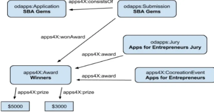
Fig 4. The RDF triples before changes. Here we state that the application SBA Gems has won an award in the event Apps for Entrepreneurs. This model is complex, because it requires us to specify an extra class (Submission) in order to use the wonAward-property, and yet we are
unable to specify which prize the application won ($5000 or $3000).
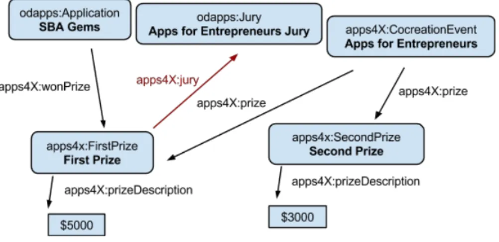
Fig 5. The RDF triples after changes. In this model it is straightforward to specify that an application (SBA Gems) won a prize, because we don’t need to use the Submission intermediate class. We are also able to specify which prize the application won (FirstPrize).
Notice also that now the jury is connected to a prize by specifying a jury-attribute for prizes (instead of having a prize-attribute for the jury i.e. direction of the arrow changed).
Eurecom Semester Project - Alexis Troberg Page 8 of 27 Fig. 4. The RDF triples before changes. This use case states that
the application SBA Gems has won an award in the event Apps for Entrepreneurs.
In Figure 4, the model is complex, because it re-quires to specify an extra class (:Submission) in
order to use the :wonAward-property. Thus, it
does not allow to specify which prize the applica-tion won ($5000 or $3000). While in Figure 5, the model is straightforward to specify that an applica-tion (SBA Gems) won a prize. In this case, there is no need to use the Submission intermediate class. Fur-ther, the model allows to specify which prize the ap-plication won (:FirstPrize). It should be notice also that now the jury is connected to a prize by spec-ifying a jury-attribute for prizes (instead of having a prize-attribute for the jury i.e. direction of the arrow changed).
5.2.2. Improving the model for specifying winners Open data events often include competitions where the best applications are rewarded, and this informa-tion was modeled in the Apps for Europe RDF vocab-ulary as well. However, the current model for this was unnecessarily complicated and therefore the model was simplified. Previously, winning apps required a separate “Submission”-class in order to state that they had won a competition. Furthermore, the vocabulary didn’t allow to state which position (winner, second, third etc.) the winning application was awarded. These problems were fixed by introducing a new property “wonPrize” for applications, so as to state that an ap-plication won a prize without needing to have an in-termediary “Submission”-class, and by introducing the new classes “FirstPrize”, “SecondPrize”, and
“Third-Prize” that are all subclasses of the ““Third-Prize”-class. We concluded that it is satisfactory to be able to state po-sitions one to three for the winning applications, and thus reduce the vocabulary complexity by avoiding modeling arbitrary positions (by having a position at-tribute for the prize for example).
Also some other minor changes were suggested for the vocabulary:
– Use the word “Prize” instead of “Award” (i.e. re-name in all places)
– Normalize the values for juryRate and usersRate
attributes (because otherwise they can’t be com-pared to each other)
– alternatively reuse the review vocabulary from
vocab.org32or schema.org33
– Introduce propertiesconnectedApp(for Event)
and connectedEvent (for Application), so
that applications and events can be linked to-gether.
5.3. Implementation and Application 5.3.1. Universal JavaScript plugin for RDF
population
The inspiration for the JavaScript based solution
came from services like https://muut.com/,
which offers embeddable commenting and discussion forums and it can be installed on any web page in-dependent of the content management system (CMS). Since almost all people have JavaScript support en-abled in their browsers34 it enables us to implement a solution that can be installed on any web page and also works on almost any browser.
The most striking difference between the CMS based plugin and the JavaScript plugin is the user base, since the JavaScript solution works on any web page while the CMS plugin obviously only can be installed on a dedicated websites. Also the technical approach differs significantly, because in the CMS based ap-proach the server will do all the work for producing the HTML and RDFa markup for the events, while in the JavaScript approach it is the client browser that is responsible for this task.
32http://vocab.org/review/terms.html 33http://schema.org/Review
34According to a study by Yahoo only about 1% have JavaScript disabled in their browsers. Source: https: //developer.yahoo.com/blogs/ydnfourblog/ many-users-javascript-disabled-14121.html
Ghislain Atemezing et al. / Modeling visualization tools and applications 13
Fig 4. The RDF triples before changes. Here we state that the application SBA Gems has won an award in the event Apps for Entrepreneurs. This model is complex, because it requires us to specify an extra class (Submission) in order to use the wonAward-property, and yet we are
unable to specify which prize the application won ($5000 or $3000).
Fig 5. The RDF triples after changes. In this model it is straightforward to specify that an application (SBA Gems) won a prize, because we don’t need to use the Submission intermediate class. We are also able to specify which prize the application won (FirstPrize).
Notice also that now the jury is connected to a prize by specifying a jury-attribute for prizes (instead of having a prize-attribute for the jury i.e. direction of the arrow changed).
Eurecom Semester Project - Alexis Troberg Page 8 of 27
Fig. 5. The RDF triples after changes.
Technical description: The JavaScript plugin
con-sists of three distinct parts (Cf. Figure 6) that are tech-nically independent of each other, but they can still be deployed on the same server if needed:
RESTful API for creating, editing and removing events
and applications from the database. Both inter-faces listed below (2 and 3) communicates and manipulates the data using the RESTful API
Admin interface for event organizers. Event
organiz-ers manage their events and applications through this interface, which is provided as a “software as a service” (SaaS35).
Embeddable script that will display the event and
application information both in human readable form and in computer readable form (RDFa for-mat) on the event organizers web page. The script will fetch the event and application information using the RESTful API and then manipulate the document object model (DOM ) after page load and inject the event and application description into the DOM.
RESTful API: The API was implemented in Node.js36
, which is a platform for running applications writ-ten in JavaScript on server side. It is built on Google Chrome’s JavaScript runtime and provides very good performance thanks to it’s asynchronous data manip-ulation model . Node.js has become very popular re-cently and there is a huge number of third party
ex-35http://en.wikipedia.org/wiki/Software_as_
a_service
36http://nodejs.org/
Fig 6. The three main components of the JavaScript plugin.
4.3.1 RESTful API
A RESTful API was built for managing the events and applications. Both the admin interface and the embeddable script uses the RESTful API to manipulate the data in the database. RESTful services have recently become very popular choices for the API architecture, because they are lightweight, easier for developers to implement and they fit well with the HTTP protocol . The 16 communication with the API happens over HTTP, typically using AJAX-requests. The API sets a special “Access-Control-Allow-Origin” HTTP header in order to allow cross origin resource sharing (CORS) . 17
The implemented API methods are listed below. All methods return a response in JSON 18 format. Most of the methods require authentication (marked by red “auth”-text below).
Authentication (login)
● POST /login
○ specify “email” and “password” as POST-parameters
○ successful login returns an authentication token that should be used for all methods that require authentication. The token is sent as a HTTP-header (name “Authorization”) with the token value, for example “Authentication: Token 27jLGz^0F1;;<2Dj”.
16 Source: http://en.wikipedia.org/wiki/Representational_state_transfer [Referenced 2014-06-09] 17 More information: https://developer.mozilla.org/en-US/docs/Web/HTTP/Access_control_CORS [Referenced 2014-06-10]
18 JSON is a lightweight serialization format. More details: http://en.wikipedia.org/wiki/JSON [Referenced 2014-06-09]
Eurecom Semester Project - Alexis Troberg Page 14 of 27
Fig. 6. Universal JavaScript components
tensions and frameworks written for it. Furthermore, since the programming language is JavaScript, many libraries and frameworks written for browsers will also function in Node.js. For more details on how to con-figure the plugin, the readers are encouraged to read the Appendix A.
The data is stored in MongoDB, which is the lead-ing NoSQL database37. In addition to this Mongoose38
object data mapper was used in order to simplify the data manipulation and to give structure to the database. Finally, node-restful was used to transform the Mon-goose schema into a working REST API. Node-restful internally relies on Express , which is the most popular web application framework for Node.js.
Admin Interface: The admin interface provides an
intuitive and easy-to-use interface for event
organiz-37http://www.mongodb.com/
leading-nosql-database
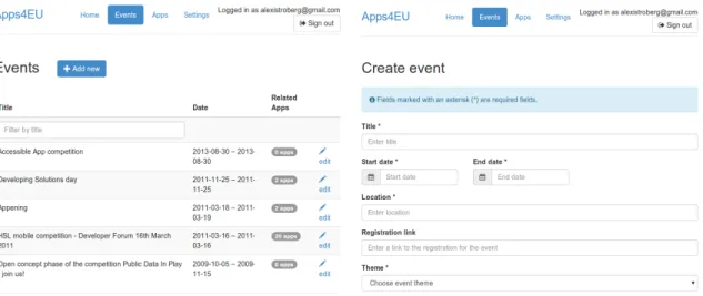
ers to manager their events and the related applica-tions. It is provided as software as a service and will be hosted and managed by Apps for Europe. Event or-ganizers will register to the service and after this they have access to all the features of the admin interface. Two screen shots of the service is presented in Figure 7 .
The admin interface is implemented in HTML, CSS and JavaScript. Bootstrap39was used as a CSS
frame-work. It simplifies the development of responsive web-sites and also provides clean aesthetics for the website.
AngularJS40was used as a JavaScript framework.
Embeddable script The last component of the puzzle
is the embeddable script, that is responsible of display-ing the event and application information in human readable form on the event organizer’s website. The event organizer will get the embed code from the ad-min interface, which he will then insert into the HTML code of his website. The embed code is just a refer-ence to an external JavaScript file that will be loaded from the Apps for Europe server and then executed in the browser. A detailed description of how the script works is given below:
1. The event organizer will embed the code on his own web page.
2. On page load, the <script>-tag is parsed by the browser and the actual script is loaded from the Apps for Europe -server.
3. The script is executed.
(a). The script will fetch the event or application infor-mation using an AJAX-request.
(b). After the server has responded with the event/ap-plication information, the information is displayed on the page in human readable form by modifying the DOM of the page. Furthermore, the same information is presented also in computer readable format by em-bedding RDFa in the DOM.
5.3.2. Creating the Knowledge-base for Past Events The final task was to create the knowledge base for past events by using the Apps for Europe RDF vo-cabulary and generating data to feed the endpoint at http://apps4europe.eurecom.fr/sparql
39http://getbootstrap.com/ 40https://angularjs.org/
. The list of events was extracted from the Apps for Europe Google spreadsheet41.
The goal was to populate the events and applica-tions, so that they would follow and fulfill the Apps for Europe vocabulary as well as possible. However, the format and information provided on the event web pages varied, and therefore we were usually only able to populate the following information for most of the events:
– Title
– Dates (start and end date) – Description (free text)
– Prizes (if the event included an application con-test)
– Jury members (if the event included an
applica-tion contest)
– Location (usually only country was known)
Similarly, the information provided for applications varied even more, and sometimes we were able only to populate the title, description and the homepage of the application. Because of these problems, the data populated into the triple store doesn’t include all the information we would have hoped to have.
The original idea was to automate the triple store data population as far as possible using content scrap-ing , but because of the heterogeneity of the web pages (in terms of structure and data) a semi-automated ap-proach was used. Especially the problems listed below prevented a fully automatic approach from being im-plemented:
– because of the heterogeneity in the structure of
the web pages, it is for example extremely hard to “automatically” know which part of the page con-tains the event location or application homepage link
– many links to the event pages were broken, and
thus manual work was required in order to relo-cate the actual page
In order to be as efficient as possible in the data pop-ulation the semi-automatic approach was used. Here, the key idea was to populate event pages having only a few application entries (less than 10) manually us-ing the JavaScript plugin, and for the rest of the event pages web scraping was used to populate the applica-tion entries (the scraping script had to be configured
41https://docs.google.com/spreadsheet/ccc?
key=0AiXRLGASq8I0dDlfZURkWGpSODBJaWotQUp3eGNwNGc&usp= sharing
Fig. 7. Screenshots of the admin interface. On the left is the event listing page and on the right is the form for creating an event.
for each event website separately). More details of the script can be found in Appendix A.
The goal was to populate all the past events (112 in total). However, many of the websites for the past events had already disappeared or didn’t include enough information for data population. Furthermore, the data population process turned out to take much more time than anticipated, and therefore we managed to populate only 28 events and in total 889 application entries. The average number of application entries per event was 34 and the median 22.
Visualizations and applications could be built on top of the knowledge base, but because of the small size of the current knowledge base, it is difficult to extract quantitative data from the knowledge base. Some ideas for visualizations are presented below:
– Map visualization of where past events have been
organized
– Most popular categories/themes for applications – Gallery of application screenshots (visual
inspira-tion for developers).
The dataset is available below in different formats as dump for download in RDF/Turtle and MongoDB:
– RDF in turtle format:
https://www.dropbox.com/s/3075qsblxzau2fk/ rdfInTurtleFormat.tar.gz
– MongoDB dump: https://www.dropbox.
com/s/m2sr4na12v3yk07/apps4europe. tar.gz
5.4. Discussion
The embeddable script is non-optimal in the sense that the event or application information is loaded only after the actual page (where the script is embedded) has loaded. This causes some additional delay before the page is fully rendered, but the problem can be alle-viated by showing loading indicators.
CSS styling for the events and applications is pro-vided using Bootstrap. All CSS rules have been made specific to the container div-element of the plugin, in order to prevent the CSS from conflicting with the CSS of the page. In the future, another solution called shadow DOM could be used to prevent conflicts be-tween different components of the page, but at the
mo-ment the browser support for shadow DOM42 is not
satisfactory. Since the event and application informa-tion is directly embedded on the page using DOM, the event organizer can add his own CSS styling to the plu-gin by overriding the provided CSS rules.
The RDF information about events and applications is populated only if event organizers actually use it on their websites, and therefore it is crucial to ensure that the plugin is appealing in the eyes of the event organiz-ers. It would be especially useful to study the usability of the plugin and also discuss with the event organiz-ers how well the Apps for Europe ontology fits with their data model. In addition to this, also the security of the JavaScript-plugin should be improved, although the information entered to the plugin is not very critical from a security perspective.
6. Conclusion
In this paper, we have described different tools used for visualizing data, with a classification based on the type of data: structured and graph data. We have also discussed different types of applications currently built on top of government open data initiatives. After sur-veying the state of the catalogs of applications, we have proposed a vocabulary (DVIA) to enable the com-mon annotation for applications to be interoperable on the Web. A generic JavaScript plugin have been pro-posed for enabling the generation of RDF data on web-sites for applications contests in Open Data events.
Acknowledgments
This work has been partially supported by the French National Research Agency (ANR) within the Datalift Project, under grant number ANR-10-CORD-009.
Appendix A
The system consists of three components, each hav-ing their own code repository:
– Admin-interface: This is the interface that event organizers use to create new events and to get the embed code for embedding the event on their own
website. It is available at https://github.
com/EurecomApps4Eu/admin-interface.
– interface: This interface provides a
REST-ful service for events and applications, available
athttps://github.com/EurecomApps4Eu/
rest-interface
– Embeddable script athttps://github.com/
EurecomApps4Eu/event-website. This repository contains the code that is embedded on the event organizer’s own website. It will fetch the event and application information from the REST-interface, and then display the information directly on the event organizers webpage. The three different components can be installed on different computers, if needed. REST-interface re-quires Node.js and MongoDB to be installed, whereas Admin-interface and Event-website produces static files (when running the build task) that can be hosted on any web server that is capable of serving static files.
Algorithm 1 Installing and configuring the
REST-interface
1. Clone the repository
2. Install dependencies by running the command “npm install”
3. Configure the system by editing "config.js"-file 4. Start the service by running "node app.js PORT", and replace PORT
with the port you want to run the application in (typically port 80 for HTTP)
Algorithm 2 Installing and configuring the
Admin-interface
1. Clone the repository
2. Install Node dependencies by running the command "npm install"
3. Install Bower dependencies by running the com-mand "bower install"
(if bower is not installed run "npm install bower -g") 4. Configure the system by editing file "app/script-s/app.js". Look for appSettings-part in the file. 5. Build the system with command "grunt build" (if grunt is not installed, run "npm install grunt -g"). This will produce static HTML/CSS/JS-files that can be hosted on any web server.
Algorithm 3 Installing and configuring the
Event-website
1. Clone the repository
2. Install Node dependencies by running the command "npm install"
3. Install Bower dependencies by running the com-mand "bower install"
(if bower is not installed run "npm install bower -g") 4. Configure the system by editing file "config.js" 5. Build static HTML/CSS/JS-files by running "grunt all"
References
[1] G. Atemezing and R. Troncy. Tools for visualization (v.1.2). Deliverables - D.6.2 of DataLift project, 2012.
[2] G. Atemezing and R. Troncy. Usage scenarii for applications (v.1.1). Deliverables- D.6.1 of DataLift project, 2012. [3] Tim Berners-lee, Yuhsin Chen, Lydia Chilton, Dan Connolly,
Ruth Dhanaraj, James Hollenbach, Adam Lerer, and David Sheets. Tabulator: Exploring and analyzing linked data on the semantic web. InIn Proceedings of the 3rd International Se-mantic Web User Interaction Workshop, 2006.
[4] Mike Bostock. Data-driven documents, 2012. http:// d3js.org/.
[5] Josep Maria Brunetti, Sören Auer, Roberto García, Jakub Klímek, and Martin Neˇcaský. Formal linked data visualiza-tion model. InProceedings of International Conference on Information Integration and Web-based Applications & Services, IIWAS ’13, pages 309:309–309:318, New York, NY, USA, 2013. ACM.
[6] Stuart K. Card, Jock D. Mackinlay, and Ben Shneiderman, ed-itors. Readings in information visualization: using vision to think. Morgan Kaufmann Publishers Inc., San Francisco, CA, USA, 1999.
[7] Ed H. Chi. A taxonomy of visualization techniques using the data state reference model. InProceedings of the IEEE Sympo-sium on Information Vizualization 2000, INFOVIS ’00, pages 69–, Washington, DC, USA, 2000. IEEE Computer Society. [8] Pieter Colpert, Anastasia Dimou, Ghislain Auguste
Atemez-ing, and Raphaël Troncy. Technical toolset for open data com-petitions apps for europe. Technical report, Ghent University, EURECOM, 2014.
[9] Tetherless Constellation. How to use google visualization api. Wiki notes, 2012. http://data-gov.tw.rpi.edu/ wiki/How_to_use_Google_Visualization_API. [10] Aba-Sah Dadzie and Matthew Rowe. Approaches to
visualis-ing linked data: A survey.Semantic Web, 2(2):89–124, 2011. [11] Aba-Sah Dadzie and Matthew Rowe. Approaches to
visualis-ing linked data: A survey.Semantic Web Journal, 2(2):89–124, 2011.
[12] Alexander de Leon, Filip Wisniewki, Boris Villazón-Terrazas, and Oscar Corcho. Map4rdf - Faceted Browser for Geospa-tial Datasets. InUsing Open Data: policy modeling, citizen empowerment, data journalism (PMOD’12), 2012.
[13] Lars Grammel and Margaret-Anne Storey. Choosel â ˘A ¸S web-based visualization construction and coordination for informa-tion visualizainforma-tion novices. Poster: IEEE Informainforma-tion Visual-ization Conference, 2010.
[14] Alvaro Graves. Creation of visualizations based on linked data. InProceedings of the 3rd International Conference on Web Intelligence, Mining and Semantics, WIMS ’13, pages 41:1– 41:12, New York, NY, USA, 2013. ACM.
[15] Marti Hearst, Ame Elliott, Jennifer English, Rashmi Sinha, Kirsten Swearinged, and Ka-Ping Yee. Finding the flow in web site search, 2002.
[16] Marti A. Hearst. Search User Interfaces. Cambridge Univer-sity Press, New York, NY, USA, 1st edition, 2009.
[17] J. Klimek, J. Helmich, and M. Neasky. Application of the Linked Data Visualization Model on Real World Data from the Czech LOD Cloud. In6thInternational Workshop on the Linked Data on the Web (LDOW’14), 2014.
[18] Jakub Klímek, Jirí Helmich, and Martin Necaský. Payola: Col-laborative linked data analysis and visualization framework. In The Semantic Web: ESWC 2013 Satellite Events - ESWC 2013 Satellite Events, Montpellier, France, May 26-30, 2013, Re-vised Selected Papers, pages 147–151, 2013.
[19] Fadi Maali and John Erickson (eds). Data catalog vocabulary (dcat). W3C Recommendation, 2014. http://www.w3. org/TR/vocab-dcat/.
[20] Danh Le Phuoc, Axel Polleres, Christian Morbidoni, Manfred Hauswirth, and Giovanni Tummarello. Rapid semantic web mashup development through semantic web pipes. In18th In-ternational World Wide Web Conference (WWW’09), Madrid, Spain, 2009.
[21] Emmanuel Pietriga. Isaviz: A visual authoring tool for rdf, 2004.http://www.w3.org/2001/11/IsaViz/. [22] IBM Research. Many eyes, 2010.http://www-958.ibm.
com/software/data/cognos/manyeyes/.
[23] Dave Reynolds, Jeni Tennison, Leigh Dodds, and et. al. Linked data api, 2012.https://code.google.com/p/ linked-data-api/.
[24] Percy E Salas, Michael Martin, Fernando Maia Da Mota, Karin Breitman, Sören Auer, and Marco A Casanova. Publishing sta-tistical data on the web. InProceedings of 6th International IEEE Conference on Semantic Computing, IEEE 2012. IEEE, 2012.
[25] G. Martin Skjaeveland. Sgvizler: A javascript wrapper for easy visualization of sparql result sets. In9thExtended Semantic Web Conference (ESWC’12), 2012.
[26] Claus Stadler, Michael Martin, and Sören Auer. Exploring the Web of Spatial Data with Facete. InCompanion proceedings of 23rd International World Wide Web Conference (WWW), pages 175–178, 2014.