THE SWALLOW-TAIL PLOT: A SIMPLE GRAPH FOR
VISUALIZING BIVARIATE DATA.
Maria Adele Milioli
Dipartimento di Economia, Universit`a di Parma, Parma, Italia Sergio Zani
Dipartimento di Economia, Universit`a di Parma, Parma, Italia.
1. Introduction
The scatterplot is the most popular tool for visualizing bivariate quantitative data. The addition of graphical information has been suggested to make this graph more powerful (see e.g. Cleveland and McGill, 1984). A bivariate boxplot displayed in a scatterplot enables to visualize the shape, the correlation and the outliers of the distribution (Zaniet al., 1998; Rousseeuwet al., 1999).
Rodgers and Nicewander (1988) showed 13 formulas for the correlation coefficient, each of which represents a different computational and conceptual definition of this index.
In particular, for centered variables the correlation coefficient is the cosine of the angle between the two vectors and this relation suggests alternative ways to vi-sualize bivariate data (Trosset, 2005). Recently Graffelman (2013) has proposed graphs, called linear-angular correlation plots, for revealing correlation structure. In this paper we introduce a new graph based on the angular representation of the two standardized vectors. This plot shows in a simple way the sign and the value of correlation of the two variables, the relationship between the minimum (maximum) of a variable and the minimum (maximum) of the other variable and eventually the corresponding relationship between the 25-th(75-th) percentiles. If the minimum (maximum) of the two variables correspond to different units, the edge of the plot presents a shape that looks like a swallow-tail and this explains the suggested name. The swallow-tail plot displays information about both variables and cases.
This graphical depiction is especially suitable for small data sets (Hand et al., 1994) and for teaching purpose.
In Section 2 we describe the construction of the graph for bivariate data, using a set of social and economic indicators of the 27 Member States of the EU (Euro-pean Union).
The inverse function is given by:
α=arcos(r) (2)
Graffelman (2013) points out that it is hard to estimate the correlation with rea-sonable precision by eye from the angle between two vectors due to the nonlinearity of the cosine function with respect to the angle. He suggests to use the linearized cosine function given by:
r=−2 πα
′+ 1 (0< α′ ≤π) (3)
r= +2 πα
′−3 (π < α′≤2π)
whereα′ is the angle between the vectors after the suggested transformation. The corresponding inverse functions of these relations are given by:
α′= π
2(1−r) (4)
α′= π 2(3 +r)
Table 1 shows the values ofαandα′ corresponding to different values ofr(Figure 2 in Graffelman (2013) visualizes these relations). For both relations in (2) and (4), an angle ofπ/2 radians (90◦) represents uncorrelated variables, an angle of 0 orπradians (0◦ or 180◦) corresponds to perfect correlation (r= +1 orr= -1). We introduce our graphical method by means of an example, using a data set of 4 economic indicators for the 27 countries of EU with reference to the year 2011 (Eurostat, 2013):
• Percentage of the total population at-risk-of poverty (POVERTY)
• Employment rate, age group 15-64, in % of the total population (EMPLOY-MENT)
TABLE 1
Relation of the correlation coefficientrto the angleαgiven by formula (2) and to the angleα′ given by formula (4)
α α′
r radians degrees radians degrees
0.95 0.317 18.19 0.079 4.5
0.9 0.451 25.84 0.157 9
0.8 0.644 36.87 0.314 18
0.7 0.798 45.57 0.471 27
0.6 0.927 53.13 0.628 36
0.5 1.047 60 0.785 45
0.4 1.159 66.42 0.942 54
0.3 1.266 72.54 1.099 63
0.2 1.369 78.46 1.257 72
0.1 1.471 84.26 1.414 81
0 1.571 90 1.571 90
-0.1 1.671 95.74 1.728 99
-0.2 0.184 101.54 1.886 108
-0.3 1.876 107.46 2.042 117
-0.4 1.982 113.58 2.199 126
-0.5 2.094 120 2.356 135
-0.6 2.214 126.87 2.513 144
-0.7 2.346 134.43 2.670 153
-0.8 2.498 143.13 2.827 162
-0.9 2.691 154.16 2.985 171
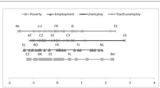
Figure 1 – Display on a line of the standardized values of each variable
TABLE 2
Correlation matrix of the four variables
Poverty Employment Unemploy Youthunem
Poverty 1 -0.623 0.379 0.506
Employment -0.623 1 -0.556 -0.679
Unemploy 0.379 -0.556 1 0.915
Youthunem 0.506 -0.679 0.915 1
The standardized values (mean = 0 and standard deviation =1) of each variable are visualized in Figure 1: an acronym of the names of the States corresponding to the minimum, the 25-thpercentile, the median, the 75-thpercentile, the maximum are highlighted. The correlation matrix is presented in Table 2.
In order to visualize a pair of variables, a simple criterion is to display the two corresponding lines in Figure 1 with an angle αcomputed by (1) or α′ given by (3). We chooseα′ for the reasons suggested by Graffelman (2013) and especially because with this transformationr = 0.5 entailsα′ = 45◦.
We connect by means of a segment the point of the unit presenting the minimum (maximum) on a line with its point on the other line. If the two min (max) correspond to different units, there are two segments for the min (max) and the graph shows a shape similar to a swallow-tail; if the two min (max) are in the same unit there is only a segment.
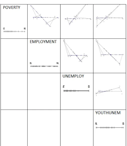
In Figure 2 we present the suggested plot for the pairs of variables:
• POVERTY and EMPLOYMENT (r = -0.623)
• POVERTY and UNEMPLOY (r= +0.379)
The plots were obtained using the open source software GEOGEBRA. It is a multi-platform dynamic mathematics software for all levels of education that joins geom-etry, algebra, tables, graphing, statistics and calculus in one easy-to-use package (www.geogebra.org).
The three graphs correspond to typical situations: fair negative correlation, weak positive correlation, strong positive correlation. The angle of the two axes shows at a glance the relationship between the two variables.
Furthermore the shape and the length of the tails visualize the behavior of the minimum and the maximum of each variable. For the two first pairs of variables the swallow-tail appearance is clear, both for the min and the max: the unit cor-responding to a min (max) for a variable is not the same for the other variable. Therefore the unit with the min (max) may be an univariate outlier (when its tail is very long), but not a bivariate outlier.
For the third pair of variables the two max occur for the same country (ES i.e. Spain): this side of the plot looks like a duck-tail and the unit needs further investigation in order to discover whether it is a bivariate outlier.
The swallow-tail plot could be not attractive when the unit corresponding to the min (max) of a variable presents a positive (negative) standardized value for the other variable: in this case the graph doesn’t show a shape similar to swallow-tail or duck-tail.
In the suggested plot also the points of the unit corresponding to the 25-th (75-th) percentile of a variable may be linked by a segment to the point of the same unit on the other axes, but this extension is useful only in a few situations and when the figure is large enough.
The suggested plot differs from the oblique coordinates, where a unit corresponds to single point (not to two points on the two axes as in the swallow-tail plot): thex-coordinate of a point is the abscissa of its projection onto thex-axis in the direction of they-axis and the y-coordinate is similarly determined. This type of coordinates is usede.g. in factor rotation in factor analysis.
3. The swallow-tail plot matrix
The traditional tool for displaying more than two quantitative variables is the scatterplot matrix that may help to reveal structure in multivariate data. Friendly (2002) has suggested new graphical techniques, called “corrgrams”, for visualizing directly the pattern of relations among variables in correlation matrices. Recently Emersonet al.(2013) have presented a more flexible display for a mixture of quantitative and categorical variables, called “generalized pairs plot”.
We suggest to extend the use of the swallow-tail plot for visualizingkquantitative variables (k >2) in a similar way to the scatterplot matrix.
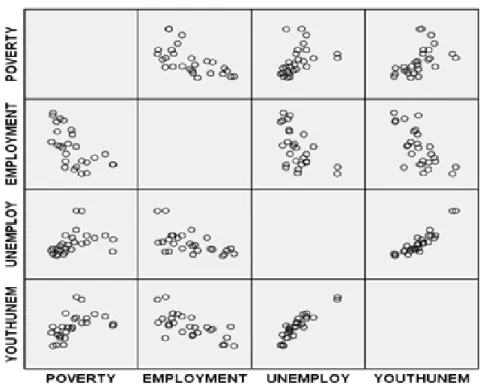
Figure 4 – Scatterplot matrix of the four variables
In Figure 3 the swallow-tail plot matrix for the four indicators mentioned in sec-tion 2 is presented. The sign (positive or negative) and the magnitude of the correlation for each pair of variables may be detected at a glance by means of the orientation of the two axes and this is an advantage with respect to the classical scatterplot matrix (Figure 4). Furthermore the shape of the left tail and right tail in each panel of the swallow-tail matrix points out the potential univariate or bivariate outliers.
4. Final remarks
Furthermore the two edges of the graph, i.e. the segments connecting the points on the two axes of the unit corresponding to the minimum (maximum) of a vari-able, show the characteristics of the extreme values and are useful in the detection of univariate or bivariate outliers. At a glance the swallow-tail plot offers useful information about the variables and the units and may be added to the classical graphs for bivariate data.
REFERENCES
W. S. Cleveland, R. I. McGill (1984). The many faces of a scatterplot. Journal of the American Statistical Association, 79, no. 388, pp. 807–822.
J. W. Emerson, W. A. Green, B. Schloerke (2013). The generalized pairs plot. Journal of Computational and Graphical Statistics, 22, no. 1, pp. 79–91.
Eurostat (2013). Europe in figures - Eurostat yearbook. Eurostat. URL http://ec.europa.eu/eurostat.
M. Friendly (2002). Corrgrams: Exploratory displays for correlation matrices. The American Statistician, 56, no. 4, pp. 316–324.
J. Graffelman(2013). Linear-angle correlation plots: New graph for revealing correlation structure. Journal of Computational and Graphical Statistics, 22, no. 1, pp. 92–106.
D. J. Hand,K. McConway,E. Ostrowski(1994).A Handbook of Small Data Sets. Chapmann and Hall, New York.
A. Inselberg(2009). Parallel Coordinates: Visual Multidimensional Geometry and its Applications. Springer-Verlag, New York.
J. L. Rodgers,W. A. Nicewander(1988). Thirteen ways to look at the corre-lation coefficient. The American Statistician, 44, no. 2, pp. 59–66.
P. J. Rousseeuw, I. Ruts, J. W. Tukey (1999). The bagplot: A bivariate boxplot. The American Statistician, 53, no. 4, pp. 382–387.
M. W. Trosset(2005). Visualizing correlation. Journal of Computational and Graphical Statistics, 14, no. 1, pp. 1–19.