The
Excel 2007
Data & Statistics
Cookbook
A Point-and-Click! Guide
Larry A. Pace
The Excel 2007 Data & Statistics Cookbook: A Point-and-Click! Guide ISBN 978-0-9799775-1-0
Published in the United States of America by TwoPaces LLC
102 San Mateo Dr. Anderson SC 29625 Copyright © 2007 Larry A. Pace
Camera-ready text produced by the author.
All rights reserved. No part of this document may be photocopied, reproduced by any means, or translated into another language without the prior written consent of the author.
MICROSOFT®
is a registered trademark, and EXCEL®
is a trademark of the Microsoft Corporation.
Brief Contents
Preface and Acknowledgements vii
About the Author ix
1 A Crash Course in Excel 1
2 Data Structures and Descriptive Statistics 7
3 Charts, Graphs, and Tables 25
4 One-Sample t Test 43
5 Independent-Samples t Test 47
6 Paired-Samples t Test 49
7 One-Way Between-Groups ANOVA 53
8 Repeated-Measures ANOVA 57
9 Correlation and Regression 61
10 Chi-Square Tests 65
11 Appendix 71
Contents
Preface and Acknowledgements vii
About the Author ix
1 A Crash Course in Excel 1
The Workbook Interface 1
What Goes into a Worksheet 1
Entering Information 3
2 Data Structures and Descriptive Statistics 7
Data Tables 7
Built-In Functions 7
Summary Statistics Available From the AutoSum Tool 10
Data Table Summary Statistics 10
Additional Statistical Functions 13
The Analysis ToolPak 14
Example Data 15
Descriptive Statistics in the Analysis ToolPak 18
Frequency Distributions 20
3 Charts, Graphs, and Tables 25
Pie Charts 25
Bar Charts 26
Histograms 27 Line Graphs 29
Scatterplots 30
Pivot Tables and Charts 33
Using the Pivot Table to Summarize Quantitative Data 37
The Charts Excel Does Not Do 41
5 Independent-Samples t Test 47
Example Data 47
The Independent-Samples t Test in the Analysis ToolPak 48
6 Paired-Samples t Test 49
Example Data 49
Dependent t Test in the Analysis ToolPak 50
7 One-Way Between-Groups ANOVA 53
Example Data 53
One-Way ANOVA in the Analysis ToolPak 54
8 Repeated-Measures ANOVA 57
Example Data 57
Within-Subjects ANOVA in the Analysis ToolPak 58
9 Correlation and Regression 61
Example Data 61
Regression Analysis in the Analysis ToolPak 62
10 Chi-Square Tests 65
Chi-Square Goodness-of-Fit Test with Equal Frequencies 65
Chi-Square Goodness-of-Fit Test with Unequal Expected Frequencies 67
Chi-Square Test of Independence 68
11 Appendix 71
Preface and Acknowledgements
The predecessor to this book was well received, and considering the feedback from instructors and students, I have expanded the coverage of the data management features of Excel in this update, as these are quite powerful and flexible. This book makes use of Excel 2007 for Microsoft Windows. All the functionality described in this book is also available in Excel 2003, and most of it is available in earlier versions as well. However, as you have already found or will soon find, the screens look very much different in the newest version of Excel. If you are using Excel 2003 or an earlier version, you may find my Excel Statistics Cookbook (2006) more to your liking.
Students, instructors, and researchers wanting to perform data management and basic descriptive and inferential statistical analyses using Excel will find this book helpful. My goal was to produce a succinct guide to conducting the most common basic statistical procedures using Excel as a computational aid. For each procedure, I provide an example problem with data, and then show how to perform the procedure in Excel. I display the output and explain how to interpret it.
This cookbook shows you how to use Microsoft Excel for data management, basic descriptive and inferential statistics, charts and graphs, one-sample t tests, independent samples t tests, dependent t tests, one-way between groups ANOVA, repeated measures ANOVA, correlation and regression, and chi-square tests. I include an appendix that provides a quick reference to some of the most frequently-used statistical functions in Excel.
Interactive Excel templates for performing most of the statistical tests described in this book can be found at the author’s web site. Most of the datasets used in this book and other resources are available as well:
http://twopaces.com
This cookbook makes no use of macros or third-party add-ins, instead relying on Excel’s built-in statistical functions, simple formulas, and the Analysis ToolPak distributed with Excel. I would like to say from the outset that Excel is best suited for preliminary data handling and exploration and only the most basic statistical analyses. More complicated analyses should be performed with dedicated statistical packages such as SPSS, SAS, or MINITAB.
About the Author
Larry A. Pace, Ph.D., is an award-winning professor and statistics education innovator. He is a professor of psychology at Anderson University in Anderson, SC, where he teaches courses in statistics, research methods, psychology, management, and business statistics. Previously, he was an instructional development consultant for social sciences at Furman University, where he provided support to faculty in teaching and engaged learning, research design and statistics, and technology in education. He was also a visiting lecturer in psychology at Clemson University, where he taught courses and labs in psychology, research methods, and statistics. He is the co-owner of TwoPaces LLC, a firm providing statistical consulting and publishing services. Dr. Pace has authored or coauthored eleven books, more than 80 published articles, chapters, and reviews, and hundreds of online articles, reviews, and tutorials.
Dr. Pace earned the Ph.D. from the University of Georgia. He has taught at Anderson University, Clemson University, Austin Peay State University, Capella University, Louisiana Tech University, LSU-Shreveport, the University of Tennessee, Rochester Institute of Technology, Cornell University, Rensselaer Polytechnic Institute, and the University of Georgia. Dr. Pace has also lectured at the University of Jyväskylä in Finland.
In addition to his academic career, Dr. Pace was employed by Xerox Corporation for nine years and a private consulting firm for three years. He has been an internal and external consultant, facilitator, trainer, academic administrator, and business owner. His consulting clients have included International Paper, Libbey Glass, Compaq Computer Corporation, GE, AT&T, Lucent Technologies, Xerox, and the US Navy.
A resident of Anderson, South Carolina, Dr. Pace shares his home with his wife and business partner Shirley Pace, three spoiled cats, one dog, and a college student. When he is not busy teaching, consulting, conducting research, or writing, he enjoys figuring out things on the computer, reading, tending a small vegetable garden, hosting family gatherings, and cooking on the grill.
1
A Crash Course in Excel
The Workbook Interface
Microsoft Excel is a spreadsheet program. Even if you have never used a spreadsheet program, you will find Excel fairly straightforward. In my own personal experience, learning a spreadsheet program is somewhat harder than learning a word processing program like Microsoft Word or a presentation program like Microsoft PowerPoint, but is easier than learning a dedicated statistics package such as SPSS or a relational database program like Microsoft Access. It is certainly easier than learning a scripting or programming language. If you are already familiar with Excel 2007, you may safely skim or even skip this beginning chapter. But if you are not, don’t worry, because I will provide you with everything you need to know to get started using Excel for basic statistics.
The best way to learn Excel is to launch the program and then enter some information into the worksheet. F1 is the universal Windows help key, and you should learn to use it constantly. There are a number of excellent web-based and printed Excel tutorials, and I suggest you look there if you are unfamiliar with a spreadsheet program. This book will work best for you if you launch your Excel program and follow along with the examples. Interactive worksheets, workbooks containing the Excel files for most of the examples in this book, and other resources can be found at the companion web site located at the following URL:
http://twopaces.com/cookbook.html
If you have previously used dedicated statistics programs like SPSS or Minitab, you will recognize the data views of SPSS and Minitab as spreadsheets. However, you might be interested to learn that the Excel interface combines the data view, the variable view, and the output viewer into a single “unified” problem space.
What Goes into a Worksheet
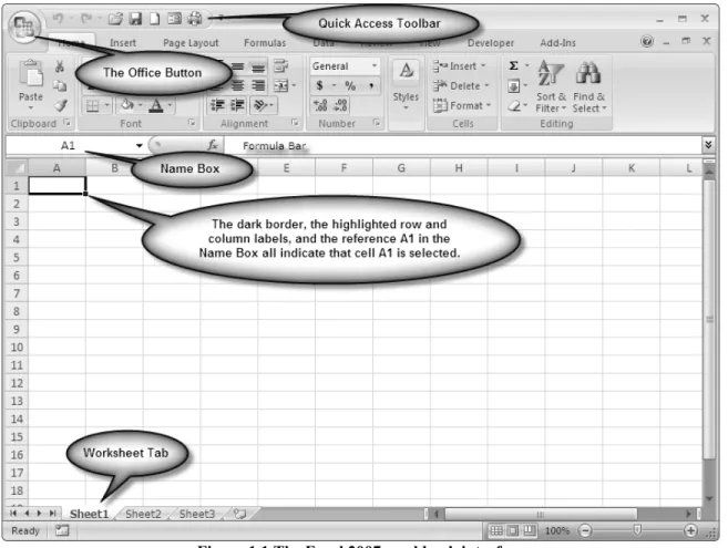
An Excel workbook file can have multiple plies or worksheets. One can navigate through these separate worksheets by clicking on the tabs at the bottom of the workbook. Throughout this book I refer to the workbook interface shown in Figure 1.1. If you have
The functionality you are used to is still there, although occasionally in unexpected places.
Figure 1.1 The Excel 2007 workbook interface
Spreadsheets consist of rows and columns. The intersection of a row and a column is called a cell. By convention we refer to the column number first and the row number second. A cell in a worksheet can contain any combination of the following kinds of information:
• numbers
• text
• formulas
• built-in functions
• pointers to other cells
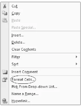
If you are entering text or numbers, you can just type those directly into the cell or the Formula Bar. If you are entering a formula, function, or pointer, you signal to Excel that you are not entering text or a number by preceding your entry with an equal sign (=). You can format the contents of cells by changing fonts, colors, borders, and other features. Right click on the cell or range to see the context-sensitive menu (see Figure 1.2) and then select FormatCells.
Entering Information 3
Figure 1.2 Context-sensitive menu
It is also possible to embellish a worksheet by adding elements that are not attached to any specific cell. These include charts and graphs, clip art or other graphics, text boxes, drawings, word art, equations, and many other kinds of objects.
Entering Information
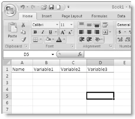
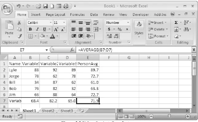
You can enter information into a cell of a worksheet in two different ways. You have already seen one of these: just type information directly into the cells of the worksheet or select the cell and then type into the Formula Bar. As an alternative, you can also use Excel’s default data form. Assume that you have the following information and want to enter it into your worksheet (see Table 1.1)
Table 1.1 Example data
Name Variable1 Variable2 Variable3
Lyle 88 92 89
Jorge 78 62 78
Bill 34 87 62
Bob 76 82 32
Jim 66 88 64
As previously discussed, to enter information into a cell, you can simply point to the cell with the mouse or the arrow keys and click to select the cell. Begin typing and
Figure 1.3 Worksheet prepared for data entry
If you want to use a default data form for data entry rather than typing entries directly into worksheet cells or the Formula Bar, you can add the Form command to the Quick Access Menu. To do so, click on the Office Button (see Figure 1.4), and then click on Excel Options. In the resulting dialog box, click on Customize, and then use the dropdown menu to select Commands Not in the Ribbon. Scroll to Form and then click on Add (see Figure 1.5). Now the data form appears in the Quick Access Toolbar (see Figure 1.6).
Entering Information 5
Figure 1.5 Adding the Data Form icon to the Quick Access Toolbar
Figure 1.6 Data Form icon
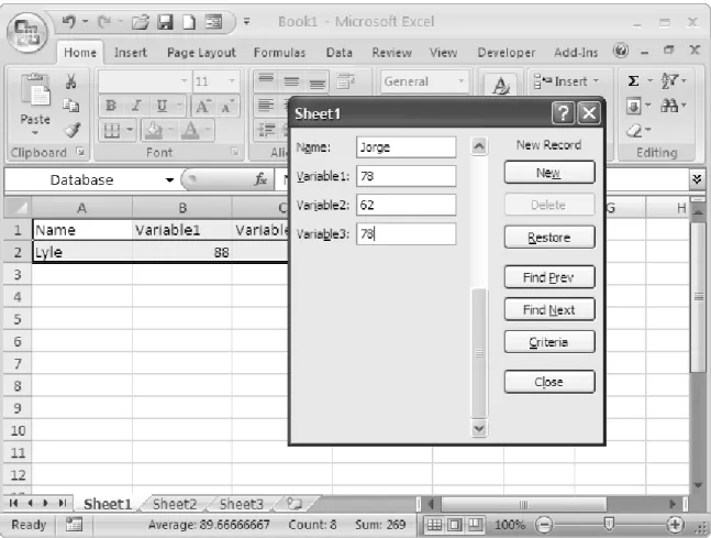
Now enter at least one data value in the appropriate column, select the entire range including the variable labels and the row with the data entered, and click on the Data Form icon. The default data form now appears, and you can enter data by typing into the form. See Figure 1.7. This form gives you the option of searching for and editing data entries as well as adding and deleting entries.
2
Data Structures and
Descriptive Statistics
Data Tables
As I discussed in Chapter 1, it is good practice to enter a row of column headings that provide labels for the fields (variables) in your worksheet, usually in the first row of the worksheet. Look at the column headings in Figure 1.3. These labels provide information about the data entered in the worksheet. You should keep the labels relatively short and use only letters and numbers in your data labels. The labels should begin with a letter, and should not contain any spaces or any special characters with the exception of underscores or periods. Some programs like Minitab, SPSS, and Access are able to import the row of column headings as variable names.
With Excel 2003 Microsoft introduced a very useful feature called Data List that made it easier to work with structured data for the purpose of sorting, filtering, and summarizing variables. This feature is now resident in the Table menu of Excel 2007. The Table menu also provides access to a powerful tool called the pivot table, which will be discussed in the next chapter.
Built-In Functions
Excel provides many built-in functions and tools for data management and statistical analysis. Let us begin our exploration with a very useful tool called AutoSum. Return to the data from Chapter 1. Add a column for the individual averages and a row for the variable averages (see Figure 2.1). Select the entire range of data and the empty row and column adjacent to the data.
Figure 2.1 Preparation for the AutoSum feature
Select the dropdown arrow beside the AutoSum icon (the Greek sigma) in the Standard Toolbar. Select Average and all the averages will be calculated at the same time (see Figure 2.2). I formatted the averages to a single decimal place. You can do this by selecting a cell or a range of cells and then clicking the right mouse button. Select
Format, Cells, Number and change the number of decimal places to whatever you like.
In general, the average should be reported with one more significant digit than the raw data.
Built-In Functions 9
Figure 2.2 Using the AutoSum feature
To view all the formulas in the cells of your worksheet, press the <Ctrl> key and the
accent grave (`). See Figure 2.3. Pressing <Ctrl> + ` again will return the worksheet to the normal view.
Summary Statistics Available From the AutoSum Tool
The AutoSum Tool does much more than just add or average numbers. It provides the following summary statistics for a selected range of cells. As illustrated above, to activate the AutoSum tool, select the range of cells with a blank cell, row, and/or column for the output. Click on the AutoSum icon (the Greek sigma) in the Standard Toolbar, and select the desired statistic:
• Sum
• Average
• Count
• Minimum
• Maximum
Data Table Summary Statistics
Through its Table feature, Excel 2007 provides access to various summary statistics for each variable. To create a table, select the desired range of data including the row of column headings and then click on Insert, Table (or Ctrl+T) as shown in Figure 2.4.
Data Table Summary Statistics 11 The completed table with default formatting is shown in Figure 2.5. Tables allow the user
easily to sort, filter, and format the data within a selected range of a worksheet. Various summary statistics are shown for the selected data in the Status Bar at the bottom of the workbook interface. The user is able to choose which statistics are displayed by right-clicking inside the Status Bar (see Figure 2.6).
Figure 2.5 Completed table with default formatting
It is also easy to add a Total Row to the table that can give access to these and other built-in functions for each variable built-in the table. To add a Total Row, click anywhere built-inside the table. A Table Tools menu with a Design tab will appear (see Figure 2.5). On the Design tab, select Total Row (see Figure 2.7).
2.6 Options available in the Status Bar
Any of these statistics can be chosen for a given variable. When the data are filtered, these summary statistics are updated to refer to only the selected values, making the table an excellent way to examine group differences.
Additional Statistical Functions 13
2.7 Total Row added to table
Additional Statistical Functions
Many additional statistical functions are available via the Insert Function command. Select Insert, Formulas, click on fx in the Formula Bar, or select MoreFunctions from the AutoSum menu. The Insert Function menu appears in Figure 2.8.
Figure 2.8 Insert Function menu
Figure 2.9 Partial list of statistical functions
The Analysis ToolPak
There are many Excel add-ins and macros available that provide increased statistical functionality. We will concern ourselves in this book with only one of these, the Analysis ToolPak provided by Microsoft with the Excel program. The Analysis ToolPak comes with Excel, but is not installed by default. To install the Analysis ToolPak, click the Microsoft Office Button, and then click Excel Options (See Figure 2.10). Click Add-ins, and then in the Manage box, select Excel Add-ins. Click Go. In the Add-Ins available box, select the Analysis ToolPak checkbox, and then click OK. If the Microsoft Office installation files were not saved on your computer’s hard drive, you will need access to these files on the original installation CD or on a server.
Example Data 15
Figure 2.10 Gaining access to Excel options
After you have installed the Analysis ToolPak, there will be a Data Analysis option available in the Data menu. See Figure 2.11.
Figure 2.11 Data Analysis option
Example Data
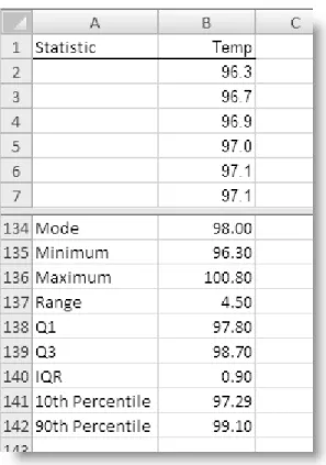
Table 2.1 Body temperature measurements for 130 adults 96.3 98.0 98.7 97.9 98.6 96.7 98.0 98.8 97.9 98.7 96.9 98.0 98.8 98.0 98.7 97.0 98.0 98.8 98.0 98.7 97.1 98.0 98.9 98.0 98.7 97.1 98.1 99.0 98.0 98.7 97.1 98.1 99.0 98.0 98.7 97.2 98.2 99.0 98.1 98.8 97.3 98.2 99.1 98.2 98.8 97.4 98.2 99.2 98.2 98.8 97.4 98.2 99.3 98.2 98.8 97.4 98.3 99.4 98.2 98.8 97.4 98.3 99.5 98.2 98.8 97.5 98.4 96.4 98.2 98.8 97.5 98.4 96.7 98.3 98.9 97.6 98.4 96.8 98.3 99.0 97.6 98.4 97.2 98.3 99.0 97.6 98.5 97.2 98.4 99.1 97.7 98.5 97.4 98.4 99.1 97.8 98.6 97.6 98.4 99.2 97.8 98.6 97.7 98.4 99.2 97.8 98.6 97.7 98.4 99.3 97.8 98.6 97.8 98.5 99.4 97.9 98.6 97.8 98.6 99.9 97.9 98.6 97.8 98.6 100.0 98.0 98.7 97.9 98.6 100.8 Body Temp
The entire dataset should be placed in a single column in an Excel worksheet with an appropriate heading as shown in Figure 2.12. To simplify matters, after selecting the range of all 130 measurements, I gave it the name Temp by typing the name into the Name Box. After naming a range, you can enter the name of the desired range in an Excel function or formula rather than typing in the range of cell references. It is also easy to select the entire range again by clicking on its name in the Name Box.
Example Data 17
Figure 2.14 Summary statistics (values)
Various descriptive statistics can be easily computed and displayed by the use of simple formulas combined with Excel’s built-in statistical functions (see Figures 2.13 and 2.14). It is very easy in Excel to determine and display the measures of central tendency (mean, mode, and median), the variance and standard deviation, the minimum and maximum values, the quartiles, percentiles, and other simple summary statistics in addition to those available in the AutoSum and Data Table features. A list of the most useful statistical functions in Excel appears in the Appendix. After determining the mean and standard deviation, one can also use the STANDARDIZE function in Excel to produce z scores for each value of X. Supply the actual values or the cell references for the raw data, and the STANDARDIZE function will calculate the z score for each observation.
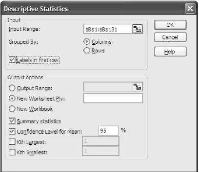
Descriptive Statistics in the Analysis ToolPak
The dialog box for the Descriptive Statistics tool is shown in Figure 2.15. To access this tool, select Data, DataAnalysis, DescriptiveStatistics. Select the desired range, or type in the name of the selected range. In this case, I used the name Temp, as discussed above. Because I used a heading in the first row and included that row in my selected input range, I checked the box in front of “Labels in first row.”
Descriptive Statistics in the Analysis ToolPak 19
Figure 2.15 Descriptive Statistics Tool dialog box
The summary output from the descriptive statistics tool appears in Table 2.2 (with a little cell formatting). One must check the box in front of Summary statistics for this tool to work. In this case, the summary output was sent to a new worksheet ply, and the table was simply copied (after some cell formatting). What Excel cryptically labels the “Confidence Level” is in actuality the error margin to be added to and subtracted from the sample mean for a confidence interval, in this case a 95% confidence interval for the population mean. The CONFIDENCE function in Excel makes use of the normal (z) distribution, while the confidence interval reported by the Descriptive Statistics tool makes use of the t distribution.
Table 2.2 Summary output from Descriptive Statistics tool
Temp Mean 98.25 Standard Error 0.06 Median 98.3 Mode 98 Standard Deviation 0.733 Sample Variance 0.538 Kurtosis 0.780 Skewness -0.004 Range 4.5 Minimum 96.3 Maximum 100.8 Sum 12772.4
Frequency Distributions
You can create both simple and grouped frequency distributions (also called frequency tables) in Excel using the FREQUENCY function or using the Analysis ToolPak’s Histogram Tool. I illustrate both approaches below.
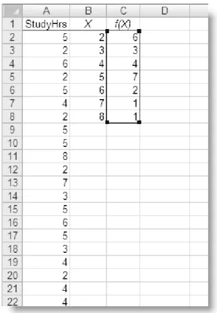
Assume that you asked 24 randomly-selected students at Paragon State University how many hours they study each week on average. You collect the following information:
Table 2.3 Study hours for 24 PSU students
5 5 3 2 8 4 6 2 2 2 7 4 5 3 4 4 5 3 2 6 2 5 5 5
As discussed in Chapter 1, the data should be entered in a single column in Excel, with an appropriate label (see Figure 2.16). The data are entered in Column A. In Column B, I placed the possible X values, which are known in Excel terminology as “bins.” In Column C Excel displays the frequency of each X value in the dataset. The frequency distribution in Column C was created via the use of the FREQUENCY function and an array formula. The array formula is revealed in Figure 2.17. To enter the array formula, one selects the entire range in which the frequency distribution will appear, clicks in the Formula Bar window, and then enters the formula, which points to the “data array” (cells A2:A25) and the “bins array” (cells B2:B8). Finally, you press <Ctrl> + <Shift> + <Enter> to place the results of the formula in the output range (see Figure 2.15). You cannot enter the array formula separately in each cell, or type the braces around the formula to make it work. It must be entered as described above.
Entering an array formula takes both practice and confidence, but it is well worth the effort, as this facility in Excel is very useful for such operations as matrix algebra, a subject we will touch on very lightly in the last chapter of this book.
Frequency Distributions 21
Figure 2.18. Using the Analysis ToolPak to produce a simple frequency distribution
It is possible to create a frequency distribution without the need for array formulas using the Analysis ToolPak’s Histogram tool. To create a frequency table using the Analysis ToolPak, select Data, Data Analysis, Histogram. Identify the input range and the bins range as before, and the tool will create a simple frequency distribution (see Figure 2.18). It is also possible easily to create grouped frequency distributions in Excel. If you omit the bin range in the Histogram tool’s dialog box, Excel will create bins (or class intervals) automatically. Or you may specify the bins manually by providing a column of the upper limits of the bins. In Table 2.4, I compare the grouped frequency distribution created by Excel (A) with a grouped frequency distribution with manually-created bins (B). The data are the body temperatures of 130 adults reported earlier in Table 2.1
Generally speaking, the results are more meaningful when the user supplies logical bins instead of allowing Excel to create its own class intervals. There is no exact science to determining the proper number of class intervals, but generally, there should be up to 10, and certainly no more than 20 intervals (or bins). One rule of thumb for determining the appropriate number of class intervals is to find the power to which 2 must be raised to equal or exceed the number of observations in the dataset. For these data, N = 130, so that 27 = 128 < 130 would probably be too few intervals, while 28 = 256 > 130 should be a sufficient number. Examination of Table 2.4 reveals that Excel often supplies class intervals with fractional widths (A), while the user-supplied bin ranges (B) would be perhaps a little more sensible.
Frequency Distributions 23
Table 2.4 Grouped frequency distributions in Excel
A: Bins Supplied by Excel B: Manual Bins
Bin Frequency Bin Frequency
96.300 1 96.0 0 96.709 3 96.6 2 97.118 6 97.2 11 97.527 11 97.8 22 97.936 19 98.4 43 98.345 29 99.0 38 98.755 30 99.6 11 99.164 20 100.2 2 99.573 8 100.8 1 99.982 1 More 0 100.391 1 More 1
3
Charts, Graphs, and Tables
Charts and graphs are easily constructed and modified in Excel, and can be displayed alongside the data for ease of visualization. The charts and graphs are dynamically linked to the data, and update automatically when the data are modified. In this chapter, you will cover pie charts, bar charts, histograms, line graphs, and scatterplots. You will also spend some time getting to know the Pivot Table tool in Excel.
Pie Charts
A pie chart divides a circle into relatively larger and smaller slices based on the relative frequencies or percentages of observations in different categories. The following data (see Table 3.1) were collected from 60 college students concerning the reasons they choose a fast food restaurant:
Table 3.1 Data for pie and bar charts
Food Taste 23 Habit 10 Food Quality 9 Convenience 8 Price 4 Food Variety 4
To construct a pie chart in Excel, select the data, including the labels, and then select the chart icon in the Standard Toolbar (or select Insert, Chart from the Menu Bar). From the Chart Wizard, select Pie as the chart type and accept the defaults to place the new chart as an object in the current worksheet. To add percentages or labels, you can right-click on the pie chart and select “Format Data Series.” See the finished pie chart in Figure 3.1:
Figure 3.1 Pie chart
Bar Charts
The same data will be used to produce a bar chart. Although Excel has a chart type labeled “bar,” it is horizontal in layout and should generally be avoided. To generate a bar chart in Excel, follow the steps above, but select “Column” as the chart type. You may ornament the bar chart by varying the colors of the bars. To do so, right-click on one of the bars and then select “Format Data Series.” Select the option “Vary colors by point” under the Options tab (see Figure 3.2).
Histograms 27
Figure 3.2 Bar chart
Histograms
A histogram resembles a bar chart, but with the gaps between the bars removed because the X axis represents a continuum or range. The study hours data used to produce a frequency distribution in Chapter 2 will be used to illustrate the histogram. Produce the bar chart using the “Column chart” tool, but select only the array of frequencies. Do not include the “bins” (the X values) in the adjacent column. These will be used as category labels for the X-axis. After selecting the frequencies as your source data, click on the Select Data icon and enter the cell references to the bins as your Category (X) axis labels (see Figure 3.3).
Figure 3.3 Adding X-axis category labels
Right-click on one of the bars and select “Format Data Series.” Change the gap size to zero under the Options tab. The completed histogram is displayed in Figure 3.4.
Line Graphs 29
Line Graphs
A frequency polygon is one kind of line graph. The data used to produce a simple frequency distribution in Chapter 2 are used again to produce a frequency polygon. Select Insert, Charts, Line as shown in Figure 3.5.
Figure 3.5 Producing a line graph in Excel
Add the correct category labels as with the histogram. The completed frequency polygon appears in Figure 3.6.
0 1 2 3 4 5 6 7 8 2 3 4 5 6 7 8 F re q ue nc y Study Hours Frequency Polygon
Figure 3.6 Completed frequency polygon
Scatterplots
A scatterplot provides a graphical view of pairs of measures on two variables, X and Y. Assume that you were given the following data concerning the number of hours 20 students study each week (on average) and the students’ GPA (grade point average).
Table 3.2 Study hours and GPA
Student Hours GPA Student Hours GPA 1 10 3.33 11 13 3.26 2 12 2.92 12 12 3.00 3 10 2.56 13 11 2.74 4 15 3.08 14 10 2.85 5 14 3.57 15 13 3.33 6 12 3.31 16 13 3.29 7 13 3.45 17 14 3.58 8 15 3.93 18 18 3.85 9 16 3.82 19 17 4.00 10 14 3.70 20 14 3.50
Scatterplots 31
Figure 3.7 Data for scatterplot
Figure 3.8 Generating a scatterplot in Excel
The finished scatterplot appears in Figure 3.9.
Pivot Tables and Charts 33 To add the trend line, left-click on any element in the data series, right-click, and select
Add Trendline. Select “Linear” as the line type.
Pivot Tables and Charts
The Pivot Table feature of Excel is very useful and quite versatile. This tool makes it possible to summarize text entries as well as numerical ones. The pivot table feature is now available via Excel’s Table menu. Among other things, this tool can also be used to summarize nominal or ordinal data for pie charts and bar charts, as well as to produce histograms and even frequency tables. In addition to counting text and numerical entries, the Pivot Table tool can be used to summarize a quantitative variable for different levels of a categorical variable. For example, there could be a table of salaries for male and female CEOs in different industries, and the pivot table might present the averages of the salaries for males and females in each of the industries.
The following data were provided by 40 college students who like peanut M&Ms and express a color preference (See Table 3.3):
Table 3.3 Peanut M&M color preferences for 40 students
Preference Preference Preference Preference Green Blue Red Red Blue Green Red Green Green Brown Green Blue Green Green Red Blue Red Red Yellow Red Green Blue Blue Green Blue Blue Blue Blue Blue Brown Blue Blue Yellow Brown Orange Red Green Yellow Blue Orange
To produce a pivot table in Excel, first place the data in a single column of an Excel worksheet, as shown in Figure 3.10.
Figure 3.10 M&M preference data in Excel (partial data)
To create the Pivot Table, select the entire data range including the column heading and then select Insert, Table, Summarize with Pivot Table (see Figure 3.11).
Pivot Tables and Charts 35
Figure 3.11 Generating a pivot table in Excel
In the resulting PivotTable framework, drag the “Color” item to the Row Labels area, and then drag the “Color” item to the Values area (see Figure 3.12). Because the data are text entries, Excel will alphabetize the labels.
Figure 3.12 Pivot table in a new worksheet
The completed pivot table appears as follows (see Table 3.4).
Table 3.4 Completed pivot table
Count of Preference Preference Total Blue 14 Brown 3 Green 10 Orange 2 Red 8 Yellow 3 Grand Total 40
This feature of Excel is a time-saver when you have to summarize large amounts of categorical data. The Pivot Table tool can be used for two-way contingency tables as well as for single categories. For a contingency table, drag one item to the row area, and the other to the column area to create a cross-tabulation. The reader should note that when data being entered into a pivot table are numerical rather than text labels, Excel will sum these numbers by default. It is easy to change the field settings in the pivot table to count
Using the Pivot Table to Summarize Quantitative Data 37 rather than sum the values. Right-click on the field or click on the drop-down arrow in the
Values area to see the available settings (see Figure 3.13).
Figure 3.13 Value Field settings dialog
Using the Pivot Table to Summarize Quantitative Data
One of the most interesting features of the Pivot Table is that it can be used to summarize quantitative data that are grouped by category. In other words, the data item(s) can be different from the row and column fields. The following hypothetical data represent the sex, industry, age, and salary in thousands of dollars of 50 CEOs (see Table 3.5). We can use a Pivot Table to summarize the salaries or ages by sex and industry.
Table 3.5 Hypothetical CEO data
Sex Industry Age Salary Sex Industry Age Salary
1 1 53 145 0 2 51 368 1 2 33 262 0 1 48 659 1 3 45 208 0 2 45 396 1 3 36 192 0 2 37 300 1 2 62 324 0 1 50 343 1 3 58 214 0 2 50 536 1 2 61 254 0 2 50 543 1 3 56 205 0 1 53 298 1 2 44 203 0 2 70 1103 1 3 46 250 0 1 53 406 1 3 63 149 0 2 47 862 1 3 70 213 0 1 48 298 1 1 44 155 0 1 38 350 1 3 50 200 0 3 74 800 1 1 52 250 0 1 60 726 0 1 43 324 0 3 32 370 0 1 46 362 0 1 51 536 0 2 55 424 0 3 50 291 0 1 41 294 0 1 40 808 0 1 55 632 0 3 61 543 0 2 55 498 0 3 56 350 0 1 50 369 0 1 45 242 0 2 49 390 0 3 61 467 0 2 47 332 0 2 59 317 0 1 69 750 0 3 57 317
The data should be placed in four columns in an Excel worksheet (see Figure 3.14). For illustrative purposes, let us assume that sex is coded 1 = female and 0 = male, and that the industries are 1 = manufacturing, 2 = retail, and 3 = service. Let us use sex as the column field and industry as the row field. We will average the ages for male and female CEOs in each industry.
Using the Pivot Table to Summarize Quantitative Data 39
Figure 3.14 CEO Data in Excel worksheet (partial data)
To build the Pivot Table, select the entire dataset, and then click on Insert, PivotTable. Accept the defaults to place the pivot table in a new worksheet ply (see Figure 3.15). Drag the sex item to the columns field and the industry item to the rows field as shown in Figure 3.16. You can then drop the age field to the Values area and change the field settings to Average, as shown in Figure 3.15.
Figure 3.15 Preparation for the pivot table
The Charts Excel Does Not Do 41
Figure 3.17 Changing PivotTable field settings
The finished pivot table with some number formatting appears below (see Figure 3.18).
Figure 3.18 Finished pivot table
little manipulation of the Chart Wizard or a facility with macros and Visual Basic for Applications. A cursory Internet search will reveal that there are many workarounds available to construct these missing charts and graphs in Excel.
A number of Excel add-ins also provide Excel with these graphical tools, along with enhanced statistical capabilities. One of the most effective add-ins is MegaStat by Professor J. B. Orris of Butler University. MegaStat is commercially distributed by McGraw-Hill. Other capable statistical Excel add-ins include PHStat from Prentice Hall and the Analysis ToolPak Plus from Thomson Learning.
4
One-Sample
t
Test
The one-sample t test compares a given sample meanX to a known or hypothesized value of the population mean
µ
0 when the population standard deviation σ is unknown.Example Data
Let us return to the body temperature measurements of 130 adults used to illustrate descriptive statistics in Chapter 2. For convenience the data are repeated below (see Table 4.1). We will test the hypothesis that these 130 observations came from a population with a mean body temperature of 98.6 degrees Fahrenheit.
Table 4.1 Body temperature measurements for 130 adults
96.3 98.0 98.7 97.9 98.6 96.7 98.0 98.8 97.9 98.7 96.9 98.0 98.8 98.0 98.7 97.0 98.0 98.8 98.0 98.7 97.1 98.0 98.9 98.0 98.7 97.1 98.1 99.0 98.0 98.7 97.1 98.1 99.0 98.0 98.7 97.2 98.2 99.0 98.1 98.8 97.3 98.2 99.1 98.2 98.8 97.4 98.2 99.2 98.2 98.8 97.4 98.2 99.3 98.2 98.8 97.4 98.3 99.4 98.2 98.8 97.4 98.3 99.5 98.2 98.8 97.5 98.4 96.4 98.2 98.8 97.5 98.4 96.7 98.3 98.9 97.6 98.4 96.8 98.3 99.0 97.6 98.4 97.2 98.3 99.0 97.6 98.5 97.2 98.4 99.1 97.7 98.5 97.4 98.4 99.1 97.8 98.6 97.6 98.4 99.2 97.8 98.6 97.7 98.4 99.2 97.8 98.6 97.7 98.4 99.3 97.8 98.6 97.8 98.5 99.4 97.9 98.6 97.8 98.6 99.9 97.9 98.6 97.8 98.6 100.0 98.0 98.7 97.9 98.6 100.8 Body Temp
Using Excel for a One-Sample
t
Test
Excel does not have a built-in one-sample t test. However, the use of Excel functions and formulas makes the computations quite simple. The value of t can be calculated from the simple formula: 0 X X t s
µ
− =where X is the sample mean,
µ
0 is the known or hypothesized population mean, andX
s is the standard error of the mean, which is 2 X X X s s s n n = =
Recall from the Descriptive Statistics Tool output in Table 2.2 that the average temperature is 98.249, the standard error of the mean is .0643, and the standard error of the mean is .0643. The value of t is calculated:
0 98.249 98.6 5.45 .0643 X X t s
µ
− − = = = −In the following worksheet model, the raw data values are entered in Column D. You can use Excel’s TDIST function to determine the probability level for the calculated t at the appropriate number of tails and degrees of freedom. The TINV function can find the critical value of t for a given probability level and degrees of freedom. The formulas used to find these values and Cohen’s d, a measure of effect size, are revealed in Figure 4.1. Note in cell B10 that the ABS function is used to find the probability of the sample t
because the TDIST function works only for nonnegative values.
Figure 4.1 Worksheet model for the one-sample t test
Using Excel for a One-Sample t Test 45
Figure 4.2 One-sample t test result
The probability that the 130 adults came from a population with a mean body temperature of 98.6 degrees Fahrenheit is less than one in a thousand, t(129) = –5.45, p < .001, two-tailed. We could conclude either that the sample is atypically cooler than average, or more realistically that the true population mean temperature is not 98.6. Interestingly, studies have shown that the true population value of body temperature is probably closer to 98.2 than to 98.6.
An interactive worksheet template for conducting this one-sample t test is provided by the author on the TwoPaces Statistics Help Page: http://twopaces.com/stats_help.html
It can be mentioned in passing that although Excel does not label it as such, the one-sample ZTEST function in Excel makes use of the one-sample standard deviation when raw data are used and the value of the population standard deviation is omitted. Therefore Excel actually performs aone-sample t test in this particular case. By naming the range of data, entering the hypothesized mean, and omitting the population standard deviation, you are actually finding t rather than z. With the data range named temp, the following formula will produce the same result as the multiple formulae shown in Figure 4.1.
=NORMSINV(1-ZTEST(temp,98.6))
Then it is simple to use the TDIST function to find the probability for a given number of tails and degrees of freedom. For example, assuming that the formula shown above is in cell E133:
5
Independent-Samples
t
Test
The independent-samples t test compares the means from two separate samples. It is not required that the two samples have the same number of observations. The Analysis ToolPak performs both one- and two-tailed independent-samples t tests.
Example Data
The following data (see Table 5.1) represent self-reported pain levels for chronic pain sufferers who were treated either with an active electromagnet or a placebo (the same device with the magnet deactivated). Higher scores indicate higher levels of experienced pain. We will conduct an independent samples t test to determine if the magnet had a significant effect on pain reduction. For convenience, the data should be entered in side-by-side columns in Excel as shown in Figure 5.1.
Table 5.1 Hypothetical pain data
Magnet 0 0 1 2 2 2 3 3 4 4 4 4 5 5 5 6 7 9
The Independent-Samples
t
Test in the Analysis ToolPak
To perform the independent-samples t test, select Data, Data Analysis, t-test:
Two-Sample Assuming Equal Variances.1 Click OK and the t test Dialog Box appears (see
Figure 5.2). Supply the ranges for the two variables, including labels if desired.
Figure 5.2 t test dialog box
The resulting t test output appears in a new worksheet ply (see Table 5.2).
Table 5.2 Output from t test
t-Test: Two-Sample Assuming Equal Variances
Magnet Placebo
Mean 3.667 8.167 Variance 5.529 3.559 Observations 18 18 Pooled Variance 4.544
Hypothesized Mean Difference 0
df 34 t Stat -6.333 P(T<=t) one-tail 0.000 t Critical one-tail 1.691 P(T<=t) two-tail 0.000 t Critical two-tail 2.032
The significant t test indicates that we can reject the null hypothesis of no treatment effect in favor of the alternative hypothesis that the magnet was effective in reducing pain. Because our hypothesis was directional, a one-tailed test is appropriate. Active electromagnets were effective in reducing chronic pain, t(34) = -6.333, p < .001, one-tailed.
1 Excel also provides a version of the t test for situations in which the assumption of equal variances is not
6
Paired-Samples
t
Test
The dependent or paired-samples t test is applied to data in which the observations from one sample are paired with or linked to the observations in the second sample.
Example Data
Fifteen students completed an Attitude toward Statistics (ATS) scale at the beginning and at the end of a basic statistics course. The data are as shown in Table 6.1. Higher scores indicate more favorable attitudes toward statistics.
Table 6.1 Data for dependent t test (hypothetical data)
Student Time1 Time2
1 84 88 2 45 54 3 32 43 4 48 42 5 53 51 6 64 73 7 45 58 8 74 79 9 68 72 10 54 52 11 90 92 12 84 89 13 72 82 14 69 82 15 72 73
You decide to test the hypothesis that the ATS score after the statistics course is significantly higher (one-tailed) than the score at the beginning. You choose an alpha level of .05.
Figure 6.1 Data for dependent t test in Excel
Dependent
t
Test in the Analysis ToolPak
To conduct the analysis, select Data, Data Analysis, t-Test: Paired Two Sample for
Means. The dialog box is shown in Figure 6.2. Enter the Variable1 and Variable2 ranges
as shown. You may place the output in a new worksheet ply or in the same worksheet as the data. In this case, we will select a new worksheet ply (see Figure 6.2).
Dependent t Test in the Analysis ToolPak 51
Figure 6.3 Dependent samples t test output
The output table for the dependent samples t test appears in Figure 6.3. The calculated t
statistic of –3.398 indicates that the Time2 ATS score is significantly higher than the ATS score for Time1. The statistics course led to significantly more positive attitudes toward statistics, t(14) = –3.398, p = .002, one-tailed.
7
One-Way Between-Groups
ANOVA
Excel’s Analysis ToolPak provides one-way between-groups analysis of variance (ANOVA), one-way within-subjects (repeated measures) ANOVA, and two-way ANOVA for a balanced factorial design. I will cover the first two cases in this and the next chapter. You will find that the two-way ANOVA tool is cumbersome and limited, and therefore that for practical purposes you will want to use a dedicated statistics package or an Excel add-in for more complicated ANOVA designs.
Example Data
The following hypothetical data will be used to illustrate the one-way between-groups analysis of variance (ANOVA). A statistics professor taught three sections of the same statistics class one semester. One section was a traditional classroom, the second section was an online class that did not meet physically, and the third section was a compressed video class in which students “attended” lectures by the professor that were shown on a large-screen television in their classroom. There were 18 students in each section. All students took the same final examination, and their scores appear as follows (see Table 7.1).
Table 7.1 Scores on a statistics final examination
Online Video Classroom 56 86 85 75 87 87 59 89 94 88 72 95 68 93 96 63 85 60 90 70 77 63 88 97 60 74 68 53 79 57 97 69 60 53 75 88 53 89 89
The properly formatted data in Excel would appear as shown in the following screenshot (See Figure 7.1).
Figure 7.1 Data for one-way ANOVA in Excel
One-Way ANOVA in the Analysis ToolPak
To conduct the one-way ANOVA using the Analysis ToolPak, select Data, Data
Analysis. Select Anova: Single Factor and then click OK. The ANOVA tool Dialog box
appears (see Figure 7.2). Provide the input range including the column labels and click OK. The resulting descriptive statistics and ANOVA summary table are shown in Figure 7.3.
One-Way ANOVA in the Analysis ToolPak 55
Figure 7.2 One-way ANOVA tool dialog box
Figure 7.3 Excel's ANOVA summary table
The significant F-ratio indicates that there is a difference among the exam scores for the three sections. Excel’s standard functions and the Analysis ToolPak do not allow post-hoc comparisons, but it is fairly easy to use Excel formulas to perform these comparisons.
8
Repeated-Measures ANOVA
The Analysis ToolPak tool that correctly performs a one-way repeated-measures (within-subjects) ANOVA is enigmatically labeled “Anova: Two-Factor Without Replication.” This tool produces a summary table in which the subject (row) variable is the within-subjects source of variance, and the columns (conditions) factor is the between-groups source of variance. For more information, refer to the author’s discussion in Introductory Statistics: A Cognitive Learning Approach (TwoPaces, 2006).
Example Data
The data from Chapter 6 are expanded as follows. Fifteen students completed the Attitudes Toward Statistics scale at the beginning of their course, at the end of the course, and six months after their course was finished.
Table 8.1 Example data for within-subjects ANOVA
Student Time1 Time2 Time3
1 84 88 90 2 50 54 60 3 40 43 44 4 48 42 50 5 53 51 50 6 67 73 80 7 58 58 65 8 76 79 83 9 69 72 73 10 52 52 60 11 89 92 95 12 87 89 92 13 76 82 85 14 73 82 82 15 73 73 76
Figure 8.1. Excel data for within-subjects ANOVA
Within-Subjects ANOVA in the Analysis ToolPak
To conduct the within-subjects ANOVA, use the “Anova: Two-Factor Without Replication tool” in the Analysis ToolPak, as shown in Figure 8.2. If you use data labels, be sure to include the column of student numbers in the input range. It is the “rows” variable.
Figure 8.2. Using Excel for Within-Subjects ANOVA.
The output is placed by default in a new worksheet ply, or optionally in the same worksheet with the data. The ANOVA summary table copied from Excel appears in Table 8.2.
Within-Subjects ANOVA in the Analysis ToolPak 59
Table 8.2 Summary output from within-subjects ANOVA
ANOVA
Source of Variation SS df MS F P-value F crit
Rows 11059.11 14 789.94 130.963 0.000 2.064
Columns 274.4444 2 137.22 22.750 0.000 3.340
Error 168.8889 28 6.03
Total 11502.44 44
The usual test of interest is the F-ratio for “Columns,” the treatment comparison. It is typically of little interest to know whether the within-subjects or “Rows” F-ratio is significant. This test is telling us what we already know—that different individuals have different attitudes toward statistics. For our purposes, it is more interesting to note that the mean attitudes toward statistics increased after the class, and are still higher six months later.
9
Correlation and Regression
To find the Pearson product-moment correlation between two variables, you may use the built-in function CORREL(Array1, Array2). You can also derive an intercorrelation matrix for two or more variables by using the Correlation tool in the Analysis ToolPak. However, the Regression tool in the Analysis ToolPak supplies the value of the correlation coefficient and also conducts an analysis of variance of the significance of the regression. Excel’s Regression tool performs both simple and multiple regression analyses. In this chapter I illustrate simple regression. To perform multiple regression analysis, supply the ranges of two or more predictor variables in the dialog box for the Regression tool.
Example Data
The data used to illustrate the scatterplot in Chapter 3 are repeated below. We will perform a regression analysis to determine if study hours (X) can be used to predict GPA (Y). We will use the Regression tool in the Analysis ToolPak.
Table 9.1 Study hours and GPA
Student Hours GPA Student Hours GPA 1 10 3.33 11 13 3.26 2 12 2.92 12 12 3.00 3 10 2.56 13 11 2.74 4 15 3.08 14 10 2.85 5 14 3.57 15 13 3.33 6 12 3.31 16 13 3.29 7 13 3.45 17 14 3.58 8 15 3.93 18 18 3.85 9 16 3.82 19 17 4.00 10 14 3.70 20 14 3.50
Figure 9.1 Excel data for regression analysis
Regression Analysis in the Analysis ToolPak
To perform the regression analysis, select Data, Data Analysis, Regression (see Figure 9.2)
Figure 9.2 Selecting the Regression tool
Regression Analysis in the Analysis ToolPak 63
Figure 9.3 Regression Tool dialog box
Enter the range for the Y variable (GPA) including the column heading. You can drag through the range or type in the cell references. Enter the range for the X variable in the same way. Check the box to indicate that the columns have labels in the first row. In this case we have also asked for residuals and to place the output in a new worksheet ply (see Figure 9.3). The Regression Tool’s output is shown in Table 9.2.
Table 9.2 Regression Tool output SUMMARY OUTPUT Regression Statistics Multiple R 0.817 R Square 0.668 Adjusted R Square 0.650 Standard Error 0.240 Observations 20 ANOVA df SS MS F Significance F Regression 1 2.089 2.089 36.261 0.000 Residual 18 1.037 0.058 Total 19 3.126
Coefficients Standard Error t Stat P-value Lower 95% Upper 95% Lower 95.0% Upper 95.0%
Intercept 1.373 0.333 4.119 0.001 0.673 2.073 0.673 2.073
Hours 0.149 0.025 6.022 0.000 0.097 0.201 0.097 0.201
The value “Multiple R” is the Pearson product-moment correlation between GPA and study hours. The F-test of the significance of the linear regression is mathematically and statistically identical to the t-test of the significance of the regression coefficient for study hours. The square root of the F-ratio, 36.261, equals the value of t, 6.022. The statistically significant regression indicates that study hours can be used to predict GPA.
The regression equation Yˆ= +a bX can be determined from the Regression Tool output to be ˆ 1.373 0.149
Y = + ×Hours. A residual can be calculated by subtracting the predicted value of Y
from the observed value. The optional residual output appears below the summary output (see Table 9.3).
Table 9.3. Residual output
RESIDUAL OUTPUT
Observation Predicted GPA Residuals 1 2.862 0.468 2 3.160 -0.240 3 2.862 -0.302 4 3.607 -0.527 5 3.458 0.112 6 3.160 0.150 7 3.309 0.141 8 3.607 0.323 9 3.756 0.064 10 3.458 0.242 11 3.309 -0.049 12 3.160 -0.160 13 3.011 -0.271 14 2.862 -0.012 15 3.309 0.021 16 3.309 -0.019 17 3.458 0.122 18 4.053 -0.203 19 3.905 0.095 20 3.458 0.042
10
Chi-Square Tests
Excel does not directly calculate the value of chi-square for either the test of goodness of fit or the test of independence, but it has several built-in functions that make chi-square tests very easy.2
These functions include:
CHIINV—this is the “inverse” of the chi-square distribution, and will return a value of chi-square for a given degrees of freedom and probability level.
CHIDIST—this function returns the p-level for a given value of chi-square at the stated degrees of freedom.
CHITEST—this feature is actually a tool that compares a range (array or matrix) of observed values with its associated range of expected frequencies. It reports the probability (p-level) of the chi-square test result, but not the computed sample value of chi-square. The CHITEST tool can be used for goodness-of-fit tests or tests of independence.
You must provide to Excel the observed frequencies (which Excel can count for you via the Pivot Table tool if you have raw data) and the expected frequencies under the null hypothesis. After you find the p-level from the CHITEST tool, you can use that value and the degrees of freedom to determine the computed value of chi-square by use of the CHIINV function.
Chi-Square Goodness-of-Fit Test with Equal Frequencies
The chi-square goodness-of-fit test compares an array of observed frequencies for levels of a single categorical variable with the associated array of expected frequencies under the null hypothesis. The null hypothesis may state that the expected frequencies are equally distributed across the levels of the variable, or that they follow some theoretical or postulated distribution.
We will illustrate the chi-square goodness-of-fit test with equal expected frequencies using the data reported in Chapter 3 and used there to illustrate the Pivot Table feature of Excel. For convenience the data are presented again (see Table 10.1).
Table 10.1 Peanut M&Ms color preference data Count of Preference Preference Total Blue 14 Brown 3 Green 10 Orange 2 Red 8 Yellow 3 Grand Total 40
Assuming that there is no preference for a given color, the preferences should be equal, so the expected frequency for each color would be 40/6 = 6.67. The value of chi-square is calculated from this formula:
∑
= − = k i i i i E E O 1 2 2 ( )χ
where k is the number of categories, Oi is the observed frequency for a given category, and Ei is the expected frequency for the same category. The degrees of freedom for the goodness of fit test are k – 1. Using the CHITEST tool along with the CHIINV function makes it unnecessary to write a formula for chi-square.
The following screenshot (see Figure 10.1) shows the formulas used to calculate the expected frequencies, the probability of the sample value of chi-square (in cell E9), and the use of the CHIINV function to find the actual value of chi-square from the p-level and the degrees of freedom (cell E8). The results of the test are shown in Figure 10.2
Chi-Square Goodness-of-Fit Test with Unequal Expected Frequencies 67
Figure 10.2 Chi-square test results
Chi-Square Goodness-of-Fit Test with Unequal Expected
Frequencies
For unequal expected frequencies, the only modification of the procedure described above is to place the expected frequencies in the appropriate cells according to the hypothesis being tested. The same functions shown above are used to find the p-value and to determine the sample value of chi-square.
According to the M&M Mars Web site, during manufacturing, the colors of peanut M&Ms are distributed as follows:
Table 10.2 Stated distribution of M&M colors
Color Percent Blue 20 Brown 20 Red 20 Yellow 20 Green 10 Orange 10
The author purchased a 6.4 oz. “Travel Cup” of Peanut M&Ms and observed that the percentages of colors were not distributed as the company had stated. The expected frequencies were derived from the stated percentages by simple Excel formulas, e.g., 20% of 75 is 15, and 10% of 75 is 7.5. The chi-square test results appear in Figure 10.3 The same worksheet model shown in Figure 10.1 was used to calculate the value of chi-square
Figure 10.3. Chi-square test with unequal expected frequencies
Chi-Square Test of Independence
The following formula is used to calculate the value of chi-square for a test of independence:
∑∑
= = − = R i C j ij ij ij E E O 1 1 2 2 ( )χ
where R is the number of rows (representing one categorical variable) and C is the number of columns (representing the second categorical variable). To calculate expected frequencies for a test of independence, the row and column marginal subtotals are multiplied for a given cell, and the product is divided by the total number of observations. This process is greatly simplified by the use of formulas in Excel. The degrees of freedom for the test of independence are (R – 1) × (C – 1). Once the expected frequencies are calculated, the CHITEST tool along with the CHIINV function will return the p-level and the sample value of chi-square for the test of independence.
The following hypothetical data represent the frequency of use of various computational tools used by statistics professors in departments of psychology, business, and mathematics (see Table 10.3).
Table 10.3 Computational tools used in statistics classes
Department SPSS Excel Minitab Total
Psychology 21 6 4 31
Business 6 19 8 33
Mathematics 5 7 12 24
Total 32 32 24 88
The worksheet model shown in Figure 10.4 was used to calculate the value of chi-square and test its significance. The results of the test appear in Figure 10.5. Note that the sums are not strictly required for the expected frequency table, but are used as a check on the
Chi-Square Test of Independence 69 calculations of the expected values. Because these calculations are repetitive, it is fairly
simple to create and save generic worksheet templates for the chi-square tests of goodness of fit and independence and then to replace the observed values with new values for new tests.
Figure 10.4 Worksheet model for chi-square test of independence
In addition to its built-in statistical tools, Excel also provides some very powerful and flexible matrix operations. These can be used with array formulas to simplify the calculation of expected values for chi-square tests. For example, the matrix of expected values shown in Figures 10.4 and 10.5 could be calculated with a single array formula (see Figure 10.6). The entire array B10:D12 is selected, and then the matrix multiplication formula is entered in the Formula Bar. Press <Shift> + <Ctrl> + <Enter> to enter the array formula, and all the expected values are calculated simultaneously (see Figure 10.6). The array formula appears in the Formula Bar window in Figure 10.7
Figure 10.6 Matrix multiplication calculates all expected frequencies simultaneously
Appendix
Useful Statistical Functions in Excel S ta tis tic al Te rm De fin ition al Form u la Exc e l Fu n c tio n /Form u la Summ a t ion 1 n i i X =
∑
SUM(X) Mea n, Expect ed Va lu e 1 n i i X X n = =∑
AVERAGE(X) Su m of Squa res 2 1 ( ) n i i SS X X = =∑
− DEVSQ(X) P opula t ion Va ria n ce 2 2 1 ( ) N i X i X X N µ σ = − =∑
VARP (X) Sa mple Va ria n ce 2 2 1 ( ) 1 n i i X X X s n = − = −∑
VAR(X) P opula t ion St a n da rd Devia tion 2 X X σ = σ STDEVP (X) Sa mple St a n da rd Devia tion 2 X X s = s STDEV(X) Sum of Cross-P rodu cts 1 ( )( ) n i i i SP X X Y Y = =∑
− − COVAR(X,Y)*n P opula t ionCova ria nce 1
( )( ) N i X i Y i XY X Y N µ µ σ = − − =
∑
COVAR(X,Y) Sa m pleCova ria nce 1
( )( ) ( , ) 1 n i i i X X Y Y cov X Y n = − − = −