Leaflet Preparation and Validation Procedures
Piddennavar Renuka
1,*, Krishnappa Pushpanjali
21Senior Lecturer, Dept of Public Health Dentistry, ACPM Dental College and Hospital Dhule 424001, Maharastra, India 2Proffesor and Head, Dept of Public Health Dentistry, MS Ramaiah Dental College and Hospital Bengaluru 560054, Karnataka, India
*Corresponding Author: [email protected]
Copyright © 2013 Horizon Research Publishing All rights reserved.
Abstract
Health education can be effective with audiovisual aids. However, oral communications often fail because they are misunderstood and/or forgotten. Therefore, information leaflets could be considered as a way of supplementing health education. Number of guidelines for producing written information have been produced over the last few years; these include advise on planning, writing and design but also emphasize the importance of obtaining evidence-based information, and involving both medical personnel, patient groups and members of public. The evaluation of information leaflet, however an essential part of this process is and is often neglected or inadequate. The aim of this review is to describe the steps involved in the production and evaluation of information leaflet. The present review has been attempted to describe methods, which can be employed to prepare and evaluate written patient information leaflet.Keywords
Patient Information Leaflet, Reliability, Validation1. Introduction
Health education can be effective with audiovisual aids. They help to simplify unfamiliar concepts; bring about understanding where words fail; reinforce learning by appealing to more than one sense, and provide a dynamic way of avoiding monotony [1]. Therefore educational materials should be designed to focus attention to provide new knowledge, to facilitate interpersonal and group discussion and to reinforce or clarify prior knowledge and behavior. There is strong evidence that patient’s overall satisfaction with the clinician will increases if they are supplied with, and comprehend, information and clinical advice [2]. Furthermore, studies confirm that providing clear information improves not only satisfaction, but also retention of the imparted information and increased compliance [2]. However, oral communications often fail because they are misunderstood and/or forgotten. Therefore, information leaflets could be considered as a way of supplementing health education. Leaflets have a number of advantages; [2]
it could be broad range of important points, and is available for patients for further reference. Many studies have shown patient prefer written information and one study, in particular, found patient who received this form of information were more satisfied with their treatment as a whole. Frequent approach is production of leaflet. Unfortunately, evidence suggests that the design of health information leaflet is poor. Leaflet must be easily understood and well presented to have any effect on patients’ knowledge [3]. The aim of this review i to describe the steps involved in the production and evaluation of information leaflet.
2. Leaflets
In an era of patient-centered care, based on the principle of a fully informed patient actively involved in the decision-making process, provision of effective information is a prerequisite. One longstanding strategy in health education is to improve knowledge has been the use of written patient information leaflets. Various literatures presented the guidelines of production and evaluation of leaflets [4-6]. Once printed and delivered, it can be retained and readily passed from person to person without distortion. A properly developed and designed message can have a deep and lasting effect on the target audience [7].Leaflet is one of commonly used non-audio health educational aids, intended for the patient/user. If the leaflet is well designed and clearly worded, this maximizes the number of people who can use the information, including older children and adolescents, those with poor literacy skills and those with some degree of sight loss. Health professionals are encouraged to seek advice from specialists in information design when devising their leaflet to ensure that the design facilitates navigation and access to information [8].
2.1. Guidelines/Recommendations for Preparation of the Leaflet
following headings: [3] 2.1.1. Type Size and Font
Choose a font, which is easy to read. Stylized fonts, which are difficult to read, should not be used. It is important to choose a font in which similar letters/numbers, such as “I”, “L” and “1” can be easily distinguished from each other. The type size should be as large as possible to aid readers. Consideration is to be given for using different text sizes to enable key information to stand out and to facilitate navigation in the text (for example, for headings). The use of capitals has to be minimized. The brain recognizes words in written documents by the word shape, so choose lower case text for large blocks of text. However, capitals may be useful for emphasis. Do not use Italics and underlining as they make it more difficult for the reader to recognize the word-shape. Italics however can be used instead of Latin terms.
2.1.2. Design and Layout of the Information
The use of ―justified text (that is text aligned to both left hand and right hand margins) in principle not to be used. Line space has to be clear. The space between lines is an important factor influencing the clarity of the text. As a general rule the space between one line and the next should be at least 1.5 times the space between words on a line, where practical. Contrast between the text and the background is important. Too little contrast between the text and the background adversely affects the accessibility of the information. Therefore, background images should in principle not be placed behind the text since they may interfere with the clarity of the information making it harder to read. A column format for the text can help the reader navigate the information. The margin between the columns should be large enough to separate the text adequately. If space is limited, a vertical line is used to separate the text . Related information is kept together so that the text flows easily from one column to the next. Consideration should be given for using a landscape layout which can be helpful to patients. Where a multi-lingual leaflet is proposed there should be a clear demarcation between the different languages used; all the information provided in each language should be assembled.
2.1.3. Headings
Headings are important and can help patients navigate the text if used well. Therefore, bold type face for the heading or a different colour, may help make this information stand out. The spacing above and below the headings should be consistently applied throughout the leaflet. Same level headings should appear consistently (numbering, bulleting, colour, indentation, font and size) to aid the reader. The use of multiple levels of headings should be considered carefully, as more than two levels may make it difficult for readers to find their way around the leaflet. However, where complex information has to be communicated multiple levels of headings may be needed. Using lines to separate the different
sections within the text can also be helpful as a navigational tool.
2.1.4. Print Colour
Print size is not only the criteria for accessibility. Characters may be printed in one or several colours allowing them to be clearly distinguished from the background. A different type size or colour is one way of making headings or other important information clearly recognizable. The relationship between the colours used is as important as the colours themselves. As a general rule dark text should be printed on a light background. But there may be occasions when reverse type (light text on a dark background) could be considered to highlight for instance particular warnings. In such circumstances the quality of the print needs careful consideration and may require the use of a larger type size or bold text. Similar colours should be avoided for the text and background as legibility is impaired.
2.1.5. Syntax
Some people may have poor reading skills, and some may have poor health literacy.Aim for simple words of few syllables. Long sentences to be avoided. It is better to use a couple of sentences rather than one longer sentence, especially for new information. Long paragraphs can confuse readers, particularly where lists of side effects are included. The use of bullet points for such lists is considered more appropriate. Where possible, no more than five or six bullet points in a list are recommended. When setting out the side effects it is particularly important to consider the order in which they are given so that the patients/users may maximise the use of the information. In general, setting out the side effects by frequency of occurrence, starting with the highest frequency, is recommended to help communicate the level of risk to individuals. Frequency terms should be explained in a way patients/users can understand for (more than 1 in 10 patients). However, where a serious side effect exists which would require the patient/user to take urgent action this should be afforded greater prominence and appear at the start of the section. Setting side effects by organ/system/class is not recommended since patients/users are in general not familiar with these classifications. 2.1.6. Style
Medical terms should be translated into language which patients can understand. Consistency should be assured in how translations are explained by giving the lay term with a description first and the detailed medical term immediately after. On a case by case basis the most appropriate term (lay or medical) may then be used thereafter throughout the package leaflet in order to achieve a readable text. Make sure that the language used alerts the reader to all the information relevant to him/her, and gives sufficient detail on how to recognise possible side effects and understand any action which may be necessary.
2.1.7. Paper
The paper weight chosen should be such that the paper is sufficiently thick to reduce transparency which makes reading difficult, particularly where the text size is small. Glossy paper reflects light making the information difficult to read, so the use of uncoated paper is considered. Make sure that when the leaflet is folded the creases do not interfere with the readability of the information.
2.1.8. Use of symbols and pictograms
Symbols and pictograms can be useful provided the meaning of the symbol is clear and the size of the graphic makes it easily legible. They should only be used to aid navigation, clarify or highlight certain aspects of the text and should not replace the actual text. Evidence may be required to ensure that their meaning is generally understood and not misleading or confusing. If there is any doubt about the meaning of a particular pictogram it will be considered inappropriate. Particular care is needed when symbols are transferred or used in other language versions of the leaflet and further user testing of these may be necessary.
2.2. Evaluation of Prepared Leaflet
Patient information leaflets are evaluated for their content and readability before delivering to patients. Number of authors described methods for content validation of tool [9-12]. Among which content validity by Lowshe method [12] is widely used. Patient information also has to be checked for readability, for that Flesch readability index is widely used [13].
2.2.1. Content validity: [12]
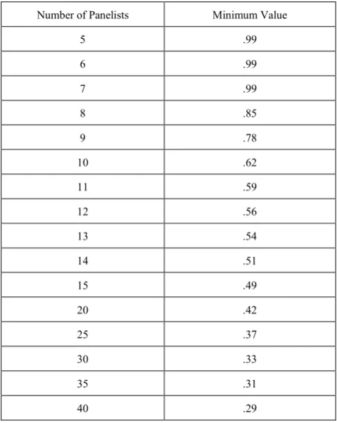
Refers to the extent to which a tool represents all aspects of a given social concept. Expert judgment is the primary method used to determine whether a test/tool has content validity. Lawshe (1975) proposed that each of the subject matter expert raters (SMEs) on the judging panel respond to the following question for each item: "Is the skill or knowledge measured by this item 'essential,' 'useful, but not essential,' or 'not necessary' to the performance of the construct?" Based on the expert opinion, tool would be modified. According to Lawshe, if more than half the panelists indicate that an item is essential, that item has at least some content validity. Greater levels of content validity
[image:3.595.312.552.242.543.2]exist as larger numbers of panelists agree that a particular item is essential. Using these assumptions, Lawshe developed a formula termed the content validity ratio: CVR = (ne − N / 2) / (N / 2) where CVR = content validity ratio, ne = number of SME panelists indicating "essential", N = total number of SME panelists. This formula yields values which range from +1 to -1; positive values indicate that at least half the SMEs rated the item as essential. The mean CVR across items may be used as an indicator of overall test content validity. The minimum values of the CVR to ensure that agreement is unlikely to be due to chance can be found in the following table
Table 1. Minimum values of the CVR to ensure agreement
Number of Panelists Minimum Value
5 .99
6 .99
7 .99
8 .85
9 .78
10 .62
11 .59
12 .56
13 .54
14 .51
15 .49
20 .42
25 .37
30 .33
35 .31
40 .29
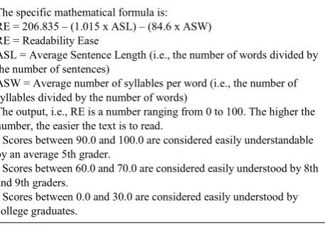
2.2.2. The Flesch Reading Ease Readability Formula: [13] Flesch Reading Ease Formula is considered as one of the oldest and most accurate readability formulas. Rudolph Flesch, an author, writing consultant, and a supporter of the Plain English Movement, developed this formula in 1948. Raised in Austria, Rudolph Flesch studied law and earned a Ph.D. in English from the Columbia University. Flesch, through his writings and speeches, advocated a return to phonics. In his article, A New Readability Yardstick, published in the Journal of Applied Psychology in 1948, Flesch proposed the Flesch Reading Ease Readability Formula.
many US Government Agencies, including the US Department of Defense. However, primarily, we use the formula to assess the difficulty of a reading passage written in English
Table 2. The Flesch Reading Ease Readability Formula
The specific mathematical formula is: RE = 206.835 – (1.015 x ASL) – (84.6 x ASW) RE = Readability Ease
ASL = Average Sentence Length (i.e., the number of words divided by the number of sentences)
ASW = Average number of syllables per word (i.e., the number of syllables divided by the number of words)
The output, i.e., RE is a number ranging from 0 to 100. The higher the number, the easier the text is to read.
• Scores between 90.0 and 100.0 are considered easily understandable by an average 5th grader.
• Scores between 60.0 and 70.0 are considered easily understood by 8th
and 9th graders.
• Scores between 0.0 and 30.0 are considered easily understood by
college graduates.
If we were to draw a conclusion from the Flesch Reading Ease Formula, then the best text should contain shorter sentences and words. The score between 60 and 70 is largely considered acceptable. The following table is also helpful to assess the ease of readability in a document:
90-100:VeryEasy 80-89:Easy 70-79:Fairly Easy 60-69 : Standard 50-59 : Fairly Difficult 30-49 : Difficult 0-29 : Very Confusing
Though simple it might seem, the Flesch Reading Ease Formula has certain ambiguities. For instance, periods, explanation points, colons and semicolons serve as sentence delimiters; each group of continuous non-blank characters with beginning and ending punctuation removed counts as a word; each vowel in a word is considered one syllable subject to: (a) -es, -ed and -e (except -le) endings are ignored; (b) words of three letters or shorter count as single syllable; and (c) consecutive vowels count as one syllable.
2.3. Advantages and Disadvantages of Leaflets [4]
2.3.1. Advantages
1. The printed word has a high degree of acceptance, credibility, and prestige.
2. Printed matter is unique in that it can be passed from person to person without distortion.
3. It allows for the reinforcing use of photographs and graphic illustrations which can be understood by illiterates.
4. It is permanent and the message will not change unless it is physically altered.
5. It can be disseminated and read or viewed by a larger, widespread target audience.
6. It can be reread for reinforcement. Complex and
lengthy material can be explained in detail. 7. It can be hidden and read in private.
8. Messages can be printed on almost any surface, including useful items.
9. Printed material can gain prestige by acknowledging authoritative and expert authors. This is particularly important in those societies where the printed word is authoritative.
2.3.2. Disadvantages
1. A high illiteracy rate reduces the effectiveness and usefulness of the printed message.
2. Printing operations require special, extensive, continuing logistic support.
3. Dissemination is time-consuming and costly, requiring the use of special facilities and complex coordination.
4. As printed material must be physically delivered to the target audience, the enemy can prevent or interfere with its dissemination.
5. It is less timely than other means of communication. 6. It can be altered by overprinting.
7.
Development and design of effective printed material requires trained and knowledgeable personnel.3. Conclusion
In an era of patient-centered care, based on the principle of a fully informed patients; actively involved in the decision-making process, provision of effective information is a prerequisite. Health education can be effective with audiovisual aids. They help to simplify unfamiliar concepts; bring about understanding where words fail; reinforce learning by appealing to more than one sense, and provide a dynamic way of avoiding monotony.11 One longstanding strategy in health education is to improve knowledge has been the use of written patient information leaflets. Once printed and delivered, it can be retained and readily passed from person to person without distortion. A properly developed and designed message can have a deep and lasting effect on the target audience [8]. Leaflet is one of the commonly used non-audio health educational aids. The leaflet is intended for patient/user. If the leaflet is well designed and clearly worded, this maximizes the number of people who can use the information, including older children and adolescents, those with poor literacy skills and those with some degree of sight loss. Health professionals are encouraged to seek advice from specialists in information design when devising their leaflet to ensure that the design facilitates navigation and access to information [14].
writing and design but also emphasize the importance of obtaining evidence-based information, and involving both medical personnel, patient groups and members of public. The evaluation of an information leaflet is, however, an essential part of this process and is often neglected or inadequate. The present review has attempted to describe methods, which can be employed to prepare and evaluate written patient information leaflet.
Developing and delivering information leaflet will not end the task. Information leaflets are probably best utilized when they are targeted at specific groups and possibly those at high risk from the disease. Leaflet should also recommend in correction certain health behaviours. Information leaflets must contain evidence based information and to be reviewed and updated on a regular basis. The Government has set up the Information Education Communication (IEC) center for health education material, as a clearing house for health professionals and patient information. High quality leaflets (IEC materials) for general public and for health care faculty are available from Family and Welfare department, Government of India. It is important that health care professionals should be made aware of the written material available and be encouraged to use it.
REFERENCES
[1] Park K. Textbook of Preventive and Social Medicine.20th ed, M/s Banarasidas Bhanot.
[2] Ley P. Communicating with patients. London: Chapman and Hall 1998.
[3] Guidance concerning consultations with target patient groups for the package leaflet. Article 59(3) and 61(1) of Directive 2001/83/EC as amended by Directive 2004/27/EC, May 2006 [Online]. Available from: URL: http://ec.europa.e u/health/files/eudralex/vol-2/c/user_consultation_200605_en .pdf.
[4] Psychological Operations/Warfare Leaflets. Available from: URL: http://www.psywarrior.com/leaflet2.html.
[5] Iddo Gal and Ayelet Prigat. Why organizations continue to create patient information leaflets with readability and
usability problems: an exploratory study. Health Education Research Theory & Practice Dec 2004:.20; 485–493 [6] Lewis MA, Newton J T. Provision of effective information.
An evaluation of the quality of commercially produced patient information leaflets. Br Dent J 2006; 201: 114-117.28
[7] Warren Stevens, Margaret Thorogood and Seher Kayikki. Cost effectiveness of community antismoking campaign targeted at a high risk group in London. Health Promotion International 2002:17(1);43-50.
[8] Meillier L, Osler M, Sabroe,S, Christensen B, Elsass B, Meyer L. Health education pamphlets about smoking—their benefit to smokers and non-smokers. Public Health Jan 1999:113;19-25.
[9] Anastasi A: Psychological Testing, 4th ed, Macmillan, New York,1976: 134-140
[10] Last JM, AbramsonJH, Greenland S et al (eds): A Dictionary of Epidemiology, Oxford U Pr, New York, 1983: 107 [11] Kirshner B, Guyatt G: A methodological framework for
assessing health indices. J Chronic Dis 1985;38: 27-36 [12] Lawshe CH. A quantitative approach to content validity.
Personnel Psychology 1975;28:563-75. Available from URL: http://www.bwgriffin.com/gsu/courses/edur9131/content/La wshe_content_valdity.pdf
[13] Flesh R. Flesh readability index. Available from: URL: http://www.readabilityformulas.com/flesch-reading-ease-rea dability-formula.php
[14] Zakrzewska JM, Leeson RMA, McClusley M, Vickers M. The development of patient information leaflets. Care of mouth after radiotherapy. Gerodontology 1997;14:48-53. [15] Smith T. Writing simple English is difficult, even for doctors.
British Medical Journal 1992;305:1266-8.
[16] Secker J, Pollard R. Writing leaflets for patients: guidelines for writing information. Edinburgh: Health Education Board for Scotland, 1995.