You say Potato, I say Po-Data:
Physical Template Tools for Authoring Visualizations
Tiffany Wun, Lora Oehlberg, Miriam Sturdee, Sheelagh Carpendale
University of Calgary
Calgary, AB Canada
{twwun, lora.oehlberg, miriam.sturdee, sheelagh}@ucalgary.ca
ABSTRACT
Data visualization authoring tools for the general public remains an ongoing challenge. Inspired by block-printing, we explore how visualization stamps as a physical tool for authoring visualizations could leverage both visual freedom and ease of repetition. We conducted two workshops where participants authored visualiza-tions on paper using hand-carved stamps made from potatoes and sponges. The low-fidelity medium freed participants to test new stamp patterns and accept mistakes. From the created visualiza-tions, we observed several unique traits and uses of block-printing tools for authoring visualizations, including: modularity of pat-terns; annotation guides; creation of multiple patterns from one stamp; and various techniques to apply data onto paper. We dis-cuss issues around expressivity and effectiveness of block-printing stamps in authoring visualizations, and identify implications for the design and assembly of primitives in potential visualization stamp kits, as well as applications for future use in non-digital environments.
Author Keywords
Information Visualization; Authoring Visualizations;
Tangible Tools; Block-Printing; Physical Template Tools; Potato
CCS Concepts
•Human-centered computing → Visualization toolkits; Information visualization;Human computer interaction (HCI);
INTRODUCTION
In our data-rich society, large data sets commonly require expert knowledge to design and disseminate accessible and information-rich visualizations (InfoVis). There is a growing call from the public for the democratization of data, which supports free and accessible information for everyone [22]. However, data accessi-bility does not necessarily guarantee data comprehension—in the absence of comprehension, people cannot equally benefit from our data-rich society. One powerful technique for improving data literacy is to encourage people to self-author data visualizations using simple techniques, and to create visual representations suited to their own comprehension needs.
We author data visualizations in a variety of media—for example, visualizations can be created digitally through coding or software, physically using stones [30] or tangible tiles [18], or sketched using pencils and markers [40]. Each medium can generate different visual representations; for example, digital software can create digital representations for screens or designs for digitally fabricated physical representations [37], whereas sketching can generate graphical representations on tablets [31, 25], whiteboards [3, 39, 8], or paper [40, 10]. Many digital data visualizations are quickly and automatically generated using templates. The wide availability of digital visualization template tools (e.g., Excel, Tableau, Spotfire) often come with tradeoffs [12], such as difficulties with finding features [5], less modifiability [16], and limited expressivity [16].
Alternatively, physical visualization authoring tools—such as tangible tiles—allow for ease of construction and increased visual freedom [18] over traditional digital visualization tools, such as Microsoft Excel [42]. However, physical representations, or physicalizations [21], are still challenging to author [37]; high-fidelity physicalizations are not easily modifiable and have high material cost, whereas tangible tiles cannot be customized and encourage construction in rectilinear configurations [41].
To address these issues, we introduce the notion of physical templates—block-printing stamps—as a novel method of authoring graphical visualizations. Using physical template tools, people can freely personalize visualizations with simple repeating visual elements. We conducted an exploratory study composed of two visualization block-printing workshops, where participants created visualizations of a predefined dataset using self-carved block-printing stamps. Our goal is to investigate: i) What types of stamp toolsdo people create and ii) What types ofvisualizations do they author with such tools; iii) Whataffordancesdo these tools have for visualization authoring; iv) How can these tools sup-portease of useandself-expressionin visualization authoring; and, v) How can peopleintegratethese tools into data comprehension.
Our main contribution is a primary exploration of physical tools used in authoring block-printed graphical visualizations. We additionally provide a discussion of the levels of freedom and self-expression introduced by authoring block-printed visualiza-tions, comparisons between block-printing stamps and alternative authoring techniques, suggestions and recommendations for the design and customization of a visualization stamp kit, and scenarios for the usage of stamps as a self-reflection tool for data.
RELATED WORK
In this section, we discuss three common approaches for novices to author visualizations: digital-based, physical-based, and sketch-based. We note the benefits and tradeoffs of authoring in each medium, and how block-printed stamps offer an alternative approach to authoring visualizations.
Authoring Digital Visualization for Novices
Template editors are the most commonly used tool to author data visualizations, as they can quickly and automatically construct visualizations based on ready-made templates [11]. Despite different visualization construction approaches, research has shown that information visualization novices still have trouble authoring digital visualizations [12]. In Mei et al.’s survey of the design space of digital construction tools, they made recommendations for how to offer greater expressivity and guided refinement during the data design process [27]. Tools such as Méndez et al.’s iVoLVER [28], Xia et al.’s DataInk [43], and Kim et al.’s Data-Driven Guides technique [23] aim to leverage both ex-pressivity and refinement, by allowing users to create accurate and custom data graphics without the need for textual programming.
However, these tools are currently not readily available and require users to learn how to use the tools. In practice, non-expert users still cope with less expressive, template-based editors available on the market, such as Excel, Spotfire, and Tableau.
Authoring Physical Visualizations
An alternative means of understanding data may be through physical data representations, or data physicalizations. While physical representations—such as Sumerian clay tokens1and Micronesian stick charts2—existed long before the advent of computers, researchers have only recently focused on the benefits of physicality as opposed to digital screens. These benefits include accessibility [21], cognitive advantages [35], and increased engagement [14, 36]. An example of a physical paradigm for authoring visualizations is the use of tangible tiles [16], which represent physically tokenized data.
The approach towards “tokenizing” data can be seen in the In-ternational System of Typographical Picture Education (ISO-TYPE) [29], which uses a series of repeating pictograms of the same size to convey quantity in an engaging and universally un-derstood manner. Huron et al. [18] took data tokenization into the physical realm for authoring visualizations, and showed that visualization non-experts were able author visualizations using tangible tiles with little difficulty. In further extension of this work, Wun et al. found that tangible tiles provided more visual freedom and expressive power in comparison to digital template tools, such as Microsoft Excel [42]. However, tangible tiles are limited in their shape, encourage construction in one model, and the completed visualizations cannot be easily transported without losing the po-sition of the tiles—and therefore their intended meaning [41].
Authoring Visualizations using Sketching
Other approaches to data visualization involve sketching represen-tations. This is often done early in the ideation phase of a visualiza-tion design project, as a low-fidelity method to develop and clarify
1http://dataphys.org/list/mesopotamian-clay-tokens/ 2http://dataphys.org/list/marshall-islands-stick-charts/
ideas about representation [4]. Paper is a popular medium for sketching visualizations due to its wide availability [40, 10], how-ever, visualization sketching has also occurred on whiteboards [3, 39, 8], tablets [31, 25], and napkins [6]. The benefits of paper as a sketching medium mean that the visual representations stay on the paper, so they can be shuffled and carried around without fear of unwanted modifications. Walny et al. [40] studied how people sketched visualizations on paper, and proposed a data sketching continuum ranging from abstract to specific, numerical representa-tions. While sketching is versatile in comparison to tangible tiles, it can require time-consuming reproduction of visually similar structures, making it unsuitable for the accurate representation of large data sets within a short period of time.
Block-Printing
To address the shortcomings inherent in current approaches for authoring visualizations, we propose block-printing stamps as an intersection of the affordances of digital-based, physical-based, and sketched-based approaches. Block-printing stamps combine the quick repetition of templates, the visual freedom of tangible tiles, and the low-fidelity ideation of paper sketches, to generate tokenized visualizations on paper. To form block-printing stamps, a relief pattern is carved onto a block of material (such as wood), with the negative space cut away. The block is then inked and pressed onto cloth or paper. Applications for block printing first included the creation of patterned textiles, and later for printing illustration and type onto paper. Nowadays, materials such as linoleum or rubber are commonly used for creating stamps; in our study, we chose potatoes and sponges as carving materials for stamps as they are accessible, cheap, and easy to carve and/or cut by novices. Since making potato stamps is a common activity for children, we chose materials that study participants would be familiar working with.
METHODOLOGY
To understand how people author visualizations with block-printing tools, we conducted two workshops where participants created visualizations of pre-defined datasets using self-carved potato and sponge stamps. We chose a workshop format to facilitate rich engagement between participants. Prior studies used workshops to facilitate visualization authoring in various mediums, from sketched visualizations [40], to constructive visualization [15] and data physicalization [17]. Our workshop is informed by the experiences of Huron et al. [17], who identified several bottlenecks while participants were constructing physicalizations.
Participants
Materials
Each participant sat at a “stamp making station” including: potatoes and sponges, cardstock and A4 paper, small knives, box-cutters, cutting boards, fruit corers, paint brushes, pens, paper plates and towels, a bowl for dispensing offcuts, and a cup of water. We also provided participants with tubes of paints in primary colors (red, blue, yellow), white, and black.
Dataset
We provided a fictitious dataset about a 4-day vacation, repre-sented as a table. We designed the dataset to be low in complexity, yet still contain multiple data columns for breadth and representa-tional variety. The dataset contained one column with date values (Date), two columns with categorical values (Where,Type of Spending), one column with ranked values (Enjoyability), and one column with numerical values (Cost in dollars). Numerical values were balanced between a value of 10 to 70 to avoid skewing.
Workshop Schedule
The workshop lasted approximately 120 minutes, consisting of 4 phases:Introduction, Creation, Discussion, andConclusion.
Introduction (25 mins)
Participants first completed a short demographic questionnaire on their experience with interactive systems, visualizations, and data. The researcher then introduced the workshop, including:
• An introduction to block-printing stamps, and a reminder on how to create colours by mixing paints.
• Common Information Visualization data mappings (i.e. position, size, count). We advised participants to think about what elements they wanted for their visual representation. • The workshop task,“Create visualizations that show the
high-lights of your 4-day trip” with the given dataset, using self-created stamps. We provided several brief tips on creating the vi-sualization: choose mappings, sketch the stamp pattern onto the medium first, paint and press onto paper, then label when done. To help provide focus, the researcher suggested the participants to pick at least 2 columns of the dataset for one visualization, then choose another set of columns for their next visualization. • A description of workshop tools and materials, and instructions on how to make stamps with potatoes and sponges.
Creation (60 mins)
We provided each participant with the sample dataset, and asked them to consider what types of stories they could tell from the data. We emphasized that participants did not need to be perfect with their visualizations. While we intended for participants to work alone, we did not discourage them from discussing with their neighbors, and some participants walked around the room to see what others were making. Throughout this time, we made a “data mapping lookup sheet” available to participants, which provided a summary of the various data mappings presented in theIntroductionphase. Huron et al.’s physicalization workshop [17] noted that participants got stuck ideating about concepts for their physicalizations; we provided the lookup sheet to remind our participants of just several different possibilities for mapping data. Lookup sheets were also previously used in Thudt et al.’s [38] self-reflection workshop to also help stimulate ongoing activity while constructing a physicalization.
Discussion (30 mins)
Participants displayed their finished visualizations to the group, along with any stamps they had created. Each participant then described their visualization to the group, along with the stamps they created and their process. The researcher then asked the entire group open-ended questions on what types of stamps they liked, what stamps they would find useful, and what stamps they would create in a canonical data stamp set.
Conclusion (5 mins)
We asked participants to complete a questionnaire on their thoughts and opinions regarding the workshop. We also asked them to sketch designs for any stamps they had suggested for a vi-sualization stamp kit. Additionally, participants could provide fur-ther feedback on the workshop in a separate follow-up interview.
Data Collection and Analysis
Each stamp making station had a video camera angled to best capture activities at that station. We recorded photos, video, and audio during theCreationandDiscussionphases, alongside supplementary field notes. We also recorded video and audio during the one-on-one feedback sessions.
We used a qualitative analysis approach. Visualizations were arranged on a two dimensional visual representation continuum, extended from Walny et al’s representational continuum for sketched visualizations [40]. As several of the visualizations were ambiguous, the lead author examined post-questionnaire answers, field notes, and transcriptions of the two group discussions to confirm visual encodings in each visualization in relation to Bertin’s visual variables [2]. Using an open coding schema [34], three of the co-authors identified themes of interest from the participants’ transcripts and artefacts [2].
Each of the participants’ process videos were reviewed to confirm the number of stamps created by participants, and the number of stamps used in the visualizations. Creating the stamps and visualizations using the given materials was an intensely personal and varied process for participants; thus we were more interested in how participants approached the authoring process, rather than the nuances of repetitive actions. In early analysis, we analyzed the two participant groups along expertise levels, but found that individual expertise mattered less than the richer results from individual participants.
FINDINGS
Our findings describe the participants’ self-created block-printing tools, their authoring process, and the resulting block-printed visualizations. We additionally discuss data encodings via stamps, visualization annotations, and the role of stamp materiality in creating block-printed visualizations. For ease of reference, participants’ individual visualizations are denoted in the form Participant Number.Vis Number(e.g., 5.1). High-resolution versions of paper figures, along with other study images and materials, can be found athttp://bit.ly/VisStamps.
Creating Block-Printing Tools
(G1: 33/37 used, average created: 7.4, min: 5, max: 10;G2: 32/34 used, average created: 6.4, min: 3, max: 11).
Participants made a diverse range of stamp shapes with varying detail. These shapes ranged from themes related to the types of spending (e.g. forks, shopping bags, airplanes), locations (e.g. outlines of country borders, flags, landmarks), geometric shapes (e.g. circles, triangles), or “others" (e.g. lines, hollowed potatoes). We define stamp shapes as the carved outcome of the stamp, while stamp patterns refer to the applied shape of the stamp on paper.
[image:4.612.331.556.157.241.2]10.2
10.1
Figure 1. P10’s stamps and visualizations with the “ink-wells” (bottom left).
One set of stamps stood out as radically different from the others: P10’s self-dubbed “ink-wells” (Fig. 1), made from hollowing the centers of potatoes and filling the depression with diluted paint.
P10: “The other stamps that I made were ‘ink well stamps’ – honestly, that was just an experiment, but depending on how much I fill the well that’s how much water that would get splashed onto the thing, and that would sort of represent how much you spent...”
We classify the stamp shapes into four categories:Icons, Geome-tries,Alphabet, andOthers.Icons(35/71) are pictographic shapes that convey an established meaning, such as emojis.Geometric (24/71) shapes are simple shapes without a predefined meaning, such as a circle or star.Alphabet(3/71) shapes (i.e. letters) are part of an existing alphabet, but are not icons since they do not convey a pre-defined meaning. Lastly,Others(9/71) are shapes that fell outside of these categories, such as axes and ticks. We consider the “ink-wells” to fall under the Other category, as they are stamps in a very loose sense and do not stamp a specific pattern.
Authoring Process
While each participant followed their own process, they generally performed the following sequence to create their visualizations: sketching and data loading,carving,stamping, andannotating.
Sketching and Data Loading:Participants started by sketching potential representations of the data, stamp shapes, and/or simulta-neously computing data values (i.e. rounding, aggregating, etc.).
Carving:Participants carved out their stamps from potatoes or sponges with provided tools. Carving was done all at once, or
intermittently with other steps; five participants (P2, P4, P7, P8, P9) chose to cut out all of their stamps before using those stamps to create their first visualization.
Stamping: Participants applied paint onto stamps by dipping them in paint or using a paintbrush before placing them on the paper. Participants often tested their stamp on a scrap piece of paper before stamping onto the actual visualization.
1.1
[image:4.612.64.286.175.376.2]1.2
Figure 2. P1’s stamps and visualizations show an example of amodular stamp pattern.
While most stamp patterns were composed from a single shape, participants P1 and P5 composedmodular stamp patternsby combining several smaller stamps. P1 composed several axes stamps together to create annotations for their visualization (1.1), as shown in Fig. 2, while P5 composed Chernoff faces [7] (5.1) and stacked circles (5.2).
9.1
Figure 3. P9’s stamps and visualizations show an example of multiple patternsfrom multiple stamps.
Using the same stamp in various ways, P2 and P9 created multiple patternson paper. By orienting different sides of the same potato stamp, P2 could generate multiple visual patterns for all of visualization 2.2. P9 (Fig. 3) angled the placements of their stamps onto the page to show varying amounts of the same stamp pattern in visualization 9.1. For P9, one “full” pattern represented 10 units, thus, this angled placement allowed them to represent the numerical portions of the dataset more accurately.
Annotating:Participants annotated their visualizations with axes, legends, titles, etc. Four participants (P1, P3, P6, P10) annotated the visualization with axes or headers before stamping onto the paper, presumably to make guides for where to stamp.
The paintbrush was used in a variety of ways during this step. Several painted over mistakes on the visualization (P3, P7), splattered and flicked paint onto their visualization (P8), or made a stamped pattern look neater on paper (P9). P4 painted sun rays on 4.3 from a series of circles. P8 used a splatter technique to apply colour after stamping the pattern down onto paper:
[image:4.612.333.553.351.423.2]Block-Printed Visualizations
Participants created a total of 21 visualizations over the two workshops (G1: 13, average 2.6;G2: 8, average 1.6). We recommended participants choose at least two data columns to ensure breadth; however, the majority (19/21) of visualizations encoded multiple data columns (although no participants visualized all five columns in one image).
Participants often used various layouts and representations when creating more than one visualization. We initially classified these visualizations against Walny et al’s representation continuum for sketched visualizations [40]; however, our visualizations did not map exactly onto the Numeracy-Abstractness continuum, as our study dataset contains non-numerical values (such as enjoyment, or type of spending). For example, visualizations 2.2 and 2.3 (Fig. 4) are dot plots, but the representations are highly abstracted, and not numerical as originally defined. Therefore we adapted several of Walny et al.’s described representation categories to describe the appearance of our participants’ visualizations below.
Countable (7/21):Walny et al. define these visualizations as the most numeric representations using countable tokens to represent the data [40]. Similarly, our participants’ visualizations tokenized data by repeating the same pattern, such as shopping bags, planes, and flags. Participants placed their patterns in various groupings to represent common themes, such as Day or Location.
Dot/Scatter Plots and Matrices (8/21):We classify visualizations as dot/scatter plots and matrices if they encode data values (e.g., enjoyment, cost) along visible categorical and numerical axes. While dot/scatter plots and matrices are defined as the second-most numeric representations along the original continuum, this is not necessarily the case with our visualizations. Visualizations 2.1 and 2.2, shown in Fig. 4, are represented as dot-plots; however, the data is highly abstracted and it is difficult to extract the raw values. Visualization 5.1 and 5.3, shown in Fig. 5, are matrices defining enjoyability over different days and locations, but numerical data (Cost) is either not encoded (as is the case with 5.3), or has been transformed into binned categories (as is the case with 5.1).
[image:5.612.330.551.95.258.2]2.1 2.2 2.3
Figure 4. P2’s stamps and visualizations. Visualizations 2.1 and 2.2 are dot plots, while visualization 2.3 is stamped in a way to look like flowers.
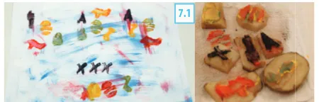
Pictoral (5/21): Similar to the original continuum, pictoral representations are highly abstract. These representations are often difficult to read raw data from, as the visual encodings are often not defined to viewers. For example, visualization 2.3 was stamped in such a way that the patterns looked like flowers; visualization 7.1 (Fig. 6) is purely graphical and does not contain any words; visualization 8.1 is coloured according to the enjoyability of certain activities in each country; visualization 8.2 contains border outlines of countries filled with dots of splattered paint to represent money spent in each country; and visualization
10.2 uses spilled paint stains on a sheet of paper to represent money spent over different days.
[image:5.612.64.286.494.567.2]5.3
5.1 5.2
Figure 5. P5’s stamps and visualizations. Visualizations 5.1 and 5.3 are matrices, while visualization 5.2 falls under theOthercategory.
Other (1/21):Visualization 5.2 (Fig. 5) consists of ringed circles, where each ring represents what activities (entertainment, food, travel, shopping) occurred in which location. It did not fall into any category as it did not encode numerical values.
As participants used stamps to create their visual representations, tokens were the most common graphical element. Each pattern on the paper—a discrete visual mark—represents some data unit [18]. Nineteen out of twenty-one visualizations used multiple tokens to represent and encode data onto the visualization. Highly numeric representations, such as the countable groupings and the charts, largely employed tokens.
Data Encoding via Stamps
Participants encoded the dataset using a number of visual variables [2] to represent the data, from multiple hues and values to various shapes and sizes. The most common visual variables used for encoding data were position (27 instances) and shape (17 instances). Position, an intrinsic visual variable, was used in all visualizations. Shape, which we identified if more than one stamp shape was used in the visualization, was used in 16/21 visualizations. The least used variables were texture (0 instances), followed by orientation and color value, or color tint/shade (2 instances each). The absence of texture and color value may come from difficulties in defining details on potato and sponge stamps, and the precision needed to mix different tints and shades.
Each stamp intrinsically encodes data through its shape; however, P10’s “ink-wells” uniquely encoded data through the amount of ink. Rather than containing a unique shape, the ink-wells acted as “vessels” for carrying data, where the color and amount of liquid
filled in the stamp was used to encode spending.
Exploring Annotations
In addition to block printing, participants used pens to create an-notations for their visualizations. Below, we discuss the levels of annotations, as well as guides and tools for producing annotations.
and axes (e.g., visualization 1.1), to visualizations only containing the title (e.g., visualization 8.2). In most cases, participants who had very pictoral and iconic visualizations did not provide a legend for their visualization (except for 6.2, which identified the locations of their flag shapes), presumably because the icon was self-explanatory. When a legend was included, it was used to define other visual encodings, such as color.
Visualizations 2.3 and 7.1 did not contain any annotations:
P2: “I wanted to write on it (2.3), but then I realized that I wore out all the pens, and then I was like: ‘screw this, I know how to, I know what it stands for and I’m the only one who needs to know about it [laughs].’ ”
P7: “In terms of understandability, it’s (7.1) probably not [easily understandable], but in terms of looking different than other visualizations– for better or worse I think that’s a success.”
However, while P2 and P7 did not annotate their respective visualizations, they still created various aesthetic marks, such as the corner markings (2.3) and the expressive background (7.1). Furthermore, while P2 did not write text in any of their visualiza-tions, they still annotated visualization 2.1 by using the first letter of the locations, and making abstract marks in visualization 2.2. P7 roughly categorized their visualization with stamp patterns alluding to the respective travel location (i.e. Paris, London, Ams-terdam), as shown in Fig. 6. Although these marks may not make sense to an outsider, they still conveyed meaning to the author.
Annotating Guides.In 7/10 cases, participants laid down partial annotations prior to stamping on their paper, or while continuing to make stamp marks. In 6/21 visualizations, participants created axes or data grouping headers before stamping onto the page, presumably as guidelines for where to stamp.
[image:6.612.62.287.430.502.2]7.1
Figure 6. P7’s stamps and visualization show an example of a visualization without annotations.
Tools for Annotation.Stamps were not only used to visually encode data, but also to annotate or aesthetically augment the visualization. P1 made a set of stamps of varying line lengths for making axes and ticks. P2 and P7 used the entire sponge without cutting or carving it. In P2’s first and second visualizations (2.1, 2.2), they applied paint to the hard edge of the sponge and dragged it across the paper to make axes. For P2’s third visualization (2.3), they dabbed the soft side of the sponge with paint to make marks on the corners of the paper. P7 also dabbed paint onto the soft side of a sponge, then smeared it across the paper to create a background for visualization 7.1. While this background did not encode data, the use of the sponge itself as a raw medium allowed P7 to customize the visualization to their desires.
Materiality of Stamps
The materials provided for stamp carving both liberated and constrained participants’ authoring process of their stamps
and visualizations. These affected participants’ willingness to experiment, their reactions to mistakes, their incorporation of art and play into the visualizations, and their difficulties in making and using stamps.
Medium Liberties.Due to the messiness of hand-carved stamps, we noticed that participants felt more comfortable with experi-menting and making mistakes on their visualizations. For example, after P2 placed a stamp, they realized they had made a mistake.
P2: “Realized that I stamped it upside down (supposed to be Ams-terdam). Ran out of space at the top, let’s just stamp right next to it. More freedom to say ‘okay, I ran out of space, put it on the side.’ ”
However, when something did not go according to their vision, participants accepted or adapted to mistakes. In one case, P8 meticulously made finely detailed stamps of country borders. However, they forgot to mirror the image of the United Kingdom, but continued using the stamp rather than start over again.
In another case, P7 changed the vision of their visualization after difficulties with making their potato stamp.
P7: “When I was cutting out this potato I saw that this shape doesn’t go the way I wanted, so I decided to go very abstract.”
When P3 and P7 stamped down a pattern in the wrong spot, they rectified their mistakes using white paint.
P3: “I made a mistake here because I read the data wrong (gestures to bottom of 3.2) and I decided to use white paint to go over it. I realised that when you’re using physicals there’s no undo [laughs], so I made my own undo.”
Given the freedom of the medium, artistic and playful themes were sometimes incorporated into the story of the visualizations throughout the authoring process. For example, P1 titled visu-alization 1.1: “My BIG Trip! by [P1], age [redacted].” P5 titled visualizations 5.1 and 5.2: “How happy I was and how stressed my wallet was”; and “How broke I was on that trip” respectively. Several participants stated that they directly aimed to incorporate art into their visualization, such as P2’s “border” annotations.
P2: “I just felt like it [2.3] looked more artistic, so I added extra things [the borders] that would make it art on this side.”
Medium Constraints:The nature of using potatoes and sponges also imposed several constraints on how participants created their stamps. The wetness of potatoes was a surprising factor [P4, P7, P8], changing the quality of participants’ patterns on paper.
P4: “I was really surprised, first of all, I thought: ‘Great, work with potatoes, must be fantastic.’ But it’s very hard because it kept– it’s humid so it’s not so easy, it’s not easy, as I expected to do.”
Participants noted various levels of success with making detailed or intentional shapes with potatoes. While participants generally liked making the stamps, only 4/10 participants were satisfied with the stamps they created. Carving stamps was a tedious and time consuming task.
Participants noted that sponges were harder to work with, harder to detail, and gave lower quality prints on paper as compared to potatoes. For example, P6 cut four stamps from the sponges, but after creating several marks with them, found the sponges unsatisfactory and recarved all their patterns using potatoes.
Despite these limitations, one participant noted that the material constraints led them to approach the task differently:
P5: “Being constrained with what you can do with a potato is really interesting, you go beyond those boundaries and you do things you don’t realize is possible with just that potato.”
Ultimately, while wetness and detailing affected the quality of the participants’ artefacts, the use potatoes and sponges as an authoring medium freed participants to experiment, make mistakes, play, and embrace unexpected results.
DISCUSSION
Below we discuss the issues that motivated our investigation into block-printing tools for authoring visualizations: expressivity and effectiveness. We also discuss block-printing stamps in relation to tangible tiles and sketching as tools for graphical visualizations.
Freedom and Self-Expression in Authoring Visualizations
Compared to digital methods for authoring visualizations, block-printing stamps gave people increased flexibility in the authoring process. A person may be constrained to follow certain steps to produce a digital visualization in software, such as picking a visual representation from a series of templates, and then modifying and adjusting as needed. Traditionally, the visual form of the data is created before a visualization can be annotated; Jansen et al.’s pipeline model for visualizations [20] describe such actions asvisual mappingandpresentation mappingrespectively. However, the iterable and free-flow nature of the participants’ authoring process sometimes went contrary to the flow of the pipeline. When participants created annotation marks (i.e. axes, ticks, lines) to guide the placement of future annotations during the study, they startedpresentation mappingbefore completing visual mapping, highlighting a certain freedom with the block-printing process outside of the InfoVis pipeline module. This type of flexibility in the authoring process was noted by Isenberg et al. [19] as being common when people were not constrained by software, and is also inline with physical and graphical paradigms such as constructive visualization [18] and sketching [40].
Furthermore, crafting personalized visualization stamps allowed for a high level of self-expression and individuality, despite identical datasets across participants. It is unsurprising that some common shapes, such as shopping bags or planes, were created by multiple participants in the workshops. However, each shape contained their own subtle styles and differences—e.g., some shopping bags had a loop for a handle, while others did not. Even the same data topic, such as food, spawned different represen-tations, including apples, soda cups, and forks. Furthermore, the playfulness of stamps as an authoring tool affected how participants presented their visualizations, like the titles P1 and P5 annotated to imply certain stories behind their visualizations. This level of playfulness and self-expression is more inline with sketch-based authoring [40], where both the tool (i.e. pencils, markers, etc.) and the resulting visualization are customizable. In contrast,
template editors often do not allow for people to customize the tool, outside of third party add-ons. Furthermore, customization of the visualization itself is limited to the software’s options, and the look and feel of the template editor may discourage people from being playful during the authoring process. While physical authoring paradigms, such as constructive visualization, focus on play as a key factor in the tool’s simplicity [16], the paradigm does not allow for customization of the tool itself during authoring, as tiles are pre-fabricated according to set colours and dimensions.
Stamps as Tools for Graphical Visualizations
In Huron et al.’s flow diagram for tangible tile construction [15], tiles could be freely moved; this is not the case with stamps, which create “semi-permanent” marks that cannot be shifted after the initial placement (although in the study, several unwanted marks were removed with white paint, or left and ignored). Furthermore, stamps are semi-permanent in that they cannot be shifted after the initial placement, although we saw various levels of ‘commitment’ to the placement location, and several people were content with either having extra visual elements not related to their visualization (i.e. 5.3), or just using white paint to remove their mistake (P3, P7).
Stamps share similarities with tangible tiles, but also have many differences. Stamps afford many visual and presentation mapping freedoms. However, many presentation mapping freedoms (such as angle and alignment) are only available before the placement of the stamp pattern, and cannot be shifted without erasing the pattern, as shown by participants placing white paint over their mistakes. Stamp tools are physical themselves, yet provide graphical output. A stamp tool is also versatile as it can represent multiple data encodings, and can be painted with different colours, or compounded together into various patterns to represent new units of data. Stamps patterns can overlay each other, whereas tiles are a physical unit that can only be stacked or laid next to one another in several configurations; stamps also allow for repetition of multiple graphical elements with one tool. Furthermore, one stamp pattern can represent multiple units of data, whereas one tangible tile represents one user-defined unit.
In comparison, stamps share more similarities and freedoms with sketching. Both a pencil and a stamp allow the user to create shapes or patterns to their desires; both techniques can be “undone” or erased; both tools allow for overlays and versatility. Stamps require initial investment to create while sketching one single element is faster, but stamps come with the ability to replicate the same pattern multiple times. Sketching and stamps work well together in tandem; this was shown in the study when participants used both stamps and pens to complete their visualizations.
DESIGN IMPLICATIONS
Our exploration into block-printing visualizations informs an initial set of primitives for a visualization stamp kit—general-purpose stamps that are conducive to block-printing data visualizations. Below, we suggest several potential stamp shapes.
Geometric primitives:Various closed geometric shapes, such as circles, triangles, squares, and hexagons are also useful. These shapes would benefit from being included as sets (e.g., circles with varying diameters) to enable size encoding.
Emojis:Emojis are ideograms meant to convey meaning; they are a ubiquitous part of how we communicate over messages. Icons were a popular stamp theme in our study; a stamp kit could contain several widely used emojis (e.g. happy face, sad face, pizza).
Blank flags:Many national flags share several similar patterns (e.g., triband, Nordic cross). A visualization kit could include several blank flag templates based on common patterns, where the person then fills in the color.
These stamps could be composed together to make compound glyphs. Stamp shapes could be used together as visualization primitives. Flags could be combined with icon stamps—for example, a Canadian flag could be composed by stamping a triband flag template, then placing a maple leaf icon on top. However, visualization forms such as arcs and curves, which vary in response to data, would not be easily representable with stamps. For example, streamgraphs would be very difficult to represent accurately with stamps, as their specific shape and curvature is unique to the underlying data.
LIMITATIONS & FUTURE WORK
Our study was a first attempt to explore how people author visualizations using block-printing stamps. Currently, such tools for authoring visualizations do not yet exist; by observing how people create their own tools in our study, our observations provide not only rich insights into a new visualization authoring technique, but also inform potential block-printing visualization tools. Our results are not generalizations on what these tools should look like, but rather reveal the potential for block-printing stamps in a visualization context, and point towards potential features useful for visualization stamps.
The materials and tools provided influenced the types of stamps created. The nature of materials like potatoes and sponges have both benefits and drawbacks. For instance, sometimes participants were unable to make the stamps they envisioned; possibly due to lack of skill, or the specific tools provided in the study. Carving stamps was a time consuming and tedious process, and using our methods, it would not be feasible for everyday users to create custom stamps for personal, everyday data visualization. Future research could explore higher fidelity materials such as linoleum or commercially-available fabrication machines for creating stamp patterns. Alternatively, shape displays could be adapted into block printing tools, such as ShapeClip [13] or InForm [9]. Furthermore, our “data mapping lookup sheet” may have also influenced the participants’ choice of visualizations and tools. However, we argue that providing such a reference helped participants feel more willing to experiment with a wider range of tools and visualizations, rather than fixating on specific stamp types—as shown by the range of data encodings in the results. Overall, we wanted people to explore stamps in a non-intimidating, low-cost medium that would reduce fear of failing, instead of focusing on finely polished end products. The variety of stamps show that participants were able to explore ideas and expressively create varied visualization tools.
It remains to be seen how useful a visualization stamp kit would be for authoring visualizations. While several of the stamp shapes, such as the flags, may be situational based on the data, these types of shapes would not be out of place as pre-existing templates in commercial stamp makers. Further work could evaluate several factors involved with a stamp kit, such as: efficiency in authoring visualizations, friendliness with visualization non-experts, the usefulness of different shapes, potential for author expressivity, or the trade-off between the number of stamp patterns and time spent authoring visualizations with those patterns.
Ultimately, we envision stamps as a means to open up visualiza-tion to new audiences. Visualizavisualiza-tion stamps could be useful in limited technology settings. Cost and access to computers have traditionally limited students from exploring DIY and tangible computing activities in economically-challenged locations such as peri-urban India [33] and Brazil [32]. In these environments, classroom activities that are focused around making and using stamps might be a low-cost and non-technologically intensive alternative for teaching fundamental visualization concepts.
The open and playful nature of stamps could have potential appli-cations in art therapy, which relies on nonverbal communication of thoughts and feelings [26]. Stamps could help people narrate their situations or personal data visually through data comics [1] or data-based storytelling [24]. However, further exploration of the viability of visualization stamps in a therapy context needs to be done in consultation with healthcare and therapy professionals.
Finally, visualization stamps could be explored in the context of new paradigms, such as graphical authoring of visualizations, or in the broader context of authoring situated and embedded visu-alizations [41], physicvisu-alizations, or tangible authoring tools for digital visualizations on various surfaces (i.e. walls, tabletops).
CONCLUSION
We explored the potential of creating and using personally made stamps to block-print visualizations. Our investigations have shown how creating visualizations via stamps is viable for experts and non-experts alike, since participants were able to carve and use stamps to create meaningful data visualizations. Our exploration has added to our knowledge about the processes behind creating visualizations, and has expanded our views of data visualizations as changing across a continuum, in both the relationship between numeracy and abstraction, and the relationship between expressivity and constraint. We hope that this work can be used to further the democratization of data, especially in groups with limited access to data authoring tools, or who are unable to engage with data visualization in this manner. Further, we hope that this work can be expanded on to further explore the liminal space between craft and visualization.
ACKNOWLEDGEMENTS
We are grateful to our participants for their time and discussion. This research was supported in part by: Natural Science and Engineering Research of Canada (NSERC); Alberta Innovates – Technology Futures (AITF); and SMART Technologies.
SUPPLEMENTAL MATERIAL
REFERENCES
[1] Benjamin Bach, Zezhong Wang, Matteo Farinella, Dave Murray-Rust, and Nathalie Henry Riche. 2018. Design Patterns for Data Comics. InProceedings of the 2018 CHI Conference on Human Factors in Computing Systems. ACM, 38:1–38:12.
[2] Jacques Bertin. 1983.Semiology of Graphics: Diagrams, Networks, Maps. University of Wisconsin press.
[3] Jeffrey Browne, Bongshin Lee, Sheelagh Carpendale, Nathalie Riche, and Timothy Sherwood. 2011. Data Analysis on Interactive Whiteboards Through Sketch-Based Interaction. InProceedings of the ACM International Conference on Interactive Tabletops and Surfaces. ACM, 154–157.
[4] Bill Buxton. 2010.Sketching User Experiences: Getting the Design Right and the Right Design. Morgan Kaufmann.
[5] Chris Chambers and Chris Scaffidi. 2010. Struggling to Excel: A Field Study of Challenges Faced by Spreadsheet Users. In2010 IEEE Symposium on Visual Languages and Human-Centric Computing. IEEE, 187–194.
[6] William O Chao, Tamara Munzner, and Michiel van de Panne. 2010. Poster: Rapid Pen-Centric Authoring of Improvisational Visualizations with NapkinVis.Posters Compendium InfoVis(2010).
[7] Herman Chernoff. 1973. The Use of Faces to Represent Points in k-Dimensional Space Graphically.Journal of the American Statistical Association68, 342 (1973), 361–368.
[8] Mauro Cherubini, Gina Venolia, Rob DeLine, and Andrew J. Ko. 2007. Let’s Go to the Whiteboard: How and Why Software Developers Use Drawings. InProceedings of the 2007 SIGCHI conference on Human Factors in Computing Systems. ACM, 557–566.
[9] Sean Follmer, Daniel Leithinger, Alex Olwal, Akimitsu Hogge, and Hiroshi Ishii. 2013. inFORM: Dynamic Physical Affordances and Constraints Through Shape and Object Actuation. InProceedings of the 26th annual ACM Symposium on User Interface Software and Technology. ACM, 417–426.
[10] Florian Geyer, Jochen Budzinski, and Harald Reiterer. 2012. IdeaVis: A Hybrid Workspace and Interactive Visualization for Paper-based Collaborative Sketching Sessions. In Proceedings of the 7th Nordic Conference on
Human-Computer Interaction: Making Sense Through Design. ACM, 331–340.
[11] Lars Grammel, Chris Bennett, Melanie Tory, and Margaret-Anne Storey. 2013. A Survey of Visualization Construction User Interfaces.Eurographics Conference on Visualization (EuroVis) - Short Papers(2013), 19–23.
[12] Lars Grammel, Melanie Tory, and Margaret-Anne Storey. 2010. How Information Visualization Novices Construct Visualizations.IEEE Transactions on Visualization and Computer Graphicss16, 6 (2010), 943–952.
[13] John Hardy, Christian Weichel, Faisal Taher, John Vidler, and Jason Alexander. 2015. ShapeClip: Towards Rapid
Prototyping with Shape-Changing Displays for Designers. InProceedings of the 33rd Annual ACM Conference on Human Factors in Computing Systems. ACM, 19–28.
[14] Steven Houben, Connie Golsteijn, Sarah Gallacher, Rose Johnson, Saskia Bakker, Nicolai Marquardt, Licia Capra, and Yvonne Rogers. 2016. Physikit: Data Engagement Through Physical Ambient Visualizations in the Home. In Proceedings of the 2016 CHI Conference on Human Factors in Computing Systems. ACM, 1608–1619.
[15] Samuel Huron, Sheelagh Carpendale, Jeremy Boy, and Jean-Daniel Fekete. 2016. Using VisKit: A manual for running a constructive visualization workshop. InPedagogy of Data Visualization Workshop at IEEE VIS 2016.
[16] Samuel Huron, Sheelagh Carpendale, Alice Thudt, Anthony Tang, and Michael Mauerer. 2014. Constructive
Visualization. InProceedings of the 2014 Conference on Designing Interactive Systems. ACM, 433–442.
[17] Samuel Huron, Pauline Gourlet, Uta Hinrichs, Trevor Hogan, and Yvonne Jansen. 2017. Let’s Get Physical: Promoting Data Physicalization in Workshop Formats. In Proceedings of the 2017 Conference on Designing Interactive Systems. ACM, 1409–1422.
[18] Samuel Huron, Yvonne Jansen, and Sheelagh Carpendale. 2014. Constructing Visual Representations: Investigating the Use of Tangible Tokens.IEEE Transactions on Visualization and Computer Graphics20, 12 (2014), 2102–2111.
[19] Petra Isenberg, Anthony Tang, and Sheelagh Carpendale. 2008. An Exploratory Study of Visual Information Analysis. InProceedings of the 2008 SIGCHI Conference on Human Factors in Computing Systems. ACM, 1217–1226.
[20] Yvonne Jansen and Pierre Dragicevic. 2013. An Interaction Model for Visualizations Beyond the Desktop.IEEE Transactions on Visualization and Computer Graphics19, 12 (2013), 2396–2405.
[21] Yvonne Jansen, Pierre Dragicevic, Petra Isenberg, Jason Alexander, Abhijit Karnik, Johan Kildal, Sriram
Subramanian, and Kasper Hornbæk. 2015. Opportunities and Challenges for Data Physicalization. InProceedings of the 33rd Annual ACM Conference on Human Factors in Computing Systems. ACM, 3227–3236.
[22] Marijn Janssen, Yannis Charalabidis, and Anneke
Zuiderwijk. 2012. Benefits, Adoption Barriers and Myths of Open Data and Open Government.Information Systems Management29, 4 (2012), 258–268.
[23] Nam Kim, Eston Schweickart, Zhicheng Liu, Mira Dontcheva, Wilmot Li, Jovan Popovic, and Hanspeter Pfister. 2017. Data-Driven Guides: Supporting Expressive Design for Information Graphics.IEEE Transactions on Visualization and Computer Graphics23, 1 (2017), 491–500.
[25] Cui-Xia Ma, Yong-Jin Liu, Hong-An Wang, Dong-Xing Teng, and Guo-Zhong Dai. 2012. Sketch-Based Annotation and Visualization in Video Authoring.IEEE Transactions on Multimedia14, 4 (2012), 1153–1165.
[26] Cathy A Malchiodi. 2011.Handbook of Art Therapy. Guilford Press.
[27] Honghui Mei, Yuxin Ma, Yating Wei, and Wei Chen. 2018. The Design Space of Construction Tools for Information Visualization: A Survey.Journal of Visual Languages & Computing44, 1 (2018), 120–132.
[28] Gonzalo Gabriel Méndez, Miguel A Nacenta, and Sebastien Vandenheste. 2016. iVoLVER: Interactive Visual Language for Visualization Extraction and Reconstruction. In Proceedings of the 2016 CHI Conference on Human Factors in Computing Systems. ACM, 4073–4085.
[29] Otto Neurath. 2010.From Hieroglyphics to Isotype: a Visual Autobiography. Hyphen Press.
[30] Herbert Reininger. 2012. Hans Rosling’s shortest TED talk. (2012).https://www.youtube.com/watch?v=UNs-ziziPyo
[31] Ramik Sadana and John Stasko. 2014. Designing and Implementing an Interactive Scatterplot Visualization for a Tablet Computer. InProceedings of the 2014 International Working Conference on Advanced Visual Interfaces. ACM, 265–272.
[32] Arnan Sipitakiat, Paulo Blikstein, and David P. Cavallo. 2004. GoGo Board: Augmenting Programmable Bricks for Economically Challenged Audiences. InProceedings of the 6th International Conference on Learning Sciences. International Society of the Learning Sciences, 481–488.
[33] Sowmya Somanath, Lora Oehlberg, Janette Hughes, Ehud Sharlin, and Mario Costa Sousa. 2017. ‘Maker’ within Constraints: Exploratory Study of Young Learners using Arduino at a High School in India. InProceedings of the 2017 CHI Conference on Human Factors in Computing Systems. ACM, 96–108.
[34] Anselm Strauss and Juliet M. Corbin. 1990.Basics of Qualitative Research: Grounded Theory Procedures and Techniques. Sage Publications, Inc.
[35] Simon Stusak, Jeannette Schwarz, and Andreas Butz. 2015. Evaluating the Memorability of Physical Visualizations. In
Proceedings of the 33rd Annual ACM Conference on Human Factors in Computing Systems. ACM, 3247–3250.
[36] Simon Stusak, Aurélien Tabard, Franziska Sauka, Rohit Ashok Khot, and Andreas Butz. 2014. Activity Sculptures: Exploring the Impact of Physical Visualizations on Running Activity.IEEE Transactions on Visualization and Computer Graphics20, 12 (2014), 2201–2210.
[37] Saiganesh Swaminathan, Conglei Shi, Yvonne Jansen, Pierre Dragicevic, Lora A Oehlberg, and Jean-Daniel Fekete. 2014. Supporting the Design and Fabrication of Physical Visualizations. InProceedings of the 2014 SIGCHI Conference on Human Factors in Computing Systems. ACM, 3845–3854.
[38] Alice Thudt, Uta Hinrichs, Samuel Huron, and Sheelagh Carpendale. 2018. Self-Reflection and Personal
Physicalization Construction. InProceedings of the 2018 CHI Conference on Human Factors in Computing Systems. ACM, 154:1–154:13.
[39] Jagoda Walny, Sheelagh Carpendale, Nathalie Henry Riche, Gina Venolia, and Philip Fawcett. 2011. Visual Thinking In Action: Visualizations As Used On Whiteboards.IEEE Transactions on Visualization and Computer Graphics17, 12 (2011), 2508–2517.
[40] Jagoda Walny, Samuel Huron, and Sheelagh Carpendale. 2015. An Exploratory Study of Data Sketching for Visual Representation. InComputer Graphics Forum, Vol. 34. The Eurographs Association & John Wiley & Sons, Ltd., 231–240.
[41] Wesley Willett and Samuel Huron. 2016. A Constructive Classroom Exercise for Teaching InfoVis. InPedagogy of Data Visualization Workshop at IEEE VIS 2016.
[42] Tiffany Wun, Jennifer Payne, Samuel Huron, and Sheelagh Carpendale. 2016. Comparing Bar Chart Authoring with Microsoft Excel and Tangible Tiles. InComputer Graphics Forum, Vol. 35. The Eurographs Association & John Wiley & Sons, Ltd., 111–120.