Chapter 4: More on two-Variable Data
Section 4.1: Transforming Relationships
Question: What do you do if the data shows a relationship that is not linear? Answer: Try a transformation.
Applying a function such as the logarithm or square root to a quantitative transforming variable is called transforming or “reexpressing” the data. Transforming data amounts to changing the scale of
measurement that was used when the data was collected. We can choose to measure temperature in degrees Fahrenheit or in degrees Celsius, distance in miles or kilometers. These changes of units are
linear transformations. Linear transformations cannot straighten a curved relationship between two variables. Linear transformations also have NO effect on the correlation coefficient (r). To straighten a curved relationship we need to use nonlinear functions like the logarithm or the square root or the cubing function to name a few. Non linear transformations can and do affect r and that is what our goal is; to get
Example #1: No tortilla chip lover likes soggy chips, so it is important to find characteristics of the production process that produce chips with an appealing texture. The following data on x = frying time (in seconds) and y = moisture content (%) appeared in the article “Thermal and Physical Properties of Tortilla Chips as a Function of Frying Time” (Journal of Food Processing and Preservation [1995]: 175-189)
Frying Time x 5 10 15 20 25 30 45 60
Moisture Content y 16.3 9.7 8.
1 4.2 3.4 2.9 1.9 1.3
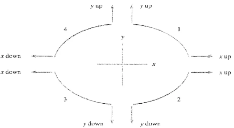
Frequently, an appropriate transformation is suggested by the data. One type of transformation that statisticians have found useful for straightening a plot is a power transformation. A power (exponent) is first selected, and each original value is raised to that power to obtain the corresponding transformed value. Table 5.6 displays a "ladder" of the most frequently used power transformations. The power 1 corresponds to no transformation at all. Using the power 0 would transform every value to 1, which is certainly not informative, so statisticians use the logarithmic transformation in its place in the ladder of transformations. Other powers intermediate to or more extreme than those listed can be used, of course, but they are less frequently needed than those on the ladder. Notice that all the transformations previously presented are included in this ladder.
Figure 5.31 is designed to suggest where on the ladder we should go to find an appropriate transformation. The four curved segments, labeled l, 2, 3, and 4, represent shapes of curved scatterplots that are commonly encountered. Suppose that a scatterplot looks like the curve labeled 1. Then, to straighten the plot, we should use a power of x that is up the ladder from the no-transformation row (
x2 or x3 ) and/or a power on y that is also up the ladder from the power 1. Thus, we might be led to
squaring each x value, cubing each y, and plotting the transformed pairs. If the curvature looks like curved segment 2, a power up the ladder from no transformation for x and/or a power down the ladder for
y (e.g.,
√
y
or log(y)) should be used.Example #2 In many parts of the world, a typical diet consists mainly of cereals and grains, and many individuals suffer from a substantial iron deficiency. The article "The Effects of Organic Acids, Phytates, and Polyphenols on the Absorption of Iron from Vegetables" (British Journal of Nutrition [1983]: 331-342) reported the data in Table 5.7 on x = proportion of iron absorbed and y = polyphenol content (in milligrams per gram) when a particular food is consumed
Food x y
Wheat germ 0.007 6.4 Aubergine 0.007 3.0 Butter beans 0.012 2.9
Spinach 0.014 5.8
Brown lentils 0.024 5.0 Beetroot greens 0.024 4.3 Green lentils 0.032 3.4
Carrot 0.096 0.7
Potato 0.115 0.2
Beetroot 0.185 1.5
Pumpkin 0.206 0.1
Tomato 0.224 0.3
Broccoli 0.260 0.4 Cauliflower 0.263 0.7
Cabbage 0.320 0.1
Turnip 0.327 0.3
Sauerkraut 0.327 0.2
Use your transformed equation to answer the following questions.
1.) What is the residual value for Turnips.
2.) Suppose Yams had a proportion of iron absorbed was .181, what would be the predicted polyphenol content of Yams.
Section 4.2: Relations in Categorical Data
Because the correlation coefficient can only be used when both variables are quantitative, we often have to use two-way tables when analyzing the relationship between qualitative or categorical variables.
The table below gives information on the age and the number of school years completed for Americans (in thousands).
Age Group
Education 25 to 34 35 to 54 55 and over
Did not Complete High School
5325 9152 16035
Completed High
School 14061 24070 18320
1 to 3 years of
college 11659 19925 9662
4 or more years of college
10342 19878 8005
To describe the relationship between the two categorical variables Age and education, we need to calculate appropriate percents from the counts given. No single graph or correlation coefficient will be able to capture this relationship adequately.
Let’s use this table to answer a few questions:
1) What is the total number of people described by this table?
Age Group
Education 25 to 34 35 to 54 55 and over Total
Did not Complete HS
5325 9152 16035
Completed High School
14061 24070 18320
1 to 3 years of college
11659 19925 9662
4 or more years of college
10342 19878 8005
Total
2) What percentage of Americans did not finish high school?
3) What percentage of Americans who had between 1 and 3 years of college are over 55?
4) What percentage of Americans who are between 25 and 34 years old had only completed high school?
5) Is there a relationship between age and whether or not one completed 4 years of college?
Age Group 25-34 35-54 55 and over
Percent with 4 years
of college 1034241388=25 % 1987873028=27.2 % 800552022=15. 4%
A bar graph helps further:
25-34 35-54 55 and over
0 5 10 15 20 25 30
Age
%
w
it
h
4
y
e
ar
s
o
f
co
lle
Simpson’s Paradox
Example: In the first half of a baseball season, player A had a batting Average of .344 for 160 times at bat while player B had an average of .341 for 240 times at bat. Player A is a better hitter than B, right? In the second half of the season player A’s average was .250 for 240 times at bat while player B’s average was .238 for 160 times at bat. Player A is still the better hitter right? Player B disagrees and says he can prove it.
Simpson’s Paradox refers to the reversal of the direction of a comparison or an association when data from several groups are combined to form a single group
The reason for Simpson’s Paradox stems from categorical lurking variables. In our example the lurking variable is the different at bats for the 1st and 2nd half of the season.
Example 2: Two students are arguing as to who is a better student. The two students divide up the course offered at their school into “easy courses” and “difficult courses” and then compile the table below by inserting their respective grades and calculating their GPA:
Difficult Classes Easy Classes
Student 1 Student 2 Student 1 Student 2
G
ra
de AB 29 15 220 02
GPA 3.18 3.17 3.09 3.0
As the table points out, for both easy and difficult classes, student 1 has the higher GPA.
Player A Player B
1st half Times at bat 160 240
average .344 .341
Hits .344 • 160 = 55 .341 • 240 = 82
2nd half
Times at bat 240 160
Average .250 .238
Hits .250 • 240 = 60 .238 • 160 = 38
Entire Seaso n
Total Hits 115 120
Total at bats 400 400
Student 2 then decides to compile their data and ignore the division into difficult and easy courses. When doing so he comes up with the table below. The table shows that he now has the higher GPA.
This reversal is, again, an example of Simpson’s Paradox, and is the result of the lurking variable “class difficulty” which when added into the analysis presents a different picture.
Student
Student 1 Student 2
G
ra
de AB 429 17
Section 4.3: Cautions about Correlation and Regression
A
Lurking Variable
is a variable that is not among the explanatory or response variables in a study and yet may influence the interpretation of relationships among those variables. A lurking variable can falsely suggest a strong relationship between x and y, or it can hide a relationship that is really there. Lurking variables can dramatically change the conclusions of a regression study. Because lurkingvariables are unrecognized and unmeasured, detecting their effects is a challenge. Many lurking variables change systematically over time.
Example 1: As the number of cell phones has increased, so have the number of accidents on I-95. So there is a strong positive correlation between the amount of cell phones and the number of car accidents. What is the lurking variable in this example?
Example 2: A study of 1000 deaths in California showed that left-handed people died at an average age of 66 while right-handers died at age 75. Should left-handers fear an early death?
“Beware the lurking variable” is good advice when thinking about an association between two variables. The example below illustrates
Common Response.
The observed association between the variables shoe size and math ability is explained by a lurking variable, age. This common response creates an association even though there may be no direct causal link between x and y.Example 3: If we were to collect data on the shoe size of a child (age 6 to 18) and their Mathematical ability we would probably find a strong positive correlation. This does not mean that having a larger foot causes you to be better in math. It simply means that the third variable, age, causes both shoe size and mathematical ability to increase.
Two variables are
Confounded
when their effects on a response variable cannot be distinguished from each other. The confounded variables may be either explanatory variables or lurking variables. When many variables interact with each other, confounding of several variables often prevents us from drawing conclusions about causation.Math ability Shoe size
Example 4: Researchers found that the more schooling a man’s wife had, the less likely he was to be at risk for heart disease. Confounding would occur if the men who married college graduates differ from those who don’t on some variable that is related to heart disease. We know that stress affects the heart. Maybe men who marry college grads have less stress because their wives make good livings and lessen the burden of bill paying.
Example 5: Many studies have found that people who are active in their religion live longer than nonreligious people. But people who attend church or mosque or synagogue also take better care of themselves than nonattenders. They are less likely to smoke, more likely to exercise, and less likely to be overweight. The effects of good habits are confounded with the direct effects of attending religious services.
Note: many observed associations are at least partly explained by lurking variables. Both common response and confounding involve the influence of a lurking variable (or variables) z on the response variable y. The distinction between these two types of relationships is less important than the common element, the influence of lurking variables. The most important lesson is: even a strong association between two variables is not by itself good evidence that there is a cause and effect link between the variables.
Example 6: Studies show that there is a correlation between societies that have high milk consumption and an increase in the incidence of cancer in those societies. Can we therefore conclude that high milk consumption causes cancer? Not really; keep in mind that societies that have high milk consumption are generally wealthier and its citizens also have a greater longevity – the longer one lives the more likely one is to contract cancer. Thus we are not sure if the higher incidence of cancer is due to the third factor of longevity or the milk consumption, or some combination of both.
The third factor of longevity is a lurking variable.
Here is the moral of story:
Correlation/Association Doesn’t Imply Causation!
Drink
milk
Contract cancer