Lincoln University Digital Thesis
Copyright
Statement
The
digital
copy
of
this
thesis
is
protected
by
the
Copyright
Act
1994
(New
Zealand).
This
thesis
may
be
consulted
by
you,
provided
you
comply
with
the
provisions
of
the
Act
and
the
following
conditions
of
use:
you
will
use
the
copy
only
for
the
purposes
of
research
or
private
study
you
will
recognise
the
author's
right
to
be
identified
as
the
author
of
the
thesis
and
due
acknowledgement
will
be
made
to
the
author
where
appropriate
you
will
obtain
the
author's
permission
before
publishing
any
material
from
the
thesis.
Customisation of Web Content for Desktop and Mobile Devices
A thesis
submitted in partial fulfilment
of the requirements for the Degree of
Doctor of Philosophy
at
Lincoln University
by
Nassiriah Shaari
Lincoln University
ii
Abstract of a thesis submitted in partial fulfilment of the
requirements for the Degree of Doctor of Philosophy.
Abstract
Customisation of Web Content for Desktop and Mobile Devices
by
Nassiriah Shaari
Accessing websites from mobile devices has been gaining popularity but may not give the same results and experiences as accessing them from a personal computer. Growth in the use of mobile devices is accelerating and therefore issues with accessing the web from them are becoming increasingly important. To investigate problems users encountered while accessing websites from mobile devices we conducted a series of surveys and conducted a user trial. Results showed that on mobile devices, users get pages with different structure, terminology, content, and location of content than those on the desktops. Each of these differences negatively impact on the user experience for the site.
To address these issues, we present a server-side adaptation approach to prioritising adaptive pages to different devices through a prioritisation system. The prioritisation approach allows users to prioritise page items for different devices. The prioritisation engine reorders, shows, and removes items based on its priority set by users or developers. With this approach, the overall web page’s structure (the parent-child relationships) is preserved and the same terminology, content, and similar location of content are delivered to all devices.
To evaluate the prioritisation system, we conducted user trials in a controlled lab-experiment evaluating the usability and user experience of adaptive pages developed for desktops and prioritised for mobile devices. We compared adaptive pages of a mock Facebook to the actual Facebook version. We also conducted a performance test analysing the performance of the prioritisation engine.
iii that adaptive pages and prioritisation provides a consistent web experience across different devices.
iv
Acknowledgements
In the preparation of this thesis, I am indebted to many people. I would not be able to complete this dissertation without tremendous help from great individuals. Here, I would like to express my deepest respect and sincere gratitude to all those who have helped me during the time of my Ph.D. study.
First and foremost, I would like to express my deepest gratitude to my supervisors – Dr. Clare Churcher & Dr. Stuart Charters for their invaluable advice, untiring support, kind supervision, and continuous encouragement throughout my study at Lincoln University.
My gratitude to all academic and staff at Applied Computing Department for their assistance and support.
My appreciation to Shirley Gibbs & Caitriona Cameron for their encouragement and assistance.
My thanks and appreciation to my Applied Computing friends – Elin, Mohammad, Yanbo for their support and friendships; Suraya Hanim, Sabrina, friends in Lincoln and Malaysia.
My appreciation to all my participants for my studies.
My deepest love and gratitude to my family in Malaysia for their love, encouragement, and doa.
v
Table of Contents
Abstract ... ii
Acknowledgements ... iv
Table of Contents ... v
List of Tables ... x
List of Figures ... xi
Chapter 1 Introduction ... 1
1.1 Research Questions ... 2
1.2 Proposed Research ... 2
1.3 Thesis Structure ... 3
Chapter 2 Literature Review ... 6
2.1 Overview of the Web ... 6
2.1.1 Types of Websites ... 6
2.1.2 Mobile web ... 7
2.2 Usability and User Experience ... 8
2.2.1 Usability ... 8
2.2.2 Usability Attributes and Measures ... 8
2.2.3 User Experience ... 9
2.3 Mobile Device Technology ... 9
2.3.1 Types of Mobile Devices ... 10
2.3.2 Mobile Operating Systems ... 10
2.3.3 Mobile Browsers ... 10
2.3.4 Mobile Network Connections ... 10
2.3.5 Mobile Emulator ... 11
2.4 Web on Mobile Devices ... 11
2.4.1 Alternative Versions of Sites ... 12
2.4.2 Automatic Adaptation... 12
2.5 Web Adaptation for Mobile Devices ... 13
2.5.1 Adaptation Types and Mechanism ... 14
2.5.2 Adaptation Approaches ... 15
Client-side Adaptation ... 15
Intermediate/Proxy Side Adaptation ... 17
Server-side Adaptation ... 18
Comparison of Adaptation Approaches... 19
2.5.3 Customisation and Personalisation ... 20
Types of Customisation ... 21
Examples of Adaptation by Customisation ... 22
2.6 Summary ... 24
Chapter 3 Requirements Gathering and Preliminary Studies ... 26
3.1 Use of Mobile Devices and Frequently Accessed Websites Survey – Survey 1... 26
3.1.1 Questionnaire Design and Validation ... 27
Pilot test ... 28
vi
3.1.3 Result and Analysis ... 29
Mobile Phone Usage ... 29
Types of Websites Access from Personal Computers and Mobile Devices ... 29
Mobile Web Usage and Experience ... 30
3.2 Social Networking Site Survey – Survey 2 ... 31
3.2.1 Questionnaire Design and Validation ... 31
Pilot Test ... 32
3.2.2 Participants and Procedure ... 32
3.2.3 Results and Analysis ... 32
Most Accessed Social Networking Site ... 33
Most Frequently Performed Tasks ... 33
Problems with the Social Networking Site on Mobile Devices ... 34
3.3 Social Networking Site (Facebook) - User Trial ... 34
3.3.1 Instrument Design and Validation ... 34
Questionnaire and Task Design ... 35
Pilot Test ... 35
3.3.2 Participant Recruitment ... 36
3.3.3 Materials and Procedure of the Trial – Conducting the Pilot Trial ... 36
Materials for the Trial ... 36
Procedure for the Trial ... 37
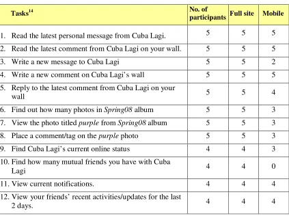
3.3.4 Results and Analysis ... 38
Number of Completed Tasks ... 38
Tasks Completion Time ... 42
Participants’ Comments ... 44
3.3.5 Limitations ... 44
3.4 Summary ... 45
Chapter 4 Proposed Approach ... 47
4.1 Issues with Web on Mobile Devices ... 47
4.1.1 Dedicated-Different Versions of Pages for Mobile Devices ... 47
4.1.2 Adaptation of Web Pages for Mobile Devices ... 48
4.2 Proposed Approach ... 48
4.3 Structuring of Pages for Prioritisation ... 51
4.4 Storage of Preferences ... 52
4.5 System Overview ... 52
4.5.1 Detect Device and User ... 53
4.5.2 Load Preferences ... 53
4.5.3 Prioritise and Display Items ... 54
4.6 Scenario Example ... 54
4.7 Summary ... 55
Chapter 5 Prioritisation Implementation... 57
5.1 Background ... 57
5.2 Identifying Prioritisable Elements ... 58
5.3 Overview of the Prioritisation Engine ... 59
5.4 Storing and Managing the Data ... 60
5.5 Preparing/Creating the XSLT Stylesheet ... 63
5.6 Constructing the Prioritisation Engine ... 65
5.6.1 Identifying the User, Device, and Page ... 65
vii
5.6.3 Updating the Items’ Preference ... 68
5.6.4 Sorting and Displaying the Prioritised Page ... 71
5.7 Strengths and Weaknesses of the Prioritisation Engine ... 72
5.8 Summary ... 74
Chapter 6 User Trial - Method and Design... 75
6.1 Overview and Purpose of the Trials ... 75
6.2 Method ... 76
6.3 Instrument Development - Survey and Tasks Design ... 77
6.3.1 Background Questionnaire... 77
6.3.2 Familiarisation with the Mobile ... 78
6.3.3 User Tasks ... 79
Choosing the Tasks for User Test ... 80
Setting up the Pages to Test ... 81
User Test Questions ... 84
6.3.4 Post Test Survey ... 84
6.3.5 Pilot Study ... 85
6.4 Participant Recruitment ... 85
6.5 Venue, Apparatus, and Materials for the Trials ... 86
6.5.1 Venue for the Trials ... 86
6.5.2 Apparatus and Materials for the Trials ... 87
6.6 Conducting the Trials – Data Collection ... 87
6.7 Study 1 – The Mobile Site Trial on the Mobile Phone ... 88
6.8 Study 2 – The Full Site Trial on the Laptop ... 89
6.9 Measurements and Data Analysis ... 89
Number of Completed Tasks and the Task Completion Time ... 90
Theme and Preferences from Users’ Responses ... 90
6.10 Threats to Validity ... 91
6.11 Summary ... 92
Chapter 7 User Trial Results ... 93
7.1 Overview of the Trials ... 93
7.2 Study 1 – the Mobile Site Trial ... 93
7.2.1 Demographic Information ... 94
7.2.2 User Tasks ... 94
7.2.3 Task 1 – Update Status ... 95
Update Status on the Prioritised Version ... 96
Update Status on the Facebook Mobile Version ... 96
7.2.4 Task 2 – Find Friend ... 98
Find Friend on the Prioritised Version ... 99
Find Friend on the Facebook Mobile Version ... 99
7.2.5 Task 3 – Show Photo Album ... 100
Show Photo Album on the Prioritised Version ... 101
Show Photo Album on the Facebook Mobile Version ... 102
7.2.6 General Observations ... 103
7.2.7 Tasks Completion Time ... 104
7.2.8 Overall Preference and User Opinion for Study 1 ... 108
User Opinion and Discussion on the Prioritised Version ... 108
User Opinion on the Facebook Mobile Site ... 112
viii
7.3.1 Demographic Information ... 114
7.3.2 User Tasks Results for Study 2 ... 115
7.3.3 Overall Preference and User Opinion for Study 2 ... 116
7.4 User Opinion on Prioritising ... 117
7.4.1 Items to Prioritise (or to Display) ... 117
7.4.2 The Removing of Unimportant Items and the ‘more...’ Link ... 119
7.4.3 Re-ordering Items Based on Their Priority ... 120
7.4.4 Prioritisation (Customisation) vs. Personalization ... 120
7.5 Summary ... 121
Chapter 8 Performance Evaluation... 123
8.1 Background of the Performance Test ... 123
8.1.1 Factors Affecting Processing Time ... 124
8.1.2 Preparing the Pages and the Databases ... 125
8.1.3 Test Method ... 127
8.2 Results ... 128
8.2.1 Effect of Database Size on Prioritisation ... 128
8.2.2 Effect of Number of Page Items on Prioritisation ... 130
8.2.3 Effect of Number of Preferences (Items Selected to be Displayed) on Prioritisation ... 132
8.3 Other Factors Affecting the Performance ... 134
8.4 Summary ... 134
Chapter 9 Discussion and Conclusion ... 135
9.1 Overview ... 136
9.2 Device Adaptive Pages and Prioritisation Engine ... 137
9.3 Usefulness of the Prioritised Pages ... 139
9.3.1 Developer Driven Prioritisation vs. User Driven Prioritisation ... 140
9.3.2 Prioritisation Overhead ... 140
9.4 Proposed Improvements ... 141
9.5 Future Work ... 142
9.6 Research Contributions ... 142
9.7 Summary ... 143
References ... 145
Appendix A Overview of Mobile Devices Technologies ... 152
A.1 Types of Mobile Devices ... 152
A.2 Mobile Operating Systems ... 153
A.3 Mobile Browsers ... 154
A.4 Mobile Networks and Connections... 155
Appendix B The Mobile Web Survey ... 156
B.1 Research Information Sheet and Consent Form ... 157
B.2 Survey 1 - Questionnaire ... 158
B.3 The Mobile Web Survey Data/Results ... 160
B.3.1 Section A – Demographics ... 160
B.3.2 Section B - Mobile Device ... 160
B.3.3 Section C - Mobile Web ... 160
ix
C.1 The Social Networking Site Survey – Questionnaire ... 162
C.2 The Social Networking Site Survey – Analysis ... 163
Appendix D The Social Networking Site (Facebook) User trial ... 164
D.1 Questions and Tasks ... 165
D.2 The Social Networking Site (Facebook) User Trial -Data ... 166
D.2.1 Demographics ... 166
D.2.2 Tasks Completion Time ... 166
D.2.3 Participants’ Comments ... 168
Appendix E XSLT Stylesheet ... 169
E.1 The XSLT Stylesheet for the Prioritisation Engine ... 169
Appendix F User Trial Materials ... 170
F.1 Background Questionnaire ... 171
F.2 Familiarization with the Mobile Sheet ... 172
F.3 Trial Instruction and User Tasks ... 173
F.4 Questions ... 175
F.5 Post Test Questions ... 175
F.6 Interview Questions ... 176
Appendix G User Trial - Results ... 177
G.1 Study 1 – Trial on the Mobile... 177
G.1.1 Path, Number of Clicks, and Number of Scroll Taken to Complete Tasks ... 177
G.1.2 Things Liked ... 181
G.1.3 Things Disliked ... 182
G.1.4 Difficult Tasks ... 183
G.1.5 Preferred Version and Reasons ... 184
G.2 Study 2 – Trial on the Laptop ... 185
G.2.1 Path, Number of Clicks, and Number of Scroll Taken to Complete Tasks on Study 2 ... 185
G.2.2 Things Liked ... 187
G.2.3 Things Disliked ... 187
G.2.4 Preferred Version and Reasons ... 187
G.3 Important Tasks on the Desktop and Mobile ... 188
x
List of Tables
Table 2.1 Comparison of adaptation approaches ... 19
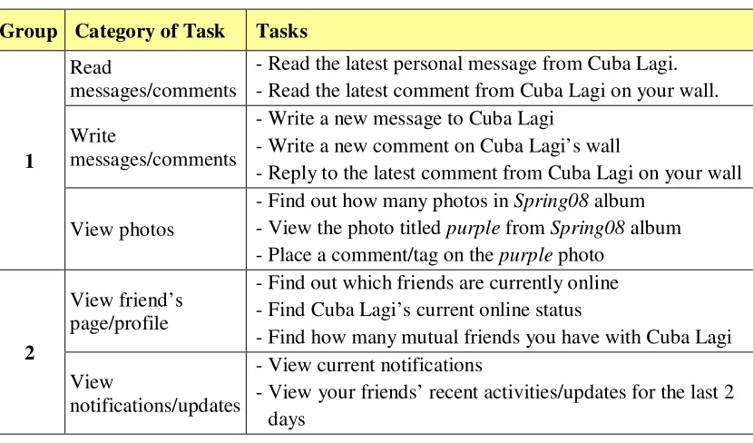
Table 3.1 Groups of Tasks ... 37
Table 3.2 Number of participants who successfully completed tasks on the standard and mobile site ... 38
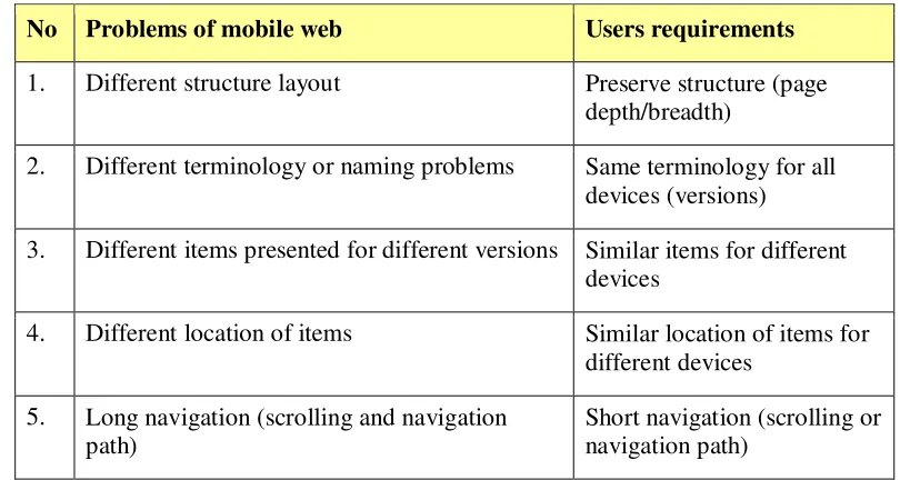
Table 3.3 Summary of problems of the mobile web and users requirements ... 45
Table 6.1 Tasks for familiarisation activities ... 79
Table 6.2 The trial design for study 1 ... 89
Table 6.3 The trial design for Study 2 ... 89
Table 7.1 The paired-samples t-test results ... 106
Table 7.2 The importance of tasks on desktop and mobile device; the bold scores are those in the first tier ... 118
Table 7.3 The number of times items to be displayed on mobile device were mentioned .... 119
Table 8.1 Summary of prioritisation processes and factors affecting performance ... 125
Table 8.2 Details of pages ... 126
Table 8.3 Time taken (in milliseconds) to prioritise a 50-item page with five preferences over different database sizes ... 129
Table 8.4 Time taken (in milliseconds) to prioritise pages with different number of page items with five preferences (items to be displayed in the final page) ... 130
Table 8.5 Time taken (in milliseconds) to prioritise a 50-item page with different number of preferences (items to be displayed in the final page)... 132
xi
List of Figures
Figure 1.1 Thesis structure ... 5
Figure 2.1 Screenshots of a few websites viewed on mobile phone emulators ... 11
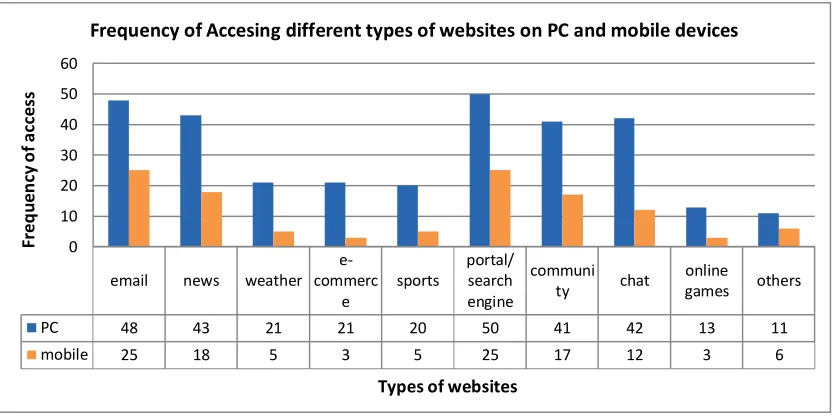
Figure 3.1 Frequency of accessing types of website on PCs and mobiles ... 30
Figure 3.2 Most frequent tasks carried out on social networking sites ... 33
Figure 3.3 Homepage of the Facebook mobile (as scrolled from the top to the bottom of the page) ... 39
Figure 3.4 Links available under 'Inbox' on the standard site ... 40
Figure 3.5 Message under friend's profile page ... 40
Figure 3.6 Friend's (Cuba Lagi's) profile page ... 41
Figure 3.7 Steps to find mutual friends ... 41
Figure 3.8 The mean task completion time for the full site and mobile site ... 42
Figure 3.9 The mean task completion time, the dashed rectangles highlight the tasks with at least one unsuccessful completion ... 43
Figure 4.1 An example of a HTML hierarchy ... 52
Figure 4.2 Overview of the Prioritisation system ... 53
Figure 4.3 a) The initial page and b) the page after prioritisation ... 55
Figure 5.1 The base page and its HTML structure ... 58
Figure 5.2 Overview of the prioritising system ... 59
Figure 5.3 Database diagram illustrating tables used to store details required for the prioritisation... 61
Figure 5.4 Items table... 62
Figure 5.5 Preferences table ... 62
Figure 5.6 Set of preferences and cutoff ... 63
Figure 5.7 The use of XSLT to format or transform a page ... 64
Figure 5.8 Template for identity copy ... 64
Figure 5.9 The login process for registered users ... 66
Figure 5.10 The process of identifying users ... 66
Figure 5.11 The HTML tree for the initial page ... 69
Figure 5.12 The page with assigned preference (number in yellow boxes) for each prioritisable item ... 70
Figure 5.13 The node tree after the removal of low priority items with a new element ‘more...’ added ... 71
Figure 5.14 The final prioritised page and its node tree ... 72
Figure 5.15 Example of divs after prioritisation ... 74
Figure 6.1 Overview of the trial design ... 77
Figure 6.2 The Home page of the full mock version and the actual Facebook full site version for user Cik Cuba. The red rectangles highlight the locations of items needed to perform the tasks (yellow boxes with number indicate the task’s number) ... 82
Figure 6.3 The Home page of the Prioritised version and the actual Facebook mobile version for Cik Cuba. The red rectangles highlight the locations of items to perform the tasks (yellow boxes with number indicate the task’s number) ... 83
Figure 6.4 Structure of the Trial ... 87
Figure 7.1 Update status features on the Home page and the Profile page of the Facebook full site ... 95
Figure 7.2 Update status box available on the Home and Profile page of the Prioritised version ... 96
Figure 7.3 Update status box on the Facebook mobile Home page ... 97
xii
Figure 7.5 Features to find friend on the Prioritised version... 99
Figure 7.6 Features to find friend on the Facebook mobile site ... 100
Figure 7.7 Links to Photo albums in the Facebook full site Home and Profile pages ... 101
Figure 7.8 Links to Photo albums in the Prioritised version ... 102
Figure 7.9 Links to Photo albums in the Facebook mobile version ... 103
Figure 7.10 The mean tasks completion time for the Prioritised version and the Facebook mobile version. ... 105
Figure 7.11 The mean task completion time for the five participants who have been accessing Facebook on their mobile. Error bars show the standard error. ... 106
Figure 7.12 The mean time taken to complete each task for each group. A trialled the Facebook mobile first, and B trialled the Prioritised version first. ... 107
Figure 7.13 Links to Photo and Photo Stories that were found to be confusing ... 113
Figure 7.14 The mean task completion time for each task. Error bars show the standard error ... 115
Figure 8.1 Flowchart of the prioritisation process ... 124
Figure 8.2 Examples of pages with 10 items and 20 items ... 126
Figure 8.3 Test structure... 128
Figure 8.4 Time for queries over database size (thousands of rows) ... 129
Figure 8.5 Time for different prioritisation phases over number of page items... 131
1
Chapter 1
Introduction
The use of mobile devices to access the web is becoming more and more prevalent. This thesis looks at a number of issues regarding the user experience of accessing the web via mobile devices. In particular, we investigate the problems caused by having several versions of a website to cater for access from different types of device. In later chapters, we introduce our prioritisation engine which allows a single page to be adapted for different devices according to the users’ preferences.
At the time of writing the number of Internet users has surpassed 2.4 billion; 1.5 billion of these users are from developing countries (ITU, 2011). Mobile phone subscriptions have reached 5.9 billion worldwide with over 4.5 billion subscribers from developing countries. As mobile devices and wireless technologies improve, the number of users accessing the Internet from their mobile phones (or mobile devices) is expected to keep increasing. These mobile devices allow users to access websites from anywhere and at any time.
There are 1.2 mobile web users worldwide (ITU, 2011); 623.3 million mobile web users in the Asia Pacific region in 2011 and it has been estimated that the number will double by 20151. India has about 150 million mobile web users and it is expected that by 2013 the number of users accessing the web from their mobile will be greater than those who access the web from their personal computer (PC) (Ohri, 2011). In Vietnam, 50% of the population access the Internet with 40% of those also accessing the web from mobile devices (Cimigo, 2011). A study by Equation Research (Gomez, 2010b) found that 67% of all web users are also using a mobile device to surf the internet.
There have been vast improvements in mobile device technology, especially smartphones, PDAs, and tablets. This suggests that the experience of viewing web pages on these devices has the potential to be similar to the desktop. However there are still issues with users browsing the web on mobile devices (Gomez, 2010b), particularly because most websites are developed and optimised for desktops and because users have different preferences and use different devices for different tasks.
Accessing websites on mobile devices causes issues such as users getting inadequate content and layout, and having an unsatisfactory browsing experience (see Chapter 2). From our
2 preliminary studies (see Chapter 3), the unsatisfactory browsing was mostly caused by the mobile website being different from the standard site accessed from the personal computer. The differences between mobile and standard sites included:
Different structure layout
Different terminology or naming of items Different items presented for different versions Different location of items
Generally, users expect comparable mobile browsing experience to that on the PC (Compuware, 2011).
1.1 Research Questions
The main purpose of this study is to investigate a suitable approach to provide users with a consistent but tailored web experience across multiple devices.
This leads to the following questions:
What are prevalent mobile web issues?
How can we ensure that users get similar web pages and browsing experience while
accessing web pages from different devices?
Can an adaptive page and prioritisation approach tailor web pages adequately for
users with different preferences and devices? Hence, the objectives of this research are to:
identify problems of mobile web (while accessing websites from mobile devices) investigate the issues of prioritising content on different devices
examine the usefulness of the prioritisation engine and adaptive pages
1.2 Proposed Research
In this thesis we will:
Investigate some of the problems encountered with the use of mobile devices for web
3 devices; tasks performed in mobile browsing and issues encountered. We will look at users’ requirements/expectation of mobile web.
Describe the development of a prototype of a server-side prioritisation engine that uses
a prioritisation and customisation to tailor adaptive web pages to different devices based on a user preference profile.
Provide the results of an empirical evaluation, investigating the effect of ‘Adaptive
page’ prioritisation approach to users’ web experience and performance in terms of completion time, and users’ satisfaction and perception of prioritisation for mobile web browsing.
1.3 Thesis Structure
The overall structure of the study takes the form of nine chapters, including this introductory chapter.
Chapter 2 presents a review of the web and mobile device technologies that could affect mobile web. We review current methods of delivering or tailoring website to mobile devices, particularly adaptation approaches and techniques.
Chapter 3 discusses our preliminary studies conducted to identify problems and gather requirements to meet our main research questions. We conducted two surveys and a small-scale user trial. In the first survey we identified the types of websites people accessed most from their personal computer (PC) and mobile devices; and problems users encountered while accessing websites from their mobile device.
Chapter 4 presents our proposed approach and the design of a prioritisation engine to prioritise ‘adaptive’ pages for different devices based on users’ preferences.
Chapter 5 details how we designed a base ‘adaptive page’ and implemented the prioritisation engine.
Chapter 6 presents the user evaluation including the research methodology, describing the user trial design, procedures, participants, data collection, and data analysis.
Chapter 7 provides the findings of our trials undertaken to investigate the usefulness of the prioritisation engine and prioritised pages.
4
Chapter 9 discusses our findings, propose improvements, research contributions, avenue for future work, and a conclusion for the thesis.
5
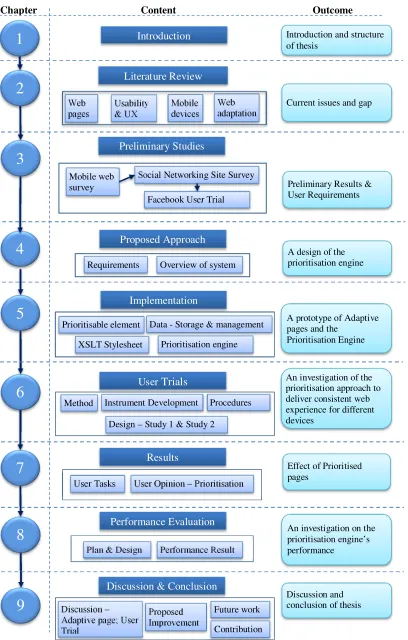
Figure 1.1 Thesis structure
Introduction
1
2
3
4
5
6
7
8
9
Literature ReviewChapter Content Outcome
Preliminary Results & User Requirements
Proposed Approach
Implementation
Performance Evaluation
Discussion & Conclusion User Trials
Results
Current issues and gap Introduction and structure of thesis
A design of the prioritisation engine
A prototype of Adaptive pages and the
Prioritisation Engine
An investigation of the prioritisation approach to deliver consistent web experience for different devices
Effect of Prioritised pages
An investigation on the prioritisation engine’s performance
Discussion and conclusion of thesis Mobile web
survey
Social Networking Site Survey
Facebook User Trial
Preliminary Studies Web pages Usability & UX Mobile devices
Requirements Overview of system Web adaptation
Prioritisable element Data - Storage & management
XSLT Stylesheet Prioritisation engine
Method Instrument Development Procedures
Design – Study 1 & Study 2
User Tasks User Opinion – Prioritisation
Plan & Design Performance Result
6
Chapter 2
Literature Review
Developments in web and device technologies have meant that accessing the web on mobile devices is becoming common. However, there are still problems with accessing the web via mobile devices. This chapter discusses mobile websites; the problems that exist with accessing the web via a mobile device; and reviews possible solutions to displaying web pages on mobile devices.
We outline an overview of the web in Section 2.1. Then, we outline the usability and user experience (Section 2.2); mobile device technologies (Section 2.3); and Web on mobile devices (Section 2.4). Next, we discuss the related work on web page adaptation (Section 2.5). Lastly, Section 2.6 summarises this chapter.
2.1 Overview of the Web
This section discusses the types of website and, mobile web and it issues.
2.1.1 Types of Websites
A website is “a set of [web pages] published by the same person, group or institution referring to a common topic” (Kriegel & Schubert, 2004). Websites have become important information sources and communication channels to disseminate and share information. Those accessing the web have different goals and perform various tasks and activities such as information seeking, communication, undertaking transactions (Cui & Roto, 2008; Kellar et al., 2006; Sellen et al., 2002) and browsing (Kellar et al., 2006; Sellen et al., 2002).
There are various types of websites and they can be categorised based on their purpose or function (Tarafdar & Zhang, 2005a, 2005b; Turk, 2001), and goal (Belanger et al., 2006). Qi and Davison (2009) classify web page into subject classification, functional classification, sentiment classification, and other types of classification. Different sites could have similar functions but different goals (Belanger et al., 2006).
7 commerce. Hong and Kim (2004) identify 16 categories of websites based on a Korean government agency consensus. Kane et al. (2009) identify 12 categories of websites commonly viewed on personal computers (PC) and mobile devices.
Based on these classifications, types of websites include educational, business transaction, entertainment, community, and portal and search engine sites. These websites can be accessed from various devices - PCs and mobile devices such as personal digital assistant (PDA) and mobile phones.
Generally, today’s popular websites as reported by Alexa.com2 are Google (search engine), Facebook (social networking site), YouTube (entertainment), and Yahoo! (portal/search engine). Similar websites are also popular for mobile users. A report by Opera (2010) shows that Google, Facebook, YouTube, and Yahoo! were the top mobile sites in 2010.
2.1.2 Mobile web
Mobile web or mobile website refers to the web as accessed from mobile devices. Accessing websites through hand-held devices present some unique problems and challenges (Murugesan & Venkatakrishnan, 2005) and is hindered because, commonly, the web content was designed for desktop computers (Cserkúti et al., 2006). As many websites are initially developed for desktops, users may encounter problems while accessing them from mobile devices. Kane et al. (2009) report inadequate page layout, small screen size of devices, poor network connections, and difficulty entering text as difficulties users encountered during web browsing on their mobile devices. Similarly, studies by Gomez (Compuware, 2011; Gomez, 2010b) report formatting (difficult to read and use); speed (slow download); and that the websites did not function as expected; as problems users encountered while accessing websites from mobile phones.
As stated in Chapter 1, the vast improvements in mobile devices technology, especially smartphones, PDAs, and tablets, indicate that the experience of viewing web pages on these devices could be similar to the desktop. However, the limited capabilities of mobile devices still causes issues with users’ experience when browsing web on mobile devices (Gomez, 2010b) especially for those websites developed primarily for desktops. The issues are also caused by users having different preferences and using different devices.
8
2.2 Usability and User Experience
As discussed earlier, although mobile web access is gaining popularity and expected to overtake the standard web access on desktops, users are having issues with the usability and user experience of mobile web. These are due to the fact that most of the websites are primarily developed for the desktops in addition to the limited capabilities of mobile devices. To understand factors that affect the usability and user experience, this section looks at the definitions related to usability and user experience.
2.2.1 Usability
There are many definitions of usability, depending on the context of use. ISO 9241-11 defines usability as “the extent to which a product can be used by specified users to achieve specific goals with effectiveness, efficiency, and satisfaction in a specified context of use” (Bevan, 2001). ISO IEC FCD 9126-1 defines usability as “the capability of the software to be understood, learned, used, and liked by the users when used under specified conditions” (Bevan, 1999). In short, usability refers to the ease of use and ease of learning; it is a measure of how user-friendly a system is (Bradshaw & Marshall, 2007; Nielsen, 2003).
Usability is one of the most important characteristics of websites (Tarafdar & Zhang, 2005b). Matera et al. (2006) define web usability as “the ability of web applications to support particular tasks with effectiveness, efficiency, and satisfaction.” Their definition is derived from the ISO 9241-11 definition of usability (Bevan, 2001). Web usability is about creating a website that will enable users to find what they are looking for quickly and efficiently3.
2.2.2 Usability Attributes and Measures
Usability can be measured using sets of criteria or attributes. Dix et al. (2004) suggest learnability, flexibility, and robustness as three principles that support usability, and Nielsen (1993) characterizes usability into learnability, efficiency, memorability, errors, and satisfaction.
There are many attempts to define general criteria for web usability for general or specific types of website (Palmer, 2002; Pearson & Pearson, 2007; Venkatesh et al., 2003). The studies of web usability are usually based on a set of criteria. For instance, Palmer (2002) uses five dimensions – download delay, navigability, content, interactivity, and responsiveness. Venkatesh et al. (2003) in comparing the perception of wired and wireless websites utilise Microsoft Usability Guidelines (Keeker, 1997) to define usability dimensions – ease of use,
9 made for the medium, content, emotion, and promotion. They report that ease of use was significantly more important in a wireless context and stress that a successful web presence does not automatically lead to a successful wireless web presence. Pearson and Pearson (2007) find that navigation, download speed, personalisation, ease of use, and accessibility are the criteria that are important in assessing web usability, with ease of use the most important. Tarafdar and Zhang (2005b) use six factors to look at factors that affect usability - information content, ease of navigation, download speed, customisation and personalisation, security, and availability and accessibility.
2.2.3 User Experience
Like usability, there are many definitions of ‘user experience’. There is no agreed or standard definition of a user experience (Botha et al., 2010) or mobile user experience.
The Usability Professionals’ Association (UPA)4 defines user experience as “Every aspect of the user's interaction with a product, service, or company that make[s] up the user's perceptions of the whole”. Colbert (2005) defines user experience as “users’ perceptions of interaction that constitute qualities of use”. ISO CD 9241-210 defines user experience as “all aspects of the user’s experience when interacting with the product, service, environment or facility” (Bevan, 2008). The World Wide Web Consortium (W3C)5 defines user experience as “a set of material rendered by a user agent which may be perceived by a user and with which interaction may be possible”.
Generally, user experience is about attitude or feeling that users have towards a product, regardless of the context of use. In this thesis, we will use this definition.
2.3 Mobile Device Technology
Blekas et al. (2006) define the term ‘mobile device’ as “a device specially designed for synchronous and asynchronous communication while the user is on the move”. Mobile devices have different features. The different features or capabilities of each mobile device can affect how the page is delivered or rendered on the device in terms of the presentation layout, the content, and the download speed. The constraints of these features can limit the mobile web usability (Kane et al., 2009) and users’ browsing experience or perception towards the web accessed on their mobile devices.
4 http://www.usabilitybok.org/glossary
10 This section will look at the types of mobile devices, and the components that could affect mobile web browsing.
2.3.1 Types of Mobile Devices
Mobile devices include a wide variety of devices such as tablets, PDAs, smart phones, and mobile phones.
In this study, the term mobile devices will refer to mobile phones, Smartphones and PDAs that uses mobile browser (not using the desktop or standard browsers). The summarised features of PDA, smartphone, and mobile phones are shown in Appendix A.1.
2.3.2 Mobile Operating Systems
There are different types of mobile operating system (OS) that will determine the functions and features available on a mobile device such as wireless application protocol (WAP), email, and text messaging.
A summarised description of currently available operating systems for mobile devices and their features and characteristics are described in the Appendix A.2.
2.3.3 Mobile Browsers
Mobile browsers (also referred to as minibrowsers or micro browsers) enable websites to be displayed on mobile devices. Normally, mobile browsers support HTML with newer versions supporting XHTML, advanced Cascading Style Sheets(CSS), and CSS handheld style sheets. Today, there are many mobile browsers available.
There are two types of mobile browsers – default browsers or the browser pre-installed by the mobile phone vendor and user-installable browsers. Different type of mobile browsers could also affect how mobile web is rendered and displayed. A description of current major mobile browsers and their capabilities is summarised in Appendix A.3.
2.3.4 Mobile Network Connections
11
2.3.5 Mobile Emulator
An emulator is software that uses the same rendering code as an actual physical device. The emulator allows users to simulate how the device will work, although the output may not be exactly the same as the actual devices (Ballard, 2007). For mobile phones, mobile/WAP emulators are available on the web for users or web designers to see how websites would look like on specific types of mobile phone models. Users can select a phone model and key in the URL resource to be viewed on the phone. These emulators are very useful for users to view how a website would look like on a particular make and model of mobile phones. Figure 2.1 shows a few examples of websites on two online emulators6.
The figure shows that while some sites rendered well on the emulator, others such as Lincoln University’s website rendered badly. This is because Lincoln University’s website does not have a mobile site or apply any mechanism to tailor its website to ‘adequately’ fit mobile devices. However, the BBC, Google, and Yahoo! website redirect users to their mobile site.
2.4 Web on Mobile Devices
A successful web presence does not automatically lead to a successful wireless web presence (Venkatesh et al., 2003). Techniques to display web pages on mobile devices are important. The techniques can be categorised into two main categories: manual (or device specific authoring) and automatic re-authoring (or adaption) (Artail & Raydan, 2005; Bickmore et al., 1999). These techniques usually minimise the content to be delivered to mobile devices.
6 http://mtld.mobi/emulator.php (access date: January 2008)
news.bbc.co.uk www.lincoln.ac.nz www.google.co.nz nz.yahoo.com
12 Minimising the content to be delivered to mobile devices is necessary (Venkatakrishnan & Murugesan, 2005) to ensure that they can be rendered and displayed adequately on mobile devices. As mobile devices probably get all the information/content from many web pages, minimising the content will also ensure that pages delivered to mobile devices are not over-crowded, tampering with users’ browsing experience.
2.4.1 Alternative Versions of Sites
In manual authoring or device specific authoring, several alternative versions of web pages are developed to suit different types of devices; it normally produces good quality pages but is a difficult approach (Artail & Raydan, 2005). An example of this technique is to have standard site for desktop access and a mobile site for mobile access. This is employed by sites such as Facebook7, Air New Zealand8, and Stuff9. Having different versions of pages is difficult to maintain and causes inconsistency between versions as admitted by Facebook (Byron, 2011):
“Every time we launched a new feature, we had to build it multiple times across different code bases: once for facebook.com, then again for m.facebook.com,
touch.facebook.com, and in native applications as well. Honestly, we weren’t very good at doing this, so certain features were missing on different devices”.
2.4.2 Automatic Adaptation
Automatic re-authoring or adaptation approach employs a content adaptation method to tailor websites developed for desktops computers to mobile devices (Ahmadi & Kong, 2008; Bickmore et al., 1999; Bila et al., 2007; Xiao et al., 2008). This approach ensures the same web content is delivered to different devices; only one version of a web page needs to be developed and maintained; an adaptation engine or transcoding module converts the pages to tailor them to mobile devices (Bickmore et al., 1999). This approach supports the ‘One Web’ idea.
‘One Web’ is an approach to ensuring device independent web pages, where only one version of web pages need to be developed, but they can be viewed or accessed by different devices. Users will access the same web pages (same sources) regardless of devices they are using. According to the W3C (2008), ‘One Web’ means “making, as far as is reasonable, the same information and services available to users irrespective of the device they are using”. The idea
13 of ‘One Web’ is to keep content of website available regardless of the device available to users. This means, the website may be presented differently in different devices but users will get the same content. The following section discusses adaptation in more detail.
2.5 Web Adaptation for Mobile Devices
This section reviews the literature concerning the use of adaptation engines to tailor websites to mobile devices.
Many adaptation techniques have been investigated to reduce, customise, and adapt web content for mobile devices (Ahmadi & Kong, 2012; Bickmore et al., 1999; Bila et al., 2007; Caetano et al., 2007; Kulkarni & Klemmer, 2011; Nichols & Lau, 2008; Xiao et al., 2009; Xiao et al., 2008).
According to the W3C, adaptation is “a process of selection, generation or modification that produces one or more perceivable units in response to a requested uniform resource identifier in a given delivery context” (Lewis, 2005). In general, the goal of web adaptation is to tailor web content to be “adequately” delivered to mobile devices. In discussing adaptation, a few terms are commonly related to adaptation:
Transcoding
Transcoding is the process of converting data from one format to another (Ihde et al., 2001). It involves sets of rules or transcoding heuristics. A few sets of early transcoding heuristics introduced to adapt web pages to mobile phones (Bickmore et al., 1999; Bickmore & Schilit, 1997; Hwang et al., 2003; Whang et al., 2001) were used to minimise the page content. For example, the “first sentence elision transform” by Bickmore et al. is a rule to transform the first sentence of each block of text into hyperlink and hide the rest of the text; and the image reduction and elision transform is the transcoding rule that replaces images with their alt tags.
In addition to these heuristics, new heuristics with specific constraints can be generated depending on the need.
Delivery context
14 characteristics, and users’ profile including users’ preferences, users’ preferred language or their location (Butler et al., 2002).
The Composite Capabilities/Preferences Profile
The Composite Capabilities/Preferences Profile (CC/PP) is a data format that expresses information about delivery context (W3C, 2004).
Document Object Model
The Document Object Model (DOM) “is a platform- and language-neutral interface that will allow programs and scripts to dynamically access and update the content, structure and style of documents [i.e. HTML, XHTML, and XML]” (Hégaret et al., 2005).
RDF Site Summary / Really Simple Syndication
RDF Site Summary or Really Simple Syndication (RSS) is a lightweight XML format/application (Beged-Dov et al., 2000) and a web content syndication format (RSS Advisory Board 2009), which summarizes website.
XML Path Language
The XML Path Language (XPath) is a language for addressing parts of an XML document, designed to be used by both XSL Transformations (XSLT) and XPointer, providing basic facilities for strings, numbers and Booleans manipulation (W3C, 1999b). A few commercial adaptation systems, such as Mowser10, and Skweezer11, are available to tailor web pages to mobile devices. Each of these commercial adaptation systems or transcoders (transcoding systems) works differently and thus delivers the site differently (in terms of speed and content/layout). Users need to access the transcoder site and specify the URL of the page to be viewed on their mobile devices.
In addition, there have been many research efforts in approach to adapting web pages for mobile devices, which will be further discussed in the following section.
2.5.1 Adaptation Types and Mechanism
Adaptation can be grouped into two main categories (in terms of when the adaptation occurs) – static adaptation that pre-processes and stores multiple versions of content, and dynamic
10 http://mowser.com/
15 adaptation that performs the adaptation on-the-fly or in real time (Lei & Georganas, 2001; Yang et al., 2008).
Generally, content adaptation is a method of transforming original content to a version suitable for display on the requesting device (Mohan et al., 1999; Mohomed et al., 2006). Content adaptation occurs when any part of the content is modified from its original source. The mechanism of content adaptation (“what” to be adapted) includes the content’s format, size, characteristics, or layout adaptation (Fudzee & Abawajy, 2008). Changes in any of these factors will affect the overall page layout or appearance.
Layout adaptation focuses on the way web page layouts are being restructured to fit the devices’ screen. Automatic adaptation approach for layout adaptation is classified into two main categories – page reformatting and page scaling (Lam & Baudisch, 2005). Page reformatting includes the change or alteration in the page format such as transforming the page layout into a single column layout, eliminating images or animation, and splitting page into subpages. Repositioning and resizing HTML elements can be used to adapt the pages layout. For example, the location of elements can be re-arranged using a sorting mechanism; and their width or height can be resized by changing the attributes of the elements using Cascading Style Sheet (CSS). Page scaling reduces the page into smaller version known as a thumbnail; the aim is to preserve the original layout.
2.5.2 Adaptation Approaches
There are three main adaptation approaches (in terms of the place the adaptation occurs): client-side adaptation, intermediate (proxy) adaptation, and server-side adaptation (Butler et al., 2002; Kim et al., 2007). Adaptation could take place in any of those three places. In addition, adaptation could also occur in more than one place, which is referred to as a hybrid or distributed approach.
Client-side Adaptation
In client-side adaptation, adaptation occurs (or is done) on the client device and is mainly controlled by the device’s and the browser’s capabilities.
16 the device’s browser. This adaptation system works in the specific mobile browsers and is in contrast to the Narrow layout method. The Narrow layout method formatted the content to fit the screen width in a single column, and the order of content displayed follows the order they were initially coded in the original layout (the top content is displayed first). A user study conducted by Roto et al., focusing on viewing and navigating on web pages, showed that Minimap scores better than the Narrow layout method.
Buyukkokten et al. (2000; 2002) introduce a browser for PDAs called Power Browser. Page layout is adapted by generating an outline-like summary view of a web page using heuristics. The summary is extracted from important texts such as anchor text, URL structure, or ALT tags. Users can expand or collapse the links for interaction with each summarised items. While text summarisation simplifies the display of web page, it loses the visual context of the page because styles and images are eliminated.
Ahmadi and Kong (2012) introduce an adaptation approach that looks at content detection and layout adaptation by analysing the original page’s DOM structure and visual layout. The adaptation system uses heuristic rules that detects and splits the DOM elements of content-related parts into subpages. The system provides a table of content for the page and navigation links for each subpages. To implement their approach, a Small Screen Device (SSD) Browser prototype has been developed. The browser allows users to remove or preserve the web page formatting, and change the font size. In their user study conducted to compare the usability of the browser with Opera mobile, Ahmadi and Kong reported that the SSD browser was slightly better in the area of subjective satisfaction, efficiency, and aesthetic. The splitting of pages into subpages reduces the need to scroll; however, it introduces additional navigation tasks or clicks.
Baudisch et al. (2004) introduce a browser that presents web pages using a fisheye view named Fishnet. Other examples of client-side adaptation approach are mobile or micro browsers that reside on the client devices. Opera Mobile is a commercial browser that uses Small Screen Rendering (SSR) (OperaSoftware, 2010) technologies to adapt web pages to users’ device. It adapts web pages into a single column layout and offers a zooming feature. Similarly, SmartView (Milic-Frayling & Sommerer, 2002) also adapts the page layout by partitioning a web page into segments, presented in a single column layout. The single column layout eliminates horizontal scrolling but increases vertical scrolling.
17 allow users to tap or pinch on items to enlarge or reduce their display. This pinching or zooming seems appropriate for pages that are already familiar to the users. Frequent switching between overview and the detail view, however, requires users to reorient themselves (Baudisch et al., 2004), which waste time (Baudisch et al., 2002) and may cause users loss of context (Adipat et al., 2011).
Intermediate/Proxy Side Adaptation
In intermediate adaptation, the adaptation engine resides on a proxy server remote from both the web server and the client device. Although this approach could overcome a mobile device’s weak processing capabilities, it requires clients to go through a proxy. The proxy may not have direct information about client or page content to adapt the pages appropriately. Digestor (Bickmore & Schilit, 1997) is an automatic adaptation engine that uses HTTP proxy to automatically re-author web pages for small screen devices. Digestor uses sets of transcoding rules to adapt the page content. For example, a block of text is replaced by its first sentence as a link to the original text block. A section header is used as link to outline the content of the whole sections. This approach is good in reducing the text on a page; however, it splits the page into multiple layers that require more clicks to go back and forth to the main content.
WebAlchemist by Whang et al. (2001) uses a structure-aware presentation method in attempting to preserve the layout of the adapted pages. WebAlchemist follows a new sequence of heuristics such as improved outlining transform and selective outlining transform. In addition to transforming section headers to hyperlink, it also transforms <ul> to hyperlink and groups corresponding <li> into subpages. In the extended WebAlchemist (Hwang et al., 2003), the web pages are split into subgroups reduced into hyperlinks using summarisation techniques to represent the subgroups.
An adaptation technique proposed by Chen et al. (2003; 2005) detects page’ structure and splits the page into subpages using thumbnail representation of a page and index to the subpages. This technique was claimed to be applicable at the client, the proxy, or the server. No user study was discussed. An evaluation on the processing time showed that it took less than 200 milliseconds to perform both page analysis and page splitting and more than 800 milliseconds to generate the thumbnail (Chen et al., 2003).
18 provides links for the details. It reduces text by removing frequent words but retains keywords to keep the text/structure meaningful. This technique is good in that highlights of page content are provided. It presents only part of web pages in summarised text that users can first read before deciding if they want to read the rest of the text. Not only that generating effective summary that accurately represents the main idea is difficult, this approach could also introduce a few more navigation tasks – users need to navigate between the summarised links and the content page.
Xiao et al. (2009) present an adaptation system that transforms web pages into subpages to fit a device’s screen width by enhancing the thumbnail technique. The system, SPTransform, employs thumbnail presentation and details transformation that uses textual enhanced thumbnail that adds a summary to the thumbnails. This technique preserves the visual context of the original page. A usability study conducted to test the subjective and objective performance of browsing experience showed that users’ browsing experience in terms of task completion time and input effort are better on the SPTransform than on the Opera browser. Kulkarni and Klemmer (2011) are working on an automatic proxy-side adaptation system that will adapt desktop pages using machine learning and heuristics approach. Page’s items or components are identified based on its DOM elements and set into classifiers. Pages with selected components are transformed into a single column layout and items are displayed in the order they were initially coded.
Research by (Blekas et al., 2006; Garofalakis & Stefanis, 2007) uses RSS feeds to adapt content to users’ devices. Using RSS, the layout of the original page is not preserved; only links and text are maintained and images and styles are removed.
Server-side Adaptation
In server-side adaptation, the adaptation engine resides on the server; the page developer has more control over how and what to adapt content to mobile devices (Laakko, 2008). The strength of server side adaptation is that it overcomes mobile devices’ weak processing capabilities and could result in a better adaptation, particularly if the server knows the device capabilities. Examples of server-side adaptation systems include the work done by (Artail & Raydan, 2005; Chua et al., 2005; Kim & Lee, 2006; Laakko, 2008; Manoharan, 2007).
19 into text. It loads the whole page and uses first sentence elision to hide certain page element from being displayed but keeping them on the page. A usability test conducted showed an overall satisfaction with the performance of the approach – that although the horizontal alignments of many elements were not maintained, the approach was effective in retaining the relationships among table elements and producing over average quality of displayed image.
Kim & Lee (2006) introduce a transcoding system based on CC/PP and annotation. The system splits web pages into smaller pages and provides a navigation map to represent the relations of the split pages. Splitting pages into subpages may introduce more clicks between levels of pages.
A dynamic content management and delivery system (Manoharan, 2007) adapts a few types of “content” to suit the device. It converts content from one format into another.
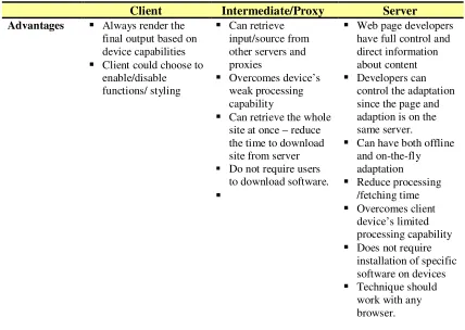
Comparison of Adaptation Approaches
As discussed earlier, adaptation may be done in any or in all the three locations - the client, proxy, and/or server. Combinations of these approaches may produce a better adaptation/result. Table 2.1 summarises the comparison of the three approaches.
Table 2.1 Comparison of adaptation approaches
Client Intermediate/Proxy Server
Advantages Always render the
final output based on device capabilities
Client could choose to
enable/disable functions/ styling
Can retrieve
input/source from other servers and proxies
Overcomes device’s
weak processing capability
Can retrieve the whole
site at once – reduce the time to download site from server Do not require users
to download software.
Web page developers
have full control and direct information about content
Developers can
control the adaptation since the page and adaption is on the same server.
Can have both offline
and on-the-fly adaptation Reduce processing /fetching time Overcomes client device’s limited processing capability
Does not require
installation of specific software on devices
Technique should
20
Client Intermediate/Proxy Server
Disadvantages Performance issues
due to limitation of device’s capabilities – limited bandwidth, processing power, - device/browser dependent
Users need to
download or install software/browser on devices. – may require updates to new adaptation/ version/ bugs fixed.
Slow download page
– devices need to download the original page before
adaptation
Less author control –
does not have direct information about content – may omit important content Requires more page
processing time – retrieve content from server
Requires request to go through proxy Need to connect to the
proxy and need to know which proxy – configure proxy server setting
Users need to
configure browser to use the proxy
May cause bottleneck
May cause bottleneck
/ traffic
May cause overload -
has to manage all computation and processing
May have heavy load
to process all adaptation and requests
Use of cache may
help
Overhead to the
servers.
More studies are now working on intermediate or server side adaptation, or a hybrid of the three approaches. The main concern is the types of adaptation done and how well the adapted page is delivered to the users and whether it meets users’ expectations.
The mobile browsers that devices are using may influence the adaptation results. Many browsers reconstruct web pages to fit in the mobile screen.
The study by Cho et al. (2006) looks at distributing and dividing the adaptation process among the client, the proxy, and the server. The aim was to minimise the process on one end and speed up the whole adaptation process. This reduces the adaptation burden or problem of having the workload concentrated only on one ‘processor’ (i.e. only to the client, the proxy, or the server). The adaptation process would be distributed adequately among the three processors depending on their resource usage. System evaluations were conducted to evaluate system’s response time and system’s stability, where the number of users was increased through simulation. The evaluations, comparing the standard approach (adaptation done on the server) and the proposed approach showed that the processing speed was faster on the proposed approach, indicating an improvement in response time and system stability.
2.5.3 Customisation and Personalisation
21 web pages that are of interest to a particular user. Customisation aims to allow users to determine the content of their interest. In contrast, personalisation aims to recommend and provide users with items of their interest without requiring users to specify it (Anand & Mobasher, 2005).
The term customisation and personalisation are sometimes used interchangeably. For example, in explaining their concept (adaptation approach) Kao et al. (2009) use the term personalisation when referring to customisation. Nielsen (2009) defines customisation as “when users determine what they want to have” and personalisation as “when the system determines what to be presented based on prediction or history of users’ preferences....”. In this study, we will use Nielsen’s definitions.
Types of Customisation
Customisation as discussed earlier aims to adapt web pages based on users’ preferences. The customisation could occur in different forms. It occurs when users are allow to change or perform some modification to the original look and feels (or the structure) of the web page. Customisation can occur when users are allowed to determine which parts of a page’s content to display and/or how they are to be modified. For instance, users can modify the position of the page’s user interface (UI) or content, page’s setting or preferences, and the page’s skin or font size12.
Reposition the user interfaces (UI) elements and content on the page
This is done by moving, adding, and/or removing blocks of content on the page. For example, users can re-arrange (drag and drop) blocks of content on the page. User could also assign priority to sections/blocks of contents/functions that they want to be displayed first. Examples of pages (or websites) include Yahoo! and iGoogle.
Modification of setting/preferences
In this method, users can determine how many and/or which blocks of content to be displayed on a page. Users can turn on/off images/graphics/audio/video; users can add/remove applications and widgets.
Change of skin colours or font sizes
Change of skin colours or the font sizes of a page (or websites) is an example of a basic form of customisation.
12 http://www.webcredible.co.uk/user-friendly-resources/web-usability/customisation.shtml (access date:
22 While customisation on the device is device dependent, customisation on the web server is device independent and is more suitable for ‘One Web’ approach. We will look at examples of customisation in the next section.
Examples of Adaptation by Customisation
Several studies have investigated approaches to customising web pages, which allow users to determine content or items of their interest, for mobile devices.
Highlight (Nichols & Lau, 2008) allows users to create a mobile version of existing websites on a desktop. Highlight splits website pages into multiple pages or “pagelets”, based on tasks that users demonstrate on a desktop version. This helps to reduce individual page size and download time on the mobile devices. Highlight allows users to test their customised applications. If there are missing tasks, users can add them to the application. It is suitable for sites with tasks that are frequently performed by users. For example, a user might create a mobile application for a particular airport consisting of only the list of arrival times and search function for a particular flight. This application is saved in a proxy server. To use the application on the user’s mobile device, the user has to go to the proxy server main page and select the application from a list of applications. These were all done through Highlight Designer, a proxy-side adaptation system that adapts the page content and layout. An informal user study conducted with three users showed that Highlight Designer is easy to use even by novice users. An empirical evaluation comparing performing the same set of tasks using Highlight to browse with desktop browser features showed that Highlight application reduces the number of interactions. While this system (a Firefox extension) is good particularly for specific task-oriented websites, it may not be suitable for other types of websites such as informational and community sites. In addition, it requires the use of a specific browser, extra set up time, and requires users to access the proxy site first.