Katherine L. Meyer. Towards a Definition of Minimalism: Principles of Minimal Visual Design in Web Interfaces. A Master’s Paper for the M.S. in I.S degree. March, 2015. 58 pages. Advisor: Dr. Ronald Bergquist
“Minimalist” has grown into more than just a buzzword amongst Web designers. In the past ten years, a minimalist design aesthetic has rapidly gained popularity and respect in mainstream Web audiences. Most Web design experts agree that minimalist Web designers approach their work with a ‘less-is-more’ philosophy: only absolutely necessary graphic and content elements should be included. However, Web design experts differ in the details, and each has a slightly different argument about what characteristics qualify as minimalist.
This study surveys the writings of several prominent Web design experts to tease out a working definition of what constitutes a minimalist Web interface. The study then codes a sample of minimalist interfaces based on the most important characteristics of
minimalism, as determined by the working definition. The results suggest that visual focus on primary content, flat graphic design, and restricted color palettes are important features of minimalist websites.
TOWARDS A DEFINITION OF MINIMALISM: PRINCIPLES OF MINIMAL VISUAL DESIGN IN WEB INTERFACES
by
Katherine L. Meyer
A Master’s paper submitted to the faculty of the School of Information and Library Science of the University of North Carolina at Chapel Hill
in partial fulfillment of the requirements
for the degree of Master of Science in Information Science.
Chapel Hill, North Carolina March 2015
Approved by
____________________________________
Table of Contents
Introduction ... 2
Characteristics of minimalism in Web design ... 3
Restricted elements & maximized negative space ... 5
Flat patterns and textures ... 6
Use of typography to convey meaning ... 9
Use of a limited color palette ... 10
Use of a grid layout ... 11
Large background images or videos ... 13
Conflation with other design trends ... 16
Roots in visual art & human-computer interaction ... 16
Emergence of minimalism in Web design ... 20
Spread of minimalism in Web design ... 26
Methodology ... 29
Results and Conclusions ... 34
References ... 42
Appendix ... 45
Coding definition document ... 45
Sample Website Info ... 50
Coding sheets ... 55
INTRODUCTION
Over the past decade, minimalism in user interfaces has gained popularity on the Web, particularly among Western early-adopters such as Web designers, developers, and artists. This minimalist style is rapidly becoming an accepted design language of the Web, as it grows to prominence with a mainstream audience. However, like many branches of art or design, the definitions of phenomena and trends in Web design are largely reliant on relativist interpretations by experts in the field. Despite the
broadening popularity of minimalist Web interfaces, design experts disagree on exactly what qualifies an interface as minimalist.
The following study begins the messy task of teasing out a definition of
minimalist Web design. Due to its nebulous nature, this definition was determined by comparing the characteristics that Web design experts seemed to agree upon—though there are many nuanced differences from each source. This definition, and its
justification, is discussed in detail in Characteristics of minimalism in Web design. To provide context, this paper first explores the fine arts and human-computer interactions movements (both also called minimalism) which influenced this Web design trend. Next, the paper traces the emergence of minimalism in Web design and its
Finally, this paper examines a sample of minimalist interfaces, coded based on the most important characteristics of minimalism, as determined by the
working definition. The goal of this exercise was to analyze the fit of the working definition to real minimalist interfaces.
CHARACTERISTICS OF MINIMALISM IN WEB DESIGN
Before we move forward to examine the emergence and spread of minimalism in Web design, it is necessary to establish a firm working definition of minimalist Web interfaces. This task is a complicated one, because there is no consensus in the field as to what exactly constitutes a minimalist interface. Indeed, in some instances Web design experts seem to contradict each other in their definitions of minimalist Web interfaces—for example, Web design and JavaScript development expert Jacob Gube claims that most minimalist interfaces use clean right angles, while Smashing Magazine author and Web designer Cameron Chapman asserts that circles are widely used in minimalist designs. Thus, the concept of minimalist Web interfaces is rather nebulous. A website’s minimal-ness is better envisioned as a point on a continuum than a binary value. For this paper, the phrase a minimalist Web interface will actually connote ‘a Web interface that makes use of minimalist design principles and strategies to a significant degree’.
Snell, 2008; Gross, 2010). Based on the survey of materials conducted for this study, ‘a minimalist Web interface’ will be defined as one in which each of the content and design elements could be soundly argued to be necessary—that is, the designer(s) have considered each element and eliminated (or not included) any that are not required to support the core functionality or message of the website (Knight, 2009; Chapman, 2010; Gube, 2008; Snell, 2008; Seitz, 2013; Campbell, 2011; Gross, 2010; K, 2013). An element of a user interface will be defined as any individual unit of the interface: including but not limited to menu items, links, images, graphics, lines, captions, textures (like gradients), colors, fonts, or icons. The goal of minimalist Web design is to present content in a “naked, clean, and intuitive way,” by providing as little distraction from the content as possible (Gube, 2008).
This definition is deceptively simple—much like the interfaces it produces. But by adhering to the core concept of minimalism, by stripping a website down to “the barest elements necessary for a design to function,” website creators must also accept a cascade of design and content consequences (Chapman, 2010). There are several subtrends that almost always occur in minimalist web interfaces, to the point that some design experts include them as defining characteristics of minimalism. However, most of these characteristics of minimalist interfaces are either unavoidable consequences of minimalizing content, or they are design choices that serve minimalized content particularly well, and so have been adopted along with minimalism in most instances.
For simplicity in this paper, these will be referred to as characteristics of
websites make use of one or two of the characteristics more than the others. The characteristics of minimalist Web interfaces are:
• restricted elements to maximize negative space (Knight, 2009; Chapman, 2010; Gube, 2008; Snell, 2008; Gross, 2010; Seitz, 2013; Campbell, 2011; K, 2013); • flat rather than skeuomorphic patterns and textures;
• thoughtful use of typography to convey meaning (Seitz, 2013; K, 2013; Chapman, 2010; Gross, 2010; Gube, 2008; Snell, 2008);
• use of a limited or monochromatic color palette (K, 2013; Chapman, 2010; Gross, 2010; Gube, 2008; Snell, 2008);
• use of a grid layout (Chapman, 2010; Gross, 2010; Gube, 2008; K, 2013; Seitz, 2013); and
• large background images or videos (Chapman, 2010; Gross, 2010; Gube, 2008). Restricted elements & maximized negative space
Negative space has been called “practically synonymous with” and “the backbone of” minimalist interfaces (Knight, 2009; Chapman, 2010). Many minimalist designers use it as a tool to try to direct a user’s attention and allow them to digest content more easily (Gube, 2008; Snell, 2008).
Flat patterns and textures
In digital design, a skeuomorphic design is an object that has unnecessary, ornamental design features that mimic its original, real-world precedent. A classic example of skeuomorphism is a save button icon in a software application that looks like a floppy disk. A generation of children now knows what that icon means, but doesn’t know what a floppy disk is. Another example would be a mobile application that tells the temperature in a given location by displaying it on a graphic of a glass thermometer, complete with the shadows and textures to make it appear 3D (Greif, 2012).
Skeuomorphism was once thought to be necessary to help ease people who were primarily used to the physical world into digital design. The worldwide,
exponential increase of the number of people using digital devices means designers no longer need to worry that users won’t understand what a calculator application does if it doesn’t look like a real-life calculator. The majority of users have evolved to
understand purely-digital representations of things without physical metaphors (George, 2014). Over the past few years, there has been an overwhelming shift in the design community away from skeuomorphism. Many designers and other leaders of the tech industry strongly feel that skeuomorphism is outdated and old-fashioned.
Skeuomorphic visual cues have been called “visual masturbation.” They are perceived by some as nothing more than a way for a graphic designer to show off (Carr, 2012). Apple’s Find My Friends application (shown in Figure 2) as it was in 2012 is an example of skeuomorphic design: the shadows and textures are included by the designers in an attempt to replicate the look of a real-life leather address book.
As the antithesis of skeuomorphism, flat design has risen to popularity. Flat interfaces do not make use of any of the obvious highlights, shadows, gradients, or
other textures that make UI elements look glossy or three-dimensional (George, 2014). Microsoft, an early proponent of flat design, praises it as “authentically digital”: allowing the medium of digital interfaces to stop pretending to be something it isn’t (“Microsoft Design Principles”).
The portfolio of the German design firm iconwerk (Figure 3) provides excellent examples of flat design. Particularly good examples here are the mounted deer head and the ringing telephone, which have no 3D effects whatsoever, yet still manage to communicate the objects they symbolize (if not their contextual meaning).
unnecessary features. Many minimalist designs utilize flat textures because it allows them to remove gradients and shadows that could be deemed gratuitous.
The phrase ‘flat design’ is often used interchangeably with ‘minimalist design’, but this usage is misleading. The trends are similar, but not the same. Some experts believe that the flat design trend grew out of the popularity of minimalist UI design (Müller, 2014). Flat design generally refers to the textures, icons, or graphics in an interface. Minimalist design applies to the larger content and layout strategies.
The labeling of minimalist interfaces as flat may be influenced by the perception of some designers that minimalist design is really just “simple,” “lazy,” or “incomplete” design (Martin, 2007). To some designers, flat design may have a better connotation.
Use of typography to convey meaning
When a designer is restrained from adding gratuitous graphic elements, typography becomes a valuable tool. In many minimalist designs, bold or large typography is used to create graphic interest without adding any additional design elements or actual graphics (Chapman, 2010). Effectively exploiting interesting
typography can help compensate for having fewer elements like photos and graphics, and can make a minimalist design feel less “plain” or “boring” (Snell, 2008). Variations in font size, weight, and style become crucial in helping users understand the hierarchy and relative importance of text (Taylor, 2013).
interest in his name and navigation structure, without adding any extra graphics or even a background color.
Figure 4: The portfolio of designer Brian Danaher. http://www.briandanaher.com/ Use of a limited color palette
Like typography, use of color becomes another valuable tool for communicating meaning as a consequence of fewer elements on the page (Chapman, 2010; Snell, 2008). With less visual information vying for a user’s attention, color palettes are more noticeable and will be more influential in a site’s impact (Snell, 2008). In design
composition, differences in color hue and saturation are instrumental in communicating the importance of elements (Steane, 2014).
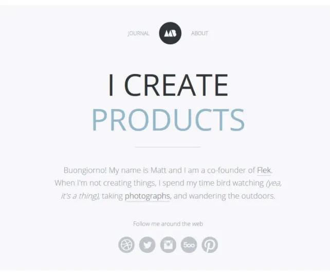
flashy, loud color schemes” (Gube, 2008). Subdued color schemes are intended to avoid upstaging the content—which, in the case of images, can still be brightly colored. Most minimalist designs are either monochromatic, or use only one bold color as an accent, and use it to—sparingly—highlight the most important elements of the site. These accented elements are usually clickable. Designer Matt Bango uses shades of grey in his portfolio (Figure 5), with sparing use of muted blue as an accent color.
Figure 5: The portfolio of designer Matt Bango. http://www.mattbango.com/ Use of a grid layout
• grids are an effective method of organizing content without adding any visual elements; and
• grids are particularly helpful when designing a website to be responsive—a trend that is separate from minimalism but is related and often co-occurs with minimalism.
Like typography and color, grid placement is another design tool that is often used to visually communicate with users without actually adding a new element to the page (Taylor, 2013). Grids can order designs without adding any complexity, and they also reflect the “rigid nature” of minimalism (Chapman, 2010; Gube, 2008). Steane likened a minimalist design’s grid to a “skeletal structure that supports design to deliver content” while appearing “invisible to the end user”. According to Treder, Windows-8 inspired “metro grids” have become extremely popular since 2013.
In 2011, Ethan Marcotte coined the phrase responsive Web design (RWD) to describe a style of Web design that rearranges pages based on viewing device widths. This is usually achieved with a combination of fluid grids, fluid images, and CSS3 media queries. Designers can specify breakpoints that control how the layout changes in different screen sizes (Steane, 2014). This strategy has become overwhelmingly popular in the past three years. Compared to other mobile design strategies like creating
grid is simply reduced from three to two when displayed on a smaller screen. For this reason, grid layouts are popular for designs who want their sites to be responsive.
In summary, a designer’s choice to include a grid layout in a minimalist Web interface may be a direct result of minimalist design strategy; a consideration for a RWD; or a combination of both.
Figure 6: The UP & ONWARD minimalist portfolio on a desktop-sized screen, with three items per row.
http://www.upandonward.com/
Figure 7: The UP & ONWARD portfolio on a mobile-sized screen, with
two items per row. Large background images or videos
ability of large background images/videos to create an impact on user perception of brand. Additionally, large background images are a prominent trend within RWD, which often co-occurs in minimalist Web interfaces. Finally, large background images/videos can really only be successful when all other elements have been strictly reduced, to prevent competing page elements.
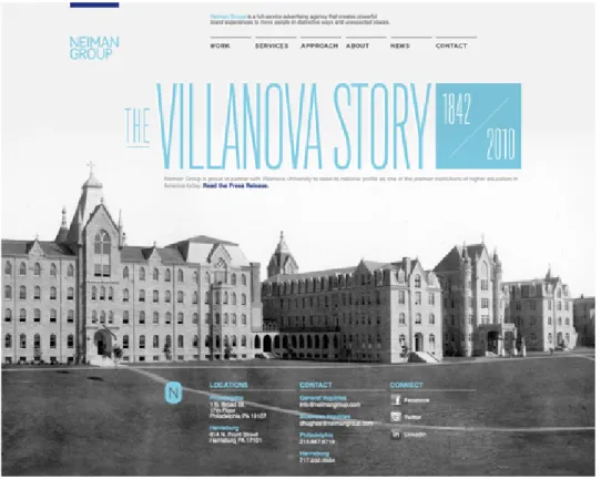
Perceptions of the minimal-ness of large background images and videos seem to have changed over time. In 2008, Gube claims that “minimal designs almost never have vibrant background images,” but is contradicted by Chapman (his fellow writer at
Figure 8: A screenshot of the Neiman Group, provided by Chapman. This site is no longer hosted live.
Conflation with other design trends
A particular difficulty that arises in identifying Web interfaces that make use of minimalist design strategies is that these strategies are often conflated with other overlapping design trends. Two of these—flat design and RWD—have already been discussed, and in some cases could be said to be characteristics of minimalist Web design. A third that must be briefly mentioned is clean design. Clean websites are often described as “uncluttered” with generous negative space, and in many cases it is used synonymously with minimalist design (McNeil, 2008, p. 55; Gube, 2008). For that reason, clean design can generally be regarded as another name for minimalist designs, though in some cases clean design may be a looser interpretation of minimalist design strategies—that is, with less strict emphasis on reducing unnecessary elements.
ROOTS IN VISUAL ART & HUMAN-COMPUTER INTERACTION
Figure 10: Staatliches Bauhaus by Walter
Gropius (Winton) Figure 11: Braun SK 4 record player designed by Dieter Rams (Dieter Rams)
Figure 12: Horizontal Line by Ellsworth
Kelly (Sims) Figure 13: Poster for the Zurich Town Hall by Joseph Mueller-Brockmann (Purcell)
Notable minimalist influences in visual art include graphic designer Josef Müller-Brockmann, painter Ellsworth Kelly, industrial designer Dieter Rams, and the famous German design movement Bauhaus. Figure 10 through Figure 14 are examples of the works of these artists. Note the clean lines, simplicity, and sparing use of color in each of these examples. Despite the wide variety of mediums, a coherent design style is
perceptible.
The perspective behind minimalist art was neatly summarized by the motto of famous 20th century architect Ludwig Mies van der Rohe: “Less is more” (Mies: The
Man, the Legacy, 2012). This motto would later become the spirit and unofficial mantra of minimalism in Web design.
At the end of the twentieth century, minimalism began to take shape as a separate trend within the field of human-computer interaction (HCI). In 1990, HCI researcher John M. Carroll was studying the ways people used technical training
manuals, and looking for ways to improve them (Carroll J. M., 1990). From his research, he developed the theory of Minimalism in technical communication, which emphasizes modular and task-oriented design. Carroll’s theory suggests that a successful design will support quick action by prioritizing brevity; and will anticipate its user’s needs, existing mental models, and sense-making behaviors (Carroll J. M., 1998).
towards Web design, Carroll’s Minimalism might translate to getting the interface out of the way, in order to allow users to achieve their goals.
Carroll rejects the notion that Minimalism can only be applied to relatively simple information domains. “... there is no reason to believe that even the most
intricate and complex domain cannot be conveyed through an action-oriented approach that focuses on core skills” (1998, 77).
In 1982, political scientist and data visualization expert Edward Tufte published the first edition of his highly influential book, The Visual Display of Quantitative
Information, which provided arguments on how to improve graphical displays of data. Tufte introduced the concept of a data-ink ratio. When discussing printed graphics, the data-ink ratio is the proportion of the data-ink (the “core of a graphic, the no-redundant ink arranged in response to the variation in the numbers presented”) to all ink used to print the graphic (93). Tufte advocated maximizing this data-ink ratio by removing any elements that do not reasonably contribute new information.
This concept of data-ink could be applied to Web interfaces by considering the ‘content-pixel’ ratio for any interface. The goal is the same: a high proportion of the amount of meaningful elements to all elements on the interface.
elements to draw attention for its own sake is irrelevant, distracting, and visually confusing.
EMERGENCE OF MINIMALISM IN WEB DESIGN
Beginning in the mid 2000’s, echoes of the minimalist art movement began to appear in Web interfaces: larger swaths of negative space, low amounts of content, and a restricted color palette. Google is often credited as the pioneer of minimalist Web interfaces. Google has prioritized simplicity and austerity in its interfaces ever since its beta offering in the 1990’s. Even though Google now offers a huge variety of products from Google Drive to YouTube to Gmail to Google Maps, its homepage has changed very little over 15 years. Only three navigation options are visible: in order to access the rest of Google’s offerings, users must use the grid icon to access a tray of more options.
Figure 16: Google (2014) https://www.google.com/
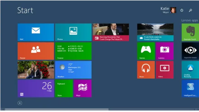
Google’s appreciation for minimalism was far ahead of the rest of the Web, but slowly user and designer preferences began to lean towards greater simplicity in Web interfaces. This shift was underscored by two major redesigns in two tech industry giants: Microsoft’s release of Windows 8 in 2011, and Apple’s release of iOS7 in 2013.
In 2010, design leads at Microsoft decided that their digital products had become overly complex: the interfaces were getting in the way of the users and the content. So, they attempted to establish clearer focus on the users by creating a new company-wide, cross-product design philosophy (Clayton, 2014).
unofficial name, and many people still refer to Microsoft’s design as such.) Microsoft’s goal was to create a minimal, revolutionary UI that could be used across its family of desktop and mobile operating systems; gaming consoles; applications; and websites.
This new design philosophy was quintessentially minimalist, drawing directly from the minimalist art movement. Microsoft’s official design documentation even claims that the Bauhaus school is one of its fundamental design pillars, and they
advocate “[removing] anything that’s superfluous […] perfection is achieved when there is no longer anything to take away” (Microsoft Design Principles - Windows App
Development).
Figure 17: Microsoft Windows 8 "tiles"
Carr praised Microsoft for “distancing itself from skeuomorphism while emphasizing a flat user interface that’s minimalist to the core […] It’s a stripped-down UI that many find appealing” (Carr, 2012). Microsoft was lauded for stripping away “the extra design fluff” and making it easier for users to read and understand content (George, 2014). Years later, as the trends set by Modern design gained purchase in Web design,
Microsoft continued to accumulate accolades for being “a few years ahead of the rest of the technology and user interface industry” (Bilton, 2013).
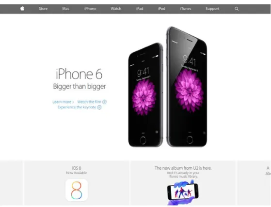
Though Apple has worked hard to define its brand in simplicity and ease-of-use, Apple designers have historically—and controversially—favored skeuomorphic patterns in their interfaces. In 2013, Apple radically revamped its mobile operating system, iOS, to a much flatter and more minimal style with iOS7. PC Magazine author Chandra Steele wrote that Apple’s move was just “catching up” to UI philosophies of Google and
Figure 18: Screenshots of iOS7 from AppleInsider.com
Figure 19: Apple.com (September 01 2014)
SPREAD OF MINIMALISM IN WEB DESIGN
In the early days of the Web, most designs were “cluttered and overbearing”, and many still are today (Knight, 2009). Even with early trendsetters like Google, it took time for minimalism to catch on in Web design. First came the early-adopters: the Web designers, graphic designers, artists, photographers, architects, and developers who were hip to the trend and embraced it. Designer and blogger Emily Chang wrote about the surge toward minimalism in 2006:
Perhaps it’s the success of Google’s search page, or our collective reaction against the flashing banner ads and intrusive popups of the last decade, or the Jonathan Ives effect, but it’s as though web users, designers, and developers alike have all agreed to a new de facto standard of Mies van der Rohe’s ‘less is more.’
Chang’s assertion that all Web users embraced minimalism was probably not accurate in 2006, and may be an exaggeration today—the audience of the Web is too diverse to make such sweeping statements. However, it is reasonable to assume she did speak for the perspective of many Web designers and developers—people who are deeply immersed in the cutting-edge trends of the Web.
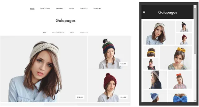
providing stock site templates that are almost entirely minimalist designs (see Figure 21 and Figure 22). This is particularly significant because these services often target people with no development or design experience—people who want to set up their online bike store or bakery website or online wedding invitation without having to touch Illustrator or a line of HTML. The reason these services are selling minimalist websites is because it’s what their customers want.
Figure 21: "Galapagos", a minimalist e-commerce theme sold by Squarespace http://www.squarespace.com/templates/?q=galapagos
METHODOLOGY
This study consists of the analysis of the visual design characteristics of 112 sample website home pages, all of which make use of minimalist visual design principles to some degree. These sample websites were identified as minimalist by
• one or more of the expert authors whose opinions contributed to the working definition of minimalist web interfaces for this study (Gube, Chapman, Knight, Taylor),
• a CSS gallery dedicated to aggregating particularly good minimalist websites to be used as inspiration for other web developers/designers (siteInspire, Siiimple), or
• the researcher herself, by assessing the visual characteristics of each potential sample website against the working definition characteristics. When the websites were identified by the researcher herself, they were often
discovered using a technique similar to footnote chasing. For example, after arriving at a Web design agency’s website identified as minimalist by an expert author, the
Figure 23: A breakdown of the sample websites by who, or what, identified them as minimalist interfaces
Sample website demographics
The researcher attempted to gather a relatively diverse set of sample websites. The majority of the samples were company websites (38%) or professional portfolios (36%), but e-commerce, marketing, publication (magazine/news), and education sites were also used, as well as two Web applications.
Researcher 28%
Expert author 48% CSS gallery
24%
Figure 24: The content types of the websites included in the sample
Many (38%) of the sample websites were in the design industry: for example, a company website for a design agency or a personal portfolio of a user experience designer. Sites for technology/development (14%), branding/marketing (11%), and fashion (11%) were also prominent. Websites about photography, art, architecture, film, and health were also included.
The majority of the sample websites originated from the United States (43%), but a wide variety of other countries were represented, including the United Kingdom, Japan, Canada, Australia, and Norway. See for a complete list of the origin countries.
0 5 10 15 20 25 30 35 40 45 50
Sample websites by origin country
US 48
UK 18
Japan 7
Canada 5
Australia 4
Norway 4
Argentina 3
France 3
Germany 3
The Netherlands 3
Sweden 2
Singapore 2
Brazil 1
Finland 1
Hungary 1
Ireland 1
Italy 1
Mexico 1
Poland 1
Spain 1
Switzerland 1
Vietnam 1
Figure 25: The origin countries of the websites included in the sample
Coding procedures
Each website was assessed based on its homepage alone. This decision was based on the assumption that designers intend to use their homepages to present their site’s identity and purpose.
A note about objectivity
Many of these characteristics are of a relative and subjective nature, and so assessment relied heavily on the judgment of the researcher—who acknowledges her judgments are influenced by her previous experience with interfaces; her personal opinions/preferences; and her background as a middle class, Western, white, information technology professional with an advanced formal degree. Interesting further research could be conducted based on a similar set of sample websites, using a larger and more diverse group of coders.
Coding definitions
A first draft of the definitions was written and tested on 20 of the sample websites, then revised to account for the more complicated question of color palette. The following characteristics are the final set that was used to assess each of the 112 sample websites. Based on the established working definition of minimalism, the first three characteristics were expected to be the most prevalence.
• Avoidance of unnecessary graphic elements (yes or no)
• Makes use of a substantial amount of negative space (yes or no) • Focused on primary content (yes or no)
• Restricts use of color (monochromatic, accent colors, or not restricted)
o If using one or two accent colors, uses these accent colors to draw attention to strategic elements (yes or no)
• Uses a grid layout, either as the primary or secondary structure of the page
(yes or no)
• Features a large, or full page, image or video (yes or no)
• Avoids using artificial 3D effects and textures to mimic physical spaces (yes or no)
• Uses circular elements in design or logo (yes or no)
The characteristic of ‘no unnecessary content’ was not assessed, as a true and reliable assessment of such a characteristic would require substantial understanding of the interface designer’s perspective, and perhaps also the needs of the users. For the full coding definition document used in the assessment, see the Appendix.
RESULTS AND CONCLUSIONS
For each characteristic assessed, the number of sample websites satisfying the criteria of each characteristic was determined. Note that for all data discussed, the results only identify characteristics that tend to occur in minimalist websites. Further research is needed to conclusively determine which trends are inherent in minimalism as a movement, and which simply tend to co-occur.
Minimalist characteristic # of sites % of sites
Design is focused on the primary content 108 96%
Flat design elements 108 96%
Avoids unnecessary graphic elements 97 87%
Uses substantial amount of negative space 94 84%
Uses typography in an unusual, striking or meaningful way 84 75% Features a large (or full page) image or video 64 57%
Uses a grid in the structure of the page 48 43%
Uses circular design elements 18 16%
Total 112 100%
Figure 26: Assessment totals for each minimalist characteristic
Occurring in 96% of the sample sites, the two most notably prevalent
characteristics in the sample set were: a design that draws the user’s eye to the primary content; and flat design elements. These two characteristics also tended to occur together: 104 of the 112 websites sampled (93%) were both flat and focused on the primary content.
Avoidance of unnecessary graphic elements and use of large amounts of negative space follow fairly closely behind, with 87% and 84% of the total websites sampled, respectively. A significant amount (75%) of the websites made use of
These results were somewhat surprising, particularly because the three characteristics that fit the theoretical core of minimalism in Web design (focus on primary content, avoidance of unnecessary graphic elements, and substantial negative space) were not present in all sample websites. Only 72% of the sampled websites were determined to possess all three characteristics together.
Substantial negative space—which has been called the “backbone” of
Focused on content, 108 Flat elements, 108 No unnecessary graphics, 97 Substantial negative space,
94 Meaningful typography, 84 Large image/video, 64
Grid structure, 48 Circular elements, 18
0 20 40 60 80 100 120
Number of sample websites
Minimalist characteristic assessments
Use of color in the sample websites
When assessing the use of color in the sample websites, the researcher looked at background colors, logos, navigational elements, iconography, and typography, but did not consider content as part of the color palette. So, for example, a photographer’s website could be considered monochromatic even if it features examples of her work that are in color.
Almost half of the websites sampled (49%, 55 websites) used a monochromatic color palette. Almost as many websites used one or two accent colors in an otherwise monochromatic color palette (46%, 52 websites). Only 5 of the sampled websites (4%) used unrestricted color palettes composed of three or more colors in different hues.
Of the 55 monochromatic websites, 51 were greyscale—they used exclusively white, black, and grey shades in their color schemes. The remaining four
monochromatic sites used neutral, earthy hues of green, gold, and tan. See Figure 27 for sample hues for each of these four sites.
Figure 27: Sample hues from non-grayscale monochromatic websites
Hexcode Color
#F5F3E7
#FFFFF3
#EAE8E0
Of the 52 websites that use one or two accent colors, 83% (43 websites) seemed to use the accent colors strategically to draw attention to important elements, like the logo or a ‘Contact us’ button. Only 9 of the websites with accent colors used them in a seemingly random or meaningless way.
Accent colors were used for a wide variety of purposes on the sites, including: • Indicating the ‘active’ selection in a navigation scheme;
• Drawing attention to the logo;
• Helping links or action buttons (conversion actions like ‘subscribe,’ ‘try,’ or ‘buy’) stand out from other content;
• Visually attractive elements (for example, a full-width ad for a sale on an e-commerce site);
• Or, calling attention to important words in a phrase, such as the brand name in a logo, or the profession in a tagline on a portfolio.
A new working definition
Based on the results of this study, we may refine the original working definition of minimalism in Web interfaces. This study did not seek to quantify or test the core principle of minimalism as the prioritization of the ‘most necessary’ elements and the elimination of any unnecessary elements. However, that principle is supported by the fact that almost all of the sites (96%) had a strong focus on the primary content, and that most of the sites (87%) had little or no unnecessary graphic elements.
minimalist design. Again, this particular quality was very susceptible to the researcher’s subjectivity. However, these results may indicate that though large swaths of negative space is the ideal for minimalist websites in theory, designers may choose to sacrifice that quality in order to use valuable screen space. This area in particular could benefit from further research.
The fact 96% of the sites used restricted color palettes—either monochromatic or very few accent colors—lends strong support to the argument that minimalistic websites use color sparingly. The high number of sites that used their accent colors strategically suggests that the minimalist designers are reducing their color palettes not only for aesthetic effect, but also to carefully influence users’ attention.
It remains unclear if flat design should be considered a necessary characteristic for a minimalist design. The surprisingly ubiquitous flat design patterns in the sample websites does support the assertion that, despite being popularly classified as separate design trends, flat design and minimalist design may be two branches of the same trend. At the very least, they are certainly complementary, and the two concepts coexist well in the same site design.
Opportunities for further research
As previously mentioned, this study was limited by the necessity to use one researcher’s subjective judgments to assess and code the sample websites. Further research would be greatly improved by including multiple coders with diverse national, cultural, ethnic, educational, and professional backgrounds.
Another promising avenue of research would involve communicating with the designers of the websites themselves. Because the judgments of viewers are so variable and subjective (one person’s definition of ‘a lot of negative space’, could be very
different from another’s), much weight is placed on the intentions of the designer. Did the designer intend to remove all unnecessary elements of the page? What does she or he define as unnecessary? Many insights might arise from conducting interviews or surveys with design professionals who describe the products they create as ‘minimalist’.
REFERENCES
Apple Reveals Overhauled iOS 7 with Vibrant, More Colorful Design. (2013, June 10). Retrieved September 27, 2014, from AppleInsider.
Bilton, N. (2013, April 23). The Flattening of Design. Retrieved September 21, 2014, from The New York Times.
Carr, A. (2012, September 11). Will Apple's Tacky Software-Design Philosophy Cause a Revolt? Retrieved September 21, 2014, from Fast Company.
Carroll, J. M. (1990). The Nurnberg Funnel Designing Minimalist Instruction for Practical Computer Skill. Cambridge, Mass: MIT.
Carroll, J. M. (1998). Minimalism beyond the Nurnberg Funnel. Cambridge, Mass: MIT. Chapman, C. (2010, May 13). Principles of Minimalist Web Design, with Examples.
Retrieved Aug 25, 2014, from Smashing Magazine.
Clayton, S. (2014, September 21). Modern Design at Microsoft. Retrieved from Microsoft.
Dieter Rams. (n.d.). Retrieved September 27, 2014, from Vitsoe.
George, D. (2014, March 10). Flat vs. Skeuomorphic. Retrieved September 3, 2014, from Standing Dog Blog.
Greif, S. (2012, September 12). What Skeuomorphism Is (And Isn't). Retrieved September 3, 2014, from SachaGreif.com.
Gube, J. (2008, November 17). Showcase of Clean and Minimalist Designs. Retrieved August 25, 2014, from Smashing Magazine.
Knight, K. (2009, December 3). Minimalist Web Design: When Less is More. Retrieved September 2, 2014, from Webdesigner Depot.
Lowe, M. (2011, December 13). Minimalism in Web Design. Retrieved September 4, 2014, from Scquelch Design.
Martin, M. (2007, January). 'Minimalism' Is Just Designer Speak for Laziness. Retrieved September 2, 2014, from Pro Blog Design.
McNeil, P. (2008). The Web Designer's Idea Book: The Ultimate Guide to Themes, Trends and Styles in Website Design. Cincinnati: HOW Books.
Microsoft Design Principles - Windows App Development. (n.d.). Retrieved September 21, 2014, from Microsoft Windows.
Mies: The Man, the Legacy. (2012). Retrieved September 1, 2014, from Mies van der Rohe Society.
Müller, F. (2014, November 7). Flat Design: A History, Past, Present and Future.
Retrieved January 13, 2015, from Onextrapixel - Web Design and Development Online Magazine.
Rubin, J., & Chisnell, D. (2008). Handbook of Usability Testing How to Plan, Design, and Conduct Effective Tests. Indianapolis, IN: Wiley Pub.
Sims, P. (n.d.). Ellsworth Kelly (American, Born 1923). Retrieved September 27, 2014, from MoMA.
Snell, S. (2008, January 16). The Anatomy of a Minimalistic Web Design. Retrieved September 2, 2014, from Vandelay Design.
Steane, J. (2014). The Principles & Processes of Interactive Design. New York: Bloomsbury.
Steele, C. (2013, June 7). The (Digital Design) World is Flat. Retrieved September 14, 2014, from PCMag.com.
Taylor, A. (2013, September 3). Flat and Thin Are In. Retrieved August 23, 2014, from Smashing Magazine.
Tufte, E. R. (1983). The Visual Display of Quantitative Information. Cheshire, Connecticut: Graphics Press.
Tufte, E. R. (1997). Visual Explanations: Images and Quantities, Evidence and Narrative.
Cheshire, Connecticut: Graphics Press.
Want, C. (2009). Minimalism. Retrieved September 01, 2014, from MoMA.
APPENDIX
Coding definition document
• Each interface will be assessed on its home page.
o Just because a site uses certain techniques on its homepage does not mean it uses them throughout the site.
o It is generally safe to assume that these sites, particularly the smaller sites, intend to put their ‘best foot forward’ and present their site’s identity and purpose on the home page.
• Interfaces will be viewed on a Lenovo Y480 IdeaPad laptop at 1366 x 768 resolution, in the Chrome browser (v. 39.0.2171.85 m) at 100% zoom. • Where necessary, the researcher will scroll beyond the ‘fold’ to assess the
interface.
• The characteristic ‘no unnecessary content’ will not be assessed, as a true and
reliable assessment would require extensive understanding of the interface’s
designer’s perspective, and perhaps also the needs of its users.
• The ‘subtract-it-till-it-breaks’ approach cannot be assessed without consulting
each interface’s designers.
• These criteria were tested on a sample of 20 interfaces, then revised. Assessment Criteria
1. Does the interface seem to avoid ‘unnecessary’ graphic elements?
The interface avoids using gratuitous graphics (lines, shadows, backgrounds, textures, overlays, gradients, etc.) to communicate information that may have been displayed in a more efficient way (higher data-ink ratio).
o No:
Only interfaces with extremely obvious violations will receive a no. (If this characteristic is considered too strictly, all but the most basic interfaces would have at least one element that someone
might argue unnecessary.)
2. Does the interface make use of a ‘substantial’ amount of negative space?
o Yes: (any or all of the following)
A generous use of negative space around elements
A generous use of negative space to define separate sections of the page
A generous use of negative space in the margins of the page A generous use of ‘negative’ space, even if that negative space is
actually over a background image, as long as that background image is somehow subdued or uniform—that is, clearly not part of the content.
3. At first glance, is the design focused on the primary content?
The researcher’s eye was quickly drawn to the main or primary content of the page (a portfolio’s projects, a magazine’s featured articles).
o No:
A bold non-content element distracts the eye away from more important elements.
4. Does the interface restrict its use of color? How?
o Monochromatic:
The interface uses a monochromatic color palette (white, black, grey).
o One to two accent colors:
The interface uses a primarily monochromatic color palette with one or two accent colors.
The interface uses a color palette composed of no more than two colors, even if primary.
Images do not count in the color palette, except in the case that a very dominant and colorful image features prominently in the interface (such as in a full page background).
o Not restricted:
The color palette involves more than two colors.
5. Does the interface use an accent color to draw attention to strategic elements?
The interface uses one or two accent colors to draw users’ attention to strategic elements, like the logo or links.
o If had accent colors: No:
It does not seem to use its accent color(s) in any meaningful way.
o If monochromatic or not restricted: N/A
6. Does the interface use typography in an unusual, striking, or meaningful way?
o Yes: (any or all of the following)
Typography is used to create visual interest or draw attention. Typography is used to communicate meaning, particularly the
hierarchy or relationship of text, labels, or headings.
‘Typography’ can refer to the manipulation or juxtaposition
involving any aspect of the typography: tracking, kerning,
alignment, font-face, size, etc.
7. Does the interface use a grid layout (either as the primary or secondary structure of the page)?
o Yes:
Some or most of the content on the page is organized in a grid, with neat rows and columns of regularly-sized content.
o Yes:
A large image or video is featured, either as a background or as a means of creating design identity and visual interest.
The image/video should be considered ‘large’ if it dominates the page, stretching across whole or most of the width and/or height of the page.
The image/video can be behind content, as a background, or not.
o No:
An interface might have substantial use of large photographs on the page (for example, a photographer’s portfolio) but if it does not feature a single dominant image, it will not be counted in this category.
9. Does the interface avoid using artificial 3D effects and textures? Is the interface flat?
o Yes: The interface uses few or no skeuomorphic effects (shadows, textures, gradients) on things like images, buttons, or form elements.
o An interface that is not flat in the strict sense may not necessarily be
skeuomorphic in the sense that it’s trying to mimic physical spaces (see
Google’s Material design).
10. Does the interface make use of circular elements?
Sample Website Info
ID Type Industry Country Identified
by
1 Company Branding/Marketing Argentina Gube
2 Portfolio Design Finland Chapman
3 Portfolio Design Germany Gube
4 Portfolio Design Hungary Gube
5 E-commerce Fashion Australia Researcher
6 Company Design US siteInspire
7 Company Design UK Siiimple
8 E-commerce Fashion UK Researcher
9 Portfolio Design US Chapman
10 Company Branding/Marketing UK Researcher
11 Publication Technology/Development US Chapman
12 Portfolio Design US Gube
13 E-commerce Fashion US Researcher
14 Company Textiles Germany siteInspire
15 E-commerce Technology/Development US Siiimple
16 Portfolio Photography Canada siteInspire
17 Portfolio Design Argentina Gube
18 Company Branding/Marketing US Gube
19 Portfolio Design US Researcher
20 Company Film The Netherlands Chapman
21 Portfolio Design France Gube
22 Portfolio Design Brazil Knight
23 Company Branding/Marketing Canada Gube
24 Portfolio Design Canada Gube
25 Company Technology/Development Canada Researcher
26 Portfolio Photography UK Chapman
27 Company Technology/Development Canada Siiimple
28 Project Art UK Chapman
29 Web app Music US Researcher
30 Marketing Sports France Researcher
31 Portfolio Design Spain Gube
32 Portfolio Film France Chapman
33 Company Textiles UK siteInspire
34 Company Branding/Marketing Italy Chapman
35 Company Design Mexico Gube
36 Portfolio Design US Gube
37 Education Art US siteInspire
38 Company Design Argentina Chapman
39 Portfolio Technology/Development UK Gube
40 Publication Art UK Gube
42 Marketing Hospitality Japan Researcher
43 Portfolio Design Norway Chapman
44 Company Design Australia siteInspire
45 Portfolio Design Norway Gube
46 Company Photography Poland Siiimple
47 Portfolio Design Germany Knight
48 Publication Fashion Singapore siteInspire
49 Portfolio Architecture Sweden Chapman
50 Publication Fashion US Researcher
51 Portfolio Photography UK Knight
52 Portfolio Technology/Development US Gube
53 Portfolio Design The Netherlands Researcher
54 Company Design UK Gube
55 Company Restaurant US siteInspire
56 Portfolio Design UK Gube
57 E-commerce Fashion US Siiimple
58 Portfolio Technology/Development US Gube
59 Company Design Norway Gube
60 Portfolio Architecture UK Knight
61 Portfolio Photography Japan Researcher
62 Company Art Australia Researcher
63 Marketing Fashion UK Researcher
64 Portfolio Design UK Researcher
65 Portfolio Fashion UK Researcher
66 Company Design UK Researcher
67 Company Branding/Marketing UK Siiimple
68 Education Design Ireland siteInspire
69 Company Design US Chapman
70 Company Technology/Development US Chapman
71 Portfolio Design US Gube
72 Portfolio Photography US Chapman
73 Portfolio Design US Chapman
74 Marketing Branding/Marketing Japan Researcher
75 Company Branding/Marketing Sweden Chapman
76 Company Design US Gube
77 Company Design US Gube
78 Company Health & Fitness US Siiimple
79 Portfolio Design US Gube
80 Company Branding/Marketing The Netherlands Researcher
81 E-commerce Fashion Japan Researcher
82 Portfolio Design US Gube
83 Company Architecture Australia siteInspire
84 Marketing Film Switzerland Researcher
85 Company Restaurant Singapore Researcher
87 Company Technology/Development US Researcher
88 Company Design US Researcher
89 Company Design US Researcher
90 Company Fashion US Researcher
91 E-commerce Health & Fitness US Researcher
92 Portfolio Design UK Gube
93 Portfolio Design US Researcher
94 Project History US Researcher
95 Company Design US siteInspire
96 E-commerce Technology/Development Japan Researcher
97 Company Technology/Development US Siiimple
98 Company Technology/Development US Siiimple
99 Company Technology/Development US Siiimple
100 Company Technology/Development US Siiimple
101 Portfolio Photography Norway siteInspire
102 Company Branding/Marketing US Siiimple
103 Company Technology/Development US Siiimple
104 E-commerce Fashion US Siiimple
105 Publication Technology/Development US Gube
106 Portfolio Design Japan Chapman
107 Portfolio Design Vietnam Gube
108 Portfolio Design US Chapman
109 Marketing Fashion US siteInspire
110 Marketing Branding/Marketing US Taylor
111 Web app Health & Fitness US Taylor
112 E-commerce Design Japan Researcher
Type Industry Country or
Language
Content amt
Company Restaurant Singapore Low
Portfolio Design Spain
Company Branding/Marketing Sweden Low
Company Film The Netherlands Low
Company Branding/Marketing The Netherlands
Company Health & Fitness US
Company Design Argentina Low
E-commerce Fashion Australia High
Company Design Australia
Company Architecture Australia
Company Technology/Development Canada
Portfolio Photography Canada
Portfolio Film France Low
Portfolio Design France
Portfolio Design Germany Low
Company Textiles Germany
Education Design Ireland
Portfolio Design Japan Low
E-commerce Fashion Japan High
E-commerce Technology/Development Japan High
E-commerce Design Japan High
Marketing Hospitality Japan Medium
Marketing Branding/Marketing Japan Low
Portfolio Photography Japan Low
Company Design Mexico
Company Design Norway
Portfolio Photography Norway
Company Photography Poland
Marketing Film Switzerland
Portfolio Design The Netherlands Low
Portfolio Photography UK Medium
Project Art UK Low
Portfolio Technology/Development UK
Publication Art UK High
Portfolio Photography UK Low
Company Design UK Low
E-commerce Fashion UK High
Company Design UK
Company Textiles UK
Portfolio Design US Low
Portfolio Design US Low
Company Branding/Marketing US
Portfolio Design US
Portfolio Technology/Development US
Portfolio Technology/Development US
Portfolio Design US
Publication News US
Publication Technology/Development US
Portfolio Design US
Publication Fashion US Medium
Web app Music US Medium
Company Technology/Development US
E-commerce Fashion US
Company Design US
Company Restaurant US
Company Design US
Education Art US
Coding sheets ID N o u n n eces sar y g rap h ic el em en ts N eg at ive sp a ce? F o c u s o n c o n te n t? R est ri ct ed co lo r? A ccen t co lo r? T y p o g ra p h y ? G ri d ? Im ag e/ vi d eo ? F la t? C ir cl es?
1 n y n accent y y n n y n
2 n y y accent y y y n y n
3 n y y accent n y y n y n
4 n y y accent n y n y y n
5 y y y mono n/a y y y y y
6 y y y not restricted n/a y y y y n
7 y y y mono n/a y y y y n
8 y n y mono n/a n y n y n
9 y y y mono n/a y n n y n
10 n y n accent y y y y y n
11 n y y accent y y n n y y
12 n n y accent y y y n y n
13 n n y accent y y n n n n
14 y y n mono n/a n n y y n
15 n y y accent y y y n y n
16 y y y mono n/a y y n y n
17 y y y accent y y y n y n
18 y y y mono n/a y n n y y
19 y n y mono n/a y y y y n
20 n n y mono n/a n n y y y
21 y y y mono n/a n y n y n
22 y y y accent y y n n y n
23 y n y accent y y y n y n
24 y y y accent y n y y y n
25 y y y accent y y n y y n
26 y y y mono n/a y n y y n
27 y y y mono n/a y n y y n
28 y y y mono n/a y n y y n
29 y y y mono n/a y y y y n
30 y y y accent n y y n y n
31 n y y mono n/a n y n y n
32 y y y mono n/a y n n y n
34 y y y accent y y n y y y
35 y n y mono n/a y y y y n
36 y y y mono n/a y n y y n
37 y y y mono n/a y n y y n
38 y y y mono n/a n y n y n
39 y y y mono n/a y n n y y
40 y n y mono n/a n n n y n
41 y n y not restricted n/a y n y y n
42 y y y mono n/a y n y y y
43 y y y accent y y y y y n
44 y y y mono n/a n n n y n
45 y y y accent n y y y y n
46 y y y mono n/a y n y y n
47 y y y mono n/a n y n y n
48 y y y accent y y n y y n
49 y y y accent n n n y y n
50 y y y mono n/a y n y y n
51 y y y mono n/a n n y y n
52 y y y mono n/a y n y y n
53 y y y mono n/a y n n y n
54 y n y accent y y y n y y
55 y y y mono n/a n n y y n
56 y n y accent y y y y n n
57 y n y mono n/a y y y y n
58 y y y mono n/a y n n y n
59 y y y mono n/a y y n y n
60 y y y accent y n n y y n
61 y y y mono n/a n n y y n
62 y y y mono n/a y n y y n
63 y n y accent y n n y y n
64 y y y accent n n y n y n
65 y n y accent y n y n y n
66 y y y not restricted n/a y n y y n
67 y y y accent y y n y y n
68 y y y mono n/a n n n y y
69 y n y accent y y y n y n
70 y y y accent y y n y y y
71 y y y mono n/a n y y y n
72 y n y accent y y n n y n
73 y y y accent y y n n y n
74 y y y mono n/a n n n y n
75 n y y mono n/a y y y y n
77 y y y accent y y n y y n
78 n y y not restricted n/a y y y y y
79 y y y accent y y n n y n
80 n y y mono n/a y y y y y
81 y y y mono n/a y n y y n
82 y n y accent y y y y y n
83 y y y mono n/a n n y y n
84 y y y mono n/a y n y y n
85 n y n mono n/a n n y y n
86 y y y accent y y y y y n
87 y y y accent y y n n y y
88 y y y accent n y y y y n
89 y y y accent y y y n y y
90 Y y y accent y y n y y n
91 y y y accent y y n y y n
92 y y y mono n/a n y n y n
93 y y y accent y y n n y y
94 y y y accent y y n n y n
95 y y y mono n/a n y n y n
96 y y y mono n/a y y y n n
97 y y y accent y n n y y n
98 y y y accent y y n y y n
99 y y y accent y y n n n y
100 y y y accent y y y n y y
101 y y y mono n/a n n y y n
102 y y y accent y y n y y n
103 y y y not restricted n/a y y y y n
104 y n y accent y y y n y n
105 y y y mono n/a y n n y n
106 y y y mono n/a y n n y n
107 y y y mono n/a y y n y n
108 y y y mono n/a y y n y n
109 y y y accent n y n y y n
110 y y y accent n y y y y n
111 y y y accent y y n y y n
Minimalism definition matrix
Author Year
No unnecessary graphic elements No unnecessary
content Focused on content
Subtract it till breaks approach Large amounts of white space Restricted use of
color typography Bold Circles
Subtle or restricted textures Clean lines / grid layouts Background images and/or videos
Seitz 2013
Karol K 2013
Campbell 2011
Chapman 2010
Gross 2010
Knight 2009
Gube 2008
Snell 2008
mentioned/included primary argument
not mentioned contradicted