Abstract—Since the rise of smartphones, APP application became an important tool in our life. However, a good interface design not only brings people to a more convenient life, also can improve the quality of life. Therefore, this study used the concept of human-computer interaction and the method of cognitive walkthroughs to design an early indoor parking navigation system. And then eye-tracking technique and Questionnaire for User Interaction Satisfaction (QUIS) were used to analyze the system. This study proposes to improve the interface method. We hope the indoor parking navigation system can be improved in the future. Moreover, the conclusions might be available to serve other researchers or developers as a reference.
Index Terms—eye-tracking, indoor parking navigation system, cognitive walkthroughs, QUIS, usability
I. INTRODUCTION A. Research Background and motivation
In the past fifty years, people believe that if they have their own cars can enhance the quality of life. Thus, the car ownership rate is rising. Parking demand is increasing when the number of motor vehicles rises. In order to solve the parking problem, there are many large-scale three-dimensional parking and underground parking to use (Chen, 2011). Many parking lots have hundreds or even thousands of parking spaces. However, People usually have a big trouble to find parking space when the cars drive in. Parking lots are mostly display mechanism with the remaining parking spaces, but not precise enough. Therefore, if the nice parking lot provides a solution, it can let the driver reach the ideal parking space directly. The driver can save their time to look for the parking spaces, and achieve parking purpose rapidly.
Navigation system is an example of anywhere things, where the computing facility is embedded in an everyday object (car) for an everyday task (driving). The maturing navigation systems market of over the past decade has prompted academic and commercial research into the human computer interface (HCI) for these systems.
A system of indoor parking navigation should be
Su ,K.-W Author is with the Dept. of Information Management, National Kaohsiung First University of Science and Technology , e-mail: [email protected]
Cai ,H.-H Author is with the Dept. of Information Management, National Kaohsiung First University of Science and Technology , e-mail: [email protected]
Wu ,Y.-Y Author is with the Dept. of Information Management, National Kaohsiung First University of Science and Technology , e-mail: [email protected]
Li Y.-T Author is with the Dept. of Information Management, National Kaohsiung First University of Science and Technology , e-mail: [email protected]
designed and considered from these problems. The system has evolved from the traditional GPS to the APP application by smartphone. Therefore, this research used usability testing; it involves the developed app parking lot navigation system, subjective questionnaires and the objective eye-tracker.
Eye-tracking has emerged as a promising method for detecting usability problems, especially in websites (Ball, Eger, Stevens & Dodd, 2006). Eye movement data and eye fixations can supplement the data obtained through usability testing by providing more specific information on the user's visual attention. This study aims to develop a task-based usability checklist based on cognitive walkthrough in views of mobile phone user interface participants. A structure of UI design elements and usability principles related to mobile phones were developed. To demonstrate the practical effectiveness of the proposed checklist, comparative experiments were conducted on the usability testing and eye-tracking.
B. Research Objective
Parking navigation is widely used, but there are no any smartphone APP programs designed to fit the user interface of the different needs of the "indoor" parking navigation system currently on the market. Therefore, usability evaluation are used the system to analyze the results of the system. The research objectives are listed below:
1. The important points are using the parking navigation system to realize Human-Computer Interaction (HCI), and using usability evaluation to design an indoor parking navigation system.
2. This study will have user objective eye-tracking experiments, to increase result of the accuracy. 3. In order to improve the interface of design, this study
add the method of measure include operation time, completion rate and operation error. We use these methods to cross analysis and let the system become more completely.
II. LITERATUREREVIEW A. User Interaction Design
Designing with a user-centered approach requires that the user be involved from the very beginning. It is important to integrate user's expertise and knowledge and to understand what people are doing, how, when, and why (Ji et al., 2006). Smart phone has become a natural part of our lives. Usability brings many benefits: Users are able and willing to use the various features of the phone and the services supplied by the operators, such as application (app), and, above all, user satisfaction increases (Zhijun, 2007). Therefore, how to let people in the use of smartphones, you can effectively and convenience to complete the tasks
Applying Eye Tracking to Evaluate Indoor
Parking Navigation System
currently performed by the smartphone, they need good communication interface (Le Peuple & Scane, 2003). B. The Design Criteria of Navigation System
In-vehicle navigation systems are an example of ubiquitous computing. With the proliferation of mobile consumer devices such as PDAs, intelligent phones and in-car navigation systems, it is no wonder that many navigation applications have been developed. Most of these applications invariably make use of some form of map. They also often exploit the increased accessibility of supporting technologies such as positioning system (e.g. GPS) and wireless network (Beeharee & Steed, 2006). This study adopts Ngo et al. (2000) the criteria of navigation system to establish the indoor parking navigation system. C. The Design Criteria of Small Screen
Shneiderman and Plaisant (2004) indicate a big challenge over the next these years will be addressing the usability of small displays (less than 640×480 pixels). Facilitating completion of basic tasks in small touch-screen interfaces has been an important goal in Human-computer interface research (Kwon, Choi & Chung, 2011).
Parush and Yuviler-Gavish (2004) found navigation time using the desktop platform to be shorter than navigation time using the cellular phone platform. Small display size with shorter text lines degrades visual search and reading performance (Parush & Yuviler-Gavish, 2004). Word length can cause problems with human-computer interfaces (Riegelsberger & Nakhimovsky, 2008). The frequency of using small mobile interfaces is currently much higher than that of using regular computer interfaces.
Small displays can display only limited information and thus we have to accurate understood what the user demand is. Then increase their operational time. This study adopts K?rkk?inen and Laarni(2002) the criteria of small screen to build the indoor parking navigation system.
D. Technology of Eye-tracker
Eye-tracking is based on the fact that a record of a person's eye movements while doing a task provides information about the nature, sequence and timing of the cognitive operations that takes place (Aula, Majaranta & Räihä, 2005). Eye-tracking studies have been used in diagnosing the effectiveness of Website designs with point of interest detection (fixation) and information transmission via eye movement (scan path) as two main indicators (Aula et al., 2005). Based on this relation between cognition and eye behavior, the trace of navigation pathways and user attention patterns is used to study the cognitive processes involved in reading (Aula et al., 2005) , picture perception, visual search (Bednarik & Tukiainen, 2006), problem solving, face perception and many other tasks. Eye-tracking data is mostly used in conjunction with user testing and videotaping (usually gaze plots and heat maps).
E. Application of Eye-tracking and the Small Screen Usability testing involves measuring the performance of users on tasks with regard to the ease of use, the task time, and the user's perception of the experience of the software application or systems such as a small screen. Eye-tracking has become a capable tool to answer research questions relating to where the user's visual attention is on the screen (Preece, Rogers & Sharp, 2002). Drewes and Schmidt (2007) made a comprehensive research on gaze gestures and
presented some scalable gaze gestures which could be performed in any location on screen, and used them for interacting with computers and devices with smaller displays.
As most existed eye-trackers are difficult to get accurate eye-movement data from a small view angle on real mobile devices. On the other hand, eye-tracking research on mobile usability evaluation grows accordingly (Norlien, 2011) , and it provides information about how users interact with a mobile graphical user interface and, helps usability professionals propose appropriate solutions for design optimization (Cheng, 2011).
Many usability testing methods used in various applications, we choose the cognitive walkthroughs, eye-tracking and questionnaires to assess the indoor navigation parking system in this study.
III. RESEARCH METHODOLOGY
This research methodology can be separated into three parts. The first part is introducing development of indoor parking navigation system. The second part is Research Method. According to the design criteria of navigation system and the design criteria of small screen, we used the method of Cognitive walkthrough to design the indoor parking navigation system. And then we used eye-tracking to explore the indoor parking navigation system. The last part is experimental design, and it shows the readers how to design the task in this study.
A. Development of Indoor Parking Navigation System This system operates by the Android mobile system; when the user use the internet the data will be connected; and through the data-server; the database provides immediate parking plan and business information for users to surf; mobile phone feedback information to the database. And now the indoor parking navigation system combines with smart phone and application. The application is designed for small screens. Several iterations of the interface were tested. We integrated features modeled on those in commercial applications and included the lessons learnt from previous applications and several papers. We did several usability tests to make sure icons and annotations were legible.
The navigation application is capable of presenting different modalities to the user. The application has four tabs viewer, map, route and help.
B. Research Method
The cognitive walkthrough was developed as an additional tool in usability engineering, to give design teams a chance to evaluate early mockups of designs quickly (Rieman, Franzke & Redmiles, 1995). It does not require a fully functioning prototype, or the involvement of users. Instead, it helps designers to take on a potential user perspective, and therefore to identify some of the problems that might arise in interactions with the system.
C. Cognitive walkthrough and Eye-checking 1) Cognitive walkthrough
The cognitive walkthrough is a usability inspection method that evaluates the design of a user interface for its ease of exploratory learning, based on a cognitive model of learning and use. At any time during the development process, cognitive walkthrough can be performed on an interface at any time during the development process, from the original mock-ups through the final release. The process of the cognitive walkthrough includes a preparatory phase and an analysis phase. During the preparatory phase, the experimenters have to determine the interface, the task, and the actions to be taken during the task.
2) Eye-checking
Eye movement data and eye fixations can supplement the data obtained through usability testing by providing more specific information on the user’s visual attention (Pretorius et al., 2005). Therefore, this study collected in the part of eye-tracking: fixation time (fixation duration) and regressive eye movement. We use fixation time (fixation duration) and regressive eye movement with operation time, completion rate, operation error and subjective evaluation to analysis.
In usability engineering, eye-tracking assists software designers to evaluate the usability of screen layouts. The assessment of the user’s visual attention can be measured by means of think-aloud protocols or questionnaires, utilized by traditional usability studies (Pretorius et al., 2005). Incorporating eye-tracking into software usability evaluation can provide additional knowledge that is obtained from traditional usability testing methods.
D. Experimental Design
This paper combines by two methods, the first is cognitive walkthrough and the second is eye-tracking. First, we used cognitive walkthrough to design an Indoor Parking Navigation System. And then according to the system, we used the eye-tracker to evaluate it. After the experiment, we used indicators of operating time, completion rate, operation error and the user's subjective evaluation as measures to analyze.
E. The Method of Measure
This paper use eye-track to test fixation time (fixation duration) and regressive eye movement, and collect user’s operation time, completion rate, operation error and subjective evaluation to analysis. Through above items we can explore the usability of indoor parking navigation system.
1) Fixation duration: The time of eye ball during from A end to B start.
2) Regressive eye movement: It means the eye track from A to B then back to A. It’s more frequency and more unclear.
3) Operation time: Test users begin operation to the process of time until the operation is completed task. If operation time more than average time too much, it means the system is not easy to use.
4) Subjective evaluation: After the end of the test, the subjects on the operation from three dimensions: the task difficulty, complete efficiency and easy to learn.
F. Experimental Procedure
The system follows the criteria from Ngo et al. (2000),
Kärkkäinen and Laarni (2002). We design the initial indoor parking navigation system, and then get command by cognitive walkthrough. Through many changes finally we complete the indoor parking navigation system. Many studies used usability evaluation, but only provided a subjective questionnaire test less for an objective test. Therefore, this study will have user objective eye-tracking experiments to increase result of the accuracy.
The first part, cognitive walkthrough, we have to let the participant know what the objective of this study is, and in the experiment we must to conform the participant will not be interrupted. After several tasks, the experiment will be ended. The participants have to answer the questionnaire, and then complete the task.
The second part, eye-tracking, we have to let the participants know what is the objectives of this study, and the participants were given time to make them comfortable in front of the PC before the eye-tracker calibration commenced. A 9-point calibration with corner correction was used at all times. The participants were asked to keep their head as still as possible during the experiment as to minimize inaccuracy caused by head movements. Participants were offered the opportunity to stand up and relax half-way through the experiment.
G. The Design of Questionnaire
In 1988, researchers from Human Computer Interaction Laboratory (HCIL) of the University of Maryland developed the Questionnaire for User Interaction Satisfaction (QUIS). The QUIS was designed to assess users' subjective satisfaction with specific aspects of the human-computer interface. The questionnaire (Harper & Norman, 1993) is constructed in five constructs: overall reactions to the software, screen, terminology and system information, learning, and system capabilities and it consists of twenty-four items. Users rate each question on a scale from 1 (the lowest) to 7 (the highest).
IV. RESULTS AND DISCUSSION
After introducing the research experiment, we explain first, the result of cognitive walkthrough. Second, the interface design of indoor parking navigation system. Third, we explain analyzing the result of eye-tracking. Fourth is the data of QUIS. And the last one is discussion.
A. Analyzing the Result of Cognitive Walkthrough
In the early stage of system implementation, we used cognitive walkthrough to establish the indoor parking navigation system. After a series of experiments, we compiled Table 4-1 and discuss in the next section.
B. Participants
In this research, we involved 8 participants, 4 males and 4 females. We special requests, they are familiar with operating a smartphone. He participants of education level are college and university. They are all drive experience and they have driven recently.
I).
Table I Participants’ opinion
Recommend Frequency Percentage Screen
No parking “P” is not clear to express. 2 25% There are so many words in the parking
space. (ex:monitor) 3 37.5%
The prompt of remain parking is too
small. 8 100%
Terminology and system information
The App is no operation handbook. 4 50% The information cannot be enlarged. 6 75% The main menu should be placed in the
bottom. 4 50%
After button description, it should
confirm, not cancel. 8 100%
System capabilities
Enter the screen for a long time. 5 62.5% We don’t know the next step after the
button description. 3 37.5%
In accordance with all above opinions enhance the system interface. After modification, we will use the eye-tracker to evaluate the indoor parking navigation system further. Next, this study compiled system figure of interface design of indoor parking navigation system.
C. Interface Design of Indoor Parking Navigation System The final interface development of the indoor parking navigation system is listed from Figure 4-1 to Figure 4-2. In addition to the opinion of cognitive walkthrough, we are also according to fill The Design Criteria of the Navigation System and The Design Criteria of Small Screen to establish the indoor parking navigation system.
1) System position
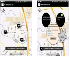
Into the system, first step the smart phone will position the current location. Then the nearby parking lot information will appear. When the user touches the parking P, the screen will pop up detail parking information. (See Fig 1) After touch P, it pop up the window above information contains: address, charging method, remaining parking space, business opening hours, related information and enter the indoor parking lot.
Fig 1 System positioning and indication of parking and the interface of parking lot information
2) The interface of indoor parking lot
After enter the indoor parking lot, there are some important information contains: remaining parking space, free parking space, button description, and three main menus (See Fig 2). The background has been modified after showing the most comfortable gray, and we compiled participants’ opinions to change the three main menus pattern. You can use three menus to park your car according to your needs.
The dialog pops up when you enter the indoor parking lot
(See Fig 2 left). There are detail descriptions to show out, and then after confirm to close. The three menus contain: Walking distance, driving distance and parking security (See Fig 2 right).
[image:4.595.346.512.98.212.2]
Fig 2 The interface of indoor parking and the photo of button description.
D. Analysis the result of eye-tracking
After introduce the interface design of indoor parking navigation system, the analyzing the result of eye-tracking as given in this chapter. We analysis the eye-tracking items include: fixation duration, regressive eye movement, completion rate, operation error and operation time.
E. Participants
In this research, we involve 12 male and 8 female, and the education level are college and university. Most of the participants are students; some of participants are workers, business and other. They are all first time to attend this experiment, and first time to use the eye-tracker.
F. Fixation Duration
In this section, fixation duration is divided two parts: frequency and duration.
1) Frequency
We discover Task 3 and Task 7 spend the most of time to fixate. Task 4 and Task 6 spend the shortest time to fixate.
According to records of the experiment, we found that Task 3 and Task 7 are required to find the remaining parking spaces. When the participants find the remaining parking space they fixated many times. Thus the most of time is spent on Task 3 and Task 7. Task 4 is "read the button description" and Task 6 is "go to C-market and enter". Task 4 is based on browsing, so it doesn't spend many times on fixation. Because Task 1 is the same implement, they don't need spend many times to find on Task 6.
2) Duration
According to records of the experiment, we found that Task 3 and Task 7 accurately spend much time because the frequency is the highest. Usually Task 3 than Task 7 spends much time because Task 3 is the first time to require implement. And the remaining parking space of Task 3 is more difficult to find. Task 6 spends less time than Task 4 because browsing is faster than reading. G. Analysis Completion rate, Operation Error and Operation Time
This study explored completion rate, operation error and operation time for improving the system interface.
1) Completion rate and operation error
[image:4.595.103.247.529.645.2]Table II the completion rate and operation error of every task (unit :%)
Task 1 2 3 4 5 6 7 8
Completion rate 65 60 95 40 85 90 65 90
Operation error 35 40 5 60 15 10 35 10
In the completion rate, the highest rate is Task 3. It means the design of interface is the best all of the design. It can let the participants operation easily and clearly.It means the design of interface is better. We change the main menu after cognitive walkthrough. We design the pattern and place to let the interface more convenient.
In the operation error, if the rate is higher than 20% it means the design of interface isn’t clear enough.
2) Operation time
If operation time more than average time too much, it means the system is not easy to use. After eye-tracking experiment, we summarized 20 participants' data to understand how much time they spend in which task. After statistic, the table is as following (See Table III):
Table III the Operation time of every task
Task Number DuringMax DuringMin Mean S.D.
1 20 28.82 15.35 8.12
2 20 47.00 21.84 10.43
3 20 5.78 17.84 10.13 3.36
4 20 9.31 31.12 18.32 5.52
5 20 1.43 18.63 5.98 4.11
6 20 5.62 21.06 9.65 3.26
7 20 3.05 22.66 10.91 6.51
8 20 2.90 17.56 8.13 3.77
From Table 4-3, we can see that the mean of the Task 2 is 21.84, and the Task 5 is 5.98. It means the Task 2 spend too much time, so the participants can't find the button of store information. The indoor parking navigation system needs to increase the prompt which needs to be highlighted on the screen, or more clearly in the future. ask 5 is the shortest time in the task, so we can understand the main menu is placed in the place.
H. 4.4 Analysis the Questionnaire Data
After the eye-track experiment, we asked the participants have to fill in the questionnaire. In this section, we analysis two parts contain: reliability analysis and Questionnaire for User Interaction Satisfaction. The questionnaire we adopted in this research is referring from the literature of QUIS, which we have mentioned in Chapter 2. Thus, the questionnaires are valid.
I. Reliability Analysis
The result of reliability analysis show the Cronbach's Alpha value is 0.91, 0.86 for the overall reactions to the software, 0.71 for the screen, 0.72 for the terminology and system information, 0.70 for the learning and 0.67 for the system capabilities. However each dimension also reaches 0.6. The data of Cronbach's α value is shown in Table IV.
Table IV Reliability of QUIS
Item Cronbach’s α No. of Items
Overall reactions to the software 0.86 6
Screen 0.71 4
Terminology and system
information 0.72 5
Learning 0.70 5
System capabilities 0.67 5
Overall 0.91 25
J. Questionnaire for User Interaction Satisfaction
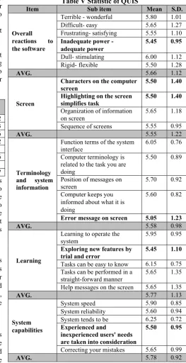
[image:5.595.288.552.142.655.2]Questionnaire for QUIS evaluate the users’ satisfaction and system’s usability. In the QUIS questionnaire we constructed five dimensions: overall reactions to the software, screen, terminology and system information, learning, and system capabilities. It consists of 25 items. The data of QUIS is shown in Table V.
Table V Statistic of QUIS
Item Sub item Mean S.D.
Overall
reactions to the software
Terrible - wonderful 5.80 1.01 Difficult- easy 5.65 1.27 Frustrating- satisfying 5.55 1.10 Inadequate power -
adequate power
5.45 0.95
Dull- stimulating 6.00 1.12 Rigid- flexible 5.50 1.28
AVG. 5.66 1.12
Screen
Characters on the computer screen
5.50 1.40
Highlighting on the screen
simplifies task 5.50 1.40
Organization of information on screen
5.65 1.18 Sequence of screens 5.55 0.95
AVG. 5.55 1.22
Terminology and system information
Function terms of the system interface
6.05 0.76 Computer terminology is
related to the task you are doing
5.50 0.89
Position of messages on
screen 5.70 0.92
Computer keeps you informed about what it is doing
5.60 0.82
Error message on screen 5.05 1.23
AVG. 5.58 0.98
Learning
Learning to operate the system
5.95 0.95 Exploring new features by
trial and error
5.45 1.10
Tasks can be easy to know 6.15 0.75 Tasks can be performed in a
straight-forward manner 5.65 1.35 Help messages on the screen 5.65 1.35
AVG. 5.77 1.13
System capabilities
System speed 5.90 0.85
System reliability 5.60 0.94 System tends to be 6.25 0.72 Experienced and
inexperienced users' needs are taken into consideration
5.50 0.95
Correcting your mistakes 5.65 0.99
AVG. 5.78 0.92
In Table V, it shows the statistic of QUIS. Scores of all the dimensions are higher than 5, thus it can be inferred that participants are quite satisfied with this system.
K. Discussions
last stage of Questionnaire for User Interaction Satisfaction, we identified out the defects of the indoor parking navigation system. Through the experiment, there have some recommendations and modifications as follows: 1) Cognitive walkthrough
As the advices of the participants the icon of P become more identifiable and clearly, and the prompt of remain parking lot is too small. After cognitive walkthrough the size becomes more identifiable and the main menu should be placed in the bottom. After cognitive walkthrough the prompt becomes more clearly.
2) Eye-tracking
a) Fixation duration
According to records of the experiment, we found that Task 3 and Task 7 spend the most of time to fixate. When the participants find the remaining parking space they fixated many times.
According to the result, we have to enhance the display of the screen. The results show the participants thought the system interface is consistency, but the screen layout is kind of confusing or inconvenient. This problem is caused by the reasons for Task 3 and 7 fixation duration too much.
b) Regressive eye movement
According to records of the experiment, Task 2 and Task 4 are the most times to spend because Task 2 and Task 4 require large amounts of saccade.
On the whole, The Task 2 “See the floor information” can indicate the participants’ regressive eye movement spends too much time to find and browse. It leads the “Inadequate power - adequate power” is only 5.45 in Overall reactions to the software (QUIS).
And the fixation duration of Task 3 “Check the remaining parking spaces and enter the parking lot” propose most of the participants couldn’t close the window when they have confirmed the remaining parking lot. So the “Characters on the computer screen” and “Highlighting on the screen simplifies task” is only 5.50 in Screen (QUIS).
The regressive eye movement of Task 4 “Read the button description” spends so much time to read, most of participants don’t know to use the button description. It causes the “Error message on screen” is only 5.05 in Terminology and system information (QUIS). The indoor parking navigation system doesn’t tell the user the mechanism of error message on screen, so it doesn’t follow the principle of the interface-feedback.
We can see The Task 1 “Into the system and go to B-market’s parking lot.” The largest purpose of this task hopes the participants to explore the indoor parking navigation system. We can see the error rate is 35%, but it’s over 20%. It leads the “Exploring new features by trial and error” is only 5.45 in Learning (QUIS).
The last one is the “Experienced and inexperienced users' needs are taken into consideration” is only 5.50 in System capabilities (QUIS). This study limited the participants have driving experience and using smart phone experience, so it doesn’t design for everyone. That is why the “Experienced and inexperienced users' needs are taken into consideration” is only 5.50.
However the analysis of fixation duration, regressive eye movement, completion rate, operation error, operation time and QUIS also show the interface of Task 2 and Task 4
don’t design very well. We have to modify in the future.
V. CONCLUSIONS
Parking is generally seeking out the most important and the most troublesome thing. Through this experiment we can know what kind of visual interface design and operating patterns in mobile device in the indoor parking navigation system are the users really need and care about.
In this study, we use cognitive walkthrough and eye-tracking to present the problem in the indoor parking navigation system, and tried to modify in the future. Furthermore, this study also considered the user experience as a very important factor, so designers need to put the factor of HCI interface into the indoor parking navigation system when the designer design.
The study designed an indoor parking navigation system and through eye-tracking to explore the usability. We hope the system can become better and better after modification.
REFERENCES
[1] Aula, A., Majaranta, P., & Räihä, K. J. (2005). Eye-Tracking Reveals the Personal Styles for Search Result Evaluation, Interact 2005, LNCS 3585, 1058-1061.
[2] Baus, J., Krüger, A., & Wahlster, W. (2001). A Resource-Adaptive Mobile Navigation System, ITC-IRST, 5-9.
[3] Bednarik, R., & Tukiainen, M. (2006). An eye-tracking methodology for characterizing program comprehension processes, In ETRA 2006. ACM 1-59593-305.
[4] Beeharee, A., & Steed, A. (2006). A Natural Wayfinding - Exploiting Photos in Pedestrian Navigation Systems, Human-computer interaction with mobile devices and services, 88-81.
[5] Chen, J. M. (2011). Study on the characteristic of air quality in indoor car parks, Department of Environmental Engineering and Science Feng Chia University.
[6] Cheng, S. W. (2011). The research framework of eye-tracking based mobile device usability evaluation, the 1st international workshop on pervasive eye tracking & mobile eye-based interaction, 21-26. [7] Choi, J., & Bakken, S. (2010). Web-based Education for
Low-literate Parents in Neonatal Intensive Care Unit: Development of a Website and Heuristic Evaluation and Usability Testing. International Journal of Medical Informatics, 79, 565-575
[8] Ji, Y. G., Park, J. H., & Lee, C. (2006). A usability checklist for the usability evaluation of mobile phone user interface, International journal of human- computer interaction, 20(3), 207-231.
[9] Kärkkäinen, L. & Laarni, J. (2002). Designing for Small Display Screens, Nordic osForum for Human-Computer Interaction Research (NordiCHI 02), ACM Press, 2002, 227-230.
[10] Ministry of transportation and communications R.O.C. http://www.motc.gov.tw
[11] Ngo, D. C. L., Teo, L. S., & Byrne, J. G. (2000). Formalizing guidelines for the design of screen layouts, Displays, 21(1), 3-15 [12] Norlien, M. J. A. (2011). An investigation of usability issues with
mobile systems using a mobile eye tracker, International University in Germany.
[13] Preece, J., Rogers, Y., & Sharp, H. (2002). Interaction design. Experiencing architecture (Second ed.)
[14] Pretorius, M., Calitz, A., & Van Greunen, D. (2005). The added value of eye tracking in the usability evaluation of a network management tool, the 2005 annual research conference of the South African institute of computer scientists and information technologists on IT research in developing countries, 1-10.
[15] Rieman, J., Franzke, M., & Redmiles, D. (1995). Usability Evaluation with the Cognitive Walkthrough, ACM, 387-388. [16] Ross, T. & Burnett, G. (2011). Evaluating the human-machine
interface to vehicle navigation systems as an example of ubiquitous computing, International Journal of Human-Computer Studies, 55, 661-674