Jessica D. Stroes M.Sc. Thesis February 2018
Supervisors:
M. Schmettow Prof. F. van der Velde
Cognitive Psychology & Ergonomics Faculty of Behavioural, Management and Social
Sciences University of Twente
P.O. Box 217 7500 AE Enschede The Netherlands
Faculty of Behavioural, Management and
Social Sciences
Adjusting the navigation structure
of a faculty intranet to the average
2
Abstract
The purpose of this study was to propose an alternative navigation structure for the intranet of
the faculty Behavioural, Management and Social Sciences of the University of Twente. A good
navigation structure is crucial for the usability of a website (Bernard, 2000a). When adjusting
this structure to the way users categorize the website content, the user’s mental model, the
website will be more intuitive and easier to use (Schmettow & Sommer, 2016). A multilevel
open card sorting test was done to gain insight into the mental model of the average intranet
user as well as gaining insight into the way users label categories. Heatmaps were created to
visualize the mental model of the users. A Q-sort task was used to prioritize items on the
intranet. The average user categorized content representative for the intranet in three categories:
education, organization and services. Anecdotal evidence that was gained during the Q-sort
indicates that participants often did not see the need for the intranet in the first place. In contrary
to the expectation of this research, the basic underlying structure of the current intranet did not
deviate a lot from the proposed structure. Other impact factors of the intranet being hard to
navigate are clutter because of outdated content, lack of location feedback and bad internal
search engine findability. Advised is to evaluate the need for a BMS intranet in the first place.
When it is decided to re-design the intranet the advice would be to critically measure the content
to criteria as determined in this study, to adjust the categorization to the proposed structure and
to appoint a content manager.
3
Table of contents
1. Introduction ... 5
1.1. Summary and motivation... 5
1.1.1. Present study ... 5
1.2. Context... 6
1.2.1. Current intranet ... 6
1.2.2. Purpose and target group of the BMS intranet ... 7
1.3. Theoretical background ... 8
1.3.1. Website usability ... 8
1.3.2. Navigation structure ... 9
1.3.3. User centered design ... 9
1.3.4. Guidelines for the design of a navigation structure ... 10
1.3.5. Mental model ... 12
1.3.6. Card sorting ... 13
1.3.7. Q-sort ... 14
2. Method ... 14
2.1. Participants ... 15
2.2. Item selection ... 15
2.3. Test materials ... 17
2.4. Procedure ... 17
2.5. Data analysis ... 18
3. Results ... 20
3.1. Card sorting ... 20
3.2. Q-sort ... 25
3.3. Observations navigation structure current intranet ... 26
4. Redesign recommendations ... 29
4.1. Visual interpretation general heatmap ... 29
4.2. Visual interpretation user group heatmaps ... 32
4.3. Ambiguities ... 35
4.4. Proposed structure ... 36
4.4.1. Categorization and labels ... 38
4.4.2. Prioritization with Q-sort ... 40
5. Discussion ... 41
5.1. Comparison with the current intranet ... 41
4
5.3. Anecdotal evidence ... 44
5.4. Limitations ... 45
5.5. Executive summary ... 47
6. References ... 48
7. Appendices ... 54
7.1. Appendix A – Organizational structure BMS ... 54
7.2. Appendix B – Current navigation structures English and Dutch intranet ... 55
7.3. Appendix C – Participant instruction (English and Dutch) ... 59
7.4. Appendix D – Informed consent ... 61
7.5. Appendix E – Data analysis syntax ... 61
7.6. Appendix F – Data entry syntax ... 64
5
1. Introduction
1.1. Summary and motivation
In the beginning of 2015 a fusion between the faculties Management & Organisation and
Behavioural Sciences of the University of Twente took place, leading to a new faculty:
Behavioural, Management & Social sciences (BMS). Both faculties had their own intranet
which were merged to create one central place with information about the current situation
within the faculty. Since this merge, the faculty of Behavioural, Management & Social sciences
has indicated that employees experience difficulties with finding their way on the faculty
intranet, causing a decrease in productivity. Therefore the faculty has asked to redesign the
intranet in such a way that it will be easier to use, in other words: improving the usability of the
website.
An important aspect for the usability of a website is the navigation structure (Martin &
Kidwell, 2001). For the (re-)design of a navigation structure of a website general guidelines are
available (see Bevan (2005) for an overview of guidelines and standards for web usability).
However, for the specific categorization of items within a navigation structure of a website
there are little to no specific guidelines because the categorization is dependent on the content
of the website. The organization of information in a person’s mind can be seen as a mental
model. When the navigation structure of a website is adjusted to the mental model of its users
it will be more intuitive and therefore more usable (Schmettow & Sommer, 2016). A
user-centered method to approach the user’s mental model of items on a website is card sorting
(Dong, Martin, & Waldo, 2001). With the card sorting method insight can be gained into the
mental model of users (Spencer & Warfel, 2004). To prioritize the items of the website, the
Q-sort method is used.
1.1.1. Present study
In the present study an alternative navigation structure will be proposed for the BMS intranet.
This will be based on the mental model of the users of the intranet. An open multilevel
hierarchical card sorting study will be utilized to approximate the mental model of users of the
faculty intranet. With this mental model, insight can be gained in the categorization of the
intranet content of the average user. This method will be combined with a Q-sort to prioritize
6
proposal for an alternative navigation structure for the BMS intranet that is adapted to the
approximated mental model combined with the prioritizations will be given. The main research
question of this study is as follows: ‘What is an alternative navigation structure for the intranet
website from the faculty Behavioural, Management and Social sciences based on the average
mental model of faculty employees as approached by an open multilevel card sorting test
combined with the Q-sort method for the prioritization of the website items?’
1.2. Context
The faculty of Behavioural, Management & Social sciences (BMS) is a faculty that consist of
multiple departments (see appendix A for an overview of the organizational structure of BMS).
The faculty strives to ‘play a pivotal role in understanding, co-engineering and evaluating
innovation in society’. It is an overarching institution of multiple studies which consist of
departments with knowledge in psychology, business administration, public administration,
communication sciences, philosophy and education sciences. All departments share a focus on
solving societal challenges. There are supportive services that are not related to a specific study
programme that fulfil a supportive function for the faculty, such as ‘Marketing and
Communication’, ‘Educational Affairs’ and ‘Human Resources’.
1.2.1. Current intranet
The faculty intranet is a website that is accessible for everyone that has an internet connection
via the university of Twente or that has an account at the university of Twente. It is meant to
serve as a place where employees can find up-to-date information about the BMS faculty and
it also serves as a reference work. A restriction for redesigning the intranet is that every website
of the university of Twente has the same layout, it is not possible to deviate from this.
The faculty intranet is available in two languages: English and Dutch. Although the
intranet suggests there is also a German version, there is not. There are similarities between the
content and navigation structure of the English and Dutch intranet but there are also big
differences. Therefore from now on the Dutch and English intranet will be considered
separately from each other. The basic structure of both can be found in appendix B. In figure 1,
the main page and part of the local navigation structure of the intranet can be seen. The current
7
different from the intranet in that it can be accessed by everyone, there is no login required as
[image:7.595.67.538.129.430.2]is with the intranet.
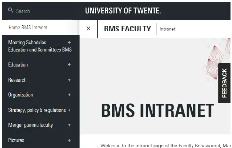
Figure 1. A screenshot of the BMS intranet homepage, retrieved from
https://www.utwente.nl/en/bms/intranet/
1.2.2. Purpose and target group of the BMS intranet
The target group of the intranet are employees of the BMS faculty. The information on the
intranet should be relevant and aimed at BMS employees. The purpose of the intranet is to
inform them about faculty specific matters that are slightly confidential. Slightly confidential
information refers to information that does not have to be shared with the entire internet, such
as education quality information, but that is appropriate to be accessed by university affiliated
persons. Because the information on the intranet is slightly confidential, access to the BMS
intranet is restricted: only students and employees affiliated to the university can login to reach
the intranet. Faculty related matters that are not confidential can be found on the general BMS
8
1.3. Theoretical background
1.3.1. Website usability
While browsing on a website a user must carry out multiple cognitive tasks at the same time.
Kim & Hirtle (1995) divide these cognitive tasks in three categories: (1) navigational tasks: the
planning and execution of routes through the structure of the website; (2) informational tasks:
reading and understanding the content that is presented and (3) task management: coordinating
information and navigational tasks. The performance of these tasks at the same times requires
cognitive overhead (Kim & Hirtle, 1995). When a user’s cognitive resources are overwhelmed
by these cognitive tasks, thus when the overhead is high, degraded performance occurs. This
high cognitive overhead can cause ‘user disorientation’ (Boechler, 2001). User disorientation is
described by Hardman & Edwards (1989) as “the user not having a clear conception of the relationships within the system, or knowing his present location in the system relative to the
display structure, or finding it difficult to decide where to look next within the system”. This
disorientation can express itself in three ways: (1) the user does not know where to go next; (2)
the user does not know how to achieve their goal and (3) the user does not know where he is in
relation to the overall structure (Hardman & Edwards, 1989). User disorientation can cause
cognitive overload and getting lost on a website, this can lead to the user failing into achieving
a goal, the user getting frustrated and it can induce the user to leave the website (Gwizdka &
Spence, 2007; Otter & Johnson, 2000). User disorientation is a major (usability) problem
causing users experiencing problems with (coordinating) navigational tasks (Foss, 1989;
Gwizdka & Spence, 2007). To support the user with performing cognitive tasks without causing
a cognitive overload, a website has to be user-friendly, in other words it has to have a high
usability.
The usability of a website is an aspect that is often overlooked, however it is an
important aspect for a user’s success in finding information (Gullikson et al., 1999). Usability
is defined as ‘the extent to which a product can be used by specified users to achieve specified
goals with effectiveness, efficiency and satisfaction in a specified context of use’ (International
Organization for Standardization, 1998). Effectiveness is an aspect of usability which measures
the degree to which a user can achieve goals. Efficiency measures the effort that is needed to
achieve a goal and satisfaction refers to how content users are with a website (Schmettow &
9
figure out and learn, the layout should be as intuitive as possible and there should be as few
steps as possible required to retrieve the desired information (Bernard, 2000a).
According to Fang & Holsapple (2006) there are five classes which are identified as
joint contributors to the usability of a website: (1) task features; (2) user features; (3) provider
features; (4) system features and (5) environment features. Of these five features, system
features are the most controllable. Because an organized, well-designed and intuitive navigation
system is critical for user success (Chevalier & Kicka, 2006) and can help reducing user
disorientation (Head, Archer, & Yuan, 2000) a choice has been made to focus on the adjustment
of the system feature ‘navigation structure’ to increase the usability of the BMS faculty intranet.
1.3.2. Navigation structure
The navigation structure of an intranet is a very important aspect for its ease of use (Martin &
Kidwell, 2001), it is vital for a website’s usability (Bernard, 2000a). A website that provides
low or substandard levels of navigability impairs the consumption of information (Wojdynski
& Kalyanaraman, 2016). A good navigation structure allows users to acquire more of the
information they seek and it makes the information easier to find (Fang & Holsapple, 2006).
Users of a website must be able to navigate freely and with confidence through a website in
order to make efficient use of the content (Dong, Martin, & Waldo, 2001). Many users prefer
browsing the navigation structure over the search function when trying to find information
(Katz & Byrne, 2003). Furthermore many users have poor search skills and will therefore not
succeed with only using the search function (Nielsen, 2014). This makes a good navigation
structure a key feature for the usability of a website. Organizing information in such a way that
users can intuitively find particular information is a challenge (Schmettow & Sommer, 2016).
1.3.3. User centered design
If a navigation structure matches users’ needs, expectations and cognitive processes, users can
navigate effectively through a website (Boechler, 2001; Martin & Kidwell, 2001). By assessing
the expectations and preferences of the users for the intranet, a sense of ownership, contribution
and community is encouraged, which is vital to an effective intranet (Martin & Kidwell, 2001).
Adjusting the navigation structure to the cognitive processes of the average user is a
user-centered design process. This is a broad term which described a process of designing were
User-10
centered design methods aim to optimize the usability of a website rather than forcing users to
change their ways of acting to use the system (Hjalmarsson, 2015). Hahsler and Simon (2000)
give three reasons to use a user-centred approach when creating a navigation structure to
organize objects: the structure gets (1) an increased usability; (2) a reduced subjectivity and (3)
a higher level of acceptance, because users have actively participated in the (re)design process.
For these reasons the choice has been made to work with user centered design methods in the
current study.
1.3.4. Guidelines for the design of a navigation structure
For the design of a navigation structure with a good usability a few general guidelines are
available. First of all, the depth and breadth of a menu navigation structure have an important
influence on the usability of a website. Increasing the depth of a navigation structure decreases
its search efficiency (Kiger, 1982). Snowberry et al. (1983) found that error rates increase from
4.0% to 34.0% as depth increased from a single level to six levels. Therefore a broader
navigational menu structure is preferred. However, the shape of a hypertext structure is also
important. Bernard (2002) found that navigational structures with broad middle levels and
navigational structures with a constant shape produced the poorest performance with
participants whereas concave shapes (i.e. (6 x 2 x 2 x 12)) of the same depth were navigationally
more efficient. The concave structure shape is an optimal design structure according to Norman
and Chin (1988) because when there is a larger percentage (and thus more defined) of
descriptive category items at the beginning of a structure the user can form a more exact match
between the category and the actual target item. At the final (terminal) level, a broad menu
reduces the overall information uncertainty because at this level the target items are more
explicitly defined.
Another guideline for the design of a navigation structure is that the website must
provide feedback on the users location in the navigation structure in order to let the user know
where he is at a website (Bevan, 2005). Feedback can be provided by providing path and
hierarchy information with for example the use of breadcrumb navigation (Rogers & Chaparro,
2003).
Regarding the actual content of a navigation structure there are only very general
11
Several guidelines that should be taken into consideration when (re)designing the actual content
of a navigation structure will be extracted from literature in the following paragraphs.
To gain more insight into how to structure the actual content of a navigation structure,
it is important to clarify how users decide on what information to select. According to the
‘information foraging theory’ users searching for information on a website can be compared to
animals foraging for food. An animal has to choose where to look for food in the same way a
person has to choose where to look for certain information. Metaphorically the user is an
information predator whose aim it is to select information with a maximum gain rate of
information relevant to their task (Pirolli & Card, 1999). The information foraging theory
assumes that people follow an ‘information scent’ path when deciding what item to click on. Information scent describes the amount of information that users can obtain from proximal cues
(for example item labels) regarding the location of the information that the user is looking for
(Pirolli, 1997). The proximal perception of information scent is used to assess the gain and
prevalence of the information source behind the item: it informs the user about which item to
select to maximize the information that can be gained. The more explicit the association is
between the initial descriptive item and the targeted item, the greater the scent is (Bernard,
2002). If the scent is sufficiently strong, the user (forager) will be able to make a correct choice
at each decision point which supports successful category selection by the user (Snowberry et
al., 1983). A high information scent for category or item labels is particularly helpful at the
highest levels of an information hierarchy, because when a user selects the correct category
there is a higher chance on reaching their goal without click backtracks (Czerwinski & Larson,
1998).
User judgement on information scent is based on spreading activation (Pirolli & Fu,
2003). The information goal of a user activates a set of chunks in a user’s memory. This
activation spreads in a spreading activation network through memory associations to words and
images that the user sees on a website page. The amount of activation matching for the goal-
and display chunks is an indicator of their mutual relevance. If the chunks that are activated for
a descriptive item on a website match the chunks activated by the goal of a user, the user will
judge the descriptive item as being highly relevant to the pursued goal and the information scent
can be described as being high (Pirolli & Fu, 2003). By letting users themselves indicate what
12
the connection between items and labels. A high information scent is pursued when adjusting a
website to these insights (Otter & Johnson, 2000).
Another important aspect for the design of a good navigation structure is the
categorization of information (Nawaz, Clemmensen, & Hertzum, 2011). Categorization, also
referred to as ‘classification’ in some literature, is the clustering of information that shares a
common property (Nawaz, Clemmensen, & Hertzum, 2011). Coxon (1999) states that a basic
principle for category formation is that the categories provide maximum information with the
least cognitive effort needed to understand the information. Also, categories must be distinct
and mutually exclusive (Gullikson et al., 1999). Often once developed, categories form a
hierarchical cognitive taxonomy (Porac & Thomas, 1990).
1.3.5. Mental model
Cognitive categories are based on perceived similarities and differences in the attributes of the
objects or events that are being classified by someone (Rosch, Barbara, & Lloyd, 1978). The
categorization of information in the mind of a person can be seen as a mental model. A mental
model is the internal representation of a concept that corresponds to the external structure that
it represents (Chi, 2008). It is so to speak a map of the perceived world structure as it is in the
mind of a person (Yuviler-gavish & Parush, 2008). In the case of a website the mental model
of a user is specifically about the perceived structure of the website domain. Mental models in
a person are formed through experience, training and instruction (Yuviler-gavish & Parush,
2008) and are based on beliefs not on facts (Nielsen, 2010).
A common usability problem with websites is that there is a gap between the designers’
mental model and the users’ mental model (Nielsen, 2010). For a user to navigate successfully
through a website, at least a rough idea of how the website is organized is required (Bernard,
2000b). If the information on a website is categorized in a manner that fits well with the user’s
perception of the information topics as it is in their mental model, then information retrieval on
the website is efficient and sometimes even satisfying (Bernard, 2000a). According to Rosch et
al., (1978) “maximum information with least cognitive effort is achieved if categories map the
perceived world structure as closely as possible” as can be visualized in a mental model (Rosch
et al., 1978). Therefore, if information on a website is structured similarly to the average mental
model of a user of the website domain, the website will have a higher usability and the search
13
a website according to the users average mental model also reduces the problem of user
disorientation (Bernard, 2000a).
1.3.6. Card sorting
A mental model cannot be observed directly, therefore it has to be inferred indirectly
(Yuviler-gavish & Parush, 2008). A user-centered method to approach the mental model of a user is card
sorting (Spencer & Warfel, 2004). The card-sorting technique assumes that people make sense
of the world by categorizing it and that people can describe their own categorisation with
reasonable validity and reliability (Rugg & McGeorge, 1997). With card sorting insight can be
gained into the participant’s categorization of the assessed items: how users group, sort and
label information and objects (Spencer & Warfel, 2004). A card sorting exercise allows
participants to express their internal perceptions of the relatedness of items within a set, the
strength of the perceived semantic proximity within a set of items is assessed (Dong et al., 2001;
Schmettow & Sommer, 2016). A card sort can help understand the knowledge structure of a
domain of concepts users have, thereby showing a glimpse of their internal mental model
(Petrie, Power, Cairns & Seneler, 2011). It can help designers of a website understand the
expectations of users regarding the content organization (Dong et al., 2001). After a card sort a
grouping structure can be created which pulls semantically associated items together
(Schmettow & Sommer, 2016).
Card sorting is a knowledge-elicitation activity involving the user grouping objects or
concepts. In a card sorting test a user is provided with a set of cards. On the cards are items that
represent subjects that are (going to be) on the website. The user has to organize and categorize
these items in way that they perceive as being logical. The objects or concepts can be presented
as online or physical cards, both seem to wield the same results (Bussolon, Russi & Missier,
2006). There are single-level card sorts and multilevel card sorts. With single-level card sorts
participants can only sort cards into a single level of groups. With multilevel card sorts,
sometimes referred to as hierarchical card sorts, participants have the possibility to partition
groups they made in a previous step, which results in nested groups of cards (Schmettow &
Sommer, 2016). In this way subjects can express any concepts that cover hierarchical levels
(Harloff, 2005). A challenge with multilevel card sorting is the increase in the number of items
to be sorted (Wood & Wood, 2008). Card sorts in which participants define and label the groups
14
into what labels are logically connected to a certain goal for users in order to pursue a high
information scent. With an open card sort it is possible to gain this insight because users are
labelling the categories themselves. Card sorts where the groups are provided in advance are
termed closed card sorts. A closed card sort can be useful when adding new content to an
existing structure (Spencer & Warfel, 2004).
1.3.7. Q-sort
For the navigation structure of a website, an order of importance must be created. The most
significant information is placed on higher levels or even on the homepage, the less significant
information is placed lower down the tree structure. This is an issue of prioritization, for which
classic card sorting does not apply. Therefore the Q-sort method can be used as an addition to
the card sorting test (Schmettow & Sommer, 2016). The Q-sort method is an inverted technique
of factor analysis. It is an alternative measurement technique which can be used in any situation
where subjectivity is at issue (Ten Klooster, Visser & de Jong, 2008). With the Q-sort method
several qualitative aspects can be measured in a quantitative manner, the strengths of both
research types are combined (Amin, 2000).
In the Q-sort method, the participant is given a set of items. This would be the same set
of items as used with the card sorting test. The items must be placed on a scale according to
importance (Block & Eagle, 1963). It is a forced-choice research approach and therefore all
items must be ranked by the participant (Ten Klooster et al., 2008). However, the user is limited
in the amount of items that can be placed at a certain ranking. This results in having the items
sorted into a given normal distribution in the end (Rugg & McGeorge, 1997). With a Q-sort,
distinct groups with a different opinion about prioritization can be detected. Also which items
were scored roughly in the same level (consensus items) and which items were scored at a
different level by different participants (contention items) can be detected (Donner, 2001).
Based on the results of the Q-sort decisions can be made about the hierarchy and prioritization
of items on the faculty intranet.
2. Method
This study combines two methods: the card sorting method and the Q-sort method. Card sorting
15
Sommer, 2016). In order to enable the participants to organize the items in a hierarchical
structure and to label the groups themselves, a multilevel open card sort was conducted. In order
to establish a hierarchy of relevance of the website items a Q-sort was conducted. The Q-sort
method measures qualitative aspects in a quantitative manner (Ten Klooster et al., 2008). Both
methods are participatory and user-centered.
2.1. Participants
In total twenty-four participants volunteered to participate in the study. Of these participants,
twelve had an academic function and twelve had a supportive function within the BMS faculty.
Twelve of the participants were more or less familiar with the intranet and twelve were not at
all familiar with it. Two of the participants who were familiar with the intranet, administered
parts of the intranet by adding information to it regularly. For the Q-sort task, data of one
participant is missing because the participant did not have enough time after the card sort to
conduct the Q-sort. The participants were sampled via email and by convenience sampling
within the employees of the BMS faculty. All participants had a good command of either the
Dutch or English language.
2.2. Item selection
A card sorting test was conducted to approach the mental model of the average user. For the
execution of this test items had to be selected that represent the BMS faculty intranet. It is
important that the amount of items that will be used for the card sort is sufficient. Research
suggests that there should be no less than thirty items and no more than a hundred (Spencer &
Warfel, 2004; Tullis, 2003). The content of the card sort items should be representative for the
site and have to have enough similarity to allow groups to be formed. If the items that are chosen
are too varied, participants will not be able to create natural groupings. Furthermore it is best
that the granularity (level of detail) of the items is more or less similar because participants find
it difficult to group items that have different levels of granularity (Spencer & Warfel, 2004).
To make a representative item selection for the card sort, three inclusion and some
exclusion criteria were defined based on the target group and purpose of the intranet. Based on
these criteria, items were selected that are most representative for the faculty intranet, an
16
communication employee that manages the BMS intranet was consulted to discuss if the item
selection made by the researcher was sufficient.
The first inclusion criteria was that items should be relevant for employees of the BMS
faculty. An example of an item that is relevant for BMS employees is ‘Career and professional
development’ because this is specifically about the development of BMS employees. ‘Student services’ is excluded because this service is meant for students and not for employees.
Items on the BMS intranet should be moderately confidential. An example of moderate
confidential information is an overview of the members of the company medics team or the
actions of improvement that will be made for study programmes. An example of an item that
was excluded is ‘Repetitive strain injury’. An exception was made for items that refer to a
specific BMS facility or service. This is because it can be convenient for employees to know
where information about these facilities, departments and services can be found. For example
a reference item that refers to the BMS faculty council intranet.
Finally, items have to be specifically relevant for BMS. The items on the current intranet
often refer to general university facilities, policies or regulations that are not specifically linked
to the BMS faculty. ‘BMS employees for Marketing and Communication’ is BMS specific and therefore included. ‘ICT service centre’ is general for the university and excluded.
A few (mainly exclusion) criteria have been determined that are practical for the card
sorting task itself. First of all, items should not be too specific. Those that are very specific are
often only important for certain employees and do not give a good representation of the general
content of the intranet. Specific documents or information that clearly belong to a group are put
together in an overarching item. All the OFI-numbers for example are grouped together.
Furthermore, the content of the items must be up-to-date. Many items on the current BMS
intranet are outdated and are generally no longer relevant for employees. An example of this
are two categories and its content that are completely left out in the item selection:
‘Tech4People’ and ‘Merger gamma faculty’. Content about the former MB and GW faculties
is left out because the faculties do not exist anymore. Some content is not up-to-date but still
useful as reference, content like this is not included in the item selection because it does not
have a place in the basic framework of the navigation structure. There is a good chance that for
example ‘Older student opinions about PSY master courses’ will be in the same place within the mental model as ‘Student opinions PSY master courses’. Therefore this reference content
17
content is repetitive for different study programmes. Information about actions for
improvement for example is available for five different study programmes. To avoid too much
repetition in the card sort, only two study programmes are chosen to select items from
(Communication Science and Psychology). In this way participants can group the content
differently but do not have to repeat the sorting for the same items multiple times. Items can
categorized per study programme but can also be organized based on content.
For the Q-sort the same items were used as with the card sort except for six study
specific items (three for Psychology and three for Communication Science) being interchanged
for three items with the same content but not study specific (for example ‘Student opinions
BMS bachelors/masters’ instead of ‘Student opinions bachelor Communication Science’) . This
was done in order to prevent participants who affiliated to another BMS study than Psychology
or Communication Science sorting the cards at a low level of relevance purely because of the
study programme and not because of the actual subject on the card. This means that for the
Q-sort thirty items were used.
2.3. Test materials
This study was conducted using physical cards for both sorting tasks. The cards were made
digitally with Microsoft Word, printed out on paper, cut out and laminated. The cards had the
item names on it and in the low right corner a number. This numbering was relevant for the
researcher to document the data after the test and was randomized to prevent influencing the
participant. On the back of every card was a short description of the concerning item. Post-its
were used by the participants to label the groups. For the Q-sort five cards which indicated the
level of relevance (with -- for ‘not relevant at all’, - for ‘not quite relevant’, +/- for ‘neutral, 1
for ‘quite relevant’ and 2 for ‘very relevant’) were printed. They were used to divide the table
into five parts for participants to sort the cards. For the input of the data, both R-studio and
SPSS were used. The card sort data was analyzed with R-studio and the and Q-sort data with
SPSS.
2.4. Procedure
The card sorting tests took place at either the office of the participant or in a project room. The
room only needed a table to sort the cards on and preferably no other distractions. At the
18
(see appendix C). Then the employee was asked if familiar with the BMS intranet. An additional
explanation was given about the procedure of the card sorting and the researcher asked if the
participant was familiar with the current intranet. After the instruction the participant had to
sign an informed consent (see appendix D). The participant executed the card sorting test by
grouping the cards on the table in an intuitive manner. To keep the card sort intuitive and to
prevent the participant from thinking too much about the groups made a time frame of half an
hour was given for the card sort. When it was unclear for a participant what an item meant the
researcher referred to the explanatory text on the item card. On the Post-its the participant wrote
names for the created groups. During the execution of the card sort participants were instructed
to think out loud so the researcher could get insight into their approach and make notes. After
finishing the card sorting test the researcher wrote down the created groups and sub-groups with
help of the numbers on the cards. The researcher also made a picture of the sorted cards to
document the grouping and labelling of the participant. Hereafter the Q-sort took place. The
participant read the second part of the instruction and the researcher gave a short additional
explanation. The participant had to assign each card to one of the five levels of relevance.
Subsequently the researcher placed five cards on the table to make clear which levels of
relevance there were and to create separate rows to divide the cards in. The participant divided
the cards over the levels based on how relevant the concerning item was for him or her. The
researcher made sure the participant did not exceed the limit of cards per relevance level in
order to achieve the given normal distribution of 10% - 20% - 40% - 20% -10%. To document
the distribution, the researcher wrote down which cards were placed in every level and a picture
was made of the sorted cards.
2.5. Data analysis
To analyze card sort results, an interim step is needed where similarity measures between any
two items are created. With these measures a similarity matrix can be made. In an open single
level card sort similarity measures are dichotomous: items are grouped together or not (Hudson,
2005). However, with an open multi-level card sort the measures for similarity between items
is more complex because they are divided in multi-level groups which makes the co-occurrence
of items gradual (Schmettow & Sommer, 2016). A frequently used similarity measure for
hierarchical card sorts is the Jaccard coefficient (Capra, 2005; Rorissa & Hastings, 2004). The
19
groups both items are a member of divided by the number of groups at least one item is member
of. When there are more group levels, as can be the case for a multi-level card sort, the
granularity of the set of possible values increases for the Jaccard score for any two items
compared (Schmettow & Sommer, 2016).
A similarity matrix represents the mutual semantic proximity between any two items.
To structure a similarity matrix in a way that clusters of items with a large similarity become
clear, agglomerative hierarchical cluster analysis (HCA) can be executed. With HCA an
iterative algorithm operates on the similarity matrix that merges items or groups closest to each
other at every step (Schmettow & Sommer, 2016). Based on the agglomerative clustering
algorithm, a visualization of the similarity matrix itself can be made in the form of an ordered
heatmap. A heatmap is diagonally mirrored and is a graphical representation of a similarity
matrix, for which applies that the stronger the similarity between items the warmer the colour
is (Wilkinson & Friendly, 2009). If the order of items on a heatmap is adjusted to the order of
iterative aggregation steps during HCA, clusters with strong similarity will appear on the
diagonal of the heatmap (Schmettow & Sommer, 2016). It is possible that an item fits multiple
clusters, a HCA will then put the item into the cluster which it fits best (Capra, 2005). A heatmap
will visualize the cluster(s) where the item can also fit: the colour of the item will be different
from the surrounding items. An item like this is termed as an ‘ambiguity’ (Schmettow &
Sommer, 2016). Ambiguities have to be judged manually by a researcher. This can be
time-consuming and possibly inaccurate.
The card sorting data was analyzed in R-studio, see appendix E for the syntax. First the
data was manually inserted, see appendix F for the data entry syntax of one participant.
Hereafter the Jaccard score was calculated and based on this score a similarity matrix was
created. The similarity matrix was reordered into a heatmap with help of an agglomerative
cluster analysis. Based on the clusters and ambiguities, the average mental model of users was
described based on which an alternative navigation structure was created.
For analyzing the Q-sort results, the mean prioritization per item was calculated. This
score indicates which items are seen as important on average. Based on these scores there can
be decided which items should receive more prioritization in the proposed navigation structure.
The data was first manually inserted into the statistical programme SPSS. The first row
contained all the participant numbers and the first column the item numbers. For every
20
corresponded with a score: not relevant at all corresponded with -2, not quite relevant with -1,
neutral with 0, quite relevant with 1 and very relevant with 2. With SPSS the mean prioritization
and standard deviation for every item was calculated.
3. Results
In this result section the results of the card sort and Q-sort task will be presented. Hereafter
additional observations about the website will be given and described.
3.1. Card sorting
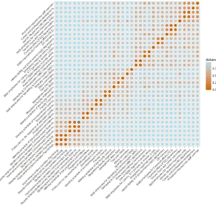
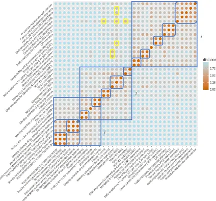
Based on the card sorting data of all participants a heat map has been constructed (see figure
21
Figure 2. Heatmap of all users. The card sort items can be found vertically and horizontally,
the stronger the perceived similarity between items the warmer the colour.
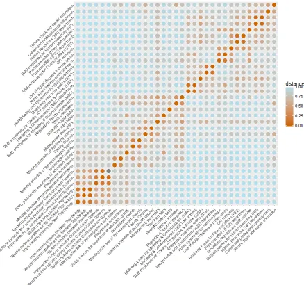
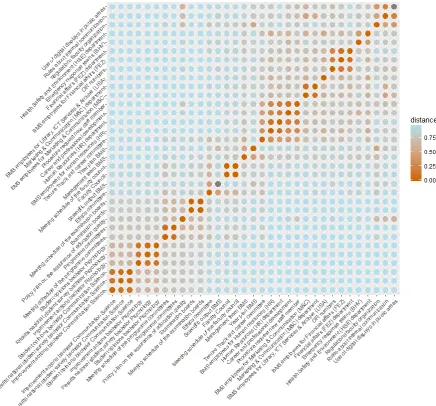
The participant pool can be divided in two main user groups: Scientific staff and
supportive staff. To analyze if these user groups have different mental models, separate
22
23
Figure 4. Heatmap of supportive staff. For additional explanation see figure 2.
Off-diagonal warm bleeding spots can be seen on the heatmaps, these indicate ambiguities.
When items are truly ambiguous they truly match with more than one item. Because it is
impossible to create a heatmap that matches the mental model of everyone, warm bleeding spots
can also indicate differences between mental models of users. This means that multiple
participants (but not the greater part) link the concerning item to a different item. The nature of
the ambiguities can be discovered by comparing those of the user groups with one another.
24
Table 1
Category labels as proposed by participants
Nr. Labels
1 Departments and employees BMS organization Services
Services for employees Organization Faculty matters/affairs
Organization of BMS Supportive facilities Administration
Overview faculty organization Faculty and functional
division
Faculty BMS
Organizational structure Who is who BMS
Institutions
Management Structure BMS departments
2 Rules and administration Rules and regulations Regulations
Administration How to do something Regulation Procedures
Issuing of rules Practical information Career
Frequently Asked Questions Functional information Public Relations
BMS Facilities and procedures
3 Research and development Science Research
4 Interne overlegstructuren Governance bodies Overarching for BMS
Committees and departments General BMS information
Committees and boards Boards and committees
BMS Gremia Committees BMS programme organization Education organization
5 Data faculty BMS Policy Faculty regulations
BMS vision, goals and management
Vision 2017
6 Student experiences Analysis Kwaliteitszorg
Improvement actions Results Opinions
Information programmes Evaluation Bachelor programmes Kwaliteitsborging Information programmes Education Data
Note. Labels participants gave to groups during the card sort can be found here. Every group
in the table contains labels that are (roughly) linked to each other or to the same subject. The
columns do not indicate any separation within the group but are merely created to keep the size
of the table manageable.
In table 1 an overview can be seen of the labels that were given by participants during the card
sort. Labels were often similar to each other. Often participants chose to use the name of an
existing item as label, which happened mostly for sub-level categories. These labels are not
included in the table. Some labels are in Dutch because participants could not properly translate
25
3.2. Q-sort
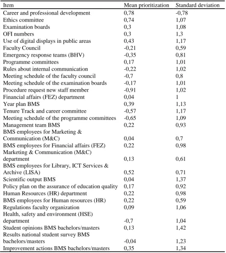
For the Q-sort a mean prioritization and a standard deviation has been calculated for every item
[image:25.595.70.534.206.726.2]based on the scores given by all participants, see table 2.
Table 2
Overview mean prioritization and standard deviation all items for Q-sort score
Item Mean prioritization Standard deviation
Career and professional development 0,78 -0,78
Ethics committee 0,74 1,07
Examination boards 0,3 1,08
OFI numbers 0,3 1,3
Use of digital displays in public areas 0,43 1,17
Faculty Council -0,21 0,59
Emergency response teams (BHV) -0,35 0,81
Programme committees 0,17 1,01
Rules about internal communication -0,22 1,02
Meeting schedule of the faculty council -0,7 0,8
Meeting schedule of the examination boards -0,17 1,01
Procedure request new staff member -0,91 1,02
Financial affairs (FEZ) department 0,04 1
Year plan BMS 0,39 1,13
Tenure Track and career committee -0,57 1,17
Meeting schedule of the programme committees -0,65 1,09
Management team BMS 0,22 0,93
BMS employees for Marketing &
Communication (M&C) 0,04 0,7
BMS employees for Financial affairs (FEZ) 0,22 0,98
Marketing & Communication (M&C)
department 0,13 0,61
BMS employees for Library, ICT Services &
Archive (LISA) 0,52 0,71
Scientific output BMS 0,04 1,37
Policy plan on the assurance of education quality 0,17 0,92
Human Resources (HR) department 0,22 0,98
BMS employees for Human resources (HR) 0,22 0,59
Regulations faculty organization 0,09 1,06
Health, safety and environment (HSE)
department -0,7 1,04
Student opinions BMS bachelors/masters 0,13 1,42
Results national student survey BMS
bachelors/masters -0,04 1,23
26
Note. Participants could score items from -2 to 2. With -2 indicating the item was perceived as
being not relevant at all, -1 as not quite relevant, 0 as neutral, 1 as quite relevant and 2 as very
relevant.
Noticeable during the Q-sort was that the participants often were very divided in opinions about
what was relevant and what was not. This can be seen by the fact that the standard deviations
exceed the mean scores in all cases. Because interpreting all items would be too extensive for
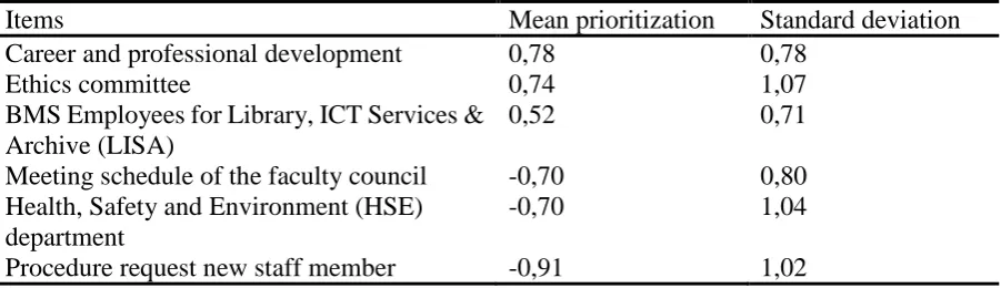
the study, the three most prioritized and the three least prioritized will be interpreted in the next
[image:26.595.74.525.340.470.2]chapter (see table 3).
Table 3
Top three highest and lowest mean prioritization and standard deviation of items
Items Mean prioritization Standard deviation
Career and professional development 0,78 0,78
Ethics committee 0,74 1,07
BMS Employees for Library, ICT Services & Archive (LISA)
0,52 0,71
Meeting schedule of the faculty council -0,70 0,80
Health, Safety and Environment (HSE) department
-0,70 1,04
Procedure request new staff member -0,91 1,02
Note. See table 2 for an explanation about the scoring.
3.3. Observations navigation structure current intranet
Additional (mainly factual) observations have been made by the researcher regarding flaws in
the current intranet navigation structure. These observations were made while exploring the
BMS intranet in order to extract representative items. The observations could decrease the
usability of the intranet and are summed up below.
1. Unnecessary and unclear repetition of items Every item that a user clicks on is shown
again as top item in the level below. For example: if one clicks on ‘Education’, the first
item in the level below will be again ‘Education’. If a user clicks on this multiple options
can happen: (1) the user is redirected to a web page where the menu items appear once
27
category (3) the user is redirected to an empty page This is inconsistent and the user can
not know up front what to expect when clicking on a repeated item.
2. Too much items in a row without clear categorization Several levels contain up to
thirty items without further categorization. When this is the case, the user has to read
every item separately to find what he is looking for. An example being ‘Archive’ items
on the intranet, for example with ‘Older opinions’ underneath ‘Student opinions’. This
contains up to twenty-four items without further categorization.
3. Being redirected without warning Quite often the user is being redirected to another
university or external website without a warning when clicking on an item. The website
where the user is being redirected to appears in the same tab as the user is currently
being on, this can cause the user to get lost. Because the design of all university websites
is identical a user sometimes does not notice that redirection is taking place. A solution
could be that the website the user is being directed to, opens automatically on a different
tab.
4. Back button goes to home page When clicking on the ‘back button’ in the browser,
the user is redirected to the intranet homepage instead of to the page the user was visiting
previously. There are up to seven levels in the current navigation structure. It can lead
to frustration when the user clicks on an item which doesn’t give the expected
information, because when trying to get back the user has to start navigating all over
again from the home page. Furthermore, the back button referring to the homepage
poses a problem when the user is redirected to the general BMS website in the same tab
(as described above). If this happens there is no possibility of going back to the intranet
with the back button.
5. Visibility home button The ‘Home BMS intranet’ button at the top of the local
navigation structure can only be seen when the user is already on the BMS intranet
homepage. It is not necessary for a user to be able to click on the home button when
already on the homepage. However when the user is somewhere else on the intranet, it
is convenient to have the possibility to go back to the home page by clicking on the
home button. This is not possible in the current BMS intranet.
6. Inconsistency between the Dutch and English intranet As mentioned before, the
28
same but in a different language, this is not the case. This inconsistency can cause users
to miss certain information when being on either the Dutch or English version.
7. Inconsistent item order Sometimes there is no consistency in the order of items. For
example for content below ‘Quality Assurance’ the order of the information is different
per study.
8. Outdated information A great part of the intranet content is outdated and incomplete.
For example only the BMS year plan of 2013 can be found.
9. Dead links and empty items There are a lot of dead links on the intranet. Quite often
a user is referred to an empty page or one that does not exist anymore.
10.Label does not match content Labels do not always match their content. For example
‘Student associations’ contains information about study associations, which are totally
different from student associations. This can cause confusion with the user.
11.Too specific labels Sometimes labels of items are too long and detailed. This makes it
hard for a user to scan the label and to know quickly what to expect. An example is
‘Information for promovendi (cursussen, verlenging dienstverband, beoordelingsformulier e.d.)’.
12.Inconsistent item labels Documents with similar content are often labelled differently
per study, this can be seen for example in the documents beneath ‘Course evaluation’.
13.Inconsistent label content In general, labels on a website give information about the
content that can be found when clicking on the item. However, on the current intranet
sometimes an announcement is done within a label as occurs with ‘I.v.m. de fusie per 1
mei a.s. zijn de verkiezingen voor de faculteitsraad GW geannuleerd. Nader bericht
volgt’. This is inconsistent and it can cause confusion with the user. The label is not
only used as an announcement but sometimes it is not even possible to click on it.
14.Double item labels Sometimes item labels are redundant but contain different
information. This is very confusing as the user has no clue as to the difference between
the items. For example ‘Organisatie-coördinatie-stage afronding buitenland’ is repeated
five times beneath the subcategory ‘Stages’. Every one of these contain different items
beneath. Some of them again have identical names but contain different information.
15.Dutch labels at the English intranet and vice versa Labels on the English intranet are
sometimes in Dutch. This makes it hard to understand the content of items for users who
29
16.Internal search bar only gives external information When using the internal search
bar on the intranet, the results can lead to anywhere on the internet except for the BMS
intranet itself. This can be confusing to users.
17.Multiple levels for single items Sometimes a separate level is made for only one item,
this causes an unnecessary greater path length. ‘Further reading and background information’ for example has only one final item below. It is more transparent to put the
final item directly at the place of the category item instead of making the user click on
it. Sometimes the items on different levels are even named the same, for example
‘Oriëntatie buitenlandse opleidingstrajecten’ contains only one final item below with
exactly the same name.
18.Separate items for similar information Separate items are made for information that
can be put on one page. For example there are three items within the ‘Financial Affairs’
category that all give contact information. This can be easily put underneath one item
with a slightly more general name.
19.Inconsistent referring ‘Naar de Nederlandse website/To Dutch website’ is given
(beneath ‘Financial Affairs’). This is inconsistent with the language buttons present in
the standard layout.
4. Redesign recommendations
For this study the main research problem is to find a navigation structure that suits the average
user. To answer this question, the proximity structure in the heatmap, the group labels and the
Q-sort ratings were used.
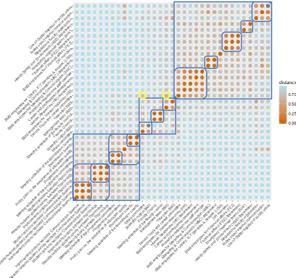
4.1. Visual interpretation general heatmap
A visual interpretation of the heatmap of all participants was done, the blue boxes point out the
main- and sub clusters, ambiguities were indicated with yellow boxes (see figure 5). In table 4
an overview of the items per main cluster in the visually interpreted heatmap can be found.
Three main categories of the mental model can be distinguished: (1) education (2) organization
and (3) services. Every category and characterization of the approached users mental model
30
The heatmap gives inconclusive information about the mental model regarding the
overlapping part between ‘Education’ and ‘Organization’. When including this with ‘Education’,
this category consists of information about the quality of education, educational committees
and a policy plan about the assurance of educational quality. The information about the
education quality is categorized per study programme and not by content. This specific
information can be clustered in a subgroup because of the strong similarity scores. The
committees in the category (the programme and the examination committee) are relevant for
education. Users divided the committees by content instead of sorting them purely on function.
‘Organization’ consists of committee, faculty overarching and scientific output items.
When including the overlapping part here, committees are categorized together in the mental
model, regardless of the content of the committee. The committee specific content can be
divided in subgroups based on their proximity. Overarching faculty items such as information
about the year plan, management team and faculty regulations are categorized together in the
mental model. These items are sorted by their content and not by their function. The year plan
for example has concerning the content no strong connection with the quality assurance policy
plan, but concerning the functions they are in the same category. ‘Ethics committee and ‘BMS
scientific output’ can be put together in a subgroup. Both are about research and seem to be
categorized according to content in the mental model.
As for ‘Services’ most items are about general university services and items that users
categorize to belong with these services. Every subcategory that can be created contains one
department, its employees and sometimes specific content that was matched with the services.
Regarding the services the actual organizational structure matches with the mental model of the
average user. The services are categorized by content and not by function. Categorization by
function would be the case if all the departments or all the employees would be categorized
31
Figure 5. Visually interpreted heatmap of all the participants. Main- and sub clusters are pointed
out with blue boxes, ambiguities with yellow boxes. For additional explanation see figure 2.
Table 4
Items per main cluster in the visually interpreted heatmap of all participants
Cluster Items
1 Meeting schedule of the examinations boards
Examination boards
Policy plan of the assurance of education quality Programme committees
Meeting schedule of the programme committees Student opinions bachelor Communication Science
Results national student survey bachelor Communication Science Improvement actions bachelor Communication Science
1
2
[image:31.595.74.478.601.739.2]32
Student opinions bachelor Psychology
Results national student survey bachelor Psychology Improvement actions bachelor Psychology
2 Scientific output BMS
Ethics committee Year plan BMS
Management team BMS
Regulations faculty organization
Meeting schedule of the Faculty Council Faculty Council
Meeting schedule of the examination boards Examination boards
Policy plan of the assurance of education quality
3 Procedure request new staff member
Career and professional developments Human Resources (HR) department BMS employees for Human Resources Tenure Track an career committee Financial affairs (FEZ) department
BMS employees for Financial affairs (FEZ) OFI numbers
Health Safety and Environment (HSE) departments Emergency response teams (BHV)
BMS employees for Library, ICT Services & Archive (LISA) Use of digital displays in public areas
Rules about internal communication
Marketing & Communication department (M&C)
BMS employees for Marketing & Communication (M&C)
Note. The clusters as interpreted visually in the heatmap of all participants. The first and second
clusters have three overlapping items.
4.2. Visual interpretation user group heatmaps
To discover if the mental model for the two user groups have differences, the heatmaps of the
33
Figure 6. Visually interpreted heatmap of the scientific staff user group. Main- and sub clusters
are pointed out with blue boxes, ambiguities with yellow boxes. For additional explanation see
34
Figure 7. Visually interpreted heatmap of the supportive staff user group. Main- and sub
clusters are pointed out with blue boxes, ambiguities with yellow boxes. For additional
explanation see figure 2.
Large parts of the clusters in both groups are similar, even though the items are ordered
differently sometimes. However, there are three notable differences. First, ‘Regulations faculty
organization’ is clustered together with the ethics committee in the scientific staff heatmap. The
link between these items is not immediately clear. It could be because the ethics committee
decides about certain regulations regarding ethics and ‘Regulations faculty organization’ is also
about regulations, although about more overarching ones for the faculty itself. In the supportive
35
areas’ and ‘Rules about internal communication’. These have in common that they entail
information about rules and regulation, even though on a different level. Second, the item ‘OFI
numbers’ is clustered together with the financial affairs department (FEZ) and its employees in
both heatmaps. In the supportive staff heatmap ‘OFI numbers’ can also be clustered with ‘Use of digital displays in digital areas’ and ‘Rules about internal communication’. The items have
in common that they entail information about some form of internal communication within the
faculty. Lastly, in the heatmap of the scientific staff an overlapping part of clusters is present
similar to the heatmap of all users. In the heatmap of the supportive staff this ‘inconclusive’
cluster matches stronger with the items about the quality of education.
The mental models of the two user groups do not differ enough from each other to create
separate intranet versions. The proposed navigation structure can possibly be adjusted to the
differences between the mental models with cross links.
4.3. Ambiguities
Three warm bleeding spots are present in the heatmap of all users, which can indicate
ambiguities. To discover their nature, a comparison was made between the ambiguities in the
heatmap of all users than those that can be found in the separate user group heatmaps (see table
[image:35.595.69.529.539.688.2]5).
Table 5
Comparison of ambiguities of general heatmap with the ambiguities of specific user groups
Heatmap all user groups SC SP Truly
ambiguous? 1. Tenure track and
career committee Ethics committee Faculty council Yes Yes Yes No Yes No 2. Regulations faculty
organization
Rules about internal communication Use of digital displays in public areas
Yes No Yes Yes Yes No
3. Management team Career and professional development Yes No No
Human Resources (HR) department Yes No No
Tenure Track and career committee Yes Yes Yes
Emergency response teams (BHV) Yes No No
Note. SC is short for scientific staff, SP is short for supportive staff. If an ambiguity is present
36
The ambiguities with the Tenure Track and Career committee can be explained because all of
these items are committees or can be considered as one. The ambiguities with ‘Regulations faculty organization’ can be explained because all items entail information about internal
communication within BMS. The ambiguities with ‘Management team’ are more complex.
Considering the content or the actual organization structure there is no immediate connection
between the items. However, when considering the function, these items connect because they
are all part of the general organizational structure of BMS. ‘Career and professional development’ is an exception. Possibly participants linked the management team to this item
because of the influence the management team has on career and professional development
opportunities. Only scientific staff members connect the management team to the items
mentioned in table 3, except for the tenure track and career committee. A possible reason for
this could be that supportive staff is often more involved with the different services than the
scientific staff. Therefore supportive staff possibly has a more specific mental model regarding
the organizational structure, that matches the actual organization structure of BMS more
closely. Scientific staff possibly categorizes more in general terms when it comes to the
organization structure without having much knowledge of the actual structure.
4.4. Proposed structure
Based on the described mental model an alternative navigation structure was proposed as can
be seen in table 6. The categorization aspects that deviate from the mental model will be
justified with content based arguments. The assignment of labels proposed by participants to
create a high information scent will be discussed as will be the order of the items in the proposed
structure.
Table 6
Alternative navigation structure for the BMS intranet
First level Second level Third level
Committees, boards and faculty
regulation
Ethics Committee
Faculty Council Faculty Council
37
Examination Boards
Examination boards
Meeting schedules of the Examination boards Programme
committees
Programme committees
Meeting schedules of the programme committees
Regulation of the faculty
Year Plan BMS
Management team BMS
Regulations faculty organization Policy plan on the
assurance of education quality Tenure Track and career committee1
Services and information
Library, ICT Services and Archive (LISA)
BMS employees for Library, ICT Services and Archive (LISA)
Human Resources (HR)
Career and Professional development Human Resources (HR) department BMS employees for Human Resources Tenure Track and career committee Procedure request new staff members Financial Affairs
(FA)
Financial Affairs (FEZ) department
BMS employees for Financial Affairs (FEZ) OFI numbers
Marketing and Communication (M&C)
Use of digital displays in public areas Rules about internal communication Marketing and Communication (M&C) department
BMS employees for Marketing and Communication (M&C) Management team BMS1 Emergency response teams (BHV) Evaluation study programmes Bachelor Communication Science
Student opinions bachelor Communication Science
Results national student survey bachelor Communication Science
Improvement actions bachelor Communication Science Bachelor
Psychology
Student opinions bachelor Psychology Results national student survey bachelor Psychology
Improvement actions Bachelor Psychology Programme
committees
Programme committees