A Constrained Randomization Approach to
Interactive Visual Data Exploration with
Subjective Feedback
Bo Kang, Kai Puolam ¨aki, Jefrey Lijffijt, Tijl De Bie
Abstract—Data visualization and iterative/interactive data mining are growing rapidly in attention, both in research as well as in industry. However, while there are plethora of advanced data mining methods and lots of works in the field of visualisation, integrated methods that combine advanced visualization and/or interaction with data mining techniques in a principled way are rare. We present a framework based onconstrained randomizationwhich lets users explore high-dimensional data via ‘subjectively informative’
two-dimensional data visualizations. The user is presented with ‘interesting’ projections, allowing users to express their observations using visual interactions that update a background model representing the user’s belief state. This background model is then considered by a projection-finding algorithm employing data randomization to compute a new ‘interesting’ projection. By providing users with information that contrasts with the background model, we maximize the chance that the user encounters striking new information present in the data. This process can be iterated until the user runs out of time or until the difference between the randomized and the real data is insignificant. We present two case studies, one controlled study on synthetic data and another on census data, using the proof-of-concept toolSIDEthat demonstrates the presented framework.
Index Terms—Exploratory data mining, dimensionality reduction, data randomization, subjective interestingness.
F
1
I
NTRODUCTIOND
ATA visualization and iterative/interactive data min-ing are both mature, actively researched topics of great practical importance. However, while progress in both fields is abundant, methods that combine them in a principled manner are rare.Yet, methods that combine state-of-the-art data mining with visualization and interaction are highly desirable as they could exploit the strengths of both human data ana-lysts and of computer algorithms. Humans are unmatched in spotting interesting patterns in low-dimensional visual representations, but poor at reading high-dimensional data, while computers excel in manipulating high-dimensional data and are weaker at identifying patterns that are truly relevant to the user. A symbiosis of human analysts and well-designed computer systems thus promises to provide the most efficient way of navigating the complex informa-tion space hidden within high-dimensional data. This idea has been advocated within the visual analytics field already a long time ago [1], [2], [3].
Contributions. In this paper we introduce a generically
applicable method based on constrained randomizations for finding interesting projections of data, given some prior knowledge about that data. We present use cases of in-teractive visual exploration of high-dimensional data with the aid of a proof-of-concept tool [4] that demonstrates the presented framework. The method’s aim is to aid users in • B. Kang, J. Lijffijt, and Tijl De Bie are at IDLab, Department of Electronics and Information Systems, Ghent University. E-mail:
{bo.kang,jefrey.lijffijt,tijl.debie}@ugent.be
• K. Puolam¨aki was at the Finnish Institute for Occupational Health and is now at the Department of Computer Science, University of Helsinki. E-mail: [email protected]
Manuscript received xxxx; revised yyyy.
discovering structure in the data that the user was previ-ously unaware of.
Overview of the method.The underlying idea is that the
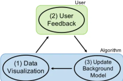
analysis process is iterative, and during each iteration there are three steps (Fig. 1).
Step 1.The user is presented with an ‘interesting’ projection of the data, visualized as a scatter plot. Here, interestingness is formalized with respect to the initial belief state and the scatter plot showsprojections of the data to which the data and the background model differ most.
Step 2. The user investigates this scatter plot, and may observe structure in the data that contrasts with, or add to, their beliefs about the data. We will refer to observed structures or features as patterns. The user then indicates what patterns the user has seen.
Step 3.The background model is updated according to the user feedback given above, in order to reflect the newly assimilated information.
Next iteration. Then, the most interesting projection with respect to this updated background model can be computed, and the cyclic process iterates until the user runs out of time
(1) Data Visualization (2) User Feedback (3) Update Background Model User Algorithm
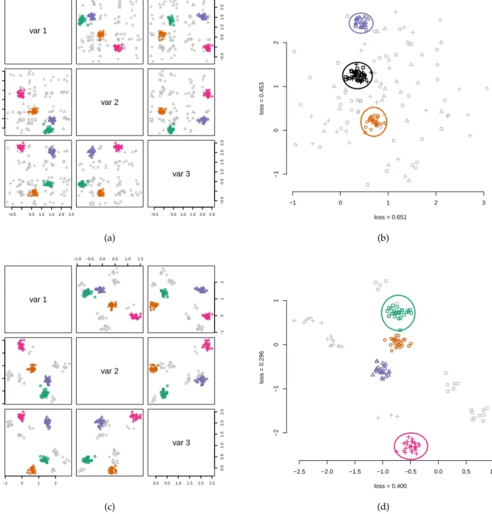
var 1 −0.5 0.51.01.52.0 2.5 ● ● ● ● ● ● ● ● ● ● ● ● ● ● ● ● ● ● ● ● ● ● ● ● ● ● ● ● ● ● ● ● ● ● ● ● ● ●● ● ● ● ● ● ●● ● ● ● ● −0.5 0.5 1.0 1.5 2.0 2.5 ● ● ● ● ● ● ● ● ● ● ● ● ● ● ● ● ● ● ● ● ● ● ● ● ● ● ● ● ● ●● ● ● ● ● ● ● ● ● ● ● ●● ● ●● ● ●●● −0.5 0.5 1.0 1.5 2.0 2.5 ● ● ● ● ● ● ● ● ● ● ● ● ● ● ● ● ● ● ● ● ● ● ● ● ● ● ●●●● ●●● ● ●●●●●● ● ● ●● ● ● ● ● ●● var 2 ● ● ● ● ● ● ● ● ● ● ● ● ● ● ● ● ● ● ● ● ● ● ● ● ● ● ● ● ●●●● ● ● ● ●● ● ● ● ● ●● ● ●● ● ● ● ● −0.5 0.5 1.0 1.5 2.0 2.5 ● ● ● ● ● ● ● ● ● ● ● ● ● ● ● ● ● ● ● ● ● ● ● ● ● ● ● ● ● ● ● ● ● ● ● ● ● ● ● ● ● ● ● ●● ● ●●●● ● ● ● ● ● ● ● ● ● ● ● ● ● ● ● ● ● ● ● ● ● ● ● ● ● ● ● ● ● ●●● ● ● ● ●● ●● ● ● ● ● ● ●●●●● ● −0.5 0.5 1.01.5 2.0 2.5 −0.5 0.5 1.0 1.5 2.0 2.5 var 3 (a) −1 0 1 2 3 −1 0 1 2 loss = 0.651 loss = 0.453 ● ● ● ● ● ● ● ● ● ● ● ● ● ● ● ● ● ● ● ● ● ● ● ● ● ● ● ●● ●●● ● ● ●●●● ● ● ● ● ● ● ● ● ● ● ● ● (b) var 1 −1.0 −0.5 0.0 0.5 1.0 1.5 ● ● ● ● ●● ● ● ● ● ● ● ● ● ● ● ● ● ● ●● ● ● ● ● ● ● ● ● ●● ● ● ● ● ● ● ● ● ● ● ● ● ● ●● ● ● ● ● −1 0 1 2 ● ● ● ● ●● ● ● ● ● ● ● ● ●● ● ● ● ●●● ● ● ●●● ● ● ● ●● ● ● ● ● ● ● ● ●● ● ● ● ●●● ● ● ●● −1.0 −0.5 0.0 0.5 1.0 1.5 ● ● ●● ●● ● ● ● ● ● ● ● ● ● ● ● ● ● ● ● ● ● ● ● ● ● ●● ●● ● ● ● ● ● ● ● ● ● ● ● ● ● ● ● ● ● ● ● var 2 ● ● ● ● ●●● ● ● ● ● ● ● ● ● ● ● ● ● ● ● ● ● ● ● ● ● ● ● ●●● ● ● ● ● ● ● ● ● ● ● ● ● ● ● ● ● ● ● −1 0 1 2 ● ● ●● ●● ● ● ● ● ● ● ● ● ● ● ● ● ●● ● ●● ●● ● ● ●● ●● ● ● ● ● ● ● ● ● ● ● ● ● ●● ● ●● ●● ●● ● ● ●●● ● ● ● ●● ● ● ● ● ● ● ● ● ● ●● ● ● ● ● ● ● ●●● ● ● ● ●● ● ● ● ● ● ● ● ● ● ●● ● ● 0.0 0.5 1.0 1.5 2.0 2.5 0.0 0.5 1.0 1.5 2.0 2.5 var 3 (c) −2.5 −2.0 −1.5 −1.0 −0.5 0.0 0.5 1.0 −2 −1 0 1 loss = 0.400 loss = 0.296 ● ● ● ● ● ● ● ● ● ● ● ● ● ● ● ● ● ● ● ● ● ● ● ●● ● ● ● ● ● ● ● ● ● ● ● ● ● ● ● ● ● ● ● ● ● ● ● ●● (d)
Fig. 2. (a) Pairwise scatter plots of a 3-dimensional toy data set that contains four clusters (indicated by different glyphs/colors). The initial random background model is shown with gray glyphs. (b) Two-dimensional projection to a direction where the data and the background model differ most. The user marks three clusters visible in the scatterplot as shown by ellipsoids. Two of the clusters (blue triangles and orange circles) correspond to the actual clusters of the toy data, but the third cluster (black) is a combination of two clusters (green boxes and cyan crosses). (c) The information of the three clusters has been absorbed into the background model which now shows more structure. (d) The next projection shows the largest difference between the updated background model and the data, which now clearly highlights the difference between the green (box) and cyan (cross) clusters, formerly presented in Fig. 2b to be one (black) cluster. The points in the orange (circle) and violet (triangle) clusters are exactly on top of the respective background distribution points. After marking these cluster with ellipsoids the user has completely understood the structure of the data and after updating the background model matches the data.
or finds that background model (and thus the user’s belief state) explains everything the user is currently interested in. Central objective. Our main goal is to support serendipity, i.e., the discovery of new knowledge ‘by chance’. However, instead of user randomly guessing feature combinations that may yield interesting visualizations, we employ an algorithm that provides projection vectors that provide
max-imally contrasting information against an evolving back-ground model. The central idea is that this increases the chances of finding truly interesting patterns in the data.
Example.Consider the 3-dimensional dataset of four
clus-ters shown in Fig. 2. The raw data and the initial background model are shown in Fig. 2a. The clusters are shown with colored glyphs and the background model that reflects the
user’s initial beliefs is shown with gray markers. Initially, the background model is totally random (no beliefs).
Step 1 is that the user is presented with an initial scatter plot as shown in Fig. 2b. In step 2, the user marks clusters, as shown also in Fig. 2b. Step 3 is that the background model is updated based on this feedback, which results in a new background distribution (Fig. 2c). In the next iteration, the process repeats itself; steps 1 and 2 of the second iteration are shown in Fig. 2d.
To illustrate the stepwise process, this example was con-structed such that the cluster structure of the data is obvious in any pairwise scatter plot. However, the objective is that the user can efficiently explore the data, also if the data has very high dimensionality. In that case, it is beneficial that an algorithm computes meaningful axes (i.e.,interesting projections) to use for visualization. In Section 3 we present more extensive walkthrough examples on both synthetic and real data.
Formalization of the background model.To compute
inter-esting projections, a crucial challenge is the formalization of the background model. To allow the process to be iterative, the formalization has to allow for the model to be updated after a user has given feedback on the visualization. There exist two frameworks for iterative data mining: FORSIED [5], [6] and a framework that we will refer to as CORAND [7], [8], for COnstrained RANDomization.
In both cases, the background model is a probability distribution over data sets and the user beliefs are modelled as a set of constraints on that distribution. The CORAND approach is to specify a randomization procedure that, when applied to the data, does not affect how plausible the user would deem it to be. That is, the user’s beliefs should be satisfied, and otherwise the data should be shuffled as much as possible.
Given an appropriate randomization scheme, we can then find interesting remaining structure that is not yet known to the user by contrasting the real data with the randomized data. A most interesting projection can be computed by defining an optimization problem over the difference between the real data and the randomized data. Here, the optimization criterion is chosen as the maximal
L1-distance over the empirical cumulative distributions. New beliefs can be incorporated in the background model by adding corresponding constraints to the random-ization procedure, ensuring that the patterns observed by the user are present also in the subsequent randomized data. Hence, subsequent projection will again be informative be-cause the randomized and the real data will be equivalent with respect to the statistics already known to the user.
Outline of this paper As discussed in Section 2, three
challenges had to be addressed to use the CORAND ap-proach: (1) defining intuitive pattern types (constraints) that can be observed and specified based on a scatter plot of a two-dimensional projection of the data; (2) defining a suitable randomization scheme, that can be constrained to take account of such patterns; and (3) a way to identify the most interesting projections given the background model. The evaluation with respect to usefulness as well as com-putational properties of the resulting system is presented in Section 3. Experiments were conducted both on synthetic
data and on a census dataset. Finally, related work and conclusions are discussed in Sections 4 and 5, respectively.
NB. This manuscript is an expanded and integrated version of two conference papers [4], [9]: [9] introduced the algorithmic problem, while [4] presented the proof-of-concept tool and interface. Besides the integration and changes throughout, the main differences are this new in-troduction and the inin-troduction of a stopping criterion (Secs. 2.4, 3.5).
2
M
ETHODSWe will use the notational convention that upper case bold face symbols (X) represent matrices, lower case bold face symbols (x) represent column vectors, and lower case standard face symbols (x) represent scalars. We assume that our data set consists of n d-dimensional data vectors
xi. The data set is represented by a real matrix X = xT
1 xT2 · · · xTn
T
∈ Rn×d. More generally, we will
denote the transpose of the ith row of any matrix A as
ai (i.e., ai is a column vector). Finally, we will use the
shorthand notation[n] ={1, . . . , n}.
2.1 Projection tile patterns in two flavours
In the interaction step, the users declare that they have become aware of (and thus are no longer interested in seeing) the value of the projections of a set of points onto a specific subspace of the data space. We call such information a projection tile pattern for reasons that will become clear later. A projection tile parametrizes a set of constraints to the randomization.
Formally, a projection tile pattern, denotedτ, is defined by a k-dimensional (with k ≤ d) subspace of Rd, and a subset of data points Iτ ⊆ [n]. We will formalize the k
-dimensional subspace as the column space of an orthonor-mal matrix Wτ ∈ Rd×k withWTτWτ = I, and can thus
denote the projection tile asτ = (Wτ,Iτ). We provide two
ways in which the user can define the projection vectorsWτ
for a projection tileτ.
2D tiles.The first approach simply choosesWτ as the two
weight vectors defining the projection within which the data vectors belonging toIτwere marked. This approach allows
the user to simply specify that he or she knows the positions of that set of data points within this 2D projection. The user makes no further assumptions—they assimilate solely what they see without drawing conclusions not supported by direct evidence.
Clustering tiles.It is possible that after inspecting a cluster, the user concludes that these points are clustered not just within the two dimensions shown in the scatter plot, and wishes for the system to model immediately also other dimensions in which the selected point set forms a cohesive cluster. This would lead to the system not considering other projections that highlight this cluster as particularly informative. To allow the user to express such belief, the second approach takes Wτ to additionally include a basis
for other dimensions along which these data points are strongly clustered. This is achieved as follows.
Let X(Iτ,:)represent a matrix containing the rows
the two weight vectors onto which the data was projected for the current scatter plot. In addition to W, we want to find any other dimensions along which these data vectors are clustered. These dimensions can be found as those along which the variance of these data points is not much larger than the variance of the projectionX(Iτ,:)W.
To find these dimensions, we first project the data onto the subspace orthogonal to W. Let us represent this subspace by a matrix with orthonormal columns, further denoted as W⊥. Thus, W⊥TW⊥ = Iand WTW⊥ = 0. Then, Principal Component Analysis (PCA) is applied to the resulting matrix X(Iτ,:)W⊥. The principal directions
corresponding to a variance smaller than a threshold are then selected and stored as columns in a matrixV. In other words, the variance of each of the columns ofX(Iτ,:)W⊥V
is below the threshold.
The matrix Wτ associated to the projection tile pattern
is then taken to be:
Wτ=
W W⊥V.
The threshold on the variance used could be a tunable parameter, but was set here to twice the average of the variance of the two dimensions ofX(Iτ,:)W.
2.2 The randomization procedure
Here we describe the approach to randomizing the data. The randomized data should represent a sample from an implic-itly defined background model that represents the user’s belief state about the data. Initially, our approach assumes the user merely has an idea about the overall scale of the data. However, throughout the interactive exploration, the patterns in the data described by the projection tiles will be maintained in the randomization.
Initial randomization. The proposed randomization
pro-cedure is parametrized by n orthogonal rotation matrices
Ui ∈ Rd×d, where i ∈ [n], and the matrices satisfy
(Ui)T = (Ui)−1. We further assume that we have a bijective
mappingf : [n]×[d]7→[n]×[d]that can be used to permute the indices of the data matrix. The randomization proceeds in three steps:
Random rotation of the rows:Each data vectorxiis rotated
by multiplication with its corresponding random ro-tation matrixUi, leading to a randomised matrixY
with rowsyTi that are defined by: ∀i: yi=Uixi.
Global permutation: The matrixYis further randomized by randomly permuting all its elements, leading to the matrixZdefined as:
∀i, j: Zi,j=Yf(i,j).
Inverse rotation of the rows:Each randomised data vector in Zis rotated with the inverse rotation applied in step 1, leading to the fully randomised matrix X∗
with rowsx∗i defined as follows in terms of the rows
zT
i ofZ:
∀i: x∗i =UiTzi.
The random rotationsUi and the permutationf are
sam-pled uniformly at random from all possible rotation matri-ces and permutations, respectively.
Intuitively, this randomization scheme preserves the scale of the data points. Indeed, the random rotations leave their lengths unchanged, and the global permutation sub-sequently shuffles the values of the d components of the rotated data points. Note that without the permutation step, the two rotation steps would undo each other such that
X∗ = X. Thus, it is the combined effect that results in a randomization of the data set.
The random rotations may seem superfluous: the global permutation randomizes the data so dramatically that the added effect of the rotations is relatively unimportant. However, their role is to make it possible to formalize the growing understanding of the user as simple constraints on this randomization procedure, as discussed next.
Accounting for one projection tile.Once the user has
assim-ilated the information in a projection tileτ = (Wτ,Iτ), the
randomization scheme should incorporate this information by ensuring that it is present also in all randomized versions of the data. This ensures that the randomized data is a sam-ple from a distribution representing the user’s belief state about the data. This is achieved by imposing the following constraintson the parameters defining the randomization:
Rotation matrix constraints: For each i ∈ Iτ, the
com-ponent of xi that is within the column space of Wτ must be mapped onto the firstkdimensions of yi = Uixi by the rotation matrix Ui. This can be
achieved by ensuring that:
∀i∈ Iτ: WτTUi= (I 0). (1)
This explains the nameprojection tile: the information to be preserved in the randomization is concentrated in a ‘tile’ (i.e., the intersection of a set of rows and a set of columns) in the intermediate matrixYcreated during the randomization procedure.
Permutation constraints.The permutation should not af-fect any matrix cells with row indices i ∈ Iτ and
columns indicesj∈[k]:
∀i∈ Iτ, j∈[k] : f(i, j) = (i, j). (2)
Proposition 1. Using the above constraints on the rotation
matricesUiand the permutationf, it holds that: ∀i∈ Iτ,xTiWτ =x∗i
T
Wτ. (3)
Thus, the values of the projections of the points in the projec-tion tile remain unaltered by the constrained randomizaprojec-tion. Hence, the randomization keeps the user’s beliefs intact. We omit the proof as the more general Proposition 2 is provided with proof further below.
Accounting for multiple projection tiles.Throughout
sub-sequent iterations, additional projection tile patterns will be specified by the user. A set of tilesτifor whichIτi∩ Iτj =∅
ifi6=jis straightforwardly combined by applying the rel-evant constraints on the rotation matrices to the respective rows. When the sets of data points affected by the projection tiles overlap though, the constraints on the rotation matrices need to be combined. The aim of such a combined constraint should be to preserve the values of the projections onto the
projection directions for each of the projection tiles a data vector was part of.
The combined effect of a set of tiles will thus be that the constraint on the rotation matrixUi will vary per data
vector, and depends on the set of projectionsWτ for which i ∈ Iτ. More specifically, we propose to use the following
constraint on the rotation matrices:
Rotation matrix constraints. Let Wi ∈ Rd×di denote a
matrix of which the columns are an orthonormal basis for space spanned by the union of the columns of the matricesWτ forτwithi∈ Iτ. Thus, for any iandτ :i∈ Iτ, it holds thatWτ =Wivτfor some vτ ∈ Rdi. Then, for each data vectori, the rotation
matrixUimust satisfy:
∀i∈ Iτ: WiTUi= (I 0). (4)
Permutation constraints.Then the permutation should not affect any matrix cells in rowiand columns[di]:
∀i∈[n], j∈[di] : f(i, j) = (i, j).
Proposition 2. Using the above constraints on the rotation
matricesUiand the permutationf, it holds that: ∀τ,∀i∈ Iτ,xTiWτ =x∗i
T Wτ.
Proof. We first show thatx∗
i TW i=xTiWi: x∗iTWi=zTi U T iWi=zTi I 0 =zi(1 :di)T =yi(1 :di)T =yTi I 0 =xTi Wi.
The result now follows from the fact thatWτ =Wivτ for
somevτ ∈Rdi.
Technical implementation of the randomization.To ensure
the randomization can be carried out efficiently throughout the process, note that the matrixWifor thei∈ Iτfor a new
projection tileτcan be updated by computing an orthonor-mal basis for(Wi W). Such a basis can be found efficiently
as the columns of Wi in addition to the columns of an
orthonormal basis ofW−WT
i WiW (the components of Worthogonal toWi), the latter of which can be computed
using the QR-decomposition.
Additionally, note that the tiles define an equivalence relation over the row indices, in whichiandjare equivalent if they were included in the same set of projection tiles so far. Within each equivalence class, the matrix Wi will
be constant, such that it suffices to compute it only once, tracking which points belong to which equivalence class.
2.3 Visualization: Finding the most interesting two-dimensional projection
Given the data setXand the randomized data setX∗, it is now possible to quantify the extent to which the empirical distribution of a projectionXwandX∗wonto a weight vec-torwdiffer. There are various ways in which this difference could be quantified. We investigated a number of possibili-ties and found that theL1-distance between the cumulative distribution functions works well in practice. Thus, withFx
the empirical cumulative distribution function for the set of values inx, the optimal projection is found by solving:
max
w kFXw−FX∗wk1.
The second dimension of the scatter plot can be sought by optimizing the same objective while requiring it to be orthogonal to the first dimension.
We are unaware of any special structure of this optimiza-tion problem that makes solving it particularly efficient. Yet, using the standard quasi-Newton solver in R [10] with ran-dom initialization and default settings (the general-purpose optim function with method="BFGS"), or the numericjs library for Javascript [11], already yields satisfactory results, as shown in the experiments below.
2.4 Significance of a projection and stopping criterion
Although it has not been written down before, it is concep-tually straightforward in CORAND to assess the statistical significance of any pattern of interest (here projection), because it is always possible to compute the empirical p-value of a pattern under the background model.
This works as follows. Denote the score function of a pattern asf(X,X∗), e.g., the optimized statistic is
f(X,X∗) = max
w kFXw−FX ∗wk
1.
This statistic hinges by definition on a comparison between the real dataXand the randomized dataX∗. An important question is:how surprising is this statistic?
We can take the viewpoint that we are comparing a cer-tain randomized datasetX∗, which has no structure except for the constraints that we have defined so far, to another datasetX. The question that we need to consider is, does the real dataXstill have interesting structure with respect to the pattern syntax? Essentially, we are asking whetherf(X,X∗)
is surprising given the background model. Equivalently, if X would not contain interesting structure anymore, we expectf(X,X∗)to be ‘similar’ tof(X∗0,X∗), whereX∗0 is another randomized dataset from the same constraints.
This latter statement about similarity can be made quan-tified in an empirical p-valuepˆ[8], [12], where we compare
f(X,X∗)againstf(X∗0 1,X∗), . . . , f(X∗ 0 N,X∗)withX∗ 0 i
be-ing a randomized version ofX∗, employing still the same constraints. A rationale whyX∗i0 should derived fromX∗
and not from X can be found in [13]. In full, given N
randomizations to compare with, the empirical p-value is
ˆ p= 1 +PN i=11 f(X∗i0,X∗)≥f(X,X∗) N+ 1 .
The two-dimensional scatterplot is based on two or-thogonal projections that each have a different value
kFXw−FX∗wk
1. These can be compared against the the seriesf(X∗i0,X∗)to obtain an empirical p-value for either axis. If the p-value for an axis is above a threshold that the user finds acceptable, e.g., 0.05, the values should not be studied. Since constraints can only be added, meaning the model will be closer to the data, the p-values should be roughly monotonic and the analysis can be terminated when the threshold is reached. See Section 3 for an example.
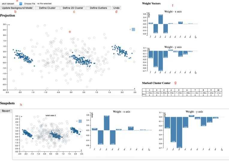
Fig. 3. Layout of our web appSIDE, with the data visualization and interaction area (a–e), projection meta information (f, g), and timeline (h).
2.5 The risk of false positive observations
One may have the concern that even with the use of a stopping criterion, showing a user projections that hopefully contain meaningful structure can lead to—or even increase the chance to—the observation of patterns that are not real. There are three important aspects to consider here:
1) The proposed approach makes no claims about causality. For example, the data may be biased, contain errors, there may be missing variables that could explain observed correlations and patterns. The projections may highlight information that is spurious in the sense that it pertains to the data col-lection process rather than the reality the data was intended to capture. However, this should be con-sidered a positive feature, because learning about such artefacts in the data can be greatly beneficial. During interpretation of the patterns, one should always be cautious and aim to explain the observed patterns, instead of taking them at face value. 2) The patterning (i.e., arrangement) of the points in
the visualizations shown to a user correspond to projections, which is simply a weighted combina-tion of the original features. As such, only structure that is present in the data can be shown.
3) The prototype implementation introduced in the next section shows besides the data also the ran-domized version of the data that the projection is aimed to contrast with. In our experience, it is straightforward to visually observe whether the structure shown in the visualization has substantial magnitude as compared to the randomized data. As such, the stopping criterion can be used to make the system even more robust against the analysis of noise, but it is usually easy to see when the pro-jections no longer pick up any significant structure, even without the stopping criterion. See for example Figure 7.
3
E
XPERIMENTSWe present two case studies to illustrate the framework and its utility. We first introduce a proof-of-concept tool and discuss how this tool implements the concepts presented in Section 2. A description of how the tool may be used in practice is interweaved with the subsequent case studies. Fi-nally, we present an evaluation of the runtime performance and the stopping criterion.
(a)
(b)
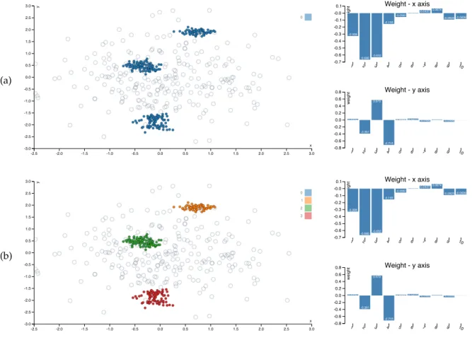
Fig. 4. Example of the first visualization given bySIDEon the synthetic data (Section 3.2). Solid dots represent actual data vectors, whereas open circles represent vectors from the randomized data. Row (a) shows the first visualization, while (b) shows the same visualization with the three clusters marked by us. Right of the scatter plot are bar charts that represent the weight vectors that constitute the projection vectors.
TABLE 1
Mean vectors of user marked clusters for the Synthetic data (Section 3.2).
Figure Cluster Dim 1 Dim 2 Dim 3 Dim 4 Dim 5 Dim 6 Dim 7 Dim 8 Dim 9 Dim 10
4b
top (1) 0.250 0.467 -0.334 0.347 -0.00263 -0.0331 -0.0201 -0.0506 -0.00254 -0.0610
mid (2) -0.774 -1.45 1.03 -1.07 0.0815 0.103 0.0623 0.157 0.00787 0.189
bottom (3) 0.348 0.0525 0.401 -0.329 0.0859 -0.0694 -0.0212 -0.0307 0.0557 -0.152
3.1 Proof-of-concept toolSIDE
The case studies are completed with the a JavaScript version of our tool, which is available freely online, along with the used data for reproducibility.1[4]
The full interface of SIDE is shown in Figure 3. SIDE was designed according to the three principles for ‘visually controllable data mining’ [3], which essentially state that both the model and the interactions should be transparent to users, and that the analysis method should be fast enough such that the user does not lose its trail of thought.
The main component is the interactive scatter plot (Fig-ure 3e). The scatter plot visualizes the projected data (solid dots) and the randomized data (open gray circles) in the current 2D projection. By drawing a polygon, the user can select data points to define aprojection tile pattern. Once a set of points is selected, the user can press either of the three feedback buttons (3c), to indicate these points form a cluster or to define them as outliers.
1. http://www.interesting-patterns.net/forsied/side/
If the user thinks the points are clustered only in the shown projection, they click ‘Define 2D Cluster’, while ‘De-fine Cluster’ indicates they expect that these points will be clustered in other dimensions as well. ‘Define Outliers’ fully fixes the location of the selected points in the background model to their actual values, such that those points do not affect the projections anymore.
To identify the defined clusters, those data points are given the same color, and their statistics are shown in a table (Figure 3g). The user can define multiple clusters in a single projection, and they can alsoundo(Figure 3d) the feedback. Once a user finishes exploring the current projection, they can press ‘Update Background Model’ (Figure 3b). Then, the background model is updated with the provided feedback and a new scatter plot is computed and presented to the user in an iterative fashion.
A few extra features are provided to assist the data ex-ploration process: to gain an understanding of a projection, the weight vectors associated with the projection axes are plotted in bar charts (Figure 3f). Below those, a table (Figure
(a)
(b)
Fig. 5. Continuation of the visualizations given bySIDEon the synthetic data (Section 3.2). Rows (a) and (b) show the second and third visualization.
3g) lists the mean vectors of each colored point set (cluster). The exploration history is maintained by taking snapshots of the background model when updated, together with the associated data projection (scatter plot) and weight vectors (bar charts). This history in reverse chronological order is shown in Figure 3h.
The tool also allows a user to revert back to a certain snapshot, to restart from that time point. This allows the user to discover different aspects of a dataset more consis-tently. Finally, custom datasets can be loaded for analysis from the drop-down menu (Figure 3a). Currently our tool only works with CSV files and it automatically sub-samples the custom data set so that the interactive experience is not compromised. By default, two datasets are preloaded so that users can get familiar with the tool. Notice that, since the tool runs locally in your browser and there are no server-side computations, you can safely analyse data that you cannot share or transmit elsewhere.
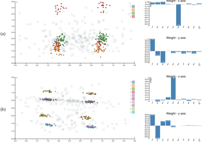
3.2 Synthetic data
In the first case study, we generated a synthetic data set that consists of 1000 ten-dimensional data vectors of which dimensions 1–4 can be clustered into five clusters, dimen-sions 5–6 into four clustersinvolving different subsets of data points, and of which dimensions 7–10 are Gaussian noise. All dimensions have equal variance.
In Figure 4a we observe the initial visualization from SIDE. The blue dots are data points while the open cir-cles correspond to a randomized version of the data. The
randomized data points are shown in order to ground any observed patterns in the visualization because they show what we should be expecting given the background knowl-edge encoded thus far. As this is the initial visualization, the only encoded knowledge is the overall scale of the data.
Next to the visualization we find two bar charts that visualize the projection vectors corresponding to the x-and y-axis. We observe the x-axis has loadings mostly on dimensions 2 and 3 and to a lesser extent 1 and 4. The other loadings (dimensions 7–10) are so small they likely correspond to noise that is by chance slightly correlated to the cluster structure in dimensions 1–4. The y-axis is loaded onto dimensions 2–4.
The distribution of the projected data points clearly con-trasts with the randomized data, indicating that probably the visualization is showing meaningful structure. Because the data is 10-dimensional while the scatter plot is 2-dimensional, we cannot be sure just from the visualization where in the original space the observed clusters are located. Hence, we mark the three clusters, as shown in Figure 4b.
Table 1 shows the mean vectors for each of the three clusters. Because this is synthetic data, the dimensions are meaningless, but normally it should be possible to under-stand what the clusters mean and how they differ from each other based on careful inspection of these numbers. Future use of the tool will have to show whether these mean statistics are sufficient, or whether additional information (e.g., variances) could be helpful or necessary.
for a new visualization (’Update background model’ in the full interface shown in Figure 3), which is then based on a model that incorporates the marked structure.
The subsequent most interesting projection is given in Figure 5a. The x-axis corresponds almost purely to di-mension 6, which together with didi-mension 5 contains the orthogonal cluster structure. The y-axis again corresponds to a subspace of dimensions 1–4, highlighting that indeed the red cluster actually consists of two parts.
If we mark the four clusters shown in Figure 5a, our model will contain eight clusters: the red cluster breaks into four parts, the green and orange into two each. In Figure 5b we recover the remaining structure in the data; the x-axis (dimension 5) divides each of the already defined clusters into two, and on the y-axis, there is again a subspace of dimensions 1–4, which splits the brown-yellow cluster into two, while the others are unaffected.
We designed this example to illustrate the feedback that a user can give using the constrained randomizations. Additionally, it shows how the methods succeeds in finding interesting projections given previously identified patterns. Thirdly, it also demonstrates how the user interactions meaningfully affect subsequent visualizations.
3.3 UCI Adult data
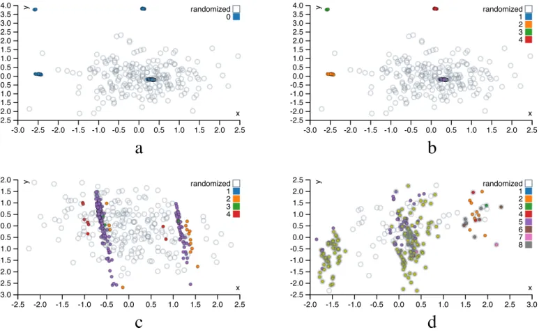
In this case study, we demonstrate the utility of our method by exploring a real world dataset. The data is compiled from the UCI Adult dataset2. To ensure the real time in-teractivity, we sub-sampled 218 data points and selected six features: “Age” (17−90), “Education” (1−16), “HoursPer-Week” (1−99), “Ethnic Group” (White, AsianPacIslander, Black, Other), “Gender” (Female, Male), “Income” (≥50k). Among the selected features, “Ethnic Group” is a categorical feature with five categories, “Gender” and “Income” are bi-nary features, the rest are all numeric. To make our method applicable to this dataset, we further binarized the “Ethnic Group” feature (yielding four binary features), and the final dataset consists of 218 points and 9 features.
We assume the user uses clustering tiles throughout the exploration. Each of the patterns discovered during the exploration process corresponds to a certain demographic clustering pattern. To illustrate how the constrained ran-domizations help the user rapidly gain an understanding of the data, we discuss the first three iterations of the exploration process. The first projection (Figure 6a) visually consists of four clusters. The user notes that the weight vectors corresponding to the axes of the plot assign large weights to the “Ethnic Group” attributes (Table 2, 1st row). As mentioned, we assume the user marks these points as part of the same cluster. After marking (Figure 6b), the tool informs the user of the mean vectors of the points within each clustering tile. The 1st row of Table 3 shows that each cluster completely represents one out of four ethnic groups, which may corroborate with the user’s understanding.
Taking the user’s feedback into consideration, a new projection is generated. The new scatter plot (Figure 6c) shows two large clusters, each consisting of some points from the previous four-cluster structure (points from these four clusters are colored differently). Thus, the new scatter
2. https://archive.ics.uci.edu/ml/datasets/Adult
plot elucidates structure not shown in the previous one. Indeed, the weight vectors (2nd row of Table 2) show that the clusters are separated mainly according to the “Gender” attribute. After marking the two clusters separately, the mean vector of each cluster (2nd row of Table 3) confirms this: the cluster on the left represents male group, and the female group is on the right. Notice that these clusters also yield other meaningful information, because the projection vectors not only correspond to gender (Table 2, 2nd row). We find in the table of cluster means (Table 3, 2nd row) that the genders are skewed over age, ethnicity, and income.
The projection in the third iteration (Figure 6d) consists of three clusters, separated only along the x-axis. Interest-ingly, the corresponding weight vector (3rd row of Table 2) has strongly negative weights for the attributes “Income” and “Ethnic Group - White”. This indicates the left cluster mainly represents the people with high income and whose ethnic group is also “White”. This cluster has relatively low y-value; i.e., they are also generally older and more highly educated. These observations are corroborated by the cluster mean (Table 3, 3rd row).
For this case study, we also measured the performance ofSIDE in three components: loading data, fit background model then compute new projection, update visualizations. We repeated the experiment (with two iterations each) ten times on a desktop with 2.7 GHz Intel Core i5 processor and recorded the wall clock time. On average, loading Adult dataset takes 11ms, fitting the background model then computing the new projection takes 7.0s, updating the visualization takes 41ms.
This case study illustrates how the proposed constrained randomization methods facilitates human data exploration by iteratively presenting an informative projection, consid-ering what the user has already learned about the data.
3.4 Performance on synthetic data
Ideally any interactive data exploration tool should work in close to real time. This section contains an empirical analysis of an (unoptimized) R implementation of the method, as a function of the size, dimensionality, and complexity of the data. Note that limits on screen resolution as well as on human visual perception render it useless to display more than of the order of a few hundred data vectors, such that larger data sets can be down-sampled without noticeably affecting the content of the visualizations.
We evaluated the scalability on synthetic data withd∈ {16,32,64,128} dimensions and n ∈ {64,128,256,512}
data points scattered around k ∈ {2,4,8,16} randomly drawn cluster centroids (Table 4). The randomization is done here with the initial background model. The most costly part in randomization is usually the multiplication of orthogonal matrices, indeed, the running time of the randomization scales roughly as ndx
, where xis between
2 and3. The results suggests that the running time of the optimization is roughly proportional to the size of the data matrixndand that the complexity of datakhas here only a minimal effect in the running time of the optimization.
Furthermore, in 90% of the tests, the L1 loss on the first axis is within 1% of the best L1 norm out of ten restarts. The optimization algorithm is therefore quite stable,
-3.0 -2.5 -2.0 -1.5 -1.0 -0.5 0.0 0.5 1.0 1.5 2.0 2.5 x -2.5 -2.0 -1.5 -1.0 -0.5 0.0 0.5 1.0 1.5 2.0 2.5 3.0 3.5 4.0 y 0 randomized -3.0 -2.5 -2.0 -1.5 -1.0 -0.5 0.0 0.5 1.0 1.5 2.0 2.5 x -2.5 -2.0 -1.5 -1.0 -0.5 0.0 0.5 1.0 1.5 2.0 2.5 3.0 3.5 4.0 y 1 2 3 4 randomized -2.5 -2.0 -1.5 -1.0 -0.5 0.0 0.5 1.0 1.5 2.0 2.5 x -3.0 -2.5 -2.0 -1.5 -1.0 -0.5 0.0 0.5 1.0 1.5 2.0 y 1 2 3 4 randomized -2.0 -1.5 -1.0 -0.5 0.0 0.5 1.0 1.5 2.0 2.5 3.0 x -2.5 -2.0 -1.5 -1.0 -0.5 0.0 0.5 1.0 1.5 2.0 2.5 y 1 2 3 4 5 6 7 8 randomized
a
c
b
d
Fig. 6. Projections of UCI Adult dataset: (a) projection in the1stiteration, (b) clusters marked by user in the1stiteration, (c) projection in the2nd
iteration, and (d) projection in the3rditeration
and in practical applications it may well be be sufficient to run the optimization algorithm only once. These results have been obtained with unoptimized and single-threaded R implementation on a laptop having 1.7 GHz Intel Core i7 processor.3 The performance could probably be
signifi-cantly boosted by, e.g., carefully optimizing the code and the implementation. Yet, even with this unoptimized code, response times are already of the order of 1 second to 1 minute.
3.5 Stopping criterion
Finally, we tested whether the stopping criterion presented in Section 2.4 can indeed quantify whether the current projection is different from the structure level present due to random noise. We evaluated this in a controlled setting, i.e., using the synthetic data described in Section 3.2, which consists of 1000 ten-dimensional data vectors of which di-mensions 1–4 can be clustered into five clusters, didi-mensions 5–6 into four clustersinvolving different subsets of data points, and of which dimensions 7–10 are Gaussian noise.
Since the data essentially contains cluster structure at three levels (in dimensions 1–6) and noise (dimensions 7– 10 are purely random, 1–6 also contain some noise), we expect that in the fourth iteration the background model does not yet contain all the exact values of the data, but it contains the cluster structure, assuming the user has
3. The R implementation used to produce Table 4 is available also via the demo page (footnote 1).
properly marked that. Then, because the constraints contain all real structure, the projection is based purely on random differences between the real data and the randomized data. In experiments, we find that not in every run the results are the same, due to the nondeterministic randomization and optimization procedures. For example, it is not rare that the background model already contains the exact values of all data points after three iterations. However, if the run goes indeed as described above, where the first three iterations show the various clusterings in the data, then the empirical p-values align perfectly with our expectation: the p-values should be high after three iterations, and equal to one after four iterations. In the other cases, the p-values are equal to one already after three iterations.
The test statistic of the projections and the empirical p-value for five iterations in one test run are given in Table 5. We observe that in the first three iterations,pˆ≤0.01for both axes. As expected, in the fourth iteration (shown in Figure 7) the projections do not correspond to substantial structure anymore, andp >ˆ 0.05for both axes. In the fifth iteration, the data is completely fixed and hence we findpˆ= 1.
4
R
ELATED WORKVisualization pipeline. The pipeline of visualizing
high-dimensional data is recognized to have three stages [14]: Data transformationis the act of changing the data into a desired representation. In this stage methods such as dimen-sionality reduction (DR), clustering, and feature extraction
TABLE 2
Projection weight vectors for the UCI Adult data (Section 3.3).
Figure axis Age Edu. h/w EG AsPl EG Bl. EG Oth. EG Whi. Gender Income
6a X -0.039 -0.001 0.001 0.312 -0.530 -0.193 0.763 0.017 0.008 Y 0.004 -0.004 -0.002 0.816 -0.141 0.465 -0.313 -0.011 0.002 6c X 0.081 -0.028 -0.022 -0.259 -0.233 -0.104 -0.380 -0.846 -0.001 Y -0.590 0.541 0.143 -0.233 -0.380 -0.026 -0.293 0.232 0.000 6d X 0.119 -0.149 0.047 0.102 0.191 0.104 -0.556 0.0581 -0.769 Y -0.382 -0.626 -0.406 0.346 0.317 -0.0287 0.111 -0.248 0.059 TABLE 3
Mean vectors of user marked clusters for the UCI Adult data (Section 3.3).
Figure Cluster Age Edu. h/w EG AsPl EG Bl. EG Oth. EG Whi. Gender Income
6b top left 35.0 8.67 34.7 0.00 0.00 1.00 0.00 0.667 0.333 bott. left 37.2 9.43 40.3 0.00 1.00 0.00 0.00 0.286 0.071 top right 35.6 1.3 51.1 1.00 0.00 0.00 0.00 0.750 0.250 bott. right 38.4 10.2 41.6 0.00 0.00 0.00 1.00 0.762 0.275 6c left 39.0 10.2 43.3 0.0377 0.0252 0.0126 0.925 1.00 0.321 right 36.0 9.95 37.9 0.0339 0.169 0.0169 0.780 0.00 0.102 6d left 42.5 11.6 46.3 0.00 0.00 0.00 1.00 1.00 1.00 TABLE 4
Median wall clock running times, for randomization and optimization over ten iterations of finding 2D-projections usingL1loss. Also shown
is the number of iterations in which theL1norm first component ended
up within1%of the result with the largestL1norm (out of 10 tries). A
high number indicates the solution quality is stable, even though the actual projections may vary.
rand. k∈ {2,4,8,16} n d (s) optim. (s) #tries∆<1% 64 16 0.1 {1.0,1.2,0.9,1.2} {10,10,9,8} 64 32 0.5 {1.8,2.1,2.4,2.5} {10,8,10,10} 64 64 2.5 {5.6,3.5,4.6,4.5} {10,9,10,8} 64 128 11.5 {8.9,10.1,11.4,10.2} {10,10,8,9} 128 16 0.2 {2.0,1.7,2.4,2.0} {10,1,6,8} 128 32 0.8 {2.6,3.5,4.0,4.8} {9,10,10,10} 128 64 5.1 {6.7,5.3,8.3,9.6} {8,10,10,9} 128 128 24.5 {13.8,17.4,15.2,20.4} {10,9,10,7} 256 16 0.4 {4.3,2.6,3.3,4.7} {10,8,10,9} 256 32 1.8 {6.3,8.2,7.9,8.8} {8,9,10,10} 256 64 9.2 {12.4,10.1,19.2,16.3} {10,10,10,9} 256 128 39.9 {33.5,36.3,30.6,35.6} {10,9,8,9} 512 16 0.5 {6.7,6.3,6.1,7.5} {10,9,10,10} 512 32 2.4 {16.6,19.6,20.2,17.5} {9,9,10,10} 512 64 13.6 {34.9,23.5,22.3,41.0} {10,10,8,7} 512 128 68.0 {74.5,68.1,72.3,62.8} {10,1,9,9} TABLE 5
Test statistic and empirical p-value for both projections (xandyaxes) in a test run of the synthetic data.
Iteration fx(X,X∗) fy(X,X∗) pˆx pˆy 1 0.127 0.093 0.01 0.01 2 0.084 0.078 0.01 0.01 3 0.080 0.044 0.01 0.01 4 0.028 0.026 0.17 0.14 5 0.000 0.000 1.00 1.00
are used. As we aim to find informative projections in lower dimension, we focus on the discussion of DR methods. Dimensionality reduction for exploratory data analysis has been studied for decades. Early research into visual explo-ration of data led to approaches such as multidimensional scaling [15], [16] and projection pursuit [17], [18]. Most recent research on this topic (also referred to as manifold learning) is still inspired by the aim of multi-dimensional
Fig. 7. Projection of the synthetic data, fourth iteration in the empirical p-value test run. The empirical p-values for the axes are 0.17 and 0.14, indicating the amount of structure shown is comparable to what is expected in random noise. Notice also that the distribution of the randomized data is very similar to that of the real data and that the projection vectors are not similarly sparse as in the previous iterations (Figures 4 and 5), both signalling that the background model captures all meaningful structure present in the data.
scaling; find a low-dimensional embedding of points such that their distances in the high-dimensional space are well represented. In contrast to Principal Component Analysis [19], one usually does not treat all distances equal. Rather, the idea is to preserve small distances well, while large dis-tances are irrelevant, as long as they remain large; examples are Local Linear and (t-)Stochastic Neighbor Embedding [20], [21], [22]. Even that is typically not possible to achieve perfectly, and a trade-off between precision and recall arises [23]. Recent works are mostly spectral methods along this line.
Visual mapping aims to encode the information in data space (the outcome of data transformation) into visual representations. For different types of the input data, the applicable encoding varies [14], [24]. Our approach takes multivariate real-valued data as input and visualizes the 2D projections of the data using scatterplots. While simple 2D scatter plots allow to track the information learned by user, it would be possible to simultaneously visualize mul-tiple pairwise relationships. For example, Scatterplot Matrix (SPLOM) [25] and Parallel Coordinate Plot (PCP) [26] show pairwise relationships between multiple data data attributes at once. Based on radial coordinates, visual encodings such
as Star Coordinate Plot [27] and Radviz [28] are also used for simultaneous multivariate data visualization.
View transformation renders the visual encodings on the screen. Visualization of large number of data points usually has limitations such as high computational cost, visual cluttering (hence occlusions). To address these issues, con-tinuous scatterplots [29] and concon-tinuous PCPs [30] as well as splatting scatterplots [31] and splatting PCPs [32] have been introduced. Such techniques are not yet used in proof-of-concept toolSIDEbut may be useful if users need to anaylze datasets with very many data points.
User Interaction. Orthogonal to the data visualization
pipeline, data visualization methods and systems can also be categorized by the amount of user interaction involved. We adopt the categorization proposed by Liu et al. [14]:
Computation-centric approaches have minimum interac-tivity, where a user only needs to set the initial parameters. The previously introduced dimensionality reduction meth-ods all belong to this category.
Interactive explorationapproaches fix data transformation models but allow users to explore the models with inter-active visual mappings, e.g., navigate, query, and filter. For example, SAMP-Viz [33] and the work by Liu et al. [34] first compute a few data representatives using clustering methods. A user can navigate through these representatives and study the corresponding visualizations. Voyager [35] takes user selected data attributes as input and recommends either the visualizations that contains the selected attributes or representative visualizations that reveal the relationships between other attributes. Although the described recom-mendation mechanism is rather naive (visualizations are ordered by the types and names of the corresponding attributes). For each visualization, the authors propose a rule of thumb for choosing the visual encodings based on cognitive considerations. SeeDB [36] takes a user-specified database query and a reference query as input. For both queries, SeeDB evaluates all possible aggregate views that defined by a triplet: a group-by attribute, a measure at-tribute, and an aggregation function. Based on the deviation between the aggregative views of user-specified query and the corresponding one of the reference query, SeeDB visual-izes the top k views that have largest deviation in bar charts. Model manipulation techniques maintain a model that reflects a user’s interaction in order to provide the user new insights. The existing methods (e.g., [37], [38], [39]) usually assume the user have a specific hypothesis in mind. Through interactions, these methods aim to help the user efficiently confirm or reject the hypothesis. On the other hand, we model user’s belief about the data, and update the model after a user has studied a new visualization. Our approach exposes as much new information as possible to the user, thus increasing the user’s serendipity of gaining new insights about the data.
In order to reflect a user’s interaction in the model, it is important to acknowledge the cognitive aspect of how humans identify [40], [41], [42] and assimilate [43] visual patterns. As our first attempt, SIDE assumes a user can vi-sually identify the clusters in 2D scatterplots and internalize the position of the points in the clusters. One important line of future work is to investigate alternative assumptions about what a human operator can learn from a scatterplot.
Iterative data mining and machine learning. There are
two general frameworks for iterative data mining: FORSIED [5], [6] is based on modeling the belief state of the user as an evolving probability distribution in order to formalize subjective interestingness of patterns. This distribution is chosen as the Maximum Entropy distribution subject to the user beliefs as constraints, at that moment in time. Given a pattern syntax, one then aims to find the pattern that provides the most information, quantified as the ‘subjective information content’ of the pattern.
The other framework, which we here named CORAND [7], [8], is similar, but the evolving distribution does not necessarily have an explicit form. Instead, it relies on sam-pling, or put differently, on randomization of the data, given the user beliefs as constraints. Both these frameworks are general in the sense that it has been shown they can be applied in various data mining settings; local pattern mining, clustering, dimensionality reduction, etc.
The main difference is that in FORSIED, the background model is expressed analytically, while in CORAND it is defined implicitly. This leads to differences in how they are deployed and when they are effective. From a research and development perspective, randomization schemes are easier to propose, or at least they require little mathematical skills. Explicit models have the advantage that they often enable faster search of the best pattern, and the models may be more transparent. Also, randomization schemes are computationally demanding when many randomizations are required. Yet, in cases like the current paper, a single randomization suffices, and the approach scales very well. For both frameworks, it is ultimately the pattern syntax that determines their relative tractability.
Besides FORSIED and CORAND, many special-purpose methods have been developed for active learning, a form of iterative mining or learning, in diverse settings: clas-sification, ranking, and more, as well as explicit models for user preferences. However, since these approaches are not targeted at data exploration, we do not review them here. Finally, several special-purpose methods have been developed for visual iterative data exploration in specific contexts, for example for itemset mining and subgroup discovery [44], [45], [46], [47], information retrieval [48], and network analysis [49].
Visually controllable data mining. This work was
moti-vated by and can be considered an instance ofvisually con-trollable data mining[3], where the objective is to implement advanced data analysis method so that they are understand-able and efficiently controllunderstand-able by the user. Our proposed method satisfies the properties of a visually controllable data mining method (see [3], Section II B): (VC1) the data and model space are presented visually, (VC2) there are intuitive visual interactions that allow the user to modify the model space, and (VC3) the method is fast enough to allow for visual interaction.
5
C
ONCLUSIONSIn order to improve the efficiency and efficacy of data explo-ration, there is a growing need for generic and principled methods that integrate advanced visualization with data mining techniques to facilitate effective visual data analysis
by human users. Our aim with this paper was to present a principled framework based on constrained randomization to address this problem: the user is initially presented with an ‘interesting’ projection of the data and then employs data randomization with constraints to allow users to flexibly express their interests or beliefs. These constraints expressed by the user are then taken into account by a projection-finding algorithm to compute a new ‘interesting’ projection, a process that can be iterated until the user runs out of time or finds that constraints explain everything the user needs to know about the data. By continuously providing a user with information that contrasts with the constructed background model, we maximize the chance of the user to encounter striking and truly new information presented in the data.
In our example, the user can associate two types of con-straints on a chosen subset of data points: the appearance of the points in the particular projection or the fact that the points can be nearby also in other projections. We also provided case examples on two data sets, one controlled experiment on synthetic data and another on real census data. We found that in these preliminary experiments the framework performs as expected; it manages to find inter-esting projections. Yet, interinter-estingness can be case specific and relies on the definition of an appropriate interestingness measure, here the L1 norm was employed. More research into this choice is warranted. Nonetheless, we think this approach is useful in constructing new tools and methods for interactive visually controllable data mining in variety of settings.
Also, a fundamental problem with linear projections is that they may not capture all types of structure in the data. It would be possible to work in a kernel space to overcome this or study non-linear manifold learning. However, the defini-tion of clusters in the visualizadefini-tion does not readily map back to the original data space. Hence, it is not obvious then how to track the user’s gained knowledge in a background model. Thus, this remains an open research question.
We have been actively working to putSIDEinto practical use. One interesting application is a data analysis task called “gating”. Gating is an analysis technique applied by biologists to flow cytometry data, where cells are data points and each point is described by a few intensity readings corresponding to emissions of different fluorescent dyes. The goal of gating is to extract clusters (‘gates’) based on cell’s fluorescence intensities so that the cell types of a given sample can be differentiated. This is ongoing work.
SIDE is a prototype with several limitations. From a fundamental perspective, we assume a user can visually recognize the clusters in 2D scatterplots and internalize the position of the points in the clusters. This may misguide users if they give feedback and progress through a series of visualizations without making the effort to truly understand the defined clusters. They may not learn much, but more im-portantly because the intent is to provide new information continuously, there is almost no redundancy between the visualizations so information that is a combination of two or more previous visualizations is also never shown.
In further work we intend to investigate the use of the FORSIED framework to also formalize an analytical back-ground model [5], [6], as well as its use for computing the most informative data projections. Additionally, alternative
pattern syntaxes (constraints) will be investigated. Another future research direction is the integration of the constrained randomisation methods into software libraries in order to facilitate the integration of the methods in production level visualization systems.
A
CKNOWLEDGMENTSThis work has received funding from the European Re-search Council under the European Union’s Seventh Frame-work Programme (FP7/2007-2013) / ERC Grant Agreement no. 615517, from the FWO (project numbers G091017N, G0F9816N), from the European Union’s Horizon 2020 re-search and innovation programme and the FWO under the Marie Skłodowska-Curie Grant Agreement no. 665501, from the Academy of Finland (decisions 326280 and 326339), and from Tekes (Revolution of Knowledge Work project).
R
EFERENCES[1] J. Thomas and K. Cook,Illuminating the Path: Research and
Develop-ment Agenda for Visual Analytics. IEEE Press, 2005.
[2] D. Keim, J. Kohlhammer, G. Ellis, and F. Mansmann, Eds.,
Mas-tering the Information Age: Solving Problems with Visual Analytics. Eurographics Association, 2010.
[3] K. Puolam¨aki, P. Papapetrou, and J. Lijffijt, “Visually controllable
data mining methods,” inProc. of ICDMW, 2010, pp. 409–417.
[4] B. Kang, K. Puolam¨aki, J. Lijffijt, and T. De Bie, “A tool for
subjective and interactive visual data exploration,” in Proc. of
ECML-PKDD - Part III, 2016, pp. 3–7.
[5] T. De Bie, “An information-theoretic framework for data mining,”
inProc. of KDD, 2011, pp. 564–572.
[6] T. De Bie, “Subjective interestingness in exploratory data mining,”
inProc. of IDA, 2013, pp. 19–31.
[7] S. Hanhij¨arvi, M. Ojala, N. Vuokko, K. Puolam¨aki, N. Tatti, and
H. Mannila, “Tell me something I don’t know: Randomization
strategies for iterative data mining,” inProc. of KDD, 2009, pp.
379–388.
[8] J. Lijffijt, P. Papapetrou, and K. Puolam¨aki, “A statistical
signif-icance testing approach to mining the most informative set of
patterns,”DMKD, vol. 28, no. 1, pp. 238–263, 2014.
[9] K. Puolam¨aki, B. Kang, J. Lijffijt, and T. De Bie, “Interactive visual
data exploration with subjective feedback,” in Proc. of
ECML-PKDD - Part II, 2016, pp. 214–229.
[10] R Core Team, R: A Language and Environment for Statistical
Computing, R Foundation for Statistical Computing, Vienna, Austria, 2016. [Online]. Available: https://www.R-project.org/ [11] S. Loisel, “Numeric javascript,” http://www.numericjs.com/. [12] B. V. North, D. Curtis, and P. C. Sham, “A note on the calculation
of empirical p-values from Monte Carlo procedures,”Am. J. Hum.
Gen., vol. 71, no. 2, pp. 439–441, 2002.
[13] S. Hanhij¨arvi, “Multiple hypothesis testing in data mining,” Ph.D. dissertation, Aalto University School of Science, 2012.
[14] S. Liu, D. Maljovec, B. Wang, P.-T. Bremer, and V. Pascucci, “Vi-sualizing high-dimensional data: Advances in the past decade,”
IEEE TVCG, vol. 23, no. 3, pp. 1249–1268, 2017.
[15] J. B. Kruskal, “Nonmetric multidimensional scaling: A numerical
method,”Psychometrika, vol. 29, no. 2, pp. 115–129, 1964.
[16] W. S. Torgerson, “Multidimensional scaling: I. theory and
method,”Psychometrika, vol. 17, no. 4, pp. 401–419, 1952.
[17] J. H. Friedman and J. W. Tukey, “A projection pursuit algorithm
for exploratory data analysis,”IEEE Tr. Comp., vol. 100, no. 23, pp.
881–890, 1974.
[18] P. J. Huber, “Projection pursuit,”Ann. Stat., vol. 13, no. 2, pp. 435–
475, 1985.
[19] K. Pearson, “On lines and planes of closest fit to systems of points
in space,”Philosophical Magazine, vol. 2, no. 11, pp. 559–572, 1901.
[20] G. E. Hinton and S. T. Roweis, “Stochastic neighbor embedding,” inProc. of NIPS, 2003, pp. 857–864.
[21] S. T. Roweis and L. K. Saul, “Nonlinear dimensionality reduction
by locally linear embedding,”Science, vol. 290, no. 5500, pp. 2323–
[22] L. van der Maaten and G. Hinton, “Visualizing data using t-SNE,”
JMLR, vol. 9, no. Nov, pp. 2579–2605, 2008.
[23] J. Venna, J. Peltonen, K. Nybo, H. Aidos, and S. Kaski, “Informa-tion retrieval perspective to nonlinear dimensionality reduc“Informa-tion
for data visualization,”JMLR, vol. 11, no. Feb, pp. 451–490, 2010.
[24] J. Kehrer and H. Hauser, “Visualization and visual analysis of
multifaceted scientific data: A survey,”IEEE TVCG, vol. 19, no. 3,
pp. 495–513, 2013.
[25] M. A. Fisherkeller, J. H. Friedman, and J. W. Tukey, “Prim-9, an interactive multidimensional data display and analysis system,”
Dynamic Graphics for Statistics, pp. 91–109, 1988.
[26] G.-D. Sun, Y.-C. Wu, R.-H. Liang, and S.-X. Liu, “A survey of visual analytics techniques and applications: State-of-the-art research
and future challenges,”JCST, vol. 28, no. 5, pp. 852–867, 2013.
[27] E. Kandogan, “Star coordinates: A multi-dimensional
visualiza-tion technique with uniform treatment of dimensions,” inInfoVis,
vol. 650, 2000, p. 22.
[28] P. Hoffman, G. Grinstein, K. Marx, I. Grosse, and E. Stanley, “Dna
visual and analytic data mining,” inInfoVis, 1997, pp. 437–441.
[29] S. Bachthaler and D. Weiskopf, “Continuous scatterplots,”TVCG,
vol. 14, no. 6, pp. 1428–1435, 2008.
[30] J. Heinrich and D. Weiskopf, “Continuous parallel coordinates,”
TVCG, vol. 15, no. 6, pp. 1531–1538, 2009.
[31] A. Mayorga and M. Gleicher, “Splatterplots: Overcoming
over-draw in scatter plots,”TVCG, vol. 19, no. 9, pp. 1526–1538, 2013.
[32] H. Zhou, W. Cui, H. Qu, Y. Wu, X. Yuan, and W. Zhuo, “Splatting
the lines in parallel coordinates,” in Computer Graphics Forum,
vol. 28, no. 3, 2009, pp. 759–766.
[33] H. Zhang, Q. Liu, D. Qu, Y. Hou, and B. Chen, “Samp-viz: An in-teractive multivariable volume visualization framework based on
subspace analysis and multidimensional projection,”IEEE Access,
2017.
[34] S. Liu, B. Wang, J. J. Thiagarajan, P.-T. Bremer, and V. Pascucci, “Visual exploration of high-dimensional data through subspace
analysis and dynamic projections,” inComputer Graphics Forum,
vol. 34, no. 3, 2015, pp. 271–280.
[35] K. Wongsuphasawat, D. Moritz, A. Anand, J. Mackinlay, B. Howe, and J. Heer, “Voyager: Exploratory analysis via faceted browsing
of visualization recommendations,”TVCG, vol. 22, no. 1, pp. 649–
658, 2016.
[36] M. Vartak, S. Rahman, S. Madden, A. Parameswaran, and N. Poly-zotis, “S ee db: efficient data-driven visualization
recommenda-tions to support visual analytics,”VLDB, vol. 8, no. 13, pp. 2182–
2193, 2015.
[37] M. Gleicher, “Explainers: Expert explorations with crafted
projec-tions,”TVCG, vol. 19, no. 12, pp. 2042–2051, 2013.
[38] E. T. Brown, J. Liu, C. E. Brodley, and R. Chang, “Dis-function:
Learning distance functions interactively,” inVAST, 2012, pp. 83–
92.
[39] A. Endert, C. Han, D. Maiti, L. House, and C. North, “Observation-level interaction with statistical models for visual analytics,” in
VAST, 2011, pp. 121–130.
[40] M. Sedlmair, A. Tatu, T. Munzner, and M. Tory, “A taxonomy
of visual cluster separation factors,” inComputer Graphics Forum,
vol. 31, no. 3pt4, 2012, pp. 1335–1344.
[41] H. Wickham, D. Cook, H. Hofmann, and A. Buja, “Graphical
inference for infovis,”TVCG, vol. 16, no. 6, pp. 973–979, 2010.
[42] E. Wu and A. Nandi, “Towards perception-aware interactive data
visualization systems,” in Data Syst. Interactive Anal. Workshop,
2015.
[43] J. Chuang, D. Ramage, C. Manning, and J. Heer, “Interpretation and trust: Designing model-driven visualizations for text
analy-sis,” inSIGCHI, 2012, pp. 443–452.
[44] M. Boley, M. Mampaey, B. Kang, P. Tokmakov, and S. Wrobel, “One click mining—interactive local pattern discovery through implicit
preference and performance learning,” inProc. of KDD IDEA, 2013,
pp. 27–35.
[45] V. Dzyuba and M. van Leeuwen, “Interactive discovery of
inter-esting subgroup sets,” inProc. of IDA, 2013, pp. 150–161.
[46] M. van Leeuwen and L. Cardinaels, “Viper — visual pattern
explorer,” inProc. of ECML–PKDD, 2015, pp. 333–336.
[47] D. Paurat, R. Garnett, and T. G¨artner, “Interactive exploration of larger pattern collections: A case study on a cocktail dataset,” in
Proc. of KDD IDEA, 2014, pp. 98–106.
[48] T. Ruotsalo, G. Jacucci, P. Myllym¨aki, , and S. Kaski, “Interactive
intent modeling: Information discovery beyond search,”CACM,
vol. 58, no. 1, pp. 86–92, 2015.
[49] D. H. Chau, A. Kittur, J. I. Hong, and C. Faloutsos, “Apolo: making sense of large network data by combining rich user interaction and
machine learning,” inProc. of CHI, 2011, pp. 167–176.
Bo Kang Bo Kang is a PhD student at the IDLab, Ghent University, Belgium. He holds an MSc degree in Computer Science from the Uni-versity of Bonn, Germany. His primary inter-ests are data mining and machine learning, and more specifically dimensionality reduction and representation learning. He has a website at http://users.ugent.be/∼bkang/.
Kai Puolam ¨akiKai Puolam ¨aki is Associate Pro-fessor of computer science and atmospheric sci-ences in the Department of Computer Science at the University of Helsinki. He completed his PhD in 2001 in theoretical physics at the University of Helsinki. His primary interests lie in the areas of data mining, machine learning, and related algo-rithms. He holds a title of Docent in Information and Computer Science at the Aalto University School of Science, Finland. He has a website at http://www.iki.fi/kaip/.
Jefrey LijffijtJefrey Lijffijt is a FWO [Pegasus]2
Marie Skłodowska-Curie Fellow at the IDLab, Ghent University, Belgium. He graduated as a Doctor of Science in Technology (graded with distinction) in 2013 at Aalto University, Finland. For his doctoral thesis, he won the Aalto Uni-versity School of Science ’Best Doctoral Thesis’ of 2013 award. His main research interests are theory and practice of statistical modeling and pattern mining in various data. He has a website at http://users.ugent.be/∼jlijffij/.
Tijl De BieTijl De Bie is currently Full Professor at Ghent University, Belgium. Before moving to Ghent, he was a Reader at the University of Bristol, where he was appointed Lecturer (Assis-tant Professor) in January 2007. Before that, he was a postdoctoral researcher at the KU Leuven (Belgium) and the University of Southampton. He completed his PhD on machine learning and advanced optimization techniques in 2005 at the KU Leuven. During his PhD he also spent a combined total of about 1 year as a visiting re-search scholar in U.C. Berkeley and U.C. Davis. He is currently most actively interested in the formalization of subjective interestingness in exploratory data mining, and in the use of machine learning and data mining for music informatics as well as for web and social media mining.