Working Paper No. 420
Is the Equalizing Effect of Retirement Wealth Wearing Off?
by
E dward N. Wolff
T he L evy E conomics Institute, New Y ork University, and NB E R March 2005
The Levy Economics Institute Working Paper Collection presents research in progress by Levy Institute scholars and conference participants. The purpose of the series is to
disseminate ideas to and elicit comments from academics and professionals. The Levy Economics Institute of Bard College, founded in 1986, is a nonprofit, nonpartisan, independently funded research organization devoted to public service. Through scholarship and economic research it generates viable, effective public policy responses to important economic problems that profoundly affect the quality of life in the United States and abroad.
T he L evy E conomics Institute P.O. B ox 5000
A nnandale-on-Hudson, NY 12504-5000
http://www.levy.org
ABSTRACT
Retirement wealth is often viewed as a great equalizer, offsetting the inequality in standard household net worth. One of the most dramatic changes in the retirement income system over the last two decades has been a decline in traditional Defined Benefit (DB) pension plans and a sharp rise in Defined Contribution (DC) pensions. Using data from the Federal Reserve Board’s Survey of Consumer Finances, I find that retirement wealth (the sum of pension and Social Security wealth) had a considerably weaker offsetting effect on wealth inequality in 2001 than in 1983. Whereas standard net worth inequality increased modestly between 1983 and 2001, the inequality of augmented wealth (the sum of retirement wealth and net worth) surged from 1983 to 2001, very much in line with income inequality. Moreover, whereas median net worth climbed substantially from 1983 to 2001, median augmented wealth actually fell over this period.
Keywords: Pensions, Social Security, Wealth, Inequality
1. INTRODUCTION
While almost all the attention of the media has been riveted on the Social Security system, the devolution of the private pension system has received surprisingly little attention. Indeed, one of the most dramatic changes in the retirement income system over the last two decades has been the replacement of many traditional Defined Benefit (DB) pension plans with Defined
Contribution (DC) pensions. Moreover, retirement wealth is often viewed as the great equalizer, offsetting the inequality in standard household net worth. The main focus of the paper is to analyze the effects of this substitution on the overall distribution of household wealth.
The work of Poterba, Venti, and Wise (1998) suggests that the transition from DB to DC type plans increased pension wealth dramatically. My results, reported below, also confirm that
mean pension wealth rose strongly between 1983 and 2001. However, median pension wealth grew much more slowly over this period and pension wealth inequality grew sharply as well.
A related issue that will be covered in this paper regards the distributional effects of Social Security wealth. Feldstein (1976), in a seminal paper on this subject found that the inclusion of Social Security wealth led to a sharp reduction in overall wealth inequality. I also find the same effect. However, my results show that median Social Security wealth grew more slowly than net worth over the period from 1983 to 2001 and its equalizing effect dissipated over these years.
The results of this paper also clear up a “puzzle” encountered in earlier work (Wolff, 2001). In particular, the share of total household wealth held by the richest one percent of households increased only a bit between 1989 and 1998, and the Gini coefficient for total
household wealth actually declined slightly. I expected both the share of the top one percent and the Gini coefficient to have shown a considerable increase.
The reason is that in previous work (see Wolff, 2002) I identified two factors that seem to underlay much of the change in the share of wealth held by the top one percent. The first is the change in underlying income inequality and the second is the change in the ratio of stock prices to housing prices (see Figure A). In a simple regression of the share of the top one percent on these two factors, both variables proved statistically significant and the goodness of the fit of the equation was quite high.1 Over the period from 1989 to 1998, income inequality, as
1 A regression of a wealth inequality index, measured by the share of marketable wealth held by the top 1 percent of
measured by the share of the top five percent increased by 2.8 percentage points, and the ratio of share prices to housing prices surged by a factor of 2.5. Extrapolating on the basis of the
regression estimates, I would have expected a 9.9 percentage point increase in the share of the top one percent between 1989 and 1998, compared to its actual gain of 0.7 percentage points (see Figure B).
Wojciech Kopczuk and Emmanuel Saez (2004), using U.S. estate tax data from 1916 to 2000, also find very little change in the shares of wealth held by the top wealth groups in the 1990s. Indeed, they find very little change in the 1980s as well. The share of the top one percent was 21.1 percent in 1983 and 20.8 percent in 2000.
The next section of the paper (Section 2) provides a review of the pertinent literature on this subject. Section 3 describes the data sources and develops the accounting framework used in the analysis. Section 4 shows time trends in standard measures of household wealth over the 1983-2001 period. Sections 5 and 6 investigate changes in pension wealth and Social Security wealth, respectively, over this period. Section 7 presents summary measures on total
(augmented) household wealth. Alternative pension wealth calculations are shown in Section 8. Concluding remarks are made in Section 9.
families (INC), and the ratio of stock prices (the Standard and Poor index) to housing prices (RATIO), with twenty-one data readings between 1922 and 1998, yields:
WLTH = 5.10 + 1.27 INC + 0.26 RATIO, R2 = 0.64, N = 21 (0.9) (4.2) (2.5)
with t-ratios shown in parentheses. Both variables are statistically significant (INC at the 1 percent level and RATIO at the 5 percent level) and with the expected (positive) sign. Also, the fit is quite good, even for this simple model.
Sources are (A) Share of income of the top 5 percent: The basic data source is the Current Population Report series on shares of income held by families that runs from 1947 to 1998. The data are available on internet at the address: http://www.census.gov/hhes/income/histinc. The earlier data, from 1922 to 1949, are from Kuznets's (1953) series on the percentage share of total income received by the top percentiles of tax units. This series is benchmarked against the census figure for 1949. (B): Standard and Poor 500 Composite Stock Index: (1) From 1922 to 1969:
U.S. Bureau of the Census, Historical Statistics of the United States, Colonial Times to 1970, Bicentennial
Edition, Part I, Washington, DC, U.S. Government Printing Office, 1975, p. 1004. (2) From 1970 to 1998: U.S.
Council of Economic Advisers, Economic Report of the President, 2000, Washington, DC, U.S. Government
Printing Office, 2001, Table B-93, p. 406. (C) Median House Prices: (1) From 1922 to 1969: U.S. Bureau of the
Census, Historical Statistics of the United States, Colonial Times to 1970, Bicentennial Edition, Part I,
Washington, DC, U.S. Government Printing Office, 1975, Series N 259 & 261, p. 647. (2) From 1970 to 1998:
U.S. Bureau of the Census. Statistical Abstract of the United States, 1999, 119th edition, Washington, D.C., U.S.
2. LITERATURE REVIEW
Previous work on the overall distributional effects of pension and Social Security wealth has been rather limited. The seminal paper on this subject is Martin Feldstein (1974), who introduced the concept of Social Security wealth and developed its methodology. His main interest was in the aggregate level of Social Security wealth and its effect on aggregate savings and retirement patterns. In a follow-up paper, Feldstein (1976) considered the effects of Social Security wealth on the overall distribution of wealth on the basis of the 1962 Survey of
Financial Characteristics of Consumers (SFCC), a survey performed by the Federal Reserve Board of Washington. The paper found that the inclusion of Social Security wealth had a major effect on lowering the inequality of total household wealth (including Social Security wealth). The Gini coefficient for the sum of net worth and Social Security wealth among families in age class 35 to 64 was 0.51, compared to a Gini coefficient of 0.72 for net worth.
Edward Wolff followed up Feldstein (1976) by examining the distributional implications of both Social Security and private pension wealth. Wolff (1987), which used the 1969
Measurement of Economic and Social Performance (MESP) database, was one of the first papers to add estimates of private pension wealth and examine their effects on the overall distribution of wealth. The paper showed that while Social Security wealth has a pronounced equalizing effect on the distribution of augmented wealth (the sum of marketable wealth and retirement wealth), pension wealth has a disequalizing effect on augmented wealth. In particular, the addition of Social Security wealth to net worth reduced the overall Gini coefficient from 0.73 to 0.48 but the addition of pension wealth to the sum of net worth and Social Security wealth raised the Gini coefficient back to 0.66. The sum of Social Security and pension wealth has, on net, an equalizing effect on the distribution of augmented wealth but substantially less than Social Security wealth alone.2
Kathleen McGarry and Andrew Davenport (1997) used the 1992 wave of the Health and Retirement Survey (HRS) to estimate private pension wealth. They found that pension wealth is only slightly more equally distributed than net worth and that adding pension wealth to net worth has a modest effect on inequality (with the wealth share of the top decile declining from 52.9 to 44.8 percent with the addition of pension wealth). Arthur Kennickell and Annika Sunden
2 Also, see Wolff (1992) for a discussion of some of the methodological issues involved in estimating both Social
(1999) used the 1989 and 1992 Survey of Consumer Finances (SCF) to analyze the effects of Social Security and pension wealth on the overall distribution of wealth. They also found a net equalizing effect from the inclusion of these two forms of retirement wealth. In particular, the inclusion of pension and net Social Security wealth3 reduced the share of total wealth held by
the top one percent with head less than the age of 65 in 1992 from 31.3 percent to 16.2 percent. Estimates are not provided separately for pension wealth and Social Security wealth. As far as we are aware, there are no estimates of Social Security or pension wealth that have been provided thus far from the 1998 or 2001 SCF.
In contrast, there are a host of studies that examine the intra-cohort redistributional effects of Social Security benefits relative to contributions into the Social Security system. They consider which groups are net gainers and which net losers from the Social Security System as a whole. These papers include Wolff (1993), who used the 1962 SFCC and the 1983 SCF;
Coronado, Fullerton, and Glass (2000) who derived their estimates from the Panel Study of Income Dynamics (PSID); Smith, Toder, and Iams (2001), who based their work on Survey of Income and Program Participation (SIPP) data matched with Social Security administrative data and the micro-simulation MINT model; Jeffrey Liebman (2002), who matched Social Security Administration earnings and benefit records to the 1990 and 1991 panels of the SIPP; Dean Leimer (2003) and Leimer (2004), who based his analysis on Social Security administrative data.
There are several other topics of relevance to this paper. First, several papers have now used the Health and Retirement Survey (HRS) to examine what proportion of total (augmented) household wealth is comprised of pension and social security wealth. Alan Gustman, Olivia Mitchell, Andrew Samwick, and Thomas Steinmeier (1997) found that in 1992, pensions, Social Security, and health insurance accounted for half of the wealth held by all households aged 51 to 61 in the HRS; for 60% of total wealth of HRS households who are in wealth percentiles 45 to 55; and for 48% of health for those in the 90th to 95th wealth percentiles. In a follow-up study, Gustman and Steinmeier (1998) used data from the HRS to examine the composition and distribution of total wealth for a group of 51 to 61 year olds. They focused on the role of pensions in forming retirement wealth. They found that pension coverage is widespread, covering two thirds of households and accounting for one quarter of accumulated wealth on
3 Net social security wealth is defined as the discounted present value of future social security benefits less future
average. Social Security benefits accounted for another quarter of total wealth. They also
reported that the ratio of wealth (excluding pensions) to lifetime earnings was the same for those individuals with pensions and for those without pensions. They concluded that pensions cause very limited displacement of other forms of wealth.
Second, several studies have documented changes in pension coverage in the United States, particularly the decline in DB pension coverage among workers over the last two decades. Before this, Laurence Kotlikoff and Daniel Smith (1983) provided one of the most comprehensive treatments of pension coverage and showed that the proportion of U.S. private-wage and salary workers covered by (traditional DB) pensions more than doubled between 1950 and 1979. David Bloom and Richard Freeman (1992), using Current Population Surveys (CPS) for 1979 and 1988, were among the first to call attention to the decline in DB pension coverage. They reported that the percentage of all workers in age group 25-64 covered by these plans fell from 63 to 57% over this period. Among male workers in this age group, the share covered dropped from 70 to 61%, while among females in the same age group, the share remained almost constant, at 53%.
Alan Gustman and Thomas Steinmeier (1992) documented the change-over from DB plans to DC plans between 1977 and 1985 on the basis of IRS 5500 filings. They estimated that only about half of the switch was due to a decline in DB coverage conditional on industry, size, and union status and the other half was due to a shift in employment mix toward firms with industry, size, and union status historically associated with low DB coverage rates. Other studies include William Even and David Macpherson (1994a, 1994b, 1994c, and 1994d). The 1994c study showed a particularly pronounced drop in DB pension coverage among workers with low levels of education; and Even and Macpherson (1994d), showed a convergence in pension coverage rates among female and male workers between 1979 and 1998.
Department of Labor (2000) found that a large proportion of workers, especially low wage, part-time, and minority workers, were not covered by private pensions. The coverage rate of all private sector wage and salary workers was 44 percent in 1997. Coverage of part-time, temporary and low-wage workers was especially low. This appears to be ascribable to the proliferation of 401(k) plans and the frequent requirement of employee contributions to such plans. It also found important racial differences, with 47 percent of white workers participating but only 27 percent of Hispanics. Another important finding is that 70 percent of unionized workers were covered by a pension plan, compared to only 41 percent of non-unionized
workers. Pension participation was found to be highly correlated with wages. While only 6 percent of workers earnings less than $200 per week had a pension plan, 76 percent of workers earning $1,000 per week participated.
Third, a related topic of interest is whether DC pension plans have substituted for DB-type plans. Leslie Popke (1999), using employer data (5500 filings) for 1992, found that, indeed, 401(k) and other DC plans have substituted for terminated DB plans and that offering a DC plan raises the chance of a termination in DB coverage.
Fourth, several papers looked at the issue of whether DC plans have substituted for other forms of wealth and whether there was any net savings derived from DC plans. James Poterba, Steven Venti, and David Wise (1992, 1993, 1995), using SIPP data for 1984 and 1991, Poterba, Venti, and Wise (1998), using HRS data for 1993, and Poterba, Venti, and Wise (2001), using both macro national accounting data and micro HRS data, concluded that the growth of IRAs and 401(k) plans did not substitute for other forms of household wealth and, in fact, raised household net worth relative to what it would have been without these plans. They found no substitution of DC wealth for either DB wealth or other components of household wealth.
In contrast, William Gale in a series of papers both by himself and with colleagues, found very little net savings emanating from DC plans. Gale (1995) concluded that when biases in estimation procedures in the previous literature on the subject are corrected, the offset of pension wealth on other forms of wealth can be very high. Using data from the 1984, 1987, and 1991 SIPP, Eric Engen and William Gale (1997) estimated that “at best” only a small proportion of 401(k) contributions represent net increments to household savings. In later work, Engen and Gale (2000) refined their analysis to look at the substitution effect by earnings groups. Using data from the 1987 and 1991 SIPP, they found that 401(k)s held by low earners may more likely represent additions to net worth than 401(k)s held by high earners, who hold the bulk of this asset. Overall, only between 0 and 30 percent of the value of 401(k)s represent net additions to private savings. Kennickell and Sunden (1999) found a significant negative effect of both defined benefit plan coverage and Social Security wealth on non-pension net worth but
concluded that the effects of defined contribution plans, such as 401(k) plans, on other forms of wealth are statistically insignificant.
3. DATA SOURCES AND ACCOUNTING FRAMEWORK
The principal data sources used for this study are the 1983, 1989, 1998, and 2001 Survey of Consumer Finances (SCF) conducted by the Federal Reserve Board. Each survey consists of a core representative sample combined with a high-income supplement.4 The SCF provides
considerable detail on both pension plans and Social Security contributions. The SCF also gives detailed information on expected pension and Social Security benefits for both husband and wife. For 1983, the Federal Reserve Board has also made its own calculations of the wealth equivalent value of both expected pension benefits and Social Security benefits and made these available in its Public Use sample. However, this has not been done for the other years.
The principal wealth concept used here is marketable wealth (or net worth), which is defined as the current value of all marketable or fungible assets less the current value of debts. Total assets are the sum of: (1) the gross value of owner-occupied housing; (2) other real estate owned by the household; (3) cash and demand deposits; (4) time and savings deposits,
certificates of deposit, and money market accounts; (5) government bonds, corporate bonds, foreign bonds, and other financial securities; (6) the cash surrender value of life insurance plans; (7) the current market value of Defined Contribution pension plans, including IRAs, Keogh, and 401(k) plans; (8) corporate stock and mutual funds; (9) net equity in unincorporated businesses; and (10) equity in trust funds. Total liabilities are the sum of: (1) mortgage debt, (2) consumer debt, including auto loans, and (3) other debt. I use the symbol NW to refer to standard net worth. It should be stressed that the standard definition of net worth includes the market value of DC pension plans. (We shall return to this point later on in the paper).5
A word should be said on why I use the SCF instead of the newer Health and Retirement Survey (HRS), which has much more complete data on earnings histories and has employer-provided information on individual DB pension plans of each employee covered by these plans. There are three reasons. First, the SCF provides much better data on the assets and liabilities
4 See, for example, Kennickell and Woodburn (1992), Kennickell, McManus, and Woodburn (1996),
and Kennickell and Woodburn (1999) for details on the construction of the weights used in the SCF files.
5 Only assets that can be readily converted to cash (that is, “fungible” ones) are included. As a result, consumer
durables, such as automobiles, televisions, furniture, household appliances, and the like, are excluded here since these items are not easily marketed or their resale value typically far understates the value of their consumption services to the household.
that constitute marketable net worth. Second, the SCF data date from 1983, whereas the HRS data start in 1992. Since the most important transformation of the pension system occurred beginning in the late 1980s, the SCF data allow us to better track this change over the transition period. Third, the age coverage of the HRS is limited whereas the SCF covers the whole
population.
The imputation of both pension and Social Security wealth involves a large number of steps, which is summarized below. Greater details can be found in the Appendix.
A. Pension Wealth
For retirees (r) the procedure is straightforward. Let PB be the pension benefit currently being received by the retiree. The SCF questionnaire indicates how many pension plans each spouse is involved in and what the expected (or current) pension benefit is. The SCF questionnaire also indicates whether the pension benefits remain fixed in nominal terms over time for a particular beneficiary or is indexed for inflation. In the case of the former, the (gross) Defined Benefit pension wealth is given by:
(1a) DBr = ∫ 0 PB(1 - mt)e-δtdt
where mt is the mortality rate at time t conditional on age, gender, and race; δ the nominal
discount rate, for which the (nominal) 10-year treasury bill rate is used; and the integration runs from the current year to age 109). In the latter case,
(1b) DBr = ∫ 0 PB(1 - mt)e- δ*tdt
and δ* is the real 10-year treasury bill rate, estimated as the current nominal rate less the Social Security Plan II-B assumption of 4.0 percent annual increase of the Consumer Price Index (CPI).
Among current workers (w) the procedure is somewhat more complex. The SCF
provides detailed information on pension coverage among current workers, including the type of plan, the expected benefit at retirement or the formula used to determine the benefit amount (for example, a fixed percentage of the average of the last five year’s earnings), the expected
retirement age when the benefits are effective, the likely retirement age of the worker, and vesting requirements. Information is provided not only for the current job (or jobs) of each spouse but for up to five past jobs as well. On the basis of the information provided in the SCF
and on projected future earnings (see the Appendix for details), future expected pension benefits (EPBw) are then projected to the year of retirement or the first year of eligibility for the pension.
Then the present value of pension wealth for current workers (w) is given by: (2) DBw = ∫ LR EPB(1 - mt)e-δtdt
where RA is the expected age of retirement and LR = A - RA is the number of years to
retirement. As above, and the integration runs from the expected age of retirement to age 109.6 It should be noted that the calculations of DB pension wealth for current workers are based on employee response, including his or her stated expected age of retirement (see Appendix D), not on employer-provided pension plans. A couple of studies have looked at the reliability of employee-provided estimates of pension wealth by comparing self-reported pension benefits with estimates based on provider data. Using data from the 1992 wave of the HRS, both Gustman and Steinmeier (1999) and Johnson, Sambamoorthi, and Crystal (2000) found that individual reports of pension benefits varied widely from those based on provider information. However, the latter also calculated that the median values of DB plans from the two sources were quite close (about a 6 percent difference).
B. Social Security Wealth
For current Social Security beneficiaries (r), the procedure is again straightforward. Let SSB be the Social Security benefit currently being received by the retiree. Again, the SCF provides information for both husband and wife. Since Social Security benefits are indexed for inflation, (gross) Social Security wealth is given by:
(3) SSWr = ∫0 SSB(1 - mt)e-δ*tdt
where it is assumed that the current social security rules remain in effect indefinitely.7 The imputation of Social Security wealth among current workers is based on the worker's projected earnings history estimated by regression equation (see the Appendix for details). The steps are briefly as follows. First, coverage is assigned based on whether the
6 Technically speaking, the mortality rate m
t associated with the year of retirement is the probability of surviving
from the current age to the age of retirement.
7 Separate imputations are performed for husband and wife and an adjustment in the Social Security
individual expects to receive Social Security benefits and on whether the individual was salaried or self-employed. Second, on the basis of the person's earnings history, the person's Average Indexed Monthly Earnings (AIME) is computed. Third, on the basis of existing rules, the person's Primary Insurance Amount (PIA) is derived from AIME. Then,
(4) SSWw = ∫ LR PIA(1 - mt)e-δ*tdt .
As with pension wealth, the integration runs from the expected age of retirement to age 109.8 Here, too, it should be noted that estimates of Social Security wealth are based on reported earnings at a single point in time. These estimates are likely to be inferior to those based on longitudinal work histories of individual workers (see, for example, Smith, Toder, and Iams, 2001, whose estimates are based on actual Social Security work histories.) In fact, actual work histories do show much more variance in earnings over time than one based on a human capital earnings function projection. Moreover, they also show many periods of work disruption that I cannot adequately capture here. However, I do have some retrospective information on work history provided by the respondent (see Appendix D for details). In particular, each individual is asked to provide data on the total number of years worked full-time since age 18, the number of years worked part-time since age 18, and the expected age of retirement (both from full-time and part-time work). On the basis of this information, it is possible to
approximate the total number of full-time and part-time years worked over the individual’s lifetime and use these figures in the estimate of the individual’s AIME.
Nonetheless, since my estimates of SSW assume a continuous work life, I am likely to be overstating the value of SSW for many workers. This is likely to bias upward my estimates of mean and median SSW, as well as a downward bias in the variability of Social Security wealth. It may also lead to an understatement of the correlation between net worth and SSW. For all three reasons, this estimation procedure will likely lead to an over-estimate of the degree to which SSW equalizes total wealth inequality.
Estimates will be provided for the following components of household wealth:
(5) NW = NWX + DC
8 As with pension wealth, the mortality rate m
t associated with the year of retirement is the probability of surviving
where DC is the current market value of Defined Contribution pension plans and HDWX is marketable household wealth excluding DC and NW corresponds to marketable wealth or net worth. Total pension wealth, PW, is given by:
(6) PW = DC + DB
Private accumulations PA is then defined as the sum of NWX and total pension wealth:
(7) PA = NWX + PW
The term “private accumulations” is used to distinguish contributions to wealth from private savings and employment contracts with both private and government employers from those of social insurance provided by the state — notably, Social Security (also see Section 8 below for more discussion of this concept).
Retirement wealth RW is then given as the sum of pension and social security wealth: (8) RW = PW + SSW
Finally, augmented household wealth, AW, is given by
(9) AW = NWX + RW.
4. TRENDS IN STANDARD MEASURES OF HOUSEHOLD WEALTH.
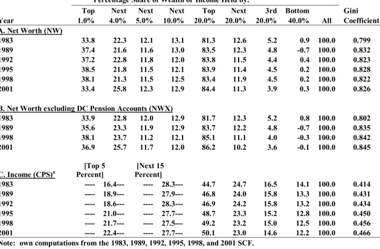
Table 1 documents a robust growth in wealth during the 1990s. Median wealth was 16 percent greater in 2001 than in 1989. After rising by 7 percent between 1983 and 1989, median wealth fell by 17 percent from 1989 to 1995 and then rose by 39 percent from 1995 to 2001. As a result, median wealth grew slightly faster between 1989 and 2001, 1.32 percent per year, than between 1983 and 1989, at 1.13 percent per year.9
Mean net worth also showed a sharp increase from 1983 to 1989 followed by a rather precipitous decline from 1989 to 1995 and then, buoyed largely by rising stock prices, another surge in 2001. Overall, it was 65 percent higher in 2001 than in 1983 and 44 percent larger than in 1989. In fact mean wealth grew quite a bit faster between 1989 and 2001, at 3.02 percent per
9 The time trend is very similar when the unadjusted asset values are used instead of my adjusted values
and when the value of vehicles is included in net worth. Similar results can also be derived from the estimates provided by Kennickell and Woodburn (1999) for 1989 and 1995.
year, than from 1983 to 1989, at 2.27 percent per year. Moreover, mean wealth grew almost three times as fast as the median, suggesting widening inequality of wealth over these years.
Median household income, based on Current Population Survey data, after gaining 11 percent between 1983 and 1989, grew by only 2.3 percent from 1989 to 2001—much slower than median net worth. The net change over the whole period was 14 percent. In contrast, mean income rose by 16 percent from 1983 to 1989 and by another 12 percent from 1989 to 2001, for a total change of 30 percent.
The robust performance of median net worth over the 1990s is particularly surprising in contrast to trends in median income. Indeed, between 1983 and 1998, while median income grew by 13.8 percent, median net worth gained 11.1 percent (and from 1989 to 1998, 2.3 percent and 3.8 percent, respectively). However, between 1998 and 2001, median net worth exploded by 11.5 percent while median income stagnated.
Looking at Panel B of Table 1, we see the important role played by DC pension wealth, which forms part of net worth NW. If DC pension wealth is excluded from net worth, then median wealth NWX actually declined over the 1990s, by 3.9 percent, and mean NWX grew more slowly than standard net worth NW. The rapid accumulation of DC pension wealth thus helped maintain household savings over the 1990s. We shall return to this point later in the paper.
Table 2 shows trends in both wealth and income inequality. It is most useful to begin with the income trends (Panel C). Household income inequality, based on CPS data, increased between 1983 and 1989, with the share of the top five percent rising by 2.5 percentage points, while the share of the next fifteen percent and that of the bottom four quintiles all fell.10 The Gini coefficient rose from 0.414 to 0.431 over this period. Between 1989 and 2001, the share of the top five percent rose by another 3.5 percentage points while the next fifteen percent and the bottom four quintiles again lost ground, so that the Gini coefficient again increased, from 0.431 to 0.466. All told, according to the CPS figures, there was no abatement in the growth of inequality in the 1989-2001 period compared to 1983-1989.
The trends are different for wealth. As shown in Panel A, wealth inequality, after rising steeply between 1983 and 1989, remained virtually unchanged from 1989 to 2001. The share of wealth held by the top 1 percent rose by 3.6 percentage points from 1983 to 1989 and the Gini
10 The CPS tabulations provided by the U.S. Bureau of the Census do not include the income shares of
coefficient increased from 0.80 to 0.83. Between 1989 and 2001, the share of the top percentile actually declined sharply, from 37.4 to 33.4 percent, though this was almost exactly
compensated for by an increase in the share of the next four percentiles. As a result, the share of the top five percent actually increased slightly, from 58.9 to 59.2 percent, as did the share of the top quintile, from 83.5 to 84.4 percent. The share of the fourth and middle quintiles also
declined slightly, while that of the bottom 40 percent increased somewhat, so that overall, the Gini coefficient fell very slightly, from 0.832 to 0.826.
However, when we now exclude DC pension wealth from net worth, we find that inequality in wealth NWX actually rose over the 1990s (see Panel B). The share of the top one percent gained 1.3 percentage points, that of the top 5 percent grew by 3.7 percentage points, and the share of the top quintile increased by 2.6 percentage points between 1989 and 2001, while the Gini coefficient rose by 0.011 points. Here, too, the accumulation of DC pension wealth helped to moderate wealth inequality over the 1990s.
Table 3 shows changes in the overall portfolio composition of household wealth. In 2001, owner-occupied housing was the most important household asset in the breakdown shown in the table, accounting for 28 percent of total assets. However, net home equity amounted to only 19 percent of total assets. Real estate, other than owner-occupied housing, comprised 10 percent, and business equity another 17 percent. Liquid assets, including bank deposits, money market funds, CDs, and the cash surrender value of life insurance, made up 9 percent and (DC) pension accounts amounted to 12 percent. Financial securities made up 2 percent; corporate stock and mutual funds, 15 percent; and trust equity a little less than 5 percent. Debt as a proportion of gross assets was 13 percent, and the debt-equity ratio (the ratio of total household debt to net worth) was 0.14.
There have been some notable trends in the composition of household wealth over the period between 1983 and 2001. The most important from the standpoint of this paper is that DC pension accounts rose from 1.5 to 12.3 percent of total assets, with almost the entire gain
occurring after 1989. This increase almost exactly offset the decline in liquid assets, from 17.4 to 8.8 percent—again, with almost all of the change occurring after 1989. Though there is no direct econometric evidence of substitution here, there is circumstantial evidence the explosion in the use of various types of pension accounts, like IRAs, 401(k) plans, and other thrift plans appears to have allowed households to substitute tax-free pension accounts for taxable savings deposits, rather than increasing overall family savings.
This tabulation provides a picture of the average holdings of all families in the economy, but there are marked class differences in how middle-class families and the rich invest their wealth. As shown in Table 4, the richest one percent of households (as ranked by wealth)
invested almost 80 percent of their savings in investment real estate, businesses, corporate stock, and financial securities in 2001. Housing accounted for only 8 percent of their wealth, liquid assets 6 percent, and pension accounts 6 percent. Their debt-equity ratio was 2 percent and their ratio of debt to income was 34 percent. Among the next richest 19 percent, housing comprised 27 percent of their total assets, liquid assets another 9 percent, and pension assets 16 percent. Forty-six percent of their assets took the form of investment assets— real estate, business equity, stocks, and bonds. Debt amounted to 9 percent of their net worth and 77 percent of their income.
In contrast, almost 60 percent of the wealth of the middle three quintiles (60 percent) of households was invested in their own home in 2001. Another 25 percent went into monetary savings of one form or another and pension accounts. Together housing, liquid assets, and pension assets accounted for 84 percent of the total assets of the middle class. The remainder was about evenly split among non-home real estate, business equity, and various financial securities and corporate stock. The ratio of debt to net worth was 32 percent, much higher than for the richest 20 percent, and their ratio of debt to income was 100 percent, also higher than the top quintile.
There is remarkable stability in the composition of wealth by wealth class between 1983 and 2001. The most notable exception is a substitution of pension assets for liquid assets—a transition that occurred for all three wealth classes but that was particularly marked for percentiles 80-99 and for the middle three quintiles.
5. PENSION WEALTH
Table 5 highlights trends in pension holdings over the 1983-2001 period. In this and the subsequent tables, it should be noted that the unit of observation is the household, not the individual worker. Moreover, I have divided households into three age groups: under 47, 47-64, and 65 and older. Data for the youngest group are the most problematic, since estimates of both DB pension wealth and social security wealth depend on projecting future work life and, in the case of the former, future job tenure with the same employer. Data for retirees are the most
secure since both pension and social security benefit levels are already determined. Estimates of both DB and social security wealth for the middle-aged group lie in between in terms of
reliability. Individuals close to retirement have a fairly good idea of their expected age of retirement and have a high likelihood of remaining with their current employer (see Farber, 2001, for some evidence).
The share of all households with DC pension accounts skyrocketed over the 1983-2001 period, from 11 to 52 percent, or by 41 percentage points. The story is very similar for the three different age groups shown in Table 5—even among the elderly. The proportion holding
pension accounts advanced by 40 percentage points in age group 46 and under, by 50
percentage points among households in age group 47-64, and by 33 percentage points among elderly households. In 2001, about 62 percent of households in the age range of 47 to 64 held some form of DC account, compared to 35 percent of elderly households and 54 percent of younger households. Most of the gains occurred after 1989.
Opposite trends are apparent for Defined Benefit (DB) pension wealth. The share of all households with DB pension wealth fell by 18 percentage points between 1983 and 2001, from 53 to 34 percent. Among households in age group 47-64, the decline was even more precipitous — by 24 percentage points, from 69 to 45 percent — while among elderly households the proportion fell by 20 percentage points and among young households, by 10 percentage points. In 2001, while 47 percent of elderly households held some form of DB pension wealth, only 45 percent of households in age group 47-64 and only 23 percent among young households
recorded DB entitlements. Most of the loss in coverage again occurred after 1989.
The percentage of all households covered by either a DC or a DB plan increased from 54 to 66 percent between 1983 and 2001. Among the 47-64 age group, the proportion rose by 5.6 percentage points, to 76 percent in 2001, while among the elderly, the share fell by 4.3 percentage points, down to 63 percent in 2001. The biggest rise occurred among younger households, whose proportion surged from 36 to 61 percent. The share of households covered by pensions in 2001 was 76 percent among the middle-aged, compared to 63 percent among the elderly and 61 percent among the youngest age group.
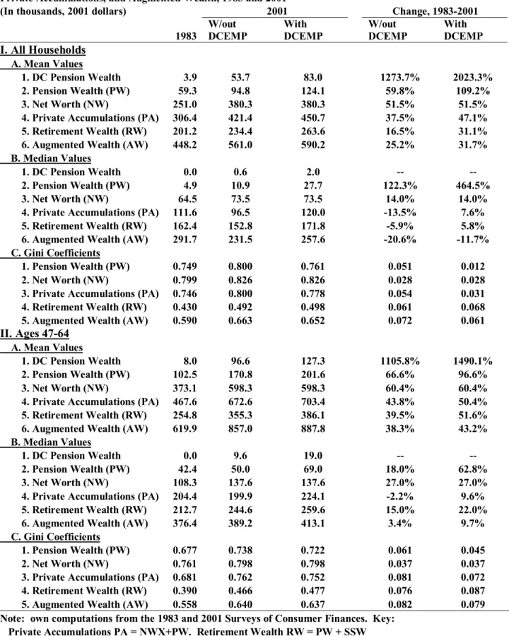
As shown in Table 6, there were huge increases in the average holdings of DC pension accounts.11 Among all households, the average value of these accounts increased ten-fold
11 Due to space constraints, I show results for only 1983 and 2001. Results for some other key variables are also
between 1983 and 2001, from $3,900 (in 2001 dollars) to $53,700. Among age group 46 and under the increase was by a factor of 10.1 and among age group 47-64 the gain was by a factor of 11.1, while among elderly households, the rise was by a factor of 28.4. In 2001, mean DC pension wealth was greatest among age group 47-64, at $96,600, second highest among elderly households, at $53,600 and lowest among the youngest age group, at $28,200.
Opposite trends are again evident for the average value of DB pension wealth. Among all households, the mean value fell by 26 percent between 1983 and 2001, from $55,400 (in 2001 dollars) to $41,200. Losses were also marked for age group 47-64, who saw their mean DB pension wealth decline by 21 percent between 1983 and 2001, and for younger households, whose average DB wealth fell by 27 percent. However, the valuation of pension rights among younger workers has to be interpreted cautiously, since these are based on projected benefits in 20 to 40 years hence.12 However, the average value of DB plans among the elderly fell by somewhat less over this period, 14 percent. In contrast to DC pensions, the average value of DB pension wealth was highest among elderly households—$105,600 in 2001—compared to $74,300 among middle-aged households and only $16,900 among young households.
We can now consider one of the issues raised in the Introduction: Has the spread of DC type pension plans adequately compensated for the decline in traditional DB pension coverage? The results indicate that the answer is both “yes” and “no.” Average pension wealth PW (the sum of DC and DB pensions) increased for all age groups between 1983 and 2001. Among all households, the mean value of total pension wealth PW climbed by 60 percent. Among those in age groups 46 and under and 47 to 64, the mean value increased by 76 and 66 percent,
respectively, while among elderly households the mean value jumped by 70 percent. The story is not quite as positive when we look at trends in median pension wealth. Among all households, median pension wealth PW more than doubled between 1983 and 2001, from $4,900 to $10,900 (result not shown). However, much of this gain is a result of increased pension coverage. When the sample is limited to those households with positive pension wealth, the median actually fell by 17 percent, from $64,300 to $53,700, over the period. Among young households who have pension wealth, median pension wealth increased by 14 percent, among middle-aged pension holders by 9 percent, and among elderly pension holders by 16 percent.
The bottom line is that while mean pension wealth grew robustly over this period, median pension wealth shows much more modest gains.
In Table 7, I show Gini coefficients for pension wealth. I again focus on dispersion among pension holders only within the age group. Among all households, the inequality of DC pension wealth fell over the period from 1983 to 2001. This was also true among young and middle-aged households but not among elderly DC pension owners.
However, the level of inequality in DC pension wealth was still very high in 2001, even among DC account holders alone. The Gini coefficient among all DC pension account holders was 0.741 in 2001. This compares to a Gini coefficient for net worth of 0.826. Inequality among DC account holders within age group was almost as great as among all DC account holders.13 In contrast, the dispersion in traditional DB pension wealth trended upward over the 1983-2001 period. Among all households who had plans, the Gini coefficient climbed from 0.555 to 0.638. Among middle-aged pension holders, DB pension wealth inequality also climbed sharply (by 0.088), as it did among elderly pension recipients (0.202). In contrast, DB wealth inequality declined by 0.078 points among young households with DB plans.
In terms of inequality levels, DB pension wealth inequality was considerably lower among DB pension wealth holders than among DC pension account holders. Not surprisingly, the switchover from DB pension plans to DC pension plans has resulted in an upsurge in pension wealth inequality.
This trend is also documented in Table 7. Among all households, the Gini coefficient for total pension wealth PW rose by 0.051 from 0.749 to 0.800, while among pension wealth holders, the increase was even more striking, by 0.157, from 0.537 to 0.695. The pension wealth inequality patterns are very similar among both middle-aged and elderly households. However, among the younger households, pension wealth inequality increased only slightly among all households in this group and declined sharply among young households with pension plans—a reflection of the large increase in the share of young households with such plans.
Figure 1 provides a look at the cumulative distribution of pension wealth among all households in 1983 and 2001. Because the percentage of households with positive pension wealth expanded over the period from 54.4 to 65.6, the 1983 cumulative distribution initially lies above the 1998 cumulative distribution. However, what is striking is that though the 1983
13 This result accords with media accounts of a large divide in the value of 401(k) plans between executives and
cumulative distribution lies above the 2001 cumulative distribution throughout, the two are very close from a pension wealth level of $10,000 (in 2001 dollars) through $65,000. In other words, despite the gain in the share of households with some pension wealth, between 1983 and 2001, a lot of them had very small amounts of pension wealth in 2001 (perhaps, an IRA of a few
thousand dollars).
Figures 2a and 2b provide further details on the change in the distribution of pension wealth among all households over the 1983-2001 period. At lower percentile levels up to and including the median, there were large gains in pension wealth over the period, reflecting the increase in the share of households with a pension pan. Between percentiles 60 and 75, the percentage increase in pension wealth ran from 14. to 21.6 percent. However, the percentage increase in pension wealth was higher at the upper percentiles, ranging from 29.5 percent at the 80th percentile to a spectacular 82.4 percent at the 99th percentile. These results illustrate that the largest growth of pension wealth occurred at the top of the pension wealth distribution.
Results are even more dramatic for middle-aged households (Figures 2c and 2d) and elderly households (Figures 2e and 2f). Among the former, the share with positive pension wealth grew from 70.2 to 75.9 percent over the period, so that percentage gains in pension wealth were very high at lower percentiles. However, pension wealth at the 35th percentile fell by a substantial 14 percent and at the 40th percentile by 7 percent. Pension wealth at the 45th to 60th percentile gained less than 20 percent. In contrast, percentage gains in pension wealth increased from 53 percent at the 80th percentile to a remarkable 123 percent at the 99th
percentile. The pattern is quite similar among elderly households. Pension wealth actually fell between the 45th and 65th percentile, from 100 to 9 percent. Percentage gains in pension wealth then rose monotonically by percentile, from 9 percent at the 70th percentile to a huge 146
percent at the 99th percentile. The results rather convincingly display that the size distribution of
pension wealth, particularly among middle-aged and elderly households, substantially widened over the years from 1983 to 2001.
A decomposition of the inequality of pension wealth PW in 1983 and 2001 reveals the changing contribution of the two forms of pensions to overall pension wealth inequality.As derived in Wolff (1987), for any variable X = X1 + X2,
CV2(X) = p
where CV is the coefficient of variation (the ratio of the standard deviation to the mean), CC is the coefficient of covariation, defined as the ratio of the covariance to X2, p1= X1/X, and p2 =
X2/X.14
Results are shown in Table 8. As noted above, pension wealth inequality increased over the 1983-2001 period. In this case the coefficient of variation of PW among all households rose by 0.60 points, from 2.07 to 2.66. The coefficient of variation of DC wealth fell over the period by over half, from 8.5 to 3.7, while the coefficient of variation of DB pension wealth grew by a little over a half, from 2.0 to 3.2. Much of the change reflected the increasing share of
households with DC pension wealth and the corresponding decline in the share of households with DB plans. Still, even in 2001, the inequality of DC pension wealth was greater than that of DB pension wealth.
Despite the decline in DC inequality, the largest contribution to the growth of PW inequality was the increasing share of DC pension wealth in total pension wealth (lines C1 and D1). Indeed, it more than accounted for the total increase in PW inequality over the 1983-2001 period. Moreover, despite the rise in DB inequality over the period, its declining share of total pension wealth helped to reduce overall pension wealth inequality (lines C2 and D2). The correlation between DC and DB pension wealth was quite small in both 1983 and 2001—0.17 and 0.14, respectively—and showed a decline over the period. The increase in the coefficient of covariation between the two components also contributed somewhat to the overall rise in PW inequality over the period. Results for age group 47 to 64 are quite similar.
I next look at trends in both mean and median private accumulations (PA) over the 1983 to 2001 period (see Table 9). We begin by recapitulating trends in net worth over the period. Among all households, mean NWX (net worth excluding DC) rose by 32 percent while the median barely changed. Mean net worth rose by 52 percent, while its median increased by only 14 percent. I next add pension wealth to NWX to obtain private accumulations. Its mean value was up by 38 percent, compared to 52 percent for net worth, while its median value was down by a very sizeable 14 percent, compared to a 14 percent increase in median net worth.
Among middle-aged households, the mean value of PA rose by 44 percent, compared to a 60 percent increase in net worth, whereas the median value of PA was down by 2 percent, compared to a 27 percent gain in median net worth. Among elderly households, the mean value of PA rose by 41 percent, compared to a 50 percent rise in net worth, while the median grew by
30 percent, as opposed to a 48 percent increase in net worth. Among younger households, mean PA was up by 45 percent, compared to a 60 percent growth in net worth, while median PA remained completely unchanged, in contrast to a 21 percent decline in median net worth.15
Generally speaking, private accumulations fared worse than conventional net worth. Mean PA rose less than mean net worth, while median PA increased far less than median net worth (except for young households). A comparison of trends in PA with those in NWX suggests that households dipped into their private savings to finance their 401(k) and other DC plans.
In Table 9, I also consider the effects of pension wealth on overall wealth inequality. The Gini coefficient for net worth among all households is 0.826 in 2001. If we subtract DC
pensions, then the Gini coefficient rises by 0.019 points to 0.845. Adding DB pension wealth to net worth results in a fall of the Gini coefficient of 0.026 points, to 0.800. This rather modest decline in the Gini coefficient is due to both the high level of pension wealth inequality in the population and the high correlation of pension wealth with marketable net worth (see below).
Looking over time, we also find that the equalizing effect of DB pension wealth has mitigated over the period from 1983 to 2001. Whereas the Gini coefficient for net worth among all households advanced by 0.028 points over the 1983-2001 period, the Gini coefficient for PA gained 0.054 points. Likewise, adding DB pension wealth to net worth results in a 0.053 decline in the Gini coefficient in 1983 but only a 0.026 decrease in 2001. However, the joint effect of adding total pension wealth to NWX is more similar in the two years: a 0.056 reduction in the Gini coefficient in1983 and a 0.045 reduction in 2001.
The results are sharpest for middle-aged households. For this group, the Gini coefficient for net worth increased by 0.037, while that for PA ballooned by 0.081. Likewise, among the elderly, PA inequality increased by 0.020 points, whereas net worth inequality fell by 0.016 points. The exception to this pattern is young households, for whom PA inequality increased less than net worth inequality.
Table 10 provides a decomposition to provide an alternative assessment of the effects of adding private pension wealth to NWX (net worth less DC pension accounts) on the inequality of PA among all households and those in age group 47 to 64. As noted earlier, pension wealth inequality among all households as measured by the coefficient of variation (CV) increased by
15 Here, again, some caution should be exercised with regard to pension wealth figures for young households,
0.60 points over the 1983-2001 period. Inequality in NWX increased less over the period — by 0.25 points — and the coefficient of variation of PA grew by only 0.06 (Panel A). It is of note that the increase in the inequality of PA based on CV is considerably smaller than that based on the Gini coefficient. This reflects the fact the CV is much more sensitive to changes in the upper tail of the distribution than is the Gini coefficient, and, as we shall see below, a large portion of the change in the distribution of PA occurs in the middle deciles.
The correlation between NWX and PW increased over the period, from 0.21 to 0.26, and in this decomposition the rising correlation accounted for 110 percent of the rise in the
coefficient of variation of PA. The growth in pension wealth inequality together with its rising share in PA also made a positive contribution to the rise in the CV of PA (33 percent), while the declining share of NWX in PA made a negative contribution.
Results are rather different for the 47 to 64 age group. Here the largest contribution is made by the rising inequality in NWX (62 percent), followed by the rising correlation between NWX and PW (29 percent) and then by the rise in PW inequality (9 percent). The results suggest that for this age group at least lower wealth households substituted DC pension wealth for other components of net worth, accounting for the sharp jump in the inequality of NWX.16
Figures 3a and 3b provide a closer look at the size distribution of PA among all households in 1983 and 2001. Here it becomes quite clear that the major gains over the 1983-2001 period were made by households at the high end of the wealth distribution. Indeed, comparing the size distributions among all households in the two years at different percentile levels, we find an almost monotonic relation between percentile level and percentage change in PA over the period. The percentage growth in PA surges from -73 percent at the tenth percentile to 79 percent at the ninety-ninth percentile. The crossover point in the two distributions occurs just about at the sixtieth percentile. Results are quite similar for households in age group 47 to 64, with the percentage growth in PA ballooning from -98 percent at the tenth percentile to 94 percent at the ninety-ninth percentile and the two distributions crossing slightly below the median (see Figures 3c and 3d). In contrast, among elderly households, PA shows positive growth at and above the 15th percentile, though here again the percentage increase in PA tends to rise with the percentile level.
16 Here it should be stressed that a decomposition is not a behavioral model—that is, we do not take into account
6. SOCIAL SECURITY AND TOTAL RETIREMENT WEALTH
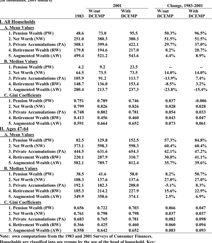
In contrast to the strong growth in pension wealth, mean social security wealth among all households rose by only 10 percent between 1983 and 2001 (see Table 11). The average value of social security wealth gained 21 percent among middle-aged households between 1983 and 2001 and 65 percent among young households, though it did remain largely unchanged among elderly households. Likewise, median social security wealth increased by a very modest 7 percent among all households. Households in the 47-64 age bracket saw their median social security wealth grow by 22 percent, while elderly households experienced a 4 percent decline. In contrast, young households saw their median social security wealth climb by 68 percent.
Social security wealth averaged $139,500 in 2001. This compares to a mean net worth (NW) figure of $380,300 and mean pension wealth of $94,800. Median social security wealth in 2001 was $120,700 — close to that of mean social security wealth. This suggests a normal or close to normal distribution of social security wealth. Moreover, median social security wealth was almost double median net worth ($73,500) and more than ten times higher than median pension wealth ($10,900). Mean and median social security wealth among middle-aged households was about 40 percent greater than that among elderly households and about 70 percent greater than that among young households. The smaller social security wealth among the elderly relative to the middle-aged largely reflects the higher lifetime earnings of the latter, whereas the smaller social security wealth among the young relative to the middle-aged largely reflects the greater discount factor applied to future social security benefits (from the larger number of years left before retirement).
The inequality of social security wealth is much lower than that of net worth or pensions (see Table 11). In 2001, the Gini coefficient for social security wealth among all households was 0.34, compared to 0.83 for net worth and 0.80 for pension wealth. In this case, inequality in social security wealth plummeted over the 1983-2001 period, with the Gini coefficient falling by 0.11 points. The Gini coefficient for social security wealth also fell considerably among young, middle-aged, and elderly households over the period.
More details on the change in the distribution of social security wealth between 1983 and 2001 are provided in Figures 4a-4f. Among all households, there was strong growth in social security wealth over the period, reflecting the increase in social security coverage from 82
to 98 percent. Moreover, in contrast to pension wealth, the largest gains were made by the lowest percentiles. Indeed, the percentage increase in SSW was almost inversely related to the percentile level, ranging from 160 percent at the 20th percentile to -6 percent at the 99th
percentile. The pattern is similar for middle-aged households, though here all the gains were positive, ranging from 163 percent at the 10th percentile to 6 percent at the 99th percentile.
Among elderly households, the same inverse relation can be observed, though in this case the gains are positive up to the 45th percentile and negative over the remainder of the distribution. Total retirement wealth is the sum of DC pensions, DB pension wealth, and social security wealth. Among all households, mean retirement wealth grew by 17 percent from 1983 to 2001 (see Table 11). Moreover, mean retirement wealth was up among each of the three age groups over the 1983-2001 period: by 41 percent among young households, by 40 percent among middle-aged ones, and by 20 percent among the elderly. In contrast, median retirement wealth among all households fell by 6 percent between 1983 and 2001. It declined by 3 percent among elderly households, though among young households it rose by 29 percent over the 1983-1998 period and among middle-aged ones it was up by 15 percent.
The inequality of retirement wealth lies between that of social security wealth on the one hand and both pension wealth and net worth on the other hand (Table 11). In 2001, the Gini coefficient for retirement wealth among all households was 0.49, compared to 0.34 for social security wealth, 0.80 for pension wealth, and 0.83 for net worth. The main news here is a sharp
rise in the inequality of retirement wealth over the 1983 to 2001 period among all households, among whom the Gini coefficient increased by 0.061 points, among middle-aged households by 0.076 points, and among the elderly by an even more sizeable 0.111 points. However, among young households, the Gini coefficient declined by 0.077 points, reflecting the increae in private pension coverage reported earlier.17
Figures 5a-5f portray changes in the distribution of retirement wealth RW between 1983 and 2001. Among all households, percentage gains in RW form a U-shaped pattern, falling from 52 percent at the 10th percentile to -9 percent at the 45th percentile and then climbing to 55 percent at the 99th percentile. The strong growth in RW among the lowest percentiles reflects the large increases in SSW at the bottom, while the sharp gains among the top percentiles is due to the huge gains of pension wealth at the top. The decline in the middle is a reflection of the
17 Here, again, some caution should be exercised with regard to retirement wealth figures for young households,
losses in PW in this part of the distribution. The pattern of percentage gains is also U-shaped among middle-aged households, though in this case all the gains are positive. In contrast, among the elderly, the percentage increases rise almost monotonically with the percentile level, from -18 percent at the 10th percentile to 105 percent at the 99th percentile. This pattern reflects the
slight decline in SSW at the middle and the large decline of PW at the bottom, as well as the substantial increase of PW at the top.
Table 12 provides a decomposition to analyze the sources of the large gains in the inequality of RW over the 1983 to 2001 period. Here, it is clear that the main contributor to this increase is the substantial growth in pension wealth inequality. The latter accounted for 85 percent of the total growth in RW inequality among all households and for 89 percent of the growth among households in age group 47 to 64. The correlation between PW and SSW also intensified over the period, from 0.11 to 0.39, and in this decomposition the rising correlation accounted for 29 percent of the rise in the coefficient of variation of RW among all households and 22 percent among middle-aged households. Inequality in SSW lessened over the period and offset somewhat the rise in PW inequality.
7. AUGMENTED WEALTH
Table 13 provides figures on the trend in both mean and median augmented wealth over the 1983 to 2001 period. We begin by recapitulating trends in net worth over the period. Among all households, mean net worth rose by 52 percent, while median net worth increased by 14
percent. If we next add pension wealth to NWX, then the mean value of PA was up by 38 percent, compared to 52 percent for net worth, and the median value was down sharply, by 14 percent. The mean value of augmented wealth AW, the sum of net worth, PW, and SSW, rose even less, by only 25 percent, over the 1983-2001 period, and median AW plummeted by 21 percent.
The patterns are similar by age group. Among young households, mean AW increased by 39 percent, compared to 60 percent for NW, and median AW plunged by 18 percent, compared to a 21 percent drop in NW. Among middle-aged households, mean AW grew by 38 percent, compared to 60 percent for NW, and median AW increased by a tiny 3 percent, compared to 27 percent for NW. The elderly experienced a 30 percent gain in mean AW,
compared to 50 percent in mean NW, and median AW advanced by 13 percent, much less than the 50 percent gain in median NW.
Table 14 considers the effects of adding retirement wealth on overall wealth inequality. In 2001 the Gini coefficient for net worth among all households was 0.826. Adding pension wealth to net worth (PA) results in a modest decline of the Gini coefficient of only 0.026 points to 0.800. This is due to both the high level of pension wealth inequality in the population and the high correlation of pension wealth with marketable net worth. However, adding social security wealth to net worth results in a sizeable reduction in the Gini coefficient of 0.161 points, from 0.826 to 0.665 (result not shown). This reflects both the much lower level of inequality in SSW than in marketable wealth, as well as its relatively low (though positive) correlation with net worth. Finally, adding both pension wealth and social security wealth to net worth results in an only very modest further reduction of the Gini coefficient to 0.663. The main equalizing effect of retirement wealth comes from social security, not private pensions. Results are very similar for the three age groups.
Looking over time, we find as our main result that the equalizing effect of retirement wealth has mitigated over the 1983-2001 period. Whereas the Gini coefficient for net worth among all households advanced by 0.028 points over the 1983-2001 period, the Gini coefficient for PA gained 0.054 points and that for the sum of NWX and SSW grew by 0.034 points, while the Gini coefficient for augmented wealth ballooned by 0.072. In other words, while the
addition of retirement wealth to net worth reduced the Gini coefficient by 0.208 points in 1983, the difference was only 0.164 in 2001. Thus, the inequality reducing effects of adding retirement wealth to net worth has fallen over the years from 1983 to 2001.
The results are very similar for middle-aged and elderly households. Among the former, the Gini coefficient for net worth increased by 0.037 while that for augmented wealth climbed by 0.082. Among the latter, the Gini coefficient for net worth actually fell by 0.016 while that for AW grew by 0.047. The exception is young households, for whom the net worth Gini coefficient advanced by 0.062 while that for AW remained unchanged.
Figures 6a-6f give a graphical picture of changes in the distribution of AW between 1983 and 2001. Among all households, percentage gains in AW, like those of RW, form a U-shaped pattern, falling from -10 percent at the 10th percentile to a low of -28 percent at the 40th percentile and then advancing to 48 percent at the 99th percentile. The pattern seems to mirror
point occurs at the 80th percentile, with households at or above this point enjoying positive gains and those below suffering losses.
The pattern of percentage gains is quite similar among middle-aged households, with percentage gains falling from -1 percent at the 10th percentile to a low of -7 percent at the 25th
percentile and them climbing to 90 percent at the 99th percentile. In this case, the crossover point
occurs at the 35th percentile. In contrast, among the elderly, the percentage increases remain relatively flat between the 10th and 60th percentile, at around 10 percent, and then rise to 58 percent at the 99th percentile.
Figures 7a and 7b show retirement wealth by net worth percentile among all households. It is apparent that there is a strong correlation between net worth and retirement wealth. In 2001, RW ranged from a low of $116 thousand for the lowest wealth class to $739 thousand for the top wealth class in 2001 — more than a sixfold difference. These results also indicate a relatively strong positive correlation between NW and RW. It also appears that the correlation became stronger between 1983 and 2001 (as we shall see in Table 15). It is also evident from Figure 7b that between 1983 and 2001 RW grew generally faster at higher wealth percentiles, particularly at the 80th percentile and above.
A decomposition, shown in Table 15, provides more details on the effects of adding retirement wealth RW to NWX (net worth less DC pension accounts) on the change in wealth inequality among all households and among middle-aged ones alone over the 1983-2001 period. The results indicate that the main source — about three quarters — of the inequality gain is due to rising inequality in NWX. As noted above, the correlation between NWX and RW is positive and also increased over the period, from 0.22to 0.27. The rising covariance of RW and NWX accounted for another fifth or so of the increase in AW inequality. Finally, the rise in the inequality of RW itself explained the other 6 percent.18
8. ALTERNATIVE PENSION WEALTH CALCULATIONS
So far I have treated DB and DC pension wealth as well as SSW as comparable concepts. However, there are important differences in their estimation. Most notably, the calculation of DB wealth is estimated on the basis of the future stream of pension benefits on the assumption
18 It should be stressed once again that a decomposition is not a behavioral model. In particular, in this case, we do
that the employee remains at his or her firm of employment until the person’s expected retirement date. The computation of SSW is also based on the assumption that the worker remains at work until the person’s expected retirement date. On the other hand, the DC valuation is based on the current market value of DC plans.
There are two ways of putting DB (and SSW) and DC on an “equal footing.” First, one can compute DB and SSW on a “year-to-date” (YTD) basis, assuming that the worker stopped working as of the year of the survey, say 2001. It is possible to do this for SSW by computing the SS benefits that would be received if the worker stopped working in 2001. For DB, we can do this for responses that indicate DB benefits as a percentage of last year’s salary by using current earnings (as opposed to projected earnings) to calculate the expected DB benefit. However, this method is a bit problematic since we do not know how the worker’s DB benefit depends on his or her years of service in the company or when the worker is vested. Moreover, most respondents simply indicate what they expect their DB benefit to be at year of retirement. Since we do not know the actual formula used, it is impossible to compute the expected benefit on the basis of current earnings. Moreover, in the case of the 1983 SCF, we do not have the underlying data to perform the necessary calculations for YTD SSW or DB wealth.19
Second, one can project forward DC wealth to year of retirement (YOR). The 2001 SCF does provide information on the employer contribution to DC plans, like 401(k)s (see Part E of the Appendix). If we assume, as in the case of DB pensions, that workers remain at their company until retirement and that the terms of their DC contract with their employer stays the same, then it is possible to do this. In most cases, the employer contribution is a fixed
percentage of the employee’s salary. On the basis of the estimated human capital earnings functions for each worker, I can calculate the annual stream of future employer contributions to the DC plan until retirement (which I call DCEMP).20
19 This comparison might actually overstate the case. Some future DB entitlements are based on past jobs (as
opposed to current jobs), which, of course, do not require any additional work time with the company to secure future DB benefits. However, the portion of future DB benefits that accrue from past jobs is relatively small—I estimate only 9.65 percent of total DB benefits in 2001.
20 Moreover, the 1983 data do not present a problem, since DC wealth was a trivial amount, so that we can again