Analysis and Design of Web Applications for Use in
Conventional and Mobile Computing Devices.
Project report – Computer Science Master’s Module
Jens Ehlert Lassen (39230) [email protected] , Advisor: Lecturer Morten Rhiger [email protected]
CBIT, University of Roskilde, DK-4000 Roskilde May 29th, 2013
Abstract
The project examines the usability of web (HTML) applications originally designed for use in conventional desktop computers and laptops when used by mobile computing devices. Of particular interest are tablets and smartphones. The project also investigates whether existing technology and developmental approaches can be used to redevelop such web applications as to be compatible with mobile devices and desktop devices and yet retain their usability and functionality.
The project first reviews the evolution of mobile computing from the 1960’s until the present day and provides a statistical background for the importance of mobile computing in a web application context. To anchor the project in the real world existing web applications provided by Resultmaker A/S (http://resultmaker.com ) will be studied, and an attempt to redevelop one of these applications will be made. The project reviews existing literature with respect to Mobile Human Computer Interaction and selects the Thinking Aloud Protocol as the main usability evaluation method supplemented by a questionnaire based on the Likert attitude rating scale. The project discusses the typology of web applications suitable for use in mobile computers, their advantages and disadvantages as well as whether usability issues should be solved on the server or on the client. Different approaches to resolving usability
issues are reviewed including principles and methods found in W3C Mobile Web Design Best Practices, Interface Design Patterns, User-centered Development, and Responsive Web Design. Ways of resolving the usability issues will be investigated by developing an experimental prototype.
The usability evaluation, which was conducted with participation of six testers, produced a short list of serious usability issues, which was used to target solutions and guide the development of the experimental prototype. The experimental prototype was created in iterations, where relevant web technology was reviewed in parallel with being considered for use, or actually being used in the iterations. The final experimental prototype was created using the Responsive Web Design and is able to function in both conventional and mobile computing devices as well as in the five main browser types. The investigation shows that it is possible using the Responsive Web Design Approach to redevelop (or create from scratch) web applications that function well in conventional as well as mobile devices. However whether the use of this approach is sensible depends on the character and circumstances of the web application, its complexity and the developmental resources available to its owner, as it may sometime better sense to develop separate web applications, rather than a one-size fits-all application.
1
Table of Contents
1. Introduction ... 3
1.1 The Evolution of Desktop Computers ... 3
1.2 Mobile Computing ... 3
1.3 Mobile Computers Develop in Divergent Ways ... 4
1.3.1 Laptops ... 4
1.3.2 PDA Personal Digital Assistant ... 5
1.3.3 Smartphone ... 6 1.3.4 Tablets ... 7 2 Research ... 9 2. 1 Research Question ... 9 2.2 Research Method ... 11 3. Literature Review ... 13
3.1 Human Computer Interaction (HCI) ... 13
3.2 Some Perspectives on Use of Mobile Computers ... 16
3.3 Usability Studies for Mobile Computing ... 18
3.4 Types of Applications for Mobile Computers ... 21
3.5 Design Theory and Guidelines ... 25
3.6 Design Patterns for Mobile Computers ... 27
3.7 Designing Interfaces - Patterns ... 28
4. Empirical – Usability Evaluation ... 31
4.1 Designing the Usability Evaluation. ... 31
4.2 Plan for Usability Testing ... 31
4.3 Methodology ... 32
4.4 Conducting the Usability Test ... 34
4.5 Analysis of the Usability Test ... 35
4.5.1 Data Analysis Methods and Algorithms ... 35
4.5.2 Analysis of Usability Test Data ... 36
4.5.3 Conclusion ... 40
5. Designing and Building the Prototype... 41
5.1 Possible Solutions ... 41
5.2 Responsive Web design as a Solution ... 42
5.2.1 HTML and the HTML Document Object Model (DOM) ... 42
5.2.2 The HTML DOM model ... 43
2
5.2.4 Javascript and HTML DOM ... 46
5.2.5 Cascading Style Sheets ... 52
5.2.6 CSS and the HTML DOM model ... 52
5.2.7 Responsiveness via CSS Media queries ... 54
5.2.7 Media Query Example ... 56
5.2.9 Flexible Grid-based Layout and Flexible Images. ... 60
5.2.10 Responsiveness to media types ... 62
5.2.11 Discussion. ... 67
5.3. Designing the Prototype ... 68
5.4 Constructing the Prototype ... 69
5.4.1 jQuery introduced ... 69
5.4.2 Program structure ... 71
5.4.3 Content of the left side ... 73
5.4.4 Content of the right side ... 73
5.4.5 Content of Page Bottom. ... 74
5.5 Matching Usability Issues with Solutions ... 74
6. Conclusion/Discussion ... 77 7. Figures ... 79 8. Tables ... 111 9. Program Code ... 124 9.1 Listing 1- listing1.htm ... 124 9.2 Listing 2 - listing2.htm ... 126 9.3 Listing 3 – listing3.htm ... 129 9.4 Listing 4 – myreset.css ... 130 9.5 Listing 5 – base-style.css ... 132 9.6 Listing 6 – function.library.js ... 134 9.7 Listing 7 – listing7.htm ... 135 9.7 Listing 8 – final-base-style.css ... 140 9.7 Listing 9 –final.function.library.js ... 143 10. Bibliography ... 148
3
1. Introduction
1.1 The Evolution of Desktop Computers
The basic structure of a computer consists of hardware and software components, where the hardware consists of one or more processors (CPU), main memory, input/output modules, and the system bus which allows the components to communicate internally. The software component consists of an operating system, which uses and manages the hardware components to provide computer user with data processing
functionality [1, p. 9]1. Stallings describes an operating system as a user/computer interface. A computer is thus organized in a hierarchical fashion, where computer user is found at the highest level, concerned primarily with the application programs at this level. Utility programs exist in the layer below application programs, followed by the operating system at the layer below the utility programs. The actual computer hardware is found at the lowest level of the model. The layers function as a mediator between the user and the hardware, providing the user with data processing functionality with little need to deal with the hardware itself [1, p. 52]. Early computers were quite expensive and in the 1950’s and 1960’s were therefore primarily found in large corporations such as General Motors or universities such as MIT [1, p. 57 & 64]. While the amount of financial resources required to own and operate computers of this kind necessarily limited the proliferation of computers the continuing trend in miniaturization of electronic components meant that computer could be built on a decreasing cost scale. The development of VLSI (Very Large Scale Integration) technology with more than 10.000 components pr chip enabled Intel to create its first microprocessor in 1971 commencing the process of developing microcomputers. By 1981 when IBM introduced its PC (Personal Computer) system, other microcomputers were being introduced such as the Apple I and II [2, p. 10], Commodore’s PET and the Altair 880. [3, pp. 27-28]. As cost is an important factor as a determinant of personal computer adoption by individuals and organizations [4, p. 93], the increasing affordability of computers facilitated the growing prevalence of computers in the home and workplace. That the percentage of U.S. household that had adopted computers had by 1997 reached 37 % and by 2010 77 % [5, p. 1] may serve as evidence of the trend. Personal computers are currently used as work stations for individuals or as servers for multiple users by billions of people world-wide [6].
1.2 Mobile Computing
One definition of Mobile Computing is: “Taking a computer and all necessary files and software out into the field.” [7] While moving a desktop computer from place to place is certainly possible, this would not
provide users with portability or mobility in practice as the sheer physical size and weight of the device, and its nature as a composite object encumber its use as a mobile device. Moving a desktop computer typically involves disassembling it into its constituent parts; the monitor, the keyboard, the CPU unit itself, and all the
1 The IEEE 2006 referencing and bibliography standard is used in this document. 2
4
cables connecting the parts to each other and to power supplies Subsequently transporting the parts to a different place in space, reassembling the parts to a whole, securing an appropriate power supply, and if needed finding a data feed (normally access to a WAN or LAN). An alternative definition of mobility, which emphasizes the concept of portability, is:”Mobile computing: being able to use a computing device even when being mobile and therefore changing location. Portability is one aspect of mobile computing.”
[8]. The definition of portable is “able to be easily carried or moved, especially because being of a lighter and smaller version than usual” [9]. The latter definition of the concept mobile computing highlights a notion of computer portability which resembles the present state of mobile computers, as contemporary mobile computers weigh less and are appreciably easier to move around than desktop computers.
In 1968, 13 years before the introduction of IBM’s PC, a scientist at Xerox PARC, Alan Kay, felt inspired by several things he had just experienced; Kay had just seen a flat screen display and shortly after, a stylus-only
handwriting character recognition device. Subsequent to a meeting with Kay’s fellow mathematician Seymour Papert, the idea occurred to him of creating a portable computer for children. Kay’s model of a portable computer for children was a) mobile, b) interactive and c) had the shape of a notebook, which was rather different than contemporary computer terminals. The mobile device was intended to be used as a medium to read as well as write, and Kay decided to call it the Dynabook. [10, p. 389]. Figure 1 shows Kay’s illustration of two children busy using their Dynabooks, while Figure 2 shows Kay’s cardboard mockup of the Dynabook. Considered retrospectively, Kay’s 1968 design was remarkably prophetic, although a practical embodiment of his concept didn’t materialize for decades.
1.3 Mobile Computers Develop in Divergent Ways
The evolvement of mobile computers has followed multiple routes, resulting in the development of such well-known device-type categories as the laptop/ notebook, PDAs, smartphones and tablets.
1.3.1 Laptops
A laptop is defined as “A portable computer with an LCD screen that weighs from two to 10 pounds ….. It uses batteries for mobile use and AC power for charging and desktop use. High-end laptops provide nearly all the speed and capabilities of desktop computers” [11] . Almost immediately after the introduction of
IBM’s PC several manufacturers endeavored to develop and market portable computers, and by the early 1980’s a number of models had been presented to the public with names such as: Osbourne, Epson, Compaq, Commodore, Tandy, Sharp, Toshiba and Apple [12]. Some instances of contemporary portable computers are the 1983 Commodore SX-64 with a CPU speed of 1 Mhz. and 64K RAM which sold for $1.000, see Figure 3 [13] and the 1988 Compaq SLT/286 with a CPU speed of 12 Mhz. for $5.399, Figure 4 [14]. Although these models have a dated appearance, the illustrations show that they are quite unmistakably portable computers. The relatively high price range of the Compaq must necessarily have placed the computer out of range for most individuals, and judging by the title of this New York Times article:
5
“Executive Computer. Compaq finally makes a laptop” [14], the laptop was at this time a choice for early
adopters [15] with money to spend. In 1991 Apple introduced its PowerBook 100, (Figure 5) a laptop which has been said to be “one of the first light weight portables and helped to define the design of all future
laptops” [16]. The PowerBook100 appears by today’s standards to be somewhat “clunky”, however does to a large extent resemble laptops produced recently (2012/13). Compare for example a PowerBook 100 to a random 2013 laptop: a Dell Latitude (Figure 6) and observe the extraordinary resemblance of one device to the other in spite of a difference of 22 years between the years of manufacture for each device. The
PowerBook 100, a self-contained computer with integrated screen and keyboard, although not having the computing power or accessories of modern mobile computers was nevertheless a realization of Alan Kay’s vision of portable computing. Curiously there seems to be less of a resemblance between the PowerBook 100 and Allan Kay’s Dynabook, than between the PowerBook 100 and the Dell Latitude notwithstanding the same difference in age; about 22 years. Since its initial stages the laptop has been adopted by millions of users, and by 2008 annual shipments of laptops had reached 136 million units projected to increase to 236 million by 2012 [17].
1.3.2 PDA Personal Digital Assistant
A definition of the PDA is “(Personal Digital Assistant) A handheld computer for managing contacts, appointments and tasks. PDAs typically include a name and address database, calendar, to-do list and note taker, which are the functions in a personal information manager application … Wireless PDAs may also offer e-mail and Web browsing and data are synchronized between the PDA and desktop computer via USB or wireless.” The concept of the Personal Digit Assistant was first presented to the public in a speech by John Scully of Apple Computers at the Winter Consumer Electronics Show in 1993 [18, p. 60]. The PDA was described in 1993 by Byte Magazine as being a “highly portable easy-to-use computing and
communication device aimed at the mass market.” [18, p. 51]. Bayus writes that the PDA as conceived by John Scully evolved from Kay’s original Dynabook (Figure 1) concept of a mobile computer for children. Alan Kay had joined Apple as an “Apple Fellow” and influenced John Scully, who adopted many of his futuristic ideas [2, p. 92 & 192]. When introduced in 1993, the Apple Message Pad with its Newton operating system (Figure 7) was rushed to market, despite having a number of bugs and poorly designed features, and while Apple Inc. did become the first movers in this device category, the product itself would consequently cause the company serious problems due to those defective features [18, p. 58]. Three years later U.S. Robotics introduced its proprietary version of the PDA called the Palm Pilot (Figure 9) [19]. The Palm Pilot featured similarities as well as distinguishing attributes in comparison to the Apple Message Pad, such as a physical bottom menu instead of the touch screen bottom menu of the Message Pad. In this moment in time other companies such as IBM, Sony, Motorola, Amstrad, Tandy and Casio, were introducing their proprietary versions of the PDA. In 1997 Apple pushed on with the introduction of the more complex appearing E-mate (Figure 8), based on the Newton operating system, having similar features as the
6
Macintosh PowerBook 100 (Figure 5). These Apple products never became commercially successful and were discontinued in 1998 [20].
1.3.3 Smartphone
IBM introduced in 1994 a combined mobile telephone and PDA called the Simon Personal Communicator,
see Figure 10. Simon provided functions such as e-mail, telecommunication, paging, calendar, a pen-based sketchpad, controlled by a monochrome touch screen [21]. The product lasted less than six months before being taken off the market [22]. The Simon has been called the first smartphone [23], but how could a smartphone be defined? One definition of a smartphone is “A cellular telephone with built-in applications and Internet access. In addition to digital voice service, modern smartphones provide text messaging, e-mail, Web browsing, still and video cameras, MP3 player and video playback and calling. ..turning the once single-minded cell phone into a mobile personal computer.” [24]. Nokia introduced in 1996 the
Communicator 9000, a combined mobile telephone and PDA (See Figure 12) [25], which was described in the US patent application as “.. a communicator which has a first user interface, i.e. the PDA interface,
whereby it is possible to store various data in the device, to have a wireless connection to the Internet network, and to receive for example telecopier messages, and which has a second user interface i.e. the CMT user interface (Cellular Mobile Telephone), whereby it is possible to perform conventional mobile phone functions. . .” [26]. In 2000 Ericsson introduced the R380 (Figure 13 and Figure 14 ) which was first of all a GSM mobile phone, but which equally importantly had computer features such as internet data access, e-mail, calendar, storage, flip keyboard on the Symbian operating system. The model was a trend setter and extremely popular at the time [27]. Another release in that year was the Microsoft Pocket PC which was produced in two versions: one with and one without a mobile telephone [28]. In 2003 Microsoft presented a new release and changed the name of the system to Windows Mobile [29] and has since released successive versions of its OS, but has however never been able to dominate the market in the same way as it has dominated the Desktop market. Figure 16 shows a Windows Mobile 6.5 from 2009 [30]. One of the more popular devices at that time was the BlackBerry released in 2002 by RIM, see Figure 15, which I believe became a corporate favorite for a long time and having a share of the vendor’s market of 48.13 % by 1Q 2009, see Table 26 - Based on data from Figure 24 and Figure 25.These devices held the majority share of the market until 2007 when Apple released its first smartphone, called the iPhone 1, see Figure 17. A combined mobile phone and mobile computer with a touch screen and a touch screen keyboard, integrated multimedia features, and other smartphone features, [31] the device became an immediate success, and remains so to the present day. The open-source Google-backed Android operating system was launched in 2008 [32], and soon began to be the operating system of choice for Samsung, Google, HTC and others. As of 2Q 2012, Android was used in 64 % of shipped smartphone units [33].
7
From 2000 until the present day, the smartphone sector has been characterized by the rise and fall of various smartphone types, makes and operating systems as shown by charts in Figure 24 and Figure 25 charting the distribution between different vendors and operating systems for the 2009 – 2012 time frame. Table 26 is based on data assembled from Figure 24 and Figure 25 and provides an overview of relevant trends. Whereas Symbian with 53.17 % and Blackberry with 22.47 % of total shipments by OS in 1Q 2009 dominated the market for smartphones, by 2Q 20012 the picture had changed substantially. In 2Q 2012 Android was the leader at 64.47 % followed by iOS with 18.93 %. Furthermore whereas Blackberry with 48.13 % and Apple with 24.58 % of total shipments by vendor dominated the market in 1Q 2009 by 2Q 2012, the situation had changed such that Samsung with 41.31 % and Apple with a reduced 19.74 % now dominated the market. The point being made is that the relative popularity of mobile vendors and operating systems is very unsettled, and the relative shares of the vendor and operating system market vary from year to year.
1.3.4 Tablets
Tablets – One of the multiple paths down which the development of mobile computing has proceeded is the development of tablet computers. A tablet computer might be defined as “A general-purpose computer contained in a single panel. Its distinguishing characteristic is the use of a touch screen as the input device. Modern tablets are operated by fingers, and a stylus is an option, whereas earlier tablets required a stylus.”
[34]. Kay’s 1968 Dynabook concept resembles this type of computer, as a single panel; however the Dynabook features an integrated keyboard, rather than a touch screen. While other types of mobile computers had been developed and introduced in the meantime (PDAs, Smartphones and laptops) actual tablet computers were few and far between. Microsoft introduced an early prototype of a tablet computer in November 2000 called Tablet PC [35]. The presentation was followed up at the Comdex 2001 Trade Show where Microsoft released an early version of its Tablet PC [36]. The Microsoft Tablet PC featured the Windows XP Tablet PC Edition and was presented in physical prototypes made by various manufacturers such as Compaq and Acer. In 2003 it was rumored that Apple intended to revive the Message Pad, E-mate product lines, as Apple had applied for a patent for a mobile computing device with wireless connectivity, see Figure 18 and Figure 19 [37]. However the next device to be released (2007) was to be a smartphone, and not a tablet computer. When presenting the new device the Apple’s CEO, Steve Job, described the new device as “three revolutionary new products. The first one is a widescreen iPod with touch controls…The second is a revolutionary new mobile phone…And the third is a breakthrough internet communications device." [38].
Three years later in 2010 Apple released its first iPad [39], which corresponded quite closely to the design document of 2003 [37]. Apple had evidently decided to postpone its release until the 2007 iPhone had been in commercial use for some years. The iPad as initially released resembles quite closely the Dynabook, with the exception of the introduction of a touch screen keyboard instead of an integrated physical keyboard. The
8
iPad became a commercial success and was followed soon by the introduction of similar devices by Samsung, Nokia and HTC. Microsoft introduced in 2012 a tablet PC featuring a tablet version of the Windows 8 OS. In 2012 manufacturers introduced 27 different models, of which 70.4 % were equipped with the Android operating system, 7.4 % with iOS and 22.2 % with Windows, see Table 3 .
The mobile computing domain has seen a development where the emergence of the late 1980’s early 1990’s Compaq SLT/286, PowerBook 100 and similar devices was the start of a development towards the present day laptop, while the prevalence of the PDA rose in the 1990’s only to disappear with the smartphone wave of the late 2000’s. With the 2007 introduction of the iPhone the widespread adoption of the smartphone began to accelerate, followed closely by the present day success of Samsung and the Android OS The smartphone is now rapidly displacing the mobile telephone where at present more than half of all mobile phones sold are smartphones [41]. This year manufacturers are expected to ship 716 million units compared to 495 million units in 2011 [42]. The tablet has had a long history dating back to the Microsoft Table PC in 2000, but had relatively few adopters until the introduction of the iPad in 2010, when consumers suddenly took interest in the device type. Since 2010 rate of tablet adoption by users has increased dramatically and sales of tablets has risen from zero in 2000 to 3.3 million units in 2010 to a predicted 326 million units in 2015 [43]. The most prevalent operating system is Android with 70.4 % of the installed base, followed by Microsoft with 14.6 % and iOS with 7.4 see Table 3 . Shipments of so-called smart connected devices, which include desktops, laptops smartphones and tablets, world-wide is forecasted to increase substantially over the next few years, rising from 1.194 million units annually to 2.107 million units annually in 2016. In 2016 smartphones will account for 66.7 % of that total, tablets coming in second at 13.4 % followed by laptop PCs at 12.8 % and desktop PCs at 7.2 %. Based on this forecast a fair appraisal of the situation is that the greater portion of future media use and internet access will occur using mobile devices, particularly smartphones and tablets, see chart Figure 26 and data in Table 4 [44].
9
2 Research
2. 1 Research Question
A consulting firm, Resultmaker A/S, (http://www.resultmaker.com ) provides Business Process Management (BPM) digitalization for public and private organizations. What Resultmaker A/S specifically provides is software that makes an organization’s digitalized business processes available to its stakeholders on the public internet or an organizational intranet. The web application functions as front-end, that connects to a back-end server which actually contains the processes, rules and associated data relevant for the
organization. The digitalized business processes are actuated when the organization’s user accesses the appropriate form on the front-end server, and follows a sequence of predefined forms as instructed. The sequence of forms is determined by an interactive, responsive process, the flow of the process depending on the answers to previous questions. A user may interrupt the completion of a process for any length (within reason) of time, and is able to return to an incomplete process, as the server will remember the state of the incomplete process on behalf of the user. Examples of workflows that have been digitalized are[45]:
1. Graduate Program Admission (Copenhagen Business School).
Resultmaker A/S has implemented a fully automated process for handling CBS’s 3.500 annual admission applications. The system guides applicants through the admission process, ensuring that the applicant submits a complete and correct admission application. The system processes the application against the background of existing information about the applicant and the purpose of the application, resulting in a preliminary recommendation to accept or reject the application.
2. Digital Solution for Motor Vehicle Inspection (Trafikstyrelsen, Transportation Ministry) .
Performing motor vehicle inspections has been privatized, and there is now a need to automatically transmit a large quantity of vehicle inspection transaction information to the Ministry of
Transportation. The system connects all parties involved in a way which didn’t increase the need for manpower in the Ministry.
3. Digital Building Permit (Frederiksberg County)
A system for handling building permit applications ensures that the often highly complex
applications are filled out correctly, and can be processed in a timely fashion. The traditional paper building permit applications were incorrectly filled out in 70 % of cases; this number has fallen to 0 % of cases after implementing the new work flow system.
4. Applying for Social Benefits
Citizens and resident are now required to use a web application to apply for social benefits (kontanthjælp). The application guides applicants through a series of steps, collecting information along the way, and ensuring that the application is complete when submitted to the server. The application accelerates the application process by eliminating errors along the way, and eliminating
10
benefits application that cannot succeed for legal reasons. .
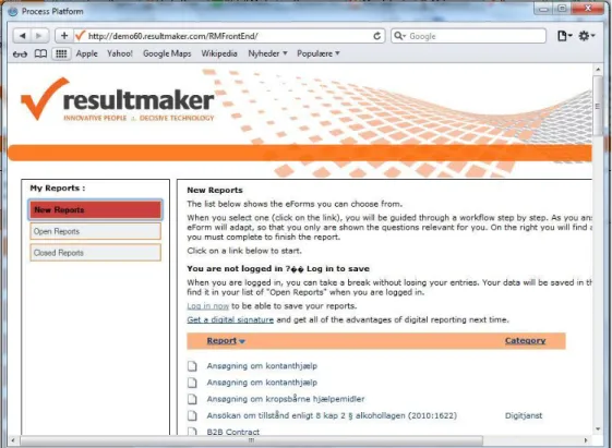
The system consists of a front-end application in XHTML and asp.net pages, which provides the forms necessary for performing the business processes (Figure 21 and Figure 22). When a user has logged in and chosen the relevant form, he or she follows the instructions as needed. The front-end application responds to the user input, communicating with the back-end application (Figure 20). The back-end application
incorporates a “Process Engine” to process the interaction with the user, using the rules and
meta-information associated with the particular business process that has been configured in the front- and back-end. Information that defines and describes the particular user’s interaction with the system is stored in a back-end database. The form data is encapsulated in a data object which persists from session to session until completion of the process. For example, in the case of an application for admission to the Graduate program at CBS, an applicant may start an application, but has the option of leaving it, and coming back later to finish it. The applicant may need to interrupt the process in order to find material and information required by the application process, and then resume working on the application, as time may permit. In this scenario, the back-end server stores information so that the application is maintained in the database in a preliminary and tentative state. When the applicant reaches the end of the process, he or she will be submitting an application for admission in a standard state of completion, which enables CBS to quickly and accurately make it
decision on whether to grant the applicant admission or not.
The types of processes that are digitalized using Resultmaker software are typically either business-to-business, or customer-to-business or citizen-to-government. While some of the individual applications will be used from a home or office (CBS, Calculator, Maternity Leave) others could be used on-site or from mobile devices: (Motor Inspection, Building Permits and Applying for Social Benefits). BI Intelligence estimates that tablet shipments will reach 27.6 million units compared to PC shipments of 87.6 million units in the third quarter of 2012, see Figure 23 [46]. With the increasing proliferation of mobile devices an increasing proportion of users will be accessing the web applications using smartphones or tablets,
consequently a growing number of users will be accessing the Resultmaker A/S front-end applications from mobile devices such as tablets. For this reason it would be of interest to examine the degree to which Resultmaker front-end applications are suitable for use in mobile devices such as a tablet, and the extent to which it would be possible to adapt Resultmaker A/S’s front-end applications for access from mobile devices, and finally whether it would be more helpful to develop completely new versions of the existing web-applications for use in mobile devices, than re-engineer existing program versions. The questions may be formulated as follows:
Given the current state of existing technology, to what extent would it be possible to utilize existing web-applications, originally designed for use in conventional desktop (and laptop) computers, in
11
mobile devices, specifically tablets and smartphones, without loss of important functionality and reduction of usability?
Assuming a negative answer to the first question, would it be possible to re-develop existing web-applications so as to be able to be used as originally intended on conventional desktop (and laptop) computers as well as mobile devices retaining pre-existing functionality and usability.
What is the impact of existing browser technology on the preceding questions: namely, when
redeveloping web-application for use in stationary and mobile devices, would it be possible to ensure that all important functionality and aspects of usability are preserved all of the five most frequently used HTML browser programs (cross-browser functionality).
2.2 Research Method
1. Theoretical – Analytical a. Literature Survey 2. Empirical – Analytical a. Usability Evaluation b. Experiment - PrototypeThe research method will be a multiple approach: in Part 1 a review of applicable literature regarding utilization of web-applications on mobile devices of various kindswill be presented. In Part 2 a study will be conducted in the form of a Usability Evaluation in which the utilization of an existing web-application will be analyzed in terms of the existing literature and actual performance when used on various devices. Finally, in Part 3 an experimental prototype will be presented which explains relevant technology and demonstrates the extent to which a cross-browser compatible web-application can be devised which retains the important functionality of the original application while eliminating usability issues discovered in connection with the execution of the usability evaluation.
13
3. Literature Review
3.1 Human Computer Interaction (HCI)
In 2003 Kjeldskov and Graham published a review of HCI research methods [47] the purpose of which was to describe the state of current practice for studying mobile HCI “to identify shortcomings in the way research is conducted and to propose opportunities for future approaches”. 102 publications on mobile human-computer interaction research were studied and categorized with respect to method and purpose. The review indicated that there was a significant bias towards constructing systems, and testing them in a
laboratory setting. Methods such as action research, case studies, and field studies were seldom used to evaluate systems. The authors concluded that a lack of methodological research limited the accumulation of knowledge regarding the design of human computer interaction in a mobile systems context [47].
A finding by their study that only 41 % of usability papers were empirical in nature and that no qualitative study of usability dimension were considered in said studies, was a motivation for the formulation of a research question: “What are the key formation and evaluation dimensions of usability in mobile technology usability studies?”, which was dealt with in a meta-analytical2study published in 2011 by Coursaris and Kim [48]. The study was a review of 100 published mobile usability studies, which were analyzed within a framework for mobile usability studies created for the purpose. The proposed usability evaluation framework is a “disk” surrounding a core of usability dimensions. The four corners of the disk are contributors to the core from 4 aspects or “contextual framework categories”: The User, the Technology, the Environment and the Task/Activity (Figure 27). The authors identified 31 measures of usability amongst which were the three main components of usability as specified by the ISO definition: (1) Efficiency, (2) Effectiveness and (3) Satisfaction. The table and chart exhibited in Figure 28 are based on the results tabulated in the paper’s table 1 [48, p. 124 ff.] and shows that the published mobile usability studies included in this analysis focus on the traditional components of usability, to such an extent that the 29 other measurement dimensions are
restricted to 30 % of the count. The paper concludes inter alia that this knowledge domain could benefit from extending the core of usability measurement components to include some of the measures defined in this study, in particular accessibility, hedonics and in addition study the interrelationships between the individual measurement dimensions [48, pp. 129 - 131].
In 2012 Kjeldskov and Paay published a longitudinal review of literature concerning the design and use of mobile devices [49] as a follow-up to their earlier 2003 study of mobile HCI, the intention of which was to investigate whether the field had seen changes in the intervening period. For the 2012 study, the authors had selected 144 research articles published in 2009 by the 10 most influential conferences and journals that are devoted to the study of mobile HCI. The study tried to determine the methodologies used in the individual
2 The authors describe meta-analysis, as a“… systematic procedures of coding, recording, and computing, a meta-analysis is an organized way to summarize, integrate, and interpret selected sets of empirical studies…. ”
14
studies and the purpose of each article. The conclusion of the study was that the most frequently used categories of methodology were lab experiments (49 %), field studies (35 %) and applied research (30 %). The most frequent categories of purpose were evaluating (68 %), engineering (40 %) and understanding (31 %). [The percentages totals are in excess of 100 % as there may be multiple methods and purposes used in a paper]. The conclusion was HCI research is “a highly empirically driven area of research with a growing focus on understanding the phenomena of mobile HCI.” [49, p. 76].
Usability can be viewed from multiple perspectives; Morten Hertzum describes six different perspectives on usability [50, pp. 568-571], called “images of usability” [48, p. 122]:
Universal Usability Usability entails the challenge of making systems for everyone to use.
Situational Usability Usability is equivalent to the quality-in-use of a system in a specified situation with its users, tasks and wider context of use.
Perceived Usability Usability concerns the user’s subjective experience of a system based on his or her interaction with it.
Hedonic Usability Usability is about joy of use rather than ease of use, task accomplishment and freedom from discomfort.
Organizational usability Usability implies groups of people collaborating in an organizational setting. Cultural Usability Usability takes on different meanings depending on the users’ cultural background.
Universal usability - the reality of modern societies is the increasing degree of digitalization in private and public organizations both with regard to employees’ functions in organizations and the way the public is served by these organizations. Services which hitherto were performed person-to-person on a piecemeal basis interaction are now often handled by means of self-service via distributed applications. In such cases it becomes an important goal to design systems that offer universal usability in order to ensure inclusiveness in relation to as many users as possible. Hertzum discusses Shneidermann’s definition of usability which describes a situation where: “90 % of all households are successful users of information and communication services at least once a week” [51]. The dimensions of this definition of universal usability are 1) User Diversity – with respect to interests, age, cognitive abilities, 2) Technological Diversity – with respect to the technological assets different users have at their disposal and 3) knowledge gaps – which is the degree of technical knowledge possessed by different users. In combination, these dimensions delineate the degree of actual universal usability. For example, if 80 % of users possessed the cognitive ability to effectively use a particular technology, 80 % of users had the technological potential to do so, and 80 % had the requite knowledge, then the degree of universal usability would equal: 0.83 = 0.512 or 51.12 %, which does not quite match the concept of universal usability. This might only be considered problematical in a context where access to public and private services is exclusively available via IT applications that are characterized by a low degree of universal usability.
15
Situational Usability - Hertzum regards situational usability as a very context dependent perspective on usability, and describes it consisting of two main characteristics: 1) the whole use situation including all technical and social elements and 2) the specific situation, that being the context of use. For example a tool which might be ideal for trial and error in a peaceful office setting may not be the appropriate choice for implementing in an air-traffic control tower. The ISO 9241 part 11 [52] definition of usability is the conventional definition of situational usability, where usability is defined as the “Extent to which a product can be used by specified users to achieve specified goals with efficiency, effectiveness and satisfaction in a specified context of use” [50, p. 575] . This definition consists of the following elements:
Element Definition
Effectiveness Accuracy with which users achieve specific goals.
Efficiency Resources expended in relation to the accuracy and completeness with which user achieve specific goals
Satisfaction Freedom from discomfort, and positive attitudes towards the use of the product
While the above definition was published in 1998 at a time when smartphones and tablet computers were nearly non-existent, it remains an important aspect of usability assessment, as mentioned in section 3.1, above. The importance of usability evaluation for the success of an interface / web site can be explained like this: “On the Web, usability is a necessary condition for survival. If a website is difficult to use, people leave. If the homepage fails to clearly state what a company offers and what users can do on the site, people leave. If users get lost on a website, they leave. If a website's information is hard to read or doesn't answer users' key questions, they leave.” [53].
Organization Usability - in an organizational context there is a plethora of systems and application which are more or less mandatory and which facilitate the collaboration between individual employees in conducting business and operations of interest to the organization. The process by which application and information systems are adopted for use in organizations is called the organizational adoption decision, which is
characterized by being a decision that originates at the management level of an organization. Participants in an organization at a lower level may have some influence on the process of adoption, but management has the power to make decisions regardless of what anyone else might think or say as an organizational decision will typically be based on strategic goals and tactical considerations that people at a lower level of the hierarchy may not be privy to or aware of. In any case any IT application or system which is put to use in an organization must have a minimum of usefulness if the organization wishes to get the maximum effect of its investment of time and financial recourses in its systems [50].
16
3.2 Some Perspectives on Use of Mobile Computers
Smartphone Use by Non-Mobile Business Users (2011)
A recent study of 243 smartphone users from a large United States based corporation looked at the difference between perceived and actual use of smartphones in connection with task related performance. The persons included in the study were all persons whose work did not require mobile computing facilities. It is
commonly understood that smartphones are better for consuming than for producing information. The results of the study indicate that perceived performance was not far from measured performance, so that users have a fairly accurate view of the relationship between effort put into using devices and the performance obtained from using devices. Users found smartphones useful for consuming information i.e. reading e-mail, web pages, using apps, etc., however found producing information i.e. answering e-mails, writing letters, and in particular entering password to be time consuming and exasperating, The researchers concluded that more effort needs to be put into the design of input mechanisms for smartphones and, presumably, by extension all types of mobile computing devices [54].
Understanding Tablet Use: A Multi-Method Exploration (2012)
An investigation of large mobile computer use conducted in 2011 found that most tablets are used for personal reasons, primarily checking e-mail [55]. The researcher used a multi-method approach to analyze the contextual tablet usage of a group of 33 participants in three U.S. cities. The study’s data was collected using four approaches: (1) written diaries, (2) video diaries, (3) follow-up interviews and (4) contextual inquiry observations resulting in 773 observations of individual tablet use. An analysis of the data revealed a number of aspects of tablet use, which were categorized by (a) location, (b) type of use and (c) which other type of use happened (almost) simultaneously. The categories of type of use, see Table 7, were tabulated and cross-referenced with the categories of location, Table 5, as well as with the categories of type of secondary and simultaneous use, see Table 6. Table 5 shows that the three most frequent categories of location are (a) Couch, (b) Bed and (c) Home, while the three most frequent categories of secondary activity are (a) watching TV, (b) Eating and (c) Cooking. Finally, the three most frequent categories of type of use are (a) E-mail checking, (b) Playing games, and (c) Social networking, with (d) Gathering Information as very close to third place. The categories of use were cross-referenced with location in a table and the resultant chart shows that the most prevalent combinations of type of use and location are (a) E-mail checking and (b) Playing Games on the Couch, and (c) E-mail checking in Bed and (d) at Home, see Figure 29. The most prevalent combinations of use and secondary use are (a) E-mail checking while watching TV and (b) while Eating/Drinking, see Figure 30. The one category of location that indicated a work
environment accounted for less than 6 % of incidents, the conclusion in light of the above being that the tablet as a mobile computing device does not yet have a presence in the work place. A follow-up study might well show different results, as the adoption of tablet computers by works and consumers has accelerated since the study took place in 2011 [55].
17
Where do Tablets fit in the Organization’s Workstation Inventory? (2012)
Another view of the extent to which tablets will be deployed for business purposes is presented by a paper which takes a look at present trends in business use and future trajectories of tablet acquisition and deployment [56]. The paper cites Baseline Magazine for the information that 50 % of respondents expect increased tablet use by business in the next year, and a CIO insight survey which found that 35 % of organizations have deployed tablets, 31 % are testing tablets and 26 % are evaluating tablet use. At the present organizational tablet deployment is being driven by the “BYOD” (Bring Your Own Device) phenomenon3. These circumstances would indicate that tablets are being adopted by business users to a significant degree, and this kind of mobile computer will have a prominent position in most organization’s technology strategy for the coming years. The paper identifies a number of challenges that will need handling, such as the situation that most users do not fully understand the differences and similarities
between desktops and laptops on the one hand and smartphones and tablet computers on the other. This lack of understanding leads users to believe that any task that can be accomplished using computers
(desktops/laptops) can be done using smartphones and tablet computers. This is however not the case, as smartphones and tablets have a limitations to functionality, that makes it impossible to fully replicate the features and functionality of desktop/laptop computers. The paper refers to a statistic compiled by
Lenovo/Qualcomm [linked at http://www.onestopclick.com [57]] which tabulates the relative frequency of types of tasks performed on tablets (Table 8), which shows that consumers mainly use tablets for gaming, e-mail and browsing, while business users use their tablets for e-e-mail, browsing, remote work, sales support and customer representation. The paper gives an analysis of what tasks are most suitably performed on which type of computer (Table 9). The authors of the paper have tried to categorize the types of task that are best performed on three different forms of computers: (1) Laptops (2) Tablet computers and (3) Smartphones and propose a schema of appropriate usage or deployment within an organization. The tasks which are
considered useful for all three types of devices are emailing and simple applications. Smartphones have been used for these uses since the middle 90,s and have found a useful niche. Laptop computers have basically the same power and features as desktops, and are capable of the entire list of tasks. Tablet computers have been used since the early 90’s, albeit to a limited degree prior to 2010. The rate of adoption has increased
dramatically since Apple introduced the iPad in 2010, making the widespread use of tablets a recent
innovation. The tasks which fit the characteristics of tablets are a subset of the total list, inter alia: e-mailing, simple applications, viewing documents, light content creation, presentation tool, etc. The paper concludes
3
While perhaps not the first organization to do so, INTEL identified and named the Bring Your Own Device (BYOD) phenomenon in 2009, describing BYOD as the situation where employees use their own devices – computers, tablet, etc in the work place or in connection with work related activity outside of the work-place. INTEL’s CISO Malcolm Harkins states that the BYOD is an unstoppable trend, which it is better to manage outright rather than prohibit. BYOD brings with it advantages such as mobility, flexibility and productivity, but also security risks arising from employees having sensitive information on privately owned mobile devices. Harkins thinks that by 2014, 70 % of all INTEL employees will be using own devices for work purposes all or part of the time [132] .
18
that tablets will have a place in an organizations IT structure, that it cannot replace desktop/laptops, that there are policy issues to develop governance issues with regard to where and how tablets may be used.
3.3 Usability Studies for Mobile Computing
A comparative evaluation of how 12 participants were able to complete four specific tasks on web applications compared users’ task performance using desktop computers and smartphones [58]. The usability study, published in 2007 and which does not deal with tablet computers identified several ways in which the user experience differed when using a desktop computer or a mobile device. A major issue was the difference in screen size between a mobile device and a desktop, which was seen to have made the user experience on a mobile device more troublesome than on a desktop. In order to improve the user experience on mobile devices it would be necessary to ensure that the user feels that he/she is control of his or her user experience, and that users must be able to navigate the web page and browse after information without having a sense of getting lost on the page. The article provides a checklist of recommendations to ensure a higher degree of user satisfaction with the web applications interface as viewed from a mobile device, than is presently available.
Some guidelines would be:
Ensure that styling does not obscure the visibility of links or text Label all input fields and controls clearly
Limit the length of lists; group links and label clearly
Use text rather than images in link to improve page download performance.
Ensure that a search function is always available, as users prefer not to scroll through pages, but prefer to use a search function.
Usability of iPad Apps and Websites (2011)
Jacob Nielsen conducted an empirical usability study of 26 iPad apps and 6 Websites in 2011, following up on an initial usability study published in 2010 [59]. The study consisted of two different parts, where a study of usability testing was conducting with the assistance of 16 participants who were paid to assist in the study for the first part, and for the second part a design review of iPad Apps was conducted by an expert user. All participants had owned and used an iPad for at least two months. The usability testing used the Thinking Aloud Protocol, where the participants were asked to perform a number of tasks on specified Apps or Web applications.
A test session consisted of an initial interview where participants were asked about their iPad apps related activities and the apps they had already used. The session continued with users being asked to perform predefined tasks on the iPad while under observation [59, p. 111]. Sometimes participants were asked to
19
perform additional tasks developed ad hoc to fit particular apps that were installed on their iPad. All sessions were recorded by a video camera. Participants would comment on the following 1) What they we looking for or doing 2) What they either liked or disliked about the web site or apps, and 3) What made it either easy or difficult to perform the requested task.
The report described a number of design characteristics that made for less usability, which also had been reported in the original 2010 report [59, pp. 7 - 8]:
1. Read-tap Asymmetry – which is where web sites feature text that is large enough to read, but too small to tap – touchable areas on the screen should be large enough to actually touch.
2. Websites working well for the performance of simple tasks, where complex interactions became difficult – complex web sites should be constructed as apps not as web sites.
3. Touchable areas that were so small, and close together, that increased the chances of touching the wrong button.
4. Accidental activation resulting from touchable areas being too close to another and too small. (research shows that the best target size of touchable areas is a minimum size of 10 x 10 mm [59, p. 25]) 5. Low discoverability – active areas did not appear to be touchable.
6. Users dislike typing and therefore seek to avoid tasks involving typing. Other newer findings were:
1. Splash screens are being used in some apps, which is not a very good idea.
2. Swipe-ambiguity, where too many areas are swipe-able and therefore confusing for users. 3. Information overload – too much information squeezed into too small of a space.
4. Too many navigation features offered at one time, confusing users.
5. Tablets are shared devices – this should be kept in mind when designing apps or web sites. 6. Tasks iPads are used for:
a. Playing games b. Social networking c. Media consumption d. Reading news e. Browsing
At the time of publication, iPads were seldom used for information production, with the exception of answering e-mails [59, p. 9].
20
As part of the MOMENTO project4 a two year study was undertaken with respect to identifying factors which can measure the success of mobile business services. Two case studies were conducted to help construct a questionnaire which can be used as a tool to measure the success of mobile business services. The first case involved a mobile service used for booking and dispatching taxis, while the second case involved a service which is used for documenting the measurement of safety factors at building sites.
The paper mentions Frøkjær’s findings [60], that the utility of the traditional three elements of usability depends on the context of the application domain, user’s experience and use context to be able to yield a sufficient measurement of usability. User experience ratings are usually collected by way of questionnaires, of which there are a number of established models5, however the paper states that the established models do not address mobile usability issues in a satisfactory manner. It is assumed that a satisfactory measurement of usability needed to measure more than the elements of the ISO definition, and it was found that an aspect of usability can be whether the applications increased productivity and were safe to use. An addition aspect of usability was learnability, (an aspect also discussed by Nielsen [53]), in the sense that the use of an
application must be learnable to avoid errors and danger.
While consumers are normally able to choose between alternative service providers, business users have often no choice in the matter. Consumers’ subjective satisfaction and ease-of-use affect consumers’
propensity to accept and adopt a service, and if they don’t like a particular offering can choose to leave. In a business context, users are captive users; this is however no reason to ignore user satisfaction, as business user’s subjective satisfaction may have an effect on measures of over-all work satisfaction and productivity [61, p. 242]. Some measures are more important in the first stages of implementation, e.g. installation and learnability, while usability in terms of efficiency and productivity are more important in later stages. In summary the paper proposes a list of ten usability measures, called themes, that in all probability have a significant effect on the success of mobile business services, and which could be used to develop a questionnaire for use as a tool in usability evaluations.
Mobile Usability (2012) Jacob Nielsen
Subsequent to the iPad usability study of 2011, Nielsen published in 2012 a larger scale mobile usability study based on observation of 124 smartphone user and 36 tablet user sessions. Nielsen is convinced that a group of 160 observed users is a sufficient numerical quantity to be able to identify the majority of usability problems associated with an application or apps [62]. In another article Nielsen presents a scatter chart with
4
The MOMENTO project is a research and industrial cooperation project financed by the Finnish Funding Agency for Technology and Innovation (TEKES) and five companies. The purpose of the project is to work for the success of mobile business services by using measurement tools p.244. [61]
5
The usability questionnaires to which the paper refers are: System Usability Scale (SUS), Software Usability Measurement Inventory (SUMI), Questionnaire for User Interface Satisfaction (QUIS), the After-Scenario Questionnaire (ASQ), Post Study System Usability Questionnaire (PSSUQ), The Computer System Usability Questionnaire (CSUQ) [61] p.239.
21
the number of usability findings per project plotted on the y-axis, and the number of test participants per project on the x-axis for the latest 83 usability projects performed by NN Group (Figure 55). The tentative conclusion is that the quantity of usability findings per project does not show a linear correlation with the number of test participants per project for number of test participants greater than 10 per project. Nielsen usually recommends five test participants for a usability test [63], which is a sufficient number of
participants to generate a satisfactory number of recommendations for improvements of web sites or
applications. Shneiderman recommends a group of six test participants as a sufficient quantity of users to be able to collect useful information about a web site’s usability in earlier stages, while a greater number is recommended to be able measure usability with confidence at a later stage in the project [64, p. 192]. The
Think Aloud Protocol, which was used in the iPad study, is described as a technique where the test participants are asked to “think aloud” concurrently with performing the test or tasks belonging to that particular test or evaluation. The tester should as far as possible refrain from taking over the tasks, but be facilitating and helpful to make it possible for the participant to complete the test. The tester observes and records the reactions and actions of the tester, which will form the basis of the subsequent analysis and recommendations [65, p. 161]. To implement the Think Aloud Protocol users were asked to complete a number of predefined tasks, and asked to make comments regarding their task performance concurrently with task performance. The questions that were asked were the following: 1) What they were looking for or reading, 2) What they liked or didn’t like about the site and 3) what made it easy or difficult to use the site [62, pp. 4-7].
3.4 Types of Applications for Mobile Computers
There are several general software development approaches when creating applications for the mobile computing platform. In Google’s guidelines for delivering applications to Android devices, two approaches are described [66]:
A client side application developed using the Android SDK
A web application developed using ordinary web technology and delivered via the web browser, which does not require installation on the client.
Apple’s guidelines describe the situation similarly [67]:
An iOS application, which is an application developed in Apple’s iOS SDK and installed and which
functions entirely within the iPhone/iPad device.
Web content, which is content hosted on a web site, and which is frequented by iPhone/iPad users via the device’s browser (primarily the Safari application). The types of web content which may be delivered in this fashion are:
22
o Web applications, which are web pages that are developed using ordinary web technology, but which use the technology to emulate the iOS look and feel. A web app may be accessed via the Safari application (the Safari UI is normally concealed) using an installed icon, similar to the way an iOS application is accessed, so there is virtually no apparent difference between a native iOS app and the web application.
o Optimized web pages, which are web pages that are optimized for access through a web browser, but which may be able to detect whether it is being accessed by iOS devices and adjust screen dimensions and scale appropriately.
o Compatible web pages, which are web pages that may be viewed reasonable well on iOS devices, but which may contain elements that do not view properly on iOS devices, and which do not attempt to detect screen dimensions and adjust appropriately.
Microsoft which produces an OS (Windows 7, 8 and RTM) for tablet computers and smartphones as well as a tablet computer called Surface [68] has published guidelines for adding support for mobile devices to Aspx.net web forms and MVC applications and in that context discusses Architectural Options in the context of mobile usability of web applications created using the Aspx.net framework [69]. Without going into too many technical details, developers have three main options for supporting mobile users of aspx.net web applications: (1) Do Nothing, (2) Solve the problem on the client, and (3) solve the problem on the server, each option having its advantages and disadvantages:
A. Do Nothing means creating a standard desktop oriented web application and hope for the best.
o The obvious advantage to this option is that it’s effortless and inexpensive.
o The disadvantages: older smartphones cannot render the html while new smartphones may render the web page, but the user needs to scroll sideways and up and down to see the page, also, as functionality dependent on mouse devices is not possible to use.
B. Solve the problem on the client which means using CSS, Javascript, styling and progressive enhancement6 to let the web application adapt the application to the client’s characteristics. This approach is similar to the Apple guidelines for web applications that respond to the mobile device’s size and type.
o The advantage to this approach is that the web application adapts itself to the dimensions and input characteristics of the client, and when an application needs to be updated or
6
Yahoo defines Progressive Enhancement in the following and contrasts it with Graceful Degradation: “The concepts of graceful degradation and progressive enhancement are often applied to describe browser support strategies. Indeed, they are closely related approaches to the engineering of "fault tolerance". These two concepts influence decision-making about browser support. Because they reflect different priorities, they frame the support discussion differently. Graceful degradation prioritizes
presentation, and permits less widely-used browsers to receive less (and give less to the user). Progressive enhancement puts content at the center, and allows most browsers to receive more (and show more to the user). While close in meaning, progressive enhancement is a healthier and more forward-looking approach”, from Yahoo Developer Network. [134]
23
changed, it needs only be changed in one place: in the server code, and not in client, which needs to be pushed out to millions of clients.
o The disadvantage to this approach is that the differences there are between desktop and mobile computers is so radical, that using CSS and Javascript alone may be inefficient to be able to create a single application that can be viewed on all types of computer devices.
o An additional disadvantage is that creating the same workflow in a simplified form may be impossible.
o Finally, different devices have different access to bandwidth, and a mobile device which has inferior access to bandwidth will find a web application which is acceptable on a desktop with access to high bandwidth unacceptably slow to use on a mobile data connection.
C. Solve the problem on the server – If the server is able to determine the device which is accessing the web application and its characteristics, it will be able to perform differentiated logic and output differentiated HTML
o Advantages are great flexibility, as all changes in web applications are performed on the web server, and can be done at any time (within reason, of course.)
o An additional advantage is lesser bandwidth demands, as there is not program to download only markup and content.
o A disadvantage is having to design and code spate pages per device type (iPad, iPhone, Desktop, Android, Windows Phone etc.)
o Device detection is not a fail safe operation and depends on lists or a database of well-known devices and their specifications. The information may not necessarily be updated on a day-to-day basis.
Microsoft advises combining approach B with approach C where minor style issues are handled at the client level while all major issues are handled at the web server level [69]. Please note that these guidelines focus exclusively on web applications created in aspx.net web pages or aspx.net MVC modules; however the recommendations are of a general nature and not require the use of the aspx.net framework, which is Microsoft’s proprietary technology for dynamically generated HTML markup, similar to Oracle’s Java Servlets [70], Java Server Pages (JSP) or the open source PHP.
Responsive Web Design is an elaborated version of optimized web pages, which is where the web server serves a web page, using scripting or CSS to detect the device type which is accessing the web page, as well as its screen dimensions and other characteristics, and subsequently adjusts and scales the HTML markup appropriately. Figure 31 shows how the BBC proposes to redesign its BBC TV Channel Home Page using Responsive Web Design as an example of how pages will be served depending on the requesting device type: desktop, tablet or smartphone [71]. In 2011 a web designer, Ethan Marcotte (EM), wrote in his book
24
Responsive Web Design that while there may be a case to be made for creating a separate mobile application every time a new mobile device is released, this approach may be an impossible task as the number of devices proliferate. An interest in building architecture made him familiar with a development in
architectural design called Responsive Architecture, where buildings “re-form themselves dynamically to better fit their occupants” [72, p. 7]. For example a glass wall will become opaque when the number of occupants exceeds certain boundaries to ensure a measure of privacy. Figure 32 shows the glass wall before becoming opaque, and Figure 33 after it has become opaque. Buildings will become more interactive with their occupants by responding to their presence and influence. Within the context of web design designers are facing challenges posed by the increasing number of diverse mobile computers for which to server web pages. Rather than creating individual applications for each design which can give a fragmented experience, designers might consider that each device is a facet of the total design and practice Responsive Web Design. According to Marcotte, the basic components of Responsive Web Design are:
A flexible grid-based layout Flexible images and media
Media queries (a part of the CCS3 specification)
The use of Responsive Web Design was considered by www.netmagazine.com to be one of the top 15 trends in web design in 2012 [73], and the top trend in 2013 [74]. As the Responsive Web Design approach utilizes parts of the CCS3 specification, older web browsers may not be able render web pages in the intended way, which is clearly a drawback to this approach, leading one to think of whether Progressive Enhancement could be an option.
Jacob Nielsen has also reservations with respect to Responsive Web Design. Whilst he acknowledges the utility of developing a single web application in a way that enables the transparent servicing of web page requests from multiple device types, as this simplifies the task of web site maintenance, he also warns that the a single web site for all types of devices may necessarily cause problems for users, as sites with deep folder levels, complicated pages, lots of data and a complex information hierarchy may not be actually adaptable for use on mobile devices. Furthermore, the effort involved in maintaining the mobile
responsiveness of a site is comparable to the effort involved in creating and maintaining two dedicated web sites: one for desktops and one for mobile devices. Ultimately the decision to maintain one or several web sites depends upon an analysis of whether the cost-benefit ratio for the proposed course of action is the optimal choice for the web site owner [62, pp. 31 - 32].
![Figure 1 - Making your own Space War Game on the Dynabook.” [10].](https://thumb-us.123doks.com/thumbv2/123dok_us/1385858.2685647/82.892.464.792.195.417/figure-making-space-war-game-dynabook.webp)
![Figure 18 – 2003 Apple Design Application [37] Figure 19 2003 Apple Design Application [37]](https://thumb-us.123doks.com/thumbv2/123dok_us/1385858.2685647/84.892.223.658.768.1036/figure-apple-design-application-figure-apple-design-application.webp)
![Figure 23 – Global PC and Tablet Shipments [46].](https://thumb-us.123doks.com/thumbv2/123dok_us/1385858.2685647/86.892.130.758.125.456/figure-global-pc-tablet-shipments.webp)
![Figure 26 – Worldwide Smart Connected Devices Market Forecast [44]](https://thumb-us.123doks.com/thumbv2/123dok_us/1385858.2685647/87.892.90.680.126.549/figure-worldwide-smart-connected-devices-market-forecast.webp)
![Figure 27 –suggested mobile usability framework [48, p. 121].](https://thumb-us.123doks.com/thumbv2/123dok_us/1385858.2685647/88.892.290.596.152.575/figure-suggested-mobile-usability-framework-p.webp)
![Figure 30 [55] – Frequency of top tablet activities by secondary activities.](https://thumb-us.123doks.com/thumbv2/123dok_us/1385858.2685647/89.892.493.769.130.554/figure-frequency-tablet-activities-secondary-activities.webp)
![Figure 32 – Responsive Architecture – Windows have not yet become opaque [127].](https://thumb-us.123doks.com/thumbv2/123dok_us/1385858.2685647/90.892.88.664.128.543/figure-responsive-architecture-windows-opaque.webp)
![Figure 36 – Touch Tools [80, p. 454].](https://thumb-us.123doks.com/thumbv2/123dok_us/1385858.2685647/91.892.89.582.123.460/figure-touch-tools-p.webp)
