Northumbria Research Link
Citation: Jenson, Adam (2018) The Use of Data Visualisation in English Local Authorities. Doctoral thesis, Northumbria University.
This version was downloaded from Northumbria Research Link: http://nrl.northumbria.ac.uk/41202/
Northumbria University has developed Northumbria Research Link (NRL) to enable users to access the University’s research output. Copyright © and moral rights for items on NRL are retained by the individual author(s) and/or other copyright owners. Single copies of full items can be reproduced, displayed or performed, and given to third parties in any format or medium for personal research or study, educational, or not-for-profit purposes without prior permission or charge, provided the authors, title and full bibliographic details are given, as well as a hyperlink and/or URL to the original metadata page. The content must not be changed in any way. Full items must not be sold commercially in any format or medium without formal permission of the copyright holder. The full policy is available online: http://nrl.northumbria.ac.uk/pol i cies.html
i
The Use of Data Visualisation in
English Local Authorities
A. Jenson
PhD
ii
The Use of Data Visualisation in
English Local Authorities
Adam Jenson
A thesis submitted in partial fulfilment
of the requirements of the
University of Northumbria at Newcastle for
the degree of
Doctor of Philosophy
Research undertaken in the
Department of Geography
Faculty of Engineering and Environment
iii
Abstract
In recent years, there has been an explosion in the amount of data we have at our disposal. Data is big, open-source and transparent. As such, there is a renewed faith in data-driven decision-making. However, this also comes with its own caveats; the power of data is based on an assumed objectivity, of presenting a view from nowhere. These assumptions of objectivity, and the vast increase in the amount of data, have left problems in interpreting it. Organisations trying to make sense of data include local authorities, who are facing challenging times through enforced austerity spending measures, which have seen budget cuts, service restrictions and reduced staff numbers. They are told to become more efficient and targeted in their working practices, and this has seen a move in some organisations towards a data-driven approach. One proposed solution to this has come through data visualisation, which seeks to make sense of data, either through an ability to analyse previously unmanageable data sets, or through the communication of findings to a wider audience. It is this context from which this thesis draws its empirical focus.
This thesis contributes to methodological discourse in investigating data visualisation from a qualitative perspective. It investigates the wide range of networks, actors and intermediaries within the context of four specific local authority case study organisations in England. It makes a telling contribution to address the lacuna in the theory of data visualisation by applying a post-representational approach adopted from cartography, which seeks to build upon, rather than replace, the growing literature on data visualisation. A post-representational approach recasts data visualisation as a broad set of practices, to think critically about the practices of visualisation and not simply focus on the product. As such, it creates a theoretical space for future investigation, which incorporates both those seeking applied knowledge (asking technical questions) and those asking theoretical questions. Understanding data visualisations as processes reveals that they are not practiced in isolation; they are mobilised in relation to other tasks and are subject to the complexities, interactions, constraints and emotions of that moment. Unpicking these conditions, as well as the aesthetic and technical elements of production, provides a holistic interpretation of how data visualisations are brought into being and made to do work in the world, whilst contributing to the larger field of post-representational cartography by moving beyond maps and exploring the implications and differences in engagement between maps and data visualisations.
v
Contents
Chapter 1: Introduction...1
1.1 Introduction...1
1.2. Overview of chapters...5
Chapter 2: Literature Review ... 8
2.1 Introduction... 8 2.2 Austerity ... 9 2.3 Data ... 13 2.3.1 Big data ... 13 2.3.2 Open data ... 15 2.3.3 Critical data ... 17 2.4 Data visualisation ... ...18
2.4.1 History of data visualisation...18
2.4.2 Data visualisation production ... 22
2.4.4 Chart type... 26
2.4.5 Critical data visualisations ... 28
2.5 Cartography ... 35
2.5.1 Functional cartography ... 35
2.5.2 Communication model ... 36
2.5.3 Continuing cartographic thinking ... 40
2.5.4 Critical cartography ... 41
2.5.5 Persuasive and deceptive ... 45
2.5.6 ‘Democratisation’ of cartography ... 47
2.5.7 Cartography to empower ... 50
2.6 Post-representational cartography ... 51
vi
Chapter 3: Methodology ... 55
3.1 Justification of theoretical approach ... 55
3.2 Mixed methods ... 57
3.3 Research design ... 58
3.4 Research methods: Survey ... 60
3.5 Research methods: Case study ... 64
3.6 Reflections ... 73
Chapter 4: Local Authority Case Studies ... 75
4.1 Introduction... 75
4.2 Survey results ... 77
4.2.1 Local authority differences ... 77
4.2.2 Differences in production ... 78
4.2.3 Key factors of local authority data visualisation ... 80
4.2.4 Case study criteria ... 80
4.2.5 Summary ... 83
4.3 Authority 1 ... 83
4.3.1 Introduction... 83
4.3.2 Geography... 84
4.3.3 History and structural change ... 84
4.3.4 Demography ... 85
4.3.5 Structure ... 85
4.3.6 Austerity ... 86
4.3.7 Data visualisation in Authority 1 ... 88
4.3.10 Summary ... 94
4.4 Authority 2 ... 95
4.4.1 Introduction... 95
4.4.2 Geography... 95
vii
4.4.4 Demography ... 96
4.4.5 Deprivation ... 97
4.4.6 Structure ... 97
4.4.7 Austerity ... 98
4.4.8 Data visualisation at Authority 2 ... 100
4.4.9 Processes of production ... 101 4.4.10 Actors ... 102 4.4.11 Roles ... 105 4.4.12 Key strengths ... 106 4.4.13 Summary ... 107 4.5 Authority 3 ... 107 4.5.1 Introduction... 107 4.5.2 Geography... 108
4.5.3 History and structural change ... 108
4.5.4 Demography ... 109
4.5.5 Structure ... 109
4.5.6 Austerity ... 109
4.5.7 Data visualisation in Authority 3 ... 111
4.5.8 Processes... 112 4.5.9 Actors ... 113 4.5.10 Roles ... 114 4.5.11 Other stakeholders ... 115 4.5.12 Summary ... 116 4.6 Authority 4 ... 116 4.6.1 Introduction... 116 4.6.2 Geography... 117
4.6.3 History and structure ... 117
4.6.4 Demography ... 118
viii
4.6.6 Austerity ... 119
4.6.7 Data visualisation at Authority 4 ... 120
4.6.8 Processes... 121 4.6.9 Actors ... 121 4.6.10 Roles ... 122 4.6.11 Summary ... 126 4.7 Processes of production ... 126 4.7.1 Roles ... 127 4.7.2 Drivers ... 129 4.7.3 Networks ... 132 4.7.4 Data sources ... 134
4.7.5 Data literacy and rigour ... 136
4.7.6 Design strategies ... 138
4.8 Summary ... 141
Chapter 5: A Post-Representational Approach ... 142
5.1 Introduction... 142
5.2 Aesthetic processes ... 146
5.2.1 The role of conventions ... 147
5.2.2 Creative decisions ... 149
5.2.3 Organisational conventions ... 151
5.2.4 Aesthetics shape the message ... 155
5.2.5 Summary ... 157
5.3 Technical processes ... 158
5.3.1 The technical skills of map reading ... 159
5.3.2 Improving technical skills ... 160
5.3.3 Understanding audience ability ... 161
5.3.4 Alternative skills ... 163
ix
5.3.6 Summary ... 166
5.4 Social processes ... 168
5.4.1 Other narratives, guided tours and collaborative productions ... 169
5.4.2 The complex performance ... 169
5.4.3 Social histories ... 170
5.4.4 Of the moment ... 171
5.4.5. Summary ... 173
5.5 Political processes ... 175
5.5.1 Excluding, transforming and reshaping information ... 175
5.5.2 Organisational hierarchical pressure ... 177
5.5.3 Summary ... 178
5.6 Embodied processes ... 180
5.6.1 Beauty and complexity ... 181
5.6.2 Creating an emotional bond ... 182
5.6.3 Summary ... 184
Chapter 6: Conclusions ... 189
6.1 Introduction... 189
6.2 Summary of findings ... 191
6.3 Contributions to academic discourse ... 192
6.4 Potential future research agendas ... 194
Bibliography ... 196
Appendices ... 208
Appendix A: Overview of case study organisaitons………..208
Appendix B: Survey Information and questionnaire……….……223
x
List of Figures
Figure 2.1. Florence Nightingale’s Coxcombs. 19 Figure 2.2. Jon Snow’s cholera outbreak map. 20 Figure 2.3. Napoleon’s invasion of Russia, 1812. 21 Figure 2.4. Smith et al (2009), the selection of typology of visualisation. 24 Figure 2.5. Smith et al (2009), production pathway of visualisation. 25 Figure 2.6. Cleveland and McGill (1984), hierarchy of perception. 27 Figure 2.7. US Republican health report, 2010. 30 Figure 2.8. Legend film poster, 2015. 31 Figure 2.9. Periscopic US gun deaths graph. 32 Figure 2.10. Iraq’s bloody toll graph. 33 Figure 2.11. Kolacny communication model, 1969. 37 Figure 2.12. Simplified Kolacny communication model, 1969. 37 Figure 2.13. Morrison communication model, 1976. 38 Figure 2.14. MacEachren cartographic process of communication, 1979. 38 Figure 3.1. Single and multiple case study design. 60 Figure 3.2. Selection of chart types used in the survey. 63 Figure 3.3. Production flow chart of local authority data visualisation. 65 Figure 4.1. Pathway of production of local authority data visualisation 81 Figure 4.2. Leicestershire dashboard. 92 Figure 4.3. Road traffic accidents. 92 Figure 4.4. Road traffic accidents in Leeds, 2017. 102 Figure 4.5. Road traffic accidents in Leeds B, 2017 102 Figure 4.6. Homelessness dashboard 1, National Audit Office. 104 Figure 4.7. Homeless dashboard 2, National Audit Office. 114 Figure 4.8. Public Health England, mental health. 123 Figure 4.9. Unemployment in Lancashire. 124 Figure 4.10. National homelessness map 125 Figure 4.11. Kirk’s roles of production, 2015. 128
xi
Figure 4.12. Children and Families performance in Norwich. 131 Figure 5.1. Where does my money go? 148 Figure 5.2. London local government spending, 2014/2015. 150 Figure 5.3. Leicestershire Council Red, Amber, Green ratings. 152 Figure 5.4. Lancashire County Council dashboard. 153 Figure 5.5. North Tyneside Council parks annual use. 161 Figure 5.6. North Tyneside Council parks issues. 161
xii
List of tables
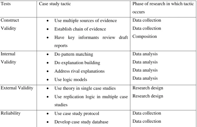
Table 3.1. Designs of case study validity (Kidder and Judd, 1996). 59
Table 3.2. Illustrating the completed interviews. 71
Table 4.1. Yorkshire Authority: sources of funding (2017/2018) 77 Table 4.2. Yorkshire Authority budget distribution 2017 2017 77
Table 4.3. Southern Authority savings generated 2017/18 90
Table 4.4. Authority 2’s income sources, annual report, 2017 99
Table 4.5. Southern Authority sources of funding 2017 91
Figure 4.6. Southern Authority spending on services, 2017/18 91 Figure 4.7. Northern Authority budget 2018/2019 broken down by directorate 102
Figure 4.8. Northern Authority, total costs of services 103
Table 4.9. Midlands Authority budget per service area 2018 114
xiii
Acknowledgements
For Amy and Marie
Firstly, I would like to thank Jon Swords, who from our first meeting in 2010 saw something in me which I could not have foreseen, and who has changed the direction of my life and my perception of what is achievable. I have continued to grow under his guidance and will always be indebted to him for that. He has shown an unflinching and unwavering faith in me throughout the most turbulent times and remained patient and considered throughout. His contribution through academic and personal guidance is the foundation of this thesis. I hope this goes some way to repaying that faith. I would like to thank my dad and Jane for their continued love, support, advice and assistance throughout the past four years.
To the extended family, I would like to thank Andy and Megan for the constant friendship and to again congratulate you on your wedding. To John and Paul for always pushing me to achieve more and for challenging my outlook on life. To Marty for being an absolute pillar of support throughout this entire journey, I promise one day I hope to return the favour. To Nadia, Stevie and Robin, thank you for all of the support during the past four years.
Finally thank you to Stein and Andre for their continued influence and support.
xiv
Declaration
I declare that the work contained in this thesis has not been submitted for any
other award and that it is all my own work. I also confirm that this work fully
acknowledges opinions, ideas and contributions from the work of others.
Any ethical clearance for the research presented in this thesis has been
approved. Approval has been sought and granted by the University Ethics on
18/12/14.
I declare that the word count of this thesis is 71,297 words.
Name:
Adam Jenson
Signature:
1
Chapter 1: Introduction
1.1 Introduction
In recent years, there has been an explosion in the amount of data we have at our disposal. Data are big, open-source and come with a plethora of publicised benefits, streamlining services and creating smarter decision-making. As such, there is a renewed faith in data in decision-making. However, this also comes with its own caveats; it often works through an assumed objectivity, of presenting a god-like view from nowhere (Aiello, 2009). Gitelman and Jackson (2013) suggest that data should not be considered as objective, raw and coming from nowhere, but instead as the answer to a specific question given in a particular context. As such, they are not universal truths which can mobilised to answer any given hypothesis. These assumptions of objectivity, and the vast increase in amounts of data, have left problems in interpreting it. Some of the organisations trying to make sense of data are local authorities, who themselves are facing challenging times, with continued budget reductions applied through the context of austerity, and they have seen budgets, staff numbers and services greatly reduced. They are being asked to do more with less. They are told to become more efficient and targeted in their working practices, and this has seen a move in some organisations towards a data-driven approach. One proposed solution to this has come through data visualisation, which seeks to make sense of data, either through an ability to analyse previously unmanageable data sets or through communicating findings to a wider audience. It is from this context that this thesis draws its empirical focus.
Data visualisation as a discipline has a long history, with notable works such as Jon Snow’s mapping of London’s cholera outbreak (1854) and Florence Nightingale’s Coxcombs (1859) illustrating its lineage and the practicality of communicating complex information throughout the ages. However, despite its roots, development of the subject has remained sparse and disjointed, lacking the rich depth of history of its neighbouring disciplines, such as cartography. The field of data visualisation is mostly approached from two key perspectives. First, data visualisation practitioners who work within the conventions of design (Kennedy, 2017) and best practice (Kirk, 2017), given their focus outside of academia, remain unconcerned with theoretical developments within the field. The second key approach is that of the scientific objective communication perspective (Few, 2004), which operates through a fixed ontology of scientific truth. Therefore, there has been little progress towards a critical, theoretical perspective on the field of data visualisation. To those key groups a data visualisation is a data visualisation: never in the state of becoming, it is ontologically fixed and it will always remain a data visualisation. The aim of this thesis is to begin to address this lacuna.
2
Given data visualisation’s growing prominence in decision-making and service delivery for local authorities and other governance organisations, and its wider appeal in fields such as journalism, its lack of a theoretical grounding needs to be addressed. Local authority budgets amount to billions of pounds each year, and the basis upon which spending decisions are being made needs to be understood. Without adequate theory, understanding the role of data visualisations is crucial in this process. This thesis makes an early theoretical contribution towards understanding the (re)production of data visualisation within English local authorities. It does so by considering neighbouring subjects whose theory could be adopted and applied. Cartography is a more mature discipline which has developed through theoretical and philosophical engagements which, to date, have been neglected in the field of data visualisation. Cartography has a rich history in academia, and it is upon this that this thesis draws. Particular attention is drawn to the multiple similarities in these to fields evolution and potentially overlapping theoretical developments. For example, early work in cartography was focussed on models of communication (Morrison, 1976) and functionality (Robinson, 1976), which can be compared to the contemporary field of data visualisation. Since the 1970s, however, the critical turn in cartography has provided tools for deconstructing maps in order to reveal the hidden power dynamics (Harley, 1989). By deconstructing maps, scholars were able to build a new theoretical foundation for cartography, which placed each map in its own historical and social context and reflected the ideals of those who created it. More recently, a small group of scholars have sought to challenge the ontological security of maps, moving from a representative to a processual approach (Del Casino and Hannah, 2000; Kitchin and Dodge, 2007; Kitchin et al, 2012), considering maps as ontogenetic – of the moment, constantly in a state of ‘becoming’, and made to do work in the world (Kitchin, 2007). I argue that the critical theories of cartography, and post-representational approaches in particular, provide the basis for a common framework both for those seeking applied knowledge (asking technical questions) and those who seek to ask theoretical questions (Kitchin, 2012).
The main aims of this research, then, are to examine the role of data visualisation within local authorities in England, and it does so by initial exploration through a broad scoping questionnaire, before investigating four case study organisations. In order to fill the gap in the literature regarding a lack of theoretical engagement with data visualisation, this research adopts the work of Kitchin and others (Kitchin and Dodge, 2007; Kitchin et al, 2012) to apply a post-representational cartographic lens to local authority data visualisation. I investigate how they ‘become’ through a five-part framework that seeks to understand the aesthetic, technical, social, political and embodied dimensions of the (re)production of data visualisations. The research questions for this study are:
3
1. How and why do local authorities use data visualisation?
2. How do visualisations ‘become’?
3. How useful is post-representational cartography to understanding data visualisation?
Although this research could be presented through many lenses, it chooses to use the organisations of local authorities from which to contextualise and apply a post-representational cartographic approach to data visualisation. Although it illuminates the key examples of the types of issues facing authorities and staff who engage operationally with data visualisation, it is not presenting a case of particular practices, but is a discussion of the potential benefits of considering data visualisation as ‘ontogenetic’. In recognising that these processes are (re)made individually, this research does not aim to present a report on best practice; it seeks to present a theoretical discussion around considering data visualisation from a post-representational cartographic perspective. In pinning down complex unfolding practices, it recognises that data visualisations do not emerge in the same way to each individual and, as such, transpire as being filtered through a complex network of social, technical, aesthetic, embodied and political processes. Considering data visualisation in this way renegotiates the role of the audience in authoring their own meaning into texts, the role of the momentary context of engagement and the influence of the multiple competing processes which shape engagement.
In order to fully investigate the effects of these processes on the individual and to encourage openness with participants with regards to their working environments and the operational constraints in engaging with data visualisation in local authorities, it is necessary to anonymise participants and organisations.
In answering these research questions, this thesis contributes to a methodological discourse in investigating data visualisation from a qualitative perspective. In keeping with the work of Couldry and Powell (2014), as previously highlighted, there has been a lack of attention in research to the social actors and groups of actors, in a variety of places and settings, which influence data visualisation production. Similarly, Ambrosio (2015) suggests that in order to fully understand the production of data visualisations, we should consider them as a series of choices made by actors and intermediaries. More recently, Kennedy (2017) suggests that the role of actors and intermediaries are themselves influenced by the decisions and priorities of the organisations which created them. This thesis therefore presents an initial attempt towards exploring these challenges by investigating the wide range of networks, actors and intermediaries within the context of a specific organisation. In addition, this thesis contributes more broadly to the field of post-representational cartography by providing an early attempt to answer Kitchin’s (2007) call to untangle the unfolding practice of data visualisation. This is done by exploring the constellation of actors and their interactions that shape the unfolding, which includes knowledges
4
(existing manuals and guides), practices (aesthetic choices, conventions), immaterialities (equipment, software) and the organisations themselves.
This research helps to address the lacuna in theory in data visualisation by applying the post-representational approach, which seeks to build on, rather than replace, the growing literature on data visualisation, and does not exclude the bodies of work from the adjoining disciplines. Rather it presents a point of focus which encompasses the previously established work, and offers enough flexibility to encourage further development from fields not mentioned within this research. A post-representational approach recasts data visualisation as a broad set of practices, to think critically about the practices of visualisation and not simply to focus on the product. In doing so, it creates a theoretical space which incorporates both those seeking applied knowledge (asking technical questions) and those asking the theoretical questions. This research therefore presents a case for shifting the ontological position of data visualisations and considering them as processes, not as representations. This reveals that they are not practiced in isolation; they are mobilised in relation to other tasks and are subject to the complexities, interactions, constraints and emotions of that moment. Unpicking these conditions, as well as the aesthetic and technical elements of production, is key to providing a holistic interpretation of how data visualisations are actioned into being and made to do work in the world. This research also highlights the difference in the temporalities of engagement with maps and data visualisations. In everyday use, maps are enacted to solve relational problems such as how to get from A to B; they are usually actioned out of necessity (Del Casino and Hannah, 2000; Kitchin and Dodge, 2007). The map is enacted for as long as is needed in order to get to one’s destination. Similarly, data visualisation is undertaken to provide insight or to communicate analysis into a particular issue. In order to maximise interpretation, users must be receptive, curious about the subject and willing to invest time in interpreting its knowledge. A further difference is revealed when considering the difference in the temporality of ‘becoming’ for maps and data visualisations. The phenomena on show on maps do not change so readily: roads, mountains and cities are less likely to change in a drastic manner in the short term. However, local authority data visualisations are often designed for a specific time span: for instance, communicating results for a weekly, monthly or quarterly period. In the short term, the data changes, which often means illustrating an entirely new set of results.
This research has also adopted the work of Pickles (2004) and proposes that data visualisations should be considered not as readerly texts (those that create readers for an already written text), but as writerly ones (those which require the reader to, in part, author meaning). Interpreting data visualisation in this way places recognition on the labour which is, in part, undertaken by the audience to gain insight, clarity and depth in interpretation. In applying Pickles’ (2004) conceptualisation, data visualisations as writerly
5
texts provide a multiple and open series of readings. This means that the success of a data visualisation in relaying its message is not an inevitable consequence of the design practice. The ability of the audience to interpret the information is not something which is rigid and can always be ‘designed in’. It is a more fluid exchange between designer and audience, and the result of existing knowledge, skills and an audience’s willingness to engage.
1.2 Overview of chapters
Chapter 2 discusses the three main fields of study which are significant to data visualisation and this particular research. It contextualises the study by firstly addressing the vast increase in data and introducing critiques, assumptions and theoretical approaches to data. It then considers the field of data visualisation and begins by depicting its history and notable works. This illustrates that data visualisation, despite its recent surge in popularity, is not entirely a modern phenomenon. Following this, a cross-examination of key work in the field of data visualisation production is discussed to highlight the pathways of production and the role of ‘chart selection’ in framing the insight and analysis on display. It then explores critical approaches to data visualisation, and highlights the disjointed body of theoretical work. This critical approach also draws attention to the role of actors, intermediaries and organisations in production, which influence the analysis chapter of this research. The final section of Chapter 2 provides an account of critical work in cartography. Initially it explores early communicative and representation-based models to highlight its similarity to current data visualisation. It then explores the theoretical developments of cartography as the focus shifted towards a more critical and politically focussed field. This work offers potential avenues for exploration, which can advance our understanding of the work data visualisations do in the world. The final section addresses the most recent shift in cartographic thinking: a post-representational cartography that moves from a representational to a processual approach, and outlines the framework which is enacted to reveal the findings within this thesis.
In Chapter 3, I utilise the literature which was outlined in the previous chapter to evolve my research questions. Here I begin with the theoretical underpinnings of my chosen mixed methods approach. My case study selection and justification is also made in this chapter. Once complete, I reflect on the process of research and the methods I adopted. The chapter concludes with some personal reflections on the fieldwork process.
6
With my conceptual and methodological framework established in Chapter 4, I present the first of my empirical chapters. It begins by providing an account of the broad scoping survey, firstly illustrating differences between local authorities, and secondly providing an insight into the three key pathways of the production of data visualisation as identified from the survey results. The first two identified staff as being solely responsible for the initiation or application of data visualisation, or the organisations as having no uniform data visualisation strategy. A smaller number of respondents highlighted their organisations as having access to a specialist designer or design team. It then explored the software and skills involved in the pathways of data visualisation production within English local authorities. With this established, I then present an in-depth account of each of the four selected case study organisations: Authority 1, Authority 2, Authority 3 and Authority 4. In presenting each of the organisations, I illustrate their differences in structure, services, demography and the effects of austerity. In the second half of each case study, I address their particular engagement with data visualisation to highlight their networks of production, the skills and backgrounds of their actors and the roles involved in producing data visualisation. The final section of this chapter brings together an account of the processes of production which are unfurling across all the case study organisations. I illustrate the economic and organisational drivers that provoke engagement with data visualisation, the sources of data, the requisite skills and training and the common constraints.
Once this is established, Chapter 5 turns its attention to the second and third research questions. It draws together evidence across the four case study organisations to apply the chosen theoretical framework adopted by Kitchin (2012) to investigate how data visualisations ‘become’ by applying a post-representational cartographic approach to data visualisation. In order to best structure and unpick the multiple competing and complex processes which emerge as data visualisations unfold, the five key processes are presented individually. The aesthetic presents the design conventions in presenting a professional standard for data visualisation creation. It gives an account of their role in providing the opening exchanges in the emergent practices of data visualisation. The technical illustrates the role of technical skills and data literacy in the unfolding practice of data visualisations. Within local authorities, complexity was reined in and limited to its most simple. Unlike maps, which can be used to solve relational problems, data visualisations are often enacted voluntarily. There are also further technical challenges which constrain the emergent practices; this section therefore addresses issues of technology and connectivity in relation to wider critiques of the digital divide. The third process discussed is the
social. Here I depict data visualisation as unfolding through a collaborative function between user and narrator, through conversation, through the actions of pointing, probing and tracing lines. The performance of a data visualisation begins to enable a more social, experiential unfolding. The fourth process discussed is the political. In this I illustrate the role of the designer in manipulating the message of the visualisation and the role of the organisation in influencing information. The fifth framework is
7
the embodied. In this section, I draw on the work of D’Ignazio (2015) and explore the beauty, complexity and creating an emotional bond in attracting the gaze of the reader. The final section of this chapter draws on the findings from Chapters 4 and 5 and answers the third research question by reflecting on the potential and value of a post-representational cartography as applied to data visualisation.
Chapter 6 brings together my findings and outlines my empirical, methodological and theoretical contributions made in relation to the wider academic fields of data visualisation and post-representational cartography. Finally, I highlight the three proposed avenues for future research, which build on this research and more broadly the field of data visualisation.
8
Chapter 2: Literature Review
2.1 Introduction
The following chapter presents the theoretical grounding for the methodological intervention into this research. It aims to present work in the field of data visualisation and to highlight its focus on the practical application of the discipline. It does so to bring a familiarity to those practices and to the influence of particular authors who shape data visualisation design in local authorities. It then draws attention to the interdisciplinary nature of the field and the way in which other subjects have been adopted and mobilised to provide insights within the burgeoning field of critical data visualisation. The disjointed and sporadic nature of this field also illustrates the need for a more holistic theoretical interpretation, to better understand the way in which it works in the everyday – something which is addressed in this research through the application of a post-representational cartographic framework to local authority data visualisation, which is discussed further in Chapter 5.
Having discussed the field of data visualisation, the second half of this literature review focusses on the field of cartography. It does so to highlight the similarities between these two subject areas, and draws comparisons between previous paradigms in cartography and contemporary data visualisation studies. Cartography has a long and rich history of interpreting spatial data graphically and visually. It has its early works rooted in communication and perception, which are still influential in key principles of data visualisation. A chronological account of cartography is then traced to reveal the potential avenues of exploration for future data visualisation research. Cartography has a history of being considered as an objective reflection of the world. However, over time it has been shown as being inscribed by the aims, ideals and dominant groups who create it (Harley, 1989). Maps have also been shown to have been mobilised for more devious means (Pickles, 2004) and used as political tools due to their ability to hide behind scientific objectivity, create knowledge and present truths (Crampton, 2006; Goodchild, 2007). By presenting these works, it embraces the rich history of cartography and shows how current theoretical advances in cartography can be applied to data visualisation to present a cohesive and grounded academic field. It is important to become familiar with aspects of the field of critical data studies. Data provides the foundation of visualisations, yet can still be considered as objective, neutral and raw (Gitelman and Jackson, 2013). Therefore section 2.2 provides an introduction to critiques, assumptions and theoretical approaches to data, as well as methodological problems in understanding and interpreting data, before addressing visualisation as one potential solution to those challenges.
9
Section 2.3 explores data visualisation. It begins by depicting its history and notable works, to illustrate that data visualisation, despite its recent surge in popularity, is not entirely a modern phenomenon. Following this, a cross-examination of key texts in the field of data visualisation production is discussed, to create familiarity with the pathways of production and the role of ‘chart selection’ in framing the insight and analysis on display. This section then explores more recent critical approaches to data visualisation, and highlights the disjointed body of theoretical work. The critical approach also draws attention to the role of intermediaries and organisations in production, which influences the analysis chapter of this research. The final section of this chapter (2.4) focusses on a chronological account of cartography. Initially it explores early communicative and representation-based models to highlight their similarity to current data visualisation. It then depicts the theoretical developments of cartography as focus shifted towards a more critical and politically focussed field. This is discussed as it offers potential avenues for exploration which would advance our understanding of the work data visualisations do in the world. The final section addresses the most recent shift in cartographic thinking. A post-representational cartography moves from a representational to a processual science (Kitchin, 2007). It draws attention to the notable works and the benefits of advancing the field. This section mobilises the work of Kitchin (2012) as the framework which is mobilised in analysis in this thesis to explore what can be learned from applying a post-representational cartographic lens to data visualisation.
2.2 Austerity
Austerity in Britain arrived as a result of the global financial crisis and the stress it placed on the economy. The massive austerity measures, which began to be imposed in 2010 by the Conservative-led coalition government, have had a devastating impact on the everyday lives of citizens (Ballas, Dorling and Hennig, 2017). The response to the global financial crash was processed through the ideology and manifesto of the conservative political regime and has seen enormous cuts to public services, and national and local government budgets, as a way to enable to the United Kingdom to begin to ‘live within its means’ (Loopstra, 2015). Austerity saw a tightening of purse strings that continued to grow in severity in the following decade. Local authorities and the services they deliver have been one of the most impacted groups from almost a decade of austerity spending measures. They have continued to see reductions in budgets, staff size and the availability of services they offer (Ferry, Coombs and Eckersley, 2017). It is for these reasons that local authorities are now forced to seek alternative means of delivery. They are faced with adapting their approach or experiencing the very real threat of permanent removal of certain services. It is within this context and these challenges that data and data visualisation have come to the fore as a means of doing more with less, allowing local authorities to
10
become more targeted, efficient and innovative in their delivery of services (discussed post-representationally in Chapter 5).
One enabling factor in the deep-rooted affliction of austerity was that the introduction and continued severity of cuts met little challenge in national politics and the media (Bambra and Garthwaite, 2014), and austerity has been critiqued by Klein (2007) as being a tool made for political ends. Rather than being a measured response to the economic crisis, austerity has become an excuse for further appropriation of social resources by the rich (Klein, 2007). Austerity spending measures have also been criticised as being unnecessary, and the language of austerity merely constitutes for further concentration of power and wealth in a few private hands; it has been considered as the main justifying mantra for the coalition government’s economic and social policy (Levitan, 2012).
The global financial crash and the justification of austerity provided an opportunity to force down public sector spending, which manifested itself as cuts in welfare, which impinged on the sick, young, poor and disabled. In 2015, local government spending was described as having fallen by a third since 2008 (Bambra and Garthwaite, 2015), although, as presented through the case studies below, this figure has continued to grow and local authorities are still challenged with enforced spending measures which place many services under the very real risk of being switched off permanently. Bulman (2018) notes that 2019/2020 marks the biggest cuts to government funding since 2010 in the face of unprecedented pressure and demand on services, and a further £1.3 billion reduction in funding from central government has left 168 councils without a revenue support grant (Burns, 2018). The rising pressure on individual councils has increased speculation that more local authorities could follow Northamptonshire County Council into bankruptcy (Butler, 2018). The scale and impact of cuts is further illustrated by the loss of funding by as much as 60p of every £1 the government had provided for services between 2010 and 2020. Further projections suggest an £8 billion funding hole by 2023 unless there is a change in action towards the demand and costs for adults’ and children’s care services (Burns, 2018). The pressure for adults’ and children’s services means councils are being challenged to find financing from other departments, meaning many will lose the ability to provide anything more than their statutory responsibilities (Burns, 2018), whilst others will have to sacrifice more popular services such as parks and leisure, libraries and Sure Start centres.
The full impact of austerity is also felt in the everyday lives of people, through cuts to both central and local government budgets. The growing social divisions following austerity spending measures since 2010 have had a devastating effect on the most disadvantaged (Ballas, Dorling and Hennig, 2017).
11
Burns (2018) suggests that local authorities are increasingly unable to provide dignified care for the elderly, whilst Bulman (2018) suggests that the elderly, children and the homeless are being left to fend for themselves. This is evidenced by reductions in spending on children who are at risk of neglect or abuse, which has been slashed by 26% over the past five years, whilst overall spending on children’s services has dropped by 42% (Bulman, 2018). The cuts to local services have also compounded and have in some cases excelled the growing spatial and health inequalities nationally (Bambra and Garthwaite, 2015). These growing chronic spatial inequalities are disproportionately affecting the older industrial areas in the North (Beatty and Fothergill, 2014). Bambra and Garthwaite (2015), for example, identified that real-term spending per working age adult had reduced by £470 in Middlesbrough, compared to only £50 in Hampshire. This has deepened societal problems, with many parts of the country facing issues of social depreciation. Austerity has led to a rapid worsening of overall UK health (Dorling, 2016). There has been a growing reliance on food banks, an explosion in the number of children in care and over 80,000 families placed in temporary accommodation (Butler, 2018).
At the same time as these cuts, central government is embarking on a process it calls ‘localism’, which in short refers to the transfer of power, authority and resources from central government to local government and public organisations. The following sections draw attention to localism and its role in setting the context for this research. Localism is itself a fuzzy concept with many uses and meanings (Clarke 2013). Firstly, it can be used to describe the positive disposition towards the decentralisation of political power due to its connections with democracy and community. Secondly, it is used to describe the decentralisation of political power to elected local government and local bodies (Lowndes and Pratchett, 2011). Clarke (2013) described the use of localism in political discourse as being purposefully vague in meaning and imprecise. It brings together political notions of decentralisation, participation and community, geographical understandings of scale and place, as well as managerialist interpretations of efficiency (Clarke, 2013).
There has always been a ‘localist’ element to British politics (Clarke, 2013). However, this research mobilises localism as it (re)emerged as a defining political keyword against a backdrop of austerity spending measures and endorsed by the 2010 coalition government (Featherstone et al, 2012). The 2011 Localism Act fundamentally altered a key component in local integrity and governance (Lawton and Macaulay, 2013). It foregrounded a particular form of localism and was considered the most wide-ranging legislation on English local government in several decades (Lawton and Macaulay, 2013), and it has been described as ‘a radical devolution of power to local level’ (Communities and Local Government Committee, 2011). Key elements of the Localism Act include new community rights to bid for land, new neighbourhood planning rights, the transfer of public functions to local authorities in order to improve accountability or promote economic growth and the creation of general powers for
12
local authorities to develop innovative approaches to service delivery and governance (Lawton and Macaulay, 2013). Localism from the coalition government involved at least three parts. The first was to remove the central and regional control on local government, the second was to make local governments more accountable, and the final point was to devolve power beyond local government to local groups and organisations (Clarke, 2013). Although the coalition government’s approach to localism diverges significantly from that of New Labour, it does pick up on some of the legacies of previous governments, such as engaging civil society as a partner in wellbeing (Lowndes and Pratchett, 2011).
Localism is perceived as being beneficial to local governments as they are comparably less bureaucratic than their regional or national counterparts. This in turn reduces the amount of money being spent on bureaucracy and increases the ability to spend on the front line (Clarke, 2013). This has broader benefits for local communities, as governance becomes more efficient, more democratic and more responsive to the needs of the communities (Lowndes and Sullivan, 2008). Localism is said to provide greater accountability and a sense of engagement with local issues. Centralisation can create distance in our democracy between the government and the governed (Clarke, 2013). Therefore, through localism, it is assumed people can know local councillors or become local councillors themselves (Corry and Stoker, 2002). Blond (2010) describes localism in this way, considering civil society as a mediator, allowing for responsible action and positive welfare outcomes to be achieved. Furthermore, Clarke (2013) highlights that centralised national policies do not allow for local solutions to major social problems.
However, this has been critiqued, as localities are by no means natural, local needs are rarely homogenous, and effective solutions to local needs are rarely found just at the local scale (Smith, 2001; Amin, 2002). The localism of recent governments fails to recognise the transient and temporality geography of individuals who regularly move across local borders, whilst also failing to recognise the plurality and diversity of many localities, which incorporate a mix of genders, sexualities, social classes and ethnic backgrounds (Mohan and Stokke, 2010). This in turn can lead to conflicting and diverging interpretations of local needs (Featherstone et al, 2012). There are also critiques of localism as being part of a wider process of austerity spending measures in England. Featherstone et al (2012) note that this form of localism is not politically innocent and is part of a much broader practice, in which the central government has constructed the local as antagonistic to the state (Featherstone et al, 2012), with localism being employed to instigate a new ‘roll back’ of neoliberalism (Peck and Tickell, 2002), which involves dismantling and downsizing public organisations, privatising public services and attacking collective entitlements through funding cuts (Peck, 2010). This form of ‘austerity localism’ (Featherstone et al, 2012) is applied through the context of increasingly vicious spending cuts and can
13
be considered as a mechanism for the central government to externalise responsibility for the performance failure of local government (Lowndes and Pratchett, 2011). Furthermore, the impact of cuts and the wider costs of recession undermine the prospects of localism for all but the most affluent councils. This form of localism has also been critiqued due to its refusal to engage with power relations and inequalities within communities. Therefore, those who are likely to be empowered is not an equal process, but instead only engages with certain citizens – those with resources, expertise and the required social capital. As I draw upon in the empirical chapters of this thesis, austerity is not only the context from which data visualisation engagement is encouraged, but it is also identified as being important in understanding the social, political and technical unfolding practices of data visualisation in everyday practice. The following subsection explores the effects of austerity in the UK and offers some critiques of the politics of austerity.
2.3 Data
Data is becoming embedded within everyday technologies and everyday lives. As we move into the data-driven age, social scientists are beginning to understand and conceptualise data in new ways to provide theoretical understanding and burgeoning academic literature. Defining and understanding the context and changing ways in which data has become available can provide a great foundational framework to later understand the complex political economy entwined in the creation of data visualisation. This section presents the changes and increase in data and the challenges of understanding data. It does so to provide the context in which data visualisation has become one potential solution for meeting these challenges.
2.3.1 Big data
Where once sparse, costly data formed understandings of the world, there is now an abundance of data, which shapes the world and creates knowledge (Kitchin, 2013). Data is now embedded in everyday life, and commonly available technologies act as vessels to collect, store and link data. The Internet, computer software and social media have all contributed to an explosive growth in the amount of data which is generated. This, combined with technological advances and software roll-out, from which technologies have transformed from ‘dumb’ to ‘smart’, has meant that the early 2000s ushered in a transformation in the volume of data being generated and collected (Eaton et al, 2012), leading Google CEO Eric Schmidt (2010) to state that more data is being produced every two days than in the entire history prior to 2002 (Kitchin, 2014). This is expected to continue, and global data is expected to continue to grow by 40% per year (Manyika, 2011). The European Union Director for Digital Agenda suggests that 1.7 million billion bytes of data are generated per minute globally (Rial, 2013). The huge
14
increase in data has been termed ‘big data’, defined as data which is exhaustive, vast in volume and high in velocity (Kitchin, 2014). It is considered dynamic and varied in its ability to be utilised and connected in different ways, and its low cost means that it can be gathered prolifically. Kitchin (2014) suggests three sources for data collection, the first being directed data, which is most commonly associated with traditional forms of surveillance, such as passport control and CCTV. In these instances, a human operator controls the technological gaze.
Automated data is that which is inherent and automatic to the function of a device, and includes data from mobile phones, which create data and record their history simultaneously, producing records of how users navigate apps and revealing their clickstream data, which illustrates how people navigate the mobile web. Showing when and where it was requested and how it was used. Capture systems are those that record data from a task whilst it is being performed, such as store checkout systems. Also, the scanning of machine-readable objects such as travel passes which gather data about a person’s movement through a system (Kitchin and Dodge, 2011).
The final data type is volunteered data, which is gifted by the user. This is most commonly illustrated as interactions across social media, such as posting comments, as well as the crowd-sourcing of data, where data is generated by individual users and contribute to a much wider system of information, such as OpenStreetMap.
These changes and the burgeoning field of literature on big data have provided a variety of opportunities and challenges to make best use of the newfound field. Social science has historically created theories and shaped our understanding of the world utilising scarce data supplies and samples. Optimistically approaching big data allows an opportunity to develop a new era of conceptual social science based upon large data sets. In order to fully explore and analyse the newfound unstructured data, new tools to curate and manage data must be developed (Kitchin, 2013). This, however, does pose new challenges, as mentioned above. Academics traditionally look for relationships, concepts and theories within small sampled data sets. The transformation towards big data therefore poses a methodological problem. Kitchin (2013) notes that within the social sciences, methods appear ill equipped to deal with the transformation, and in order to fully realise the potential of big data, new tools must be realised. Kitchin also suggests that the era of big data could spell the end of theory, as there is no longer a need to develop trends as the ‘whole picture’ can be revealed (Kitchin, 2014b). However, there will always be a need for big data to contextualise a moment, which seems best suited to the intervention of social scientists. There is also a suggestion that big data holds superiority over previous small sampled work. This notion proposes that big data provides a full picture and a clear understanding, and that the complex relationships within are waiting to be revealed. This devaluing of small data studies neglects to realise
15
that, however exhaustive and large a data set is, ultimately it is still a sample (Kitchin, 2013). Taylor et al (2014) suggest that the scale of big data and the popular excitement surrounding it give the impression that the data is completely raw and comes from nowhere. However, it must be recognised that data does not exist independently of the ideas, techniques, technologies and context in which it was created. This is a point best summarised by Gitelman and Jackson (2013), who suggest that the very notion of raw data is an oxymoron, that data is never raw and always cooked.
2.3.2 Open data
Data has undergone great changes in recent years. The drastic surge in the amount of data being produced has led to new developments, concepts and an increased desire to understand data theory. Whilst big data is defined by its exhaustive size, open data is defined by its use (Gurin, 2014). Open data is data that is publicly available, which was once considered to be expensive and private. Shadbolt et al (2010) define open data as having two key characteristics: the first is that it is accessible to the public; the second is that it needs to be licensed for reuse, which truly democratises the information (Gurin, 2014). Its advocates often promote it as being more useful, more democratic and less threatening (Kitchin, 2014b). Open data is often promoted hand in hand with government transparency, which has gathered great momentum on both sides of the Atlantic in recent years. Transparency is often mooted as a tool which, when acted upon correctly, encourages greater accountability in public bodies, through citizen journalists and armchair investigators (Pollock, 2006). Public participation in these issues is intended to dramatically increase the accountability of public bodies, which will then improve governance. Shadbolt et al (2012) showed some scepticism by suggesting that it is only once participation is achieved on a great scale that the potential of open data can truly be realised.
Despite all of its promise, it is noted that open data has developed far faster than any critical understanding of the issue. Being thrust into the public eye on a wave of positivity has meant that, while data is becoming more open, we seem unaware of the long-term effects. One major area requiring attention is a long-term, sustainable financial model for open data (Kitchin, 2014). Whilst open data can be distributed for minimal cost, the initial collection, production, curation and management of data can prove extremely costly (Pollock, 2006), particularly when specialist equipment and skilled staff are required. It is already noted that even in the early stages of open data, austerity cuts have caused problems of fluctuating quality in data, which in turn reduces the response rate and almost nullifies the possibility of innovation (Kitchin, 2014) – an issue which is reintroduced in the context of local authority case studies (Chapter 4). Ossella (2013) suggests that one solution may be direct government subvention, the idea being that the release of data will lead to new, innovative products which can create new markets and increase the taxable income for the government (Pollock, 2006). However, Kitchin
16
(2014) disagrees with this premise and suggests that, whilst this may hold true in certain high-value data sets such as mapping and transport, it is less likely that other fields will develop new markets.
Open data has also been criticised for lacking usability (Pollock, 2006), with some open data websites said to resemble ‘data dumps’, which lack sufficient support tools to actively encourage participant analysis (Kitchin, 2014). Perhaps open data is a victim of its own popularity, with websites resembling rough-and-ready responses to emerging phenomena, produced in order to meet a specific demand at the time without much idea of ever achieving the overall intended aims. The theme of unmanageable data dumps is something which reoccurs during the case study exploration in Chapter 4.
One major flaw in the open data movement is that it ignores the politics of data. It is widely perceived as being democratised, and a tool for good and for equality. Whilst those efforts are commendable, they neglect questions about how the data is used, for whom the data is being released and in whose interests (Shah, 2013). As mentioned above, there are questions about the quality of data being released and a clear lack of usability. In these instances, the nobility of free data must be questioned as to how data that not everyone can understand can contribute to a free and equal understanding of issues. Even in cases where the usability is improved, there are still questions as to just who can make use of the data. Kitchin (2014b) states that it often falls upon the socially privileged, noting that the complexity of the hardware and software involved creates distance for the unskilled and untrained. Furthermore, even once the data has been analysed by citizen journalists, they lack the political skill or contacts to make their voices heard. Open data is underpinned by a political economy ideology, driven by multiple actors with their own agendas and aims. Bates (2013) suggests that the key participants are not the public, but big business and the government. Contextualised within austerity cuts and the privatisation of public services, the whole movement gained real momentum once big business began campaigning for open data (Kitchin, 2014), in which the dominant capitalist agenda worked under a cloak of transparency to meet their own needs. In doing so, they gained access to expensive public data for free. Bates (2013) also suggests that open data initiatives may be part of a deliberate strategy which opens up all public services to private competition.
2.3.3 Critical data
In recent years, the world around us has become increasingly data driven. As we move towards smart technologies, there is more data being produced and it is increasingly being mobilised to inform and shape how we receive and disseminate knowledge. At the same time, academics have been engaging critically with what this might mean. There is a renewed faith in numbers (Van Zoonen, 2014) and the
17
insights data delivers, which has led to a data delirium (Beer, 2016). The way data is embedded within our everyday lives also means it is being used to explain social phenomena. Mayer et al (2013) refer to the datafication of everyday life, as we project more of ourselves, our interactions and our relationships onto various social media platforms; this presents an opportunity for data to be mobilised to explain social relationships and everyday experiences. Because of this faith in data, Kennedy et al (2016) suggest that it is becoming increasingly valued, important and influential in decision-making and shaping our knowledge about the world. As such, it is important to begin to inspect the assumptions of data.
The field of critical data studies begins to challenge the objective assumptions of data. In their work, Gitelman and Jackson (2013) coin the term ‘raw data’ is an oxymoron, a point which is reaffirmed by Kitchin (2014b), who suggests that data should not be considered as objective and coming from nowhere, but instead as the answer to a specific question given in a particular context. Data are not universal truths which can be mobilised to answer any given hypothesis. Crawford (2013) describes the assumed scientific objectivity of data, which allows the researcher to present a view of a phenomenon from afar, meaning users can be removed from closer scrutiny, whilst the presentation of numbers minimises the need for intimate knowledge or personal trust. Kennedy et al (2016) further this by suggesting that data mobilised in media and other commentary often presents itself as speaking the language of facts, which in itself creates a level of assumed trust between object and user. There are also issues of access and language. Boyd and Crawford (2012) suggest that, despite notions of clarity and transparency, those unable to speak the language of data are excluded from the conversation, which reproduces existing uneven power relations, and new data-based ones emerge. This has led to new challenges in understanding data. Kennedy (2017) suggests that the proliferation, meaning and analysis of data open up further academic avenues of exploration and the possibility of new forms of discrimination, exclusion, privacy invasion, surveillance, control and exploitation. These issues of data numeracy, access and objectivity are all again readdressed within the analysis in Chapter 5.
2.4 Data visualisation
The importance of visualisation has increased dramatically in recent years. The availability of data has generated a need to find new ways to best utilise it and help maximise its potential (Kitchin, 2014). Visualisations have come to the fore as a means of tracing patterns, discovering new trends and ultimately revealing new phenomena (Leegwater, 2010). As such, visualisations are currently an
18
essential tool in the successful communication of such a data-induced world. Another justification of the current importance of visualisations is that they have ‘gone public’ (Fonseca, 2010). Data continue to be made public and are widely available through transparency agendas. This, combined with the availability of desktop software and web apps, is said to facilitate the investigation and sharing of insights.
2.4.1 History of data visualisation
This section draws attention to the history of data visualisation. It aims to show that data visualisation is a field with a long history, but the examples given also highlight how sporadic and somewhat sparse this history can be. This is important to consider against a subject such as cartography, whose history is equally long, but which has a much greater depth and body of work, both practically and theoretically.
It is important to highlight that, despite the contemporary field being somewhat burgeoning, data visualisation has been a prominent part of communication, investigation and analysis for a much longer period of time. The introduction of data graphics can be traced back to the work of Lambert and Playfair in the late 1700s, who first used visual interpretations of data to explore data and reveal patterns (Tufte, 1983; Tufte, 2001), although the 19th century produced a plethora of new and notable developments in maps and charts. Jon Snow’s (1854) significant work in analysing the cholera outbreak in London in 1854 is one of the key defining works in the field of visualisation. At the time, the cause of cholera was assumed to be the foul air. However, by mapping the local water pumps and the number of deaths due to cholera, Snow was able to trace the outbreak to a particular water pump located on Bond Street. The use of visualisation as a tool for communication led to that particular pump being shut down and a subsequent decline in cholera-related deaths. Despite being critiqued in later years for not assessing varying densities of populations in and around the water pumps (Tufte, 1983), Snow’s work is considered to be one of the key foundational pieces in the field of data visualisation (Rogers, 2013).
19
Following her predecessors, Florence Nightingale’s notable visual documentation of the conditions for injured soldiers in Crimea (Nightingale, 1859) is largely interpreted as being one of the most defining works in the field of data visualisation. In this example, the mortality statistics of wounded soldiers were presented in ‘coxcombs’. They depict cyclical data, including mortality statistics per month of the year. The shadings in each segment represent the cause of death, demonstrating that most soldiers were in fact dying from diseases caught in hospital rather than wounds inflicted during war. The visual presentation of the data meant that Nightingale’s findings were able to reach a far broader audience.
20 Figure 2.2. Jon Snow’s cholera outbreak map (Source:
https://www.theguardian.com/news/datablog/2013/mar/15/john-snow-cholera-map).
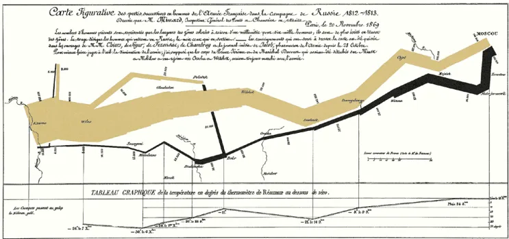
The final example of key works is considered to be the best ever example of visualisation (Tufte, 1983; Friendly, 2002). It displays the losses suffered by Napoleon during the invasion of Russia in 1812. The piece uses brown lines to highlight Napoleon’s army advancing, whilst black lines illustrate the retreat. The thickness of the lines shows size of the army at each particular moment, depicting that the army that arrives in Moscow is around one-fifth of the size of the army that began the invasion. It also shows the timeline of events by presenting the date, as well as the location, in the latitudinal and longitudinal points.
21
Figure 2.3. Napoleon’s invasion of Russia, 1812 (Source: https://thoughtbot.com).
These examples illustrate the power of data visualisations, but it was only in the 20th century that people began to conceptualise how they worked. Bertin’s (1983) seminal work on the semiology of graphics, for example, produced a foundational framework for analysing information visualisation. He identified various data types, such as categories, maps, numbers and networks, and retinal variables for visual encoding, such as position, shape, orientation, size and colour. The influence of this work can be traced throughout the development of data visualisation, and it has also cross-pollinated into other areas such as cartography. Few (2004) developed these principles, honing in on the role and application of colour in data visualisations. Few presented nine principles of colour in data visualisation:
1. The background colour must be consistent.
2. The background colour must show a contrast between background and object. 3. The use of colour must only be used for communicative purposes.
4. A different colour must be applied for differences in data meaning.
5. Natural colours should be used to display information, whilst bright or dark colours should highlight significant information to draw greater attention.
6. Designers should apply a single hue for sequential ranges.
7. For the benefit of those who are colour-blind, avoid using red and green in the same display. 8. Designer should avoid visual effects.