ABSTRACT
CHANG, JIAE. Development of a perceptual Visualization Assistant for multi-dimen-sional data visualizations. (Under the direction of Christopher G. Healey.)
A PERCEPTUAL VISUALIZATION
ASSISTANT FOR MULTI-DIMENSIONAL
DATA VISUALIZATION
by
Jiae Chang
A thesis submitted to the Graduate Faculty of North Carolina State University
in partial fulfillment of the requirements for the Degree of
Master of Science
Computer Science
Raleigh
2001
APPROVED BY:
BIOGRAPHY
Jiae Chang was born in Seoul, Korea on July 1st, 1968. She received her bachelors degree in Computer Science from the department of Computer Science at Myong Ji Uni-versity, Seoul, Korea in 1993. She was with Institute of System Planning in Tokyo, Japan from 1993 to 1996 as a software engineer. She joined the department of Computer Science at the North Carolina State University, Raleigh, NC, in fall of 1999. She is currently work-ing towards completion of her Masters degree in Computer Graphics.
publication: Assisted Visualization of E-Commerce Auction Agents
ACKNOWLEDGEMENT
I still clearly remember the first day that I met my advisor. I was very embarrassed or maybe lost to follow his explanation about his research. He spoke so fast, and I was too dumb to understand his research. But, anyway, he allowed me to join his laboratory (maybe it was his mistake...he he he). A few days later, he told me that he recommended me to have SAS’s scholarship. He was worried about my financial status. What a great teacher! I was very happy with tears.... However, I was not a good or smart student. It was my tragedy and his tragedy. I was struggling to survive in the course work, so how could I concentrate on my research? I was very depressed, and I felt always sorry for him. Finally, I cried during the regular meeting time (shame on me!). I talked to him I was tired of my life and I was stuck on everything. He listened to my foolish story and tried to help me. He was very worried about me. If he did not encourage me at that time, maybe I am still in the depression. I recovered and I came back to write my thesis. Another problem was just start! My native language is not English, and I am not a good writer either. He corrected my thesis million times! I am sure no other teacher can do as my advisor did. He has great patience and passion. Not only that, he checked my slides for presentation also. During the presentation, in D-day, he seemed like more nervous than I was. Sorry! I cannot finish my thesis without my advisor Dr.Christopher Healey. Say thank to him is never be enough for his help, advice and support. I cannot forget all of my laboratory friends’ support also. Laura kept listening to my boring personal problems. When I depressed about my life and thesis, I could relax and recover my energy from her warm encourage and hug. Further-more, she corrected my thesis so many times without complaining. Sarat, he is my project-mate, also gave me a lot of advice for my thesis and project. He also encouraged me a lot when I was tired from my thesis. And I want to thank Brent for his valuable contributions to my writing and ideas. I am really sorry about that I bothered you guys so much, and thanks. I also want to say thank to Dr. Robert St. Amant for his idea and inspiration for my thesis. I also appreciate Dr. Douglas S. Reeves for his advice and idea to perform an experiment in my thesis. Finally, I want to thank my family for their support and love.
Table of Contents
List of Figures...v
List of Tables... vi
1
Introduction... 1
1.1 What is visualization? ...1
1.2 Problems of visualization...2
1.3 Research goals ...4
1.4 Proposed design ...4
1.5 Benefits of ViA ...7
2
Related Works... 8
2.1 Automating design of visualizations...8
2.2 Representing multi-dimensional data visualizations ...13
2.2.1 Classification of visualization ...13
2.2.2 Methodology for data representation...15
2.2.3 Underlying data models and data structures for visualization...17
2.3 Rule-based visualization ...18
3
Perceptual Visualization ... 20
3.1 Color ...24
3.1.1 Color feature...24
3.1.2 Luminance feature ...27
3.2 Texture ...27
3.3 Combinations of color and texture...38
4
A Perceptual Visualization Assistant (ViA) ... 40
4.1 Architecture ...40
4.2 Evaluation engines ...43
4.2.1 Color engine ...45
4.2.2 Luminance engine ...46
4.2.3 Height engine...47
4.2.4 Density engine ...48
4.2.5 Regularity engine...49
4.3 search engine...51
5
Practical Applications ...53
5.1 Visualization of weather dataset ...54
5.2 Visualization of auction agent competition dataset ...60
5.2.1 TAC Visualizations...62
5.3 Comparison Experiment ...68
6
Conclusion ... 80
List of Figures
FIGURE 1.1: Visualization system: ...6
FIGURE 2.1: Vista’s composition techniques: ...12
FIGURE 2.2: An example of NSP: ...17
FIGURE 3.1: Human eye by Resnikoff (1987)...21
FIGURE 3.2: Examples of target search in Healey and Enns’ report: ...23
FIGURE 3.3: CIE LUV color model: ...26
FIGURE 3.4: Example of similar textons: ...28
FIGURE 3.5: Examples of texture features: ...33
FIGURE 3.6: Combination of textures: ...36
FIGURE 3.7: Examples of texture mapped brush strokes: . ...39
FIGURE 4.1: ViA’s architecture...42
FIGURE 5.1: The results of ViA: ...56
FIGURE 5.2: Candidate mappings provided by ViA: ...58
FIGURE 5.3: Student TAC data visualized with three different M: ...68
FIGURE 5.4: Current weather forecast system: ...73
List of Tables
TABLE 2.1: Examples of Object classes and Operation classes: ...13
TABLE 5.1: A table showing the input data ...54
TABLE 5.2: A table showing the attributes to visualize during a TAC simulation ...63
TABLE 5.3: “On which picture is it easiest to distinguish...” ...76
TABLE 5.4: “Point out the areas that have...”...77
TABLE 5.5: “Can you detect wind direction in both pictures?” ...77
TABLE 5.6: “Point out the areas that have...”...78
1 Introduction
1.1 What is visualization?
Visualization is the pictorial presentation of certain types of data or information [35][42]. Visualization systems differ greatly, from 2D representations (such as graphs or bar charts) to 3D volume rendering systems. Visualization is an important link between two powerful information-processing systems: human cognition and the modern com-puter. It is a key technology for extracting information, and therefore it is becoming more and more necessary in our increasingly information-rich society. Visualization techniques can enable us to navigate and explore the rapidly growing number of networked data col-lections far more easily and to discover far more quickly information hidden in these datasets. Therefore, in the visualization area, a critical issue is to determine how to effec-tively represent large amounts of data.
weather datasets contains several attribute values at each sample data point (or data ele-ment): temperature, wind speed, pressure, precipitation, cloud, frost, etc. ViA can be used to determine good ways to display the data by representing each attribute with a visual feature such as color, luminance, height, regularity, or density. This “data-feature map-ping” is built semi-automatically, with only minimal input from users on their viewing preferences and analysis needs. Most importantly, a user does not need to have expertise in either psychophysics or scientific visualization to construct these mappings.
Many factors must be considered in order to build effective multi-dimensional visual-ization. For example, (1) Which visual features should we use for each data attribute? (2) Is there visual interference between different visual features? (3) How important is a data attribute in the overall visualization? (4) Is an attribute’s data domain continuous or dis-crete? (5) Is the spatial frequency of certain attributes high or low? Our system was built using a combination of perceptual guidelines derived from psychophysical experiments and an AI-based search technique. Thus, our system has the flexibility to consider differ-ent datasets and user needs. Our studies suggest that ViA is a robust multi-dimensional visualization support system that can be applied to many types of datasets and analysis tasks.
1.2 Problems of visualization
Much research has been performed and is still ongoing in the multi-dimensional data visualization area. The methodologies and the datasets that are being used by various visu-alization researchers are not identical, but the goals are very similar. The main research issues and the problems of multi-dimensional data visualization that this thesis addresses are the following:
• To represent multiple independent data attributes simultaneously in a single display
• To design a formal rule-based system to help to build effective data feature mappings
• To make a semi-automatic assistant for the construction of multi-dimensional data
visualizations
Displaying multiple data attributes together is the defining characteristic, and one of the key challenges in multi-dimensional data visualization. The explosion of large, com-plex, multi-dimensional datasets from numerous application domains has generated sig-nificant interest in this area. There are many problems that need to be considered in order to effectively visualize multiple data attributes simultaneously. For example, the maxi-mum number of data attributes that can be represented at once is critical. New techniques should try to increase this upper limit. Previous research based on human perception and human cognition has studied ways to measure and manipulate limits on our ability to “see” information. This research reveals what can limit our understanding of multi-dimen-sional displays. It also motivates us to find new methodologies to design more efficient and more expressive visualizations. Some researchers have suggested that a robust rule-base is needed to support multi-dimensional data visualization. The study of human per-ception, visual effects, and data analysis can be used to construct these rules. The desire to help a broad range of practitioners to visualize their data suggests the need for a seamless support system. A rule base for the design of multi-dimensional visualizations could be used as a foundation for exactly this kind of system. To date there are only a few previous attempts to build a visualization assistant. In order to be flexible, such a system must work in an application independent manner. This leads to a number of interesting and important questions, for example: How can we decompose or classify the data elements? How should we allocate visual features to each data attribute? Is it possible to measure the con-flicts or interference that may occur between different visual features? Finally, how can results from human perception be harnessed to help to address these needs? A significant body of research has been conducted or is currently ongoing to find a way in which to design perceptually salient visualizations.
between automation and flexibility. Each user’s interests and analysis requirements are different and so much can depend on the need to satisfy personal preferences. This research does not pursue the perfect system for all users. Rather we want to implement a flexible, generalizable, and perceptually grounded semi-automatic visualization system.
1.3 Research goals
My research aims to diminish some of the visualization problems outlined earlier. The research goals can be summarized as follows:
• Implement a semi-automatic rule-based visualization assistant that can be applied to
datasets from a variety of application domains
• Design an efficient and effective method to reduce the time needed to search for
candi-date visualizations
• Combine the rule-base and search algorithm into a rapid, accurate, flexible, low cost
system to produce perceptually salient visualizations that allow users to analyze their data
• Evaluate visualizations produced by our system through a comparison with existing,
commonly accepted visualizations
1.4 Proposed design
might be improved. (4) Based on evaluation weights and hints from each engine, construct a small collection of new mappings M1, M2,..., Mi with high potential for improvement. (5)
Continue this process until a user-chosen stopping condition is met; the top mappings are then returned to the user.
To evaluate a visualization, we must obtain high-level information about the dataset, and about the user’s preferences and analysis needs. We collect these application-indepen-dent properties partially through automatic analysis, and partially through a simple user interface presented to the user before the system begins. Data collected from this process is translated into input data for ViA. Input data plays an important role in specifying the domain data type, the user task demands, and the priority or importance ordering of data. Input data also affects the evaluation weights and hints returned by the evaluation engines.
Before any visualization can occur, a mapping of data attributes to individual visual features must be decided. In order to build a mapping that is perceptually salient for the various user tasks outlined, several conditions should be considered. For example, a data attribute’s domain type (continuous or discrete) and spatial frequency (low or high) can affect which visual features are best suited to represent it. We should avoid foreseeable visual interferences by swapping conflicting attribute-feature pairings. Adjustments based on the importance a user assigns to the attributes may be needed to build better mappings. The most important consideration is that our visualizations must allow a user to complete their exploration and analysis tasks. All of these considerations are encoded into the eval-uation engines of ViA.
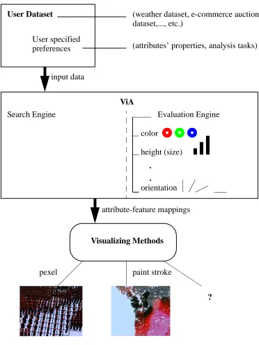
FIGURE 1.1: Visualization system: a user dataset, along with input data (attributes’ domain type, importance ordering, analysis tasks, spatial frequency) will be provided to ViA; ViA will produce a set of perceptually salient attribute-feature mappings using perceptual evaluation engines and an AI-based mixed-initiative search algorithm; External visualization methods will display the best visualization based on ViA’s suggested mappings.
User Dataset (weather dataset, e-commerce auction
dataset,..., etc.) User specified
preferences (attributes’ properties, analysis tasks)
ViA
Visualizing Methods
?
pexel paint stroke
Search Engine Evaluation Engine
input data
attribute-feature mappings color
height (size)
.
.
1.5 Benefits of ViA
Our proposed research offers several important advantages over existing data visualiza-tion techniques. In particular,
• perceptually salient: each visualization produced by ViA is carefully designed to
sup-port rapid and accurate visual exploration and discovery by taking advantage of a user’s low-level visual systems,
• application independent: ViA is designed to be applicable to a wide range of datasets
and analysis tasks,
• semi-automatic: ViA works with the user to free them from the need for expert
knowl-edge about visualization design or psychophysics, at the same time, ViA allows users to state preferences, apply constraints, and guide the resulting visualizations to respect context and requirements specific to the data to be displayed,
• computationally efficient: ViA identifies appropriate visualizations using a mixed
2 Related Works
Multidimensional visualization has been an active research field for more than three decades. Since the 1987 NSF workshop formally recognized the importance of multi-dimensional visualization, a lot of research in this field has been accomplished [35]. We are most interested in research in visualization that has focused on (1) representing multi-ple independent data attributes simultaneously in a single display, (2) designing a formal rule-based system to help to build effective data feature mappings, (3) integrating human perception into a visualization system, and (4) making a semi-automatic assistant for the construction of multi-dimensional data visualizations.
The rest of this chapter is an explanation about several prominent visualization studies and how they influence each other. Through the study of past research, we can understand same key problems in visualization that many researchers are trying to solve and how visualization methodologies have been developed. At the same time, we might infer the way solutions to those problems should be approached.
2.1
Automating design of visualizations
Jock Mackinlay developed an application-independent presentation tool (APT) that designs effective and expressive graphical, static, 2D presentations (such as bar charts, scatter plots, and connected graphs) of information automatically [29]. He focused on how to synthesize a graphical design that expressed a set of relations and their structural prop-erties effectively and automatically. APT is codified with two criteria: expressiveness and
effectiveness.
graphical objects are encoded based on their graphical properties (i.e., positional, tempo-ral, retinal properties). A graphical sentence is a collection of tuples. As an example of tuples, Mackinlay used a set of graphical objects (O) and a set of locations (L). A graphi-cal language can be defined by a set of graphigraphi-cal sentences. The APT uses this well-formed graphical language to design graphical presentation automatically.
The effectiveness criterion concerns the issue of human perception in visualization. Mackinlay tried to establish a conjectural theory to implement a human perceptual visual-ization with the effectiveness of a graphical language. This trial is very important in the area of human perceptual visualization. Many ensuing researchers are inspired by Mackin-lay’s effectiveness to implement human perceptual visualization. The most significant effectiveness criterion he observed was the importance order between graphical proper-ties. Mackinlay called this order the effectiveness ranking. Graphical properties with higher effectiveness rankings are more accurately displayed in the entire visualization. Thus, more important graphical objects (O) are encoded with higher effectiveness rank-ings.
APT followed a divide-and conquer strategy. The algorithm is based on three steps:
partitioning, selection, and composition. The expressiveness and effectiveness criteria are
applied at every step. This strategy has become a basic model of general visualization implementation. Through partitioning, data classification is performed, such as reordering graphical objects by their importance of the overall visualization. In the selection step, data attributes and visual features are mapped to one another to implement a visualization. Finally, all selected data attributes are composed in the same spatial area to construct a visualization.
interactor (e.g., translation, scaling, orientation). An interactor has four basic components: a set of encoding spaces, a set of encoding objects, a set of selections, and a user interface. Encoding spaces usually define the dimensional spatial area for objects to be repre-sented. AutoVisual is restricted to at most 3-dimensions. A world maybe represented by one of following sets of encoding objects: 1D dipsticks, 2D line graphs, 3D height fields, and 3D color-scale point clouds. These are the usual pattern of spaces and interactors that support AutoVisual. The selection determines the hierarchical relation between the worlds that are encoded by interactors. A selection is composed of geometric subsets of the encoding space of the parent interactor. The user interface component of an interactor plays the role of supporting a user task (i.e., exploration, directed search, and comparison). The binding of translation, scaling, and orientation are the main features of the user inter-face for AutoVisual. AutoVisual uses Jock Mackinlay’s expressiveness and effectiveness criteria for the search termination conditions. Each state in search space represents a possi-ble interactive visualization. Those criteria are modified for interactive visualization.
2.2 Representing multi-dimensional data visualizations
2.2.1 Classification of visualization
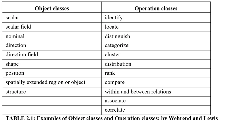
Wehrend and Lewis grouped visualization problems into two classes that are indepen-dent of application domain [43]. They pointed out the importance of data classification to automate the visualization. The first grouping, object classes, groups the type of data domain into scalars, directions, shapes, or positions, etc. The main reason for this classifi-cation is that data cannot be converted into any given class of representation. For example, size, hue, or angle can be a representation for scalar data, but they are not appropriate rep-resentation for position data. The second grouping, operations classes, characterizes the user’s goal or user’s analysis task in visualization. Several examples for object classes and operations classes are in the Table 2.1. Based on the user’s goal, operations are mainly specified as either identification or comparison. Objects and operations are put together into a matrix form. Mackinlay’s composition rule (discuss in 2.3) is then applied to create a visualization design from this matrix. They called this approach a catalog manner. How-ever, they were skeptical about the appropriateness of their classification for complex objects, such as fields or structures. They purported that the implementation of an auto-matic visualization system needs a lot of support in specific definitions of visual represen-tations.
Object classes Operation classes
scalar identify
scalar field locate
nominal distinguish
direction categorize
direction field cluster
shape distribution
position rank spatially extended region or object compare
structure within and between relations
associate correlate
Similar research on classifying visual knowledge representations was performed by Lohse et al [28]. They expressed their objective for classifying visual representations in four points. They are summarized as follows: (1) understanding how people organize and process visual knowledge, (2) identifying problem areas and anomalies in visualization, (3)communicating how to convey knowledge visually, and (4) predicting future research needs and limitations of visualization. To achieve those goals, they decided the classifica-tion of data is much more important than any other process in the development of a multi-dimensional visualization. Classification is performed in a bottom-up manner. Initially, subjects sorted data items into groups of similar data items using a bottom-up sorting pro-cedure. After grouping the data items, subjects continued to combine their initial group-ings into larger clusters. They repeated this process until all data items were in one cluster. Data items include icons, graphs, tables, maps, and so forth. To ensure the maximum vari-ability of data items, they chose representative samples from a broad range of fields. The subjects for the sorting task were as heterogeneous as possible. They selected a bottom-up procedure as a sorting task strategy because subjects could classify data items while see-ing their graphical forms. Classification was accomplished in a trailblazsee-ing manner, instead of a conceptual manner. The problem of this taxonomy is that volunteers for the sorting task could classify data items into different classes or categories. In other words, classification can be influenced by the volunteers. To adjust for this problem, the experi-menter had to allow some trade-off. After the data-sorting task was completed, the data was analyzed. This analysis was performed in two ways: subject analysis and item
analy-sis. Subject analysis determines whether the sorts were homogeneous. This was done by
clustered again into more groups. This clustering helped to identify a multi-dimensional visual representation.
2.2.2 Methodology for data representation
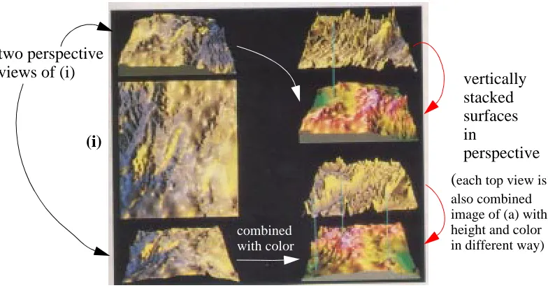
Robertson described the Natural Scene Paradigm (NSP) for displaying and analyzing multivariate data [36][37][38]. The NSP is an inversion of Mackinlay’s APT method (dis-cuss in 2.3). In APT, the data drives the selection of the encoding techniques. Therefore APT is a bottom-up approach, since it is data driven. Robertson insists that the data-driven pipeline scenario is complicated to achieve, because the user must interact in several steps with both systems and tools. Thus, the system needs to translate the data every time the user interacts with the system. This is not efficient for the whole visualization system. In addition to that, the user must have expertise about visualization. Robertson also pointed out that the amount of raw data currently exceeds the ability of data management, meaning current visualization systems fail to efficiently use the knowledge-base technique. Typi-cally, the knowledge-base technique uses a bottom-up approach. Due to these deficien-cies, Robertson et al were skeptical about the data driven bottom-up approach. Thus, they tried a top-down approach for visualization.
Their visualization representation was performed by natural scene paradigm (NSP). NSP can be divided into three steps. First, select a clear and easily understandable model such as a 3D natural scene or structure. Second, decompose that model into recognizable properties. Finally, combine the properties of the user’s demands by using graphic simula-tion techniques. The representasimula-tion can be accomplished in various ways depending on the dimensionality of the data, and the display methods, and accompanying constraints. Attributes (point, local, and global) of the scene properties are represented in table struc-ture or tree strucstruc-ture. Fig.2.2 shows several combined images using NSP. In Fig.2.2(a), there are two perspective views of (i) and (ii). In Fig.2.2(b), the right-hand side views are all combined images of data representation (i.e., top of each views are combined image of Fig.2.2(a) with height and color using their own data representation methods; bottom of each views are combined image of (i) in Fig.2.2(b) with color). In Fig.2.2(b), the right-hand side views show us the vertical stacking in perspective.
(a) decomposed data representation
(i) (ii)
view of (ii) in perspective without shadow
view of (ii) in perspective with shadow view of (i) in
perspective without shadow
FIGURE 2.2: An example of NSP: (a) decomposed data representation; (b) multiple sets of the combined-in-perspective images.
2.2.3 Underlying data models and data structures for visualization
Gallop consolidated and developed the underlying data models and structures in a flow visualization system [31]. Gallop insisted that the data models should be classified along with the underlying data representation fields and abstract visualization objects. The dataset, which Gallop defined, is based mostly on scientific flow data. Naturally, the flow dataset is a nearly continuous or empirical, time-dependent model. Thus when he decom-posed the dataset into variables and functions, he considered the empirical components and time components as highly important.
In Gallop’s research, data variables (or data elements) are divided into two groups:
dependent variables and independent variables. The methodology of visualization
depends on the attributes of the data variable. The most important difference between
dependent variables and independent variables is whether the data components are ranked
by dependency on each other. In a dependent variable strategy, the data components are ranked with dependency, and then data sampling occurs based on the assigned ranks. Ranking is not done in the independent variable strategy. In the independent variable case, a non-hierarchical data sampling is performed before mapping to the coordinate system.
(b) multiple set of combined approach
(i) vertically stacked surfaces in perspective (each top view is also combined image of (a) with height and color in different way)
two perspective views of (i)
Gallop pointed out the importance of rearranging the data model before we implement it, because the range of scientific data is very diverse. To implement extremely diverse data, we need a formal methodology to classify data models. A user cannot expect system-atic visualization systems until we have formal ways to express those diverse data models.
2.3 Rule-based visualization
Rogowitz and Treinish published their research about perceptual rule-based visualiza-tion systems (PRAVDA)[8][33]. They investigated visualizavisualiza-tion operavisualiza-tions for higher-level representations of metadata. They also introduced visualization rules, which provide guidance for the visualization operations based on human cognition, vision, and color. These rules focused on how to map the physical dimensions into perceptual dimensions. They thought human cognition could be varying from user to user and from image to image.
Their perceptual rules are divided into two classes: Class I rules and Class II rules. Class I rules are basic rules for building a representation of data. This class of rules can handle, not only converting metadata into perceptual dimensions, but also insuring con-ceptual preservation of high-level visual features such as color, shape, and size after map-ping. There are two ways to implement perceptual mapping: perceptual isomorphism and
non-isomorphic color scales. The former rule is an idea of keeping consistency between
pro-duced PRAVDAColor as a module of data visualization to assist the user’s colormap selections.
The architecture of PRAVDA consists of three parts, the data flow part, the rule-based operation, and the selections. The most important part is the rule-based operation. On the basis of the data entered, the rule-based operation selects the proper colors for the data fea-tures along with a colormap (PRAVDAColor). PRAVDAColor uses spatial frequency to select appropriate mappings. PRAVDAColor determines the luminance, hue, and satura-tion based on spatial frequency. For example, if the spatial frequency is high, the colormap offers a monotonic luminance component and if it is low, colormap offers a single hue variation in saturation. The spatial frequency is calculated in PRAVDAColor by the data type, but not included within the dataset itself. The rule-based operation can also give advice on the range of data segmentation and highlighting. The selection part is supported by the user interface. PRAVDA can only offer the proper range of data mapping, but still needs user interaction for the final decision of which mappings to implement.
In their report, the authors mentioned that PRAVDA could be applied for domain-inde-pendent factors. However, implementation of multiple data sets only with hue, luminance, and saturation is not flexible enough. We must consider interference between hue, lumi-nance, and saturation when multiple data attributes are implemented simultaneously. In the human vision system, the maximum number of hue variations that a human can recog-nize without interference is only seven [13]. In addition to that, luminance and saturation cannot be perceived effectively at the same time by human perception. In that context, the available number of hue variations is relatively less than seven. That means PRAVDA cannot expect high effectiveness in a system displaying datasets that require many data attributes to be represented. To implement multidimensional datasets effectively, we still need extra methods for multiple data attributes.
3 Perceptual Visualization
Perceptual visualization is the study of how to improve visualization systems for rapid and accurate data analysis through a human perception and cognition approach. Visualiza-tion is a visual effect to show informaVisualiza-tion through a proper medium. The main objective of visualization is not only to display graphical images, but also to give or transport infor-mation through a specific visual effect to the viewer. When a human sees an image, the human vision system translates it into perceptual knowledge or data in the human brain. Therefore, effective visualization requires the study of both the human visual system and human perception and cognition to understand the message of a visual effect.
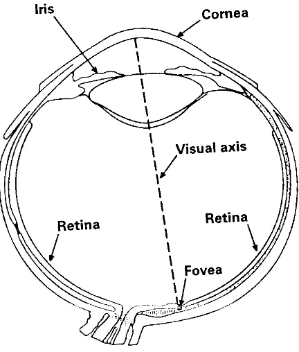
Resnikoff has studied the human vision system [42] (Fig.3.1 shows the human eye structure). The first level of the visual system is the retina. The retina covers a visual field of about 160° wide. The organization of this part of the retina is good at detecting move-ment or other changes of visual environmove-ment. The second level of visual system is the foveal (the inner part of the fovea). This high resolution field is moved to points of interest about 1 to 5 times/sec. at rate of up to 100°/sec. per one movement. In the base of this eye movement mechanism, the automatic, stimulus-based attention shifting causes this mech-anism to shift towards the brain. Through the unique processing of brain, the information is sent to two separate systems: one encodes spatial properties such as location, size, and orientation, and another encodes object properties such as color, shape, and texture [42]. These primitive properties (i.e., location, size, orientation, color, shape, texture, etc.) are important preattentive visual features. Perceptual data visualization is a research area that studies preattentive visual features and develops a methodology of using preattentive visual features to implement data visualization.
knowledge and experience. High-level cognition is too complicated to classify. However, high-level cognition or knowledge is accomplished through the primitive low-level human vision system.
FIGURE 3.1: Human eye by Resnikoff (1987)
A new approach to perceptual visualization is also needed for multi-dimensional data visualizations to display multiple data attributes simultaneously. Intuitively, multi-dimen-sional data visualization needs special rules for data to visual feature mapping. This map-ping task is performed by rules. Those rules are based on human perception. The rule is the main focus in multi-dimensional visualization. To implement the rule base, we need to understand the relation between the preattentive visual features and human perception. There are several experiments addressing the preattentive visual features and their effect on human perception. I will address these more specifically in the next sub chapter.
forecasts. Many data visualizations are made of color or texture because the human vision system can process these visual features. Human eyes can catch or classify differences in hue and recognize the shape of an object almost effortlessly. The ability to perceive color and texture is almost primitive and close to an instinctive effort. According to Healey and Enns’ report [12][14][15], analysis using color and texture normally requires no more than 200 milliseconds, and the user task completion time is constant and independent of the number of data elements in a display. In my research, color and texture are also used as a visual feature for data representation. However, there are limitations to human vision and perception of different colors and textures. We need to consider the trade-off when sys-tems use multiple colors and textures. Also, we have to adjust those features under certain circumstances. Those adjustments are accomplished in the foundation of human percep-tion. The primitive tools of color and texture can support not only “low-level” perceptual tasks, but also “high-level” data exploration when properly used and balanced.
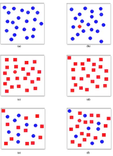
FIGURE 3.2: Examples of target search in Healey and Enns’ report: (a) and (b) identifying a red target in a sea of blue distractors is rapid and accurate, target absent in (a), target present in (b); (c) and (d) identifying a red circular target in a sea of red square distractors is rapid and accurate, target present in (c), target absent in (d); (e) and (f) identifying the same red circle target in a combined sea of blue circular distractors and red square distractors is significantly more difficult, target absent in (e), target present in (f)
(a) (b)
(c) (d)
3.1 Color
Color can be divided into hue and luminance. If we analyze color, we learn that there are several distinct color categories (e.g., red, yellow, green, blue, purple in the CIE LUV color model 1) [12][13][15]. These color categories can be mixed together to create more colors. Changing the brightness of a color category in turn creates a different color repre-sentation by that group. In visualization, this feature is often called luminance.
Luminance can be used as an effective tool in graphical visualization. Because hue and luminance are closely related, they can sometimes interfere with one another in certain cir-cumstances. Thus, to display both hue and luminance features at the same time, we must anticipate interference, and we should make adjustments so that this interference, if it exists, does not negatively impact the resulting visualizations. Therefore, I will categorize color into hue and luminance. In our perceptual visualization system (ViA), we can use hue and luminance as two different features for data elements, if necessary. But in many cases we combine them into a single color feature to avoid viewer confusing and potential visual masking.
3.1.1 Color feature
Before color is used for visualization, the visualization system or expert must answer these two questions:
• What kind of colors can be used to implement visualization based on human
percep-tion?
• What is the maximum number of colors that can be used without any causing
difficul-ties in the analysis of displayed data?
When colors are selected to display the data elements, they should be perceptually anced and distinguishable. Any color can be selected from any color group. To have bal-ance in terms of perception, the selected colors need to have a mutually uniform
difference. For example, if every color in a set has a different pairwise variation of bright-ness, the set is not perceptually balanced. As a result, some of the colors may not easily be distinguishable. Thus, to select colors with a uniform perceived difference, colors should be analyzed by root color (color group or hue) and brightness. There are several studies on setting up perceptually balanced color models. CIE LUV, Munsell, and the Optical society of America Uniform Color Space are examples of such models. Healey and Enns [14][15] analyze perceptual colors through color distance, linear separation, and color category. They used the CIE LUV color model to measure color distance. The CIE LUV color model specifies color with hue and brightness. The colors, which have roughly the same brightness, are classified into isoluminant colors. The color distance is measured simply by Euclidean distance in the CIE LUV color space. For example, given two colors x and y in CIE LUV space, the distance ∆E* unit is:
(EQ 1)
L encodes luminance, and u and v encode chromaticity (u corresponds to the red-green
opponent channel, and v is for the blue-yellow).
The PRAVDA color map [33] also is similar to the CIE LUV color model, but the PRAVDA colormap does not use the Euclidean formula. The PRAVDA colormap use three components to set the rule for color: luminance, hue, and saturation.
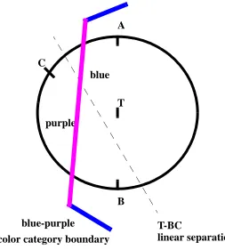
Healey and Enns were not satisfied only with color distance to control the color differ-ence. In their experiments, they found that the linear separation effect could affect per-ceived color difference even though the color distance is roughly the same. The linear separation effect, reported in Bauer and Cowan’s research [6], is as follows. Background color may affect the perception of the target color. Therefore, certain backgrounds make searching for a target color more difficult. The linear separation effect is explained very specifically in Healey and Enns report [14][15]. I adopt their explanation with Fig.3.3. In Fig.3.3, there are three-background distractors A, B, and C. T is the target color. Those colors are all displayed in the CIE LUV color space. According to (EQ 1), the color dis-tance TA, TB, and TC are roughly equal. However, searching for T in a group of back-ground elements colored A and B is more difficult than in a backback-ground of elements
colored B and C. This is because a straight line exists that can separate T from B and C, but no such line exists for T from A and B (since, T is colinear with A and B). Also, Kawai et al. suggested color category can affect perceived color difference. For example, searching for T in a sea of background elements colored A or B is harder than in a sea of elements colored C. This is because both T, A and B lie within a color category named “blue”, while C lies within a different category named “purple” [32]. Perceived color dif-ference increases between colors from different categories. Color distance and linear sepa-ration are reasonable rules for color selection, and are applied in my research.
FIGURE 3.3: CIE LUV color model: a target color T and three background distractor colors A, B, and C; T is on the line AB (i.e., length (TA) == length (TB)), but T is separated by a T-BC line; T, A, and B is in the “blue” color region, while C is in the “purple” color region.
Another research by Healey and Enns’s implies a limitation to the number of colors that should be used for perceptual visualization. In their experiment, the observers had
T C
A
B
T-BC
linear separation blue
purple
blue-purple
much more difficulty in identifying certain colors during trials with more than seven isolu-minant colors. That is, observers’ response times increased and the accuracy decreased. Based on this experiment, our system advises not to select more than seven colors at once to allow certain exploration tasks.
3.1.2 Luminance feature
ViA uses luminance as one of its visual features. Luminance and hue are intuitively closely related, because both features are combined to make up what we usually refer to as color. If these two features are not properly organized, it might make the whole visualiza-tion system less effective. When hue and luminance are used together, variavisualiza-tion in either can change the colors the viewer sees. The visualization systems of our laboratory (e.g., the nonphotorealistic painterly stroke method [19], pexel [15]) can allow luminance alone to be used to produce a perceptually balanced gray tone. We will often combine hue and luminance into a single, perceptually balanced “color” feature however, to avoid unneces-sary viewer confusion.
3.2 Texture
Like color, texture can also be decomposed into a fundamental perceptual dimensions. Many researchers have focused on these two important issues:
• Texture selection: What texture patterns can be used for visualization?
• Variation of texture dimensions: What fundamental properties (e.g., height, density,
regularity or orientation) can be identified in a texture pattern?
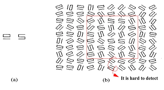
preattentive processing. Julesz suggested that only a difference in textons or in their den-sity can be detected preattentively. One example of texton theory is shown in Fig.3.4. Although the two elements are clearly different when shown in isolation, when oriented randomly, it is very difficult to distinguish the locations and boundaries of the two differ-ent patches even though they have the same number of line segmdiffer-ents and terminators. Anne Treisman [3] concluded through her experiments that line ends or terminators, blobiness or closure, tilt and curvature could be perceptual texture primitives. Grinstein et al. created a system called EXVIS that uses “stick-men” icons that vary their orientation and spatial position to form texture patterns [25]. Ware and Knight used Gabor filters that modulate the amplitude, frequency, and size of a Gabor hat function to construct texture patterns [45]. Turk and Banks proposed streamlines, directed, sized, positioned arrows to visualize two dimensional vector fields [44]. Salisbury et al. used computer-generated pen-and-ink drawings to generate texture-like patterns (e.g., cross-hatching, light and dark contrast, directional strokes) to produce simulated drawings of an underlying picture or 3D object [40]. Healey and Enns built a perceptual texture element (which is called a pexel) for texture patterns.
FIGURE 3.4: Example of similar textons: (a) two textons that appear different in isolation; (b) the same two textons are difficult to be distinguished in a randomly oriented texture environment
Based on these previous result, we identified four texture dimensions that we could use to encode information. We believe variations in these dimensions will form perceptually detectable changes in the resulting texture patterns. These changes can then be used by viewers to identify and analyze patterns, trends, and relationships, contained in their data. The four dimensions we chose to use were:
• Height (or size): the height (in 3D) or area (in 2D) of each element used to form the
tex-ture pattern
• Density: the spatial packing of the texture elements
• Regularity: the amount of regularity or randomness in the spatial placement of the
tex-ture elements
• Orientation: the tilt (in 3D) or direction (in 2D) of the texture elements
Fig.3.5(a): Three variations of height
short pexels
medium pexels
Fig.3.5(b): Three variations of density
sparse dense
regular
irregular
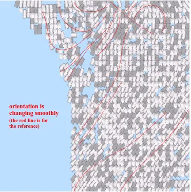
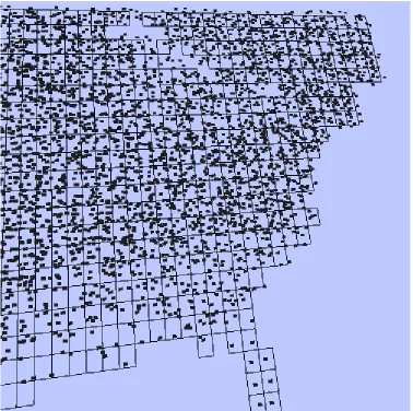
FIGURE 3.5: Examples of texture features: (a) height (short, medium, tall); (b) density (sparse, dense, very dense); (c) regularity (regular, irregular); (d) orientation
Fig.3.5(d): Orientation using nonphotorealistic painterly stroke method
orientation is changing smoothly
short and low density area
tall and high density area (1 short pexel in a unit area)
(9 tall pexels in a unit area)
tall and regular area short and irregular area
FIGURE 3.6: Combination of textures: In (a) height and density, (b) height and regularity, and (c) density and regularity are combined
Different color and texture properties cannot be combined in a display in an ad-hoc fashion with an expectation that the resulting images will always be perceptually salient. Different visual features can interact with one another to produce visual interference. Rather than highlighting areas of interest, visual interference will mask important infor-mation contained in the visualization. For example, Healey and Enns’ [15] experiment revealed that height and density are not always perceptually salient. Tall elements can sometimes hide variation in density partially because the visual system favors detecting
changes in height before detecting changes in density. Other properties of a dataset or the analysis tasks to be performed can dictate which visual feature will work well, and which will not. Important factors to consider are include the spatial frequency of the underlying data attributes, spatial size of groups of elements the viewer wants to identify, and the domain type of data attributes.
Interferences are less severe when only texture features or only color features are used as opposed to when color and texture are combined [5]. Most visualization systems (including ViA) are implemented with a combination of color and texture. Therefore, we can expect more complex interferences. Next I describe several important studies that can help us to avoid or minimize this interference.
3.3 Combinations of color and texture
Beck [7] showed that texture segregation is easy when it is based on simple properties such as color (e.g., a red area will segregate clearly from a green area); brightness (e.g., a dark area will segregate from a light one); and line orientation (e.g., an area containing tilted Ts segregates well from an area containing vertical Ts). It is true that a texture pat-tern made up of simple properties is much easier to detect than one made up of multiple properties. However, in multidimensional data visualization, we are confronted with mul-tiple data attributes that need to be displayed together. One of the goals of multidimen-sional visualization is to maximize expressiveness while minimizing perceptual visual interference. Unfortunately, little research to date has studied the combination of color and texture. Callaghan [10][11] reported that random color interferes with identifying bound-aries formed by simple texture shapes, but random shape texture patterns do not affect identifying a color boundary. However, Treisman [4] claimed that random color variation had no effect on detecting the presence or absence of target elements. Later, Snowden [41] insisted that the performance of a search depends on the target type. Snowden also sug-gested that any random variation of color or texture might affect performance. Although ViA is designed based on Callaghan’s and Snowden’s conclusions of color texture inter-ference, a final definitive answer to when such interference occurs has not yet been reached.
results on orientation as a feature are under construction. A pexel [15] is one of the basic texture elements in my research area. Large portions of my research were concerned with avoiding or balancing the interferences, together with data domain and analysis task requirements, to gain the most effective perceptual performance during the visualizations of multiple data attributes.
In practical applications of my research, a nonphotorealistic painterly stroke system was also used to implement some of ViA’s visualizations. This system represents one of the visualization techniques being designed in our laboratory. A simulated paint stroke that can vary its appearance by modifying various color and texture properties is used to produce painterly renditions of a dataset. Fig.3.7 shows an example of several visual fea-tures such as color, size, density, and orientation displayed using paint strokes. Research on the use of painterly styles to encode information is ongoing. Our nonphotorealistic painterly stroke visualization system is meant to produce visualizations that are both effective and artistic. This is an outside the scope of my research , so I will not deliver fur-ther specific explanations.
4 A Perceptual Visualization Assistant
(ViA)
This chapter describes implementation details of ViA. ViA is a kind of middle ware to assist visualizations. Mapping attributes to visual features is an important step in the visu-alization system implementation. We suggest ViA as an assistant for this mapping prob-lem based on ViA’s underlying robust perceptual rules. ViA is largely divided into two parts: one part comprising of the evaluation engines and the other, the search engine. I par-ticipated mainly in the development of the evaluation engines. The rest of this chapter is to explain ViA’s architecture, how the evaluation engines work, and the search engine algo-rithm.
4.1 Architecture
Before I explain ViA’s architecture, I will attempt to describe the big picture of the whole visualization system in Fig.1.1. The visualization system consists of three parts: the user dataset input system, ViA, and the visualization rendering system. User datasets are input into the system through an interface specifically designed for this purpose. Through this input system, we gather not only the dataset itself but also other important user infor-mation. The user provides the importance ordering of the data attributes, and specifies analysis tasks throughout the visualization. These tasks will be explained later in detail. Also, we get information about the spatial frequency of data attributes and whether the attribute type is discrete or continuous. This information is principal data for ViA to eval-uate mappings between data attributes and features. Based on this information, ViA will produce sets of the best possible visualization mappings along with someadditional infor-mation that helps users make a final decision before rendering.
improved. The search engine is based on a mixed-initiative algorithm [9][24]. ViA’s data structures consist of a visualization mapping structure called DF_map, and a data structure to store evaluation engines hints generated, to help to guide the search engines. ViA thus consists of a DF_map data structure (mapping list), the evaluation engines, a hint data structure, and a search engine. ViA’s architecture is shown in Fig.4.1. Before I explain the
DF_map data structure, I will clarify the use of the terms attributes and features in this
FIGURE 4.1: ViA’s architecture
The DF_map is a linked list consisting of mapped pairs of data attributes and features (e.g., an attribute and the feature currently being recommended to display it). The search engine produces a list of mapped pair node: one for each active attribute to be visualized. Different evaluation engines will analyze each node (e.g., the color engine analyzes the node whose feature is color, the height engine analyzes the node using height, and so on). The DF_map maintains information about the data attributes such as domain type, spatial frequency, importance, task, etc. This information is used by the evaluation engines dur-ing their analysis.
Input data (data attributes, attributes’ properties, analysis tasks)
Candidate attribute-feature mappings
ViA
search engine evaluation engines
priority queue
DF_map
hints
luminance
height
density
regularity color
M1
M2 M3
Mn
attribute-feature 1 attribute-feature 2
The evaluation engines will analyze each mapped pair based on the attribute’s proper-ties and the user’s preferences or requirements. ViA begins by asking the user the follow-ing questions:
• Domain type: is each attribute’s domain type continuous or discrete?
• Importance ordering: what is the relative importance of the attributes to the user?
• Spatial frequency: is each attribute’s spatial frequency high or low?
• Tasks: what are the specific analysis tasks (search, estimate, boundary detect, tracking
or nothing) to be performed on each attribute?
The evaluation engines analyze each mapped pair and note any violations of our per-ceptual guidelines. The evaluation engines produce a normalized weight based on the number and severity of the violations that are found. If possible, the evaluation engines will also suggest hints on how various mapped pairs might be improved. This advice is stored within a hint data structure. The hint data structure has information about the hint category, and an estimated improvement in the overall evaluation weight if the hint is applied. These hints are used by the search engine to probe intelligently for more optimal mappings.
Now, I will explain specifically how the evaluation engines and the search engine work.
4.2 Evaluation engines
The evaluation engines examine each mapping M that is selected by the search engine. A mapping M consists of mapped pair combinations of a visual feature vj and an attribute
Aj in the dataset. For example, in the case of the weather dataset, we might match like this:
, , ,
, . These mapped pairs form the elements of the mapping M. Briefly, the relationship of an attribute and visual feature can be formalized by .
temperature→color windspeed→luminance precipitation→height cloud→regularity frost→density
Each of the five evaluation engines, the color engine, the luminance engine, the height engine, the density engine and the regularity engine, will test an attribute-feature pair
for:
• Attribute domain type: Does vj support the domain type of Aj? (e.g., Can vj produce
continuous scales if Aj is continuous? Or can vj produce an appropriate number of dis-tinguishable values if Aj is discrete?)
• Interference: Can other mapped pairs in M visually interfere with ? This
occurs when a less important attribute Ak uses a visual feature vk that is perceptually more salient than vj (in our guidelines, we specify the salience of features in this order: luminance, hue, height, density, and finally regularity)
• Spatial frequency: Is vj appropriate for representing the spatial frequency of Aj?
• Task applicability: Does vj support the exploration and analysis user tasks on Aj?
The specific information needed to determine these four conditions is stored in the
DF_map data structure. For example, for a certain attribute Aj, the DF_map will store the
attribute’s currently mapped feature, its domain type (discrete or continuous), its spatial frequency (low or high), and its importance (as a normalized weight), the user tasks to be perform on the attribute.
After the evaluation engines test the mapping of , they produce an evaluation weight and zero or more hints on how to possibly improve the mapped pair. First of all, the evaluation weight is meant to indicate if that mapping is appropriate. The weight is in the range of 0.0 and 1.0. Intuitively, the weight 1.0 means that is a good mapped pair and 0.0 means a completely flawed mapped pair. Whenever there is any violation of the test conditions for the mapping, the evaluation engines decrease the evaluation weight and try to produce hints to fix the violation. The evaluation engines also provide the poten-tial improvement in the evaluation weight in case the hint is accepted. The hints generated by the evaluation engines include:
• Feature swap: swap visual features that interfere with each other.
• Discretization: range a continuous attribute into discrete intervals or reduce the number
of discrete intervals.
Aj→vj
Aj→vj
Aj→vj
• Importance weight modify: adjust the importance weight assigned to an attribute.
• Task adjust: remove unimportant tasks to be performed on an attribute.
Hints are applied by the search engine to produce new mappings to be evaluated. These
new mappings are stored in a priority queue in the order of their estimated evaluation weight improvement. So far I have explained how the evaluation engines work in general. Now, I will explain in more detail how each evaluation engine executes, using our percep-tual guidelines.
4.2.1 Color engine
The color engine examines these things:
• When the attribute’s domain type is discrete, check if the total number of unique
attribute values is supported by the color feature: Each discrete attribute has a set
number of different unique values. This number dictates the number of unique colors we need to represent the attribute. In our guidelines, if the attribute has more than seven discrete values, the number of discrete values needs to be reduced. This is because the human visual system has difficulties detecting more than seven isoluminant colors. The weight penalty for exceeding seven colors is based on the amount of reduction in color distance and linear separation as described in chapter 3.1. In this case, a discretize hint is recommended.
• Check if the spatial frequency of the attribute is appropriate for the color feature:
The color feature is not appropriate for high spatial frequency data attributes. This is based on well known results from perception. In this case, the color engine would sug-gest swapping the color feature for the luminance or height features with a feature swap
hint.
• Check if the other visual features can interfere with the color feature: Interference
is checked based on two properties: the importance ordering of the data attributes, and the ranking of the perceptual salient of different visual features. If a less important attribute is using luminance, we need to swap color and luminance (i.e., we check to see if and , Aj > Ak). In this case, the hint is
importance weights Aj and Ak is small. An additional hint importance weight modify is generated in this situation.
• Check if each task is supported by the color feature: Currently, discrete colors can
supports all tasks, and continuous colors can support boundary detect and tracking tasks only. Thus, when the color feature is mapped to a continuous data attribute, if the task is search or estimate, the color engine will produce a warning that the task might be inappropriate. The color engine will check the importance weight for the attribute. If it is below a very small lower bound (we normally set the lower bound to 0.25), the color engine suggests discarding the offending tasks based on the assumption that the task is unimportant (since the attribute as a whole is not important to the user). In this case, a hint task adjust is suggested.
4.2.2 Luminance engine
The luminance engine examines these things:
• When the attribute’s domain type is discrete, check if the total number of unique
attribute values is supported by the luminance feature: Each discrete attribute has a
• Check if each task is supported by the luminance feature: Currently, discrete
lumi-nance can supports all tasks, and continuous lumilumi-nance can support boundary detect and tracking tasks only. Thus, when the luminance feature is mapped to a continuous data attribute, if the task is search or estimate, the luminance engine will produce a warning that the task might be inappropriate. The luminance engine will check the importance weight for the attribute. If it is below a very small lower bound (we nor-mally set the lower bound to 0.25), the luminance engine suggests discarding the offending tasks based on the assumption that the task is unimportant (since the attribute as a whole is not important to the user). In this case, a hint task adjust is suggested.
4.2.3 Height engine
The height engine examines these things:
• When the attribute’s domain type is discrete, check if the total number of unique
attribute values is supported by the height feature: Each discrete attribute has a set
number of different unique values. This number dictates the number of unique heights we need to represent the attribute. In our guidelines, if the attribute has more than five discrete values, the number of discrete values needs to be reduced. This is because the human visual system has difficulties detecting more than five heights. The weight pen-alty for exceeding five heights is based on the amount of normalizing by twenty-five (we normally set the upper bound of unique value to twenty-five). Thus, if there are more than twenty-five discrete values for the height, the weight is going to be 0.0. In this case, a discretize hint is recommended. Also, the height engine would suggest addi-tional hint feature swap. If there are less than seven values, swap height for color, because color can support seven discrete values. Color is better than height for mapping to attributes that have more than five discrete values.
• Check if other visual features can interfere with the height feature: Interference is
Ai > Aj, Ak). In this case, the hint is feature swap. We can also ask to adjust importance
weights if the difference between importance weights (Ai and Aj) or (Ai and Ak) is small. An additional hint importance weight modify is generated in this situation.
• Check if each task is supported by the height feature: Currently, discrete height can
supports all tasks, and continuous height can support boundary detect and tracking tasks only. Thus, when the height feature is mapped to a continuous data attribute, if the task is search or estimate, the height engine will produce a warning that the task might be inappropriate. The height engine will check the importance weight for the attribute. If it is below a very small lower bound (we normally set the lower bound to 0.25), the height engine suggests discarding the offending tasks based on the assumption that the task is unimportant (since the attribute as a whole is not important to the user). In this case, a hint task adjust is suggested.
4.2.4 Density engine
The density engine examines these things:
• When the attribute’s domain type is discrete, check if the total number of unique
attribute values is supported by the density feature: Each discrete attribute has a set
number of different unique values. This number dictates the number of unique densities we need to represent the attribute. In our guidelines, if the attribute has more than four discrete values, the number of discrete values needs to be reduced. This is because the human visual system has difficulties detecting more than four densities. The weight for exceeding four discrete value is normalized. Thus, if there are more than four discrete values for the density, the weight is going to be 0.0. In this case, a discretize hint is rec-ommended. Also, the density engine would suggest additional hint feature swap. If there are less than seven discrete values, swap density for color, because color can sup-port seven discrete values. Color is better than density for mapping to attributes that have more than four discrete values.
• Check if the spatial frequency is appropriate for the density feature: The density
swapping the density feature for the luminance or height features with a feature swap
hint.
• Check if the other visual features can interfere with the density feature:
Interfer-ence is checked based on two properties: the importance ordering of the data attributes, and the ranking of the perceptual salient of different visual feature. If a less important attribute is using color, luminance or height, we need to swap density for color,
lumi-nance or height (i.e., we check to see if and ( ,
or ), Ai > Aj, Ak, Al). In this case, the hint is feature swap. We can also ask to adjust importance weights if the difference between importance weights (Ai and Aj), (Ai and Ak) or (Ai and Al) is small. An additional hint
importance weight modify is generated in this situation.
• Check if each task can be performed by the density feature: Currently, discrete
den-sity can supports all tasks, and continuous denden-sity can support boundary detect and tracking tasks only. Thus, when the density feature is mapped to a continuous data attribute, if the task is search or estimate, the density engine will produce a warning that the task might be inappropriate. The density engine will check the importance weight for the attribute. If it is below a very small lower bound (we normally set the lower bound to 0.25), the density engine suggests discarding the offending tasks based on the assumption that the task is unimportant (since the attribute as a whole is not important to the user). In this case, a hint task adjust is suggested.
4.2.5 Regularity engine
The regularity engine examine these things:
• When the attribute’s domain type is discrete, check if the total number of unique
attribute values is supported by the regularity feature: Each discrete attribute has a
set number of different unique values. This number dictates the number of unique regu-larities we need to represent the attribute. In our guidelines, if the attribute has more than two discrete values, the number of discrete values needs to be reduced. This is because the human visual system has difficulties detecting more than two regularities. The weight penalty for exceeding two regularity is based on the amount of normalizing
Ai→density∈M Aj→color∈M
![FIGURE 2.1: Vista’s composition techniques [26], pp.39: In each case, the two graphs on the left are the components and the graph on the right is the resulting composite](https://thumb-us.123doks.com/thumbv2/123dok_us/1633396.1203715/19.612.143.516.79.623/figure-vista-composition-techniques-graphs-components-resulting-composite.webp)