Concept-Driven Visual Analytics: an Exploratory
Study of Model- and Hypothesis-Based Reasoning
with Visualizations
In Kwon Choi Indiana University, Indianapolis
Taylor Childers Indiana University, Indianapolis
Nirmal Kumar Raveendranath Indiana University, Indianapolis
[email protected] Swati Mishra
Cornell University [email protected]
Kyle Harris
Indiana University, Indianapolis [email protected]
Khairi Reda
Indiana University, Indianapolis [email protected]
ABSTRACT
Visualization tools facilitate exploratory data analysis, but fall short at supporting hypothesis-based reasoning. We con-ducted an exploratory study to investigate how visualizations might support aconcept-drivenanalysis style, where users can optionally share their hypotheses and conceptual models in natural language, and receive customized plots depicting the fit of their models to the data. We report on how partici-pants leveraged these unique affordances for visual analysis. We found that a majority of participants articulated meaning-ful models and predictions, utilizing them as entry points to sensemaking. We contribute an abstract typology represent-ing the types of models participants held and externalized as data expectations. Our findings suggest ways for rearchitect-ing visual analytics tools to better support hypothesis- and model-based reasoning, in addition to their traditional role in exploratory analysis. We discuss the design implications and reflect on the potential benefits and challenges involved.
CCS CONCEPTS
•Human-centered computing→Visual analytics; In-formation visualization;
KEYWORDS
Visual analytics; sensemaking; hypothesis- and model-based reasoning; mental models
Permission to make digital or hard copies of all or part of this work for personal or classroom use is granted without fee provided that copies are not made or distributed for profit or commercial advantage and that copies bear this notice and the full citation on the first page. Copyrights for components of this work owned by others than the author(s) must be honored. Abstracting with credit is permitted. To copy otherwise, or republish, to post on servers or to redistribute to lists, requires prior specific permission and/or a fee. Request permissions from [email protected].
CHI 2019, May 4–9, 2019, Glasgow, Scotland Uk
© 2019 Copyright held by the owner/author(s). Publication rights licensed to Association for Computing Machinery.
ACM ISBN 978-1-4503-5970-2/19/05...$15.00 https://doi.org/10.1145/3290605.3300298
ACM Reference format:
In Kwon Choi, Taylor Childers, Nirmal Kumar Raveendranath, Swati Mishra, Kyle Harris, and Khairi Reda. 2019. Concept-Driven Visual Analytics: an Exploratory Study of Model- and Hypothesis-Based Reasoning with Visualizations. InProceedings of CHI Confer-ence on Human Factors in Computing Systems Proceedings, Glasgow,
Scotland Uk, May 4–9, 2019 (CHI 2019),14 pages.
https://doi.org/10.1145/3290605.3300298
1 INTRODUCTION
Visualization transforms raw data into dynamic visual repre-sentations that, through human interpretation, provide new insights [6]. Well-designed visualizations enable people to explore and make data-driven discoveries — a bottom-up process. Yet, an equally important discovery pathway (in-deed, considered the hallmark of good science) involves a top-down method of conceptualizing models and hypothe-ses, and testing those against the data to validate the un-derlying knowledge. Scientists are well-known for mixing exploratory and hypothesis-driven activities when making sense of data [25]. Statisticians also recognize the need for bothexploratory and confirmatory analyses [54], and have developed a range of statistical methods to support both analysis styles.
By contrast, current visualization tools, if inadvertently, discourage users from explicitly testing their expectations, nudging them instead to adopt exploratory analysis as the principal discovery mode. Visualization designers focus pri-marily on supporting data-driven tasks (e.g., overviewing the data, browsing clusters) [2, 5, 46], but often neglect fea-tures that would aid users in testing their predictions and hypotheses, making it less likely for users to engage in these activities. It has been suggested that expectation-guided rea-soning is vital to conceptual change [11, 26]. The lack of hypothesis-driven workflows in visual analytics could thus be a stumbling block to discovery. An opportunity exists to re-architect visualization tools to capture some of the cognitive advantages of hypothesis-centric science.
One way to counteract the imbalance in tools is to in-troduce visual model-testing affordances, thereby enabling users to externalize their conceptual models, and use them as entry points to sensemaking. In suchconcept-driven ap-proach, the user shares his/her hypotheses with the interface, for instance, by describing expected data relationships in natural language. The system analyses these specifications, selects the pertinent data features, and generates concep-tually relevant data plots. In addition to showing the data, concept-driven visualizations would incorporate a represen-tation of the user’s model and depict its fit. The visualization could also provide the user with targeted interactions for digging into model-data discrepancies.
Researchers and practitioners have started exploring de-signs that explicitly engage a viewer’s conceptual model. For example, the New York Times featured a visualization that initially displayed a blank line chart, inviting the viewer to first predict and sketch the likelihood of a person attending college based on their parent’s income level [1]. The em-pirical relationship is then visualized alongside the sketch, allowing the viewer to compare their prediction against real data. Kim et al. experimentally studied the effects of this kind of interaction, and found that it improved participants’ recall of the data, even when they had little prior knowledge about the topic [23]. However, it is still unclear what effects such model-testing affordances might have when introduced broadly in general-purpose visualization tools. Given the opportunity, might users take the time to share their mod-els and data expectations with the system? Or would they continue to adopt a purely exploratory approach to anal-ysis, as is traditionally the case? What kind of conceptual models would users express? How might the availability of model-testing affordances impact users’ analytic behaviors? To investigate the above questions, we conducted a medi-ated experiment to explore how people might interact with a concept-driven visualization interface in a sensemaking con-text. Participants were asked to iteratively pose data queries and, optionally, provide their data expectations in natural language. They were then presented with manually crafted visualizations that incorporated a representation of their ex-pectation alongside the data. We present a qualitative analy-sis of participants’ interactions with this model interface and describe the emerging analytic behaviors. We then present an abstract typology of data models encompassing the vari-ety of expectations we observed in the study. Our findings suggest design implications for incorporating model-testing affordances into visualizations tools. We assess the potential benefits and difficulties involved in realizing such designs and outline future research directions.
2 BACKGROUND & RELATED WORK
Concept-driven analytics is inspired by research on sense-making and scientific reasoning. We examine relevant works from cognitive science and visual analytics. We then discuss attempts at making adaptive visualizations that respond to user tasks or models, and to natural language queries.
Sensemaking and Scientific Reasoning
Sensemaking refers to a “class of activities and tasks in which there is a native seeking and processing of information to achieve understanding about some state of affairs” [29]. Sev-eral models have been proposed over the years to capture the main activities of sensemaking. Pirolli and Card observe the following sequence in sensemaking: analysts approach the source data by filtering for relevant information [37], extract-ing nuggets of evidence, and re-expressextract-ing the evidence in a Schema. In this model, data is progressively funneled into increasingly sparser and more structured representations, culminating in the generation of hypotheses or decisions. While the model allows for feedback, it is often conceived as bottom-up and data-driven sensemaking.
An alternative model is Klein et al.’s data-frame theory, which posits that, when people attempt to make sense of information, “they often begin with a perspective, view-point, or framework—however minimal” [26, 27]. This ini-tial “frame” can take the form of a story, map, timeline, hy-pothesis, and so on. The frame is, in essence, a meaning-ful conceptual model that encompasses the main relation-ships one expects to see. Here, sensemaking is primarily an expectation-guided activity: the analyst iteratively ques-tions his/her frame by testing its fit against the data. Poor fit can lead one to elaborate the frame by adding new “slots” to account for specific observations, or, alternatively, cause the analyst to adopt an entirely new frame. Klein et al. ar-gue that a purely bottom-up approach to sensemaking is counter-productive, because it blocks analysts from deliber-ately testing their expectations, which is essential to refining one’s knowledge [26].
Dunbar echoes the above perspective in his empirical find-ings on the cognitive basis of scientific discovery. In this work, subjects were placed in a scientific investigation mod-eled after a prominent discovery of a novel gene-regulation mechanism [11]. Using simulated experimental tools sim-ilar to what scientists had used at the time, subjects were tasked to identify genes responsible for activating enzyme production in E. coli. Only a small fraction of participants discovered the novel inhibitory mechanism. The researcher observed that participants who made the discovery generally followed a strategy of consistently comparing the data they gathered to their expectations, and setting goals for them-selves to explain discrepancies. Successful discovery was, in
essence, guided by frames and deliberate goals, rather than spontaneously arising from the data. Conversely, subjects who neglected setting expectations and opted for bottom-up experimentation experienced a mental “block”—they often failed to make the discovery despite having seen the nec-essary evidence [11]. In subsequent field research, Dunbar noted that successful scientists pay special attention to re-sults that are inconsistent with their hypotheses, and, in what can be construed as a form of top-down reasoning, conduct new experiments in order to explain inconsistencies [13].
The above views of sensemaking emphasize model-based analysis and hypothesis-testing as critical components of discovery, and show that this type of reasoning is quite per-vasive in the scientific enterprise [12]. Frames and expecta-tions aid the discovery process by providing “powerful cog-nitive constraints” [11]. Even when having large amounts of information at their disposal, analysts often rely on ex-isting frames, testing data against provisional hypotheses, more readily than they can spontaneously create new frames from data [28]. Unfortunately, though, current visualization tools do not provide interactions to scaffold this kind of expectation-guided analysis.
Visualization Tools for Sensemaking
Visualization plays an important role in data-driven sci-ence [22], helping people quickly observe patterns [6], which can raise new questions and lead to insights. Visualization re-searchers have developed design patterns to enable users to interactively navigate the information space and transition among data plots [20]. For instance, Shneiderman proposed “overview first, zoom and filter, then details on demand” [46]. The overview display depicts the major data trends and clus-ters to orient the user, with subsequent interrogations occur-ring through a combination of zooming and filteoccur-ring actions. Although widely adopted, the layout, available interactions, and information content of “overview first” visualizations are often predetermined by the interface designer; they are thus less responsive to users’ mental models, and do not explicitly support visual hypothesis or model testing.
A few visualization tools provide built-in features for users to externalize and record their hypotheses and insights from within the interface [18, 47, 49]. On the surface, this ap-pears to provide an outlet for users to articulate their concep-tual models and adopt concept-driven reasoning. However, a key limitation in these tools is that they treat hypothe-ses and knowledge artifacts as ‘products’. Externalizing hy-potheses is thus merely intended to help people recall their discoveries [17, 39], but not as potential entry points into the sensemaking process. Interestingly, most of these tools were inspired by Pirolli and Card’s bottom-up sensemaking model [37]. To our knowledge, there are no visualization tools that support top-down, expectation-guided analysis, as
espoused by the data-frame theory [28]. Our work explores how people might utilize such a tool.
Some effort has been made to design predictive visual-izations that adapt to user goals and models. For instance, Steichen et al. detect the viewer’s current task from their eye gaze behavior [50]. Endert et al. introduced ‘semantic interaction’, which deduces conceptual similarity between data items based on how users manipulate the visualization, and accordingly adjust an underlying data model [14]. While these techniques provide a form of adaptation to user goals and models in real-time, they are limited to inferring low-level features of people’s mental models. Furthermore, these techniques do not provide explicit hypothesis and model validation affordances, which we seek to establish.
Natural Language Interfaces for Visualization
Natural language has emerged as an intuitive method for interacting with visualizations [48]. There now exist tools that allow users to speak or type their queries in natural lan-guage, and automatically receive appropriate data plots [52]. Generally, these tools work by identify data features ref-erenced in the query [10, 45], resolving ambiguities [15], and then generating appropriate visualizations according to perceptual principles and established designs [33]. Natural language processing (NLP) is primarily couched as a way to lower the barrier for creating visualizations, especially among novices [3, 19]. However, NLP also presents a com-pelling approach to tap into users’ internal models and pre-dictions about data; users could verbalize their hypotheses to the interface and, in return, receive custom visualizations that either validate or question those hypotheses. That said, current NLP-based tools are merely capable of responding to targeted questions about the data, and do not make an effort to infer users’ implied models or data expectations.
While there exist intelligent tutoring systems that are capable of inferring mental models via NLP [8, 36], these sys-tems are mainly intended for assessing a learner’s mastery of fundamental scientific facts [30] (e.g., whether a student grasps the human body’s mechanism for regulating blood pressure [16]). It is unclear if such techniques can be used to infer users’ mental models in visual analytics. Further-more, there is limited empirical knowledge about the nature of conceptual models people express when interacting with visualizations. With few exceptions (e.g., [32, 42, 55]), mental models are often treated as products of the visual analytic process — domain-embedded ‘insights’ gained after interact-ing with the visualization [21, 35, 44]. But do insights reflect conceptual models that people retain for the long-term, and subsequently activate as frames when making sense of un-seen data?
Our work directly addresses the above gaps; we collect ex-ample models from participants specified in natural language,
and in the context of visual analysis sessions involving realis-tic datasets. Rather than limiting our analysis to ‘insights’ [7], we give participants the opportunity to engage in hypothesis-and model-based reasoning, by inviting them to articulate expectations to test against the data (before seeing the lat-ter). As such, the sample specifications we collect reflect deeper conceptual models likely encoded and recalled from participants’ long-term memories. We inductively construct a typology from these examples to understand the types of data models people come to express in visual analytics.
3 METHODS
We conducted an exploratory study to investigate how peo-ple might interact with a visualization interface supporting a concept-driven analysis style. Such an interface would give users the option of sharing their conceptual models and receiving relevant data plots in response. Because, to our knowledge, no such interface exists, we opted for a me-diated study: subjects entered their queries and models in natural language through an interface, but the visualizations were generated manually by an experimenter (hereafter, the mediator). This design was inspired by earlier InfoVis stud-ies [19, 57] and is particularly suited for this formative stage. The study addresses two research goals (RG 1, RG 2):
• RG 1—We sought to determine whether participants would opt to share their models and expectations dur-ing visual analysis, as opposed to followdur-ing an ex-ploratory approach. How often do people engage in expectation-guided analysis? Where do their expecta-tions come from? How does the availability of model-testing affordances impact participants’ sensemaking activities?
• RG 2—Given the opportunity to engage in
expectation-guided analysis, what kind of models do people ex-press? Can we classify these models according to the fundamental data relationships implied, while abstract-ing natural language intricacies?
Participants
We recruited 14 participants between the ages of 22 and 50 from a large, public university campus. Participants were required to have had at least 1-year experience in using a data analysis tool (e.g., R, SPSS, Excel, Tableau). Selected par-ticipants represented a range of disciplines: eight majored in informatics, two in engineering, two in natural sciences, one in social science, and one in music technology. Participants were compensated with a $20 gift card.
Setup
The study comprised two 40-minute visual analysis sessions. In each session, participants were asked to analyze a given
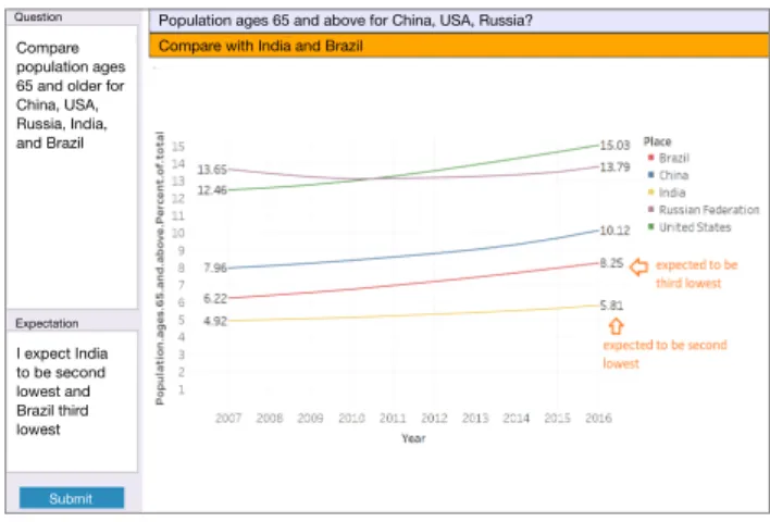
dataset and verbally report their insights. We sought to place participants in an open-ended sensemaking context to elicit realistic behaviors. We thus did not provide them with specific tasks or questions. Rather, they were instructed to analyze the provided datasets by developing their own questions. This setup is thus similar to earlier insight-based studies [31, 40, 41, 43] but with one crucial difference: our interface is initially blank and contained only two empty text boxes: ‘query’ and ‘expectation’. Participants typed their query and optionally provided an expectation in natural lan-guage. The mediator interpreted the query-expectation pair in real-time, and generated a response visualization using a combination of Tableau and R. If an expectation was pro-vided, the mediator manually annotated the visualization to superimpose the expected relationship onto the plot, while highlighting any discrepancy between the data and the ex-pectation. The result was then shown to the participant as a static visualization (see Figure 1). To help maintain partici-pants’ chain of thought, the interface allowed them to see a a history of the last five visualizations.
Compare population ages 65 and older for China, USA, Russia, India, and Brazil I expect India to be second lowest and Brazil third lowest
Compare with India and Brazil
Population ages 65 and above for China, USA, Russia? Question
Expectation
Submit
Figure 1: The experimental interface. Participants entered a query and, optionally, an expectation (left). They received a data plot with their expectation annotated to highlight the difference between and their model and the data.
Procedures
Participants analyzed two datasets over two separate ses-sions. The datasets comprised socio-economic and health in-dicators (e.g., labor force participation, poverty rate, disease incidence), depicting the variation of these attributes over geography and time. The first dataset comprised 35 health indicators for 20 major cities in the US in 2010-2015 [9]. The second dataset is a subset of the World Development In-dex with 28 socio-economic indicators for 228 countries in 2007-2016 [4]. We provided participants with a paper sheet containing a summary of each dataset and a list of attributes contained within. The list also included a brief description
of each attribute along with its unit of measurement. Addi-tionally, we provided printed world and US maps with major cities indicated to facilitate geo-referencing.
At the beginning of the study, participants were given a few minutes to simply read the attribute list and scan the maps. In pilots, we found that this step is conducive to the analysis; it seemed participants were using this time to for-mulate initial lines of inquiry and activate prior knowledge, form which they seem to derive concrete expectations. Next, the experimenter demonstrated the interface mechanics by typing two example query-expectation pairs and asking par-ticipants to try examples of their own, emphasizing that input is in free-form, natural language. Participants sat at a desk and viewed the interface through a wall-mounted 50-inch monitor. They interacted using keyboard and mouse. In addition to the mediator who sat behind and away from the participant, another experimenter was present in the room to proctor the study and answer questions. The study was video and audio recorded. Participants were also instructed to think aloud and verbalize their thoughts. Additionally, screen captures were recorded periodically.
Analysis and Segmentation
In addition to textual entries that were manually entered through the interface, we transcribed participants’ verbal utterances from the audio recordings. The combined ver-bal and typed statements were then segmented into clauses following verbal protocol analysis techniques [53]. This re-sulted in a total of 835 segments, after discarding technical questions about the interface and utterances not germane to the study. We then classified segments into one of three categories:question,expectation, andreaction. Questions are concrete inquiries about data attributes (e.g., P3: “Can I get the adult seasonal flu vaccine [rates] from 2010-2015 for all cities?”). Expectations comprised statements that are indica-tive of predicted data relationships participants expected to observe, before actually seeing the visualization (more on this in Section 5). Reactions include comments participants made after seeing the resulting visualization (e.g., P12: “Ok so it’s much higher than expected.”).
Because a single question was often followed by multi-ple verbalized expectations, our method resulted in more expectations than questions. However, we maintained a link between each expectation and its origin question to ade-quately capture the context. Hereafter, we refer to the cycle of formulating a question, providing one or more data expec-tation (optional), and receiving a visualization as a‘query’. In total, we collected 277 distinct queries and 550 expectations from 14 participants (distribution illustrated in Figure 2).
0 10 20 30 40 50 60 70 80 90 P1 P2 P3 P4 P5 P6 P7 P8 P9 P10 P11 P12 P13 P14 Queries Expectations
Figure 2: Distribution of queries and expectations across par-ticipants.
Selecting Visualization Templates
In response to queries, the mediator sought to generate fa-miliar visualizations, such as line charts, bar charts, and scat-terplots. The appropriate visualization was determined after considering the query provided by the participant and the types of attributes involved. For example, when the partici-pant used words like ‘correlation’ or ‘relationship’ between two quantitative attributes (e.g., P3: “Is there a relationship between country’s population density and total unemploy-ment rate in 2016?”), the mediator used a scatterplot. On the other hand, when the participant referenced temporal trends (e.g., “across the years” or by providing a specific time range), the mediator employed a line chart and represented the referenced attributes with one or more trend lines (e.g., P14: “School enrollment of females vs males in Pakistan vs Afghanistan over time”).
Visualizing Participants’ Expectations
The mediator employed a variety of strategies to superim-pose participants’ expectations onto the visualization, aiming to visually highlight any mismatch between data and expec-tations. We outline some of these strategies but note that the resulting designs are not necessarily optimal. Rather, the resulting visualizations reflected the mediator’s best attempt to respond in real-time and with minimal delay so as not to frustrate participants or disrupt their thought process. These constraints made it difficult to optimize the design, so in most cases the mediator opted for simplicity over optimality.
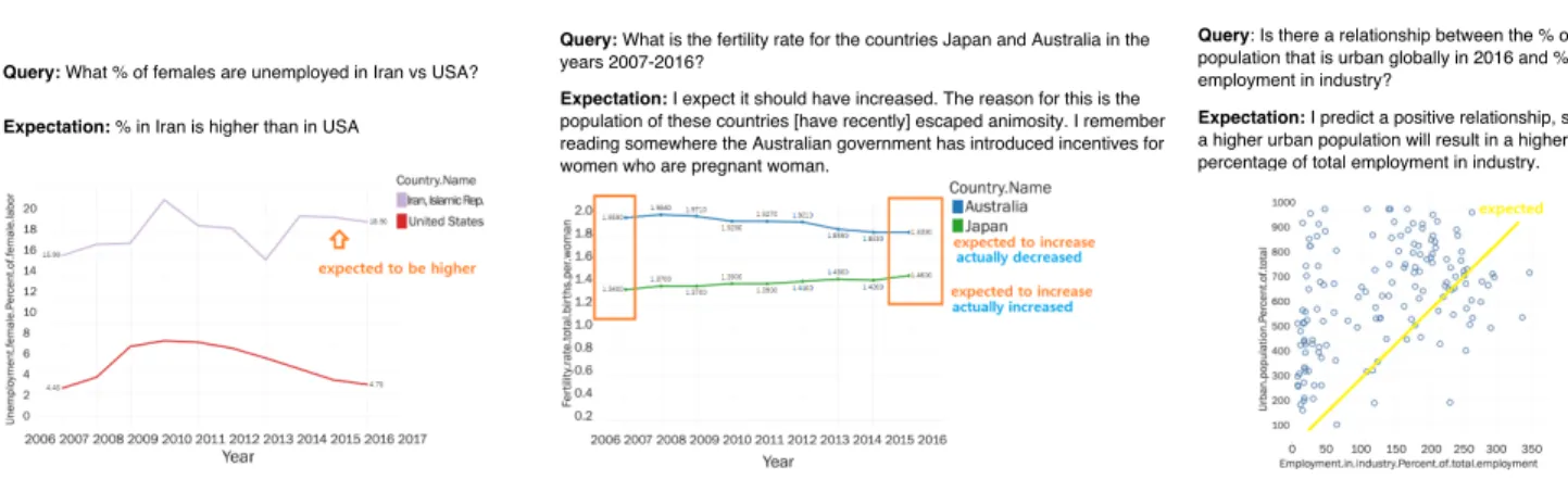
It was relatively straightforward for the mediator to su-perimpose participants’ expectation onto the visualization, when the expectation can be directly mapped to specific marks in the visualization. For instance, in a query about female unemployment in Iran vs. the US, P14 expected that the “percentage in Iran is higher”. The corresponding visu-alization comprised two trend lines depicting how unem-ployment changed in the two countries over time. Here, the mediator added an arrow pointing to Iran’s along with a text
Query: What % of females are unemployed in Iran vs USA? Expectation: % in Iran is higher than in USA
Query: What is the fertility rate for the countries Japan and Australia in the years 2007-2016?
Expectation: I expect it should have increased. The reason for this is the population of these countries [have recently] escaped animosity. I remember reading somewhere the Australian government has introduced incentives for women who are pregnant woman.
Query: Is there a relationship between the % of total population that is urban globally in 2016 and % of total employment in industry?
Expectation: I predict a positive relationship, such that a higher urban population will result in a higher percentage of total employment in industry.
Figure 3: Three example query-expectation pairs from the study and the associated response visualizations as created by the mediator in real-time.
annotation reading “expected to be higher” (see Figure 3-left). During pilots, we found that adding textual annotations improved the readability and prompted more reflection. Gen-erally, whenever the participant’s model implied inequality (e.g., between two or more geographic locations), an arrow was added to the mark(s) referenced along with a text anno-tation indicating the predicted ordering. Similarly, when the participant predicted a specific quantity, a text annotation restating the expectation (e.g., “60 expected”) was added near the corresponding mark. Such annotations, while simplis-tic, served to focus participants’ attention onto parts of the plot most relevant to their expectation, enabling them to efficiently compare their model and the data.
Expectations involving correlations and trends required some interpretation on the part of the mediator, as those often lacked information about the predicted strength of the correlation or the slope of the trend. The mediator attempted to infer the implied strength from context, and visualized such expectations as line marks overlaid onto the plot. For in-stance, Figure 3-right shows a regression line (yellow) for an expected “positive relationship” between urban population and total employment in industry. When the strength of pre-dicted trends could not be readily determined, the mediator employed text annotations and indicated whether, subjec-tively, the data had met the expectation (Figure 3-center).
4 FINDINGS — USAGE PATTERNS
We first discuss our observations on how participants ap-proached the sensemaking task, and how they interacted with the model concept-driven interface (RG 1). In Section 5, we systematically examine the types of expectations exter-nalized by participants (RG 2).
Analytic Behaviors
We observed two distinct analytic behaviors: model valida-tion and goal-driven querying.
Model Validation.The most frequent analytic behavior,
occurring in 218 queries (78.7% of total), can be classified asmodel validation; the participant sought to explicitly test his/her expectation against the dataset. When seeking to validate models, participants typically provided a query that directly probed their model along with a clear expectation to be tested. For instance, P4 asked about the relationship between alcohol abuse and chronic disease, expecting to “see a clear positive correlation.” During the study, participants were asked to indicate whether their expectations had been met after receiving the visualization: 107 model-validation queries (53.5%) resulted in data that did not fit participants’ expectations, 18 (9%) resulted in partial fit, and 75 (37.5%) were described as having a ‘good fit’.
Reaction to the visualization varied depending on whether the participant’s expectation had been met. When the visu-alization showed data in agreement with the model, the par-ticipant typically verbally indicating that their expectation had been met, often repeating their prediction so as to seem-ingly emphasize the validated model. However, when data is presented that contradicted the expectation, we observed several types of reaction.
In 22 instances (17.3% of queries resulting in unmet ex-pectations), participants formulated new hypotheses in an attempt to explain the mismatch. For example, P2 asked a question about the percentage of youth population in five U.S. cities, expecting to see a higher percentage in Wash-ington D.C. compared to Denver. This expectation was not borne out, and upon examining the graph, the participant responded with a possible explanation: “maybe because D.C. has more government offices, or people there work in gov-ernmental offices mostly, so because of that there are more old people than youth, comparatively.” Occasionally, partici-pants drew on factors external to the dataset to justify the mismatch.
In a second type of reaction, unmet expectations led a few participants to generate follow-up queries in order to explain the mismatch. For example, P7 predicted increasing unemployment in Italian industry. When his expectation did not match the visualization, a subsequent line of exploration was developed to investigate other sectors “so we are seeing that unemployment has increased in 2014 and then it went down twice, so can we see the employment in the services area?” However, this type of analysis directed at model-data discrepancy was rare, occurring in 3 queries only (2.4%).
On the other hand, some participants responded to unmet expectations by questioning the veracity of the data. This behavior was observed 14 times (in 11% of queries resulting in model-data mismatch). Here, both subjective impressions and objective anecdotes were invoked to justify the rejec-tion of the result. For example, P12 asked about the birth rate per woman in his home country of Bangladesh. When the response came back as approximately half his expec-tation (2.13 instead of 4 predicted births), the participant responded that “[he’s] unsure how they actually got this data... it really doesn’t reflect the conditions.” This type of reaction was generally pronounced when the participant had personal knowledge about the subject. As another ex-ample, P1 expressed an expectation of a correlation between rural population and agricultural employment but when the data contradicted his views he stated “this displays the oppo-site of what I expected... is this the real data?” Lastly, in the majority of cases (88 queries, or 69.3%), participants simply moved on to another query, without explicitly addressing the model-data discrepancy.
Goal-Driven Querying.We classified 52 queries (18.8%) in
which participants sought to answer well-defined questions asgoal-driven. In contrast to model validations, goal-driven queries lacked expectations despite stemming from concrete epistemological objectives. For instance, when querying lung cancer mortality in Minneapolis, P7 simply noted: “I don’t know what to expect”.
The remaining 7 queries (2.5%) comprised questions about the structure of the study, the nature of “questions that can be asked”, or about the meta data (e.g., P5: “How complete is the data available on access to electricity in 2007?”)
Sources of Expectations
To understand where participants’ data expectations come from, we analyzed verbal utterances looking for references to the origin. In queries where the source could be identified, participants drew upon two sources of information when conceptualizing expectations: their prior knowledge and in-formation gleaned from earlier visualizations seen in the study. In 19 of 26 expectations (73.1%), participants relied on their memory when formulating predictions. This included
information remembered from the media as well as personal perceptions and anecdotes. For example, when expecting a higher employment rate in Detroit compared to other major cities, P2 noted that she had “heard that there are lots of jobs in Detroit” because “lots of friends after graduating from here moved to either Texas or Detroit.” On the other hand, 7 expectations (26.9%) were formed or derived based on infor-mation uncovered through previous queries. An example of a study-informed expectation is when a participant, after ask-ing about the time needed to start a business in Bangladesh, followed up with a query requesting the same data for the US. In specifying his expectation, the participant predicted that “if it is 19.5 days [in Bangladesh] then it should be around 3 [in the US]”. Most participants used a combination of the two methods, conceptualization hypotheses from their memory and drawing upon insights they uncovered during the study, although the former was more common, on average.
5 FINDINGS — MODELS ABOUT DATA
To understand the mental models participants held and ternalized during the study, we analyzed and coded their ex-pectations. We then synthesized a typology comprising the most frequently observed models. We formally account for each model type with a set of abstract, language-independent templates. We begin by describing the coding methodology.
Coding Methodology
Two coders inductively coded participants’ expectations (n=550) using a grounded theory approach [51]. Because expectations were often incomplete on their own, the coders also considered the associated queries to resolve implicitly referenced attributes. Additionally, the coders considered the resulting visualizations, adopting the mediator’s inter-pretation to resolve any remaining ambiguities. Long sen-tences that had no interdependencies between the constitut-ing clauses were divided into multiple expectations durconstitut-ing the segmentation phase (see ‘Analysis and Segmentation’).
Throughout the coding process, the emerging themes were regularly discussed with the rest of the research team and revised iteratively, leading up to a final coding scheme. The entire expectation dataset was then recoded using the final-ized scheme. Coding reliability was measured by having the two coders redundantly code 40 expectations (approximately 8% of the dataset). Intercoder agreement was 90%, with a Co-hen’s kappa of 0.874, indicating strong agreement [34]. The scheme was organized as a two-level hierarchy; codes that represent conceptually similar expectations were grouped under ‘types’ and ‘subtypes’.
Building on the final coding scheme, we synthesized ab-stract templates representing each type and subtype of expec-tation observed. The templates capture fundamental data re-lationships entailed, but omit the exact attributes and trends.
Relationships Partial Or dering Tr ends & V alues Model Subtype
Cause and effect X causes Y (to increase | decrease) [in locations C+] [between T1-T2] Mediation X [pos | neg] affects Y , which in turn [pos | neg] affects Z [in locations C+]
Causal sequence A series of past events (E1, E2, E3, ...) caused X (to increase | decrease) [in locations C+] [between T1-T2] Correlation
Template
X [pos | neg] correlates with Y [in locations C+] [between T1-T2] Direct
comparison
Locations C1+ are (higher | lower | similar | dissimilar) compared to locations C2+ in X [between T1-T2]
X is [not] (high | low) [in locations C+] Goodness of fit
X is (higher than | lower than | similar to | different from) Y [in locations C+] [between T1-T2]
Ranking Locations (C1, C2, ...) are in (ascending | descending) order with respect to X
Location A is ranked (Nth | lowest | highest) from [a set of locations C+ | all available locations] in X
Values
Trends
[Average of] X (equals | greater than [equal] | less than [equal]) V [in locations C+] X is in the range of V1-V2 [in locations C+]
X (increases | decreases) between T1-T2 [in locations C+] X exhibits a (geometric shape) between T1-T2 [in locations C+]
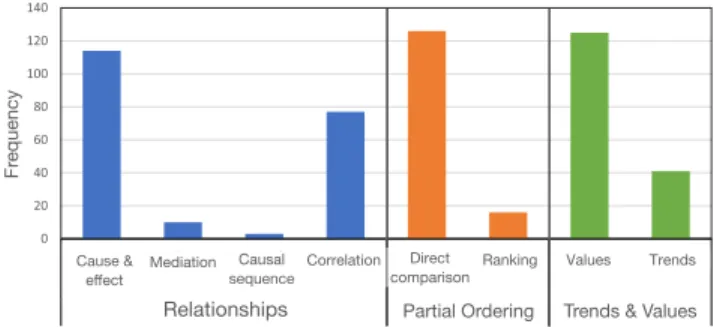
114 / 114 10 / 10 3 / 3 73 / 77 R1. R2. R3. R4. C1. C2. K1. K2. V1. V2. V3. T1. T2. 119 / 120 5 / 6 2 / 2 13 / 14 102 / 102 5 / 5 18 / 18 31 / 33 8 / 8 ID
Figure 4: A typology of data models held and externalized by participants. The three major model types (Relationships, Partial Ordering, and Trends and Values) are further divided into subtypes. We formally describe each model subtype with language-independent templates. Color-coded slots in the templates represent data attributes (purple), geographies (cyan), time periods (green), event sequences (yellow), quantitative data values and trends (blue), and other qualifiers (grey). Parameters not always specified in participants’ expectations are considered ‘optional’ and enclosed in brackets.
Instead, the templates define ‘slots’ that serve as placehold-ers for attributes, trends, values, and other qualifiplacehold-ers. Taken together, these templates constitute a typology of models par-ticipants externalized and tested against the data. Expressing an expectation can accordingly be thought of as selecting an appropriate template from the typology and ‘filling’ its slots to complete the specification.
Of the 550 expectations we recorded, 503 (91.4%) could be classified under the typology. The remainder could not be fully classified either because they were observed rarely (no more than once) and thus did not warrant inclusion as unique templates, or because, while they could be matched with a suitable template, they included additional information that could not be fully expressed by the matching template. The resulting typology is outlined in Figure 4. We observed three major model types: Relationships, Partial Ordering, and predicted Trends and Values. In the following, we discuss each model type in detail and outline its variants (hereafter referred to as subtypes). Figure 5 illustrates the number of times participants invoked the different models.
Relationships
The most frequently observed model (204 expectations, or 39.8%) entailed an expected relationship or interaction be-tween two or more attributes. We classified this model into four subtypes, based on the nature of the relationship:
Cause and Effect (R1).Participants frequently expected an
attribute to unidirectionally affect a second attribute. For ex-ample, P14 expected that “Because there are a lot of rules
Cause and effect Mediation Causal sequence Correlation Direct comparison
Ranking Values Trends
Relationship Partial Ordering Trends and Values
Fr
eque
ncy
Relationships Partial Ordering Trends & Values
Cause & effect Causal sequence Mediation Direct comparison Ranking
Correlation Values Trends
Fr
equency
Figure 5: Frequency of model occurrence in expectations. and regulations [that are] kind of not in favor of women’s rights... I assume Iran should be lesser than USA” in regards to the rate of female unemployment. This example can be rephrased to fit templateR1(see Figure 4): Rules and reg-ulations that limit women’s personal freedom[X]causes
female employment[Y]to decrease in Iran[C]. The
sec-ond clause from the above example was separately classified as a Direct Comparison between Iran and the US (more on this later).
Notably, participants frequently referenced causal factors that were outside the dataset. For instance, in the above ex-ample, there were no attributes about ‘rules limiting personal freedoms’ in our dataset. Additionally, participants occasion-ally qualified the expected cause-and-effect relationship to specific locations (e.g., ‘Iran’) or to a certain time window.
We determined a goodness of fit for each template (re-ported in Figure 4) by counting instances where expectations
could be fully expressed in the template by filling slots in the latter. All 114 expectations implying simple cause-and-effect relationships could be expressed with this template.
Mediation (R2).In addition to simple cause-and-effect
rela-tionships, participants also expected mediations; an attribute affecting another attribute indirectly through a mediator. For example, P5 stated: “I’m assuming the more [people] go to school the more educated they are, and the more life expectancy will increase for all of them.” This example can be expressed under templateR2with educational attainment
[Y]acting as a mediator between the rate of secondary
school enrollment[X]and life expectancy[Z]. Consider
a second example from P9: “I’m guessing people generally don’t really think about settling down in New York City unless you have some high income source so.” Here, cost-of-living[X]negatively affects the percentage of population
without stable income[Y], which in turn negatively affects
unemployment rate[Z]in New York City[C].
Causal Event Sequence (R3).A chain of past events is
hy-pothesized to affect an attribute. Consider an example from P6 who expected that “after the war on Iraq, for whatever reasons, and the [capture] of Saddam and installing [of a] new government... I think, around this time will come for [American forces] to leave the country and [return] auton-omy to local Iraqi government... I wanted to see how educa-tion has progressed between 2008 and 2016.” In this model, which can be expressed with templateR3, the first event is the invasion of Iraq, the second is the capture of Saddam Hussein, followed by returning control to an Iraqi govern-ment. This chain of events was expected to affect secondary school enrollment[X], an attribute in the dataset. Consider
a second example where P6 hypothesized that the fertility rate in Australia would have increased because of a govern-ment policy: “I remember reading somewhere the Australian government has introduced incentives for women who are pregnant woman... So I just wanted to know how the thing has fared.” Causal event sequences were rare, occurring only in 3 expectations, all of which fit the template.
Correlation (R4).A decidedly weaker relationship than
cause-and-effect. Generally, participants indicated whether they expected a “positive” or “negative” correlation, without implying causality. For example, P3 “[predicted] a positive relationship” between opioid-related mortality and poverty. In a few cases, participants did not concretely specify the di-rection of the correlation, simply stating that there would be one (e.g., P5: “I’m assuming there is a correlation”). However, based on their reaction to the visualization, the expected correlation was almost always conceived as positive. Simi-larly, participants rarely specified the strength of an expected relationship; only a handful of participants used the words
“strong”, “significant”, or “linear” to describe a correlation. In a few instances, the expected correlation was qualified to a specific location or a time window (e.g., P3: “I predict a positive correlation [between country population density and total unemployment rate] in 2016”). This template ex-presses 73 of 77 expected correlations, with the exceptions of utterances implying loose relationships that could not clearly identified as causal or correlative.
Partial Ordering
This model defines a partial order or ranking for a set of data items under a specific criterion. Often, the referenced data items denote cities, countries, or clusters of geographical locations with similar characteristics (e.g., “big cities”). The model, observed in 142 expectations (27.7%), can be divided into two subtypes: Direct Comparison and Ranking.
Direct Comparison (C1, C2).Participants frequently drew
direct comparison between two sets of items, expecting one set to exhibit higher or lower values with respect to a specific attribute. For instance, P9 expected “[preschool enrollment] to be higher in Boston as opposed to in Cleveland.” The magnitude of the difference was often unspecified.
Most direct comparisons were limited to two specific data items (e.g., ‘Boston’ and ‘Cleveland’), but in a few cases mul-tiple items were collectively compared to a second set of item (e.g., P14: “I think Spanish speaking population is more on the west coast compared to east coast”). As this example suggests, it was often unclear whether the inequality was expected to held over the averages of the two sets (‘east’ and ‘west’ coast cities), or whether a direct pairwise compari-son between items in the two sets was implied. Barring the ambiguity, this type of expectation can be expressed with templateC2.
Ranking (K1, K2).In addition to making direct
compar-isons, participants also ranked a set of items (usually ge-ographic locations) with respect to a specific attribute. For instance, P1 expected “LA to be the highest [in excessive housing cost burden] followed by Boston, Denver, Portland and Houston.” Such models were observed only a handful of times in our study.
In a more common subtype of this model (templateK2), participants predicted the rank of a specific location relative to the rest of the dataset. For instance, P8 expected “India will be second lowest [with respect to population aged 65 and above].” Participants also predicted the locations ranking highest or lowest in regards to an attribute (e.g., P8: “Maybe, [for unemployment rate of females], China [is] lowest, and Saudi Arabia [is] highest”). In rare cases, participants in-voked a multi-attribute ranking criterion. For instance, when
asking “Which city has the lowest combination of teen smok-ing, unemployment, and children’s blood lead levels”, the participant expected “San Jose or Washington DC”. How-ever, this happened rarely, and thus not accounted for in our typology.
Trends and Values
This model, observed 166 times (32.4%), entails expectation of encountering specific values or trends within the data. Participants typically invoked a single attribute and speci-fied explicit quantitative expectations on how that attribute manifests at specific geographies, or in certain time periods. We observed two subtypes: Values and Trends.
Values (V1–V3).Expectations containing specific
quantita-tive values for an attribute were very common. For instance, P10 expected that “in developed countries, college enroll-ment rate will be a little higher than 25 percent”, which can be expressed with templateV1. In some instances, partici-pants explicitly referred to the ‘average’ expected value in different locations, or over the entire dataset. We also ob-served participants expecting a range of values, rather than a single concrete quantity (e.g., P9: “I expect it to be around 85-90%”). Lastly, in 18 value-based expectations, participants predicted an attribute to be simply ‘high’ or ‘low’, without elaborating (e.g., P12: “I think the number is very low.”)
Trends (T1, T2).Hypothesized trends were typically
con-ceptualized as increasing or decreasing values over time for a single attribute. For instance, P4 predicted “the number [of unemployed females] in China will be decreasing”. In some cases, participants provided a more concrete geometric de-scription of the predicted trend, a model that can be loosely captured with templateT2. For example, P2 predicted that “[in] Miami, [one] might see some peaks [in opioid-linked mortality rate] during especially the seasonal times”). With the exception of two instances, all 166 expectations involving concrete values and trends fit one of the above templates.
6 DISCUSSION & DESIGN IMPLICATIONS
Our study sheds light on how people might adopt hypothesis-and model-guided reasoning in visual analytics. We reflect on the main findings and, where appropriate, consider the design implications (highlighted with a⋆).
Sensemaking with a Concept-Driven Interface
Given the opportunity, we found that a majority of partici-pants engaged in model validation, by explicitly outlining their expectations when submitting a query. Overall, 78.7% of queries were accompanied with concrete predictions about the data (recall that participants had the option of not pro-viding expectations and issue questions only). However, it
was difficult to gauge whether an externalized expectation was primarily intended to validate a model, or whether it simply reflected a participant’s best guess in what could be an information gathering task.
Interestingly, a majority of expectations (73.1%) whose source is indicated were conceptualized or recalled from memory; a smaller portion could be directly attributed to information seen in an earlier visualization. This latter point suggests that participants’ strategy, to a large extent, com-prised exploration of a ‘hypothesis space’ [25]. In other words, participants did not seem to adopt a purely data-driven approach, in which the analyst ‘explores’ the informa-tion space and develops insights from data. Rather, it seems that the interface helped scaffold hypothesis-based inquiry, driven primarily by conceptual models participants held, developed, and tested throughout the experiment.
⋆Design Implication: Our findings suggest that letting users optionally externalize their models in visualization tools, and use those models to drive the generation of data plots would provide a viable visual analysis workflow. Fur-thermore, findings suggest that, in the majority of queries, users would leverage such affordances by activating their mental models as entry points to the analysis. That said, it is unclear whether a concept-driven analysis style would be beneficial to discovery. Being exploratory in nature, our study did not assess participants’ ability to discover new knowledge. This issue could be investigated in a future con-trolled study comparing the different analysis styles (ex-ploratory vs. concept-driven, or a mixture thereof).
Interacting with Visualized Expectations
Eliciting and visualizing one’s data expectations is shown to statistically improve data recall [23, 24]. However, it is unclear how individuals respond to such visualizations. Our study contributes qualitative insights on how people react to seeing their expectations alongside the data.
When a participant’s expectation fit the data, the reaction was brief and typically included a verbal response emphasiz-ing that the expectation was borne out. Unmet expectations, however, evoked a variety of responses. Some participants attempted to justify the mismatch by invoking explanations or factors external to the dataset. On the other hand, a tiny minority of participants reacted to unmet expectations by de-veloping additional lines of inquiry in an attempt to explain the mismatch. This response is reminiscent of behaviors in Dunbar’s experiment, in which motivated subjects were able to make a conceptual leap in their understanding by delib-erately digging into unexpected results [11]. Similarly, very few participants in our study persisted, attempting to inves-tigate reasons behind the discrepancy between their models and the data. It is unclear, though, whether this behavior
resulted from intrinsic goal-setting on behalf of the partici-pant, or whether it was partially prompted by reflecting on the visualized expectation.
Another type of response to unmet expectation is charac-terized by distrust; questioning the veracity of the data or the visualization. Participants exhibited this behavior when they had personal knowledge about the topic (e.g., when looking at economic data about their country of origin). On one hand, such reaction could reflect a healthy skepticism when encountering what might seen as implausible data. On the other hand, it may reflect a difficulty in changing one’s model, when the latter is derived from deeply-held beliefs or personal impressions. Lastly, in the majority of un-met queries (69.3%), participants simply moved on without attempting to reconcile or explain the mismatch.
⋆Design Implication:It seems plausible to suggest that simply visualizing the gap between one’s mental model and the data is enough to prompt reflection and, by extension, improve understanding [23]. Nevertheless, the low rate of follow-up onto unmet expectations (2.4%) indicates a need for carefully thought out designs and interactions that mo-tivate users to dig into model-data discrepancy, when the latter arises. Similarly, our findings suggest that users may still ignore flawed models and continue to have ‘persistent impressions’ in the face of discrediting evidence [56]. This in turn suggests a need for persistent visual highlighting of model-data inconsistencies that people cannot easily ignore.
Thinking about Data
Our model typology suggests that participants thought about the data with varying levels of generality. At one end of the spectrum, Relationship models suggest generalizable pro-cesses thought to cause an interaction between two or more attributes. Such models were validated by finding an exem-plifying data item (often one that registers extremely), and testing whether its attributes are consistent the projection. For instance, the participant who hypothesized a negatively causal relationship between cost-of-living and unemploy-ment opted to select New York City as a test bed (and where living costs are unusually high).
Similarly, expectations involving trends hinted at concep-tualized phenomena that unfold over time, which in turn was thought to impact an observable attribute. However, trend-inducing processes were usually not stated concretely as part of the expectation. For instance, comments from the participant who predicted a trend of “decreasing female un-employment” in China implied a process where by more females are entering the workforce due to a combination of government policies and a shifting socio-economic land-scape. However, unlike Relationships, an explanatory model was often not specified.
At the other end of the spectrum, Partial Orderings and Value-based models were less systematic in nature; these models often reflected personal observations and anecdotal facts remembered by participants. For instance, Direct Com-parisons often invoked expectations about geographies with which a participant had some familiarity.
From Conceptual Models to Data Features
An important part in validating conceptual models is connect-ing them to concrete data measures. While participants were generally able to articulate models and derive meaningful expectations, they often did not establish clear correspon-dence between their models and the relevant data features in the dataset at hand. For instance, one participant expected a “correlation between children’s blood lead levels and all types of cancer mortality”. Although the first factor could be immediately resolved to a unique attribute, the dataset had several attributes related to cancer incidence. Participants often did not identify which attributes they intended to refer to, or whether the expected relationship is projected to hold over an aggregate (e.g., average incidence across all cancer types). Consequently, many of the models had ambiguities that were left for interpretation by the mediator.
We also observed participants referring loosely to data features, even when the corresponding attribute could be resolved unmistakably. This often presented as ambiguity in the level of granularity at which attributes are being ‘ac-cessed’. Consider the following expectation: “College enroll-ment rate will be a little higher than 25 percent.” Bearing in mind that this attribute is time-varying, is the partici-pant referring to the average value across the time series? Or is the model expected to hold individually in each year? Consider another example where a participant wanted to look at the prevalence of adult smoking in Philadelphia and Indianapolis, expecting the former to have a higher rate. Al-though the prevalence of smoking was available over several years (2010-2015), the participant did not specify whether the predicted relationship was expected to hold consistently over time, over an average of all years, or in the most recent year. Naturally, the mediator responded with a line chart containing two trend lines for each city. Nevertheless, the ambiguity made it difficult for the mediator to properly an-notate the expectation onto the visualization; should she call out every year where the inequality was violated? Or would the participant tolerate a few inversions, as long as the slope of trend lines is consistent with the expectation? This sort of ambiguity might suggest a cognitive difficulty in connecting one’s conceptual model to concrete data features.
⋆Design Implication:It is possible to resolve some model ambiguities at the interface (e.g., via a selection menu show-ing attribute suggestions for ambiguous concepts [15]). More generally, it seems desirable to allow users to partially and
iteratively specify their model with feedback from the inter-face. However, if iterative model specification is enabled, the issue of multiple comparisons should be considered carefully; as multiple similar models are tested iteratively, the analyst runs a higher risk of making false discoveries [38, 58]. Tools should therefore track the number of model revisions or the number of data ‘peeks’, thereby allowing analysts to make reasonable model adjustments while calling out the potential for false discovery and overfitting.
External References and Mental Model Gaps
Participants routinely invoked factors that were external to the data in their models. For instance, one participant ex-pected women’s workforce participation to be negatively affected by laws that limit personal freedom. The latter mea-sure was not present in the provided dataset, and thus could not be visualized. References to external factors were partic-ularly common in expectations involving causality. This is not surprising, as causal reasoning often entails considera-tions that are not directly accessible to the analyst. However, the need to invoke external factors may present a design bottleneck for enabling a truly concept-driven sensemaking experience. If the user is not allowed to ‘see’ model-related attributes that are outside the immediate data at hand, many models could potentially go unvalidated or under-explored. That, in turn, can be frustrating to users or, at the very least, disruptive to their thought process; some of our participants quickly abandoned what could have been fruitful lines of inquiry upon encountering unavailable data.
⋆Design Implication:A potential mitigating solution is to incorporate a ‘data discovery’ mechanism in sensemaking tools, allowing automatic search and importation of external data as needed. Such feature could help in validating models that invoke concepts external to the immediate data at hand.
In addition to referencing external factors, participants occasionally invoked references to non-specific quantities in their expectations. As templateV3suggests (see Figure 4), participants expected that certain attributes will be simply “high” or “low”. This can be taken to mean one of two things: the participant is expecting the attribute (often at certain geographies) to be higher or lower than average, or, alterna-tively, the participant had an idiosyncratic, possibly uncer-tain quantity in mind to compare against, but neglected to specify it concretely. We also observed ambiguous references to geographies. For instance, some participants referred to “developing countries” and “big cities”.
⋆Design Implication:In addition to interface elements that prompt users to manually resolve ambiguities in their model, certain references (e.g., to “big cities”) could be resolved algo-rithmically by consulting appropriate ontologies. That said, we still do not fully understand the reasons behind the ambi-guities in participants’ model specifications. Although some
omissions could be attributed to users being parsimonious in their specification, we suspect uncertainty in people’s mental models to play a role in incomplete specifications. The latter presents a more difficult issue to address. Additional research is needed to understand the gaps and ambiguities in people’s data expectations, and to devise strategies to resolve them.
7 LIMITATIONS & FUTURE WORK
Our study has several limitations that should be contextual-ized when interpreting its findings. First, although partici-pants had experience in using a variety of data analysis tools, they did not have specialized knowledge in the datasets posed by the study. This may have impacted their ability to artic-ulate expectations. In contrast, a domain expert will likely poses more sophisticated mental models, which may not be reflected in the current typology. Moreover, it is possible that the models we observed would be different, had we used different datasets. Replicating our study with domain experts examining their own data could provide richer insight into the kinds of models users may seek to externalize.
During the study, we observed a relatively large number of model validations (over three quarters of total queries). This suggests that concept-driven affordances would be fre-quently utilized, if introduced into tools. However, our study design could have inflated this number, given that partic-ipants were encouraged to both type and verbalize their expectations. The think-aloud setup enabled us to increase the fidelity of the analysis, by including models participants did not have the bandwidth to formally enter through the interface. That said, it is possible that actual users would be more deliberate when externalizing models and, hence, utilize model-testing affordances less frequently compared to our participants.
A third limitation stems from the type of visualizations used in the study. We opted for minimalistic, static visualiza-tions so as not to bias participants to behave or interact in a certain way. However, compared to interactive representa-tions, static plots offer limited potential for exploration. This might have impacted participants’ ability to inquire further, especially when results contradicted their models.
Lastly, in analyzing the models expressed by participants, we abstracted away the subtleties of natural language, focus-ing instead on characterizfocus-ing the conceptual relationships en-tailed. We also did not attempt to infer implied relationships, beyond what is being directly uttered or typed. Therefore, our model typology represents the results of a first-order, ‘low-level’ analysis. Nevertheless, we believe the typology represents a significant first step towards understanding the full complexity of models people draw upon when making sense of data. The typology will also guide our future work, as we seek to develop algorithmic techniques for parsing users’ expectations and encoding them in visualizations.
8 CONCLUSIONS
We conducted an exploratory study to investigate how peo-ple might interact with a concept-driven visualization inter-face. Participants analyzed two datasets, asking questions in natural language and, optionally, providing their expec-tations. In return, they received customized data plots that visually depicted the fit of their mental models to the data. We found that, in the majority of queries, participants lever-aged the opportunity to test their knowledge by outlining concrete data expectations. However, they rarely engaged in follow-up analyses to explore places where models and data disagreed. Via inductive analysis of the expectations observed, we contributed a first typology of commonly held data models. The typology provides a future basis for tools that respond to users’ models and data expectations. Our findings also have implications for redesigning visual analyt-ics tools to support hypothesis- and model-based reasoning, in addition to their traditional role in exploratory analysis.
ACKNOWLEDGMENTS
We thank the anonymous reviewers for their thorough and constructive feedback, which greatly improved the paper. This paper is based upon work supported by the National Science Foundation under award 1755611.
REFERENCES
[1] Gregor Aisch, Amanda Cox, and Kevin Quealy. 2008. You Draw It: How Family Income Predicts Children’s College Chances. http://nyti. ms/1ezbuWY. (2008). [Online; accessed 25-August-2018].
[2] Robert Amar, James Eagan, and John Stasko. 2005. Low-level compo-nents of analytic activity in information visualization. InInformation Visualization, 2005. INFOVIS 2005. IEEE Symposium on. IEEE, 111–117.
[3] Jillian Aurisano, Abhinav Kumar, Alberto Gonzales, Khairi Reda, Jason Leigh, Barbara Di Eugenio, and Andrew Johnson. 2015. “Show me data”: Observational study of a conversational interface in visual data exploration. InIEEE VIS posters.
[4] World Bank. 2018. World Development Index. https://data.worldbank. org/indicator. (2018). [Online; accessed 25-August-2018].
[5] Matthew Brehmer and Tamara Munzner. 2013. A multi-level typology of abstract visualization tasks.IEEE Transactions on Visualization and Computer Graphics19, 12 (2013), 2376–2385.
[6] Stuart Card, Jock Mackinlay, and Ben Shneiderman. 1999.Readings in information visualization: using vision to think. Morgan Kaufmann.
[7] Remco Chang, Caroline Ziemkiewicz, Tera Marie Green, and William Ribarsky. 2009. Defining insight for visual analytics.IEEE Computer Graphics and Applications29, 2 (2009), 14–17.
[8] Wei Chen. 2009. Understanding mental states in natural language. In
Proceedings of the Eighth International Conference on Computational Semantics. Association for Computational Linguistics, 61–72.
[9] Big Cities Health Coalition. 2018. Health Inventory Data. http://www. bigcitieshealth.org. (2018). [Online; accessed 25-August-2018]. [10] Kedar Dhamdhere, Kevin S McCurley, Ralfi Nahmias, Mukund
Sun-dararajan, and Qiqi Yan. 2017. Analyza: Exploring data with conversa-tion. InProceedings of the 22nd International Conference on Intelligent User Interfaces. ACM, 493–504.
[11] Kevin Dunbar. 1993. Concept discovery in a scientific domain. Cogni-tive Science17, 3 (1993), 397–434.
[12] Kevin Dunbar. 1997. How scientists think: On-line creativity and conceptual change in science.Creative thought: An investigation of conceptual structures and processes4 (1997).
[13] Kevin Dunbar. 2001. What scientific thinking reveals about the na-ture of cognition.Designing for science: Implications from everyday, classroom, and professional settings(2001), 115–140.
[14] Alex Endert, Patrick Fiaux, and Chris North. 2012. Semantic interaction for sensemaking: inferring analytical reasoning for model steering.
IEEE TVCG18, 12 (2012), 2879–2888.
[15] Tong Gao, Mira Dontcheva, Eytan Adar, Zhicheng Liu, and Karrie G Karahalios. 2015. Datatone: Managing ambiguity in natural language interfaces for data visualization. InProc. ACM UIST’15. ACM, 489–500.
[16] Michael S Glass and Martha W Evens. 2008. Extracting information from natural language input to an intelligent tutoring system. Far Eastern Journal of Experimental and Theoretical Artificial Intelligence1,
2 (2008).
[17] David Gotz and Michelle X Zhou. 2009. Characterizing users’ visual analytic activity for insight provenance.Information Visualization8, 1
(2009), 42–55.
[18] David Gotz, Michelle X Zhou, and Vikram Aggarwal. 2006. Interactive visual synthesis of analytic knowledge. InVisual Analytics Science And Technology, 2006 IEEE Symposium On. IEEE, 51–58.
[19] Lars Grammel, Melanie Tory, and Margaret-Anne Storey. 2010. How information visualization novices construct visualizations.IEEE Trans-actions on Visualization and Computer Graphics16, 6 (2010), 943–952.
[20] Jeffrey Heer and Ben Shneiderman. 2012. Interactive dynamics for visual analysis.Queue10, 2 (2012), 30.
[21] Daniel Keim, Gennady Andrienko, Jean-Daniel Fekete, Carsten Görg, Jörn Kohlhammer, and Guy Melançon. 2008. Visual analytics: Defini-tion, process, and challenges. InInformation visualization. Springer,
154–175.
[22] Steve Kelling, Wesley M Hochachka, Daniel Fink, Mirek Riedewald, Rich Caruana, Grant Ballard, and Giles Hooker. 2009. Data-intensive science: a new paradigm for biodiversity studies. BioScience59, 7
(2009), 613–620.
[23] Yea-Seul Kim, Katharina Reinecke, and Jessica Hullman. 2017. Ex-plaining the gap: Visualizing one’s predictions improves recall and comprehension of data. InProc CHI’17. ACM, 1375–1386.
[24] Yea-Seul Kim, Katharina Reinecke, and Jessica Hullman. 2018. Data Through Others’ Eyes: The Impact of Visualizing Others’ Expectations on Visualization Interpretation.IEEE Transactions on Visualization & Computer Graphics1 (2018), 1–1.
[25] David Klahr and Kevin Dunbar. 1988. Dual space search during scien-tific reasoning.Cognitive science12, 1 (1988), 1–48.
[26] Gary Klein, Brian Moon, and Robert R Hoffman. 2006. Making sense of sensemaking 1: Alternative perspectives.IEEE intelligent systems4
(2006), 70–73.
[27] Gary Klein, Brian Moon, and Robert R Hoffman. 2006. Making sense of sensemaking 2: A macrocognitive model.IEEE Intelligent systems
21, 5 (2006), 88–92.
[28] Gary Klein, Jennifer K Phillips, Erica L Rall, and Deborah A Peluso. 2007. A data-frame theory of sensemaking. InExpertise out of context: Proceedings of the sixth international conference on naturalistic decision making. New York, NY, USA: Lawrence Erlbaum, 113–155.
[29] Christian Lebiere, Peter Pirolli, Robert Thomson, Jaehyon Paik, Matthew Rutledge-Taylor, James Staszewski, and John R Anderson. 2013. A functional model of sensemaking in a neurocognitive ar-chitecture.Computational intelligence and neuroscience2013 (2013),
5.
[30] Mihai Lintean, Vasile Rus, and Roger Azevedo. 2012. Automatic detec-tion of student mental models based on natural language student input