Plotting experimental data usingpgfplots Joseph Wright
Abstract
Creating plots in TEX is made easy by thepgfplots package, but getting the best presentation of ex-perimental results still requires some thought. In this article, the basics ofpgfplotsare reviewed before looking at how to adjust the standard settings to give both good looking and scientifically precise plots. 1 Introduction
Presenting experimental data clearly and consist-ently is a crucial part of publishing scientific results. A key part of this is the careful preparation of plots, graphs and so forth. Good quality plots often make results clearer and more accessible than large tables of numbers. A number of tools specialise in produ-cing plots for scientific users, both commercial (such asOrigin andSigmaPlot) and open source (for exampleQtiPlotandSciDAVis). The output of these programs is impressive, but TEX users may find that it lacks the ‘polish’ that TEX can provide. There are a few approaches to producing plots directly within a TEX document, but perhaps the easi-est method to use thepgfplotspackage (Feuersänger, 2010). This is an extension of the very popularpgf graphics system (Tantau, 2008), which as many read-ers will know works equally well with the traditional DVI-based work flow and the increasingly popular direct production ofPDFoutput. pgfplotsalso works with plain TEX, LATEX and ConTEXt, meaning that it is an accessible route for almost all TEX users.
As with any tool, getting the best results with pgfplotsdoes require a bit of understanding. In this article, I’m going to look at getting good results for plots of experimental data. This includes things like worrying about units and how to get the graphics out of TEX for publishers who require it.
In the examples, I am going to use real experi-mental data from the research group I work in,1 and explain how I’ve presented this for publication. The aim is to showpgfplots in use ‘in the wild’, rather than the usual approach of somewhat contrived sets of data. The examples do not aim to be a com-plete survey of the power of pgfplots: its manual is excellent and covers all of the options in detail. 2 The basics
There are some basics that need to be in place before plots can be created. First, the code for pgfplots
1My supervisor is Professor Christopher Pickett: http://www.uea.ac.uk/che/pickettc 0 0.2 0.4 0.6 0.8 1 0 0.2 0.4 0.6 0.8 1
Figure 1: An empty set of axes
needs to be loaded. This is designed to work equally well with TEX, LATEX and ConTEXt, and of course the loading mechanism depends on the format:
\input pgfplots.tex % Plain TeX
\usepackage{pgfplots} % LaTeX
\usemodule[pgfplots] % ConTeXt
Plots are created inside an ‘axis’ environment,
which itself needs to be inside thepgf environment ‘tikzpicture’. The differences between the three
formats again mean that there are again some vari-ations. So, for plain TEX:
\tikzpicture \axis
% Plot code \endaxis \endtikzpicture while for LATEX: \begin{tikzpicture}
\begin{axis} % Plot code \end{axis} \end{tikzpicture} and for ConTEXt: \starttikzpicture
\startaxis % Plot code \stopaxis \stoptikzpicture
In the examples in this article I’ll leave out the wrap-per and concentrate just on the plot code, which is the same for all three formats.
If the wrapper is given with no content at all thenpgfplotswill fill in some standard values. This gives an empty plot (Figure 1). To actually have something appear, data has to be added to the axes. This is done using one or more\addplotinstructions,
which have a flexible syntax which can be applied to a wide range of cases.
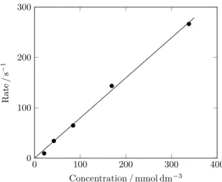
Table 1: Rates of a chemical reaction [Data taken from Jablonskyt˙e, Wright, and C. J. Pickett (2010)].
Concentration Rate / mmol dm−3 / s−1 338.1 266.45 169.1 143.43 84.5 64.80 42.3 34.19 21.1 9.47
Before starting to produce some real plots, there is one minor thing to set up. The most recent version of pgfplots(1.3) makes a number of improvements to the standard settings for the package, but only if told to. For new plots, it makes sense to use these improved abilities using
\pgfplotsset{compat = newest}
in the source. In this article, I’ve included this line in the preamble for the source (which is in LATEX). 3 Small data sets
Small sets of data, for example values calculated by hand, can be plotted by including the data directly in the TEX source. As an example set of data, I am going to use the rate of a chemical reaction, recently reported by the research group I work in (Table 1). As shown, the rate of a chemical reaction depends on the concentration of one of the ‘ingredients’, which as a table is suggestive but not really immediately accessible.
This can be plotted rapidly using the\addplot
macro along with the coordinateskeyword, with
the input reading \addplot coordinates { ( 338.1, 266.45 ) ( 169.1, 143.43 ) ( 84.5, 64.80 ) ( 42.3, 34.19 ) ( 21.1, 9.47 ) };
(placed inside the axis environment, as explained
above). This shows a number of features of the pgfplotsinput syntax. First, after the primary macro (\addplot) a keyword is used to direct the behaviour
of the code. Second, there is no need to worry about white space, which makes it easier to read the in-put. Third, as with otherpgf commands, the entire
\addplotinput is terminated by a semi-colon. This
will allow multiple plots to use the same axes, as will be demonstrated later.
Using the input above also reveals why it is necessary to think about plots, even with a powerful
0 100 200 300
0 100 200
Figure 2: A raw plot based on the data in Table 1. system like pgfplots. Using the simple input I’ve given results in Figure 2. There are a number of issues with this initial plot. Most obviously, the data points should not be plotted in a ‘join the dots’ fashion. Much better would be independent points along with a best fit line showing the trend. The plot is also in colour, which for a simple plot like this one is not really necessary. Publishers prefer black and white unless colour is adding real information.
As with other parts of thepgf system,pgfkeys uses key–value arguments to alter settings. Here, the options apply to a particular plot, and so are given as an optional argument to the \addplotmacro in
square brackets (irrespective of the format in use). So the appearance of the plot can be altered by adding an optional argument and suitable settings to the
\addplotmacro.
\addplot[ color = black,
fill = black,
mark = *, % A filled circle
only marks ]
These keys all have self-explanatory names: the pgfplots manual of course gives full details. It is possible to use ‘black’ for the combination of color = blackandfill = black; here, I will stick to the
longer version including the key names, as it makes the meaning a little clearer.
Adding a best fit line means a second\addplot
is needed. TEX is not the best way to do general mathematics, and so the fitting was done using a spreadsheet application. The easiest way to add a line is to specify the two ends and show only the line: \addplot[
color = black,
mark = none
0 100 200 300 0
100 200 300
Figure 3: Second version of a plot based on the data in Table 1.
coordinates {
( 0, 0 )
( 350, 279 ) };
Making these first set of changes gives Figure 3, which already looks more professional.
There is still more to think about before the plot is finished. The axes do not start from 0, but instead from a bit below zero: hardly very clear, and certainly not needed here. Much more importantly, the axes are not labelled and there are no units. These are both problems about the entire plot, not just one data set. So in this case the optional ar-gument to the axis environment comes into play.
This follows the start of the environment in square brackets (recall that the start of the environment is format-dependent, as shown above). Once again the various option names are pretty self-explanatory: [ xlabel = Concentration\,/\,mmol\,dm$^{-3}$, xmax = 400, xmin = 0, ylabel = Rate\,/\,s$^{-1}$, ymax = 300, ymin = 0 ]
The result of these adjustments is Figure 4. The contents of theaxisenvironment is now:
[ xlabel = Concentration\,/\,mmol\,dm$^{-3}$, xmax = 400, xmin = 0, ylabel = Rate\,/\,s$^{-1}$, ymax = 300, ymin = 0 ] 0 100 200 300 400 0 100 200 300 Concentration / mmol dm−3 Rate /s − 1
Figure 4: Final version of a plot based on the data in Table 1. \addplot[ color = black, fill = black, mark = *, only marks ] coordinates { ( 338.1, 266.45 ) ( 169.1, 143.43 ) ( 84.5, 64.80 ) ( 42.3, 34.19 ) ( 21.1, 9.47 ) }; \addplot[ color = black, mark = none ] coordinates { ( 0, 0 ) ( 350, 279 ) };
The plot now looks good, but there are a few other points to note before moving on to more com-plex challenges. In a real publication, the caption of the figure should give any necessary experimental details about the data presented. Also notice that both axes of the plot are in simple whole numbers. For this plot (and Table 1), the original concentra-tions were in mol dm−3, and were multiplied by 1000 to make them whole numbers. Usually this approach makes the final result much easier to read (even if it requires more effort initially). pgfplotscan do simple mathematics, but I tend to favour doing the calcula-tions first in an external tool and stick to using TEX for its strength: typesetting.
The ideas used for the preceding plot can readily be applied to presenting several sets of data on the same axes. pgfplotsallows the user to pick a number
of markers to differentiate the plots, and to include legends and so forth. However, it rapidly becomes unwieldy to have the raw data in the TEX source when there are a number of curves to plot. Luckily, pgfplots has an alternative \addplot syntax that
help out.
4 Large sets of data
As the number of data points to plot grows, adding the information directly to the source rapidly be-comes laborious and error-prone. Almost always, the data will be available in a structured format, and so reading an external file becomes a much more effi-cient way to proceed. pgfplotscan read data tables from, for example, tab-separated text files, which can conveniently be written by standard data handling software. There are two approaches to reading such data: loading the entire table into a macro which can then be used for plotting, or reading the data as part of the\addplotline. The most appropriate
method depends on the context: both methods will be illustrated here.
4.1 One set of axes, several plots
When several related sets of data need to be presen-ted on one set of axes, it rapidly becomes easier to use external data files even if each plot has only a small number of points.
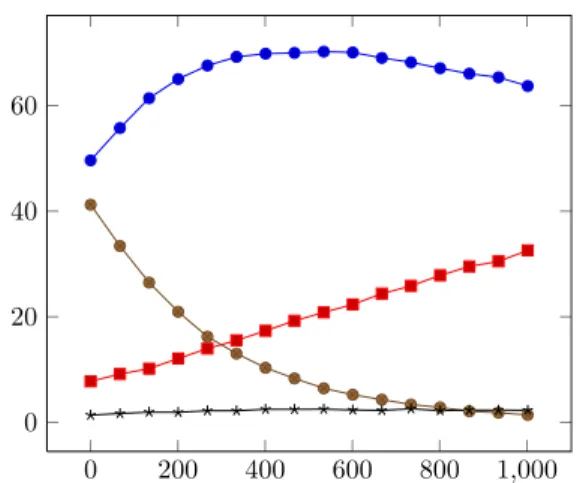
Here, I will illustrate the methods using the change in amount of four chemicals over time. The data here are available as a single text file, and there are not too many time points. It therefore makes most sense to load all of the data into a macro, and to use it to create each plot in turn. With the numbers saved in a file calleddata-set-two.txt, the reading
instruction is
\pgfplotstableread{data-set-two.txt} \datatable
Here, the name of the storage macro (\datatable) is
arbitrary: in a complex document it would probably be more descriptive.
In the table here each column has a header for ease of reference, with the first few rows reading
Time a b c d 0 49 7 41 1.3 67 55 9 33 1.6 134 61 10 26 1.9 200 65 12 20 1.9 ...
The columns can be referred to either by their header name (‘y = hheader namei’) or by their position in the table (‘y index = hheader indexi’), with column ‘a’ here being they column with index 1, ‘b’ with
index 2, and so on. It’s also possible to include
0 200 400 600 800 1,000
0 20 40 60
Figure 5: Raw plot using a pre-loaded data table. comment lines in the data file, which can be used for things like the units or reference numbers for the raw data.
The plot can then be created using the ‘table’
keyword after the\addplotmacro:
\addplot table[y = a] from \datatable ; \addplot table[y = b] from \datatable ; \addplot table[y = c] from \datatable ; \addplot table[y = d] from \datatable ;
Here, the second keyword ‘from’ indicates that a
macro will be used to supply the data to plot. With no formatting changes the result is Figure 5. As with the first data set, it is better not to ‘join the dots’. As this applies to the entire plot,only marks
can be given in the optional argument to the start of theaxisenvironment, rather than repeating the
same instruction for each\addplot macro. There
also needs to be a legend to tell the reader which curve is which. Using the\addlegendentrymacro
after each\addplot line will automatically gather
the necessary information (symbol type and colour), and will result in a legend being added to the plot: \addplot table[y = a] from \datatable ;
\addlegendentry{Compound \textbf{a}} ;
\addplot table[y = b] from \datatable ;
\addlegendentry{Compound \textbf{b}} ;
...
The ideas about labelling axes and setting an appro-priate scale which were necessary for the first plot also apply here. Making these adjustments leads to Figure 6.
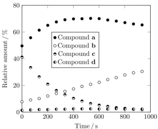
Once again, colour is not really necessary here if care is taken with the rest of the plot. The visual difference between the different markers should be enough to show which curve is which. When pre-paring the real diagram for publication, my super-visor asked for all of the symbols to be circles, filled
0 200 400 600 800 1,000 0 20 40 60 80 Time / s Relativ e amoun t/ % Compounda Compoundb Compoundc Compoundd
Figure 6: Second version of a plot from a pre-loaded data table.
in different ways. That needed a bit of help from
comp.text.texto get half-filled circles, which can
be achieved by creating a special marker using some lower levelpgf code:
\pgfdeclareplotmark{halfcircle}{% \begin{pgfscope} \pgfsetfillcolor{white}% \pgfpathcircle{\pgfpoint{0pt}{0pt}} {\pgfplotmarksize} \pgfusepathqfillstroke \end{pgfscope}% \pgfpathmoveto {\pgfpoint{\pgfplotmarksize}{0pt}} \pgfpatharc{0}{180}{\pgfplotmarksize} \pgfpathclose \pgfusepathqfill }
(don’t worry too much about this; for myself, I just accept that it works!). Including the above code in the source means thathalfcirclecan be used as a
value for themarkkey:
\addplot[mark = halfcircle, ...
The filled portion can be moved ‘around’ the circle by rotating the mark
\addplot[
mark = halfcircle,
mark options = {rotate = 90},
There are a couple of other issues with Figure 6. Most obviously, the legend is covering some of the data points, while there is a handy space right in the middle. This can be fixed by askingpgfplotsto move the entire legend box using thelegend style
key, which is used in the optional argument to the
axisenvironment. It takes a bit of experimentation
to get the correct position; in this case
0 200 400 600 800 1000 0 20 40 60 80 Time / s Relativ e amoun t/ % Compounda Compoundb Compoundc Compoundd
Figure 7: Final version of a plot from a pre-loaded data table.
[
legend style = { at = {(0.6,0.75)}} ]
seems to be about right.
Thexaxis label for 1000 includes a comma as a digit separator: that is not usual in publications in English. So there is a slight modification to make to the digit formatting routine: this is a generalpgf setting:
\pgfkeys{
/pgf/number format/
set thousands separator = }
Making these changes, and adjusting a few minor settings to get the colours correct leads to the final version of the plot (Figure 7). Here is the code: [ legend style = { at = {(0.6,0.75)}}, only marks, xlabel = Time\,/\,s, xmax = 1000, xmin = 0,
ylabel = Relative amount\,/\,\%,
ymax = 80, ymin = 0 ] \addplot[ color = black, mark = *
] table[y = a] from \datatable ; \addlegendentry{Compound \textbf{a}} ; \addplot[
color = black,
fill = white,
mark = *
\addlegendentry{Compound \textbf{b}} ; \addplot[
color = black,
mark = halfcircle
] table[y = c] from \datatable ; \addlegendentry{Compound \textbf{c}} ; \addplot[
color = black,
mark = halfcircle,
mark options = {rotate = 90} ] table[y = d] from \datatable ; \addlegendentry{Compound \textbf{d}} ; 4.2 An experimental spectrum
One common technique in scientific research is record-ingspectra: how a sample absorbs light, microwaves, radio waves,etc. Often, these are published by simply taking the raw print out from the control program and pasting it into the article, which does not make for a good appearance. So replotting with pgfplots is a good idea.
Spectra tend to involve a lot of numbers, and so using an external table is once again a good idea. As these are large files that will only be used once, loading to a macro is not efficient. Instead, the data table can be loaded as part of the \addplot line,
with the syntax
\addplot table {data-set-three.txt};
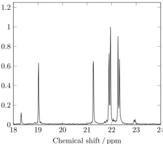
The first version of the plot in this case (Fig-ure 8) already includes a number of the refinements discussed in the first two examples. The example shows data from a technique called ‘nuclear mag-netic resonance’, in which radio waves are absorbed by a sample. In the plot, thexaxis is related to the frequency of the radio waves, while they axis shows how much is absorbed.
The plot looks generally good, but there are some adjustments required. First, they scale is es-sentially arbitrary, and so is usually not given any values at all. This can be achieved by setting the
yticklabels option to an empty value in the
op-tional argument to theaxis environment:
[yticklabels = ]
Second, for various historical reasons it is normal to plot thexaxis backward (running high to low). The latest version of pgfplotscan do this automatically using thex diroption.
\addplot[
x dir = reverse, ...
These changes give an improved version of the plot (Figure 9).
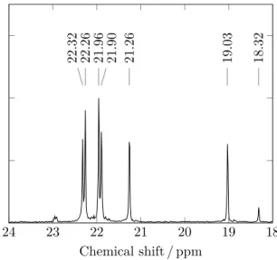
The final thing this plot needs is some ‘peak labels’: markers showing the exact value at the top
18 19 20 21 22 23 24 0 0.2 0.4 0.6 0.8 1 1.2 Chemical shift / ppm
Figure 8: First version of a single spectrum.
18 19 20 21 22 23 24 Chemical shift / ppm
Figure 9: Second version of a single spectrum.
of each peak. For this, the pgf\node macro can be
used. A\nodecan be used to put material anywhere
on a plot, and each node takes a range of options to control its appearance. In this case, the node itself is going to be completely empty, and apinwill be
used to point to the node. A pin generates a short line from the node to some associated text, which in this case I want to rotate by 90◦to pack the labels in. The syntax ends up a little bit complicated, as various options need to be correct, for example: \node[
coordinate,
pin = {[rotate=90]right:22.26} ] at (axis cs:22.26,1.1) { };
Therightkeyword here can be replaced by an angle,
which can then be used to be slightly off a peak’s position, for example
\node[ coordinate,
pin = {[rotate=90]5:22.32} ] at (axis cs:22.32,1.1) { };
Once again, putting everything together leads to the completed plot (Figure 10).
[
x dir = reverse,
xlabel = Chemical shift\,/\,ppm,
xmin = 18, xmax = 24, ymax = 1.75, ymin = 0, yticklabels = ] \addplot[ color = black, mark = none
] table from {data-set-three.txt}; \node[ coordinate, pin = {[rotate=90]5:22.32} ] at (axis cs:22.32,1.1) { }; \node[ coordinate, pin = {[rotate=90]right:22.26} ] at (axis cs:22.26,1.1) { }; \node[ coordinate, pin = {[rotate=90]right:21.96} ] at (axis cs:21.96,1.1) { }; \node[ coordinate, pin = {[rotate=90]-5:21.90} ] at (axis cs:21.90,1.1) { }; \node[ coordinate, pin = {[rotate=90]right:21.26} ] at (axis cs:21.26,1.1) { }; \node[ coordinate, pin = {[rotate=90]right:19.03} ] at (axis cs:19.03,1.1) { }; \node[ coordinate, pin = {[rotate=90]right:18.32} ] at (axis cs:18.32,1.1) { }; 4.3 Changes over time
The previous example demonstrated how to plot a single spectrum from an external file. In a final example, I want to look at going beyond this to showing how experimental data changes over time. This means plotting a series of spectra on the same
18 19 20 21 22 23 24 22.32 22.26 21.96 21.90 21.26 19.03 18.32 Chemical shift / ppm
Figure 10: Final version of a single spectrum. axes, and finding a good way to show which way time is running. Some people choose to use a ‘three-dimensional’ plot for this scenario, andpgfplots in-cludes the ability to generate this type of output. However, experience suggests to me that there is more value in a well-constructed two-dimensional plot than a three-dimensional representation of the same data. The challenge is therefore to find the best way to represent the results on paper.
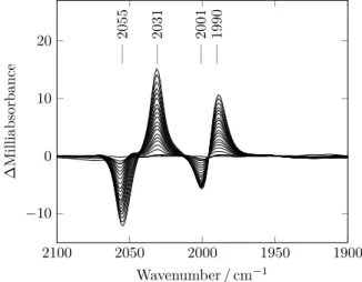
In this example, the raw data is how a sample absorbs infra-red light (heat). There is a reaction taking place, and so the absorption will change over time. The initial results simply show a series of peaks, a bit like Figure 10. The changes are quite subtle compared to the overall scale, so the first stage in cre-ating a plot is not TEX related. Using a spreadsheet it’s possible to find how the signal changes relative to the one at the start of the experiment: this gives a ‘difference spectrum’ for each time. That can then be saved as a text file which can be used as the input topgfplots.
In this case, a single file contains all of the data for the plot. To get each\addplotline to use a single
time, the optional argument to thetablekeyword
is used, for example:
\addplot[mark = none] table[y index = 1]
{data-set-four.txt};
\addplot[mark = none] table[y index = 2]
{data-set-four.txt}; ...
As there are many almost identical lines, the pgf
\foreach macro can be used to vary only the y
index used
\foreach \yindex in {1,2,...,20} \addplot[mark = none]
1900 1950 2000 2050 2100 −10 0 10 20 2055 2031 2001 1990 Wavenumber / cm−1 ∆ Milliabsorbance
Figure 11: First plot of a change over time. table[y index = \yindex]
{data-set-four.txt};
A bit of experimentation showed that around 20 lines gave a good appearance for the plot (the full data set has nearly 200 time points!). The\foreach
syntax makes it easy to show an evenly-spaced subset of the available points, by setting the gap between selected columns to be larger:
\foreach \yindex in {1,10,...,189} \addplot[mark = none]
table[y index = \yindex] {data-set-four.txt};
This uses every 9th column for the plot, and in the example results in 19 separate curves (Figure 11).
There is one obvious problem with the plot: which way is time running? Here, careful use of colour can be used in a way which really does add to the information imparted by the plot. To do this, a ‘plot cycle’ is needed to specify the colour used for each plot. There are some built in to pgfplots, but one is also easy to construct:
\pgfplotscreateplotcyclelist {blue to red}{% color = red!0!blue\\% color = red!5!blue\\% color = red!10!blue\\% color = red!15!blue\\% color = red!20!blue\\% color = red!25!blue\\% color = red!30!blue\\% color = red!35!blue\\% color = red!40!blue\\% color = red!45!blue\\% color = red!50!blue\\% color = red!55!blue\\% color = red!60!blue\\% color = red!65!blue\\% 1900 1950 2000 2050 2100 −10 0 10 20 2055 2031 2001 1990 Wavenumber / cm−1 ∆ Milliabsorbance
Figure 12: Second plot of a change over time (time runs blue to red).
color = red!70!blue\\% color = red!75!blue\\% color = red!80!blue\\% color = red!85!blue\\% color = red!90!blue\\% color = red!95!blue\\% color = red!100!blue\\% }
It’s important to note that the end of lines here must end in comments. With that cycle available, the option cycle list namecan be used for the axes:
this will mean that the first plot will be pure blue, the second 95 % blue and 5 % red, and so on.
The other minor adjustment to make is to in-clude a line at for y = 0. This can be done by including an extra ‘tick’:
[
extra y ticks = 0,
extra y tick labels = ,
extra y tick style =
{ grid = major } ]
(The ‘extra y tick labels = ,’ line makes sure
that the label for 0 is not printed twice, as this gives a slightly ‘bold’ appearance.)
These two adjustments lead to Figure 12: [
cycle list name = blue to red,
extra y ticks = 0,
extra y tick labels = ,
extra y tick style = { grid = major },
x dir = reverse,
xlabel = Wavenumber\,/\,cm$^{-1}$,
xmin = 1900,
xmax = 2100,
ymax = 27,
ymin = -15
]
\foreach \yindex in {1,10,...,189} \addplot table[y index = \yindex]
{data-set-four.txt}; \node[ coordinate, pin = {[rotate=90]right:1990} ] at (axis cs:1990,16) { }; \node[ coordinate, pin = {[rotate=90]right:2001} ] at (axis cs:2001,16) { }; \node[ coordinate, pin = {[rotate=90]right:2031} ] at (axis cs:2031,16) { }; \node[ coordinate, pin = {[rotate=90]right:2055} ] at (axis cs:2055,16) { };
As with the other plots, it’s important to include details about the experiment somewhere close to the figure: usually the caption is a good place for this. In the published article, I included details about what I used as time zero, the time range and concentrations for the experiment in the caption.
5 Exporting plots from TEX
Processing a large number of plots in TEX can lead to the program running out of memory. The ability to set up plots as separate files which can then be included in the main document as graphics is there-fore important. At the same time, some publishers require all graphics to be available as stand-alone files, which again means finding a way to export plots from TEX.
pgfplotsincludes methods for carrying out this process in an automated fashion. The latest release of pgfplotsmakes the process much easier than was previously the case, and includes full instructions on how to proceed. When using pdfTEX the lines \usetikzlibrary{pgfplots.external}
\tikzexternalize{<filename>}
will instructpgfplotsto make each plot into a separate PDFfile. To create PostScript files the additional command:
\tikzset{external/system call = {latex -shell-escape -halt-on-error -interaction=batchmode -jobname "\image" "\texsource"; dvips -o "\image".ps "\image".dvi}}
is needed, and the main file should be typeset inDVI mode. In both cases\write18(external command
execution) needs to be enabled for the process to work correctly.
6 Conclusions
Producing scientific plots usingpgfplotscan produce high quality output with relatively little effort for the user. To do so, some thought about both the information to be reported and the appearance of the output is needed.
7 Acknowledgements
Thanks to Stefan Pinnow for a number of useful improvements both to the code and to the text while drafting this article.
The published versions of the figures used here originally appeared in Wright and Pickett (2009) and Jablonskyt˙e, Wright, and C. J. Pickett (2010). They are reproduced by permission of The Royal Society of Chemistry.
References
Feuersänger, Christian. “pgfplots”.http://mirror. ctan.org/graphics/pgf/contrib/pgfplots,
2010.
Jablonskyt˙e, Aušra, J. A. Wright, and C. J. Pickett. “Mechanistic aspects of the protonation of [FeFe]-hydrogenase subsite analogues”.Dalton Transactions(39), 3026–3034, 2010.
Tantau, Till. “The TikZ andpgf Packages”.
http://mirror.ctan.org/graphics/pgf,
2008.
Wright, Joseph A., and C. J. Pickett. “Protonation of a subsite analogue of [FeFe]-hydrogenase: mechanism of a deceptively simple reaction revealed by time-resolvedIRspectroscopy”. Chemical Communications (38), 5719–5721, 2009. Joseph Wright Morning Star 2, Dowthorpe End Earls Barton Northampton NN6 0NH United Kingdom joseph.wright (at) morningstar2.co.uk