Worcester Polytechnic Institute
Digital WPI
Major Qualifying Projects (All Years)
Major Qualifying Projects
April 2019
ReVisIt: Enabling Passive Evaluation of Interactive
Visualizations
John Edward Dyer
Worcester Polytechnic InstituteLuke Daniel Gardner
Worcester Polytechnic InstituteMadeline Burke
Worcester Polytechnic Institute
Follow this and additional works at:
https://digitalcommons.wpi.edu/mqp-all
This Unrestricted is brought to you for free and open access by the Major Qualifying Projects at Digital WPI. It has been accepted for inclusion in Major Qualifying Projects (All Years) by an authorized administrator of Digital WPI. For more information, please contactdigitalwpi@wpi.edu.
Repository Citation
Dyer, J. E., Gardner, L. D., & Burke, M. (2019).ReVisIt: Enabling Passive Evaluation of Interactive Visualizations. Retrieved from
ReVisIt
Enabling Passive Evaluation of Interactive Visualizations
Advisor:
PROFESSOR LANET. HARRISON
Written By:
MADELINE BURKE
JOHNDYER
LUKEGARDNER
A Major Qualifying Project
WORCESTERPOLYTECHNIC INSTITUTE
Submitted to the Faculty of the Worcester Polytechnic Institute in partial fulfillment of the requirements for the
Degree of Bachelor of Science in Computer Science.
ABSTRACT
V
isualizations on the web are used to communicate information to a wide range of audiences. However, there exists no widely accepted method for visualization creators to understand how an audience engages with their work. To address this, we propose using passive evaluation, where user interaction with visualizations is logged, and later explored by the creator. ReVisIt is a tool that captures user interactions with a visualization, processes them, and displays them in a dashboard. To evaluate ReVisIt, we conducted several interviews with visualization creators. We concluded that a tool like ReVisIt would be valuable to creators, and there are several opportunities for future work in this area.ACKNOWLEDGEMENTS
Many thanks to Professor Lane T. Harrison and Dr. Mi Feng for their many hours of work advising the team. Their feedback throughout the process was invaluable for the success of this project.
TABLE OF
CONTENTS
Page List of Tables v List of Figures vi 1 Introduction 1 2 Background 3 2.1 Evaluation of Visualizations . . . 42.2 Contemporary Evaluation Systems . . . 5
2.3 Passive/Implicit Evaluation . . . 7
2.3.1 Logging Interactions in Human-Computer Interaction . . . 7
2.3.2 Re-Visualizing Logged Interactions with Visualizations . . . 9
3 Methodology 10 3.1 ReVisIt Logger . . . 11
3.1.1 Tracking User Interaction with the HTML Tree and Webpage Event System 11 3.1.2 Interaction Event Stream Data Organization . . . 12
3.1.3 Using Node.js to Build the Logger . . . 13
3.1.4 Code to Log Events . . . 13
3.1.5 Scalability and Cost of the ReVisIt Logger . . . 14
3.2 ReVisIt Server . . . 14
3.2.1 Node.js Server . . . 15
3.2.2 Storing Data . . . 15
3.2.3 Server-side Processing . . . 15
3.3 ReVisIt Frontend Design . . . 20
3.3.1 Using Five Design Sheets to Determine User Interface and Visualization Designs . . . 20
3.3.2 Creating Prototypes for the ReVisIt User Interface . . . 25
3.3.3 Using React to Frame the ReVisIt Dashboard . . . 26
TABLE OF CONTENTS
3.3.5 Using Semiotic Library to Implement Side Visualizations . . . 26
4 Results 28 4.1 ReVisIt Dashboard . . . 28
4.1.1 Timeline of User Interaction . . . 29
4.1.2 Overlay Visualization to Show the Location of a User Interaction . . . 31
4.1.3 User Summary Charts . . . 32
4.1.4 Element Summary Charts . . . 33
4.1.5 Summary Values . . . 34
4.2 ReVisIt Evaluation . . . 35
4.2.1 Collecting Sample User Interaction Data . . . 35
4.2.2 Interviews with Professional Interactive Visualization Creators . . . 38
5 Discussion 41 5.1 Important Aspects of ReVisIt . . . 41
5.2 Areas of Improvement . . . 42
5.3 Limitations . . . 42
5.4 Future Work . . . 42
5.4.1 Improved Method of Generating the Overlay Visualization . . . 43
5.4.2 Improved KPIs and Side Visualizations . . . 43
5.4.3 Improved User Experience and Functionality . . . 43
5.4.4 Scalability . . . 43
5.4.5 Security and Privacy . . . 44
6 Conclusion 45
Appendix A: Code to Log Events i
Appendix B: Code to Calculate Uniqueness iv
Appendix C: Interview Protocol ix
L
IST OFTABLES
TABLE Page
LIST OF
FIGURES
FIGURE Page
2.1 Current Interactive Visualization Life Cycle . . . 3
2.2 The Nested Model . . . 4
2.3 Layers of the Nested Model . . . 5
2.4 Google Analytics Dashboard . . . 6
2.5 Adobe Analytics Dashboard . . . 6
2.6 Chartbeat Dashboard . . . 7
2.7 UsaProxy . . . 8
2.8 WebQuilt . . . 9
3.1 Current Cycle of Visualization Creation . . . 10
3.2 The ReVisIt Logger . . . 11
3.3 Hover Event . . . 12
3.4 The ReVisIt Server . . . 14
3.5 The ReVisIt Dashboard . . . 20
3.6 User Interface Five Design Sheets - Individual Sheet 1’s . . . 21
3.7 UI FdS - Group Sheet 1 . . . 21
3.8 UI FdS - Group Sheet 2 . . . 22
3.9 UI FdS - Group Sheet 3 . . . 23
3.10 Visualizations Five Design Sheets - Individual Sheet 1’s . . . 23
3.11 Visualizations FdS - Group Sheet 1 . . . 24
3.12 Visualizations FdS - Group Sheet 2 . . . 24
3.13 Visualizations FdS - Group Sheet 3 . . . 25
3.14 Digital Mock-up of the ReVisIt Dashboard . . . 25
4.1 Components of the ReVisIt System . . . 28
4.2 ReVisIt Dashboard Overview . . . 29
4.3 Timeline of User Interaction . . . 30
4.4 Visualization of an Individual User Session . . . 31
4.5 Overlay Visualization . . . 32
LIST OFFIGURES
4.7 Element Summary Charts . . . 34
4.8 Summary Statistics . . . 34
4.9 255 Charts Visualization . . . 35
4.10 Metafilter Visualization . . . 36
4.11 Colleges Visualization . . . 36
C
H A P T E R1
INTRODUCTION
Interactive visualizations are becoming increasingly prevalent on the web. The growing popularity of JavaScript, and the active development of tools for visualization creation, such as D3, makes it easier than ever for people to publish visualizations on the web. Visualization creators range from professional designers at news organizations, to hobbyists, and have diverse goals. They may wish to communicate a particular message through their visualizations, or they may want to enable users to freely explore data sets to reach their own insights. Nevertheless, visualization creators currently do not have an effective method of collecting feedback from their audiences once their visualization is published. This makes it hard to determine if they are meeting their goals. Some existing tools, like Google Analytics, capture user information at the webpage level, but they do not capture any user interaction data relating to the visualization. Visualization creators can survey their audience manually to gather feedback, but surveys require a great deal of time and effort to set up. Additionally, due to possible bias, these surveys may yield results that are not representative of the entire audience. Visualization creators can also ask their peers for feedback, but these peers are often experts in their respective fields, have similar knowledge as the creator, and therefore may have very different perspectives than the target audience.
Passive evaluation is a more ideal alternative to these options, and consist of two parts. The first involves directly capturing and logging users’ interactions with visualizations. This can be done automatically, and does not require extra effort on the part of the creator or audience. The second part of passive evaluation involves processing the logged interactions and presenting the data so visualization creators can gain insights about their audience. The main issue with passive evaluation is that there are no widely-accepted tools suitable for capturing interactions at the visualization level.
This project focused on addressing this unmet need of visualization creators. We researched ways to enable passive evaluation of visualizations published on the web. Specifically, we had
CHAPTER 1. INTRODUCTION
three research questions:
1. What are the current goals and working contexts of visualization creators?
2. How can valuable data regarding audience interactions with visualizations be captured efficiently?
3. How can user interaction data be visualized to help visualization creators understand their audience?
To answer these questions, we took three steps. First, a thorough literature review provided background on similar work. Next, through an iterative design process we developed a prototype tool, ReVisIt, which logs and re-visualizes users’ interactions with visualizations on the web. Finally, we conducted interviews with visualization creators to learn about their goals, and how a tool like ReVisIt might be able to help them achieve these goals. These actions led to three main contributions:
1. A flexible logging system that can easily be added to a visualization on the web to capture user interactions with individual visualization elements.
2. A dashboard for visualization creators that re-visualizes logged interaction data with interactive, exploratory charts.
3. Feedback from interviews with visualization creators, an understanding of their goals in creating visualizations, and how re-visualizing users’ interactions could help them achieve their goals.
C
H A P T E R2
BACKGROUND
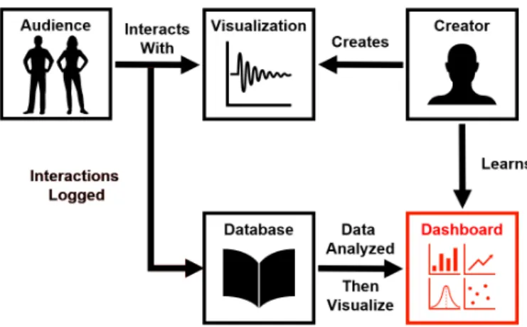
Data visualizations have become a vital part of communicating information to a large audience. Over the years, they have become more complex and unique than ever. Nevertheless, the means by which creators and visualization audience members interact has remained the same. Currently, after a creator makes a visualization, they have no knowledge as to how an audience interacts with their work, as shown in Figure 2.1. Bridging the gap between a creator and the visualization audience members is important so that creators can examine how audience members are engaging with the visualization and can identify ways to improve the visualization to fit audience needs. As an example, when developing PROACT (PROgnosis Assessment for Conservative Treatment) [1], a personalized health risk communication tool, the development team looked to its users when determining how to best design the product. Given the complexity of the subject matter, tailoring the visualizations of the tool to fit the audience of prostate cancer patients and doctors was difficult without examining feedback from them. Just as PROACT required user data to evaluate the visualizations of the product, similar tools used to communicate information to an audience require evaluation to produce the best end result.
Figure 2.1:Currently, interactive visualization creators create a visualization, audience members then interact with said visualization, and there is no further connection between the creator and the audience. The creator has no way of understanding how an audience engages with their work.
CHAPTER 2. BACKGROUND
2.1
Evaluation of Visualizations
When designing a visualization, or a system that uses visualizations, evaluation is pertinent in determining its validity. However, due to the complexity of many visualizations, evaluation can become difficult. For this reason, models and techniques have been created to break down this intricate problem and help designers identify issues and create methods of assessing and solving said issues.
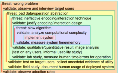
One way to evaluate a visualization design’s validity is to look at different parts of the system and how they interact with each other. Tamara Munzner’s evaluation technique, the Nested Model, explores four different layers of a system: domain problem characterization, data/operation abstraction design, encoding/interaction technique design, and algorithm design. Issues within each layer inevitably cascade into layers downstream, as indicated by the arrows in Figure 2.2. The potential threat to the validity of the system, as well as how to validate this problem, of each layer is shown in Figure 2.3. This model highlights key points of interest designers should look to when evaluating their data visualization [2].
Figure 2.2:The Nested Model by Tamara Munzner shows that a visualization’s design’s validity can be evaluated by examining different parts of the system. Issues within each layer of the system affect other layers [2].
Munzner’s model works to explain a method for evaluating a visualization, this can then be applied to specific scenarios for understanding visualizations. Lamet al. lay out three scenarios for understanding visualizations. They are as follows: Evaluating User Performance, Evaluating User Experience, and Evaluating Visualization Algorithms. Each scenario has a different goal to assist practitioners in properly evaluating the different parts of a visualization. For example, Evaluating User Performance looks to assess how certain features affect the performance of system users. Methods within this scenario could include controlled experiments, or simply field logs that capture user’s interactions behind the scenes. Field logs provide value through the large number of interactions and observations that can be collected, and the ability for users to use the, system in a natural environment rather than in a lab [3].
There have been several attempts of using this method of field logs to evaluate a user’s interactions [4][5][6]. One specific example is the logging of analyst interactions with a data set to determine the analyst’s interactions. In this study, researchers tasked participants with a text
2.2. CONTEMPORARY EVALUATION SYSTEMS
Figure 2.3:The possible issues in each layer of Munzner’s model are shown above. The validations which can prevent these problems are listed under the corresponding threats within the layers. These threats and validations should be considered with evaluating a visualization. [2].
analysis task and recorded their interaction logs. These interaction logs were then processed to create visualizations the represent the participants’ actions. Through these visualizations of participant interaction logs, researchers were able to understand participant’s interests and strategies when they analyzed text[7]. While this was a closed study with controlled user tasks, it provides evidence that similar interaction logging tools can aid in the understanding of an audience of a visualization.
2.2
Contemporary Evaluation Systems
While there are systems in use today that provide analytics on user behavior on the web, they are not without their shortcomings. One of the most popular of these systems is Google Analytics. Google Analytics provides developers with statistics on the users who visit their sites, with information including device, operating system, and location. It also provides an overview of the pages users visit, and visualizations of how users navigate between pages. With just a few lines of code developers can integrate Google Analytics into their site, providing them with this page and site level data on user interactions, visualized in many different interactive charts. Google Analytics also allows developers to specify events to track, such as users selecting certain elements on the page. However, this requires extra coding for each event, making it unsuitable for collecting large amounts of interaction data at a visualization specific level.
CHAPTER 2. BACKGROUND
Figure 2.4:Google Analytics provides a detailed audience overview.
Two other popular systems include Adobe Analytics and Chartbeat. While they have slightly different features, they share the same purpose of capturing and displaying user interaction data at mainly a site or page level. While they could be used to collect data on user interactions with specific items of a page, just as a visualization, this would require substantially more coding on the part of the developer.
2.3. PASSIVE/IMPLICIT EVALUATION
Figure 2.6:Chartbeat provides details on different user segments.
Overall, these are very useful platforms for capturing how users interact with a website, and can help web designers develop meaningful insights about their audience [8][9][10]. However, they are too general for visualization creators. Configuring either of these tools to capture user interaction data with potentially hundreds of small chart elements on a page would be impractical, and these tools would likely not be able to summarize the data collected in a way that produces meaningful insights.
2.3
Passive/Implicit Evaluation
As explained by Lamet al., tracking a user’s interactions with a system allows the assessment of how certain features affect user performance. One efficient way to gather this data is through field logs, which allow the user to use the system in a natural environment while their interaction data is tracked behind the scenes [3]. Once the information regarding the user’s session is recorded, a developer can analyze the data and assess any changes that should be made to improve the system. The passive form of evaluating the user can be informed by Human-Computer Interaction technology.
2.3.1 Logging Interactions in Human-Computer Interaction
There are several systems that have been developed in attempt to capture user interaction data and visualize it in a way that makes it simple for creators to gain insights on user behavior. One is UsaProxy [11][12][13]. UsaProxy, as shown in Figure 2.7, sits in between the developer’s server and the client, and modifies the HTML pages served to capture user interaction data. This includes events for page loading and unloading, resizing, changes to focus, mouse clicks, mouse movements, scrolling, and key presses. While this system does not require the developer to write code to track these interactions, or require the client to run any specific software, the
CHAPTER 2. BACKGROUND
amount of data collected is very large and cannot be well tailored to the analyst’s needs. With UsaProxy, analysts would manually have to filter the data after it is collected based on what they are interested in learning. UsaProxy also does not provide any way to visualize the data it collects, making it difficult for creators to explore the data and draw insights without already having an idea of what to look for. While collecting user interaction data is simple with UsaProxy, analyzing and visualizing it is not.
Figure 2.7:UsaProxy modifies HTML pages requested by the client, in order to capture and log interactions on those pages. Processing of those logs must be done manually [12].
One system that visualizes click stream data is WebQuilt [14]. Like UsaProxy, WebQuilt uses a proxy-based approach to collecting user interaction data. WebQuilt goes beyond just logging the data and constructs a graph where nodes are pages users visit, and edges represent transitions between pages. The graph utilizes size and color to indicate the frequency a path was taken and how long users spent on a page between transitioning. An example of this is shown in Figure 2.8. With this type of data display, analysts are able to view this data at an aggregate level, or filter it to look at a specific group or individual users. The graph allows analysts to easily discover navigation patterns, and identify areas of interest, such as which pages most captured user’s attention. While these are meaningful insights, WebQuilt only captures page-level data. Developers are unable to track user interactions with specific elements on the page, which would allow for a more detailed analysis of user behavior.
2.3. PASSIVE/IMPLICIT EVALUATION
Figure 2.8:WebQuilt processes interaction logs to visualize how users navigate between webpages. It does not reveal anything about how users interact with each individual page [14].
2.3.2 Re-Visualizing Logged Interactions with Visualizations
In order to understand how a user interacts with their work, a visualization designer must first be able to analyze the interactions directly related between the user and the visualization interface. This can be achieved by logging the user’s interactions, such as mouse movements or keyboard presses through a proxy-based approach to logging a users interactions [12][14]. However, when creating said logger, the needs of the designer must be taken into account.
Han et al. worked to determine what interaction logs should include in order to provide designers with the best tool to understand logging data surrounding their work. They found that a system must meet certain requirements. First, the system needs to be able to capture events and organize the most relevant of said events. The system must provide visualizations that can be configured to fit the designer and their work, since all visualizations are not the same. Additionally, the system should have the ability to be applied to a variety of visualization engines [15]. A system with these tools is a powerful asset to any visualization designer. Given that visualizations are becoming more complex than ever, understanding users interactions and gathering feedback from the interactions is a key part in refining the wide scope that is visualization implementations to fit a target audience.
C
H A P T E R3
METHODOLOGY
The current process surrounding data visualizations includes the creation by the creator and the interactions by an audience. As shown in Figure 3.1 in black, once visualizations are made, the creator has no association with the audience of their visualization. This current process denies a creator the ability to gather feedback from their audience to allow for improvements on future work. With ReVisIt, a passive evaluation visualizer, a creator is able to learn from their audience by viewing how they interact with their work. Indicated in red in Figure 3.1, ReVisIt connects the creator to their audience by logging the audiences’ interactions with the visualization and then visualizing this data in a dashboard.
Figure 3.1:The current cycle of visualization creation is limited to the audience interacting with the visualization and the creator creating said visualization. There is currently no widely accepted mechanism for the creator to see how user interact with that visualization. The addition of the ReVisIt system, in red, would close this gap and enhance the cycle.
3.1. REVISIT LOGGER
3.1
ReVisIt Logger
As stated by our first research question (What are the current goals and working contexts of visualization creators?), visualization creators have goals they set to achieve through their visualizations. However, as stated above, there is currently no association between the audience and creator of a visualization, thus making these goals nearly impossible to achieve. In order to close this gap, we propose logging the interactions the audience has with a visualization to be later analyzed by the creator. ReVisIt would be a system that could track user’s interactions with a visualization and present this data to the creator is a comprehensive way. Figure 3.2 illustrates the process by which the audience and creator use ReVisIt. This section covers the basic technical knowledge of how the audience interacts with the visualization, how that interaction will be logged, and how that data will be analyzed.
Figure 3.2: The interactions users have with a visualization can be tracked and logged. The ReVisIt Logger captures these interactions and looks to answer our second research question (How can valuable data regarding audience interactions with visualizations be captured efficiently?).
3.1.1 Tracking User Interaction with the HTML Tree and Webpage Event
System
The modern web, Web 2.0, is reliant on user interaction and uses an event based system to permit and respond to these interactions. Each click, key-press, and mouse movement is referred to as an event. Events by a user can be recorded and logged through JavaScript code [16]. Event listeners, also known as event handlers, detect when specific events occur and run a block of code at the time the event occurs [17]. Using this event system present in all modern browsers with JavaScript event listeners, particular user interactions surrounding specific elements of a webpage can be logged.
An event listener contains information regarding the type of event that has occurred, and the element of the webpage with which it is associated. This information allows one to only record
CHAPTER 3. METHODOLOGY
predefined user events with specific webpage elements. This information can be logged as a data entry to learn how the user is interacting with the webpage [13]. While this is not the only way to log user interactions,[18] it can provide sufficient data with low associated time and resource costs.
To track interactions with specific elements of a webpage, we use the element tree structure that is present in each webpage. The HTML code that is run to create a webpage can be considered a text document that defines a set of elements that the browser then interprets to display the visual content of the webpage as seen by the user. In HTML, each element defined belongs to a parent element, thus forming a tree-like structure. At the root of the tree is the Document element. Event listener, as described above, can be assigned to one or several of these elements. Using this tree structure, we can assigned an event listener to an element and its corresponding children thus allowing us to create multiple listeners on an entire branch of the tree with minimal code.
3.1.2 Interaction Event Stream Data Organization
Logging the interaction of a user through event listeners provides a collection of individual data points which is meaningless without the context provided by each other. An event stream data structure and techniques for analyzing and sorting that structure allow for a meaningful conclusion to be drawn from these data.
Figure 3.3:Two events are captured, mouse-enter and mouse-leave. These are combined with the time between them to make a single hover event.
The data generated when logging events through event listeners are data points gathered at the time an event takes place. These data points can be organized in chronological order to form an event stream. An event stream gives more meaning to the data by putting them in context of each other to inform the reader. For example, look at Figure 3.3. Two event listeners are placed on Element1. One is triggered when the user moves the mouse onto Element1 and the other is triggered when the mouse is moved away from Element1. Analyzing these log entries separately would not be as insightful as viewing them in chronological order relevant to each other. By viewing them together, one can infer more about the user’s actions. In this example, an analyst could infer that the time between the user moving the mouse to and from Element1 was spent hovering it. This not only gives the action of the user at that time, but the user’s location on the
3.1. REVISIT LOGGER
webpage as well. Using this logic, one can find patterns in the log data to better understand user behavior surrounding certain elements.
Once data is collected into an event stream it must be analyzed and organized to make make the information readable and valuable to a human user. Many methods have been proposed to make this process both effective and efficient. Most involve using a computer to sift through the large data sets created by logging event-based data and combining known information about the data set with data mining and pattern finding to process and analyze the data. Several previous works will help inform decisions in this area of the project, including: what types of patterns and sequences are important [19], dealing with the noise and inconsistency of real-world generated data [20][21], categorizing and ranking event importance to understand user interactions [22], and techniques to visualize the large data sets [23] [19] [22] [24].
3.1.3 Using Node.js to Build the Logger
We implemented the client-side logger as a Node.js module. Node.js is a run-time environment that allows JavaScript to be run on any platform [25]. A node module is a JavaScript library that can be imported into any Node.js program [26]. Node modules can be easily published to NPM, the world’s largest software registry, containing over 800,000 JavaScript packages [27]. This allows code to be easily distributed to developers all over the world. In our case, if ReVisIt evolves into a stable platform and we decide to publish it, visualization creators would be able to install our logger in a simple, standard way. We also used the Node.js library Browserify [28] to compile our Node.js logger and create a second version that is a standard JavaScript library, compatible with all web browsers. This allows our logger to be included in any webpage.
3.1.4 Code to Log Events
One of our goals when creating the ReVisIt was to make the client-side logger simple to set up and flexible for visualization creators. It takes a few lines of code to add our logger to a visualization:
1 // any code required to create the visualization should be placed first 2 var logger = new RevisitLogger ('96858 cd7-b4b4-44a3-b654-727f6cc7714b '); 3 logger.logEvents ('vis ', [' vis-element ']);
Once any code used to create the visualization finishes executing, a logger object is instanti-ated.96858cd7-b4b4-44a3-b654-727f6cc7714bis the unique id of the visualization, generated on the server side. ThelogEventsmethod is then called to attach event listeners to visualization elements. The first argument,vis, is the id of the root visualization element. The second argu-ment is an array of classes of eleargu-ments to log events for. The full code that shows how the logger logs events is in Appendix A.
CHAPTER 3. METHODOLOGY
3.1.5 Scalability and Cost of the ReVisIt Logger
The logging module of the ReVisIt system that is used to collect user interactions was built with scalability and cost in mind. Rather than tailor this logger to certain visualization types, we decided to give ReVisIt the ability to be applied to a range of different visualizations. This logger was designed to work with any HTML system by taking advantage of events, classes, and recursion down the HTML element tree to combat scalability issues. We also worked to reduce the cost of ReVisIt. The term ‘cost’ in this case would include network bandwidth, resources cost on the client browser, and resource cost of the collection system. While these factors can be controlled for the closed ReVisIt system, the unknown environmental factors of ReVisIt users, such as client browsers and network bandwidths, could limit the amount and type of data the logger could collect. Due to these potential restrictions, the ReVisIt logger only collected a limited set of data for each user event when logging user interactions. Included in this collected data is the timing and type of each event. While this set of raw data is limited, further analysis and engineering allow for these data points to inform deep analysis of user interaction with almost any HTML-based visualization.
3.2
ReVisIt Server
Once the user interaction data has been logged, it must be stored, analyzed, and sent to the dashboard where it will be presented to the creator. This part of the ReVisIt process is shown in red in Figure 3.4. This section discusses the process by which the server was created and how it analyzes the data captured by the logger.
Figure 3.4:The data collected by the Logger must analyzed and saved before it can be presented in the dashboard. The ReVisIt Server processes the Logger data and saves it to be presented in the dashboard.
3.2. REVISIT SERVER
3.2.1 Node.js Server
We used Node.js for our server that processes logged data and serves it to the visualization dashboard. Using Node.js provides several advantages. First, it can perform input/output (I/O) asynchronously, which allows for data to be read and written without blocking the execution of the rest of the program [25][29]. Second, it is flexible in that there is no single right or preferred way of implementing functionality [29]. Node.js servers can be deployed on many different platforms, connect to any type of database, and be heavily customized according to requirements. This allows the ReVisIt server to be modified as needed to scale effectively and handle larger number of users and data. Lastly, due to the popularity of NPM, there are thousands of libraries available to us to simplify our development process. For example, we used the library Express, a lightweight, extendable server framework [30], when creating the ReVisIt server. Express is among the most popular node modules, and greatly reduces the amount of repeated code required to set up a functional server and RESTful API [31].
3.2.2 Storing Data
The ReVisIt server saves data in JSON schema, as this is a standard format for storing and transferring data. JSON is also easy to work with and manipulate with JavaScript. Since this project is a prototype, we did not use any formal database and simply saved this data in JSON files. In order to scale ReVisIt effectively, a database service would need to be incorporated, but this aspect was not necessary to evaluate the value of our system with a limited number of users. When deciding to store data in JSON files rather then a database, we recognized that future developers on this project would have more time to research the pros and cons of different services. We did not want to implement a feature that would restrict future decisions. For these reasons we concluded that using a database was currently outside the scope of our project.
3.2.3 Server-side Processing
The ReVisIt server processes the raw interaction logs of a visualization’s audience. This processing includes calculating metrics based on the interactions of each audience member, and formatting the data so that it can be displayed in a concise way in the ReVisIt Dashboard. These metrics include calculating overall summary statistics, such as number of sessions, number of events, total duration of all interactions, and the averages for number of interactions per user and interaction duration. Additionally, the counts of sessions based on device type: mobile, tablet, or desktop are calculated. These statistics give visualization creators a general overview of their audience, and give them baseline metrics that they can use to compare different visualizations they create.
1 {
2 " numSessions ": 8,
CHAPTER 3. METHODOLOGY 4 " totalDuration ": 631415 , 5 " averageNumEvents ": 262.125 , 6 " averageDuration ": 78926.875 , 7 " stdDevNumEvents ": 137.67086785933637 , 8 " stdDevDuration ": 53362.77582316695 , 9 " devices ": [
10 { " type ": " mobile ", " count ": 0 },
11 { " type ": " tablet ", " count ": 0 },
12 { " type ": " desktop ", " count ": 8 }
13 ] 14 }
Listing 3.1:Summary statistics give an overview of the audience. In this example, 8 users interacted with the visualization, all on desktop, for approximately 1.5 minutes on average.
To help a visualization creator understand what parts of their visualization captured their audience’s attention, the server calculates element-based statistics, including the number of interactions and duration of interactions for each individual element. These computed statistics are then attached to the element information captured by the logger, including the HTML element type, and any id or classes the visualization creator assigned to it. With meaningful id names for each elements, these statistics allow a creator to easily identify what parts of the visualization the audience interacts with.
1 [ 2 {
3 " elementId ": " element227 ",
4 "id": " Worcester Polytechnic Institute ",
5 " className ": " college ", 6 " nodeName ": " circle ", 7 " numInteractions ": 23, 8 " interactionDuration ": 64875 9 }, 10 { 11 " elementId ": " element1 ",
12 "id": " Stanford University ",
13 " className ": " college ", 14 " nodeName ": " circle ", 15 " numInteractions ": 17, 16 " interactionDuration ": 6636 17 }, 18 { 19 " elementId ": " element4 ",
20 "id": " Columbia University in the City of New York ",
21 " className ": " college ",
22 " nodeName ": " circle ",
23 " numInteractions ": 15,
3.2. REVISIT SERVER
25 }, 26 ... 27 ]
Listing 3.2:Element statistics allow creators to see what pieces of the visualization users interacted with most. In this example, more users interacted with the element representing Worcester Polytechnic Institute than the elements representing Stanford or Columbia.
The most in depth statistics calculated are user session statistics. For each session, the number of interactions, duration, device type, and the processed event log is recorded. This log is mostly the same as the raw event log, but we take into account that mouse-enter and mouse-leave events are really just start and ends to a hover interaction, as described in 3.1.2, therefore the duration between these types of events is calculated and considered a hovering event. Additionally, we use a Node.js library, node-random-name [32], to generate unique but random names to assign each user session. While not necessary, we believe it allows visualization creators to more easily identify, compare, and discuss different users of interest when analyzing the information presented in the dashboard.
1 [ 2 {
3 " session ": "6 b593c37-4688-4ee6-a927-853a4955aeee ",
4 " userName ": " Abraham Samyn ",
5 " uniqueness ": 0.6862184966321876 , 6 " percentile ": 25, 7 " numEvents ": 296 , 8 " startTime ": 1549492518000 , 9 " endTime ": 1549492641407 , 10 " duration ": 123407 , 11 " device ": " desktop ", 12 " events ": [ 13 { 14 " type ": " hover ", 15 " timeStamp ": 3496.400000003632 , 16 " endTimeStamp ": 3512.9000000306405 , 17 " absoluteTime ": 1549492518000 , 18 " endAbsoluteTime ": 1549492518013 , 19 " element ": {
20 "id": " Chamberlain College of Nursing-Florida ",
21 " className ": " college ", 22 " nodeName ": " circle ", 23 " elementId ": " element213 " 24 }, 25 "x": 360 , 26 "y": 146 , 27 " duration ": 16.500000027008355 28 },
CHAPTER 3. METHODOLOGY 29 ... 30 ] 31 }, 32 ... 33 ]
Listing 3.3: User session statistics allow creators to compare the interaction patterns of different users.
Session statistics also include a metric we call Uniqueness, a number that represents how unique that session is compared to all the others. This metric is based on which elements a user interacts with, and for how long. A low value, close to 0, indicates the interaction pattern is similar to the members of the audience, while a high value indicates the pattern is atypical. The process for calculating uniqueness is published in “Patterns and Pace” by Feng, Peck, & Harrison [33], and is derived from the TF-IDF algorithm. The code can be found in Appendix B. A Uniqueness score per audience member allows visualization creators to select and view the interaction sequence of a session based on how similar or different it was to others. Creators can then begin to develop an idea of what the interaction pattern of a typical user looks like, as well as identify what interaction patterns can be considered outliers.
Finally, with the ReVisIt server also calculates binned session statistics. For three statistics (uniqueness, number of interactions, and duration of interactions) we group sessions into equally sized bins, and record the count of sessions that fall within each bin. This allows visualization creators to see how sessions are distributed with regard to these three metrics and whether the users are distributed normally, or skewed in some way.
1 { 2 " uniquenessDistribution ": [ 3 { 4 " numSessions ": 3, 5 " values ": [ 6 0.6726970117321406 , 7 0.6862184966321876 , 8 0.7153233679496417 9 ], 10 " lowerBound ": 0.6726 , 11 " upperBound ": 0.724 , 12 " name ": " 0.6726 -0.724 " 13 }, 14 ... 15 { 16 " numSessions ": 2, 17 " values ": [ 18 1.0351445704974225 , 19 1.0835451657652708 20 ],
3.2. REVISIT SERVER 21 " lowerBound ": 1.0322 , 22 " upperBound ": 1.0836 , 23 " name ": " 1.0322 -1.0836 " 24 } 25 ], 26 " numInteractionsDistribution ": [ 27 { 28 " numSessions ": 2, 29 " values ": [ 30 106 , 31 117 32 ], 33 " lowerBound ": 106 , 34 " upperBound ": 159 , 35 " name ": " 106 -159 " 36 }, 37 ... 38 { 39 " numSessions ": 1, 40 " values ": [ 41 537 42 ], 43 " lowerBound ": 484 , 44 " upperBound ": 537 , 45 " name ": " 484 -537 " 46 } 47 ], 48 " interactionDurationDistribution ": [ 49 { 50 " numSessions ": 2, 51 " values ": [ 52 24411 , 53 30703 54 ], 55 " lowerBound ": 24411 , 56 " upperBound ": 43864 , 57 " name ": " 24411 -43864 " 58 }, 59 ... 60 { 61 " numSessions ": 1, 62 " values ": [ 63 180041 64 ], 65 " lowerBound ": 160587 , 66 " upperBound ": 180041 , 67 " name ": " 160587 -180041 "
CHAPTER 3. METHODOLOGY
68 } 69 ] 70 }
Listing 3.4:Binned session statistics allow creators how visualizations are distributed with regard to uniqueness, number of interactions, and duration of interactions.
3.3
ReVisIt Frontend Design
Creators that use ReVisIt will interact with the dashboard. This is considered the frontend of the product since it is the part of the system that the user will interact with directly. The dashboard, as shown in red in Figure 3.5, will host the information collected and processed by the ReVisIt server. It is here that the visualization creator can view how their audience interacted with their visualization. Through the use of this dashboard, visualization creators can attempt to determine if their visualizations have achieved the goals of said visualization.
Figure 3.5:The final part of the Enhanced User Interaction Cycle is the ReVisIt Dashboard. This dashboard hosts the logged interactions collected with the Logger so that interactive visualization creators can analyze how their audience interacted with their visualization.
3.3.1 Using Five Design Sheets to Determine User Interface and
Visualization Designs
To plan out the interface and visualizations of ReVisIt we used the Five Design Sheet (FdS) methodology. FdS uses low-fidelity prototyping to harness the rapid creation of ideas and designs. The process is simple, first, write down ideas and filter, categorize, combine and refine, and then question. This makes up the first sheet. The second, third, and fourth sheets are for sketching out three different layout designs and focusing on alternative features. The fifth, and final, sheet is the realization design, or the final concept [34].
3.3. REVISIT FRONTEND DESIGN
Throughout our design process, we completed several iterations of FdS. First, we completed the activity individually to create possible designs for the ReVisIt user interface (UI). We first used FdS to design the user interface, and then again to design the visualizations within the interface. For the first sheet of our modified FdS, each team member individually sketched out simple ideas. The first sheet results from the interface FdS session are shown in Figure 3.6. After going through our individual ideas, we grouped similar concepts together and made another "first sheet" as a group, as shown in Figure 3.7. As a group, we determined the interface design should allow users to switch between their different visualizations within ReVisIt, organize their visualization users, and it should display a main visualization with other visualizations available to view.
Figure 3.6: For the first page of the Five Design Sheet process, team members independently brainstormed features to include in the ReVisIt user interface (UI). These features included a timeline of logged interactions, a menu displaying different visualizations to analyze, and multiple visualizations displaying logged data.
Figure 3.7: After individual brainstorming, the group came together and aggregated similar ideas for the ReVisIt UI. We determined the necessary features for the ReVisIt UI includes the ability to switch between analyzed visualization, organization of visualization users, and one main visualization with other visualizations displaying more data surrounding it.
CHAPTER 3. METHODOLOGY
After identifying the main features that should be included in the interface, we proceeded to Sheet 2. For this sheet we drew an interface design on a white board as a team. This design consisted of a side panel listing the different projects a user may have in ReVisIt. The main panel contained different visualizations displaying data regarding users of a ReVisIt user’s visualizations. These would be displayed in a card format. This is shown in Figure 3.8.
Figure 3.8:The second sheet of the Five Design Sheet process is to begin sketching the design of the layout which includes the key features from Sheet 1. For this design, the group sketched a side menu containing different ReVisIt projects, and then multiple cards next to the menu containing different visualizations that would display logged data.
The third, and final, sheet for designing the UI is shown in Figure 3.9. This design features a large, main visualization in the middle of the dashboard and key performance indicators (KPIs) surrounding it. These KPI’s would contain smaller visualizations or key numbers relating to the users of a visualization. In the upper corner is a hamburger menu that would expand into a list of other ReVisIt projects of the user.
After establishing the UI of the dashboard, we used the Five Design Sheet methodology to determine the design of the main visualization and content of the KPI’s. Similar to the process used when designing the UI, we first drew out the first design sheet individually and then combined our shared ideas. The results are shown in Figure 3.10 and 3.11. As a team we agreed that the KPI’s should contain information regarding the number of visits to elements of a visualization, which elements were visited first and last, the duration of each visit, the total number of users, and the uniqueness of the users. Here, a "visit" would be considered a mouse-over or click of the user. The duration would be determined by the time between a mouse-in and mouse-out of the element.
Once the information that should be presented by the visualizations was established, we moved to FdS Sheet 2. The results are shown in Figure 3.12. The main visualization features a timeline with different rows for each element of the analyzed visualization. Every time a user interacts with an element, it is represented by a symbol in the specified row. The longer the event, the larger the symbol. These user sessions would be organized by their uniqueness and filtered by a drop-down menu above the visualization. Below the visualization there is a scroll bar that
3.3. REVISIT FRONTEND DESIGN
Figure 3.9:Similar to Sheet 2, Sheet 3 focuses on the design of the ReVisIt UI. this design includes the side menu from Sheet 2, but can be collapsed on the side. The remaining UI space includes a main visualization in the center with smaller, Key Performance Indicators (KPI) surrounding it. We determined this was the best design to use fot the ReVisIt UI.
Figure 3.10:Another round of Five Design Sheets (FdS) was completed to determine the design of the visualization of the ReVisIt frontend. Again, for the first sheet, each team member individually brainstormed features to include. Some of these brainstormed features were a chart to display the amount of time users spent on elements of the visualization, a timeline of interaction events of users, and filters based on the device the visualization was viewed on and interaction event types.
would be used to show more events. The KPI’s of this design contain the most visited element, the element with the longest visit duration, the element with the most first visits and element with the most last visits, and the total number of user sessions.
Unlike the first FdS for designing the dashboard UI, the third sheet of this FdS set was built upon the design from the second sheet with some minor additions. As shown in Figure 3.13, many of the features from the second design sheet were kept in the third design sheet. For example, the
CHAPTER 3. METHODOLOGY
Figure 3.11:After comparing ideas generated in the individual Sheet 1’s, the group came together to narrow down features to be included in the visualizations of ReVisIt. These features included Key Performance indicators to display information about what elements of the visualization users visited, a list of user sessions, and a central visualization in the middle displaying a timeline of user interactions.
Figure 3.12:Sheet 2 included a sketch of the ReVisIt visualization designs. The main visualization included a timeline of user interactions with different elements of the analyzed visualization. A ReVisIt user could choose which user session to view from a drop down above the timeline. Surrounding the timeline were different KPIs that displayed different information such as the most visited element, the element that was visited first the most, and the total amount of user sessions.
main visualization is the same, as are the original KPI’s. Differences between the two designs include a rearrangement of the KPI’s to group element information and user information, the addition of a KPI to display the distribution of user uniqueness, and the addition of a way to filter the data of the main visualization by device used.
3.3. REVISIT FRONTEND DESIGN
Figure 3.13:The final sheet for the ReVisIt visualizations designs was based off of Sheet 2, but includes more details about user sessions and more flexibility for the ReVisIt user when analyzing the data. Some of these new features are the distribution of uniqueness score of user sessions, and filters that would change what user sessions are displayed in the timeline based off of what device the user used to interact with the visualization.
3.3.2 Creating Prototypes for the ReVisIt User Interface
Figure 3.14:To provide a better idea of the potential final product of ReVisIt’s frontend, we created a digital mock-up of the design from the Five Design Sheets. This mock-up incorporated features from Sheet 3 of both FdS sessions. The differences include making the devices used by users a KPI instead of a filter for the timeline, and displaying all of the user sessions on the timeline rather than only showing on session at a time.
Prior to implementing the results of our FdS sessions, we needed to finalize the designs. To do this, we created a digital mock-up of the ReVisIt UI. Since hand-drawn renditions of a design can be difficult to fully envision, we decided to create a digital rendition of our drawings. This allowed us to not only see a more realistic interpretation of the design, but also allowed us to easily make changes and edit the design. With the power to quickly produce and examine multiple versions of
CHAPTER 3. METHODOLOGY
the design, we were able to determine the best layout for the UI. An example of one iteration of our digital mock-up is shown in Figure 3.14. While the final rendition of the ReVisIt dashboard does not implement this color scheme or exact visualizations, having a digital rendition of what the product should look like before implementing it was helpful during implementation. With digital mock-ups created, we were ready to select what frameworks and libraries to use to start coding and build the actual dashboard. Three of the main ones we used are React, D3, and Semiotic.
3.3.3 Using React to Frame the ReVisIt Dashboard
React is a web development framework which was created by Facebook and released in 2013. It was used as the framework for the [dashboard platform] of ReVisIt because it allowed for quick development. React uses simple components, state restrictions, and its innovative life cycle to allow for webpages to auto-update when given new information. This, along with continued active support and improvements have allowed it to become a standard for UI in web development in the past few years. Experience using the platform is becoming common, future development easily possible. The quick development is helped by the quick setup for react and large amounts of support modules available, including React Router. We used this package to allow our react app to have different link locations and allow the user to use the back button. React made frontend development quick and easy and provided consistency and support for future development [35].
3.3.4 Using D3 to Create the Main Dashboard Visualization
D3 is a JavaScript-based library for editing DOM elements. While it can be used to directly edit DOM elements, its strength is binding data to functions to create visualizations on a webpage. This gives developers and data scientists a powerful ability to create custom visualizations and to adapt existing visualizations to new data sets. D3 is the core technology behind the main visualization in the ReVisIt dashboard. It allows for custom visualizations to be paired to almost any data-set. This flexibility allowed us to create powerful and adaptive visualizations with plenty of room for further development and improvement. D3 has a large community and is still receiving active support and development [36].
3.3.5 Using Semiotic Library to Implement Side Visualizations
Semiotic is another JavaScript visualization library, made specifically for React. It provides a few standard chart components, providing an abstraction over how data is bound to visualization elements. This makes it easier to work with than D3 when creating simple chart types. This is also its main disadvantage; It makes it more difficult to customize visualizations. It is also a newer library and does not have as large of a community as D3. Semiotic is used for the side
3.3. REVISIT FRONTEND DESIGN
visualizations of the ReVisIt dashboard, as those are standard bar charts and histograms, and do not require as much customization as the main visualization [37].
C
H A P T E R4
R
ESULTSThe resulting ReVisIt system features three components: the logger, the server, and the dashboard. The features of these components and how they relate to the user and the analyze interactive visualization are shown in Figure 4.1. The features of the ReVisIt dashboard, as well as the evaluation of these features are discussed in this chapter.
Figure 4.1:Each component of the ReVisIt system key features that allow ReVisIt to be a passive evaluation tool for interactive visualization users to use when analyzing the interactions of their visualization’s audience.
4.1
ReVisIt Dashboard
The dashboard we created for ReVisIt aggregates the interaction data of a visualization’s audience and presents it in a central event timeline with detailed information on user interaction sequences, and smaller side visualizations that provide summaries of the data. This dashboard, shown in Figure 4.2 also includes features such as filtering and highlighting items in the main visualization.
4.1. REVISIT DASHBOARD
The figures for this section include snapshots of a ReVisIt project that analyses the user sessions of the Video Game visualization, shown in Figure 4.12.
Figure 4.2:The ReVisIt dashboard includes an event timeline of user sessions in the middle, user and element summary charts on the side, key summary statistics, and an overlay visualization that shows the location of elements that users interacted with on the analyzed visualization.
4.1.1 Timeline of User Interaction
The main visualization in the middle of the ReVisIt dashboard is the timeline. This visualization is what creators will primarily interact with. As shown in Figure 4.3, this visualization aggregates individual interaction events into an event timeline. Each rectangle represents an interaction of a user on the analyzed visualization. Clicks are shown as orange bars and are given a minimum width so that they are visible despite them being an instantaneous moment. The left side of the bar is located at the actual time of the event. Hovers, shown in purple are comprised of two events captured by the logger, mouse enter and mouse leave. These events are inherently tied together and are therefore combined on the timeline to show as a single hover event over the time that the hover occurred. Hovering over a rectangle of the event timeline displays a tooltip with detailed information about that interaction, including the element interacted with, when the interaction occurred, and how long it lasted. Figure 4.3 shows a ReVisIt user hovering their mouse over an event on the event timeline. This specific event is a user hovering over element22 which represents the Wii Sports (2006) Wii data point of the analyzed visualization, as displayed in the tooltip. In addition to the tooltip appearing upon hovering over this event, supplementary events involving this element are highlighted in the event timeline by an increase in size. This feature allows ReVisIt users to identify commonly interacted with elements between users of the analyzed visualization. The y-axis of the timeline is used to show the two different modes of the visualization. This first, as seen in 4.3, shows a single session, with each row a different
CHAPTER 4. RESULTS
Figure 4.3:The main feature of the ReVisIt dashboard is an event timeline that includes every user session of users that interacted with the analyzed visualization. When an event on the timeline is hovered over, more information regarding that event is shown.
element of the visualization. This views allows for easier views of a single user’s interaction with the visualization. Analysis at this level can help identify problems and patterns that cannot be seen from a wider view. This leads to the second timeline view shown in 4.4, where all sessions for the visualization are shown. Each session is given its own row in the visualization and the row label can be clicked on to show that session in greater detail. Individual users of the analyzed visualization are listed with a randomly-generated name and their uniqueness score sorted from most to least unique. This allows visualization creators to see what the interaction pattern looks like for the average user, as well as atypical ones, and compare and contrast them. The randomly generated names of each user are for identification purposes. As the timeline is meant to be an exploratory visualization it will not provide easy answers out of the box. However, because ReVisIt is targeted at visualization creators, some amount of experience with data exploration can be assumed in the target users. There is a vast amount of information regarding the audience of the analyzed visualizations and the timeline gives ReVisIt users the flexibility to find insights
4.1. REVISIT DASHBOARD
Figure 4.4:Each user session detailed on the main event timeline can be further analyzed after clicking on the user’s randomly-assigned name.
from that data that are most relevant to them and their visualizations. A more rigid visualization might be easier to use but would give less valuable insights.
4.1.2 Overlay Visualization to Show the Location of a User Interaction
A visualization that augments the data displayed in the main visualization is the overlay. This is a screenshot of the original visualization created. When the visualization creator hovers over an interaction in the main visualization, a point is rendered over the overlay visualization, showing where that interaction occurred on the original visualization. This allows visualization creators to see a more visual representation of a user’s interaction sequence. By hovering over a row of interactions in the main visualization, they can see how those interactions occurred spatially in the overlay visualization.
There are a couple limitations of the overlay visualization. First, there is no automatic way to capture the screenshot of the original visualization. This is not something our Logger is able to do. We had to manually take a screenshots and save them in a particular location on our server. While our Logger is simple to add to any webpage and configure, unless we could figure out how to incorporate screenshot capturing into our logger, uploading a screenshot would be more work on the part of the visualization creator.
Second, the overlay visualization was only possible because all the users we collected data from interacted with our visualizations on a single computer, so the screen size was constant. We
CHAPTER 4. RESULTS
knew the visualizations would be a constant size, so we were able to use logged mouse x and y position to calculate where over the visualization the interaction occurred. With different devices and screen sizes, the visualizations will not always be the same size or look the same. More work will have to be done to figure out a robust solution for this that will work on any visualization across devices. We discuss this further in Future Work.
Figure 4.5:In the bottom-right corner of the dashboard is the overlay visualization (shown on the left). When a user event is hovered over on the timeline visualization (shown on the right), the location in which the event occurred is highlighted in blue on the analyzed visualization.
4.1.3 User Summary Charts
To the left of the main visualization we have four user summary charts, shown in Figure 4.6. The first, User Interaction Duration Distribution, is a histogram of how long users spent interacting with the analyzed visualization. The second, User Uniqueness Distribution, is a histogram of user uniqueness scores. The third, User Num Interactions Distribution, is a histogram of the number of interactions each user did. The Last chart, Devices Used, is a bar chart showing the number of users by device type, whether they were on a phone, tablet, or computer. These charts allow visualization creators to get a general overview of their audience see how they are distributed. In addition, the charts provide filtering functionality in the main visualization. When the visualization creator clicks a bin or bar, the user sessions in the main visualization are filtered to only include users that fall within that bin or bar. This is a useful feature, because it allows visualization creators to compare how different segments of their audience interacted with their visualization.
4.1. REVISIT DASHBOARD
Figure 4.6:To the left of the main event timeline are charts that summarize the different users of the analyzed visualization. Hovering over a chart will reveal more information.
4.1.4 Element Summary Charts
On the right of the main visualization there are two element summary charts. The first, Most Interacted with Elements, is a bar chart showing the top five elements that users interacted with the most. The second, Longest Interacted with Elements, is a bar chart showing the top five elements that users spent the longest time interacting with. These charts allow visualization creators to understand which elements of their visualization most caught people’s attention. Also,
CHAPTER 4. RESULTS
when they hover over a bar representing one of the elements, that element is also highlighted in the main visualization. This way, they can easily see which users interacted with it.
Figure 4.7: To the right of the ReVisIt dashboard’s main visualization are more charts that summarize the interactions with elements of the analyzed visualization.
4.1.5 Summary Values
Underneath the element charts are some summary statistics, shown in Figure 4.8. These include the number of users who interacted with the visualization, the total and average number of interactions per user, and the total and average amount of time each user spend interacting. These statistics give visualization creators a general overview of how users interacted, and gives them a baseline which they can compare individual users to.
Figure 4.8:Below the element summary charts are key statistics regarding the audience of the analyzed visualization and their interactions.
4.2. REVISIT EVALUATION
4.2
ReVisIt Evaluation
To evaluate ReVisIt, we interviewed four data visualization creators. In the interviews, each creator answered questions regarding their work and then was given a chance to interact with ReVisIt and give their feedback. This section explains how we went about preparing for the interviews and the results we obtained from them.
4.2.1 Collecting Sample User Interaction Data
In order to evaluate the value of our dashboard, we had to collect interaction data to process and display in the ReVisIt dashboard. To do this, we first selected four different interactive visualizations to have users interact with. The first, 255 Charts, displays 255 small line charts showing the growth of various industries following the Great Recession. When users hover over one of the lines, as shown in Figure 4.9, a graph pops up with more detailed information about that industry and it’s growth at various points in time [38].
Figure 4.9:This visualization, 255 Charts, was used to collect sample user interactions to display in the ReVisIt dashboard. 255 Charts is an interactive visualization that shows 255 small line charts. When a user hovers over one of these lines, a graph appears next to the cursor that shows more detailed information.
The second visualization, shown in Figure 4.10, we selected is called Metafilter, and displays 20 line graphs to visualize data from a social media site. Each graph shows the annual number of blog posts that were written in a certain category on that site, an how it changes over time. By
CHAPTER 4. RESULTS
hovering over a point in any of the charts, users can compare the number of posts written in that category at that specific time to that of all the other categories [39].
Figure 4.10:Another interactive visualization used to collect sample user interactions is referred to as the Metafilter Visualization. This visualization shows 20 line graphs . When a user hovers over one graph, the corresponding locations on the other graphs are also highlighted.
The third visualization we selected is called Colleges. As shown in Figure 4.11, it displays a bubble chart, where each bubble represents a college. Hovering over an college shows information about it, including its admission rate, annual cost, and median of earnings. The data displayed in this visualization was taken fromcollegescorecard.ed.gov[40].
Figure 4.11:This interactive visualization, referred to as the Colleges Visualization, was also used to collect sample user interactions. When a user hovers over a bubble of the bubble chart, more information appears in a tooltip.
4.2. REVISIT EVALUATION
The fourth visualization we selected is called Video Games, shown in Figure 4.12. It displays a bar chart of the top 50 best selling video games ordered by year of release. Hovering over a bar shows detailed information about the video game, including the exact number of units sold, year of release, genre, platform, developer, publisher, and ratings [41].
Figure 4.12:The last interactive visualization used to collect sample user data is referred to as the Video Games Visualization. When a user hovers over a bar of the bar chart, more information regarding the specific data point appears in a tooltip.
We selected these four visualizations for a few reasons. First, 255 Charts, Metafilter, and Colleges have been used in previous experiments, including ones that logged user interaction and collected data that produced insightful results. Second, none of the visualizations are particularly interesting or informative from a user perspective unless they interact with them to view more specific information. This increases the chance that users we select to participate will interact with the visualizations enough to produce a sufficient quantity and variety of data. Lastly, we believed the subject of the visualizations, especially colleges and video games, would be interesting to our participants, who are mainly college students. Again, we believed this would increase the amount of interaction.
With our visualizations selected, we created a webpage for each, with our Logger library included. We configured our logger to track interactions with the main elements of interest on each visualization. In order to get accurate results, we decided to run the websites and server to process the data locally on a single computer. All participants would use that computer to interact with the visualizations. The participants we selected were all WPI students, as it was easiest to get a large number of participants from this population. We ended up getting between
CHAPTER 4. RESULTS
eight and nine students to participate for each visualization. In the process of collecting data, we realized students were not interested enough in Metafilter to interact with it enough to produce useful data, so for the remainder of our evaluation we focused on the other three.
4.2.2 Interviews with Professional Interactive Visualization Creators
To answer our third research question (How can tools like ReVisIt help interactive visualization creators understand their audience through visualized user interactions?), and evaluate ReVisIt’s potential to be a passive evaluation tool for creators, we conducted four interviews with visualiza-tion creators. These interviews consisted of quesvisualiza-tions regarding the interviewee’s current work and evaluation processes, a demo of the ReVisIt interface, task-based questions regarding the interface, and questions about their impression of ReVisIt. These questions were based off of our research questions. The full interview protocol can be found in Appendix C.
4.2.2.1 Most Creators Have No Information About Their Audience
The first portion of the interview consisted of understanding the current goals and working contexts of the interactive visualization creators we interviewed. Once we understood their work and how they approach creating visualizations, we looked to understand how they were evaluating their work. To do this, we asked questions such as "How do you currently measure whether your visualization was successful in achieving your goals?" and "Are you currently tracking any data regarding your visualizations after they are published?". The answers to these questions were mixed among the interviewed creators. Half of the creators said they have Google Analytics, but admitted that they barely use the service. The other half said they have no information regarding their work once it is published. These answers show that there is no widely-accepted mechanism for visualization creators to understand how users are reacting to their visualizations. One consensus that all of the interviewees shred was that having more information about the users and how they are interacting with the visualizations would be helpful.
4.2.2.2 Creators are Attracted to the Main Timeline Visualization
The next portion of the interview included an overview of the ReVisIt interface, a guided tour, and task-based questions regarding the information presented in the interface. Using the data we had collected from our sample visualizations, we set up a public version of the ReVisIt dashboard. This allowed us to give our interviewees remote access to the ReVisIt frontend and understand how it would work with realistic data. After the interviewee was familiar with the interface, we asked them the following task-based questions to gauge how intuitive the ReVisIt interface is and if new users would be able to use its features to properly analyze the data presented. The purpose of these questions, shown in Table 4.1, were to mimic the types of tasks that ReVisIt users would