Little, Claire
(2018)
Machine learning for understanding complex, interlinked
social data.
Doctoral thesis (PhD), Manchester Metropolitan University.
Downloaded from:
http://e-space.mmu.ac.uk/622001/
Usage rights:
Creative Commons: Attribution-Noncommercial-No
Deriva-tive Works 4.0
Please cite the published version
MACHINE LEARNING FOR
UNDERSTANDING COMPLEX,
INTERLINKED SOCIAL DATA
CLAIRE LITTLE
A thesis submitted in partial fulfilment of the
requirements of the Manchester Metropolitan
University for the degree of Doctor of Philosophy
Centre for Policy Modelling
Faculty of Business and Law
Manchester Metropolitan University
April 2018
i
A
BSTRACT
With the growing availability of ‘big’ data, increasing computer power, and improved data storage capacities, machine learning techniques are now frequently employed in order to make sense of data. Yet, the social sciences have been slow to adopt these techniques, and there is little evidence of their use in some academic fields. This thesis explores the methods most commonly utilised in social science research, that is, linear regression and null hypothesis significance testing, in order to identify how machine learning methods might complement these more established methods.
A case study exploring the Troubled Families programme provides a practical example of how machine learning techniques can be utilised on complex, interlinked social data in order to provide deeper understanding and more insight into the data. Eleven different types of families were identified using cluster analysis, and analysis was performed in order to understand how the family’s lives changed after joining the TF programme when compared to before. The analysis provided insight into the various types of families that existed and the problems that they had. It also highlighted that, had the data been analysed on an overall global level, it would have been prone to an averaging effect whereby many of the changes that occurred were not apparent; analysis on the cluster-level resulted in identification of cluster-cluster-level patterns, and a greater understanding of the data.
This thesis demonstrated that machine learning techniques, such as cluster analysis and decision tree learning, can be effectively utilised on complex ‘real-life’ social science datasets. These methods can identify hidden groups and relationships, and important predictors in a dataset, provide a better understanding of the structure of the data, and aid in generating research questions and hypotheses.
ii
A
CKNOWLEDGEMENTS
I would like to thank my supervisors, Professor Bruce Edmonds and Dr Keeley Crockett, for all their advice throughout. A special thank you to Bruce whose support has been much appreciated.
Thank you too, to everyone at the Centre for Policy Modelling over the years. And also, to the English City Council who allowed me to use the data for this research. It provided a great, and very interesting, case study.
iii
T
ABLE OF
C
ONTENTS
Abstract ... i
Acknowledgements ... ii
Table of Contents ... iii
List of Figures ... viii
List of Tables ... xiii
Terminology ... xvi
1 Introduction... 1
1.1 Background ... 1
1.2 Aims ... 2
1.3 Research Questions And Objectives ... 2
1.4 Outline ... 3
2 Regression ... 5
2.1 Introduction ... 5
2.2 Background ... 5
2.3 OLS Linear Regression ... 6
2.4 Assumptions ... 8
2.5 Model Interpretation ... 9
2.5.1 Visualisation ... 10
2.5.2 Statistical Measures ... 13
2.6 Critical literature surrounding the implementation of linear regression in the social sciences ... 16
2.7 Conclusion ... 23
3 Statistical Significance and Reproducibility... 25
3.1 Introduction ... 25
3.2 Null Hypothesis Significance Testing ... 25
iv
3.2.2 The Logic of NHST ... 30
3.2.3 Suggestions from the Literature on How to Deal with Some of the Problems Associated with the Use of NHST ... 32
3.3 Reproducibility ... 36 3.3.1 P-hacking ... 37 3.3.2 Replication ... 39 3.4 Conclusion ... 42 4 Data Mining ... 44 4.1 Introduction ... 44 4.2 Background ... 45
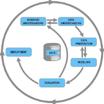
4.3 The Data Mining Process ... 47
4.4 Supervised and Unsupervised Learning ... 48
4.5 Model Evaluation and Cross-Validation... 49
4.6 Visualisation ... 53
4.6.1 t-Distributed Stochastic Neighbor Embedding ... 53
4.7 Decision Tree Learning ... 54
4.7.1 Decision Tree Example ... 55
4.7.2 History and Development ... 56
4.7.3 CART ... 58
4.7.4 Advantages and Disadvantages of CART Decision Trees ... 62
4.8 Random Forests, Bagging And Boosting ... 64
4.8.1 Bagging ... 64 4.8.2 Random Forests ... 65 4.8.3 Boosting ... 66 4.9 Clustering ... 67 4.9.1 K-means Clustering ... 68 4.9.2 Hierarchical Clustering ... 69
v
4.9.3 Evaluation ... 72
4.9.4 Limitations ... 75
4.9.5 Summary ... 76
4.10 Limitations of Data Mining ... 77
4.11 Conclusion ... 79
5 Data Mining in Social Science Research ... 80
5.1 Introduction ... 80
5.2 Computational Social Science ... 80
5.3 Big Data ... 82
5.3.1 Data Brokers ... 87
5.4 Data Mining in Social Science Research Literature ... 89
5.4.1 Educational Data Mining ... 89
5.4.2 Other Research Literature ... 92
5.5 Ways that Machine Learning Methods Might be Utilised in Social Science Research ... 101
5.6 Conclusion ... 101
6 Case Study Part A: Clustering Troubled Families ... 103
6.1 Introduction ... 103
6.1.1 The Troubled Families Programme ... 104
6.1.2 Intervention Treatment ... 106
6.1.3 Questions Raised About the TF Programme ... 107
6.2 Methodology ... 109
6.2.1 Data Description ... 110
6.2.2 Troubled Families Data ... 113
6.2.3 Geographical Visualisation of Data ... 119
6.2.4 Hierarchical Clustering Preparation ... 130
vi
6.3 Results ... 138
6.3.1 Hierarchical Clustering using Complete-Linkage ... 138
6.3.2 Detailed summary of clusters ... 153
6.3.3 Using Decision Tree Learning to describe the clusters... 172
6.3.4 Geographical Links to Families and Clusters ... 176
6.4 Summary ... 188
6.5 Discussion ... 195
6.6 Conclusion ... 198
7 Case Study Part B: Troubled Families One Year Later ... 202
7.1 Introduction ... 202
7.2 Methodology ... 202
7.3 Results ... 204
7.3.1 Intervention Length and Further Referrals ... 204
7.3.2 Counting Events in the Year Following the Start of Intervention ... 206
7.3.3 Comparison of cluster assignments one year later ... 221
7.3.4 School Attendance Timelines ... 223
7.3.5 Considering the Families One Year Later ... 229
7.3.6 Detailed Summary of clusters following the start of intervention ... 238
7.3.7 Prediction of outcome for families ... 257
7.3.8 Final Summary of clusters ... 268
7.4 Discussion ... 271
7.5 Conclusion ... 274
8 Conclusion ... 277
8.1 Introduction ... 277
8.2 Summary of the Work ... 277
8.3 The Research Questions ... 284
vii
8.5 Directions for Future Work ... 286
8.6 Final Thoughts ... 287
References ... 288
Appendices ... 304
Appendix A ... 304
A1: Attributes utilised as predictors for the models predicting cluster assignment from place-based data ... 304
A2: Full Variable Importance scores for each model, with model details ... 305
A3: Simpler Multinomial Logistic Regression Model ... 309
Appendix B ... 311
B1: Attributes utilised as predictors for the machine learning models ... 311
B2: Set 1 Results for Predicting planned/unplanned endings ... 312
B3: Set 2: Results for Predicting ‘improvement’ ... 319
viii
L
IST OF
F
IGURES
Figure 1: Anscombe’s Quartet data (Anscombe, 1973) plotted to illustrate the importance of data visualisation ... 12 Figure 2: The Knowledge Discovery in Databases (KDD) Process as defined by Fayyad et al. (1996) ... 47 Figure 3: The CRISP-DM Process, as defined by Chapman et al. (2000) ... 48 Figure 4: Example decision tree of passenger survival on the Titanic, with accuracy at each leaf (in decimal), and the percentage of data reaching that leaf (percentage). Data
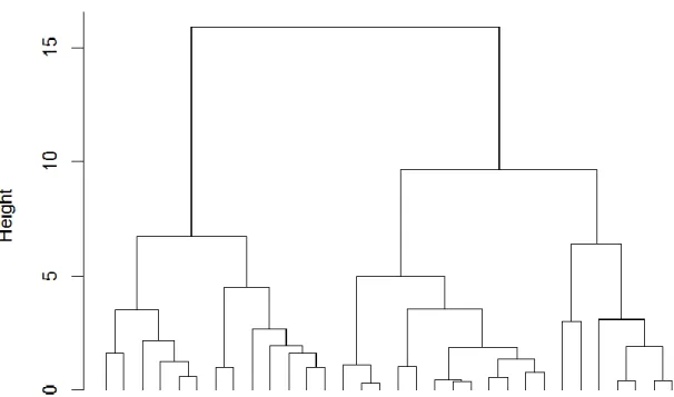
obtained from the ‘rpart’ R package (Therneau and Atkinson, 2015) ... 56 Figure 5: Example dendrogram, plotted using the R base package ‘mtcars’ sample data . 71 Figure 6: Example silhouette plot, showing the silhouette values for the 3-cluster solution of the example clustering contained in Figure 5, which utilised the R base package
‘mtcars’ sample data ... 74 Figure 7: Pearson correlation for various events occurring in the year prior to first
intervention, utilising the ECC TF data ... 118 Figure 8: Percentage of Troubled Families living in each LSOA (as a percentage of all families living there). Using ECC data and Census 2011 data ... 121 Figure 9: Percentage of Troubled Families living in each OA (as a percentage of all families living there). Using ECC data and Census 2011 data ... 121 Figure 10: Pearson Correlation between various characteristics of the city’s Output Areas (using Census 2011 data) and percentage of TF living in the Output Area (using ECC data) ... 122 Figure 11: Percentage of deprived households per LSOA (Census 2011 data) ... 125 Figure 12: Percentage of people with no qualifications per LSOA (Census 2011 data) .... 125 Figure 13: Percentage of people with bad or very bad general health per LSOA (Census 2011 data) ... 126 Figure 14: Percentage of lone parent households per LSOA (Census 2011 data) ... 126 Figure 15: Percentage of households that own their home per LSOA (Census 2011 data) ... 127 Figure 16: Percentage of economically active people per LSOA (Census 2011 data) ... 127 Figure 17: Percentage of people who committed a crime in each LSOA (2011), using ECC data ... 129
ix
Figure 18: Percentage of total crime occurring in each LSOA (2011), using Police data (Home Office (2016)) ... 129 Figure 19: Heatmap of the events occurring for each TF in the year prior to intervention, using ECC data ... 132 Figure 20: Distribution of family size for TF who had events in the year prior to
intervention, using ECC data ... 135 Figure 21: Distribution of family size for TF who had no events in the year prior to
intervention, using ECC data ... 135 Figure 22: Complete-Linkage hierarchical clustering dendrogram with the seven-cluster solution highlighted ... 139 Figure 23: Silhouette values and Gamma statistic values plotted for various cluster
solutions using complete-linkage hierarchical clustering method ... 140 Figure 24: Comparison of other hierarchical clustering linkage methods ... 141 Figure 25: Silhouette plot of the seven-cluster solution, obtained using complete-linkage hierarchical clustering of the ECC TF data ... 142 Figure 26: Two-dimensional representation, plotted using t-SNE, of the seven hierarchical clusters obtained from complete-linkage hierarchical clustering of the ECC TF data ... 143 Figure 27: Two-dimensional representation, plotted using t-SNE, of all eleven clusters (the seven clusters obtained by complete-linkage hierarchical clustering together with the four pre-specified clusters) ... 145 Figure 28: Nightingale plot of cluster characteristics ... 148 Figure 29: The percentage of families receiving each intervention type by cluster (ECC data) ... 150 Figure 30: Percentage of children in each cluster attending schools with each OFSTED rating, utilising ECC data linked to Department for Education (2016) data... 152 Figure 31: Percentage of families in cluster 1 with each event, with percentage of events for all families highlighted for comparison ... 153 Figure 32: Age distribution of children (aged under 18 on first intervention start date) and adults in cluster 1 ... 154 Figure 33: Percentage of families with each event for cluster 2, with percentage for all families highlighted ... 155 Figure 34: Age distribution of children (aged under 18 on first intervention start date) and adults in cluster 2 ... 156
x
Figure 35: Percentage of families with each event for cluster 3, with percentage for all families highlighted ... 157 Figure 36: Age distribution of children (aged under 18 on first intervention start date) and adults in cluster 3 ... 158 Figure 37: Percentage of families with each event for cluster 4, with percentage for all families highlighted ... 159 Figure 38: Age distribution of children (aged under 18 on first intervention start date) and adults in cluster 4 ... 160 Figure 39: Percentage of families with each event for cluster 5, with percentage for all families highlighted ... 161 Figure 40: Age distribution of children (aged under 18 on first intervention start date) and adults in cluster 5 ... 162 Figure 41: Percentage of families with each event for cluster 6, with percentage for all families highlighted ... 163 Figure 42: Age distribution of children (aged under 18 on first intervention start date) and adults in cluster 6 ... 164 Figure 43: Percentage of families with each event for cluster 7, with percentage for all families highlighted ... 165 Figure 44: Age distribution of children (aged under 18 on first intervention start date) and adults in cluster 7 ... 166 Figure 45: Age distribution of children (aged under 18 on first intervention start date) and adults in cluster 8 ... 167 Figure 46: Age distribution of children (aged under 18 on first intervention start date) and adults in cluster 9 ... 168 Figure 47: Age distribution of children (aged under 18 on first intervention start date) and adults in cluster 10 ... 169 Figure 48: Age distribution of children (aged under 18 on first intervention start date) and adults in cluster 11 ... 170 Figure 49: Decision tree visualising cluster rules, derived using the ‘rpart’ R package implementation of the CART algorithm and plotted with the ‘rpart.plot’ R package ... 174 Figure 50: TF living in each LSOA as a percentage of all households in each LSOA, by cluster assignment (utilising ECC data linked to Census 2011 data) ... 177
xi
Figure 51: Heatmaps of TF geographical concentration for each cluster (utilising ECC data) ... 179 Figure 52: TF living in each LSOA as a percentage of the total TF living there, by cluster (utilising ECC data) ... 180 Figure 53: Parallel points plot of place-based data (Census 2011 data linked to the Output Area that each TF lived in) aggregated by cluster assignment ... 182 Figure 54: Heatmap comparison of the geographical locations of families in clusters 1 and 3 ... 184 Figure 55: Comparison of events for each TF in the years prior to and following the first intervention date, utilising ECC data ... 208 Figure 56: Monthly count of Children In Need (CIN) events for all children in the ECC area, compared to just TF children (utilising ECC data) ... 210 Figure 57: Monthly count of Child Protection Plan (CPP) events for all children in the ECC area, compared to just TF children (utilising ECC data) ... 211 Figure 58: Monthly count of Looked After Children (LAC) events for all children in the ECC area, compared to just TF children (utilising ECC data) ... 212 Figure 59: Half-termly average percentage of unauthorised school absence for all pupils in the ECC area, compared to just the TF pupils (utilising ECC data) ... 213 Figure 60: Half-termly count of school exclusions for all pupils in the ECC area compared to just the TF pupils (utilising ECC data) ... 213 Figure 61: Count of NEET incidence per month, for all individuals in the ECC area
compared to just TF individuals (utilising ECC data) ... 214 Figure 62: Monthly count of criminal offences committed by adults for the ECC area, compared to just TF adults (utilising ECC data) ... 215 Figure 63: Monthly count of criminal offences committed by children (aged under 18) for the ECC area, compared to just TF children (utilising ECC data) ... 215 Figure 64: Nightingale plot comparison of cluster characteristics in the year before and after the start of intervention (Using ECC data) ... 220 Figure 65: Alluvial plot showing the change in cluster assignments one year after the start of intervention ... 222 Figure 66: Timelines of school absence for the five half-terms before and after the start of intervention for all applicable children, ECC data ... 225
xii
Figure 67: Individual school absence timelines for the five half-terms before and after the start of intervention for children in each cluster, ECC data ... 225 Figure 68: Average percentage of School Absence by Cluster, for the five-half terms before and after the start of intervention, ECC data ... 226 Figure 69: Absence timelines aggregated by school OFSTED rating, for the five half-terms before and after the start of intervention (ECC data linked to Department for Education (2016) data) ... 228 Figure 70: Percentage of families with events in the years before and after the start of intervention, for all families ... 239 Figure 71: Percentage of families with events in the years before and after the start of intervention for cluster 1 ... 239 Figure 72: Percentage of families with events in the years before and after the start of intervention for cluster 2 ... 241 Figure 73: Percentage of families with events in the years before and after the start of intervention for cluster 3 ... 243 Figure 74: Percentage of families with events in the years before and after the start of intervention for cluster 4 ... 244 Figure 75: Percentage of families with events in the years before and after the start of intervention for cluster 5 ... 246 Figure 76: Percentage of families with events in the years before and after the start of intervention for cluster 6 ... 247 Figure 77: Percentage of families with events in the years before and after the start of intervention for cluster 7 ... 249 Figure 78: Percentage of families with events in the years before and after the start of intervention for cluster 8 ... 251 Figure 79: Percentage of families with events in the years before and after the start of intervention for cluster 9 ... 252 Figure 80: Percentage of families with events in the years before and after the start of intervention for cluster 10 ... 254 Figure 81: Percentage of families with events in the years before and after the start of intervention for cluster 11 ... 255
xiii
L
IST OF
T
ABLES
Table 1: Anscombe’s quartet data, x and y values for four datasets, from Anscombe (1973) ... 11 Table 2: Anscombe’s quartet summary statistics for all four datasets, from Anscombe (1973) ... 11 Table 3: Details of useful Information contained in the ECC database ... 111 Table 4: Brief description of all individuals contained in the ECC database ... 112 Table 5: Number of troubled families with each configuration of adults and children, using ECC TF data ... 114 Table 6: Overview of TF demographics and events occurring in the year prior to
intervention, using ECC data ... 115 Table 7: Percentage of TF receiving each first intervention type, from ECC TF intervention data ... 119 Table 8: Status of first interventions, from ECC TF intervention data ... 119 Table 9: Percentage of families with each number of different types of events in the year prior to intervention (ECC data) ... 133 Table 10: Comparison of TF with and without events in the year prior to first intervention, using ECC data ... 134 Table 11: Comparison of cluster metrics to determine the optimal number of clusters . 139 Table 12: Silhouette widths for seven-cluster solution of the ECC TF data clustering ... 141 Table 13: Percentage of families with each event per cluster with notable percentages highlighted in bold ... 146 Table 14: Mean number of events for each cluster, with notable means highlighted in bold ... 146 Table 15: Percentage of families with each event per cluster, for events not clustered on (with notable percentages highlighted in bold) ... 149 Table 16: First intervention treatment types by cluster (with notable percentages
highlighted in bold) ... 149 Table 17: First Intervention treatment outcomes by cluster (with notable percentages highlighted in bold) ... 151 Table 18: School OFSTED ratings by cluster, utilising ECC data linked to Department for Education (2016) data ... 151
xiv
Table 19: Confusion matrix for predicted cluster assignments ... 173 Table 20: Variable importance scores for the decision tree predicting cluster assignment ... 175 Table 21: Aggregated demographic data by cluster assignment with interesting
characteristics highlighted in bold (utilising ECC and Census 2011 data) ... 181 Table 22: Accuracy on test dataset for each of the models predicting cluster membership using place-based attributes ... 186 Table 23: Most important ‘place-based’ attributes for each model to predict cluster assignment ... 187 Table 24: Percentage of families who had further referrals and treatment, by cluster and overall. From ECC intervention data ... 205 Table 25: Percentage of first interventions ending in planned and unplanned ending by treatment type, from ECC intervention data ... 206 Table 26: Percentages of families with events in the year prior to and following first intervention date, utilising ECC data ... 209 Table 27: Percentage of families in each cluster with events in the year prior to and
following first intervention date (with interesting percentage highlighted in bold). Utilising ECC data ... 216 Table 28: Percentage of families in each cluster with events not clustered upon in the year prior to and following start of intervention (with interesting percentages highlighted in bold). ECC data ... 217 Table 29: For each cluster, the percentage of families who had no further events after the start of intervention treatment ... 222 Table 30: Number and percentage of children with absence timeline data from each cluster, utilising ECC data ... 224 Table 31: Phase 1 reduced criteria - number of families whose children met the criteria in the year following the start of intervention, by cluster (with percentages in parentheses). ECC data ... 230 Table 32: Number (and percentage in parentheses) of families who had no further events, fewer events, or more events after the start of intervention. ECC data ... 231 Table 33: Families who had some improvement after the start of intervention, using a combined approximation of the Government guidelines with consideration of the
xv
Table 34: Percentage of first interventions that ended in planned or unplanned endings, by families that had ‘improvement’ or not, and by cluster ... 235 Table 35: Percentage of families who received more than one intervention, for families with and without ‘improvement’ and by cluster assignment. ECC data ... 236 Table 36: Results of models predicting planned/unplanned endings with/without further treatment (with models that beat baseline accuracy highlighted in bold) ... 260 Table 37: Baseline accuracy compared to test set accuracy for models predicting
'improvement'. Models with test set accuracy better than the baseline are highlighted in bold ... 264 Table 38: Brief comparison of the key characteristics of families in the clusters before and after the start of intervention ... 268
xvi
T
ERMINOLOGY
Attribute Equivalent to variables or features, e.g. a person’s race or gender Predictor Independent variable
Target Dependent variable
Model fit The goodness of fit of a model describes how well it fits the data. A well fitted model predicts very close or equal to the actual target value
Overfitting Occurs where a model learns the data too well (i.e. it captures noise as well as any underlying relationship) and cannot generalise to new data
Underfitting Occurs where a model cannot capture any pattern in the data Type I error Incorrectly rejecting a true null hypothesis (false positive) Type II error Incorrectly accepting a false null hypothesis (false negative) Sensitivity Also known as true positive rate or recall, this is the proportion of
positives correctly identified in a classification model (e.g. the proportion of patients correctly identified as having a disease) Specificity Also known as the true negative rate, this is the proportion of
negatives correctly identified in a classification model (e.g. the percentage of healthy people correctly identified as not having a disease)
P-value The probability of obtaining this (or more extreme) data, given that the null hypothesis is true
NHST Null hypothesis significance testing TF Troubled Family
ECC The English City Council who provided the TF data for this study (and wished to remain anonymous)
CIN Children in Need CPP Child Protection Plan LAC Looked After Children
1
1
I
NTRODUCTION
1.1
B
ACKGROUNDThe analysis and understanding of data is fundamentally important to society. Analysis of data might be used to: test an existing hypothesis; formulate new hypotheses; check the reliability and quality of a dataset; evaluate the level of impact of one or more variables against another; gain insights and explore hidden relationships; show that a dataset is not completely random; or to predict future cases or events. There are many reasons for data analysis, but perhaps the overall aims are to discover something useful, to predict something, or to support decision and policy making.
In recent years data-driven analysis (or data science) has become more prevalent, both in academic research and in industry. This has coincided with the growth of ‘big data’, a reduction in the cost of data storage, and ever more powerful computers. Data is being stored at a rapid rate and in massive volumes, and it is collected from almost every imaginable source - for example, customer databases, social media, sensor data, financial data, governmental data, and biomedical and scientific data. This ever-increasing store of data has generated great interest into how best to derive insights or gain competitive advantage from it. Many traditional statistical techniques are simply not equipped to cope with the size, type and dimensionality of these large quantities of data. This has prompted improvements in the methods used to analyse it, such as more efficient algorithms and the development of free, open-source software.
Whilst much of the focus has been on ‘big’ data with regards to machine learning, the methods can usefully be deployed upon ‘smaller’ data, and they are particularly suited to the types of data that are synonymous with social science research (such as social
surveys, and wide, interlinked data). Academic fields such as computer science have deep involvement in developing methods for, and analysing, this data; however, the social sciences have seemingly lagged behind in adopting these new methods. Social scientists are ideally placed to ask informed research questions of this new data, to aid in
understanding results and to take advantage of these methods. Yet, whilst there is growing interest in the use of machine learning methods, they are not frequently utilised in social science research.
2
1.2
A
IMSThis project aims to show that machine learning techniques can be utilised effectively on social science datasets and that they can be particularly useful for identifying patterns and hidden underlying relationships.
The project also aims to show that machine learning techniques can effectively
complement the more established methods, such as regression. Machine learning might be used for exploratory data analysis, to discover hidden groups within data, to identify relationships and important predictors, determine the structure of a dataset, to generate hypotheses, or be utilised to confirm results. The adoption of machine learning methods such as cross-validation could also produce more robust work when applied to
established methods.
1.3
R
ESEARCHQ
UESTIONSA
NDO
BJECTIVES The overall research questions are: Can machine learning techniques be effectively utilised or adapted to facilitate the analysis and comprehension of large social science data sets?
Which data mining methods are most effective for discovering otherwise hidden patterns within complex and often noisy social data?
Can data mining methods provide a detailed picture of trends and patterns within a dataset?
Can machine learning methods be utilised to suggest new hypotheses and research questions?
The objectives of this research are to explore the use of machine learning in the social sciences, and to discover how these methods might be best utilised on social science data. This includes considering the methods that are currently employed and exploring why there may be a reluctance to explore the utilisation of more data-driven methods. A practical analysis of the use of machine learning methods will be provided by a large analysis of data pertaining to the Troubled Families Programme. The data is anonymised so as not to identify individuals or families. It is also noisy and interlinked, and contains information pertaining to the events that families had (such as school absence, criminal offences and child safeguarding events) and details that described the families and the
3
individuals in them (such as age, location, and details of the intervention treatments that families received).
This analysis will consider whether machine learning methods can be effectively utilised to identify groups or patterns within the data. More explicitly, it asks:
Whether there exist unique groups of families within the Troubled Families data
Does the identification of these groups provide deeper insight than one overall analysis of the data might provide?
How do the lives of the families in each cluster change following their introduction to the TF programme, and is it possible to predict, or identify important factors that may indicate where positive future outcomes will occur?
1.4
O
UTLINEChapters 2 and 3 provide a description of the methods that are most commonly used in social science research, this is in order to provide a baseline for the following chapters which discuss alternative methods that might be used to complement these methods. Chapter 2 provides a description of linear regression, and the various assumptions that must be satisfied in order for results to be valid. It explores model interpretation and considers the issues with linear regression that might lead to flawed results.
Chapter 3 considers null hypothesis significance testing and explores the various issues surrounding its use, a broader discussion of reproducibility is also included. Chapter 4 provides an outline of data mining, including a brief history, and outline of various methods. The methods utilised in this thesis are explored; these are clustering, decision tree learning, random forests and boosted methods. There is a discussion of both the positive and negative aspects of data mining. Chapter 5 explores the use of data mining methods in existing social science research and considers the ways that these methods might be optimally utilised.
Chapters 6 and 7 comprise parts 1 and 2 of the case study. This explored data
surrounding the Troubled Families programme, which was set up by the UK Government in order to target and provide help to families with multiple problems (such as school exclusion, child safeguarding issues, or criminal offences). Chapter 6 provided a description of the Troubled Families Programme and aimed to discover whether there were any clusters, or groups of similar families within the data. The geographical location
4
of the families was also explored in order to determine whether location might be an important factor in a family’s problems. Chapter 7 continued the analysis from Chapter 6 and utilised the clusters to investigate the lives of the families in the year after they joined the TF programme. This considered whether families had shown any improvement in their circumstances one year later. Both of the chapters utilised data mining methods, such as cluster analysis, decision tree learning and visualisation techniques in order to explore and analyse the data.
Chapter 8 concludes the thesis and provides a summary of the research together with a consideration of the contributions of the research and avenues for future work.
5
2
R
EGRESSION
2.1
I
NTRODUCTIONThe purpose of this, and the following, chapter is to discuss established approaches used in the social sciences, and to highlight the advantages and disadvantages of these
methods. These methods are explored in order to establish a reason for considering the use of alternative methods, and to provide a baseline for discussion of these alternatives. Linear regression and other correlational methods are widely used in the social sciences, and can be powerful tools, in that their results are relatively easy to understand, and they can intuitively highlight relationships between attributes. However, linear regression relies upon strict statistical assumptions to be effective and this chapter explores those assumptions and the consequences of not satisfying them.
This chapter also provides a brief description of Ordinary Least Squares Linear Regression. Methods of interpretation and evaluation of regression models are described,
highlighting that there can be weaknesses with some of the methods used. The importance of visualisation and exploratory data analysis in the modelling process is considered. A discussion of the literature surrounding the various issues associated with the use of linear regression in the social sciences is provided. This explores what the consequences of misspecified regression models are, gives a consideration of why models are sometimes misspecified, and considers suggestions as to how to overcome some of the problems.
2.2
B
ACKGROUNDRegression Analysis is one of the fundamental processes of modern statistics and encompasses a broad range of techniques and methods, but in essence, it explores the relationship between a target (or dependent, outcome or response) attribute and one or more predictor (or independent or explanatory) attributes. It is used to identify whether there is a relationship between the predictor/s and the target attribute, to describe both the form and strength of those relationships, and to also provide an equation (or
mathematical model) describing the relationship such that the predictors can be used to predict the target.
6
Ordinary Least Squares (OLS) Linear Regression is one of the most commonly used methods in Social Science papers that require some form of quantitative analysis of the relationships between attributes. The method had its beginnings in the early 1800s when mathematicians Adrien-Marie Legendre (1752-1833) and Carl Friedrich Gauss (1777-1855) both, independently of each other and for the purpose of calculating astronomical orbits, published papers describing the method of least squares (Sorenson, 1970).
Building upon this, scientist Sir Francis Galton (1822-1911) was instrumental in the development of modern ideas of regression and correlation. He was particularly
interested in genetics and heredity, and presented the first regression line at a lecture in 1877 (Stanton, 2001). In further work on the heights of parents and their children, he first described the phenomenon of regression towards the mean (Galton, 1886). Galton’s colleague, mathematician Karl Pearson (1857-1936), and Udny Yule (1871-1951) extended and formalised mathematically much of their ideas on regression and correlation (Yule, 1897; Pearson et al., 1903). Pearson himself is generally credited as being one of the founders of modern statistics, having defined the Pearson Product Moment correlation coefficient, the Chi-squared distribution, and the idea of p-values and statistical
hypothesis testing (Pearson, 1900).
Although in recent years new regression methods have been developed to deal with more complex data and problems, OLS regression is still arguably the most commonly used method (Berk et al., 2014). Newer methods include: robust regression, which attempts to deal with outliers and heteroscedasticity; nonparametric regression which can provide a more flexible regression curve and relaxes the assumption of linearity; Bayesian regression which is useful for poorly distributed and more complex data and provides analysis within the context of Bayesian inference; ridge regression which attempts to alleviate multi-collinearity of predictors; and time series regression.
2.3
OLS
L
INEARR
EGRESSIONSimple linear regression is the method of predicting a quantitative target attribute Y from a single predictor attribute X, assuming that there is a linear relationship between the two (i.e. that their relationship can be described by a straight line when plotted).
Mathematically, where there are n data points, a target attribute 𝑦𝑖, and the single
7
𝑦𝑖 = 𝛽0+ 𝛽1𝑥𝑖 + 𝜖𝑖 (2.1) For 𝑖 = 1, … , 𝑛 and where the regression coefficients 𝛽0 and 𝛽1 are unknown constants
that represent the intercept and slope terms in the model. 𝜖𝑖 is the error term or
residual. The intercept 𝛽0 is the value of y when x = 0, i.e. it is the point at which the
regression line crosses the y-axis when plotted. The slope, 𝛽1, refers to how much change
there is predicted in y for one unit change in x. The residual is the difference between the predicted value (𝑦̂𝑖) and actual value of 𝑦𝑖, written 𝜖𝑖 = 𝑦𝑖− 𝑦̂𝑖. Residuals may be
positive or negative; if the residuals were all zero, all data points would sit on the regression line and there would be no error at all in the model.
In many cases, a simple model is not adequate and there is a need to consider more than one predictor; this is particularly true when dealing with complex datasets and real-world problems. In this case, multiple linear regression is required. The equation for this is:
𝑦𝑖 = 𝛽0+ 𝛽1𝑥𝑖1+ ⋯ + 𝛽𝑗𝑥𝑖𝑗 + 𝜖𝑖 (2.2) For 𝑖 = 1, … , 𝑛 and where there are n data points, 𝑦𝑖 is the target, and 𝑥𝑖1 to 𝑥𝑖𝑗 are the
predictors. 𝛽0 is the intercept and 𝛽1 to 𝛽𝑗 are the regression coefficients.
For both multiple and simple linear regression, the optimal solution is found by using the data to estimate the values of the unknown constants 𝛽0 to 𝛽𝑗. There are various
methods for accomplishing this, but by far the most commonly used (Hayes and Cai, 2007; James et al., 2013) is the method of Ordinary Least Squares, or OLS. This may be because it is relatively quick and easy to implement (it is included in most statistical software as standard), the basic methodology is relatively easy to understand (especially for those without a mathematical background), and it is easily interpretable. OLS seeks to find the straight line or plane that cuts through the data points, producing the least amount of error.
The OLS function derives the estimates (𝛽̂₀ to 𝛽̂𝑗) by finding the line or plane that
minimizes the sum of squared errors (SSE) between the actual and predicted values for 𝑦𝑖. Squaring the errors removes any issue over whether the error is negative or positive.
𝑆𝑆𝐸 = ∑ 𝜖𝑖2 𝑛 𝑖=1 = ∑(𝑦𝑖− 𝑦̂𝑖)2 𝑛 𝑖=1 (2.3) Minimising this gives, in the case of simple regression, the following equations (James et al., 2013):
8 𝛽̂1 = ∑𝑛𝑖=1(𝑥𝑖 − 𝑥̅)(𝑦𝑖 − 𝑦̅) ∑𝑛𝑖=1(𝑥𝑖 − 𝑥̅)2 (2.4) 𝛽̂0 = 𝑦̅ − 𝛽 1 ̂𝑥̅ (2.5)
Where 𝑦̅ and 𝑥̅ are the means of the target and predictor attributes.
Multiple linear regression can be generalised to handle categorical target attributes and those that are not Normally distributed. In the case of a binary target, logistic regression may be used. Logistic regression aims to estimate the probability of a specific level of the target attribute given the predictors, and can be employed for both binary or multinomial target data. Linear and logistic regression (and Poisson regression, ANOVA, etc.) belong to a broader class of models called the generalised linear model, or GLM (Nelder and Wedderburn, 1972). GLM is a flexible generalisation of linear regression that allows for target attributes that follow any distribution from the Exponential family (rather than just those that are Normally distributed) and allows for a link function of the mean to vary linearly with the predictors (rather than assuming that the target itself must vary linearly).
2.4
A
SSUMPTIONSLinear regression remains popular in the social sciences because it provides a relatively easy to understand equation that can help to identify significant predictors. It also allows a researcher the ability to examine the effect of one predictor on the target whilst holding all other variables constant. This is particularly useful in a social science context, where unlike with more natural sciences (for example, chemistry), the experimental variables often cannot be manipulated. For example, a researcher cannot change a subject’s income or age whilst holding all other variables constant; much social science data is observed, and not manipulated through experiments. However, as with many statistical methods, for OLS regression to be effectively implemented, and for its results to be reliable it must satisfy certain assumptions (Boslaugh, 2013; James et al., 2013):
Linearity – The target should be linearly related to the predictor/s. That is, the relationship could be plotted on a straight line (or on an n-dimensional plane where there are n predictors)
Normality – all continuous attributes should be approximately Normally distributed, and without extreme outliers
Independence of errors – the prediction error for each data point should be independent of the prediction error of all other data points, and errors should be Normally distributed
9
Homoscedasticity – the variance of the target should not vary for different values of the predictors. That is, the prediction errors should be constant over the entire data range, and not, for instance, smaller or larger when Y is small
Multicollinearity – for multiple regression, none of the predictors should be correlated with each other. Highly correlated predictors can obscure the true relationship of each individual predictor to the target attribute
Linear regression also generally relies upon the idea that the data is of good quality (no measurement errors), is not too small, and where it is a sample, that it is drawn from a random sample of the whole population. In reality, when dealing with complex social science data, these assumptions can be very difficult to identify and satisfy. Often, they may be only partially satisfied, if at all. Yet if they are not, then it is likely that regression results will be inaccurate, and that conclusions drawn from the model may be misleading (Freedman, 1995; Berk et al., 2017). The severity of the consequences varies greatly depending upon the assumptions that are not satisfied. Outliers and non-linearity can cause bias in the regression parameters, meaning that the relationships are not described accurately. Heteroscedasticity, multicollinearity and residuals that are not Normally distributed result in biased standard errors of regression estimates, which then lead to incorrect confidence intervals and significance tests (Erceg-Hurn and Mirosevich, 2008). This can cause problems when making statistical inferences and generalising to a larger population.
There are methods to deal with some of these issues. For example, data might be transformed into a more linear form (e.g. using a log or inverse transformation),
interaction terms might be included, or outliers removed, so that assumptions are met. But these transformations must be deemed suitable for the particular model and also be interpretable. However, often the first difficulty may simply be identifying that there is a problem, particularly when dealing with large, complex datasets. In reality, models may rarely completely satisfy all of the assumptions. Where assumptions cannot be
adequately satisfied, or the data simply is not linear, it may be that a more robust or non-parametric method would be more suitable, rather than performing linear regression.
2.5
M
ODELI
NTERPRETATIONIdeally models should be interpreted and evaluated by a mixture of visualisation and statistical measures (Achen, 2005; Draper and Smith, 2014; Woodside, 2016), these are considered in the following section.
10
2.5.1 Visualisation
Whilst there are many statistical measures available to evaluate a model, visualisation is also a vital tool. Visualisation of data is important both before and after a regression as it may reveal problems that are not easily identifiable from numerical statistics alone. Prior to regression, visualisation may highlight when a dataset does not satisfy regression assumptions and enable suitable transformations to be made to the data where
appropriate; it thus may help avoid making Type I and Type II errors. It can be particularly useful in identifying outliers, non-linear relationships, collinearity of predictors, and homoscedasticity.
After regression, visualisation can be a useful tool for analysing the residuals and may also help to identify possible weaknesses in the model, such as heteroscedasticity. Useful methods include plotting the residuals against the fitted values and predictors, and quantile (Q-Q) plots to check for normality.
Given how useful it can be, visualisation should be a vital step in the regression process, yet in general, statistical visualisation is frequently underused in the social sciences (Zuur et al., 2010; Healy and Moody, 2014). Despite the increased availability and usability of software to aid in the production of visualisations (and in data analysis generally), it seems that the social sciences, and in particular sociology, are lagging behind other areas in their use of statistical visualisation (Healy and Moody, 2014). As highlighted by Healy and Moody (2014) it is common for top sociology journals to publish papers with many tables but no figures, whereas the opposite is true of the top natural science journals; in these, a key figure is often central to the article and this may help to illuminate the discussion.
The consequences of relying solely upon descriptive statistical outputs and not adequately exploring and visualising data were effectively highlighted by Anscombe (1973) and more recently by Soyer and Hogarth (2012). Despite its age, the Anscombe’s quartet example is still widely quoted (for example, Shoresh and Wong (2012), Branch (2014), Healy and Moody (2014), Lindsay (2015), Nielsen (2016) and Woodside (2016)) because it effectively illustrates that exactly the same summary and regression output statistics can be obtained from very different datasets.
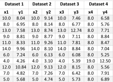
Anscombe (1973) created four simple datasets of x and y values, with 11 observations for each, and performed a regression on each dataset. The data is contained in Table 1; in
11
the first three datasets the x values are identical, however, the y values are different for all datasets. Table 2 highlights the summary statistics for each dataset, which are almost identical despite differences in the data.
Table 1: Anscombe’s quartet data, x and y values for four datasets, from Anscombe (1973)
Dataset 1 Dataset 2 Dataset 3 Dataset 4
x1 y1 x2 y2 x3 y3 x4 y4 10.0 8.04 10.0 9.14 10.0 7.46 8.0 6.58 8.0 6.95 8.0 8.14 8.0 6.77 8.0 5.76 13.0 7.58 13.0 8.74 13.0 12.74 8.0 7.71 9.0 8.81 9.0 8.77 9.0 7.11 8.0 8.84 11.0 8.33 11.0 9.26 11.0 7.81 8.0 8.47 14.0 9.96 14.0 8.10 14.0 8.84 8.0 7.04 6.0 7.24 6.0 6.13 6.0 6.08 8.0 5.25 4.0 4.26 4.0 3.10 4.0 5.39 19.0 12.50 12.0 10.84 12.0 9.13 12.0 8.15 8.0 5.56 7.0 4.82 7.0 7.26 7.0 6.42 8.0 7.91 5.0 5.68 5.0 4.74 5.0 5.73 8.0 6.89
Table 2: Anscombe’s quartet summary statistics for all four datasets, from Anscombe (1973)
Statistics for all four datasets: Value:
Mean of x 9 (exact)
Variance of x 11 (exact)
Mean of y 7.50 (to 2 d.p.)
Variance of y 4.1 (to 1 d.p.)
Correlation between x and y 0.82 (to 2 d.p.)
Linear regression equation y = 3.0 + 0.5x (to 1 d.p.)
𝑹𝟐 0.67
The 𝑅2 for all the models is the same, and is moderately high, explaining two thirds of the variation in the data. However, when the x and y values for each dataset were plotted together with the regression lines an interesting picture emerged (Figure 1). For Dataset 1, the model had captured the relationship, with the regression line going directly
through the middle of the points, but for the other three models there were clear
problems. Dataset 2 showed no linear relationship between x and y (so linear regression was not appropriate, at least without transformation). Dataset 3 had one clear outlier which had forced the regression line upwards (without it, there would be a straight line). And dataset 4 also had one clear outlier that had skewed the relationship from what would have been a simple straight line.
12
Figure 1: Anscombe’s Quartet data (Anscombe, 1973) plotted to illustrate the importance of data visualisation
Whilst a simple example in two dimensions, Anscombe highlighted the importance of not relying solely upon numerical statistics, and of visualising the data both before and after a regression. It also highlighted that, in this case, evaluating the models using the 𝑅2 value would have led to a belief that all models were equally valid, when they clearly were not. Another example is provided by Matejka and Fitzmaurice (2017) who created multiple datasets that wildly differed visually but shared identical summary statistics.
Contrasting Anscombe’s work, Soyer and Hogarth (2012) illustrated that providing numerical regression outputs alone can result in misleading interpretations of regression models. Their experiment asked leading academic economists to interpret simple linear regression outputs (such as 𝑅2, standard errors, regression coefficients and scatter plots) and make probabilistic inferences from them. The participants produced the most accurate interpretations where given only visualisations to study. When given just numerical regression outputs they were less accurate; interestingly, the addition of visualisations to these made little difference. Where forced to consider only
13
visualisations (scatter plots with regression lines) participants were more accurate and Ziliak (2012:713) suggests that this was because a simple graph allowed them to visualise the model uncertainty, whereas without this the econometricians fell back upon
focussing on 𝑅2 and t values and hence were likely to ‘vastly’ over or underestimate the levels of uncertainty.
As acknowledged by the authors, there were limitations to the study. It had only a 9% response rate, and asked questions which might be considered ‘tricky’ as they involved calculating probabilities (as opposed, say, to simply assessing the ‘significance’ of particular variables). However, it highlighted the extent to which regression outputs alone may be misinterpreted, and identified that providing basic visualisations allowed the experts to infer levels of uncertainty more accurately.
Both the Soyer and Hogarth (2012) and Anscombe (1973) examples highlight that visualisations can allow more accurate inference, and that summary statistics alone cannot always identify correlations and non-linear relationships within a dataset.
However, these were both simple, two-dimensional examples and it should be noted that more complex, higher dimensional data may be more difficult to analyse. Newer data mining visualisation methods present ways to do this (Liu et al., 2017), but seem so far to be more frequently utilised outside the field of social science. In particular, as well as more established methods such as Principal Component Analysis, a method such as t-Distributed Stochastic Neighbor Embedding (t-SNE) is effective at representing high-dimensional data in two (or three) dimensions, which may then be visualised in a scatterplot (Van Der Maaten and Hinton, 2008).
2.5.2 Statistical Measures
Statistical measures used to evaluate a regression model generally include the F statistic, Residual Standard Error (RSE), coefficient of determination (𝑅2), the standard errors of the regression coefficients and their t-values and p-values, and tests to determine the distribution of the residuals, such as the Kolmogorov-Smirnov test (Boslaugh, 2013; James et al., 2013). Where there are multiple predictors, the standard errors and their p-values are typically used to decide which predictors are significant.
As well as considering the standard errors of the individual regression coefficients, the Residual Standard Error (RSE) is also a popular measure of overall fit (or lack of fit) of a
14
regression model (James et al., 2013). It is an estimate of the standard deviation of the residuals, 𝜖, and has the formula
𝑅𝑆𝐸 = √ 1
𝑛 − 𝑝 − 1∑(𝑦𝑖− 𝑦̂𝑖)2
𝑛
𝑖=1
(2.6)
Where n is the sample size, p is the number of predictors, and 𝑦𝑖 − 𝑦̂𝑖 is the error, or
residual.
RSE is measured in units of Y, and not in the form of a percentage or proportion. This means it should provide a meaningful measure of fit (since it is in the same unit as the target), but in practice it can be difficult to determine what a good RSE value is. However, a small RSE generally indicates that there is only small error and the model fits the data well, i.e. that 𝑦𝑖 ≈ 𝑦̂𝑖 for i = 1,…,n. Whereas a large RSE may indicate a lack of fit, i.e. that
the values of 𝑦̂𝑖 are very far from 𝑦𝑖. It is dependent upon the specific dataset as to what
might constitute acceptably ‘small’ or ‘large’ RSE values. An advantage of the RSE is that it can be used to compare different regression models (as opposed to the 𝑅2, which cannot where different data samples are used).
2.5.2.1 R-Squared
Perhaps the most commonly used method of evaluating model fit (Renaud and Victoria-Feser, 2010; Draper and Smith, 2014) is to calculate the coefficient of determination, or 𝑅2. The 𝑅2 is generally defined as the proportion of variation in the target, Y, that is
explained by the model. 𝑅2 takes a value between 0 and 1, where an 𝑅2 of zero would mean a model that explained none of the variation, and an 𝑅2 of 1 would mean a perfect model (all points on the regression line/plane). An 𝑅2 of 0.9, for example, would mean that 90% of the variation in the values of Y could be accounted for by the values of X. For simple linear regression the 𝑅2 is calculated as the square of the correlation between the target (Y) and predictor attribute (X), that is 𝐶𝑜𝑟(𝑋, 𝑌)2. In the case of multiple linear regression, 𝑅2 is calculated as the square of the correlation between the target and the prediction, 𝐶𝑜𝑟(𝑌, 𝑌̂)2.
Adding more predictors to a model will always increase the 𝑅2, regardless of whether there is any significant effect (James et al., 2013:212). Therefore, it can be a deceptive metric where there are many predictors. An alternative measure is the adjusted 𝑅2,
15
which corrects for sample size and the number of predictors, by penalizing the addition of predictors that add nothing to the model (James et al., 2013:212).
𝐴𝑑𝑗𝑢𝑠𝑡𝑒𝑑 𝑅2 = 1 − 𝑆𝑆𝐸 (𝑛 − 𝑝 − 1)⁄
𝑇𝑆𝑆 (𝑛 − 1)⁄ (2.7) where p is the number of predictors, n the data sample size, SSE is the sum of squared errors, and TSS is the total sum of squares.
The adjusted 𝑅2 may be a more suitable measure than 𝑅2 if a model contains many predictors, or when comparing models that contain different numbers of predictors (but use the same dataset). However, despite the apparent usefulness of the adjusted 𝑅2 in these conditions, it seems that it is still not utilised as often as it could be in academic research. This may be because some regression texts do not seem to stress its usage (for example, Draper and Smith (2014:140)) or because it is seen simply as a measure to enable choice between many models and this is often not required.
Overall, the 𝑅2, with its value measured as a proportion between 0 and 1, can be an attractive metric as it appears much easier to understand than measures such as the RSE. However, the 𝑅2 value can be deceptive, and in practice, it is not always easy to
determine what a ‘good’ 𝑅2 value should be. It is dependent upon the context of the model; the particular dataset and the model goal. In fields such as machine learning, a value close to 1 would be expected from a ‘good’ model, whereas in fields that contain noisy data with much unmeasured error, a much smaller 𝑅2 may be deemed acceptable. Reporting 𝑅2 values of less than 0.1 is common in fields such as sociology and political science and whilst such low values could indicate measurement difficulties or large random effects, it could also indicate that important factors have been omitted from the model (Freedman, 2009:52).
The 𝑅2 has long been considered a controversial measure of fit for regression models, with the criticism spanning many decades (for example, Tufte (1969), Achen (1977), King (1991), Berk (2004)). A problem with using the 𝑅2 as a measure of fit is that in the simple case, it does not evaluate the model at all, it is simply an indicator of correlation. In the case of multiple regression, the 𝑅2 always increases as the number of predictors
increases, irrespective of model performance, and this can be misleading. And since the 𝑅2 is dependent upon underlying variation in the data, it cannot be used to compare
16
simply because of different sample variance, rather than that the underlying relationships have changed (Achen, 1977).
Achen (1990) describes the 𝑅2 as meaningless and a measure only of the particular data sample, making it useless for determining the quality of model fit. Whereas (King, 1986) points out that there is no statistical theory behind the 𝑅2, it simply measures the spread of data points around the regression line/plane. Despite the criticism over the years, it seems it is not uncommon for social science academic papers to report only the 𝑅2 value of their models when referring to overall fit. The previous example of Anscombe’s (1973) quartet highlighted the danger of evaluating a model using only the 𝑅2; all four models had the same 𝑅2 despite three of them being completely misspecified. Correlation, in general, is a poor way of summarising data; Tufte (1969) also performed a very similar experiment to Anscombe’s, which highlighted the faults of the correlation coefficient by plotting three datasets all with the same correlation, but very different data distributions. However, despite the criticism, much of the critical literature still make the point that the 𝑅2 can be useful. It is a useful first metric to consider (Draper and Smith, 2014:34), in the
sense that, superficially at least, a high value may provide some indication that the model has captured relationships between the predictor and target attributes for that particular dataset, whereas a low value indicates that the model probably has failed to capture relationships, if there are any. As Freedman (2009:53) states ‘the 𝑅2 measures goodness of fit, not the validity of any underlying causal mechanism’, and this means that other statistical metrics must also be considered when evaluating a model. The 𝑅2 should not be reported in isolation (Luskin, 1991), as this can be misleading. For instance, a high 𝑅2 value without any individual significant regression coefficients might warrant further investigation into whether the model meets all assumptions, such as multicollinearity.
2.6
C
RITICAL LITERATURE SURROUNDING THE IMPLEMENTATION OF LINEAR REGRESSION IN THE SOCIAL SCIENCESRegression models can be a powerful tool for social scientists, in that their results are relatively easy to understand, and they can highlight relationships between attributes. Where assumptions are well understood, regression models can provide useful
explanatory power of a particular phenomenon and detail the effects of each predictor upon a target whilst holding all others constant (or controlling for). This is all without
17
requiring much data (they can be used with relatively small datasets) or computing power. However, criticism of the use of linear regression in social science research has been around for many years (for example, Leamer (1983), McGregor (1993), Freedman (1995), Wilcox (1998), Berk (2004), Achen (2005), Erceg-Hurn & Mirosevich (2008), Elwert & Winship (2010), Armstrong (2012), Woodside (2016)). The criticism generally focusses on the misuse of the method (whether knowingly or not), and unrealistic expectations that surround its usage. The method itself is not criticised, simply its implementation. Perhaps the main problem associated with the use of linear regression is that it relies on very strict statistical assumptions which are extremely difficult to satisfy (Berk et al., 2017); failure to satisfy these assumptions means that the method is often misused and incorrectly applied. It seems that little attention is paid to this problem, yet if a model is misspecified and initial regression assumptions are not satisfied then this can result in Type I and Type II errors, leading to inconsistent research and the production of flawed conclusions (McGregor, 1993; Freedman, 1995; Berk et al., 2017).
Wilcox (1998) makes the point that there has been no shortage of academic research over the years stating that methods such as OLS linear regression, ANOVA and other correlational methods are not robust when the underlying assumptions are not met. And regression assumptions are rarely satisfied when analysing ‘real’ data (McGregor, 1993; Freedman, 1995; Berk, 2004; Erceg-Hurn and Mirosevich, 2008).
McGregor (1993:802) states that regression assumptions are ‘almost always ignored, dismissed, left unexamined, or consciously violated’, and argues that regression models have been an impediment to progress in the social sciences, in that ignoring assumptions can result in misleading errors and wrong conclusions. Similarly, Freedman (1995) argues that the regression models used by social scientists to make causal inferences generally depend upon many untested and unarticulated assumptions. Models built upon such a foundation are prone to a lack of reproducibility, and reliance upon their results can be misleading.
Perhaps the simplest assumption of a regression model is that the relationship between the target and predictor attributes is linear and additive. That is, that the relationship could be plotted on a straight line (or an n-dimensional plane where there are n
predictors). Yet in reality, this represents such a simple model of any problem, and given the complex nature of many social science research questions, it is unlikely that many
18
models would truly fall into such a linear relationship. It therefore seems that the method of linear regression is often inappropriate for usage on complex social science data (McGregor, 1993).
Heteroscedasticity is a regression assumption which can be difficult to identify (Erceg-Hurn and Mirosevich, 2008); it can be caused by non-linear relationships, interactions, incorrect scaling of data or the existence of different groups within the data. Although heteroscedasticity should not bias the estimate of the regression coefficients, it can affect the validity of significance tests and confidence intervals, producing liberal or
conservative estimates and therefore lead to Type I and Type II errors (Hayes and Cai, 2007).
Another regression assumption that can be particularly difficult to detect and satisfy, even for trained statisticians, are interactions. When dealing with complex, high-dimensional data it may be almost impossible to realistically identify all interactions. Even for low-dimensional data, the complexity of much social science data means that relationships within the data may not be clearly understood. Yet not detecting and accounting for interactions means that estimates are likely to be biased (Elwert and Winship, 2010). Whilst there are methods to aid in the detection of interactions, such as the use of group-level variables, these are often not employed (Erceg-Hurn and
Mirosevich, 2008).
Dawson (2014) suggests that studies containing interactions are found in almost all journals containing quantitative research, yet, in general, researchers are not well equipped to either recognise or deal with them. Many research papers do not even mention whether they have tested for, or considered, the presence of interactions (Vatcheva et al., 2016). Elwert and Winship (2010:327) assert that despite the fact that most models will contain interactions of some kind, the ‘overwhelming majority’ of OLS regression models in the social sciences count all predictors as main effects; interactions are simply ignored. It is likely that the suggestion it is the ‘overwhelming majority’ of models might be an overestimation (as the authors provide no evidence to back this up), but there is little doubt that many social science regression models do not (or simply cannot) adequately account for interactions.
(Elwert and Winship, 2010) surmise that this may be because, although social scientists are aware of effect heterogeneity (i.e., they would acknowledge that causal effects may
19
vary from group to group, for example), they have an implicit belief that the main effects coefficients of a model provide an ‘average’ of causal effects. That is, social scientists simply hope that their failure to identify interactions in their model will result in returning ‘average’ causal effects without biasing the model. This approach has been shown to be unreliable where effect heterogeneity exists; main effects only models can be effective in some cases, but not in others (Elwert and Winship, 2010). This has implications for inference, as since heterogeneity in social phenomena is so prevalent, it is dangerous to extend results to the general population, as it cannot be clear whether results will generalise (Xie, 2013).
Not satisfying regression assumptions such as Normality means that any resulting confidence intervals and effect sizes may be inaccurate, and whilst there are robust regression techniques that can deal more effectively with outliers, skewness and non-Normality, they are rarely employed (Erceg-Hurn and Mirosevich, 2008). Wilcox (1998) argues that psychology journals contain many nonsignificant results that would have been deemed significant had more modern (post 1960) robust techniques been used. This view is reiterated by Erceg-Hurn and Mirosevich (2008) who surmise that many
researchers are simply unaware that classical parametric tests such as regression have limitations, or that there exist more robust methods that might overcome this. Robust methods suggested by Erceg-Hurn and Mirosevich (2008) and Wilcox (1998) include using trimmed means, Winsorized variances, rank-based methods and bootstrapping.
Overall, there are likely a number of reasons for the problems with satisfying regression assumptions that are detailed in the literature: researchers might be unaware of the assumptions, or else simply do not have a clear understanding of them; researchers might understand but have difficulty in identifying problems or implementing a solution with complex models (Erceg-Hurn and Mirosevich, 2008); or researchers might simply ignore the assumptions (Berk, 2004). Part of the difficulty in identifying assumptions may be because people are simply not taught those skills. In general, there is a lack of analytic skills to deal with data (Peng, 2015), and many undergraduate courses teach only basic regression and do not cover more advanced methods (Eisenhauer, 2015).
It may be that much of the critical literature is simply overlooked, and that perhaps without direct practical examples it is difficult for a researcher to appreciate how the reported issues might impact upon their research. If a regression model is utilised simply
20
to describe a dataset and is not responsible for providing inference to a larger population, then perhaps much of the criticism seems overly negative, as much of the focus is on the consequences for inference. Berk (2004) lists several examples of regression models that successfully identified trends or patterns in data, without the need for statistical
inferences or causal statements.
However, where regression models are responsible for inference and policy decisions, the consequences of their misuse can be more serious. It is notable that much of the quoted literature, whilst providing technical detail, do not provide many practical examples of the specific consequences for a regression that has been misspecified; but they may feel that the mathematical detail should suffice. One of the consequences of misspecified
regression models is perhaps more broadly evident in inconsistent research results, that is research that produces conflicting conclusions, does not replicate (Open Science
Collaboration, 2015) or is deemed unreliable (Berk, 2004; Ioannidis, 2005). As McGregor (1993:802) notes there is often ‘no corpus of reinforcing findings’ from regression studies that cover the same factors - they can result in very varied regression coefficients and model fit values, but if the regression model was strong, then similar studies should lead to similar results, however, they do not (McGregor quotes particular examples of the covariates of democracy). Ward et al. (2010) make a similar point about the predictors of civil conflict, arguing that despite various large studies being conducted, there is little accurate guidance in this area. The National Research Council (2012:1) of the USA
decided that since the various studies into the deterrent effect of capital punishment had reached ‘widely varying, even contradictory, conclusions’, (for example, concluding that executions save lives, or that they actually increase homicides, or that they have no effect) then research studies should not be used to inform policy judgement about capital punishment. They made the point that the studies were ‘plagued by model uncertainty’ and the regression models used strong assumptions that lacked credibility (such as assuming homogeneity across states and years) (National Research Council, 2012:7). Another example is the critical response to Donohue and Levitt’s (2001) claim that the legalization of abortion in the USA in the 1970s resulted in a drop in crime rates nearly two decades later. There were various conflicting responses to this: Lott and Whitley (2001) suggested that legalizing abortion actually increased murder rates; Joyce (2004) did not find any meaningful association between the legalization of abortion and the drop


![Chlorido[1 (2 oxidophenyl)ethylidene][tris(3,5 dimethylpyrazol 1 yl)hydroborato]iridium(III) chloroform monosolvate](data:image/gif;base64,R0lGODlhAQABAIAAAP///wAAACH5BAEAAAAALAAAAAABAAEAAAICRAEAOw==)