VOLUME
PUBLISHED
http://www.demogDOI: 10.4054/DemRes.201
Research
APC curvature plots: Displaying nonlinear
period
Enrique Acosta
Alyson A. van Raalte
This publication is part of the Special Collection on “Data Visualization,” organized by Guest Editors Tim Riffe, Sebastian Klüsener, and Nikola Sander.
©
This open
Attribution 3.0 Germany (CC BY 3.0 DE), which permits use, reproduction, and distribution in any medium, provided the original author(s) and source are given credit.
See
VOLUME
PUBLISHED
http://www.demog DOI: 10.4054/DemRes.201Research
APC curvature plots: Displaying nonlinear
period
Enrique Acosta
Alyson A. van Raalte
This publication is part of the Special Collection on “Data Visualization,” organized by Guest Editors Tim Riffe, Sebastian Klüsener, and Nikola Sander.
© 201
This open
Attribution 3.0 Germany (CC BY 3.0 DE), which permits use, reproduction, and distribution in any medium, provided the original author(s) and source are given credit.
See https://creativecommons.org/licenses/by/3.0/de/legalcode
VOLUME
PUBLISHED
http://www.demog DOI: 10.4054/DemRes.201Research
APC curvature plots: Displaying nonlinear
period-cohort patterns on Lexis plots
Enrique Acosta
Alyson A. van Raalte
This publication is part of the Special Collection on “Data Visualization,” organized by Guest Editors Tim Riffe, Sebastian Klüsener, and Nikola Sander.
2019 Enrique
This open-access work is published under the terms of the Creative Commons Attribution 3.0 Germany (CC BY 3.0 DE), which permits use, reproduction, and distribution in any medium, provided the original author(s) and source are given credit.
https://creativecommons.org/licenses/by/3.0/de/legalcode
VOLUME 41
PUBLISHED
http://www.demog DOI: 10.4054/DemRes.201Research Material
APC curvature plots: Displaying nonlinear
cohort patterns on Lexis plots
Enrique Acosta
Alyson A. van Raalte
This publication is part of the Special Collection on “Data Visualization,” organized by Guest Editors Tim Riffe, Sebastian Klüsener, and Nikola
Enrique
access work is published under the terms of the Creative Commons Attribution 3.0 Germany (CC BY 3.0 DE), which permits use, reproduction, and distribution in any medium, provided the original author(s) and source are given credit.
https://creativecommons.org/licenses/by/3.0/de/legalcode
41, ARTICLE
PUBLISHED 7
http://www.demographic DOI: 10.4054/DemRes.201Material
APC curvature plots: Displaying nonlinear
cohort patterns on Lexis plots
Enrique Acosta
Alyson A. van Raalte
This publication is part of the Special Collection on “Data Visualization,” organized by Guest Editors Tim Riffe, Sebastian Klüsener, and Nikola
Enrique Acosta & Alyson A. van Raalte
access work is published under the terms of the Creative Commons Attribution 3.0 Germany (CC BY 3.0 DE), which permits use, reproduction, and distribution in any medium, provided the original author(s) and source
https://creativecommons.org/licenses/by/3.0/de/legalcode
, ARTICLE
7 NOVEMBER
raphic DOI: 10.4054/DemRes.201Material
APC curvature plots: Displaying nonlinear
cohort patterns on Lexis plots
Enrique Acosta
Alyson A. van Raalte
This publication is part of the Special Collection on “Data Visualization,” organized by Guest Editors Tim Riffe, Sebastian Klüsener, and Nikola
Acosta & Alyson A. van Raalte
access work is published under the terms of the Creative Commons Attribution 3.0 Germany (CC BY 3.0 DE), which permits use, reproduction, and distribution in any medium, provided the original author(s) and source
https://creativecommons.org/licenses/by/3.0/de/legalcode
, ARTICLE
NOVEMBER
raphic-research.org/Volumes/ DOI: 10.4054/DemRes.2019
APC curvature plots: Displaying nonlinear
cohort patterns on Lexis plots
Alyson A. van Raalte
This publication is part of the Special Collection on “Data Visualization,” organized by Guest Editors Tim Riffe, Sebastian Klüsener, and Nikola
Acosta & Alyson A. van Raalte
access work is published under the terms of the Creative Commons Attribution 3.0 Germany (CC BY 3.0 DE), which permits use, reproduction, and distribution in any medium, provided the original author(s) and source
https://creativecommons.org/licenses/by/3.0/de/legalcode
, ARTICLE
NOVEMBER
research.org/Volumes/ 9.41.42
APC curvature plots: Displaying nonlinear
cohort patterns on Lexis plots
This publication is part of the Special Collection on “Data Visualization,” organized by Guest Editors Tim Riffe, Sebastian Klüsener, and Nikola
Acosta & Alyson A. van Raalte
access work is published under the terms of the Creative Commons Attribution 3.0 Germany (CC BY 3.0 DE), which permits use, reproduction, and distribution in any medium, provided the original author(s) and source
https://creativecommons.org/licenses/by/3.0/de/legalcode
, ARTICLE 42, PAGES
NOVEMBER
research.org/Volumes/ 42
APC curvature plots: Displaying nonlinear
cohort patterns on Lexis plots
This publication is part of the Special Collection on “Data Visualization,” organized by Guest Editors Tim Riffe, Sebastian Klüsener, and Nikola
Acosta & Alyson A. van Raalte
access work is published under the terms of the Creative Commons Attribution 3.0 Germany (CC BY 3.0 DE), which permits use, reproduction, and distribution in any medium, provided the original author(s) and source
https://creativecommons.org/licenses/by/3.0/de/legalcode
, PAGES
NOVEMBER 201
research.org/Volumes/
APC curvature plots: Displaying nonlinear
cohort patterns on Lexis plots
This publication is part of the Special Collection on “Data Visualization,” organized by Guest Editors Tim Riffe, Sebastian Klüsener, and Nikola
Acosta & Alyson A. van Raalte
access work is published under the terms of the Creative Commons Attribution 3.0 Germany (CC BY 3.0 DE), which permits use, reproduction, and distribution in any medium, provided the original author(s) and source
https://creativecommons.org/licenses/by/3.0/de/legalcode
, PAGES
2019
research.org/Volumes/APC curvature plots: Displaying nonlinear
cohort patterns on Lexis plots
This publication is part of the Special Collection on “Data Visualization,” organized by Guest Editors Tim Riffe, Sebastian Klüsener, and Nikola
Acosta & Alyson A. van Raalte.
access work is published under the terms of the Creative Commons Attribution 3.0 Germany (CC BY 3.0 DE), which permits use, reproduction, and distribution in any medium, provided the original author(s) and source
https://creativecommons.org/licenses/by/3.0/de/legalcode
, PAGES 1205
research.org/Volumes/Vol41
APC curvature plots: Displaying nonlinear
cohort patterns on Lexis plots
This publication is part of the Special Collection on “Data Visualization,” organized by Guest Editors Tim Riffe, Sebastian Klüsener, and Nikola
access work is published under the terms of the Creative Commons Attribution 3.0 Germany (CC BY 3.0 DE), which permits use, reproduction, and distribution in any medium, provided the original author(s) and source
https://creativecommons.org/licenses/by/3.0/de/legalcode.
1205
-Vol41/
APC curvature plots: Displaying nonlinear
This publication is part of the Special Collection on “Data Visualization,” organized by Guest Editors Tim Riffe, Sebastian Klüsener, and Nikola
access work is published under the terms of the Creative Commons Attribution 3.0 Germany (CC BY 3.0 DE), which permits use, reproduction, and distribution in any medium, provided the original author(s) and source
-
1234
42/
APC curvature plots: Displaying nonlinear
age-This publication is part of the Special Collection on “Data Visualization,” organized by Guest Editors Tim Riffe, Sebastian Klüsener, and Nikola
access work is published under the terms of the Creative Commons Attribution 3.0 Germany (CC BY 3.0 DE), which permits use, reproduction, and distribution in any medium, provided the original author(s) and source
1234
1 Introduction 1206
2 Existing methods for analyzing APC curvature 1207
2.1 Statistical APC models for analyzing curvature 1209
2.2 Graphical tools for analyzing curvature 1210
3 The proposed visualization 1215
4 Construction of the plot 1216
4.1 Detection of curvature and the temporal section frame of interest 1217
4.2 Estimation of curvature features 1217
4.3 Translation of curvature attributes into visual properties of the plot 1218
5 Empirical application 1218
5.1 Excess mortality from drug-related causes among boomers 1218
5.2 Young adult mortality hump 1222
5.3 Cohort fertility rate 1223
6 Conclusions 1225
7 Acknowledgements 1225
References 1226
APC curvature plots:
Displaying nonlinear age-period-cohort patterns on Lexis plots
Enrique Acosta1
Alyson A. van Raalte2
Abstract
BACKGROUND
The analysis of age-period-cohort (APC) patterns of vital rate changes over time is of great importance for understanding demographic phenomena. Given the limitations of statistical modeling, the use of graphical analyses is often regarded as a more transparent approach to identifying APC effects.
OBJECTIVE
The current paper proposes a Lexis plot for the depiction and analysis of curvature, which is defined as the estimable nonlinear component of age, period, and cohort effects.
METHODS
In a single visualization, we combine the dynamics of the location, the magnitude, and the spread of nonlinear temporal effects for multiple populations or demographic phenomena. Using vital rates, we provide three examples in which we analyze the APC nonlinear effects of different demographic phenomena.
RESULTS
We construct several APC curvature plots to display the following patterns: the modal cohort of excess mortality from drug-related causes by racial/ethnic group in the United States among the baby boomer generations; the modal age of excess mortality in young adults; and the modal age of fertility over cohorts and across populations.
CONTRIBUTION
The use of the APC curvature plot offers more flexibility when analyzing nonlinear APC effects than the use of mathematical models or other Lexis plots.
1 Max Planck Institute for Demographic Research, Rostock, Germany, and Département de démographie,
1. Introduction
It has long been recognized that populations change along the three dimensions of age, period (typically calendar year), and cohort (typically year of birth) (Caselli and Vallin 2005; Keiding 2011). The question of whether it is possible to independently isolate these age, period, and cohort (APC) effects on temporal changes in population phenomena has been vigorously debated since the first half of the 20th century (Keyes et
al. 2010; Murphy 2010). Recently, discussions of this topic became even more heated in reaction to the set of methods proposed by Yang and colleagues (Bell and Jones 2013; Fosse and Winship 2018, 2019a; Luo 2013; Masters et al. 2016; Reither et al. 2015; Yang and Land 2013). At the center of this latest debate is the identification problem that arises because of the perfect linear dependence between these three dimensions (age = period ‒ cohort), as this dependence makes it impossible to estimate a unique solution without imposing additional constraints.
Given this limitation, the use of graphical analyses is often regarded as a more transparent approach to identify APC effects than the use of statistical modeling (Murphy 2010; Preston and Wang 2006; Willets 2004). Consistent with this idea, the hand-drawn contours indicating cohort mortality improvement patterns presented in the work of Kermack, McKendrick, and McKinlay (1934) have been recognized as a pioneering example of research demonstrating that long-term mortality change tends to follow the birth cohort dimension (Finch and Crimmins 2004; Hobcraft, Menken, and Preston 1982; Preston and Wang 2006). Nevertheless, the question of whether the identification of such visual patterns could also be interpreted as “cohort effects” (i.e., whether improvements in mortality could be the consequence of period-based improvements or the improved performance of newer birth cohorts) has yet to be resolved. This is, for example, the case for APC statistical models; see Murphy (2010) for an interesting review.
The analyses that focus instead on identifying divergence from secular trends (also known as curvature3) in each of the three temporal dimensions (Holford 1983; Rodgers
1982; Tango and Kurashina 1987) are more effective and less polemical than those focused on identifying the dominant patterns of change. For example, such analyses might seek to identify a systematic fluctuation that follows a cohort, and that is independent of changes over the age and the period dimensions. Such curvature would
3 Note that the term ‘curvature’ used here refers to deviations from linear effects, as originally proposed by
be indicative of divergence in the behavior of members of a particular set of cohorts from the behavior of the cohorts born before or after them.
Our aim here is to propose a visualization tool that allows for the depiction of such APC curvature and its attributes. In particular, we overcome a key limitation of the existing methods: comparing the change in curvature attributes over time across several demographic phenomena or populations in a single visualization.
The paper is structured as follows. In section 2, we present a short description of some of the existing statistical and graphical methods for the detection and analysis of nonlinear APC effects, while highlighting the advantages and the limitations of each of these methods. For the sake of clarity, we complement the description of each method by applying it to the analysis of excess mortality related to drug abuse among Hispanic baby boomers in the United States. These mortality rates are presented in a Lexis surface in Figure 1. In section 3, we present our proposed visualization technique. We describe its advantages and explain how it can complement existing methodologies. Section 4 consists of a step-by-step description of the construction of the plot. Section 5 provides three empirical applications of the proposed visualization (shown in Figures 5‒7). In the final section, we draw some conclusions.
For the examples presented, we used the R programming language (R Core Team 2018) for the analysis and data visualization. In addition, we used the packagesggplot2
(Wickham 2016),Epi (Carstensen et al. 2018),MortalitySmooth (Camarda 2012), and
HMDHFDplus (Riffe 2015). All of the data and code for replicating results are openly available (Acosta 2019).
2. Existing methods for analyzing APC curvature
curvature, and apply each one to the case of drug-related mortality among Hispanic baby boomers.
Figure 1: Lexis surface of observed and smoothed drug-related mortality rates for Hispanic males in the United States during 1990‒2016, ages 20‒75
a
b
2.1 Statistical APC models for analyzing curvature
Several arithmetic and statistical models have been proposed to identify deviation from trends, such as the Median Polish technique (Keyes and Li 2010; Selvin 2001; Tukey 1977) and the Detrended Age-Period-Cohort models (dAPC) (Carstensen 2007; Clayton and Schifflers 1987; Holford 1983).
In general terms, the APC effects can be decomposed into linear trend and curvature components (Fosse and Winship 2019b; Holford 1983; Tango and Kurashina 1987). While there are infinitely many ways to partition the linear effects into APC components, the curvature components have the same shape and magnitude regardless of the parameterization used to fit the model (Clayton and Schifflers 1987; Holford 1983, 1991). To obtain these nonlinear components, the effects (log of relative risks) in dAPC models are constrained to be zero on average, with a zero slope (detrended). In this parameterization, the reference category is the overall age, period, or cohort average; centered at its linear trend component. More details about the parameterization of the model can be found in Carstensen (2007).
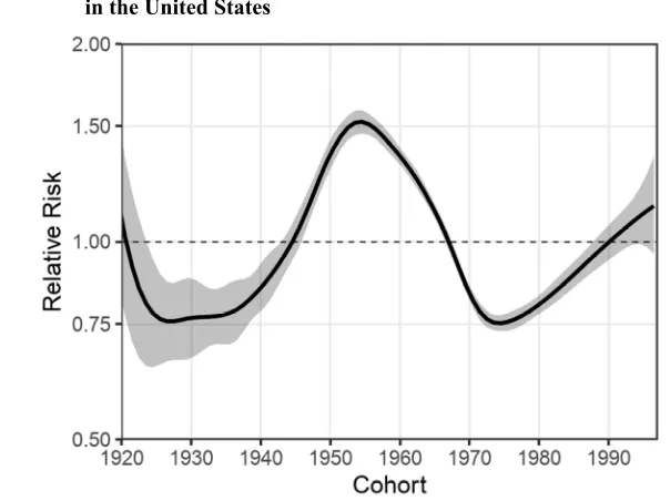
As an example, Figure 2 shows the estimates of the nonlinear cohort effects in relative risk values that are obtained from a dAPC model applied to the drug-related mortality of Hispanic males. If we focus our attention on the concave shape of the curvature for the boomer cohorts (born between 1940 and 1970), we see that according to these estimates, the most disadvantaged cohort (the curvature peak) is the cohort born in 1954, for whom the risk of dying from a drug overdose is nearly 1.6 times higher than would be expected given the overall linear cohort trend.
Figure 2: Relative risks of drug-related mortality for cohorts of Hispanic males in the United States
Notes: The cohort relative risk estimates were obtained from a detrended APC model (dAPC) applied to drug-related mortality for Hispanic males aged 20‒75 during the 1990–2016 period. Cohort effects (i.e., the log of the relative risks) are constrained to be zero (0) on average, with zero (0) slope. B-splines are used for fitting the APC effects. The reference category is the overall cohort average, indicated in the plot with a horizontal dashed line. The gray area indicates the 95% confidence interval. Estimates were obtained using the R packageEpi (Carstensen et al. 2018).
An alternative model proposed by Chauvel (2013) allows for the estimation of a hysteresis value that indicates whether the magnitude of the curvature increases or decreases over time. This model is, however, a fixed measure of change that reflects only constant increases or decreases over time, and it does not allow for modifications in the curvature ridge/floor location over time/age.
2.2 Graphical tools for analyzing curvature
linear trends. Indicative Lexis diagrams (Willets 2004) and colored Lexis surfaces (Rau et al. 2008, 2018; Richards, Kirkby, and Currie 2006) of these derivatives have been proposed as visualization techniques that could be applied to identify the presence of such patterns in Lexis plots.
Variations over APC dimensions are complementary perspectives that can be used to visually detect curvature on Lexis surfaces. When looking at rate changes over age/cohort (i.e., vertical changes along the same period in the Lexis diagram), we can identify within-period divergence in rate changes, although we cannot unambiguously attribute such divergence to age or cohort because of the identification problem. Analogously, when looking at changes over age/period (i.e., diagonal changes along the same cohort in the Lexis diagram) it is possible to determine age/period fluctuations that are independent from variations over cohorts.
Raw derivatives in vital rates are generally noisy, particularly when using high-resolution data or low-frequency events. Thus, it has been suggested that the underlying data should be smoothed over ages and years in order to reduce random fluctuations4
(Rau et al. 2018); as shown in Figure 1.
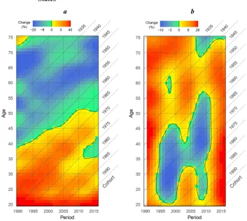
Figure 3 depicts Lexis surfaces of rates of mortality change over age/cohort (Panel a) and over period/cohort (Panel b) from drug-related causes in Hispanic males in the United States. Note that for this empirical example, we do not depict the Lexis surface of rates of mortality change over age/period because our interest is on cohort effects, which are not identifiable in such surfaces.
Given the large variations in drug-related mortality over time, the plot of derivatives over age/cohort (vertical changes along the same period as in the Lexis diagram, Figure 3a) depicts the nonlinear cohort effect of the Hispanic boomers more clearly than the plot of derivatives over period/cohort (horizontal changes along the same age group as in the Lexis diagram, Figure 3b). The diagonal contour line following the cohorts born around 1955 in Figure 3a indicates that the peak in mortality rates followed those cohorts, even if the cohort curvature is camouflaged by the strong period fluctuations visible in Figure 3b.
4 Note that smoothed rates are useful for identifying divergence from the trend that occur over large time
Figure 3: Lexis surfaces of changes in drug-related mortality rates over age/cohort and over period/cohort for Hispanic males in the United States
a b
Notes: Panel (a) is the Lexis surface of changes over age/cohort (read vertically from young to old ages, or from newer to earlier cohorts); with a yellow-to-red scale indicating the relative mortality rate increase for age x compared to age x-1 (or cohort k compared to cohort k+1) in the same year, and a green-to-blue scale indicating a relative mortality decline between consecutive ages/cohorts. The black contour line depicts zero changes in mortality, which indicates a local maximum or minimum death rate in a given calendar year (i.e., a curvature ridge or floor). For example, if we examine the year 2000, we see that death rates increased with age until hitting their maximum value at age 44 (curvature ridge). From ages 45 to 75, the death rates declined over age. Panel (b) is the corresponding Lexis surface of changes in drug-related mortality rates over period/cohort (read horizontally from earlier to more recent calendar years/cohorts) for Hispanic males in the United States; with a yellow-to-red scale indicating the relative mortality rate increase for year t compared to year t-1 (or cohort k compared to cohort k-1) in the same age, and a green-to-blue scale indicating a relative mortality decline between consecutive calendar years. Again, the black contour indicates a curvature ridge or floor in a given age. For example, if we examine age 50, we see that the death rates increased with time until hitting a maximum value in 2005 (curvature ridge). From 2006, the death rates declined over time until reaching a local minimum value in 2011 (curvature floor).
time/age. The first step in the extraction of curvature (excesses or depths) is to estimate a baseline, which is a counterfactual scenario of vital rates in the absence of nonlinear age, period, or cohort effects under analysis (for instance, in the absence of nonlinear cohort effects for the Hispanic boomers’ example).
Several methods are available to estimate a baseline from which it is possible to obtain curvature in vital rates. These approaches include applying interpolation techniques (Camarda 2012), extracting the irregularity using decomposition techniques (Remund, Camarda, and Riffe 2018), using detrended APC models (Chauvel, Leist, and Smith 2017), or simply detrending the smoothed vital rates over the selected perspective of change (i.e., over age, period, or cohort). There is no ideal generic method that can be applied because each demographic phenomenon and research question has specific underlying hypotheses that should be accounted for.
For the case of cohorts of Hispanic males in the United States who are disadvantaged in terms of drug-related mortality, we present two examples using the interpolation and dAPC approaches for the estimation of the mortality baseline. For the interpolation process, we excluded deaths pertaining to disadvantaged cohorts, who were previously estimated to be born between the advantaged 1940 and 1970 cohorts (see Figure 2), and interpolated the surface with these 31 cohorts removed. The estimation of the mortality baseline was done through the two-dimensional interpolation option available in the R packageMortalitySmooth. Figure 4a depicts the excess mortality rates (per 100,000 population) among these cohorts over the interpolated baseline; i.e., the difference between the smoothed observed mortality rates and the hypothetical mortality that is predicted if mortality had developed according to a linear trend from the 1940 to the 1970 birth cohort.
Alternatively, to obtain a mortality baseline that accounts for all cohorts present in the observed data, we fitted a dAPC model with all linear trends attributed to age and period variations (cohort-detrended), and set all cohort terms to zero, while removing all cohort curvature components from the predicted baseline. Figure 4b presents the excess mortality among cohorts over a baseline that excludes cohort curvature; i.e., the difference between the smoothed observed mortality rates and the hypothetical mortality that is predicted if mortality had developed according to the overall linear trend for all of the cohorts.
relative to the performance of all of the observed cohorts included in the observation window.
Figure 4: Lexis surfaces of the excess drug-related mortality rates for male Hispanic boomers in the United States
a b
Note: Panel (a) is the excess mortality rates (/100k) estimated as the difference between the smoothed mortality rates and an interpolated baseline that omits the 1940‒1970 cohorts from the Lexis mortality surface. Panel (b) is the excess mortality rates (/100k) estimated as the difference between the smoothed mortality rates and a baseline obtained from a dAPC model with the cohort terms set at zero; i.e., centered at the linear trend component of the cohort effects. In this case, the excess mortality is relative to the overall mortality trend across cohorts.
plots is that they depict general patterns that modulate the changing phenomena over a wide age and time frame. In a single image, it is possible to identify several irregularities potentially indicative of APC effects on the dynamics of a specific phenomenon of a population.
These plots are useful for the analysis of temporal patterns in a single phenomenon in a single population. However, when comparisons across several phenomena within a single population or of a single phenomenon across several populations are desired, it is necessary to construct a surface for each phenomenon/population analyzed. In addition to requiring considerable space, an important limitation of such comparisons is that displaying contrasting patterns across surfaces is visually difficult, even when surfaces are facetted.
3. The proposed visualization
In the current paper, we follow in the tradition of the aforementioned literature by attempting to visually depict and contrast the nonlinear changes in demographic phenomena over the APC dimensions. Specifically, we demonstrate the value of making a broad-picture comparison of how the location of a curvature feature of a demographic phenomenon is changing over time. This curvature feature could be anything from the location of the cohort with maximum excess mortality by cause of death to the mode of age-specific fertility in different populations. In the former case, the visualization enables the comparison of the temporal patterns for many phenomena (causes of death) in one population on one plot. In the latter case, the aim is to compare the temporal patterning of a single phenomenon (age-specific fertility schedules) across a variety of populations or subgroups. While the simplest visualization depicts the changing location of these demographic phenomena (i.e., a curvature ridge or floor), the use of visual attributes such as color, size, and opacity allows for more information about the densities to be depicted; including, for instance, the change in the magnitude and the spread of curvature.
strategically considering the tradeoff between visual complexity and the clarity of the visualization (Munzner 2014).
Although the APC curvature plots proposed here contribute additional information that is not available in APC statistical models, they should be seen as complementary. Some estimable functions from statistical APC models are of great value, and are not obtainable by graphical analysis, such as the statistical significance of a particular pattern (Holford 1991). In Table 1, we summarize some of the advantages and limitations of the statistical and visual methods we have discussed.
Table 1: Comparison of the properties of different methods for the analysis of nonlinear APC patterns
Detection of curvature
Temporal dynamic of curvature features Comparability across populations / phenomena
Statistical measuresa
Type Method Location Magnitude Spread
Statistical models
dAPC models + - - - + +
dAPC hysteresis model + - +/- - + + Graphical tools Surface of
derivatives + + - - -
-Surface of
excess - +/- + + -
-APC curvature
plots - + + + +
-Note: (+) indicates that the method is able to perform the property; (+/-) that it does so to some degree, albeit imprecisely; and (-) that it is not able to perform the property.
aSome examples of these statistical measures are tests of statistical significance and confidence intervals.
In the following, we describe the procedure for constructing APC curvature plots for demographic phenomena, and apply the procedure to three empirical examples: (1) the excess mortality of baby boomer cohorts in the United States from drug-related causes across racial/ethnic populations, (2) the stability of the age location of the young adult mortality hump, and (3) the temporal patterning of age-specific cohort fertility peaks across countries.
4. Construction of the plot
4.1 Detection of curvature and the temporal section frame of interest
As mentioned in the introduction, there are statistical methods (e.g., dAPC models in Figure 2) and pre-existing visualization tools (e.g., Lexis surfaces of changes in vital rates over age/cohort and over period/cohort in Figure 3) that allow for the detection of curvature patterns.
After some features of curvature (e.g., curvature ridge and floor) have been identified, their temporal positions in the Lexis diagram determine the temporal frame of interest. This framing is important because other “irregularities” located outside of this temporal section represent a potential source of noise for the analysis.
4.2 Estimation of curvature features
Remund and colleagues (2017) proposed three attributes of interest that could be used in describing the young adult mortality hump and provided examples of summary indices that could be used to measure them. These attributes are location (e.g., mode, mean, and median), magnitude (e.g., loss in life expectancy, years of life lost, and death counts), and spread (e.g., standard deviation and quantile). These dimensions and indices could be enriched so that they can be used to analyze other demographic phenomena.
The minimum requirement of a comparative APC curvature plot is the location measure (i.e., mode, mean, etc.). Other dimensions, such as magnitude and spread, are optional and complementary measures that could be used to enrich the comparative analysis, but that are not strictly necessary for the construction of a basic version of the plot.
In cases in which the deviance from the trend is also a local or an absolute maximum or minimum, the mode of the ridges and the valleys may be obtainable by extracting the age/period coordinates of the maximum or the minimum smoothed values within the temporal section frame. However, for cases in which these irregularities are not a local maximum or minimum, the estimation of their respective location, magnitude, and spread requires additional information pertaining to the divergence of vital rate estimates.
using age, period, or cohort perspectives depending on the temporal dimension that is of interest.
4.3 Translation of curvature attributes into visual properties of the plot
The population or the demographic phenomenon to be compared in the Lexis surface is a categorical value that should be translated into color; preferably using a color-blind safe palette (as is done here), or into different point shapes for a black-and-white printout5. The location measures should be translated into the age and period
coordinates in the Lexis diagram. To prevent unrelated curvatures from being fused, unifying these point coordinates by lines should be avoided.
The magnitude and the spread measures should be standardized and can be translated into opacity level and shape size.
5. Empirical application
For illustrative purposes, we applied the procedure described above to construct APC curvature plots for three demographic outcomes with different temporal perspectives: (a) comparing excess mortality from drug-related causes across several racial/ethnic groups of boomers in the United States; (b) examining excess mortality among young adults; and (c) comparing cohort fertility rates across several countries. In this section, we describe how we estimated the location, the magnitude, and the spread features of curvature; and how we translated these features into an APC curvature plot that displays the attributes for each case. Although our main objective is to propose a visualization tool, we briefly comment on some of the determinants that might be driving the nonlinear APC patterns that are easily identifiable and comparable using this visualization technique.
5.1 Excess mortality from drug-related causes among boomers
Previous exploratory and descriptive analyses have suggested that baby boomers in the United States have a disproportionate susceptibility to drug-related mortality throughout
5 When using different point shapes, equal areas must be given equal values of spread across the different
their life course (Acosta et al. 2019a; Miech, Koester, and Dorsey-Holliman 2011; Zang et al. 2019). Thus, for this specific case, we are interested in comparing the attributes (location, magnitude, and spread) of the cohort mortality curvature of drug-related mortality for several racial/ethnic groups of US males in a single Lexis plot.
We use cause-specific mortality data and population estimates by calendar year, age, sex, race, ethnic group, and cause of death from 1990 to 2016 drawn from the US National Vital Statistics System (NVSS 2019a, 2019b). This dataset allows us to use single-year resolution in the estimation and visualization of nonlinear cohort effects. Here, we define drug-related mortality as deaths involving drug use registered in the categories of accidental and undetermined intent overdoses, or in the categories of mental or behavioral causes (i.e., ICD 10 codes F11-19, F55, X40-44, Y10-14).
1. Category: Each observed racial/ethnic group was identified by a distinct color, or by a different point shape in the case of a black-and-white printout (see Figure A-1).
2. Location: For each calendar year, we plotted the age/cohort location of the maximum relative risk of drug-related mortality.
3. Magnitude: The relative risk compared to the baseline value for each point was translated into opacity. Note that the opacity scale reflects the difference in relative risk within each racial/ethnic group. We use a relative scale because it allows us to better identify the variation in magnitude over time and for each group. The absolute differences in magnitude across racial/ethnic groups can be seen by comparing the minimum and maximum values reached by group. This range in magnitude is indicated in the legend for each group.
4. Spread: The standard deviation of the hump in relative risk for each period was translated into point size.
Figure 5: APC curvature plot of the features of excess drug-related mortality among four racial/ethnic groups of boomer males in the United States
5.2 Young adult mortality hump
Excess mortality in young adults – also known as the accident or young adult mortality hump – is a well-known feature of the age structure of most mortality regimes, particularly among males. Goldstein (2011) presented a plot of the hump peaks over time for several countries, and Remund and colleagues (2018) decomposed and plotted the contributions by cause of death in order to analyze several features of the hump in the United States. Here, we used mortality data for certain countries drawn from the Human Mortality Database (HMD 2019) to compare not only the curvature ridges of the hump, but the additional features of their changes in magnitude and spread over time and across different countries. As in the method employed by Goldstein, we defined the hump as the difference between the cross-sectional period smoothed mortality rates and an interpolated mortality baseline between ages 10 and 40. We performed the smoothing and the baseline interpolation using the methods we previously applied to obtain Figure 4a. However, unlike the example presented in Figure 4a, we interpolated the hypothetical baseline with excess age-related mortality rather than cohort-related mortality.
We compared the young adult mortality hump in Spain, Russia, Taiwan, and the United States during the 1965‒2016 period. Figure 6 shows the variation over time of the modal age of the hump, its magnitude measured by excess death rates (per 100,000 population), and the spread of the hump measured by standard deviation. A black-and-white printout of this plot is presented in Figure A-2.
Figure 6: APC curvature plot of the features of excess mortality in young adult males in four countries
Notes: The coordinates of the points indicate the location of the curvature ridge over time (i.e., the modal age/cohort of the excess mortality by single-year period). The magnitude, indicated by the color opacity, is the excess death rates (/100k), calculated as the difference between the death rate in the modal age/cohort and the corresponding death rate in the baseline. The minimum and maximum excess mortality rates reached by the curvature ridge of each country during the period under observation are indicated in the legend. Finally, the curvature spread, indicated by the point size, is estimated as the standard deviation of the curvature in each period.
5.3 Cohort fertility rate
As a final example to show the applications beyond mortality, we plotted some aspects of fertility behavior along cohorts. Figure 7 depicts the age-specific fertility outcomes of the cohorts born between 1905 and 1985 in Spain, Sweden, and the United States. Figure A-3 displays a black-and-white version of this plot. Cohort age-specific fertility rates (ASFR) were obtained from the Human Fertility Database (HFD 2019) and extracted using the R packageHMDHFDplus (Riffe 2015).
consider more recent cohorts who are likely to have reached the modal age in fertility but have not yet completed their childbearing. As mentioned previously, any number of indices could be used to capture the three dimensions of location, magnitude, and spread.
Figure 7: APC curvature plot of cohort fertility rate peaks in three countries
Notes: The coordinates of the points indicate the location of the curvature ridge along the cohort (i.e., the modal age/period of the ASFR by single-year cohort). The magnitude, indicated by the color opacity, is measured as the ASFR mode by cohort. The minimum and maximum ASFR reached by the modal age/period of each country are indicated in the legend. The curvature spread, indicated by the point size, is estimated as the standard deviation of the curvature before the modal age/period.
6. Conclusions
In this paper, we discussed the advantages of using visualization tools on Lexis diagrams for analyses of age-period-cohort nonlinear effects of vital rates rather than mathematical models, as well as some of the limitations of these tools. We proposed the APC curvature plot to enrich the analysis of irregularities in vital rates that are indicative of nonlinear age, period, or cohort effects. We argue that compared to mathematical models and other Lexis plots, this visual display provides a higher level of flexibility because it allows us not only to depict the dynamics of the location, the magnitude, and the spread of temporal effects over time together; but to contrast different populations or subtypes of demographic phenomena in a single visualization. We outlined the process that can be used to construct APC curvature plots for the analysis of nonlinear APC effects. Using vital rates, we provided some examples of how this approach can be applied by analyzing cohort effects on drug-related mortality by racial/ethnic groups within the United States; age effects on young adult mortality in Russia, Taiwan, Spain, and the United States; and age/period effects on fertility in Spain, Sweden, and the United States. Finally, we have provided R-code that can be used to reproduce these examples.
7. Acknowledgements
References
Acosta, E. (2019). Reproducible materials for ‘APC Curvature Plots: Displaying nonlinear age‒period‒cohort patterns on Lexis plots’ [electronic resource].
https://osf.io/5bmyz/.
Acosta, E., Gagnon, A., Ouellette, N., van Raalte, A.A., Bourbeau, R.R., and Nepomuceno, M. (2019a). Racial and ethnic diversity in the Boomers’ excess mortality due to substance abuse in the United States. Paper presented at PAA 2019 Annual Meeting, Austin, US, April 10‒13, 2019. http://paa2019.
populationassociation.org/abstracts/193435.
Acosta, E., Hallman, S.A., Dillon, L.Y., Ouellette, N., Bourbeau, R., Herring, D.A., Inwood, K., Earn, D.J.D., Madrenas, J., Miller, M.S., and Gagnon, A. (2019b). Determinants of influenza mortality trends: Age-period-cohort analysis of influenza mortality in the United States, 1959–2016.Demography 56(5):1723– 1746.doi:10.1007/s13524-019-00809-y.
Bell, A. and Jones, K. (2013). The impossibility of separating age, period and cohort effects.Social Science and Medicine 93(Supplement C): 163–165.doi:10.1016/
j.socscimed.2013.04.029.
Camarda, C.G. (2012). MortalitySmooth: An R package for smoothing Poisson counts with P-splines.Journal of Statistical Software.doi:10.18637/jss.v050.i01. Carstensen, B. (2007). Age‒period‒cohort models for the Lexis diagram.Statistics in
Medicine 26(15): 3018–3045.doi:10.1002/sim.2764.
Carstensen, B., Plummer, M., Laara, E., and Hills, M. (2018). Epi: A package for statistical analysis in epidemiology. https://cran.r-project.org/web/packages/
Epi/index.html.
Caselli, G. and Vallin, J. (2005). Frequency surfaces and isofrequency lines. In: Caselli, G., Vallin, J., and Wunsch, G. (eds.).Demography: Analysis and synthesis. San Diego: Academic Press: 69‒78.
Chauvel, L. (2013). Spécificité et permanence des effets de cohorte: Le modèle APCD appliqué aux inégalités de générations, France/États-Unis, 1985‒2010. Revue française de sociologie 54(4): 665–705.doi:10.3917/rfs.544.0665.
Chauvel, L., Leist, A., and Smith, H. (2017).Detecting the ‘Big Red Spot’ of age-period excess mortality in 25 countries: Age‒period‒cohort residual analysis. Paper presented at PAA 2017 Annual Meeting, Chicago, US, April 27‒29, 2017.
Clayton, D. and Schifflers, E. (1987). Models for temporal variation in cancer rates. II: Age–period–cohort models.Statistics in Medicine 6(4): 469‒481. doi:10.1002/
sim.4780060406.
Finch, C.E. and Crimmins, E.M. (2004). Inflammatory exposure and historical changes in human life-spans. Science305(5691): 1736–1739. doi:10.1126/science.1092
556.
Fosse, E. and Winship, C. (2018). Moore–Penrose estimators of age–period–cohort effects: Their interrelationship and properties.Sociological Science 5(14): 304‒
334.doi:10.15195/v5.a14.
Fosse, E. and Winship, C. (2019a). Analyzing age‒period‒cohort data: A review and critique.Annual Review of Sociology 45(1): 467–492.
doi:10.1146/annurev-soc-073018-022616.
Fosse, E. and Winship, C. (2019b). Bounding analyses of age‒period‒cohort effects
Demography 56(5): 1975–2004.doi:10.1007/s13524-019-00801-6.
Goldstein, J.R. (2011). A secular trend toward earlier male sexual maturity: Evidence from shifting ages of male young adult mortality. PLOS ONE 6(8): e14826.
doi:10.1371/journal.pone.0014826.
HFD (2019). Human Fertility Database. Max Planck Institute for Demographic Research (Germany) and Vienna Institute of Demography (Austria) [electronic resource]. https://www.humanfertility.org/cgi-bin/main.php.
HMD (2019). Human Mortality Database. University of California, Berkeley (USA), and Max Planck Institute for Demographic Research (Germany) [electronic resource]. http://www.mortality.org/.
Hobcraft, J., Menken, J., and Preston, S. (1982). Age, period, and cohort effects in demography: A review.Population Index 48(1): 4–43.doi:10.2307/2736356. Holford, T.R. (1983). The estimation of age, period and cohort effects for vital rates.
Biometrics 39(2): 311–324.doi:10.2307/2531004.
Holford, T.R. (1991). Understanding the effects of age, period, and cohort on incidence and mortality rates.Annual Review of Public Health 12: 425–457.doi:10.1146/
annurev.pu.12.050191.002233.
Keenan, K., Saburova, L., Bobrova, N., Elbourne, D., Ashwin, S., and Leon, D.A. (2015). Social factors influencing Russian male alcohol use over the life course: A qualitative study investigating age based social norms, masculinity, and workplace context.PLoS ONE 10(11).doi:10.1371/journal.pone.0142993. Keiding, N. (2011). Age–period–cohort analysis in the 1870s: Diagrams, stereograms,
and the basic differential equation. Canadian Journal of Statistics 39(3): 405–
420.doi:10.1002/cjs.10121.
Kermack, W.O., McKendrick, A.G., and Mckinlay, P.L. (1934). Death-rates in Great Britain and Sweden: Some general regularities and their significance.The Lancet
223(5770): 698–703.doi:10.1016/S0140-6736(00)92530-3.
Keyes, K.M. and Li, G. (2010). A multiphase method for estimating cohort effects in age-period contingency table data. Annals of Epidemiology 20(10): 779–785.
doi:10.1016/j.annepidem.2010.03.006.
Keyes, K.M., Utz, R.L., Robinson, W., and Li, G. (2010). What is a cohort effect? Comparison of three statistical methods for modeling cohort effects in obesity prevalence in the United States, 1971‒2006.Social Science and Medicine (1982)
70(7): 1100–1108.doi:10.1016/j.socscimed.2009.12.018.
Luo, L. (2013). Assessing validity and application scope of the intrinsic estimator approach to the age‒period‒cohort problem. Demography 50(6): 1945–1967.
doi:10.1007/s13524-013-0243-z.
Masters, R.K., Powers, D.A., Hummer, R.A., Beck, A., Lin, S.-F., and Finch, B.K. (2016). Fitting age‒period‒cohort models using the intrinsic estimator: Assumptions and misapplications.Demography 53(4): 1253–1259.doi:10.1007/
s13524-016-0481-y.
Miech, R., Koester, S., and Dorsey-Holliman, B. (2011). Increasing US mortality due to accidental poisoning: the role of the baby boom cohort.Addiction106(4): 806–
815.doi:10.1111/j.1360-0443.2010.03332.x.
Munzner, T. (2014).Visualization analysis and design. (1st edition). Boca Raton: AK
Peters/CRC Press.doi:10.1201/b17511.
Murphy, M. (2010). Reexamining the dominance of birth cohort effects on mortality.
Population and Development Review 36(2): 365–390.doi:10.1111/j.1728-4457.
NVSS (2019a). Bridged-race population estimates ‒ Data files and documentation [electronic resource]. https://www.cdc.gov/nchs/nvss/bridged_race/data_docu
mentation.htm.
NVSS (2019b). Vital statistics online data portal [electronic resource].https://www.cdc.
gov/nchs/data_access/vitalstatsonline.htm.
Preston, S.H. and Wang, H. (2006). Sex mortality differences in the United States: The role of cohort smoking patterns. Demography 43(4): 631–646. doi:10.1353/
dem.2006.0037.
Pullum, T.W. (1980). Separating age, period, and cohort effects in white U.S. fertility, 1920–1970. Social Science Research 9(3): 225–244. doi:10.1016/0049-089X
(80)90013-7.
R Core Team (2018).R: A language and environment for statistical computing. Vienna: R Foundation for Statistical Computing [electronic resource].
http://www.R-project.org.
Rau, R., Bohk-Ewald, C., Muszyńska, M.M., and Vaupel, J.W. (2018). Visualizing mortality dynamics in the Lexis diagram. The Springer Series on Demographic Methods and Population Analysis. Springer International Publishing.doi:10.10
07/978-3-319-64820-0.
Rau, R., Soroko, E., Jasilionis, D., and Vaupel, J.W. (2008). Continued reductions in mortality at advanced ages.Population and Development Review 34(4): 747–
768.doi:10.1111/j.1728-4457.2008.00249.x.
Reither, E.N., Masters, R.K., Yang, Y.C., Powers, D.A., Zheng, H., and Land, K.C. (2015). Should age‒period‒cohort studies return to the methodologies of the 1970s? Social Science and Medicine 128: 356–365. doi:10.1016/j.socscimed.
2015.01.011.
Remund, A., Camarda, C.G., and Riffe, T. (2017).Analyzing the young adult mortality hump in R with MortHump. Rostock: Max Planck Institute for Demographic Research (MPIDR Technical Report TR-2018-003).
Remund, A., Camarda, C.G., and Riffe, T. (2018). A cause-of-death decomposition of young adult excess mortality. Demography 55(3): 957–978. doi:10.1007/s135
24-018-0680-9.
Richards, S.J., Kirkby, J.G., and Currie, I.D. (2006). The importance of year of birth in two-dimensional mortality data. British Actuarial Journal 12(1): 5–61.
Riffe, T. (2015).Reading human fertility database and human mortality database data into R. Rostock: Max Planck Institute for Demographic Research (MPIDR Technical Report TR-2015-004).
Rodgers, W.L. (1982). Estimable functions of age, period, and cohort effects.American Sociological Review 47(6): 774–787.doi:10.2307/2095213.
Selvin, S. (2001).Epidemiologic analysis: A case-oriented approach. Oxford: Oxford University Press.doi:10.1093/acprof:oso/9780195146189.001.0001.
Tango, T. and Kurashina, S. (1987). Age, period and cohort analysis of trends in mortality from major diseases in Japan, 1955 to 1979: Peculiarity of the cohort born in the early Showa Era.Statistics in Medicine 6(6): 709–726.doi:10.1002/
sim.4780060608.
Tarone, R. and Chu, K.C. (1996). Evaluation of birth cohort patterns in population disease rates. American Journal of Epidemiology 143(1): 85–91. doi:10.1093/
oxfordjournals.aje.a008661.
Tukey, J.W. (1977). Exploratory data analysis. (1st edition). London: Pearson.
doi:10.1002/bimj.4710230408.
Valdes, B. and George, K. (2013). Demographic analysis of AIDS mortality in Spain.
Population Vol. 68(3): 473–485.doi:10.3917/popu.1303.0539.
Wickham, H. (2016). Ggplot2: Elegant graphics for data analysis. (2nd edition).
Houston, TX: Springer International Publishing. doi:10.1007/978-3-319-24277-4.
Willets, R.C. (2004). The cohort effect: Insights and explanations. British Actuarial Journal 10(4): 833–898.doi:10.1017/S1357321700002762.
Yang, Y. and Land, K.C. (2013).Age‒period‒cohort analysis: New models, methods, and empirical applications. Boca Raton, FL: Chapman and Hall/CRC.
Zang, E., Zheng, H., Yang, Y.C., and Land, K.C. (2019). Recent trends in US mortality in early and middle adulthood: Racial/ethnic disparities in inter-cohort patterns.
Appendix: Black-and-white printout of the Lexis plots
Figure A-1: B&W APC curvature plot of the features of excess mortality from drug-related causes in four racial/ethnic groups of boomer males in the United States
Figure A-2: B&W APC curvature plot of the features of excess mortality in young adult males in four countries
Figure A-3: B&W APC curvature plot of cohort fertility rate peaks in three countries