For Peer Review Only
Effects of flood risk visualization format on house purchasing decisions
Journal: Urban Water Journal
Manuscript ID Draft
Manuscript Type: Research Article Date Submitted by the Author: n/a
Complete List of Authors: Dobson, Barnaby; University of Bristol, Department of Civil Engineering Miles-Wilson, Jolyon; University of Sussex, Social Decision Laboratory, School of Psychology
Gilchrist, Iain; University of Bristol, School of Experimental Psychology Leslie, David; Lancaster University, Mathematics and Statistics
Wagener, Thorsten; University of Bristol, Department of Civil Engineering; University of Bristol, Cabot Institute
Keywords: Urban flooding, Flooding, Social Systems
For Peer Review Only
Effects of flood risk visualization formaton house purchasing decisions
1
2
Author 1 3
● Barnaby A. Dobson 4
● Department of Civil Engineering, University of Bristol, Bristol, UK 5
Author 2 6
● Jolyon J. Miles-Wilson 7
● School of Experimental Psychology, University of Bristol, Bristol, UK 8
Author 3 9
● Iain D. Gilchrist 10
● School of Experimental Psychology, University of Bristol, Bristol, UK 11
Author 4 12
● David S. Leslie 13
● Department of Mathematics and Statistics, University of Lancaster, Lancaster, UK 14
Author 5 15
● Thorsten Wagener, PhD, MSc, Dipl-Ing (FH), MICE 16
● Professor of Water and Environmental Engineering, Department of Civil Engineering, 17
University of Bristol, Bristol, UK 18
● Cabot Institute, University of Bristol, Bristol, UK 19
Full contact details of corresponding author.
20
[email protected], 07910328211, 93/95 Woodland Road, Bristol, UK, BS8 1US 21
4759 words in main text and table (excluding references) and 4 figures, submitted
22
22/01/2018
23
24
For Peer Review Only
Abstract
25
We investigated how decision-making is affected by the visual presentation of flood risk 26
information. We exposed participants to different formats of flood risk information while 27
they simulated selecting a property to purchase. We compared three flood risk formats: (i) 28
maps currently used by the UK Environment Agency, (ii) tables that present flood level and 29
frequency information, and (iii) graphical representations depicting the level-frequency 30
combination using a cartoon house image as a physical referent. In the experiment 31
participants were presented, via computer screen, side-by-side information about two houses 32
in a series of trials. Participants made a forced choice preference judgement between 108 33
different pairs of houses to indicate which they would purchase. Our findings indicate that 34
when risk information is presented in map format, individuals are less accurate in selecting 35
lower-risk houses, compared to when the same information is presented as a graphic 36
representation of a house or as a table. 37
Keywords chosen from Urban Water Keywords
38Urban Flooding, Flooding, Social Systems 39
1. Introduction
40Stakeholder inclusion is becoming an important factor of flood risk management. As a result, 41
data itself is insufficient and we should begin to consider its presentation and communication 42
(Newman et al., 2011). While there is increasing recognition for the necessity of public 43
consideration, quantitative investigations into how humans make decisions in the context of 44
flood risk information are still limited; flood risk communication format is a commonly 45
recommended but rarely addressed research topic (Kellens et al. 2013). A key question in 46
this context is how to present flood risk information to members of the public so that they can 47
make informed decisions. 48
For Peer Review Only
Newman et al. (2011) also state that policy change in flood prevention has partially shifted 49
responsibility for flood prevention away from the UK government. This change might be 50
driven by the realisation that resources are insufficient to fully protect everyone. This 51
assumption is reinforced by ten Brinke et al.’s (2008) suggestion that, in flood risk 52
management, the UK (as well as France and the USA) is more favourable to preparation, 53
response and recovery than to prevention (as in the Netherlands or Japan). This may be 54
because large-scale prevention projects are simply more cost effective in areas of higher 55
exposure, e.g. for regions lying below sea level. Ten Brinke et al. (2008) also discuss the 56
increasing importance of pro-action, i.e. for reducing the need for defences by avoiding high-57
risk areas. If governments aim to move towards pro-action, with less need for prevention and 58
increased individual responsibility, then they cannot hope to do so without sufficient 59
consideration of the efficacy of communication with the public. 60
The need for good public awareness regarding flood hazards is becoming increasingly 61
evident, especially in the context of the ongoing environmental consequences associated with 62
climate change (Solomon, 2007). Researchers and governmental bodies currently emphasise 63
the necessity of publicly available flood risk information on which individuals can base 64
appropriate flood mitigation strategies. In Europe, this information is typically provided in 65
the form of flood hazard maps, as per the requirements of the 2007 Flood Directive adopted 66
by the European Parliament (Directive EU, 2007). 67
Moel et al. (2009) examined in detail the extent of flood map coverage in the EU. They 68
suggest that governmentally developed maps are created/used for emergency planning, 69
spatial planning and for raising awareness. These are predominantly frequency extent maps, 70
but occasionally flood level based ones are used (e.g. Netherlands, Germany and Beven et al., 71
2015). Despite such maps covering large areas and often containing extensive information, it 72
appears that public awareness and appreciation of risk from flooding and its resultant 73
For Peer Review Only
preventative behaviour remains highly variable (US: Bell and Tobin, 2007: UK: Burningham 74
et al., 2008; EU: Siegrist and Heinz, 2008). 75
Many studies have provided possible explanations for this variability, such as previous 76
experience with hazards (e.g. Siegrist and Gutscher, 2006; Pagneux et al., 2011), or socio-77
demographic variables including income (Lindell and Hwang, 2008) and home ownership 78
(Burningham et al., 2008). Although such studies have undoubtedly provided a wealth of 79
insight into the complexity of effective risk communication, implementation of their 80
contributions to risk communication media appears to be quite challenging. This perhaps lies 81
in the level of personalisation required to accommodate the variation in personality and 82
socio-demographic variables (Burningham et al., 2008). Another target for development that 83
has received relatively little attention in risk communication is the visual organisation of risk 84
communication media. There exists a considerable body of research that documents the 85
various biases of visual perception (i.e. gestalt principles) that facilitate the perception and 86
interpretation of visual scenes (e.g. Pinker, 1990; Carpenter and Shah, 1998; Kelleher and 87
Wagener, 2011), but which have been largely overlooked or underused by risk 88
communicators. 89
Bell and Tobin (2007) provide a notable exploration of different interpretations elicited 90
through different ways of presenting flood risk information. They note that flood risk 91
information is commonly based upon – and in many cases prescribed by – the 100-year return 92
period (i.e. a 1 percent chance of a flood occurring in a given year), yet “the initial goal of 93
adopting the 100-year flood criterion was not effective communication of risk or risk policy, 94
but efficient administration and implementation” (p. 302). Indeed, the use of this criterion 95
continues to be debated (National Research Council, 2006), while it is also understandable 96
that one way of communicating cannot be equally efficient for a range of purposes. 97
For Peer Review Only
Compounding this issue is Bell and Tobin’s (2007) finding that, when asked to choose what 98
aspects of flooding most concerns them – given the choices of flood water level, flooding 99
frequency, a combination of the two, or other aspects – no participant chose the frequency of 100
flooding alone as the most concerning aspect of a flood. This finding warrants concern 101
regarding the widespread use of frequency-based flood-risk communication (i.e. the 100-year 102
return period). Moreover, flood level, rather than flood frequency, emerged as the 103
predominant concern for 49 percent of participants, indicating that emphasising predicted 104
flood levels may be more relevant for public communication (a further 42 percent chose level 105
and frequency and none chose frequency alone). Developing this last point, Bell and Tobin 106
(2007) also found evidence to suggest that flood risk awareness is enhanced when physical 107
references (e.g. “the flood reaches up to the doorstep) are used to describe the extent of a 108
flood. The authors suggest, consistent with others (Smith, 2000), that including information 109
about flood extent in combination with flood frequency may prove effective. This finding 110
reinforces the availability heuristic of the importance of personal experience. Given these 111
study results, we expect that a dedicated communication method should involve a 112
combination of physical reference (i.e. flood level) and frequency. 113
Our study investigates decision-making in response to three different ways of presenting 114
flood risk information: (i) the map format currently used by the UK Environment Agency, (ii) 115
a table format that presents a matrix of flood level in combination with flood frequency, and 116
(iii) a graphical representation depicting the level-frequency combination using a cartoon 117
house image as a physical reference. The latter two formats were newly devised for this 118
experiment, drawing on the suggestions made by Bell and Tobin (2007) as discussed above. 119
Accordingly, we hypothesised that the formats utilising the combination of flood level and 120
flood frequency would lead participants to more frequently reject the higher-risk option in a 121
two-alternative forced-choice decision-making task. In our experiment, participants were 122
For Peer Review Only
asked to choose between two different houses available for sale. Details of the houses were 123
presented to participants on an information sheet that was close to the kind of sheet routinely 124
provided to home buyers (see following section). Across these sheets we manipulated how 125
the flood risk information was presented and by systematically controlling across trials all the 126
other information on the sheets we were able to measure the unique contribution the different 127
ways of presenting the flood risk information to the decision. 128
2. Method
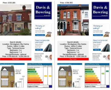
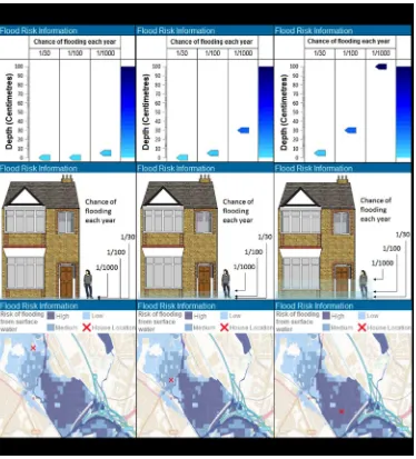
129Experiment
130The study was based on examining the response of participants to different types of flood risk 131
information provided in the context of selecting a property to purchase. In the experiment 132
participants were presented on a computer screen with a series of trials in which information 133
about two houses were presented side by side (see Figure 1). Participants were asked to make 134
a forced choice preference judgment between these pairs of houses to indicate which house 135
they would consider purchasing. We manipulated the way in which the flood risk 136
information was presented (Table, Graphic or Map; See Figure 2) and the severity of the 137
flood risk (Low, Medium or High) to see how these two factors influenced the preference. 138
All participants had corrected to normal vision. Participants were selected on the basis of 139
being either previous home buyers or actively seeking to purchase a home at the time of 140
testing. All lived in or near to the city of Bristol in the UK. 141
For the map format, maps were taken from the UK Environment Agency (EA) flood risk map 142
service. They were selected from the Birmingham area of the UK. This area has a range of 143
flood risks with a relatively uniform housing style, which reduces the variability associated 144
with house style preferences. House location crosses were randomly placed in pixels that met 145
For Peer Review Only
the appropriate risk level and contained a house (this was done by RGB pixel values). It 146
should be noted that the EA does not publish precise details on how these risk levels are 147
calculated, we are simply using the risk listed in their public flood maps. 148
The remaining two display conditions in the experiment were table and graphic. In both 149
cases the flood risk information was presented in a way that decoupled flood severity and 150
recurrence interval. While the flood maps do not list depth, our study of the literature 151
suggested recipients of flood risk information find depth to be a particularly motivating 152
factor. As a result, based on correspondence with the EA, we translated these risk bands into 153
estimated depth-probability terms. These novel display methods provided the user with more 154
granular information regarding the nature of the risk for a particular property. The table 155
format aimed to mimic the European Union Energy Rating label, which is used, at least in the 156
UK, as part of the details published to advertise houses for sale. The graphic format was used 157
to give the flood risk levels a concrete perspective (Pappenberger, et al., 2013). 158
Each of the three display formats were presented at three possible levels of risk (low, 159
medium, high). The flood risk presentation format of any two pages in a comparison trial was 160
always the same. This allowed flood presentation styles to be compared without any 161
sensitivity bias from style (e.g. no comparison contained a table compared with a map). Other 162
choices were made as follows: 163
• To ensure variation could only be attributable (besides individual preferences) to 164
flood risk information only flood information on an estate agent page was altered 165
between participants. There were 3 possible risk level pairings (low/medium; 166
low/high; medium/high), 2 possible positions (right/left) and 3 formats 167
(map/table/graphic). This requires 18 participants to ensure every possible 168
combination for every possible estate agent page is viewed. 169
For Peer Review Only
• With 6 trials of every risk-position-format pairing, each participant viewed 108 trials, 170
thus 216 estate agent pages. 171
• Houses were paired based on number of windows, colour and size to ensure they were 172
comparable aesthetically. Besides a picture of the house; price, estate agent logo, 173
three small adverts, energy rating and search criteria were also displayed on the estate 174
agent page. These additional details were randomly assigned and fixed (across 175
participants) to that page. 176
• The picture of the house could be presented in the left or right hand side of the page. 177
The houses were selected from the suburbs of Birmingham so that they were 178
consistent with the map. 179
• House prices displayed varied randomly on a trial by trial basis between £195,000 and 180
£205,000 which was realistic for this area at the time of testing. 181
• We selected 2 different estate agent logos. Each different estate agent logo had a 182
different page layout (left aligned or right aligned) and advert associated with it. 183
• Energy ratings for houses were displayed in standard UK Energy Performance 184
Certificates format. We chose 10 pairings of Current and Potential energy rating to 185
display (Current, Potential: B,A; B,B; C,B;C,C; D,C; D,D; E,D; E,E; F,E; F,F) 186
• The search criteria were the same on every estate agent page in the experiment. 187
• Trial order was randomised for each participant. 188
• We made an a-priori decision to test 18 participants. To our knowledge there are no 189
previous studies that are similar enough to the current one to allow us to carry out a 190
formal power calculation. We selected 18 participants as this is a typical number of 191
participants testing in this broad type of behavioural experiments. As such this study 192
is exploratory. 193
For Peer Review Only
• Participants were presented with a comparison of two estate agent pages which 194
simulated what they might see following a web search on a house purchase website. 195
Every comparison had a different house image and flood risk level. The participant 196
had to click on a ‘buy house’ button on one of the pages to proceed to the next 197
comparison. 198
• Participants carried out five practice trials followed by 108 comparisons that formed 199
the basis of the analysis reported here. At the end of the testing session we also 200
collected and recorded post experiment feedback which is reproduced in full in the 201
appendix. 202
Analysis
203For the purposes of the current analysis, the response for each decision was classified as 204
either ‘correct’ if the house with the lower flood risk was chosen and ‘incorrect’ if the house 205
with the higher flood risk was chosen. A binary logistic regression analysis with ‘correct’ as 206
the discrete dependent variable and participant, risk format, risk comparison, and a format-207
by-comparison interaction (e.g. map, low vs high risk) as explanatory factors was conducted 208
to determine the effects of these variables on the probability of correct responses. ‘Incorrect’ 209
was defined as the dependent reference category and participant 18, map format, and 210
medium-high comparison were entered as the reference categories for the factors. 211
Binary logistic regression creates a model, based on explanatory factors, which predicts the 212
dependent variable. For a vector of explanatory variables x=(x1,…,xn), the model fits the 213
probability of a correct answer to be F(x), satisfying 214
()
1 − () = + + ⋯ + . (1)
215
For Peer Review Only
The coefficients, β=( β0, β1,…, βn) are the unknown parameters of the model and are 216
estimated to best explain the observed data. These β coefficients can by interpreted as the ‘log 217
odds ratio’; exp(βi), which indicates how much more likely the model is to produce ‘correct’
218
when the explanatory factor xi takes a value of 1 compared with when it takes a value of 0;
219
thus when βi>0 the factor xi increases the probability of seeing the correct response, and
220
when βi<0 the factor xi decreases the probability of seeing a correct response.
221
When fitting logistic regressions, the significance of a factor is assessed by a χ2 statistic 222
which measures the difference in the ability of the model to fit the data with or without that 223
factor present in the model. Under a null hypothesis that a factor does not enhance the ability 224
to fit the data, the χ2 statistic has a χ2 distribution with parameter equal to the number of 225
parameters added to the model (thus when the presentation format factor is added the χ2 226
statistic has a χ2(2) distribution, because 2 additional β parameters are added to the model 227
corresponding to the two non-reference levels of this factor). We thus compare the calculated 228
statistic to the distribution of the appropriate χ2 random variable; if the observed value is 229
extreme (indicated by a low p-value) then it is assessed that the factor is a significant 230
contributor to model fit. 231
3. Results
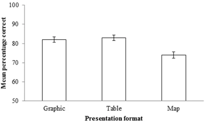
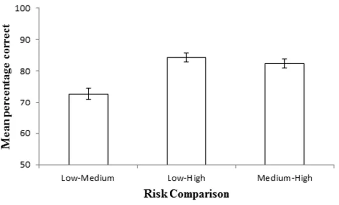
232Figure 3 shows that the mean percentage correct was higher for the graphic and table 233
representations compared to the more widely used map representation. While all presentation 234
formats lead to a high percentage of correct choices, there is a large drop in performance if 235
the map presentation format is used. Figure 4 further shows how often the participants 236
selected correctly as a function of what risk levels the two houses were at. The graph shows 237
that the percentage correct choices was higher if the choices were between low-high and 238
between medium-high risk houses. In contrast, there was a decrease in percentage correct if 239
For Peer Review Only
one house was low risk and the other medium. This result is in line with expectations given 240
flood risk is of less importance as a decision criterion in such cases. 241
The logistic regression, as specified above, allows us to investigate which of these differences 242
are statistically significant. The outcome of this modelling exercise is shown in Table 1. 243
Critically for the current study there was a reliable effect of the presentation format (χ2(2) = 244
21.12, p < 0.001) indicating that we have strong evidence that participants’ responses were 245
affected by how the information was presented. There was also a robust effect of risk 246
comparison (χ2(2) = 33.39, p < 0.001) indicating that participants were sensitive to the 247
relative flood risk between the two houses presented in any given trial. There was no 248
evidence for a reliable interaction between these two factors (χ2(4) = 0.95, p = 0.917). This 249
suggests that the presentation type and the risk combine in an additive manner to affect the 250
choices made. Less centrally to the focus of this paper there was also a main effects of 251
participant (χ2(17) = 102.01, p < 0.001) indicating that there were reliable individual 252
differences between the participants in how they responded; these are among the strongest 253
effects and are account for personal differences (e.g. education or age) between participants. 254
As shown in Table 1 and Figure 3, graphic presentation (χ2(1) = 4.45, p = 0.035), and table 255
presentation (χ2(1) = 7.70, p = 0.006), are both significantly more likely to produce a correct 256
response than map presentation (the reference category). Low-medium comparisons (χ2(1) = 257
4.43, p = 0.035), were observed to produce significantly lower probabilities of correct 258
responses than medium-high comparisons (reference category), whilst low-high comparisons 259
were not found to differ, as also illustrated in Figure 4. Again, we found no evidence that the 260
format of presentation interacted with the risk difference to produce a greater effect of one 261
presentation mode at a particular risk level. 262
For Peer Review Only
At the end of the experiment participants were asked to provide comments about 263
their experience. In particular, participants were asked what they thought about the 264
flood-risk presentation formats and whether they adopted a particular strategy 265
throughout the experiment. Though these comments have not been analysed 266
quantitatively, a brief summary describing trends in the responses is provided below. 267
Participant comments are also provided in Appendix A. 268
In general, participants appeared to prefer the graphic and/or table presentation 269
formats over the map format. Specifically, six out of 18 participants preferred 270
graphic presentation, five of 18 preferred table format, whilst only three of 18 271
described a preference for map format. Two of those preferring maps expressed 272
confusion about frequency-based flood predictions in graphic and table 273
presentations, whilst the third found it difficult to see the different flood levels 274
presented in the graphic format. Four out of 18 participants did not express a clear 275
preference for any one format. 276
The map format was repeatedly described as causing confusion due to the extent of 277
light and dark blue depicting relative risk; a lack of defining borders and the use of 278
different hues of the same colour were reported to make certain areas appear more 279
risky than they actually were, this is consistent with the results reported by (Ratwani 280
& Trafton, 2008). Another recurrent theme in participants’ comments was a feeling 281
of lack of control in dealing with flood-risk level; participants often expressed that 282
they could not “do anything” about flood-risk level or where they live, but that they 283
can “do something” about, for example, poor energy performance (e.g. install 284
insulation). Thus, poor energy performance was generally more acceptable to 285
participants than high flood-risk. 286
For Peer Review Only
4. Discussion
287
The present experiment investigated how decision-making based on flood risk information is 288
affected by the way in which this information is visually presented. We compared three ways 289
of presenting the same flood risk information: (i) the map format of presentation currently 290
used by the UK Environment Agency, (ii) a table format that presents flood level information 291
in combination with flood frequency information, and (iii) a graphical representation 292
depicting the level-frequency combination using a cartoon house image as a physical referent. 293
Our findings indicate that when risk information is presented in map format, individuals are 294
less accurate in selecting lower-risk houses, compared to when the same information is 295
presented as a graphic representation of a house or as a table (Figure 1). In addition, we find 296
evidence for a reliable ability to avoid high-risk houses when they were presented jointly with 297
either low or medium risk houses (Figure 2). We find no evidence of an interaction between 298
these two effects. 299
This results pattern is consistent with previous research into presenting flood risk 300
information. For example, Bell and Tobin (2007) compared participants’ responses to four 301
ways of presenting the risk of a 100-year flood event (‘100-year flood’ vs. ‘1 percent chance 302
in any given year’ vs. ‘26 percent chance occurring in 30 years’ vs. a flood risk map) and 303
found the 1 percent description to be consistently more effective in conveying uncertainty 304
than the 100-year description. Conversely, the 1 percent description was found to perform 305
worse than the 100-year description in motivating concern or protection (e.g. preventative 306
behaviour), a finding that indicates – as the present study does – that differing presentations 307
of risk elicit differing conclusions by the viewer; i.e. composition affects conclusion. This 308
result further highlights the need to consider what the intended message of a risk 309
communication medium is during its design already. 310
For Peer Review Only
In contrast to the wealth of research dedicated to investigating individual differences in flood 311
risk communication and perception, there is markedly less attention focused on how the 312
visual features of flood-risk presentation affect their interpretation, despite an extensive 313
literature on the perception of graphical representations of quantitative information (e.g. 314
(Carpenter & Shah, 1998), (Cleveland & McGill, 1986), (Shah & Freedman, 2011)). For 315
example, models of visual display comprehension emphasise an interaction between top-316
down (e.g. content familiarity, graph skills; i.e. individual differences) and bottom-up (e.g. 317
visual features of the display) processes when decoding information from visual displays 318
(Hegarty, 2005), (Kriz & Hegarty, 2007). In the case of graph comprehension, for example, 319
Shah and Freedman (2011) showed that the same quantitative information is interpreted 320
differently when presented in bar graphs as compared to line graphs, and prior knowledge 321
(i.e. top-down processing) was found to interact with the influence of presentation format. 322
The authors suggest that these systematic differences in interpretation can in part be 323
understood in the context of Gestalt Laws of Perceptual Organisation (Wertheimer, 1938). 324
Indeed, other researchers (Pinker, 1990) have provided detailed theories of how Gestalt 325
principles such as those of similarity, proximity, and good continuity are used by viewers to 326
manage the cognitive processing demands of graphical displays (Shah, et al., 1999). In light 327
of this, it is surprising that the role of such bottom-up processing (and its interaction with top-328
down processing) has so far been largely under-studied in the context of flood-risk 329
communication. 330
The influence of the aforementioned Gestalt principles on interpretation is evident in the 331
presentation formats used in the present experiment. The table format in particular is 332
conducive to organising the displayed information based on the good continuity provided by 333
its columns, whilst the principle of proximity is likely to facilitate flood level comparisons in 334
the graphic format. These principles influence what inferences are made by directing 335
For Peer Review Only
attention toward and facilitating the processing of particular elements of the visual display. A 336
possible explanation for the varied success of map presentations of flood-risk information 337
may thus be the absence of these perceptual elements that direct, focus, and facilitate the 338
cognitive processing of visual displays. It would therefore be useful in future studies to 339
further explore visual elements of flood-risk presentation mediums that are particularly 340
effective in encouraging appropriate inference generation. 341
We have made the assumption that the desired impact on behaviour of flood risk 342
communication is lesser acceptance of higher risks; we have treated flood communication as 343
successful if the viewer accepts the lower-risk option. This was necessary to be able to 344
measure participants’ decision-making behaviour in response to the different presentation 345
formats, although we acknowledge that this may not be the desired output of flood risk 346
communication in all cases in the real world. Were this the case, there already exists evidence 347
to suggest that an effective way to do this would be to communicate affect-laden flood-risk 348
messages that induce, for example, fear of flood events (Keller, et al., 2006). However, such 349
an approach is likely to leave viewers relatively over-sensitised to risk, and in reality it is not 350
the goal of flood-risk communication to ‘scare’ the public into avoiding all higher-risk 351
options but rather to make a more informed decision. As such, our simplifying assumption 352
may constrain generalisation to instances in the real world, and future research would benefit 353
from the adoption of paradigms that do not treat risk-aversion per se as the desirable 354
behavioural outcome. One possibility may be to frame similar experiments in the context of 355
an economic game, where participants would have the opportunity to make a profit based on 356
the odds of their decisions; in such cases, high-risk decisions may provide greater payoffs and 357
so will not be ubiquitously avoided. 358
5. Practical Relevance and Potential Applications
359For Peer Review Only
The present experiment evidences an important influence of the visual format of flood-risk 360
communication mediums on viewers’ interpretations. Our key finding – that participants are 361
more accepting of high probability flood risks when this information is presented in map 362
format as compared to the graphic and table format – is particularly relevant for flood-risk 363
communicators in countries that currently employ flood hazard maps as their primary method 364
for communication. For members of the European Union in particular, the finding that flood 365
hazard maps encourage greater risk acceptance than other types of (newly conceived) risk 366
presentation is potentially problematic in light of the fact that this method of communication 367
is currently prescribed by the 2007 Flood Directive of European Parliament (2007/60/EC). It 368
is possible that an over-focus on individual and socio-demographic variables and an under-369
focus on visual presentation factors may in part explain why improving public risk awareness 370
is such a challenge. Further investigation of the influence of different formats of flood-risk 371
presentation may provide useful insight for flood-risk communicators, who may wish to 372
implement what is known about graphical representation and the influence of visual (bottom-373
up) elements of graphical displays in addition to tackling the variation resulting from (top-374
down) socio-demographic and individual differences. The implications of our findings add to 375
those of others who have similarly identified issues with the use of the 100-year return period 376
(Bell & Tobin, 2007). These early-stage findings highlight a need for greater consideration of 377
presentation format in flood-risk communication, and future research in this area is likely to 378
prove useful in improving public awareness and understanding of risk from flood events. 379
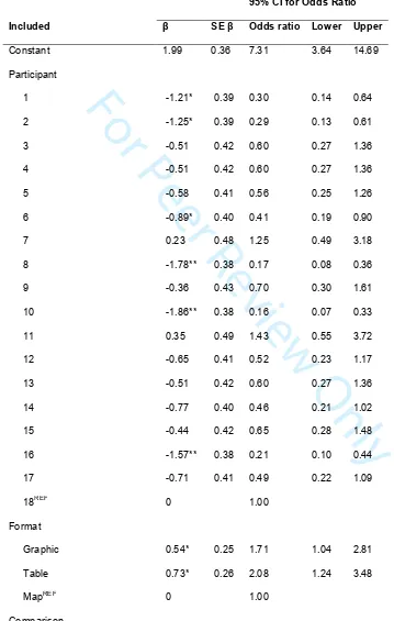
Table 1
380Model parameter estimates of binary logistic regression analysis, showing parameter values 381
of beta (β), standard error of beta (SE β), odds ratio (exp(β)), and odds ratio confidence 382
For Peer Review Only
intervals, with ‘correct’ as the dependent variable and ‘participant’, ‘presentation format’, and 383
‘risk comparison’ as factors. 384
95% CI for Odds Ratio
Included β SE β Odds ratio Lower Upper
Constant 1.99 0.36 7.31 3.64 14.69
Participant
1 -1.21* 0.39 0.30 0.14 0.64
2 -1.25* 0.39 0.29 0.13 0.61
3 -0.51 0.42 0.60 0.27 1.36
4 -0.51 0.42 0.60 0.27 1.36
5 -0.58 0.41 0.56 0.25 1.26
6 -0.89* 0.40 0.41 0.19 0.90
7 0.23 0.48 1.25 0.49 3.18
8 -1.78** 0.38 0.17 0.08 0.36
9 -0.36 0.43 0.70 0.30 1.61
10 -1.86** 0.38 0.16 0.07 0.33
11 0.35 0.49 1.43 0.55 3.72
12 -0.65 0.41 0.52 0.23 1.17
13 -0.51 0.42 0.60 0.27 1.36
14 -0.77 0.40 0.46 0.21 1.02
15 -0.44 0.42 0.65 0.28 1.48
16 -1.57** 0.38 0.21 0.10 0.44
17 -0.71 0.41 0.49 0.22 1.09
18REF 0 1.00
Format
Graphic 0.54* 0.25 1.71 1.04 2.81
Table 0.73* 0.26 2.08 1.24 3.48
MapREF 0 1.00
Comparison
[image:18.612.86.445.133.698.2]For Peer Review Only
Low-Medium -0.47* 0.22 0.62 0.40 0.97
Low-High 0.14 0.24 1.15 0.72 1.84
Medium-HighREF 0 1.00
Format-Comparison Interaction
Graphic by Low-Medium -0.17 0.34 0.84 0.44 1.63
Graphic by Low-High 0.05 0.37 1.06 0.51 2.17
Graphic by Medium-HighREF 0 1.00
Table by Low-Medium -0.29 0.35 0.75 0.38 1.48
[image:19.612.70.522.63.650.2]Table by Low-High -0.06 0.38 0.95 0.45 1.98
Table by Medium-HighREF 0 1.00
Map by Low-MediumREF 0 1.00
Map by Low-HighREF 0 1.00
Map by Medium-HighREF 0 1.00
385
Note: Model χ2 (25) = 158.46, p < .001. *p < .05. **p < .001. REF = Reference category. 386
387
Appendix
388Participants’ comments and opinions having completed the experiment. 389
Participant Comments
1 • Map presentation easiest to use.
• Experience of house being flooded.
• Awareness of recent flooding events.
• Strategy: Compared images, followed by energy, followed by flood risk.
2 • Graphic presentation very powerful.
For Peer Review Only
• Maps difficult to understand.• Strategy: Compared images, followed by energy, followed by flood risk,
followed by price.
3 • Flood risk had large influence on decisions.
• Began to ignore price.
• Aesthetics of the houses also had some influence.
4 • Graphic presentation best.
• Began to ignore energy performance information.
• Also began to ignore flood-risk information as this participant had
previous experience with unreliable flood-risk information.
5 • Graphic and table presentations better than map presentation.
• Map difficult to understand.
• Strategy: Checked flood risk, followed by energy performance. If
energy performance for a house was high it was further considered, even
if it was at high risk of flooding. Price considered with respect to what
improvements could be carried out on house (e.g. build an extension).
6 • Graphic presentation best; easy to see flood levels.
• Table presentation second best.
• Maps hardest to use.
• Strategy: At start compared all aspects (e.g. aesthetics, price, etc.) and
compared risk information last. Later started to compare
flood-risk information first and then compared other things. Energy
performance largely ignored. Willing to pay more for a lower risk
house. Tendency to initially prefer aesthetically pleasing houses, but this
For Peer Review Only
preference reduced if house was at high risk.• Participant felt that flood risk information would be useful when buying
a house; had not previously considered this when buying a house.
7 • Graphic presentation best.
• Map presentation difficult to understand.
• Strategy: Energy performance information ignored because one can "do
something" about poor energy performance but one cannot do anything
about the risk of flood. Aesthetic preference played a role, but swayed
by flood-risk level.
• Flood risk information should be provided with house information when
looking to buy so that a fully informed decision can be made.
• This participant independently investigated flood-risk information when
buying their house.
8 • Table presentation best.
• Graphic presentation second best.
• Map presentation most difficult.
• Strategy: Compared aesthetics, followed by price, followed by
flood-risk information. Ignored energy performance information because one
can "do something" about energy performance.
• It would be useful if this information was provided on estate agent
websites.
9 • Table presentation best.
• Graphic presentation more difficult to use.
• Strategy: Largely influenced by flood-risk information. Ignored energy
For Peer Review Only
performance information because one can "do something" about it (e.g.
insulation). Ignored price.
10 • No data available.
11 • Map presentation was easiest to use.
• Other presentation formats were more difficult because of use of
fractions (frequency probabilities) to describe risk.
12 • Graphic presentation was easiest to use.
• Map presentation was hardest to use; crosses surrounded by lots of blue
make it look more risky.
• Strategy: Largely influenced by aesthetics, followed by flood-risk
information.
13 • Graphic presentation was most informative.
• Strategy: Compared energy performance and flood risk information.
Participant noticed that these were the only factors that considerably
changed.
14 • Table presentation easiest to use.
• Map presentation more difficult to use.
• "Fear factor" associated with picture; high flood level for a rare flood
still appears off-putting.
• It would be useful for flood risk information to be provided when
viewing houses.
• This participant has bought several houses in the past.
15 • Map presentation most difficult to use.
• Graphic and table presentations equally easy/difficult to use.
For Peer Review Only
• On first trial struggled slightly with understanding table presentation;
fractions (flood frequencies) and flood level slightly confusing.
• Didn't really like the look of the houses.
• Flood risk information would be useful when looking at houses.
16 • Map presentation easiest to use, although got confusing when close to
boundaries.
• Table and graphic presentations challenging because of the fraction
descriptions of probability (flood frequencies).
• People have so much information about buying houses that they become
overwhelmed and prefer to ignore said information.
• Strategy: Aesthetics were the main influence.
17 • Table presentation easiest to use.
• Map presentation most difficult to use.
• Strategy: Energy performance more likely to be compromised for better
flood-risk odds, as you one cannot do anything about location of house
but can do something about energy performance.
18 • Map presentation was most difficult to use and most concerning.
• Graphic presentation was confusing because the lowest two flood level
estimates were very close together and thus difficult to see.
• Table presentation most useful.
• Strategy: As experiment progressed participant tended to forget about
attending to certain factors, including flood-risk information.
• Flood-risk information would be useful to have provided when looking
to buy a house.
390
For Peer Review Only
Acknowledgements
391
The UK Environment Agency for their advice in appropriate frequencies and levels. This 392
work was supported by the Natural Environment Research Council [Consortium on Risk in 393
the Environment: Diagnostics, Integration, Benchmarking, Learning and Elicitation 394
(CREDIBLE); grant number NE/J017450/1] and by the UK Engineering and Physical 395
Sciences Research Council [Decision making in an unstable world; grant number 396
EP/I032622/1]. 397
Bibliography
398Bell, H. M. & Tobin, G. A., 2007. Efficient and effective? The 100-year flood in the 399
communication and perception of flood risk.. Environmental Hazards, 7(4), pp. 302-311. 400
Beven, K., Lamn, R., Leedal, D. & Hunter, N., 2007. Communicating uncertainty in flood 401
inundation mapping: a case study., International Jounrla of River Basin Management, 13(3), 402
pp. 285-295. 403
Burningham, K., Fielding, J. & Thrush, D., 2008. It'll never happen to me’: understanding 404
public awareness of local flood risk.. Disasters, 32(2), pp. 216-238. 405
Carpenter, P. A. & Shah, P., 1998. A model of the perceptual and conceptual processes in 406
graph comprehension.. Journal of Experimental Psychology: Applied, 4(2), p. 75. 407
Cleveland, W. S. & McGill, R., 1986. An experiment in graphical perception. nternational 408
Journal of Man-Machine Studies, 25(5), pp. 491-500. 409
Directive, E. U., 2007. 60/EC of the European Parliament and of the Council of 23 October 410
2007 on the assessment and management of flood risks.. Journal of the European Union L , 411
288(27). 412
For Peer Review Only
Hegarty, M., 2005. Multimedia learning about physical systems. In: The Cambridge 413
handbook of multimedia learning.. s.l.:s.n., pp. 445-465. 414
Kelleher, C., & Wagener, T., 2011. 10 rules for effective data visualization. Environmental 415
Modeling and Software, doi:10.1016/j.envsoft.2010.12.006. 416
Keller, C., Siegrist, M. & Gutscher, H., 2006. The role of the affect and availability heuristics 417
in risk communication. Risk Analysis, 26(3), pp. 631-639. 418
Kellens, W., Terpstra, T. & Maeyer, P. d., 2013. Perception and communication of flood 419
risks: A systematic review of empirical research. Risk Analysis, 33(1), pp. 24-49. 420
Kriz, S. & Hegarty, M., 2007. Top-down and bottom-up influences on learning from 421
animations.. International Journal of Human-Computer Studies, 65(11), pp. 911-930. 422
Lindell, M. K. & Hwang, S. N., 2008. Households' perceived personal risk and responses in a 423
multihazard environment.. Risk Analysis, 28(2), pp. 539-556. 424
Moel, H. d., Alphen, J. v. & Aerts, J. C. J. H., 2009. Flood maps in Europe–methods, 425
availability and use.. Natural Hazards and Earth System Science, 9(2), pp. 289-301. 426
National Research Council, 2006. Completing the forecast: characterizing and 427
communicating uncertainty for better decision using weather and climate forecasts. Washingt 428
DC, National Academy Press. 429
Newman, R., Ashley, R., Molyneux-Hodgson, S. & Cashman, A., 2011. Managing water as a 430
socio-technical system: the shift from 'experts' to 'alliances'. Engineering Sustainability, 431
164(ES1), pp. 95-102. 432
For Peer Review Only
Pagneux, E., Gísladóttir, G., & Jónsdóttir, S. (2011). Public perception of flood hazard and 433
flood risk in Iceland: a case study in a watershed prone to ice-jam floods.. Natural hazards, 434
58(1), pp. 269-287. 435
Pappenberger, F. et al., 2013. Visualizing probabilistic flood forecast infromationL: expert 436
preferences and perceptions of best practice in uncertainty communication. Hydrological 437
Processes, Volume 27, pp. 132-146. 438
Pinker, S., 1990. A theory of graph comprehension. Artificial intelligence and the future of 439
testing, pp. 73-126. 440
Ratwani, R. M. & Trafton, J. G., 2008. Thinking graphically: connecting vision and cognition 441
during graph comprehension. Jounarl of Experimental Psychology: Applied, 14(1), pp. 36-49. 442
Shah, P. & Freedman, E. G., 2011. Bar and Line Graph Comprehension: An interaction of 443
top‐down and bottom‐up processes.. Topics in Cognitive Science, 3(3), pp. 560-578.
444
Shah, P., Mayer, R. E. & Hegarty, M., 1999. Graphs as aids to knowledge construction: 445
Signaling techniques for guiding the process of graph comprehension. Journal of Educational 446
Psychology, 91(4), p. 690. 447
Siegrist, M. & Gutscher, H., 2006. Flooding risks: A comparison of lay people's perceptions 448
and expert's assessments in Switzerland.. Risk Analysis, 26(4), pp. 971-979. 449
Siegrist, M. & Heinz, G., 2008. Natural hazards and motivation for mitigation behavior: 450
People cannot predict the affect evoked by a severe flood.. Risk Analysis, 28(3), pp. 771-778. 451
Smith, D. I., 2000. Floodplain management: problems, issues and opportunities . In: D. J. 452
Parker, ed. Floods vol. I.. London: Routledge, pp. 254-267. 453
For Peer Review Only
Solomon, S., 2007. Climate change 2007-the physical science basis: Working group I 454
contribution to the fourth assessment report of the IPCC (Vol 4.). s.l.:Cambridge University 455
Press. 456
ten Brinke, W. B., Saeijs, G. E., Helsloot, I. & van Alphen, J., 2008. Safety chain approach in 457
flood risk management. Proceedings of the ICE-Municipal Engineer , 161(2), pp. 93-102. 458
Wertheimer, M., 1938. Laws of organization in perceptual forms.. In: A source book of 459
Gestalt psychology. London: s.n., pp. 71-88. 460
Figures
461Figure 1: Example display in the experiment that shows two different real estate 462
advertisements including information on flood risk in the bottom left. Participants were 463
asked to select the house that they would prefer. 464
Figure 2: The three ways of presenting the flood risk information that were used on the real 465
estate advertisements: Table (top row); Graphic (middle row) and Map (bottom row) for the 466
three levels of risk: Low Risk (first column); Medium Risk (second column); High Risk 467
(third column). 468
Figure 3. Mean percentage of trials in which the lower risk property was selected 469
within each presentation format (N = 648 for each format; Total N = 1944). Error 470
bars depict the standard error of the estimate of the mean. 471
Figure 4. Mean percentage of trials in which the lower risk property was selected 472
within each risk comparison (N = 648 for each comparison; Total N = 1944). Error 473
bars depict the standard error of the mean. 474
475
For Peer Review Only
Figure 1: Example display in the experiment that shows two different real estate advertisements including information on flood risk in the bottom left. Participants were asked to select the house that they would
prefer.
419x331mm (72 x 72 DPI)
For Peer Review Only
Figure 2: The three ways of presenting the flood risk information that were used on the real estate advertisements: Table (top row); Graphic (middle row) and Map (bottom row) for the three levels of risk:
Low Risk (first column); Medium Risk (second column); High Risk (third column).
1335x1449mm (72 x 72 DPI) 3
For Peer Review Only
Figure 3. Mean percentage of trials in which the lower risk property was selected within each presentation format (N = 648 for each format; Total N = 1944). Error bars depict the standard error of the estimate of
the mean.
178x99mm (72 x 72 DPI) 3
For Peer Review Only
Figure 4. Mean percentage of trials in which the lower risk property was selected within each risk comparison (N = 648 for each comparison; Total N = 1944). Error bars depict the standard error of the
mean.
169x101mm (72 x 72 DPI) 3
![[A quest for the perfect bowl]](data:image/gif;base64,R0lGODlhAQABAIAAAP///wAAACH5BAEAAAAALAAAAAABAAEAAAICRAEAOw==)