3D or not 3D? Evaluating the Effect of the Third Dimension
in a Document Management System
Andy Cockburn and Bruce McKenzie
Department of Computer Science
University of Canterbury
Christchurch, New Zealand
+64 3 364 2362
http://www.cosc.canterbury.ac.nz/
{andy, bruce}@cosc.canterbury.ac.nz
ABSTRACT
Several recent research systems have provided interactive three-dimensional (3D) visualisations for supporting everyday work such as file and document management. But what improvements do these 3D interfaces offer over their traditional 2D counterparts? This paper describes the comparative evaluation of two document management systems that differ only in the number of dimensions used for displaying and interacting with the data. The 3D system is heavily based on Robertson et al.’s Data Mountain, which supports users in storing, organising and retrieving ‘thumbnail’ representations of documents such as bookmarked web-pages. Results show that our subjects were faster at storing and retrieving pages in the display when using the 2D interface, but not significantly so. As expected, retrieval times significantly increased as the number of thumbnails increased. Despite the lack of significant differences between the 2D and 3D interfaces, subjective assessments showed a significant preference for the 3D interface.
Keywords
3D user interfaces, document management, information visualisation, spatial memory.
INTRODUCTION
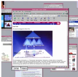
The three-dimensional (3D) graphics of computer games provide compelling evidence that desktop computers are capable of supporting rapidly interactive three-dimensional visualisations, yet 3D interfaces remain largely tied to niche markets such as Computer Aided Design. Recent document- and file-management research systems—such as the Web Book [1], the Data Mountain [6], and Cone trees [7]—have begun to explore 3D visualisation for everyday office work. There is, however, a surprising lack of empirical research
into the benefits (or costs) that are produced by moving from two to three dimensions.
In this paper we describe the comparative evaluation of a 2D and 3D version of a system that is strongly based on the Data Mountain developed by Robertson and colleagues at Microsoft Research [4,6]. The Data Mountain, shown in Figure 1, allows users to arrange ‘thumbnail’ images of documents (such as web pages) on a 3D inclined plane. It is designed to exploit humans’ natural capacity for spatial memory and cognition. The user’s perception of depth and distance is enhanced by, among other cues, dynamically resizing the thumbnails as they are moved up (further) and down (nearer) the ‘mountain’. Because the user’s viewpoint is fixed, no special interface controls or devices are needed to manipulate items in the 3D space (unlike VRML interfaces that require the user to first select a mode of 3D motion).
The two main questions motivating our research are as follows. Firstly, what differences, if any, exist between the efficiency of working with 2D and 3D interfaces for document management? Secondly, what differences, if any, exist between people’s preferences for working with these interfaces?
In the next section we describe related work. Then the two interfaces used in the experiment are described, followed by the details of the experimental design. Results are then presented and discussed, followed by the conclusions. RELATED WORK
There have been two previous evaluations of the Data Mountain. The first [6] compared bookmark retrieval times and error rates across three interfaces (two versions of the Data Mountain and Internet Explorer (IE4)) and across a variety of cueing conditions used to prompt the user’s search. Results showed that the Data Mountain provided reliable improvements in efficiency and error rate over IE4’s bookmarking scheme, particularly when the search cueing condition included the thumbnail image. The second evaluation [4] compared the use of different similarity metrics (“implicit queries”) within the Data Mountain to help users store and retrieve web pages.
Permission to make digital or hard copies of all or part of this work for personal or classroom use is granted without fee provided that copies are not made or distributed for profit or commercial advantage and that copies bear this notice and the full citation on the first page. To copy otherwise, or republish, to post on servers or to redistribute to lists, requires prior specific permission and/or a fee.
SIGCHI’01, March 31-April 4, 2001, Seattle, WA, USA. Copyright 2001 ACM 1-58113-327-8/01/0001…$5.00.
These studies showed that, compared to current bookmarking techniques, the Data Mountain can improve user performance, and that certain refinements to the interface (such as adding implicit queries) can further increase performance. They do not, however, reveal whether the performance gains are due to the 3D visualisation, or to some other factor such as the acuity of the user’s spatial memory. As Robertson et al. state: “We would like to understand the relative contributions to this successful study of the various components (3D versus 2D…)”.
Several projects have investigated the relative performance and preference of users for 2D and 3D non-interactive graphs. Levy et al. [5] show that users make sophisticated judgements about their preference for depth in graphs. They found a general preference for 3D graphs, particularly when they are to be used for making a memorable impression, and when communicating information to others. Two earlier studies [2, 8] show little difference between 2D and 3D graphs in the accuracy of users’ interpretations, nor in the speed (‘latency’) of interpretation.
There have been few prior studies that directly compared 2D and 3D interactive systems. Ware and Franck [9] compared “how much more (or less) can be understood in 3D than in 2D”. The subject’s tasks involved determining whether or not two nodes in a 3D network had a path of length two between them. Error rates and the time to provide an answer were measured. Results showed that the 2D interface was reliably out-performed by 3D interfaces. Given the nature of the task in Ware and Franck’s evaluation—tracing paths in a three-dimensional figure—it is probably unsurprising that the two-dimensional interface performed poorly. Three-dimensional interfaces are already widely used for tasks involving modelling 3D objects (such as CAD), and it seems intuitive that allowing users to tailor their angle of perspective should improve task performance. The question about the relative usability of 2D versus 3D
interfaces for the new generation of 3D document management systems remains unanswered.
In our prior work [3], we compared subjects’ efficiency in locating files when using Cone-Trees (a three-dimensional technique for exploring hierarchical data structures [7]) and when using a ‘normal’ folding tree interface similar to that used in Windows Explorer. When using Cone-Trees the subjects took significantly longer to locate files, and their efficiency deteriorated rapidly as the branching factor of the hierarchy increased. The subjects’ comments, however, indicated that the Cone-Tree interface provided a better sense of the structure of the information space.
The Cone-Tree experiment did not isolate dimensionality as a factor under study. Rather, it compared a 3D interface with a significantly different 2D interface for the same task. In particular, Cone-Trees introduce a latency for cone rotation that does not occur in the corresponding 2D
Figure 1: Robertson et al.'s Data Mountain.
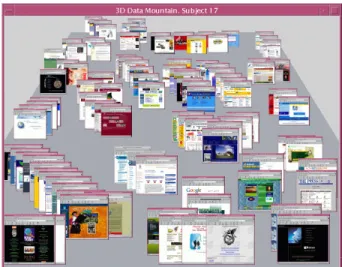
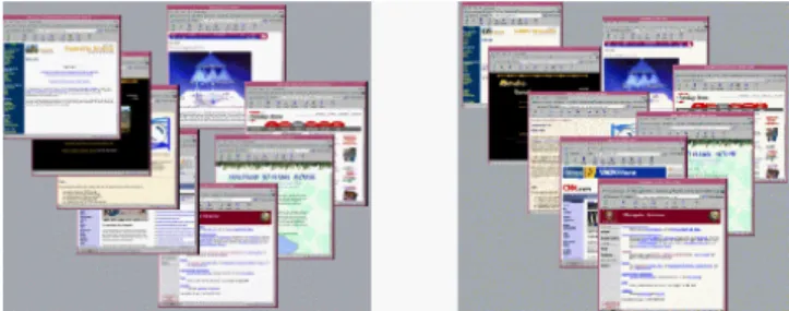
Figure 3: The 2D version of the Data Mountain. Subject 18’s arrangement of 99 pages. Figure 2: The 3D version of the Data Mountain.
interface—instead, users scroll directly to the data required. The study reported in this paper aims to limit the interface differences only to those that arise from the use of 2D versus 3D displays.
2D AND 3D DATA MOUNTAIN INTERFFACES
The interfaces used for the experiment were designed to be as similar as possible except for the number of visual dimensions. Both interfaces allow users to locate thumbnail images of web pages within the display. Figure 2 shows the 3D interface after Subject 17 had stored 99 web pages in their display, and Figure 3 shows the 2D interface after Subject 18 had positioned an identical number of pages. The tidy organisation of thumbnails in Figure 3 (2D) is a factor of this subject’s behaviour rather than that of the interface. Due to the varied storage and positioning strategies used by the subjects, the appearance of ‘order’ in both the 2D and 3D interfaces varied enormously between the subjects.
Both interfaces supported two basic actions with identical mouse bindings:
• Thumbnail movement. Thumbnails are dragged around the display using the left mouse button.
• Thumbnail magnification. Pressing and holding the right mouse button over any thumbnail magnifies it to a large size (262x250 pixels). When any thumbnail image is magnified, its title (extracted from the HTML <Title> tag of the web page) is shown beneath it (see Figure 4). When the right mouse button is released, the thumbnail returns to its original size.
The differences between the interfaces are as follows:
• Available X-axis. In the 3D interface the thumbnails cannot be moved off the edge of the sloping plane. This is consistent with Robertson et al.’s Data Mountain, and is necessary to maintain the user’s sense of depth and distance.
• Thumbnail resizing. In the 3D interface, thumbnail images diminish as they are moved up the Data Mountain. The resizing is extremely fluid, giving a strong visual impression that the images are getting smaller as they are pushed ‘further’ away. The maximum and minimum sizes of thumbnails (at the bottom and top of the mountain) are approximately 157x150 and 42x40 pixels respectively.
In the 2D interface, all thumbnail images are a constant size at 89x85 pixels (approximately the mid-point size of the 3D thumbnails). This size was chosen to ensure that both interfaces allow the same number of thumbnails to be positioned on the display before the user is forced to begin overlapping thumbnails. Both interfaces allow a maximum of 85 thumbnails to be ‘tiled’ on the display without any overlapping.
• Layering control. In the 3D interface, there is a natural metaphor for controlling the layering of thumbnails:
‘nearer’ thumbnails occlude ‘further’ ones. As a thumbnail is dragged further up the inclined plane it pops behind any thumbnails in its path. We did not implement Robertson’s ‘tall grass’ metaphor, in which nearby thumbnails are animated to briefly move away from the dragged thumbnail before an animation returns them to their original position. We also did not implement Robertson’s minimal thumbnail separation requirement. Instead we left users with full control over thumbnail location in both interfaces (issues of thumbnail organisation and separation are discussed further in the results).
In the 2D interface there is no natural metaphor for layering. We chose to implement a simple control aimed at learnability rather than efficiency: clicking or dragging a thumbnail with the left mouse button causes it to rise above all other thumbnails. Magnifying an occluded thumbnail (in either interface) brings the magnified image to the surface temporarily.
We were careful to ensure that there were no performance differences between the systems. Both systems are fluidly interactive with no noticeable delay in manipulating thumbnails.
Prior to the experiment we strongly suspected that the 3D interface would prove to be more efficient because of its ‘natural’ metaphor for layering related pages within clusters. Trial users, who were not participants in the study, confirmed that both interfaces seemed usable, and that the sense of depth and distance in the 3D interface was powerfully communicated.
EXPERIMENTAL DESIGN
The primary purpose of the experiment was to see if there were any differences between the 2D and 3D interfaces in the efficiency of storing and retrieving web page thumbnail images. We were also interested in how performance in these tasks might be affected by increasing densities of data
(‘clutter’) within the displays. Finally, we were interested in the subjective assessment of the interfaces.
The experiment was a two way mixed factorial analysis of variance (ANOVA) for independent variables ‘interface type’ with two levels (2D and 3D) and ‘data density’. The three levels of data density were ‘sparse’, ‘medium’ and ‘dense’ which were measured with 33, 66 and 99 thumbnails on the display. Because of the risk of a learning effect between the 2D and 3D interfaces, the interface type was a between-subjects factor. Data density was a within-subjects factor. Table 1 summarises the experimental design.
The same set of 99 web pages was used for all subjects. The main criterion for selecting the pages was that the subjects should be roughly familiar with the page’s topic. They included, among other things, media providers such as
cnn.com, major international commercial organisations
such as coke.com, local retail companies, and a variety of
local University sites.
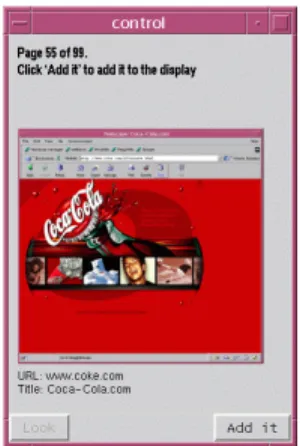
The evaluation procedure consisted of repeating storage and retrieval exercises for the sparse, medium and dense conditions. The repeated exercises for each density are summarised in Table 2. Starting with a blank display, the subjects added 33 pages to the display, one at a time. The pages were presented in random order in a separate window (Figure 5). The cueing condition for each page consisted of a magnified thumbnail of the page, the page URL and its title. Subjects were asked to read the title out-loud and to ask for clarification if they did not understand the page topic. Pressing the “Add it” button (bottom right of Figure 5) added the thumbnail to the main Data Mountain interface at the middle-bottom of the window (see Figures 2 and 3). They then moved the thumbnail to the desired location, and proceeded to the next thumbnail. Subjects were informed that they should organise the pages quickly, but that they should focus on creating a good organisation that would allow them to rapidly find thumbnails. Other than the occasional clarification of the content of an unfamiliar
page, the subjects were given no hints or advice about the topics or categories of the pages. Software timed the task completion time for storage and organisation.
Having placed and organised the first 33 pages, the subjects responded to two 5-point Likert scale questions: Q1 “It was easy to place the pages” and Q2 “I will be able to quickly find pages” (disagree 1, agree 5).
The retrieval task consisted of finding, as quickly as possible, ten randomly selected pages from the display, one at a time. The cueing condition for each page was identical to that used for storage: the user was shown the magnified image, its URL and title. Software timed each task, with the clock stopping when the subject magnified the target page. A time limit of 100 seconds was used for the search tasks. After the ten searches, subjects responded to three more Likert scale questions: Q3 “I was able to quickly find pages”, Q4 “I remembered the location of the pages needed”, and Q5 “The display is cluttered”.
Once the storage and retrieval tasks were completed for the sparse condition (33 pages), the subjects proceeded to the medium condition, adding a further 33 pages to the display. They then retrieved ten randomly selected pages from the 66 pages shown. Finally, subjects repeated the tasks for the last 33 pages, giving the dense condition.
When all of the tasks were complete, the subjects responded to a final Likert-scale question: Q6 “Overall the interface is effective”.
The 28 subjects were volunteer undergraduate (18) and postgraduate (10) Computer Science students. They were randomly assigned to the 2D (14) or 3D (14) conditions.
Table 1: Experimental design. Density factor within subjects. Interface factor between subjects.
Data Density (within subjects) Sparse (33) Medium (66) Dense (99)
2D Even subjects S2-28 Even subjects S2-28 Even subjects S2-28 Interface Type (between
subjects) 3D Odd subjects S1-27 Odd subjects S1-27 Odd subjects S1-27
Table 2: Repeated tasks for each density.
Task Comments Measure
Storage/ organisation
Place and organise 33 pages on the display, one at a time
Time
Q1 “It was easy to place the pages” Likert-Scale
Q2 “I will be able to quickly find pages”
Likert-Scale
Retrieval Find ten randomly selected pages in the display
Time (for each search).
Q3 “I was able to quickly find pages” Likert-Scale
Q4 “I remembered the location of the pages needed”
Likert-Scale
Figure 5: The control interface for cueing storage and retrieval tasks.
Each evaluation session lasted approximately one hour. The subject’s training lasted approximately ten minutes, during which they were shown the appropriate 2D or 3D interface with 22 randomly located pages in the display. They were shown the interface controls and were asked to carry out several sample tasks.
RESULTS
The subjects in both interface conditions enjoyed the experiment, with many of them stating that the evaluation was hard work but thoroughly absorbing, and that time passed extremely quickly. The next two subsections report the quantitative results for the storage/organisation tasks, and for the retrieval tasks. We then discuss the subjective results from the questionnaire and comments.
Storage and organisation task
The mean times for storing 33 pages in the 2D and 3D interfaces were 437 (s.d. 138.2) and 505.6 (s.d. 165.7) seconds. This, however, is not a significant difference (F(1,26) = 1.890, p=.181). There was also no significant difference between the times taken to store pages in the sparse, medium and dense conditions (F(2,52)=0.606, p=.549): means 462.4 (s.d. 169.0), 488.4 (s.d. 164.4), and 463.0 (s.d. 135.3).
The subjects’ comments revealed the reason for the absence of a difference between densities. In the sparse condition, a large proportion of the subjects’ time was spent identifying categories as each page arrived. In the medium and dense conditions, however, less time was spent decision-making, but more was needed to manipulate thumbnails within ‘cluttered’ existing categories. Most of the subjects chose to subdivide categories that grew too large in the medium and dense conditions, but this process was characterised by rapid mechanical activity. This rapid activity was in marked contrast to the relatively thoughtful process of category identification in the sparse condition.
Almost all (26 of 28) of the subjects chose to organise the thumbnails by grouping sets of thumbnails describing similar topics—the remaining two subjects used a horizontal alphabetical arrangement, based on the page title. As more pages were added to the display (in the medium and dense conditions) the category groups often required sub-categories to be created, and a variety of techniques were used to achieve this. One particularly efficient subject in the 3D condition used sub-categories that were based on ‘distance from home’. For example, within a group of travel related pages, he had the thumbnail for “Air New Zealand” in front of the thumbnail for “Qantas Airlines” which was in front of “United Airlines” and “British Airways”. Other subjects used depth in the 3D condition to place ‘interesting’ pages near and uninteresting ones further ‘away’. In the 2D environment, the difficulty of precisely controlling the layering of thumbnails was a major problem for many subjects, and similar ‘distance-oriented’ arrangements were unused (or used in a way that the
experimenters were unable to detect, and were not mentioned by the subjects).
Another fairly common storage technique, used in both the 2D and 3D interface, was to place closely related pages very close to one another (for example, placing the “University of Auckland” in front of “University of Auckland, Department of Computer Science”, see Figure 3). This technique caused mixed success during the retrieval tasks: although the subjects would rapidly find the correct ‘region’ on the display, they would then have to move the front page in order to retrieve the sub-topic page. A minimum displacement requirement, as implemented by Robertson et al., would have prohibited this storage technique.
Finally, some of the subjects optimised their thumbnail organisation within categories by ensuring that pages with low visual identity (for example, a white background with black text) were arranged with less overlapping than pages with high visual identity (for example, a large block of a bright colour). Several subjects commented that if the Data Mountain’s style of bookmark retrieval became commonplace, companies would redesign their pages to maximise visual identity.
Page retrieval task
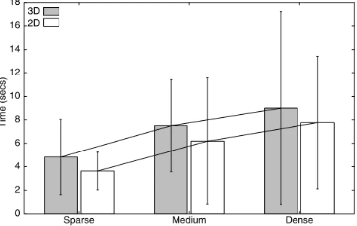
Both interfaces performed well in the page retrieval tasks, and users were normally able to rapidly find pages: approximately 90% and 85% of the tasks were completed within ten seconds using the 2D and 3D interfaces. Figure 6 summarises the mean page retrieval results for the two interfaces across the three densities; error bars show one standard deviation above and below the mean. The figure shows that the mean time for page retrieval was higher for the 3D interface across all densities. The main effect for interface type, however, was not significant (F(1,26)=0.289, p=.601), with mean values of 5.98 (s.d. 4.80) and 6.77 (s.d. 5.64) for the 2D and 3D interfaces. The main effect for density was strongly significant (F(2,52)=8.752, p < .005), with means for the sparse, medium and dense conditions of 4.10 (s.d.2.52), 6.65 (s.d. 4.57) and 8.37 (s.d. 6.85). The 0 2 4 6 8 10 12 14 16 18
Sparse Medium Dense
3D 2D
Time (secs)
Figure 6: Mean task completion times for the retrieval tasks across the 2D and 3D interfaces and across levels of density. Error bars show standard deviations.
figure also confirms the absence of an interaction between interface type and data density (F(2,52)=.072, p=.931). There were four failures to find the thumbnail image within the 100 second time limit: three when using the 2D interface and one when using the 3D interface. These are both very low failure rates given the task pool of 420 trials per interface (14 subjects per interface, and 30 trials per subject).
There were three primary causes of the subjects failing to rapidly find pages: first, mis-categorised pages; second, cross-categorised pages; third, large categories with minimal separation between them. All problems were encountered in both interface conditions. Problems of mis-categorisation normally resulted from slips by the user, such as forgetting that one page on a topic had been placed at a particular location prior to grouping further pages under the same category in a different location. Several subjects mentioned the problem of remembering the categories they had chosen, and some asked if it were possible to put text labels over the categories.
Problems of cross-categorisation occurred when subjects were asked to retrieve pages that could be classified under more than one category: for instance, “Air New Zealand” could be classified under “Large Companies” or “Travel”. The final class of retrieval problem occurred when subjects were over-anxious to save space in the display, and used a minimal separation between large sets of pages. Many times subjects would immediately go to the correct group of pages, magnify several (missing the target page), then decide that they must have misplaced it elsewhere, resorting to a more-or-less random search. We suspect that Robertson
et al.’s minimal separation technique would have reduced the frequency of this type of problem. It is important to note, however, that there were no differences in the thumbnail separation requirements of the two interfaces. Subjective Measures
Although there is no reliable difference between the storage and retrieval task completion times for the 2D and 3D interfaces, there were significant differences in the subject’s ratings. Mean response values to the five point Likert scale questions (1 disagree, 5 agree) are summarised in Figure 7 and Table 3.
The subjects’ responses to the overall effectiveness question (Q6, Table 3) showed a higher rating for the 3D interface (means 3.50 (s.d. .86) and 4.25 (s.d .70)), giving a reliable result (Mann-Whitney U Test, U=51, N1=N2=14, p < .05). Many users of the 3D interface also commented that the interface felt “natural” and “a good way to organise bookmarks”. Equivalent statements about the 2D interface were less common.
Other than the subjects’ assessment of effectiveness, none of the other questions revealed significant differences between the two interfaces (Mann-Whitney U tests). Figure 7 clearly shows, however, that the increasing density of the tasks strongly influenced their responses to each question, providing a reliable difference between densities (Friedman Tests) for all but question 4 (Table 3).
The effectiveness of spatial memory (one of the fundamental hypotheses motivating the original implementation of the Data Mountain) was strongly reinforced by the subjects’ performance in retrieving pages and in their responses to Q4 “I remembered the location of the pages needed”. In both interface conditions, prior to performing the retrieval tasks, subjects doubted that they would be able to quickly find pages (Q2 of Figure 7 and Table 3). After completing the tasks, however, most subjects gave a stronger rating of agreement to the statement “I was able to quickly find the pages” (Q3). In the 2D dense condition, eight subjects rated their ability to find pages more highly than their expected performance, six
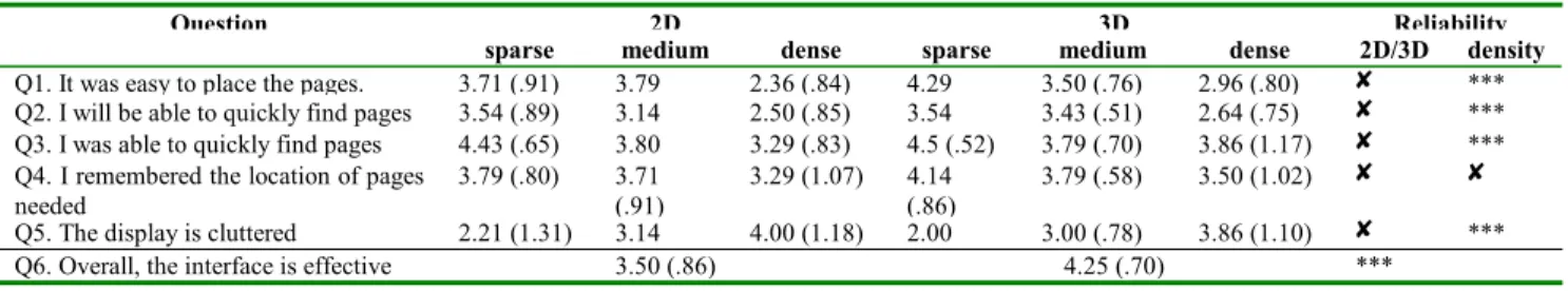
Table 3: Mean (standard deviation) responses to 5-point Likert scale questions. ✘✘✘✘, not significant at the .05 level. *** significant at the .05 level.
Question 2D 3D Reliability
sparse medium dense sparse medium dense 2D/3D density
Q1. It was easy to place the pages. 3.71 (.91) 3.79 2.36 (.84) 4.29 3.50 (.76) 2.96 (.80) ✘ *** Q2. I will be able to quickly find pages 3.54 (.89) 3.14 2.50 (.85) 3.54 3.43 (.51) 2.64 (.75) ✘ *** Q3. I was able to quickly find pages 4.43 (.65) 3.80 3.29 (.83) 4.5 (.52) 3.79 (.70) 3.86 (1.17) ✘ *** Q4. I remembered the location of pages
needed 3.79 (.80) 3.71 (.91) 3.29 (1.07) 4.14 (.86) 3.79 (.58) 3.50 (1.02) ✘ ✘
Q5. The display is cluttered 2.21 (1.31) 3.14 4.00 (1.18) 2.00 3.00 (.78) 3.86 (1.10) ✘ *** Q6. Overall, the interface is effective 3.50 (.86) 4.25 (.70) ***
2 2.5 3 3.5 4 4.5 5 S M Q1 D S M Q2 D S M Q3 D S M Q4 D S M Q5 D
Preference (1= Disagree, 5=Agree)
3D 2D
Figure 7: Responses to Q1–Q5 5-point Likert scale questions across (S)parse, (M)edium and (D)ense conditions for the 2D and 3D interfaces.
gave the same value, and none rated their ability worse than expected. Values for the 3D interface are similar, with eight subjects rating their performance better than expected, five the same, and one worse.
DISCUSSION
To summarise the results, the mean task completion times for all storage and retrieval tasks were higher when using the 3D interface than when using the 2D interface. These differences, however, were not statistically significant. The mean times for retrieving thumbnails from the different levels of density were significantly different, but there was no interaction between the interface type and density factors.
We were surprised to find no significant difference between the interfaces, and even more surprised that the 2D interface provided the lower mean task times. Prior to the experiment, we strongly suspected that the ‘natural’ depth behaviour of the 3D interface would allow greater levels of efficiency.
Although we are hesitant to speculate about why the 3D interface did not provide performance improvements, we suspect that it is due to the difficulty of visually matching the cueing condition (the magnified thumbnail) with the diminished thumbnails located beyond the mid-point of the 3D display. While the subjects’ spatial memory normally rapidly directed them to the correct area of the display, the subjects generally relied on visual matching to precisely identify the target page. In the 2D interface, there was a constant mapping between cueing condition (the page URL, title and a 262x250 thumbnail) and the actual thumbnail (fixed at 89x85 pixels). In the 3D condition, however, if the target thumbnail was located at the ‘top’ of the mountain, it would be rendered at 42x40 pixels.
It is probably unsurprising that the mean task completion times for the retrieval tasks were reliably different as the density of the data set increased—the users had to contend with more ‘clutter’. However, we were surprised to find no significant interaction between interface and density. We suspected that the benefits of the 3D interface would become apparent in denser tasks; to us, the 3D interface seemed to allow more powerful and natural schemes for dealing with large numbers of thumbnails. Furthermore, the subjects’ organisation strategies and comments appeared to support this interaction, yet task performance measures categorically did not support its existence. Again, we believe that the problems of visually matching images overcame any performance benefit that might have been gained in the 3D condition.
Despite the lack of significant differences between task performance with the interfaces, the subjects’ subjective assessments show significant preference for the 3D interface. These results echo those of research into the differences between 2D and 3D passive graphs [2,5,8]. These studies have shown little or no difference between
accuracy and efficiency in retrieving information from the graphs, but revealed that subjects generally prefer the 3D presentation.
Confounding Factors
There were several possible confounding factors in our experiment. We doubt that any of the following factors would have altered the conclusions of the study.
Banners on Thumbnail Images
When we created the 99 thumbnail images used in the experiment, we captured the entire browser window displaying the page. The top of each thumbnail therefore included Netscape’s menu- and tool-bars. For this reason, the top portion of each thumbnail provides no page identification cues. We noticed this flaw after the first subjects had participated in the study, and we chose to continue.
Although the banners appear in both interfaces there is a risk that they adversely affected the 3D interface more strongly than the 2D one. This risk is due to the way in which thumbnails are automatically located behind one another as they rise up the 3D Data Mountain. It is therefore impossible to arrange overlapping thumbnails so that all of the bottom of a more distant thumbnail is visible. Such an arrangement is possible in the 2D interface. Figure 8 shows how the 3D interface (right) reveals the top of more distant thumbnails, while the 2D interface allows the user to control the direction of the layering effect.
We strongly doubt that removing banners from the thumbnails would have changed the results. The ‘reverse’ cascading effect shown in Figure 8 (left) was rarely used by the subjects, with most (such as Subject 18, shown in Figure 3) choosing to layer thumbnails in the same direction as that supported by the 3D Data Mountain.
2D Layering Controls
Although the 2D interface was capable of supporting varied layering effects, the interface controls for achieving them was poor. Clicking on a thumbnail with the left mouse button, or dragging it, would raise it to the surface level (above all other thumbnails). The subjects had two main problems with this limited interface. Firstly, there was no way to increase the layering depth of a thumbnail, and secondly, there was no support for moving thumbnails
without raising them to the surface. These problems adversely affected the subjects’ performance in the 2D
Figure 8: Flexible layering in the 2D interface (left), and constrained layering in 3D (right).
storage tasks. Often, when adding an additional item to a group of related thumbnails, the user would have to make many additional thumbnail clicks to achieve a desired cascading effect (such as that shown in Figure 3).
Improving the range of layering controls in the 2D interface might have reduced the time for the 2D storage task, and might have improved 2D responses to Q1 (“It was easy to place the pages”). It is unlikely, however, that it would have resulted in significant changes in the retrieval tasks.
Familiarity and Subject Pool
Our subjects (computer science students), like most computer users, are familiar with dragging objects on a 2D graphical user interface such as the ‘desktop’ or a drawing canvas. Most, however, are not familiar with manipulating objects on a 3D surface.
3D Fidelity
The final possible confounding factor concerns the quality of the visual presentation of the 3D interface. Robertson et al.’s Data Mountain used many sophisticated visual cues to enhance the 3D effect. Our interface, in contrast, is relatively lifeless. Further perceptual cues might have reduced task performance times in the 3D condition.
Several of the subjects using the 3D interface made comments about the interface being “realistic” and “natural”. We received no comments indicating that the 3D effects failed to give a sense of depth. We believe the evaluation was a fair comparison of a 3D interface with an almost identical 2D version.
CONCLUSIONS
Three-dimensional interactive visualisations are widely used for tasks involving modelling 3D surfaces. Prior studies have shown that 3D interfaces are more effective than their 2D counterparts for these modelling tasks. Recently there has been a growth of interest in 3D interactive systems for everyday ‘desktop’ computing applications, such as document and file management. The relative value of the third visual dimension in these systems has not previously been evaluated.
The evaluation reported in this paper begins to address the question “what usability benefits, if any, do three-dimensional document management interfaces provide over their 2D counterparts?”. The results echo prior work comparing 2D and 3D passive graphs. They show no significant difference between task performance in 2D and 3D, but a significant preference for the 3D interfaces. We
look forward to future work investigating the conditions under which 3D interfaces for document management provide performance enhancements over their 2D counterparts.
REFERENCES
1. Card, S. K., Robertson, G. G., and York, W. The WebBook and the WebForager: An Information Workspace for the World Wide-Web. In Proceedings of CHI'96, Vancouver, April 1996, ACM Press, 111-117. 2. Carswell, C., Frankenberger, S., and Bernhard, D.
Graphing in depth: Perspectives on the use of three-dimensional graphs to represent lower-three-dimensional data.
Behavior and Information Technology 10, 6, 459-474. 1991.
3. Cockburn, A. and McKenzie, B. An evaluation of cone trees. In People and Computers XV (Proceedings of the 2000 British Computer Society Conference on Human-Computer Interaction.), University of Sunderland, September 2000, Springer-Verlag, In Press.
4. Czerwinski, M., Dumais, S., Robertson, G., Dziadosz, S., Tiernan, S., and van Dantzich, M. Visualizing implicit queries for information management and retrieval. In Proceedings of CHI'99, Pittsburgh, May 1999, ACM Press, 560-567.
5. Levy, E., Zacks, J., Tversky, B., and Schiano, D. Gratuitous graphics? Putting preferences in perspective. In Proceedings of CHI'96, Vancouver, April 1996, ACM Press, 42-49.
6. Robertson, G., Czerwinski, M., Larson, K., Robbins, D., Thiel, D., and van Dantzich, M. Data Mountain: Using spatial memory for document management. In
Proceedings of UIST'98, San Francisco, California, November 1998, ACM Press. 153-162.
7. Robertson, G., Mackinlay, J., and Card, S. K. Cone Trees: Animated 3D visualizations of hierarchical information. In Proceedings of CHI'91, New Orleans, May 1991, ACM Press, 189-194.
8. Spence, I. Visual psychophysics of simple graphical elements. Journal of Experimental Psychology: Human Perception and Performance 16, 4, 683-692, 1990. 9. Ware, C., and Franck, G. Evaluating stereo and motion
cues for visualizing information nets in three dimensions. ACM Transaction on Graphics 15, 2, 121-139, 1996.