A Power-Law Analysis of the Uneven Geographic
Distribution of Executions in the Post-Furman era of the
Death Penalty
April 9th, 2015 Dr. Frank Baumgartner
Table of Contents
Chapter 1- Introduction: 1-2
Chapter 2- Literature Review: 3-10 Chapter 3- Theory: 11-16
Chapter 4- Data Collection Procedures: 17-19 Chapter 5- Homicides: 20-26
Chapter 6- Homicides per Population: 27-33 Chapter 7- Executions per Population: 34-45 Chapter 8- Executions per Homicide: 46-54 Chapter 9- Executions: 55-60
Chapter 10- Conclusion: 61-62 Appendix: 63-66
Figures
Chapter 5- Homicides
Figure 5.1- Homicides by county, 1984 to 2012: 21 Figure 5.1.a- All counties: 21
Figure 5.1.b- Excludes counties with less than 100 homicides: 21 Figure 5.2- Counties with the highest number of homicides, 1984 to 2012: 24
Figure 5.3- Cumulative frequency distribution of homicides across US counties, 1984-2012: 25 Figure 5.4- Log-log plot of the distribution of homicides across US counties, 1984-2012: 26 Chapter 6- Homicides per Population
Figure 6.1- Homicides per population rates by county from 1984 to 2012: 27 Figure 6.1.a- All counties: 27
Figure 6.1.b- Excludes counties with less than 10,000 population: 27
Figure 6.2- Large counties with the highest homicides per population rate across US counties: 31 Figure 6.3- Log-log plot of homicides per population rates across US counties: 32
Chapter 7- Executions per Population
Figure 7.1- Executions per population rates across United States Counties: 35 Figure 7.1.a- All counties: 35
Figure 7.1.b- Excludes counties with less than 10,000 population: 35
Figure 7.2- Cumulative frequency distribution of executions per population rates across US counties: 42
Figure 7.3- Log-log plot of executions per population rates across US counties: 43 Figure 7.4- Semi-log plot of executions per population rates across US counties: 44 Chapter 8- Executions per Homicide
Figure 8.1- Executions per homicide rates across US counties: 46 Figure 8.1.a- All counties: 46
Figure 8.1.b- Excludes counties with less than 100 homicides: 46
Figure 8.3- Log-log plot of executions per homicide rates across all US counties: 53 Figure 8.4- Semi-log plot of executions per homicide rates across US counties: 54 Chapter 9- Executions
Figure 9.1- Number of executions across US counties: 55 Figure 9.1.a- All counties: 55
Figure 9.1.b- Excludes counties with no executions: 55
Tables
Chapter 5- Homicides
Table 5.1- Counties with the highest number of homicides from 1984 to 2012: 23 Chapter 6- Homicides per Population
Table 6.1- Counties with the highest homicides per population rates from 1984 to 2012: 29 Chapter 7- Executions per Population
Table 7.1- Counties with the highest executions per population rates: 37 Table 7.2- Large counties with the highest executions per population rates: 40 Chapter 8- Executions per Homicide
Table 8.1- Counties with the highest executions per homicide rates: 49
Table 8.2- Violent counties with the highest executions per homicide rates: 50 Chapter 9- Executions
Chapter 1
Introduction
In 1972 the United States Supreme Court ruled in Furman v. Georgia that the application of the death penalty was arbitrary and capricious, and placed a hold on executions until states could prove they had created a more consistent system for death sentencing. By 1976, 37 states had reenacted the death penalty under the claim that they had created a more consistent method. However, current statistics on the application of the death penalty in the United States show that racial and geographic inequity remains the status quo. Although a large amount of research concerning racial inequity in the imposition of capital punishment in the United States exists, statistical analysis and data on the extent of geographic inequality remains limited.
The 1972 Furman majority opinion explains “that the Eighth and Fourteenth
Amendments cannot tolerate the infliction of a sentence of death under legal systems that permit this unique penalty to be so wantonly and so freakishly imposed”. Thus, the United States Supreme Court ruled that executions be postponed until the creation and implementation of a less arbitrary system of imposing death. Since 1976, 1,373 individuals have been executed in the United States under the promise that the post-Furman capital punishment system is no longer unfairly distributed.
However, an overview of literature on the death penalty trends, combined with new statistics on homicides and executions in the United States1 supports three hypotheses contrary to
the concept that capital punishment is operating within an equitable system in the post-Furman era due to the severe unequal geographic distributions that define execution patterns since 1977.
Hypothesis #1: A large majority of executions occur in a very small number of counties and many counties have few or no executions.
Hypothesis #2: The geographic distribution of executions follows a power-law,
suggesting that the outcome of capital punishment cases is heavily correlated with the location of the trial due to historical developments. This remains true even when possible lurking variables are controlled, including population and homicide numbers.
Hypothesis #3: This geographic inequality is a result of the existence of a self-perpetuating local legal culture that either promotes or prohibits executions2.
An overview of previously published research on the distribution of executions in combination with previously unpublished statistical analysis using an original dataset will illustrate the large inequalities in the geographic distribution of executions within United States. The unequal geographic distribution of executions in America is especially striking when
examined through the lens of the 8th Amendment due to its severe nature and unusual geographic pattern. The fact that the death penalty continues to persist in such an unequal manner not only violates the 14th Amendment right to “equal protection of the laws” but also violates the 1972
United States Supreme Court Furman ruling that the death penalty not be imposed in an unequal or biased manner.
Chapter 2
Literature Review
The substantial quantity of research and literature on the death penalty makes the absence of a more complete statistical overview of post-Furman executions surprising. However, a good base of more specific research presenting several different trends concerning the inequitable distribution of the death penalty in the post-Furman era does exist. In order to understand the importance of the application of a log-log test, an overview and explanation of power-law and exponential relationships will also be introduced.
Literature on Racial Inequality in the Imposition of the Death Penalty
The most prevalent and complete research on the unequal imposition of the death penalty
concerns the inequality of racial distribution in execution rates as well as jury decisions.
Amsterdam (1988) presents a clear portrait of the pervasiveness of racial prejudice concerning
the application of the death penalty in Georgia. Some of Amsterdam’s most notable findings
include the fact that while only forty percent of post-Furman Georgia homicides had white
victims, over eighty-seven percent of cases where the death sentence was imposed had white
victims. Amsterdam presents a compelling multiple regression analysis that strongly suggests
that no non-racial factors can account for this racial inequality. Amsterdam’s paper provides a
The first limitation of Amsterdam’s study is the study’s solitary focus on racial discrimination,
which will be supplemented in this thesis by the contribution of data on all executions and
homicides in the United States during the post-Furman era of the death penalty. Another
limitation of Amsterdam’s study is that the study only reports findings on the state of Georgia.
The analysis presented in this thesis will hopefully alleviate this limitation through the addition
of a complete geographic analysis of every execution in the United States since 1976. While
Amsterdam’s study is limited in some ways it provides an excellent example of a complete
multiple regression analysis and presents a clear picture of racial discrimination in the death
penalty throughout the post-Furman era.
Macher (1995) presents a history of racial prejudice in the application of the death
penalty as well as an overview of some of the most important statistical studies on racial injustice
concerning United States executions. This study is helpful in the discussion of McCleskey v.
Kemp, an important 1987 United States Supreme Court case in which an African-American man
was granted relief from his sentence of death on the basis of two important statistical studies that
outlined the extreme racial prejudice present in the American justice system in the South.
Perhaps the most important of these studies is the Baldus study (Gross, 2012), in which a
sophisticated multiple regression analysis was performed to show the impact of race in the
application of the death penalty. Macher’s study is limited in its focus on only racial inequality.
Similarly, Macher does not provide any new statistics, but rather overviews those that have
already been published. Macher’s overview of past statistical analyses on unequal distributions
of the death penalty is a great asset in that Macher critiques certain decisions made in past
studies. Macher’s criticisms of past studies have been taken into account in order to improve the
many more studies on the effects of racial prejudice in the current inequity of executions in
America; many of which have been included in the bibliography. While these studies are
beneficial in their contributions and findings, most are limited either in scope (many only study
one state) or time span (some only analyze ten or fifteen year periods). Similarly, most of the
studies focus only on racial inequities and largely ignore the significant role of geographic
inequities. The current limitations on the study of the imposition of executions can be addressed
through a more complete statistical analysis of another important inequality— the geographic
distribution of all executions —in all fifty states since 1976.
Literature on the Geographic Inequality in the Imposition of the Death Penalty
The post-Furman capital punishment system is currently being administered in an
unexpected geographic manner. Counties with higher populations generally experience a higher
number of homicides, and thus if capital punishment was fairly distributed one would expect to
see that large counties have both high homicide and execution numbers. However, existing
literature and studies suggests that the correlation between population, homicides, and executions
is not as strong as would be expected in an equitable legal system. This geographic inequality
exists not only at the interstate level but also within states, suggesting the existence of cultural
mechanisms that self-perpetuate a culture that either promotes or prohibits executions. Currently
literature on the geographic inequality of the death penalty remains limited. However, Little
(2001) provides both empirical and historical information that directly relates to geographic
inequity of executions in the post-Furman era. Little discusses the availability of the death
illustrates the extreme geographic inequity in execution distribution through statistical analysis.
One particular passage from Little’s article illustrates the tendency of the South to use capital
punishment in a much more frequent manner, “of the 102 defendants who had then been
authorized for federal capital prosecution, half of these defendants (51 total) came from districts
in the fifteen Southern or Border States which traditionally favor the death penalty. In fact, in
terms of federal death penalties actually imposed fully, 80% came from these states” (Little,
2001, 9). The main limitation of Little’s study is the fact that the paper’s statistical analysis only
examines the use of capital punishment from 1994 to 1999. However, the statistical analysis in
this thesis suggests that this trend has intensified over time, with nearly forty percent of
executions since 1976 being administered in Texas alone. Little also explains different reasons
for this trend, which include the local nature of politics and the importance of regional cultural
norms, which this thesis will discuss and expand upon as one of the potential reasons for the
geographic inequality that plagues death penalty distributions in the post-Furman era. In our
statistical overview we intend to explain the trends behind these inequities with greater detail.
Baumgartner et al. (2008) provides a detailed account of the geographic distribution and
changes in public opinion towards the death penalty over time. This book provides thorough
empirical analysis of capital punishment in America, including data on racial and geographic
distributions of executions. In their analysis the authors show that the current distribution of
death sentences and executions in the post-Furman era is subject to the previously mentioned
geographic and racial disparities. A main component of this book is a complex multiple
regression analysis. The multiple regression analysis in this book displays the tendency of a few
states to execute at very high rates while most others rarely or never do so. Additionally, the
county of conviction play in the outcome of a defendant’s capital trial. While the focus of our
study’s statistical analysis is the use power-law tests, the analysis in this book will serve as a
beneficial example of how to examine execution distributions through statistics. However, the
statistics that have been gathered to date will allow a more complete and in depth picture of the
unequal trends that plague execution distributions. This thesis will address some of the
previously mentioned limitations through the addition of county, homicide, and population
information related to the unequal nature of post-Furman death penalty distributions.
Introduction to Power-Laws
An understanding of the mechanism behind power-law distributions is key to
understanding the importance of the results presented in later chapters, and thus an overview of
the mechanisms that create networks that have power-law distributions is necessary. Barabási et
al. (2002) present a compelling yet easy to understand summary of networks and the way they
can lead to power-law distributions.
The authors explain that many aspects of life, from the economy to our own biological
existence, are surprisingly interrelated. The connected nature of life is what creates networks,
which in the context of this thesis will be represented by the local legal culture that comprises a
county and the surrounding region. Although famous intellects such as Erdős and Rényi
previously believed that most of these networks, even complex ones, operated in a random
manner, Barabási et al. explain that nature instead prefers a slightly different approach that will
be explained later in the theory section of our paper. However, it is worth noting that a network,
when values are presented as a histogram, will usually plot as a relatively even bell curve if the
distributions look much different when presented as a histogram when compared to a bell curve.
Power-laws, when plotted as a histogram, will have a large number of cases clustered at one end
of the plot and an extreme tail that extends far from the median of the distribution.
Barabási et al. explain that several important characteristics must be considered when examining the nature of a network. The first is whether the network is the result of a random
process or if the network was created and exists in a non-random manner. The next is the
strength of the ties between members of the network, and whether clustering exists. As the
authors explain, clustering in society is intuitive as humans have a strong tendency to enjoy the
comfort of cliques. For the purpose of this thesis, clustering may occur around an execution
“hub” such as Harris County in Texas. This would suggest that smaller counties surrounding
Harris county, although they may experience relatively low rates of crime, execute at higher rates
because the surrounding local culture promotes a culture of executing individuals3.
Pareto’s law is another way to explain the existence of power-law distributions. Pareto’s
law, in the most basic sense, states that eighty percent of productivity is output by only twenty
percent of the network. The existence of these networks is, as Barabási et al. put it, “special”, as
nature generally prefers more evenly distributed connections without too many extremes on
either side of the median. However, anytime that Pareto’s law applies it can be assumed with a
high degree of certainty that the network follows a power-law (also called Pareto) distribution.
Histograms depicting power-law distributions are illustrated as a continuously decreasing line in
a log-log scale. This means that many small events coexist with a few very large events. A
helpful analogy that Barabási et al. provide is to imagine the existence of a power-law in terms of
human height. If human height followed a power-law, it would not be uncommon for a large
3 Refer to section one of the appendix for a more detailed explanation of the concept of local legal cultures and the
majority people to be less than six feet tall, but it would also not be unusual to see a person who
was more than five hundred feet tall. However, as previously mentioned, these power-laws
rarely exist in basic nature distributions, as nature tends to favor a more equal and less extreme
distribution, but the more complex the system the more likely a power-law is to emerge.
Complexity is especially important in the context of this study, as the historical development of
local cultural and legal norms is an extremely complex process.
Examining the distribution of executions in the post-Furman era of capital punishment
using power-law analysis will help to determine whether executions occur in an equally
distributed manner or are driven by previous cultural, legal, and other biases. County homicide
numbers and population sizes are distributed as a power-law, meaning that there are a few very
highly populated and violent counties that coexist with many small and non-violent counties.
Thus, if capital punishment were administered on a non-biased, case-by-case manner it would be
logical to assume that highly populated and violent counties experience the highest number of
executions. If the results of the statistical analysis performed in this thesis show that there are a
large number of counties with high population and homicide numbers yet low execution
numbers, or vice-versa, it can be assumed that there are other non-random processes at work.
Some of these processes include the historical development of local legal and ideological
mechanisms that self-perpetuate either high or low rates of executions.
A potential mechanism behind the existence of power-law degree distributions in
complex networks is that although individual choices are highly unpredictable, as a group
humans follow much more predictable patterns. This point will be key in examining later
findings related to execution distributions and will be expanded upon in the theory section. The
extreme distributions. One of the most likely culprits for the existence of power-law or
exponential distributions in execution data is the concept of self-perpetuation created through the
historical development and prolonged existence of a local legal culture that either promotes or
prohibits the use of capital punishment. One way to imagine self-perpetuation is in terms of the
“rich-get-richer” phenomenon. This phenomenon states that if one imagines every dollar in the
world, it is more likely that these dollars will connect to someone who already has a large
number of dollars over someone who has very few dollars. In the context of this study, a the
“rich-get-richer” phenomenon would occur if counties with high numbers of executions continue
to execute at high rates, while counties with very few or no executions continue to rarely or
never administer capital punishment.
Today it is known that while real complex networks are not completely random, as once
proposed by Erdős and Rényi, randomness and chance still play an important role in the makeup
and characteristics of networks. This overview of the nature of networks and power-laws from
Barabási et al. will provide an important framework for the rest of this paper and will become instrumental in suggesting potential societal mechanisms, such as self-perpetuation and the
Chapter 3
Theory
We are interested in determining whether the network of executions in the United States during the post-Furman era is distributed randomly or whether there is a self-perpetuating system that is currently dictating which individuals are executed and which individuals are not. In other words, are these cases independent judicial events, each being judged on the merits of the facts at hand, or are they mutually dependent? Once a United States county executes one individual, does that county become more comfortable with the concept of execution? Does this comfort lead to more executions at higher rates as time progresses? We hypothesize that it does through the development of a local legal culture, which is explained in greater depth in the appendix. These are the questions that must be answered in order to determine whether the current United States’ system of imposing executions is adhering both to the constitution and to the Furman ruling. It will be essential to control for the most likely potential lurking variables in order to fully and correctly answer these questions.
executions in other counties. If the results are closer to Pareto’s law, this will mean that the network of United States executions resembles a power-law distribution. This recalls the analogy from Barabási et al. of the man who was several hundreds of feet tall, but instead this would be depicted as a majority of counties with very few executions and very few counties with a comparably large number of executions.
Lurking variables must be controlled for in order to know whether the geographic
distribution of executions is logically rooted in demographic characteristics or whether there is a less logical historical, legal, and cultural process at work. The variables that we have addressed in attempts to gain a more complete knowledge of execution trends are county population and number of murders, as well as the rates we can derive from these variables: homicide per capita, execution per homicide, and execution per capita rates.
In order to obtain the results necessary to properly examine execution distribution trends each previously discussed variable and rate will be examined through a similar process.
determine whether a relationship fits the characteristics of a power-law or exponential distribution, more steps will be necessary.
After the frequency distribution has been generated and analyzed the next step will be to show the cumulative distributions of the variable. In other words, we will generate another distribution that will show the number of counties that fit into each value of the variable of interest. This will allow us to better examine the nature of the relationship between the variables and whether or not the trend of interest is the result of unbiased independent judicial processes or the result of a self-perpetuating and ever-growing local county-level or regional-level trend. In order to determine whether the relationship truly fits the distribution of a power-law one final test will be required. The cumulative frequencies must be placed on a log-log plot in order to determine whether the relationship is a true power-law or simply a skewed normal distribution. These log-log plots will have a best-fit power-law equation for the variable of interest, and if a log-log plot using the data falls along or very close to this line, it is likely that the relationship is a true power law, meaning non-random processes, such as the development of a local legal culture and self-perpetuation, are a driving factor behind the distributions of executions.
If the relationship does not appear to be either a power-law or normal distribution, a final test will be employed, displaying the data on a semi-log plot. If the results of a semi-log plot are close to a straight horizontal line, this would indicate the existence of an exponential relationship or possibly even a more extreme extended exponential relationship. In other words, it is likely that there is a degree of self-perpetuation occurring in terms of the imposition of executions, possibly as a result of varying local legal cultures.
changing the equation to read: log f(k)= log a – c log k. In this equation we are plotting log f(k) as a function of log k. The (-c) exponent in this equation is the slope of the results, and ‘a’ is the y-intercept. Thus, the higher the exponent (-c) in a power-law equation, the higher the severity of the network’s power-law features will be, as the log of the cumulative frequency is related to the cumulative severity of the event. This means that a higher exponent indicates the degree exponent. If the relationship exhibits characteristics of a power-law distribution, the resulting plot from this equation should be a relatively straight downward sloping diagonal line when plotted on a log-log scale. If the line does not conform to the line of best fit for a power-law very well, it is likely that the relationship is not exhibiting characteristics of a power-law distribution but rather an exponential one.
If the relationship does not appear to adhere to a normal distribution and is instead a power-law or exponential distribution, there will be several important factors to consider when examining the results. The first is that this indicates a large disparity between very few counties and all others in terms of the variable of interest (such as homicides, executions, or a rate). The counties that are extreme outliers then could be considered execution heavy, having many more executions occur there than at all others. These counties would then dominate the network of executions in the United States to a degree that self-perpetuation born from a local legal culture and historical developments would be a very likely driving factor. In other words, it could be possible that these counties have grown accustomed to executions and thus execute far more frequently than all other counties in the United States. This would suggest the existence of the “rich-get-richer” phenomena, only instead of money that is coming into already huge pockets we are seeing executed individuals joining the ranks of already large numbers of executed
If power-law distributions do define the geographic distribution of executions, it must be considered that the construction of the United States execution network is not a totally random process. Thus, it is very likely possible that some U.S citizens are being prosecuted and in some occasions executed in a different manner than other U.S citizens because of some historical event or decision which occurred in a county or a region many years ago. Mechanisms that may drive this culture include religion, political ideology, the existence of a prior crime that was so heinous as to incite the death penalty, and racial prejudice. These mechanisms have the potential to shape the modern local legal culture of a county, even if the development of this culture occurred decades earlier. If each capital case is being judged on historical trends and not independently on the facts presented, this could potentially constitute a violation of the Fourteenth Amendment of the United States Constitution. It may be possible that some citizens are not able to receive equal protection of the laws due to something as trivial as the county they were tried in and its
corresponding legal culture born from historical developments that are unrelated to the particular case in question in terms of capital punishment trials and results.
Before analyzing the results it is important to note that as of 2015 eighteen states have elected to abolish capital punishment. Of these eighteen states, none lie below Maryland and most are in the northeastern United States. It is likely that the geographic inequalities are the result of historical developments of legal mechanisms and a state or counties past use of
increased. Of the 1,373 executions imposed between 1972-2014, more than sixty-five percent, or 906, have occurred in five Southern states aloneiv.
One proposed mechanism behind this geographic inequality is that some states simply have larger populations and higher crime rates, and thus, execute on a more frequent basis. However, by controlling for population size and homicide rate, it will become clear that this geographic inequality between states is not a result of either of these proposed mechanisms. By illustrating that geographic differences are not solely a result of population size or homicide rate, it will become clear that more complicated and arbitrary mechanisms—regional historical use, prejudice, and developments of the death penalty and its corresponding legal culture in
individual communities—are more likely the true culprits for the current unequal geographic distribution of the United States execution system.
iv Texas has by far the most executions during this period at 518, followed by Virginia and Oklahoma tied at 110.
Chapter 4
Data Collection Procedures
The first step in collecting this data was to obtain the annual county level homicide data from the Bureau of Justice Statistics (BJS) websitev. The data from this website covers annual homicide rates in each United States county from 1984 to 2012. Depending on the year of the data presented, the data may either be in Stata .dta or ASCII format. The data for years 2003 to 2008 was in ACSII format, while all other years were in Stata .dta format. For the data that was in ASCII format it was necessary to convert this data to .txt format and then to convert the .txt file to a .dta file. The do-file used to complete this format conversion can be found in the appendix1. The data for the years 1995 and 1997 was combined into one dataset on the BJS website, so these years were separated into individual years using a do-file that can be found in the appendix2.
Once all the reported homicide data was in .dta format for all years from 1984 to 2012 the next step was to combine all of the years into one large dataset using a join-by command3. After the datasets were combined it became evident that many different counties were missing
removed from the dataset5. After completing these steps there was now a complete dataset for reported homicide statistics for 3137 United States counties from 1984 to 2012. The next step was to add execution data to this dataset.
The execution database is one that was created by the UNC-Chapel Hill Political Science department’s Dr. Frank Baumgartner and contains data on every execution in the United States since the death penalty was first revived in 1977. This dataset was originally in Microsoft Excel format (.xls) and was converted to .dta format using a Stata do-file6. This data was then added to the homicide dataset using a join-by command7. The executions were then collapsed by FIPS, meaning that for every county with an execution there would be a count of the number of
executions in that county. For counties with no execution, this variable was missing. These missing numbers were then recoded to zero, meaning that counties with no executions would have a value of zero in this column. Once this was completed the homicide data was summed by county so that a new variable, called “allhom” indicates the total number of homicides in each county from 1984 to 2012. After this new summed variable was created the annual homicide data was removed from the dataset.
Next, data was obtained from the census database. In order to properly examine trends in homicides and executions data was obtained at the county level for populationvi, percent white populationvii, and poverty percentageviii. All of these datasets are publicly available on the census website in .txt format. In order to convert these files to the full dataset it was necessary to use an in-file command in Stata8. After this census data was added the homicide and execution rates were calculated. Dividing the reported county homicide number by county population and multiplying the result by one thousand calculated the homicides per capita rate. Dividing the
Chapter 5
Homicides
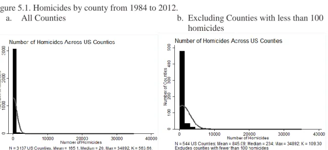
Figure 5.1. Homicides by county from 1984 to 2012.
a. All Counties b. Excluding Counties with less than 100 homicides
1984-2012 truly is. In order to get a better idea of the distribution of homicides among larger or more violent counties, a second plot was necessary.
Figure 5.1.b shows another simple frequency distribution plot of the sum of homicides among United States counties and also employs a threshold. This threshold excludes all counties with less than 100 counties. Placing this threshold reduced the sample size from 3,137 counties to 544. This means that 2,593 counties, or roughly 82 percent, experienced less than 100 homicides over a twenty-eight-year timespan. Thus, a large percentage of counties
experience very little homicides, and less than 18 percent experience more than an average of 4 homicides annually. What is revealing, however, is that the basic frequency distribution with the threshold in place is similar in nature to the distribution containing no threshold. However, the average homicide for this data is clearly much larger at 845, and the median is also substantially larger at 234 homicides per county. This distribution still contains some major outliers, the majority of which can be found on the following table 5.1.
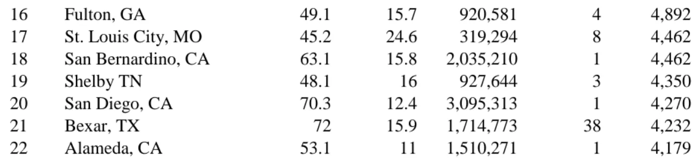
Table 5.1. U.S Counties with the highest number of homicides from 1984 to 2012.
Rank County, State
Percent White
Percent in
Poverty Population Executions Homicides
1 Los Angeles, CA 52.8 17.9 9,818,605 2 34,892
2 Cook, IL 58.2 13.5 5,194,675 5 19,474
3 Wayne, MI 53.7 16.4 1,820,584 0 15,111
4 Harris, TX 61.2 15 4,092,459 123 12,359
5 Kings, NY 43.7 25.1 2,504,700 0 10,572
6 Philadelphia, PA 46.4 22.9 1,526,006 1 10,561
7 Queens, NY 47.4 14.6 2,230,722 0 9,139
8 Dallas, TX 60.6 13.4 2,368,139 53 8,568
9 District of Columbia, DC 32.2 20.2 601,723 0 7,685
10 Baltimore, MD 32.6 22.9 620,961 0 7,341
11 Orleans, LA 28.9 27.9 343,829 4 7,040
12 Maricopa, AZ 79.8 11.7 3,817,117 11 6,829
13 New York, NY 57.1 20 1,585,873 0 6,780
14 Miami-Dade, FL 72.3 18 2,496,435 12 6,494
16 Fulton, GA 49.1 15.7 920,581 4 4,892
17 St. Louis City, MO 45.2 24.6 319,294 8 4,462
18 San Bernardino, CA 63.1 15.8 2,035,210 1 4,462
19 Shelby TN 48.1 16 927,644 3 4,350
20 San Diego, CA 70.3 12.4 3,095,313 1 4,270
21 Bexar, TX 72 15.9 1,714,773 38 4,232
22 Alameda, CA 53.1 11 1,510,271 1 4,179
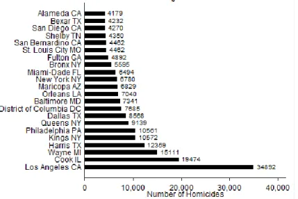
Figure 5.2. Counties with the Highest Number of Homicides from 1984 to 2012.
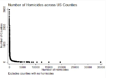
Figure 5.3. Cumulative frequency distribution of homicides across U.S. counties, 1984 to 2012.
For the purposes of our analyses the cumulative distribution shown in figure 5.3 displays the number of counties that fall into every count of homicides, starting with all counties included in the sample and decreasing for each homicide count. For example, while the cumulative frequency of all counties with at least one homicide from 1984 to 2012 is 2,980 counties, the cumulative frequency of counties with at least two homicides would be 2,855, as 125 counties have exactly 1 homicide and thus are excluded from this cumulative number. The shape of this distribution, which some say resembles a hockey stick, suggests that homicides across US counties are distributed with power-law characteristics. To be sure that homicides are distributed amongst US counties as a power-law one final analysis was required, which can be found
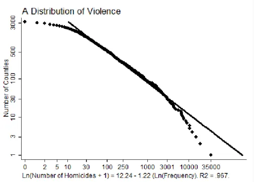
Figure 5.4. A log-log plot of the distribution of homicides across U.S counties.
Figure 5.4 displays a log-log plot of the cumulative frequency distribution of homicides across all US counties from 1984 to 2012. While a perfect power law would fall directly along the solid line (as the solid line shows the best fit power-law equation: Ln (Homicides + 1) = 12.24 – 1.22 * Ln(Frequency), this equation appears to fit the data between 30 and 3000, or for two orders of magnitude. The r-squared of 0.967 suggests that much of the data is relatively close to the line of best fit (or predicted value of this data) if the entirety of this data was truly distributed as a power-law.
Chapter 6
Homicides per Capita
Every results chapter in our study follows a similar format, which will become clear while reading. However, while the format may appear similar in terms of the types of graphs and results that are presented, the data they display often tells a very different story, which this chapter will reveal in comparison to the chapter on homicides alone. This chapter examines homicide per capita rates from 1984 to 2012 across all 3,137 counties in our sample. Because this number would be extremely small, the ratio was multiplied by 1,000. This means the results will read as homicide per 1,000 population across US counties.
Figure 6.1. Homicides per capita rates by county from 1984 to 2012.
a. All counties b. Counties with more than 10,000 population
similarly to figure 5.1.a, figure 6.1.a appears to have the basic characteristics of a power-law, or at the very least does not appear to be evenly distributed in a standard normal distribution. The fact that this distribution resembles a power-law makes sense considering the fact that both county homicide and population numbers are distributed as power laws. However, while this is the case the tail is certainly less extreme in homicide per capita rate distributions when compared to homicide rates alone, which may suggest the distribution is not truly a power-law but rather an exponential one. Additionally, the data in figure 6.1.a is more widely distributed, with a large majority of the results falling between 0 and 5 homicides per 1,000 capita over this period of time. The max of 20 homicides per 1,000 population is a clear outlier; especially considering the mean of these results was only 1 homicide per 1,000 population.
It should be noted that we still see a large number of counties with few homicides per capita coexisting with a small number of counties with a high number of homicides per capita. Figure 6.1.b shows the same type of frequency distribution; the only difference is that a threshold of at least 10,000 population has been employed. While homicide per capita rates do not seem to have the same severity of power-law characteristics as homicide numbers alone, it is still
beneficial to run further tests to look for other information, such as the existence of an
Table 6.1. Counties with the Highest Homicide Per Capita Rates from 1984 to 2012
Rank County, State
Percent White
Percent in
Poverty Population Executions Homicides
Homicides per Population
1 Orleans LA 28.9 27.9 343,829 4 7,040 20.48
2 St. Louis City MO 45.2 24.6 319,294 8 4,462 13.97
3 District of Columbia DC 32.2 20.2 601,723 0 7,685 12.77
4 Richmond VA 39.2 21.4 204,214 2 2,513 12.31
5 Baltimore MD 32.6 22.9 620,961 0 7,341 11.82
6 Wayne MI 53.7 16.4 1,820,584 0 15,111 8.30
7 Washington MS 34.3 29.2 51,137 0 364 7.12
8 Hinsdale CO 97.8 7.2 843 0 6 7.12
9 Philadelphia PA 46.4 22.9 1,526,006 1 10,561 6.92
10 Hinds MS 37.7 19.9 245,285 2 1,625 6.62
11 Taliaferro GA 38.7 23.4 1,717 1 11 6.41
12 Chicot AR 43.8 28.6 11,800 0 73 6.19
13 Glascock GA 90.8 17.2 3,082 0 19 6.16
14 Petersburg VA 19.1 19.6 32,420 2 197 6.08
15 Portsmouth VA 47 16.2 95,535 5 573 6.00
16 Martinsville VA 56 19.2 13,821 0 81 5.86
17 Phillips AR 39.7 32.7 21,757 0 126 5.79
18 Norfolk VA 50.1 19.4 242,803 1 1,387 5.71
19 Macon AL 14.3 32.8 21,452 1 121 5.64
20 Leflore MS 30.2 34.8 32,317 0 180 5.57
Figure 6.2. Large counties with the highest homicide per capita rates from 1984 to 2012.
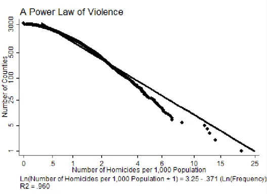
Figure 6.3. A log-log plot of homicide per capita rates across US counties.
Chapter 7
Execution per Capita Rates
A potential factor in the unequal geographic distribution of executions in the United States is population, so in order to test the effect of county population on execution distribution, a rate of execution per one million capita was calculated. We know that the distribution of population across US counties is not random and follows a power-law distribution, and thus, if executions, which also follow a power-law, are a result of differences in population we would expect for counties with a high population to have high execution rates. The distributions and results are interesting and provide insight into the extent of the effect of population on execution counts.
Figure 7.1. Execution per Population Rates Across United States Counties
a. All Counties b. Only counties with at least 10,000 people
As can be seen above, the differences between these distributions is not very substantial. Figure 7.1.a has a mean of 5.07, a median of 0, and a max of 582.4. The Kurtosis of this
propelling the unequal distribution in executions. At first glance, these results seem to suggest that while population does play a role in execution distributions, there are still other mechanisms such as the local legal culture and the self-perpetuation it creates that propel the unequal
Table 7.1. Counties with the highest number of executions per population from 1977 to 2014. Rank County, State Percent White Percent in
Poverty Population Homicides Executions
Homicide per Population* Executions per Homicides# Executions per Population
1 Taliaferro, GA 38.7 23.4 1,717 11 1 6.4 90 582.4
2 Schuyler, MO 99.3 17 4,431 4 2 0.9 500 451.4
3 Richmond, VA 65.4 15.4 9,254 13 4 1.4 307 432.2
4 Roger Mills, OK 93.4 16.3 3,647 3 1 0.8 333 274.2
5 Refugio, TX 81.7 17.8 7,383 5 2 0.7 400 270.9
6 Crockett, TX 78.5 19.4 3,719 7 1 1.9 142 268.9
7 Williamsburg, VA 80.8 18.3 14,068 16 3 1.2 187 213.2
8 Noble, OK 89.7 12.8 11,561 12 2 1.0 166 173
9 Coal, OK 81 23.1 5,925 8 1 1.4 125 168.8
10 Pondera, MT 85.1 18.8 6,153 4 1 0.7 250 162.5
11 Greer, OK 84 19.6 6,239 17 1 2.7 59 160.3
12 Bleckley, GA 73.8 15.9 13,063 14 2 1.1 143 153.1
13 Wilbarger, TX 79.9 13.1 13,535 24 2 1.8 83 147.8
14 Powell, MT 94.7 12.6 7,027 1 1 0.1 1,000 142.3
15 Bailey, TX 69.1 16.7 7,165 15 1 2.1 67 139.6
16 Pecos, TX 78.3 20.4 15,507 32 2 2.1 63 129
17 Navarro, TX 72.2 18.2 47,735 85 6 1.8 71 125.7
18 Tillman, OK 76.9 21.9 7,992 19 1 2.4 53 125.1
19 Leon, TX 84.5 15.6 16,801 21 2 1.2 96 119
20 Hamilton, TX 94.8 14.2 8,517 13 1 1.5 77 117.4
Table 7.1 shows the 20 counties with the highest execution per population rates of all US counties. As can be seen there are a large number of counties in this sample that have very high execution per population rates and have a very small population. This is to be expected, as small counties are not immune to the self-perpetuation of legal culture. This is especially true when considering that many of these counties are geographically near larger counties where execution numbers are very high. For example, many of these counties are in Texas, a state that has more than 500 executions.
Table 7.2. Large counties with the highest execution per population rates across all US counties
Rank County, State
Percent in
Poverty Population Homicides Executions
Execution per Homicide# Homicide per Population Executions per Population*
1 Williamsburg VA 18.3 14,068 16 3 187.5 1.1 213.2
2 Noble OK 12.8 11,561 12 2 166.7 1.0 173.0
3 Bleckley GA 15.9 13,063 14 2 142.9 1.1 153.1
4 Wilbarger TX 13.1 13,535 24 2 83.3 1.8 147.8
5 Pecos TX 20.4 15,507 32 2 62.5 2.1 129.0
6 Navarro TX 18.2 47,735 85 6 70.6 1.8 125.7
7 Leon TX 15.6 16,801 21 2 95.2 1.3 119.0
8 Brunswick VA 16.5 17,434 42 2 47.6 2.4 114.7
9 Callaway MO 8.5 44,332 22 5 227.3 0.5 112.8
10 Morgan GA 10.9 17,868 8 2 250.0 0.5 111.9
11 McIntosh OK 18.2 20,252 42 2 47.6 2.1 98.8
12 Clay TX 10.3 10,752 15 1 66.7 1.4 93.0
13 Sabine TX 15.9 10,834 15 1 66.7 1.4 92.3
14 Middlesex VA 13.0 10,959 13 1 76.9 1.2 91.2
15 Potter TX 19.2 121,073 274 11 40.1 2.3 90.9
1 Logan AR 15.4 22,353 16 2 125.0 0.7 89.5
17 Fairfax VA 5.7 22,565 8 2 250.0 0.4 88.6
18 Monroe AL 21.3 23,068 63 2 31.7 2.7 86.7
19 Jackson TN 18.1 11,638 5 1 200.0 0.4 85.9
20 Perry MS 22.0 12,250 3 1 333.3 0.2 81.6
The results displayed in table 7.2 are shocking. The threshold set at 10,000 population was meant to eliminate the possibility of very small counties that have executed only a few people and thus have an extraordinarily high execution rate. When the same test was run on all very large counties in America (cities with over 1.5 million people), the only state included was Texas. As can be seen again, almost all of these counties are below the Mason-Dixon line and most reside in extremely high execution states.
Figure 7.2. A cumulative frequency distribution of execution per one million population rates across all US counties.
Figure 7.2 suggests that while the distribution of executions per population may not be a power-law, the relationship is clearly not normal and instead suggests the existence of an
Figure 7.3. Log-log plot of executions per population rates.
While the relationship displayed above is clearly not a complete power-law distribution, this relationship also does not resemble a normal distribution. As can be seen above in figure 7.3, the r-squared of the distribution when compared to the best fit line of a power-law is .822, suggesting that a large amount of the non-randomness of execution distributions (due to the development of local legal culture and perhaps other non-random factors) persists to a high degree even when population is accounted for. While this discovery is probably not surprising considering the significant evidence of the unequal geographic distribution of executions that has been presented to this point, it is still interesting as the effect of population is commonly offered as the driving factor behind the geographic execution inequality that defines the United States capital punishment system.
While the distribution in figure 7.3 is not a true power-law, it is very clear that the
plot a power-law would contain a slight downward slope that then turns outwards and produces a straight long tail. A normal distribution would be representened by a line that slopes directly down to the x-axis and does not have a tail, while an exponential distribution would have a significantly longer tail. The more severe the tail, the more severe the expoential relationship (and subsequent non-randomness of execution per population rates) is. Figure 7.4 displays this semi-log relationship.
Figure 7.4. A semi-log plot of execution per population rates across US counties
The results displayed in figure 8.4 suggest the existence of a strong exponential relationship due to the long nature of the tail as well as the straight nature of the tail. The
Chapter 8
Execution per Homicide Rates
Another possible factor for the uneven geographic spread of executions in the post-Furman era is that it is possible the high execution counties are executing more individuals as a
result of extremely high murder rates and a desire to curb these high homicide numbers. The execution per homicide rate analyzed throughout this chapter is per 1,000 homicides in order to make the plots and charts more comprehendible. As shown in chapter 5, homicides are also a power-law, as some counties such as Baltimore and Los Angeles have over 20,000 homicides from 1984-2012 while the majority of counties have numbers far below 100. Executions are also distributed as a power-law, so if high homicide rates are the reason for the uneven geographic distribution of executions we should expect to see that these rates will show that a high homicide number leads to a high execution number. Figure 8.1 displays two frequency distributions, one with and one without a homicide threshold.
Figure 8.1. Execution per homicide rate across US counties
Figure 8.1.a presents a simple frequency distribution of the execution per
1,000-homicides rate from 1984-2012 across all 3137 US counties included in our sample. The mean of this distribution is 5, while the median is 0. This suggests that outliers are significantly skewing these results, as is obviously seen when viewing the very long tail that reaches all the way to 1000. In other words, at least one county has executed one individual for one homicide. The Kurtosis of this distribution is nearly 460, indicating the presence of an extremely sharp peak and that a large degree of non-random factors are responsible for this result other than homicide rate alone. In order to minimize the number of outliers created by rare cases such as the 1 execution per 1 homicide we see in figure 8.1.a, it was necessary to complete another frequency distribution excluding all counties with less than 100 homicides from 1984-2012, as displayed in figure 8.1.b.
Table 8.1. Counties with the highest execution per homicide rates.
Rank County, State
Percent White
Percent in
Poverty Population Executions Homicides
Executions per Population* Homicides per Population# Executions per Homicides
1 Powell MT 94.7 12.6 7,027 1 1 142.3 0.1 1,000
2 Schuyler MO 99.3 17 4,431 2 4 451.4 0.9 500
3 Refugio TX 81.7 17.8 7,383 2 5 270.9 0.7 400
4 Perry MS 76.6 22 12,250 1 3 81.6 0.3 333
5 Moniteau MO 93.8 9.9 15,607 1 3 64.1 0.2 333
6 Roger Mills OK 93.4 16.3 3,647 1 3 274.2 0.8 333
7 Leake MS 56.5 23.3 23,805 1 3 42 0.1 333
8 Richmond VA 65.4 15.4 9,254 4 13 432.2 1.4 308
9 Pondera MT 85.1 18.8 6,153 1 4 162.5 0.7 250
10 Morgan GA 70.3 10.9 17,868 2 8 111.9 0.5 250
11 Fairfax VA 75.6 5.7 22,565 2 8 88.6 0.4 250
12 Callaway MO 92.9 8.5 44,332 5 22 112.8 0.5 227
13 Boone IN 98.5 5.2 56,640 2 10 35.3 0.2 200
14 Jackson TN 99.3 18.1 11,638 1 5 85.9 0.4 200
15 Williamsburg VA 80.8 18.3 14,068 3 16 213.2 1.1 188
16 Noble OK 89.7 12.8 11,561 2 12 173 1.0 167
17 Meade SD 95 9.4 25,434 1 6 39.3 0.2 167
18 Gillespie TX 93.9 10.2 24,837 2 12 80.5 0.5 167
19 Crockett TX 78.5 19.4 3,719 1 7 268.9 1.9 143
20 Bleckley GA 73.8 15.9 13,063 2 14 153.1 1.1 143
Table 8.2. The highest execution per homicide rate counties in counties with more than 100 homicides
Rank County, State
Percent in
Poverty Population Homicides Executions
Executions per Population* Homicides per Population# Executions per Homicide
1 Brazos TX 26.9 194,851 171 12 61.6 0.9 70.2
2 Pittsylvania VA 11.8 63,506 100 5 78.7 1.6 50.0
3 Kent DE 10.7 162,310 132 6 37.0 0.8 45.5
4 Prince William VA 4.4 402,002 224 9 22.4 0.6 40.2
5 Potter TX 19.2 121,073 274 11 90.9 2.3 40.1
6 Jefferson MO 6.8 218,733 105 4 18.3 0.5 38.1
7 Anderson TX 16.5 58,458 109 4 68.4 1.9 36.7
8 Chesterfield VA 4.5 316,236 220 8 25.3 0.7 36.4
9 Montgomery TX 9.4 455,746 367 13 28.5 0.8 35.4
10 Bowie TX 17.7 92,565 206 6 64.8 2.2 29.1
11 Comanche OK 15.6 124,098 218 6 48.3 1.8 27.5
12 Smith TX 13.8 209,714 369 10 47.7 1.8 27.1
13 Taylor TX 14.5 131,506 189 5 38.0 1.4 26.5
14 Coconino AZ 18.2 134,421 114 3 22.3 0.8 26.3
15 St. Charles MO 4.0 360,485 117 3 8.3 0.3 25.6
16 Sebastian AR 13.6 125,744 158 4 31.8 1.3 25.3
17 Lubbock TX 17.8 278,831 497 12 43.0 1.8 24.1
18 Liberty TX 14.3 75,643 126 3 39.7 1.7 23.8
19 Williamson TX 4.8 422,679 126 3 7.1 0.3 23.8
Table 8.1 displays the 20 counties that have the highest execution per homicide rates in the United States. Similarly to table 7.1, almost all of these counties are extremely small. This is to be expected however, considering that it is likely a few counties will execute at a high rate if they have done so in the pass. What is surprising, however, is that once again many of these counties lie below the Mason-Dixon line and only a few have very high homicide rates. Once again, as with executions per population, it is very possible that many of these states, due to their proximity to death penalty “hubs”, are comfortable seeking the death penalty as a result of the pervasive pro-execution legal culture leaking into the surrounding communities. It should be noted that most of these counties have very few executions, and none have more than five. Similarly, none of these counties have experienced more than 22 homicides from 1984 to 2012, a very small number compared to the national mean of 165. However, while these homicide and execution numbers are small, the rates at which individuals are executed in these counties are astonishing when considering that the national average is 5 per 1,000 homicides for all counties and around 33 for the 465 counties with any executions. In order to examine whether violence does play a major role in execution rates, it was essential to examine the highest execution per homicide rate counties in counties within death states that have more than 100 homicides from 1984-2012, as displayed in table 8.2.
culture can have not only on counties with huge numbers of executions but also on the regions that surround them. Not only do these processes seem to display the characteristics of a self-perpetuating legal process, but they also indicate that one a local culture begins to execute, this tendency to execute gains inertia. In other words, it is very difficult for a local capital
punishment culture to change once a path has been set, even in the face of changing political or legal environments. To examine the nature of this distribution, a cumulative frequency
distribution of execution per homicide rates is displayed below in figure 8.2.
Figure 8.2. A cumulative frequency distribution of execution per homicide rates across US counties
homicide rates, and the results are similar to those seen when execution per population rate was examined in the previous chapter in figure 7.3.
Figure 8.3. A log-log plot of executions per homicide rates across all US counties.
analysis is required to display and determine the nature of the geographic nature of execution per homicide distributions, as presented in figure 8.4.
Figure 8.4. A semi-log presentation of execution per homicide rates across US counties.
This distribution is very similar to the exponential one seen in figure 7.4, again
Chapter 9
Executions
As mentioned previously, our database has information on every execution in the United States since the death penalty was reinstated in 1977. This means that we have as accurate of a picture of the distribution of all 1,373 executions that have occurred since 1977 as possible in terms of location to the county level. As previously, this chapter will follow a very similar format, first introducing regular frequency distributions of execution numbers, then tables and figures of the top counties, and finally a cumulative frequency analysis and power-law test. The results are very interesting, and although published previously by Dr. Frank Baumgartner, this data contains two additional years of execution statistics. Figure 9.1 shows two different frequency distributions of executions across US counties.
Figure 9.1. Number of Executions across US Counties
a. All counties b. Excludes counties with no executions
few outliers, the most noticeable of which is Harris County in Texas at 123 executions, the maximum number of executions of any county in the United States since 1977. Another noticeable feature of this distribution is the massive number of counties with 0 executions. In fact, only 465 counties have executed even one person as of 2014 (all of these counties have been included in our dataset). This means that out of the total 3,145 counties in the United States, 2,680 have not executed a single person. This is especially interesting considering the fact that 2,980 counties have experienced at least one homicide since 1984, and 540 counties have experienced over 100 homicides during that period. The average number of executions between all US counties from 1977 to 2014 is 0.44, and the median is 0. The extremely long tail of this distribution certainly seems to suggest the existence of a power-law distribution, but more tests are required before we can correctly make that assumption.
Figure 9.1.b shows another frequency distribution, however, this figure only shows the distribution of execution numbers across counties that have executed at least one person. Interestingly, even when eliminating the large number of execution-free counties, this
distribution essentially mimics the distribution found in figure 9.1.a and maintains an extremely long tail with many counties lying between 1 and 4 executions. This shows us that even among the 465 counties that have executed anyone (these are considered outliers in the overall sample of 3,173 counties), some counties are still executing at a huge degree above the average. In fact, even in this distribution with the execution threshold the average is only 3 executions between all 465 counties, and the median is only 1 execution. Another way to consider the extremity of the inequality of this distribution is the fact that of the 465 executing counties, only 57 have
much larger than it would be if counties distributed executions in a more evenly dispersed way. Table 9.1 shows the counties with the highest number of executions and exposes some very interesting trends as well.
Table 9.1. Counties with the highest number of executions from 1977 to 2014. Rank County, State
Percent White
Percent in
Poverty Population Homicides Executions
1 Harris, TX 61.2 15 4,092,459 12,359 123
2 Dallas, TX 60.6 13.4 2,368,139 8,568 53
3 Oklahoma, OK 73.7 15.3 718,633 1,880 39
4 Bexar, TX 72 15.9 1,714,773 4,232 38
5 Tarrant, TX 73.4 10.6 1,809,034 3,590 37
6 St. Louis County, MO 77.8 6.9 998,954 1,008 23
7 Tulsa, OK 78.9 11.6 603,403 1,400 18
8 Jefferson, TX 58.4 17.4 252,273 699 15
9 Nueces, TX 74.8 18.2 340,223 661 14
10 Montgomery, TX 89.9 9.4 455,746 367 13
11 Pima, AZ 77.8 14.7 980,263 1,933 13
12 Brazos, TX 76.2 26.9 194,851 171 12
13 Lubbock, TX 76 17.8 278,831 497 12
14 Miami-Dade, FL 72.3 18 2,496,435 6,494 12
15 Maricopa, AZ 79.8 11.7 3,817,117 6,829 11
16 Orange, FL 70.9 12.1 1,145,956 1,784 11
17 Potter, TX 70.8 19.2 121,073 274 11
18 Smith, TX 73.9 13.8 209,714 369 10
19 Mobile, AL 63.9 18.5 412,992 1,512 10
20 Hamilton, OH 74 11.8 802,374 1,676 10
Table 9.1, above, shows the top 20 counties with the highest number of executions
between 1977 and 2014. Texas has a strong presence among this list, in fact accounting for more than 338 executions in the top 20 execution counties alone. This is a staggering figure;
compared to the size of the population. Another interesting figure present in this table is that almost all of the counties are around 60 to 80 percent white, and none have a minority white percentage. This may lend some credibility to the concept that the post-Furman capital punishment is still subject to deep-rooted racial prejudice and factors that follow, including a skewed local legal culture developed over decades. On the other hand it is clear that a large number of these counties have a poverty rate that is around or above the national average of 14.5 percent (per 2013). These statistics are all of interest and illustrate of the distribution of
executions in the post-Furman era. The following figure shows the top execution counties in a bar chart format.
Figure 9.2. United States counties with the highest number of executions.
cumulative frequency distribution for the 465 counties with at least 1 execution.
Figure 9.3. Cumulative frequency distribution of executions across executing US counties
Figure 9.3 again has the basic shape of a power-law distribution, the previously
However, to ensure that this distribution follows a power-law relationship, it is essential to perform the log-log test, as done below in figure 9.4.
Figure 9.4. A log-log plot of the cumulative frequency of executions across all US counties
Chapter 10
Conclusion
As has been shown throughout this study, executions are unevenly geographically distributed, either resembling power-law or exponential relationships. We have also examined these distributions in an attempt to discover whether these uneven distributions are the result of possible lurking variables such as population and high rates of violence, yet the results did not suggest that population size nor rates of violence are the primary motivating factors for the existence of these exponential and power-law distributions. Because population, executions, and homicide numbers are distributed as power-laws, if these executions were the result of random factors we would expect the rates of these statistics to also be distributed along a power law. The rate of homicide per capita was very closely distributed as a power-law, which is to be expected considering the fact that larger counties will generally have higher homicide rates than smaller ones. By this logic, it should also be assumed that in a fairly operated capital punishment system high homicide rates would be strongly correlated to high execution rates. However, when the rates are calculated the r-squared value of both execution per capita and execution per homicide decreases significantly from the value of 0.96, suggesting that something is interfering with these trends.
hypothesized components that lead to the development of these local legal cultures, which can increase, minimize, or eliminate the use and frequency of executions, can be found in the appendix.
As the 14th Amendment of the United States Constitution explicitly states, all United States citizens are guaranteed equal protection of the law. However, the results of this study suggest that this is not currently the case, as evidenced by examples such as when counties like Los Angeles and Cook—both in non-abolition states and with more than a combined 40,000 homicides—have less than 10 combined executions while counties like Harris and Oklahoma have only 15,000 combined homicides yet more than 160 executions. Distributions and ratios such as these point to something much different than a simple “more homicides and higher population leads to more executions” answer and expose a system that continues to operate in a
Appendix
Appendix Section 1. Additional Information on the Development of Local Legal Culture Baumgartner et al. first hypothesized the concept of the impact of local legal culture on capital punishment in 2008. This concept provides a potential explanation for the extreme geographic skews we have seen dominate execution distributions in the post-Furman era of the death penalty. As shown throughout this study, most states execute very few individuals, and even in states with counties that execute high numbers of people there are a large number of counties with none or very few executions. While population size and homicide numbers do play a role in these uneven distributions, they do not appear to be the primary driving factor for the power-law and exponential distributions we have seen throughout an examination of our results.
Therefore, the historical development of a local legal culture is a viable reason for the existence of the self-perpetuation, or the “rich-get-richer” phenomenon, which dominates the network of executions during the post-Furman era. One way to explain this hypothesis is through an example of a county that has not yet experienced an execution or has not executed an
more heinous, yet the defendant was not executed. Thus, suggesting capital punishment for this defendant would probably not coincide with the tenants of an equitability functioning legal system and as such the prosecutor will likely not seek the death penalty in this case.
These early decisions, which were likely based on a number of relatively arbitrary decisions and developments, is a self-perpetuating system, the few counties that have performed executions from an early period are likely to continue to grow more comfortable doing so in the future. This ability to successfully seek the death penalty and carry out executions becomes more severe as the number of executions in a legal district increase. As the number of
executions in a county become more common, the prosecutor in that district likely have more confidence that his staff has the experience to successfully achieve a sentence of death for the defendant, that the juries will be more likely to come to an agreement on a death sentence, and that the judges in the district—as well as the appellate courts in the region—will sanction the sentence.
The results of this self-perpetuation work both ways, as can be illustrated using a
hypothetical county in which no execution has yet occurred. In these counties, the prosecutor is more likely to believe that he does not have the staff experience to successfully secure a death sentence, that the defense attorney’s will be incapable of properly representing the defendant (a