View Recommendation for Visual Data
Exploration
Humaira Ehsan
Masters of Computer Science
A thesis submitted for the degree of Doctor of Philosophy at
The University of Queensland in 2019
Abstract
The widespread use of digital systems has resulted in an exponential increase in the volume of available data, with data being collected across all domains; from banking and finance to health and energy. However, this data is only beneficial if it is unlocked to generate insights. Visual data exploration plays an important role in this process of discovering insights. Typically, it involves an analyst going through the following steps: 1) selecting a subset of data for analysis, 2) generating different visualizations of that analyzed data, and 3) sifting through those visualizations for the ones which reveal interesting insights. Based on the outcome of the last step, the analyst might have to refine their initial selection of data so that the newly analyzed subset would show more interesting insights. This is clearly an iterative process, where each selection of data (i.e.,input query) is a springboard to the next one. For this time-consuming process to be effective, a challenging combination of system and domain expertise is required.
Motivated by the need for an efficient and effective visual data exploration process, several solutions have been proposed towards automatically finding and recommending interesting data visualizations (i.e., steps 2 and 3 above). The main idea underlying those solutions is to automatically generate all possibleaggregate viewsof data, and recommend the top-k interesting views, where an interestingness of a view is quantified according to some utility function. Recent work provides strong evidence that a
deviation-basedformulation of utility is able to provide analysts with interesting visualizations which highlight some of the particular trends of the analyzed datasets. In particular, the deviation-based metric measures the distance between the probability distribution of a specific dataset under analysis, calledtarget view, and that of a reference dataset, calledcomparison view. The underlying premise is that visualizations with higher deviations are expected to reveal insights which are very particular to the analyzed dataset. While the deviation-based notion of utility has been shown to be effective in recommending views with categorical dimensional attributes, in this work we argue that it falls short in capturing the requirements of numerical dimensions. Furthermore, such visualizations entail high data processing costs because a large number of views are generated to evaluate their usefulness.
In this thesis, we propose novel view recommendation schemes, which incorporate a hybrid multi-objective utility function that captures the impact of numerical dimension attributes. These schemes help to address the challenges associated with high data processing cost and the presence of numerical dimensional attributes. The first scheme,Multi-Objective View Recommendation for Data Exploration (MuVE), adopts an incremental evaluation of our multi-objective utility function, which allows pruning of a large number of low-utility views and avoids unnecessary objective evaluations. The second scheme, upper MuVE (uMuVE), further improves the pruning power by setting the upper bounds on the utility of views and allowing interleaved processing of views, at the expense of increased memory usage. Finally, the third scheme, Memory-aware uMuVE (MuMuVE), provides pruning power close to that of uMuVE, while keeping memory usage within a specified limit.
Moreover, existing solutions have been shown to be effective in recommending interesting views under the assumption that the analyst is precise in their selection of analyzed data (i.e., step 1 above).
That is, the analyst is able to formulate a well-defined input query that selects a subset of data, which contains interesting insights that can be revealed by the recommended visualizations. Such an assumption is clearly impractical and severely limits the applicability of those solutions. In reality, it is typically a challenging task for an analyst to select a subset of data that has the potential of revealing interesting insights. Hence, it is a continuous process of trial and error, in which the analyst keeps refining their selection of data manually and iteratively until some interesting insights are revealed. In this work we argue that, in addition to the existing solutions for automatically recommending interesting views, there is an equal need for solutions that can also automatically select subsets of data that would potentially provide such interesting views. Motivated by the need for a query refinement solution that is able to automatically modify the analyst’s initial input query into a new query, we propose efficientQuery Refinement for View Recommendation (QuRVe)schemes, which automatically refine an input query to search for subsets of data having interesting views and recommend the top-k views. However, uncontrolled refinement of queries can lead to problems such as dissimilar refined queries from input query and statistically insignificant results. Therefore, a multi-objective function is proposed to measure similarity, interestingness and significance of the refined queries and their corresponding views. The principle idea underlying proposed QuRVe scheme is to incrementally access the refined queries in order of their similarity with the original query, which allows an early termination of search and results in pruning of a large number of views. Additionally, uQuRVe scheme further reduces the cost by tightening the upper bounds on the utility of the views and short circuiting unnecessary views. Extensive experimental evaluations also support the significant gains provided by our proposed schemes.
Furthermore, the recommended aggregate views are based on the target views defined on subsets of data selected by the refined queries and comparison views defined on the reference dataset The interesting views revealed in such a manner can be considered asglobal interesting views. However, in this work we argue that the assumption in the existing systems that the comparison views are always defined on a specific reference dataset, which is typically the complete database, limits discovery of interesting insights. Such systems fail to discoverlocal interesting views, in which the comparison views belong to subsets of data instead of the specified reference dataset. This discovery of local interesting views is a non-trivial task as it increases the search space of views exponentially and more importantly, may combinations of comparison and target views for aggregate views lack contextual relationship with each other. We formulate the problem ofrefinement of reference datasetfor view recommendation and propose a baseline scheme to recommend locally interesting views. Moreover, in this thesis we also present the design and implementation of a holistic prototype systemView-360for view recommendation. Additionally, we also showcase the effectiveness of our schemes on real world datasets along with in depth analysis for insights.
Declaration by author
This thesis is composed of my original work, and contains no material previously published or written by another person except where due reference has been made in the text. I have clearly stated the contribution by others to jointly-authored works that I have included in my thesis.
I have clearly stated the contribution of others to my thesis as a whole, including statistical assistance, survey design, data analysis, significant technical procedures, professional editorial advice, financial support and any other original research work used or reported in my thesis. The content of my thesis is the result of work I have carried out since the commencement of my higher degree by research candidature and does not include a substantial part of work that has been submitted to qualify for the award of any other degree or diploma in any university or other tertiary institution. I have clearly stated which parts of my thesis, if any, have been submitted to qualify for another award.
I acknowledge that an electronic copy of my thesis must be lodged with the University Library and, subject to the policy and procedures of The University of Queensland, the thesis be made available for research and study in accordance with the Copyright Act 1968 unless a period of embargo has been approved by the Dean of the Graduate School.
I acknowledge that copyright of all material contained in my thesis resides with the copyright holder(s) of that material. Where appropriate I have obtained copyright permission from the copyright holder to reproduce material in this thesis and have sought permission from co-authors for any jointly authored works included in the thesis.
Publications during candidature
• Humaira Ehsan, Mohamed A. Sharaf, and Panos K. Chrysanthis: Muve: Efficient multi-objective view recommendation for visual data exploration. In the Proceedings of 32nd IEEE International Conference on Data Engineering (ICDE), May 2016.
• Humaira Ehsan, Mohamed A. Sharaf, and Panos K. Chrysanthis: Efficient recommendation of aggregate data visualizations. IEEE Transactions on Knowledge and Data Engineering, 30, 2, 2018.
• Humaira Ehsan and Mohamed A. Sharaf: Materialized View Selection for Aggregate View Recommendation. In the Proceedings of Australasian Database Conference (ADC), January 2019.
Submitted manuscripts included in this thesis
• Humaira Ehsan, Mohamed A. Sharaf and Gianluca Demartini: QuRVe: Query Refinement for View Recommendation in Visual Data Exploration. Submitted to Submitted to 35th ACM Symposium On Applied Computing (ACM(SAC)), Mar 2020.
Publications included in this thesis
The following publication has been incorporated as Chapter 3.
1. [1]Humaira Ehsan, Mohamed A. Sharaf, and Panos K. Chrysanthis, Muve: Efficient multi-objective view recommendation for visual data exploration, In the Proceedings of 32nd IEEE Interna-tional Conference on Data Engineering (ICDE), May 2016.
Contributor Statement of contribution % Humaira Ehsan(candidate) Problem Formulation 80
Design of Algorithms 80
Experiments 100
Paper Writing 60
Proof Reading and Feedback 50 Mohamed A. Sharaf Problem Formulation 20 Design of Algorithms 20
Paper Writing 30
Proof Reading and Feedback 30 Panos K. Chrysanthis Paper Writing 10 Proof Reading and Feedback 20
2. [2]Humaira Ehsan, Mohamed A. Sharaf, and Panos K. Chrysanthis, Efficient recommendation of aggregate data visualizations,IEEE Transactions on Knowledge and Data Engineering, 30, 2, 2018.
Contributor Statement of contribution % Humaira Ehsan(candidate) Problem Formulation 80
Design of Algorithms 100
Experiments 100
Preparation of Figures 100
Paper Writing 70
Proof Reading and Feedback 50 Mohamed A. Sharaf Problem Formulation 20
Paper Writing 20
Proof Reading and Feedback 30 Panos K. Chrysanthis Paper Writing 10 Proof Reading and Feedback 20
3. [3]Humaira Ehsanand Mohamed A. Sharaf: Materialized View Selection for Aggregate View Recommendation, In the Proceedings of Australasian Database Conference (ADC), January 2019.
Contributor Statement of contribution % Humaira Ehsan(candidate) Problem Formulation 80
Design of Algorithms 100
Experiments 100
Preparation of Figures 100
Paper Writing 80
Proof Reading and Feedback 70 Mohamed A. Sharaf Problem Formulation 20
Paper Writing 20
Proof Reading and Feedback 30
The following publication has been incorporated as Chapter 4.
1.Humaira Ehsan, Mohamed A. Sharaf and Gianluca Demartini: QuRVe: Query Refinement for View Recommendation in Visual Data Exploration. Submitted to 35th ACM Symposium On Applied Computing (ACM(SAC)), Mar 2020.
Contributor Statement of contribution % Humaira Ehsan(candidate) Problem Formulation 80
Design of Algorithms 100
Experiments 100
Preparation of Figures 100
Paper Writing 70
Proof Reading and Feedback 70 Mohamed A. Sharaf Problem Formulation 20
Paper Writing 20
Proof Reading and Feedback 20 Gianluca Demartini Paper Writing 10 Proof Reading and Feedback 10
Contributions by others to the thesis
My principle advisor, Dr. Mohamed Sharaf, has largely contributed towards the research problems presented in this thesis. Dr. Sharaf assisted me by providing guidance and feedback on formulating the problems and solutions in this thesis. He also reviewed, polished and assisted with the published papers included as part of this thesis.
Statement of parts of the thesis submitted to qualify for the award
of another degree
No works submitted towards another degree have been included in this thesis.
Research Involving Human or Animal Subjects
Acknowledgments
My PhD work would not have been possible without the support of an incredible number of people who have helped me navigate this path, and believed in me.
First and foremost, this PhD was impossible without the unwavering support of my PhD advisor and mentor, Dr. Mohamed Sharaf. I would like to express my sincere gratitude to Sharaf for sharing his immense knowledge about research and for pushing me to my limits to improve. Mohamed’s patience, support and trust during this time has been instrumental in the completion of this thesis.
I also want to thank Professor Shazia Sadiq, and Dr. Gianluca Demartini for taking the time out of their busy schedules to serve on my advisory committee. Your encouragement, and insightful comments are greatly appreciated. I want to thank the co-author of my papers: Panos K. Chrysanthis for his support, knowledge sharing and valuable feedback.
This PhD and everything else that I have achieved would not have been possible without the prayers, love, and motivation of my parents. My husband, Ehsan, has been with me every day of this journey and has many stories to tell! His encouragement, support, and patience kept me going. To my beloved daughter Sualyha, I would like to express my thanks for being such a good girl always cheering me up.
My PhD would not have been possible without the PhD wisdom of my dear friends, Amina and Hina. My PhD experience would have been so much less fun and enriching without them. My brother, Hammad, has been yet another rock of support for me and a place I have turned to for advice and encouragement so many times. I also want to thank all my colleagues and friends at Data and Knowledge Engineering (DKE) group for their support.
Financial support
This research was supported by IPRS Commonwealth Scholarship and Australian Government Re-search Training Program Scholarship.
Keywords
Visual Data Exploration, View Recommendation, Query Refinement
Australian and New Zealand Standard Research Classifications
(ANZSRC)
ANZSRC code: 080604, Database Management, 100%
Fields of Research (FoR) Classification
Dedicated to ...
Contents
Abstract . . . ii
Contents xi List of figures xiv List of tables xvii 1 Introduction 1 1.1 Overview . . . 1
1.2 Thesis Contribution . . . 7
1.2.1 Efficient View Recommendation for Numerical Dimensions . . . 7
1.2.2 Query Refinement for View Recommendation . . . 8
1.2.3 View-360: A Prototype System for View Recommendation . . . 9
1.3 Thesis Layout . . . 9
2 Related Work 11 2.1 Data Exploration . . . 11
2.2 Visual Data Exploration . . . 13
2.3 Visualization Recommendation . . . 15
2.3.1 Data-Driven Recommendation Systems . . . 16
3 Efficient Binned View Recommendation 23 3.1 Introduction . . . 23 3.2 Related Work . . . 26 3.3 Preliminaries . . . 27 3.3.1 View Recommendation . . . 27 3.3.2 Numerical Dimensions . . . 28 3.3.3 Binned Views . . . 29
3.4 Multi Objective View Recommendation . . . 31
3.4.1 Problem Definition . . . 31
3.4.2 Search Strategy Overview . . . 33 xi
xii CONTENTS
3.4.3 Baseline Schemes . . . 34
3.4.4 The MuVE Scheme . . . 35
3.4.5 The uMuVE Scheme: Upper Bound Based MuVE . . . 38
3.4.6 The MuMuVE Scheme: Memory-aware uMuVE . . . 40
3.4.7 Vertical Search Schemes . . . 43
3.4.8 Approximate Search Schemes . . . 45
3.4.9 Experimental Testbed . . . 47
3.4.10 Experimental Evaluation . . . 48
3.5 Materialized View Selection for Aggregate View Recommendation . . . 56
3.5.1 Problem Definition . . . 56
3.5.2 mView: Greedy Approach . . . 59
3.5.3 Materialized views with MuVE . . . 61
3.5.4 Experimental Testbed . . . 62
3.5.5 Experimental Evaluation . . . 63
3.6 Summary . . . 64
4 Input Query Refinement for View Recommendation 67 4.1 Introduction . . . 67 4.2 Related Work . . . 70 4.2.1 Query Refinement . . . 70 4.2.2 Hypothesis Testing . . . 71 4.3 Preliminaries . . . 71 4.3.1 View Recommendation . . . 71 4.3.2 Query Refinement . . . 73 4.3.3 Hypothesis Testing . . . 74
4.4 Query Refinement for View Recommendation . . . 75
4.4.1 View Recommendation with Query Refinement . . . 75
4.4.2 Problem Statement . . . 76
4.4.3 Similarity Aware Query Refinement . . . 77
4.5 Search Schemes . . . 77
4.5.1 Linear Scheme . . . 78
4.5.2 The QuRVe Scheme . . . 79
4.5.3 The uQuRVe Scheme . . . 82
4.5.4 The uQuRVe-range Scheme . . . 84
4.5.5 The QuRVe-Approximation . . . 85
4.6 Experimental Testbed . . . 86
4.7 Experimental Evaluation . . . 87
4.8 Summary . . . 92 5 View-360: A Prototype System for View Recommendation 93
CONTENTS xiii
5.1 Introduction . . . 93
5.2 Reference Dataset Refinement . . . 95
5.2.1 View Recommendation with Reference Dataset Refinement . . . 96
5.3 View-360 . . . 97
5.3.1 General Settings . . . 98
5.4 Business Domain . . . 99
5.4.1 Flight Delays and Cancellations 2015 . . . 99
5.4.2 Data Pre-processing . . . 99
5.4.3 Experiments Settings . . . 101
5.4.4 Summary of Results . . . 102
5.5 Health Domain . . . 108
5.5.1 Diabetes Patients Dataset . . . 109
5.5.2 Data Pre-processing . . . 109
5.5.3 Experiment Settings . . . 111
5.5.4 Summary of Results . . . 113
5.6 Discussion . . . 122
6 Conclusions and Future Work 125 6.1 Summary of Contributions . . . 125
6.2 Future Work . . . 126
Bibliography 129
List of figures
1.1 Data exploration process- Key steps . . . 2
1.2 Non-Binned Aggregate View . . . 3
1.3 Binned Aggregate View . . . 3
1.4 View from Input QueryQ(Lacks Deviation) . . . 5
1.5 View from Refined Input Query and Comparison View . . . 6
2.1 Data exploration . . . 11
2.2 Data exploration Interface . . . 12
2.3 Components of Effective Visualization . . . 14
2.4 Visualization Recommendation Systems . . . 16
3.1 View on players of the GSW team (target view) . . . 24
3.2 View on all players in the 2015 NBA (comparison view) . . . 24
3.3 Binned target view (i.e., GSW team) and comparison view (i.e., all NBA teams) . . . 25
3.4 Horizontal and Vertical Searches for recommending top-k visualizations . . . 34
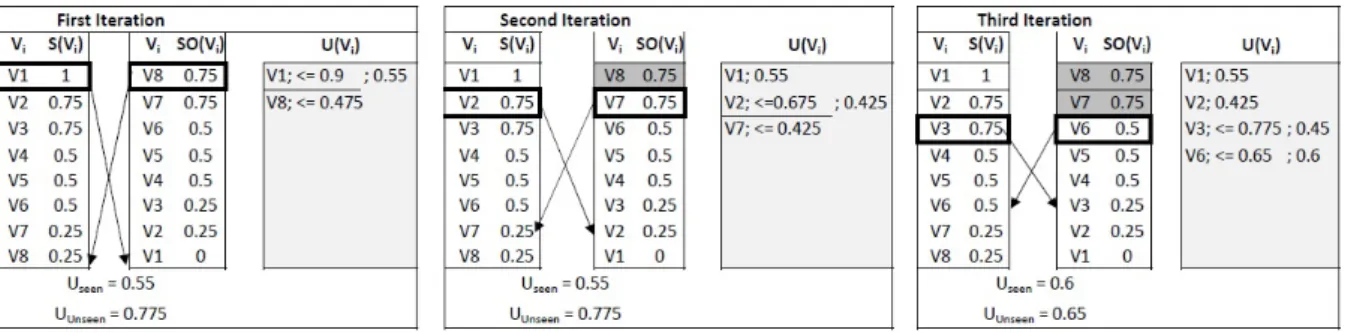
3.5 Example: The MuVE Scheme . . . 37
3.6 Example: The uMuVE Scheme . . . 39
3.7 Example: The MuMuVE Scheme (Max-Bins) . . . 41
3.8 Example: The MuMuVE Scheme (Max-Utility) . . . 43
3.9 DIAB:Impact ofαAandαDon cost, whileαS=0.2 . . . 49
3.10 Impact ofαAandαDon fully probed views, whileαS=0.2 . . . 49
3.11 DIAB: Impact ofαDandαSon cost, whileαA=0.2 . . . 49
3.12 Impact ofkon Cost . . . 51
3.13 Priority Function Analysis . . . 51
3.14 NBA: Scalability . . . 52
3.15 DIAB: Progressive Results . . . 52
3.16 Impact ofML on MuMuVE Scheme . . . 52
3.17 NBA: Impact of additive range partitioning on cost . . . 54
3.18 NBA: Impact of additive range partitioning on fidelity . . . 54
3.19 NBA: Impact of geometric range partitioning on cost . . . 54 xiv
LIST OF FIGURES xv
3.20 NBA: Impact of geometric range partitioning on fidelity . . . 55
3.21 DIAB: Impact of View Refinement and Skipping Approximations on Cost . . . 55
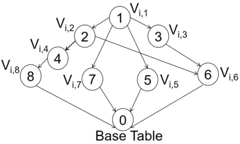
3.22 GeneratingVi,2by performing aggregation onVi,4orVi,8 . . . 56
3.23 Lattice for ViewViwithB=8 . . . 57
3.24 Example of Cost Model for HashAggregate Operator Wherebm=8 andb=4 . . . 59
3.25 Impact ofαAandαSon cost . . . 63
3.26 Impact ofαAandαSon relative difference . . . 63
3.27 Impact ofαAandαDon cost . . . 64
3.28 Impact ofαAandαDon relative difference . . . 64
4.1 View from Refined QueryQ1(Far fromQ) . . . 68
4.2 View from Refined QueryQ2(Close toQ) . . . 69
4.3 Query SpaceQ . . . 78
4.4 The QuRVe Scheme . . . 81
4.5 uQuRVe Example . . . 83
4.6 Pattern of Deviation . . . 84
4.7 uQuRVe-range Example . . . 85
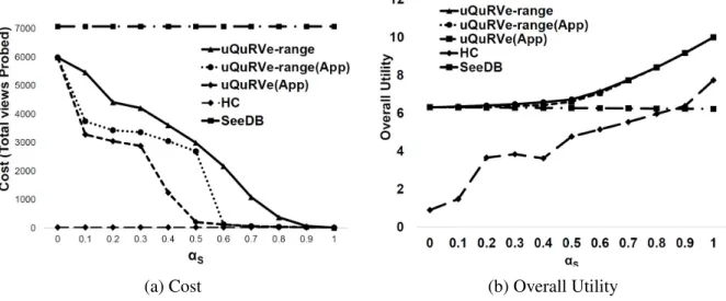
4.8 Impact ofαSandαDon Cost . . . 88
4.9 Impact ofk . . . 89
4.10 Impact of Dimensions on Cost . . . 89
4.11 Impact of Grid Resolution on Cost (Log Scale) . . . 90
4.12 Impact of Grid Resolution on Overall Utility . . . 90
4.13 Impact of Approximation Schemes . . . 91
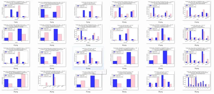
5.1 View-360: Recommended Views . . . 94
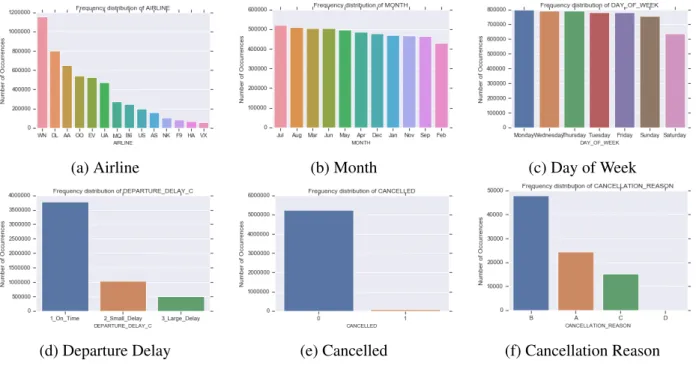
5.2 Flight Delays Dataset: Attributes Distribution . . . 101
5.3 Flight Delays Dataset: Hawaiian Airline (V1) . . . 102
5.4 Departure delay vs. Distance . . . 103
5.5 Flight Delays Dataset: Hawaiian Airline (V2) . . . 104
5.6 Flights Distribution . . . 104
5.7 Flight Delays Dataset: Hawaiian Airline (V3) . . . 105
5.8 Departure Delay vs. Arrival Delay for Hawaiian Airline . . . 105
5.9 Scheduled Departure Time vs. Departure Delay . . . 106
5.10 Flight Delays Dataset: Busy Airports . . . 108
5.11 Diabetes Dataset: Attributes Distribution . . . 112
5.12 Diabetes Dataset: Age Group[10-20)V1 . . . 113
5.13 Diabetes Dataset: Age Group[10-20)V2 . . . 114
5.14 Diabetes Dataset: Primary Diagnosis Details . . . 114
5.15 Diabetes Dataset: Age Group[10-20)V3 . . . 115
xvi LIST OF FIGURES
5.17 Diabetes Type 250.0x vs. HbA1CResult . . . 116
5.18 Diabetes Types and Age group 70-80 . . . 117
5.19 Diabetes Types and Age group 70-80 . . . 117
5.20 Diabetes Dataset: Age Group [0-10)V1. . . 118
5.21 Diabetes Dataset: Age Group [0-10) Bar Charts . . . 118
5.22 Diabetes Dataset: Age Group [0-10)V2. . . 119
5.23 Diabetes Dataset: Age Group [0-10)V3. . . 119
5.24 Diabetes Dataset: Re-admissions for Different Age GroupsV1 . . . 120
5.25 Diabetes Dataset: Re-admissions for Different Age GroupsV2 . . . 120
5.26 Diabetes Dataset: Re-admissions for Different Age Groups Bar Charts . . . 121
5.27 Top-k List with Target View Refinement . . . 123
List of tables
2.1 Summary of symbols . . . 18
2.2 Deviation-Based Data-Driven Visualization Recommendation Systems . . . 20
3.1 Computing the probability distribution of the comparison view shown in Figure 3.3. . . 29
3.2 Details of Datasets . . . 47
4.1 Summary of symbols . . . 72
5.1 Flights Delay Dataset: Attributes Description . . . 100
5.2 Flights Delay Dataset: Nominal attributes . . . 101
5.3 Diabetes Dataset: Attributes Description [4] . . . 110
5.4 Diabetes Dataset: ICD-9-CM Diagnosis Codes [5] . . . 111
Chapter 1
Introduction
1.1
Overview
The amount of data being generated and collected daily is in the order of terabytes. However, this data is only beneficial if it is unlocked to generate insights. Visual data exploration plays an important role in discoveringinteresting insights. A typical data exploration process involves the analyst systematically engaging in activities as shown in Figure 1.1. First, the analyst chooses asubsetof data that might be of interest by writing aninput queryor by using some graphical interface. Second, she analyses that subset for discovering interesting insights, using various techniques such as tabular data, graphical representations, statistical summaries etc. Finally, she refines the subset selection by modifying the input query of first step and then repeating the process till some insights are revealed. This clearly is a hit and miss process through which discoveries about the data are made. The effectiveness of this process depends on the ability of the analyst, performance of the exploration techniques and the complexity of the dataset. For this time-consuming process to be effective, a challenging combination of system and domain expertise is required. Particularly, selecting a subset of data that would reveal interesting insights requires domain knowledge and a comprehensive knowledge about the dataset. Additionally, for complex data, it is infeasible for an analyst to manually generate and browse all possible visualizations for insights. Therefore, there is a need for automated solutions that can effectivelyrecommendsuch visualizations.
Motivated by the need for an efficient and effective visual data exploration process, several solutions have been proposed towards automatically finding and recommending interesting data visualizations [6–12]. The main idea underlying those solutions is to automatically generate all possible visualizations, and recommend thetop-kinteresting visualizations, where aninterestingness
of a view is quantified according to some utility function. However, such solutions come at the expense of high data processing costs, where a large number of visualizations are generated and their interestingness is evaluated. Moreover, the hardest part of visualization recommendation is to quantify what would be interesting for the analyst. Consequently, the visualization recommendation problem has been approached from different angles, such as deviation-based/similarity-based methods that
2 CHAPTER 1. INTRODUCTION
Figure 1.1: Data exploration process- Key steps
quantify interestingness as a similarity/distance metric [6, 13–15], user-actions-based methods that quantify interestingness in term of user’s intent, which is inferred by her present actions or by historic data [7, 16], perception-based methods, that learn human perception and use it to mine and recommend interesting visualizations [10–12].
In particular, recent work provides strong evidence that adeviation-basedformulation of utility is able to provide analysts with interesting visualizations that highlight some of the particular trends of the analyzed datasets. Specifically, the deviation-based metric measures the distance between the
probability distributionof the subset of data to be analyzed called thetarget dataset and that of a
reference dataset, which is typically the entire database from which that target dataset is extracted. Moreover, the visual representation of these probability distributions is called anaggregate view, which is then plotted using some of the popular visualization methods (e.g., bar charts, scatter plots, etc.). The underlying premise is that a visualization that results in a higher deviation is expected to reveal some interesting insights that are very particular to the analyzed dataset [6, 17]. The problem of recommending top-k aggregate views from deviation-based utility metric is formally stated as: Definition 1. Top-k View Recommendation:Given a database DB, a user-specified query Q which selects a subset DQfrom database DB, a deviation based utility function U , and a positive integer k,
find thekaggregate views overDQ, which have the highest deviation values.
The baseline solution to the problem defined in Def. 1 is that all possible aggregate views are generated, deviation of each view is calculated and the the top-k views with highest deviation values are recommended. However, while the deviation-based notion of utility has been shown to be effective in recommending views with categorical dimensional attributes, in this thesis we argue that it falls short in capturing the requirements of numerical dimensions [18, 19]. Particularly, in the presence of such numerical dimensions,binned aggregationis required to group the numerical values along a dimension into adjacent intervals. Given the large number of options for binning a numerical dimension, it is expected that different binning configurations will result in different deviations, and in turn, different levels of interestingness from the analyst point of view. For instance, in a view with small number of bins, interesting insights are expected to remain hidden under a smooth and coarse visual representation. Meanwhile, in a view that contains a large number of bins, insights might go unnoticed in a cluttered or sparse visualization. Hence, the problem defined in Def. 1 is extended for view recommendation in the presence of numerical dimensions as follows:
1.1. OVERVIEW 3
Figure 1.2: Non-Binned Aggregate View
Target viewVi(DQ)(income>50K) andComparison viewVi(D0Q)(income≤50K) Deviation= 0.17866330071272257
Figure 1.3: Binned Aggregate View
Target viewVi(D0Q)(income>50K) andComparison viewVi(D0Q)(income≤50K)
Deviation= 0.2993347659872509
Definition 2. View Recommendation for Numerical Dimensions: Given a database DB, a user-specified query Q which selects a subset DQfrom database DB, a deviation based utility function U , and a positive integer k, find the kbinnedaggregate views over DQ, which have the highest deviation values.
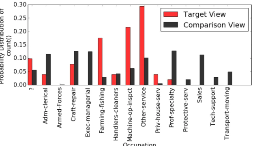
To illustrate the impact of binning on numerical dimensions, consider the following example: Example 1. Consider an analyst who wants to explore and find interesting insights in the U.S. Census income dataset [20], which is stored in table C. She notices that the categorical attributeincome
has two categories, that isincome > 50Kandincome ≤ 50K. Her intuition is that analyzing the two categories of income might reveal some interesting insights. Therefore, for her analysis, she chooses the target dataset (DQ) consisting of those individuals who haveincome > 50K, by posing the following input query Q:
Q: SELECT * FROM C WHERE income > 50K,
Similarly, for reference dataset, she chooses the individuals withincome ≤ 50K, which is comple-ment of DQ. Both target and reference datasets include dimension (e.g., gender, education, occupation, etc.), and measure (e.g., final wages, capital gain, etc.) attributes.
To recommend interesting bar chart visualizations, different SQL aggregate functions are applied on the views resulting from all the possible pairwise combinations of dimensions and measures, then
4 CHAPTER 1. INTRODUCTION
the most interesting views are presented to the analyst. Fig. 1.2 shows one of the top-k visualizations defined on the dimensionyears of education (educationnum)with aggregate functionCOUNT. Particularly, such visualization is equivalent to plotting the probability distributions of a view Vi(DQ)
defined on target dataset (target view) and a View Vi(D0Q)defined on reference dataset (comparison view):
Vi(DQ):SELECT educationnum, COUNT(*) FROM C
WHERE income > 50K GROUP BY educationnum
Vi(D0Q): SELECT educationnum, COUNT(*) FROM C WHERE !(income > 50K ) GROUP BY educationnum
Hence, the deviation value shown in Fig. 1.2 is the distance between the probability distribution of Vi(DQ)and Vi(D0Q). At first glance, comparing the two views fails to reveal clear insights about compared income groups. However, binning the two views, as shown in Figure 1.3, reveals some very interesting observation. Particularly, Figure 1.3 shows that more than 50% of individuals having
income > 50Khave college education (i.e., educationnum≥12). However, 70% of the individuals having income≤50K have education between 6-11 years. Clearly, this observation reflects that generally people havingincome≤50Kdid not get college education.
As the above example shows, choosing the right binning is essential in the process of extracting insights from the data, whether that process is performed manually or analytically. In Chapter 3, we address the challenges introduced by binning. We propose a multi-objective function and novel suite of search schemes for efficient recommendation of top-k aggregate data views for numerical dimensions.
Moreover, the proposed solutions [1–3, 6] are shown to be effective in recommending interesting views under the assumption that the analyst is precise in their selection of analyzed data. That is, the analyst is able to formulate a well-defined input query that selects a subset of data, which contains interesting insights that can be revealed by the recommended visualizations. In reality, it is typically a challenging task for an analyst to select a subset of data that has the potential of revealing interesting insights. Hence, it is a continuous process of trial and error, in which the analyst keeps refining their selection of data manually and iteratively until some interesting insights are revealed. Therefore, in this work we argue that, in addition to the existing solutions for automatically recommending interesting views, there is an equal need for solutions that can also automatically select subsets of data that would potentially provide such interesting views. That is, there is a need for solutions in which the two tasks of data selection as well as view recommendation are both automated and work together in synergy. Hence, the problem formulated in Def. 2 can be expanded to include the above mentioned tasks of data selection as:
Definition 3. Input Query Refinement for View Recommendation: Given a database DB, a user-specified query Q which selects a subset DQfrom database DB, a deviation based utility function U , and a positive integer k,automatically refineQ, to generate a setQof all possible refined queries Qj such that Qj∈Qand find the k aggregate views over all DQj, which have the highest deviation values.
1.1. OVERVIEW 5
Figure 1.4: View from Input QueryQ(Lacks Deviation)
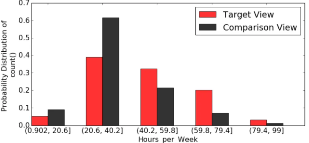
Target ViewVi(DQ):SELECT Hours per Week COUNT(*) FROM C WHERE education ≥ 12 GROUP BY Hours per Week
Comparison ViewVi(DB):SELECT Hours per Week COUNT(*) FROM C
GROUP BY Hours per Week
Deviation=0.04598937500117262
To further illustrate the need for such solution, consider the following example.
Example 2. Consider Ex. 1 again, now the analyst knows that there is something interesting about having higher education. Therefore, she decides to perform further analysis on subset of data of those who have achieved a high level of education. Hence, she selects from the overall Census data that particular subset in which everyone has completed their 12th year of education (i.e., graduated high school) via the the following input query:
Q: SELECT * FROM C WHERE education ≥ 12,
To find top-k visualizations, she might use one of the existing approaches (e.g., [1, 6]), in which the target and comparison views are generated and their deviation is computed by using a distance function. Fig. 1.4 shows one of the top-k visualizations recommended by such approaches. Particularly, the figure shows a bar chart in which the x-axis is defined on dimensionHours per week, and the y-axis is the probability distribution of the aggregate functionCOUNT.
Moreover, it can be clearly seen from Fig. 1.4 that the target and comparison views are almost the same, which is also reflected by the low-deviation value (i.e., deviation = 0.045989..). However, such visualization would still be recommended by existing approaches because it achieves the maximum deviation among all the views generated over the data subset selected by query Q, despite of that maximum value being inherently low. That is, the subset of data selected by the analyst pertaining to those who completed their 12th year of education falls short in showing any interesting insights.
The previous example illustrates a clear need for a query refinement solution that is able to automatically modify the analyst’s initial input query into a new query, which selects a subset of data that includes interesting insights. Those hidden insights are then easily revealed using existing solutions which are able to recommend interesting visualizations. To that end, one straightforward and simple approach would involve generating all the possible subsets of data by automatically refining all the predicates of the input query. Consequently, for each subset of data selected by each query refinement, generate all possible aggregate views. In addition to the obvious challenge of a prohibitively large search space of query refinements, this naive approach would also lead to views that might appear
6 CHAPTER 1. INTRODUCTION
Figure 1.5: View from Refined Input Query and Refined Reference Dataset Target ViewVi(DQ1):SELECT Hours per Week COUNT(*) FROM C
WHERE education ≥ 14 GROUP BY Hours per Week
Comparison ViewVi(DQ2):SELECT Hours per Week COUNT(*) FROM C WHERE education ≤ 5 GROUP BY Hours per Week
Deviation=0.23288980694954403
to be visually interesting but they are useless from the analyst’s perspective. Particularly, the naive approach might lead to refined queries which are significantly dissimilar from the input query and recommend views that are statistically insignificant. In Chapter 4, we formulate our problem of query refinement for view recommendation, propose a multi-objective function and constraints to measure similarity, interestingness and significance of the refined queries and their corresponding views. Moreover, novel algorithms are proposed for the efficient navigation of the refined queries search space for recommendation of data visualizations.
As mentioned earlier, in the recommended aggregate views, the target views are defined on subsets( target datasets) selected by refined queries, while comparison views are defined on a reference dataset. Particularly, the reference dataset can be the complete database as in Ex. 2 or complement of the target dataset as in Ex. 1. Hence, the interesting views revealed in such a manner can be considered asglobal interesting views, as the aggregate view generation involves the complete database (global) one way or another. However, contrary to global interesting views, there can existlocal interesting viewswhere the comparison views come from another subset of data instead of the given reference dataset. In particularly, that means refining the reference dataset as well. Consequently, all possible aggregate views, include all combinations of target views corresponding to all target datasets (i.e., refined queries) and comparison views from all refined reference datasets. Therefore, the problem defined in Def. 3 can be extended and redefined as:
Definition 4. Reference Dataset Refinement for View Recommendation: Given a database DB, a user-specified query Q which selects a subset DQfrom database DB, a deviation based utility function U , a positive integer k, and a set of automatically refined queriesQ, automaticallyrefine the reference datasetand find the k global and local aggregate views, which have the highest deviation values.
1.2. THESIS CONTRIBUTION 7 Example 3. Consider the U.S. Census income dataset [20] and the input query of Ex. 2.
The view shown in Figure 1.5 is the top-1 view after the refinement of the input query and the refinement of the reference dataset. Particularly, this aggregate view is generated by computing the deviation between the probability distribution of a target view define on the refine query Q1 and a comparison view defined on a refined reference dataset which is selected by query Q2.
Q1:SELECT * FROM C WHERE WHERE education ≥ 14
Q2: SELECT * FROM C WHERE WHERE WHERE education ≤ 5
Note that the view shown in in Figure 1.5 is more interesting than the view of Figure 1.4 and it is also reflected by the deviation value. However, it is a locally interesting view where two subsets of data are compared and insight is revealed about those two subsets.
The previous example illustrates clearly that refining the reference dataset can lead to more interesting views. A naive approach would be to generate all possible combinations of target and comparison views from refined queries and refined reference dataset and then recommend the top-k views. In addition to a prohibitively large search space, the naive approach would also lead to views that lack semantic value. Particularly, every possible combination of target and comparison view might lead to aggregate views in which the compared comparison and target view has no contextual connection to each other. In Chapter 5 we formulate the problem of reference dataset refinement for view recommendation and include a baseline scheme. We also present a prototype system View-360 that recommends top-k aggregate view after considering all aspects of view recommendation.
Next, we present the contributions of this thesis.
1.2
Thesis Contribution
Motivated by the need to efficiently and effectively recommend aggregate views for visual data explo-ration, we have addressed multiple aspects of view recommendation problem: 1) Recommendation of top-k aggregate data views in the presence of numerical dimensions. 2) Automatically refining the user’s initial input query and the reference dataset query to get to the aggregate visualizations that are interesting. 3) View-360 a prototype system for aggregate view recommendation for visual data exploration. 4) Effectiveness based analysis of two real world datasets.
1.2.1
Efficient View Recommendation for Numerical Dimensions
To address these challenges of view recommendation in the presence of numerical dimensions, we introduce a novel hybrid multi-objective utility function, which captures the impact of numerical dimension attributes in terms of generating visualizations that are: 1) interesting, 2) usable, and 3) accurate. Combining these often conflicting objectives dramatically expands the search space of possible visualizations (i.e., aggregate views). Moreover, it significantly increases the processing time incurred to asses the overall utility of each view, which is assembled from the utility values of each of the three objectives listed above.
8 CHAPTER 1. INTRODUCTION
Therefore, in this work, we present a novel suite of search schemes for efficient recommendation of top-k aggregate data views.
Multi-Objective View Recommendation for Data Exploration (MuVE): We propose the Multi-Objective View Recommendation for Data Exploration schemes [1, 2]. The main idea underlying our first schemeMulti-Objective View Recommendation for Data Exploration (MuVE)) is to use an incremental evaluation of the multi-objective utility function, where different objectives are computed progressively. Our results in [1] show that MuVE is able to prune a large number of unnecessary views, and in turn reduces the overall processing time for recommending the top-k views. However, the pruning power is highly dependent on the order in which the views are presented to MuVE and might often limit its performance gains.
upper MuVE (uMuVE):To address the limitation of MuVE, we propose our second schemeupper MuVE (uMuVE), in which the goal is to provide a flexible navigation of the search space so that high-utility views are discovered earlier. Particularly, uMuVE is based on setting upper bounds on the utility of each possible view, which is then exploited to effectively guide the search process by means of interleaving the evluation of the different objectives offered by the different views. Due to that interleaved processing, at any point of time, uMuVE would typically have multiple views under consideration, which requires significant amount of memory for storing their data.
Memory-aware uMuVE (MuMuVE):The improvement in uMuVE comes at the expense of high memory usage. We propose another scheme MuMuVE that aims to provide a pruning power close to that of uMuVE, while keeping memory usage within predefined constraint.
Materialized View Selection for Aggregate View Recommendation (mView): The most expensive operation while computing the utility of views is the time spent in executing the queries related to the views. To reduce the cost of this particular operation, we propose a novel technique mView , which instead of answering each query related to a view from scratch, reuses results from the already executed queries. In particular, this is done by materializing views and answering queries from the materialized views instead of the base table. Due to prohibitively large number of views, the blind application of materialization may result in even further degradation of the cost. In this work we first defines a cost benefit model to decide which views are the best to reuse. Later, we propose scheme mView which materializes the best set of views in an optimal order and consequently reduces the overall cost of the solution [3]. After analyzing the trade off between cost savings of mView and MuVE scheme, we also propose extension of mView for MuVE Scheme.
1.2.2
Query Refinement for View Recommendation
In this work we argue that, in addition to the existing solutions for automatically recommending interesting views, there is an equal need for solutions that can also automatically select subsets of data that would potentially provide such interesting views. Particularly, we highlight the need for automatic refinement solutions that are guided by the user’s preference. Consequently, we propose a novel suite of schemes for automated query refinement for view recommendation in visual data exploration.
1.3. THESIS LAYOUT 9
Query Refinement for View Recommendation (QuRVe): The main idea underlying our QuRVe schemes is to incrementally access the refined queries in order of their similarity with the original query, which allows an early termination of search and results in pruning of a large number of views.
upper Query Refinement for View Recommendation (uQuRVe): The upper bound on deviation used by QuRVe scheme to prune low utility views is a theoretical extreme value and it is oblivious to the under consideration target and comparison view.The main idea of uQuRVe scheme is to provide tighter upper bound on deviation of views by using the properties of deviation function and the already executed comparison views.
upper Query Refinement for View Recommendation - range(uQuRVe-range): The main idea behind uQuRVe-range is to reduce search time even further by having more control on the order in which views are generated. Particularly, it prioritize to generate the views with the high utility first.
Query Refinement for View Recommendation (QuRVe)-Approximation: Approximation based extension for uQuRVe and uQuRVe-range schemes are proposed to further improve performance, while incurring negligible loss in the quality of recommendation.
1.2.3
View-360: A Prototype System for View Recommendation
In this work, we argue that in existing recommendation systems, the assumption that a comparison view is generated from a default or predefined reference dataset, limits the discovery of interesting insights. Therefore, the reference dataset should also be refined by refining the query that selects the reference dataset, we name it the reference dataset refinement. The aggregate view recommendation with the refinement of reference dataset is non-trivial as it increases the search space of views exponentially, and more importantly all combinations of comparison views and target views in an aggregate view are not comparable due to the lack of contextual connection between them. In this thesis, we define the problem of reference dataset refinement for view recommendation and present a baseline scheme.
View-360: The design and implementation of a holistic prototype system View-360 for view recommendation is presented. Particularly, it includes all of the search schemes presented in this thesis. Moreover, it also includes all aspects of aggregate view recommendation i.e, recommendation based on categorical and numerical attributes, and recommendation based on refinement on target and comparison queries.
Dataset analysis: We showcase the effectiveness of all of our proposed schemes in this thesis by performing detailed analysis on real datasets from various domains. Particularly, we show all steps of data analysis and insights discovery on two datasets: one from general domain and one from the health domain.
1.3
Thesis Layout
The rest of the thesis is organized as follows: In Chapter 2, we present preliminaries and related work. In Chapter 3, we present a suite of search schemes for efficient recommendation of top-k aggregate
10 CHAPTER 1. INTRODUCTION
data views. In Chapter 3.5, we present the schemes to solve the problem of materialized view selection for binned aggregate views. In Chapter 4, we present a suite of efficient schemes that automatically refine input query. In Chapter 5, we present the problem of reference dataset refinement and we show application of our schemes on real world dataset from different domains. Finally, Chapter 6 concludes this thesis and overviews future work.
Chapter 2
Related Work
2.1
Data Exploration
Traditionally databases have structures, precise data, clear input queries and specific users, makes data analysis easy and efficient. However, with the revolution of Big Data we are forced to rethink our theories and implementation of databases [21]. Now almost every domain has a huge volume, velocity, variety and veracity of data. Addtionally, users with varying level of technical skills and domain knowledge are performing analysis tasks. Therefore, there have emerged many new facets of storage, retrieval, presentation and exploration of big data.
Particularly, data exploration can be performed in two ways:
• Open ended exploration: Data characteristics are hidden from the user and exploration can mean finding interesting insights in data, investigating and seeking inspiration, and suggesting new hypothesis.
• Targeted exploration: User is somewhat familiar with data characteristics and exploration is used as a tool to evaluate the quality of the data, compare specific data, use data to make decisions, and verify existing hypothesis.
Both open ended and targeted data exploration pose challenges that cannot be addressed through traditional search and query mechanisms [22, 23]. Traditional data search relies heavily on the
Figure 2.1: Data exploration 11
12 CHAPTER 2. RELATED WORK
Figure 2.2: Data exploration Interface
database structure and built in queries. In contrast to traditional data search, any data exploration process includes several iterations of following steps, as show in Figure 2.1:
1. issuing a query to the database
2. executing query and generating results 3. reviewing results
4. reformulating the next query
Although database is the key component of this exploration process, only step 2 of executing query and generating results is database-centric. Whereas steps 1, 2 and 3 are user-centric. Hence, the efficiency and effectiveness of the exploration process primarily depends on the user. The assumption of traditional database systems, that the users can formulate structured queries to the underlying database in order to achieve analysis tasks, is often not true for data exploration. Additionally, user-centric processes, are inherently long and laborious which often end in undesired results. Therefore, improving the user interactions with underlying database has been the spotlight of research recently.
There have been many research efforts to develop exploratory interfaces that create a layer between the user and the database as shown in Figure 2.2. It facilitates the user in formulating input, for instance, recent interface allow users to provide input in terms of keywords, uncertain queries, example tuples, graphical parameters and the output can be displayed in the form of interesting visualizations which aid steps of the result review and reformulation of the input for the next iteration. Key requirements of the exploratory interface is that it should be simple enough to avoid complicate declarative languages and, at the same time, it should have flexibility and expressiveness to satisfy complex information needs [24]. Generally, exploratory interfaces can be divided into the following three categories [21]:
1. Example-driven exploration: Generally in the data-driven exploration, the user is unable to express their data interests precisely, but she may have an idea of what an interesting result will look like [24–28]. In such situations, the user can be aided with an interface to navigate through subsets of data to find interesting insights. This can be done by showing the user a few samples from the dataset, get feedback and find interesting objects based on presented samples. For instance, AIDE [27, 29] predicts a query that retrieves user’s objects of interest. First it prompts the user to label a set of sample objects as relevant or irrelevant, based on this feedback it collects new set of sample objects. AIDE learns the user interests based on his relevance
2.2. VISUAL DATA EXPLORATION 13 feedback on strategically collected samples. Ymaldb [30] is another approach which presents the users with additional items that are not part of the results of their original query but may be of interest to them. The computation of such results is based on the frequency of the most interesting (attribute, value) pairs in the user query result and in the database instance. In [28], it is assumed that the user is aware of a few example tuples that should be present in the output of the query and the proposed framework discovers the minimal project join queries based on an example table. These systems at some level require the user to be familiar with the data model they are exploring, which may not be true for the naive user. Therefore, these systems are suitable for a particular set of users and usage scenarios.
2. Assisted Query Formulation: Numerous novel query interfaces have been proposed that assist the user in formulating the target queries [31–37]. Particularly, user guided visual tools and query recommendation tools have been developed for specifying relational queries for data exploration. For instance, DataPlay [33] is a sophisticated query specification tool which provides features like graphical specification of query and constraint recommendations for fine tuning the query. Moreover, it also provides a feature to add or remove results and auto correct the query accordingly. Snipsuggest [36] is a tool for non-expert database users, who need to perform complex analysis. As the user starts typing a query, SnipSuggest proposes several completions using relevant snippets collected from a log of past queries. The more a user writes, the more accurate the suggestions get. Another query recommendation system Charles [37] introduces a Segmentation Description Language (SDL). As the user provides a query, Charles breaks its extent into meaningful segments and returns the subsequent SDL descriptions. This provides insight into the set described and offers the user directions for further queries.
3. Visualization tools: Visualization has many faces in the context of data exploration. Visual-ization tools effectively assist the users in formulating input, however, such tools come under the category of assisted query formulation. Visualization also plays a key role in reviewing and interpretation of results for data exploration. Moreover, there are even new types of interactions proposed through visualization such as collaborative annotations and searches [38]. For the purpose of effective and efficient data exploration, automatic recommendation of interesting visualizations has been focus of research lately [6–9, 17], which is focus of this thesis as well. The role of visualization in data exploration and the existing tools and techniques are reviewed in the next section.
2.2
Visual Data Exploration
Data visualization is perhaps the most widely used tool in a data analyst’s toolbox [39]. Generally, gen-erating a visualization involves specification of visualization type (e.g., bar chart, scatter plot), filtering (e.g., selecting subset of data to visualize), transformation (e.g., aggregation on data), parameters (e.g., assigning attributes to axes) and visual encodings (e.g., color, size). Range of visualization tools
14 CHAPTER 2. RELATED WORK
Figure 2.3: Components of Effective Visualization
are available with different features to create these data visualizations. Some of these tools are more expressive, giving expert users more control for instance, ggplot2 , vega-Lite, D3 but require significant programming skills, while others are easier to learn and faster to create visualizations such as Microsoft Excel, Google Spreadsheets but still require mappings between data and visualizations [40].
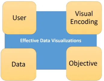
The following key components are involved in creating an effective visualization (Figure 2.3): • Data: What is the quality of data and what portion of data (tables, tuples, attributes) is visualized. • Objective: What is goal of generating the visualization.
• Visual Encoding: What is the type, size, color and other attributes of the visualization, what will be the mapping between attribute of data and axes of visualization
• User: What is the level of technical skills and domain knowledge of the user affects, additionally what is the user expectation and preference from the visualizations.
Moreover, generating an effective visualization is highly challenging for big data due to a number of factors such as, quality of data, volume of data, limitation of the tools, time constraints, varying technical expertise and domain knowledge of the user.
The idea of the visual data exploration approach is to iteratively create and refine visualization for the open ended or targeted data exploration goals. Recent years have seen the introduction of many visual analytic tools such as Tableau, Qlik and Spotfire [41–43], particularly for the purpose of visual data exploration. These tools aim to provide aesthetically high-quality visualizations and easy interfaces for the analyst. However, as mentioned before, generating useful visualizations requires complete knowledge about the data, clear objective of visualization, domain knowledge, expertise in statistics and visualization design. Even super analysts face cognitive barriers in these settings. Time pressures and data overload work against the analyst’s ability to rigorously follow effective methods for generating, managing, and evaluating visualizations [44]. Additionally, the exploration process by default has lack of clarity in terms of objective of exploration and for a non-expert user visual data exploration becomes even more challenging and time-consuming. To speed up the data
2.3. VISUALIZATION RECOMMENDATION 15 exploration process, the visual exploration tools can be complemented with automated recommendation of interesting visualizations.
2.3
Visualization Recommendation
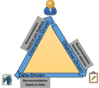
The goal of visual recommendation is to aid the users in visualization design and in taking exploration decisions by providing quick traversal through the space of visualizations. Particularly visualization recommendation systems automatically generate visualizations, measure the utility of a visualization, and recommend the interesting ones, in terms of the factors mentioned Figure 2.3. In design of visualization recommendation systems, different systems may prioritize different factors depending on the recommendation goals and intended applications. Accordingly the recommendations systems can be mapped to the model displayed in the Figure 2.4. The three corners of the triangle are objective-driven, interaction-driven and data-driven recommendations. The three corners are not mutually exclusive, for instance, a data-driven recommendation need to have some online/offline interaction to initiate the recommendation process and it also has, at the least, some open ended exploration objective. Therefore, the existing systems are around the body of the triangle some are more towards one corner while the others are on the other end. However, we categorize the existing work into one of the three categories based on the contribution of the three categories in the recommendation of visualizations. Below we list down the categories and we briefly mention the systems that belong to each category:
• Objective-Driven: Recommendation criteria is based on a particular objective such as missing value, outlier, finding specific pattern, and analysis on particular attributes of data. For instance, Profiler [8] automatically flags problematic data and recommends visualizations based on mutual information metric. Semantic windows [34] is designed to find number of queries that find rectangular regions of the data space the user is interested in. Rank-by-Feature Framework [45] computes statistical summaries and ranking for histograms and scatter-plots.While visualizations can be ranked by various features, the user still selects a ranking criterion according to the task at hand, and then all possible projections are ranked by that criterion.
• Interaction-Driven: The recommendation criteria is based on online interaction with the user and the user feedback is used to continuously improve the recommendation. AIDE [29] engages the user in a conversation by getting feedback, while in the background the system builds user model that predicts data matching user interest. INDIANA [22] assists the user in gaining insights through an interactive and incremental process. Statistically grounded algorithms are proposed to support interactive data exploration. ForeCache [46] is a tool for suggesting browsing patterns on multi-dimensional numerical data to users; the recommendations are provided with different levels of granularities by aggregating data, and are strongly focused on the user’s interests about previously explored data.
• Data-Driven: Recommendation criteria is based on either data characteristics such as data summaries, distributions, correlations, or some historical data, data collected from offline
16 CHAPTER 2. RELATED WORK
Figure 2.4: Visualization Recommendation Systems
interactions. We discuss the features, key issues and systems of this category in detail in the next section.
2.3.1
Data-Driven Recommendation Systems
The main idea of data-driven recommendation systems is to automatically discover and recommend visualizations based on properties of data, with minimal interaction with the user. These systems are most suitable when the user lacks clear objective of exploration and has low level of familiarity with the data. The key issues in designing such systems are:
1. Quantifying Interestingness: There is a lack of unified and consistent formulation of interest-ingness measure. A number of methods have been proposed to quantify intrestinterest-ingness such as, deviation-based, similarity-based and perception-based [6, 10, 47].
2. User preferences: Different users may be interested in different attributes or visualizations. Having user preference included in the recommendation scheme provides an important criteria to evaluate which visualizations are useful for different users [39]. At the same time these systems are targeted to keep the user interaction to the minimum so that users of all skill levels can use them effectively.
3. Scalability: Data-driven recommendation system can be computationally expensive as it involves generation and evaluation of huge number of visualization, therefore scalability becomes a challenge. Even for a moderate size dataset the exploration may involve exponential space of visualizations [39].
4. False Discoveries: The data-driven approach of recommendation significantly increases the risk of finding false discoveries [48]. Therefore, the insights should be tested for statistical significance.
2.3. VISUALIZATION RECOMMENDATION 17 5. Coverage: Covering all parts of dataset with every possible visualization is a non-trivial task.
Different systems focus on various levels of coverage. It is important to understand how much of the space of potential visualizations is covered by the recommendation system [39].
The data-driven recommendation systems address these issues one way or another. However, the focus of such systems is typically a subset of these factors. In terms of quantifying interestingness and identifying visual encodings, the most recent research efforts have focused on learning human perception. In particular, understanding which visualization and transformation is good under which scenarios and using that learning to mine the interesting visualization. Moreover, such systems involve heavy interaction with the user in the learning phase, hence these system can come under the interaction-driven systems. However, focus of this interaction is off-line and the learning is taken as input to the system like the data, therefore, the recommendation process is dominated by the data-driven approach. The performance and capabilities of these systems can be improved by improving the dataset of examples, which is used to train the models.
DeepEye [10] is a ML based system with online and offline components, the off-line component trains two ML models. First model trains a decision tree to determine whether a given dataset and an associated visualization is good or bad. Second model is a neural-network to rank the visualizations. The on-line component generates all possible visualizations and uses the trained models to select top-k visualizations.
Data2Viz [11] is another learning based system that automatically generates visualizations using deep learning approach. Particularly, the visualizations generation is formulated as a language translation problem data specifications are mapped to visualization specifications in Vega-Lite. A multi-layered attention-based encoder-decoder network is trained with long short term memory units.
VizML [12] proposes another ML based approach for visualization recommendation that learns visualization design choices through a corpus of datasets and associated visualizations. Neural network classifiers are developed for five design choices prediction tasks. The work also benchmark with a test set through crowdsourcing.
Next, we review the systems that quantify interestingness in term of metrics directly related to data and not on any other sources such a learning from prior knowledge or domain expertise. QuickInsights [47] formulates insights based on three elements i.e., subject, type and interestingness to discover insights. Insight subject is the content of the insight such as the subset, the attributes and the transformation. It supports 12 types of insights such as correlation, outliers etc. To achieve efficient insights, QuickInsights proposes mechanism to prioritize insight evaluation tasks and smart query grouping to reduce the number of queries. The interestingness is measured as a combination of significance and impact score of insight. QuickInsights is released in Microsoft Power BI tool. In their previous work [49] they propose the concept of insight derived from aggregation result in multiple steps. The computation sharing and pruning based optimizations are also proposed.
Foresight [44] considers insight as a strong manifestation of a distributional property of data. It proposes insight classes such as, dispersion, skew, heavy tails, outliers etc., and the visualization types for each class. Foresight initially presents top-k instances in data based on different ranking. The user
18 CHAPTER 2. RELATED WORK
Symbol Description
DB Database
Q Input query
T Predicates for Input query
DQ Dataset selected byQ Vi ith aggregate view
Vi(DQ) ith target view
Vi(DB) ith comparison view onDB
D(Vi) Deviation of aggregate viewV(i)
Table 2.1: Summary of symbols
can then choose the interesting ones and explore further by issuing insight queries in specific format. It can handle large datasets by using approximate methods based on sketching and indexing.
VizDeck [7] generates all possible 1-D and 2-D visualizations ranked by statistical measures on a dashboard. The ordering of the visualizations can be adjusted by the proposed voting mechanism in which users can share, vote or save visualizations.
In data-driven recommendation, a huge number of visualizations are generated and comparisons are made to discover insights. As a result the probability of discovering spurious insights increase. This is known as multiple comparison problem (MCP) and is well studied in statistics. In the context of visualizations recommendations [50] investigate this problem and proposes methods to evaluate MCP by measuring the accuracy of insights with known ground truth labels.
Deviation-Based Data-Driven Recommendation Systems
As mentioned earlier, one of the main challenges in recommending data-driven visualizations is the quantification of interestingness which depends on a lot of factors. Recent work provides strong evi-dence that a deviation-based formulation of interestingness is able to provide analysts with interesting visualizations that highlight some of the particular trends of the analyzed datasets [6]. The underlying premise is that a visualization is likely to be interesting if it displays a large deviation from some reference (e.g., complete dataset, another dataset, historical data or the rest of the data).
Consider a databaseDB, the user specifies an input queryQto select a subsetDQof data fromDB.
For instance, consider the following input queryQ:
Q: SELECT * FROMDB WHERET;
InQ,T specifies a combination of predicates, which selects a portion of DBfor visual analysis. Typically, the reference dataset is either the complete databaseDB. For deviation-based recommenda-tion systems, a visualizarecommenda-tion shows comparison of the visual representarecommenda-tion for target and reference dataset. For instance, a visual representation ofQis basically the process of generating an aggregate viewVi, composed of a target viewVi(DQ)on DQand a comparison viewVi(DB) onDB, which is then plotted using some of the popular visualization methods (e.g., bar charts, scatter plots, etc.). Typically, for computing deviation a distance metric is defined as utility function which computes distance betweenVi(DQ)andVi(DB).