Evaluation of illustration-inspired techniques for
time-varying data visualization
Alark Joshi†1and Penny Rheingans‡1
1Computer Science Department, University of Maryland Baltimore County
Abstract
Illustration-inspired techniques have provided alternative ways to visualize time-varying data. Techniques such as speedlines, flow ribbons, strobe silhouettes and opacity-based techniques provide temporal context to the current timestep being visualized. We evaluated the effectiveness of these illustrative techniques by conducting a user study. We compared the ability of subjects to visually track features using snapshots, snapshots augmented by illustration techniques, animations, and animations augmented by illustration techniques. User accuracy, time required to perform a task, and user confidence were used as measures to evaluate the techniques. The results indicate that the use of illustration-inspired techniques provides a significant improvement in user accuracy and the time required to complete the task. Subjects performed significantly better on each metric when using augmented animations as compared to augmented snapshots.
Categories and Subject Descriptors(according to ACM CCS): H.1.2 [Human factors]:
1. Introduction
Illustration-inspired techniques have been found to be ef-fective at conveying information succinctly and efef-fectively. Techniques inspired by photography as well as illustra-tions have been adapted to visualizing time-varying data
[WS03,SJEG05]. Practitioners currently use large
panora-mas of snapshots (as shown in Figure1) taken over time or watch an animation of these snapshots to perform feature tracking. However, as can be seen by looking at the series of snapshots as shown in Figure1, it is very hard to identify the direction in which the contained three-dimensional features are moving.
To measure the visual tracking ability of human observers, Pylyshyn [Pyl03] showed subjects a series of moving objects over time. Subjects were asked to visually track these ob-jects as they moved. The study found that a human observer can successfully track up to five objects moving at a rela-tively moderate speed, but as the number of moving objects increased, the user’s ability to track the features decreased
† Alark Joshi: [email protected] ‡ Penny Rheingans: [email protected]
dramatically. He also found that the user’s ability to track features dropped sharply as the speed of the moving objects increased.
In previous work, we proposed the use of techniques inspired by comics to augment time-varying data visu-alizations with illustrative cues to provide temporal con-text [JR05]. We presented four techniques: speedlines, flow ribbons, strobe silhouettes and opacity modulation tech-niques to convey positional change in time-varying data. It was claimed that the use of illustration-inspired techniques would aid the visual feature tracking abilities in visualizing time-varying data.
We evaluated the effectiveness of the illustration-inspired techniques by conducting a formal user study. The tech-niques were evaluated using three measures: accuracy in completing a task, time required by the users to complete a task and user confidence. Illustration-inspired techniques can be classified into two groups: Speedlines and flow rib-bons are similar in nature and opacity modulation and strobe silhouettes are similar in the way they communicate path positions of features. We evaluated speedlines and opacity-based techniques, since they were representative of these two classes of illustration-inspired techniques.
2 Alark Joshi & Penny Rheingans / Evaluation of illustration-inspired techniques for time-varying data visualization
Figure 1: These are a set of snapshots from evenly spaced time steps of the turbulent vortex dataset [FS98]. As is evident from looking at the snapshots, it is very hard to correlate and track a particular feature over different time steps. These images were generated using Volview [Kit06].
Figure 2: The image depicts change over time in a feature
for CFD data. The rightward motion of the flow feature is conveyed using speedlines.
1.1. Speedlines
Speedlines are defined as lines that convey information to the viewer about the path traversed by a particular feature over time. They are basically lines that follow a particular feature over time. Illustrators have used speedlines to con-vey motion by altering the characteristics of these lines. The thickness, line style, and variation of the line’s opacity are among the characteristics that successfully convey change in direction. Darker, thicker regions of the line convey an older time step whereas lighter, thinner regions of the speedline depict a more recent time step.
In our study, the speedlines technique was applied to syn-thetic data as well as real-world data from the computational fluid dynamics (CFD) domain. In Figure2, the speedlines depict the rightward motion of the flow feature over the un-derlying features.
1.2. Opacity modulation
Illustrators often used blurred, desaturated images to depict older time steps with brighter, more detailed images repre-senting newer time steps. In visualization, the same effect can be obtained by using opacity modulation techniques.
For this technique, an illustration feature is identified and
Figure 3: The image conveys change over time using
opacity-based techniques. The upward motion of the fea-ture is conveyed using opacity-based techniques. The older timesteps, shown by the faded representations of the feature over time, provide temporal context.
opacity-modulated snapshots of each timestep are merged into one visualization. Older timesteps are represented by translucent, blurred representations while newer timesteps are more crisp and brightly displayed. This provides insight into the origin of the feature and its path through multiple timesteps.
This technique was applied to synthetic data as well as real-world data. Figure3shows a visualization where the older time step is shown by a translucent, faded representa-tion, whereas the newer time step is crisp and brighter. This visualization conveys the upward leftward motion of the fea-ture.
2. Hypothesis
Our testable hypothesis is that illustration-inspired tech-niques can lead to improved visual tracking of features as they move over time. By improved visual tracking, we mean that the techniques will facilitate faster and more accurate visual tracking than standard snapshot-based or animation-based visualization of time-varying data.
Figure 4: A screenshot of a sample screen that is shown to the subjects. The subjects were shown snapshots and were asked to
indicate the direction of motion of a particular feature moving over time. They were also requested to specify a confidence level in their answer.
3. Independent variable
The independent variable for the user study is the visualiza-tion technique being used to visualize the time-varying data: • A panorama of snapshots (such as the one shown in Figure
1).
• A single snapshot of the current timestep augmented with one of the illustration-inspired techniques. Figure2shows an example image of the same.
• An animation depicting the motion of the feature over time.
• An animation augmented with one of the illustration-inspired techniques.
4. User study details
Before we began the formal evaluation process, we ran a pi-lot experiment. The pipi-lot study was not timed or scored for user accuracy. The pilot study was conducted with three sub-jects whose answers were not considered in the final evalua-tion of the techniques.
4.1. Subjects
We tested the illustration-inspired techniques with 24 sub-jects (15 males and 9 females aged 22 to 30) who had basic familiarity with using computers. We performed full facto-rial, within-subjects testing to evaluate the techniques. In or-der to balance oror-dering effects, we tested the subjects with all possible combinations of orderings of trials.
4.2. Datasets
Both synthetic and real-world data were presented in all four representations. The synthetic datasets that we used con-sisted of either a single feature tracing a simple path (linear or circular), multiple features tracing simple paths (linear, circular, spiral) and multiple features tracing complex paths. The real world data that we used is the turbulent vortex dataset from Rutgers University [FS98]. The dataset is a pseudospectral simulation of coherent turbulent vortex struc-tures with a 128×128×128 resolution (100 time steps). The variable being visualized is vorticity magnitude. The dataset has numerous features that change position over time. 4.3. Procedure
During the course of conducting the user study, we first ex-plained the study procedure to the subject. On obtaining con-sent from the subject for the study, we conducted the user study. At the end of the user study, we requested the subjects to fill out a usability questionnaire to get subjective feedback from them.
The user study was conducted using a web browser. Since we had to show videos to the subjects, we used Riva Free FLV encoder to encode AVI files into flash files that can be shown to the viewer in the browser setting.
Figure4shows a screenshot of the snapshot-based visual-ization that we showed the subjects. Figure5shows a screen-shot of the augmented snapscreen-shots technique that was shown to the subjects. We first asked the user a question and de-pending on the kind of data (snapshots or animation), the
4 Alark Joshi & Penny Rheingans / Evaluation of illustration-inspired techniques for time-varying data visualization
Figure 5: This is a screenshot showing an augmented
snap-shot based visualization to the subjects. The users were asked to indicate the direction of motion as well as their con-fidence in their answers.
user observed it and provided an answer. We asked the user to specify the direction in which a particular feature was moving. The user picked one of the given choices and in-dicated a confidence level in their answer. We used a Lik-ert scale to measure the confidence that the subjects had in their answers. The user was asked to select a confidence level from one of: Not at all confident, Slightly confident, Confi-dent, Highly ConfiConfi-dent, and Completely confident.
4.4. Questionnaire
Subjects were requested to fill out a questionnaire evaluat-ing the effectiveness of the various techniques. Their an-swers were obtained on a Likert scale of 1 (easy/agree) to 9 (hard/disagree). The questions asked in the questionnaire were as follows:
Figure 6: These images show a subset of the kinds of motion
that we asked the subjects to choose. This enabled us to test more complex motions than just simple leftwards, rightwards kinds of motion.
1. Were the questions asked for each evaluation straightfor-ward?
2. Overall, did you think the speedlines techniques helped convey direction better than standard visualization tech-niques?
3. Overall, did you think the opacity-based techniques helped convey direction better than standard visualization techniques?
4. Could you perform simple tasks such as tracking a sin-gle feature using standard snapshots or animation-based techniques?
5. Could you perform simple tasks such as tracking a single feature using illustration-based techniques?
6. Could you perform hard tasks such as tracking multi-ple features using standard snapshots or animation-based techniques?
7. Could you perform hard tasks such as tracking multiple features using illustration-based techniques?
5. Tasks
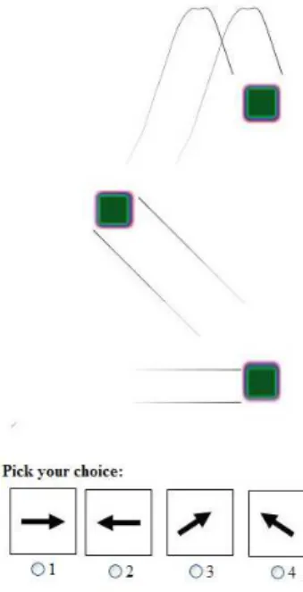
We asked users to track features as they were moving over time. Such tasks are representative of what researchers need to do on a regular basis as they track vortex tubes in fea-ture data, as they track hurricane feafea-tures over time, as they track the energy of jets entering a region, and so on. Our tasks were simple enough to test the effectiveness of the illustration-inspired techniques with subjects who are not necessarily application-domain experts; nevertheless, they represent tasks that scientists need to perform on a regular basis. The task-based question that we asked the user was Which of these paths seems to best represent the observed direction of motion of the feature?
The subject was presented with four choices of paths and was asked to select one of them according to the perceived motion. This enabled us to test complex motion paths instead of just simple linear motion of features. Figure6shows some of the images that we showed our subjects. They would in-dicate the perceived direction of motion of the feature by selecting one such glyph.
6. Dependent variables
We measured the accuracy of the subjects in performing the task in addition to the time required to complete the task. The user performance time is the time required by the user
dence of the user in their answer. We also obtained feedback in the form of subjective satisfaction where we asked sub-jects to rate their experience on a scale of 1-9 (Likert scale).
7. Results
We analyzed the results of the user study using statisti-cal techniques. To compare the four different visualiza-tion types, we used the statistical test Analysis of Variance (ANOVA) as well as Tukey’s post-hoc pairwise comparison test . These tests allowed us to compare the accuracy, tim-ings, and confidence obtained from the four groups (snap-shots, augmented snap(snap-shots, animations, and augmented an-imations). The test began with a null hypothesis that the use of illustration-inspired techniques provided no speedup in completing tasks, no improvement in accuracy, and that the users felt equally confident in their answers for all tech-niques. The statistical measure of significance p evaluates the probability of the result agreeing with the null hypoth-esis. For values of p< 0.05, the null hypothesis is re-jected, implying that the use of illustration-inspired tech-niques makes a difference.
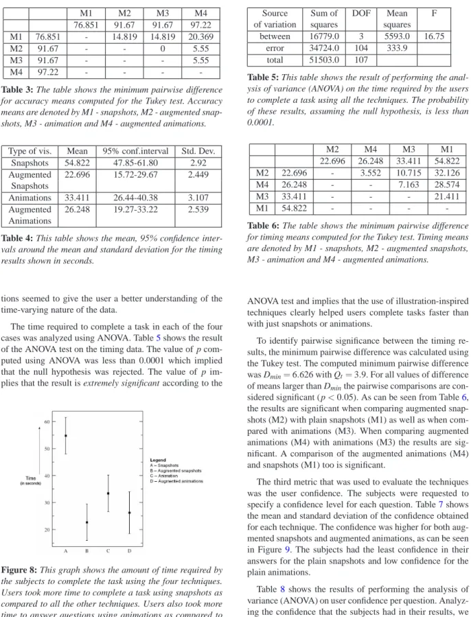
The first metric that we used to evaluate the techniques was user accuracy, defined as the number of correct answers per user per technique. The mean and standard deviation for each technique are listed in Table 1. Figure 7shows a graph of the same data. A comparison of the snapshots technique with the snapshots technique augmented with the illustration-inspired techniques shows that the subjects got more answers correct using the augmented snapshots. Simi-larly, in the case of animations compared to augmented an-imations, the subjects were more accurate when using aug-mented animations, as can be seen in Figure 7. The tem-poral context that the illustration-inspired techniques pro-vide seem to help users complete the task more accurately. Amongst all the four techniques, the augmented animations techniques seems to provide users with the most useful in-formation to correctly complete the task.
Analyzing the accuracy results using the ANOVA test yields the results shown in Table2. The variation between the four different visualization techniques is high. The prob-ability p of this result assuming the null hypothesis is less than 0.0001. This implies that the result is extremely signifi-cant and that the null hypothesis is rejected. This proves that the use of illustration-inspired techniques increases the user accuracy for visual tracking of features.
To identify pairwise significance, the minimum pairwise difference was calculated using the Tukey test. The com-puted minimum pairwise difference was Dmin=4.706 with Qt=3.9. For all values of difference of means larger than Dminthe pairwise comparisons are significant (p<0.05). As can be seen from Table3, the results are significant when
Augmented Snapshots 91.67 11.7284
Animations 91.67 11.111
Augmented Animations 97.22 5.144
Table 1: This table shows the mean and standard deviation
of the accuracy of the users. Users completed tasks with the most accuracy in the case of augmented animations.
Figure 7: This graph shows accuracy results grouped
ac-cording to the categories of questions asked. The categories, from left to right, are Snapshots, Augmented Snapshots, Ani-mations, and Augmented Animations. The user accuracy for Augmented Snapshots is better than Snapshots, similarly the accuracy is better for Augmented Animations as compared to Animations.
comparing augmented snapshots (M2) with snapshots (M1). Similarly, the results is significant when comparing aug-mented animations (M4) with plain animations (M3).
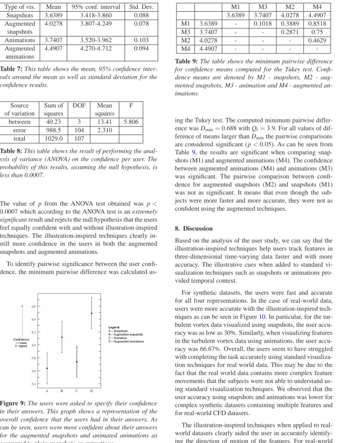
The second metric we used to evaluate the techniques was the time required by the subject to complete each task per visualization technique. Table4shows the mean and stan-dard deviation for the four visualization techniques. Figure 8shows a graphical representation of the timing results. The subjects required more time when viewing snapshots than in the other three cases. Augmented animations helped sub-jects answer questions faster than just animations. Overall, even though loading an animation took more time,
anima-Source Sum of DOF Mean F
of variation squares squares
between 6181.0 3 2060.0 12.02
error 17804.0 104 171.4
total 24004.0 107
Table 2: This table shows the result of performing the
analy-sis of variance (ANOVA) on the accuracy per user. The prob-ability of these results, assuming the null hypothesis, is less than 0.0001.
6 Alark Joshi & Penny Rheingans / Evaluation of illustration-inspired techniques for time-varying data visualization M1 M2 M3 M4 76.851 91.67 91.67 97.22 M1 76.851 - 14.819 14.819 20.369 M2 91.67 - - 0 5.55 M3 91.67 - - - 5.55 M4 97.22 - - -
-Table 3: The table shows the minimum pairwise difference
for accuracy means computed for the Tukey test. Accuracy means are denoted by M1 - snapshots, M2 - augmented snap-shots, M3 - animation and M4 - augmented animations.
Type of vis. Mean 95% conf.interval Std. Dev.
Snapshots 54.822 47.85-61.80 2.92 Augmented 22.696 15.72-29.67 2.449 Snapshots Animations 33.411 26.44-40.38 3.107 Augmented 26.248 19.27-33.22 2.539 Animations
Table 4: This table shows the mean, 95% confidence
inter-vals around the mean and standard deviation for the timing results shown in seconds.
tions seemed to give the user a better understanding of the time-varying nature of the data.
The time required to complete a task in each of the four cases was analyzed using ANOVA. Table5shows the result of the ANOVA test on the timing data. The value of p com-puted using ANOVA was less than 0.0001 which implied that the null hypothesis was rejected. The value of p im-plies that the result is extremely significant according to the
Figure 8: This graph shows the amount of time required by
the subjects to complete the task using the four techniques. Users took more time to complete a task using snapshots as compared to all the other techniques. Users also took more time to answer questions using animations as compared to animations augmented with illustration-inspired techniques.
Source Sum of DOF Mean F
of variation squares squares
between 16779.0 3 5593.0 16.75
error 34724.0 104 333.9
total 51503.0 107
Table 5: This table shows the result of performing the
anal-ysis of variance (ANOVA) on the time required by the users to complete a task using all the techniques. The probability of these results, assuming the null hypothesis, is less than 0.0001. M2 M4 M3 M1 22.696 26.248 33.411 54.822 M2 22.696 - 3.552 10.715 32.126 M4 26.248 - - 7.163 28.574 M3 33.411 - - - 21.411 M1 54.822 - - -
-Table 6: The table shows the minimum pairwise difference
for timing means computed for the Tukey test. Timing means are denoted by M1 - snapshots, M2 - augmented snapshots, M3 - animation and M4 - augmented animations.
ANOVA test and implies that the use of illustration-inspired techniques clearly helped users complete tasks faster than with just snapshots or animations.
To identify pairwise significance between the timing re-sults, the minimum pairwise difference was calculated using the Tukey test. The computed minimum pairwise difference was Dmin=6.626 with Qt=3.9. For all values of difference of means larger than Dminthe pairwise comparisons are con-sidered significant (p<0.05). As can be seen from Table6, the results are significant when comparing augmented snap-shots (M2) with plain snapsnap-shots (M1) as well as when com-pared with animations (M3). When comparing augmented animations (M4) with animations (M3) the results are sig-nificant. A comparison of the augmented animations (M4) and snapshots (M1) too is significant.
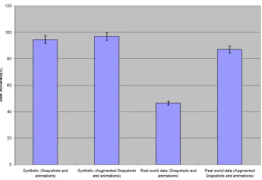
The third metric that was used to evaluate the techniques was the user confidence. The subjects were requested to specify a confidence level for each question. Table7shows the mean and standard deviation of the confidence obtained for each technique. The confidence was higher for both aug-mented snapshots and augaug-mented animations, as can be seen in Figure9. The subjects had the least confidence in their answers for the plain snapshots and low confidence for the plain animations.
Table8shows the results of performing the analysis of variance (ANOVA) on user confidence per question. Analyz-ing the confidence that the subjects had in their results, we found that subjects were more confident in the correctness of their answers when using illustration-inspired techniques.
Augmented 4.0278 3.807-4.249 0.078 snapshots
Animations 3.7407 3.520-3.962 0.103
Augmented 4.4907 4.270-4.712 0.094
animations
Table 7: This table shows the mean, 95% confidence
inter-vals around the mean as well as standard deviation for the confidence results.
Source Sum of DOF Mean F
of variation squares squares
between 40.23 3 13.41 5.806
error 988.5 104 2.310
total 1029.0 107
Table 8: This table shows the result of performing the
anal-ysis of variance (ANOVA) on the confidence per user. The probability of this results, assuming the null hypothesis, is less than 0.0007.
The value of p from the ANOVA test obtained was p< 0.0007 which according to the ANOVA test is an extremely significant result and rejects the null hypothesis that the users feel equally confident with and without illustration-inspired techniques. The illustration-inspired techniques clearly in-still more confidence in the users in both the augmented snapshots and augmented animations.
To identify pairwise significance between the user confi-dence, the minimum pairwise difference was calculated
us-Figure 9: The users were asked to specify their confidence
in their answers. This graph shows a representation of the overall confidence that the users had in their answers. As can be seen, users were more confident about their answers for the augmented snapshots and animated animations as compared to plain snapshots or animations.
M1 3.6389 - 0.1018 0.3889 0.8518
M3 3.7407 - - 0.2871 0.75
M2 4.0278 - - - 0.4629
M4 4.4907 - - -
-Table 9: The table shows the minimum pairwise difference
for confidence means computed for the Tukey test. Confi-dence means are denoted by M1 - snapshots, M2 - aug-mented snapshots, M3 - animation and M4 - augaug-mented an-imations.
ing the Tukey test. The computed minimum pairwise differ-ence was Dmin=0.688 with Qt=3.9. For all values of dif-ference of means larger than Dminthe pairwise comparisons are considered significant (p<0.05). As can be seen from Table9, the results are significant when comparing snap-shots (M1) and augmented animations (M4). The confidence between augmented animations (M4) and animations (M3) was significant. The pairwise comparison between confi-dence for augmented snapshots (M2) and snapshots (M1) was not as significant. It means that even though the sub-jects were more faster and more accurate, they were not as confident using the augmented techniques.
8. Discussion
Based on the analysis of the user study, we can say that the illustration-inspired techniques help users track features in three-dimensional time-varying data faster and with more accuracy. The illustrative cues when added to standard vi-sualization techniques such as snapshots or animations pro-vided temporal context.
For synthetic datasets, the users were fast and accurate for all four representations. In the case of real-world data, users were more accurate with the illustration-inspired tech-niques as can be seen in Figure10. In particular, for the tur-bulent vortex data visualized using snapshots, the user accu-racy was as low as 30%. Similarly, when visualizing features in the turbulent vortex data using animations, the user accu-racy was 66.67%. Overall, the users seem to have struggled with completing the task accurately using standard visualiza-tion techniques for real world data. This may be due to the fact that the real world data contains more complex feature movements that the subjects were not able to understand us-ing standard visualization techniques. We observed that the user accuracy using snapshots and animations was lower for complex synthetic datasets containing multiple features and for real-world CFD datasets.
The illustration-inspired techniques when applied to real-world datasets clearly aided the user in accurately identify-ing the direction of motion of the features. For real-world data, when visualized using augmented snapshots, the user
8 Alark Joshi & Penny Rheingans / Evaluation of illustration-inspired techniques for time-varying data visualization
Figure 10: In this graph, the accuracy of the users for
syn-thetic data versus real world data is compared. As can be seen, the accuracy for synthetic data is high for both with and without illustration-inspired techniques. The accuracy for real world data without illustration-inspired techniques is very low whereas the use of illustration-inspired tech-niques when applied to real world data has boosted the ac-curacy of the users.
accuracy is much higher at 82%. Subjects performed best (user accuracy = 92.66%) with the real world data when vi-sualized using augmented animations. The temporal context and illustrative cues provided using the illustration-inspired techniques seemed to have had a significant impact on the visual tracking abilities of the subjects.
Among the four techniques, the subjects preferred the an-imations with illustration-inspired techniques the most. This could have been due to the fact that the illustration-inspired techniques augmented animations without distracting the viewer from the main aim of viewing the time-varying phe-nomenon. The illustrative cues provide important cues to the viewer in a non-invasive manner and clearly help users to complete tasks faster and more accurately than the other techniques. The ability to complete tasks correctly with the use of illustration-inspired techniques seems to have given the users confidence regarding the correctness of their an-swers.
Our subjective evaluation gave us feedback regarding the users’ preferences for the various techniques. Almost all the users (92%) thought that both the speedlines and the opacity-based techniques helped convey direction bet-ter than only snapshots or only animations. Of the two tech-niques, the users indicated through their answers that they preferred the speedlines technique (70.8%) to the opacity-based techniques (29.2%). From discussions with domain experts, we think this might be due to misinterpretation of older timesteps actually being data for the current timestep. The amount of opacity variation from one timestep to an-other needs to be investigated further to avoid such confu-sion.
9. Conclusion
We evaluated previously introduced illustration-inspired techniques by conducting a user study. Analyzing the re-sults of the user study led to the fact that users were able to perform tasks of visually tracking features more accurately and faster using the illustration-inspired techniques than us-ing plain snapshots or animations. Subjects were much more confident of their answers when they used the illustration-inspired techniques. Users performed better at completing tasks with the augmented animations technique as compared to static visualizations. Subjects performed much better on real-world data when using the illustration-inspired tech-niques as compared to synthetic data, where they were able to perform the task equally well with all the four techniques. Further evaluation studies in the interactions of multiple such illustration-inspired techniques in a single visualiza-tion will provide more guidelines to applicavisualiza-tion domain ex-perts. Occlusions of illustration-inspired techniques by fea-tures ahead of them can be further examined to improve the effectiveness of their techniques.
10. Acknowledgements
We would like to thank Dr. Deborah Silver and Kristina Ben-nett for providing the Vortex dataset. We would like to thank all our subjects for participating in the study. We would like to thank the anonymous reviewers for their excellent feed-back. This work has been funded by NSF grant numbers 0121288 and 0081581.
References
[FS98] FERNANDEZ V., SILVER D.:
Computa-tional fluid dynamics - turbulent vortex dataset: http://www.caip.rutgers.edu/ xswang/feature/index.html, 1998.
[JR05] JOSHI A., RHEINGANS P.: Illustration-inspired techniques for visualizing time-varying data. In Proceed-ings IEEE Visualization 2005 (2005), pp. 679–686. [Kit06] KITWARE I.: Volview: A volume visualization
system, 2006.
[Pyl03] PYLYSHYNZ. W.: Seeing and Visualizing: Its not what you think (Life and Mind). Bradford Book, 2003. [SJEG05] SVAKHINEN., JANGY., EBERTD., GAITHER
K.: Illustration and photography inspired visualization of flows and volumes. In Proceedings of IEEE Visualization 2005 (2005), pp. 687–694.
[WS03] WOODRINGJ., SHENH.-W.: Chronovolumes: a direct rendering technique for visualizing time-varying data. In Proceedings of the 2003 Eurographics/IEEE TVCG Workshop on Volume graphics (2003), ACM Press, pp. 27–34.
![Figure 1: These are a set of snapshots from evenly spaced time steps of the turbulent vortex dataset [FS98]](https://thumb-us.123doks.com/thumbv2/123dok_us/10320325.2941516/2.918.119.788.122.252/figure-snapshots-evenly-spaced-steps-turbulent-vortex-dataset.webp)