Project Acronym: CATALYST
Project Full Title: Collective Applied Intelligence and Analytics for Social Innovation Grant Agreement: 6611188
Project Duration: 24 months (Oct. 2013 - Sept. 2015)
D3.9 Collective Intelligence Dashboard
Deliverable Status: Draft
File Name: CATALYST_ D3.9.pdf
Due Date: May 2014 (M8)
Submission Date: June 2014 (M9) Dissemination Level: Public
Task Leader: Open University
This project has received funding from the European Union’s Seventh Framework Programme for research, technological development and demonstration under grant agreement n°6611188
The CATALYST project consortium is composed of:
SO Sigma Orionis France
I4P Imagination for People France
OU The Open University United Kingdom
UZH University of Zurich Switzerland
EN Euclid Network United Kingdom
CSCP Collaborating Centre on Sustainable Consumption and Production Germany
Purpose Purpose Europe United Kingdom
Wikitalia Wikitalia Italy
Disclaimer
All intellectual property rights are owned by the CATALYST consortium members and are protected by the applicable laws. Except where otherwise specified, all document contents are: “© CATALYST Project - All rights reserved”. Reproduction is not authorised without prior written agreement.
All CATALYST consortium members have agreed to full publication of this document. The commercial use of any information contained in this document may require a license from the owner of that information.
Revision Control
Version Author Date Status
0.1 Anna De Liddo (OU) June 03, 2014 Initial Draft 0.2 Michelle Bachler (OU) June 09, 2014 Additions to Draft
0.3 Anna De Liddo (OU) June 10, 2014 Draft
0.4 Stéphanie Albiéro (Sigma) June 11, 2014 Quality Check
0.5 Anna de Liddo (OU) June 11, 2014 Confirmed revisions and changes 1.0 Stéphanie Albiéro (Sigma) June 12, 2014 Submission to the EC
Table of Contents
Executive summary ... 5
Introduction ... 6
1.
Collective Intelligence Dashboard ... 7
1.1 What it does ... 7
1.2 Who is it for ... 7
1.2.1 Community managers ... 7
1.2.2 Community’s members ... 8
2.
Software Description ... 9
2.1 High Level Architecture ... 9
2.2 Dashboard Visualisations ... 10
2.2.1 The People & Issues Ring ... 11
2.2.2 The Contribution River ... 12
2.2.3 The Social Network ... 13
2.2.4 The Debate network Visualisation ... 14
3.
Demonstrations ... 15
3.1 An Introduction Demo on the DebateHub CI Dashboard ... 15
3.2 The People & Issues Ring ... 15
3.3 The Social Network Visualisation ... 15
3.4 The Contributions’ River ... 16
3.5 The Debate Network ... 16
3.6 Statistic Report pages on Content Creation and Voting ... 17
3.6.1 Statistic page on Content Creation ... 17
3.6.2 Statistic page on Voting Activities ... 17
4.
Conclusions and Future Development ... 18
Executive summary
The present document is a deliverable of the CATALYST project, funded by the European Commission’s Directorate -General for Communications Networks, Content & Technology (DG CONNECT), under its 7th EU Framework Programme for Research and Technological Development (FP7).
The document describes the Collective Intelligence Dashboard. The Collective intelligence Dashboard is a tool to monitor, measure and understand the nature and quality of the collective intelligence processes emerging with the community debate.
The CI dashboard is the place in which advanced analytics on social and conversational dynamics can be made visible and fed back to the community for further awareness and reflection on the state and outcomes of a public debate. It is composed of various visualisation pages and of some statistical pages representing different aspects of the collective intelligence and online deliberation process supported by CATALYST’s tools.
The Dashboard visualisations will differ on each CATALYST partner’s Website as required by specific community platforms features, and they will be added to over the course of the project. Some of these visualisations will be based on Analytics developed in D3.5 (from UZH), whereas other will be platform specific.
This document presents both: 1) the Dashboard visualisations already produced and integrated with some of the CATALYST’s community platforms; and 2) future plan of development.
Links to the working DebateHub and LiteMap dashboards will be also provided, together with screencasts of the 4 main visualisations and analytics reports already implemented.
Introduction
This deliverable is a result of Task 3.9. The main goal of Task 3.9 is to study, design and develop a Collective Intelligence (CI) analytics dashboard.
The CI analytics dashboard aims at making visible the different kinds of analytics and recommenders that result from both Tasks 3.5 and from other data available from the CATALYST partners’ tools.
From a user scenario perspective making analytics visible is an important feature, which aims at supporting better understanding, sensemaking and reflection of the online debate. In fact, from the user-requirement analysis conducted in D2.1 (page 25), users considered poor visualisation one of the top key issues of most common community platforms for online debate. The main reason for this can be summarised as follow:
Participants struggle to get an overview of what happened in an online community debate. (What are the key members? What are the most relevant discussions? Etc)
Participants are rarely aware of other people contributions before they contribute to the debate (this also lead to poorly informed contribution and idea duplication)
Newcomers do not know where to start contributing
Community managers do not know where new contributions would be mostly needed (debate management is ineffective because community managers are missing tools to analyse the debate and direct users attention).
Community managers struggle to summarise the state of a debate to disseminate results and engage new users
Non-appealing visualisations also reduce participation (“pretty” interfaces are motivating, while nobody likes contributing to a “dull” interface)
Visualisations, analytics reporting and attention mediation recommenders are meant to mitigate these issues, thus improving informed participation and quality of contributions to the online debate. Eventually, visualisations are also seen as ways to make online debate more engaging and fun.
The CI dashboard will therefore provide interactive visualisations, analytics reports and attention mediation streams to make usable and useful the feedback, knowledge, and insights coming form advanced analytics and processing of the online discourse. The main research question for this work is therefore: “how do we device intuitive, engaging, interactive visualisations for users to better explore and understand the main content, insights, outcomes and hidden dynamics of an online debate”.
From a technical requirement perspective, designing and developing a CI dashboard requires two main activities: 1. The study and testing of different interactive visualisation designs (to be customised per activity and data
type that we want to monitor and analyse);
2. The design and testing of a debate dashboard that combines more than one visualisation in a coherent user experience.
Moving toward the achievement of the above higher level user and technical requirements, in the following we describe the CI dashboard together with the initial visualisations that have been implemented so far. The CI dashboard for DebateHub will be used as example demonstrator of the developed visualisations and links to the LiteMap and DebateHub CI dashboard will be also made available for further exploration. In the next face of development we aim to demonstrate example of the CI dashboard in use with the other CATALYST partners platforms such as Assembl and Utopia.
1.
Collective Intelligence Dashboard
1.1
What it does
The Collective Intelligence Dashboard is composed of an aggregation of visualisations, analytics report and recommender streams each devoted to highlight f.i. specific social dynamics, different aspects of engagement, discourse evolution and events patterns.
The CI dashboard aims at deploying attention mediation information to focus users’ attention on things that would not be otherwise evident or visible to the users. These visual feedback are considered important to raise awareness and understanding of the debate process and aim at making users’ participation to the debate more engaging, interesting and useful.
The CI Dashboards can be called at different levels of granularity, which will provide: 1. A site level dashboard
2. A group level dashboard 3. A map/issue level dashboard
Each Dashboard will be composed of various Visualisation pages and some statistical pages, differing on each site (see in example the Debate Hub and LiteMap dashboards) and showing different information visualisations at each level (global, group or issue level) as appropriate.
At present, we have 4 main visualisations implemented, more visualisations will be added to over the course of the project.
Some of these visualisations will be based on Analytic data from the CATALYST partner UZ (D3.5).
Another social network visualisation will come from the CATALYST Partner Wikitalia in the near future (T3.4).
The visualisation pages based on data from UZH (T3.5) and some DebateHub (D3.6) and LiteMap (D3.3) specific visualisations will be available from our websites as separate embeddable pages that can be called by any CATALYST partners to embed in their site pages or dashboards. Each of these embeddable visualisation pages will require that a url is passed to it that can be used to fetch the data required by the Visualisation. The data will be expected to be returned from that passed url in jsonld format to the CIF (CATALYST Interchange Format) specification. At this stage one embeddable visualisation is available as a service which draws a force directed graph of the data it fetches from the passed url to be used by CATALYST partner if/where desired.
The details and a snapshot of the visualisations and analytic interface already developed at this stage will be detailed in the software functionalities section.
1.2
Who is it for
1.2.1 Community managers
The CI Dashboard provides community managers with a space to get visual analytics and statistical reports on the state and progress of an online debate in terms of people, topics, processes, ideas, debate maturity, agreement/disagreement rate, participation, and even quality of the online debate.
The CI dashboard is a magnifying lens for debate health, dynamics and outcomes. Community managers can use the information provided from the dashboard to serve three main purposes:
Attention mediation: access recommendation streams, which suggest to people the debates/content that need further discussion, evidence, or participation. Recommenders stream can be also used to prioritise reading.
Engagement: use Visualisations as external representations of the debate to provoke further contributions, analysis and reflection. Community managers can also use the visualisations provided by the CI dashboard to convey or challenge specific ideas and mobilise community’s participation.
1.2.2 Community’s members
The CI dashboard provides community members with a tool to scrutinise the online debate and hopefully make them aware of other people contributions. Community members at large can use the CI dashboard as a tool to get an overview of what happened in an online community debate and find out What are the key members? What are the most relevant discussions and key points that have been proposed? How did the debate evolved in time? etc). This should support better-informed conversations and reduce duplication. The CI dashboard also provides visual summaries and recommendation that community members who are new to the conversation can use to decide where to start contributing.
Communities can therefore use the CI dashboard to learn more about the key people, issues, ideas and arguments and to better make sense of the online debate.
2.
Software Description
2.1
High Level Architecture
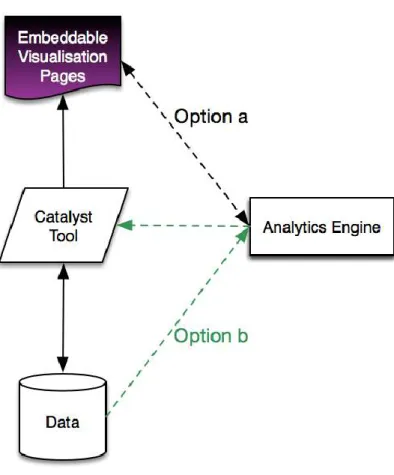
This section is not intended to be a full-fledged design document of the CI dashboard components. A full-fledged design document is expected at the end of the project. In the meanwhile we will describe the initial high level
architecture of the CI dashboards which describes the way Embeddable Visualisations and Analytics will be exchanged between CATALYST partners’ tools (Figure 1).
Figure 1: CI Dashboard High Level Architecture
As we described previously, the CI Dashboard will mainly consist of Visualisations Pages that can be embedded in any CATALYST tool or in other community platforms. The visualisation pages will:
1) Either manage the communication with the Analytic Engine (see Option a links in Figure 1). This means that the CATALYST partners’ tools that want to call visualisation will be sending data to the Visualisation Pages, which then will call the analytic service required to build that visualisation.
2) Alternatively the Visualisation pages will be called by each CATALYST tool directly. Each tool will manage the communication with the Analytic engine to obtain the appropriate data analytics to be visualised and it will send them to the Visualisation pages(Engine (see Option b link in Figure 1).
One of these two different methods, or a combination of the two methods, will be used in the future to handle the CI dashboard communications with the different CATALYST partner tools.
The Dashboards will also consist of Analytics Reports and recommenders stream that the different CATALYST tools can decide to expose in different places in their user interface. Analytics Reports and Recommenders are not part of the visualisation work and therefore will be most likely handled with a direct communication between each CATALYST tool and the Analytics Engine (see Option b links in Figure 1).
2.2
Dashboard Visualisations
The CI Dashboard will provide different visualisations each responding to specific information needs. Each visualisation will therefore provide different functionalities. In the following we describe the 5 Visualisation already implemented, and highlight the features provided by each visualisation.
For exemplification purposes we are going to use the Debatehub CI dashboard at Global level. This can be accessed at: http://hubtesting.kmi.open.ac.uk/ui/stats/
The DebateHub Dashboard is composed at present of 6 widgets:
3 visualisations: The People and Issue Ring, The Social Network Viz, and the Contribution River and;
3 Statistical Report pages: The Overview, The Item Created Plot and The Voting stats.
In the following we will describe the three visualisations and the main Statistics information presented in the Dashboard.
An example DebateHub Dashboard at group Level can also be viewed at:
http://hubtesting.kmi.open.ac.uk/ui/stats/groups/index.php?groupid=1371081761300975416001395225816 Whereas, an example DebateHub Dashboard at map level can be viewed at:
http://hubtesting.kmi.open.ac.uk/ui/stats/debates/index.php?nodeid=1371081761300784351001395226035 The CI dashboards has been also implemented and integrated in the LiteMap tool and can be explored at: http://maptesting.kmi.open.ac.uk/ui/stats/
2.2.1 The People & Issues Ring
Figure 3: People & Issue Ring Visualisation
This visualisation maps members of a discussion group to the issues in which they took part. The top half of the ring shows in blue the group members. The section thickness indicates the total number of contributions a user made compared to the other users. So in the Figure 3, we can notice that member 3 was the most active user, with a similar contribution number as member 1. Whereas member 2 contributed considerably less than the other two members. The bottom half of the ring shows issues. The links between members and issues show which members contributed to which issue. The colour of a connection shows if a user most prominently contributed with supporting arguments (green link), counter arguments (red links), or ideas (grey link) to a specific issue.
The weight of the connection shows the contribution power across issues, it tells how big is the total number of contributions given by a single user to an issue, compared to each other user and issue. In Figure 3, in example, we can tell that member 3 contributed to issue 7 more than any other member to any other debate and he mostly contributed with supporting arguments.
This does tell us that nobody else supported any other debated issue with a higher number of contributions. We can therefore guess that he may have an important stake in that debate.
Links variety and thicknesses also allow us to make some considerations and comparisons on the attitude expressed by different users. For instance, in Figure 3 we can see that the most prominent contribution type for member 3 was positive or neutral. There are different things we could infer form this. For example we can speculate that member 1 is: 1) either a person that tends to be supportive rather than critical, 2) or that issue 7 is very well framed so that it mostly attract support, 3) or that member 3,, who toward all other issues showed balanced contributions, was very unbalanced toward supporting issue 7 so he may have a big stake in this issue. One way or another, this visualisation allows us to potentially spot patterns: either in people attitude (interpretation 1), in issue framing (interpretation 2) or in uneven distribution of interest within the community (interpretation 3). This is an example of how, despite the fact that the inferences that can be done are right or wrong, this visualisation supports a deeper analysis, speculations and reflections on the relationship between people and debated issues.
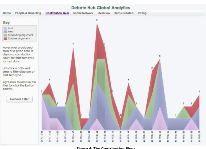
2.2.2 The Contribution River
Figure 4: The Contribution River
The Contribution river visualisation shows the distribution of contributions by time and by type. High picks show a bigger volume of total contributions at a given time. While low picks show periods in which the conversation has been dying out. Figure 4 shows the Contribution river at global level, this means the total contributions to the DebateHub website across many discussion groups and issues. This is useful to access the general success or failure of the entire user experience but it does not tell much for example on when a specific group is under delivering and it may need a push. The Contribution River at discussion group level may in this case be more meaningful since it would show if a
2.2.3 The Social Network
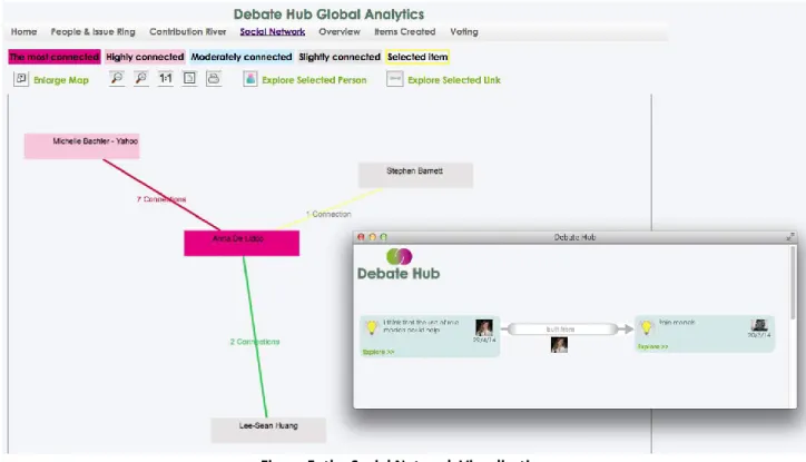
The following demonstration video shows the social network visualisation. This consists of a network graph in which participants to the online discussion are nodes and the argumentation structure in the conversation is represented by connections between nodes. In this visualisation, two users are considered “socially” connected if their ideas are connected, specifically, if they have authored posts that are “conceptually” related in the discourse network. There are three types of semantic relationships between participants that are considered in the social network:
1. A green link, showing support between users, is built when one of the two users added an argument supporting an idea form the other user.
2. A red link, showing challenge between users, is build when one of the two users creates an argument against an idea form the other user.
3. A grey link, showing “response” between users, is built when one of the two users posts an idea in response to an issue raised by the other user.
Figure 5: the Social Network Visualisation
In Figure 5, we can see a social network visualisation composed of 5 users. The node colour represents the degree centrality of a user in the network and it varies from fuschia (highest degree centrality, showing the most connected person in the network), to light grey (lowest degree centrality, showing slightly connected users). Apart from the colour coding, connections between users have a number representing the strength of the connection between them. By clicking on a connection link, users can explore the exact nature of the connection. In example in Figure 5 by clicking on the “1 connection” label a pop-up window appears showing that Anna and Stephen are connected because an idea proposed by Anna was built on a previous idea from Stephen. This functionality provides a very transparent guidance on how to interpret and further analyse the social network.
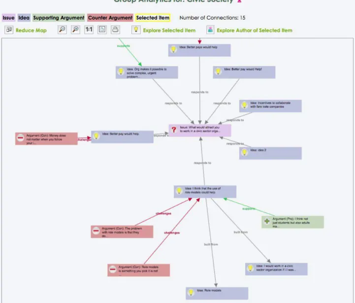
2.2.4 The Debate network Visualisation
The Debate network Visualisation shows the online conversation as argument maps. Each issue in the conversation will represent a separate cluster of nodes in this visualisation. Specifically, each discussion around a specific issue will consist of an argumentation tree in which: the issue will be the root (or the centre in a star graph layout as in Figure 6), around the issue there will be the ideas responding to it (see blue nodes with a light bulb icon spreading around the issue); and around each idea there will be pro arguments (green nodes with a “+” icon in Figure 6) and counterarguments (red nodes with a “-“ icon in Figure 6) backing it up..
The Debate Network Visualisation is a way to visualise the posts that highlight the argumentation structure rather than the temporal sequence of the posts in the conversation. This visualisation aims to visually highlight debate’s unbalance such as: ideas with many opposing arguments (with many red icons around them), ideas that are untapped (not connected to any post) etc.
3.
Demonstrations
3.1
An Introduction Demo on the DebateHub CI Dashboard
Watch the Video at: http://youtu.be/yvt91V2LjTI
3.2
The People & Issues Ring
This video describes one of the Visualisations part of the CATALYST's CI Dashboard: The People and Issues Ring. This consists of a modified sunburst visualisation which represents two main data types in each half of the ring: People and debated issues. The Visualisation shows how people distributed their activities across debated issues with connections between People arcs (in light blue) and Issues arcs (in purple). Connections are colour coded to express and classify the type of contributions in positive (red links show if a person added mostly supporting arguments to the debate), negative (green links show if a person added mostly challenging arguments to the debate, or neutral (grey link shows if a person mostly contributed by adding ideas or ne issues to the debate). Watch the video to see how the Visualisation can be explored.
Watch the Video at: http://youtu.be/q0Xqet0Ho_U
3.3
The Social Network Visualisation
The following demonstration video shows the Social Network Visualisation. This visualisation is designed to show how people are connected through the contributions they have made to the online discussion. Nodes represent participants to the conversation and connections represent debate’s contributions that connect those people. The colour of the connections between people shows the dominant type of contributions made between two people. There are three types of connections: negative (red), positive (green), and neutral (grey) connections. The level of connectivity between people is showed by the colour of the nodes in the network visualisation. Watch the video to have a live demonstration of this visualisation.
Watch the Video at: http://youtu.be/yaUtv_SL3mA
3.4
The Contributions’ River
The following demonstration video shows the Contribution River Visualisation. This consists of an Area Chart showing the contributions' stream by time. The colour gradients show 4 types of contributions: issues, ideas, pro and con. When hovering each stack a tooltip provides the number of contribution per type.
By left-clicking a stack the Contribution river is filtered by stack type, while right-click is used to restore all stacks. This visualisation provides an overview of the period of time that is particularly prolific (high picks) or particularly poor in term of contributions to the discussion. It also provides a visual filter of contribution types (stack colours) and a dynamic filter to explore each river type in isolation.
Watch the Video at: http://youtu.be/moTNvTxZnqQ
3.5
The Debate Network
This video presents the Debate Network visualisation. This consists of a network graph showing the posts in the online conversation as nodes in an argument map. Each debated issue is an argument tree in the visualisation. At Global level and discussion’s group level the Debate Network visualisation allows quickly identifying the most debated issue. In fact, each issue will be represented as a separate cluster of nodes. The bigger the cluster the more the ideas and arguments added to that debate. On the contrary, the Debate Network at issue level consists of one unique argument tree and it will allow quickly identifying the most controversial ideas proposed. Watch the video to see the Debate Network visualisation in action.
3.6
Statistic Report pages on Content Creation and Voting
The CI Dashboard will also consists of Statistic pages and report on key deliberation data such f.i. content creation, and voting.
The two following demonstration videos show some very preliminary stats pages implemented in the DebateHub CI dashboard.
3.6.1 Statistic page on Content Creation
The following video describes the histogram used to present content creation by time and by type. A different colour is used per contribution type; with issues in light purple, ideas in light blue, pro in green and con arguments in red.
Watch the Video at: http://youtu.be/SGbZ34PP0Dk
3.6.2 Statistic page on Voting Activities
The following demonstration video shows the statistic page for voting activity. This consists of some statistic tables showing voting activities on all items and some summary statistics of votes per post and per person. Specifically 6 tables show: the top voted items, the top voted for and against items; the top 10 voters and the top voters for and against (basically the people that mostly voted in favour or against others).
4.
Conclusions and Future Development
In this document we summarised the current development state of the Collective Intelligence (CI) Dashboard.
We described the main end users and aims of the CI dashboard in the context of CATALYST’s research (in section 1). We also introduced the higher-level architecture of the Dashboard (section 2.1) and described the main visualisations already implemented (section 2.2). Links to two exampled of CI dashboard integrated in two CATALYST tools (DebateHub and Litemap) have also been provided (2.2). Finally a series of demonstration movies have been recorded to demonstrate the Debate Dashboard in action.
This document reports on the first building infrastructure work needed to set up the CI Dashboard (concept and initial prototype). The next phase of CI Dashboard’s work will consist of investigating, developing and testing new visualisations that are specifically targeted to visualise results of the analytics and recommenders provided by Task 3.5 (See D3.5).
A subset of deliberation analytics will be selected to be visualised in the dashboard. After that a wide range of visualisation will be surveyed in order to choose the best visualisation that fit each analytic.
Finally the chosen visualisations will be implemented and integrated in different CATALYST platforms ready to be tested in Task 4.6 with a small set of users and with targeted usability tests.
After that, the revised and upgraded (after usability testing) versions of the visualisations will be tested in the context of different CATALYST platforms in-the-wild during the second testing phase with real use-case partners communities (months 17-22).
List of Tables and Figures
Figure 1: CI Dashboard High Level Architecture ... 9
Figure 2: DebateHub CI Dashboard at Global Level, showing visualisations and statistics on all Website’s data, across groups and debates. ... 10
Figure 3: People & Issue Ring Visualisation ... 11
Figure 4: The Contribution River ... 12
Figure 5: the Social Network Visualisation ... 13