R E S E A R C H A R T I C L E
Open Access
Two new approaches for the
visualisation of models for network
meta-analysis
Martin Law
1*, Navid Alam
2, Areti Angeliki Veroniki
3,4, Yi Yu
5and Dan Jackson
6Abstract
Background: Meta-analysis is a useful tool for combining evidence from multiple studies to estimate a pooled
treatment effect. An extension of meta-analysis, network meta-analysis, is becoming more commonly used as a way to simultaneously compare multiple treatments in a single analysis. Despite the variety of approaches available for presenting fitted models, ascertaining an intuitive understanding of these models is often difficult. This is especially challenging in large networks with many different treatments. Here we propose two visualisation methods, so that network meta-analysis models can be more easily interpreted.
Methods: Our methods can be used irrespective of the statistical model or the estimation method used and are
grounded in network analysis. We define three types of distance measures between the treatments that contribute to the network. These three distance measures are based on 1) the estimated treatment effects, 2) their standard errors and 3) the corresponding p-values. Then, by using a suitable threshold, we categorise some treatment pairs as being “close” (short distances). Treatments that are close are regarded as “connected” in the network analysis theory. Finally, we group the treatments into communities using standard methods for network analysis. We are then able to identify which parts of the network are estimated to have similar (or different) treatment efficacy and which parts of the network are better identified. We also propose a second method using parametric bootstrapping, where a heat map is used in the visualisation. We use the software R and provide the code used.
Results: We illustrate our new methods using a challenging dataset containing 22 treatments, and a previously fitted
model for this data. Two communities of treatments that appear to have similar efficacy are identified. Furthermore using our methods we can identify parts of the network that are better (and less well) identified.
Conclusions: Our new visualisation approaches may be used by network meta-analysts to gain an intuitive
understanding of the implications of their fitted models. Our visualisation methods may be used informally, to identify the most salient features of the fitted models that can then be reported, or more formally by presenting the new visualisation devices within published reports.
Keywords: Network meta-analysis, Network analysis, Visualisation
Background
Meta-analysis is a popular technique for combining the results from multiple two-arm studies that compare a single pair of treatments. Here each included study pro-vides an estimated treatment effect and its associated precision. Standard methods for meta-analysis result in a
*Correspondence:[email protected] 1MRC Biostatistics Unit, Cambridge, UK
Full list of author information is available at the end of the article
weighted average of these study specific estimated treat-ment effects.
The concept of aggregating multiple two-arm studies has been extended to networks of evidence that simul-taneously compare multiple (more than two) treatments. This may include multi-arm studies that examine more than two treatments. This extension is called network meta-analysis [1,2], where estimates of the relative treat-ment effect of all possible pairs of treattreat-ments are simul-taneously obtained. This includes pairs of treatments that
have not been compared directly in any trial. However, it can be difficult to interpret fitted models for net-work meta-analysis, especially when many treatments are included. For example, in large networks it is typically hard to determine which treatments are estimated to have similar efficacy, which parts of the network are well identi-fied, and so on. The aim of this paper is to provide two new visualisation methods to help both analysts and the con-sumers of network meta-analyses better understand the implications of their fitted model.
A wide variety of models and estimation methods for network meta-analysis are available. However, all we assume is that we either have, or can deduce, the estimated relative treatment effects (and the corresponding standard errors) for all possible treatment comparisons in the net-work. We will show how these quantities can be calculated from standard network meta-analysis output and these quantities should, in any case, be reported when present-ing the results from network meta-analyses. Hence for our purposes it does not matter what statistical methodology was used. All we require is that a network meta-analysis model has been fitted.
Our intention is to visualise fitted network meta-analysis models, rather than the data that was used to fit them. Visual displays of the structure of the data are also important and ‘network diagrams’ are often provided. A variety of software is available for producing these dia-grams [3–5] and in Fig.1 we show a network diagram,
created using the R [6] package pcnetmeta [4], for the dataset that we will later use to illustrate our methods. Here, each edge represents the presence of a direct com-parison, and the thickness is proportional to the number of direct comparisons. A number of different conven-tions are possible when using network diagrams, such as providing the number of direct comparisons on the edges or displaying multi-arm studies using polygons. See Chaimani et al. [5] for a discussion of the possible conven-tions that can be used when presenting network diagrams and also a variety of other types of graphical displays. Net-work diagrams convey the main characteristics of the data, rather than results from statistical analyses that provide our focus here.
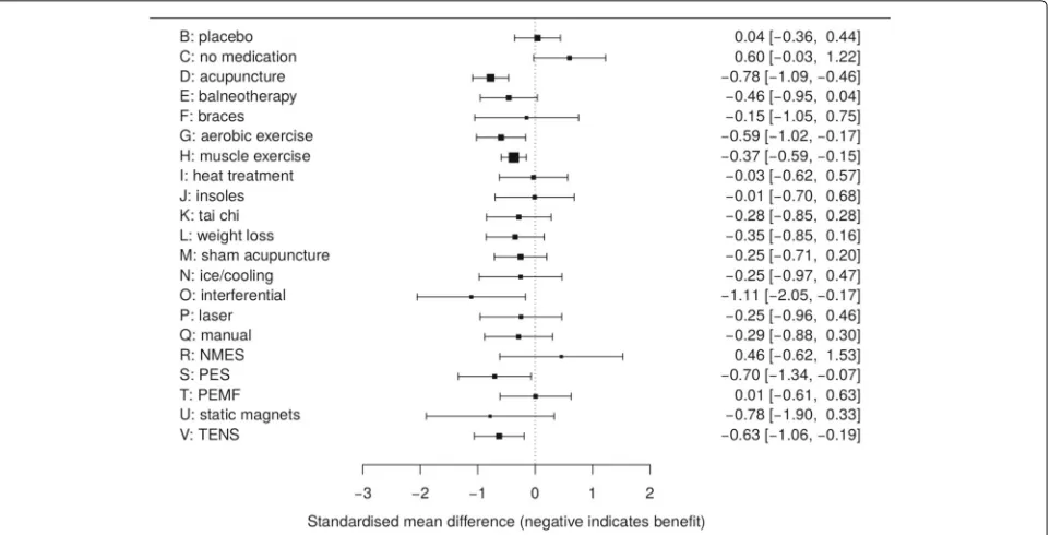
It appears that there is currently no standard approach to visually displaying the results from network meta-analyses. A variety of contrasting possibilities have there-fore been used in practice. For example there-forest plots, ubiquitous in pairwise meta-analysis, can be repurposed in network meta-analysis to visually compare a reference treatment to all the others. Figure2is an example of such a forest plot, where we show the estimated treatment effects and 95% confidence intervals for all treatments, relative to standard care, for the fitted model that we will use illus-trate our methods below. It is possible to extend this idea and include all relative effect estimates in a single forest plot (for example Wang et al. [7], their Figure 2; Wu et al. [8], their Figure 4; Tricco et al. [9], their Figure 2). Forest
Fig. 2Forest plot of results compared to reference treatment A, standard care. NMES, neuromuscular electrical stimulation; PES, pulsed electrical stimulation; PEMF, pulsed electro- magnetic fields; TENS, transcutaneous electrical nerve stimulation
plots such as these are useful but it is not easy to then visualise the implications of the fitted model for the net-work as a whole. Wu et al. [8] also use the additional visual device of showing network diagrams that have estimated treatment effects and confidence intervals displayed on the network edges (their Figure 2). However this results in network diagrams that display a very large amount of information that is difficult to visualise. Wu et al. [8] also plot Bayesian ranking probabilities (their Figure 3). In a Bayesian framework, rankings can also be produced using the surface under the cumulative ranking curve (SUCRA) [10]. Figure 3 of Dulai et al. [11] is an interesting example of a visual display of SUCRA rankings, where a scatterplot of SUCRA rankings for safety are plotted against SUCRA rankings for efficacy. While plots of ranking probabilities may be useful to gain an understanding of which treat-ments are likely to be the most effective it remains, at best, difficult to visualise which treatments are most similar in terms of their estimated efficacy, the extent to which each pairwise comparison is well identified, and so on.
Another way to communicate the results from network meta-analyses is to present the results numerically in tables. Estimates can be tabulated with respect to a sin-gle reference treatment only (Wu et al. [8], their Table 2) or for all pairwise comparisons (Wang et al. [7] their Table 1; Tricco et al. [9] their Table 2). Tables of network meta-analysis results may also be presented by allocating one row and column to each treatment, and showing the inferences for each comparison in the appropriate table entry (Dulai et al. [11] their Figure 2; Stegeman et al.
[12], their Table 3). However visualising the implications of tables of results when there are many treatments in the network, may be a daunting task.
In short, although a variety of ways to display fitted models for network meta-analysis have been proposed, none of these ideas provide simple or intuitive approaches for visualising these models. This paper exploits ideas from network analysis to develop two new methods that display communities of treatments that are identified as being similar to each other, using three distance measures. We will therefore be able to easy identify which treatments are estimated to have similar efficacy, which parts of the network are well identified, and so on.
A recently developed method is that of Rücker et al. [13], which separates treatments into a hierarchy of efficacy. This is in contrast to our methods, which seek to group similar treatments. Although the method proposed by Rücker et al uses adjacency matrices based on treat-ment efficacy, as we propose, and so is in some respects similar to our methods, we prefer our approach as it uses more sophisticated community detection algorithms and visualises several different aspects of the fitted model.
to a challenging example network that has been analysed previously. We conclude with a discussion.
Methods
We will use an artificial example to explain our methods. This example involves only four treatments and is suffi-ciently simple that we do not require methods such as ours to visualise it; we present it for didactic purposes only.
Without loss of generality, we take treatmentAas the reference treatment. Models for network meta-analysis can then be described using treatment effects of the other treatments relative to this reference treatment (treatmentsB,C,D, and so on). These treatment effects are usually denoted as δAB, δAC, δAD and referred to as basic parameters [14–17]. The primary inferences are made by estimating these basic parameters and their covariance matrix, which immediately results in infer-ences for all treatment effects relative to A. The infer-ences for the other treatment effects are made using appropriate linear combinations of these basic param-eters, for example the treatment effect of C relative to B is δAC − δAB. For our artificial example, suppose that such a model for network meta-analysis contain-ing four treatments has been fitted, where we estimate
δ=δAB,δAC,δADTas
ˆ
δ=
⎛ ⎝0.300.50
0.45
⎞
⎠;Varδˆ = ˆV =
⎛
⎝0.041 0.019 0.0050.019 0.102 0.004 0.005 0.004 0.026
⎞ ⎠.
(1)
For our purposes it does not matter what type of model or estimation method was used result in (1). To visualise the implications of this model, we define three distance measures. It is possible to use other measures of distance when using our methods and we return to this issue in the discussion and the Additional file 1. Each of these distances measures result in at×tdistance matrix that we call aDmatrix, wheretis the number of treatments included in the network. The entries of theseDmatrices, denoteddij, will then be the distance between theith and
jth treatments. For example,d24 will denote the distance
between the second and fourth treatments, i.e. treatments
BandD. We will definedii = 0 fori = 1, 2,· · ·t, so that
the distance from any treatment to itself is zero. We will also ensure thatdij =djifori=j, hence we use distance measures that are symmetrical.
Three measures of distance between treatments in the network
The most obvious measure of the difference between two treatments in the fitted model is the absolute value of their estimated relative treatment effect. This distance is used in order to visualise which treatments are estimated to
have similar efficacy. From (1), this measure of distance results in theDmatrix
D1=
⎛ ⎜ ⎜ ⎝
0 0.30 0.50 0.45 0.30 0 0.20 0.15 0.50 0.20 0 0.05 0.45 0.15 0.05 0
⎞ ⎟ ⎟
⎠. (2)
The entries in the first row and column ofD1in (2) are simply the absolute values of the estimated basic parame-ters given in (1). The other entries ofD1are the absolute values of the appropriate linear combinations of estimated basic parameters that provide the appropriate estimated treatment effect. For exampled23=d32= |ˆδAC− ˆδAB| = |0.5−0.3| =0.20. These distances are our first way of mea-suring distance in the network. Small distances indicate that treatments are “close" (similar estimated treatment efficacy). Small distances of the two other measures of dis-tance that follow also indicate that treatments are close. An example of how to obtain the entries of a genericD1 matrix is provided in the Additional file1.
Another way to measure the distance between treat-ments is the standard error of the estimated treatment effects. This distance is used in order to visualise which parts of the network are more accurately identified. From (1), this measure of distance results in theDmatrix
D2=
⎛ ⎜ ⎜ ⎝
0 0.202 0.319 0.161 0.202 0 0.324 0.239 0.319 0.324 0 0.346 0.161 0.239 0.346 0
⎞ ⎟ ⎟
⎠, to 3 d.p. (3)
The entries in the first row and column of D2 in (3) are simply the square-root of the diagonal entries of Vˆ in (1). The other entries ofD2 are the standard errors of the appropriate linear combinations of estimated basic parameters that provide the appropriate treatment effect. For example
d23=d32=
VarδˆAC− ˆδAB =
VarδˆAB− ˆδAC
=
VarδˆAC +VarδˆAB −2×CovδˆAC,δˆAB
Our third and final measure of distance is based upon the two-tailed p-values that are calculated using the abso-lute estimated treatment effects and their standard errors using the first two distances. This distance is used in order to visualise which treatments are estimated to have simi-lar efficacy in terms of their statistical significance, rather than their estimated treatment effect. Although we would align ourselves with those who emphasise estimation over testing, decision making is often based on the results of hypothesis tests and so we include this distance for the benefit of those who make decisions using this type of criterion. Further, the reader should be aware of the fact that, under the null hypothesis and when using a contin-uous test statistic,pvalues follow a uniform distribution on [0, 1]; this result, combined with issues relating to repeated testing, may serve to discourage analysts from drawing strong conclusions from the occasional small (or large)pvalue. The ratio of the entries of theD matri-ces in (2) and (3) provide the usual test statistics Zij,
for i = j, and the corresponding two-tailed p-values
are Pij = 2
−Zij
, where (·) is the standard nor-mal cumulative distribution function. These p-values are not immediately appropriate measures of the distances between treatments, because a smaller p-value means that there is stronger statistical significance, which means that the treatments are more different and so further apart. This is in contrast to the previous two distance measures, where small values indicate similarity. We therefore use the complement of these p-values,dij = 1−Pij = 1− 2−Zij
, fori=j, where we further definedii =0. For our artificial example the resulting distance matrix is
D3=
⎛ ⎜ ⎜ ⎝
0 0.862 0.882 0.995 0.862 0 0.463 0.470 0.883 0.463 0 0.115 0.995 0.470 0.115 0
⎞ ⎟ ⎟
⎠, to 3 d.p. (4)
When explaining how to derive our three distances, we have assumed that the fitted network meta-analysis model is parameterised using basic parameters. This is typically the case but need not be so, for example if an arm-based analysis [18] has been performed. All that we require is that distance matrices using our three measures can be calculated from the fitted model. The three types of distance matrices contain very straightforward quanti-ties and it should be equally easy to calculate them when using any network meta-analysis methodology. The code we provide in the Additional file1takes (1) as the input and obtains the three distance matrices from these.
Forming adjacency matrices
Our three measures of distance are not immediately useful in the network analysis methods for forming communities that follow. This is because these methods are intended to be applied to networks where some, but not all, vertices (in
our context, treatments) are connected. Distance matrices (2), (3) and (4) indicate that all treatments are connected, though some are further away from each other than oth-ers. In order to create networks where not all vertices are connected, we will use a threshold to determine whether or not treatments are close enough together to be con-sidered connected. We use a variety of thresholds and all three types of distance measures. However for didac-tic purposes, let us consider using just the first distance matrixD1 (2) and assume that estimated relative treat-ment effects that are less than 0.4 are considered close enough to be connected, but those greater than 0.4 are not. For example, readers might like to imagine that in our artificial example, the estimated effects are standard-ised mean differences, and treatment effects on this scale that are less than 0.4 are often considered moderate. We therefore form an ‘adjacency matrix’ from (2), where all off-diagonal entries of D1 that are less than or equal to the threshold give rise to entries of value one in the cor-responding adjacency matrix; all other entries are set to zero. This results in the adjacency matrixA:
A=
⎛ ⎜ ⎜ ⎝
0 1 0 0 1 0 1 1 0 1 0 1 0 1 1 0
⎞ ⎟ ⎟
⎠. (5)
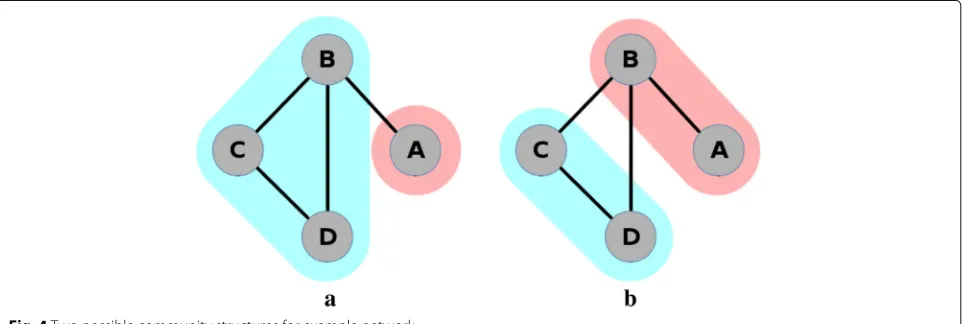
MatrixA is symmetric, which is the case for all adja-cency matrices used in our methodology because our three measures distances are symmetric. In general how-ever, adjacency matrices need not be symmetric in net-work theory. The netnet-work corresponding to the adjacency matrix (5) is shown in Fig.3.
Network analysis and community detection
Fig. 3Network diagram and corresponding adjacency matrix for a basic network
all treatments in a single community. We use the nota-tionCi to denote the community that contains vertexvi. For example, for the first community structure described above (Fig.4a), we haveC1= 1 andC2 =C3 =C4 =2, and in Fig.4b we haveC1 = C2 = 1 andC3 = C4 = 2. Network analysis provides us with methods to determine if the first of these community structures is considered a better description of the connection density than the sec-ond, or indeed if any other community structure describes this even better.
A common method of community detection is to calculate the modularity of each possible community structure. A community structure with high modularity has a high density of edges within communities, and few edges between communities. The community structure of interest is one that maximises the modularity. There may be more than one community structure that max-imises modularity. Other community detection methods exist [19], but modularity maximisation remains widely used. We will adopt this well known approach here, and explain it in more detail below.
Modularity
For simplicity, we describe what is meant by modularity for unweighted adjacency matrices, that is, for networks where vertices are regarded as either connected or uncon-nected. We define the total number of edges in the net-work to bem; for the network in Fig.3we havem = 4. We define the number of edges connected to vertex vi
(its degree) to be ki; for the network in Fig. 3 we have
k1 = 1,k2 = 3,k3 = 2 andk4 = 2. For a given network and community structure, the number of edges within communities is
O= 1
2 t
i=1
t
j=1
AijδCi,Cj, (6)
whereδ(a,b)is the Kronecker delta. The purpose of the half in (6) is to account for double counting, because in the double summation we count both ends of edges separately, and so we count each edge twice.
Assuming that all edges are equally likely to end at any vertex, the probability that one particular edge leads to
vertex vj is kj/2m. Vertex vi has ki edges, and so the expected number of edges from vertexvitovjiskikj/2m. The total expected number of edges connecting vertices from the same community is therefore
E= 1
2 t
i=1
t
j=1
kikj
2mδ(Ci,Cj) (7)
As in Eq. (6), the purpose of the half in (7) is to account for double counting.
The modularity is obtained by subtracting (7) from (6) and dividing by the total number of edges m, to give
(O−E)/mor
Q= 1
2m t
i=1
t
j=1
Aij−
kikj
2m
δ(Ci,Cj). (8)
The modularity Q is therefore essentially an ‘O − E statistic’, a type of statistic widely used in statistics. By dividing bym, the modularity is the observed proportion of edges within communities minus the corresponding expected proportion of edges. A community structure that describes the density of the edges in the network well has a high modularity relative to that of others.
The optimal community structure is defined as the one that provides the maximum possible modularity for a given network. In relatively small networks, this opti-mal structure can be found by calculating the modularity for every possible community and taking the community structure with the largest value. Since m is is fixed for any given network, maximising the modularity is equiv-alent to maximising the ‘O−E statistic’. In other appli-cations where networks may contain hundreds, or even thousands, of vertices, this exhaustive approach will not feasible. It is then possible to use a heuristic algorithm to search through a smaller subset of possibilities [19]. In our code we allow the use of one such heuristic algorithm, because it could be useful in applications where there are very many treatments and many possible community structures. However it will only be in extreme instances where an algorithm will be necessary for computational reasons in network meta-analysis applications. The mod-ularity of each of the community structures in Fig.4 is Q1= −0.03125 andQ2=0. Thus the second community structure has a slightly greater modularity than the first, and so we would take this grouping to be the better rep-resentation of the network. Details of this calculation are shown in the Additional file1.
The first visualisation method
The first of our two visualisation methods simultane-ously displays three separate community structures based on the three distance measures described above. This is because our three distances describe different aspects of the fitted model and we suggest that it is desirable
to examine all of them. As explained above, when using algorithms for community detection it is necessary to remove some connections to avoid having every vertex directly connected. For this purpose we suggest using a threshold to dichotomise the measures into “close" (connected) and “not close" (unconnected). We use thresholds that are particular quantiles of the empirical distances (as contained in distance matrices for our arti-ficial example in equations 2, 3 and4). These matrices are symmetrical and so when determining an appropriate quantile we use just the upper triangle part ofDmatrices, excluding the main diagonal.
Once an appropriate threshold has been computed for each distance measure, adjacency matrices can be obtained and community detection algorithms applied. We have found it useful to explore the use of a variety of quantiles, so that we can assess how communities form as we become more, or less, relaxed about the distance required to regard treatments as close. In our code, our default is to explore the 20%, 40%, 80% and 80% quantiles, though any quantiles can be chosen. With three mea-sures of distance, and four thresholds, our default results in examining 12 community structures. We have found this to be an adequate, but not overwhelming, number of possibilities to explore. Our code takes each quantile in turn and graphically displays the resulting network, with the optimal community structure, for all three types of distances simultaneously. Examples are shown for our real example below. In this way we can quickly and eas-ily assess which treatments are estimated to have similar efficacy (using our first measure of distance), which parts of the network are better identified (using our second measure of distance) and for which pairs treatments the statistical significance of their difference is weakest and strongest (using our third measure of distance).
Full, detailed code for undertaking the visualisation is provided in the Additional file1. However, the method can be summarised as a three-step process:
Step 1: Use the estimates derived from any
meta-analysis estimation method to create a distance matrix.
Step 2: Using some threshold, normalise the distance matrix to create an adjacency matrix.
Step 3: Utilise community detection methods to uncover the optimal group structure and display this structure on a network diagram.
The second visualisation method: Taking uncertainty into account
are used to calculate the first of our distance measures and this is not taken into account when using our first visualisation method. In other words, we do not really know if treatments are close enough to be considered con-nected when using our first measure, because we only have estimates of their true values.
In fact, there is also statistical uncertainty in the stan-dard errors used to calculate our second and third distance measures, but it is common-practice in meta-analysis to take all variance components as known when performing the pooling [16, 17]. This is a reasonable approximation in large samples, where normal approx-imations with ‘known’ variance are often used for the estimated treatment effects. Hence refraining from taking into account the uncertainty in the standard errors is of much less concern. Furthermore the meaning of a p-value is ‘the probability that the chosen test statistic would have been at least as large as its observed value if every model assumption were correct, including the test hypothesis’ [20]. Although assumptions are needed to calculate this probability, if the standard errors are treated as fixed then there is no uncertainty in this calculation. Ignoring the statistical uncertainty in the fitted model is not a seri-ous source of concern when using our second and third measures of distance, but it is for the first.
In order to take into account this uncertainty when using our first distance measure, a parametric bootstrap-ping procedure was adopted. Here we simulate many realisations from the multivariate distribution Nδˆ,Vˆ , where the necessary quantities for our artificial exam-ple are given in Eq. (1). Realisations such as these were also used by White et al. [21] for performing approximate classical ranking (see their ‘Ranking in the consistency model’ section). Then for each realisation fromN
ˆ
δ,Vˆ we use the same procedure as described above for our first measure of distance (including the use of a particu-lar threshold) but we instead use the random realisation as the estimated treatment effects. This results in a differ-ent community structure for each simulated realisation. We calculate the proportion of simulated realisations that result in each treatment pair being placed in the same community, and display these proportions using a heat map. We emphasise that these proportions do not have a probabilistic interpretation such as estimating the proba-bility that each treatment belongs to the same community. For this a Bayesian approach, where the likelihood used in the analysis is the probability distribution of community structures, would be required. We leave this possibility as an avenue for further work. Heat plots have been sug-gested previously to show the ranking of treatments [22] but the plots suggested here are conceptually different because are used to identify communities of treatments with similar or different estimated efficacies.
Weighted and unweighted approaches
For both methods, there are two approaches based on whether the user wishes to use weighted or unweighted adjacency matrices – that is, whether the remaining con-nections should be given identical weights or not. In the unweighted case, relative effect estimates, standard errors andpvalues beyond a given threshold are deemed uncon-nected in the adjacency matrices – that is, given a value of zero. Otherwise, they are deemed connected – that is, given a value of one.
We also include the option of using weighted adjacency matrices. In the initial adjacency matrices, all vertices are either connected (indicated by a one) or not connected (indicated by a zero). However, more generally, connected vertices can be indicated in adjacency matrices using any positive value, where larger entries indicate stronger con-nections. A simple way to produce weighted adjacency matrices from distance matrices is by taking the recip-rocal of all off-diagonal entries of a distance matrix D that are less than or equal to the threshold and taking all other entries to be zero. However this choice or taking the reciprocal is somewhat arbitrary; the reciprocal function serves to give greater weights to treatments that are closer together (and do not exceed the threshold) but any other decreasing function that transforms positive values in this way could also be used for this purpose.
In summary, in the weighted case, existing connections between treatments are given a weight, where a greater weight indicates a stronger connection. In the case of estimates and standard errors, the reciprocal is taken. In the case ofpvalue, the reciprocal of the complement is taken.
Results
Example: Osteoarthritis of the knee
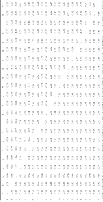
D1and the values in the lower triangle are the distances contained in D2. Table 1 nicely highlights the difficulty in visualising fitted models for network meta-analysis when many treatments are present; Figs. 1 and2 assist with this but our methods are intended to help us bet-ter understand the implications of fitted models such as this one.
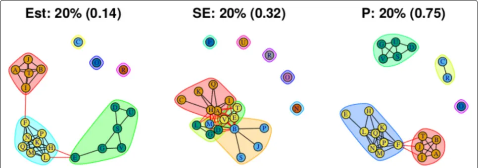
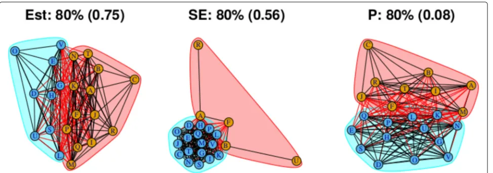
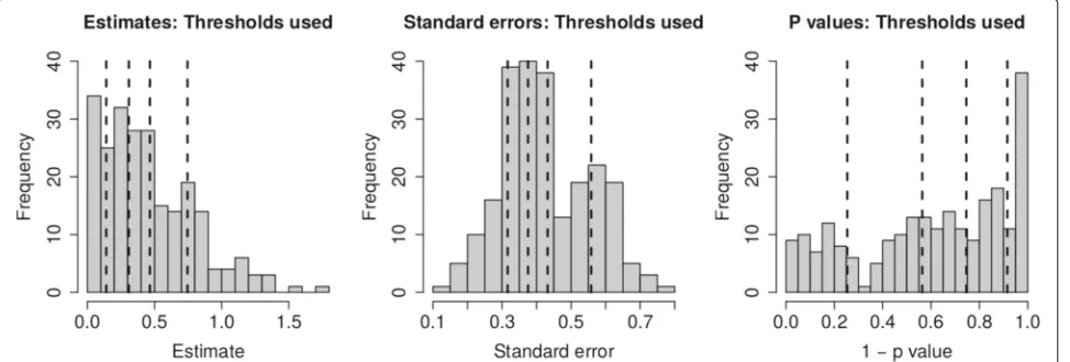
As stated above, the output for the first method com-prises three plots for every threshold used – one each for the (absolute) treatment effect estimates, the standard errors and the (the complement of ) thepvalues – and so employing four thresholds (20%, 40%, 60%, 80% quantiles) results in 12 plots. These plots are shown in Figs.5,6,7 and8. In all figures, (absolute) relative effect estimates, standard errors and (the complement of ) thepvalues are displayed in the left, middle and right plots respectively. The values of the quantiles for each characteristic – used for the first visualisation method – are shown in Table2, and in the context of the observed distributions of the dis-tance measures in Fig. 9. These are the 20%, 40%, 60% and 80% quantiles of the three distance measures. For example, the 40% threshold of the (absolute) estimated relative effects estimates in Table1is 0.31 (Table2). Having determined suitable thresholds, adjacency matrices can be calculated and community detection algorithms applied in the way described above. The output of the second method comprises one heat map per threshold used, resulting in four heat maps. These four plots are shown in Fig.10.
We will examine each of the three distance measures in turn, including a comparison of the output of the first and second methods for the (absolute) relative effect esti-mates. We provide output for both the weighted and unweighted approaches, but focus on the unweighted approach, briefly describing the results of the weighted approach in terms of its similarity to the unweighted
approach. For the heat map used in the second method, the accompanying code can reorder the treatments using R’s default hierarchical clustering method. This reordering takes place for the first threshold and resulting plot then fixed for subsequent plots, allowing easier comparison of heat maps across thresholds. We obtain results using both visualisation methods.
Treatment effect estimates
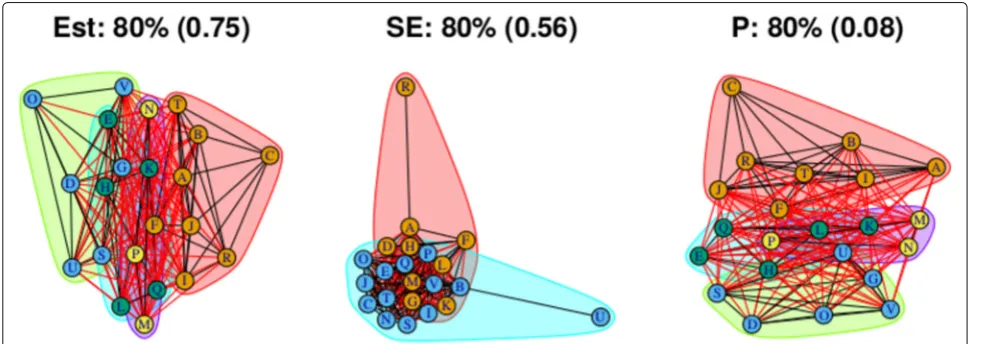
Figure5 (left) shows the community structure for treat-ment effect estimates obtained using a threshold placed at the 20% quantile. There are three distinct, large com-munities, with three more single treatment communities. Edges that exist across, rather than within, communities are shown in red. The treatments A, B, I, J and T are contained in one community, with a single edge to a sec-ond community, comprising the treatments F, H, K, L, M, N, P and Q. This second community is linked by two edges to a third community comprised of treatments D, E, G, S, V and U. This community structure is reflected in the corresponding output from the second method, shown in Fig.10a, where, the “ABIJT” community can be seen, as can the “DEGSVU”. Many of the weakest connec-tions, those with the smallest proportions of times in the same community, come from pairing one treatment each from these communities. The single-treatment communi-ties are treatments C, O and R. The poorest performing treatment is C, followed by R (Table 1). The commu-nity containing placebo and standard care, the ABIJT com munity, contains other poorly performing treatments. The treatment with the greatest efficacy is O. The DEGSVU community contains the next-best performing treatments and has no direct links to any treatments from the com-munity containing the poorest treatments. The centre “FHKLMNPQ” community contains treatments with effi-cacy between these two communities.
Fig. 6Groupings for example dataset (unweighted), using first method with threshold at 40%
Fig. 7Groupings for example dataset (unweighted), using first method with threshold at 60%
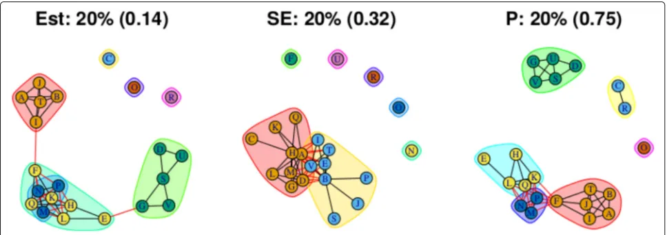
Table 2Thresholds used in the visualisation of the model fitted to the osteoarthitis of the knee dataset (first method)
Quantile Characteristic
(Absolute) Effect estimate
Standard error
(Complement of)Pvalue
20% 0.14 0.32 0.25
40% 0.31 0.38 0.56
60% 0.47 0.43 0.75
80% 0.75 0.56 0.92
The community structures obtained from a threshold using the 40% quantile are shown in Fig. 6. For the rel-ative treatment effect estimates (left figure), there are now two large and two small communities: Treatments from the middle community in the previous figure have been absorbed into the two more extreme communities on either side, with the less effective community (ABIJT) now containing treatments F, K, M, N, P and Q, and the better performing community (DEGSVU) now containing treatments E, H and L. The treatments with the poorest efficacy, C and R, have been combined into a single com-munity. Figure 10b, the corresponding output from the second method, also shows these changes in the commu-nity structure, with two large communities beginning to appear.
Using the 60% quantile (Fig.7), all treatments have now been absorbed into one of two large communities, with the treatments with the greatest efficacy – D, O, U, and so on at one end of the network in one community, and those with the lowest efficacy – C and R – at the oppo-site end of the network in another community. However, there are also many connections across the two communi-ties, suggesting that there is similarity in relative treatment
effect estimate among certain treatments across the com-munities. The output from the second method, shown in, Fig.10c, is somewhat in agreement, with some very high proportions of connections between treatment pairs in the extremities of the communities, very low proportions of connections regarding treatment pairs at opposite ends of the community structure, and similar proportions of connections across most other treatment pairs. This sug-gests that there may be high similarity of effect estimates within a subset of each community, low similarity across those two subsets, and moderate similarity between treat-ments in the centre of the community structure when compared with any other treatment.
The output from the final threshold used, the 80% quantile, is shown in Fig.8. There remain two commu-nities with an increased number of connections across them. From the second method with the threshold set at the 80% quantile, Fig. 10d, we can also identify two main communities. However, the output does not sug-gest that the two communities necessarily encompass all treatments. Like the heat map in Fig. 10c, there are high proportions of connections between two smaller communities: One containing treatments A, B, C, I, J, R and T, and the other containing treatments D, E, G, H, L, S, U, and V.
To summarise, the results using the 60% and 80% thresholds suggest that, if we are to require larger esti-mated effects to indicate worthwhile treatment benefit, then there is some evidence of the presence of two com-munities of treatments. The treatments in the first of these communities possess similar effectiveness to stan-dard care but those in the second community (DEGHLO-SUV) appear to be more effective. However the other quantiles indicate that the situation is more complicated, in particular if we consider smaller estimated effects to be worthwhile then multiple communities of treatments
Fig. 10Relative treatment effect estimates, bootstrap method: Heatmaps showing the proportion of times each pair of treatments was in the same community, with regards to treatment effect.a20% quantile.b40% quantile.c60% quantile.d80% quantile
appear. The heat plots further suggest that the discrete nature of any community structure is likely to be consid-ered overly simplistic. Despite the difficulties presented by this challenging example, our new results add con-siderable insight, for example they suggest that patients who are in considerable pain and require the greatest potential pain relief should perhaps consider one of the treatments in the second community that our methods have identified.
Standard errors
Standard errors andpvalues are examined using the first method only. The community structure obtained using the 20% threshold is shown in Fig. 5 (centre) and is comprised of four small communities that are closely con-nected and five unconcon-nected communities each contain-ing one treatment. Those treatments are F, N, O, R and U.
in those studies, thus the connections make intuitive sense.
The overall conclusion is that, while the relative effects of most treatment pairs have relatively similar levels of identifiability, there are some treatments – F, O, R, and U (and to some extent, N) – that are less well identified. For these particular treatments the precision of any treat-ment comparison is low when compared to the rest of the network. Figure1indicates that this might be anticipated, because there are very few direct connections involving these treatments, but there are other treatments for which this is also the case whose treatment effects are better identified. Our methods have therefore successfully high-lighted the parts of the network that are less well identified from the fitted model. Our finding that, relative to the rest of the network, four or five of the treatments are so poorly identified is at best much less obvious unless we use our new visualisation methods.
Pvalues
For this distance measure, a connection between a pair of treatments indicates that the pvalue is large, and so there is little evidence of a difference between the treat-ments when both effect size and standard error are taken into account. The community structure obtained using the 20% threshold is shown in Fig. 5 (right), and shows five communities of differing sizes, with few connections across them. This set of structures resembles that of the treatment effect estimates (Fig. 5, left), which is to be expected. Note that the value of the threshold is 0.25, meaning that connections exist between treatment pairs for which the relative effect estimate has a p value of greater than 1 − 0.25 = 0.75. Using the 40% thresh-old results in three communities, with two communities connected only to a central community and not to one
another. The membership of these communities resem-bles the community structure for the effect estimates using the 20% quantile (in Fig.5(left)), where the treat-ment pairs with the greatest differences in estimates are far apart in terms of the network structure. However, here, the distance is based onpvalue rather than solely the esti-mates. The output from using the 60% and 80% thresholds are similar to one another, showing community structures with two large communities that also show the treatment comparisons with the smallestpvalues as being far apart. The overall conclusions when examining the pvalues is similar to when examining the treatment effects above; the presence of two communities is apparent but again our visualisation devices indicate that the situation is somewhat more complicated than this.
Weighted results
The community structures created for all three distance measures and and four specified quantiles using the weighted approach are shown in Figs.11,12,13and14. These are the weighted equivalent to the community structures in Figs.5,6,7and8. The communities found using the weighted approach are broadly similar to those found using the unweighted approach. The main dif-ference in this example is that the weighted approach tends to create one or two more communities when using the distance measures of treatment effect estimate and pvalue. In general, we find that the weighted approach makes the boundaries between communities identified by the unweighted approach less clear.
Discussion
We have developed two new, and closely related, meth-ods for visualising the implications of fitted models for network meta-analysis. Our methods use algorithms for
Fig. 12Groupings for example dataset (weighted), using first method with threshold at 40%.
Fig. 13Groupings for example dataset (weighted), using first method with threshold at 60%
community detection, a concept originating in network analysis, to group treatments using insightful criteria.
We have explained how weighted and unweighted adja-cency matrices may be used in conjunction with both our methods. In the weighted case, we take the reciprocal of the distance measure. However, the reciprocal gives very considerable, and often excessive, weight to treatments that appear (perhaps by chance) to be very close together. We have not therefore found the use of weighted adja-cency matrices very helpful when visualising models for network meta-analysis. Other approaches for calculating weighted adjacency matrices may prove more satisfactory than the approach proposed here, and we leave this as a potential avenue for further work.
Our distance measure based on standard errors high-lights which parts of the network are least well identified. This is not necessarily obvious from standard statistical output and so we regard this as an important contribu-tion of our work. However, our methods do not explain why some parts of the network may be less well identified. This is an important subsequent question to address. For example, a particular set of comparisons may be poorly identified because there is little or no direct evidence for them, for example because these combinations of treat-ments could be less suitable for the same types of patient. Alternatively, this could be because these treatments are a combination of older and newer treatments, and so have not been directly compared for historic reasons. Having used our methods to determine which parts of the net-work are less well identified, additional considerations will be required to determine why this is the case. Another issue is that our methods based on distances defined by estimated effect sizes may be affected by publication biases. However our methods could be used in conjunc-tion with methods and models that adjust for publicaconjunc-tion bias [25] and we leave methods that form communities whilst adjusting for publication biases as an avenue for future work.
In this paper we implement the three distance mea-sures described above. However alternative meamea-sures of distances between treatments may also be useful and we strongly encourage the consideration of other possibili-ties. In particular, incorporating distance measures that measure inconsistency [26] within the network is one exciting possibility. However inconsistency is usually con-ceptualised as differences between the results from studies that include different combinations of treatments, rather than differences between the treatments themselves [21]. Hence developing distance measures that measure incon-sistency in the network is not straightforward, but one possibility is to define a distance that is based on the differ-ences between estimated treatment effects under models that assume consistency and allow this assumption to be relaxed, and thus measuring the impact of inconsistency
in the network. Other possibilities include measuring sta-tistical significance in other ways, for example basing this measure on test statistics directly rather than p-values; although we use empirical quantiles of distances to deter-mine community structures, the use of test statistics rather than p-values will make a difference if the weighted version of our methodology is used. Furthermore distance measures based on p-values and/or test statistics for alter-native hypothesis tests, for example that test for clinical rather than statistical significance, may also be of interest. In many respects the the authors prefer the second method because it explicitly allows for the uncertainty in the fitted model in a statistically principled way. How-ever the first method allows us to simultaneously visualise multiple characteristics of the fitted model. This allows the user to easily understand not only the relative magni-tudes of the effects, but also their degree of precision and statistical significance. Thus, both methods are valuable tools to understand the results of a network meta-analysis. When fitting a Bayesian model for network meta-analysis we could use draws from the posterior distribution when using our second method, instead of the parametric boot-strapping procedure that we have proposed here, in order to avoid using normal approximations for the posterior distribution of the estimated treatment effects. When fit-ting a Bayesian model for network meta-analysis we could use draws from the posterior distribution when using our second method, instead of the parametric bootstrap-ping procedure that we have proposed here, in order to avoid using normal approximations for the posterior dis-tribution of the estimated treatment effects. The normal approximations required by the bootstrap method are not always very accurate, especially in situations where the outcome data are binary the event is rare, or if there are just a few small studies. See Jackson and White [27] for a full discussion of this and related issues.
Regarding computation time, the results were obtained using a computer containing an i7-4790 processor and 16 gigabytes of RAM. Computation time for the exam-ple dataset (22 treatments, four quantiles) using the first method was just a few seconds. For the second method, the computation time was around three minutes. As stated above, the time taken to calculate the modularity for every possible grouping increases exponentially with the number of nodes, and so computation time will be less for most network meta-analysis datasets.
Conclusions
In summary, we have presented two new methods for visualising fitted models for network meta-analysis, so that their implications may be better understood. We have demonstrated that our methods add considerable insight when applied to model that was previously fitted to a chal-lenging real network meta-analysis dataset. Our methods were developed using the softwareR. Full computing code is provided in the Additional file 1, where the code is explained in detail. The example dataset is also provided in these Additional file1, along with all output.
Additional file
Additional file 1:Supplementary material: Grouping treatments into communities. This file contains: An in-depth explanantion regarding how the treatments are grouped into communities; Full R code and an explanation of how it may be used in practice; The example data used, and R code that reproduces the figures in the main manuscript and this document, and figures showing the output of both methods, using both unweighted and weighted approaches. (DOCX 1896 kb)
Abbreviations
SUCRA: Surface under cumulative ranking curve
Acknowledgements Not applicable.
Funding
ML received funding from the UK Medical Research Council (NIHR grant RP-PG-0109-10056). The data used was collected prior to and independently of its analysis in the manuscript. The funding body had no role in the writing of the manuscript.
Availability of data and materials
All data generated or analysed during this study are included in this published article’s supplementary information files.
Authors’ contributions
ML and DJ wrote the manuscript. NA provided software code. YY suggested development of network analysis. AA contributed to improving the manuscript. All authors read, made contributions to and approved the final manuscript.
Ethics approval and consent to participate
This is a paper about statistical methods. All data are from a published network meta-analysis and are made available to all in the supplementary materials. Hence no ethical approval for the use of these data is required.
Consent for publication Not applicable.
Competing interests
All authors declare that they have no competing interests.
Publisher’s Note
Springer Nature remains neutral with regard to jurisdictional claims in published maps and institutional affiliations.
Author details
1MRC Biostatistics Unit, Cambridge, UK.2Statistical Laboratory, University of Cambridge, Cambridge, UK.3Li Ka Shing Knowledge Institute, St. Michael’s Hospital, Toronto, Canada.4Department of Primary Education, School of Education, University of Ioannina, Ioannina, Greece.5School of Mathematics, University of Bristol, Bristol, UK.6Statistical Innovation Group, Advanced Analytics Centre, AstraZeneca Cambridge, Cambridge, UK.
Received: 6 March 2018 Accepted: 20 February 2019
References
1. Salanti G, Higgins JPT, Ades AE, Ioannidis JPA. Evaluation of networks of randomized trials. Stat Methods Med Res. 2008;17:279–301.
2. Salanti G. Indirect and mixed-treatment comparison, network, or multiple-treatments meta-analysis: many names, many benefits, many concerns for the next generation evidence synthesis tool. Res Synth Methods. 2012;3:80–97.
3. Rücker G, Schwarzer G, Krahn U, König J. netmeta: Network Meta-Analysis using Frequentist Methods.https://CRAN.R-project.org/ package=netmeta. Accessed Aug 2017.
4. Lin L, Zhang J, Chu H. pcnetmeta: Patient-Centered Network Meta-Analysis. R package version 2.4.https://CRAN.R-project.org/ package=pcnetmeta. Accessed Aug 2017.
5. Chaimani A, Higgins JPT, Mavridis D, Spyridonos P, Salanti G. Graphical Tools for Network Meta-Analysis in STATA. PLoS ONE. 2013;8(10):e76654. 6. R Core Team. A Language and Environment for Statistical Computing.
https://www.R-project.org/. Accessed Aug 2017.
7. Wang R, Kim BV, van Wely M, Johnson NP, Costello MF, Zhang H, Hung Yu Ng E, Legro RS, Bhattacharya S, Norman RJ, Mol BWJ. Treatment strategies for women with WHO group II anovulation: systematic review and network meta-analysis. BMJ. 2017;j138:356.https://doi.org/10.1136/ bmj.j138.
8. Wu H, Huang J, Lin H, Liao W, Peng Y, Hung K, Wu K, Tu Y, Chien K. Comparative effectiveness of renin-angiotensin system blockers and other antihypertensive drugs in patients with diabetes: systematic review and bayesian network meta-analysis. BMJ. 2013347.https://doi.org/10. 1136/bmj.f6008.
9. Tricco AC, Ashoor HM, Antony J, Beyene J, Veroniki AA, Isaranuwatchai W, harrington A, Wilson C, Tsouros S, Soobiah Yu CH, Nutton B, Hoch JS, Hemmelgarn BR, Moher D, Majumdar SR, Straus SE. Safety, effectiveness, and cost effectiveness of long acting versus intermediate acting insulin for patients with type 1 diabetes: systematic review and network meta-analysis. BMJ. 2014;g5459:349.https://doi.org/10.1136/bmj.g5459. 10. Salanti G, Ades AE, Ioannidis JPA. Graphical methods and numerical
summaries for presenting results from multiple-treatment meta-analysis: an overview and tutorial. J Clin Epidemiol. 2011;64:163–71.https://doi. org/10.1016/j.jclinepi.2010.03.016.
11. Dulai PS, Singh S, Marquez E, Khera R, Prokop LJ, Limburg PJ, Gupta S, Murad MH. Chemoprevention of colorectal cancer in individuals with previous colorectal neoplasia: systematic review and network meta-analysis. BMJ. 2016;i6188:355.https://doi.org/10.1136/bmj.i6188. 12. Stegeman BH, de Bastos M, Rosendaal vanHylckamaVlieg A, Helmerhorst FM,
Stijnen T, Dekkers OM. Different combined oral contraceptives and the risk of venous thrombosis: systematic review and network meta-analysis. BMJ. 2013;f5298:347.https://doi.org/10.1136/bmj.f5298.
13. Rücker Cates CJ, Schwarzer G. Methods for including information from multi-arm trials in pairwise meta-analysis. Res Syn Meth. 2017;8:392–40. https://doi.org/10.1002/jrsm.1259.
14. Lu G, Ades AE. Assessing evidence inconsistency in mixed treatment comparisons. J Am Stat Assoc. 2006;101:447–59.
15. Jackson D, Barrett JK, Rice S, White IR, Higgins JPT.
16. Jackson D, Law M, Barrett JK, Turner R, Higgins JPT, Salanti G, White IR. Extending DerSimonian and Laird’s methodology to perform network meta-analysis with random inconsistency effects. Statist Med. 2016;35: 819–39.
17. Jackson D, Veroniki AA, Law M, Tricco AC, Baker R. Paule-Mandel estimators for network meta-analysis with random inconsistency effects. Res Synth Methods. 2017;8(4):416–34.https://doi.org/10.1002/jrsm.1244. Epub 2017 Jun 5.
18. Zhang J, Fu H, Carlin BP. Detecting outlying trials in network meta-analysis. Statist Med. 2015;34:2695–707.
19. Newman MEJ. Analysis of weighted networks. Phys Rev. 2004;70(5): 056131.https://doi.org/10.1103/PhysRevE.70.056131.
20. Greenland S, Senn SJ, Rothman KJ, Carlin JB, Poole C, Goodman SN, Altman DG. Statistical tests,Pvalues, confidence intervals, and power: a guide to misinterpretations. Eur J Epidemiol. 2016;31:337–50. 21. White IR, Barrett JK, Jackson D, Higgins JP. Consistency and
inconsistency in network meta-analysis: model estimation using multivariate meta-regression. Res Synth Methods. 2012;3:111–25. 22. Veroniki AA, Straus SE, Fyraridis A, Tricco AC. The rank-heat plot is a
novel way to present the results from a network meta-analysis including multiple outcomes. J Clin Epidemiol. 2016 Aug;76:193–9.https://doi.org/ 10.1016/j.jclinepi.2016.02.016. Epub 2016 Mar 3.
23. Centre for Reviews and Dissemination. Acupuncture and other physical treatments for the relief of chronic pain due to osteoarthritis of the knee: a systematic review and network meta-analysis, York: University of York. 2012. 24. Law M, Jackson D, Turner R, Rhodes K, Viechbauer W. Two new
methods to fit models for network meta-analysis with random inconsistency effects. BMC Med Res Methodol. 2016;16:87.https://doi. org/10.1186/s12874-016-0184-5.
25. Trinquart L, Chatellier G, Ravaud P. Adjustment for reporting bias in network meta-analysis of antidepressant trials. BMC Med Res Methodol. 2012;12:150.
26. Krahn U, Binder H, König J. A graphical tool for locating inconsistency in network meta-analyses. BMC Med Res Methodol. 2013;13(1):35. 27. Jackson D, White IR. When should meta-analysis avoid making hidden