ccNexfin System:
A New Interface Design
C.A.Wieringa
Benchmark Electronics
22-08-2014
Universiteit Twente
ccNexfin System:
A New Interface Design
Catharina Annechien Wieringa
Studentnumber: s1211188
Bachelor Assignment Industrieel Ontwerpen
University of Twente
Faculty CTW
22-08-2014
Benchmark Electronics Almelo
Lelyweg 10 Almelo
Mentor at Benchmark: Christian Suurmeijer
Foreword
Carrying out my bachelor thesis project at Benchmark Almelo has been a valuable learning experience. Besides
that, it gave me a good view on what working in an office
looks like. The people at the department were always very kind to me and helped me when I had questions.
During this project I have learned a lot of things.
Finding participants of the specific target group was hard,
but eventually I was glad people were willing to help me to achieve my goal. Furthermore, doing a project on my own helped me to develop my skills further in graphical
interface design and prototyping. I am satisfied with what
I have created during this project. There are several things which still can be improved in the new user interface, but I think I have made a meaningful contribution to
Benchmark.
I would like to thank everyone who provided me with assistance throughout the project. In particular, I wish to thank the following people:
Christian Suurmeijer, for offering his guidance and support throughout the project.
Arie Paul van de Beukel, for offering his guidance and advice. You have given me new inspiration to come to a better user interface.
All the participants of the usability test and especially
Herman Wever. Herman helped me to find more
participants in the ICU of the UMCG hospital in Groningen.
Research
Phase
screens is the start measuring BP option missing in the navigation bar because of this demo mode.
Installation process
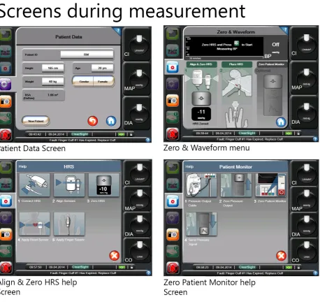
The user can start the ccNexfin system by pressing on the
on / off button on the monitor. During the startup
process a startup screen with the Edwards Lifescience logo
will emerge for a couple of seconds. The first menu the user will see is the Patient data menu. The user should first fill in the data before he can go to another menu option. After filling in the form the home button should be pressed
to confirm the data. Thereafter, the finger cuff should be
installed to start measuring data. The menu Zero &
Waveform will open during the placing of the finger cuff.
This menu shows what the nurse should do during placing
the finger cuff and HRS sensor and the zeroing process.
By pressing on the question mark more explanation about this process will appear on the screen. After installation measuring can be started by pressing on the green Start measuring BP button. The screens which the user sees during this measurement preparation process are visualized in Figure 4.
|
Research phase
|
Research phase
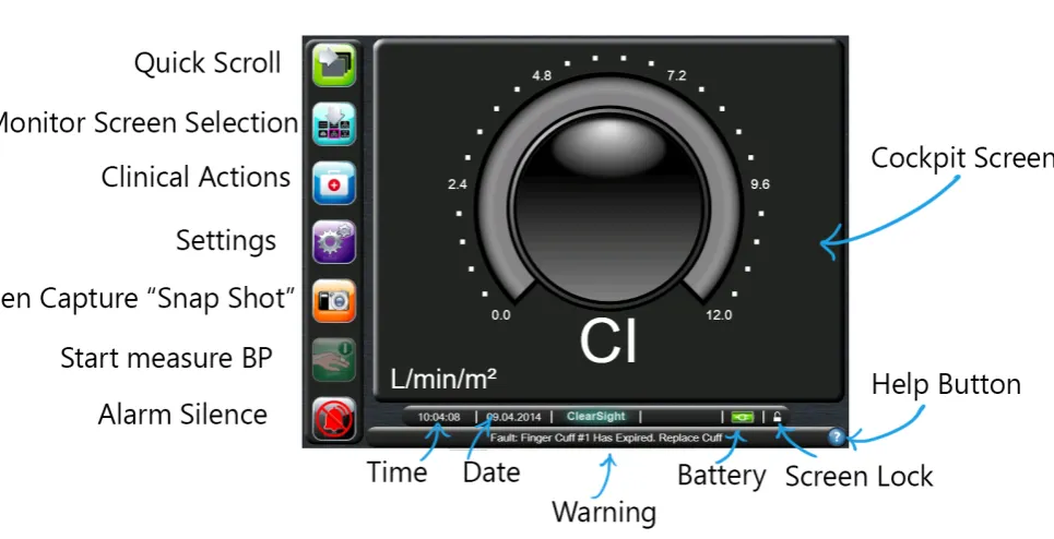
parameters; however these four tabs might be overlooked by beginner users because most of the attention goes to the six screens. The six information screens mentioned previously are placed on the right side of this menu. The user can select an information screen either by using the Quick Scroll button or by using the Monitor Screen Selection tool which will be visualized in the main menu.
Clinical Actions
By pressing on the Clinical Actions icon a new menu will appear above the main menu (Figure 7). The user can choose the following options in this menu:
- Zero & Waveform - Enter CVD
- Derived Value calculator - Event Review
- More
Notable is that the menu size is different from the other two menus. Besides that, new icons are used instead of only text. Only text would probably be enough to make the menu functions clear to the user.
Settings
The user should press the Settings icon to change the
settings of the ccNexfin system (Figure 8). The settings are
divided into different categories which are: - Patient Data
- Monitor Settings - Parameter Settings - Data Download - Demo Mode - Engineering - Help
Inside these categories more options will be offered to the user. This menu structure is clear and does not give too many options to the user at once. A notable issue is that only this menu can be closed by pressing the home button instead of a cross.
Figure 6. Monitor Screen Selection
|
Research phase
Figure 12. Monitor Screens
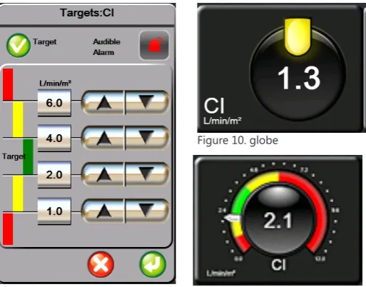
the Cockpit screen are more extensive (Figure 11). In these globes it is more clear if the value positioning is too high or too low for its target value. If a measured value is in the red zone it starts blinking to gain attention from the user. By pressing around all the globes it is possible to change the parameter that will be visualized. A new menu will pop-up where the already chosen parameters are selected and
a new selection can be made. By pressing inside a globe it is possible to change target values and alarm settings (Figure 9). The adjustments of these settings can also be made in the settings menu. These shortcuts are quite useful; however the action of pressing inside or outside
the globe will probably lead to difficulties by pressing the
Interaction styles
There are two main forms of interaction styles used in the
Nexfin interface, namely menu selection and form fill. Most
of the interaction forms are menu selection. Functions are organized to their tasks, especially in the settings menu.
To give input to the system form fill interaction is used.
For example patient data and target values can be set via
a form fill.
Menu buttons
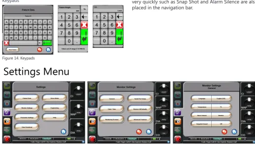
There are several kinds of buttons used: List buttons, value buttons, scroll buttons, normal buttons and slider buttons. Figure 13 visualizes these buttons. Notable is that the buttons have a chrome look except the slider button. The list button can be touched on both sides; a popup menu will appear with several choices. The choice made by the user will be placed on the right side of this button. Switch-ing an option on and off can be done by usSwitch-ing the slider button. A keypad will appear by touching the value buttons.
Examples of these keypads are shown in Figure 14. The
user can give the input value and press enter to confirm
the input data. In case the value does not meet the value range a warning will appear. The screen parameter menu has three different statuses: no color, color and stroked.
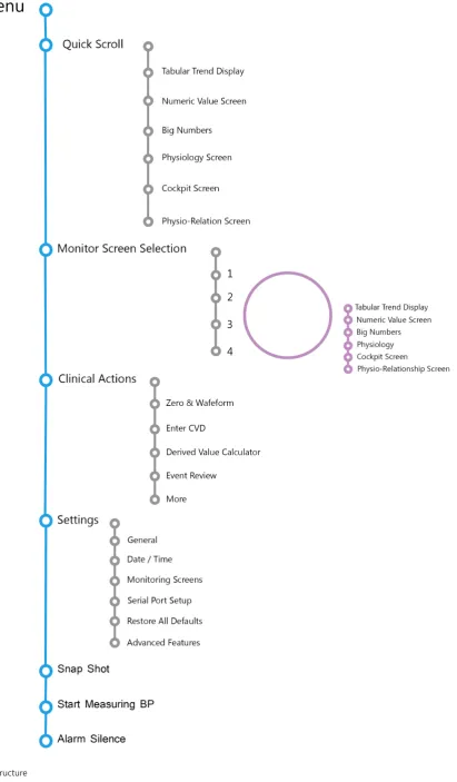
1.4 Menustructure
A clear overview of the system will be given by describing the menu structure. The main functions are visualized in Figure 16. The main menu is the head of the tree structure. The navigation bar is the next layer of the tree. By touching the Quick Scroll button or Monitor Screen Selection button the different screens can be selected. In these six screens menu parameters, targets and alarms can be adapted to the preferred settings. This can also be done in the settings menu. The settings menu also has a tree structure with several choices of subgroups. An example of this structure is shown in Figure 15. Options which the user may need very quickly such as Snap Shot and Alarm Silence are also placed in the navigation bar.
Figure 14. Keypads
Figure 15. Settings Menu
|
Research phase
|
Research phase
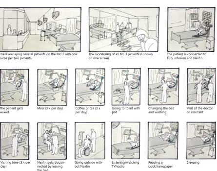
Figure 17. Context of use
- Depending on the condition of the patient, he will be placed on the nursing ward, medium care, intensive care or emergency care.
- The patient will be transported and moved to the pre-OR where he will receive an ECG pad.
- The Nexfin is taken into the OR.
- The patient is moved from the bed to the OR table. - The patient will receive an infusion line and anesthetics
- The Nexfin is applied and hooked up.
- During surgery the patient may lie in a wide variety of positions.
- After surgery, all equipment is disconnected and wiped down.
- The patient is transferred to the recovery room. - In the recovery room the patient will be monitored. - During a longer stay, the patient will be washed, during which equipment may be moved or even removed.
- After surgery all equipment will be disconnected and wiped down.
The tasks of the anesthesiologists and intensivist are more dependent on the user interface. They need a continuous update of the hemodynamic parameters in order to decide what actions should be taken to meet the target values of the set parameters. Actions such as giving an intervention should also be updated to the system by the
anesthesiologist or intensivist.
|
Research phase
|
Research phase
interface contains “A road to health” menu where a real-time snapshot of the patient’s key hemodynamic parameters is shown. It can be compared with the
Physiology Screen of the Nexfin.
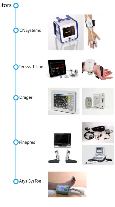
It might be said that these two interfaces look more professional than the colorfull and round interface of the
Nexfin, because it has less noise. However, the interface of the Nexfin looks more intuitive because of the use of
symbols. The CNSystem and Tensys interfaces have more text which makes it harder to understand a function in a short time. Besides, the Tensys system is not consistent in the placing of the navigation bar.
It can be concluded that in many medical devices for hemodynamic purpose a black background color is used. The black background is needed to obtain a high contrast with the basic colors which have to warn the user. Symbols and colors can make the user interface more intuitive but an overload should be avoided to keep the interface clean.
- Not all non optional buttons have a grey overlay.
- The warning and date/time bar look like buttons but do not have this function
- Menu is smaller than other menus.
- Menu can be closed by pressing on cross instead of home button. - Menu does not contain name.
- Icons and text are used together.
- No route indication.
- This menu does not contain a name.
- Choice of amount of parameters can only be confirmed by pressing on
one of the six screens.
- The background contains the same color as title bar within other menus.
- Buttons do not have the same look.
- Title part does not have a dark background. - Not all non optional buttons have a grey overlay. - There is no standard size for pop up screens.
|
Research phase
- There is no standard size for pop up screens. - Not all non optional buttons have a grey overlay. - Title part does not have a dark background.
- There is no standard size for pop up screens. - Not all non optional buttons have a grey overlay. - Title is missing.
- Menu is smaller than other menus. - Title part does not have a dark background.
- Instruction pictures were not clear to the participants of the usability test.
|
Research phase
4.4 Color blindness
It is possible to become an anesthetist while experiencing color blindness. Therefore, the use of colors should be
investigated. However, at first should be analyzed what
kinds of color blindness do exist.
There are different kinds of color blindness:
• Protanomaly: i.e. reduced sensitivity to red light. • Deuteranomaly: i.e. reduced sensitivity to green light. • Tritanomaly: i.e. reduced sensitivity to blue light. • Monochromacy: i.e. no color vision.
Some of the difficulties which might be experienced are:
Protanopia
Protanopes are more likely to confuse: 1. Black with many shades of red
2. Dark brown with dark green, dark orange and dark red 3. Some blues with some reds, purples and dark pinks 4. Mid-greens with some oranges
Deuteranopes
Deuteranopes are more likely to confuse: 1. Mid-reds with mid-greens
2. Blue-greens with grey and mid-pinks 3. Bright greens with yellows
4. Pale pinks with light grey 5. Mid-reds with mid-brown 6. Light blues with lilac
Tritanopes
The most common color confusions for tritanopes are light blues with greys, dark purples with black, mid-greens with blues and oranges with reds. (19)
The current user interface has a black background. Within this background red, yellow and green are used. As already shown in Figure 25, reds and greens are getting darker and lead to a very low contrast. Red, yellow and green are the alarm colors and are very important to warn the user. It is useful for these users to create more contrast between the background and information colors. Another valuable option is to give other hints to users besides colors.
Concept
Phase
Parameter Selection
This menu was missed in the current interface. This menu should allow the user to set parameters on and off to prevent noise on screen. Besides, it should be possible to set the four main globe parameters with on globe 1 for example the most important parameter which should always be on screen. This menu also creates the
possibility to introduce the different abbreviations with their full name to the user in order to prevent
miscommunication.
Keypads
Keypads are important for the user to give input to the system. The keypads should have their boundaries to prevent the user from giving wrong input. For example, during entering patient weight only numbers are needed and it should be clear to the user in which unit this
information should be entered.
Figure 26. Screen structure
Figure 27. Big Numbers
|
Concept phase
Figure 29. Physiology screen
Figure 30. Physio-relation screen
Figure 32. Zero & Waveform
Figure 33. Target Value/Globe parameter
Figure 31. Parameter Selection
|
Concept phase
Figure 37. Tabular trend screen Figure 38. Numeric value screen
Figure 39. Big number screen Figure 40. Physiology screen
Measurement Stage
During the measurement stage only three menu options are possible. These three options are: Monitor Screen Selection, Clinical Actions and Settings.
- Monitor Screen Selection: The user is able to switch monitor screens and switching the amount of parameters. An arrow on the left side, just like in the navigation menu, shows if the user has chosen 1, 2, 3 or 4 parameters. A small preview picture of the screen shows the user what the actual screen will look like. This small picture prevents the user from picking the wrong screen.
- The Clinical Actions menu and the Settings menu
both have the same style (Figure 44). Light blue buttons with white text. The user is always able to navigate to the previous state of the menu to prevent situations that
menus should first be closed and opened again. These
two menus inter alia allow the user to change settings which were made during the startup stage.
Monitor screens
The tabular trend screen (Figure 45) shows a maximum of four trend graphs. The trend line is blue and the green rectangle shows if the value is in the good range. If the value is in the red range, the trend line will be above or under the red arrows which visualize this boundary. The current measured value can be seen in the square globe at the right side of the screen. The color of the globe visualizes if the measured value is good (green), starting to get dangerous (orange) and if the value is dangerously high or low (red). This color metaphor is globally used in
traffic lights which will lead to recognition to the users.
|
Concept phase
Figure 43. Startup menu
The numeric value screen (Figure 46) shows the average measurement data in a certain time interval. The globe at the right side indicates which parameter is shown in which number set. Besides, it gives just like in the tabular trend screen the status of the parameter.
The big number screen (Figure 47) only shows the globes. A maximum of four globes can be shown on screen. The color of the globes shows the status of the parameter. Because of the large area of color it is easy to see from a distance what the status of a parameter is.
The physiology screen (Figure 48) is almost the same as
the first concept. Because simplicity and
tranquility is needed no shadows or effects are used in this info graphic.
The measured values have a contour color in the
physio-relationship screen (Figure 49). Parameters which do not contain data have light grey text which will make it send backwards. Only contour colors are used because color areas would create too much noise. Since the navigation bar and globes already have color areas.
8.4 Conclusion
This concept focuses on functionality and simplicity. By using the metaphor of arrows it gets clear to the user in which menu or step the user is in. Besides the target value popup uses the arrow to show its relation to the globe. The status of the parameter can be seen from a long distance because of the big color tiles. The zeroing process is divided in several smaller steps to lead the user through every necessary step to zero the HRS sensor without skipping a step.
Figure 46. Numeric value screen
Figure 47. Big numbers screen
Finalization
Phase
12.2 Style
The participants of the usability test thought that there
was too many color in the Nexfin Flat concept. However it was selected as the clearest concept. This final concept contains the style of the Nexfin Flat but with less color
areas which makes it easier to the eye.
The not selected menu tab options are grey instead of (low opacity) blue. In this way the menu buttons get less to the foreground and makes the user able to focus on the important measurement values.
The colors blue, green, orange and red are used to give information to the user. Blue is used because it comes forward very easily. Most of the color blinds are able to see blue colors and can therefore be used as a trend line
color, menu notifications and menu options.
The green color is used to notify the user that the measured value is in a good range. The green color is used in a part on a circle on the globe, as a square in the physiology screen and as a contour around a tile in the physio-relationship screen. The same goes for the orange
color notification. The red color notification however
colors the whole tile in the physio-relationship screen. Because a red value is too dangerously high or low it is important that the user can identify this problem immediately.
A color blind user will see the green, red and orange color as brown to orange colors. By differentiating the
visualization of these colors a cue is given to the color blind user to indicate if the value is good or dangerous.
References
Books
Mullet, K., Sano, D., (1995). Designing Visual Interfaces. Mountain View: SunSoft Press
Stone, D., Jarrett, C., Woodroffe, M., & Minocha, S. (2005). User Interface Design and Evaluation. San Francisco: Elsevier, Inc.
Reports
Edwards Lifesciences, (2012). EV1000 Clinical Platform Operator’s manual. Flikkema, M. (1997). Color in the ScopeMeter User Interface.
Grob, M. (2012). Usability extrapolation for the non-invasive continuous blood pressure meter. IEC, (2007). Medical devices: Application of usability engineering to medical devices
Schäffer, L.S. (2010). Comfortstudie voor medische draagbare sensorapparaten.
Zhang, J. et al. (2003) Using usability heuristics to evaluate patient safety of medical devices. Journal of Biomedical Informatics, 36, 23-30.
Websites
(1) http://www.edwards.com/products/mininvasive/pages/ccnexfinsystem.aspx visited on 8-4-2014
(2) http://www.learnhemodynamics.com/hemo/basics.htm visited on 16-4-2014
(3) http://www.edwards.com/products/mininvasive/pages/ccnexfinsystem.aspx visited on 10-4-2014
(4) http://www.surgeryencyclopedia.com/La-Pa/Operating-Room.html visited on 11-4-2014
(5) http://www.surgeryencyclopedia.com/Fi-La/Intensive-Care-Unit.html#ixzz2yZ1hfNxY visited on 11-4-2014
(6) http://www.mca.nl/Patient-en-Bezoeker/In-het-ziekenhuis/Afdelingen-specialismen/afdeling-specialisme/did/165. aspx visited on 16-4-2014
(7) http://www.mmcsurgery.com/anesthesiology/responsibilities.html visited on 11-4-2014 (8) http://www.rand.org/pubs/research_briefs/RB9541/index1.html visited on 11-4-2014 (9) http://www.whhs.com/intensivist-program/ visited on 11-4-2014
(10) http://www.finapres.com/ visited on 14-4-2014
(11) http://tensysmedical.com/global/ visited on 14-4-2014
(12)http://www.draeger.com/sites/en_aunz/Pages/Hospital/Infinity-CNAP-SmartPod.aspx?navID=1288 visited on
14-4-2014
(13) http://www.cnsystems.at/products/cnap-monitor-500 visited on 14-4-2014 (14) http://www.nngroup.com/articles/ten-usability-heuristics/ visited on 15-4-2014
(15) http://www.envisionup.com/ask-the-envision-gurus/web-design-trends-for-2014/ visited on 17-4-14 (16) http://www.mergeagency.com/creative-design/web-trends-2014 visited on 17-4-2014
(17) https://creativemarket.com/blog/2013/12/25/4-typography-trends-for-2014 visited on 18-4-2014
Appendices
Parameter
Description
Oxygen Consumption (VO2) The amount of oxygen used by body per minute. Estimated Oxygen Consumption (VO2e) An estimate of the amount oxygen used by body per
minute.
Oxygen Consumption Index (VO2I) The amount of oxygen used by the body per minute indexed against body service area.
6. Zou u liever de keuze hebben uit tekst in plaats van iconen?
7. Wat vindt u van de manier van weergave van de parameters in de Monitor Screens?
8. Mist u nog manieren van weergaven van parameters? 9. Zijn er volgens u schermen van de monitor screens die u als overbodig ziet?
10. Hoe heeft u het kleurgebruik en indeling van de interface ervaren?
11. Denkt u dat de verschillende kleuren in het navigatie menu de interface gebruiksvriendelijker maakt?
12. Vindt u de stijl van de interface passen bij het doel van het apparaat?
13. Als u de keuze had welke van de volgende stijlen heeft
uw voorkeur als interface stijl voor de Nexfin en wat voor
stijl vind u het minst aantrekkelijk?
7. Verander de eenheid van temperatuur van Celcius (°C) naar Fahrenheid (°F) en sluit vervolgens het menu.
Tijd: Zeer traag
Fouten:
- Monitor screens doorlopen om vervolgens een parameter te veranderen.
- Naar clinical menu navigeren
- Bij instellingen zoeken bij parameter settings in plaats van General
Opmerkingen:
- Er wordt gedacht dat dit ook een parameter is waardoor zij deze zoeken onder parameter settings.
8. Maak een Snapshot (Foto). Wat krijgt u te zien?
Tijd: Zeer snel
Fouten: Geen
Opmerkingen: Het is hen totaal niet duidelijk wat het nut is van deze functie.
Algemeen veel voorkomende fouten:
- Wanneer een menu open staat op een globe op de achtergrond drukken.
- Naar een ander menu willen navigeren voordat het menu gesloten is.
- In het settingsmenu wordt vaker op het huisje gedrukt dan op het pijltje terug.
IV
|
Ideation material
|
Appendices
|
Appendices
|
Appendices
Enquete
1. Welke stijl vindt u het meest aantrekkelijk en welke het minste?
Zet de meest aantrekkelijke op 1 en de minst aantrekkelijke op 3.
1
2
3
O
O
O
O
O
O
O
O
O
2. Welke concept vindt u het meest overzichtelijk en welke het minste?
Zet de meest overzichtelijke op 1 en de minst overzichtelijke op 3.
1
2
3
O
O
O
O
O
O
3. Geef van de volgende iconen aan of u deze duidelijk of onduidelijk vindt met betrekking tot hun functie:
Zeer
onduidelijk Onduidelijk Neutraal Duidelijk duidelijkZeer
O O O O O
O O O O O
O O O O O
O O O O O
O O O O O
O O O O O
O O O O O
O O O O O
O O O O O
O O O O O
O O O O O
O O O O O
O O O O O
O O O O O
4. Geef van de volgende navigatie elementen aan welke u het duidelijkste vindt (1) en welke u het minst duidelijk vindt (3).
Monitor Screen Selection
1
2
3
O
O
O
O
O
O
O
O
O
Clinical Actions
1
2
3
O
O
O
O
O
O
O
O
O
Start/Stop measuring BP
1
2
3
O
O
O
O
O
O
O
O
O
5. Hoe heeft u het kleurgebruik ervaren per concept? Er zijn meerdere antwoorden mogelijk.
O Goed
O Te fel
O Te licht
O Te druk
O Te rustig
O Anders Namelijk:
O Goed
O Te fel
O Te licht
O Te druk
O Te rustig
O Anders Namelijk:
O Goed
O Te fel
O Te licht
O Te druk
O Te rustig
Interactie
6. Welke manier van instructie tijdens het Zero pro-ces heeft uw voorkeur en waarom? Zet op 1 uw eerste voorkeur en op 3 uw minst favoriete voorkeur.
1
2
3
O
O
O
O
O
O
O
O
O
7. Welke manier van parameter selectie heeft uw voorkeur en waarom? Zet op 1 uw eerste voorkeur en op 3 uw minst favoriete voorkeur.
1
2
3
O
O
O
O
O
O
O
O
O
8. Welke manier van globe weergave heeft uw voorkeur en waarom? Zet op 1 uw eerste voorkeur en op 3 uw minst favoriete voorkeur.
1
2
3
O
O
O
O
O
O
O
O
O
9. Welke weergave van dit diagram heeft uw voorkeur en waarom? Zet op 1 uw eerste voorkeur en op 3 uw minst favoriete voorkeur.
1
2
3
O
O
O
O
O
O
O
O
O
10. Wanneer u gebruik heeft gemaakt van de hulp tekst in de bovenste balk van het scherm, vond u deze informatie nuttig? (Denk aan schermnaam en instructie bij enkele menu’s.)
12. Zijn er nog manieren van interactie die u niet logisch vindt per concept?
O Ja namelijk
O Nee
O Ja namelijk
O Nee
O Ja namelijk
O Nee
13. Zijn er nog punten in de interface die u mist of anders zou willen zien?
14. Heeft u verder nog opmerkingen?
Einde van deze enquête
VI
|
The final concept screens
Startup screen
|
Appendices
Step 2 Parameter Selection
Step 4 Zero & Waveform
|
Appendices
Tabular Trend Screen 1
Tabular Trend Screen 3
|
Appendices
Numeric Value Screen 1
Numeric Value Screen 3
|
Appendices
Big Number Screen 1
Big Number Screen 3
|
Appendices
Physiology Screen 1
Physiology Screen 3
|
Appendices
Physio-relationship Screen 1
Physio-relationship Screen 3
|
Appendices
Monitorscreen Selection Menu