79:1 (2017) 75–79 | www.jurnalteknologi.utm.my | eISSN 2180–3722 |
Jurnal
Teknologi
Full Paper
FRACTIONAL RESIDUAL PLOT FOR MODEL VALIDATION
Nur Arina Bazilah
a, Muhammad Hisyam Lee
a*, Suhartono
c, Abdul
Ghapor HussinHussin
c, Yong Zulina Zubairi
da
Department of Mathematical Sciences, Universiti Teknologi
Malaysia, 81310 UTM Johor Bahru, Johor, Malaysia
b
Department of Statistics, Faculty of Mathematics and Natural
Sciences, Institut Teknologi Sepuluh Nopember, Surabaya,
Indonesia
c
Faculty of Science and Defence Technology, Universiti
Pertahanan Nasional Malaysia, Kuala Lumpur, Malaysia
d
Centre for Foundation Studies in Science, Universiti Malaya, Kuala
Lumpur, Malaysia
Article history
Received 27 April 2016 Received in revised form
1 November 2016 Accepted 10 December 2016
*Corresponding author
[email protected]
Graphical abstract
Abstract
A pairwise comparison is important to measure the goodness-of-fit of models. Error measurements are used for this purpose but it only limit to the value, thus a graph is used to help show the precision of the models. These two should show a tally result in order to defense the hypothesis correctly. In this study, a fractional residual plot is proposed to help showing the precision of forecasts. This plot improvises the scale of the graph by changing the scale into decimal ranging from -1 to 1. The closer the point to 0 will indicate that forecast is robust and value closer to -1 or 1 will indicate that the forecast is poor. Two error measurements which are mean absolute error (MAE) and mean absolute percentage error (MAPE) and residual plot are used to justify the results and make comparison with the proposed fractional residual plot. Three difference data are used for this purpose and the results have shown that the fractional residual plot could give as much information as the residual plot but in an easier and meaningful way. In conclusion, the error plot is important in visualize the accurateness of the forecast.
Keywords: Model validation, error measurement, residual plot
Abstrak
Perbandingan berpasangan adalah penting untuk mengukur kejituan model yang digunakan. Ukuran ralat sering digunakan untuk tujuan ini tetapi ianya terhad kepada sesuatu nilai sahaja, oleh itu graf sering digunakan untuk membantu menunjukkan tahap ketepatan model. Kedua - duanya seharusnya menunjukkan keputusan yang seiring untuk menentukan hipotesis yang tepat. Dalam kajian ini, plot ralat pecahan digunakan untuk membantu menunjukkan ketepatan ramalan. Plot ini menambahbaik dengan menukar skala graph kepada perpuluhan di antara -1 dan 1. Titik yang menghampiri 0 akan menunjukkan ianya teguh dan titik yang menghampiri -1 dan 1 menunjukkan ramlan itu lemah. Dua ukuran ralat iaitu ralat mutlak min (MAE) dan ralat mutlak peratusan min (MAPE) dan plot ralat digunakan sebagai perbandingan dengan plot ralat pecahan. Tiga data yang berbeza digunakan untuk kajian ini dan dari keputusan yang diperolehi, plot ralat pecahan dapat memberikan maklumat yang sama seperti plot ralat tetapi dalam cara yang lebih mudah untuk difahami dan lebih bermakna. Kesimpulannya, plot ralat adalah penting untuk menggambarkan ketepatan sesuatu ramalan.
Kata kunci: Kejituan model, pengiraan ralat, plot ralat
© 2017 Penerbit UTM Press. All rights reserved
Dec Nov Oct Sep Aug Jul Jun May Apr Mar Feb Jan 40
30
20
10
0
Month
R
e
s
id
u
a
l
SIMA TSR Holt Winter Neural Netw ork Chen Cheng
Dec Nov Oct Sep Aug Jul Jun May Apr Mar Feb Jan 1.0
0.5
0.0
-0.5
-1.0
Month
F
ra
c
ti
o
n
a
l
R
e
s
id
u
a
l
1.0 INTRODUCTION
In order to observe how good a model fits a data, a pairwise comparison is used to determine [1]. This observation is important not only to show the new outcomes, but it is also to show evidence to the readers so that the author reasoning could be verified correctly [2]. Despite on how many quantitative systems are used in modeling geographic data, the most important objective is to seek possible means of improving the models. Therefore, to make evaluation informative, predicted values must be compared with measured values in a meaningful ways [3]. Error measurement such as mean absolute error (MAE), root mean square error (RMSE), mean absolute percentage error (MAPE) and so on are used to give information on whether a model is good in forecasting the data. But as been mentioned by Hyndman and Koehler [4] and Hyndman [5], these proposed methods are not generally applicable which could mislead the results of the forecasting. Thus, there were quite a number of studies in finding and improving the methods in error measurement to help delivering the information on the accuracy of the forecasting.
Other than error measurement, it is useful if one could observe the precision of the model graphically. If error measurement could gives information about the analysis from the value, graphs are important to show the precision for each of the value. This graph is important to identify unusual or influential observations, to measure model hypothesis and to understand the novelty from the model [6]. Graphical plots provide an easy assessment of the preliminary goodness-of-fit tests. Nevertheless a more popular approach of assessment is used as a reliable measure on the fit of the model. Graphs should be tally in a tentative manner based on specific tests of hypothesis [7]. This graph is important to identify unusual or influential observations, to measure model hypothesis and to understand the novelty from the
model [6, 8].
Time series plot and residual plot are always used to help visualize the accurateness of the model in time series analysis. Basically, time series plot is a graph that was used to evaluate the pattern of the data over time. It is used to study the daily, weekly or annual cycle of a data. Therefore time series plot is always used to make a comparison between the actual value and the forecasted value. Usually from the plot we could see more than two graphs are plotted to make a comparison. This plot is the most common plots used by many to show the difference between the actual and forecast data [9-12].
Residual plot is a plot that is used to show the difference between the actual and forecasted values. The larger the difference, the incompatible the model is. Residual plot can access whether the observed error is consistent with the stochastic error. Residual plot could give information if there is something wrong with the analysis. For example if the
residual plot moves further away from the zero as the time increase, then something must be wrong with the modeling or the model might not be appropriate for the data. Therefore, model could be improved by
considering another model or else. A good model
should have residuals that are closed to the centre on the zero throughout the range on the fitted values. The history of the residual plot has been explained by Cox [7] in his study.
The problem with common plot use for comparison such as time series plot and residual plot are that it depends on the scale. If data has a large number such as in load usage or arrival of tourists per year where the figure is in hundred thousand units, the difference is usually in thousand units which could gives an idea that it is a bad forecast when actually it is a good one. This is because the common residual plot does not have boundaries. Moreover, it is also hard to set a benchmark on the residual plot to exclaim whether a model is good or bad because of the boundaries.
In this study, we proposed a fractional residual plot to observe the fit between data and models. This plot will give meaningful information on how the model fit with a data by changing the residual scale in y-axis into decimal ranging between -1 and 1. Because of the minimum and maximum value are -1 and 1, it helps to understand whether the forecast is good or not by just looking at the plot. The closer the residue to zero, the better the model is. Other than to show the performance of a model, this plot also could be used as a benchmark. One could set a limit for the analysis. For example, it can be used for a very critical purpose such as percentage of survival in a medical test then the residue should not be more than 0.1 or 0.05. If the residue is exceeding the benchmark level, it must be rejected.
2.0 METHODOLOGY
By changing each residual into percentage, we plot the new residual to see the pattern. By transform the residual into percentage, ones could estimate how close or far the forecast from the real value. Other than that, this plot also could be set with a benchmark point since the minimum and maximum value is fixed from -1 to 1. This benchmark point is essential for a certain case such as when one to make a decision whether or not a further work needs to be done in order to improve the forecast.
To make sure that the point is between -1 and 1, we used this formula below.
ˆ
for
1, 2,
,
t t
t t
y
y
x
t
n
y
where
y
t is the original value andy
ˆ
t is the forecast valueand
y
t cannot be equal to 0. These values are then beingplotted to see the performance of the forecasting. This method is done by using Minitab software.
It gives a better and clear idea on how the performance of the model when the point is set from -1 until 1. Negative value will indicate that the forecast is underestimated whilst the positive value will indicate that the forecast is overestimated. Two plots used are the residual plot and fractional residual plot. The residual plot is used to make a comparison with the fractional residual plot.
Three types of data are used in this study. The first data is the monthly Bali tourism data. We also used data from the M3 competition and the third one is daily load data from Malaysia. All of these three data has been modeling by using time series model. The error measurements used in this study are mean
absolute error (MAE) and mean absolute
percentage error (MAPE). MAE is easy to understand and compute but it cannot be used to make a comparison between different series because of scale dependent [5]. The formula of the MAE can be written as below.
1
1
ˆ
MAE=
n t t t
y
y
n
(2)MAPE has the advantage of being scale dependant and it is easy to make a comparison between different data series [4, 5]. The MAPE formula can be written as below.
1
ˆ
1
MAPE=
100
n t t
t t
y
y
n
y
(3)For both formula,
y
t is the actual value andy
ˆ
t isthe forecast.
3.0 RESULTS AND DISCUSSION
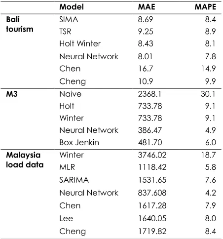
After data is analyzed with few models, the MAE and MAPE is calculated in order to see which model superior for each data and the residual plot is plotted to be the point of reference in order to see whether the fractional residual error plot support the result in the MAE and MAPE and gives similar information as the residual plot. Table below is the result of MAE and MAPE for each data and time series model used
Table 1 Error measurements for selected data and models
Model MAE MAPE
Bali
tourism SIMA TSR 8.69 9.25 8.4 8.9
Holt Winter 8.43 8.1
Neural Network 8.01 7.8
Chen 16.7 14.9
Cheng 10.9 9.9
M3 Naive 2368.1 30.1
Holt 733.78 9.1
Winter 733.78 9.1
Neural Network 386.47 4.9
Box Jenkin 481.70 6.0
Malaysia
load data Winter MLR 3746.02 1118.42 18.7 5.8
SARIMA 1531.65 7.6
Neural Network 837.608 4.2
Chen 1617.28 7.9
Lee 1640.05 8.0
Cheng 1719.82 8.4
As can be seen from Table 1, for all data neural network shows the best fit. The MAE and MAPE results are tally with each other, smaller value indicate a better model. MAE result cannot be used to make a comparison between the series. And although for data like M3 and Malaysia load data show larger value for MAE but the value of the MAPE is actually quite small. This actually signifies that the data has large value. The value of the MAPE is also very small for most of the models which are less than 10% because MAPE puts a heavier penalty on the positive errors compare to negative errors [5].
To our concern, these error measurements are quite bias in order to illustrate the fitness of the model since both of these error measurements used the mean value from the sum of the residues. Thus, the usage of graphical plot is proposed in order to support the result above and give heuristic
information about the model fitting. Figure 1(a) and
(b) show a comparison between residual plot and fractional residual plot for Bali tourism. Both of these plots are tally in order to show which model is superior from another. Residual plot shows that the entire residue for each models used has negative value. And the value of the residue is between 0 and 40. In general, if the data consist from a large number like in hundreds or thousands unit than this residue actually shows a good result but if the data is actually consist from a number less than 100, than this plot has shown that the forecast is a bad forecast.
(a) Residual plot for Bali tourism data
(b) Fractional residual plot for Bali tourism data
Figure 1 A comparison between the (a) residual plot and
the (b) fractional residual plot for Bali tourism data
This difficulty is also applied to the other two data used in this study. As can be seen from Figure 2 (a) and (b), the residue for Naive model move further away from the centre as the time increase but for other models, the residue value is ranging around 0 to 4000 for residual plot and 0 to 0.5 for fractional residual plot which gives a suggestion that the Naive model is not appropriate for this data compare to the other models. Alternatively, if we refer to these plots, a general conclusion for the range between 0 and 4000 can be large for external reader but when referring to the fractional residual plot, the residue between 0 and 0.5 would definitely gives suggestion that the residual is in between the good and poor model and one could see which models are appropriate for the data. Both of these plots give the same illustration of the outcomes but when comparing which of these two give clear and meaningful idea of the forecast, it is obviously that the fractional residual plot is easier to understand.
(a) Residual plot for M3 data
(b) Fractional residual plot for M3 data
Figure 2 A comparison between (a) residual plot and (b)
fractional residual plot for M3 competition data
Compare to Figure 2(a) residual plot, Figure 2(b) illustrate better plot in giving the idea how good the models are. Though Holt model already gives residuals below 0.1, but advanced model such as ANN did improvise the forecast in making the residuals smaller that Winter and Box Jenkin.
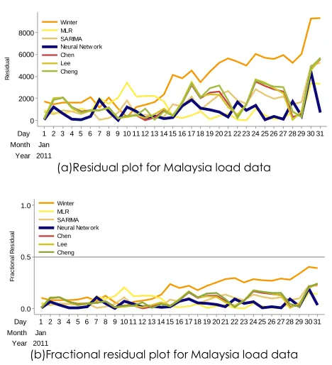
This is also true when longer outcomes are provided and more models are used. As can be seen from Figure 3 (a), the residual plot has a range between 0 and 90000. Generally these value are large but when refer to Figure 3 (b) the range is actually only between 0 and 0.4 only.
(a)Residual plot for Malaysia load data
(b)Fractional residual plot for Malaysia load data
Figure 3 A comparison between residual plot (a) and
fractional residual plot (b) for Malaysia load data
For all three data above, all three of them show a consistency and tally results with the error measurement between the plots in Figure 1 until Figure 3 and in Table 1. The fractional residual plot is easier to understand since it has a minimum and
Dec Nov Oct Sep Aug Jul Jun May Apr Mar Feb Jan 40 30 20 10 0 Month R e s id u a l SIMA TSR Holt Winter Neural Netw ork Chen Cheng Dec Nov Oct Sep Aug Jul Jun May Apr Mar Feb Jan 0.5 0.0 -0.5 Month F ra c tio n a l R e s id u a l SIMA TSR Holt Winter Neural Netw ork Chen Cheng 6 5 4 3 2 1 4000 3000 2000 1000 0 R e s id u a l Naive Holt Winter ANN Box Jenkin 6 5 4 3 2 1 0.5 0.4 0.3 0.2 0.1 0.0 Fr ac ti o n al R e si d u al
Na i ve Hol t Wi nter ANN Box Jenki n
maximum boundary which is -1 and 1. For a comparison, scale on the y-axis for all Figure 1(a), Figure 2(a) and Figure 3(a) show different value. So it is difficult to determine whether the maximum point of the residual on the residual plot is acceptable or not. Unlike the fractional residual plot, it is easier to tell whether the model gives good forecast or not because the range is limit between -1 and 1 only. Furthermore, these plots give details on the exact dispersal of the residues. The larger the value of the error from the error measurements, the larger the range of the residuals are.
4.0 CONCLUSION
For the conclusion, the fractional residual plot is a good way to measure the goodness-of-fit of models in a graphic manner. It gives similar information as the residual plot but in a more easy and meaningful way. Using the fractional residual plot, the pattern of the residue is clearer. Since the value of the residual has been transformed into decimal point ranging from -1 to 1, it is easier to determine whether the forecast is good or bad and a comparison between different series also could be made. Closer value to 0 will give the idea that the model is good and closer value to -1 or 1 show that the model is poor. Other than that, error plot is suggested to be used together with the error measurement to support an outcome of a hypothesis. Not only it will give a robust findings but it also help showing the outcomes accurately.
Acknowledgement
This study was funded by the Universiti Teknologi Malaysia through the Research University Grant Tier 1 Scheme (grant Q.J130000.2508.15H64).
References
[1] Legates, D. R. and G. J. McCabe. 1999. Evaluating The
Use Of “Goodness‐Of‐Fit” Measures In Hydrologic And
Hydroclimatic Model Validation. Water Resources
Research. 35(1): 233-241.
[2] Cumming, G., F. Fidler, and D. L. Vaux. 2007. Error Bars In
Experimental Biology. The Journal Of Cell Biology. 177(1):
7-11.
[3] Willmott, C. J. 1981. On The Validation Of Models. Physical
Geography. 2(2): 184-194.
[4] Hyndman, R. J. and A. B. Koehler. 2006. Another Look At
Measures Of Forecast Accuracy. International Journal Of
Forecasting. 22(4): 679-688.
[5] Hyndman, R. J. 2006. Another Look At Forecast-Accuracy
Metrics For Intermittent Demand. Foresight: The
International Journal Of Applied Forecasting. 4(4): 43-46.
[6] Baddeley, A. et al. 2005. Residual Analysis For Spatial Point
Processes (With Discussion). Journal Of The Royal Statistical
Society: Series B (Statistical Methodology). 67(5): 617-666.
[7] Cox, N. J. 2004. Speaking Stata: Graphing Model
Diagnostics. Stata Journal. 4(4): 449-475.
[8] Abramo, G., C.A. D’Angelo, and L. Grilli. 2015. Funnel
Plots For Visualizing Uncertainty In The Research
Performance Of Institutions. Journal Of Informetrics.
9(4): 954-961.
[9] Baharudin, Z. and N. Kamel. 2007. One Week Ahead Short
Term Load Forecasting. European Conference on Power
and Energy Systems (EuroPES 2007) IASTED. Palma de Mallorca, Spain. 29-31 August 2007. 1-6.
[10] Gould, P. G. et al. 2008. Forecasting Time Series With
Multiple Seasonal Patterns. European Journal of
Operational Research. 191(1): 207-222.
[11] Soares, L. J. and M. C. Medeiros. 2008. Modeling And
Forecasting Short-Term Electricity Load: A Comparison Of Methods With An Application To Brazilian Data.
International Journal of Forecasting. 24(4): 630-644.
[12] Zhang, G. P. 2003. Time Series Forecasting Using A Hybrid
ARIMA And Neural Network Model. Neurocomputing.