A dissertation submitted to the University of Dublin
for the degree of Doctor of Philosophy
Aidan O’Flannagain
Trinity College Dublin, March 2015
of use and acknowledgement.
Name: Aidan O’Flannagain
events is still incomplete. In this thesis, I outline work which was
performed in order to build upon the understanding of the initiation
of solar flares, primarily through analysis of nonthermal X–ray and
radio emissions. In the first two parts of this work, open questions on
the motion and size of nonthermal X–ray sources in solar flare loops
are addressed, and in the final part a unique observation of magnetic
reconnection in the high corona and the associated radio emissions
are presented and discussed.
The nonthermal distribution of accelerated electrons believed to
pro-duce solar hard X–ray emissions is known to evolve dramatically over
the course of a solar flare, from a steep to a flat power–law spectrum
as the acceleration process becomes more efficient. In the context of
the commonly–used collisional thick–target model, this should
pro-duce nonthermal X–ray sources which move down the flare loop as
the spectrum steepens. However, this has never been observed,
con-stituting a problem with the standard model. In the first part of this
thesis, the analysis of an early impulsive event, which exhibits low–
energy nonthermal emission early in the flare, is presented. It is found
The second piece of work outlined in this thesis includes a
poten-tial solution to another outstanding problem in X–ray solar physics,
namely of extended X–ray source sizes. Previously, X–ray sources
were found to be far larger than the sizes predicted using the
colli-sional thick–target model. This problem is addressed by incorporating
a unique model of the ionisation fraction of the plasma encountered by the accelerated electron distribution in a model flare. We include a
local peak ionisation, which is expected to be produced by the beam
itself. This locally ionised and heated chromosphere successfully
pro-duces a vertically extended X–ray source, which accounts for a large
portion of the difference between observed and previously modelled
X–ray emission.
The final part of this thesis outlines a new observation of magnetic
re-connection in progress in an active region which also exhibits a radio
noise storm. The collapse of the observed X–point includes inflows
and outflows of 1–5 km/s and 30–100 km/s, respectively, implying
a reconnection rate of 0.05, consistent with previous observations of
reconnection on the solar limb. We demonstrate that the magnetic
geometry suggested by extreme ultra–violet imaging and potential
magnetic field extrapolations suggests the presence of a 3D
separa-tor connecting magnetic null points above the active region. In this context, the radio noise storm evolution during the collapse is then
explained by the concept of long–term gradual acceleration followed
by flare–related reconnection, which produces a rapid brightnening of
Firstly I’d like to thank my supervisor, Peter Gallagher, for always knowing whether I needed motivation or a good shove. Above all, for
your unstoppable, contagious enthusiasm.
Similarly I’d like to extend a huge thanks to John Brown, Ryan
Mil-ligan and Gordon Holman, without whom I never would have known where to start.
Thank you to the stellar professors, Brian Espey and Graham Harper,
for reminding me that other stars can be cool too. I am also hugely
grateful for the group of ridiculous people who made the Office a truly
fun place to be. My fellow students and postdocs, Shaun, Sreejith, Scullion, DVD, Jason, Larisza, Dave, Shano, Joe, Sophie, Higgo, Big
Eamo, Eoin, Danny, Pietro, Neal, Mel, Diana, Lauren, Draco, Sam
Badman, Aoife and Laura, have all had a unique impact on my life
and my sanity. The times we’ve shared will be very difficult to forget.
Except the Fridays. They’re already gone.
I’d like to thank my family, Mary, Liam K., Liam D., and Roisin, all
of whom worked hard to keep reminding me what life is really about.
Finally, Jen, you know how much your support and patience have
helped me during the last four years. Any of the people who noticed that I was unexpectedly happy during the final months of writing this
sphere”,
Astrophysical Journal,in review, 2014,
Outlined in Chapter 5
3. Aschwanden, M. J., O’Flannagain, A. M. et al.
“A Global Survey of Solar Flare Energetics”, Astronomy & Astrophysics, in prep.
4. Bloomfield, D. S., O’Flannagain, A. M. et al.
“A Comprehensive Overview of the 2011 June 7 Event”,
Astronomy & Astrophysics, in review, 2014
5. Ryan, D. R., O’Flannagain, A. M., Aschwanden, M. J. & Gallagher, P. T.
“The Compatibility of Flare Temperatures Observed with AIA, GOES, and
RHESSI”,
6. O’Flannagain, A. M., Gallagher, P. T., Brown, J. C., Milligan, R. O., Holman, G. D.
“Solar Flare X-ray Source Motion as a Response to Electron Spectral
Hard-ening”,
Astronomy & Astrophysics, 555, A21, 2013,
1.1 Solar Flares . . . 2
1.1.1 Morphology . . . 8
1.1.1.1 X–Ray Structure . . . 12
1.1.1.2 Structure in Other Wavelengths . . . 14
1.1.2 Temporal Evolution . . . 18
1.1.2.1 The Preflare Phase . . . 18
1.1.2.2 The Impulsive Phase . . . 18
1.1.2.3 The Gradual Phase . . . 22
1.2 Radio Noise Storms . . . 25
1.2.1 Spectral Obsevations . . . 26
1.2.2 Spatial Structure . . . 28
1.3 Thesis Outline . . . 31
2 Theory 33 2.1 Plasma Physics . . . 34
2.1.1 Maxwell’s Equations . . . 35
2.1.2 Plasma Kinetic Theory . . . 36
2.1.3 Magnetohydrodynamics . . . 37
2.1.4 The Force–Free Approximation . . . 41
2.1.5 Magnetic Reconnection . . . 46
2.1.5.1 Sweet-Parker Reconnection . . . 49
2.1.5.2 Petschek Reconnection . . . 50
2.2 Solar Flare Models . . . 53
2.2.1 Particle Acceleration . . . 55
2.2.1.1 Acceleration in 3D Reconnection at Null Points . 56 2.2.2 Density Models and Nonuniform Ionisation . . . 59
2.3 Nonthermal Emission Mechanisms . . . 63
2.3.1 The Collisional Thick Target Model . . . 63
2.3.2 Plasma Emission . . . 65
3 Instrumentation 69 3.1 The Ramaty High Energy Solar Spectroscopic Imager (RHESSI) . 70 3.1.1 RHESSI Imaging . . . 70
3.1.1.1 Back Projection . . . 73
3.1.1.2 CLEAN . . . 76
3.1.1.3 Visibility Forward Fit . . . 77
3.1.2 RHESSI Spectroscopy . . . 78
3.2 The Solar Dynamics Observatory (SDO) . . . 81
3.2.1 The Atmospheric Imaging Assembly (AIA) . . . 82
3.2.2 The Helioseismic and and Magnetic Imager (HMI) . . . 86
3.3 The Nan¸cay Radioheliograph (NRH) . . . 91
3.3.1 Interferometric Imaging . . . 93
4 Coronal Hard X-ray Source Response to Electron Spectral Hard-ening 99 4.1 Introduction . . . 100
4.2 RHESSI Observations . . . 103
4.2.1 Spectroscopy . . . 105
4.2.2 Imaging . . . 108
4.3 Thick Target Modelling . . . 112
4.4 Results . . . 116
5.4 Results . . . 134
5.4.1 HXR Height Profile . . . 134
5.4.2 Instrumental Effects . . . 138
5.4.3 HXR Spectrum . . . 141
5.5 Conclusion . . . 143
6 Observing Magnetic Reconnection in a Collapsing Coronal Null-Point 147 6.1 Introduction . . . 149
6.2 Observations . . . 151
6.3 Data Analysis . . . 154
6.3.1 Potential Field Extrapolation . . . 154
6.3.2 EUV and Radio Comparison . . . 157
6.4 Interpretation . . . 161
6.5 Conclusion . . . 162
7 Discussion and Future Work 165 7.1 Coronal Hard X-ray Source Response to Electron Spectral Hardening166 7.1.1 Expanded Dataset . . . 166
7.1.2 Fokker-Planck Modelling . . . 171
7.2 Hard X-ray Source Sizes in a Beam-Heated and Ionised Chromo-sphere . . . 173
7.2.1 HXR Source Asymmetry . . . 174
7.3 Observing Magnetic Reconnection in a Collapsing Coronal Null– Point . . . 178
7.3.2 Detailed radio analysis . . . 180
7.4 High–Resolution Observations of Ribbon Formation . . . 182
indicated by the outlined white areas within the group, located
at A and B upon first observation, and C and D after 5 minutes
(Carrington, 1859). . . 2
1.2 Early observations of X–ray solar flares, produced by the Hard
X–ray Imaging Spectrometer (HXIS) onboard the Solar Maximum
Mission (SMM). Shown are three flares (a–c), with contours of
soft (3.5–5.5 keV) X–ray images on the top row, and hard (16–
30 keV) X–ray images on the bottom row. These images reveal
the footpoint–looptop spatial structure that still describes many
modern flare observations. The upper images show hot, thermally–
emitting plasma at the apparent flare looptop, while the bottom
HXR images show pairs of nonthermal footpoints beneath. The
dashed line in the April and May events correspond to the magnetic
neutral line, and in the November event correspond to the location
of the filament which was present before the impulsive phase of the
1.3 The now–famous observation of an ‘above–the–looptop’ HXR source,
observed by S. Masuda on 13 January 1992 using the YOHKOH
HXT. The upper panels show contours of HXR emission for
in-creasing energy from left to right. The soft X–rays show the usual
loop–shaped structure, while a clear HXR source is visible above
the looptop. The bottom images are produced using the SXT,
demonstrating there is no apparent thermal emission present to
explain the source. This source was therefore interpreted as
non-thermal emission originating from the acceleration site itself
(Ma-suda et al., 1994). . . 5
1.4 Exploded view of the Ramaty High Energy Spectral Solar
Im-ager (RHESSI) instrument. Shown are the dual–grid rotation–
modulated collimater system as well as the hyperpure germanium
detectors. RHESSI is described in detail in Section 3.1. . . 6
1.5 A statistical overview of solar flare energy emission ranging from
nanoflares on the left through microflares to large flares on the
right. Each colour of plot corresponds to data gathered by a
differ-ent solar instrumdiffer-ent over a differdiffer-ent duration, listed in the legend.
As shown, studies frequently reveal a power law in the distribution
of flare frequency with emitted energy (Hannahet al., 2011). . . . 7
1.6 Active regions on the Sun. Shown to the left is a line–of–sight HMI
magnetogram, and to the right an AIA 193 ˚A image, produced on
31 July 2012 (See Section 3.2 for a description of these
instru-ments). As shown, pairs of strong regions of oppositely–aligned
magnetic field in the magnetogram correspond to hot coronal loop–
shaped structures in the EUV image. . . 9
1.7 A reconnecting solar coronal loop, as seen in AIA 131 ˚A. This
event occured on the eastern solar limb, and exhibited inflows and
outflows which were interpreted as an observation of magnetic
forming an arcade (Liu et al., 2013). . . 11
1.9 RHESSI nonthermal loop HXR images for ten solar flare events.
Lower energy emission is shown at the top, and higher at the
bot-tom. For each energy, the top row is produced by CLEAN, and
the bottom by VIS FWDFIT (see Section 3.1.1 for details on these
imaging methods). As shown, loop length appears to increase with
increasing photon energy (Xu et al., 2008). . . 13
1.10 HXR emission associated with UV ribbons. The background
im-ages show RHESSI 25–50 keV emission, reconstructed with the
CLEAN algorithm. Overlaid are the contours of the ribbons as
seen in the TRACE 1600 ˚A channel. Finally, the 50%, 70% and
90% contours of the apparent looptop 6–12 keV SXR RHESSI
images are overplotted in yellow in the final image. As time
pro-gresses from a–f, the HXR sources evolve from isolated footpoints
to ribbon–like structures (Liu et al., 2007). . . 15
1.11 Comparison of RHESSI 10–20 keV images (black contours) and
34 GHz images produced by the Nobayama Radioheliograph (NoRH;
Nakajima et al., 1994), shown as grey contours. As shown, the
NORH microwave emission originates from a pair of footpoints and
occasionally a more extended loop structure, while the RHESSI
SXRs trace out the overlying loop of heated plasma (Sui et al.,
1.12 Three gamma–ray flares observed by RHESSI. Trace images are
shown for (from left to right) flares occuring on October 28,
Octo-ber 29, and NovemOcto-ber 2 of 2002. Overlaid in red and blue are the
contours of the 200–300 keV (HXR) and 2218–2228 keV (gamma
ray) RHESSI images. In the middle image, the blue circle is
cen-tred on the centroid location with a radius of 1σ of this position.
The purple lines trace the motion of the HXR footpoints (Hurford
et al., 2006). . . 17
1.13 Flare HXR footpoint evolution during the impulsive phase. Left:
20–50 keV RHESSI HXR centroids produced by CLEAN (crosses)
and PIXON (circles; Metcalfet al., 1996) overlaid on a EIT 195 ˚A
im-age of a flare ribbon. The time each source is measured at is
indi-cated by the symbols colour, and the polarity inversion line is
over-plotted in gray. HXR sources appear at the northern edge of the
flare ribbons and evolve southward between 13:12 and 13:24 UT.
Right: Evolution of photon spectral index and flux at 35 keV over
the impulsive phase (Grigis & Benz, 2005). . . 19
1.14 Evidence for explosive chromospheric evaporation. Shown are
ve-locity maps produced by the Coronal Diagnostics Imager (CDS;
Harrison et al., 1995) for He I and Fe XIX line emission in the
top and bottom panels, respectively. Red and blue pixels denote
down– and up–flowing material, respectively, with the velocity
scale shown on the right. Overplotted are 10 % and 40 %
con-tours of RHESSI 25–60 keV emission (Milligan et al., 2006a). . . . 21
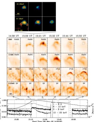
1.15 Cooling in a canonical solar flare. Top: RHESSI 12–25 keV and 6–
12 keV looptop images shortly after the peak in HXRs. Middle:
Se-quences of images produced using TRACE and SOHO/CDS, with
responses to coronal temperatures decreasing from 8 MK (top) to
0.25 MK (bottom). Time during the flare progresses from left to
right. Bottom RHESSI (left axis) and GOES (solid line, right axis)
lightcurves, with noted times corresponding to the images above
1.17 A type I radio noise storm dynamic spectrum. Top: Left– and
right– circularly polarised spectra for a four hour period, exhibiting
a storm particularly in the latter two hours of the observation.
Bottom: Zoomed–in subsets of the above spectra, denoted there by
the red box in the RCP image. Here the fine structure of the storm
is revealed. Overplotted diamonds denote where the automated
detection procedure has marked the presence of bursts (Iwaiet al.,
2013). . . 27
1.18 Interpreted spatial structure of Type I noise storms. Shown are
the solar limb as a black curve, with marked sunspots. Above this
active region is the volume producing the type I storm. Higher
frequency plasma emission originates from lower heights in the
corona, where density is higher (McLean, 1981). . . 29
1.19 Noise storm association with SXR active regions. Shown are three
full–disk X–ray images produced by the Hinode X–Ray Telescope,
for three different times during the passage of an active region
across the disk. Overplotted contours show 80% of peak flux
lev-els of 408 (blue), 327 (green), 237 (orange), and 151 MHz (red),
observed by the Nan¸cay Radioheliograph (Del Zanna et al., 2011). 30
2.1 The plasma beta parameter in the solar atmosphere. The plasma
beta parameter, or the ratio of gas to magnetic pressure of a
plasma, is shown for the photosphere, chromosphere and corona
2.2 Potential magnetic field extrapolation from three colinear
photo-spheric magnetic charges using the mpole algorithm. The solid
horizontal line represents the photosphere at z = 0, while curved
solid lines represent extrapolated potential fields. Dotted lines
rep-resent the ‘mirror’ extrapolated fields underneath the photosphere,
which can also be produced by the same method. However, the
sub–surface field is generally treated as a cylindrical flux tube, as
shown. Triangles represent the location of magnetic null points
(Longcope, 1996). . . 46
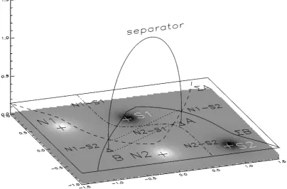
2.3 3D Potential magnetic field extrapolation from a quadrupolar
ac-tive region using the mpole algorithm. The locations of the
netic charges are marked by plus signs on top of the synthetic
mag-netogram. The location of the separatrix surfaces at z = 0.15 are
shown as solid and dashed lines, demonstrating that their point
of intersection denotes a separator, shown as the solid line that
passes upwards into the corona. This separator connects the two
null points A and B, denoted by triangles (Longcope, 1996). . . . 47
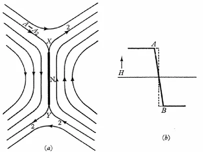
2.4 The Sweet-Parker reconnection model. a) A schematic of the
mag-netic field line topology in the diffusion region. b) The magmag-netic
field strength as it varies in the horizontal direction, demonstrating
the large magnetic field gradient around the neutral line (Sweet,
1958). . . 48
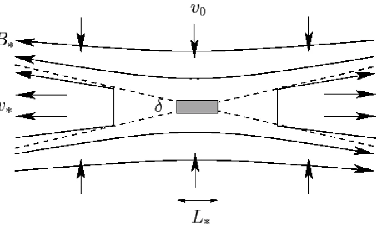
2.5 The Petschek reconnection model. The shaded area in the centre
of the image is a Sweet-Parker diffusion region, where the small
length scaleδ is low enough for the Reynolds number to approach
unity, allowing magnetic diffusion (Fitzpatrick, 2011). . . 51
2.6 Geometry of a Sweet–Parker layer that is unstable to plasmoids
2.8 Geometry of a magnetic null point. a)Sampled magnetic field lines
based on Equations 2.51 - 2.53. b) During reconnection, inflow and
outflow respective to the null point are expected, as highlighted in
the 3D shaded regions here. (Dalla & Browning, 2005). . . 59
2.9 Model evolution of a proton spectrum accelerated at a null point.
On the left, evolution of the spectrum is shown (from black to blue
to green to orange to red) for a magnetic field of 100 G, with the
initial (black) spectrum representing the chosen initial distribution.
On the right, the evolution is shown with the same colour evolution
in the case of a magnetic field of 20 G (Browninget al., 2010). . . 60
2.10 The VAL model of the solar atmosphere. Shown are the
tempera-ture (solid curve) and mass density (dashed curve) variation with
height above the solar surface, which is on the right of the plot.
Notable are the sharp drop in temperature and rise in density at
the transition region, followed by the roughly exponential rise in
density with depth into the chromosphere, where the temperature
reaches its minimum (Vernazza et al., 1981). . . 61
2.11 Statistically derived density structure of the flaring solar
atmo-sphere. The black solid line represents the density structure based
on a fit to results of a statistical RHESSI study based on HXR
2.12 The ‘bump–on–tail’ instability. The solid line represents a particle
distribution which will lose energy to Langmuir waves with phase
velocity between V1 and V2, which is where the slope is positive.
This mechanism will cause a flattening of the bump. If the
distri-bution was produced by faster particles outpacing slower ones, the
bump will evolve toward lower energies, as shown by the dashed
line (Linet al., 1981). . . 66
3.1 A schematic of the RHESSI imaging apparatus. Incoming solar X–
rays enter at the top, encountering the first and rear set of grids on
their path to the germanium detector at the rear of the instrument.
The fraction of X–ray flux which reaches the detector is sensitive
to their angle of incidence. As the entire spacecraft rotates once
every four seconds, this results in a modulated lightcurve which is
encoded with spatial information on the incident X–rays (Hurford
et al., 2002). . . 71
3.2 Demonstration the relationship between ideal RMC modulated
profiles and HXR source brightness, extent, and location on the
solar disk. On the left are idealised HXR fluxes plotted against
time, with the corresponding model source on the right inset (Lin
et al., 2002). . . 72
3.3 Demonstration of the RHESSI Back Projection algorithm. To the
far top–left, a map (Fm) containing a simple Gaussian source at
an arbitrary position is input. From left to right, (and in terms of
Equation 3.1), the modulation pattern (Pim), measured count flux
(Ci), and their product, the weighted probability map (Pim·Ci)
are then shown. To the right of these is a running sum of the
weighted map. Here, the left column covers the first half–rotation
of the instrument, and the right covers the second. As shown,
this process gradually builds up a Back Projection image, known
as a ‘dirty map’, exhibiting heavy sidelobes. The use of multiple
detectors, and post–processing algorithms such as CLEAN, can be
3.6 Schematic of AIA telescope design. Visible or UV light enters
through the aperture on the left, and passes to the primary
mir-ror located around the right baffle. Solar light is reflected into
the left baffle, where it is reflected again off the active secondary
mirror. The secondary mirror takes information recorded by the
guide telescope and stabilises the image for the CCD. The filter
wheel and shutter are finally located between the right baffle and
the CCD. These two components determine the wavelength of light
to be recorded and the exposure time, respectively (Lemenet al.,
2012). . . 83
3.7 AIA temperature response functions for each of the six ‘coronal’
channels. Each curve corresponds to the digital number (DN)
recorded at the AIA CCD as a result of incident emission from
plasma of a given temperature. . . 85
3.8 Sample early images produced using AIA shortly after launch.
Top row, left to right: 131 ˚A, 94 ˚A, 335 ˚A. Middle row:, 171 ˚A,
193 ˚A and 211 ˚A, Bottom row: 1600 ˚A, 304 ˚A, and a line–of–sight
magnetogram produced with SDO’s Helioseismic and Magnetic
Im-ager (HMI) (Lemenet al., 2012). . . 86
3.9 Schematic diagram of the HMI instrument onboard SDO. Sunlight
enters from the top–right into the front window filter, importantly
then passing through the Lyot filter and wide– and narrow–band
Michaelson filters. The light then terminates at the front and side
3.10 HMI tuning positions. Six positions are shown in different colours
which sample the Fe I solar line which is shown in black. Each
position is sampled once every 45 seconds (Schou et al., 2012). . 89
3.11 An example full–disk magnetogram produced by the HMI
instru-ment. These data were taken from the date of an active region
collapse observed on 6 July 2013 at the active region just east of
disk–center. This event is explored fully in Chapter 6. . . 90
3.12 Schematic of the current NRH setup, highlighting the East–West
and North–South baselines of 3200 m and 1295 m, respectively
(Kerdraon & Delouis, 1997). . . 92
3.13 NRH images produced on 1 July 1996 during a type III/type V
solar radio burst, shortly after the upgrade from an analog to a
digital correlator (Kerdraon & Delouis, 1997). . . 94
3.14 A schematic of a simple two–element interferometer. Two
detec-tors are separated by baseline vector b. The detected signals V1
and V2 at each detector are sent to a correlator where the
multi-plied and time–averaged response R is produced. Figure Credit:
National Radio Astronomy Observatory. . . 95
3.15 The responses of an interferometer consisting of 2, 3, and four
detectors, resulting in 1, 3, and 6 pairs in each case, respectively.
Individual pair responses are shown by narrow lines, with the total
beam is given as a thick line. When three detectors are used, a
significant reduction in the number of sidelobes over that observed
by one pair is observed, however they are still noticably present. In
the case of four detectors, the response almost appears Gaussian,
with a width of λ/b. Figure Credit: National Radio Astronomy
in order to clarify the difference between subsequent spectra. Thus,
the rightmost plot includes spectra produced by nonthermal
elec-trons of index 4 (solid line), 4.5 (dashed line) and 5 (dotted line).
Bottom: Synthetic images based on the injected beam parameters
used to produce the spectra above. The 1D profile of HXR flux
along the path of the electron beam were produced using the model
outlined in Section 4.3, then multiplied across by a Gaussian and
curved to demonstrate what a flare loop observation might look
4.2 (a) X-ray Lightcurve of the flare of 28 November 2002. The 12–
25 keV curve is scaled by a factor of five for clarity. Four times are
marked, corresponding to the start times of the four images and
spectra shown below. Overplotted is the electron power-law index
derived from the spectral fits (dotted line), demonstrating the
con-currence of maximum spectral hardness (minimum spectral index)
with peak in HXR emission. (b) Spatially integrated spectra for
the times of their corresponding images using pre-flare background
subtraction. Overlaid are thermal and nonthermal fits constructed
using the OSPEX spectral analysis suite. Residuals, or the
dif-ference between observed and model-based X-ray flux, normalized
to the one-sigma uncertainty in the photon flux, are plotted
be-low each spectrum. (c) RHESSI image contours corresponding to
energy bands of 3–6, 6–8, and 8–10 keV, with a contour showing
20–50 keV at t3, the HXR peak. These images are centred on the
west limb, denoted by the solid line. Contours represent 75% of the
peak emission of the image, with a second 50% contour included
for the 8–10 keV image at interval t2, in order to show the location
of the southern source. Images are generated using the CLEAN
algorithm available in the RHESSI image analysis software. Each
of the intervals used for these images are eight seconds in duration,
beginning at the time shown in (b). . . 104
4.3 RHESSI mages produced by scanning through finely–spaced
en-ergy bins for two time intervals. Top: Images are shown for
in-creasing energy from left to right, continuing in a second row, for
energies from 4 to 51.5 keV, with finer spacing at the lower part of
the spectrum, where counts are higher. The time interval for this
set of images was 68 seconds long, starting at 04:35:00 UT, thus
covering the full rise phase of the flare. A long interval was
cho-sen in order to achieve the required counts for imaging. Bottom:
Images for identical energy bands, produced over a time interval
of 24 seconds, starting at 04:36:00. This time interval covers the
Footpoints are defined as the peak position of 25-50 keV emission
at 04:36:08–04:36:12 UT, the peak in HXRs. The temporal
spac-ing of the data points here does not represent the integration time
of the associated RHESSI images. For all images but the first,
the integration time is 8 s, while the spacing between them is 4 s,
resulting in an overlap of 4 s. Inset: An example image of 3–6
keV emission at 04:35:40–04:35:48 UT. The source, just prior to
splitting into two, can be seen to the right of the image, at the
assumed looptop. Overlaid on the image are locations of the peaks
of Gaussian fits to the current descending source (open square) and
the 20–50 keV footpoints seen at the HXR peak (filled diamonds).
The definition of height is visualised as the distance along the circle
between the southern footpoint and the southern source. . . 111
4.5 Modelled HXR flux distribution with distance from the footpoint
along the flare loop, produced using Equations (4.4) and (4.5)
and assuming example density parameters Hr = 109cm, Nr =
2.43×1019cm−2, and a = 0.9. Four sample spectral index values
are input at a photon energy of 7 keV. Since z- and δ-
indepen-dent factors are neglected, the distributions are normalised such
that they peak at 1; however, the location of the peaks and the
relative scaling between plots of different index are accurate. The
height at which dI/dz distributions are at their maximum (zmax)
is noted, illustrating the HXR source height’s dependence on
spec-tral index. For lower specspec-tral indices, the height at whichdI/dz is
4.6 (a) Electron spectral index, based on fits to RHESSI spectra. (b–
d) Model and observed nonthermal source height evolutions for
photon energies of 3–6 keV, 6–8 keV and 8–10 keV respectively.
Source heights derived from RHESSI observations are denoted by
diamonds, with vertical solid lines indicating the one-sigma width
of the Gaussian which was fitted to the X-ray source. The heights
corresponding to the peak in model intensity are shown as a solid
line. The shaded gray area extending above and below the solid line
represents a one-sigma width of the model intensity distribution,
calculated using its full width at half maximum, where FWHM =
2.35σ. Two alternate model height evolutions are shown as dashed
and dotted lines, which use different fit parameters Nr, Hr, and
a. Along with the model given by the solid line, these all produce
minimal χ2 values when fit to the data. The alternative results
are presented to show the range of possible fits to the data, with
corresponding density models shown in Figure 4.7. The dashed
horizontal line represents the absolute height of the 25–50 keV
footpoint, approximately 0.24 Mm. Fit parameters of the solid
sities and scale heights outside of this range are not expected to
be accurate. It was assumed that the density structure of the flare
plasma was approximately constant over the ∼20 s rise phase of
the HXRs. Vertical solid lines indicate the location of peak
emis-sion for the denoted energies, which represent the three energy
bands used in this study. The values shown correspond to the first
observation, where the injection spectral index isδ = 5. . . 120
5.1 (a) Target ambient plasma temperature variation with height. The
quiet-Sun case is shown in black, and the flaring target case is
shown in red. In the latter case, a localised increase in
tempera-ture, peaking around 2 Mm, is present due to beam heating. The
sudden rise in temperature around 2.5 Mm constitues the
transi-tion region. (b) Target plasma density (solid lines) and ionisatransi-tion
fraction (dashed line) distributions with height. In the flaring
sce-nario, the chromosphere has been ionised around the region of peak
beam energy deposition which, along with the rise in temperature,
causes an increase in scale height. This results in an enhancement
of density in the upper chromosphere. (c) HXR flux distribution
versus height for photons of 50 keV. The black and red flux
pro-files correspond to the neutral and NUI target cases, respectively,
and both profiles are divided by the value of peak emission in the
neutral case. Also shown are the full-width-half-max (FWHM) of
5.2 (a) Distribution of HXRs in height and energy, in the case where
nonuniform ionisation is taken into account. Emission is
nor-malised to the maximum flux in its energy band. (b) Vertical size
and (c) centroid height of the model sources versus energy, for the
nonuniform (red) and fully neutral (black) case. Overplotted in
blue are the observational values recorded in Kontar et al.(2010),
as shown in Figure 6 of that paper. . . 137
5.3 Demonstration of the effect of RHESSI’s imaging response to HXR
sources produced by neutral and NUI target chromospheres. (a/c):
A model HXR input map produced by taking the matrix product
of a 3 arcsec FWHM Gaussian with the neutral/NUI HXR profile
of 50 keV emission as shown in Figure 5.1 (c). The vertical line
represents the western solar limb. The sharp dropoff in flux at
the right of the source in (c) is due to the sharply–defined
tran-sition region, shown at ∼2.4 Mm in Figure 5.1. (b/d): The map
produced by running the VIS FWDFIT routine on the calibrated
eventlist resulting from the map shown in (a). This serves as an
approximation of a RHESSI image given a HXR source produced
in a neutral/NUI chromosphere. . . 140
5.4 (a) Model HXR spectra resulting from the interaction of a
power-law beam of electrons with a neutral (black) and nonuniformly
ionised (red) target. (b) Same data as (a), but flux is multiplied
byδ−1 in order to more clearly show the distinction between the two cases. (c) The spectral index of the HXR spectra shown in
(a), calculated by using the derivative of log(Flux) with respect to
all available frequencies from 150 to 445 MHz. . . 151
6.2 Overview of the collapse of the X–shaped coronal structure. Top:
AIA 171 ˚A images covering the 90 minutes surrounding the
col-lapse. Overlaid on the earliest image are the ‘slices’ used to
gener-ate the time–distance plots shown in Figures 6.4 and 6.5. Slices A
and B are 67 arcseconds and 96 arcseconds long, respectively, with
the arrow denoting the reference direction for the time–distance
plots. Middle: NRH 430 MHz images showing the Type I storm
source at the times of the above images. Overlaid is the field of
view of the AIA images. Bottom: GOES 1–12 keV and RHESSI
3–6 keV lightcurves, showing the flares which occurred during the
collapse. . . 153
6.3 Results from thempolepotential field extrapolations. Top: Sam-ples of extrapolated potential magnetic field lines (white), viewed
from above, overlaid on the HMI line–of–sight magnetogram
pro-duced before (left), during (middle) and after (right) the collapse
of the X–point. Blue filled circles lie on the locations of NRH
cen-troids, with colors matching the correlation to frequency given in
Figure 6.2. Overplot on each frame as a black dashed line is the
lo-cation of the separator which passes closest to the NRH centroids.
The three times were chosen to match those shown in Figure 6.2.
Bottom: The same magnetic field lines shown in the top row are
shown again, viewed tangentially to the photosphere from a point
south of the active region. The dashed line again refers to the
6.4 Time–distance plots demonstrating the apparent plane–of–sky
mo-tion of brightening in the 171 ˚A channel along slice A (panel (a))
and slice B (panel (b)), which are shown in Figure 6.2. The
hor-izontal dotted line denotes the location of the apparent coronal
X–point, and vertical dashed lines correspond to the three time
intervals used to produce the three panels in Figure 6.2. (c) NRH
brightness temperature, averaged over the area within a 50%
con-tour of each NRH image, for its 7 highest recorded frequencies,
smoothed over 6 points and normalised to clarify local peaks. (d)
NRH extent, measured as the linear distance between the centroid
of the highest– and lowest– frequency stable sources, which were
432 and 298 MHz, respectively. . . 159
6.5 Time–distance plots demonstrating the apparent plane–of–sky
mo-tion of brightening in the 193 ˚A channel along slice A (panel (a))
and slice B (panel(b)), which are shown in Figure 6.2. In contrast
with the 171 ˚A emission, this higher energy emission appears to
brighten earlier and closer to the apparent X–point. (c) and (d)
NRH brightness temperature and NRH extent, as also shown in
figure 6.4. . . 160
7.1 Histogram of SXR delay times for 70,000 RHESSI flares. t sxr is
defined as the time of the peak of 3–6 keV emission, whilet hxris
defined as the time of the peak of the highest emission detected, as
recorded in NASA’s RHESSI flare list (NASA, 2014). The vertical
dash–dotted line shows the delay time for the 28 November 2002
Chapter 4. . . 169
7.3 Initial analysis of an early impulsive event. This event was found
using the methods outlined above. Top: Lightcurve of RHESSI
emissions at 3–12, 12–50, and 50–300 keV, including a nearly
iso-lated peak in the harder bands shortly before 03:04 UT, highlighted
in gray. Bottom: Results of an early study intended for
compari-son with the HXR source descent and spectral hardening observed
in the 28 November 2002 event. The solid line shows the HXR
spectral index based on power–law fits to the RHESSI spectrum,
while the points indicate the radial height of the source centroids
above the solar photosphere. . . 170
7.4 Sample Fokker–Planck result. Top: Image of nonthermal electron
flux against height on the vertical axis and electron energy on the
horizontal axis. Here, a height of zero represents the looptop, or
point of acceleration, so positive and negative heights represent
distance from this point. A sample ‘slice’ through energy near the
looptop gives a spectrum (bottom–left), while a slice through height
at 100 keV produces a distribution with height (bottom–right). . . 172
7.5 HXR source asymmetry in a locally ionised chromosphere. (a)
Density and ion fraction for a simple model solar atmosphere for
the case of a neutral chromosphere (black) and a chromosphere
with a local peak in ionisation fraction (red). b-d) Simulated HXR
emission from the chromosphere at 20, 40 and 81 keV, calculated
based on the collisional thick target model, again for the fully
7.6 Observations of HXR asymmetry in a large solar flare. Left: RHESSI
HXR PIXON images, overlaid with three curved slices. Right:
HXR profiles of emission along the central slice (dashed line) and
integrated across the distance between the two outer slices (solid
line). In this case, zero is the position at the top of the slice in the
images on the left. Energy of photon emission increases from top
to bottom. . . 177
7.7 A demonstration of the multi–scale Gaussian normalisation
algo-rithm. Left: An AIA 171 ˚A image ofthe western solar limb during
a flare and filament eruption. This image was produced by the
gamma–transform (taking the original image to some power
be-tween 0 and 1). Right: The same image, produced using the MGN
code, clearly highlighting the fine details of the coronal loop
struc-ture, especially off–disk (Morgan & Druckm¨uller, 2014). . . 180
7.8 LOFAR dynamic spectrum of radio emission during the X–point
collapse outlined in Chapter 6. As shown, the Type I noise storm
which persists throughout the day is well–observed by LOFAR. In
particular, a drifting bursty structure is apparent in the 20 minutes
prior to the flares and collapse of the active region loops studied
previously. The emission appears to drift to lower frequencies,
which for plasma emission can be interpreted as a drift to lower
densities. . . 181
7.9 Schematic diagram of the Swedish Solar Tower. The∼1 m primary
fused silica lens is located at the top of the tower in order to avoid
the refraction caused by convective air flows near the ground. The
lens is mounted on a turret which tracks the Sun throughout the
day. The light then reflects off the two shown 1.4 m flat mirrors to
be passed to the mirror setup labelled as c, which passes the light
to an optical bench which includes the desired beam splitters and
cameras. a and b show the Schupmann corrector system, which is
intended to cancel out the effects of the 1 m lens. (Scharmeret al.,
ribbons in an the (second) X–class flare of 10 June 2014.
Over-laid as solid black lines are the RHESSI 50% and 90% contours
of CLEAN images produced at the same time. Bottom: RHESSI
spectra produced at the same time as the associated images above.
Crosses represent the background–subtracted RHESSI X–ray
at all wavelengths from low–frequency radio waves to gamma rays. Despite
oc-curing up to many tens of times a day, the varied and complex physical processes
which are involved in the phenomenon of solar flares are still being actively
stud-ied to this day. In particular, nonthermally accelerated particles are believed to
play a key role in flare initiation, and yet there remains no clear consensus on how
they propagate through the solar atmosphere. An important diagnostic for these
accelerated particles is the analysis of hard X-ray and plasma radio emission.
In this chapter, we place observations of the active Sun in these wavelengths,
and others, in a historical context, and the general understanding of the physics
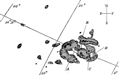
Figure 1.1: A hand–drawn image of the first and one of the largest solar flares ever observed. This event was detected by Richard Carrington during a routine observation of a large sunspot group (shown as black umbrae and shaded penum-brae). The bright ribbons are indicated by the outlined white areas within the group, located at A and B upon first observation, and C and D after 5 minutes (Carrington, 1859).
1.1
Solar Flares
The first solar flare to be imaged was the Carrington event, which occured on
1 September, 1859 (Carrington, 1859; Hodgson, 1859). Sketched by Carrington
himself as shown in Figure 1.1, this event was referred to as “exceedingly rare”.
Indeed, it has since been learned that this event was unique in that it was one
of the most powerful solar flares ever recorded, and the most geo–effective. The
ejected material related to this event is believed to have impacted the Earth,
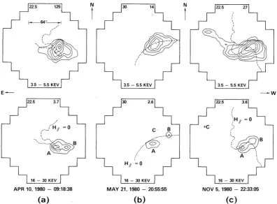
Figure 1.2: Early observations of X–ray solar flares, produced by the Hard X– ray Imaging Spectrometer (HXIS) onboard the Solar Maximum Mission (SMM). Shown are three flares (a–c), with contours of soft (3.5–5.5 keV) X–ray images on the top row, and hard (16–30 keV) X–ray images on the bottom row. These images reveal the footpoint–looptop spatial structure that still describes many modern flare observations. The upper images show hot, thermally–emitting plasma at the apparent flare looptop, while the bottom HXR images show pairs of nonthermal footpoints beneath. The dashed line in the April and May events correspond to the magnetic neutral line, and in the November event correspond to the location of the filament which was present before the impulsive phase of the flare (Duijveman
et al., 1982).
some cases causing fires, and allowing telegraphs to be used without power
(Com-mittee On The Societal & Economic Impacts Of Severe Space Weather Events,
2008). In addition, the event produced a massive amount of highly energetic
2006).
This event sparked 150 years of investigation into these powerful, apparently
rare solar storms. Ground–based observations continued to provide high–detail
images of visible–light sunspots and flares, but in order to probe the high–energy
aspects of common solar flares, numerous balloon– and space–based X–ray
im-agers and spectrometers were developed. Solar hard X–rays (HXRs) were first
recorded by a balloon flight operated by Peterson & Winckler (1959). The first
space–based X–ray instruments dedicated to solar flares were launched onboard
the Solar Maximum Mission (SMM; Strong & Schmelz, 1999) on 4 February 1980.
The HXR Burst Spectrometer (HXRBS Orwig et al., 1980), Gamma–ray
Spec-trometer (GRS Forrest et al., 1980), and the HXR Imaging Spectrometer (HXIS
van Beek et al., 1980) onboard the SMM were designed to observe solar HXRs at
energy ranges of 20–255 keV, 300–9000 keV and 3.5–30 keV, respectively. These
combined spatial and spectral observations revealed the characteristic ‘footpoint–
looptop’ structure of solar flares (see for example Figure 1.2, also observed by
Ohki et al. (1983)), and important evidence for the nonthermal acceleration of
particles (Brown & Loran, 1985).
The HXIS was later supplemented by the Soft X–ray Telescope (SXT: Tsuneta
et al., 1991) and the Hard X–ray Telescope onboard the Japanese YOHKOH
spacecraft, known as Solar–A prior to launch. The SXT was used in the study
important aspects of solar flares, such as soft X–ray (SXR) jets (Shibata et al.,
1992), however the HXT was used to uncover a key in understanding solar flare
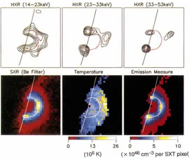
acceleration processes – an ‘above–the–looptop’ HXR source (Masudaet al., 1994,
shown in Figure 1.3). This new type of source – thereafter determined to be quite
Figure 1.3: The now–famous observation of an ‘above–the–looptop’ HXR source, observed by S. Masuda on 13 January 1992 using the YOHKOH HXT. The upper panels show contours of HXR emission for increasing energy from left to right. The soft X–rays show the usual loop–shaped structure, while a clear HXR source is visible above the looptop. The bottom images are produced using the SXT, demonstrating there is no apparent thermal emission present to explain the source. This source was therefore interpreted as nonthermal emission originating from the acceleration site itself (Masudaet al., 1994).
emission; HXRs produced by an accelerated population of electrons immediately
interacting with their surrounding plasma. This event along with other
observa-tions of plasmoid moobserva-tions were combined to form a comprehensive model of solar
flares, relying on theories of a process known as magnetic reconnection (Shibata,
Figure 1.4: Exploded view of the Ramaty High Energy Spectral Solar Imager
(RHESSI) instrument. Shown are the dual–grid rotation–modulated collimater system as well as the hyperpure germanium detectors. RHESSI is described in detail in Section 3.1.
As we move to the modern era of solar HXR observations, we find it is
dom-inated by a single instrument: the Ramaty High–Energy Solar Spectroscopic
Imager (RHESSI; Lin et al., 2002). RHESSI, shown in Figure 1.4 and described
in much more detail in Section 3.1, was launched in February 2002, and is capable
of producing ∼3 arcsecond (∼2 Mm) resolution images of solar HXRs from ∼3
keV to 17 MeV, at a uniquely high spectral resolution of ∼1 keV for energies
below 100 keV, increasing to 5 keV at 5 MeV. Given these strengths, RHESSI
has contributed immensely to the understanding of the high–energy aspects of
solar flares, which is outlined in the remainder of this Section.
These fifteen decades of solar observing have provided a wealth of information
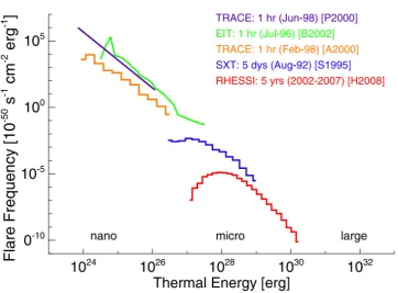
on the overall behaviour of solar flares. For example, as shown in Figure 1.5, the
amount of energy released in solar flares covers over nine orders of magnitude.
us-Figure 1.5: A statistical overview of solar flare energy emission ranging from nanoflares on the left through microflares to large flares on the right. Each colour of plot corresponds to data gathered by a different solar instrument over a different duration, listed in the legend. As shown, studies frequently reveal a power law in the distribution of flare frequency with emitted energy (Hannah et al., 2011).
ing many of the instruments outlined above (Aschwanden et al., 2000; Benz &
Krucker, 2002; Crosby et al., 1993; Hannah et al., 2008; Lin et al., 2001; Parnell
& Jupp, 2000; Shimizu, 1995). Studies such as these, reviewed in Hannah et al.
(2011), demonstrate that the distribution of flare frequency with size tends to
follow a power–law form (Akabane, 1956), suggesting the presence of a cascading
mechanism of energy release in solar flares. Statistical studies have also revealed
a number of general behaviours in solar flares, such as adherence to the Neupert
effect, which states that the HXR flux is proportional to the temporal derivative
[image:45.595.127.490.142.409.2]log10 (Energy, erg)
Mode 21 April 2002 23 July 2002
Magnetic 32.3 ±0.3 32.3 ± 0.3
Flare
Thermal plasma, T >10 MK 31.3−+01.4 31.1+0−1.4 Nonthermal electrons 31.3+?−0.5 31.5+?−0.5 Nonthermal ions,>1 MeV nucleon−1 < 31.6 31.9 ± 0.5 CME
Kinetic 32.3 ±0.3 32.0 ± 0.3
Gravitational potential 30.7 ±0.3 31.1 ± 0.3
Energetic particles at 1 AU 31.5 ±0.6 <30
Table 1.1: Energy partition in two solar eruptive events. (Emslieet al., 2005)
Additionally, several studies have been performed with the goal of
determin-ing the energy partitiondetermin-ing of solar eruptive events (SEEs). SEEs are generally
defined to include the solar flare, which constitutes the thermal and nonthermal
electromagnetic radiation produced by an event, as well as the coronal mass
ejec-tion (CME) released. The resulting energy budget for two SEEs was produced
by Emslie et al. (2004, 2005), and is shown in Table 1.1. These results showed
that the CME energy in both cases constitutes the dominant part of the energy
budget, far more than the accerlerated particles, which has placed constraints on
flare models developed since.
1.1.1
Morphology
Solar flares occur in areas of the solar atmosphere characterised by a substantially
increased magnetic field strength, known as active regions, however there are
ex-ceptions (Dodson & Hedeman, 1970; Martin, 1980). This immediately highlights
Figure 1.6: Active regions on the Sun. Shown to the left is a line–of–sight HMI magnetogram, and to the right an AIA 193 ˚A image, produced on 31 July 2012 (See Section 3.2 for a description of these instruments). As shown, pairs of strong regions of oppositely–aligned magnetic field in the magnetogram correspond to hot coronal loop–shaped structures in the EUV image.
backdrop for the spatial structure of a ‘standard’ solar flare. These active regions
are commonly associated with bright extreme ultra–violet (EUV) loop structures
(such as those shown in the full–disk image in Figure 1.6). This emission is
cre-ated by de–excitation of highly ionised ∼0.1–10 MK coronal plasma, which is
described as ‘frozen in’ to the active region magnetic field (see Section 2.1.3) for
detail). As such, EUV emission is a useful starting point in the discussion of the
spatial structure of active regions and solar flares.
Along with visible light, EUV emission constitutes the majority of radiated
energy in a solar flare (Woods et al., 2006). EUV images have been produced
at high resolution with many instruments such as the EUV Imaging Telescope
(EIT; Delaboudini`ere et al., 1995) onboard the Solar and Heliospheric
Figure 1.7: A reconnecting solar coronal loop, as seen in AIA 131 ˚A. This event occured on the eastern solar limb, and exhibited inflows and outflows which were interpreted as an observation of magnetic reconnection (Suet al., 2013).
TRACE;), and the Atmospheric Imaging Assembly (AIA; Lemen et al., 2012)
onboard the Solar Dynamics Observatory. Here we outline two characteristic
structures in terms of solar flare plasma. Firstly, coronal loops are a common
ob-servation with these instruments, and are generally interpreted to trace out the
magnetic field lines which connect positive and negative magnetic poles in the
solar photosphere (e.g., Gosain, 2012). The flows exhibited within and between
these coronal loops are often presented as evidence for magnetic reconnection
when direct observations of nonthermal emission are unavailable (Narukage &
Shibata, 2006; Savageet al., 2012a; Yokoyamaet al., 2001). One such example is
shown in Figure 1.7. In this event, an apparent X–point was produced by a hot
coronal loop on the eastern limb, exhibiting clear inflow and outflow as predicted
by 2D magnetic reconnection models (Su et al., 2013).
Another common observation seen in EUV is the coronal arcade. Arcades
can be seen as the 3D extension of the limb–observed coronal loop, as they are
essentially hot, thermally emitting plasma along the multiple sets of field lines
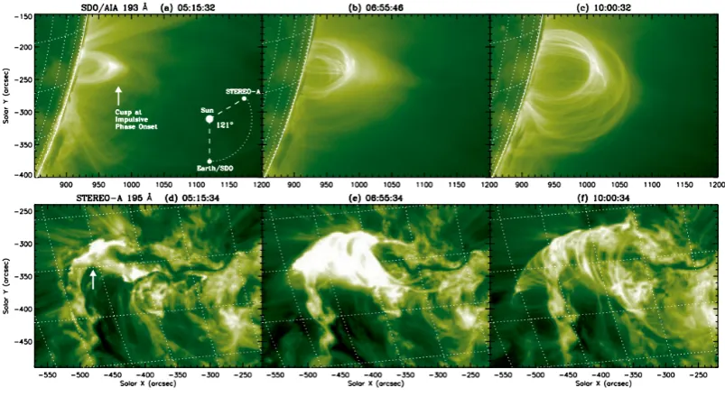
Figure 1.8: Two views of a solar flare arcade. Top: AIA 193 ˚A images, taken from the point of view of the Earth appear to be on the western solar limb. The loop is shown to expand with time (from left to right) as the event progresses.
Bottom: STEREO 195 ˚A images at the same time intervals, from a location 121◦ counter–clockwise, as shown in the inset of the first image. As shown, from above the active region, the loop structure is revealed to be extended, forming an arcade (Liuet al., 2013).
is demonstrated in Figure 1.8, which shows a coronal ‘loop’ observed from the
Earth’s point of view, with its 3D nature as an arcade revealed by the Extreme
Ultraviolet Imager (EUVI; Wuelser et al., 2004) onboard the Solar–TErrestrial
RElations Observatory (STEREO), which was located above the active region
at the time (Liu et al., 2013). Arcade formation is strongly linked with the
production of flux ropes, which are thought to be the originating structures of
CMEs (Fan & Gibson, 2007; Roussev et al., 2003; Webb, 1992).
A related visible and ultra–violet (UV) phenomenon which is strongly
asso-ciated with loops and arcades is that of flare ribbons. Ribbons are commonly
emis-sion produced by the 3 to 2 Balmer transition in neutral hydrogen, known as
Hα emission. They generally appear as roughly parallel brightenings, usually
separated by the polarity inversion line of the magnetic field (e.g., Asai et al.,
2003; Zirin & Tanaka, 1973). Importantly, ribbons are consistently associated
with HXR footpoints (see below for details), which indicates that the emission is
produced by chromospheric plasma which has been nonthermally heated by the
accelerated electrons producing the HXRs (Canfield & Gayley, 1987; Qiu et al.,
2001). Thus, ribbon formation and evolution played an important role in the
developement of the standard model of solar flares.
1.1.1.1 X–Ray Structure
X–ray images provide detailed information on both the thermal and nonthermal
processes which occur in a solar flare. As originally shown in Figure 1.2, X–
ray images often exhibit a structure well–described by a pair of high–energy
footpoints, and a larger extended loop structure in the softer X–rays. Notably,
SXRs often originate exclusively from higher up in the loop, as this is where
heated plasma gathers in the gradual phase of the flare (see Section 1.1.2.3).
Examples of this overall structure remain common in the RHESSI era. However,
the improved capabilities of RHESSI have lead to further discovery, for example
that of the presence of a ‘super–hot’ 44 MK distribution of plasma located slightly
above the standard flare looptop in one observed event (Caspi & Lin, 2010).
Separate from thermal loop emission, nonthermal looptop and ‘above–the–
looptop’ sources have been of great interest since their discovery by Masudaet al.
(1994), as they can potentially reveal details on the location and nature of the
Figure 1.9: RHESSI nonthermal loop HXR images for ten solar flare events. Lower energy emission is shown at the top, and higher at the bottom. For each energy, the top row is produced by CLEAN, and the bottom by VIS FWDFIT (see Section 3.1.1 for details on these imaging methods). As shown, loop length appears to increase with increasing photon energy (Xuet al., 2008).
these Masuda sources, all electrons are energised, suggesting a direct observation
of the accleration region (Krucker & Battaglia, 2013; Krucker et al., 2010). In
some circumstances, loop emission can also be produced nonthermally, and it has
been shown by numerous studies that more extended loop–like sources appear
for higher photon energies (see Figure 1.9), consistent with a beam of particles
penetrating downwards from above, with higher energy particles reaching further
along the loop before braking (Guo et al., 2012; Jeffrey & Kontar, 2013; Xu
et al., 2008). Motion of these sources during a flare have also been put forward
as evidence for reconnection between the looptop and a previously disconnected
plasmoid (B´arta et al., 2008; Milligan et al., 2010)
A great focus of RHESSI studies has been on the spatial location, structure
and size of nonthermal footpoints. A number of studies have been performed to
how accelerated electrons deposit their energy in the corona and chromosphere
(Aschwandenet al., 2002; Battagliaet al., 2012). In terms of source size, advanced
image reconstruction techniques were used to reveal that HXR footpoints are 3–6
times larger than predicted, based on the collisional thick target model, leading
to the suggestion of a threaded loop structure rather than a single monolithic
loop (Dennis & Pernak, 2009; Kontar et al., 2010). This issue is a focus of the
analysis outlined in Chapter 5.
1.1.1.2 Structure in Other Wavelengths
HXR footpoints are frequently associated with the Hαand UV ribbons mentioned
above (e.g., Tanaka & Zirin, 1985; Temmeret al., 2007). This supports the
inter-pretation that ribbons are produced at the footpoints of flare arcades, where the
accelerated electrons causing the nonthermal heating are emitting bremsstrahlung
in HXRs. However, a consistent distinction between HXR footpoints and
visi-ble/UV ribbons is that HXR sources are often much more localised, usually
con-fined to points along ribbons. It has been suggested by Asai et al. (2002) that
the HXRs occur at regions of the flare arcade which exhibit locally increased
magnetic field strength. However, a small number of events have occurred in
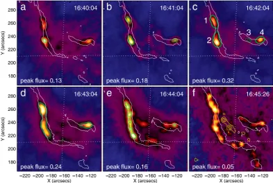
which HXRs exhibit a ribbon–like structure (Masuda et al., 2001). An example
of such an event is shown in Figure 1.10. In this observation by Liuet al.(2007),
it is hypothesized that these counterexamples occur when a uniformity of energy
deposition occurs along a ribbon, perhaps due to a uniquely clear transition from
sheared loops to the standard post–flare arcade.
Microwave emission is also known to be associated with impulsive HXR
Figure 1.10: HXR emission associated with UV ribbons. The background im-ages show RHESSI 25–50 keV emission, reconstructed with the CLEAN algorithm. Overlaid are the contours of the ribbons as seen in the TRACE 1600 ˚A channel. Finally, the 50%, 70% and 90% contours of the apparent looptop 6–12 keV SXR RHESSI images are overplotted in yellow in the final image. As time progresses from a–f, the HXR sources evolve from isolated footpoints to ribbon–like structures (Liuet al., 2007).
microwaves are interpreted as gyrosynchrotron and synchrotron emission
pro-duced by nonthermally accelerated electrons spiraling along the strong magnetic
fields in solar flare loops (Kundu, 1961). Indeed, microwave imaging has revealed
a strong association in spatial structure with SXR emission, as demonstrated
for example in 1.11 (see also e.g., Kundu et al., 2004, 2009). However, a large
number of studies have shown that the spectral index of electrons producing
Figure 1.11: Comparison of RHESSI 10–20 keV images (black contours) and 34 GHz images produced by the Nobayama Radioheliograph (NoRH; Nakajima
et al., 1994), shown as grey contours. As shown, the NORH microwave emission originates from a pair of footpoints and occasionally a more extended loop struc-ture, while the RHESSI SXRs trace out the overlying loop of heated plasma (Sui
et al., 2005b).
break in the power law between the HXR energies and ∼300 keV, above which
microwaves are produced (Kunduet al., 1994; Silva et al., 2000).
In extremely energetic events, some flares have exhibited the impulsive
emis-sion of gamma radiation. Gamma rays originating from the Sun were first
ob-served as an enhancement over background flux at all energies below 7 MeV,
Figure 1.12: Three gamma–ray flares observed by RHESSI. Trace images are shown for (from left to right) flares occuring on October 28, October 29, and November 2 of 2002. Overlaid in red and blue are the contours of the 200–300 keV (HXR) and 2218–2228 keV (gamma ray) RHESSI images. In the middle image, the blue circle is centred on the centroid location with a radius of 1σ of this position. The purple lines trace the motion of the HXR footpoints (Hurfordet al., 2006).
Suri et al., 1975). Line emission at these energies is interpreted as emission from
chromospheric atoms which have been excited by accelerated ions and protons
during a solar flare (Kuzhevskii, 1969; Lingenfelter & Ramaty, 1967). A series of
gamma–ray emitting events were imaged by RHESSI and TRACE, as shown in
Figure 1.12. The 2.2 MeV emission used to produce the images is dominated by
the neutron capture line, produced when neutrons created in flare ion collisions
are captured on3He nucleii (see e.g., Biermann et al., 1951; Hua & Lingenfelter,
1987). These rare observations of impulsive gamma–ray emission normally reveal
single unresolved sources, such as in the latter two events, which have indicated
that these bursts are produced in flares. However in the first event of October 28
2002, two ‘footpoint–like’ sources appeared about 15 arcsec offset from the HXR
footpoints, which may be explained partly by gradient and curvature drifts, which
1.1.2
Temporal Evolution
As we have now established the standard spatial structure of solar flare emissions,
we will now outline a detailed description of solar flare emission as the event
evolves over time. Below we detail the behaviour of a standard solar flare in
terms of morphological and spectral evolution by dividing the flare progression
into three phases; the preflare phase, the impulsive phase, and the gradual phase.
1.1.2.1 The Preflare Phase
In the minutes to hours leading up to impulsive flare events, it has been noted by
many authors that a gradual brightening appears in SXR, EUV and UV
wave-lengths (Acton et al., 1992; Bumba & Kˇrivsk´y, 1959; F´arn´ık et al., 1996). This
brightening is commonly attributed to some sort of pre–heating of the
chromo-spheric plasma up to temperatures as high as 10 MK, despite the lack of particle
acceleration at the time (e.g., Fletcher et al., 2013). This requires that an
addi-tional model for energy transfer from corona to chromosphere in the pre–flaring
phase be developed. For example, one study has suggested that this heating
is caused by a conduction front, originating in the corona, which travels to the
chromosphere, heating and expanding plasma there (Battaglia et al., 2009).
1.1.2.2 The Impulsive Phase
The impulsive phase is characterised by a rapid increase in the nonthermal
emis-sions outlined above, namely gamma–rays, HXRs, white light continuum, and
nonthermal radio and microwave emissions. During this time, most of the stored
de-Figure 1.13: Flare HXR footpoint evolution during the impulsive phase. Left:
20–50 keV RHESSI HXR centroids produced by CLEAN (crosses) and PIXON (circles; Metcalf et al., 1996) overlaid on a EIT 195 ˚A image of a flare ribbon. The time each source is measured at is indicated by the symbols colour, and the polarity inversion line is overplotted in gray. HXR sources appear at the northern edge of the flare ribbons and evolve southward between 13:12 and 13:24 UT.Right:
Evolution of photon spectral index and flux at 35 keV over the impulsive phase (Grigis & Benz, 2005).
spite lasting on the order of minutes. Studies which make use of magnetic field
extrapolations from the photosphere have supported this idea, showing that
ac-tive regions with a large amount of measured free energy tend to produce more
flares (Jinget al., 2010). Such studies have also shown a drop in magnetic energy
and magnetic helicity during a solar flare (Bleybel et al., 2002; Murray et al.,
2013), again indicating that this energy is released to power the flare.
It is during the impulsive phase that the HXR and Hα footpoints discussed
above appear and evolve. From the standard model of solar flares it is expected
that new magnetic field lines are brought into the reconnection region as a flare
2.1.5 for details). In fact, footpoints are regularly observed to separate over time,
interpreted as the growth of the flaring loop system above (Fletcher & Hudson,
2002; Qiu et al., 2002). It has also been shown that these HXR sources show
a consistent motion along flare ribbons, as shown in Figure 1.13. Here, HXR
sources appear to move clearly along the footpoints of the flare arcade, and so
was interpreted as a disturbance which propagated smoothly along the arcade,
triggering acceleration as it progressed (Grigis & Benz, 2005).
Conversely, footpoint convergence is also a reasonably common observation,
for example from 13:12 to 13:14 UT in Figure 1.13. Indeed there are several
observations which show convergence followed by separation (e.g., Ji et al., 2008;
Zhouet al., 2008). Such observations can also be accompanied by a HXR looptop
source which exhibits a decrease in altitude during the footpoint convergence
(Liu et al., 2009). These observations are partially explained by the concept of
a coronal implosion, or inflow of plasma towards the region of energy release as
magnetic pressure rapidly drops (Hudson, 2000; Sim˜oes et al., 2013).
Accelerated particles which produce these nonthermal signatures deposit their
energy in the chromosphere, causing a process of heating and expansion of plasma
known as chromospheric evaporation (Antiochos & Sturrock, 1978). This process
has been categorised as either gentle or explosive chromospheric evaporation. In
the former case, the chromospheric plasma is heated by either the accelerated
particles or a conduction front and so expands, while in the latter, the plasma is
heated so rapidly that radiative cooling is insufficient, and plasma expands both
upwards and downwards (Fisher et al., 1984; Mariskaet al., 1989). With modern
UV and HXR imaging spectrometers, both types of evaporation have now been
(Milligan et al., 2006a,b). In this work, upward and downward velocities on the
order of ∼230 and ∼30 km/s were detected from blue– and red–shifted thermal
plasma emission, respectively. More recently, evaporation has been detected
in-directly through RHESSI HXR nonthermal emissions (Liu et al., 2006) and by
loop–filling microwave emission (Gan & Li, 2012).
Finally it is important to consider the spectral evolution during a solar flare.
The RHESSI HXR spectrum is generally comprised of an exponential thermal
component and a power–law nonthermal component (see Section 3.1.2 for further
details). During the impulsive phase, the nonthermal component dominates the
HXRs. Often it first appears relatively steep before flattening to reach the higher
energies, then softens again as the flare transitions into the gradual phase (e.g.,
Benz, 1977; Fletcher & Hudson, 2002; Parks & Winckler, 1969). This behaviour
is commonly referred to as ‘soft–hard–soft’ evolution, and is apparent for example
in Figure 1.13, where during the course of the event, a large number of impulsive
HXR bursts occur, along with multiple instances of fall and rise of spectral index.
This evolution is generally attributed to an increase and decrease in acceleration
efficiency, which should also have an effect on HXR spatial structure. This concept
is one of the science goals of this thesis, and is explained fully in Chapter 4.
1.1.2.3 The Gradual Phase
Following the rapid energy conversion and release associated with the impulsive
phase, a great deal of emission still continues to take place for hours afterward,
in a period of time known as the gradual phase of the flare. During this time,
nonthermal HXRs and radio emission are generally no longer observed, and SXRs