Art and Design Theses Ernest G. Welch School of Art and Design
Spring 4-9-2015
Graphic Design and Morale: Helpful Widgets and
Worthwhile Distractions for the Masculine Chemo
Crowd
Carrie W. Brown
Georgia State University
Follow this and additional works at:https://scholarworks.gsu.edu/art_design_theses
This Thesis is brought to you for free and open access by the Ernest G. Welch School of Art and Design at ScholarWorks @ Georgia State University. It has been accepted for inclusion in Art and Design Theses by an authorized administrator of ScholarWorks @ Georgia State University. For more information, please [email protected].
Recommended Citation
Brown, Carrie W., "Graphic Design and Morale: Helpful Widgets and Worthwhile Distractions for the Masculine Chemo Crowd." Thesis, Georgia State University, 2015.
HELPFUL WIDGETS AND WORTHWHILE DISTRACTIONS
FOR THE MASCULINE CHEMO CROWD
by
CARRIE WALLACE BROWN
Under the Direction of Elizabeth Throop, MFA
ABSTRACT
This thesis explores the possibility that graphic design can have a positive impact on the
morale of a male undergoing chemotherapy for testicular cancer. The paper explains the concept
of “morale,” why it is vital for patients at a cancer infusion center, and subsequently how graphic
design can boost morale. The supporting research fostered a socially-responsible design
solution—a mobile application that intertwines design, health, and technology. The application is
geared to the patient experience. As such, it can reduce anxiety by providing a distraction in the
form of entertainment (as well as providing tools and an anonymous connection for the
individual patient to a similar patient population). Furthermore, the application is also designed
for research purposes by establishing a framework for collecting measurable data. In turn, this
data can be used to enhance the chemotherapy experience—thus contributing to a positive
impact on the morale of the cancer patient.
HELPFUL WIDGETS AND WORTHWHILE DISTRACTIONS
FOR THE MASCULINE CHEMO CROWD
by
CARRIE WALLACE BROWN
A Thesis Submitted in Partial Fulfillment of the Requirements for the Degree of
Master of Fine Art
in the College of Arts and Sciences
Georgia State University
Copyright by Carrie Wallace Brown
HELPFUL WIDGETS AND WORTHWHILE DISTRACTIONS
FOR THE MASCULINE CHEMO CROWD
by
CARRIE WALLACE BROWN
Committee Chair: Elizabeth Throop
Committee: Ritu Aneja
Jeff Boortz
Electronic Version Approved:
Office of Graduate Studies
College of Arts and Sciences
Georgia State University
DEDICATION
ACKNOWLEDGEMENTS
I would like to express my special appreciation and thanks to my thesis committee,
composed of Associate Professor Elizabeth Throop, Assistant Professor Jeff Boortz, and
Associate Professor Dr. Ritu Aneja. You have each challenged my ideas, encouraged my
research, and pointed me in new directions when I was at a stopping block. Your guidance has
been invaluable. I look forward to staying in touch in the future. Also, I wish to express my
thanks to the faculty and staff of the Ernest G. Welch School of Art and Design. Thank you for
your support over the last three years.
I want to extend special thanks to Dr. Guiherme Cantuarai, Tama Duffy Day, and the
nurses I met at the Northwestern Memorial Hospital Infusion Center in Chicago, IL and the
Northside Hospital Infusion Center in Atlanta, GA for informing my research and confirming my
decision to move forward with the concept. Additionally, I want to express my thanks to the
American Cancer Society for allowing me to present my “big idea,” and for providing
tremendous feedback that reminds me that this project is just the beginning.
Words cannot express how thankful I am to my family, who did not bat an eye when I
told them I was placing my career on hold and going back to school, regardless of having said, “I
would never do that.” To my husband, Christopher Brown, I am eternally grateful for your
unwavering support, unconditional love, constant encouragement, not to mention your supreme
fathering and housekeeping skills throughout this journey. And, to my daughter, Nora Mills
Brown (who was exactly eight weeks old on my first day of graduate school and is now almost
three years old), you make me incredibly proud.
TABLE OF CONTENTS
ACKNOWLEDGEMENTS ... v
TABLE OF CONTENTS ... vi
LIST OF FIGURES ... viii
1 INTRODUCTION ... 1
2 THE AUDIENCE ... 2
3 CHEMOTHERAPY ... 3
4 INFUSION CENTERS ... 5
5 MORALE ... 5
5.1 Loss of Control ... 6
5.2 “Chemobrain” as a Condition ... 7
6 LAUGHTER IN STRESSFUL SITUATIONS ... 8
7 SENSE OF BELONGING ... 11
8 CASE STUDIES ... 12
8.1 Case Study 1—Technology to Boost Morale: StandWith App ... 12
8.2 Case Study 2—Humorous Voice: A Girlfriend’s Guide to Pregnancy ... 13
8.3 Case Study 3—Knowing Your Audience: Movember ... 14
8.4 Findings from Case Studies ... 15
9 THE INFUSION ENVIRONMENT ... 16
9.2 Northside Hospital Infusion Center (Atlanta, GA) ... 21
10 THE PROJECT ... 30
10.1 Messaging ... 31
10.2 Security ... 31
10.3 Name and Logo ... 32
10.4 Platform and Interface ... 35
10.5 Widgets ... 37
11 CONCLUSION ... 71
LIST OF FIGURES
Figure 9.1 Entrance ... 17
Figure 9.2 Corridor ... 17
Figure 9.3 Corridor Artwork ... 18
Figure 9.4 Waiting Area ... 18
Figure 9.5 Patient Infusion Station Taken From Within the Nurses’ Station ... 19
Figure 9.6 Patient Infusion Station ... 20
Figure 9.7 Personalization in the Nurses’ Station ... 21
Figure 9.8 Corridor ... 22
Figure 9.9 Corridor Artwork ... 22
Figure 9.10 Waiting Area ... 23
Figure 9.11 Waiting Area ... 24
Figure 9.12 Patient Infusion Area ... 24
Figure 9.13 Patient Infusion Area ... 25
Figure 9.14 Patient Infusion Area ... 25
Figure 9.15 Exiting the Patient Parking Deck ... 26
Figure 9.16 Brochure Shelves ... 28
Figure 9.17 Collection of Infusion Center Materials ... 29
Figure 9.18 Brochure and Magazine Racks ... 29
Figure 10.1 Project Logo ... 33
Figure 10.2 Project Typography ... 34
Figure 10.3 Project Color Palette ... 35
Figure 10.5 Main Menu ... 44
Figure 10.6 My Badgemaker ... 45
Figure 10.7 My Wallpaper ... 46
Figure 10.8 Sleep Screen ... 47
Figure 10.9 Mood-o-Meter ... 48
Figure 10.10 Guys Who ‘Get It’ – Community ... 49
Figure 10.11 Guys Who ‘Get It’ – Messaging ... 50
Figure 10.12 The Chemo Brain ... 51
Figure 10.13 The Chemo Brain – People ... 52
Figure 10.14 The Chemo Brain – Transport ... 53
Figure 10.15 The Chemo Brain – Contacts ... 54
Figure 10.16 What’d They Say? – Glossary ... 55
Figure 10.17 What’d They Say? – Personal Glossary ... 56
Figure 10.18 Thanks, I Needed That – Joke ... 57
Figure 10.19 Thanks, I Needed That – Answer ... 58
Figure 10.20 The Horse’s Mouth – Email Composer ... 59
Figure 10.21 The Horse’s Mouth – Archives ... 60
Figure 10.22 The Horse’s Mouth – Settings ... 61
Figure 10.23 Channel Surf – Menu ... 62
Figure 10.24 Channel Surf – Movies ... 63
Figure 10.25 Channel Surf – Television ... 64
Figure 10.26 Channel Surf – Sports ... 65
Figure 10.28 Arcade – Menu ... 67
Figure 10.29 Arcade – Squirrel Bandit ... 68
Figure 10.30 Arcade – Ear Ring Toss ... 69
1 INTRODUCTION
In August 2013, my sister informed me that her husband had been diagnosed with
testicular cancer. The “C-word” had never been used in my immediate family. Thus, we were all
quite shocked and quick to formulate questions and make assumptions about the impact of his
frightening diagnosis. A few Google searches later, it was evident that testicular cancer is
considered a “good cancer” in contrast to forms considered impossible to survive. When caught
early, (which was thankfully the case), his form of cancer is considered curable—a term not
often applied in the cancer diagnosis realm.
Our family was thankful and extraordinarily relieved that the prognosis of my sister’s
husband was positive. However, despite our relief, there was still great concern and worry
among us regarding the surgery and a lengthy regimen of chemotherapy looming ahead for him.
He and my sister had both recently completed graduate school, were thriving in their professions,
and were the proud parents of an eight-month-old son. Physicians’ visits had revealed a long list
of potential physical side effects from chemotherapy—in addition to possible psychological
changes over the course of the treatment. These potential side effects caused worry for him and
the family as to how this interruption would affect his familiar and day-to-day routines to which
the family had become accustomed. Short-term side effects were inevitable. However, we
worried as to whether there would be long-term side effects that would impact him for the rest of
his life.
The concept of changed patient confidence and morale during chemotherapy got me
wondering if it is possible for morale (an emotion influenced by forces beyond physical
determinants) to be effected by graphic design. Clarity of message, aesthetic cohesion, and
careers. Equally important to graphic design itself is the emotional response of the viewer, in
that—as designers—our common goal is to each be a solver (and being a
problem-solver includes overcoming emotionally-charged obstacles). Therefore, my goal in this project
was two-fold: to assess if graphic design can affect health outcome, and to develop a patient tool
to relieve the anxiety and stress of chemotherapy.
2 THE AUDIENCE
Cancer is a multifaceted issue, and with much conflicting published research based on
different clinical studies involving data collection, analysis, and interpretation of findings.
Therefore, the findings and conclusions should be considered in relation to the manner in which
the study was conducted (i.e., size of the study population). It is important to recognize that all
races, ages, and genders can develop cancer, and that receiving a diagnosis of cancer can occur at
any time of life. Likewise, it is important to recognize that a cancer diagnosis also impacts the
family and friends of the individual diagnosed with cancer. Meanwhile, the amount of stress and
anxiety experienced by the patient can also impact that person’s treatment outcome.
For men, a diagnosis of testicular cancer can produce a high degree of fear and have a
profound impact on their lives. According to the Testicular Cancer Society, “young men between
the ages of 15-35 are at the highest risk” of developing this form of cancer. Additionally,
“testicular cancer is 4.5 times more common in white men versus black men,” and “the risk for
Hispanics, American Indians and Asians falls between that of white and black men.”1
In 2011, the National Cancer Institute published the results of their Surveillance,
Epidemiology, and End Results Program, and included testicular cancer trends over a 36-year
period (1975–2011). Inclusive of all races within the US population, this study revealed a 0.8%
annual increase in testicular cancer cases, but stabilization in death rates—and concluded that
early detection is vital to reducing the overall cancer death rate. The same study also revealed
that 95.3% of men survive five years or more after being diagnosed with testicular cancer—
99.2% if discovered in the first, localized stage.2 Thus, the prognosis of a patient is typically
positive even if a shock to his perception of his masculinity and feeling of self-confidence.
For the purposes of this thesis, I will focus on testicular cancer patients undergoing
chemotherapy treatment at an infusion center. Thus, the graphic design solution is targeted to this
specific cancer patient population, and encompasses this populations’ similar experiences as
patients interacting with healthcare staff during the course of their chemotherapy treatment.
3 CHEMOTHERAPY
The Testicular Cancer Society reports that cancer treatment depends on the type, stage,
patient’s overall health, and individual preferences. In most circumstances, treatment involves at
least one of the following: active surveillance after initial surgery, radiation therapy,
chemotherapy, and retroperitoneal lymph node dissection (RPLND).3 Chemotherapy is a
medication approach to eliminating, targeting, and killing rapidly dividing cancer cells. It does
not target a particular part of the body (as opposed to radiation aimed at a specific area in the
body); instead, chemotherapy usually acts on cells throughout the entire physiological system.
The emergence of chemotherapy to treat cancer occurred in the 1950s, and it can have
systemic effects and cause challenging side effects. Since the 1950s, chemotherapy drugs have
been created that have fewer side effects, and are more targeted to specific cancer cells.
Presently, patients typically receive a “cocktail” of intravenous or oral chemotherapy drugs to
2 "Surveillance, Epidemiology, and End Results Program Turning Cancer Data Into Discovery," Cancer of the
Testis, accessed January 3, 2015.
destroy cancer cells or impede the growth of these cells. Schedules of chemotherapy
administration vary from patient to patient, but are typically determined by an oncologist and
administered by a team of nurses.4 Depending on the stage at which malignant tumors or cells
are discovered, testicular cancer patients may receive their chemotherapy treatment once a day,
once a week, or even once a month.5
The potential for side effects during the course of treatment is high, because
chemotherapy medications frequently also destroy healthy cells in the body. Patients receiving
chemotherapy could experience a range of side effects including: nausea, fatigue, vomiting,
mouth sores, nerve damage, neutropenia, diarrhea, constipation, and hair loss. It is well known
that chemotherapy treatments can be exhausting. Therefore, breaks are given between
chemotherapy cycles, in order to allow the body time to rest and rebuild healthy cells that have
been destroyed during the process. Unfortunately, halting chemotherapy can result in metastasis
in which the affected cancer cells rapidly multiply and spread throughout the patient’s entire
body.6 The likelihood of a positive outcome following adherence to chemotherapy regimen
(versus the poor prognosis if the cancer is not treated at all) leads most patients to agree to
chemotherapy despite the likelihood of exhaustion and side effects—as well as other potential
risks (such as a reaction).
4 "Learning about Chemotherapy Treatment," Learning about Chemotherapy Treatment, accessed October 15,
2014.
5 "Questions about Chemotherapy," Questions about Chemotherapy, accessed November 15, 2014.
6 "Chemotherapy, Nausea, Vomiting, Fatigue, Neutropenia, Diarrhea, Constipation, Hair Loss, Mouth Sores,
4 INFUSION CENTERS
Cancer patients typically receive treatment at an outpatient infusion center. Infusion
centers administer medications, fluids, antibiotics, pain relief, and various other treatments in an
environment staffed with oncology nurses, patient care technicians, and often a dedicated
pharmacist. In addition, patients are usually provided with blankets, drinks, and snacks—and
some infusion centers provide dieticians and spiritual counselors. Furniture for patients is
characteristically over-scaled and plush to increase comfort; flexible seating is regularly
provided to the family and friends of the patient who visit during the process.
Length of stay at an infusion center depends on the type of cancer, treatment regimen,
and the patient’s progress over the course of the treatment. Much of the time is spent
administering “pre-drugs,” which help prepare the body absorb the chemotherapy—and all of the
medications are typically administered intravenously through a port inserted just underneath the
skin of a patient’s arm or chest.7 For the most part, patients entertain themselves or rest during
the treatment period, while infusion center staff attend to the healthcare needs of the individual
patients. However, chemotherapy can be a long-term and debilitating process; it can therefore
lead to lengthy periods of physical weakness and psychological stress. Thus, it is not uncommon
for the overall optimism and morale of a patient to decline over the full course of treatment.
5 MORALE
By definition, morale is “the mental and emotional condition of an individual or group
with regard to the function or tasks at hand; a sense of common purpose with respect to a group;
and, the level of individual psychological well-being based on such factors as a sense of purpose
7 "Infusion Center," For Chemotherapy at Southeastern Regional Medical Center, January 01, 0001, accessed
and confidence in the future.”8 The rise in the number of patients receiving chemotherapy
treatment, an over-worked medical staff, and the stresses that patients endure as they fight
chemotherapy side effects can negatively affect patient morale.
Research studies focused on patient morale have included the impact of administrative
and procedural changes (as well as interior design and architectural changes).9 On the other had,
no published research (or none that can be located in a database search) exists as to how graphic
design can make a positive impact on morale in cancer patients. In order to begin to evaluate
whether graphic design can make such a positive impact, it is first necessary to investigate the
factors that contribute to the negative emotional transformation—and decline in self-confidence
and morale—among cancer patients undergoing treatment.
5.1 Loss of Control
As the author of Changing Buildings, Building Change!, Jacques Mizan states that being
able to experience a sense of control in this environment enables individuals to “attain a ‘sense of
mastery’ over the unpredictability of illness, facilitating coping, and potentially improved
clinical outcomes.”10 A feeling of loss of control is exacerbated by the combination of physical
health unknowns (i.e., remission or not), interruption of normal life, and dependency on medical
staff to treat their cancer. While there are tools (e.g., journals, organizers, and workbooks) that
attempt to give a patient the ability to increase their sense of control and are intended to be
helpful, these are usually generic and overly inclusive of “how-to” information—rather than
8 "morale"" Merriam-Webster, accessed October 10, 2014.
9 "Doctor's Orders — A Day at the Spa," L.A. Center for Women's Health, March 1, 2013, accessed October
05, 2014,; McGraw Hill Construction, The Drive Toward Healthier Buildings: The Market Drivers and Impact
of Building Design and Construction on Occupant Health, Well-Being and Productivity, report, Smart Market
Report, pg. 1-15; Ulrich T. Beth, Lavandero Ramón, and Woods Dana, "Critical Care Nurse Work
Environments 2013: A Status Report," Critical Care Nurse 34, no. 4 (2014): pg. 64-79, accessed September 15, 2014, Academic Search Complete, EBSCOhost.
10 Shelley E. Taylor, "Adjustment to Threatening Events: A Theory of Cognitive Adaptation.," American
encompassing the patient’s emotional experience of fear and anxiety as related to their specific
cancer diagnosis. For example, a pre-generated checklist of items to bring to a hospital stay, or a
list of events that will happen on the day of your surgery are both generalized tools that do not
meet the needs of individual cancer patients.
Balance of communication is also a critical factor in enabling the patient’s sense of
control. Healthcare staff must manage expectations by communicating both efficiently and
compassionately, as this can relieve the anxiety and sense of loss of control experienced by the
patient. Likewise, patients must be compliant and clear about the need to maintain a trustworthy
relationship with staff. An infusion center that provides health education tools that promote
control, facilitate communication, and provide clearly understandable information can foster a
healthy and life-affirming environment for patients and their family members along with the
center’s staff members. In turn, this can improve the overall patient experience during their
chemotherapy treatment, and the likelihood of a positive outcome.
5.2 “Chemobrain” as a Condition
Depending on whom you ask, a condition called “chemobrain” may or may not be
grounded in scientific research. The MD Anderson Cancer Center at the University of Texas
defines “chemobrain” as a “…a symptom reported by many cancer patients. Chemobrain, or
difficulty in efficiently processing information, is a legitimate, diagnosable condition that may be
caused by chemotherapy treatment, the cancer itself, or secondary medical conditions such as
anemia.”11
The negative cognitive effect of chemotherapy can contribute to a patient’s feeling of loss
of self-confidence and morale—as well as contribute to a sense of loss of control. Psychological
side effects include difficulty concentrating on a single task, problems with short-term memory,
feeling mentally “slower” than usual, confusing dates and appointments, and fumbling for the
right word or phrase. While the cause of the decreased cognition is uncertain, researchers have
found several coping mechanisms to ease frustrations associated with this particular side effect.
These include short blasts of exercise, memory aids, sleep aids, easing stress, elevating mood,
and minimizing distractions.12
The concept of “chemobrain” (whether accepted by medical researchers as a side effect
of chemotherapy or not) impacts the way information and graphics are presented in the overall
design solution described in this paper. Therefore, the proposed design solution will not only
provide information, but it will also assist patients in making lists of needed items, keeping track
of doctor’s appointments, recording names of the medical staff, and locating important contact
information. The mobile application is intended to be an all-inclusive tool that eliminates having
to search through multiple notebooks, pamphlets, and websites for essential information.
Additionally, entertaining games and curated entertainment (e.g., popular television shows,
genre-specific movies, comedy routines, and even viral videos) can help the patient maintain a
sense of normalcy under the abnormal conditions of spending time in an infusion center.
6 LAUGHTER IN STRESSFUL SITUATIONS
Men with testicular cancer face a difficult physical and mental journey. This disease
becomes an immediate test of their mental capacity as a perceived threat to their masculinity as
well as their lives. After diagnosis, this patient population is typically given an abundance of
anxiety-producing and generic materials describing testicular cancer and their various treatment
options. Subsequently, many of these patients turn to non-medical websites on the Internet, and
get engrossed in websites and chat rooms that heighten their confusion and fear regarding their
diagnosis due to the prevalence of “medical shoptalk” and misinformation. In addition,
well-meaning friends may express their own fears and sadness, thereby increasing depression and fear
in the patient—as opposed to increasing the patient’s sense of humor (that can aid in their ability
to psychologically cope with their diagnosis).
A 2013 study entitled Humour in Adult Cancer Care: A Concept Analysis notes that
humor in the infusion center environment, “may ease the physical or metaphysical pain of the
shock of cancer diagnosis and the psychosocial effects of cancer treatments on patients and their
families.”13 I suspect that the presence of humor (or simply a lighter and more conversational
voice within reading materials and tools) could be enormously beneficial for a chemotherapy
patient.
Research indicates that men are more likely to deny that a personal health problem exists
than women. Yet—once identified—men are more disposed to confront the issue directly and
without reservation. Meanwhile, women deal with problems in a more emotional manner leaning
on friends and family for advice and guidance.14
According to the authors of the 2004 study entitled, The Role of Humor for Men With
Testicular Cancer, “Most people in our society assume that those who develop cancer have a
death sentence. This is no longer true of testicular cancer, in which the outlook is optimistic,
especially when compared, for example, to cancers of the lung, liver, or pancreas. Testicular
cancer is not only much easier to cure than it was in the past but also very much in the news.”
The study also suggests “men’s use of humor might sometimes [be] a reaction to this relief as
13 Mary Anne Lagmay Tanay, Julia Roberts, and Emma Ream, "Humour in Adult Cancer Care: A Concept
Analysis," Journal of Advanced Nursing 69, no. 9 (September 2013): pg. 2132, accessed January 29, 2015,.
14 Lisa K. Tamres, Denise Janicki, and Vicki S. Helgeson, "Sex Differences in Coping Behavior: A
well as a way of reassuring others that they were not fearful about the diagnosis. Men with this
disease often need to communicate, simultaneously, that they have cancer but that their life is not
in danger… a fertile breeding ground for humor.”15
In 2012, Bill Carter (a longtime television and entertainment author for the New York
Times) wrote an article, In the Tastes of Young Men, Humor Is Most Prized, in which he
discusses Comedy Central. The main demographic of Comedy Central is young men (18-34
years old) which is also the demographic most susceptible to developing testicular cancer. His
findings note that, “more than music, more than sports, more than ‘personal style,’ comedy has
become essential to how young men view themselves and others.”16
An online survey of 2,000 people conducted by Nielson Entertainment Television arrived
at the following three conclusions: 1) 88% said their sense of humor was crucial to their
self-definition, 2) 74% said “funny people are more popular,” and 3) 58% said they sent out funny
videos to make what might be called a special impression on someone else.17
While television is still considered the number one source of comedy, the Internet and its
ability to provide immediate laughter in the form instant imagery and videos is challenging the
former role of “the tube.” Therefore, the Internet and mobile applications are assuming a greater
role in providing needed comic relief to people in their everyday lives.
One should not disregard that the perception of something as “humorous” is a highly
subjective reaction, and not universal among individuals. Likewise, what is perceived as
“humorous” to a certain population (based on race, age, gender) may not be humorous to another
15 A. Chapple, "The Role of Humor for Men with Testicular Cancer, “Qualitative Health Research 14, no. 8
(2004): pg. 1137, accessed December 12, 2014.
16 Bill Carter, "In the Tastes of Young Men, Humor Is Most Prized, a Survey Finds," The New York Times,
February 19, 2012, accessed January 10, 2015.
17 Bill Carter, "In the Tastes of Young Men, Humor Is Most Prized, a Survey Finds," The New York Times,
population or culture. Juliann Scholl (author of The Use of Humor to Promote Patient-Centered
Care published in the Journal of Applied Communication Research) suggests:
…one should not view humor as a panacea. While humor can supplement more
traditional approaches, it should never be a replacement for proven treatments or sound
medical advice. Rather, it can be a tool with which therapy is administered, not unlike a
syringe used to inject a flu vaccine. However, this ethnography does suggest that humor
can be used to endorse a patient-centered culture that thrives on individualized care, the
promotion of goodwill, the self-expression of both patients and providers, and the
enhancement of the patient-provider relationship.18
The plot of a movie and the message of an ad campaign do not have a “one-size-fits-all appeal,”
and neither will this graphic design solution. On the other hand, it needs to appeal to a sizeable
portion of the target demographic—and therefore, the solution needs to encompass a
comprehension of common interests and habits.
7 SENSE OF BELONGING
Belonging to a community of empathetic individuals can elevate the feeling of normalcy
in cancer patients, and thereby reduce the stress associated with being a patient in an infusion
center. Connecting with people that have similar diagnoses (not to mention overlapping interests
and hobbies) has the potential to enable patients to maintain a realistic perspective and normalize
their situation. In A Pathway to Empowerment; Evaluating a Cancer Education and Support
Porgramme in New Zealand, the authors suggest, “a sense of empowerment emerges from
awareness, belonging, and feeling of control; feelings that result in informed choices, fostering
18 Juliann C. Scholl, "The Use of Humor to Promote Patient-centered Care," Journal of Applied
realistic expectations, utilizing self-care strategies, increasing their confidence and
communication skills, or feeling connected and inspired.”19
From diagnosis to chemotherapy completion, cancer patients need to feel secure about
taking the initiative to ask questions of medical providers, perform research into their type of
cancer and treatment options from reliable sources, and make connections with others who have
a similar diagnosis. The design solution described in this paper will promote self-advocacy in
order to provide that sense of belonging.
8 CASE STUDIES
By studying relevant projects focused on design-driven social change, I intend to
demonstrate the impact that even a small idea can have on the health and wellness of testicular
cancer patients. A specific set of criteria was used to determine which case studies are included
in the following discussion, and the criteria for inclusion are: 1) humor as a guiding mechanism
for making intimidating medical situations more approachable, and 2) smart use of technology to
make an impact on the health and wellness of the intended audience.
8.1 Case Study 1—Technology to Boost Morale: StandWith App
The following statement describes the mission of Fuck Cancer: “to educate through
storytelling to change the way people think, talk, and act about cancer.”20 In 2009, Yael Cohen
(its founder and CEO) first personally encountered cancer when her mother discovered she had
breast cancer. Cohen insists that it was early detection that saved her mother’s life. Subsequently,
19 P. Kane, M. Jasperse, and P. Herst, "A Pathway to Empowerment: Evaluating a Cancer Education and
Support Programme in New Zealand," European Journal Of Cancer Care 23, no. 5, accessed October 14, 2014.
she felt moved to communicate that message through a foundation that brings awareness to the
lifesaving aspects of early detection in an authoritative, courageous, and edgy way.
Cohen used her experience of cancer and know-how to develop a technology product that
helps relieve stresses experienced by the caregiver of a cancer patient. Meanwhile, Cohen
explained (in an interview with Fast Company’s Rebecca Greenfield) the uncomfortable and
awkward—albeit well-intended—offerings of family, friends and acquaintances once a person
has made their diagnosis public in the following statement: “… you've got 14 bouquets of
flowers that are dying and nobody has walked the dog.”21
Notably, Cohen’s own experience with being her mother’s caregiver and “organizer of
gifts and favors” led her to develop the care management application called StandWith that
creates a network of people through social media outlets.22
The concept is inspired design with one simple message—to focus on something small to
achieve something big. For example, StandWith can enable family and friends to decrease the
overall stress experienced by a cancer patient through understanding that person’s immediate
needs; thus, the family and friends can complete a simple errand much needed by that individual
dealing with cancer (such as picking up much needed laundry detergent).
8.2 Case Study 2—Humorous Voice: A Girlfriend’s Guide to Pregnancy
Vicki Lovine is an author (and mother of four offspring) who took it upon herself to
advise women in a frank and humorous manner about the realities of pregnancy. According to
Lovine’s website (GirlfriendsGuide.com), her book has been reprinted 41 times and translated
21 "From Fuck Cancer's Founder, A New App For People Who Ask "How Can I Help?"" Fast Company, May
06, 2014, accessed November 11, 2014.
22 "From Fuck Cancer's Founder, A New App For People Who Ask "How Can I Help?"" Fast Company, May
into 12 languages.23 On her website and in her book, Lovine addresses pregnant women worried
about the physical changes in their bodies—as well as discussing the embarrassing realities of
giving birth, intimacy during pregnancy, and how to handle unwanted pregnancy advice.
Additionally, Lovine provides “straight-talk” accounts of preparing for birth, giving birth, and
what really happens once parents return home with the baby from the hospital. She doesn’t take
the “blessings” of pregnancy of childbirth so seriously, but neither does she take them for
granted.
Lovine’s style of writing appeals to mothers who prefer to avoid the popular “feel-good”
pregnancy books so widely available in favor of straightforward and succinct storytelling. Due to
the success of A Girlfriend’s Guide to Pregnancy, Lovine has gone on to write additional books
on subjects relevant to her mostly female audience. While her audience may be considered niche,
Lovine has excelled at addressing its needs, and thus created a loyal following among those who
see her as a trusted advisor.
8.3 Case Study 3—Knowing Your Audience: Movember
The Movember Foundation is a global charity focused on raising awareness and funds for
men’s health. This nonprofit targets the following three aspects of men’s health: 1) prostate
cancer, 2) testicular cancer, and 3) mental health. Currently, it has funded 800 programs in 21
countries. According to its website, the Movember brand seeks to be “fun, accountable,
transparent, humble, innovative, and remarkable in an effort to provide ‘constructive change’ and
raising awareness for the cause.” In terms of testicular cancer, the aim of this foundation is to
“seek to improve their physical and mental health, and reduce mortality.”24
23 "About Vicki," Girlfriends Guide RSS, accessed January 16, 2015.
A main goal of the Movember Foundation is to provide a lighter approach to discussing
men’s health, and to simply “start a positive movement.” In an interview for the New York
Times, Joe Walters (co-author of Cause Marketing for Dummies) describes Movember by stating
“Even though these are serious issues, they engage in a fun way. Women’s causes, children’s
causes and pet causes often encourage you with sadness, but Movember engages you with
humor.”25
It is important to recognize that the Movember brand uses a simple and light-hearted way
to bring attention to their cause. Movember asks men to grow mustaches during the month of
November and use their new look to begin conversation on the issues. From there, people are
encouraged to donate financially, as well.26 The brand possesses an inkling of silliness, and—
with that—the ability to make awkward situations comfortable and approachable, by giving men
the opportunity to discuss their masculinity without the fear of being labeled.
8.4 Findings from Case Studies
For most people, personal health is considered a sensitive and serious topic. The natural
instinct is to be discrete about our bodies, maintain privacy, and certainly not make light of a
serious situation such as cancer. The reason that each of these case studies is relevant to this
project is that each demonstrates the capacity to humanize an uncomfortable situation along with
normalizing conversations about medical needs. Yael Cohen, Vicki Lovine, and the Movember
organization are passionate about meeting a large but unmet need in society. In turn, that passion
has been successful in enabling positive changes for three distinct groups of people coping with
health-related issues and needs.
25 Andrew Adam Newman, "Brands Align With the Mustachioed Month of Movember," The New York
Times, November 03, 2013, accessed January 23, 2015.
9 THE INFUSION ENVIRONMENT
Common sense tells us that the graphic design aesthetic of a medical environment should
be light-hearted and “fresh” in order to maintain high patient interest and morale. Scenes from
nature are commonly used to reduce anxiety and pain intensity. Natural light, therapeutic sounds,
and pacifying smells can help ease “white coat syndrome” (so prevalent in the medical
environment). Ample research exists for architects and interior designers who work to create
these soothing environments, but there is no indication if the same principles apply to graphic
design. It is recognized that graphic design is ephemeral, transitory, and most successful when
speaking to a specific audience positioned to receive its underlying message. During my trips to
two different infusion centers for this project, I focused on ascertaining the best opportunity and
format for graphic design to make the greatest impact.
9.1 Northwestern Memorial Hospital Infusion Center (Chicago, IL)
I did not know what to expect upon visiting my first infusion center. The nurses at the
Northwestern Memorial Hospital in Chicago, IL were gracious enough to invite me on a tour of
the facility. I was poised to take note of the arrival experience, atmosphere, and how cancer
patients occupied their time during the lengthy hours in the infusion center.
The hospital is located in downtown Chicago, and I was dropped directly in front of the
building entryway (see fig. 9.1). From there, a 20-floor elevator ride took me to a nondescript
office corridor, lined with artwork and photography focused on nature scenes (see fig. 9.2 and
9.3). Landscapes, mountains, rivers, and the human form in triumphant pose were prominently
displayed in the infusion center’s waiting room. Rows of inhospitable institutional chairs and
foam-filled sofas lined the walls, separated by an occasional side table obscured by verbose
Figure 9.1 Entrance
Source: Google Street View27, Northwestern Memorial Hospital, Chicago, IL
Figure 9.2 Corridor
Source: Carrie Wallace Brown, Northwestern Memorial Hospital, Chicago, IL
[image:29.612.72.398.348.591.2]
Figure 9.3 Corridor Artwork
Source: Carrie Wallace Brown, Northwestern Memorial Hospital, Chicago, IL
Figure 9.4 Waiting Area
[image:30.612.73.398.384.630.2]Figure 9.5 Patient Infusion Station Taken From Within the Nurses’ Station
Source: Carrie Wallace Brown, Northwestern Memorial Hospital Infusion Center, Chicago, IL
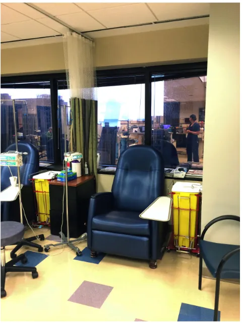
The patient infusion center was an open environment. According to the nurses, this
arrangement is preferred in that it allows medical staff to react quickly if something is going
wrong. Except for scattered patches of navy blue, taupe, and mahogany, color was absent from
the “space.” Other than the patient chairs, furniture was haphazardly placed in the rooms. While
this particular location had the advantage of large windows that looked out towards Chicago’s
skyline and Lake Michigan, the view for each session was not guaranteed since the patient
seating arrangement (chair) was available on a first-come, first-served basis. Meanwhile, the
chairs were turned toward the nurses (and away from the view) for monitoring purposes (see fig.
Figure 9.6 Patient Infusion Station
Source: Carrie Wallace Brown, Northwestern Memorial Hospital Infusion Center, Chicago, IL
Lighting was set to full intensity. This created a difficulty for patients to completely rest
in this setting. Personalization of the “space” appeared minimal; only a grouping of holiday cards
posted behind the nurses’ station (see fig. 9.7). Curtains were provided for privacy. However,
according to the nurses, the curtains were rarely used. Since I was at the center towards the end
Figure 9.7 Personalization in the Nurses’ Station
Source: Carrie Wallace Brown, Northside Hospital Infusion Center, Atlanta, GA
9.2 Northside Hospital Infusion Center (Atlanta, GA)
My trip to the Northside Hospital Infusion Center was very different from my visit to the
Northwestern Memorial Hospital. After a confusing parking situation that steered me to several
incorrect locations, I finally located the entry corridor of this infusion center. The institutional
hallways were long, and I found the gray paint and cinder block walls a disappointment in terms
of a relaxing design for patients (see fig.9.8). In addition, the walls were “accessorized” with
Figure 9.8 Corridor
Source: Carrie Wallace Brown, Northside Hospital Infusion Center, Atlanta, GA
Figure 9.9 Corridor Artwork
The waiting area was similar in feel to that of Northwestern Hospital, but inclusive of
more pattern and color. Artwork was abstract in style, and a neutral color palette and institutional
furniture greeted guests (see fig. 9.10 and 9.11).
Within this infusion center, patient stations were organized in a hierarchical manner
based on duration of a patient’s prescribed regimen. All stations were semi-private; each was
open on the front allowing the medical staff a point of visual reference. However, patients
staying for shorter amounts of time were assigned to sit in the areas with lower partitions and
providing less privacy (see fig. 9.12, 9.13 and 9.14).
Figure 9.10 Waiting Area
Figure 9.11 Waiting Area
[image:36.612.73.384.70.310.2]Source: Carrie Wallace Brown, Northside Hospital Infusion Center, Atlanta, GA
Figure 9.12 Patient Infusion Area
Figure 9.13 Patient Infusion Area
Source: Carrie Wallace Brown, Northside Hospital Infusion Center, Atlanta, GA
Figure 9.14 Patient Infusion Area
As evident in the photos included in this paper, the furniture was chaotically placed, and medical
equipment dominated the environment. At no point were patients able to physically or mentally
separate themselves from awareness that they were seated in an impersonal medical center.
Departing Northside Hospital was as frustrating as my initial arrival. I was faced with
extensive automobile congestion in the hospital parking deck (an all-too-common problem at
hospital infusion centers, particularly in an urban setting). As I sat in my car, I wondered what it
would be like to be nauseous, bewildered, and exhausted while trying to navigate out of the
parking deck in order to commence the journey home (see fig. 9.15).
Figure 9.15 Exiting the Patient Parking Deck
Source: Carrie Wallace Brown, Northside Hospital Infusion Center, Atlanta, GA
I expected these two infusion centers to be similar to blood donation centers, so was not
surprised at my frustrating experience. Common to both of these infusion centers was a large
accessible places than optimal (i.e., stacked on a table or placed on a bookshelf in the corner)
(see fig. 9.16, 9.17 and 9.18). Intended to inform (rather than entertain), these materials were
filled with overly art-directed photography, paid advertisements, and a wide range of
anxiety-provoking articles that can easily foster patient fear rather than decrease it. For example, in its
Spring 2014 issue, the articles contained in Cure magazine were as follows:
• New frontiers in lung cancer research
• Risks of childhood cancer as a result of fertility treatment
• Anti-hormone therapy for breast cancer
• Potential to over-treat cancer
• New legislation for caregivers and caregiver advocacy
• Relationship of exercise and joint pain
• New pharmaceutical research findings
• How to verbalize your diagnosis
• How to create a to-do list for caregivers
• How to read biomarkers
• Guidelines for post-cancer living
• Risk factors of radiation
• General cancer prevention
Between each of these articles were paid advertisements for legal consultation, financial
consultation, research clinics, and several self-marketing promotions from the magazine itself.
While outpatient settings in hospitals need not omit medical reading material containing valuable
research and tools for patient education, the typical way this information is presented is
centers have the responsibility of attending to physical and mental needs of a patient, so there
should be a greater awareness of the reading material and design elements that patients will
encounter. There is definitely the opportunity of the part of staff to consider patients’ needs in a
more focused and strategic way, but this is usually not considered in the maintenance of the
overall patient environment.
Figure 9.16 Brochure Shelves
Figure 9.17 Collection of Infusion Center Materials Source: Carrie Wallace Brown
Figure 9.18 Brochure and Magazine Racks
I did not get the impression that patients were actually upset about their surroundings, as
most were focused (and dependent) on their own personal electronic devices for information and
entertainment if they were not asleep. The surroundings were simply accepted as the “status
quo,” and not something that patients can control. It was accepted as the normal state that
patients need to entertain themselves. Even the presence of individual station televisions at
Northside’s infusion center was an underused amenity. This awareness influenced me to focus
my design direction at a solution that would create: 1) easily understood, specific, and engaging
materials, and 2) a resource that helps patients pass the time via a format that empowers and
provides a better-quality chemotherapy experience.
10 THE PROJECT
The objectives of the application are simple and deliberate in order to generate the best
possible results. For the patient, the objective is to provide a single source for:
• Positive distractions that have can relieve stress and induce physical changes in
the body, such as reduction of heart rate, lowered blood pressure, and muscle
relaxation;
• Organization and communication tools as a therapeutic aide to decreasing the
stress associated the medical journey and provide the opportunity of control; and,
• Anonymous online connection to a community of patients with similar diagnoses
and who are undergoing similar therapy.
For medical staff, reduced anxiety and a less stressful work environment can create a
byproduct of happier patients. For researchers, the new tool can enable vast amounts of
the application will be accessible to any testicular cancer patient. An optional (no-cost) approach
will entice patients to participate—thus becoming a valuable part of the research associated with
it.
10.1 Messaging
The target patient population will know that the message is meant for them through
appropriate copywriting as well as a brand presence compatible to those with which they already
are loyal (e.g., Microsoft, Apple, The Onion, Comedy Central, Chive, and Fitbit). The messaging
is humorous (but straightforward). Likewise, it is also sophomoric, but well intended—and
self-deprecating, but empathetic. Meanwhile, the subtext of the message is actually “cut the
bullshit”—and thereby moves beyond the generalized, “sugar-coated” approach to
chemotherapy.
10.2 Security
This audacious approach to medical communication is certainly not immune to
challenges. Even with its light-hearted and benign approach, gaining patient “buy-in” may be
difficult. The dual purpose of this tool (for personal as well as healthcare utilization) may be
daunting to patients. Measures will need to be taken to assure patient anonymity and security of
the data. While any male within the target audience is welcome to participate, one parameter to
ensure security will be that specific tablets will be assigned to specific infusion centers, and the
data will not leave that location.
Participants using the tool will be informed of research goals. They will also be informed
that that the application studies generalized habits of patients, and privacy of information will be
maintained. As explained by PC Magazine, the application is intended to perform as a walled
obtain applications or content from external sources.”28 The features of the tool will be a basic
set of applications, but with no access to the Internet or download capabilities.
10.3 Name and Logo
The approach to naming and logo creation required ample research, brainstorming, word
mapping, and sketching. Some requirements were that it be simple, memorable, timeless, and
appropriate for design—and that cleverness would foster its success with the target demographic.
The inspiration for the final name and mark was the sales question, “are you a boxers man or a
briefs man?,” as its underlying message to men is the need for underwear—regardless of type of
underwear. The metaphor of the best style of men’s underwear is relevant to testicular cancer, as
it reinforces the concept that the application applies to all men within the target age range—not
just those with a particular style preference.
A logo is often a person’s first impression of a brand. Thus, it was important to avoid
clichés associated with the condition and accurately convey the voice of the application from the
onset. Therefore, the mark includes an abstracted outline of each underwear style with a shared
waistband in the center (see fig. 10.1).
In naming the application, the nouns “boxers” and briefs” are transformed into verbs
describing the functionality of the application—an interface of boxed widgets (a shortcut to a
larger application) and brief informational tools. Each is customized to fit within its respective
undergarment and forms the brand name, Boxed and Briefed.
28 "Walled Garden Definition from PC Magazine Encyclopedia," Walled Garden Definition from PC Magazine
Figure 10.1 Project Logo Source: Carrie Wallace Brown
Typography is also essential in conveying the personality of a brand. Simplicity and
legibility is key in font selection, especially when the target audience is struggling to maintain a
normal level of clarity and energy. The Boxed and Briefed logo utilizes one typeface (Bebas
Neue), which then becomes the display face for the remainder of the application (see fig. 10.2).
Bebas Neue is a straightforward font. It is all caps, sans serif, and is a condensed typeface that
embodies a masculine “feel.” The typeface is also easily customizable, morphing soundly into
the logo silhouette.
For the remainder of the application, Bebas Neue is paired with Montserrat—which is a
more versatile and legible sans serif typeface (see fig. 10.2). In instances where there is a
significant amount of text, Montserrat is used due to its easily recognizable and very legible
letter shapes. Together, the typefaces convey masculinity, timelessness, and provide maximum
Figure 10.2 Project Typography Source: Carrie Wallace Brown
Humans are extremely responsive to color on both conscious and subconscious levels.
Color includes multiple layers of meaning, inclusive of instinct and learned associations.
Therefore, color psychology plays a key part of the brand experience. The Boxed and Briefed
logo incorporates a color palette of vermillion and light aqua. The rustic vermillion implies
energy and warmth (thereby makes the brand feel resilient and dynamic). Meanwhile, its orange
undertone contributes a more modern and masculine feel. Light aqua is vermillion’s color-wheel
compliment. The mixture of blue, green, and white within the hue conveys sincerity and
The remainder of the application incorporates a generous amount of color, each selected
to reinforce the light-hearted spirit of the brand (see fig. 10.3). The color palette includes a wide
spectrum of secondary and tertiary colors to maintain high energy throughout the user
experience. With the exception of the neutral gray and black, each color is dedicated to a widget
(providing breadcrumb navigation throughout the application).
Figure 10.3 Project Color Palette Source: Carrie Wallace Brown
10.4 Platform and Interface
The platform for the application is a tablet (a portable computer with a touch-screen
display and virtual keyboard). The tablet device is becoming a staple in our device-obsessed
society. According to research firm eMarketer, “More than 1 billion people worldwide will use a
tablet in 2015, representing nearly 15% of the global population and more than double the
number three years ago. By 2018, the number of tablet users in the world will reach 1.43
billion.”29 The ever-changing infusion center environment for the user dictates that the platform
likewise be mobile and adaptable. In turn, this will allow the patient as a user the freedom to
move with the tablet device throughout their session (rather than being confined to a specific
location in order to use it).
29"Tablet Users to Surpass 1 Billion Worldwide in 2015 - EMarketer," Tablet Users to Surpass 1 Billion
Yahoo’s CEO (Marissa Mayer) describes a quick and easy test to determine application
design success. She explains, "Once you’re in the app, is it two taps to do anything you want to
do? If yes, the app is a go. If no, it's back to the drawing board.”30 Mayer’s appreciation for the
value of mobile device design and user experience has been a guideline for this project. The
interface is modest and practical, not only to fit the smaller screen size, but also for the purpose
of maintaining patient involvement (see fig. 10.4 and 10.5). Simple interface can transcend into a
fantastic user experience—and, under these conditions, good user experience by the patient is a
must.
The navigation of the application is largely driven by the use of pictograms and emojis.
These symbols and “picture characters” are part of a universal language; they communicate more
effectively and concisely than words. For centuries, pictograms have assisted people in
navigating complicated environments (e.g., hospitals, shopping malls, and airports) without the
need for translation. What was once keyboard-typed “emoticons” has now evolved into
smartphone keyboard emojis (a newly accepted form of communicating emotion in our
exceedingly visual culture).
Personalization is a significant part of the Boxed and Briefed user experience. Today’s
gaming industry often incorporates creation of user avatars, providing the ability for players to
figuratively “leave their bodies” and enter a virtual world inclusive of anonymous play and
communication. Boxed and Briefed has adopted this idea, but in the form of a personal badge.
The user gets to create an identifier tailor-made to their interests via icons, and color preferences
(see fig. 10.6). The patient is also able to select from an assortment of backgrounds that appeal to
a wide variety of hobbies—from car enthusiasts to sports fans to fabric patterns (see fig. 10.7).
30 Nicholas Carlson, "Marissa Mayer's New Rule For App Design," Business Insider, January 23, 2015,
These personalization attributes reinforce that the application is specifically tailored for the given
patient (rather than being a generalized, impersonal piece of collateral attempting to meet the
needs of everyone). This approach is empowering for the user, and intended to maintain interest
and provide motivation for daily use.
10.5 Widgets
Boxed and Briefed is designed to be simple, comprehensible, and reflective of the user’s
primary needs as an infusion center patient. Certain aspects of the application will interest
patients more than others. To accommodate such individual preferences, the interface is a
dynamically designed dashboard of widgets that allows the user to interact with the application
to the degree that they wish. Ben Barone-Nugent (Content Strategy Lead and UX Strategist at
Proximity BBDO) describes the “the concept of progressive reduction is core to our trade. It’s the
idea that users should need less and less ‘hand holding’ as they spend more time with a product.
Good products will quickly become second nature… Users won’t remember any single word or
piece of content—they’ll just remember if your product was useful, fun, and beautiful, or if it
wasn’t.”31
At launch, the interface displays eight widgets, each fashioned to address one or more of
the factors contributing to low patient morale. Design intent and functions of each are as follows:
• Dashboard (see fig. 10.5): This brightly colored home screen is “command
central” for the patient. Personalization is evident along the top navigation bar as
well as the top left corner of the grid where the user’s screen name and avatar
badge reside. Widget names are conversational and whimsical, setting the tone of
the application from the start of use. Each includes a tagline that provides a more
succinct explanation of its function. Only two pages exist beyond the widget
applications: 1) the settings page (which is a place to manage application
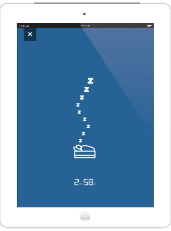
preferences, personalization, and enter demographic data), and, 2) the sleep page
(see fig 10.8) (which is a page that allows the user to temporarily log out while
they rest, simultaneously generating data on patient sleep cycles).
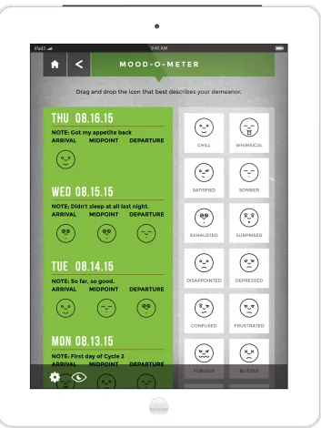
• Mood-O-Meter (see fig. 10.9): The Mood-O-Meter provides a platform for
patients to express how they are feeling both physically and mentally throughout
their chemotherapy regimen. Simple “drag and drop” motion allows the user the
ability to input the most appropriate emoji from the right-hand-side into the
journaling area on the left-hand-side. Patients are provided space to add a brief
point of reference note (i.e., “first day of cycle 2,” or “didn’t sleep at all last
night”). Through this type of record-keeping, a patient can foresee what type of
moods and feelings may occur in the next cycle of chemotherapy, or recall their
evolution from the beginning of the process. Data gained from this widget can
assist researchers in tracking changes in morale and moods associated with the
phases of drug administration.
• Guys Who ‘Get It’ (see fig. 10.10): Providing a feeling of community is an
important component of Boxed and Briefed. Belonging to a group affords
motivation, a sense of pride, and an outlet to escape from focusing on worries and
problems. Figure 10.10 shows the members of the Boxed and Briefed community
that JEEPWAV3, for example, has approved in terms of connection. New
message pictograms at the corner of members’ tabs indicate new running
• The Chemo Brain (see fig. 10.12, 10.13, 10.14 and 10.15): Information of all
types (i.e., medical, anecdotal, and administrative) inundates cancer patients from
diagnosis through the end of treatment—and beyond. It is difficult for a healthy
person to manage that facet of their healthcare, let alone one coping with routine
demands at the same time as a health crisis. For a cancer patient, “chemo brain”
makes that task virtually impossible. The Chemo Brain (as a play on words) is an
icon-based hub for both critical medical information as well as general to-do and
needs lists. Patients may utilize as much (or as little) of its data fields in order to
feel in control of their situation. Using the data fields can relieve the fear of
forgetting important points, and thereby offer the patient clarity of mind. The
widget also includes the ability to send out lists via text should a patient need to
refer to the information externally.
• What’d They Say? (see fig. 10.16): A cancer diagnosis and subsequent
chemotherapy treatment comes with an expansive list of terms not easily
understood (much less easily pronounced) by the average person. Add that
complexity to the anxiety associated with the unknowns of cancer, and the result
is a very scary scenario. Because physicians are most often well-educated and
experienced experts in their field, patients typically accept that their physicians
are worthy of their trust to aid them in making the best decisions in terms of the
patient’s treatment options. This is an important aspect of the physician-patient
relationship. However, medical expertise does not always equate to a good
unintentional, talking over a patient’s head is common among healthcare
providers. What’d They Say? is a widget that provides clarity when this occurs—
affording awareness via an alphabetical list of medical terms relevant to the
scenario. Patients are able to search for terms and create a personal list for
reference as needed throughout their chemotherapy regimen, a feature which aims
to help patients make more informed health decisions (see fig. 10.17).
• Thanks, I Needed That (see fig. 10.18 and fig. 19): As discussed, humor and
laughter aid healing in that it improves psychological health and well-being. As a
way to elevate mood and combat the uninspired surroundings of an infusion
center, Thanks, I Needed That is a 15-minute rotation of humorous (borderline
ridiculous) jokes. If nothing else, it is a way to pass the time quickly. Entertained
patients are provided a countdown clock showing the arrival time of the next
humorous anecdote.
• The Horse’s Mouth (see fig. 10.20): Having a physical health crisis can provoke a
mental health problem, and people often do not quite know how to respond
appropriately when informed that a family member or friend has cancer. Often,
cancer patients are bombarded with inquiries on their current health status—along
with offers to provide food, run errands, and so forth. The pressure to
communicate with loved ones is stressful for a patient, and especially if the offers
of sympathy and help occur in a disorganized or reactionary way. The Horse’s
Mouth provides the user as patient a platform to compose and send updates on
well as the ability to organize recipients into specific groups with which the
patient may selectively communicate (see fig. 10.22).
• Channel Surf (see fig. 10.23): Time in a chemotherapy infusion center goes by
faster when a patient’s mind is focused on something other than the activity in the
room, outside pressures, or inward discomfort. The target users of Boxed and
Briefed as cancer patients undergoing chemotherapy affords the chance to provide
movies, television, sports, and even Internet videos specifically targeted to that
patient pool’s interests. “Chemobrain” affects concentration and the ability to
reason. Therefore, classic re-runs of popular television and movies can support
full relaxation and allow the patient to escape into the mindless world of a channel
surfing couch potato versus entertainment requiring heightened concentration,
acute attention, and a high surge of adrenalin (see fig. 10.24, 10.25, 10.26 and
10.27).
• The Arcade (see fig. 10.28): Among testicular cancer patients, the oldest age
demographic includes men who were introduced to video games in adolescence.
In contrast, the youngest age demographic was born into an existent and
widespread video gaming industry. Playing video games places a person in a
virtual world, providing stimulation and relaxation for the player. Games fuel
creativity and provide unstructured time—and this can benefit patient morale.
However, the chemotherapy infusion time period is not the right time for cancer
patients to participate in the in-depth games so widely marketed at present. If
suffering from “chemobrain” or exhausted, these cancer patients most likely do