1. Introduction
Store design should attract customers, enable them to locate the merchandise, keep them in the store for a long time, motivate them to make unplanned, impulse purchase and provide them with a satisfied customer experience. A successful store should keep a consumer interested and finally convert the consumer to a customer. From the customers’ point of view, they would like the shopping process to be easy and satisfying. They prefer a pleasant shopping environment where the aisles are wide, the view of the merchandise is clear, the merchandise is easy to find and available whenever requested [1]. The retailer should have effective merchandising and displays in order to increase the satisfaction of customers. To achieve this, several characteristics of store layout design should be considered. For example, the aisle structure should be well designed to facilitate shoppers browsing and checking out
Corresponding author
E-mail: [email protected] DOI:10.22105/jarie.2017.54706
Analytical Hierarchy Process Applied to Supermarket Layout
Selection
Mahmoud. A. Barghash
,
Lina Al-Qatawneh, Saleem Ramadan, Awwad Dababneh
Department of Industrial Engineering, University of Jordan, Amman, Jordan.A B S T R A C T P A P E R I N F O
In many cases, supermarkets are founded on rental of already built property and in this case, the space is accepted as is. It is imperative in this case that the supermarket be designed to achieve multiple objectives such as ease of roaming, display area, special display areas etc. It is important for any store to have a good design, because it will be reflected on the customer’s satisfaction, which in turn will increase sales and will ease customer flow. Several possible ready-made designs are available in the literature such as Grid, loop, and mixed. When implemented on the current space limitations, they can have different achievement for the objectives of the design. Analytical Hierarchy process (AHP) represents a suitable technique for comparing these designs and reaching the final layout design selection. AHP layout selection is applied to a local supermarket and different layouts were generated. The design objectives are then evaluated for each of the layouts. It was concluded initially there is variability in the objectives achieved by the different designs, and a suitable multi-objective technique is required to select the final design. AHP is used to determine which of the designs was the most suitable through multiple comparison and consistency check. The results showed that the grid design was the most suitable for the current case study.
Chronicle:
Received: 16 June 2017 Accepted:20 September 2017
Keywords :
Supermarket Layout. Selection Criteria. Analytical Hierarchy Process.
Journal of Applied Research on Industrial
Engineering
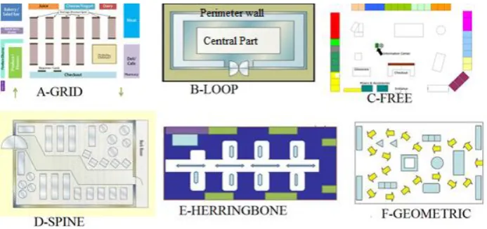
of the merchandise. The traffic flow density of the aisles should be balanced to provide a comfortable and safe shopping environment. Common store layout designs are shown in Fig 1. A grid store layout (Fig 1-A) is a highly popular design that is familiar to the majority of customers. In grid layout, fixtures and displays are laid parallel to walls. A grid floor plan maximizes every inch of available floor space, including the corners. Grid layouts make it easy for store owners to categorize. In addition, they offer plenty of end cap and feature wall exposure for promotional items and seasonal products. Loop layout or racetrack store layout (Fig 1-B) exposes customers to every item on display. In a loop floor plan, the perimeter walls is used for product display and special offers, while the central part of the store can be set up in a grid or free-flow layout or any other layout variations.
Fig 1. Common store layout designs.
A free store layout (Fig 1-C) uses easily changed fixtures to attract customers towards specific merchandise. A spine store layout (Fig 1-D) is based on a single main aisle running from the front to the back of the store, which allows customers to transport in both directions. On either side of the spine, merchandise branch off toward the back or side walls. A herringbone store layout (Fig 1-E) includes lanes that resemble bones in a fish. This layout is highly favorable with maximum 40 feet width. A geometric store layout (Fig 1-F) uses racks and fixtures to create an interesting and out-of-the-ordinary type of store design within a small budget.
2. AHP Calculations
The purpose of AHP is to evaluate the overall achievement weight or score for each process setting (experiment). This is achieved firstly through pairwise comparison between each two quality characteristics and filling the comparison matrix (
A
n n ) of the second level of the hierarchy, where n is the number of quality characteristics or objectives. Subsequently, the relative weight for each quality characteristic is calculated, and a consistency is calculated using consistency index (CI) and ratio index (RI) as given by the following equations [6]:𝐵 = 𝐴 𝑥 𝐴 (1)
𝐶 = ∑𝐵𝑖 … (2)
𝑊𝑞 = 𝐶/∑𝐶𝑖 (3)
𝐸𝑗 = ∑𝐴𝑖𝑗 (4)
𝜆𝑚𝑎𝑥 = 𝐸 𝑥 𝑊𝑞 (5)
𝐶𝐼 = (𝜆𝑚𝑎𝑥 – 𝑛) / (𝑛 − 1) (6)
𝐶𝑜𝑛𝑠𝑖𝑠𝑡𝑒𝑛𝑐𝑦 = 𝐶𝐼/𝑅𝐼 (7)
3. Methodology
The methodology begins by collecting data on current design and highlighting its drawbacks. This is followed by generating and developing different expected designs for the store layout. Then, AHP is used to select the final design. Finally, a volume based distribution of items is implemented for the final design.
4. Analysis and Results
4.1 Current Layout Design
The current store is divided into two sections: grocery (Fig 2-A) and detergents (Fig 2-B).
A-Grocery B-Detergent
Fig 2. Current layout design.
wall. 19 meters of shelves are running along the length of the left side wall. 41 meters of shelves and movable pallets are in the middle. Display area is 76 m2. The current design shows several problematic issues. There are no special display areas for offers, seasonal items or promotion. The shape of the store is rectangular and the aisles are very long. The aisles are narrow, which creates jams. There are too many items for the same brand for each product type.
4.2 Generated New Layouts
Three new layout designs are suggested for the grocery section shown in Fig 2-A. The suggestions are described in more detail in the next Sections.
4.2.1 Grid Layout
The new grid layout in Section A in Fig 3 has short, vertical shelves to the walls instead of having them tall and parallel, with products on shelves on both sides. In Section B in Fige 3, the movable pallets are arranged in a horizontal way because of the narrow space between the two walls, having a display area of 154 m.
Fig 3. Grid layout.
The advantages of this design are aisles, so it makes the roaming easier, special areas are placed at the beginning and the end of the aisles, so they are clearly seen by customers. Grid designs are Low cost and are more familiar to Costumers. On the other hand, it has some disadvantages. It has limited browsing experience. Customers are not exposed to all items in the store. The look of the layout is less interesting than other layouts.
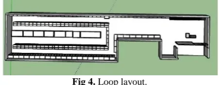
4.2.2 Loop Layout
The loop layout suggested in Fig 4 provides a major aisle that loops around the store to guide customer traffic around the store. Customer is forced to pass by all the products and probably buy more. This layout has a display area of 143 m.
Fig 4. Loop layout.
hand, disadvantages are forcing customers to take different viewing angles. Viewing the same display may force customers to take different angles, which may lead to jams and reduced display area.
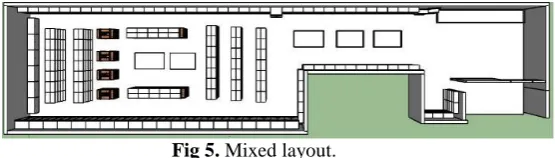
4.2.3 Mixed Layout
The proposed design in Fig 5 is a mixture of grid, loop and free in display shapes, positions and sizes, and is having a display area of 149 m.
Fig 5. Mixed layout.
Advantages of mixed layout are increase in impulse buying because the store is free-flowing, customers roam and buy items they wouldn’t buy usually, viewing merchandise is easier and the display area is large. On the other hand, disadvantages are higher cost relative to other layouts, the need to use special fixtures and free shapes and it is more difficult in directing customers to products.
4.3 Comparison Criteria for the Layout
It is decided to use five different criteria:
1. Display area: This indicates the size of allocation for each item that should be displayed in the store.
2. Simplicity: This criterion explains how much the design is simple to apply by the designer. 3. Appeal: They didn't put on how beautiful a design can be, but this is one of the factors that
have to play role even if it was minor.
4. Merchandise exposure: Not to be confused with display area; this measures how good a design is in terms of making it easier for customers to see the items that the store has.
5. Ease of roaming: Ease of roaming the store makes the buying process better and encourages customers to buy more.
4.3.1 AHP Pairwise Comparison
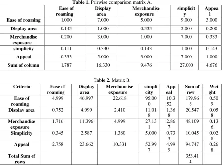
In this part of the AHP process, the different criteria are compared head to head to determine the weights that will be assigned to each one of them. A number between 1/9 and 9 is assigned to determine how favorable the criteria in Column to the criteria in Row, such that 1/9 being extremely less favorable, 9 being extremely favorable, and 1 means that they are equal. This way, matrix A is developed with three wire border as shown in Table 1.
Table 1. Pairwise comparison matrix A. Ease of roaming Display area Merchandise exposure simplicit y Appea l
Ease of roaming 1.000 7.000 5.000 9.000 3.000
Display area 0.143 1.000 0.333 3.000 0.200
Merchandise exposure
0.200 3.000 1.000 7.000 0.333
simplicity 0.111 0.330 0.143 1.000 0.143
Appeal 0.333 5.000 3.000 7.000 1.000
Sum of column 1.787 16.330 9.476 27.000 4.676
Table 2. Matrix B.
The summation of each column E in Table 1 is multiplied by the weight Wq in Table 2 to get 𝜆𝑚𝑎𝑥 (Eq. (5)) for each criterion. The consistency index CI (Eq. (6)) is calculated by subtracting n from 𝜆𝑚𝑎𝑥 and dividing the output by n-1. Finally, consistency is checked by dividing consistency index CI over ratio index RI (Eq. (7)).
For ease of roaming,
𝜆 = E1 * Wq1
𝜆 = 1.787 * 0.509 = 0.909583.
𝜆𝑚𝑎𝑥 = ∑ 𝐸 𝑥 𝑊𝑞 𝜆𝑚𝑎𝑥= 5.170
𝐶𝐼 = (𝜆𝑚𝑎𝑥 – 𝑛) / (𝑛 − 1)
= (5.170 – 5) / (5-1) = 0.0425.
For the comparison to be consistent, CI should be less than 0.1. Based on Table 3, for n= 5 and RI=1.12, consistency is calculated as follows:
Consistency = CI / RI
= 0.0425 / 1.12 = 0.038.
The comparison is consistent since 0.038<0.1.
Criteria Ease of
roaming Display area Merchandise exposure simpli city App eal Sum of row Wei ght Ease of roaming
4.999 46.997 22.618 95.00 0 10.3 52 179.96 6 0.50 9
Display area 0.752 4.999 2.410 11.01
8
1.36 8
20.547 0.05 8
Merchandise exposure
1.716 11.396 4.999 27.13 1
2.86 7
48.109 0.13 6
Simplicity 0.345 2.587 1.380 5.000 0.73
3
10.045 0.02 8
Appeal 2.758 23.662 10.331 52.99
7
4.99 9
94.747 0.26 8
Total Sum of rows
Table 3. Random consistency indices.
4.3.2 Alternatives Comparison
The same process is repeated, however, this time by comparing the layout choices for each criterion, and what was called the criterion weight is now called design alternative priority. For all criteria, the comparison matrices and the design alternatives priorities are shown in Table 4 to Table 8, respectively.
1) Simplicity
Table 4. Simplicity comparison matrix.
Simplicity Current Grid Loop Mixed Weight
Current 1.000 0.143 3.000 0.333 0.096
Grid 7.000 1.000 9.000 3.000 0.604
Loop 0.333 0.111 1.000 0.143 0.042
Mixed 3.000 0.333 7.000 1.000 0.258
Total 11.333 1.587 20.000 4.476 1.000
Consistency equals 0.0155 <0.1, consistent. The simplest design to apply according to Table 4 is grid design with a weight of 0.604 and the worst design is loop design with a weight of 0.042.
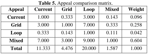
2) Appeal
Table 5. Appeal comparison matrix.
Appeal Current Grid Loop Mixed Weight
Current 1.000 0.333 3.000 0.143 0.096
Grid 3.000 1.000 7.000 0.333 0.258
Loop 0.333 0.143 1.000 0.111 0.042
Mixed 7.000 3.000 9.000 1.000 0.604
Total 11.333 4.476 20.000 1.587 1.000
Consistency equals 0.0155< 0.1, consistent. The best appearance that attracts customers and gives a good impression according to Table 5 is mixed design with a weight of 0.604 and the worst design is loop design with a weight of 0.042.
3) Ease of roaming
Table 6. Ease of roaming comparison matrix.
Ease of roaming Current Grid Loop Mixed Weight
Current 1.000 0.333 7.000 3.000 0.258
Grid 3.000 1.000 9.000 7.000 0.604
Loop 0.143 0.111 1.000 0.333 0.042
Mixed 0.333 0.143 3.000 1.000 0.096
Total 4.476 1.587 20.000 11.333 1.000
n 1 2 3 4 5 6 7 8 9 10
Consistency equals 0.0155 < 0.1, consistent. According to Table 6, the easiest roaming design is grid design with a weight of 0.604 and the worst design is loop design with a weight of 0.042.
4) Merchandise exposure
Table 7. Merchandise exposure comparison matrix.
Merchandise exposure Current Grid Loop Mixed Weight
Current 1.000 0.333 0.143 3.000 0.096
Grid 3.000 1.000 0.333 7.000 0.258
Loop 7.000 3.000 1.000 9.000 0.604
Mixed 0.333 0.143 0.111 1.000 0.042
Total 11.333 4.476 1.587 20.000 1.000
Consistency equals 0.0155 < 0.1, consistent. According to Table 7, the best design based on the merchandise exposure is loop design with a weight of 0.604 and the worst design is mixed design with a weight of 0.042.
5) Display area
Table 8. Display area comparison matrix.
Display area current Grid Loop Mixed Weight
Current 1.000 0.333 0.143 0.111 0.040
Grid 3.000 1.000 0.333 0.143 0.590
Loop 7.000 3.000 1.000 0.333 0.270
Mixed 9.000 7.000 3.000 1.000 0.100
Total 20.000 11.333 4.476 1.587 1.000
Consistency equals 0.0498 < 0.1, consistent. According to Table 8, the largest display area is achieved by grid design with a weight of 0.59 and the worst design in terms of display area is current design with a weight of 0.04.
4.3.3 Choosing the Final Design
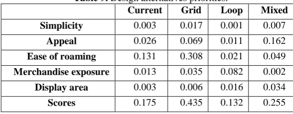
The design alternatives priorities for each criterion are summarized in Table 9 to get the final rating matrix in Table 10.
Table 9. Design alternatives priorities.
Current Grid Loop Mixed
Simplicity 0.003 0.017 0.001 0.007
Appeal 0.026 0.069 0.011 0.162
Ease of roaming 0.131 0.308 0.021 0.049
Merchandise exposure 0.013 0.035 0.082 0.002
Display area 0.003 0.006 0.016 0.034
Table 10. Final rating matrix.
Design Score
Current 17.50%
Grid 43.50%
Loop 13.20%
Mixed 25.50%
After calculating the scores, it is concluded that grid design is the most suitable design. It has the largest display area (154 m), which is desirable in store design. In addition, the grid design is the easiest design and most familiar for the customer to roam within which makes the buying process better and encourage customers to buy more. This layout contains long pathways that are placed parallel to each other. Retailers are in favor of this layout style because the rectangular arrangement of shelves fits well in the shopping behavior of customers, and it facilitates an efficient and fast shopping experience [7].
4.4 A Volume based Distribution of Items
The effectiveness of shelf design is often determined in terms of shelf space elasticity. This elasticity is a parameter that indicates to what extend additional shelf space has influence on product sales [7]. As an example, Fig 6 shows the dimensions (height, width and length) of ketchup. The product has a circular base, yet, its volume is calculated as if it is a cuboid. The irregular shape of the product due to having a bigger width in the lower part than the upper part makes the empty spaces unutilized.
Volume = length x width x height = 0.45 x 0.06 x 0.06 = 0.00162 m3.
Fig 6. Sample of ketchup.
Distribution of items was done based on the volume of sales according to the display area as shown: Sales of each product as a volume = (Volume of each product)x (sales) (7)
Percentage of each product = (Sales of each product as a volume) / (Total sales as a volume) (2)
Display volume for each product = (Percentage of each product) x (display volume of the store)
(9) Number of products that should be displayed = (Display volume for each product) / (Volume of each product)
4.4.1 Sample of Calculations
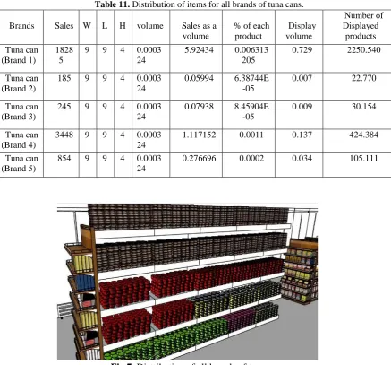
The sales and dimensions were known for each product at the local store in our case study. The following provides an example about distribution of items for all brands of tuna cans.
Volume of tuna can (Brand 1) = W x L x H = 0.09 x 0.09 x 0.04 =0.000324 m3.
Instead of considering the sales as a quantity sold per year, it is converted to volume as follows: Sales of tuna can (Brand 1) as a volume = (Volume of tuna can (Brand 1)) x (sales)
=0.000324 x 18285 =5.924 m3.
The volume of tuna can (Brand 1) as a percentage from the total volume of all products in the store is calculated as follows:
Percentage of tuna can (Brand 1) = (Sales of tuna can (Brand 1) as a volume) / (Total sales as a volume) = 5.924/96873.047620
= 0.00611522 %. Placement of tuna can (Brand 1) that will be displayed on the shelf is calculated as follows:
Display volume for tuna can (Brand 1) = (Percentage of tuna can (Brand 1)) x (display volume of the store)
=0.00611522x 112.875 = 0.7729 m3.
Finally, the correct number of tuna cans (Brand 1) that should be displayed on the shelves is calculated as follows:
Number of tuna cans (Brand 1) that should be displayed= (Display volume for tuna can (Brand 1)) / (Volume of tuna can (Brand 1))
= 0.7729 / 0.000324 = 2250.54 cans.
Table 11. Distribution of items for all brands of tuna cans.
Fig 7. Distribution of all brands of tuna cans.
5. Conclusions
In this work, we achieved for some results. We Generate three possible designs for layout: grid, loop and mixed, and choose the better design using AHP method, which was the grid design. We conclude that grid layout is the best design to implement in the local store because it has the largest display area (154m), it achieves the optimum merchandise exposure, and it is the easiest for customers to roam in. Furthermore, we calculate the correct number of products that should be displayed on shelves based on consumption.
References
[1] Ebster, C. (2011). Store design and visual merchandising: Creating store space that encourages buying. Business Expert Press.
[2] Golden, B. L., Wasil, E. A., & Harker, P. T. (1989). The analytic hierarchy process. Applications and Studies, Berlin, Heidelberg.
[3] Bhushan, N., & Rai, K. (2007). Strategic decision making: applying the analytic hierarchy process. Springer Science & Business Media.
[4] Saaty, T. L., & Vargas, L. G. (2012). Models, methods, concepts & applications of the analytic hierarchy process (Vol. 175). Springer Science & Business Media.
Brands Sales W L H volume Sales as a volume
% of each product Display volume Number of Displayed products Tuna can (Brand 1) 1828 5
9 9 4 0.0003 24
5.92434 0.006313 205
0.729 2250.540
Tuna can (Brand 2)
185 9 9 4 0.0003 24
0.05994 6.38744E -05
0.007 22.770
Tuna can (Brand 3)
245 9 9 4 0.0003 24
0.07938 8.45904E -05
0.009 30.154
Tuna can (Brand 4)
3448 9 9 4 0.0003 24
1.117152 0.0011 0.137 424.384 Tuna can
(Brand 5)
854 9 9 4 0.0003 24
[5] Dolan, J. G. (2008). Shared decision-making–transferring research into practice: the Analytic Hierarchy Process (AHP). Patient education and counseling, 73(3), 418-425.
[6] AlKaabneh, F. A., Barghash, M., & Mishael, I. (2013). A combined analytical hierarchical process (AHP) and Taguchi experimental design (TED) for plastic injection molding process settings. The International Journal of Advanced Manufacturing Technology, 1-16.