Query Visualization in Big Data
Ibrahim Abdel Moneim IbrahimMaster of Computer Science
A thesis submitted for the degree of Doctor of Philosophy at The University of Queensland in 2018
Data analysis has attracted a large population of data scientists, decision makers, and analysts with the advent of large, high-dimensional datasets in different domains during the past decade. Data visualization involves the creation and study of the visual representation of data to communicate information clearly and efficiently. Currently, Data visualization tools are the first choice in a user analysis toolbox which assist in exploring big datasets to make sense of the explored data and discover interesting insights. However, even with existing tools of data visualization, many common analysis tasks are still manual and require substantial effort and tedious trial-and-error task specifically, for non-expert users that have inadequate knowledge of the underlying data.
Today, the huge of interest in data science and the need to gain insight from data are challenging researchers and analysts for applying new visualization strategies to efficiently explore data, detect anomalies, correlations, and identify pattern-changes and trends. In addition, current visual analytical tools are not able to assist users in explaining surprising trends or outliers in the visualization and the ounce effort of this task is left to the user.
In this thesis, we address the limitations of the existing recommendation and explanation systems in the context of big data visualization. Specifically, we address a new problem which is about the limitation of current visualization recommendation tools and reduces the exploration costs to user-specified constraints. Then, we propose to recommend top (k) interesting visualizations within the specified budget. Consequently, we extend the problem of recommending interest-based visualiza-tions and introduce another problem involves structuring interest-based visualizavisualiza-tions to reveal their
interestingness. Further, we define a problem of user-trend explanations and formalize a notion of uni-formity over predicates. We propose different techniques that search for uniform predicates linearly and transform the most uniform predicates into meaningful explanations.
In this thesis, we discuss in detail our three key contributions, which address the challenges above in the context of recommendation and explanations of query visualization in big data.
Firstly, we formally define the recommendation of interest-based visualizations problem, in which users specify exploration constraints namely exploration time limit and number of explored
visual-within specified constraints. Then, we propose three approachesDi f fDVal,Sela, and DimsHisto to explore the data space intelligently by prioritizing the dimension attributes based on various statistical features such as number of distinct values, selectivity ratios, and data distribution, to early prioritize visualizations. Additionally, we present cost estimation techniques that approximate exploration and retrieval costs of visualizations to evaluate their costs against the Interest-based utility.
Based on the framework and the approaches proposed above, we extend interest-based visualiza-tions problem to consider the organization and ordering of interesting visualizavisualiza-tions into a coherent structure in order to expose theirinterestingness. We formulate this problem and define the notion of visualization coherence. Then, we proposeMedVis framework to structure a set of interest-based visualizations hierarchically based on their coherence and interest-based utilities. MedVisis running on the top of RtSEngineand creates hierarchical coherent tree that consists of influential aggregate functions, admission and measure attributes that create these visualizations.
Finally, we formulate user-trend explanations problem and introduce a notion of uniformity over predicates. For this problem, we propose User Trend Explanations (UTE) which generates insightful explanations that explains the causes of deviation in the query results from the expected user trend. UTE system applies efficient and effective approaches that split data space and search all possible ex-planations in a single relation linearly. we presentXTrend-Basic, XTrend-Advanced and XTrend-Fast
splitting techniques to solve predicates generation problem. Then, propose a transformation approach that generates meaningful explanations (predicates) to the user and defined usefulness measure to evaluate the quality of produced explanations.
We develop three systems in this thesis:
1. RtSEngine, a visual exploration tool that recommends a set of constraint-based visualizations according to user requirements.
2. UTE, a set of algorithms that describes the subset of an input records that explain why actual results of a query are deviated from a user-specified values.
3. MedVis, a system to contently structure a set of interesting visualizations in order to pro-vide a logical and understandable representation that exposes interesting attributes in high-dimensional datasets.
This thesis is composed of my original work, and contains no material previously published or written by another person except where due reference has been made in the text. I have clearly stated the contribution by others to jointly-authored works that I have included in my thesis.
I have clearly stated the contribution of others to my thesis as a whole, including statistical as-sistance, survey design, data analysis, significant technical procedures, professional editorial advice, and any other original research work used or reported in my thesis. The content of my thesis is the result of work I have carried out since the commencement of my research higher degree candidature and does not include a substantial part of work that has been submitted to qualify for the award of any other degree or diploma in any university or other tertiary institution. I have clearly stated which parts of my thesis, if any, have been submitted to qualify for another award.
I acknowledge that an electronic copy of my thesis must be lodged with the University Library and, subject to the policy and procedures of The University of Queensland, the thesis be made available for research and study in accordance with the Copyright Act 1968 unless a period of embargo has been approved by the Dean of the Graduate School.
I acknowledge that copyright of all material contained in my thesis resides with the copyright holder(s) of that material. Where appropriate I have obtained copyright permission from the copyright holder to reproduce material in this thesis.
• I. A. Ibrahim, A. M. Albarrak, and X. Li. Constrained recommendations for query visualiza-tions. Knowledge and Information Systems Journal, Springer, May 2017, Volume 51, Issue 2, pages 499-529. Incorporated in Chapter 3.
Contributor Statement of contribution I. A. Ibrahim Conception and design (70%)
Analysis and interpretation (70%) Drafting and production (60%) A. M. Albarrak Conception and design (15%)
Analysis and interpretation (15%) Drafting and production (40%) X. Li Conception and design (15%)
Analysis and interpretation (15%)
• I. A. Ibrahim, Xue Li, Xin Zhao, Sanad Al Maskari, Abdullah M. Albarrak, and Yanjun Zhang. Automated Explanations of User-expected Trends for Aggregate Queries. The 22nd Pacific-Asia Conference on Knowledge Discovery and Data Mining, PAKDD 2018, Melbourne, Aus-tralia, June 01-03, 2018. Incorporated in Chapter 4.
I. A. Ibrahim Conception and design (70%) Analysis and interpretation (70%) Drafting and production (60%) Xue Li Conception and design (10%)
Analysis and interpretation (10%) Drafting and production (5%) Xin Zhao Conception and design (7%)
Analysis and interpretation (7%) Drafting and production (5%) Sanad Al Maskari Conception and design (5%)
Analysis and interpretation (5%) Drafting and production (5%) Abdullah M. Albarrak Conception and design (5%)
Analysis and interpretation (5%) Drafting and production (5%) Yanjun Zhang Conception and design (3%)
Analysis and interpretation (5%) Drafting and production (10%)
recommendations based on hierarchical visualizations of medical data. In Big Data Analytics for Social Computing, PAKDD’18 Workshop, Melbourne, Australia June 01-03, 2018. Incor-porated in Chapter 5.
I. A. Ibrahim Conception and design (70%) Analysis and interpretation (70%) Drafting and production (60%) Abdulqader M. Almars Conception and design (15%)
Analysis and interpretation (15%) Drafting and production (20%) Suresh Pokharel Conception and design (10%)
Analysis and interpretation (10%) Drafting and production (15%) Xue Li Conception and design (5%)
Analysis and interpretation (5%) Drafting and production (5%)
Conference Papers
• Sanad Al Maskari,I. A. Ibrahim, Xue Li, and Eimad Abusham. Feature Extraction for Smart Sensing Using Multi-Perspectives Transformation. In The Australasian Database Conference ADC 2018 , Gold Coast, Australia May 23-25, 2018, Databases Theory and Applications, pages 236-248.
• Abdulqader Almars, Xue Li, Xin Zhao, I. A. Ibrahim, Weiwei Yuan, Bohan Li. Structured Sentiment Analysis. In International Conference on Advanced Data Mining and Applications ADMA 2017, Singapore, November 05 - 06, 2017, pages 695-707.
My principle advisor,Prof. Xue Li, has largely contributed towards the research problems presented in this thesis. Prof. Xue Li assisted me by providing guidance and feedback on formulating the problems and solutions in this thesis. He also reviewed, polished and assisted with the published papers included as part of this thesis.
Statement of parts of the thesis submitted to qualify for the award
of another degree
In the beginning, I would like to acknowledge the collaborators with whom I shared in this research: their names and the subjects of their contributions are listed in the Publication page that follows this. It is really exciting feelings in writing this part of my PhD thesis and the next few lines are an attempt to reflect the support and love I received from so many throughout this journey. As many things in our life, this journey was full of struggle, sweat, joy, and surprises which changed me to a better person for both research and personal life. However, what makes this journey unforgettable is the help and support which I have received from many at University of Queensland. I would like to sincerely thank all those who supported me during my PhD journey.
I would like to express my deepest gratitude to my principal advisor, Professor Xue Li who always has been the most consistent and positive source of ideas, inspiration, encouragement, and funding. From him, I have learned, how to ask good questions, conduct concrete research and the value of establishing strong work ethics and without his support, this work couldn’t have been possible. His patience and persistent guidance during my research saved my study many times. Moreover, his compassion with my personal life situation makes this journey possible. I’m always grateful and proud that I was one of his students and was being a member of his amazing group.
I would like to sincerely thank my associate advisor, Dr Xin Zhao, for his suggestions and support not only about my research, but also about my career and life. Dr Zhao solves several tough problems and I really appreciate his precious guidance in each of my research problems.
My genuine thanks extend to my advisory committee, Prof Shazia Sadiq for the insightful feed-back and support during my PhD milestones.
I thank my parents for their love and support and I am deeply grateful to my father Haj Abdel Moneim whose advices and love are living inside me no matter the distance. My all love to my mother and thank you so much for everything you have done for me. I pray to God that help me to make them happy and proud of me. My Deep thanks and love to my best friend, second father, and father-in-lawHaj Ali Abdel Kafyfor everything has done and keeps doing for me.
for being a wonderful mother for our anglesMalek, Marwan, and the gorgeous princess and I love you all.
Thank you, also, to all my colleagues in our group and I could not have been part of a better re-search group than the DKE group. Many Thanks to my amazing officemates Abdulqader M. Almars, Steve (Jingwei Ma), and Rocky in our office 78-626 and those smart illustrators in our group: Dr. Yu Li, Yanjun Zhang, Max (Mingyang Zhong), Suresh Pokharel, and Bolong Zheng. Special Thanks to all my friends who shared my life in Australia: Abdullah M. Albarrak, Sanad Al-Maskari, Sharif Shafey, Saeid Hosseini, Hazem Gouda, Fathy, El Nahas, Ahmed Youssef, and Mohab.
Lastly, I would like to formally thank my sponsor, Minia University and culture affairs and mission sector, for providing the financial support which made this journey possible.
This research was supported by Egyptain culture affairs and mission sector (Scholarships Program), Ministry of Higher eduation.
Visual Analytic,
Big Data Visualization,
Explanations of Aggregate Queries, Data Exploration,
Recommendation of Interest-based Visualization
Australian and New Zealand Standard Research Classifications
(ANZSRC)
ANZSRC code: 080604, Database Management, 100%
Fields of Research (FoR) Classification
FoR code: 0806, Information Systems, 100%Abstract i
Acknowledgments x
List of Figures xxi
List of Tables xxii
List of Algorithms xxiii
List of Acronyms xxiv
List of Symbols xxv 1 Introduction 1 1.1 Overview . . . 1 1.2 Data Visualization . . . 2 1.3 Data Explanation . . . 3 1.4 Challenges . . . 4
1.4.1 Discovering Interest-based Visualizations . . . 4
1.4.2 Recommendations for hierarchical visualization . . . 6
1.4.3 Trend Explanations of Aggregate Queries . . . 7
1.5 Contributions . . . 8
1.6 Thesis Outline . . . 10
2 Literature Review 11 2.1 Data Visualization Approaches . . . 11
2.1.1 Medical visualization Systems . . . 16
2.2.1 Influential Explanations Approaches . . . 18
2.2.2 Query Transformation . . . 20
3 Constraint-based Recommendations of Query Visualizations 21 3.1 Introduction . . . 22
3.2 Background . . . 23
3.3 Preliminaries and Problem Formulation . . . 27
3.3.1 Background and Scope . . . 27
3.3.2 Interest-based Utility . . . 28
3.3.3 Problem Formulation . . . 28
3.4 RtSEngineFramework . . . 29
3.4.1 Priority Evaluator: Dimension Attributes Prioritizing . . . 30
3.4.2 Cost Estimator: Visualizations Cost Estimation . . . 37
3.5 Experiments . . . 40
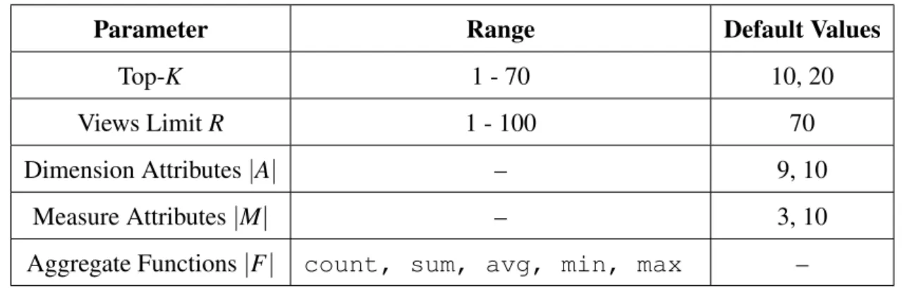
3.5.1 Datasets . . . 40
3.5.2 Algorithms . . . 40
3.5.3 Performance Metrics . . . 41
3.6 Evaluation . . . 42
3.6.1 Quality Evaluation Across Aggregate Functions . . . 42
3.6.2 Accuracy . . . 45
3.6.3 Efficiency . . . 48
3.6.4 Time Limit(tl) . . . 49
3.6.5 Cost Estimation Evaluation . . . 51
3.7 Summary . . . 53
4 Automated Explanation of User-expected Trends for Aggregate Queries 54 4.1 Introductoion . . . 55
4.2 Background . . . 56
4.3 Problem Formulation . . . 59
4.3.1 Prospective Trend Problem . . . 59
4.4 UTE Architecture . . . 61
4.4.1 Naive Splitter . . . 62
4.4.2 Basic Merger (BM) . . . 63
4.4.4 XTrend Transformation . . . 67
4.4.5 Xtrend Merging . . . 68
4.5 Experiments . . . 69
4.5.1 Datasets . . . 69
4.5.2 Evaluation Metrics . . . 70
4.5.3 Comparing Splitting Algorithms . . . 70
4.5.4 Comparing Merging Algorithms . . . 71
4.6 Conclusions . . . 73
5 Interesting recommendations based on hierarchical visualizations of medical data 75 5.1 Overview . . . 76
5.2 Background . . . 76
5.3 Preliminaries and Problem Formulation . . . 79
5.3.1 Background and Scope . . . 79
5.3.2 Views Utility . . . 79
5.3.3 Problem Formulation . . . 80
5.4 Architecture:MedVisFramework . . . 81
5.4.1 Priority Evaluator: Dimension Attributes Prioritizing . . . 82
5.4.2 Coherent hierarchical Representation . . . 83
5.5 Experiment and Evaluation . . . 84
5.5.1 Evaluation Metric . . . 84 5.5.2 Datasets . . . 85 5.5.3 Effectiveness Evaluation . . . 85 5.5.4 Efficiency Evaluation . . . 86 5.6 Summary . . . 87 6 Conclusion 88 6.1 Summary . . . 88 6.2 Future Work . . . 89
6.2.1 Query Visualization in Big Data . . . 89
6.2.2 Discovering Explanations in Big Data . . . 90
1.1 Visualization ofAveragepassengers per boarding stop for routes 411 and 412. . . 6
1.2 Architectural summary of system contributions in this dissertation. . . 8
2.1 Confidence Interval-based Pruning . . . 14
2.2 Threshold function curve asin fmax . . . 18
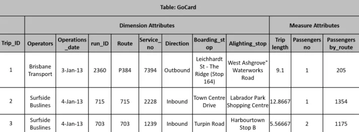
3.1 Snippet from the GoCard relational database schema with a representative sample. Each row represents one trip with a bus, a ferry or a train with 12 dimensions describ-ing the details of that trip. . . 24
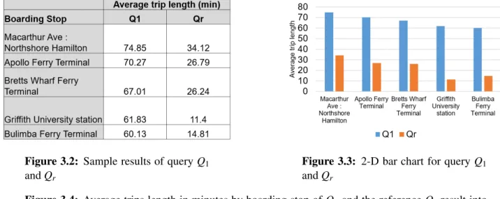
3.2 Sample results of queryQ1andQr . . . 25
3.3 2-D bar chart for queryQ1andQr . . . 25
3.4 Average trips length in minutes by boarding stop of Q1 and the reference Qr result into high utility value, i.e., highinterestingness . . . 25
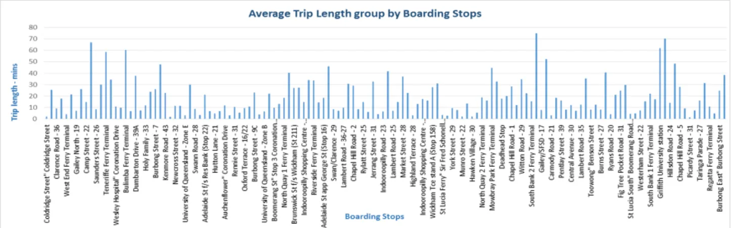
3.5 2-Dimensional bar chart visualization generated by queryQ1. The x-axis represents the boarding stop, while the y-axis represents the average trip lengths in minutes, towards University of Queensland stop. . . 26
3.6 RtSEngine: Real time Evaluation Architecture for Automatic recommendation . . . 30
3.7 sum . . . 43
3.8 avg . . . 43
3.9 count . . . 43
3.10 Accuracy on varying view spaceRandK =20 . . . 43
3.11 sum . . . 43
3.12 avg . . . 43
3.13 count . . . 43
3.14 Distance error on varying view spaceRandK=20 . . . 43
3.15 max . . . 44
3.17 Accuracy on varying view spaceRandK =20 . . . 44
3.18 max . . . 44
3.19 min . . . 44
3.20 Distance error on varying view spaceRandK=20 . . . 44
3.21 sum . . . 45
3.22 avg . . . 45
3.23 count . . . 45
3.24 Accuracy while varyingK andR=70 . . . 45
3.25 sum . . . 45
3.26 avg . . . 45
3.27 count . . . 45
3.28 Distance error on varyingKandR=70 . . . 45
3.29 max . . . 46
3.30 min . . . 46
3.31 Accuracy on varyingK andR=70 . . . 46
3.32 max . . . 46
3.33 min . . . 46
3.34 Distance error on varyingKandR=70 . . . 46
3.35 Accuracy . . . 47
3.36 Distance error . . . 47
3.37 Results quality while varying view spaceRandK=25 . . . 47
3.38 Accuracy . . . 47
3.39 Distance error . . . 47
3.40 Results quality while varyingKandR=90 . . . 47
3.41 Execution time while varyingR. . . 48
3.42 Average overhead accross views limits . . . 48
3.43 Algorithms performance while varyingR . . . 48
3.44 Total execution time while varyingK andR=90 . . . 49
3.45 Average overhead while varyingKandR=90 . . . 49
3.46 Algorithms performance on varyingK . . . 49
3.47 Accuracy of Algorithms . . . 50
3.48 Distance error . . . 50
3.50 Performance ofSela, Di f f DVal,DimHisto, andSeeDBTimelimit on different time limits whileK=100 . . . 50 3.51 Accuracy of Algorithms . . . 51 3.52 Distance error . . . 51 3.53 Average overhead . . . 51 3.54 Performance ofSela, Di f f DVal, DimHisto, andSeeDBTimelimit on varyingK and
tl=18s . . . 51 3.55 Accuracy of Algorithms . . . 52 3.56 Distance error . . . 52 3.57 Average overhead . . . 52 3.58 Results quality and average overhead using DB Estimation . . . 52 4.1 Mobile Apps visualization example . . . 56 4.2 UTEArchitecture . . . 61 4.3 XTrendSplitting . . . 65 4.4 Execution time across No. attributes . . . 71 4.5 generated explanations across No. attributes . . . 71 4.6 Cost of splitting process as dataset dimensionality increases for GoCard dataset. . . . 71 4.7 Execution time across No. attributes . . . 71 4.8 generated explanations across No. attributes . . . 71 4.9 Cost of splitting process as dataset dimensionality increases for Expenses dataset. . . 71 4.10 Merging time across No. attributes . . . 72 4.11 Merged explanations across No. attributes . . . 72 4.12 Cost of merging process across the increase of GoCard dataset dimensionality. . . 72 4.13 Merging time across No. attributes . . . 72 4.14 Merged explanations across No. attributes . . . 72 4.15 Cost of merging process across the increase of Expenses dataset dimensionality. . . . 72 4.16 Accuracy measuresprecision, recall, and F-scoreas dimensionality increases for
Go-Card dataset. . . 73 4.17 Accuracy measuresprecision, recall, and F-scoreas dimensionality increases for
Ex-penses dataset. . . 73 4.18 usefulness of explanations of GoCard dataset . . . 74 4.19 usefulness of explanations of Expenses dataset . . . 74
4.20 The usefulness of the produced explanations approaches across No. attributes and Expenses dataset. . . 74 5.1 Total Patients numbers per admission locations . . . 78 5.2 MedVisSystem based onRtSEngineArchitecture for Automatic recommendation . . 81 5.3 Hierarchical Representation for Admission . . . 86 5.4 Hierarchical Representation for Inputevents . . . 86 5.5 Execution times along different view limits . . . 86 5.6 Accuracy of algorithms along different view limit . . . 86 5.7 Results quality on varying view space sizes for the Algorithms Sela ,Di f fDVal,
3.1 Experiments parameters and their default values . . . 40 4.1 Notations used . . . 60 5.1 Relational tableRof a patients admissions data . . . 77
3.1Di f fDVal33 3.2Sela34 3.3DimsHisto36 3.4ViewsEstimate37 4.1X T R_BasicSplitting65 4.2X T R_Trasn f ormation67 5.1 Hierarchical Tree Construction 84
PTP Prospective Trend Problem EHR Electronic Health Records
f Aggregate function S Search space
Introduction
1.1
Overview
The improvement of data storage and data acquisition techniques has led to huge accumulated data volumes in a variety of applications. International research enterprises such as the Human Genome and the Digital Sky Survey Projects are generating massive volumes of scientific data. Visualization is an enabling technology which encompasses the science that deals with massive data processing, display, and interaction to derive insight from big data. Data visualization is an essential tool for ex-ploring, confirming, and communicating trends in big data, its utility goes well beyond just providing pretty pictures [10, 63].
However, The term visualization usually refers to a cyclic process in which interaction with the displayed visualization should trigger further processing and analysis [63]. Analyzing data is a data exploration process, where the analyst attempts to both discover and understand trends and patterns hidden in the data by different ways such as: outlier detection, correlation identification, and pattern changing recognition.
Today, the technology development and usage trends have continued to change the data analysis research objectives in two contradictory directions. On one side, datasets that are gathered from timely increasing sources, such as financial markets, sensor deployments, and network monitoring, are also growing in size, dimensionality, and complexity. On the opposite side, the lower costs and increasing availability to acquire, store, and process data is extending the data analysts community to include more and more non-professional and apprentice developers [25]. These trends become an immanent challenge for the research community to propose systems are both easy to use for a wide range of users, and effectively explore large and diverse datasets.
1.2
Data Visualization
Data visualization is both an art and a science [5] which encompasses the creation and study of the visual representation of data to communicate information clearly and efficiently. It is a field that has inputs from many disciplines such as the use of principles, concepts, techniques and theories come from multiple backgrounds: statistics, mathematics, programming, web design, semiotic or psychology. Data visualization is considered as the most commonly used tool in a data analyst’s toolbox to visually explore data, detect anomalies, correlations, and recognize patterns and trends. Although, the state of the art systems in data visualization assist analysts to explore, organize, present data. But, the generation of these visualizations is still a manual through tools like Excel or Tableau [96]. With the rise of interest in data science and the need to originate value from data, the necessity for effective analysis of data is broadly recognized today and many tools aim to support data scientists from industry and science with this task [74, 30].
Current visualization tools such as Excel, Fusion Tables, Polaris and Tableau [29, 62, 91, 97, 96] provide a powerful set of approaches to manually create and specify visualizations. These tools elim-inate the need for any programming or query languages skills. However, as the analysis process gets sophisticated according to high-dimensional, large volume datasets, they expose numerous limita-tions:
• Poor of data exploration to unexplored areas: according to the growth of both dimensionality and cardinality in datasets, exploring all parts of a dataset is challenging with current systems. In many cases, some attributes of the dataset are never touched or visualized, while other por-tions of the dataset are regularly visualized. For instances, analysts may visualize total sales per product while ignoring store locations or store size. This emphasis on a tiny piece of data becomes more challenging when the user is unfamiliar or has little knowledge about the dataset. In addition, most of existing visualization tools try to avoid frequent access to the database by managing their own results by caching in memory and executing data transformations directly. However, this approach has some downsides; these tools duplicate basic database operations, such as filtering and aggregation [106, 12, 108]. Moreover, current tools assume that all raw data and metadata fit entirely in memory.
• Limited data Enrichment and user preferences: As a result of supporting collaborations in cur-rent tools through sharing for both viewing and editing by others, which attracts diffecur-rent levels of users. However, analysts must specify each candidate visualization individually and manu-ally study if it satisfies the desired criteria [96, 74]. Existing tools have restricted capabilities to
mine the data for interesting values, trends, and patterns to enrich a visualization. Furthermore, existing tools do not utilize historical user behavior while identifying appropriate visualizations while support user aesthetic features.
• No comprehensive context on data: Existing tools provide users no context for the visualization rather than viewing and editing. Users must generate related visualizations manually and check if correlations or explanations can be identified. Visual analytics tools should present interesting values, trends, and patterns in an appropriate manner to reveal the data interestingness while considering data characteristics during the analysis process.
However, such characteristics should include data distributions overview, providing an under-standing of correlated attributes, and recognizing the change in patterns using regression, asso-ciation rules, or clustering [96, 98]. Current tools do not provide any concrete approaches to get a high-level summary of typical trends in the visualizations of a dataset. Recent research work proposed systems for visualization recommendations [94, 95, 103, 89] however, these systems still unable to meet all recommendation criteria in various aspects like diversity, relevance, coverage and usefulness of of recommended visualizations.
1.3
Data Explanation
Recently, a deeper level of data exploration has emerged enabling users to infer anomalies in their queries and try to understand trends and general patterns by fitting models or aggregating data. This exploration level strives to explain why a particular anomaly exists within a query result by providing a set of explanations. These explanations are precisely a set of alterations, such that when applied on the original query cause anomalies to disappear. Trends are pattern changes in business applications generated based on SQL aggregated queries. Additionally, a user expected trend is a particular pattern change in data was supposedly happen based on businesses studies.
Although most of existing tools are effective at emphasizing outliers and anomalies in data, it is significantly more problematic to determine the reasons behind them. However, there are some challenges in finding explanations in databases such as the difficulty of defining and computing in-terventions for complex datasets and queries. Furthermore, the number of possible combinations increases exponentially with the dimensionality of the dataset and it becomes unfeasible for manual testing[25, 77].
Several projects from databases and data mining research communities were proposed to provide explanations and to support interactive data exploration. some of this work have explored definitions
of causality e.g. [75] in terms of intervention: an input is said to be a cause if we can affect the output by changing just the value of that input, while keeping all others unchanged, In the context of data provenance, Meliou et al. [71, 70] define influence in the terms of boolean expressions, where an input tuple’s influence over a result tuple is relative to the minimum number of additional tuples that required be added to or removed from the database to toggle the result tuple’s existence [105]. An essential work by Wu and Madden defined the notion of tupleinfluenceof a predicate on a given result based on sensitivity analysis [50] and developed theScorpionsystem to search search for most influential predicates over the input data.
1.4
Challenges
In the following subsections, we will describe the problem of automatically identifying interest-based visualization in large datasets, we demonstrate the applicability of this problem by an example in subsection 1.4.1. In subsection 1.4.2, we extend the problem introduced in subsection 1.4.1 and propose the second problem of structuring the discovered visualizations hierarchically to expose the interestingness of data. Then, in subsection 1.4.3, we formally introduce the third problem in this thesis by illustrating the problem of finding explanations of user-specified trends in aggregate queries.
1.4.1
Discovering Interest-based Visualizations
Working with high-dimensional datasets, identifying visualizations that show interesting variations and trends in data is non-trivial. Firstly, it requires examining a huge search space of generated queries, possibly exponential while considering the increase the data dimensionality. In addition, defining and computing the interestingness of data is challenging. Moreover, Exhaustively exploring this search space is not practical and experiences enormous CPU and I/O costs. Interactive visualiza-tion analytics tools such as Tableau, Polaris,ShowMe, and Fusion Tables [29, 62, 91, 97, 96] provide some features for automatically recommending the best visualization for a dataset but it is limited to aesthetics features.
SeeDB [95], defined a deviation from a certain reference dataset is simple criterion for judging the interestingness of a visualization. It considers a visualization is likely to be interesting if it dis-plays large deviations from some reference (e.g. another dataset, historical data, or the entire of the data). SeeDB is the first recommendation system that applies the use ofvariation from a referenceto recommend interesting visualizations. Profiler [51], is visualization tool that explores the data space to detect anomalies then recommends the best binning for the horizontal axis of a visualization. It
decides which granularity is appropriate to bin on in order to depict the most interesting relation-ships in data. To illustrates the need for an automatic visualizations technique to identify interesting visualizations let’s start with the following example:
Example 1.1. A real, large and structured database called GoCard with 4.4 million tuples which represents trips details of the public transportation system of the Brisbane city in Australia. Each tuple is a record that represents a trip using either a bus, a ferry or a train, with 12 dimensions describing that trip with more details. Suppose the analytic team is studying the performance of two routes namely411 and 412that travel towards the city from a particular boarding stop: University of Queensland (UQ). These buses have received a lot of passenger complaints due to poor performance. The analyst would begin to execute the equivalent of the following SQL query and pull all data from the database for buses411 and 412, then search for the dimensions that appear to explain the increase in received complaints.
Q = SELECT * FROM GoCard WHERE route in ("411,412");
Next, the analyst would use an interactive GUI interface to generate all possible visualizations of the query result. Thereafter, s(he) manually studies all generated visualizations to find interesting visualizations that might reveal and explain the reason behind the increase of complaints. Definition 1.1. A Visualization: is a 2D traditional bar or line chart consists of a group by dimension attribute represents x-axis while y-axis shows an aggregated attribute referred as (mesaure) using an aggregate function. Figure 1.1 shows a simple visualization.
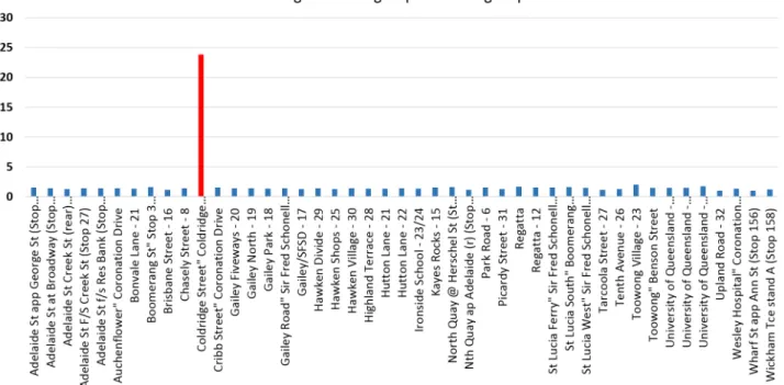
Exploring and studying this number visualizations manually is challenging and requires both knowledge and laborious work especially for high dimensional datasets. Hence, There’s an urgent need for automatic visualization recommendation techniques that recommend the analyst the most in-teresting visualization in large datasets. Figure 1.1 shows that Average passengers of boarding stop for routes411 and 412is considered to be the most interesting visualization. This because; the Visualiza-tion in Figure 1.1 depicts high average number of passengers in certain boarding stops e.g.Coldridge Street∼=23 while the normal average number of passengers in the entire(reference)dataset is about 4 passenger per stop.
Recommending interest-based visualizations raises several research issues [40, 95]: Firstly, the number of explored and evaluated visualizations that need to be considered is often large even for a small dataset with a few number of attributes. For some datasets, simply generating each of these visualizations can take many minutes. Secondly, evaluating these visualizations requires repeated computations, retrieval the same underlying data, wasting time and computational resources. Third,
Figure 1.1:Visualization ofAveragepassengers per boarding stop for routes 411 and 412.
recommendations need to be made at interactive speeds, necessitating approximations that return visualizations with slightly lower accuracy within specified budget constraints includes space size and time limits. Addressing these challenges and trade-offs in our work and a detailed discussion in Chapter 3.
1.4.2
Recommendations for hierarchical visualization
Although the problem in the previous subsection 1.4.1, finds a top(k)interest-based visualizations in large datasets, it still has a main limitation is the recommended visualizations are based only on their deviation scores and it ignores the coherence of dimensions, aggregate functions, and other attributes that construct such visualizations. In Example 1.1, a visualization in Figure 1.1 might be interesting and recommended as one of top(k)visualizations. But, the analyst still has no idea about which the attribute (e.g. Boarding stop, alighting stop, and direction) or the aggregate function (average(trip length), max(passengers) that makes the most interestingness in the dataset. This requires the analyst to study all these top(k)visualizations in order to identify the impact of a certain dimension attribute or an aggregate function which cause the most of the deviation.
To tackle such limitation, we extend the previous problem and address a new problem that defines a notion of coherence over a visualization to generate a coherent tree from a set of interest-based visualization according to their interestingness and coherence. The generated tree is hierarchically created from dimensions, aggregate functions, and other attributes that construct such visualizations. However, the tree reflects the intention that the visualizations should be organized from left to right
based on the interestingness and importance score. Chapter 5, illustrates this problem and provides more detailed discussion.
1.4.3
Trend Explanations of Aggregate Queries
Although numerous of existing visualization tools effectively discover outliers but, most of them are unable to reason why a given set of outputs are outliers or detects explanations behind such outliers. Thus, an advanced level of data exploration approaches is required to clarify reasons behind a particular trend or pattern. To illustrate, suppose that the analyst team in example 1.1, wants to understand why Coldridge Street boarding stop is about 5 times higher than the average number of passengers while the normal average is only 4 passengers. Alternatively, what are the reasons of this deviation?
Technically, what are the predicates that should be added to the original query to change the average number of passengers ofColdridge Street stop to the normal average number 4 passengers instead of 23 passengers?
The divergence in Figure 1.1 can be explained by the following predicate:
Q1: SELECT avg(Passengers), boarding stop FROM GoCard GROUP BY boarding stop where (operation_date=’06-Mar-2013’).
Definition 1.2. Explanation:An explanation (e) is a set of conjunctive predicates P={p1,p2, ...,ph}, where pi∈P is either a range of a continuous attribute or a set of containment clauses over a discrete attribute.
Finding such predicates requires extensive exploration and examinations of all possible predicates in the data space that contribute to the divergence of query results. Then, transforming high influ-ence predicates into meaningful explanations to the user which makes this problem is non-trivial and challenging due to the following factors:
• Exponential Search Space: Each single aggregate value needs to consider various combinations of input tuples affecting the original results, which depends on properties of the aggregate function itself. In the worst case, it resolves to evaluating all possible predicates (exponential search space) which is inefficient for a small dataset.
• Intensive retrieval and computation costs: executing this possible number of modified aggre-gate queries (predicates) is expensive and costly. Moreover, it requires to design efficient and effective measures to decide which subset of input tuples cause the value to be deviated. Such
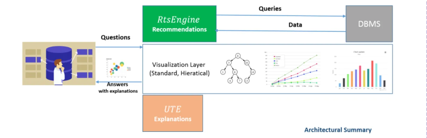
Figure 1.2: Architectural summary of system contributions in this dissertation.
measures are challenging to design because it involves iterating over all possible subsets of input tuples and applying the aggregate operator from scratch.
• Specification of User Expected Values: users want to go further to specify how much is an outlier far from their expectations which makes the problem more complex. In addition, the limitation of current approaches [105, 71] are based on exploration of the exponential search space of datasets.
Chapter 4 presents our proposed innovative techniques and algorithms which address the efficiency and effectiveness challenges involved in finding explanations of user-trends in aggregate queries.
1.5
Contributions
Motivated by the efficiency and effectiveness challenges mentioned above, this thesis contributes innovative approaches and schemes that enrich the scope of analysis process. The techniques pro-posed in this thesis, empower analytical tasks by allowing analysts to express questions about datasets through a visual interface with minimum knowledge level about underlying data. Additionally, an-swering those questions by providing interesting insights in terms of visualizations and comprehen-sive explanations.
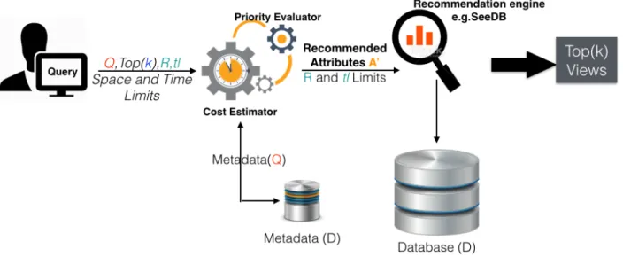
The general architecture and each of the system components are summarized and shown in Fig-ure 1.2. The visualization system interprets user interactions, such as clicks and mouse drags, into SQL queries submitted to the database. RtSEngineexplores the data search space efficiently and ef-fectively to recommend a set of top(k)interest-based visualizations. The visualization layer outputs the discovered visualizations in a dashboard layout or organizes discovered visualizations in order to create a hierarchical tree according to the user choice.
The explanation system UTE takes user’s expectations on a given visualization to generate ex-planations for expectations that the user specified. The architecture components are independent and designed to run on top of existing database. Instead of extending existing systems to support these functionalities, the proposed visualization management system is a concrete design that targets to simplify many of the analysis, performance, and exploration challenges with current database and visualization systems.
The integrated design enables a number of powerful visualization features such as those devel-oped in this dissertation, as well as a number of promising end-to-end data visualization optimization techniques. Specifically, this thesis makes the following key contributions:
• For discovering Interest-based visualizations, Chapter 3 identifies a new problem which ad-dresses the limitations of current visualizations recommendation tools by including user-specified constraints (exploration space size and exploration time limits ) to recommend top(k) interesting visualizations according to a specified budget. Realtime Scoring EngineRtSEngine, limits the exploration of visualizations by assessing priorities of recommended visualizations according to their deviation utilities and costs.
• Priority evaluator component in Subsection 3.4.1 proposes a suit of efficient prioritizing algo-rithms namely(Di f f Dval,Sela,DimsHisto)which utilize statistical features of attributes such as number of distinct values, selectivity ratios, and data distribution, to early prioritize visu-alizations. In addition, Cost evaluator component in Subsection 3.4.2, implements a set of efficient approaches to approximate the retrieval and computations costs of the generated vi-sualizations and to evaluate their estimated costs against their deviation utilities to recommend high accuracy visualizations in the specified budgets.
• MedVisframework addresses the problem of constructing hierarchical tree in Subsection 5.3.3 and defines the notion of visualization coherence.MedViswas proposed to assist users to struc-ture a set of interest-based visualizations hierarchically in Chapter 5 and automatically produces a hierarchical tree based on their coherence.
• Furthure, chapter 4 introduces the problem of user-trend explanations and formalizes a notion of uniformity over predicates in Section 4.3. Section 4.4 describesUTEsystem which searches for uniform predicates in a single relation and utilizes the linear tuple-level search space rather than the exponential predicate-level.
• Then, Subsection 4.4.3 presents a set of splitting algorithms namely; Basic, XTrend-Advanced and XTrend-Fast that solves predicates generation problem linearly. In addition,
UTEpropose a transformation approach that generates meaningful explanations (predicates) to the user and evaluated the goodness of explanations in Subsection 4.4.4.
• Furthure,UTEoptimizes the process of merging highly uniform predicates by employing geo-metric features of the predicates list generated by UTE splitters using Geo Merger scheme in Subsection 4.4.5.
1.6
Thesis Outline
This thesis is organized as follows: in Chapter 2 we present the preliminaries of big data visualizations and explanations, and elaborates more on the related work. Chapter 3 presents our first contribution for discovering Interest-based visualizations problem. Specifically, Section 3.4 provides innovative schemes called RtsEngine to efficiently discover top (k) visualizations based on a special case of budget constraints, i.e., exploration space and time limits. Subsection 3.4.1, describes prioritizing approaches to suggest promising visualizations and prune low-priority ones. In subsection 3.4.2, we propose efficient approximation and optimization techniques to estimate the retrieval and computation costs of interesting visualizations.
In Chapter 4, we formulate the Explanations of Trends in Aggregate Queries problem in sec-tion 4.3 and address its computasec-tional hardness by proposing presentUTE that explains outliers in the result of aggregation queries in section 4.4. 4.4.3 illustrates the optimization techniques forUTE
system. Chapter 5 describes the third problem of recommendations of hierarchical visualization. We formulate this problem in subsection 5.3.3 and presented our proposed approaches in subsection 5.4.2. Finally, Chapter 6 concludes this thesis and provides suggestions for future studies in the area of big data visualizations and query refinement.
Literature Review
This chapter starts with a broad overview of data visualization approaches discussed in recent litera-ture which were proposed to facilitate efficient and effective knowledge extraction. In section 2.1 We investigate the shortcomings and limitations of these techniques. Then, in subsection 2.1.1 it narrows down the discussion medical visualization systems. Section 2.2 broadly provides the illustration on data explanations approaches in databases.
In addition, subsection 2.2.1 explore in detail influential explanations techniques proposed to ad-dress similar constraints and problems to those in this thesis. subsection 2.2.2 presents a wide of overview of query transformation techniques including How-to andWhy-NotQueries problems.
2.1
Data Visualization Approaches
Visual data exploration is often described as a partnership between analyst and computer, with each partner providing unique and complementary capabilities[6, 22]. Existing exploration tools share a number of characteristics [31, 104, 65]: users might be unexperienced with datasets, these goals usually are vague and ambiguous. For most of analysis tasks, users may either query for specific information or navigate to gain insights on pieces of data such as detecting outliers, discovering cor-relation patterns, or detecting changes in trends. However, such tools may implement interfaces such as faceted browsers [107] and dynamic queries [88, 4] to assist users in discovering interesting items. Furthermore, Rx[67] and Reactive Vega[85] are examples of event-driven languages that support de-sign for visualization and front-end programming. Popular toolkits such as D3 [13], protovis [11] and matplotlib [39] are highly expressive, however they require low-level programming that impedes the ability to quickly iterate and do not scale to large datasets.
Interactive Data Visualization Tools have interested the research community over the past few years, and it has presented a number of interactive data analytics tools such as ShowMe, Polaris,
Spotfire and Tableau [51, 62, 52, 26, 3]. Other tools proposed different visualization languages [86, 100] to produce various charts. Similar visualization specification tools have also been introduced by the database community, including Fusion Tables [29] and the Devise [60] toolkit. Unlike SeeDB, which recommends visualizations automatically by exploring the entire views space, these tools place the onus on the analyst to specify the visualization to be generated. For datasets with a large number of attributes, it is unfeasible for the analyst to manually study all the attributes; hence, interactive visualization needs to be augmented with automated visualization techniques.
A few recent systems have attempted to automate some aspects of data analysis and visualization. Profiler is one such automated tool that allows analysts to detect anomalies in data [51]. Another related tool is VizDeck [52], in given a dataset, depicts all possible 2-D visualizations on a dashboard that the user can control by reordering or pinning visualizations. Given that VizDeck generates all visualizations however, it is only meant for small datasets; and VizDeck does not discuss techniques to speed-up the generation of these visualizations.
Voyager 2 [104] suggests univariate summaries to help analysts begin an exploration, and recom-mends charts related to the current focus view. Voyager 2 integrates a graphical specification interface with wildcards to assist users to specify constraints inCompassQLwhich produces a ranked collection of charts rather than just a single chart. earlier system named Voyager [103] creates a large number of visualizations and organizes them by relevance on a large, scrolling canvas.
DataSite [22] is a proactive visual analysis system that turns analysis process into a discussion between analyst and computer to reduce the cognitive load and domain knowledge requirements. DataSite generates a list of dynamically notifications arising from a computation engine to stimulate the analyst’s sense making through brief descriptions of computational modules along corresponding charts.
Declarative grammar-based languages such as the Grammar of Graphics [101] are expressive domain-specific languages designed for rapid iteration, however they do not scale beyond their host environments of SPSS and R [25]. Recent systems address these scalability limitations by ei-ther adopting specific data management techniques such as columnar data representation [51], pre-computation [59], indexing [57], sampling [1], speculation [48], and aggregation [8, 99], or devel-oping two-tiered architectures where the visualization client composes and sends queries to a data management backend [41, 91]. The former approaches are optimized towards properties of specific applications or visualization types and may not be broadly applicable.
Statistical analysis and graphing packages such as R, SAS and Matlab could also be used generate visualizations, but they lack the ability to filter and recommend ’interesting’ visualizations.
explanations for why two cube values were different, to find which neighboring cubes have similar properties to the cube under consideration, or get suggestions on what unexplored data cubes should be looked at next [43, 81, 83].
Database Visualization Work: Fusion tables [29] allow users to create visualizations layered on top of web databases; they do not consider the problem of automatic visualization generation. Devise [32] translated user-manipulated visualizations into database queries.
Although the aforementioned approaches provide assistance in query visualization, they lack the ability to automatically recommend interesting visualizations, except SeeDB which provides different optimization techniques to automatically recommend interesting visualizations while avoiding unnecessary visualizations by utilizing two kinds of optimization techniques as explained next.
Visualizations Pruning in SeeDB:SeeDB implemented an execution engine to reduce latency in as-sessing the collection of aggregate views which it applies two kinds of optimizations: sharing, where aggregate view queries are combined to share computation as much as possible, and pruning, where aggregate view queries corresponding to low utility visualizations are dropped from consideration without scanning the whole dataset.
SeeDB developed a phased execution framework, each phase operates on a subset of the dataset. Phase i of n operates on the ith of n equally-sized partitions of the dataset. The execution engine begins with the entire set of aggregate views as follows: during phase i,the SeeDB [94] modifies partial results for the views still under consideration using theithfraction of the dataset. The execution engine applies sharing-based optimizations to minimize scans on thisithfraction of the dataset. At the end of phasei, the execution engine uses pruning-based optimizations to determine which aggregate views to discard. The partial results of each aggregate view on the fractions from 1 throughiare used to estimate the quality of each view, and the views with low utility are discarded.
The execution engine uses pruning optimizations to determine which aggregate views to discard. Specifically, partial results for each view based on the data processed so far are used to estimate utility and views with low utility are discarded. SeeDB execution engine supports two pruning schemes. The first uses confidence-interval techniques to bound utilities of views, while the second uses multi-armed bandit allocation strategies to find top utility views.
1. Confidence Interval-Based Pruning:The first pruning scheme uses worst-case statistical con-fidence intervals derived from the Hoeffding-Serfling inequality [87] to bound views utilities. This technique is similar to top-k based pruning algorithms developed in other contexts [87]. It
Figure 2.1:Confidence Interval-based Pruning
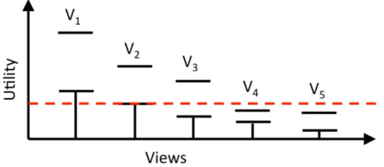
works as follows: during each phase, it keeps an estimate of the mean utility for every aggregate viewViand a confidence interval around that mean. At the end of a phase [93, 94, 15], it applies the this rule to prune low-utility views: If the upper bound of the utility of view Vi is less than the lower bound of the utility of k or more views, then Viis discarded.
For more discussion, consider a dataset has 5 viewsV1toV5as shown in Figure 2.1 and we want to get the top-2 views. At the end of phase p, viewsV1−V5 have confidence intervals shown in Figure 2.1. The highest estimates for utility so far are viewsV1−V2. In case of top-3 views, still the rule applies and becomes the highest utility estimation areV1−V3. views. However, the confidence interval forV4 lies entirely below the lower-bounds ofV1 andV2 and the same for viewV5. Thus, both viewsV4andV5are pruned and would not count for the next phase. This approach is dependent on the data type at it computes the mean utility for every aggregate view. In addition, some aggregate functions such asMAX and MINare not docile for estimation.
2. Multi-Armed Bandit Pruning:Second pruning scheme employs a Multi-Armed Bandit strat-egy (MAB) [94, 15]. In MAB, an online algorithm repeatedly chooses from a set of alternatives over a sequence of trials to maximize reward. This variation is identical to the problem ad-dressed by SeeDB: the goal is find the visualizations (arms) with the highest utility (reward). Specifically, SeeDB adapts the Successive Accepts and Rejects algorithm from [15] to find arms with the highest mean reward.
At the end of every phase, views that are still under consideration are ranked in order of their utility means. Then it computes two differences between the utility means: ∆1 is the difference between the highest mean and thek+1st highest mean, and∆n is the difference between the lowest mean and thekthhighest mean. If∆1 is greater than∆n, the view with the highest mean is accepted as being part of the top-k (and it no longer participates in pruning computations). On the other side, if∆nis higher, the view with the lowest mean is discarded from the set of
views in the running. [6] proves that under certain assumptions about reward distributions, the above technique identifies the top-k arms with high probability.
Unfortunately, both MAX and MIN are not amenable to sampling-based optimizations, as is commomly well-known in the approximate query processing literature [93, 94, 15, 16, 45]. 3. Sharing optimizations: since each visualization is translated into two queries that are
exe-cuted independently on the DBMS, SeeDB [94, 15] applies three types optimizations meth-ods to share retrieval and computations costs. Firstly, SeeDB converts multiple aggregate quires that contain same group-by attribute to a single query with multiple aggregations. For instance, views (a1,m1,f1),(a1,m2,f2), ...,(a1,mx,fy) can be combined into a single view (a1,{m1,m2, ....mx},{f1,f2, ...,fy}). Although, this method execute a single query over the underlying database but, the modified query still might take longer execution time depend on both the number and type of aggregate functions.
Secondly, SeeDB combines queries along different group-by attributes however, it is challeng-ing to determine the optimal groupchalleng-ing of attributes. This because the number of distinct groups for a set of attributes a1,a2, ...,ak is obtained by ∏ki=1 with respects to the memory budget. SeeDB uses the standard first-fit algorithm [46] to find the optimal grouping of dimension at-tributes. Finally, SeeDB executes various queries in parallel to reduce retrieval times but SeeDB is limited to define the accurate number of parallel queries.
SeeDB pruning schemes experience some limitations, as they assume fixed data distribution [94, 93] for sampling to estimate the utility of views and require large samples for pruning low utility views with high guarantees. Moreover, aggregate functions MAX and MIN are not docile to sampling-based optimizations.
Offline visualizations in SeeDB: SeeDB prunes redundant views [94] : For each table, it first deter-mines the entire space of aggregate views. Next, it prunes all aggregate views containing attributes with 0 or low variance since corresponding visualizations are unlikely to be interesting. Furthermore, SeeDB identifies clusters of attributes that are strongly correlated with each other and select to display a visualization of one of those correlated attributes. For each remaining viewVi, SeeDB computes the distribution for reference views on the entire dataset. The resulting distributions are then clustered based on pairwise correlation. From each cluster, SeeDB selects one view to compute as a cluster representative and store stubs of clustered views for sub-sequent use. At run time, the view generator accesses previously generated view stubs, removes redundant views and passes the remaining stubs to the execution engine.
2.1.1
Medical visualization Systems
To support visual sense-making in medical diagnosis, INVISQUE [35, 102] is an interactive visual-ization system proposed such as physical index cards on a two dimensional workspace. INVISQUE provides some features to support annotating, re-visiting, and merging two clusters. It discusses es-sential problems in designing medical diagnostic displays that can improve the review of a patient’s medical history [35]. A recent work, SubVIS [38] is a visualization tool which assists the user to analyze and interactively explore computed subspaces to discover insights in highly dimensional and complex patient’s datasets.
SubVIS [38] introduces an analysis workflow to visually explore subspace clusters from various perspectives and it tackles some subspace clustering challenges such as difficulty of interpretation patient results, redundancy detection in subspaces and clusters, and multiple clustering results for different parameter settings. Martinez et al. introduce a visual analytic and visualization platform (VAVP) adapted from Kimball technical system architecture [54], for injury prevention and control (IPC). VAVP involves the ongoing, systematic collection, analysis, interpretation and dissemination of data on injury-related events to support public health action and to reduce morbidity, disability and mortality due to intentional and unintentional injuries.
Ko and Chang illustrate procedures to explore healthcare data of colon cancer patients using Tableau. The dataset was obtained from Korean1 health insurance claims between 2012 and 2013 provided by the Health Insurance Review and Assessment Service to assist users to express the de-sired format using filters, drop-down lists, the calculated field. However, this procedure is limited for beginners.
Mittelstädt et al. proposed a visual analytic system for adverse drug detections to analyze corre-lations among various a number of drugs related variables and identify unexpected data features in large heterogeneous databases. The proposed approach applies statistical computations and advanced interfaces to enable experts to detect relevant low frequency events, however, this system still needs user’s supervision to validate results.
2.2
Data Explanations Approaches
Several projects from databases and data mining research communities were proposed to provide explanations and to support interactive data exploration, e.g., user ratings on sites like Yelp and IMDB [24], access log and security permissions [9]. Kanagal et al. [49] studied the problem of computing
top-k influential variables and top-k explanations to answer "why a tuple is in the output", or "why the probability of an output tuple is greater than another one" in probabilistic databases.
Explanations in Databases: Wu and Madden [105] proposed the Scorpion system to provide explanations for user aggregated queries over a single relation. Scorpion uses a set of user-specified outlier and hold-out points in a given aggregate query result to output top-K predicates which make outliers disappear. Wu and Madden developed a notion of predicate influence based on sensitivity analysis [79] in the context of data provenance [69] to define how the probability of a result tuple is influenced by an input tuple. Although Scorpion provides explanations in terms of predicates but, it fails to provide a concrete method of how much high or low outliers should be bounded.
The optimization techniques used in Scorpion [2, 14] to speed-up the evaluations of predicates are based on the incremental properties of aggregate functions such assum, avg, stddev. Though, multiple performance limitations arise for user-specified aggregate functions or when an aggregate function is considered as a black-box. Further, their approach in generating predicates for independent aggregate functions using regression trees [14] depends on user-specified threshold, which is quite difficult for end-users to define. More detailed discussion aboutScorpionoptimization techniques in the following subsection 2.2.1.
Roy and Suciu extended the model presented in [105] and proposed a formal framework for defin-ing explanations to complex SQL queries over database schemas involvdefin-ing multiple relations and foreign key constraints. However, their framework limits predicates to be conjunctive predicates of atomic equality predicates on tables. Chalamalla et al. proposed DBRx system for data cleaning which takes defined quality rules over the output and generates explanations of the errors seen on the output. The system proposed weight-based approach to annotate the lineage of target violations in source tuples. In contrast to UTE, DBRx [17, 25] traverses the query’s operator tree top-down and distributes the weights to the result’s operator lineage.
OLAP Data cubes: Sarawagi el al.[80] proposedDiff operator to to generate summary tuples that explain why two subcubes’ values differ assist users to find reasons for drops or increases observed at an aggregated level. It is based on an information theoretic formulation for expressing the reasons of why subcubes’ values are different. RELAX [84] assists users to propagate from a specific problem case in multidimensional hierarchal data cubes (e.g. drop in sales of a store in a specific region) and returns a wider context in which the problem occurs.
Another exploration work [82], recommends interesting subcubes during navigation based on previously seen subcubes by the analyst to estimate the expected values for next drill-down sessions. MRI [23] automatically provides a meaningful interpretation of ratings based on the idea of data cube. This work implements randomized hill exploration algorithms in order to discover interesting cuboid
Figure 2.2:Threshold function curve asin fmax
in OLAP cubes.
PerfXplain [53] explains relative performances questions (i.e., why some jobs have faster runtimes than others) of pairs of MapReduce jobs. PerfXplain provides a query language named PXQL for expressing performance queries and produces explanations from past MapReduce executions logs.
In contrast, Our contribution allows users to: 1) tame the exponential search space via working with a linear one instead, and 2) enable far more accurate explanations that are possible with tuples, not predicates.
2.2.1
Influential Explanations Approaches
Wu and Madden defined a notion of theinfluenceof predicates derived from sensitivity analysis [79] and proposed theScorpion[105, 25] system to explore a set of all possible explanations and outputs explantione∗has the maximum influence for user aggregated queries over a single relation. Scorpion
[105, 25] proposed two partitioning algorithms namely Decision Tree (DT) and Bottom-Up (MC)
partitioners. (DT)and(MC)algorithms are designed to split the attribute space of an input group and create a set of predicates.
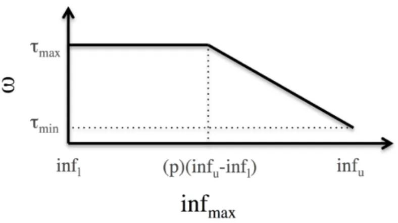
Decision Tree (DT)AlgorithmDT is a top-down partitioning algorithm for independent aggre-gates, that recursively splits the exponential space to generate predicates where tuples of an input group within a predicate have similar influence. DT re-uses the regression tree framework [14] to minimize the distribution of influence values within a given partition. Scorpion[105, 25] suggested error metric threshold for partitions that don’t contain influential tuples. To attain that,DT applies a decreasing function which defines a value is based on the maximum influence in each partitionin fmax, the upper, in fu, and lower in fl bounds of the influence values in the dataset as shown in figure 2.2.
threshold(θ) =ω∗(in fu−in fl)
ω =min(τmin+s∗(in fu−in fmax),τmax)
s= τmin−τmax (1−p)∗in fu−p∗in fl
where ω is the error as depicted in Figure 2.2, s is the slope of the downward curve, p = 0.5 is
the inflection point when the threshold starts to decrease, and τmax and τmin are the maximum and minimum threshold values.
Although the proposed decreasing function can reduce the number of predicates within a certain error rate, butDTstill needs to compute the influence on all of the input tuples. In addition,DTapplies a sampling algorithm to estimate a sampling rate in a dataset by specifying additional parameter
ε represents the percentage of influential tuples in a cluster. However, DT optimizations put the
ounce of the effort to the user sinceDT requires to specify additional information such as maximum influence, lower and upper bounds influence values in a given dataset. This kind of information requires previous knowledge about the distribution of data which is challenging for users.
Bottom-Up(MC)AlgorithmThe second proposed partitionerMCis a bottom-up subspace clus-tering [2, 105, 25] algorithm for independent, anti-monotonic aggregates, such as COUNT and SUM.
MC initially splits each continuous attribute into fixed size units, and every discrete attribute by the number of distinct attribute values. Each iteration computes the intersection of all units kept from the previous iteration whose dimensionality differ by exactly one attribute. Then, Non-dense units are pruned, and the remaining units are kept for the next iteration. MC searches for influential single-attribute predicates, and intersect them to construct multi-single-attribute predicates. MCimproves the influ-ence by adding additional dimensions that refine the predicates by merging adjacent predicates after each iteration and pruning low influence predicates.
Although, Scorpion [105, 25] proposed DT and MC to partition attributes space and generate a set of influential predicates but, these algorithms still work on exponential space and requires additional information spcified by the user. Unlike our proposed splitters XTrend Basic and Xtrend Fast Splitters that navigate the attributes space lineraly, merge only essential attributes to produce meaningful explanations with no knowledge required about the dataset. Subsection 4.4.3 in Chapter 4, provides more detailed discussion on UTE Splitting Approaches and Section 4.4.3, Section 4.4.3 illustrate both XTrend Basic and Xtrend Fast Splitters.
2.2.2
Query Transformation
A number of database researches have introduced the query transformation problem of either the input dataset or the user’s SQL to cause desired changes in the result set. Moreover, a reverse data management problem involves to answer how should the input change in order to achieve the desired output in databases. Tiresias [68, 72] is the first system that allows users to specify large set of constrained optimization problems as input to a Mixed Integer Program solver using TiQL (Tiresias Query Language) which generates a solution. TiQL is based on standard Datalog that translates queries into a Mixed Integer Program and uses a standard MIP solver. Tiresias allows users to explore what hypothetical change to make to the database in order to improve Key Performance Indicators for the enterprise.
Meliou et al. focus on determining the causes of a set of unexpected results conditioned on some prior knowledge of the correctness of another set of results. The VCC [71] proposes view-conditioned causality and responsibility to solve tracing errors; which uses a SAT solver to provide similar func-tionality to errors as the result of boolean expressions. However, the proposed solutions make tuple-at-a-time modifications to the database, rather than predicate-tuple-at-a-time. However, these techniques need to translate relevant database contents into the MIP problem, which limits the scalability to tens or low hundreds of tuples [25].
The Why Not? problem [18, 37, 92] seeks to understand why records that should be in the result are not present. Huang et. al [37] focus on providing provenance-style explanations for non-answers and presented a conceptual framework for reporting the provenance of potential answers for SPJ queries. Tran and Chan proposed ConQueR for explaining why-not questions based on automati-cally generating refined queries for SPJ queries with aggregation that involve comparison constraints. Tiresias [68] explore how to change the database state on a per-tuple basis, whereas an alternative formulation of the problem focuses on changes to the SQL query [18, 92]. In contrast, the discussed problems modify the generated predicates to expressive explanations by exploring different attributes, a detailed discussion Subsection 4.4.4 in Chapter 4.
Constraint-based Recommendations of
Query Visualizations
I. A. Ibrahim, A. M. Albarrak, and X. Li. Constrained recommendations for query visualizations. Knowledge and Information Systems Journal, Springer, May 2017, Volume 51, Issue 2, pages 499-529.
Contributor Statement of contribution I. A. Ibrahim Conception and design (70%)
Analysis and interpretation (70%) Drafting and production (60%) A. M. Albarrak Conception and design (15%)
Analysis and interpretation (15%) Drafting and production (40%) X. Li Conception and design (15%)