Supporting Content Design with an Eye Tracker: The Case of
Weather-based Recommendations
Alejandro Catala, Jose M. Alonso, and Alberto Bugarin
Centro Singular de Investigaci´on en Tecnolox´ıas da Informaci´on (CiTIUS), Universidade de Santiago de Compostela, Spain
{alejandro.catala, josemaria.alonso.moral, alberto.bugarin.diz}@usc.es
Abstract
Designing content output for weather-aware services based on domain experts can sometimes be arduous due to their lim-ited availability and the amount and com-plexity of information considered in ex-plaining their recommendations. As an initial step in our work towards generat-ing recommendations that are acceptable and readable, our methodology involving an eye tracker attempts to simplify and capture more valuable data in early design stages. Our pilot study explored which in-formation in weather-based recommenda-tions seemed to be more useful to support users decision making. The results sug-gest that interactive content could be de-ployed based on the relevance of informa-tional items and both graphical points of interest and legends could help in deliver-ing content more efficiently.
1 Introduction
In the realm of context-aware services and inter-active applications, Natural Language Generation (NLG) involving maps in combination with mete-orological data is subject to active field research (Ramos-Soto et al.,2015). Automatically generat-ing recommendations consistgenerat-ing of both text and figures can help users in making decisions while providing personalized services (Gkatzia et al.,
2017). Furthermore, it is not just an issue of giving a suitable recommendation according to the user’s context (Mocholi et al., 2012), but also to design content generators in such a way that the artificial intelligence associated to the service is better con-sidered in terms of being explainable, accountable and intelligible (Abdul et al.,2018;Alonso et al.,
2018).
The combination of such qualities means that we are facing a complex design problem that needs to deal with several issues before a successful al-gorithm can be implemented. In order to start addressing this issue, we propose to use an eye tracker with a double purpose: i) to set a prior-ity and get a narrower focus on all the informa-tion elicited from meteorologists; and ii) to supply a method in order to gather from users more ob-jective data that complement self-reporting ques-tionnaires. In this way, we expect to enable better informed design decisions. Thus, this paper con-tributes a pilot empirical study exploring with the help of an eye tracker how stimuli containing rec-ommendations with explanations supported by fig-ures are processed by people and which elements can be more relevant for generating content in fu-ture designs.
2 Background on cognitive psychology and eye tracking
newspa-per reading.
In order to analyze gaze data, there are several features and a range of metrics that eye-tracking tools can provide, as surveyed in (Sharafi et al.,
2015). Among the raw data, eye fixations are es-pecially useful, which refer to stabilization of the eye for a period of time (e.g. circa 200ms) and provide deeper understanding on where visual at-tention has been focused. Scanpaths are also in-teresting, which visualize chains of fixations. To the best of our knowledge, there is not much spe-cific work using eye-tracking to explore weather-based stimuli besides the recent study by (Sivle and Uppstad, 2018). The authors explored how multimodal reading takes place and why readers move between representations, concluding that ta-bles are more often used with respect to diagrams.
3 Study
3.1 Participants and equipment
Fifteen adult volunteers (mean: 23.13 years old, sd=2.71) participated in the empirical study. They were all postgraduate students or PhD candidates working on technical fields related to computer science. All except one stated to have prior knowl-edge of Galician geography.
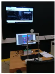
The experimental setting was implemented us-ing the EyeTribe Tracker1 to track the eye gaze on a main screen where the stimuli were displayed (see Figure1). Also, a device supported the sub-ject’s chin to prevent tracker calibration issues. A secondary bigger screen only active while answer-ing questionnaires was set behind, placed at a dis-tance so that both can be read without changing the pose, to not compromise the tracker calibration.
We used the Ogama software (Voßk¨uhler et al.,
2008) (version 5.0.5754) to assemble the stimuli and manage the gaze data recording.
3.2 Stimuli design
The empirical study consisted of 6 trials, which were randomized to prevent order effects. The stimulus in each trial included a recommenda-tion about the suitability to carry out activities on the Beach, Surfing or activities on the Mountains. Typically, a stimulus included a textual description on the upper side of the screen. The text was in Spanish, the native language of the participants. A literal transcription of a sample text on the Beach topic into English is as follows:
[image:2.595.359.472.43.196.2]1https://github.com/EyeTribe/documentation
Figure 1: Experimental setting.
“Today will be a perfect day to enjoy the beaches of A Mari˜na luguesa, like in As Catedrais or Arealonga, since the temperatures will be very pleasant and the skies will remain clear all day. Likewise, it is also recommended to attend the flu-vial beaches of the interior of Galicia.
The reason for the good weather prevailing on the Cantabrian coast and inland of Galicia is due to the move of the Anticyclone from the Azores to the east. Such a synoptic situation will cause both territories to be left out of the mists and low cloud cover that will do affect the Galician At-lantic coast.”
The text consisted of both a recommendation R (the first paragraph) and an explanation of the weather forecast E (the second paragraph). The order of these parts can lead to two possible ar-rangements (i.e.,<R,E>or<E,R>). The
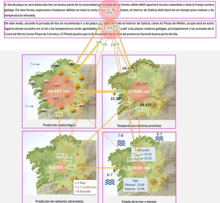
stim-uli also came with a set of maps supporting the explanation (see Figure2-Left): weather forecast, UV index, max temperature, and sea state maps. The fourth map was replaced by a storm warning map in the mountain recommendations. The stim-uli were designed by a meteorologist with expe-rience in generating weather reports, taking into account that the target user is the general public.
3.3 Procedure
ge-ographical information to get acquainted with the type of maps and related locations. Then the user performed the trials following instructions on the main screen, just switching to the secondary dis-play when requested to answer questionnaires. For each trial, there was a first screen presenting the textual description as a stimulus. The task was to read the text, in order to gather typical reading pat-terns, warm up, and be sure that tracking worked correctly. A second screen presented the same text plus the figures supporting the textual description. The task for the user was to inspect the recommen-dation to assess to which extent the visual infor-mation provided matched the textual description. The stimuli were self-paced, and participants kept their hand on the space bar all the time, which had to be pushed to move forward. Switching between displays was handled by the experimenter, turn-ing them off and on as needed. Instruction screens were set between stimuli in order to ensure that gaze recording was separated accordingly. Once the 6 trials were finished, the participant answered the demographics questionnaire.
3.4 Results 3.4.1 Gaze data
We carried out a qualitative analysis by replay-ing the fixations, scanpaths and calculatreplay-ing the at-tention maps as fixation count heatmaps with fix-ations weighted by duration as provided by the Ogama software. While fixations just give point clouds where users looked at on screen, the atten-tion maps can be used to identify regions of spe-cial attention in specific stimuli, filtering noise and enhancing visual analysis. Longer fixations, and therefore attention, have several implications. In reading tasks, longer fixations are typically over words that took longer processing time (Rauzy and Blache,2012;Sharafi et al.,2015), either because the word was more difficult to understand or just because it was considered a relevant and important term to remember. In matching tasks, fixations and attention maps provide insight into which spots can be more informational and relevant to support the textual description. This allows us to decide which information should be kept as it is, high-lighted or discarded.
In the reading tasks, we captured the reading patterns, which led to scanpaths line per line from left to right. It took on average about 29 seconds (sd=7.99), resulting in 91.28 (sd=22.97) fixations
and 3.18 fixations per second on average. The at-tention maps show that more processing effort fo-cused on the general forecast descriptionErather than in the recommendationRitself regardless of the arrangement. We must also be aware that ex-planations were usually longer than the proper rec-ommendation. When analyzing the words lying in the spots, the most prominent ones are related to weather events (e.g., showers, wind, or very sig-nificant waves) and geographical locations (e.g., Patos beach, A Madalena beach, or province of Pontevedra). Also, we noticed that some single words (e.g.,synoptic) were signaled, which are un-common terms often used by meteorologists.
In the matching tasks, each trial took 24.42 sec-onds on average (sd=9.71), with a mean number of fixations about 70.28 (sd=26.67) and 2.9 fixa-tions per second. Regarding the gaze data, weather events and geographical locations are again promi-nent in the text (e.g., light showers, high temper-ature, inland region, or beach of Carnota). Re-garding the figures, the most prominent spots are over the weather forecast map (e.g., related to spe-cific areas mentioned in the text such asA Mari˜na luguesain Figure2-Center), the max temperature map and the maps’ legends. When the gaze fo-cused longer on weather graphic symbols, they were about weather events such as showers rather than good weather conditions. The sea and the storm warning maps had some relevant role in the surfing and mountain trials respectively as de-picted in Figure2-Right. Overall, the dwell times on the defined Areas of Interests (AOIs) confirm the relevance of maps for users (see Figure3).
3.4.2 Questionnaires
We gathered additional information through ques-tionnaires provided after each trial. We used a 7-point Likert scale for assessing questions regard-ing Coherence text-graphics (m=6.26, sd=1.13), Readability (m=6.23, sd=1.02), and Understand-ability(m=6.37, sd=0.98). Some open questions to gather the most and less relevant items accord-ing to participants were included. Table1reports the frequencies of topics in the content analysis. Overall, these self-reported remarks were consis-tent with the observation from the gaze data.
4 Discussion and future work
Figure 2: Sample maps (Left). Attention maps for a beach (Center) and a mountain stimulus (Right), calculated as fixation count height maps with fixations weighted by duration and using the following colour scale normalization: purple (10%), blue (25%), turquoise (40%), green (65%), yellow (75%), orange (93%), red (100%). The stimuli size was 1920x1080, the kernel size was Ogama’s default 201.
[image:4.595.73.525.289.704.2]Table 1: Content analysis: the most ‘+’ and less ‘-’ relevant items (number of occurrences in brackets).
Beach Surfing Mountain
+ weather forecast map (7), max temperature map (4), UV in-dex map (2), sea state map (2)
sea state map (7) weather forecast map (8),
storm warning map (4), max temperature map (3)
- complex descriptions includ-ing either technical terms or place names (5), UV index (3)
max temperature map (2), UV
index map (2), place names (3) place names and technicalterms, storm warning map if there is no risk
Involving domain experts to provide well-founded descriptions and explanations is a chal-lenge. They provide much information to be fully precise, and therefore prioritizing or simplifying the pieces of information is not straightforward.
Following a traditional approach would require several design cycles to elicit information from meteorologists, who are not always available, whereas testing with users is costly even for small samples. Thus, our approach attempts to speed up the process at an early stage of development by starting with a more exploratory scenario that al-lowed us to get multiple observations at once in order to back up future design decisions. This mo-tivated that our request to the meteorologist for de-signing the stimuli included some practical con-straints such as text no longer than a short para-graph and no more than four maps fitting a single screen for a web service application. In this way, the expert still had some room to create a report and we are not discarding informational items be-forehand without a good reason. Moreover, having a setting with a PC desktop screen was deliber-ately chosen because we can focus on the content without any interference imposed by interactions (e.g., navigating between smaller screens in a mo-bile user interface), and the design space is better understood by both the domain expert and users.
The results confirmed that the domain expert who designed the stimuli used more source infor-mation than users demand and can naturally pro-cess, as suggested by underused maps and user comments regarding complex descriptions and technical terms. Thus, one design principle is to providesimplified on-screen information. Choos-ing a limited set of information sources would help to reduce complexity and cognitive load. For example, by providing only the two most rele-vant maps as reported in the results and by giving the option to interactively explore more complex and extended information. Salient gaze spots for
text were on referring expressions, such as proper nouns of places, and weather events. This is an expected result as these words are actually the key information being conveyed, in line with (Rauzy and Blache,2012).
When talking about specific places (e.g., the name of a beach or a peak), the maps should also include landmarks to facilitate its interpretation, mitigate any gap in the user’s geographical back-ground knowledge and simplify text. Furthermore, when text is the only possible output, because maps are not available or another modality is be-ing used (e.g., speech), the specific place should be accompanied of a more general location. For example, a recommendation referring to the beach called “Patos” could be improved by expanding the information in the text with a more general lo-cation well-known by users such asR´ıa de Vigo. We can also focus on the recommendationR, and then consider the generalexplanation in a follow-up interaction. This is still important to provide more intelligibly context-aware applications (Lim and Dey,2013). Expanded explanations under re-quest could include a more technical view indeed. We mustuse the legends properlyas can be a very powerful resource, with users looking at them sys-tematically. Although using heatmaps can be a very useful tool, they must be handled with care to prevent misinterpretations (Bojko,2009). Our study used fixation count height maps with a cor-rection to take into account the length of fixations. However, we must be aware that they just repre-sent average fixation behaviour, and as any aver-aged computation it can be subject to bias due to very different fixation behaviours or longer expo-sures to the stimuli. Accordingly, more advance and robust computations to complement and coun-teract such limitations should be considered when-ever possible.
complementary, but quite in agreement to those derived from questionnaires. As future work, we aim to develop a data-to-text module ready to automatically produce multimodal recommen-dations. Content design will be initially guided by the conclusions derived from this study. Fur-thermore, we will analyze how other different structures (that can be explored interactively) may affect the explainability and intelligibility of a weather-aware service.
Acknowledgements
This work has been partially funded by the Span-ish Ministry of Economy and Competitiveness under the project grants BAI4SOW (TIN2014-56633-C3-1-R), BIGBISC (TIN2017-84796-C2-1-R), and the Ram´on y Cajal Research grant RYC-2016-19802, by the European Regional Develop-ment Fund (ERDF/FEDER program) and Con-seller´ıa de Cultura, Educaci´on e Ordenaci´on Uni-versitaria (acc.2016-2019, ED431G/08), and by the CiTIUS Summer scholarship program. Special thanks go to Damian Caballero for his invaluable help and expertise on weather recommendations and forecasting. Thanks to all volunteers who par-ticipated in the study.
References
Ashraf Abdul, Jo Vermeulen, Danding Wang, Brian Y. Lim, and Mohan Kankanhalli. 2018. Trends and tra-jectories for explainable, accountable and intelligi-ble systems: An hci research agenda. In Proceed-ings of the 2018 CHI Conference on Human
Fac-tors in Computing Systems, CHI ’18, pages 582:1–
582:18, New York, NY, USA. ACM.
Jose M. Alonso, C. Castiello, and C. Mencar. 2018. A bibliometric analysis of the explainable artificial in-telligence research field. In17th International Con-ference on Information Processing and Management
of Uncertainty in Knowledge-Based Systems, pages
3–15. Springer.
Agnieszka (Aga) Bojko. 2009. Informative or mislead-ing? heatmaps deconstructed. InHuman-Computer Interaction. New Trends, pages 30–39, Berlin, Hei-delberg. Springer Berlin HeiHei-delberg.
Kristina Danielsson and Staffan Selander. 2016. Read-ing multimodal texts for learnRead-ing : a model for cul-tivating multimodal literacy. Designs for Learning, 8(1):25–36.
Dimitra Gkatzia, Oliver Lemon, and Verena Rieser. 2017. Data-to-text generation improves decision-making under uncertainty. IEEE Computational In-telligence Magazine, 12(3):10–17.
Jana Holsanova, Nils Holmberg, and Kenneth Holmqvist. 2008. Reading information graphics: The role of spatial contiguity and dual atten-tional guidance. Applied Cognitive Psychology, 23(9):1215–1226.
Johanna K. Kaakinen and Jukka Hyona. 2010. Task ef-fects on eye movements during reading. Journal of Experimental Psychology: Learning, Memory, and Cognition, 36(6):1561–1566.
Brian Y. Lim and Anind K. Dey. 2013. Evaluating in-telligibility usage and usefulness in a context-aware application. In Human-Computer Interaction. To-wards Intelligent and Implicit Interaction, pages 92– 101, Berlin, Heidelberg. Springer Berlin Heidelberg.
Pei-Lin Liu. 2014. Using eye tracking to under-stand learners’ reading process through the concept-mapping learning strategy. Computers & Educa-tion, 78:237 – 249.
Jose A. Mocholi, Javier Jaen, Kamil Krynicki, Ale-jandro Catala, Artzai Pic´on, and AleAle-jandro Cade-nas. 2012. Learning semantically-annotated routes for context-aware recommendations on map naviga-tion systems. Applied Soft Computing, 12(9):3088 – 3098.
Alejandro Ramos-Soto, Alberto Jose Bugar´ın, Senen Barro, and Juan Taboada. 2015. Linguistic descrip-tions for automatic generation of textual short-term weather forecasts on real prediction data. IEEE Transactions on Fuzzy Systems, 23(1):44–57.
St´ephane Rauzy and Philippe Blache. 2012. Robust-ness and processing difficulty models. A pilot study for eye-tracking data on the French Treebank. In
Workshop on Eye-tracking and Natural Language Processing at The 24th International Conference on
Computational Linguistics (COLING), Proceedings
of the First Workshop on Eye-tracking and Natural Language Processing, pages 1–15, Mumbai, India.
Zohreh Sharafi, Timothy Shaffer, Bonita Sharif, and Yann-Ga¨el Gu´eh´eneuc. 2015. Eye-tracking metrics in software engineering. In2015 Asia-Pacific
Soft-ware Engineering Conference (APSEC), pages 96–
103.
Anders D Sivle and Per H Uppstad. 2018.Reasons for relating representations when reading digital multi-modal science information. Visual Communication, 17(3):313–336.
Adrian Voßk¨uhler, Volkhard Nordmeier, Lars Kuchinke, and Arthur M. Jacobs. 2008. Ogama (open gaze and mouse analyzer): Open-source soft-ware designed to analyze eye and mouse movements in slideshow study designs. Behavior Research