1
AUTOMATION OF DATA ANALYSIS IN FORMULA 1
A Senior Project submitted to
the Faculty of California Polytechnic State University, San Luis Obispo
In Partial Fulfillment
of the Requirements for the Degree of Bachelor of Science in Industrial Engineering
by
2
Automation of Data Analysis in Formula 1 Racing Prescott Delzell, Patrick McCabe, Adam Mourad
Abstract
This paper explores economic solutions for Formula 1 racing companies who are
3
ACKNOWLEDGMENTS
4
Table of Contents
1. Introduction and Background ...5
1.1 Introduction ... 5
1.2 Significance ... 5
1.3 Motivation ... 6
2. Problem Description...6
2.1 Current State ... 6
2.2 Problem Statement and Project Objectives ... 8
3. Literature Review ...8
3.1 Racing Analytics ... 8
3.2 5 V’s of Big Data ... 11
3.3 Storytelling with Data ... 13
Solution Design ...14
3.4 Criteria for Success ... 14
3.5 Software Alternatives ... 15
4.2.1 Tableau... 15
4.2.2 Power BI ... 15
4.2.3 Python ... 16
4. Test and Evaluation of Design Alternatives ...16
4.1 Software Evaluation ... 16
4.2 Recommendation and Prototype Design ... 17
5. Conclusion ...18
5.1 Economic Analysis ... 18
5.2 Impact ... 18
5.3 Conclusion... 19
6. Future Directions...19
5
1.
Introduction and Background
1.1 Introduction
Formula 1 has evolved since its inaugural season in 1950. Races are no longer just about the skill of the driver. To predict the performance outcomes of their races, Formula 1 teams collect astronomical amounts of data in real time. Teams like McLaren use historical information and simulations to build their race cars for each circuit. They make changes to their cars every two weeks. The season starts in mid-March and continues until the beginning of December, and a round is every two weeks. The technical name for a Formula 1 team is a “constructor,” made up of a driver and supporting crew. For example, Red Bull Has two drivers, a pit crew, and 60 engineers on site during the race (Higginbotham). Adjustments are made before and during the race to fit racing strategy. The weekend of a race goes from Friday to Sunday with three practice sessions that are 90 minutes long, a qualifying race on Saturday evening, and the official race Sunday. The first session, Q1, is 18 minutes long and the last six cars are illuminated. The second session’s length, Q2, is 15 minutes and it is when the last six cars are eliminated. The last session, Q3, determines the starting grid for the Top ten positions.
Formula 1 was inspired by pre-war European Grand Prix championships in the 1920s and 1930s. It was founded by the FIA, International Automobile Federation, in 1946. The FIA bases its name in reference to the words “Formula”, means a set of rules to follow for cars, and “one”, meaning the highest classification for a track. There is a total of 21 grand prix races located around the world. The goal of the team is to get the most championship points to receive the driver’s world championship title. Drivers are awarded championship points at the end of each Grand Prix based off their final position (BBC).
The cost of a mid-tier team runs around $120 million annually (Tovey). Formula 1 leaders like Mercedes, McLaren, and Red Bull will spend even more in order to fund a winning team. Viewership came out to be around half a billion watching around the world in 2018 and the audience size steadily increases from year to year. Compared to other motorsports like NASCAR or Indy racing, Formula 1 is much larger and on a bigger scale. On average NASCAR has 3.3 million viewers and IndyCar racing is even smaller, with average viewership around 1.1 million (Gough) (Horner). Formula 1 presents itself on a global scale and races happened all over the world, meaning more people tune in. Races are more like a sprint than a marathon, lasting around two hours. In comparison, NASCAR is more like a marathon, lasting three to four hours.
1.2 Significance
6
from their race car multiple times a second, and their headquarters in London gets the same information in only a fraction of a second later than the pit team. Another team in Formula 1 racing, Lotus, collects over 2,000 statistics per lap. Both teams simulate the race using their real time data to understand future outcomes and adjust their racing plan accordingly. This allows them to overcome arising problems, calculate what they need to implement in their race strategy, and combat fallacies in order to finish as best they can. These decisions are made quickly during a race, making it essential for the data to be comprehensive as well as straightforward; thereby allowing decisions to be made effectively and timely.
1.3 Motivation
During the seasons of April through June, the Formula 1 generated a total of $620 million (Media). Each race event has a total average revenue of $229 million (us.motorsport.com). The goal of Formula 1 teams and smaller teams, such as Toyota Racing Development, is to be competitive and gain large amounts of product exposure. They do this by placing in the top of rankings. The sports fan wants to associate themselves with a winning team whether it's supporting them by buying merchandise or associating themselves with that brand.
Analyzing data and data visualization is essential component for racing teams to place in the top in the circuit. As motor sports collects more and more data through hundreds of sensors, there is a greater need for tools of data analyzation. These tools allow the engineers to visually see how certain factors affect that overall performance of the car. In addition, within the sport of Formula 1, there is also a need for specific long-term trend data analysis rather than weekly visualizations. Creating value-add to Formula 1 companies may drastically impact the Formula 1 league, but also the revenue of the racing company itself. The more effective racing companies can be, the more they win. The more they win, the more the racing company earns.
2.
Problem Description
2.1 Current State
The sport of Formula 1 racing is as complex in planning, training, and execution as any other sport. To start, there are their qualitative metrics to consider such as the specific racetrack, the type of tire, and what other teams are doing. In addition to qualitative information, the race cars are fitted with sensors that measure a myriad of key metrics for analysis before, during, and after a race to drive better performance. Some of these metrics may include the downforce, tire pressure, the car’s height relative to the ground, and speed. Some teams use a sizeable portion of their budget money on analytics, while others do not. We will describe the current state of analytics for both scenarios.
7
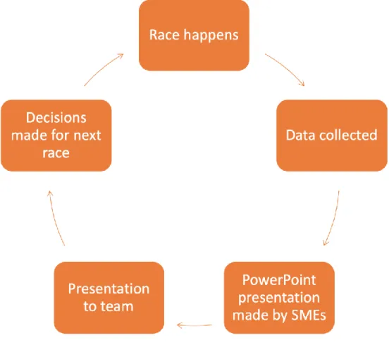
Alfa Romeo. Toyota currently follows a manual process of utilizing post-race data to make decisions to enhance performance. This process, which can also be seen in Figure 1, begins with a typical race weekend where Toyota will have their race experts watch and take notes. These Subject Matter Experts (SMEs) will then create a presentation summarizing what happened, who placed in which position, and what their
recommendations are for the Toyota team moving forward (Elliott). This method is entirely manual and relies on the empirical knowledge of these SMEs rather than strategically analyzing the data they collect.
Figure 1: Process of post-race analysis for Toyota
8
visualization that allows them to gain insights without having to sort through every line of information or manually create graphics after each race. Instead, analysts focus on other value-adding tasks such as delving deeper into anomalies in the data and
determining their root causes, or they may consider and create new visualizations that will be used for a presentation to upper management. However, for Team Mercedes who employs an estimated 115 analysts (Woodie), this software costs them $143,000 each year.
The use of analytics as a means to drive sport team performance is increasing along with the increasing presence of big data, and motorsports is no different. Oftentimes teams analyze data the moment it is collected, even during a race. There is also only about two weeks between each race in the season, so time is a valuable resource for the teams. Additionally, there is a high volume of valuable data collected that should be used in its entirety to propel better performance for the teams.
2.2 Problem Statement and Project Objectives
Formula 1 teams need an economic solution to automate their data analysis. It is impossible for teams to manually sift through 500GB of data in time to prepare for the next race. Therefore, teams that attempt to do so are forced to make decisions without knowing crucial information that was lost in the data. Other teams spend up to $143,000 on software for analyzing their data. To address the needs of handling data volume and a timely analysis, an automated, visual data dashboard should be used by these teams. The objective of this project will be to research, analyze, and recommend an economic software for creating visual dashboards. For proof of concept, we will also provide an economic analysis of each alternative and a demonstration of a dashboard using the final recommended software.
3.
Literature Review
3.1 Racing Analytics
Formula 1 Cars are equipped with 100 to 200 sensors, depending upon what the team is collecting data on. They use sensors in conjunction with wind tunnel and software simulation to predict how the car will perform on the track. Over a race weekend, data is collected over a two-day period in preparation for the main race. Engineers use race data to optimize top speeds while balancing downward force on the car which allows the car to get enough traction to drive fast through turns and embankments. Top speed is
9
vehicle. Aerodynamics play a large role in the performance of Formula 1 cars, so this data is analyzed and fine-tuned, allowing adjustments to be made before the start of the race weekend.
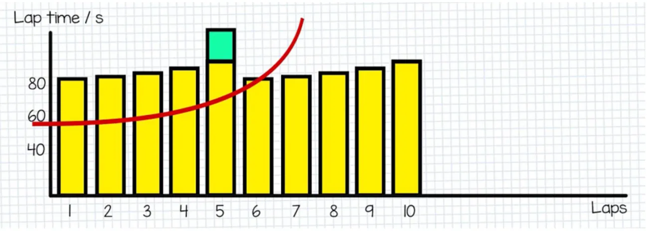
There are 5 types of compounds for tires produced by Pirelli Manufacturing: dry types are ultra-soft, super-soft, medium, and hard. Compounds Allow for grip and durability but they are traded off depending upon how hard or soft the tire is. Softap tires tend to have lower grip but a higher durability while hard tires have greater grip, but the durability decreases substantially, and they need to be changed more often. Durability impacts how often a car will come in for a pit stop which in an important factor to consider in terms of strategy. The type of tire impacts how fast the driver makes lap time (Lashkare).
Over the course of a race lap time increases exponentially once degradation begins. Figure 2 illustrates how a medium soft tire experiences degradation. Once average lap time peaks, pit crews must be prepared to change tires in order to ensure optimal race time. Degradation increases a vehicle’s lap time, making pit crew timing of tire rotation essential.
Figure 2: Average Lap Time Over A Race
10
but the pit crew’s ability to manage fuel, tires, and maintenance quickly and accurately (ChainBear). The last major factor that affects a race is the weather. Wind, rain, and heat can determine the outcome and strategy of the race. With rain, tire friction drastically decreased when there is a slick surface. The pit crew may have to switch to a wet tire made to grip the road in wet weather. Wind can affect the downward force on the car. The vehicle must be able to handle air resistance while the tires grip the road. “Clean air”, free from turbulence, is essential for moving quickly around the track. The final factor in terms of weather is heat. If the track is hot it can change the composition of the tires which can increase degradation. Because weather impacts the way the automobile performs, the team must factor in these variables in their racing strategy.
Formula 1 teams started to incorporate data into strategy in the 1970s. This data was mainly used to see how the car functioned during the race. Data collection was limited to the amount of data in a lap. At that time, crews used the pit stop to gather data from sensors. The racing team would later analyze the data after the race. By the 2000s data could be transferred wirelessly through a radio signal from the car (Wooden). Real time data same into play and teams were able to look at speed, exhaust output, tire
temperature, clutch fluid pressure, and engine RPMs, all while considering the vital signs of the driver. The pit crew team was then able to run basic predictive models with the help of historical data from previous races on specified tracks. Back at HQ, the pit crew and engineering team used this data to create better designs and strategies. Data
11 Figure 3: Diagram of Race Characteristics
There are a couple factors that are major in dictating the speed of the car: tire
composition, driver skill, setup of car, fresh air also known as are without turbulence, and track characteristics like Shape of track type of Pavement. The speed of the car is a large Factor that dictates the overall lap time other factors that come into play is the pits performance when making adjustments to the car changing tires being quick and precise not to add extra I needed time to the overall lap times is very important. The length of track is the last factor that comes into play with lap times. These factors are being analyzed as the driver is moving around the track as well as referring to the predictive models to see how well their strategy is being followed (Choo).
3.2 5 V’s of Big Data
12
Volume is likely the most straightforward to understand out of the 5 Vs. It refers to the sheer size of data that is available nowadays, especially with the increasing number of sensors in products and the heightened presence of the Internet of Things (IoT).
According to IBM, there will be 300 times the amount of data in 2020 than there was in 2005 (IBM). To put a number on that volume, there are 16 million text messages sent and 45,788 Uber rides taken each minute of each day (Marr). This amount of information at one point was too much to handle but is now at the center of the big data revolution.
Velocity is the speed at which data is acquired, moved, and communicated. This factor is critical for many applications as data is frequently updated. The use of social media and the capability of information to go viral in just seconds easily puts the idea data moving at high velocity into context. While this can be a huge benefit for teams looking to get information quickly, it can also mean making the previously obtained information obsolete as well. For example, if a racing team is not able to analyze the volume of data they have collected quickly enough, they will not be able to use it to make decisions by the deadline and will be forced to cut their losses and move on.
Variety refers to the different types of data that is available. Especially in the present day, data can take on many different forms and not all of those fit into tables and databases the way all data previously did. While this presents challenges, it also presents opportunities. Text messages, photographs, and Facebook posts each fall into different types of data that can be used in new ways. Likewise, racing teams can collect videos of the race that can be analyzed to understand what worked well and what did not work so well.
Veracity is about quality and understandability of data that is collected. There is a heavy emphasis on this factor since there can be a lot of time spent on taking unstructured, unscrubbed data and working it into something that has this “veracity.” It turns out that when doing the work of cleaning and structuring of data collected discoveries are made and solutions are formed (P). However, one in three business leaders do not trust the data they have when using it to make decisions (IBM). To address this concern, it is important to document a clear line of communication regarding how data is collected, how it was manipulated, and why each step is taken. This creates data with veracity and allows decision-makers to feel confident when utilizing that information to guide their next steps.
13
user it will be scraped immediately. If data does not have value or, for example, does not answer the problem statement at hand it will not be valued and utilized.
Finally, it is when data holds all 5 of this Vs that it is valuable and useful. Formula 1 teams have a vast ocean of data and they must quickly determine which of it has these 5 qualities and which of it does not. Any tool or service that will allow the teams to dig through the mud and find this quality information as fast as possible presents a huge opportunity for value-add in the data analysis process.
3.3 Storytelling with Data
Data is used in all aspects of a company to help make the best business decisions. It can tell a story and it can invoke emotion. It is fundamental and strategic to getting your point across. Your audience reacts to your visuals and can come to conclusions based on the data you present. Nowadays, anyone can make a graphic using data; although, it takes a great story and great visualization to convey the message you want. In order to create a great story and great visual, one must understand the context, choose a correct visual, discard of clutter, emphasize what you want, and tell a story.
Understanding the context of the data is crucial because it can reduce iterations and directs how the visualizations and story should be presented. Depending on the audience and the importance of understanding the problem, it forces the presenter to fully
understand the goal they are trying to achieve. It sets you on a path towards success and creating the perfect visual. Down the road, it will also drive the level of tone in the story and possibility of examples for the audience.
Effective visuals can be simple text, table, heatmap, line graph, slope graph, vertical bar chart, horizontal stacked bar chart, and square area graph (Knaflic). Effective visuals are the most important factor of getting your point across in a communicatively and
professional way. Some visuals that are not effective in data visualization are pie charts, donut charts, and 3D charts (Knaflic).
Clutter is the most important thing to eliminate when presenting your data. If there is clutter, your audience will have a hard time discerning what your point is and use
14
Focusing your audience’s attention allows you as a creator to guide your audience through the data and your story. By using colors, size, positions on a page, it creates a visual hierarchy that your audience can navigate through. They can process it how you like and ultimately reach the end goal you intend.
Telling a story ties into the data and gives you an advantage to leave an imprint with the audience. Stories resonate with us in ways that data cannot and help tie the visuals all together. Using repetition, narrative flow, and spoken and written narratives, our solution can display the most important information, establishing long lasting change to a
companies’ decisions.
Solution Design
3.4 Criteria for Success
In order to measure the overall benefit of the dashboard, criteria for success were chosen and defined. Each of these attributes will be considered when assessing the design
alternatives and each alternative will be scored according to its strength within each area. The criteria for success listed in Table 1were derived based on information received from the Engineering Manager on the Toyota Racing Development team.
Table 1: Criteria for Success based on Industry Expert Interview with Jonny Elliot, TRD
Criteria Description
Process Time Time necessary to process new data within the dashboard is reduced through automation
Scalable Software can be adapted for different situations as specified by the racing team using it.
Usable The user will be able to get information from the dashboard in a simple and intuitive fashion.
Customizable The team will be able to customize the dashboard design to their exact liking.
Cost Effective
15 3.5 Software Alternatives
As the amount of data and its uses increases, so does the number of software that manage and analyze it. The three software alternatives that are addressed in this project were chosen over other options based on the fact that they are all readily capable of automation and widely accepted within industry.
3.5.1 Tableau
Tableau is a desktop software that allows to extract data from a database to analyze large data sets by making graphics. For example, Tableau can make chart graphs, clustering, and data maps. The client can Process and combine data from many different sources like SQL databases, Excel spreadsheets and Cloud applications like Microsoft azure and AWS. Also does not require writing code in order to develop the graphics. Tableau does have capability to use python script in order to make graphics, but it's not natively supported (guru99).
The deduction constantly be updated make new visuals which allows quicks analysis. This allows for a lot of interactivity between the user and the software. There is no hindering limit to how much data Tableau can analyze. The software also supports multiple different devices so I can work on a computer, a tablet and even a mobile phone (Tableau).
Tableau currently does not clean data so the user or admin will have to up the data using other tools in order to be supported by Tableau. Also, there's currently no support for custom visuals that are imported into the software. leave the overall cost of the product There is a one-time license per user $1,600 in an annual maintenance of $400 per year (Miller).
3.5.2 Power BI
16
$9.99 a month. The last version, the Enterprise version, costs $4,995 per month and allows for a dedicated Cloud computer and storage resource (Microsoft).
3.5.3 Python
Python is a very versatile coding language that is open source. There are groups that makes libraries that allow for different functions and methods that allows the coder perform actions without writing code. One of these libraries called Dash was developed out of a necessity to have a R Shining Environment but with python. it was developed by the group who made Plotly. With Dash there is no need a high-level experience with JavaScript or CSS because all is written in Python. There is a virtual server that is mean on the host computer which allows the dashboard or visual to be displayed on a website in multiple platforms such as desktop tablet or mobile. The dashboard fits different aspect ratios with little effort.
Dash library is very versatile, there is a huge community for visual graphics.
customization allows for a lot of direct controls for the user interface you can add sliders, drop down menus, tabs and info text bubbles. the types of graphics Dash is capable of making is large, it ranges from graphs, maps, clustering, indexes, charts, etc. The type of data that are supported python, R, JSON, XML, and CSV.
The data can constantly update with Dash because it's running on a host computer check the code and update to display in real time. Currently, there is no limit or restrictions to how much Dash can analyze at one time because it's not a service so there are no data caps. The only limit is how powerful the computer can process the information. The cost of using because it's open source very little restrictions it's basically free for anyone to use for their project (Dash User Guide).
4.
Test and Evaluation of Design Alternatives
4.1 Software Evaluation
With three alternatives and five defined criteria for success, a quantitative measure was needed. A decision matrix is a decision-making tool that evaluates different alternatives by attaching a weight to each criterion and scoring each alternative relative to its
17
depending on how well it performs the criteria. The completed decision matrix can be seen below in Table 2.
Table 2: Decision Matrix between Power BI, Python, and Tableau
Criteria Weight Power BI Python Tableau
Process Time 5 3 3 3
Scalable 4 2 3 2
Usable 4 4 4 4
Customizable 3 3 4 2
Cost Effective 2 3.5 5 1
Total (weight x Score) 55 65 47
Tableau received the lowest score of 47 primarily due to being poor for scalability and customization. This software is known for being difficult to work with when a very specific feature is requested. Power BI came in second with a score of 55, performing well by being usable those analyzing the data but falling short in terms of scalability. Python proved to be the best alternative with a score of 65. Using Python would be extremely cost-effective and will be customizable exactly to a race team’s preference and needs.
4.2 Recommendation and Prototype Design
18
5.
Conclusion
5.1 Economic Analysis
In addition to use of the decision matrix tool, an economic analysis was considered when choosing a software for recommendation. Python was chosen for the reason that it is free and open source for anyone to use. Companies such as TRD would be able to have their already employed analysts customize their dashboard for their exact purposes the cost of $0. Since the cost of this recommendation is $0, there is no return on investment or payback period to be calculated.
Cost Breakdown
Tableau Power BI Python
One time/User $1,600 $0 $0
Yearly cost/User $400 $120 $0
Cost By Year
Year 1 $230,000 $13,800 $0
Year 2-5 $46,000 $13,800 $0
Totals
5 year cost $414,000 $69,000 $0
Cost/Year $82,800 $13,800 $0
Table 3: Cost Breakdown of Potential Solutions
5.2 Impact
As big data becomes more and more of a key player in the decisions that are made by people and organizations, the topic of ethics also becomes quite important. One of the many discussed subtopics within ethics of big data is information reuse. This occurs when a company makes changes to the use of the information they have collected after the user has already given that information for a different, predefined use. In their paper “Ethics & Big Data,” Richard Herschel and Virginia M. Miori describe the information reuse as having the capability to “potentially threaten an individual's ability to maintain a condition of limited access to his/her personal information, harm individuals, and
19
Formula 1 and all other motorsport leagues undoubtedly contribute to carbon emissions in the environment. In 2018, it was measured that Formula 1 produced 258,000 tonnes of carbon during the year (Benson). To combat this, Formula 1 has announced that they will become carbon neutral by 2030. Due to the customizability and scalability of a Python-based dashboard, teams would have the opportunity to analyze their own carbon footprint and determine areas for improvement in line with the sports initiative.
5.3 Conclusion
Formula 1 is a billion-dollar industry and utilizes a plethora of data to make racing
decisions. Using python and the open framework Dash, racing companies can build cheap dashboards for long term analysis. In addition, they can build automated visuals that automatically update from a variety of cloud solutions streaming their sensor data.
Utilizing these dashboards, companies can increase their racing performance and perhaps increase their ranking in Formula 1. This will allow for companies to be more
competitive and have higher profits.
6.
Future Directions
20
References
BBC. Formula 1: A BBC Sport beginner's guide to the new season. 16 April 2016. Article. 20 October 2019.
Benson, Andrew. ""Formula 1 Launches a Plan to Become Carbon Neutral by 2030."." n.d. www.bbc.com/sport/formula1/50382898. 12 Nov. 2019.
Blythe, Michael. Power BI data sources. 21 November 2019. Article. 23 November 2019. ChainBear. Basics of F1 Race Strategy. 8 December 2017. Video. 10 October 2019.
Choo, Christopher Ledesma Weisen. "Real-Time Decision Making in Motorsports: Analytics for Improving Professional Car Race Strategy." Thesis. 2015.
Dash User Guide. n.d. Reference Guide. 10 Novmeber 2019.
Elliott, Jonny. Toyota Racing Development in Motorsports Patrick McCabe. 10 May 2019. Formula 1. Formula 1's TV and digital audiences grow for the second year running. Janurary 18
2019. Article. 22 October 2019.
Gough, Christina. Average TV audience of NASCAR Cup Series 2018. 5 December 2018. Article. guru99. Tableau Data Connections to Databases and Multiple Sources. n.d. Guide. 10 November
2019.
Herschel, Richard. ""Ethics & Big Data."." M, Miori Virginia. Technology in Society. May 2017. pp. 31-36.
Hershel, Richard. ""Ethics & Big Data"." Virginia, Miori. t. n.d. —. "Ethics & Big Data". 2017.
Hershel, Richard. "Ethics and Big Data." Virginia, Miori. Technology in Society. 2017. pp. 31-36. Higginbotham, Stacey. How Formula 1 Teams Use Big Data to Win. 12 November 2015. Article.
20 October 2019.
Horner, Scott. NBC Sports reports higher 2019 IndyCar viewership over 2018. 5 September 2019. Article. 20 October 2019.
IBM. ""The Four V's of Big Data."." n.d. www.ibmbigdatahub.com/infographic/four-vs-big-data. Knaflic, Cole Nussbaumer. Storytelling with Data. n.d.
21
Marr, Bernard. ""How Much Data Do We Create Every Day?"." 5 May 2018. Forbes.
www.forbes.com/sites/bernardmarr/2018/05/21/how-much-data-do-we-create-every-day-the-mind-blowing-stats-everyone-should-read. 5 Sept 2019.
Media, Sportspro. "F1 revenues rise to U.S. $620m in second quarter." (n.d.).
Microsoft. What is Power BI Premium? 27 October 2019. Article. 12 November 2019. Miller, Chris. How much does Tableau Server cost? 12 Febuary 2018. Article. 12 November
2019.
P, Saporito. ""The 5 V's of Big Data."." Best's Reviews (2013).
Tableau. www.tableau.com/products/mobile. n.d. Article. 10 November 2019.
Tovey, Alan. Formula One's vast costs are driving small teams to ruin. 1 November 2014. Article. 22 October 2019.
us.motorsport.com. F1 generates more revenue per event than any sport. 12 June 2008. Article. 23 October 2019.
Wooden, Andrew. The Secret to Formula 1’s Success? Big Talent Meets Big Data. n.d. Article. 2 October 2019.