The
State
of
Health
Care
Spending
Health Care Spending in the
50 States and Select Counties
ii
By
Jeremy Nighohossian, Andrew J. Rettenmaier, And Zijun Wang
©Private Enterprise Research Center Texas A&M University
iii
Table of Contents
The State of Health Care Spending
Table of Contents ... iii
Overview ... 1
How big is the health care sector? ... 2
How much do we spend on health care? ... 7
How do enrollments vary from state to state? ... 12
How does Medicare spending vary at the county level? ... 18
State Summaries ... 23
Health Care Spending in Alabama... 24
Health Care Spending in Alaska ... 26
Health Care Spending in Arizona ... 28
Health Care Spending in Arkansas ... 30
Health Care Spending in California ... 32
Health Care Spending in Colorado ... 34
Health Care Spending in Connecticut ... 36
Health Care Spending in Delaware ... 38
Health Care Spending in Florida ... 40
Health Care Spending in Georgia ... 42
Health Care Spending in Hawaii ... 44
Health Care Spending in Idaho ... 46
Health Care Spending in Illinois ... 48
Health Care Spending in Indiana ... 50
Health Care Spending in Iowa ... 52
Health Care Spending in Kansas ... 54
Health Care Spending in Kentucky ... 56
Health Care Spending in Louisiana ... 58
Health Care Spending in Maine ... 60
Health Care Spending in Maryland ... 62
Health Care Spending in Massachusetts ... 64
Health Care Spending in Michigan ... 66
Health Care Spending in Minnesota ... 68
Health Care Spending in Mississippi ... 70
iv
Health Care Spending in Montana ... 74
Health Care Spending in Nebraska ... 76
Health Care Spending in Nevada... 78
Health Care Spending in New Hampshire ... 80
Health Care Spending in New Jersey ... 82
Health Care Spending in New Mexico ... 84
Health Care Spending in New York ... 86
Health Care Spending in North Carolina ... 88
Health Care Spending in North Dakota ... 90
Health Care Spending in Ohio ... 92
Health Care Spending in Oklahoma ... 94
Health Care Spending in Oregon ... 96
Health Care Spending in Pennsylvania ... 98
Health Care Spending in Rhode Island ... 100
Health Care Spending in South Carolina ... 102
Health Care Spending in South Dakota ... 104
Health Care Spending in Tennessee ... 106
Health Care Spending in Texas ... 108
Health Care Spending in Utah ... 110
Health Care Spending in Vermont ... 112
Health Care Spending in Virginia ... 114
Health Care Spending in Washington ... 116
Health Care Spending in West Virginia ... 118
Health Care Spending in Wisconsin ... 120
1
Overview
The geography of health care spending is multidimensional. It varies from region to region, state to state, and within states from county to county. It can be measured on a per capita basis or relative to the size of the economy. For example, Massachusetts is the state with the highest per capita health care spending in the country, while West Virginia has the highest health care spending as a percentage of the state’s economy. Average Medicare spending is highest in New Jersey and lowest in Montana. Variation in health care access can also be summarized by the geographic
distribution of insurance coverage. The state with the highest percentage of uninsured residents is Texas, while
Massachusetts has the lowest percentage uninsured. Medicaid coverage is high in California and is low in Utah. And at the county level, Medicare spending is highest in places like Miami, New York, and in McAllen, Texas and low in rural areas and much of the West. Here, these various dimensions will be explored, providing a comprehensive look at the geography of health care spending in the United States.
Given that much of the evidence on geographic variation has been based on Medicare spending, a key question is whether the observed variation in Medicare spending is descriptive of the variation in health care spending in general? While Medicare currently accounts for about 20 percent of total health expenditures, it is critical that recommendations aimed at addressing geographic variation in Medicare payments account for how Medicare is related to the distribution of other per capita spending amounts. The wide variation in Medicare spending that was not associated with variation in observed health outcomes was one of the recurring rationales for the need for health care reform. However, as will be seen, the geographic distribution of Medicare spending does not describe all health care spending. There are numerous ways to think about geographic variation, and each by itself may lead to different policy prescriptions. The relationship between the geography of Medicare spending and other health care spending measures is explored on several levels in this compendium.
The compendium is divided in two main parts. Part 1 summarizes the four ways by which the geography of health care spending is described. Health care spending as a percent of the states’ GDP is the first way in which the geography of health care is presented and is separated between Medicare, Medicaid, and non-Medicare/Medicaid spending. These data allow for analysis that extends back to 1980 for each state. Next, health care spending is analyzed on a per capita basis and is again divided between Medicare and Medicaid per enrollee in the programs, and average non-Medicare/Medicaid spending for the states’ population who are not enrolled in the programs. The per capita data are available beginning in 1991. Third, health care is summarized by state level enrollment in the public programs, the percentage of the states’ populations who are uninsured, and by the prevalence of managed care in the two public programs. The final view of the geography of health care is based on county level Medicare spending. The county level data are available from 1998 to 2010. The annual county level Medicare data include total reimbursements and enrollee counts for Parts A and B, fee-for-service aged and disabled enrollees. Disproportionate share, graduate medical
education, and indirect medical education spending are broken out separately. County level average risk scores for the aged and the disabled are available for recent years. The advantages of the county level data are the ability to include or exclude the Medicare add-on payments at the county level detail. The disadvantage is that the data is limited to fee-for-service enrollees. However, this restriction is also used in compiling the Dartmouth Atlas data, the data on which most geographic variation studies are based.
The second part of the compendium comprises 50 state summaries. The two-page summaries are based on the four ways of viewing geographic variation in health care spending and the health care markets. The first page
summarizes the key health care spending indicators in each state, and provides graphical representations of how the state compares to the national average now and in the past. Also depicted is the variation in county level Medicare spending. The second page of each state’s summary presents all of the recent metrics in tabular form. Medicare spending in four large or geographically dispersed counties is also presented at the end of each table.
2
How big is the health care sector?
Health care spending per person has grown more rapidly in the United States than per capita GDP in 43 of the past 50 years. This faster growth is evidenced in the health care sector’s growing share of the economy depicted in Figure 1. The figure shows the size of the two primary government health care programs, Medicare and Medicaid, along with all other health care spending which includes all private third-party spending, out-of-pocket spending, and other government spending. In 2010, the health care sector comprised 17 percent of the United States’ economy – a substantially larger share than in all other advanced economies. For example, in 2010 health care spending in Japan comprised just 9.5 percent of the economy and in Germany only 11.6 percent. The reasons for health care’s rapid growth in the United States are varied and include among other things the growth in insurance coverage, the growth in the relative prices for health care services, changing demographics, the expansion of government health care programs, rising incomes, and the labor intensive nature of health care production. Because U.S. spending is so much higher than in other developed countries while outcomes are comparable has led some to conclude that the United States should adopt a more centralized approach. Such an approach could go the route of a single payer and limitations on access to care or reliance on mandatory participation and stringent price controls. The Patient Protection and Affordable Care Act (PPACA) of 2010 was a manifestation of these approaches.
Before moving forward with implementation of the Affordable Care Act, it is important to consider how spending from state to state varies in terms of the health care sector’s size relative to the states’ economies, and to examine how the sizes of the states’ health care sectors have evolved over time. The State of Provider data set from the Centers for Medicare and Medicaid services provides an excellent source for these comparisons and allows for an examination of spending over a thirty-year period.1
Figure 1. Personal Health Care Spending as a % of GDP
0.0 2.0 4.0 6.0 8.0 10.0 12.0 14.0 16.0 1960 1965 1970 1975 1980 1985 1990 1995 2000 2005 2010
Non-Medicare/Medicaid
Medicare
Medicaid
3
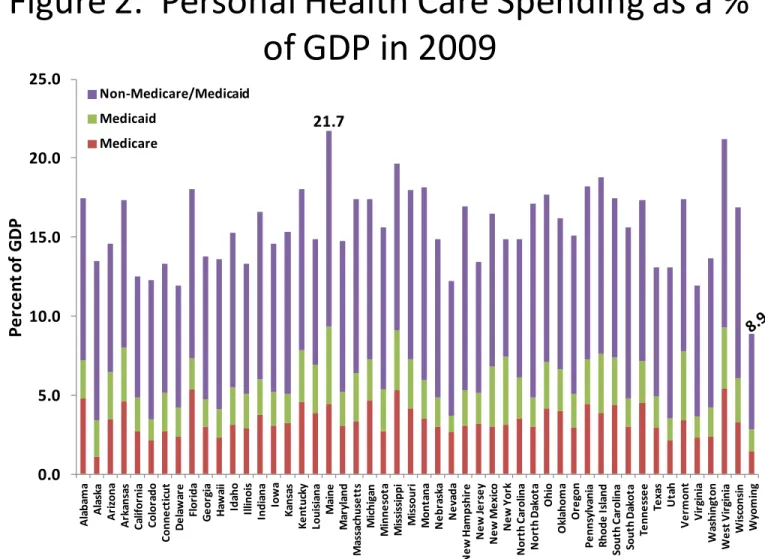
percentage of state gross domestic products in 2009, the last year of the sample. Wyoming spent only 8.86% of its GDP in health care. The next two states with lowest shares are Virginia (11.93%) and Delaware (11.95%). The three most expensive states are Maine (21.71%), West Virginia (21.18%), and Mississippi (19.65%). They each spent more than twice as much as Wyoming. The spending patterns are somewhat different in terms of Medicare. West Virginia (5.43%) and Mississippi (5.29%) remain at the top of the list of three most expensive states by GDP shares of Medicare spending. The third is Florida (5.38%), which is not surprising since it has very high concentration of retirees. The bottom three states in the Medicare spending distribution are Alaska (1.10%), Wyoming (1.43%), and Colorado (2.12%).
Maine shows the highest Medicaid spending (4.89% of its GDP). Under Maine are New York and Vermont, both in the Northeast. In terms of Medicaid spending, the three least expensive states are Nevada, Virginia and Colorado. Medicaid costs in these states are only 1.04%, 1.34%, and 1.37% of their respective economies. The overall low-cost state Wyoming is also a low Medicaid cost state (about 1.38% of its economy).
States with high Medicare/Medicaid spending often spend more in the non-Medicare/Medicaid category. However, the positive relationship is moderate with a correlation of 0.46 (not accounting for differences in the state size). For example, Maine, West Virginia, and Mississippi spend the most in terms of combined Medicare and Medicaid spending. But Maine, North Dakota, and Montana spend the most by the relative size of non-Medicare/Medicaid spending. Wyoming is ranked the lowest cost state in both the Medicare and Medicaid category and the
non-Medicare/Medicaid category. However, the next two lowest cost states are Alaska and Colorado in terms of Medicare and Medicaid spending, and New York and California in terms of the other spending category of
non-Medicare/Medicaid.
Figure 2. Personal Health Care Spending as a %
of GDP in 2009
0.0 5.0 10.0 15.0 20.0 25.0 A la ba m a A la sk a A ri zona A rk an sa s C al if or ni a C o lo ra d o C onn e ct ic ut D e la w ar e Fl or ida G e or gi a H aw ai i Ida ho Il linoi s Indi ana Iow a K ans as K e nt uc ky Loui si ana M ai ne M ar yl and M as sa ch u se tt s M ic h ig an M inn e sot a M is si ss ippi M is sour i M on ta na N e br as ka N e va da N e w H am ps hi re N e w Je rs e y N e w M e xi co N e w Y or k N or th C ar ol ina N or th D ak ot a O hi o O kl ahom a O re gon P e nns yl va ni a R hod e I sl and Sout h C ar ol ina Sout h D ak ot a Te nne ss e e Te xa s U ta h V e rm o n t V ir gi ni a W as hi ng ton W e st V ir gi ni a W is cons in W yom ingP
e
rc
e
n
t o
f
G
D
P
Non-Medicare/Medicaid Medicaid MedicareSource: State Health Expenditures by State of Provider, CMS Office of the Actuary, December 2011. State GDP from Bureau of Economic Analysis.
4
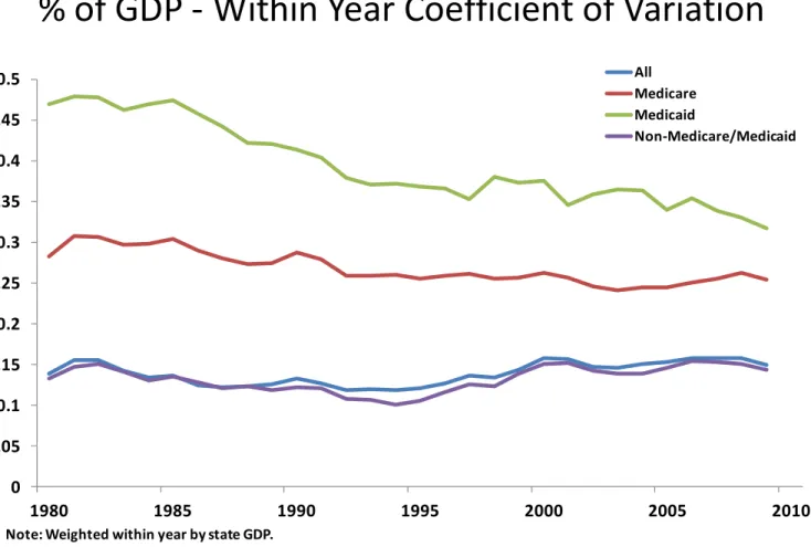
Variation in State Level Health Care Spending Each Year - To measure state-to-state variation in health care spending within each year, we compute the coefficient of variation as the ratio of the cross-state standard deviation and the average of health care spending weighted by state gross domestic products in that year. Figure 3 plots the
coefficient of variation estimates for each year from 1980 to 2009 for all four spending categories.
The state-to-state variation in total health care spending remained largely constant over the 30-year sample period. It was 0.14 in 1980 and only increased to 0.15 in the ending year, with a low of 0.12 and a high of 0.16 in the intervening years. The magnitude of state variation in non-Medicare/Medicaid spending is very similar to those of the all-spending category. There is also no clear trend in its cross-year movement. In contrast, a downward trend can be seen in state variation in Medicare spending from 1985 to the early 1990s, a period coinciding with the implementation of the Medicare prospective payment system in 1984. The coefficient of variation decreased from 0.30 in 1985 to 0.26 in 1992 (an 18% change). However, the downward trend disappeared in the remaining years, leaving the state variation measure in 2009 at about the same level as it was in 1992.
Probably the most striking feature of Figure 3 is the persistent decline of state variation in Medicaid during the sample period. The series features two cycles. The variation decreased significantly from 0.47 in 1985 to 0.35 in 1997. Although it went back to 0.38 in 1998, it has since shown some further reduction and stood at 0.32 in 2009. In addition to the above-mentioned implementation of the Medicare prospective payment system, important legislations affecting health care financing in this period also includes the implementation of the Balanced Budget Act of 1997 in 1998.
Figure 3. State of Provider Health Care Spending as a
% of GDP - Within Year Coefficient of Variation
0 0.05 0.1 0.15 0.2 0.25 0.3 0.35 0.4 0.45 0.5 1980 1985 1990 1995 2000 2005 2010 All Medicare Medicaid Non-Medicare/Medicaid
Note: Weighted within year by state GDP.
Source: State Health Expenditures by State of Provider, CMS Office of the Actuary, December 2011. State GDP from Bureau of Economic Analysis.
5
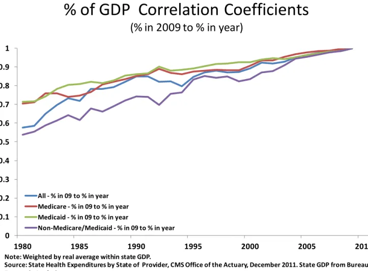
for experiencing more adverse events such as transitory high incidence of illness among its residents, or for more fundamental factors that drive up health care cost. To what degree is the observed state variation in health care spending due to temporary rather than permanent factors? To answer this question, we examine temporal spending persistence.4,5 For each of the four funding sources, we compute the correlation coefficients between the state spending in 2009 and that in each of the earlier 29 years. The results are presented in Figure 4.
Not surprisingly, the correlations in general become smaller as we move further away from the base year 2009. However, there are some significant differences with respect to spending persistence between Medicare/Medicaid and non-Medicare/Medicaid categories. A state’s Medicare spending in 1980 is still highly correlated with its level 30 years apart in 2009 with a coefficient of 0.70. The correlation is slightly higher for Medicaid at 0.71. The high spending persistence in these two institutionalized programs suggests that the factors driving state variation in Medicare and Medicaid are more likely to be permanent.
The funding source for non-Medicare/Medicaid is mostly private. Figure 4 shows that the spending in this category is significantly less persistent than Medicare and Medicaid for each year we considered. For example, spending in 1994, the midyear of the sample period is correlated with that in 2009 by a coefficient of 0.76. The correlation decreased to 0.54 between 1980 and 2009, which is 18 percentage points lower than that of Medicaid spending
persistence for the same spanning period. The persistence in the category of all health care spending by construction fell in between persistent Medicare/Medicaid and less persistent non-Medicare/Medicaid spending. The correlation
between the state overall spending levels in 1980 and 2009 is 0.58.
Figure 4. State of Provider Health Care Spending as a
% of GDP Correlation Coefficients
(% in 2009 to % in year)
0 0.1 0.2 0.3 0.4 0.5 0.6 0.7 0.8 0.9 1 1980 1985 1990 1995 2000 2005 2010 All - % in 09 to % in year Medicare - % in 09 to % in year Medicaid - % in 09 to % in year Non-Medicare/Medicaid - % in 09 to % in yearNote: Weighted by real average within state GDP.
Source: State Health Expenditures by State of Provider, CMS Office of the Actuary, December 2011. State GDP from Bureau of Economic Analysis.
6
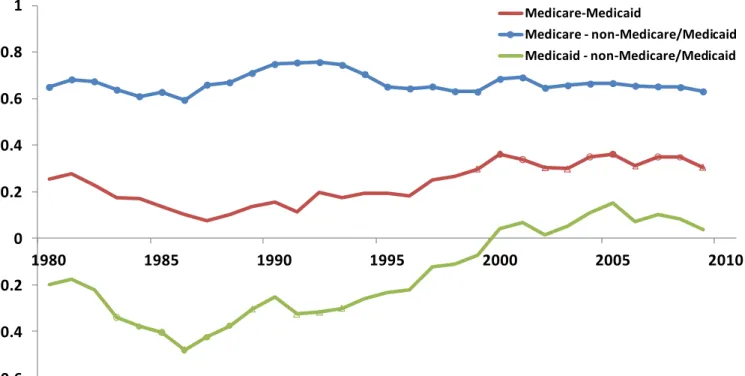
Correlations Between Expenditure Categories – If a state spends more in one health care expenditure category, is it more or less likely to also spend more in another category? And if so, has the relation evolved over time? We answer these questions by computing three pair-wise correlation coefficients for each year between state Medicare, Medicaid and non-Medicare/Medicaid spending. The time series of these correlation coefficients are plotted in Figure 5, which complements the one-year intersection picture of 2009 presented in Figure 2. The middle red line represents the correlation between spending in the two government-operated programs. These two types of expenditure are weakly positively correlated, ranging from a low of 0.08 in 1987 to a high of 0.36 with an average of 0.23. There was a clear downward trend in the correlation from 1981 to 1987, followed by a slower but generally upward trend until 2000. The correlation between the two spending categories has since leveled off.
The positive correlation between Medicare and non-Medicare/Medicaid spending is quite strong and
remarkably stable over the 30-year sample period. It was 0.65 in 1980 and remained largely the same at 0.63 by 2009. It varied within a relatively tight range of 0.59 to 0.76, suggesting that states that are expensive in terms of Medicare also tend to be expensive in terms of non-Medicare/Medicaid spending. The bottom line in Figure 5 represents a different relation between Medicaid and non-Medicare/Medicaid spending. There were some substitution effects between the two categories prior to 2000. A state spending more in Medicaid is also less likely to spend more in the
non-Medicare/Medicaid category. The relation is statistically significant from 1983 to 1993 and most evident in 1986 when the two cross-state spending series are negatively correlated with a coefficient of 0.48. However, there has been no real relation between the two series since 2000.
Figure 5. State of Provider Health Care Spending
Payers as a % of GDP - Within Year Correlations
-0.6 -0.4 -0.2 0 0.2 0.4 0.6 0.8 1 1980 1985 1990 1995 2000 2005 2010 Medicare-Medicaid Medicare - non-Medicare/Medicaid Medicaid - non-Medicare/Medicaid
Note: Years in which the correlations between states’ payers’ % of GDP are significant at the 1%, 2% and 5% level are marked with a ●, a ◌ and a ∆,respectively. Weighted within year by state GDP.
Source: State Health Expenditures by State of Provider, CMS Office of the Actuary, December 2011. State GDP from Bureau of Economic Analysis.
7
How much do we spend on health care?
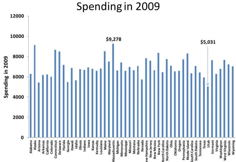
Per Capita Personal Health Care Spending -This section examines the distribution of spending on a per capita basis, both at a point in time and over the period from 1991 to 2009. The data again come from the Office of the Actuary at the CMS but rather than attributing spending to the state of the provider as in the previous section, here the spending is attributed to the individual health care consumers’ states of residence. Per capita spending allows us to examine another aspect of the geographic distribution of health care spending.2 As illustrated in the previous section, the size of the health care sector as a share of the states’ economies varies quite a bit. The same is true for per capita spending. Figure 6 depicts per capita personal health care spending in 2009 for each state. Per capita health care spending was highest in Massachusetts at $9,278, but was 46 percent lower in Utah where the average spending was $5,031. The other states in the top five in terms of average spending are Alaska, Connecticut, Maine and Delaware, while Arizona, Georgia, Idaho, and Nevada along with Utah are the five lowest spending states. There are several significant changes in the ranking of states by per capita spending when compared to the distribution of health care spending as a percent of the states’ GDP, as explored in the previous section. For example, while Delaware and Connecticut are among the highest in terms of per capita spending they were both among the lowest ten states in terms of health care spending as a percent of GDP. Overall, the correlation between the un-weighted shares of GDP and per capita spending is 0.24, which is only marginally significant and rises to 0.40 when weighted by population.
Numerous factors affect the relative spending in each state and these have been examined over the years, most notably through the extensive body of research from the Dartmouth Atlas of Health Care that is based on the regional distribution of Medicare spending.3
Figure 6. Per Capita Personal Health Care
Spending in 2009
0 2000 4000 6000 8000 10000 12000 A la ba m a A la sk a A ri zona A rk an sa s C al if or ni a C o lo ra d o C onn e ct ic ut D e la w ar e Fl or ida G e or gi a H aw ai i Ida ho Il linoi s Indi ana Iow a K ans as K e nt uc ky Loui si ana M ai ne M ar yl and M as sa chu se tt s M ic h ig an M in n e so ta M is si ss ippi M is sour i M o n ta n a N e br as ka N e va da N e w H am ps hi re N e w Je rs e y N e w M e xi co N e w Y or k N or th C ar ol ina N or th D ak ot a O h io O kl ahom a O re gon P e nns yl va ni a R hode I sl and Sout h C ar ol ina Sout h D ak ot a Te nne ss e e Te xa s U ta h V e rm on t V ir gi ni a W as h in gt o n W e st V ir gi ni a W is cons in W yom ingSp
e
n
d
in
g
in
2
0
0
9
Source: State Health Expenditures by State of Residence, CMS Office of the Actuary, December 2011
$9,278
8
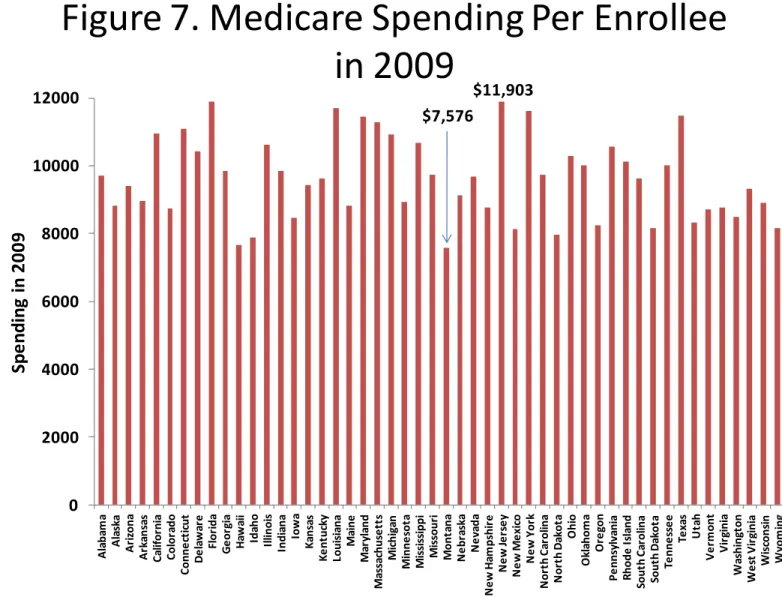
Medicare Spending per Enrollee - Medicare spending per enrollee is highest in New Jersey at $11,903 and lowest in Montana at $7,576 in 2009. These averages, depicted in Figure 7, include seniors and disabled enrollees and span patients who participate in a Medicare Advantage plan as well as those in traditional fee-for-service Medicare. The demographic makeup of Medicare patients, the health care markets, and relative prices vary from state to state and those factors interacting with the particulars of Medicare’s reimbursement formulas account for much, but not all, of the geographic variation in per capita Medicare spending. A more detailed look into some of the factors that affect the geographic distribution of Medicare spending at the county level will follow in a subsequent section. Also, the
aforementioned research based on the Dartmouth Atlas of Health Care indicates that after adjusting for demographic factors and relative prices, considerable variation remains in the fee-for-service spending by patients in different hospital referral regions.4
The other states besides New Jersey with the five highest averages are Florida ($11,893), Louisiana ($11,700), New York ($11,604) and Texas ($11,479). The five states with the lowest average Medicare spending in addition to Montana were Hawaii ($7,652) Idaho ($7,880), North Dakota ($7,958), and New Mexico ($8,120). Even without detailed statistical analysis, the contrast between the high and low spending states suggests that the relative Medicare
populations likely vary in age and health status and that the labor and capital costs of producing health care is quite different.
The correlation coefficient between the Medicare spending as a percentage of the states’ GDP, from the first section, and Medicare spending per enrollee, weighted by the states’ Medicare enrollee count, is only 0.24, which is only marginally significant at the 10% level. Again, this indicates that these different measures of health care spending lead to a broader understanding of how spending varies across the states.
Figure 7. Medicare Spending Per Enrollee
in 2009
0 2000 4000 6000 8000 10000 12000 A la ba m a A la sk a A ri zona A rk an sa s C al if or ni a C o lo ra d o C onn e ct ic ut D e la w ar e Fl or ida G e or gi a H aw ai i Ida ho Il linoi s Indi ana Iow a K ans as K e nt uc ky Loui si ana M ai ne M ar yl and M as sa chu se tt s M ic h ig an M in n e so ta M is si ss ippi M is sour i M o n ta n a N e br as ka N e va da N e w H am ps hi re N e w Je rs e y N e w M e xi co N e w Y or k N or th C ar ol ina N or th D ak ot a O h io O kl ahom a O re gon P e nns yl va ni a R hode I sl and Sout h C ar ol ina Sout h D ak ot a Te nne ss e e Te xa s U ta h V e rm on t V ir gi ni a W as h in gt o n W e st V ir gi ni a W is cons in W yom ingSp
e
n
d
in
g
in
2
0
0
9
Source: State Health Expenditures by State of Residence, CMS Office of the Actuary, December 2011
$11,903 $7,576
9
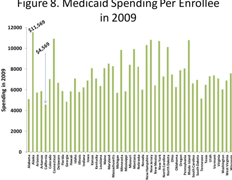
spending per enrollee has the highest variation. At the top end of the distribution, average Medicaid spending per enrollee was $11,569 in Alaska, but was less than 40 percent of that amount in California at $4,569 per enrollee. The distribution of Medicaid spending per enrollee by state is depicted in Figure 8. In 2009, the other top five states in average Medicaid spending were also the relatively high income states of Connecticut, New Jersey, Rhode Island and New York. The remaining four states with the lowest average Medicaid spending were Georgia, Alabama, Tennessee and Michigan. Medicaid is a state directed program, but relies heavily on federal funds. The states must provide certain benefits and cover particular populations, but have flexibility over extending coverage for additional benefits and populations. Over the two decades prior to 2009, the federal government covered 60 percent of total Medicaid
spending on average, but in 2009 and 2010, the federal share rose to two-thirds. The increase was part of the American Recovery and Reinvestment Act of 2009, or the “Stimulus Bill.” The federal share of Medicaid spending is expected to rise with the Affordable Care Act’s extensions of Medicaid to new enrollees and the stipulations that the federal government will pay for the bulk of the expansion’s future expenses.
In the next section, the states’ Medicaid enrollments are summarized, but it is worth noting here that the correlation coefficient between the percent of the states’ populations covered by Medicaid and spending per enrollee is negative. Also, the average Medicaid spending includes enrollees who are also eligible for Medicare – known as dual eligible beneficiaries. These dual-eligible beneficiaries are often among the more expensive beneficiaries in each program, with Medicaid covering the gaps in Medicare’s coverage, and paying for long-term care and because these beneficiaries are typically older and in poorer health, their average Medicare spending is also higher.
Figure 8. Medicaid Spending Per Enrollee
in 2009
0 2000 4000 6000 8000 10000 12000 A la ba m a A la sk a A ri zona A rk an sa s C al if or ni a C o lo ra d o C onn e ct ic ut D e la w ar e Fl or ida G e or gi a H aw ai i Ida ho Il linoi s Indi ana Iow a K ans as K e nt uc ky Loui si ana M ai ne M ar yl and M as sa chu se tt s M ic h ig an M in n e so ta M is si ss ippi M is sour i M o n ta n a N e br as ka N e va da N e w H am ps hi re N e w Je rs e y N e w M e xi co N e w Y or k N or th C ar ol ina N or th D ak ot a O h io O kl ahom a O re gon P e nns yl va ni a R hode I sl and Sout h C ar ol ina Sout h D ak ot a Te nne ss e e Te xa s U ta h V e rm on t V ir gi ni a W as h in gt o n W e st V ir gi ni a W is cons in W yom ingSp
e
n
d
in
g
in
2
0
0
9
10
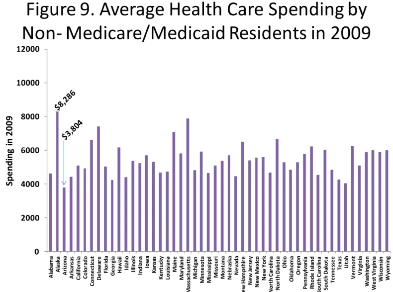
Average Spending for Residents Not Enrolled Medicaid or Medicare – The average spending in 2009 for the non-Medicare/Medicaid population in each state is presented in Figure 9. These averages indicate spending amounts for the residents who are not enrolled in either of the two primary government health insurance programs. These residents may be insured through employer-based, privately purchased health insurance, other government provided insurance, or may be uninsured. The average for each state derived from the state of residence data along with other sources. Estimated total spending by the states’ residents not enrolled in Medicare or Medicaid is equal to the total spending in each state less the Medicare and Medicaid spending and a further reduction reflecting health care spending by Medicare patients (who are not also enrolled in Medicaid) in addition to the amount paid by the program.5 The number of
residents who are not enrolled in Medicare or Medicaid is derived for the state of residence data taking into account the population enrolled in both government programs.
Average spending for non-Medicare/Medicaid residents is highest in Alaska at $8,286 and lowest in Arizona at $3,804. Massachusetts, Delaware, Maine, and North Dakota are the next four highest spending states while Utah, Georgia, Texas, and Idaho are in the lowest five spending states, along with Arizona. Based on Figures 6 through 9 it is clear that the average spending for the different sub-populations result in different state rankings and that these rankings are also quite different than those from the previous section. Altogether, this suggests that policy prescriptions must take into account the variety of available health spending data and recognize the interplay between the payment sources.
Figure 9. Average Health Care Spending by
Non- Medicare/Medicaid Residents in 2009
0 2000 4000 6000 8000 10000 12000 A la b am a A la sk a A ri zona A rk ans as C al if or ni a C ol or ado C o n n e ct ic u t D e la w ar e Fl o ri d a G e or gi a H aw ai i Ida ho Il linoi s Ind ia na Iow a K an sa s K e nt uc ky Loui si ana M ai n e M ar yl and M as sa chus e tt s M ic hi ga n M inne sot a M is si ss ippi M is so u ri M ont ana N e br as ka N e va d a N e w H am ps hi re N e w Je rs e y N e w M e xi co N e w Y or k N or th C ar ol ina N or th D ak ot a O hi o O kl aho m a O re go n P e nns yl va ni a R ho de I sl and Sout h C ar ol ina Sout h D ak ot a Te nne ss e e Te xa s U ta h V e rm ont V ir gi ni a W as hi ng ton W e st V ir gi ni a W is cons in W yo m in g
Sp
e
n
d
in
g
in
2
0
0
9
Sources: State Health Expenditures by State of Residence, CMS Office of the Actuary, December 2011, and Medicaid Statistical Information System (MSIS) for estimates of enrollees who are eligible for both Medicare and Medicaid, and authors’ estimates.
11
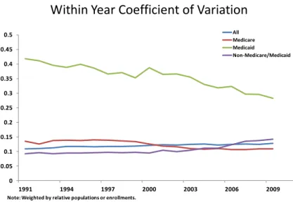
As in the previous section and shown in Figures 3-5, the Figures to the left examine the variation, persistence and correlations between the per capita spending amounts. Figure 10 presents the within year coefficients of variation (CVs) and, as was the case with the CVs based on the shares of GDP from Figure 3, per enrollee Medicaid reveals the greatest variation in each year; and the CV has declined over time from 0.42 to 0.28. The CVs for per enrollee Medicare spending declined from 0.13, to 0.11, while the other two series reveal a slight increase in variation over time. To control for the states’ relative sizes, the standard deviations and means are weighted by the states’ populations and enrollments.
Similar to the persistence patterns seen with the GDP shares, the average spending by the non-Medicare/Medicaid residents has the least
persistence over time with a correlation coefficient between the amounts in 1991 and 2009 of 0.51, as seen in Figure 11. The correlation coefficients between the average Medicare, Medicaid, and state per capita amounts in 1991 and 2009, are 0.72, 0.87, and 0.79, respectively. The persistence in these average spending levels suggests that the
government programs are relatively less dynamic over time than the spending by residents who are not in the programs.
The within-year correlations between the per capita amounts depicted in Figure 12 indicate that average Medicare spending and average Medicaid spending were not significantly correlated in any year between 1991 and 2009. Average Medicare spending and average spending by the non-Medicare/Medicaid residents was significantly and positively correlated during the first four years but was not in any of the more recent years. The correlation between average Medicaid and average spending by the non-Medicare/Medicaid residents generally rose through time and was significant beginning in 1996. These correlations suggest that each category of per capita spending indicates a different pattern of geographic variation and there is evidence that each form of payment may offset the others.6
Figure 10. Per Capita Health Care Spending
Within Year Coefficient of Variation
0 0.05 0.1 0.15 0.2 0.25 0.3 0.35 0.4 0.45 0.5 1991 1994 1997 2000 2003 2006 2009 All Medicare Medicaid Non-Medicare/Medicaid
Note: Weighted by relative populations or enrollments.
Source: State Health Expenditures by State of Residence, CMS Office of the Actuary, December 2011
Figure 12. Health Care Spending per Capita or Per
Enrollee Within Year Correlations
-0.2 0 0.2 0.4 0.6 0.8 1 1991 1994 1997 2000 2003 2006 2009 Medicare-Medicaid Medicare - non-Medicare/Medicaid Medicaid - non-Medicare/Medicaid
Note: Years in which the correlations between states’ per capita spending amounts are significant at the 1%, 2% and 5% level are marked with a ●, a ◌ and a ∆,respectively. Weighted by state populations.
Source: State Health Expenditures by State of Residence, CMS Office of the Actuary, December 2011
Figure 11. Per Capita Health Care Spending
Correlation Coefficients
(spending in 2009 to spending in year)
0 0.1 0.2 0.3 0.4 0.5 0.6 0.7 0.8 0.9 1 1991 1994 1997 2000 2003 2006 2009
All -spending in 09 to spending in year Medicare - spending in 09 to spending in year Medicaid - spending in 09 to spending in year
Non-Medicare/Medicaid - spending in 09 to spending in year
Note: Weighted by populations or enrollments averaged over 1991-2009.
12
How do enrollments vary from state to state?
Medicare Enrollees as a % of the Population – To this point, the state level variation in health care spending as a percent of the states’ GDP and expressed on a per capita basis has produced differing conclusions about where health care spending is high and where it is low. Some of the highest spending states based on shares of GDP were states with the lowest incomes, like West Virginia and Mississippi, while some of the highest spending states on a per capita basis are among those with the highest incomes like Alaska, Massachusetts and Connecticut. The higher spending in the low income states as a percent of GDP is due in part to the age and income targeted nature of Medicare and Medicaid.
This section summarizes the percentage of the states’ populations enrolled in these programs, how these enrollees participated in managed care, the percent Medicare patients who are eligible for both programs, the uninsured rate, and the degree to which the federal government participates in the Medicaid program in each state.
Figure 13 depicts the percent of the states’ populations enrolled in Medicare, designating the share who are seniors and the share who are disabled.7 The enrollee counts are from the state of residence file. West Virginia and Maine have the two highest percentages of Medicare enrollees overall, and the two highest senior percentages as well. West Virginia also has the highest disabled percentage followed by Kentucky, Alabama, Arkansas and Maine. On average these states rank about sixth from the lowest in per capita GDP. Medicare enrollees as a percent of the population are lowest in Alaska and Utah. These two states also have the lowest percentages of seniors and disabled.
Figure 13. Medicare Enrollees as a % of States’
Populations in 2009
0 5 10 15 20 A la ba m a A la sk a A ri zona A rk an sa s C al if or ni a C o lo ra d o C onn e ct ic ut D e la w ar e Fl or ida G e or gi a H aw ai i Ida ho Il linoi s Indi ana Iow a K ans as K e nt uc ky Loui si ana M ai ne M ar yl and M as sa ch u se tt s M ic h ig an M inn e sot a M is si ss ippi M is sour i M on ta na N e br as ka N e va da N e w H am ps hi re N e w Je rs e y N e w M e xi co N e w Y or k N or th C ar ol ina N or th D ak ot a O h io O kl ahom a O re gon P e nns yl va ni a R hod e I sl and Sout h C ar ol ina Sout h D ak ot a Te nne ss e e Te xa s U ta h V e rm o n t V ir gi ni a W as h in gt o n W e st V ir gi ni a W is cons in W yom ingP
e
rc
e
n
t o
f
St
at
e
P
o
p
u
la
ti
o
n
Disabled Seniors13
states have discretion to increase coverage. The program interacts with Medicare in the case of dual eligible enrollees; in some states all Medicaid beneficiaries are enrolled in managed care plans, and the percent of Medicaid paid through federal revenues in a state varies inversely with the state’s income, all of which will be discussed later in this section.
Figure 14 depicts Medicaid enrollees as a percentage of the states’ populations. In nine states, Tennessee, Massachusetts, Mississippi, Louisiana, New Mexico, New York, Maine, California, and Vermont, Medicaid enrollees comprise over 20 percent of the population. Four of these states are in the lowest quartile of states in terms of per capita GDP, but three are in the top fifth. The higher income states with Medicaid enrollments in excess of 20 percent of the population—California, New York and Massachusetts—are responsible for 50% of their Medicaid expenses (the legal minimum) and have relatively high shares of adults (not aged or blind or disabled) covered by their programs. The four lower income states with Medicaid enrollments of 20 percent or more of the population—Mississippi, Maine,
Tennessee, and New Mexico—have relatively high federal medical assistance payment percentages because of their lower incomes, and have generally higher percentages of blind or disabled enrollees.
The states with the lowest Medicaid enrollments as a percent of the population, are largely in the west or high plains, and have higher income.
Figure 14. Medicaid Enrollees as a % of States’
Populations in 2009
0 5 10 15 20 25 A la ba m a A la sk a A ri zona A rk ans as C al if or ni a C o lo ra d o C onne ct ic ut D e la w ar e Fl or ida G e or gi a H aw ai i Ida ho Il linoi s Indi ana Iow a K ans as K e nt uc ky Loui si ana M ai ne M ar yl an d M as sa chu se tt s M ic h ig an M in n e so ta M is si ss ippi M is sour i M on ta na N e br as ka N e va da N e w H am ps hi re N e w Je rs e y N e w M e xi co N e w Y or k N or th C ar ol ina N or th D ak ot a O hi o O kl ahom a O re gon P e nns yl va ni a R hod e I sl and Sout h C ar ol ina Sout h D ak ot a Te nne ss e e Te xa s U ta h V e rm o n t V ir gi ni a W as h in gt o n W e st V ir gi ni a W is cons in W yom ingP
e
rc
e
n
t o
f
St
at
e
P
o
p
u
la
ti
o
n
14
Percentage of the Population Uninsured – The uninsured rate in each state as of 2010 is presented in Figure 15. This is the percent of the population not covered by private or public insurance. Much of the impetus for the passage of the PPACA was the concern that the uninsured access the health care system only when in need of care and do not pay for the care received. This imposes costs on other payers like private insurers, public insurance like Medicare and Medicaid, or on providers who may go uncompensated. However, uncompensated care has been estimated to only account for 2.7 percent of health care spending, and much of that amount is ultimately paid by government payers (taxpayers).8 Also, the argument was made that the uninsured may forgo needed care. Most of the uninsured are relatively young, are in families above the poverty level, and are in families in which there is at least one full-time worker. Some however, are in families with unemployed workers, or in which the worker is employed in a firm that does not provide health insurance as part of its compensation package. The ACA requires individuals to be insured or face a penalty for not purchasing insurance. Limiting the extent of the preferential tax treatment of employer purchased health insurance to the cost of major medical insurance would have reduced the tax expenditures, made the cost of purchase more manageable for families, and would have lowered the expectations on the extent of coverage for the public insurance programs.
As seen in the figure, Texas had the highest percentage of its population who were uninsured in 2010, at 25 percent, followed by New Mexico, Nevada, Mississippi, and Florida. The states with the lowest percentage of their populations who were uninsured were Massachusetts, Hawaii, Maine, Wisconsin, and Vermont.
Figure 15. Percent of States’ Population
Uninsured in 2010
0 5 10 15 20 25 A la ba m a A la sk a A ri zona A rk ans as C al if or ni a C o lo ra d o C onne ct ic ut D e la w ar e Fl or ida G e or gi a H aw ai i Ida ho Il linoi s Indi ana Iow a K ans as K e nt uc ky Loui si ana M ai ne M ar yl and M as sa chu se tt s M ic h ig an M inn e sot a M is si ss ippi M is sour i M on ta na N e br as ka N e va da N e w H am ps hi re N e w Je rs e y N e w M e xi co N e w Y or k N or th C ar ol ina N or th D ak ot a O h io O kl ahom a O re gon P e nns yl va ni a R hode I sl and Sout h C ar ol ina Sout h D ak ot a Te nne ss e e Te xa s U ta h V e rm on t V ir gi ni a W as hi ng ton W e st V ir gi ni a W is cons in W yom ingP
e
rc
e
n
t o
f
St
at
e
P
o
p
u
la
ti
o
n
15
Medicare and Medicaid Enrollees in Managed Care – Between 2002 and 2010 the percentage of Medicare beneficiaries enrolled in a managed care plan rose from 13 to 25 percent and over the same period, managed care enrollment among the Medicaid eligible population grew from 58 to 71 percent.
These trends indicate the growing importance of managed care in the public insurance sector of the health care market. Figure 16 depicts the states’ percentages of Medicare and Medicaid enrollees who are in a managed care plan in 2010. The correlation coefficient between the two series is 0.35 and is significant, but when weighted by
population, the two series are not significantly correlated.
Managed care penetration in
Medicare is highest in Minnesota, where 42.8 percent of beneficiaries are in Medicare Advantage. Oregon, Hawaii, Arizona, and Pennsylvania are the other states among the top five. The five states with the lowest Medicare Advantage penetration are Alaska, Delaware, Vermont, Wyoming, and New Hampshire.
In the Medicaid program, two states, South Carolina and Tennessee, have 100 percent enrollment in managed care, while three states, Alaska, New Hampshire, and Wyoming, have no Medicaid managed care enrollment. Besides the two states with 100 percent managed care penetration in the Medicaid program, seven others have managed care penetration above 90 percent including: Missouri, Hawaii, Colorado, Georgia, Arizona, Iowa, and Oklahoma.
Figure 16. Percent of Medicare
and Medicaid Enrollees in
Managed Care in 2010
0
25
50
75
100
Wyoming Wisconsin West VirginiaWashington Virginia VermontUtah Texas Tennessee South Dakota South CarolinaRhode Island PennsylvaniaOregon OklahomaOhio North Dakota North CarolinaNew York New MexicoNew Jersey New HampshireNevada NebraskaMontana Missouri Mississippi MinnesotaMichigan MassachusettsMaryland Maine Louisiana KentuckyKansas Iowa IndianaIllinois Idaho Hawaii GeorgiaFlorida Delaware ConnecticutColorado CaliforniaArkansas ArizonaAlaska Alabama
Percent
Medicaid in Managed Care Medicare Advantage
Sources: Medicare in Managed Care from Medicare and Medicaid Statistical Supplement, 2011, Table 12.8. , CMS Office of
Information Products and Data Analysis (OIPDA). Medicaid in Managed Care from Medicaid Managed Care Enrollment Report, July 1, 2010, Data and System Group, CMS.
16
Medicare Enrollees Eligible for Medicaid – Medicare enrollees who are also eligible for Medicaid, or “dual-eligibles” have lower incomes, are often in long term care facilities, may be disabled, and have higher spending on average than do other Medicare enrollees. For some of the dual-eligible enrollees, Medicaid acts as a Medigap policy and covers cost sharing requirements; for others, it also pays Medicare premiums and for long-term care expenses.
The percentages of Medicare enrollees who are also eligible for Medicaid are depicted in Figure 17. Nation-wide, 16.2 percent of Medicare enrollees are eligible for Medicaid.9 With the passage of the PPACA, the Medicare-Medicaid Coordination Office was created with the intent to enhance the efficiency in providing care to the dual-eligible population. According to the Office’s initial report, 27 percent of Medicare’s expenditures can be attributed to these enrollees.10
The percentages in the figure provide an indication of the Medicare beneficiaries’ relative poverty, their basis for eligibility, and the particular states’ Medicaid policies. Not surprisingly, the correlation coefficient between the dual-eligibles’ percentage of the Medicare population and the Medicaid population percentages is 0.82.11 Maine, Mississippi, Vermont, Tennessee, and New York have the highest percentages of Medicare enrollees who are also eligible for Medicaid. The states with the lowest percentage of dual-eligibles are all in the west and include: Montana, Utah, Nevada, Idaho, and Wyoming.
Figure 17. Percent of Medicare Enrollees Eligible
for Medicaid in 2009
0 5 10 15 20 25 30 35 A la ba m a A la sk a A ri zona A rk ans as C al if or ni a C o lo ra d o C onne ct ic ut D e la w ar e Fl or ida G e or gi a H aw ai i Id ah o Il linoi s Indi ana Iow a K ans as K e nt uc ky Loui si ana M ai ne M ar yl an d M as sa chus e tt s M ic hi ga n M in n e so ta M is si ss ippi M is sour i M o n ta n a N e br as ka N e va da N e w H am ps hi re N e w Je rs e y N e w M e xi co N e w Y or k N or th C ar ol ina N or th D ak ot a O h io O kl ahom a O re gon P e nns yl va ni a R ho de I sl and Sout h C ar ol ina Sout h D ak ot a Te nne ss e e Te xa s U ta h V e rm ont V ir gi ni a W as hi ng ton W e st V ir gi ni a W is cons in W yo m in gP
e
rc
e
n
t o
f
M
e
d
ic
ar
e
D
u
al
E
ligi
b
le
17
percentage of each state’s Medicaid spending paid via federal revenues. The FMAP is equal to 100 percent less the state share with the caveats that the minimum and maximum FMAPs are 50 and 83 percent, respectively. The FMAP share for state i is equal to:
FMAPi = 1 – (per capita incomei2 / US per capita income2) x 0.45
A state in which per capita income is equal to the national average has an FMAP of 55 percent and would pay 45 percent of the Medicaid bill. Figure 18 depicts the “regular” FMAPs in 2010, which range from the minimum of 50 percent for the 11 states of California, Colorado, Connecticut, Maryland, Massachusetts, Minnesota, New Hampshire, New Jersey, New York, Virginia, and Wyoming to a maximum of 75.67 in Mississippi. West Virginia, Arkansas, Utah, New Mexico, Kentucky, and South Carolina all had “regular” FMAPs above 70 percent. While Figure 18 reports the “regular” FMAPs based on the formula, the American Recovery and Reinvestment Act (ARRA) of 2009 provided for an increase in the FMAPs of all states for all of 2009 and 2010 and parts of 2008 and 2011. All states received an increase of 6.2 percentage points and some received an additional increase if they experienced higher unemployment rates. By the second quarter of fiscal year 2010 the temporarily enhanced FMAPs ranged from a low of 61.59 percent in 11 states to 84.86 percent in Mississippi.12
The PPACA expands Medicaid coverage to non-elderly adults with incomes less than or equal to 133% of the Federal Poverty Level (FPL). Federal revenues will pay for all of the newly eligible enrollees’ spending from 2014 to 2016 and will ultimately decline to 90 percent by 2020. Further, the states that already cover adult enrollees in the “newly eligible” category will see their FMAPs for this population increase to 90 percent by 2018.13
Figure 18. Federal Matching % for Medicaid
Spending in 2010
0 10 20 30 40 50 60 70 80 A la ba m a A la sk a A ri zo n a A rk ans as C al if or ni a C ol or ado C o n n e ct ic u t D e la w ar e Fl o ri d a G e or gi a H aw ai i Ida ho Il linoi s Indi ana Iow a K an sa s K e nt uc ky Loui si ana M ai n e M ar yl and M as sa chus e tt s M ic hi ga n M inne sot a M is si ss ipp i M is so u ri M ont ana N e br as ka N e va da N e w H am ps hi re N e w Je rs e y N e w M e xi co N e w Y or k N or th C ar ol ina N or th D ak ot a O hi o O kl aho m a O re gon P e nns yl va ni a R hode I sl and Sout h C ar ol ina Sout h D ak ot a Te nn e ss e e Te xa s U ta h V e rm ont V ir gi n ia W as hi ng ton W e st V ir gi ni a W is cons in W yom ingFe
d
e
ra
l M
at
ch
in
g
P
e
rc
e
n
ta
ge
Source: Federal Medical Assistance Percentage (FMAP), Office of the Assistant Secretary for Planning and Evaluation, Department of Health and Human Services, http://aspe.hhs.gov/health/fmap.htm.
18
How does Medicare spending vary at the county level?
Geographic variation in health care spending has traditionally been identified by the variation in Medicare spending at the Hospital Referral Region (HRR) as defined in the Dartmouth Atlas of Health Care. The HRRs identify 306 geographic areas from which patients are referred for major surgical procedures.14 Here, county level Medicare
spending from the CMS is used to provide alternative estimates of geographic variation at a more disaggregated level.15 The county level data for fee-for-service Medicare beneficiaries is available from 1998 to 2010 and the data used
here includes total Part A and Part B reimbursements for aged and disabled beneficiaries and the number of these beneficiaries enrolled in each county. Part A spending associated with direct and indirect medical education, (DME and IME) as well as spending
associated with disproportionate share payments (DSH) is also identified for each county. Further, the average “risk” scores for the aged and disabled beneficiaries in each county are also reported in later years.16
Figure 19 depicts county level combined average Parts A and B spending in 2010 identified by quintiles in spending.17 The counties with high spending are scattered across the country, but some patterns are evident by region and along some state lines. Spending is high in the urban areas of the northeast, in the Ohio Valley, in Florida, Louisiana, and Texas, and in parts of California. Spending is a function of the demographic characteristics of the Medicare population, the local market
conditions, including relative prices for inputs, Medicare’s interaction with other payers, and the way in which health care is practiced in different areas.18
The relative percentages of low-income patients are identified by disproportionate share percentages in Figure 20.19 These are equal to the Part A disproportionate share payments as a percentage of total Part A spending in a county. The intent of
disproportionate share payments is to compensate hospitals for treating high volumes of low-income patients. As seen in Figure 20, disproportionate share percentages are high in much of the south, in the Rio Grande Valley in Texas, in the Southwest in parts of California, and in many urban areas. For example disproportionate share payments in Cameron, Webb and Hidalgo counties in South Texas are at least 17 percent of total Part A payments. In Bronx and Kings Counties in New York they were about 15 percent in Miami-Dade County in Florida, they about 14 percent of all Part A payments.
Bottom Quintile 2ndQuintile
Middle Quintile 4thQuintile
Top Quintile
Figure 19. Medicare Spending Per Fee for Service
Enrollee in 2010
Source: Medicare Advantage Rates and Statistics, Fee-for-Service Data, 2010, http//www.cms.gov/Medicare/Health-Plans/MedicareAdvtgSpecRateStats/index.html.
Figure 20. Medicare Disproportionate Share Spending as
a Percentage of Part A Spending in 2010
Source: Medicare Advantage Rates and Statistics, Fee-for-Service Data, 2010, http//www.cms.gov/Medicare/Health-Plans/MedicareAdvtgSpecRateStats/index.html. Bottom Quintile 2ndQuintile Middle Quintile 4thQuintile Top Quintile
19
counties’ Medicare beneficiaries is identified by the average “risk” scores among the aged and disabled
Medicare beneficiaries. The
distribution of risk scores is shown in Figure 21. The risk scores are based on the risk adjustment model used to define payments to managed
organizations. The scores are based on a beneficiary’s age, sex, eligibility for Medicaid, and previous
diagnoses.20 The average score is normalized to 1. The average risk scores and the disproportionate share payment percentages have a
significant enrollment weighted correlation coefficient of 0.25. Risk scores are high in the much of the Northeast, in the Midwest, Florida, south Texas and southern California.
Figure 22 depicts adjusted Medicare spending per enrollee where DSH, DME, and IME have been subtracted from the unadjusted spending shown in Figure 19 and the risk scores in each county have been normalized by the national average.21 While the risk scores may be
endogenous, counties in certain urban areas, such as the persistently high expense counties in Texas, Louisiana, and Florida, remain in the highest expense quintile.
An ongoing study conducted by the Institute of Medicine (IOM) is addressing geographic variation in health care spending. The Centers for Medicare and Medicaid Services have prepared several analyses at the request of the IOM that examine regional variation in Medicare
spending that include risk-adjusted estimates.22
Using the risk scores as a proxy for regional variation in illnesses has been critiqued by Jonathan S. Skinner, Daniel Gottlieb, and Donald Carmichael (2011). They point out that the risk-scores suffer from the “reverse causation” problem. The problem exists if the coding of diagnoses varies persistently by HRRs.23 The same critique applies to the estimates in Figure 22. However, adjusting for the DSH, DME, and IME, and some indicator or indicators of the relative health of the areas’ beneficiaries is important in accurately identifying regional variation.
Source: Medicare Advantage Rates and Statistics, Fee-for-Service Data, 2010, http//www.cms.gov/Medicare/Health-Plans/MedicareAdvtgSpecRateStats/index.html.
Figure 21. Average Risk Score in 2010
Bottom Quintile 2ndQuintile
Middle Quintile 4thQuintile
Top Quintile
Source: Medicare Advantage Rates and Statistics, Fee-for-Service Data, 2010, http//www.cms.gov/Medicare/Health-Plans/MedicareAdvtgSpecRateStats/index.html.
Figure 22. Medicare Spending Per Fee for Service Enrollee
in 2010 Adjusted for Risk, DSH, GME, and IME
Bottom Quintile 2ndQuintile
Middle Quintile 4thQuintile
20
Endnotes
1
The data source used in this section is the state-of-providers health care spending file compiled by the Centers for Medicare and Medicaid Services (CMS). It contains detailed information on annual personal health care expenditure (PHCE), and its Medicare and Medicaid components for 50 states and the District of Columbia (D.C.). Personal health care expenditure is the major component of national health expenditure (nationwide, PHCE accounts for 84.1% of the latter in 2009). State gross domestic product (GDP) is from Regional Economic Accounts of the Bureau of Economic Analysis (BEA). CMS offers two types of personal health care expenditure estimates: by state of providers and by state of residence. The state of provider data and documentation are available at
http://www.cms.gov/Research-Statistics-Data-and-Systems/Statistics-Trends-and-Reports/NationalHealthExpendData/
NationalHealthAccountsStateHealthAccountsProvider.html. The state of provider data allow for a long sample period from 1980-2009 that reveals how the regional variations have evolved over time. Because the data measure total health care goods and services provided by a state to both residents an