Part II:
Analysis of labour force data
11. Introduction
12. Descriptive analysis of survey variables 13. Analysis of supply and demand of labour 14. Size and composition of the population
15. Labour force participation of men and women 16. Employment-population ratio
17. Unemployment and its duration 18. Youth and school-to-work transition
19. Hours of work, underemployment and labour slack 20. Branch of economic activity and productivity 21. Occupational structure and segregation 22. SE and informal employment
23. I ncome from employment and earning differentials 24. Low pay and working poor
11. Introduction
The data collected in a labour force survey are used to:
a.
Derive the variables introduced in Part I;b.
Produce classifications such as thoserelat-ing to occupation, industry and SE; and
c.
Describe the socio-demographiccharacter-istics of the population, including age, sex, geographical location, educational attain-ment and sometimes migration status. The initial objective is to produce a survey re-port consisting largely of descriptive analysis of these variables and their inter-relationships. The analysis is usually in the form of tables, diagrams and related statistics. The actual pro-duction of these is easily done using one of the many available statistical software packages. The challenge is to understand and use the ta-bles,27 statistics and diagrams produced to write
the survey report. This part of the Guide Book discusses approaches to meet this challenge. It
also addresses the key issue of the quality of the survey results in terms of the errors of the estimates and the coherence of these estimates both internally and externally in comparison with other sources.
12. Descriptive analysis
of survey variables
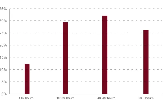
12.1 AnALysis of A singLE vAriAbLE 12.1.1 Single population: full distributionThe intention is to describe the observed pat-tern in a variable in the form of its distribu-tion. This can be: (i) a table of counts of ob-servations having the different distinct values of the variable (a frequency table); (ii) a dia-gram such as a bar chart or pie chart; and (iii) a distribution function. Note that if the vari-able is ordinal, the tvari-able, bar chart or pie chart
Jan–Mar (2008)
industry number (‘000) % share
Agriculture 799 5.9 Mining 333 2.4 Manufacturing 1,988 14.6 Utilities 95 0.7 Construction 1,112 8.2 Trade 3,156 23.2 Transport 747 5.5 Finance 1,667 12.2
Community and social services 2,564 18.8
Private households 1,163 8.5
total 13,623 100.0
Source: Quarterly Labour Force Survey, Table C, Quarter 1, Statistics South Africa
Table 1
EMPLoyMEnt by industry (south AfricA, first QuArtEr 2008)
27 Recommended tables for analysis of labour force data can be found in
a. UN (2008) : Principles and Recommendations for Population and Housing Censuses, Rev. 2, pp. 284–294, UN, New York; and
should retain the order in the values. If the variable is continuous, the bar chart could be replaced by a histogram or a smooth density curve. The analysis is very simple, based on highlighting any key points that can be de-duced about the distribution.
Example 1
Table 1 is the distribution of the employed population by industry in South Africa for the first quarter of 2008. It is in the form of both counts (frequencies) and percentages (relative frequencies). In the report, one can conclude that the major industries employing the larg-est numbers of persons are industry (23.2%), community and social services (18.8%), manu-facturing (14.6%) and finance (12.2%). Figure 1 is a presentation of the same distribu-tion in the form of a bar chart:
Figure 2: Histogram and density curve of an income distribution (artificial data)
From the diagram, we can conclude that most of the employed have incomes in the lowest three income groups, whilst very few receive income in the highest groups.
12.1.2 Single variable: Using summary statistics
As an alternative to the complete description of the distribution in the form of a table or diagram, its essential characteristics (i.e. its summary statistics) can be used instead. Sum-mary statistics characterise a distribution in terms of:
›
Some measure of central location such as mean, median or mode;›
Some measure of other locations such as quartiles, deciles, percentiles;›
Some measure of the spread of the values such as standard deviation and inter-quar-tile range; orFigure 1
EMPLoyMEnt by industry (1st Qtr 2008)
Source: Quarterly Labour Force Survey, Table C, Quarter 1, Statistics South Africa 0 500 1000 1500 2000 2500 3000 3500 Agriculture Mining Manufacturing Employment (Thousand) Utilities Construction Trade Transport Finance
Community andsocial services Private households
e.
Using data on weekly days worked by em-ployed persons in Switzerland in 2004,29 wederive the following summary statistics: Mean = 3.99 days; SD= 1.56 days; Skewness = -0.65
We can deduce that on average, employed persons worked about four days a week, with most persons working for many days and a few who worked for only a few days (nega-tively skewed).
12.1.3 Comparison across groups
12.1.3.1 Full distributions
More often than not, the analysis actually done in a survey report involves comparing the dis-tribution of a variable for different subgroups of the population or over time. In this case, using percentages instead of actual counts for
›
Some measure of the shape of thedistri-bution such as skewness coefficient. Using summary statistics to describe the dis-tribution of a variable is particularly useful when the variable is continuous.
Example 3
d.
Data on annual unemployment rates of a selection of countries in 200228yield the following summary statis-tics of the distribution of annual un-employment rates across countries: Mean = 9.5%; SD = 6.7%; Skewness = 1.3 We can conclude that the mean unemploy-ment rate is 9.5%. The values are spread out widely (SD = 6.7%), with most coun-tries having relatively low values and a few having very large unemployment rates (positively skewed). 0 5 10 15 20 25 30 40 35 1 2 3 Income Groups
Distribution of employment income
No employed
4 5 6 7 8
Figure 2
histogrAM And dEnsity curvE of An incoME distribution (ArtificiAL dAtA)
Source: Quarterly Labour Force Survey, Table C, Quarter 1, Statistics South Africa
28 Source: LABORSTA, ILO statistical database.
whilst that of the employed population al-though also lop-sided is more of an upturned U-shape.
12.1.3.2 Using summary statistics
We can use summary statistics to make com-parisons between groups or across time either directly or using diagrams such as box plots. Since the value of the standard deviation is affected by the unit of measurement, the pre-ferred measure of dispersion when compar-ing distributions is the coefficient of variation (CV), which is obtained by dividing the stand-ard deviation by the mean.
Example 5
Table 3 gives the summary statistics for the distributions in Table 2. The employed popu-lation has the highest mean age compared to the other two populations, indicating that the distributions is advisable. The analysis
com-prises describing the essential differences and similarities between the distributions.
Example 4
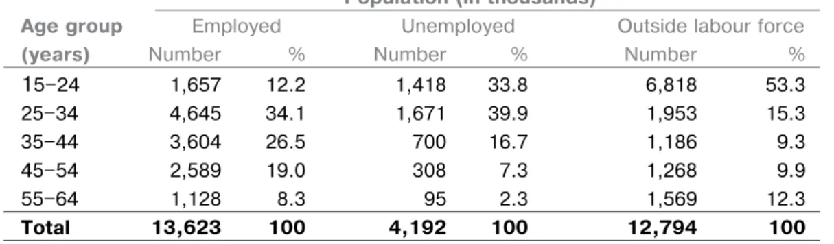
Table 2 gives the age distributions of the em-ployed population, the unemem-ployed popula-tion and the populapopula-tion outside the labour force for South Africa in the first quarter of 2008. The predominant age group for those in the labour force (employed or unemployed) is 25-34 years. For those outside the labour force it is, not surprisingly, the age group 15-24 years as a substantial number of those in this age group would have been in education. It is also interesting to note the different shapes of the distributions. The distributions of the unemployed population and those outside the labour force are lop-sided, with most of the persons in the lower age ranges, 15-34 years,
Population (in thousands)
Age group Employed Unemployed Outside labour force
(years) Number % Number % Number %
15–24 1,657 12.2 1,418 33.8 6,818 53.3 25–34 4,645 34.1 1,671 39.9 1,953 15.3 35–44 3,604 26.5 700 16.7 1,186 9.3 45–54 2,589 19.0 308 7.3 1,268 9.9 55–64 1,128 8.3 95 2.3 1,569 12.3 total 13,623 100 4,192 100 12,794 100
Source: Quarterly Labour Force Survey, Table 6, Quarter 1, Statistics South Africa
Table 2
AgE distribution by LAbour forcE stAtus (south AfricA, first QuArtEr 2008)
Population
Employed unemployed outside
population population labour force
Mean age 37.7 30.4 31.3
St. Dev. 11.4 10.0 14.5
CV 0.30 0.33 0.46
Skewness -0.3 -0.9 -0.9
Source: Based on the Quarterly Labour Force Survey, Table 6, Quarter 1, Statistics South Africa
Table 3
suMMAry stAtistics of thE AgE distributions by LAbour forcE stAtus (south AfricA first QuArtEr 2008)
observations having the same row and column values is placed in the corresponding cell, con-stituting the bivariate distribution. A substantial number of tables used in survey reports are of this type. When one or both variables are con-tinuous with a large number of values, these have to be grouped into intervals to construct the two-way table. Otherwise, the bivariate distribution of two continuous variables is represented by a distribution function of two variables.
Example 7
Table 5 shows the bivariate distribution of oc-cupation and SE in the US in 2006, with occupa-tion as the row variable and SE as the column variable. The cell entries are the number of em-ployed persons having the same pair of values of occupation and SE, i.e. the frequency with which the pair occurs in the dataset.
From Table 5, we can see that:
›
19,961 employed persons are both clerks and employees, i.e. they have the value ‘clerks’ for occupation and the value ‘employees’ for SE. Thus, they have the same observa-tion (clerks, employees).›
Not much can be said about the pattern shown in the table, except that consistently for all occupation groups, employees are in the majority. In short, the bivariate distribu-tion does not easily portray any reladistribu-tionship that may exist between the variables.›
The row totals show the marginaldistribu-tion of occupadistribu-tion and the column totals show the marginal distribution of SE. We can conclude that the most frequently oc-curring occupation is that of ‘service work-ers & shop and market sales workwork-ers’, and that of SE is ‘employees’.
The most important reason for analysing sev-eral variables together is to examine and de-scribe any relationship that may exist between the variables. For example, they may be associ-ated with each other in an interdependent way, meaning the values of one are affected by those of the other variable(s) and vice versa. A par-persons who are unemployed or outside the
labour force tend to be younger. The ages of those outside the labour force are more spread out in comparison with the others (i.e. they have a CV of 0.46 compared to that of 0.3 for the two other groups). All three distributions are negatively skewed, but less so for the em-ployed population. The extent of skewness in the unemployed population and that of the population outside the labour force again con-firms that persons in these populations tend to be at the younger ages.
12.1.4 Comparisons across time periods
The time element in the data set means that the situation can be examined both in terms of distributions as well as the individual changes that have taken place in the numbers over time (i.e. some form of basic time series analysis)
Example 6
The distributions of employment by industry in South Africa for the first two quarters of 2008 are given in Table 4. The distributions in the two quarters are quite similar (columns 3 and 5), indicating that the pattern of employment has not changed significantly over the quarters. However, in column 6, we observe a substantial increase in employment in the community and services industry (up by 71,000) as compared to the equally substantial decrease in employ-ment in the trade industry (51,000) over the two quarters. There was a slight increase in overall employment between the quarters (106,000).
12.2 AnALysis of two or MorE vAriAbLEs
12.2.1 Bivariate distribution
The distribution of two variables, referred to as the bivariate distribution of the variables, is displayed in a two-way table for nominal/ordi-nal variables. The distinct values of one variable are placed as rows (and called the row variable) whilst those of the other variable are placed as columns (the column variable). The number of
Jan–Mar (2008) Apr–Jun (2008) Qtr to Qtr
Number Number Change
Industry (‘000) % share (‘000) % share (‘000)
Agriculture 799 5.9 790 5.8 -9 Mining 333 2.4 346 2.5 13 Manufacturing 1,988 14.6 1,968 14.3 -20 Utilities 95 0.7 97 0.7 2 Construction 1,112 8.2 1,138 8.3 26 Trade 3,156 23.2 3,105 22.6 -51 Transport 747 5.5 774 5.6 27 Finance 1,667 12.2 1,687 12.3 20 Community and social services 2,564 18.8 2,635 19.2 71 Private households 1,163 8.5 1,185 8.6 22 total 13,623 100.0 13,729 100.0 106
Source: Quarterly Labour Force Survey, Table C, Quarter 1, Statistics South Africa
Occupation sE All workers Employers & Own-account workers Employees Unpaid family workers Legislators, senior officials
& managers 2,485 19,168 6 21,659
Profs., Technicians &
Assoc. profs. 1,664 28,160 2 29,826
Clerks 356 19,961 38 20,355
Service workers & shop and
market sales workers 3,625 39,095 30 42,750 Skilled agricultural and
fishery workers 63 984 16 1,063
Craft & related trade workers;
Plant & machine operators 2,686 32,425 14 35,125
total 10,879 139,793 106 150,778
Source: LABORSTA, Web database, ILO
Table 4
EMPLoyMEnt by industry
Table 5
Occupation sE All workers Employers & Own-account workers Employees Unpaid family workers % Number
Legislators, senior officials
& managers 11.5 88.5 0.0 100.0 21,659 Profs., Technicians
& Assoc. profs. 5.6 94.4 0.0 100.0 29,826
Clerks 1.7 98.1 0.2 100.0 20,355
Service workers & shop and
market sales workers 8.5 91.5 0.1 100.0 42,750 Skilled agricultural and
fishery workers 5.9 92.6 1.5 100.0 1,063
Craft & related trade workers;
Plant & machine operators 7.6 92.3 0.0 100.0 35,125
All workers 7.2 92.7 0.1 100.0 150,778
Source: LABORSTA, Web database, ILO
Table 6
conditionAL distributions of sE givEn occuPAtion (us, 2006)
Occupation sE All workers Employers & Own-account workers Employees Unpaid family workers Legislators, senior officials
& managers 22.8 13.7 5.7 14.4
Profs., Technicians
& Assoc. profs. 15.3 20.1 1.9 19.8
Clerks 3.3 14.3 35.8 13.5
Service workers & shop and
market sales workers 33.3 28.0 28.3 28.4
Skilled agricultural and
fishery workers 0.6 0.7 15.1 0.7
Craft & related trade workers;
Plant & machine operators 24.7 23.2 13.2 23.3
total
% 100.0 100.0 100.0 100.0
numbers 10,879 139,793 106 150,778
Source: LABORSTA, Web database, ILO
Table 7
We could also have used the conditional distri-butions of occupation for values of SE (Table 7). Note that the three distributions are different. In the conditional distribution of occupation for the SE group ‘Employers & Own-account workers’, the share of ‘clerks’ is only 3.3%, whilst for the SE group ‘Unpaid family workers’, the share of ‘clerks’ is 35.8%. So, once again the conclusion is that occupation and SE are interdependent.
12.2.3 Using diagrams
Diagrams can also be used to portray the condi-tional distributions and identify relationships. When both variables are categorical (e.g. occu-pation and SE), we represent the conditional dis-tributions using a component bar chart in which the bar is divided up into sections representing the different frequencies in the distribution. The bars can then be compared to establish the exist-ence of a relationship. If both variables are con-tinuous, the bivariate distribution can be illus-trated using a scatter diagram (see Example 10). In it, the pairs of values of the variables for each observation is plotted on an x-y- graph.
Example 9
The differences between the three bars are clear, establishing that a relationship exists be-tween occupation and SE, i.e. as SE changes, the distribution of occupation also changes. In particular, the shares of clerks in the three bars are markedly different, the largest being amongst the ‘Other SE’ category. For the group ‘Legislators, etc.’, the order is reversed, with the share largest for the ‘Employers’ category. Example 10
The scatter diagram in Figure 4 below is derived from the observations of two variables X and Y. The points are closely clustered together with the values of both variables tending to move to-gether in the same direction. We can therefore conclude that the variables are inter-related.
12.2.4 Using summary statistics
Instead of using the full conditional distribu-tions, the comparisons can also be made using ticular type of relationship is when the values
of one variable are expected to be affected by changes in the values of the other variable(s), but not the other way round. This is referred to as a dependent relationship. The first vari-able is called the dependent or endogenous variable and the latter are the independent or exogenous variable(s). Again, the variables may have no relationship with each other. They are then said to be independent.
12.2.2 Using the full conditional distribution
One way of investigating inter-relationships between variables is to compare the conditional distributions of one of the variables for given values of the other variable(s). For example, to study the relationship between occupation and SE, the conditional distributions of occupa-tion for given values of SE could be compared. The conditional distribution of occupation for a given value of SE, say for employees, is that obtained looking at the distribution of occupa-tion amongst the sub-populaoccupa-tion of employees (i.e. the third column of Table 5). Thus, each category of the SE variable will have its own distribution of occupation.
A relationship exists between the variables if two or more of the conditional distributions are different. If there are no differences, then the conclusion is that the two variables are not related. The survey report should also draw at-tention to any of the conditional distributions that looks interesting, in the same way as in the previous section on single-variable analysis. Example 8
The conditional distributions of SE for given categories of occupation are given in Table 6. Note the differences amongst the six condition-al distributions. For example, in the conditioncondition-al distribution of SE for the occupational group ‘Legislators, senior officials & managers’, the share of ‘employers’ is 11.5%, whilst for the oc-cupational group ‘clerks’, the share of ‘employ-ers’ is only 1.7%. Thus, the conclusion is that occupation and SE are interdependent.
0 Employers Employees SE Categories Other SE 20 40 60 80 100 120 Other OCC Sk. Agric. Server. W. Clerks Profs. Legis
Figure 3
conditionAL distributions of occuPAtion givEn sE (us, 2006) 20 10 0 -10 -20 -8 -6 -4 -2 0 2 4 6 8
Figure 4
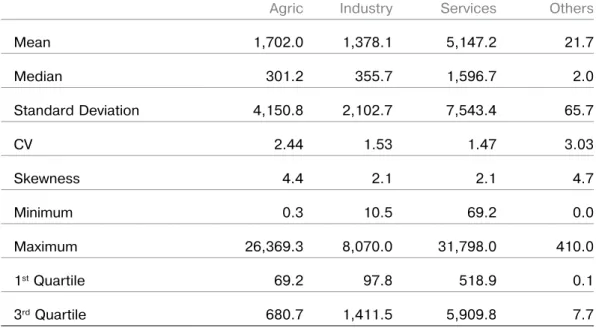
Agric Industry Services Others Mean 1,702.0 1,378.1 5,147.2 21.7 Median 301.2 355.7 1,596.7 2.0 Standard Deviation 4,150.8 2,102.7 7,543.4 65.7 CV 2.44 1.53 1.47 3.03 Skewness 4.4 2.1 2.1 4.7 Minimum 0.3 10.5 69.2 0.0 Maximum 26,369.3 8,070.0 31,798.0 410.0 1st Quartile 69.2 97.8 518.9 0.1 3rd Quartile 680.7 1,411.5 5,909.8 7.7
Table 8
suMMAry stAtistics for conditionAL distributions of incoME by industriAL sEctor
their summary statistics. This method is par-ticularly useful when one of the variables is continuous. A difference in any of these statis-tics between two or more of the distributions indicates that a relationship exists.
Example 11
Table 8 presents the summary statistics of the conditional distributions of income for a given industrial sector. We see that:
›
Means (& medians) are different – ‘Services’ has the largest mean income (and median income as well) amongst the four sectors;›
CVs are also different, showing a greaterspread for ‘Agric’ & ‘Others’; and
›
The distributions of ‘Agric’ and ‘Others’ are more skewed than for each of the other two sectors, as shown by their skewness coef-ficients.From subject-matter knowledge, one would ex-pect a person’s income to be affected by their industrial sector rather than the other way round. We can therefore conclude that there
is a dependent relationship of income on in-dustrial sector, with persons working in the services sector tending to have larger incomes than those in other sectors. Not surprisingly, all the income distributions are positively skewed.
12.2.5 Issues in using conditional distributions
12.2.5.1 Interpreting relationship
In interpreting the results of the analysis, an as-sumption has to be made about the type of re-lationship (interdependent or dependent). The choice comes from subject-matter knowledge, hypothesis of interest, research purpose, logical connections, etc.:
a.
Logically, in the relationship between the weight and height of workers the former depends on the latter, i.e. it is a dependent relationship with weight as dependent vari-able and height as the independent varivari-able.b.
From subject-matter knowledge, age andsex tend to influence the level of income, so income has a dependent relationship on
relationships, it is important to present and de-scribe all such distributions. The use of one to the exclusion of others can lead to fallacious conclusions about the relationship.
Example 13
In the well-known example of the relationship between being drunk and driving, the state-ment that 30% of road accidents is caused by drunk drivers can be misused to conclude that it is better to drive whilst drunk, as sober driv-ers are responsible for 70% of road accidents. This is as a result of using only the conditional distribution of the state of soberness of driv-ers given road accidents, ignoring the other conditional distribution of the state of sober-ness of drivers given safe driving (no road ac-cidents). The latter could have shown, for ex-ample, that only 1% of safe driving is done by drunk drivers compared to 99% done by sober drivers. The correct conclusion would then be that drunk drivers are responsible for a highly disproportionate percentage of road accidents compared to their percentage of safe driving, i.e. compared to their percentage amongst all drivers.
12.2.6 Using measures of interdependence
These measures are statistics derived from the joint distribution of two (or more) variables which assess the strength (sometimes also the direction) of the relationship between the variables.
12.2.6.1 Both variables continuous (Correlation coefficient (r))
The correlation coefficient (r) is a measure of (linear) interdependence between the vari-ables. Its values range from -1 to +1. The mag-nitude shows the strength of the relationship:
›
Value 0 means no linear relationshipwhat-soever;
›
Value 1 means perfect linear relationship (i.e. an exact mathematical relationship, e.g. Circumference of circle = 2 times diam-eter); andage and sex, with income as the endogenous variable.
c.
In the case of occupations and SE, one can only assume that the relationship, if it ex-ists, has to be interdependent.The methods described above are directed at establishing the existence of a relationship on the assumption that the type is already known. 12.2.5.2 Choosing variable of conditional distribution
Also, in carrying out analysis of this type, it is necessary to identify which of the two variables is to be used as the conditioning variable. If the intention is to explore only an interdependent relationship, it does not matter which variable is used as the conditioning variable. However, one set of these conditional distributions could be more interesting depending on the hypothe-sis of interest in the analyhypothe-sis. The choice should then clearly respect this interest. For example, in gender analysis it is more relevant to look at the conditional distributions of sex for a given variable (e.g. occupation) rather than the con-ditional distributions of occupation given sex. The latter set may look quite similar across the sexes and so fail to identify key sex differences in the individual occupation groups.
Example 12
The conditional distributions of occupation giv-en SE portrayed in Table 7 are more interesting to analyse than those of SE given occupation in Table 6. There are easily perceptible differ-ences in the former whilst the latter look rather similar.
In situations when one variable is continuous and the other is not, it is preferable to produce conditional distributions of the continuous var-iable for given values of the other varvar-iable. For example, conditional distributions of income for given levels of occupation. If both variables are continuous, then one alternative is to con-vert one of them to a grouped variable. 12.2.5.3 Possible misinterpretation
the measure of interdependence is the Chi-square statistics. Its value is always positive and the larger it is, the stronger is the relation-ship. A value of 0 indicates complete independ-ence between the variables. The value should actually be compared to some critical cut-off determined by theory in order to assess if a re-lationship exists statistically. This critical value increases with the product of (r – 1) and (c – 1), where r and c are respectively the number of rows and number of columns of the two-way distribution table. Thus, the bigger the two-way table the higher should be the Chi-square value for it to indicate that a relationship exists. If one of the variables is continuous or discrete, its values should be grouped into in-tervals to carry out this analysis.
Example 15
We can examine the existence of a relationship between occupation and SE using data in Table 5. The Chi-square value from the bivariate table is 2,103.65. The table has six rows and three col-umns, so the theoretical value to be expected if the variables were independent is 18.31 at the 5% level. The huge difference between these two numbers indicates that the variables are interdependent, and strongly so. This is, of course, the same conclusion we got above using conditional distributions.
12.2.7 Using measures of dependence
12.2.7.1 Both variables continuous (regression analysis)
The measure used to assess (linear) depend-ence of a continuous variable Y (e.g. income) on another continuous variable X (e.g. age) is the regression coefficient. The method for es-tablishing the linear dependent relationship of Y on X is called the ‘Simple linear regression of Y on X’. It can be formulated in the form Y = mX + c, where m and c are unknown constants to be estimated from the data. The equation Y = mX + c is called the regression equation and the graph of Y = mX + c is a line called the regres-sion line. ‘m’ is the regresregres-sion coefficient.
›
The closer the magnitude is to 1, thestrong-er the relationship; the closstrong-er to 0, the weaker the relationship.
The sign shows if the linear relationship is positive/direct (+) or negative/inverse (-). In the former, the values of the two variables tend to increase (or decrease) together. In the latter, the values tend to go in opposite direc-tions (i.e. one tends to increase as the other decreases or vice versa).
Example 14
a.
Values of ‘Income’ and ‘Age’ were obtained from employed persons in a survey. To in-vestigate the relationship between the two variables, the correlation coefficient be-tween them was computed. The value ob-tained is r = .65. This implies that Income and Age are directly related (positive value of r), i.e. as Age increases Income levels also tend to increase. The magnitude of 0.65 is fairly strong, indicating a close lin-ear relationship between income and age.30b.
The correlation coefficient between the ‘Height above sea level’ and the ‘Temper-ature’ of selected sites in a country was computed as -0.97. The negative sign in-dicates that ‘Height above sea level’ and ‘Temperature’ are negatively related, so as height above sea level increases, tempera-ture tends to drop. The very high magni-tude of 0.97 implies a very strong, almost exact, linear relationship between these two variables.Note that a value of 0 for the correlation coef-ficient does not necessarily mean there is no re-lationship between the variables. Such a value could be obtained for two variables with per-fect curvilinear relationship, e.g. an upturned U when the scatter diagram is plotted. It only signifies that there is no linear relationship. 12.2.6.2 Both variables
nominal/ordinal
When both variables are ordinal or nominal (e.g. educational attainment, occupation, SE),
= 98% of the variation in the values of the variable Y. This value shows the linear rela-tionship to be very strong, and so using the equation for prediction can be done with confidence.
12.2.7.2 One or more variables ordinal/ nominal
There are methods that can be used
a.
if either the dependent or independent var-iable is ordinal or nominal; andb.
if the relationship is linear. or non-liner12.2.8 Analysis of three or more variables
For the analysis of three or more variables, the above methods can be used to study the biate conditional distribution of two of the vari-ables for given values of the third. The easiest method for analysis involving more than two variables, say three variables, is to produce and analyse two-way tables of two of the variables for each value of the third variable. Several sce-narios are possible:
›
If the conditional distributions in each of the two-way tables are the same within each table and between the tables, the three variables are independent.›
If one or more of the conditional distribu-tions of the two variables in each of the two-way tables are different, but this dif-ference is the same for all of the tables, then the two variables are interdependent but they are jointly independent of the third.›
If one or more of the conditionaldistribu-tions of the two variables in each of the two-way tables are different and the pat-tern of differences changes between the tables, then the three variables are interde-pendent.
When one variable is continuous, a two-way The sign of m gives the nature of the
depend-ence of Y on X, whilst its magnitude reflects the extent to which the value of Y changes as X changes. If m = 0, Y does not depend lin-early on X. If m is positive, as X increases Y also increases. However, if m is negative, as X increases, Y decreases. The magnitude of m is the extent to which the value of Y changes for every unit increase in the value of X. Note in fact that the regression equation applies to the (conditional) mean value of Y for a given X val-ue. For example, the equation indicates that the mean of the conditional distribution of income given age changes by m for each unit increase in the value of age. So the correct version of the above statements is that Y tends to increase (or decrease) as X increases.
The assessment of the strength of the relation-ship is done using the magnitude of Pearson’s r coefficient in the form 100 * r2. We say the ‘Re-gression’ explains (100 * r2) % of the variation in the dependent variable. The higher the value, the more confidence can be given to using the regression for prediction. However, care should be exercised in using the regression equation for prediction outside the range of the original data for X even if the strength of the relation-ship is high. For example, using the linear re-gression of income on age to predict income for age values larger than those in the original set could be misleading, as the income curve flat-tens out after a certain age.
Example 16
Consider the data points represented in the scatter diagram in Example 10 above (i.e. Fig-ure 4). The data points do seem to have a linear trend and so it seems reasonable to fit a linear regression of Y on X. The results are as below:
›
The regression coefficient, m = 3.0; theinter cept, c = 1.5. Therefore, the regression equation is:
Y = 3 X + 1.5.
›
The correlation coefficient r = 0.99 and so the regression equation explains (100 * r2)31 If m = 0, knowing X does not give any information about Y. So Y does not depend linearly on X. Note there could still be another form for the dependence of Y on X even if m is 0. For example, the relationship could be curvilinear.
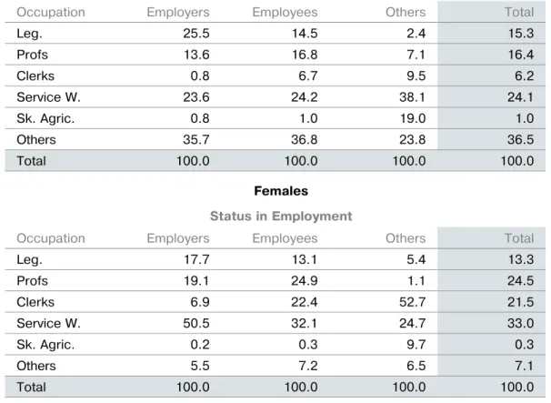
females: for example, amongst male employees, legislators constitute only 14.5% as compared to 25.5% for male employers. Consequently, we can conclude that Occupation and SE are inter-dependent for the male employed population. Again, comparing the male distribution of oc-cupations for employers with that for females, we see that whilst only 23.3% in the former are service workers, the corresponding value for the female distribution is 50.5%. Therefore, the con-ditional distributions are different both within each two-way table and between the two-way tables. We conclude that the three variables Oc-cupation, SE and Sex are interdependent. We can go on to analyse the nature of the relation-ships using the conditional distributions.
Example 18
The relationship between Occupation, SE and year in the US is analysed as follows, using the table of the other two variables containing
summary statistics of the continuous variable in the cells can be used. For example, a two-way table of occupation and SE with summary statistics of the income distribution as cell en-tries can be used to explain the relationship be-tween income, occupation and SE. Differences in the summary statistics in some of the cells would point to the existence of a relationship.
Example 17
Table 9 below presents the conditional distribu-tions of Occupation given SE and Sex in the US in 2007. These can be used as follows to analyse the relationship between sex, occupation and SE in the US in 2007.
The conditional distributions of occupations given SE in Table 9 are different both within and between the two two-way tables for males and
Males
status in Employment
Occupation Emåployers Employees Others Total
Leg. 25.5 14.5 2.4 15.3 Profs 13.6 16.8 7.1 16.4 Clerks 0.8 6.7 9.5 6.2 Service W. 23.6 24.2 38.1 24.1 Sk. Agric. 0.8 1.0 19.0 1.0 Others 35.7 36.8 23.8 36.5 Total 100.0 100.0 100.0 100.0 females status in Employment
Occupation Emåployers Employees Others Total
Leg. 17.7 13.1 5.4 13.3 Profs 19.1 24.9 1.1 24.5 Clerks 6.9 22.4 52.7 21.5 Service W. 50.5 32.1 24.7 33.0 Sk. Agric. 0.2 0.3 9.7 0.3 Others 5.5 7.2 6.5 7.1 Total 100.0 100.0 100.0 100.0
Source: LABORSTA, Web database, ILO
Table 9
2007
status in Employment
Occupation Emåployers Employees Others Total
Leg. 22.6 13.8 4.4 14.4 Profs 15.6 20.6 3.0 20.2 Clerks 3.1 14.1 39.3 13.3 Service W. 33.6 27.9 28.9 28.2 Sk. Agric. 0.6 0.7 12.6 0.7 Others 24.5 22.9 11.1 22.9 Total 100.0 100.0 100.0 100.0 2006 status in Employment
Occupation Emåployers Employees Others Total
Leg. 22.8 13.7 5.7 14.3 Profs 15.3 20.1 1.9 19.7 Clerks 3.3 14.3 35.8 13.4 Service W. 33.3 28.0 28.3 28.2 Sk. Agric. 0.6 0.7 15.1 0.7 Others 24.7 23.2 13.2 23.2 Total 100.0 100.0 100.0 100.0
Source: LABORSTA, Web database, ILO
Table 10
conditionAL distributions of occuPAtion givEn sE And yEAr conditional distributions of Occupation given
SE and Year in Table 10.
In each of the years, the conditional distri-butions of occupation given SE are different across values of SE. These differences are, how-ever, roughly the same across the years, i.e. the distributions in 2007 are the same as those in 2006. Thus, we can conclude that whilst there is an interdependent relationship between oc-cupation and SE, these variables are independ-ent of the year. This is not surprising, as the years are too close together for any significant change to have occurred in the distributions of these structural variables.
Example 19
Table 11 presents the summary statistics for the conditional distributions of income for given values of industrial sector and sex.
Whilst the Services sector has the highest mean income for both sexes, the second highest for males is in Industry whilst that of females is Agriculture. The pattern of dispersion for the income distributions is also different between males and females and between the industrial sectors. The same holds for skewness, with the income distribution for females in Industry the most positively skewed distribution whilst for males it is in Agriculture. The conditional distri-butions of industrial sector for given sex values are also different. We can conclude that there is a relationship between income, industrial sector and sex, with income dependent on both sex and industrial sector. There is also a relationship between industrial sector and sex, with most female employment tending to predominate in agriculture compared to the other sectors.
industrial sector
sex summary statistics Agriculture industry services
Male Mean 1,510.0 2,543.0 7,182.3 CV 1.32 1.41 1.92 Skewness 5.6 1.8 2.3 % distribution 43.4 32.1 24.5 Female Mean 1,821.0 1,213.5 3,484.1 CV 2.91 1.72 1.12 Skewness 1.9 2.3 1.8 % distribution 72.1 10.5 17.4
Table 11
suMMAry stAtistics for conditionAL distributions of incoME by industry And sEx
13. Analysis of supply
and demand of labour
A convenient framework for the analysis of the labour market is the supply and demand of la-bour, schematically represented in Figure 5 be-low. In general, supply and demand is an eco-nomic model of price determination in a market. In a labour market, suppliers are individual per-sons who try to sell their labour at the highest price. On the other hand, demanders of labour are enterprises, which try to fill the jobs they need at the lowest price. The equilibrium price for a certain type of labour is the wage rate. Labour supply at a given point of time com-prises all currently employed persons and un-employed persons currently available for work and seeking work. Labour force surveys are generally recognised as a comprehensive means of data collection on the supply of labour. In a labour force survey, individuals are asked their current economic activity, in particular whether they are working or actively seeking work, in which case they are part of the labour supply, or whether they are doing neither of these (i.e. are engaged only in other activities that are non-economic) in which case they are not part of the supply of labour at that moment.Labour demand, by contrast, is the sum of all occupied and vacant jobs that enterprises or employers require to conduct their economic activity. Occupied jobs are those currently filled, including those filled by employers or own-account workers themselves. Vacant jobs are unfilled jobs which the employers are ac-tively taking steps to fill immediately or within a reasonable period of time. Establishment sur-veys in which employers are asked about their currently filled jobs and vacancies generally form a suitable source of data on labour de-mand.32
In such a system, the distinction between jobs and persons is important. A person may hold more than one job and, likewise, there may be jobs held by no one or held by more than one person. The symmetry between the labour supply and labour demand concepts is also in-structive. While unemployment represents the unsatisfied supply of labour, job vacancies rep-resent the unmet demand for labour.
In this Guide Book on data analysis, the focus is on the analysis of labour supply. It is, however, important to keep in mind the overall frame-work and the need to complement the analysis in certain cases with elements of labour
mand for a better understanding of the function-ing of the labour market.
In what follows, examples are given on basic anal-ysis of labour supply with numerical illustrations using data from selected African and other coun-tries. The range of topics is wide, starting from the size and structure of the population, the labour force participation of men and women, the use of the employment-population ratio, the unem-ployment rate, the particular aspects of the youth and their transition from school to work, hours of work, the various forms of underemployment and labour slack, the classifications by branch of eco-nomic activity, occupation, SE and informal em-ployment, as well as the analysis of earnings, low pay and the working poor.
14 Size and composition
of the population
14.1 introduction
The size and composition of the population is the starting point of the analysis of labour
Figure 5
suPPLy And dEMAnd of LAbour
Economic unit: Person Statistical unit: Person
Employed persons Unemployed persons
Data source: Labour force survey Data source: Establishment survey
Occupied jobs Vacant jobs
Wage rate
Labour supply
Economic unit: Enterprise Statistical unit: Job
Labour demand
supply. Population constitutes the human cap-ital of the nation and defines its potential la-bour supply. From an economic point of view, the working population is a factor of produc-tion and its aptitude and skill level contributes to the productivity of the national economy. From a social point of view, different catego-ries of the population form social groups of particular concern and meeting their needs are major challenges faced by public institutions and society at large.
14.2 AgE PyrAMid
The current structure of the population and to some extent its past evolution and future trend can be examined with the help of the population age pyramid. It shows the size dis-tribution of the age categories of the popula-tion for men and women, separately. The pyra-mid is constructed as back-to-back horizontal bar graphs. The left bar graph shows the age structure of men and the right bar graph that of women. The age structure is ordered from bottom to top, with lower age groups at the bottom and the higher age groups at the top. Because there are generally more young
per-sons than older people and about the same number of men and women, the diagram typi-cally takes the form of a symmetric pyramid. Figures 6 and 7 show the age pyramid of Tan-zania by single year for 2010, and those of the world population in 2010 and three other se-lected countries for comparison: Nigeria, Ger-many and Iran.
In contrast with the Tanzania age pyramid, the world age pyramid, top left portion of the display, has almost a round-belly shape, the sign of a stationary population pyramid, characterised by a combination of low fertili-ty and low mortalifertili-ty. The younger population (15-29 years) is about the same size as the children population (0-14 years), 1.772 billion young people against 1.861 billion children. The adult population (30 years and over) is almost the same size as the younger popula-tion below 30 years of age.
The age pyramid of Nigeria has a closely py-ramidal shape, very similar to that of Tanzania.
Virtually every lower age group has a larger population than the next higher age group. This type of age pyramid reflects a popula-tion with a high birth rate, a high death rate and a short life expectancy, a typical pattern in a developing country. The youth popula-tion in Nigeria is 28.1% of total populapopula-tion, similar to the percentage in Tanzania (27.6%) and somewhat higher than the 25.7% world benchmark.
The age pyramid of Germany on the bottom left of the display is top heavy and is not re-ally pyramidal. It has the shape for a typical ageing population in which the top part of the age pyramid is dominant and the bottom part is actually upside down, with a higher number of people in each age group than the next lower age group. The youth population in Germany is 17.2% of total population, significantly lower than the 25.7% world benchmark.
The age pyramid of Iran exhibits a particu-lar shape, known as a youth bulge. The youth
1000 800 600
Males
Population Pyramid in frequency
Females
400 200 0 0 200 400 600 800 1000
Figure 6
tAnzAniA AgE PyrAMid 2010
Source: United Nations, Department of Economic and Social Affairs, Population Division (2009). World Population Prospects: The 2008 Revisin, CD-ROM Edition.
Pyramid: Function “pyramid” of the contributed package epicalc in R (www.cran.r-project.org). For creating a population puramid online (www.projectos.org/statitisticum).
population 15-29 years old is abnormally large relative to the population in the lower age groups (0-14 years old). This youth bulge is the result of the extraordinarily high fertility experienced during the late 1970s and con-tinuing in the 1980s, creating a large cohort of youth now 20-29 years old. The changing pat-tern of fertility and its sharp and steady fall in the last two decades can be observed in the narrow base of the age pyramid, below the youth bulge. The youth population in Iran is 33.9% of total population, significantly higher than the 25.7% world benchmark, reflecting the youth bulge.
14.3 dEPEndEncy rAtios
A useful summary measure to analyse the age structure of a population is the depend-ency ratio. It is a measure showing the number of dependents (children aged 0 to 14 and the older population aged 65 and over) to the core working age population (15-64 years):
Dependency ratio =
€
=Children(0−14years)+Aged(65years+) WorkingAge(15−64years)
The dependency ratio may be interpreted as the number of dependents that a worker on average must provide for in the society. The higher the ratio, the higher is the burden on those work-ing. The dependency ratio may be decomposed into two parts, one showing:
Child dependency ratio =
€
= Children(0−14years) WorkingAge(15−64years) and the other:
Aged dependency ratio =
€
= Aged(65years+) WorkingAge(15−64years)
Figure 8 compares the dependency ratio and its decomposition for the world population in 2010 and for the four countries mentioned earlier. It shows that the dependency ratios in Tanzania
Figure 7
PoPuLAtion AgE PyrAMids, 2010
3e+ 05 2e+0 5 1 e+05 500 00 0 0- 4 5- 9 10- 14 15- 19 20- 24 25- 29 30- 34 35- 39 40- 44 45- 49 50- 54 55- 59 60- 64 65- 69 70- 74 75- 79 80- 84 85+ 0 500 00 1500 00 2 5000 0 1200 0 10 000 8000 60 00 4000 20 00 0 0- 4 5- 9 4 1-0 1 9 1-5 102-4 2 9 2-5 2 4 3-0 3 9 3-5 3 4 4-0 4 9 4-5 4 4 5-0 555-9 5 4 6-0 6 9 6-5 6 4 7-0 7 9 7-5 7 4 8-0 8 85 + 0 2000 40 00 6000 80 00 1000 0 12 000 3 000 2000 100 0 0 0- 4 5- 9 10- 14 15- 19 20- 24 25- 29 30- 34 35- 39 40- 44 45- 49 50- 54 55- 59 60- 64 65- 69 70- 74 75- 79 80- 84 85+ 0 50 0 100 0 1 50020 00 25003 000 35 00 400 0 3000 2000 1000 0 0- 4 5- 901-4 1 9 1-5 1 4 2-0 2 9 2-5 2 4 3-0 3 9 3-5 304-4 4 9 4-5 4 4 5-0 5 9 5-5 5 4 6-0 656-9 6 4 7-0 757-9 7 4 8-0 8 85 + 0 10 00 20 00 30 00 400 0 World Nigeria Iran Germany Women Men Women Men Women
and Nigeria are above the world average, which is about 50%, i.e. for every dependent person there is on average two working age persons. In Tanza-nia and Nigeria, for every dependent person there is just a little more than one working age person.33
Figure 8 also shows that the majority of de-pendents are children (green bars), except in Germany where the majority of dependents are elderly people (yellow bars). It also shows that the lowest dependency ratio is in Iran (about 40%), reflecting the so-called “demographic window” defined as that period of time in a na-tion’s demographic evolution, lasting about 30-40 years, when the proportion of children un-der 15 years falls below 30% and the proportion of 65 years old is still below 15%.
Iran Germany World Nigeria Tanzania
Aged Dependency Ratio Child Dependency Ratio
0% 10% 20% 30% 40% 50% 60% 70% 80% 90% 100%
Figure 8
dEPEndEncy rAtios (2010)
33 UN Population Division, World Population in 2300. ST/ESA/SER.A/236, New York, 2004.
34 ILO, Resolution concerning statistics of the economically active population, employment, unemployment and underem-ployment, 13th ICLS, Geneva, October 1982, http://www.ilo.org/. For an authoritative description and update see Ralf Hussmanns, “Measurement of employment, unemployment and underemployment – Current international standards and issues in their application” (with summaries in French and Spanish), ILO Bulletin of Labour Statistics, Geneva, 2007-1, pp. IX–XXX1.
15. Labour force
participation of
men and women
15.1 LAbour forcE frAMEwork
The labour force or the EAP refers to all persons of either sex who furnish the supply of labour for the production of economic goods and services as defined by the UN systems of national accounts and balances during a specified time-reference period.34 The labour force is the sum of the
em-ployed and the unemem-ployed. The population not economically active is generally classified accord-ing to the reason for inactivity.
The minimum age limit for measuring the labour force is not specified in the international stand-ards, but it is recommended that the data should
EAP within a country. National LFPRs and highlights of the data are published every two years as part of the ILO Key Indicators of the Labour Market (KILM 1).35 Annual estimates
and projections spanning the period 1980 to 2020 are also available as part of the database of the ILO Department of Statistics.36
In Figure 9, the global LFPR in 2010 by sex and age group is graphically presented for illustration. Like most national rates, the world’s LFPR has an inverted-U shape, more pronounced for men than for women. The male curve is above the female curve, reflecting the higher LFPR of men at all age groups. For each sex, the curve increases at low ages as young people leave school and enter the labour market, reaches a peak in the age group 35-39 years for men and 40-49 years for women, before decreasing, slowly for women and more sharply for men, as people leave and retire from the labour market at older ages.
at least distinguish between persons below 15 years of age and those 15 years and over. As the international standards do not refer to a maxi-mum age limit for the measurement of the labour force, in principle any person of working age (15 years and older) could be economically active.
15.2 LAbour forcE
PArticiPAtion rAtE (LfPr)
The LFPR is an indicator of the level of labour market activity. It reflects the extent to which a country’s working age population is economi-cally active. It is defined as the ratio of the la-bour force to the working age population ex-pressed in percentage terms:
LFPR = 100 x
€
Labourforce WorkingAgePopulation
The breakdown of the LFPR by sex and age group gives a profile of the distribution of the
0% 100% 20% 40% 60% 80% Women Men 15-19 20-24 25-29 30-34 35-39 40-44 45-49 50-54 55-59 60-64 65+ Age group
Figure 9
LAbour forcE PArticiPAtion rAtE (worLd, 2010)
35 ILO, Key Indicators of the Labour Market 7th edition, Geneva, 2011, KILM 9.
LFPR among men in the US follows the general inverted U-pattern, but that of women is more like an M-pattern, with two peaks, one reflect-ing the age at which women start leavreflect-ing the labour market for reason of marriage and child bearing (25-29 years) and the other when wom-en (45-49 years) return to the labour market, al-beit at a slightly lower rate, after children reach school age.
The US diagram also shows that the age at which most young people are in the labour force is between 20 and 24 years for both men and women. The age at which most older peo-ple are out of the labour force is between 60 and 64 years, also for both men and women.
15.3 LAbour forcE PArti-ciPAtion At diffErEnt LEvELs of EducAtion
The close relationship between educational achievement and employment opportunity is widely recognised in most countries. A typical The shape of the LFPR by sex and age group
varies somewhat among countries. As shown in Figure 10, in Tanzania (Zanzibar) the LFPRs both for men and women follow similar patterns as the world average, but the male and female dif-ferences are much less accentuated. The female LFPR is almost equal to the male rate for all age groups except at top ages, reflecting the domi-nance of agriculture in the economy and the lim-ited coverage of social security for older people. The curve also shows that most people, both men and women, are in the labour force after age 15, and remain so at all ages except for older women, who, by 60-64 years, are mostly out of the labour force. By contrast, for the world as a whole, the age at which most young people are in the labour force is for men between 15 and 19 years and for women between 20 and 24 years. Similarly, the world average age at which most people are out of the labour force is for men between 60 and 64 years and for women between 50 and 54 years. The comparison with the US pattern is also in-structive. As shown in Figure 11, the shape of the
0% 100% 20% 40% 60% 80% Women Men 15-19 20-24 25-29 30-34 35-39 40-44 45-49 50-54 55-59 60-64 65+ Age group
Figure 10
pattern is presented in Figure 12 below. It shows that the higher an individual’s educational at-tainment, the more likely the person would be in the labour force. It is instructive to note,
however, that while labour force participation is higher among men than women at all levels of education, the gap almost vanishes at the ter-tiary level of education: women and men with
0% 100% 20% 40% 60% 80% Women Men 15-19 20-24 25-29 30-34 35-39 40-44 45-49 50-54 55-59 60-64 65+ Age group
Figure 11
LAbour forcE PArticiPAtion rAtE usA, MArch 2006
0 20% 40% 60% 80% 100% No education Primary education Secondary education Tertiary education Women Men
Figure 12
LAbour forcE PArticiPAtion rAtE of MEn And woMEn by EducAtionAL AttAinMEnt
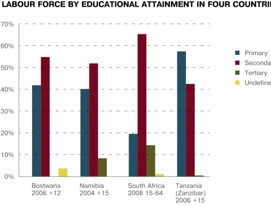
countries except Tanzania (Zanzibar), second-ary education is the dominant level of educa-tional attainment. The proportion of the labour force with tertiary education is highest in South Africa, followed by Namibia.
Laborsta for Botswana, Namibia and South Af-rica. For Tanzania (Zanzibar): 2006 Integrated Labour Force Survey, General Report, Volume II, Labour Commission and Office of Chief Govern-ment Statistician, Zanzibar, June 2008, pp. 13–15.
15.4 LAbour forcE
PArticiPAtion of woMEn by MAritAL stAtus
The relationship between female labour force participation and marital status is shown in Figure 14. In this example, the LFPR of single women is higher than that of married women (34% versus 24%). However, the highest LFPR is among divorced women, possibly due to their need to work in the absence of a partner. LFPR is lowest among widowed women, reflecting university degrees are almost equally likely to
participate in economic activity.
For more detailed analysis of the relationship between specific educational programmes and the labour market, further information would be needed on the nature of the programme (type of training and its duration); subse-quent experience of participants (both those who completed the programme and those who dropped out); and their likely experience in the absence of the programme.
Another use of the data is to find out the skill levels of the labour force of the country. The larger the proportion of the labour force with secondary and tertiary (university) education, the higher the skill level of the labour force. Figure 13 presents the distribution of the labour force by educational attainment for four Afri-can countries: Botswana (2006) for age group 12 years old and over, Namibia (2004) for age group 15+ years, South Africa (2008) for age group 15–64 years and conscripts, and Tanzania (Zanzibar, 2006) for age group 15+ years. In all
0% Bostwana 2006 +12 Namibia 2004 +15 South Africa 2008 15-64 Tanzania (Zanzibar) 2006 +15 10% 20% 30% 40% 50% 60% 70% Primary Secondary Tertiary Undefined
Figure 13
LAbour forcE by EducAtionAL AttAinMEnt in four countriEs
Source: ILO database Laborsta for Botswana, Namibia and South Africa. For Tanzania (Zanzibar): 2006 Integrated Labour Force Survey, General Report, Volume II, Labour Commission and Office of Chief Government Statistician, Zanzibar, June 2008, pp. 13–15.
ment when industry and services start to be-come the dominant form of economy activity in country.37
This phenomenon may be examined by observ-ing the national LFPR over a long period of time (if such a consistent time series is available) or by calculating the current LFPR by geographi-cal area ordered according to level of ment. The areas at the lowest levels of develop-ment should have higher LFPRs than those of areas at middle levels of development. Moreo-ver, these areas should themselves also have a lower LFPR than those of areas at higher levels of development.
16.
Employment-population ratio
Aggregate employment generally increases with growing population. Therefore, the ratio of employment to the working age population is an important indicator of the ability of the economy to provide employment to its growing the age-effect as widowers tend to be older
than women in other marital status categories, and older people tend to have lower LFPRs.
15.5 LAbour forcE
PArticiPAtion ovEr tiME
There is a widespread hypothesis that LFPR fol-lows a U-shape pattern in the course of eco-nomic development, especially in the case of women. At low levels of development, agricul-ture is the dominant form of economic activ-ity in which large numbers of men and women are engaged. The labour force participation is therefore high. Over time, economic activity shifts from home-based production to market-oriented activities in different sectors of the economy. Furthermore, increased mechanisa-tion in agriculture reduces employment op-portunities in that activity, leading to migration from rural areas to the cities in search for work or higher education, especially among young people. The result is that LFPR decreases over time at the lower levels of development before starting to increase at higher levels of
develop-37 Standing, G, Labour Force Participation and Development, International Labour Office, Geneva, 1978. 0 20% 40% 60% 80% 100%
Single Married Divorced Widowed
Figure 14
population. A decline in the employment-pop-ulation ratio is often regarded as an indicator of economic slowdown and a decline in total em-ployment an indicator of an even more severe economic downturn.
The employment-population ratio38 is defined
in percentage terms as: Employment-population ratio =
€
= NumberEmployed WorkingAgePopulation
The working age population is variously de-fined as the population 15 years old and over, the population 15 to 64 years old, or other more restrictive age intervals as proposed below. It may be calculated separately for men and women and by age group and other variables of interest, such as educational attainment and urban-rural place of residence. The ratio gener-ally changes faster than the LFPR and slower than and in an opposite direction to the un-employment rate.
Two particular uses of the employment-popula-tion ratio are given below. One use is for moni-toring the performance of the labour market over time by observing the direction of annual change in the employment-population ratio of the prime-age population (ages 25-54), called here the core employment-population ratio. When the economy is growing, this ratio should
increase, or at least remain unchanged, reflect-ing a certain harmony between the growth of the population and employment. Because the proposed indicator is restricted to the working age population 25 to 54 years old, it is not af-fected by the increased schooling of young peo-ple or earlier and lengthier retirement among the elderly, two phenomena often observed in many countries. Also, because the calculation of the ratio does not require data on unemploy-ment, the indicator should be less controversial than the unemployment rate.
Table 12 illustrates the use of the indicator, cal-culated based on data from the Labour Force Survey of South Africa:
The results show that in the period from 2007 to 2008, employment of prime-age people in-creased by 361,000, more than the increase in the size of the corresponding population. This net job gain is reflected in the slightly higher core employment-population ratio, which in-creased from 59.8% in 2007 to 60.7% in 2008. Where quarterly or monthly labour force sur-veys are conducted, the proposed indicator if further restricted to the urban areas may also provide a reliable indicator of the performance of the urban labour market within the year. This is because seasonal variations in agricul-ture and changes in school attendance during the year should have only a limited effect on the urban ratio.
south Africa (Labour force survey) 2007* 2008 change Number of employed persons aged
25–54 (‘000) 10,566 10,928 361
Population aged 25–54 (‘000) 17,684 17,998 314
core employment–population ratio 59.8% 60.7% 1.0%
* September
Source: LABORSTA, Web database, ILO
Table 12
cALcuLAtion of thE corE EMPLoyMEnt–PoPuLAtion rAtio
Another use of the employment-population ra-tio concerns the two tails of the age distribura-tion not covered by the proposed indicator, namely youth aged 15-24 and people aged 55 and over. The variations of the employment-population ratio for these two categories of persons depend on schooling behaviour and the retirement sys-tem of the country. In this regard, a useful indi-cator to monitor is the age at which most young people of that age are employed and another is the age at which most older people of that age have left employment (or perhaps preferably out of the labour force).
These indicators are best calculated on the basis of single-year age data, but can also be estimat-ed using groupestimat-ed data by linear interpolation as follows:
Age at which most youth of that age are employed =
€
17.5+5 (50%−r15−19) (r20−24−r15−19)
rounded to the nearest complete year, where r15-19 and r20-24 are the employment-popula-tion ratio for young persons aged 15-19 and 20-24, respectively. A similar method may be used for estimating the age at which most older peo-ple aged 55 and above have left employment: Age at which most people aged 55 and above have left employment
€ =57.5+5 (50%−r55−59) (r60−64−r55−59) =62.5+5 (50%−r60−64) (r65+−r60−64) € if (r60−64≥50%) if (r60−64<50%)
Table 13 illustrates the results obtained based on grouped data from the Labour Force Survey of South Africa (2007) for males and females separately. The results may be interpreted as follows: women tend to enter employment later than men (at 29 rather than 25) and tend also to leave employment earlier than men (at 54 rather than 61).
Graphically, these indicators correspond to the points of intersection of the employment–pop-ulation curve (aged 15+) with the horizontal line of 50%.
Similar values may be obtained using the curve of the LFPR instead of the curve of the employ-ment–population ratio. This gives correspond-ing estimates for entry age in the labour force (men = 22; women = 23) and exit age from the labour force (men = 62; women = 55). The accu-racy of the numerical results may be improved using single-year data rather than grouped data. Also, based on appropriate data, other calculations may be done to derive estimates of related concepts such as average age at first job or average age at first entry into the labour force and, similarly, average age at last job or average age at last exit from the labour force. south Africa (Labour force survey – sep 2007) Male women Age at which most youth of that age are employed 25 29 Age at which most older people of that age have left employment 61 54
Table 13
very slight decline in the unemployment rate in South Africa from 23.0% in 2007 to 22.9% in 2008, in line with the slight improvement noted earlier on the core employment-population ra-tio (59.8% in 2007 versus 60.7% in 2008). Unemployment statistics have created a broad range of controversies in many countries, both developing as well as developed countries.39 The
underlying definition of unemployment has been widely criticised, especially its reliance on the “one-hour criterion” of its companion em-ployment definition, which leads to excluding from the classification persons working a few hours during the week who otherwise satisfy the other criteria of the unemployed. Many other issues have been raised and sometimes vehemently, such as those concerning the borderline between employment and unem-ployment (e.g. young jobseekers working on community work programmes) and between unemployment and inactivity (e.g. so-called discouraged workers) or concerning the con-fusion between unemployment data based on surveys and registered jobseekers data based on administrative records.
Facing these challenges, some countries have introduced alternative measures of the unem-ployment rate, providing analysts and the pub-lic with a wider range of data for assessing the conditions of the labour market. An example is the set of six “alternative measures of labour underutilization” U1-U6 regularly published by the US Bureau of Labour Statistics:40
17. unemployment and
its duration
17.1 unEMPLoyMEnt rAtE
The unemployment rate is the most commonly used indicator of the labour market. It is de-fined as the percentage of persons in the labour force who are unemployed:
Unemployment rate =
€
=100×NumberUnemployedLabourForce
The unemployment rate is a measure of imbal-ance in the labour market representing the ex-tent of unutilised labour supply of the country. It is also sometimes used in a general sense as an indicator of the health of the economy, not just the labour market. Unemployment rates for specific categories of the labour force, such as men, women, youth, adults, geographic regions, or specific (past) occupations and branches of economic activity, shed light on the groups of workers and sectors of the economy or regions most affected by unemployment.
Table 14 illustrates the calculation of the unem-ployment rate using data from the Labour Force Survey of South Africa. The results suggest a
south Africa (Labour force survey)1 20072 2008 change Number of unemployed persons (‘000) 3,945 4,075 130
Labour force (‘000) 17,178 17,788 610
unemployment rate (%) 23.0% 22.9% -0.1%
1 Data cover population 15+ years old in 2007 and 15-64 years old in 2008. 2 September
Table 14
cALcuLAtions of thE unEMPLoyMEnt rAtE
39 ILO, World Labour Report 1995. Chapter 1: “Controversies in labour Statistics,” Geneva, 1995, pp. 11–30.