Saptarshi Guha Statistics Dept. Purdue University West Lafayette, IN Paul Kidwell Statistics Dept. Purdue University West Lafayette, IN Ryan P. Hafen Statistics Dept. Purdue University West Lafayette, IN William S. Cleveland Statistics Dept. Computer Science Dept.
Purdue University West Lafayette, IN
Abstract
Comprehensive visualization that preserves the information in a large complex dataset re-quires a visualization database (VDB): many displays, some with many pages, and with one or more panels per page. A single dis-play using a specific disdis-play method results from partitioning the data into subsets, sam-pling the subsets, and applying the method to each sample, typically one per panel. The time of the analyst to generate a display is not increased by choosing a large sample over a small one. Displays and display viewers can be designed to allow rapid scanning. Often, it is not necessary to view every page of a display. VDBs, already successful just with off-the-shelf tools, can be greatly improved by research that rethinks all of the areas of data visualization in the context of VDBs.
1
INTRODUCTION
Large, complex datasets have some of the following properties, often all: a large number of records; many variables; complex data structures not readily put into a tabular form of cases by variables; intricate patterns and dependencies in the data that require complex models and methods of analysis. Our goal, despite the complexity, should be comprehensive study that does not lose important information contained in the data.
Nothing serves comprehensive analysis better than data visualization. This principle has been accepted and practiced for decades (Anscombe, 1973; Daniel
Appearing in Proceedings of the 12th
International Confe-rence on Artificial Intelligence and Statistics (AISTATS) 2009, Clearwater Beach, Florida, USA. Volume 5 of JMLR: W&CP 5. Copyright 2009 by the authors.
and Wood, 1971; Tukey, 1977). Consider this regres-sion model: the mean of a numeric response is assumed linear in three numeric explanatory variables, and the errors are assumed i.i.d. N(0,σ2). Suppose there are 100 observations of the response and each of the ex-planatory variables, 400 numeric values altogether. To check the linearity and normality of the model, it is common practice to make, at the very least, a col-lection of standard displays (Cleveland, 1993; Cook and Weisberg, 1999): scatterplot matrix of the four variables (1200 plotted points); three partial residual plots, one for each explanatory variable (300 points); three conditioning plots of the response against each explanatory variable conditional on the other two (300 points); residuals against fitted values (100 points); ab-solute residuals against fitted values (100 points); nor-mal quantile plot of residuals (100 points); three con-ditioning plots with residuals in place of the response (300 points). The number of plotted points is 2400, and each point encodes two numeric values, so 4800 values are displayed. This means the ratio of graphed numeric values to the number of numeric values in the data is 12.
In an effort to achieve comprehensive analysis of a large dataset with billions or trillions of observations we obviously cannot achieve a ratio of 12 in data dis-plays. But we can make a large number of displays to pursue comprehensive analysis. A display itself can have a large numbers of pages, each of which can have many panels. The total number of pages might be measured in thousands or tens of thousands in this visualization database, or VDB. We approach this by partitioning the data into subsets, sampling the sub-sets, and applying visualization methods to each sam-ple. A sample receives the same comprehensive analy-sis as the small dataset would. Of course, the sampling frame must be chosen in a way that characterizes the data. Backing us up are numeric methods that often can be run on all subsets and help in designing sam-pling frames.
We are very optimistic because we have had substan-tial success with VDBs even though research has just begun on how to improve their use in practice. Re-search topics include the following: Methods of display design that enhance pattern perception to enable rapid scanning of the pages of a large display; automation al-gorithms for basic display elements such as the aspect ratio, scales across panels, line types and widths, and symbol types and sizes; Methods for subset sampling; Viewers designed for multipanel, multipage displays that scale across different amounts of physical screen area. This article discusses the basic concepts for a VDB, its hardware and software components, and ini-tial thoughts on some of the above research topics. Readers are encouraged to look at a Web site (ml.stat.purdue.edu/vdb) prepared in coordination with this article. It houses a number of VDBs. We will make reference in this article to three of them — surveillance,joke, and connection— that involve the analysis of three data sets.
The surveillance data are the daily counts of chief complaints from emergency departments (EDs) of the Indiana Public Health Emergency Surveillance Sys-tem (Grannis, Wade, Gibson, and Overhage, 2006). The complaints are divided into eight classifications; one is respiratory. Data for the first EDs go back to November 2004, and new EDs have come online contin-ually since then. There are now 76 EDs in the system. Respiratory complaints for the 30 EDs with the most data have been analyzed (Hafen, Anderson, Cleveland, Maciejewski, Ebert, Abusalah, Yakout, Ouzzani, and Grannis, 2009, to appear), andsurveillanceis the VDB for this analysis.
The Jester project (www.ieor.berkeley.edu/∼goldberg/
jester-data) has collected ratings on a scale of−10 to
10 of 100 jokes from 73,421 raters from April 1999 to May 2003 (Goldberg, Roeder, Gupta, and Perkins, 2001). Our joke dataset has the 14,116 raters who rated all jokes. Visualization methods are revealing the properties of the data as a guide to building a statistical model that will allow prediction of the ratings of an individual from a set of 10 gauge jokes. Internet communication consists of connections be-tween two hosts who send packets back and forth, each 1500 bytes or less. The TCP protocol manages the connections for many applications such as web page delivery (http), email (smtp), and encrypted re-mote login (ssh). Our connection dataset consists of packet traces for TCP collected on a subnet of the Purdue Statistics Department. The packets are orga-nized by connection because the research topic is net-work security based on analysis of connection proper-ties as a function of time and of the logical network.
The data for each packet are the arrival timestamp, and certain information from the TCP and IP head-ers: source-destination IP addresses (anonymized), source-destination ports; source-destination sequence numbers; size of packet payload; values of 6 flags (SYN, FIN, PSH, RST,and ACK); and ACKed se-quence number. Trace collection was on four separate days for a total of 96 hr. There are 749,128 connec-tions and 1,490,238,292 packets. The binary version of the raw data is 146 gigabytes, which is converted to a distributed database that is 190 gigabytes. More collection is planned.
2
PARTITIONING & TIME
An important strategy of comprehensive analysis for a large complex dataset is to partition it into small subsets in one or more ways, and apply numeric meth-ods and visualization methmeth-ods to each of a sample of subsets. Section 1 discussed the use of a large num-ber of plotted points per observation that is commonly carried out for small datasets. Achieving comprehen-sive analysis of a large dataset requires preserving this for the subsets, analyzing each in detail. The sam-pling frame can vary from one analysis method to the next. It is common to have numeric methods applied to more subsets than visualization methods. In some cases, sampling can be exhaustive: all subsets. Two non-exhaustive sampling methods, representative and regional, are discussed in Section 3.
Partitioning can be carried out in many different ways. Often, we start with a core partitionthat arises natu-rally from the structure of the raw data. This is a soft concept but useful nevertheless. The subsets of the core are often further partitioned by variables other than those that defined the core.
The time for a data analyst to create a display method for a single subset by writing commands in the com-puting environment can vary from very small to large. But once the commands are written, there is typ-ically negligible additional command-time difference between small and large samples. So in this regard, a large visualization database is not significantly more costly than a small one.
The data analyst spends more time looking at a large sample than at a small sample. To understand the data as a whole, there needs to be a requisite number of subsets, and this can be quite large. But study-ing displays and thinkstudy-ing about the data, and not the programming language, is time well spent. It does not have to be an undue burden. A display method applied to a very large number of subsets must be viewed se-quentially because the resulting display will take up an amount of virtual screen space much larger than the
available physical screen space. Some displays might be scanned entirely; for others, a small fraction of the pages might suffice. In work described briefly in Sec-tion 3, we are developing methods of display design that invoke principles of visual perception to enhance pattern perception and enable rapid page scanning. This turns page viewing into a form of controlled ani-mation. We are also developing viewers for the sequen-tial task that can reduce the viewing time substansequen-tially when the screen space is large.
Partitioning leads to embarrassingly parallel computa-tion. Large amounts of computer time can be saved by distributed computing environments. One is RHIPE (ml.stat.purdue.edu/rhipe), a recent merging of the R interactive environment for data analysis (www.R-project.org) and the Hadoop distributed file system and compute engine (hadoop.apache.org).
3
SAMPLING, TRELLIS, & 3 VDBs
In representative sampling, survey variables are de-fined that measure properties of the subsets. A subset sampling frame is chosen to encompass the multidi-mensional space of the survey variables in a uniform way by some definition. In regional sampling, samples have values of the survey variables lying in a region of the multidimensional space that is important to the analysis.
Partitioning for data visualization is commonplace for small data sets and is the stimulus for trellis display, a framework for visualization that provides condition-ing plots: displays of a set of variables conditional on the values of other variables (Becker, Cleveland, and Shyu, 1996). The trellis framework is well suited for displaying the subsets of large datasets by creating dis-play documents with pages and a rectangular array of panels on each page. Trellis display is implemented in R by the lattice graphics system (Sarkar, 2008)
3.1 JOKE DATASET
For the joke dataset, two core partitions have been
used — by joke and by rater — resulting in 100 and 73,421 subsets respectively. For the by-joke partition, the sampling for all numeric and visualization methods is exhaustive. For the by-rater partition, sampling is exhaustive for numeric methods, and representative for visualization methods.
All models explored for the data have a rater loca-tion effect because there are hard graders and easy graders. One model we explored starts with rescaling
the ratings to the interval [0,1] and taking a logistic
transformation. The transformed ratings are modeled by additive main effects of joke and rater, and error
Normal Quantile
Residual Rating (logistic scale)
−2 0 2 −2 0 2 −1.78 −1.63 −2 0 2 −1.55 −1.51 −2 0 2 −1.43 −1.39 −2 0 2 −1.31 −1.31 −1.27 −1.26 −1.24 −1.21 −1.19 −1.17 −1.17 −2 0 2 −1.15 −2 0 2 −1.13 −1.12 −1.1 −1.09 −1.08 −1.08 −1.07 −1.06 −1.05 −1.05 −1.05 −1.04 −1.03 −1.02 −1.01 −2 0 2 −1 −2 0 2 −0.98 −2 0 2 −0.98 −0.97 −2 0 2 −0.96 −0.95 −2 0 2 −0.94 −0.93 −2 0 2 −0.93
Figure 1: First Page of 100-Page Trellis Display of Normal Quantile Plots by Rater.
terms with identical normal distributions with mean zero.
One display method for model building is a normal quantile plot of residuals for each rater. The repre-sentative sampling frame for this method selects 4000 raters so that the rater location estimates from the model are as close to uniformly spaced as possible from the minimum to the maximum estimate. Figure 1 is the first page of a 100-page, 4000-panel trellis display for this display method and sampling frame. Each panel is a normal quantile plot of the residuals for one rater. Each page has 8 columns and 5 rows. The line on the plot goes through the two quartile points of the display. As we go left to right, bottom to top, and through the pages of the display, there is an in-crease in the rater location estimates, shown in the lower right of each panel of the display. For this plot, the 100 pages can be visually scanned in a few minutes because our visual systems can effortlessly detect de-partures of the plotted points on a panel from the line. Across the panels, the patterns of the points follow the lines, which means the normal is a good approximation of the error marginal distribution.
3.2 SURVEILLANCE DATASET
For the surveillance dataset, the core partitioning is
by emergency department (ED). Because the dataset size is moderate, the partition sampling is exhaustive for both numeric and visualization methods. Figures 2 and 3 show parts of pages 1 and 2 of a trellis display from an exhaustive sample in which the core subsets are further partitioned. The full display has 1 column, 6 rows, and 90 pages. Figures 2 and 3 are the top and bottom panels of pages 1 and 2 of the full display. In the project, new methods for modeling respiratory counts for each ED are based on STL, the
nonpara-Time (years)
C1
2
Act
2006 2007 2008STL
2
Act
Figure 2: Top and Bottom Panels of Page 1 of a 90-Page, 540-Panel Trellis Display.
Time (years)
C1
1.5
Act
2006 2007 2008STL
1.5
Act
metric seasonal-trend numeric decomposition proce-dure. Square root counts are decomposed into inter-annual, yearly-seasonal, day-of-the-week, and random-error components. Using this decomposition method, a new synoptic-scale (days to weeks) numeric outbreak detection method is developed. STL is compared with five other methods, some widely used for surveillance. Each method was tested on each ED count series. An outbreak occurrence starting on a particular day was added to the counts, the outbreak methods applied, and detect or non-detect within 14 days recorded for the start day. This was done for each ED on each day separately starting with the 366th day of data. There are 3 different outbreak magnitudes (2, 1.5, and 1), and 30 EDs (with anonymized names such as Act). With 6 detection methods, 3 outbreak magnitudes, and 30 EDs, there are 540 = 6×3×30 outbreak test
sequences across time.
Each panel of the full trellis display shows information about one test sequence for one method, one magni-tude and one ED, which are indicated by the strip labels to the left of each panel. Outbreak method changes the fastest; each page has 6 panels showing the 6 methods for one combination of magnitude and ED. Magnitude changes next fastest; on page 1 the magnitude is 2 (see Figure 2), on page 2, the magni-tude is 1.5 (see Figure 3), and on page 3, magnimagni-tude is 1 (not shown). ED changes the slowest; pages 1 to 3 are Act, pages 4 to 6 are the next ED, and so forth. The curve formed by the bottoms of the cyan lines and the tops of the magenta lines on each panel is the STL seasonal component. Each vertical line em-anating from the curve shows the detection result for the outbreak starting on the day at which the line is drawn; cyan is non-detect and magenta is detect. The full trellis display reveals the effect of the yearly seasonal pattern on detection performance and how the effect changes with the values of the three condi-tioning variables: detection method, magnitude, and ED. Outbreak methods, as expected, detect more fre-quently as the magnitude increases. STL is the best performer. STL failure to detect occurs most fre-quently during periods of decline in the seasonal pat-tern.
3.3 CONNECTION DATASET
For theconnectiondataset, core partitioning is by con-nection, resulting in 749,128 subsets. One part of the connectionVDB involves a numeric rules-based statis-tical algorithm (RBSA) that is applied to a connec-tion. Even though the algorithm is computationally intensive, distributed computing with RHIPE makes computation for all subsets feasible; sampling for this numeric method is exhaustive.
The RBSA classifies each packet in both directions of a connection as an ssh client keystroke or not. The algorithm uses the packet timestamps, payload sizes, and flags. The goal for network security is to classify the whole connection as interactive ssh or not. The algorithm does not assume knowledge of which direc-tion is a client or whether the connecdirec-tion is ssh. The ssh well-known port is 22, but the algorithm is applied to all connections because backdoor login services can be created by intruders.
The RBSA is very accurate at the packet level but does have some misclassifications; we found that clas-sifying the connection as interactive ssh if there are 5 or more keystroke detections, has very few damaging connection-level misclassifications. Part of our study of the algorithm performance uses regional sampling for the display method discussed in Section 6. The sampling frame captures connections with the follow-ing properties: classified as ssh interactive login, nei-ther host port is 22, and one host is not on the Purdue campus.
4
VIEWERS & SCREEN SPACE
To consume large VDBs we want as much physical screen space as possible. We have been experimenting with two 30-inch monitors, each 2560x1600 in reso-lution. This is equivalent to ten 1024x768 monitors. The monitors can be positioned so that the resulting screen space does not greatly exceed the visual field of the analyst, and can be viewed with small movements of the head.Designing visual displays and a viewer to look at them must consider visual processes. It must also consider a very practical matter. On a typical data analysis project, displays must be viewable on a range of dis-play devices from large multiple monitors to laptops. To make the displays scale across screen space, we de-sign them so that each page is viewable on a small screen; mouse clicks in this case take us through a document one page at a time. For larger amounts of screen space, the viewer allows multiple pages to be displayed, which is very beneficial. If we display a block of 12 pages, 6 on each of the two monitors, then a mouse click takes us to a new block of 12 pages, so the click process is reduced by a factor of 12. Within a block, eye movement over the 12 displays provides even more rapid and effective visual decoding than 12 sequential views on a small screen.
5
AUTOMATION ALGORITHMS
There are many levels of display design. The first and fundamental one is the display method:
qualita-tive and quantitaqualita-tive information of a specific type are shown by a display whose overall visual design is of a certain type. Examples are scatterplots with a smooth curve superimposed, normal quantile plots with a line through the quartile points, and box plots.
For each display method, many design decisions must be made about basic elements such as the aspect ratio; values of tick marks; line widths and colors; text sizes and fonts for labels; plotting-symbol sizes and colors; taking the log of a variable or not; when there are two or more panels with the same variables displayed, choosing the horizontal or vertical scales across panels to have the same range, to have the same number of units/cm, or to be free ranging; and many more. A data analyst is completely responsible for the deci-sion about the choice of display method, but is very well served by a system that can assist in the decisions about basic elements. Systems today already engage in this to some extent — for example, choosing the values of tick marks — but much more can be done to develop automation algorithms for basic elements and to study their mathematical, statistical, and percep-tual properties.
The aspect ratio of a display, the height of a rectan-gle just enclosing the data divided by the width, has an immense impact on our ability to judge the rate of change of one variable as function of another. Rate of change is conveyed by the slopes of line segments that make up a curve. Figure 4 shows an example: the STL seasonal component for one ED from the surveil-lancedataset. A change in the aspect ratio changes the physical slopes of the segments which in turn changes our ability to visually decode slopes to judge rate of change. In the 1980s, it was demonstrated that bank-ing to 45◦, which means choosing the aspect ratio to center the absolute values of the slopes on 1, greatly enhances the judgment of rate of change (Cleveland, McGill, and McGill, 1988; Heer and Agrawala, 2006). If we take this general principle and add to it a spe-cific definition of the meaning of centering on 45◦, then the result is a banking automation algorithm for the aspect ratio.
We are studying a new banking algorithm that pro-ceeds conceptually as follows: each segment with a negative slope is replaced with a segment of the same length but with the sign of the slope dropped to make it positive; the new segments, as vectors, are added to form a resultant vector; the segments and their resul-tant are displayed in a hypothetical display with an aspect ratio of 1, which makes the resultant have a slope of 1. The aspect ratio of the original display is chosen so that the absolute orientations are the same as those of the hypothetical display. This
resultant-vector automation algorithmwas used in Figure 4; the aspect ratio is 0.12. Figure 5 graphs the seasonal com-ponent again, but with the aspect ratio equal to 0.04. This greatly reduces our ability to perceive the behav-ior of the component.
Time (years)
Yearly Seasonal
(square root count)
−2 −1 0 1 2 2005 2006 2007 2008
Figure 4: Yearly Seasonal Component with Aspect Ra-tio of 0.12 from Resultant-Vector Algorithm.
Time (years)
Yearly Seasonal
(square root count)
−20 2
2005 2006 2007 2008
Figure 5: Figure 4 with Aspect Ratio of 0.04.
6
GESTALT DESIGN METHODS
Our extraordinary human visual system can readily process very large displays by methods of viewing not utilized for the single-page display. One is rapid scan-ning. It is possible to click at a fast rate through the pages of a document with the same display method replicated across the panels and pages, one subset per panel. But for this to succeed, it must involve the as-sessment of a gestalt: a pattern that forms effortlessly without attentive search of basic elements of the dis-play. The pattern “hits you between the eyes.” When there are two or more gestalts to assess, it is best to scan through pages assessing one at a time. Attempt-ing simultaneous assessment slows down the process remarkably because a cognitive shift of assessment is time consuming.
Gestalts can sometimes form as a matter of course for many common display methods; Figure 1 is one exam-ple. But in general, gestalt formation must get special attention in the design of a display. While principles of gestalt psychology can give some guidance (Koffka, 1935), some level of iterative experimentation for a particular type of display is typically needed.
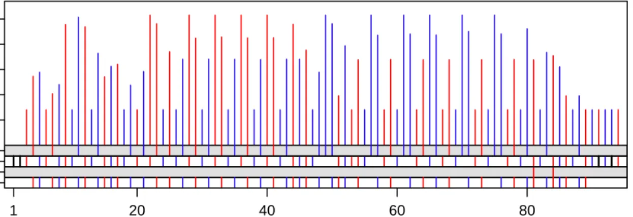
The top panels of Figures 6 to 8 show an experiment with gestalt formation for a method of visualizing con-nection packet dynamics for theconnectiondataset. In the three top panels, log(1 + payload size) for packets
Packet Number Log 2 (1+Data Bytes) PSH KS S/F/ACK Dup. ACK 2 4 6 8 10 1 20 40 60 80
Figure 6: First Experiment in Gestalt Perception: Color.
Packet Number Log 2 (1+Data Bytes) PSH KS S/F/ACK Dup. ACK 8 4 0 0 4 8 1 20 40 60 80
Figure 7: Second Experiment: Juxtaposition.
Packet Number Log 2 (1+Data Bytes) PSH KS S/F/ACK Dup. ACK 8 4 0 0 4 8 1 20 40 60 80
with payload bytes greater than 0 are plotted against the packet arrival order by the vertical lines. Also encoded is the packet direction. In Figure 6 it is en-coded by color; red is from the client and blue is from the server. We want to see each direction as a gestalt, mentally filtering out the packets of the other direc-tion. In Figure 7 direction is encoded by juxtaposition instead of the superposition of the top panel. The server packets are displayed downward on the vertical scale and the client packets upward. We could juxta-pose by an upward scale for the server with the lines emanating from the bottom of the panel, but this in-terferes with our ability to judge arrival order for client and server combined. In Figure 8, direction is encoded by color and juxtaposition. Encoding direction just by color is the poorest method for gestalt formation, jux-taposition is better, and using both is the best method, also allowing effective assessment of the sequence and size patterns in payload packets.
7
VDB COMPONENTS
The software and hardware components of a VDB (in italics below) begin with a display generatorin an in-teractive environment for data analysis that produces the VDB display documents. Astorage schemamight have the display documents as fundamental objects or the pages of the documents. A displayviewer renders the display documents on a display device; there can be different viewer designs to accommodate different document types and different amounts of screen space of display devices. Display managers organize, doc-ument, and provide access. There can be more than one manager; all provide organization and access to display storage objects but vary in the documenta-tion of the displays and of the project of which they are a part. They can range from no documentation to project notes to a comprehensive narrative of the project for others.
In our projects using VDBs, the display viewer and devices discussed in Section 4 resulted from consider-ations of VDBs. The other components are off-the-shelf, using what is readily available and widely used. We work in the R interactive environment (www.R-project.org) and use lattice graphics (Sarkar, 2008) in R to generate displays. For large datasets, we em-ploy distributed computing using RHIPE, discussed in Section 2. The storage schema objects are the in-dividual displays. Our managers are html pages with the display files as links. The html is typically com-puter generated, for example, by org-mode in emacs (org-mode.org).
We have had much success with these start-up com-ponents, but success can be far greater with more
re-search on each of them and on visualization methods for very large displays.
References
F.J. Anscombe. Graphs in Statistical Analysis. Amer-ican Statistician, 27:17–21, 1973.
R. A. Becker, W. S. Cleveland, and M. J. Shyu. The Visual Design and Control of Trellis Display. Jour-nal of ComputatioJour-nal and Graphical Statistics, 5: 123–155, 1996.
W. S. Cleveland. Visualizing Data. Hobart Press, Chicago, 1993.
W. S. Cleveland, M. E. McGill, and R. McGill. The Shape Parameter of a Two-Variable Graph. Journal of the American Statistical Association, 83:289–300, 1988.
R. D. Cook and S. Weisberg. Applied Regression In-cluding Computing and Graphics. Wiley, New York, 1999.
C. Daniel and F. Wood. Fitting Equations to Data. Wiley, New York, 1971.
K. Goldberg, T. Roeder, D. Gupta, and C. Perkins. Eigentaste: A Constant Time Collaborative Filter-ing Algorithm. Information Retrieval, 4:133–151, 2001.
S. J. Grannis, M. Wade, J. Gibson, and J. M. Overhage. The Indiana Public Health Emergency Surveillance System: Ongoing Progress, Early Find-ings, and Future Directions. In Proceedings of the Annual Symposium, pages 304–308. American Med-ical Informatics Association, 2006.
R. P. Hafen, D. E. Anderson, W. S. Cleveland, R. Ma-ciejewski, D. S. Ebert, A. Abusalah, M. Yakout, M. Ouzzani, and S. Grannis. Syndromic Surveil-lance: STL for Modeling, Visualizing, and Monitor-ing Disease Counts. BMC Medical Informatics and Decision Making, 2009, to appear.
J. Heer and M. Agrawala. Multi-Scale Banking to 45 Degrees. IEEE Transactions on Visualization and Computer Graphics, 12:701–708, 2006.
K. Koffka. Principles of Gestalt Psychology. Harcourt, New York, 1935.
D. Sarkar. Lattice: Multivariate Data Visualization with R. Springer, New York, 2008.
J. W. Tukey. Exploratory Data Analysis. Addison-Wesley, Reading, Massachusetts, U.S.A., 1977.