DAS, DEBOSMITA. Time Series Analysis & Visualization: Forecasting and Detection of the Abnormal Changes in Data. (Under the direction of Dr. Christopher Healey).
Analyzing time series data is an essential part of data forecasting. With the plethora of data we produce every day, its importance has increased dramatically. An effective visualization of time series data can help in rapidly drawing insightful inferences. Through my research work, I aim to explore this domain further to gain relevant information on past trend changes and use forecast techniques to understand changes in patterns.
Early detection in shifts and changes in time series data can be instrumental in making decisions and implementing changes. For example, the EPA has set standards for levels of Sulphur dioxide (SO") in the atmosphere. Too much SO" can cause detrimental health
conditions. In monitoring SO", a significant upward trend of the gas would be of concern and warrant investigation. Early identification of this shift or change may help save lives. Another example where identifying shifts or patterns could be helpful is in stock prices. Someone who has shares of a particular stock would be very interested in identifying whether this stock is experiencing a down turn in prices. There are many other instances where pattern and trend identification can be informative and useful.
In the past years, there has been significant interest in time series analysis. My research attempts to provide an approach to address: (1) characterizing a time series sequence using time series modeling, and (2) identifying points where the model changes in a significant way due to changes in the model’s parameters. This represents a model that can dynamically adjust while analyzing a time series sequence to predict future data points. In summary, my research goals are:
(3) Providing a uniform approach to analyze and forecast different time series. To find the answers to these issues we constructed a prototype that will learn from a given time series to identify pattern changes and forecast future data values. Once completed, the results are presented in visualizations designed to make the time series data and inflection points more readable and understandable.
Data
by Debosmita Das
A thesis submitted to the Graduate Faculty of North Carolina State University
in partial fulfillment of the requirements for the degree of
Master of Science
Computer Science
Raleigh, North Carolina 2018
APPROVED BY:
_______________________________ _______________________________ Dr. Christopher Healey Dr. Susan Simmons
Committee Chair
ii DEDICATION
iii BIOGRAPHY
iv ACKNOWLEDGMENTS
I would like to thank Dr. Christopher G. Healey and Dr. Susan Simmons for their constant support and guidance towards my thesis. Getting the chance of working under their guidance has been an honor for me.
v
TABLE OF CONTENTS
LIST OF TABLES ... vi
LIST OF FIGURES ... vii
Chapter 1 ... 1
1.0 Introduction ... 1
1.1 Thesis Problem ... 3
1.2 Proposed Approach ... 3
Chapter 2 ... 6
2.0 Background ... 6
2.1 Exponential Smoothing ... 6
2.1.1 Holt’s Linear Trend Method ... 6
2.1.2 Holt-Winters Seasonal Method ... 7
2.2 ARIMA Model ... 8
2.3 Visualization ... 14
Chapter 3 3.0 Approach ... 18
Chapter 4 4.0 Implementation ... 26
4.1 Minimum Estimation Sample Size ... 26
4.2 Hyperparameter Limits for SARIMAX ... 29
4.3 Visualizing Data ... 32
Chapter 5: Results ... 33
5.1 Data Preprocessing ... 33
5.2 Practical Implementation ... 34
5.2.1 Monthly temperature dataset of Ireland ... 35
5.2.2 Daily stock price of JP Morgan Chase & Co. ... 35
5.2.3 Simulated dataset ... 35
5.3 Performance Measurement ... 36
5.3.1 Performance Measurement with Statistical Estimators ... 36
5.3.2 Performance Measurement through Visualization ... 39
5.3.3 Temperature dataset of Ireland ... 41
5.3.4 Stock price of JP Morgan Chase & Co. ... 42
5.3.5 Simulated Dataset ... 43
Chapter 6: Conclusion ... 49
6.1 Limitations ... 49
vi LIST OF TABLES
vii LIST OF FIGURES
Figure 1 Seasonal, trend and remainder decomposition of time series data for Gilroy, CA,
USA for the years 2008-2012 ... 1
Figure 2 Extensions to tubular visualization: Rings to help user evaluate time and duration of events (a); Optional time axis with labels that represent the time steps (b) [17] ... 15
Figure 3 The user can move forward/backward along the time axis [17] ... 15
Figure 4 Figure 1 Temporal stress profile of participant P4. Each bar represents stress for a day. Colors represent stress intensity (red = high stress, green = low stress, yellow = moderate stress, grey = unknown) [18] ... 16
Figure 5 Temporal stress profiles of four participants. Colors represent stress intensity (red = high stress, green = low stress, yellow = moderate stress, grey = unknown). Each bar represents a day’s stress data, which are grouped by participants. [18] ... 16
Figure 6 Process in each iteration of rolling window analysis ... 19
Figure 7 Rolling window analysis ... 19
Figure 8 Flow chart of this study's algorithm ... 32
Figure 9 Line plot of actual values, predicted values, and 95% confidence interval boundaries of Temperature Data ... 41
Figure 10 Close up of the line plot of figure 9 ... 41
Figure 11 Snapshot of the structural details of the temperature input data and the time series model ... 41
Figure 12 Line plot of actual values, predicted values, and 95% confidence interval boundaries of Stock Price Data ... 44
Figure 13 Snapshot of the structural details of the stock price input data and the time series model ... 44
Figure 14 Plot of Actual Values ... 46
Figure 15 Plot of Actual Values and Pattern Changes ... 47
viii Figure 17 Snapshot of the structural details of the simulated input data and the time series
1 CHAPTER 1
1.0 Introduction
This thesis studies the problem of time series modeling and visualization. A time series is a series of data points indexed in temporal order. Examples of such sequences include daily stock prices of a company, monthly maximum temperature of a region, hourly concentrations of SO" and so on. Studying time series involves two components: (1) time series analysis; and (2) time series forecasting. Time series analysis includes methods for analyzing data to extract
meaningful statistics and other characteristics of the data. For example, in Figure 1 we have plotted the daily maximum temperatures of Gilroy county in California for the years 2008 to 2012 and extracted seasonal and trend patterns. The last graph in Figure 1 is the remainder which is simply the fluctuations of the data after the trend and seasonality have been removed. Thus, the remainder component helps us to understand the underlying structure of the data series and the changes in its pattern, if any.
The next component of time series study, time series forecasting, is the use of a model to predict future values based on previously observed values.
2 The question may arise, “Why do we need time series analysis and forecasting?” As per recent statistics, provided by the World Meteorological Organization, the number of vulnerable people exposed to heatwave events has increased by approximately 125 million between 2000 and 2016. Such a change in temperature will not only affect the environment but also disturb socio-economic structures [1]. If we shift our focus to a different domain, for example, the stock market, we can see how the prices of each stock change over time. These datasets have one thing in common – they are dependent on time. A plot of data points against time provides insight into how the concerned topic has evolved. While standard time series data is less of a concern, sudden changes in patterns help us to infer valuable understanding from these trends. For example, from the time series analysis and forecast of the evolution of a company, we might understand how the business is performing and if we should invest in it.
Time series data provides us with the opportunity for insight into how patterns have changed over time. Such an arrangement of statistical data in chronological order allows us to retrieve highly valuable information, for example, to (1) probe whenever we see any abnormal change; (2) understand current trends; or (3) forecast future trends for supporting decision-making processes.
In this thesis, we have included all of these primary components to explore the information gained from a time series and to find solutions to the following questions:
(1) Can we retrieve information from pattern changes in a series and predict future changes?
3 (3) Can we visualize the pattern changes in the time series and provide a visual
representation of information related to the pattern changes in the data?
To find the answers to these problems we have constructed a prototype which learns from a given time series and detects pattern changes. Once complete, the predictions are presented in a user-friendly manner through effective visualizations to make them readable and understandable. 1.1 Thesis Problem
The primary goal of this thesis is to generate a model to analyze a time series and
visualize data and time series transition points where the underlying model changes, as well as to forecast future trends. One critical step to achieve this is to collect accurate and diverse data. We decided to collect data from various sources to validate the generality of our approach. We started with data on temperature, collected by the International Panel on Climate Change. Since tracking data pattern changes is the main goal of our project, we focused on data that are claimed to have changed over time.
Next, we analyzed the collected data to identify time series transitions and predict future trends. Given a target audience from various domains, this can include people from different backgrounds and expertise. Hence, it is essential that we present our findings through an easily understandable representation to facilitate the decision-making process.
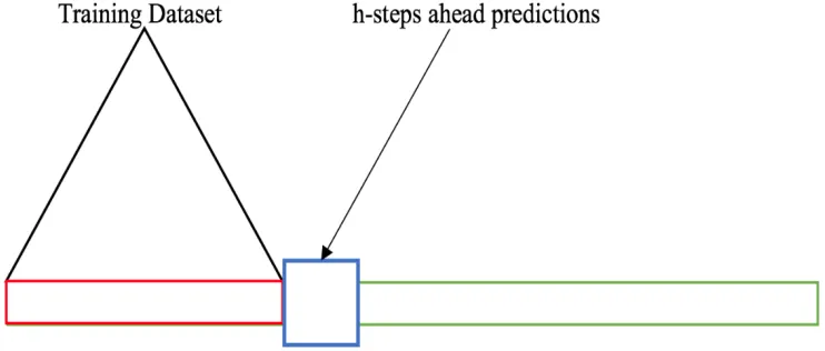
1.2 Proposed Approach
4 rolls through the sample one observation at a time. This procedure enables our model to work on a smaller size of data to detect the transitions and future data points, possibly in real-time.
For our implementation, we use the Seasonal Auto-Regressive Integrated Moving Average with eXogenous regressors (SARIMAX) [2] algorithm in Python. This is a model that can be fit to time series data in order to better understand patterns or predict future points in the series. The advantage of this model over other time series algorithms is that it considers a variety of factors that influence a series, helping us to model different types of time series. SARIMAX uses the following properties when creating a model:
(1) Past values of the predicted variable.
(2) Past errors in the forecasted values of the predicted variable.
(3) Presence of seasonality, a regular, repetitive value change pattern in the data. (4) Presence of trends, a monotonic increase or decrease in values in the data. Another aspect that we have also considered is stationarity. Stationarity is defined as a mean, and variance that do not change over time. If a time series is non-stationary, then an appropriate differencing is determined and then performed on the series to make the series stationary.
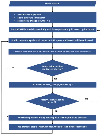
To ensure that the model dynamically fits itself with changes in series, we have included a Hyperparameter Grid Search [3] for tuning parameters of the SARIMAX model. In our
prototype, the model is created and remains unchanged until a consecutive set of time series predictions falls outside the 95% confidence interval of the predicted data. If there is an abnormal change in the pattern of the time series that is not captured by the model for
5 mark the field of the out of range values as a transition point, then recreate our model based on both the past and new, out of range values.
We continue this process until all the data in the time series is analyzed. The result is a time series divided into subsets of data, each with a specific time series model that accurately predicts that data. This allows viewers to observe both areas with similar patterns, and areas of significant difference that cause the time series to change, often dramatically.
Through this research we have worked to achieve the following: (1) A method to identify time series model transitions.
(2) A technique to visualize model parameters and transition points within the time series.
(3) Continuous searching for model transitions in real-time as new time series data values arrive.
6 CHAPTER 2
2.0 Background
We can forecast future data points in a series of temporal data series, from the past values of the variable of interest. Two common approaches are often employed: Exponential Smoothing and autoregressive integrated moving average (ARIMA).
2.1 Exponential Smoothing
Exponential Smoothing is a technique of forecasting temporal data using weighted averages of past observations, with the weights decaying exponentially as the observations get older, i.e., the most recent observations are assigned the most importance in forecasting [4]. This framework serves as the basis for numerous advanced time series forecasting algorithms. Holt’s linear trend method is one example of an exponential smoothing algorithm.
2.1.1 Holt’s Linear Trend Method
Holt’s linear trend algorithm [4] uses Exponential Smoothing to forecast data with a trend. It consists of three components: (1) level smoothing equation (𝑙$); (2) trend smoothing equation (𝑏$); and (3) forecasting equation. These components can be expressed mathematically in the following way:
Level smoothing equation: 𝑙$ = 𝛼𝑦$+ (1 − 𝛼)(𝑙$/0+ 𝑏$/0) (1) Trend smoothing equation: 𝑏$ = 𝛽(𝑙$− 𝑙$/0) + (1 − 𝛽)𝑏$/0 (2)
Forecasting equation: 𝑦$23|$5 = 𝑙
$+ ℎ𝑏$ (3)
where 𝑙$ denotes an estimate of the level of the series at time 𝑡, 𝑏$ denotes an estimate of the trend (slope) of the series at time 𝑡, 𝛼 is the smoothing parameter for the level, 0 ≤ 𝛼 ≤ 1, and 𝛽 is the smoothing parameter for the trend, 0 ≤ 𝛽 ≤ 1. Given data up to time 𝑡 𝑦$23|$5 is the
7 Holt’s trend method cannot forecast data which have the effects of seasonality, a
repetitive cyclic pattern of fixed length in a time series. To deal with this effect, an extension to this algorithm known as the Holt-Winters seasonal method was developed.
2.1.2 Holt-Winters Seasonal Method
In Holt-Winters seasonal method [4] a new component was added for including
seasonality along with the level and trend components. This algorithm has four components: (1) level smoothing equation (𝑙$); (2) trend smoothing equation (𝑏$); (3) seasonal smoothing
function (𝑠$); and (4) the forecasting equation. There are two variations of this algorithm: (1) additive model; and (2) multiplicative model. An additive model is used when the seasonal variation is near-constant over time. If the seasonal variation tends to vary with the level of the series, the Holt-Winters multiplicative model is used. Mathematically, Holt-Winters additive seasonal method can be expressed as:
Forecasting equation: 𝑦$23|$5 = 𝑙
$+ ℎ𝑏$+ 𝑚$/<23=> (4)
Level smoothing equation: 𝑙$ = 𝛼 𝑦$− 𝑚$/< + 1 − 𝛼 𝑙$/0+ 𝑏$/0 (5)
Trend smoothing equation: 𝑏$ = 𝛽 𝑙$− 𝑙$/0 + 1 − 𝛽 𝑏$/0 (6) Seasonal smoothing equation: 𝑚$ = 𝛾 𝑦$− 𝑙$/0− 𝑏$/0 + (1 − 𝛾)𝑚$/< (7) where ℎ<2 = ℎ − 1 𝑚𝑜𝑑 𝑠 + 1, i.e., the seasonal estimates are only taken from the last
observation of the estimation sample. Like Equation 1, 𝑙$ denotes an estimate of the level of the series at time 𝑡, but it also includes the seasonally adjusted observation 𝑦$− 𝑚$/<. The trend
8 denotes the number of observations in a season, i.e., the period of seasonality. For example, for monthly data 𝑠 = 12, and for quarterly data, 𝑠 = 4.
Following the same concept as the Holt-Winters additive method in Equations 4 – 7, the Holt-Winters multiplicative method is expressed as:
Forecasting equation: 𝑦$23|$5 = (𝑙
$+ ℎ𝑏$)𝑚$/<23=> (8)
Level smoothing equation: 𝑙$ = 𝛼 DE
FEG= + 1 − 𝛼 𝑙$/0+ 𝑏$/0 (9)
Trend smoothing equation: 𝑏$ = 𝛽 𝑙$− 𝑙$/0 + 1 − 𝛽 𝑏$/0 (10)
Seasonal smoothing equation: 𝑚$= 𝛾 H DE
EGI/JEGI + (1 − 𝛾)𝑚$/< (10)
Holt-Winters, due to its capability of considering both trend and seasonality in a time series, has been used widely by researchers to predict future data points of a temporal data series in various domains. The research paper “River catchment rainfall series analysis using additive Holt-Winters method [5] applied additive Holt-Holt-Winters to find trends in rainfall. In the paper, the authors multiplied the smoothing parameter 𝛽 to the trend of the most recent observation 𝑦$− 𝑦$/0 and (1 − 𝛽) to the previous estimated value of the trend to detect sudden shifts in rainfall trends effectively. A mean absolute error (MAE) of 25.25% on the seasonal rainfall trend predictions of different stations proved the effectiveness of this algorithm in detecting trends in the presence of seasonality.
2.2 ARIMA Model
Another noteworthy algorithm for time series forecasting is the AutoRegressive
9 future data points. ARIMA combines two models—AutoRegressive and Moving Average,
together with differencing.
Time series data often does not have a constant mean and variance. Such a time series is termed as non-stationary. Stationarity matters because it provides a framework in which
averaging methods (AutoRegressive and Moving Average processes) can be applied to analyze the time series behavior correctly [7]. Differencing [7] helps to stabilize the mean of a time series by removing changes in the level of a time series, thus removing trend and seasonality.
Transformations are used to stabilize the variance.
The differenced series is the change between consecutive observations in the original series, and can be expressed as the following:
𝑦$5 = 𝑦
$− 𝑦$/0 (12)
The differenced series will have 𝑡 − 1 values since there cannot be any differenced component for the first observation. Occasionally the differenced series might not look stationary after first order differencing. In that case differencing can be applied 𝑛 times to obtain a
stationary time series with 𝑡 − 𝑛 values.
The second part of the ARIMA model is the Autoregressive model [8]. In an autoregressive model the variable of interest is forecast from a linear combination of past observations of the variable. Hence, an autoregressive model of order 𝑝 can be written as:
10 Like autoregression, the moving average [9] model uses the same form of the regression equation, but considers past forecasted errors instead of past actual values of the variable of interest. A moving average model of order 𝑞 can be written as:
𝑦$ = 𝑐 + 𝜃0𝑒$/0+ 𝜃"𝑒$/"+ 𝜃O𝑒$/O+ ⋯ + 𝜃Y𝑒$/Y+ 𝑒$ (14)
where 𝑐 is a constant, 𝑒$ is white noise, and 𝜃0, 𝜃", … , 𝜃Y are the coefficients of the error terms. A moving average model with 𝑞 lagged error terms can be specified as an 𝑀𝐴(𝑞) model.
In a non-seasonal ARIMA [10], the models obtained in Equation 13 and 14, 𝐴𝑅(𝑝) and 𝑀𝐴(𝑞), are combined after an optional differencing phase of the time series. The combined
model can be written as: 𝑦$5 = 𝑐 + ∅
0𝑦$/05 + ∅"𝑦$/"5 + ∅O𝑦$/O5 + ⋯ + ∅Q𝑦$/Q5 + 𝜃0𝑒$/0+ 𝜃"𝑒$/"+ 𝜃O𝑒$/O+ ⋯ +
𝜃Y𝑒$/Y+ 𝑒$ (15)
where 𝑦$5 is the differenced series. Equation 15 can be expressed as
𝐴𝑅𝐼𝑀𝐴(𝑝, 𝑑, 𝑞) (16)
where 𝑝 = number of lagged terms in the Autoregressive model, and 𝑞 = number of lagged error terms in the Moving Average model, and 𝑑 = 0 or 1 where 1 indicates first order differencing.
11 research paper that the ARIMA model outperforms Holt-Winters or Exponential Smoothing for oil price prediction. In their experiment, they measured the accuracy of the models with a number of error measurement methodologies including mean absolute error (MAE), mean squared error (MSE), and mean absolute percentage error (MAPE). In all the measurement, ARIMA’s accuracy was better than Holt-Winters or Exponential Smoothing. It can be said, as Brighton and Gigerenzer [12] noted, “no one predictive model is inherently superior to any other; the assumptions implicit in a model must to one degree or another match the
characteristics of the problem at hand in order to yield accurate inference”.
To address seasonality, the ARIMA model was extended to the SARIMA or Seasonal ARIMA model [13]. A seasonal ARIMA model is formed by combining the general ARIMA model with seasonal terms. It can be expressed as:
𝐴𝑅𝐼𝑀𝐴 𝑝, 𝑑, 𝑞 (𝑃, 𝐷, 𝑄)< (17) where (𝑝, 𝑑, 𝑞) is the trend component, (𝑃, 𝐷, 𝑄)< is the seasonal component, and 𝑠 is the number of observations in a season. For example, for monthly data, 𝑠 = 12 and for quarterly data 𝑠 = 4.
12 he performed a long-term runoff forecast for the years 2001 – 2011 by using average annual runoff data from 1901 – 2000. In the second case, he performed the prediction using both SARIMA and ARIMA. While in the first stage the performance of SARIMA showed a relative error of less than 5%, which is commendable, in the second case a value of 𝑅" = 0.91 for
SARIMA and 𝑅" = 0.86 for ARIMA showed that SARIMA outperformed ARIMA. The
seasonal parameter 𝑚 of the SARIMA algorithm helped to test the prediction accuracy with different combinations of the climatic conditions by using different lengths of seasons. This paper demonstrates different ways of manipulation of the parameters of SARIMA to achieve the best result, and, is a good resource for understanding the application of this algorithm.
As we can see, ARIMA, SARIMA or the Holt-Winters method all performed equally well [5] [10] [14] in several studies. Their performance is largely dependent on the structure inherent in the data [12]. Most of the research [12] comparing Holt-Winters and ARIMA has labeled the former method to be simpler since in Holt-Winters we only need to estimate three smoothing parameters. ARIMA’s implementation is more complex. This claim was challenged by Hyndman and Kostenko [15] in their paper “Minimum Sample Size Requirements for Seasonal Forecasting Models”. In this study, the authors compared the two techniques and their complexity. They showed that the number of initial parameters required to implement Holt-Winters is not three as per popular belief, but more than that. For example, according to Equation 4 and 8, if we consider a monthly time series dataset, we would require the estimation of up to three smoothing parameters for the level, seasonal, and trend components. It is not often
discussed that the starting values for each of these components should also be considered. If this is done, from the Equations 5 – 6, 9 – 10, we can argue that the initial level and trend
13 shows that for monthly data, the value of seasons is 𝑠 = 12, so there will be eleven extra
parameters for the initial seasonal component. As a result, we can say that in general, for data with 𝑠 seasons per year, the number of initial values is 𝑠 + 1 and number of smoothing parameters is three making the total number of parameters 𝑠 + 4 in the Holt-Winters method [15]. On the other hand, as per Equation 17, a seasonal ARIMA, i.e., the SARIMA model is of the form 𝑝, 𝑑, 𝑞 (𝑃, 𝐷, 𝑄)< and requires 𝑝 + 𝑞 + 𝑃 + 𝑄 + 𝑑 + 𝑠𝐷 parameters [15]. For example, for an SARIMA model of (1,1,1)(0,1,1)0", the number of parameters is 1 + 1 + 0 + 1 + 1 + 12 ∗ 1 = 16. It should be noted that the number of parameters required for the
SARIMA model is less than that of Holt-Winters for monthly data. Therefore, unlike the
common belief, the truth is that the latter needs more knowledge of parameters and could be seen as more complex than SARIMA.
Another related algorithm is SARIMAX, which is same as SARIMA but with the capability to consider multiple explanatory variables. For example, if we analyze a time series data of rainfall, wind is a probable explanatory variable in this case. Considering the effects of explanatory variables increases the prediction effectiveness of a time series model. The non-seasonal variation of SARIMAX is termed ARIMAX, and is same as the ARIMA model
discussed in Equation 15, but with a component to explain explanatory variables. Cools, Moons, and Wets [16] compared the SARIMA, ARIMAX, and SARIMAX modeling techniques in their research study of daily traffic counts with “holiday” as an explanatory variable. Their results [16] showed that, compared to the other models, ARIMAX performed best in explaining the
14 2.3 Visualization
Visualization is a powerful technique to analyze trends, patterns and anomalies in a dataset. Many visualizations have been proposed for the visual explorations of time series datasets, paves the way for newer types of knowledge discovery from seemingly cryptic data. While widely used plots like line charts serve the purpose of visualization for most time series data, some datasets need special types of visual exploration to retrieve contextual information. One innovative and interactive time series visualization is tubular visualization [17]. The
principles of such a representation consist of using the axis of a tube to represent the time and the sides of the tube to represent evolution of the data attributes. The tubular visual presents an overview of the data as well as contextual details with respect to time. In one related study [17], the tubular representation of time series was extended to make it interactive and applicable to large datasets. The authors Bouali, Devaux, and Venturini [17] represented time series data in a tube with each ring of the tube denoting a time step (Figure 2). As seen in Figure 3, the tubular representation was then made interactive by adding different information like duration of events in each ring and allowing the user to provide the option to move forward or backward along the time axis to follow the evolution of different events in time. Unlike other commonly used time series plots, the presence of time axes is optional in this study and the user can choose the
15 Figure 3 Extensions to tubular visualization: Rings to help user evaluate time and duration of
events (a); Optional time axis with labels that represent the time steps (b) [17].
Figure 4 The user can move forward/backward along the tube axis. [17].
16 plots (Figure 4) a bar chart represented levels of stress in a person on different days of week, while in another (Figure 5) the authors plotted the level of stress in different people on Thursday during different weeks. The authors also randomly chose different Thursdays from different weeks for each person and represented different levels of stress by different colors. The visual representation of the time series data for stress levels of a single individual enabled within-person comparison, while data from different participants supported between-within-person comparison and helped to find possible patterns or trends in the occurrence of stress.
Figure 5 Temporal stress profile of participant P4. Each bar represents stress for a day. Colors represent stress intensity (red = high stress, green = low stress, yellow = moderate stress, grey =
unknown) [18].
Figure 6 Temporal stress profiles of four participants. Colors represent stress intensity (red = high stress, green = low stress, yellow = moderate stress, grey = unknown). Each bar represents a
18 CHAPTER 3
3.0 Approach
Time series analysis and forecasting methods usually take up a considerable amount of time and require huge amounts of data to analyze structural patterns and detect anomalies. However, these processes do not detect the structural changes in the time series in real-time. The performance of the present tools available for time series analysis is not uniform across all kinds of temporal datasets. To achieve good performance across different types of dataset with low time complexity and real-time analysis capability, we chose the following properties to address through our algorithmic approach:
(1) A model with real-time data prediction capability. (2) A methodology to assess pattern changes as they come.
(3) A generalized uniform model to analyze different time series dataset.
19 Figure 7 Process in each iteration of rolling window analysis.
Figure 8 Rolling window analysis.
Rolling window analysis [19] deals with another vital issue—space complexity. In real-life, businesses often face space constraints and it is necessary to execute several processes in parallel with optimum space usage. Because of the constant input size in rolling window analysis, this methodology helps us to achieve a constant in-memory space usage while executing the model. As a result, issues like memory space exhaustion, deadlock due to parallel execution of multiple processes, and so on are unlikely to occur.
20 monotonic increasing or decreasing trends. Instead, the effects of market volatility cause the pattern to appear random. This variation in time series data causes its mean and variance to vary over time. If future data points are detected during estimation that contain these effects, it can be difficult to differentiate true changes in an underlying pattern from effects that are merely seasonal trends. A technique to deal with these is to make the mean of the estimation sample constant over time and generate a stationary dataset [7]. As discussed briefly in the last chapter, this can be implemented through differencing.
Differencing is a technique to compute differences between consecutive observations [7]. It helps to stabilize the mean of a time series by removing the changes in the time series’s level, to eliminate trend and/or seasonality. The differenced series can be expressed as:
𝑦$5 = 𝑦
$− 𝑦$/0 (18)
where 𝑦$ is the actual value at time 𝑡 and 𝑦$/0 is the actual value at time 𝑡 − 1. If the operation of Equation 18 is applied over the time series, it will leave 𝑡 – 1 elements, since it is not possible to calculate a difference for the first observation.
The process of differencing of one (𝑦$− 𝑦$/0), in Equation 18, usually removes trend. To remove seasonality, we take the difference of the seasonal terms (𝑦$− 𝑦$/<), 𝑠 being the number of seasons. Occasionally, non-stationary properties can still remain. In that case we may need to apply differencing for a second time, which is generally termed “second-order
differencing” and can be expressed in the following way: 𝑦$55= 𝑦
$5− 𝑦$/05 (19)
21 However, the advantage of inducing stationarity in time series data overshadows this
shortcoming and with appropriate preprocessing of the data, we can avoid any problems that might occur due to a decrease in number of data points.
Another type of differencing is seasonal differencing [7]. This technique is needed if the time series contains non-stationarity due to a seasonality or repetitive cyclical pattern over a set length of time (usually denoted by 𝑠). Formally it can be defined as an observation and a
corresponding observation from the previous time period [7]. Mathematically it is expressed as: 𝑦$5 = 𝑦
$− 𝑦$/< (20)
where 𝑠 equals number of observation in a season.
Since one of our goals is to develop a uniform model to detect pattern changes in any general time series, we have addressed the following aspects in the estimation sample of a given time series:
(1) Constant mean and variance. (2) Removal of seasonal affects. (3) Removal of trends.
In order to achieve these three requirements, our approach considers both first-order differencing and seasonal differencing. Implementing both type of differencing sequentially can be cumbersome and involves manual intervention as the presence of seasons or the number of seasons will vary depending on the time series data. To handle this problem in a systematic way, we use the SARIMAX algorithm.
22 mathematical equation of SARIMAX model, according to Equation 17, at a high level is
specified as:
𝐴𝑅𝐼𝑀𝐴 𝑝, 𝑑, 𝑞 (𝑃, 𝐷, 𝑄)<
where 𝑝, 𝑑, 𝑞, 𝑃, 𝐷, 𝑄 are measures in the SARIMAX machine learning model to help generalize data patterns. Technically, these measures are known as hyperparameters. This flexibility in SARIMAX allows us to handle both trend and seasonality in a time series simultaneously. It should also be noted that we simulate a real-time data stream through the rolling window
implementation and hence, it is not possible for us to know the values of the hyperparameters of SARIMAX apriori as the estimation sample changes at each iteration. This requires the
implementation of a technique known as Hyperparameter Grid Search Optimization [20].
Hyperparameter optimization finds a tuple of hyperparameters to generate an optimal model that minimizes prediction error or residual. The traditional way of performing hyperparameter
optimization has been grid search, or a parameter sweep, which is an exhaustive search through a manually specified subset of the hyperparameter space. In our approach, we have manually specified a subset for the hyperparameters 𝑝, 𝑞, 𝑃, 𝑄 of SARIMAX to locate their optimal values with the grid search mechanism.
While SARIMAX, when implemented, worked well to predict future data points through the rolling window mechanism, it cannot provide the exact location of pattern changes in the data. If we look closely at how SARIMAX works, we can see that its performance depends on the lookback hyperparameters supplied to the model. This algorithm predicts future data points well if the hyperparameters are appropriate. However, it has been found through our
23 We will discuss this in detail in the later chapters. The behavior of exhibiting degraded
performance can be manipulated to detect the points where the pattern of the data is changing. In this thesis, we are defining pattern changes in time series data as situations where at least one of the following happens:
(1) Autocorrelation properties change, specifically, the number of lookback periods for predicting the dependent variable changes.
(2) Need for differencing changes depending on the stationarity or non-stationarity of the data sample.
(3) Order of differencing changes if we need to generate stationarity in the time series data.
In real life, temporal data points have been found to depend on previous data points [21]. For example, a temperature measurement on a winter day depends on that of the day before. It is unusual to observe a temperature that differ wildly from the last few days, for example, a
temperature like a day in summer. Therefore, we can say that temporal data points depend on one or more past data points of the same time series. This number of data points that influences the present data’s value determines the autocorrelation or lookback property of the time series data set. When the number of lookback periods needed for accurate data point prediction changes, we can consider it a probable change in pattern. A single different behavior from a single data point may be due to an outlier (e.g. a mistake in measuring or recording the point). To confirm this change, we check for consecutive data points exhibiting the same behavior. This is the approach we use to detect pattern changes. Changes in lags and moving averages cause the
24 change itself to fit to the input data. If a pattern change is detected, it also requires a change in hyperparameters of the model [20].
We have integrated the benefits of both rolling window analysis [19] and SARIMA [13], as discussed above, to accomplish the goal of identifying model transitions in real-time time series data. We emulate the real-time scenario of streaming data by using rolling window
analysis and predicting the next data point based on an estimation sample. Every time a new data point arrives, the window is rolled over 1-point and the SARIMA model predicts the next data point outside the window. Traditionally we build a new time series model whenever a new set of data arrives. But as we know, time series data is autocorrelated["0] and it is unlikely that a data
point will have no correlation to its preceding ones. If this happens repeatedly, then the pattern of the data points is assumed to be changing. If the dependent variable’s values are closely
correlated, then their properties also would be similar. This means the same model which
predicted the first point, would be capable of predicting future data points. Once a model is built, it should not be necessary to rebuild it until the properties of the data points or their
autocorrelation changes. This approach helps us address another drawback of time series implementations. Time series algorithms like ARIMA, or SARIMA, if implemented with a Hyperparameter Grid Search Optimization to fine tune the parameters, produce high time
25 This process continues as the rolling window moves forward and predicts new points. If the algorithm finds actual points falling outside the predicted points’ 95% confidence interval for some consecutive points, the SARIMA model is rebuilt and the next predicted point is marked with a pattern transition label.
Implementing the above algorithms and explaining the mathematical mechanisms
involved requires domain knowledge. However, a good visualization [22] provides us with a tool to present the processed time series for further analysis by users in more efficient terms. It helps in facilitating mining tasks like pattern searching, trend analysis, and so on. As discussed in the previous chapters, another goal of our project is to make results presentable and usable for a wide range of people or businesses. This can only be realized when we can explain our findings in an easy-to-understand way. Over many years, visualization has proved itself to be a successful tool to serve this purpose. It is known that an effective visualization can provide insights to a viewer in a way that is more efficient and effective than a written explanation. We have integrated visualization techniques with our algorithmic approach in this research.
26 CHAPTER 4
4.0 Implementation
The goal of this research is to implement an algorithm that identifies a shift or change in a time series data set. In order to accomplish this goal, our algorithm will:
(1) Define an appropriate dataset size required for estimation.
(2) Choose correct hyperparameter values for the SARIMA algorithm. (3) Construct an effective way to visualize the data.
4.1 Minimum Estimation Sample Size
The size of the training dataset depends on the number of model coefficients or hyperparameters we are required to estimate and if the data is seasonal [15]. Statistically, the number of observations needs to always be more than the parameters to estimate. As discussed in the previous chapter in Equation 21, SARIMA is usually described as 𝐴𝑅𝐼𝑀𝐴(𝑝, 𝑑, 𝑞)(𝑃, 𝐷, 𝑄)< [13], where 𝑝 and 𝑞 denote the terms for the autoregressive and moving average components of the time series data and 𝑃 and 𝑄 denote the terms for the seasonal autoregressive and moving average components of the same data. The parameters 𝑑 and 𝐷 denote the differencing order that is needed to convert the time series data and its seasonal component into stationary formats, respectively, 𝑠 denotes the number of data points to consider in each seasonal cycle. Thus, six parameters are needed in a typical SARIMA model. In the SARIMA equation, the
27 parameters or coefficients include only 𝑝, 𝑞, 𝑃 and 𝑄. In summary, the total number of effective parameters for SARIMA [15] is:
𝑝 + 𝑞 + 𝑃 + 𝑄, if no differencing is required (21) 𝑝 + 𝑞 + 𝑃 + 𝑄 + 𝑑 + 𝑠𝐷, if differencing is required (22) For example, according to Equation 22, the number of parameters for a monthly
SARIMA model of the order (2,0,3) 𝑋 (3,1,2)0" will be 2 + 3 + 3 + 2 + 0 + 12 ∗ 1 = 22. This implies the number of observations must be at least 23.
To implement SARIMA we are using the Python package sarimax in the library of statsmodels.tsa.statespace. While the main features of SARIMA are the same, some features
are different due to implementation techniques during the package development phase. Ideally the maximum lookback period or the maximum number of lags should never be more than the number of observations available in the training data. For the seasonal component of SARIMA, the number of observations is determined by the number of season cycles. For example, in case of temperature, one seasonal cycle is formed by one year of data. If we have monthly
temperature data for five years or 5 * 12 months = 60 data points, the number of seasonal observations is five or given one year as one season. As per the SARIMA algorithm, the
maximum seasonal lags allowed in the SARIMA algorithm, should be four for a monthly dataset of five years. However, in the python sarimax library, the maximum allowed lookback period for the seasonal component is always calculated with the following equation:
𝑚𝑎𝑥𝑙𝑎𝑔 = 12 ∗ yzFJ{| }~ }J<{|•€$•}y<0‚‚ 0/„ (23)
28 five years of monthly training samples with a seasonal component, the model will fail and
produce high error margins, even if we specify the value of the seasonal lags to be less than five. Due to this error, if our estimation sample has seasonality and its frequency is monthly, we must use at least eight years of monthly data to ensure that the maximum lookback period is never greater than the total number of seasonal observations. This represents a minimum sample size of 8 years * 12 months = 96 data points for monthly seasonal data. Note that the amount of data required is highly dependent on the type of data we are analyzing. For example, for data with no seasonal component, we can work with a smaller dataset. But, if we have daily temperature data then 365 data points will give us one seasonal observation. To have eight seasonal observations we would need 365 * 8 = 2920 data points or eight years of daily data. Since one of our goals is to develop a uniform model for time series data of different structures, we recommend that the minimum input size for seasonal data should be at least eight seasonal cycles. This limitation is not a part of the original SARIMA algorithm, but a part of Python’s SARIMA implementation. The ARIMA Python package used to have this drawback, but it has been corrected. This has not happened in SARIMA. We can see the number of data points that includes eight seasonal cycles varies on the type and frequency of data. In our project, we have kept this term user-defined. This gives the program the flexibility to work with data of any frequency, for example, yearly, monthly, quarterly, or daily.
29 sample size to be the rolling window size. This will result in constant space complexity for the input training data. In summary, we are completing the following processes to prepare the training sample and forecast future data points:
(1) Fix the minimum size of the training dataset depending on the nature of the data. If it is seasonal, we choose a minimum dataset that consists of eight seasonal cycles (8 ∗ 𝑠 observations).
(2) Build the SARIMA model and forecast the next data point based on the supplied training data. For example, if there are 96 data points in the training sample, we forecast the 97-th data point.
(3) Roll the training sample one point forward to repeat the operation. 4.2 Hyperparameter Limits for SARIMA
Another important aspect of our algorithm is the hyperparameter grid search optimization [20] step. From the previous chapter, we know that this is used to find the optimum value of each of the hyperparameters of a machine learning model through grid search among a range of supplied values [2]. This enables us to change our time series model dynamically as the
statistical structure of the dataset changes. In this implementation, we search for optimum values for the following hyperparameters of an SARIMA model of the format
(𝑝, 𝑑, 𝑞)(𝑃, 𝐷, 𝑄)< (Equation 17):
(1) Trend part of SARIMA
30 a. The autoregressive term (𝑃)
b. The moving average term (𝑄) c. The differencing terms (𝐷)
There are a total of six hyperparameters. To find the optimal combination, grid search optimization requires a set of values to be considered for each of the hyperparameters. For SARIMA, it has been found that the 𝑝, 𝑞, 𝑃, 𝑄 range mainly from 0 to 7, where 0 denotes no autocorrelation. On the other hand, trend and seasonal differencing are usually of first order, if the dataset is non-stationary. Of course, this range can vary depending on the dataset that we use. To enable pattern prediction for a wide range of temporal datasets, we grid search the
autoregressive and moving average terms from the set {0,1,2,3,4,5,6,7} if no user-defined range of values is found for these hyperparameters. Likewise, we will also choose the differencing terms from the set {0,1} by default, if no other user-defined range of values is specified. Once the grid search optimization method is given the set from which to choose hyperparameters, it fits each value of a parameter and searches for an optimal combination with the highest prediction accuracy. Programmatically we can achieve this by executing six nested loops for each hyperparameter. Time series forecasting through SARIMA is itself a time-consuming process. To overcome this shortcoming, even if we take a relatively small dataset, the six nested loops will increase the program’s time complexity to Ο(𝑛†). As discussed in the last chapter, our
31 rolling window moves forward, we reuse the same model and do not execute a grid search to forecast the next data point. This scenario changes when we predict a value where its true value is outside a 95% confidence interval. Every time the training dataset window rolls one step forward, two things happen:
(1) Forecast the next data point outside the estimation window. (2) Calculate the 95% confidence interval for the next data point.
32 Figure 9 Flow chart of this study's algorithm.
33 4.3 Visualizing Data
Once we have detected pattern changes in the data stream, we move to the visualization segment of our implementation. We know that visualization is helpful to explain complex terms or processes in a more accessible way through clear and informative diagrams. As we have discussed, our goal is also to present our implementation to a broader audience using a more intuitive explanation. Excel is an easy to use, commonly available, and an efficient tool for basic visualization. We implement line charts to show raw data points. To highlight the pattern
transitions we emphasize data points where the pattern is changing and provide structural details like the autoregressive and moving average terms of the transition points. Additionally, it should be noted that during the pattern transitions, the predicted value or confidence interval boundaries do not match the data pattern well. Hence, the time series model is rebuilt at those data points. To denote this mismatch in the patterns of the actual and predicted values, we show a
discontinuity in the prediction line plot for the predicted values. For any pattern change in the data, a user can see graphically where it is changing. However, a graph cannot provide all the kinds of information that one might need regarding a pattern change or the data stream. In addition to the graphical representation, we also provided a detailed snapshot of the vital
34 CHAPTER 5
5.0 Results
To evaluate the performance of our tool, we implemented our algorithm on various types of dataset. We examined the results both in terms of visualization and statistical accuracy. The primary parameters which were considered to measure performance on different datasets are:
(1) Seasonality. (2) Trend.
(3) Frequency of data i.e. yearly, monthly, weekly etc.
The current algorithm can process data streams in real-time. To simulate the input of streaming data to our test environment, we selected the first few data points of the input dataset as the starting estimation sample, forecasted the next data point outside the estimation sample, and continued rolling our training window through the remaining data by feeding one data point at a time. In order to ensure the algorithm was working as proposed, we maintained three phases for every training dataset. The phases are the following:
(1) Data preprocessing. (2) Practical implementation.
(3) Performance measurements, statistically and visually. 5.1 Data Preprocessing
35 different datasets. This required preprocessing of the data files to convert them to the general format that our tool accepts. For example, the monthly temperature data file of Ireland was available in a text file and the data were arranged horizontally for each year. The values of the file also needed to be divided by 10 to get a corresponding Celsius equivalent. To convert the data to a two-column format we performed the following:
(1) From each row, the monthly temperature is extracted for each year.
(2) The raw text file data is converted to a dataset containing columns of Index (date in YYYY-MM format) and Value (temperature of that month).
Now that the format of the converted dataset is as expected, if we feed the resultant file to our tool, it will process it successfully.
5.2 Practical Implementation
For evaluating the working procedure of the algorithm, we tested it with various kinds of datasets with a variety of parameter combinations. Table 1 shows the major datasets and the different properties we tested with our tool.
Table 1. Dataset and properties found.
Dataset Properties Found
Monthly temperature dataset of Ireland Seasonality, Trend, Monthly data frequency Daily stock price of JP Morgan Chase & Co. Trend, No seasonality, Daily data frequency Simulated dataset Strong Seasonality, Strong Trend, Monthly
data frequency
36 the best fit. Hence, for the model of the form 𝑝, 𝑑, 𝑞 (𝑃, 𝐷, 𝑄)<, (Equation 17), 𝑝, 𝑞, 𝑃, and 𝑄 are
allowed to vary from one to seven and 𝑑, 𝐷 to vary between zero and one. The parameter 𝑠 is adjusted based on the frequency of the given data. For example, for daily datasets, 𝑠 has been set to 365 and for monthly datasets, 𝑠 has been set to 12. On the other hand, datasets with no
seasonality will have 𝑠 and all other seasonal components set to zero. 5.2.1 Monthly Temperature Dataset of Ireland
We chose a monthly temperature dataset for Ireland to test datasets that contain both seasonality and trend. Temperature data usually shows the presence of strong seasonality with some trend patterns and is a perfect example of a dataset which is non-stationary with respect to time. Since the frequency of this dataset is monthly, as discussed in the previous paragraph, the number of seasons, denoted by the parameter 𝑠, is initialized to twelve.
5.2.2 Daily Stock Price of JP Morgan Chase & Co.
It is also important to test the performance of the algorithm with data showing no
seasonality. In this case, the algorithm is expected to operate only on the trend component. As a result, though we are using the same SARIMA model format for this data, it should operate without any seasonal component, like an ARIMA model of the format 𝑝, 𝑑, 𝑞 , (Equation 16). 5.2.3 Simulated Dataset
37 algorithm, it is possible to check whether the tool is identifying these changes correctly. Hence, for cross-validation purpose, we simulated a monthly dataset with a combination of the different autoregressive and moving average terms. Table 2 represents the details of the different models used in the simulated dataset.
Table 2: Simulated model details.
Trend Component (p, d, q) Seasonal Component (P, D, Q)
1, 0, 1 2, 1, 1
2, 0, 1 2, 1, 1
1, 0, 1 2, 1, 1
The model configuration is changed after every 108 observations. Now that we know where to expect a pattern change, it will be possible for us to assess whether our model is detecting these changes correctly. Simulated datasets will introduce randomness in the data structure which the model might fail to predict properly, but if the algorithm is implemented correctly, it should detect a pattern change when it appears.
5.3 Performance Measurement with Statistical Estimators
We can observe graphically where the patterns are changing, but a more inferential method would be able to use a statistical procedure to identify these changing patterns. A
38 error, mean percentage error etc. available. To understand the different statistical measures, it is important to understand the properties of each.
Mean Squared Error measures the average of the squares of the errors or deviations— that is, the difference between the estimator and actual value [23]. Mathematically it can be expressed as:
𝑀𝑆𝐸 =0y(𝑌•− 𝑌•5)" (24)
where 𝑛 = number of observations being predicted, 𝑌• = vector of actual or true values, and 𝑌•5 =
vector of predicted values.
Although mean squared error is an informative measure that is commonly used in describing accuracy in time series data, the squaring of each deviation places more weight on large errors than small errors. This causes the outliers to be heavily weighted which is not necessarily desired. Since our aim is to give equal importance to all errors to assess accuracy properly, we ruled out the use of Mean Squared Error as the estimator for measuring our test accuracies.
The next under consideration was Mean Absolute Percentage Error [24]. It expresses accuracy as a percentage and is defined by the formula:
𝑀𝐴𝑃𝐸 =0‚‚
y
Š‹/Š‹Œ Š‹ y
$•0 (25)
As we can see in the Equation 25, Mean Absolute Percentage Error first calculates the absolute difference between each of the actual and corresponding forecasted values. It then calculates the percentage of the error by summing up the absolute errors, multiplying by 100 and dividing the product by the number of fitted points 𝑛.
39 negative errors versus positive ones. Consider two scenarios. In case 1, we have the value of 𝑌• =
100, 𝑌•5 = 150, and in case 2 we have 𝑌
• = 150, 𝑌•5 = 100. Then using the Equation 25, the
error for this single point will be:
Case 1: 100 ∗ Š‹/Š‹Œ
Š‹ = 100 ∗
0‚‚/0•‚
0‚‚ = 50%
Case 2: 100 ∗ Š‹/Š‹Œ
Š‹ = 100 ∗
0•‚/0‚‚
0•‚ = 33.33%
As we can see, though both the forecasts deviate from the actual value by 50 units, MAPE assigned more penalty to the negative error. There is also a probability of the occurrence of division by zero. Since we are considering any type of temporal data in this thesis, getting a true value of zero is possible.
To overcome the above drawbacks, we considered Mean Absolute Error [25]. It is an estimator that measures the mean of absolute differences between the actual values and their corresponding forecasted values. Mathematically, it can be expressed as the following:
𝑀𝐴𝐸 =y0 y 𝑌•− 𝑌•5
$•0 (26)
As we can see, the mean absolute error gives equal importance to positive or negative errors and is simpler to interpret. If we apply Equation 26 on the scenarios that we discussed for Mean Absolute Percentage Error, we will get the following:
Case 1: 𝑌• − 𝑌•5 = 100 − 150 = 50
Case 2: 𝑌• − 𝑌•5 = 150 − 100 = 50
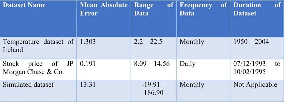
40 Table 3: Mean absolute error for each of the tests.
Dataset Name Mean Absolute Error
Range of Data
Frequency of Data
Duration of Dataset
Temperature dataset of Ireland
1.303 2.2 – 22.5 Monthly 1950 – 2004
Stock price of JP Morgan Chase & Co.
0.191 8.09 – 14.56 Daily 07/12/1993 to 10/02/1995 Simulated dataset 13.31 -19.91 –
186.90
Monthly Not Applicable
5.4 Performance Measurement with Data Visualization
Visualization is a critical segment of this study. It provides important information about the structural patterns and changes in the data with respect to the fitted model. As discussed in the “Implementation” chapter, there are two types of visualization that our tool provides the user:
(1) Diagrammatic representation of the data stream and the data points causing pattern change along with the upper and lower 95% confidence interval boundaries.
41 Figure 10 Close up of the line plot of figure 9.
5.5 Performance Measurement–Temperature dataset of Ireland
Usually noticeable pattern changes in temperature can be detected when we compare the present day’s data with temperature of a few decades ago. In our problem statement, we are
Figure 9 Line plot of actual values, predicted values, and 95% confidence interval boundaries of Temperature Data.
42 working with a life data stream scenario and trying to detect changes in data patterns in real-time. Since changes in temperature are observable when we study few decades or hundreds of years of data, it is difficult to detect transition points in real-time. Hence, as expected, the visualization of time series data, detected outliers, but never found any actual transitions. In Figure 9 we can see that the graph shows the upper and lower 95% confidence interval
boundaries in dotted blue, actual values in pink, and predicted values in green. The different line charts in the graph can be understood well in Figure 10 which shows a close up of Figure 9 highlighting the points 1 to 236. We can see that the line plot for the actual values is overlapped by that of the predicted values. This suggests the prediction accuracy of our model is high. As expected, we do not see any pattern changes in the graph. However, Figure 11 does show some rows highlighted in blue i.e. the actual values for those rows are beyond the expected 95% confidence interval boundaries. This denotes that those true values might be outliers. Since consecutive data points do not display the same behavior, we do not observe any transition in the graph.
5.6 Performance Measurement–Stock price of JP Morgan Chase & Co.
Unlike temperature data, stock prices are volatile and their pattern changes more
44
5.7 Performance Measurement–Simulated Dataset
The drawback of testing a time series model with real-world data is that we do not have any knowledge of what to expect. To address this, we simulated a dataset with three different
Figure 12 Line plot of actual values, predicted values, and 95% confidence interval boundaries of Stock Price Data.
45 sets of parameters occurring after every 108th data point. From the “Approach” chapter we know that we must have eight seasonal cycles in a dataset with seasonality. We took 96 data points as the estimation sample size or the rolling window size since 96 monthly data points represents eight years of data with eight full seasonal cycles. If there are two pattern changes in the overall data stream, we can expect the pattern change to occur at approximately the 109th data point or the 13th point after the first estimation window, and at the 218th data point or the 122nd data point after the first estimation window. Since the simulated dataset has been designed with somewhat different structural specifications for each phase, if we plot all the true values of the dataset in a graph, we should detect the pattern changes very easily.
46 Moving forward to the second pattern change, from Figure 14 we observe that the model parameters have changed at the 121st data point and there is no other change in the structure of the time series data following that. However, in Figure 15 we can see that there are two
highlighted points after the first one. One is at the 122nd data point and the next is at the 137-the data point. While our model did detect the pattern change around the 122nd data point
successfully, it also shows a third pattern change shortly after that. Since one of our main goals is to detect changes in the structure of the temporal data series, it may be appropriate if our tool tracks every structure change and the extra highlighted point represents a “mild” pattern change. To confirm this, we need to analyze the extra pattern changing point further to ensure our algorithm’s accuracy. We can do this by referring to the structural details of the data and the corresponding SARIMA model. In the second part of our visualization segment a snapshot of the details of the model’s parameters, along with the structural details regarding the pattern changes, enables us to look at these finer details.
47 Figure 15 Plot of Actual Values and Pattern Changes.
Figure 16 Closer snapshot of the simulated dataset graph.
48 points with the rebuilt model. We can see in Figure 17 that the actual values, though normally within the confidence intervals, are often fairly different from the predicted data in absolute terms. This is happening because the data is a randomly generated, so the assumption of this thesis adjacent points are correlated, is violated. Due to this lack of prediction accuracy, the overall mean absolute error of this dataset becomes as high as 13.31 for data that ranges from -19.91 to 186.9.
Moving forward to the second pattern change, we detected an additional, third pattern change. As expected (Figure 18), the model did detect the pattern change at the 122nd data point. If we refer to the trend and seasonal component details of the data in Table 2, we expected components of (1, 1) and (2, 1), respectively. Though the model detected the pattern change, it did not rebuild itself with the desired structural details. As a result, most of the actual values fell beyond the confidence interval boundaries, causing a model misfit. To fit itself to the data, the
49 model rebuilt itself once again, caused the third pattern change. After the rebuild the model identified the actual trend and seasonal component parameters of (1, 1) and (2, 1).
Figure 18 Snapshot of Structural Details of Second and Third Pattern Changes.
As we have discussed previously, due to the randomness of the input data, the prediction accuracy is low for the simulated dataset. However, Table 3 shows that the algorithm’s
50 CHAPTER 6
6.0 Conclusion
This paper presents a general algorithm, for analyzing structural patterns in a time series data stream and detecting pattern changes in the series in real time. It also proposes visualization approaches for presenting the findings of the algorithm through clear and informative diagrams. The approach operates in a rolling window mode and applies the seasonal ARIMA (SARIMA) algorithm. To optimize time complexity while maintaining high prediction accuracy, our algorithm uses the novel approach of building a time series model with hyperparameter grid search optimization, only when it detects a transition in the data points. Following the successful detection of pattern changes, the findings are visualized in Excel with line charts and a snapshot of information regarding the time series data and its structural details for each data point. To test the accuracy of the algorithm’s transition detection capability, we have executed it with different real and simulated datasets.
6.1 Limitations
We used sarimax in the library of statsmodels.tsa.statespace to execute the algorithm. The major limitation that we encountered while developing the algorithm is that the Python package cannot perform as expectation if the number of seasonal cycles is less than eight when analyzing a seasonal data stream. This limitation prevented us from testing our model with very small data streams.
6.2 Future Work
In our algorithm, we have assumed that a transition or change in pattern occurs when the actual values of three consecutive points fall beyond the expected upper or lower 95%
51 model at the start of the time series data stream and rebuild it only when there is a pattern change in the series. However, it should be noted that when we rebuild a model, there are only a certain number of data points from the new pattern in the training data window. Since a majority of the training data still have the structural specifications relevant to the previous time series model, it can decrease the prediction accuracy until the window has enough data points from the new pattern. If the randomness in the data stream is high, frequent pattern changes might occur over a short interval. For example, if a transition occurs and stays for two to three data points and then reverts back to its previous form, the model will be rebuilt two times unnecessarily. It should be studied further when it is appropriate to refit the model after a transition occurs. In addition to this, we also plan to further research the optimal number of new data points needed in the training window before a time series model is rebuilt.
52 REFERENCES
[1] World Meteorological Organization Statement on the State of the Global Climate in 2017 Provisional Release 06.11.2017, 2017.
[2] Ratnadip Adhikari, R.K. Agarwal, An Introductory Study on Time Series Modeling and Forecasting, 2013
[3] Cornell University, Hyperparameter Optimization, 2017. Available Online: http://www.cs.cornell.edu/courses/cs6787/2017fa/Lecture6.pdf
[4] Rob J Hyndman, George Athanasopoulos, Forecasting: principles and practice, Otexts, Ch 7 [5] Yan Jun Puah1, Yuk Feng Huang1, Kuan Chin Chua1 and Teang Shui Lee, River catchment
rainfall series analysis using additive Holt–Winters method, 2016
[6] Rob J Hyndman, George Athanasopoulos, Forecasting: principles and practice, Otexts, Ch 8 [7] Rob J Hyndman, George Athanasopoulos, Forecasting: principles and practice, Otexts, Ch
8.1
[8] Rob J Hyndman, George Athanasopoulos, Forecasting: principles and practice, Otexts, Ch 8.3
[9] Rob J Hyndman, George Athanasopoulos, Forecasting: principles and practice, Otexts, Ch 8.5
[10] Cejun Liu, Chou-Lin Chen, Time Series Analysis and Forecast of Annual Crash Fatalities, 2004
[11] Gurudeo Anand Tularam, and Tareq Saeed, The Use Of Exponential Smoothing (ES), Holts And Winter(HW) and ARIMA Models In Oil Price Analysis, 2016
[12] Henry Brighton, Gerd Gigerenzer, The bias bias, Journal of Business Research 68, 2015 [13] Rob J Hyndman, George Athanasopoulos, Forecasting: principles and practice, Otexts, Ch
8.9
[14] Mohammad Valipour, Long-term runoff study using SARIMA and ARIMA models in the United States, Royal Meteorological Society, 2015
[15] Rob J. Hyndman and Andrey V. Kostenko, Minimum Sample Size Requirements for Seasonal Forecasting Models, p. 13-14

![Figure 3 Extensions to tubular visualization: Rings to help user evaluate time and duration of events (a); Optional time axis with labels that represent the time steps (b) [17]](https://thumb-us.123doks.com/thumbv2/123dok_us/1762238.1226557/26.612.79.529.307.480/figure-extensions-tubular-visualization-evaluate-duration-optional-represent.webp)