Munich Personal RePEc Archive
Exploring the EMEP Input-Output
model of air pollution
Halkos, George and Barmpoudaki, Kyriaki and Voulagkas,
George and Tsilika, Kyriaki
Department of Economics, University of Thessaly
November 2018
Exploring the EMEP Input-Output
model of air pollution
George Halkos, Kyriaki Barmpoudaki, George Voulagkas & Kyriaki Tsilika
Laboratory of Operations Research, Department of Economics, University of Thessaly
Abstract
The primary objective of this paper is the structural analysis of source-receptor air pollution problems in the EU region. Two views are provided for the analysis: an emission-driven view and a deposition-driven view. Different visual schemes are used to reproduce the global pollution network and identify the biggest sources and sinks of pollution. Visual modelling helps to understand the linkages and interconnections in the transboundary pollution network. Our interactive outputs give the options to zoom in to specific areas of the global source-receptor air pollution scheme and highlight the top emitters or receptors of pollution. Ranking of countries in decreasing order of pollution responsibility and/or vulnerability using graph metrics is a main result. Data sources are emissions-depositions (or source-receptor) tables of air pollutants, available online from the data repository of the European Monitoring and Evaluation Program (EMEP) of the Long-Range Transmission of Air Pollutants in Europe. In our computer-based visual analysis, we employ solely open software.
Keywords: source-receptor air pollution; network analysis; heatmaps; free open-source software.
JEL Classification: C63; C88; Q53; Q58.
1. Introduction
The awareness of the pollution responsibility and the pollution dispersion is
the first step to combat damage and social costs associated with air pollution (Halkos
1992; 1993; 1994; 1996; Hutton and Halkos 1995, Anaman and Looi, 2000; Halkos
and Tsilika, 2014; 2017; Fujii and Managi 2016; Halkos et al., 2018; Halkos and
Papageorgiou 2016). In this paper, we introduce a visual framework that explores
linkages and interdependencies in source-receptor (hereafter SR) air pollution. The
calculation of pollution indicators and ratios along with the visualization of the
source-receptor air pollution scheme are sine qua non conditions to estimate the
environmental impact of major polluters and their severe consequences. These tasks
are integrated in network analysis software Gephi (v. 0.9.2) and in several free visual
interfaces. The computer input consists of yearly country-to-country source-receptor
(SR) pollution data over the extended EU area, as reported in the source-receptor
tabular information in the EMEP/MSC-W website. The main contributions of this
paper are:
• A computer-based design and analysis of transboundary air pollution networks and
• Mapping the pollution interactions among countries of the EMEP extended domain
In the first part of the paper, we build graph models of pollutants exchange. By
employing graph measures and metrics, pollution indicators are estimated in order to
quantify 1) the responsibility of polluters and 2) the degree of exposure for pollution
victims, in annual basis. Ranking of countries in decreasing order of pollution
responsibility and /or vulnerability is a main result of network analysis.
We aspire to illustrate the relevance of our results with respect to policy
making and potential economic consequences. Our computational approach provides
awareness in an eco-framework, in order to set the directions for pollution control
policies. Moreover, policies that reduce the associated social costs, damage costs,
climate change costs.
This paper is organized as follows. Section 2 briefly presents the software and
the data overview. The visualization tasks are described in section 3 followed by a
detailed discussion of our structural analysis of transboundary pollution data in
Section 4. Section 5 concludes the paper.
2. Software and data availability
Gephi is a cross-platform application, as it is developed in Java (Bastian et
al., 2009). It is successfully tested on many different architecture, OS and graphical
configuration. Gephi requires Java version 7 and later (https://gephi.org/). Gephi can
import several standard file formats of data files (among them CSV and spreadsheets).
Data sources are emissions-depositions (or source-receptor) tables of air
pollutants (see table 1), available online from the data repository of the European
Monitoring and Evaluation Program (EMEP) of the Long-Range Transmission of Air
Pollutants in Europe. Access to the source-receptor relationships by country of
sulphur and nitrogen, ozone and particulate matter (PM) for period 2004-2016 is
possible through the EMEP database1. The data are generated by source-receptor
calculations, where emissions for each emitter of one or more precursors are reduced
by 15%. For oxidized sulphur, oxidised nitrogen and reduced nitrogen, the results
have been scaled up to represent the entire emission from an emitter. The calculations
are based on a consistent series of model runs, all using the EMEP/MSC-W model
version rv4. The data files are given in a semicolon separated CSV format. Data used
throughout this paper concern 49 land areas from the extended EMEP domain.
3. Visualization Tasks
There are different visualization tasks for SR data analysis, which can be
classified into four categories:
• Pinpoint air pollution emitters and receptors,
• Report the variation of rankings for polluters and pollutees according to 13
different pollutants.
• Compare different regional pollution blocks (e,g, in different geographical zones).
Similarities and differences between different regions are always of great interest.
• Reveal the blame and/or damage of a country to another, in terms of transboundary
air pollution. This is a way of assessing distributional impacts of transboundary air
pollution.
4. Visualization Modules
In the existing literature and the EMEP reports, transboundary air pollution
data are presented in the form of maps, pies and bar charts (EMEP report, 2016). Here
we exploit two popular graphic methods for visualizing high dimensional data:
networks and heatmaps. Other innovative visualizations for air quality data have been
reported in (Orudjevet al., 2016; Qu et al., 2007; Kanemoto et al., 2014; Carslawa et
Table 1: Data Attributes included in SR table, all in the extended EMEP domain
Pollutant / indicator Unit
Deposition of OXS (oxidised sulphur) 100Mg of S Deposition of OXN (oxidised nitrogen) 100Mg of N Deposition of RDN (reduced nitrogen) 100Mg of N PM2.5 Effect of a 15% reduction in PPM emissions ng/m3
PM2.5 Effect of a 15% reduction in SOx emissions ng/m3
PM2.5 Effect of a 15% reduction in NOx emissions ng/m3
PM2.5 Effect of a 15% reduction in NH3 emissions ng/m3 PM2.5 Effect of a 15% reduction in VOC ng/m3
AOT40fuc2. Effect of a 15% reduction in NOx emissions ppb.h
AOT40fuc. Effect of a 15% reduction in VOC emissions ppb.h
SOMO353. Effect of a 15% reduction in NOx emissions ppb.d
SOMO35. Effect of a 15% reduction in VOC emissions ppb.d
4.1 Graph modelling
Our visualization module is based on graph theory. The countries can be
interpreted as nodes and pollution relationships among them as edges in the network,
thus to have the whole system transferred into an Input-Output network, which could
quantify the interdependency among differed countries. The network visualization and
exploration software is good at revealing the underlying structures of associations
between EMEP countries (known also as “link analysis”). It permits the user to
estimate and visualize the degree of responsibility of polluters and create the
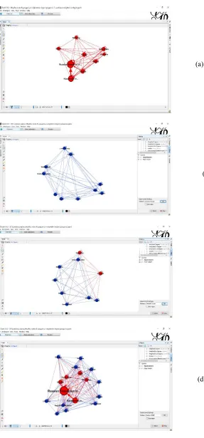
country-to-country blame network (figure 1 a,c). The user can also estimate and visualize the
degree of exposure of pollution victims (figure 1b,d). By considering the strength of
the interrelations, we indicate air pollution hotspots. Outcoming edges represent
emitters’ output and incoming edges represent receptors’ input. The edge weights
used are the levels of pollutants. The weighted degree and the weighted in- and
out-degree (Barrat et al., 2004; Newman, 2001; Opsahl et al., 2010; Jiang et al., 2019) is
calculated to investigate the structure of the network. Countries responsibility for
pollution is measured by weighted-out degree of each node. Countries exposure in
2 Accumulated amount of ozone over the threshold value of 40 ppb
pollution is measured by weighted-in degree of the pollution network. The possibility
to rank countries in order of increasing responsibility (in terms of their weighted-out
degree) or vulnerability (in terms of their weighted-in degree) to air pollution is
always an option (figures 5-6).
Gephi provides an interface for filtering nodes and edges (Heymann, 2015).
The degree filter matches nodes with a degree that falls within the given minimum
and maximum values, inclusive. A user can choose whether the filter operates on the
in-degree, out-degree or overall (in + out) degree (see indicatively figure 2).
Narrowing filters are applied to the entire network (figure 3b), and are used to select a
subset of nodes or edges in a network based on user-specified constraints (figure
4a-f). Filtering options in figure 4 bring out the distribution of the top 9 pollutees per
[image:7.595.88.511.418.709.2]geographical zone.
Figure 1: Country-to-country pollution network(pollutant: AOT40NMVOC, 2013)
(a) Size of node, name and color intensity
is analogous to emitters’ responsibility (b) Size of node, name and color intensity is analogous to receptors’ exposure
Figure 2: Filtered pollution network (pollutant: SOx, 2013, metric: weighted-out degree). Size of node and name is analogous to polluters’ responsibility
(a) Pollution interactions among top 9 polluters in
the global pollution network exposure of top 9 polluters. Numbers denote (b) Self-loops are used to depict pollution oxidised sulphur depositions in 100 Mg of S
Figure 3: Gephi options to make the global pollution network more manageable. Size of node and names is analogous to pollutees’ SOx exposure.
(a) Focusing on a certain area of the global source-receptor SOx pollution
scheme
(b) Filtering the SOx pollution network: selecting edges with weight≥300 (units:
100 Mg of S) with Edge Interaction Transformer
[image:8.595.93.497.298.654.2]Figure 4: Disconnecting the global pollution network. Size of node and name is analogous to pollutees’ SOx exposure for 2013
(a) top 9 pollutees in red
(b) Western Europe
(c) Central Europe
[image:9.595.120.407.105.720.2](e) Northern Europe
[image:10.595.112.482.71.385.2](f) Southeastern Europe network
Figure 6: Ranking polluters and pollutants of the extended EMEP area (metric: weighted-out degree). Alluvial diagram was obtained using RAWGraphs (Mauri et al., 2017)
5. Conclusions
This paper mainly focuses on how countries interact within the SR
pollution scheme and how the pollution providers spread their pollution. EMEP data
are adopted to establish inter-country input–output tables and create graph models and
tabular representations. The SR transboundary air pollution system for any pollutant
are so interconnected that the polluters affect almost all countries. The SR tables are
presented in a way to indicate the major pollution effects in the global pollution
tabular scheme. For central planners, graph modelling could be a tool for
policymaking. For governments and regional planners, ranking lists provide concise
[image:11.595.181.450.116.376.2]References
Anaman, K.A. & Looi, N.C. (2000). Economic Impact of Haze-Related Air Pollution on the Tourism Industry in Brunei Darussalam. Economic Analysis and Policy, 30(2), 133-143.
Barrat A., Barthélémy M., Pastor-Satorras R. and Vespignani A. (2004). The architecture of complex weighted networks. Proceedings of the National Academy of Sciences, 101 (11): 3747–3752.
Bastian M., Heymann S., Jacomy M. (2009). Gephi: an open source software for exploring and manipulating networks. International AAAI Conference on Weblogs and Social Media.
Carslawa D. C. and Ropkins K. (2012). Openair - An R package for air quality data analysis. Environmental Modelling & Software, 27-28: 52-61.
EMEP Status Report 1/2016. Transboundary particulate matter, photo-oxidants, acidifying and eutrophying components. METEOROLOGISK INSTITUTT Norwegian Meteorological Institute. Available at:
http://emep.int/publ/reports/2016/EMEP_Status_Report_1_2016.pdf
Fujii H. and Managi S. (2016). Economic development and multiple air pollutant emissions from the industrial sector. Environmental Science and Pollution Research, 23 (3): 2802–2812.
Halkos G. (1992). Economic perspectives of the acid rain problem in Europe. Dissertation, University of York.
Halkos G. (1993). Sulfur abatement policy: Implications of cost differentials. Energy Policy, 21(10): 1035-1043.
Halkos G. (1994). Optimal abatement of sulfur emissions in Europe. Environmental and Resource Economics, 4(2): 127-150.
Halkos G. (1996). Incomplete information in the acid rain game. Empirica 23(2): 129-148.
Halkos G., Managi S., and Tsilika K. (2018). Measuring Air Polluters' Responsibility in Transboundary Pollution Networks. Environmental Economics and Policy Studies, 20(3): 619-639.
Halkos G. Papageorgiou G. (2016). Spatial environmental efficiency indicators in regional waste generation: A nonparametric approach. Journal of Environmental Planning and Management 59(1): 62-78.
Halkos G. and Tsilika K. (2014). Analyzing and visualizing the synergistic impact mechanisms of climate change related costs. Applied Mathematics and Computation, 246: 586-596.
Halkos G. and Tsilika K. (2017). Climate change effects and their interactions: An analysis aiming at policy implications. Economic Analysis and Policy, 53: 140-146.
Heymann S. (2015). Gephi. GitHub repository. https://github.com/gephi/gephi/ wiki/Filter
Jiang M., Gao X., Guan Q., Hao X., An F., (2019). The structural roles of sectors and their contributions to global carbon emissions: A complex network perspective.
Journal of Cleaner Production, 208, 426-435.
Kanemoto K., Moran D., Lenzen M. and Geschke A. (2014). International trade undermines national emission reduction targets: New evidence from air pollution. Global Environmental Change, 24: 52–59.
Mauri, M., Elli, T., Caviglia, G., Uboldi, G., & Azzi, M. (2017). RAWGraphs: A Visualisation Platform to Create Open Outputs. In Proceedings of CHItaly '17, Cagliari, Italy, September 2017 (CHItaly '17), 5 pages. DOI:
https://doi.org/10.1145/3125571.3125585
Newman M. E. J. (2001). Scientific collaboration networks. II. Shortest paths, weighted networks, and centrality. Physical Review E, 64 (1): 1-7.
Opsahl T., Agneessens F. and Skvoretz J. (2010). Node centrality in weighted networks: Generalizing degree and shortest paths. Social Networks, 32 (3): 245-251.
Orudjev N.Y., Lempert M.B., Osaulenko I., Salnikova N.A., Kuzmichev A.A. and Kravets A.G. (2016). Computer-Based visual analysis of ecology influence on human mental health, 7th International Conference on Information, Intelligence, Systems & Applications (IISA), Chalkidiki, pp. 1-6.
Qu H., Chan W.Y., Xu A., Chung K.L., Lau K.H. and Guo P. (2007). Visual analysis of the air pollution problem in Hong Kong. IEEE Transactions on Visualization and Computer Graphics, 13(6): 1408-15.
Tableau. (2014). Visual Analysis Best Practices. Tableau Software, 41.