“Patrick has a lucid and elegant style of writing which allows him to present information in a way that is organized, focused and easy to apply.”
Professional Marketing magazine
We all know the feeling of attending a lack-lustre, dreary and formulaic presentation where dense lumps of text are read verbatim from the screen. They are tedious to sit through and it is unsurprising that the phrase “death by PowerPoint” has entered the language. But it need not be that way. With a little time and effort you can add power to your presentations and do so simply.
The PowerPoint Detox is a straightforward, practical guide designed to appeal to anyone who needs to use PowerPoint – from new presenters and those with some experience, to those who have had training or those who have not. It will help you to prepare and use slides that will:
• fit with your message and support it;
• add power to your presenting style;
• enhance your presentation with a visual element;
• make your message memorable and assist retention;
• add style and professionalism.
With sample slides and plenty of examples reproduced in PowerPoint style, The PowerPoint Detox is a clear how-to book providing practical guidance on how to create winning presentations that people will want to listen to and act on.
Patrick Forsythruns Touchstone Training & Consultancy, which advises on marketing, management and communications skills. An established author, he has written many successful business books including Successful Time Management, How to Motivate People and How to Write Reports and Proposals (all part of the Creating Success series published by Kogan Page).
Kogan Page
120 Pentonville Road London N1 9JN United Kingdom www.koganpage.com
Kogan Page US
525 South 4th Street, #241 Philadelphia PA 19147
USA 9 7 8 0 7 4 9 4 5 5 1 1 8
£12.99 US $24.95
Business and management
ISBN: 978-0-7494-5511-8
PowerPoint
Detox
Reinvent your slides
and
add
power to
PowerPoint
Detox
THE
London and Philadelphia
PowerPoint
Detox
Reinvent your slides and
add power to your presentation
Patrick Forsyth
Publisher’s note
Every possible effort has been made to ensure that the information contained in this book is accu-rate at the time of going to press, and the publishers and author cannot accept responsibility for any errors or omissions, however caused. No responsibility for loss or damage occasioned to any person acting, or refraining from action, as a result of the material in this publication can be accepted by the editor, the publisher or the author.
First published in Great Britain and the United States in 2009 by Kogan Page Limited
Apart from any fair dealing for the purposes of research or private study, or criticism or review, as permitted under the Copyright, Designs and Patents Act 1988, this publication may only be repro-duced, stored or transmitted, in any form or by any means, with the prior permission in writing of the publishers, or in the case of reprographic reproduction in accordance with the terms and licences issued by the CLA. Enquiries concerning reproduction outside these terms should be sent to the publishers at the undermentioned addresses:
120 Pentonville Road 525 South 4th Street, #241
London N1 9JN Philadelphia PA 19147
United Kingdom USA
www.koganpage.com
© Patrick Forsyth, 2009
The right of Patrick Forsyth to be identified as the author of this work has been asserted by him in accordance with the Copyright, Designs and Patents Act 1988.
ISBN 978 0 7494 5511 8
Microsoft and PowerPoint are registered trademarks of Microsoft Corporation in the United States and/or other countries.
British Library Cataloguing-in-Publication Data
A CIP record for this book is available from the British Library.
Library of Congress Cataloging-in-Publication Data Forsyth, Patrick.
The PowerPoint detox : reinvent your slides and add power to your presentation / Patrick Forsyth.
p. cm.
Includes bibliographical references. ISBN 978-0-7494-5511-8
1. Microsoft PowerPoint (Computer file) 2. Business presentations. I. Title. P93.53.M534F67 2009
658.4’52028553—dc22
2008042681
Typeset by Saxon Graphics Ltd, Derby
Contents
Author’s note vii
Preface ix
1. Introduction: stand up comic 1
Automatic pilot 3; Time for change 4; Fundamental rules 9
2. How human nature affects communication 15
Inherent problems 16; Aids to effective
communication 22; Positioning your communication 27; Projecting the right impression 29
3. Presentations: the slide/speaker duo 33
Preparation: a few moments’ thought 36; A key question 36; Deciding the message 38; Putting it together 39; Speaker’s notes 44; On your feet 54; Anything and everything 55
5. Best practice 71
Title slides 72; Ice-breaker slides 73; Checklist slides 75; Diagrammatic slides 77; Graph slides 81; Dealing with greater complexity 82; Pictures, photos and cartoons 87; ‘Flipchart’ slides 93; Being persuasive 95; Linking a message to a photograph 97; Sophistication unlimited 99; A final idea 102
Afterword 105
Appendix: Presenting successfully: the business
Author’s note
Seeing is believing
— Traditional proverb
This book is intended to do two things to help you maximize the effectiveness of your presentations. The first is to focus on the best use of visual aids used in presentations (primarily business presenta-tions), and specifically on the use of the Microsoft Office PowerPoint slides that are now so much a part of presenting. This is not a techni-cal computer guide to physitechni-cally using PowerPoint, but a guide to the creation and deployment of the right kind of slide material. Specifically it offers advice and ideas that are realistic for the busy executive or manager. Though very sophisticated things are possible with PowerPoint (see page 99), everything suggested here can be implemented simply and quickly without the cost of elaborate graphic design.
Secondly, rather than assume that readers understand the broad prin-ciples of how to deliver a good presentation, one that is clear, informs and does so in an interesting, perhaps memorable way, a summary of the key personal skills of presenting are given in the Appendix.
book after that. Equally you can leave the Appendix until the end and start from the beginning.
The slides shown in the book are, of necessity, in black and white, so some imagination is required, although the principles of using colour are referred to in context.
Key points affecting the use of visual aids in general, and PowerPoint slides in particular, are summarized in boxes called ‘Never forget’.
Making a presentation is always an exposed position to be in. But it is also an opportunity and should always be regarded as such. It is worth getting it right. You have to work at making it good and take advantage of every approach that will help you do so; making the best use of visual aids is very much part of this and can help you maximize your effectiveness.
Preface
The old thinking is not constructive enough. We need new thinking.
— Edward De Bono
Presentations matter. There can be a great deal hanging on them and rarely, if one fails to work, do you get a second chance. A poor presen-tation can blight a plan, a proposal, a repupresen-tation – even a career. But making a good one is not easy, as a quotation from Sir George Jessel makes clear: ‘The human brain is a wonderful thing. It starts working the moment you are born and never stops until you stand up to speak in public.’ If you identify with this all too readily, your fears and expe-rience will only be made worse if you make a presentation without understanding what makes it work, without adequate preparation or founded only on some irrational belief that you can wing it.
The presenter’s nightmare
If you stand up totally unprepared, then oh dear, things can go wrong. People stumble, hesitate and sweat. They begin every other sentence with the superfluous word ‘basically’. Asked to comment on some project, they say: ‘Um, er… at this moment in time we are making considerable progress with the necessary administrative preliminary work prior to the establishment of the initial first phase of work’ when they mean, ‘We aim to start soon.’ Just when they should be impressing their audience with their expertise and confidence, and making them interested in what they have to say, they upset or confuse them. Exactly what is said and how it is put matters, indeed there may be a great deal hanging on it. As Bob Hope used to say of his early performances, ‘If the audience liked you, they didn’t applaud, they let you live.’
At worst, some people go on too long, their explanation explains nothing and where they are going is wholly unclear. Some fidget endlessly whilst others remain stock still gripping the table or lectern in front of them until their knuckles go white and their fear rises from them like a mist. Others are apt to pick holes in people in the audi-ence, or their noses. If they use slides, then these can only be read from the rear of the room with a telescope, a fact made worse by their asking brightly, ‘Can you see all right at the back?’ despite the fact that there is precious little they can do about it if the answer is ‘no’, and in any case they should not be asking this question, they should know their slides are clearly legible. They barely pause for breath, as they rush from one word to the next. Many of these words are inap-propriately chosen and as many are too long. Indeed, the only rele-vant word of which some speakers appear to be wholly ignorant is ‘rehearsal’.
Winging it means that if the presenter wants people to actually under-stand even the gist of what is said, some care must be taken. So they talk v-e-r-y s-l-o-w-l-y; use simple words, and generally proceed on the basis that the audience have the brains of a retarded dormouse. They spell out complicated bits in CAPITAL LETTERS, speaking more loudly as they do so. However, they are always careful not to be condescending, as that will upset people (you do know what conde-scending meansdon’t you?).
For this kind of presenter, being on their feet is something to be savoured. They need only the briefest of introductions and they are away, moving quickly past the first slide without noticing that it is number 12, the coins in their trouser pocket rattling at 90 decibels and the audience hanging on their every repetitive mannerism as they mutter to themselves, ‘If he scratches his backside while standing on one leg again, I’m walking out.’ It makes lesser mortals feel all too sadly inadequate – even the famous: Mark Twain said, ‘It usually takes me more than three weeks to prepare a good impromptu speech.’ Poor man; just as well he was a good writer.
However, even presenters convinced of their own abilities, however erroneously they hold that view, should not hog all the opportunities for themselves just because they are fun. They should give others a chance. Next time someone asks, ‘Will you make the presentation?’ they may hand over the task to whoever displays the least enthusiasm (maybe to you?). It will do them good they think; and they may feel that there is nothing like inflicting sheer terror on a friend or colleague to make them feel superior.
poor speaker is likely to magically acquire the requisite skills instan-taneously in the few seconds between being introduced, rising to their feet to speak and clicking on the mouse.
So, if you are not in fact a natural, and few people are, you need to give it some thought before you get to your feet; once you are actually in the lion’s den it is a little late to discover that salvation is not guar-anteed by saying, ‘Nice pussycat.’
Maybe you should turn to the Appendix now. But wait a moment. Perhaps salvation is at hand. There is something available to turn the uncertainties of presenting into a walk in the park. Structure what you do around some slides – and for most of us that means some of the now ubiquitous PowerPoint slides – and surely all will be well?
Maybe.
Most would readily accept that visual aids:
ᔡ make understanding easier;
ᔡ save time, for instance reducing the need for lengthy explanation;
ᔡ improve retention (we retain more of what involves more than one sense);
ᔡ create variety (more than just talk) and thus vary pace – which in turn increases attentiveness;
ᔡ act as signposts, indicating what point has been reached within the structure of a presentation.
The audience’s nightmare
Imagine: the presenter who must be listened to stands at the front of the room, surrounded by equipment and with the screen glowing behind them. The audience is spellbound. The little company logo at the corner of the screen fascinates them. Every time the presenter clicks the computer mouse, and sends another yellow bullet point shuttling onto the screen from stage left, their attention veritably soars. One slide replaces another, then another replaces that and then another in a bonanza of bullet points… but you get the idea.
Enough.
Too often all of the slides are bland, all are simple checklists, yet the presenter who must be listened to finds them riveting; certainly they spend most of their time looking over their shoulder at the screen rather than at the audience. There is so much text on some slides that they are like pages out of a book. And an unsuitably small typeface compounds the effect and overburdens the minds of the audience. So the presenter aims to improve this by reading from them, verbatim, more slowly than the audience does and with a tone that leads one to suspect that the presenter is seeing them for the first time. It becomes akin to a bureau-cratic rain dance: a mantra and format is slavishly, indeed unthinkingly, followed – yet at the end no one is truly satisfied. Any opportunity that might have existed is at best diluted, at worst missed. Both presenter and audience have suffered ‘death by PowerPoint’.
A core element of this is when a presenter says:
ᔡ Look at this bullet point.
ᔡ And at this one.
ᔡ Now – here’s another.
ᔡ One more will make the point.
ᔡ Another will make it again.
ᔡ And now, just one more.
ᔡ Look at this interesting bullet point just going up on the screen now to illustrate what I’m saying (or rather to duplicate what I say because what I am actually doing is reading it to you as I …).
Sometimes such sentences fill the entire screen. Enough. If only good business presentations were that easy, so mechanistic: put up one slide, read its text out loud – repeat, and success follows automati-cally. But they are not.
Large numbers of lacklustre, wordy slides do not a good presentation make. Certainly they do not make a distinctive or memorable one. But then perhaps, honestly assessed, the kind of presenter caricatured above does not really believe they do. The slides are there – be honest – because that is how presentations are prepared. A ubiquitous norm is followed largely unthinkingly, and the results fail to sparkle (at worst the ‘death by PowerPoint’ phrase is well deserved). Indeed they may fail to explain, inform and certainly to persuade.
1
Introduction: stand up comic
From what has been said so far, let’s now draw two immediate conclu-sions. First, whatever is put on a slide will, for a moment at least, draw people’s attention. A group must be allowed to take things in without the distraction of having to look and listen at the same time. As Ralph Richardson said, ‘The most precious things in speech are pauses.’ It’s a good point.
Never forget: every time a slide is displayed the
presenter should pause – stop talking – while the audience’s attention is on the screen and allow their immediate interest to be exercised.
Such a pause may only need to be for a few seconds, or it could need to be longer and preceded by a comment, ‘When you see the next slide, look particularly at…’, but it should always happen. Secondly, remem-ber that slides are not essays or reports; they are essentially brief – at least initially they can be added to and grow as people watch, but we will come to that later.
Never forget: slides should be clear, simple and any words on them kept to a minimum.
If this thought was being put on a slide it might say:
‘Words on slides should be kept to as few in number as possible, and your writing style must ensure this is so.’
By writing ‘tight’ as it is called, we can reduce these to say:
‘Use as few words as possible and write only the essentials.’
But maybe a slide only needs to say:
‘Write tight. Use few words.’
Perhaps we could lose ‘Use’, or make it one line – ‘Writing tight = minimizing words and maximizing impact’ or settle for ‘Write tight’ alone.
‘Write tight!’
Adding something visual (using a block of text in the background with the archetypal red pen through it, perhaps) will help. There is no sole right way of writing anything of course, but the principle of limit-ing words on slides is fundamental to maklimit-ing them work. A final point before leaving this topic: be careful about spelling and language. For example, this sentence contains an error, its not so important, at least in terms of understanding, but mistakes are often read by an audience as evidence of an unprofessional approach. You spotted the mistake? The word ‘its’ should have been ‘it’s’. A small thing maybe, although the incorrect use of apostrophes is something anyone concerned with language will notice. But it’s is not small on screen. Your every error is up there perhaps two feet wide.
‘It’s so obvious!’
Be warned. And be careful, spell check slides and/or get someone else to take a look at them.
Automatic pilot
Maybe I was exaggerating as I described presenting in the Preface; maybe not. The fact is that for many presenters, good and not so good, the automatic response to finding that they have a presentation to make is to turn to the computer, click on PowerPoint and start to originate some slides.
presenta-tion is prepared and based it on a battery of slides. The absurdity of it only dawned on them minutes before the presentation was due to start. When they asked where the electric point was so that they could plug in their equipment, they were told, ‘You do realize most of the committee won’t be able to see your slides, don’t you?’ They did – then. But it was too late, and struggling to make a presentation designed around slides without using them, they failed to win the business. Make no mistake: if something like that can be overlooked, anything can be overlooked.
Never forget: presentations cannot be prepared
without thought (and, as we will see, that includes thinking about the visual aids).
So, while audiences may put up with this sort of thing, and a compar-ison with the norm of their experience may even be not be so bad, often everyone is aware that something is missing.
Time for change
Such a formulaic approach, screening out any real, individual consid-eration of what is best, is so prevalent and so ill thought-of by those on the receiving end of such presentations that it has become the subject of academic and journalistic comment. And it is the slides used that come in for the greatest criticism.
For instance, in the United States, a well-known and respected academic, Edward R Tufte of Yale, who is a communications expert, has written a strong condemnation of PowerPoint, The Cognitive
Style of PowerPoint (which you can read in full by accessing
www.edwardtufte.com). One fascinating example he uses concerns the Columbia space shuttle disaster. In a slide presentation, which Tufte calls ‘an exercise in misdirection’, a crucial piece of information about the foam section that detached and crippled the craft was
buried in small type several layers down in a busy PowerPoint list. Though danger was actually flagged, the warning was not noticed. The main heading on the slide indicated a positive outcome to tests, saying: ‘Review of Test Data indicates Conservatism for Tile Penetration’. One might criticize the verbose language too, but the point remains – the key information was passed over unnoticed. It was Tufte, I think, who coined the phrase ‘Death by PowerPoint’; certainly the term has entered the language and stuck.
To reinforce any lingering feeling that traditional PowerPoint style and practice are fine, try looking at www.norvig.com/Gettysburg where Peter Norvig has posted a wonderful spoof of Abraham Lincoln’s Gettysburg address:
Four score and seven years ago our fathers brought forth on this continent a new nation, conceived in liberty and dedicated to the proposition that all men are created equal.
Such stirring language and thoughts are reduced to banality by a visual presentation that is not visual, and which uses bullet points such as ‘Met on battlefield (great)’.
In the United Kingdom, a feature by John Naughton in a quality newspaper, the Guardian, addressed the same issue, quoted Tufte’s US article and added its own despairing spin: ‘Power corrupts. PowerPoint obfuscates. Next time you have to give a presentation, leave it at home.’
The reasons such a comment was made are obvious: the prevailing style of PowerPoint-driven presentations, while they are something audiences expect and tolerate, too often fails to satisfy audiences as it should. A good, stylish presenter, with presence and panache, may be able to make up for this – but only in part.
Consider a presentation as a simple hand drawn pie chart (see Figure 1.1).
comes from what you show? Visual aids can create a significant part of the impact, but they do not do – and cannot ever do – the whole job.
Furthermore, as is all too evident in some PowerPoint presentations, the slides can end up taking over, taking up too much of the time and yet still failing to enhance what is said. At worst they can dilute the effectiveness of the speaker and distract from the message they are aiming to put over.
If the presentation as a whole can be visualized in this way, consider what happens if you zoom in on the segment representing visual aids. Imagine two more pie charts, this time showing that part of the pres-entation coming over via the visual aids. Split these into two segments: first, what proportion of the slides has a visual element and what consists of words alone? Secondly, what proportion of what is on the slides will be duplicated exactly by what you say? The latter may include things you will read or get close to a verbatim rendering of.
I have seen presentations where 80 per cent (more sometimes) of everything that is said comes straight off the slides. In such circum-stances an audience might be forgiven for wondering, ‘what is the presenter for?’
You
Visual aids
Never forget: slides should support the presentation and not lead it.
Slides have many things to do. They can:
ᔡ provide an element of repetition (a key to learning and retention);
ᔡ enhance a point, adding explanation and emphasis;
Slides displaying different information
Slides duplicated by words
Figure 1.3 What is shown and what is said Visual
slides
Word slides
Figure 1.2 The visual and verbal elements of a presentation
ᔡ visualize something (literally painting a picture);
ᔡ aid retention of a message;
ᔡ help add structure and keep track of a developing, and perhaps complex, message;
ᔡ change pace;
ᔡ focus and direct audience attention;
ᔡ add humour.
One slide may do a good deal of this. A series of slides can do it all. However, they should not distract. There are moments when what a presenter is saying is the most important thing and the audience focus should be on that and that alone. It follows therefore that even when slides are an important part of a presentation they should not be domi-nating or even seen all the time. Yet how often do you (as presenter) switch on the projector at the beginning of a presentation and simply leave it on, with a slide on screen, until the end? Be honest. Think too of how far you get beyond one slide, in terms of topic and talk, before you get to another and bring that up on screen. It is not uncommon for people to talk for 10 minutes or more with the slide on the screen behind them having ceased to have anything to do with what is being said after the first few moments following its appearance.
This leads us to an important rule.
Never forget: only allow a slide to be seen while it is
relevant to and fits with what is being said. Do not allow slides to show throughout the duration of a presentation.
How do you do this? It’s easy (yet with groups I meet on training courses I am amazed how many people do not know this). You press
the B key on the computer. B = Blank. The screen goes dark and will return to exactly the same place in your presentation when you press the same key again.
Making this change alone, rather than having a slide on all the time, will improve many a presentation and allow those elements of what you need to say to shine through and be put over to maximum effect. Try it; not least you will see how it moves the audience’s attention. Switch on and eyes, and attention, go to the screen. Switch off and they focus on the presenter; for a while at least. An alternative, if you really must have something there, is to have a ‘filler’ slide: that’s some-thing with few or (preferably) no words, but some element of design and colour that is relevant but not distracting. Several copies of this can be inserted into a presentation wherever you need a pause in specific visual images and attention to be solely on you.
So let us be clear. PowerPoint is a wonderful thing (and perhaps it should be acknowledged here that there are other similar systems). But it can present hazards. If it is ill-used, or simply used without sufficient thought – the automatic pilot approach – it can and will damage a presentation; at worst it can render a presentation ineffec-tive and risk a presenter failing in whatever intention they had in making the presentation.
Fundamental rules
It has already been said that you should:
ᔡ never skimp on preparation;
ᔡ view slides as supporting a message, rather than leading it;
ᔡ not have slides showing throughout a presentation (use the B key).
Never forget:do not read verbatim.
Figure 1.4 shows an introductory slide that might be used in introduc-ing a trainintroduc-ing session on the subject of this book. I actually use it, but only as an example of what not to do.
Reading is actually quite difficult (actors who record talking books really earn their money). I discovered this myself recently giving talks to promote a travel book (A Land Like None You Know, a light-hearted account of a journey in Burma) during which I have to read extracts; it is something that takes some getting used to. Gore Vidal, being dismissive of President Eisenhower’s speeches, once said he was ‘reading a speech with his usual sense of discovery’.
Death by PowerPoint: The day’s objectives
N The day is designed to help presenters enhance the
effectiveness of their presentations, by boosting the power of the impact they make with the best use of slides and visual aids. It examines the way an audience thinks and what actively assists their understanding, thus what kind of communication is most likely to have a positive effect on their reception of your message. It looks first at two areas: factors that hinder successful communications and what approaches there are that can help us overcome these inherent obstacles.
Figure 1.4 An introductory slide
Never forget:people read to themselves seven times faster than you can read out loud; if you read you will always lag behind and attention will be compromised as people move between reading (to themselves), listening and waiting for you to catch up.
Things get worse as the text gets more verbose and best described as gobbledygook. So Figure 1.5 is worse than Figure 1.4. Creating gaps when people’s minds are free to wander, because they believe they are ahead of you and do not need to concentrate, just guarantees that your purpose is diluted.
There may be brief exceptions, getting a definition or some numerical point absolutely right perhaps, but otherwise remember what Ben Johnson said: ‘to speak and to speak well are two things’. Consider Figure 1.4 again for a moment. What could you do instead?
You could, for instance, use an illustration. Figure 1.6 shows a good starting point. An image that can be explained as showing how people
Death by PowerPoint: The day’s objectives
N The day is designed to facilitate presenters, allowing them to enhance their presentational communications effectiveness, by boosting the power of the impact they make in the deployment of slides and visual aids. It examines the psychology of audience behavioural interaction and investigates what actively promotes their understanding, thus what characteristics of communication are most likely to upgrade your performance and the reception of your message. It looks first at those factors that hinder successful communication and then it investigates other factors that help in overcoming these obstacles and making clear communication more likely.
Figure 1.5 An introductory slide with much too much text
present different profiles to the world – with the implication then explained that being a good presenter sets you apart, positively, from those who are not. This not just explains something, but is designed to motivate, persuading people that getting themselves into that position is worthwhile.
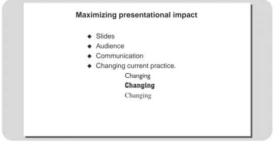
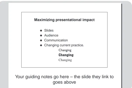
Alternatively, you could highlight key points in a word (or two). Figure 1.7 shows this in checklist style, though these words could be superimposed on the picture, either immediately or by clicking them in as a second stage.
Note: this slide can be effective with or without a heading; or first without and then with one being added.
Back to absolute basics: a typical slide looks like this:
Heading
Text
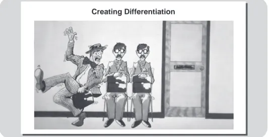
Creating Differentiation
Essentially a slide is in two parts. It may also be backed by a colour or a design. Make sure that the heading is clear and appropriate. Once introduced, and noted by the group, it may be possible to reduce the heading in size on subsequent slides to allow more room for other elements. If you use two headings (one might be the title for a talk and on every slide, the other describing the current topic), ensure that their relationship is clear. Do not let one element overpower others. For example, you might have a logo of some sort on every slide (why? because it’s visual, coloured or there to please the client). If this is the case, it risks distracting on every slide.
The second section of the slide, marked ‘text’ in the box opposite (though it might be something else), can take many forms but must always fit with what the header says. If a picture or chart needs more space to make it clear, then lose the heading for that slide (or reduce its size markedly).
A simple checklist slide, like Figure 1.7, can be enhanced visually by having one word emphasized. The word ‘change’, here could appear in a different style or appear with three or four versions of it moving or fading onto the overall image. There are, of course, a host of ways
Maximizing presentational impact
Slides
Audience
Communication
Changing current practice. Changing
Changing Changing
available in PowerPoint to emphasize a word or other element of a slide – too many to list here. These are useful, but they should not be overused, or regarded as adding sufficient interest to render making a slide better in other ways redundant.
This highlights another principle that should be borne in mind.
Never forget:a slide does not have to make sense until
the presenter adds something by speaking and creating the full message.
Such a slide may hint at something (like the three figures in Figure 1.6), but it does not even need to do that. Sometimes, as we shall see, it makes a better point by not being clear without a spoken caption, as it were. It is then the presenter and slides together that create impact and explanation; each playing a different part in achieving whatever purpose is in train.
One more basic point to end this chapter: most slides have a heading, like the ‘death by PowerPoint’ phrase on Figure 1.4. Such a phrase is useful but the weight of it does not need to be overdone. Certainly when it is repeated (because there are several slides essentially on the same subject) it can be smaller on second and subsequent slides. When it is superseded by another it is good practice to make the heading visibly move/fade in as the slide comes up; the movement will make it more likely that people notice the change.
The intention so far has been to make you think both about general typical prevailing practice, and about what you do currently. For many people what they do with regard to PowerPoint and presenta-tions is, for good or ill, a deeply ingrained habit. You need to see the dangers and the limitations of a pedestrian approach. Then you need to recognize and deploy different ways of using this tool, ways that will be beneficial to the effect you have on your audiences.
2
How human nature affects
communication
Presentations intend to communicate and that may mean doing a variety of things: inform, explain, demonstrate, stimulate, persuade, motivate, prompt, debate or change attitudes… and more. Sometimes several of these intentions are in play in one presentation. Make no mistake: communication can be difficult; and the responsibility for making communication work lies primarily with the communicator. So, no surprise.
Never forget: the responsibility for getting through to
people, for making things clear and ensuring understanding when you present, is simply – yours.
Consider two important rules:
The first rule about communication is: never assume any kind of communication is simple. Most of the time we spend in our offices is
taken up with communicating in one way or another. It is easy to take it for granted. Occasionally we are not as precise as we might be, but never mind, we muddle through and no great harm is done. Except that occasionally it is. Some communication breakdowns become out-and-out derailments. Often, there is much hanging on them, as there usually is with formal presentations. Then communications must be got exactly right and the penalties of not so doing range from minor disgruntlement to, at worst, major disruption to productivity, effi-ciency or quality of work.
The second rule is that everyone needs to take responsibility for their own communication, tackling it in a sufficiently considered manner to make it work effectively; something that must make particular sense for presenters.
To set the scene for everything that follows we shall step back just a little from the detail of presenting and consider certain underlying influences on whether communication works effectively or not, then look at how to get over the difficulties they present. This provides a practical basis for action in terms of presentations and the slides that form a part of them.
If there are difficulties associated with communication, and there surely are, then it is not because other people, work colleagues or whoever, are especially perverse; there are inherent problems caused simply by the way people are – how they tick.
Inherent problems
In communicating, your intentions are clear. It is necessary to make sure that people:
ᔡ hear what you say, and thus listen;
ᔡ understand, and do so accurately;
ᔡ take action in response (although the action may simply be to decide to take note).
Such action could be a whole range of things including agreeing to spend more time on something, attending a meeting or following specific instructions.
Let us consider hearing, understanding, action and feedback in turn.
To ensure people hear/listen (or read)
Here difficulties include the facts that:
ᔡ People cannot or will not concentrate for long periods of time: so this fact must be accommodated by the way we communicate. Long monologues are out; written communication should have plenty of breaks, headings and fresh starts; and two-way conversa-tion must be used to prevent people thinking they are pinned down and have to listen to something interminable.
ᔡ People pay less attention to those elements of a communication that appear to them unimportant. So creating the right emphasis, to ensure that key points are not missed, is a key responsibility of the communicator and something that must be done in every pres-entation.
Never forget:you have to work at making sure you are
heard – you must literally earn a hearing.
To ensure accurate understanding occurs
Difficulties here include the facts that:
ᔡ People make assumptions based on their past experience: so you must make sure you relate to just that. If you wrongly assume
certain experience exists, your message will not make much sense. (Imagine trying to teach someone to drive if they had never sat in a car: ‘Press your foot on the accelerator’ – ‘What’s that?’)
ᔡ Other people’s jargon is often not understood. You need to think very carefully about the amount you use and with whom. Jargon is ‘professional slang’ and it can be a useful shorthand between people in the know, for example in one organization or one indus-try, but it dilutes a message if used inappropriately. For instance, used in a way that assumes a greater familiarity than actually exists it will hinder overall understanding (and remember, people do not like to sound stupid and thus may well be reluctant to say ‘I don’t understand’, something that can apply whatever the reason for a lack of understanding).
ᔡ Things heard but not seen are more easily misunderstood: thus anything that can be shown may be useful and a message that ‘paints a picture’ works best.
ᔡ Assumptions are often drawn before a speaker finishes: the listener is, in fact, saying to themselves ‘I’m sure I can see where this is going’ and their mind reduces its listening concentration, focusing instead on something else; in this case perhaps something outside the presentation entirely. This too needs accommodating and where a point is central to a message, feedback can be sought to ensure that concentration has not faltered and the message really has got through. How is this done? Primarily through asking questions (see box).
A question of questions
you persuade people to action when you do not know how they view the area in which you want them to get involved? How do you motivate if you do not know what is important to people or what worries them? The answer in every such case might be stated as ‘with difficulty’. Questions create involvement, they get people talking and the answers they prompt provide the foundation for much of what makes communication successful. The same applies to presentations.
But questioning is more than just blurting out the first thing that comes to mind – ‘Why do you say that?’ Even a simple phrase may carry overtones, and people wonder whether you are suggesting they should not have said that, or see no relevance for the point made. In addition, many questions can easily be ambiguous. It is all too easy to ask something that, only because it is loosely phrased, prompts an unintended response. Ask, ‘How long will that take?’ and the reply may simply be, ‘Not long’. Ask, ‘Will you finish that before I have to go to the meeting at 11 o’clock?’ and if your purpose was to be able to prepare for the meeting accordingly, then you are much more likely to be able to decide exactly what to do.
Beyond simple clarity you need to consider and use three distinctly different kinds of question:
ᔡ Closed questions: these prompt rapid ‘Yes’ or ‘No’ answers,
and are useful both as a starting point (they can also be made easy to answer to help ease someone into the questioning process) and to gain rapid confirmation of something. Too many closed questions on the other hand create a virtual monologue in which the questioner seems to be doing most of the talking, and this can be annoying or unsatisfying to the other person.
ᔡ Open questions: these are phrased so that they cannot be
talking, they involve them and they like the feel they give to a conversation. By prompting a fuller answer and encouraging people to explain they also produce far more information than closed questions.
ᔡ Probing questions: these are a series of linked questions
designed to pursue a point. Thus a second question that asks ‘What else is important about…?’ or a phrase such as ‘Tell me more about …’ get people to fill out a picture and can produce both more detail and the ‘why’ that lies beyond more superficial answers.
Many a presentation is made to succeed by the simple expedient of starting it with some questions.
A particular form that is relevant to presentations is the rhetorical question. This is a question thrown out, not to prompt an actual answer, but to extend thinking. A presenter who says something such as: ‘How many reasons can you think of for a decline in our sales?’ may then field half a dozen examples, but the group will probably think of more (and the pace and use of slides must allow for this).
To prompt action
You might want to do so despite the facts that:
ᔡ There may be fear of taking action – Will it work? What will people think? What will my colleagues think? What are the conse-quences of it not working out? This risk avoidance is a natural feeling: recognizing this and offering appropriate reassurance is vital.
ᔡ Many people are simply reluctant to make prompt decisions: they may need real help from you, and it is a mistake to assume that laying out an irresistible case and just waiting for the commitment is all there is to it.
To stimulate feedback
The difficulties here are that:
ᔡ Some (all?) people, sometimes deliberately, hide their reaction: some flushing out and reading between the lines may be necessary.
ᔡ Appearances can be deceptive: we all know, for example, that phrases such as ‘trust me’ are as often a warning sign as they are a comment to be welcomed – some care is necessary.
ᔡ Presentations do not allow feedback automatically, though some can be gleaned from the demeanour of the audience; it certainly tells you something if too many fall asleep! Different presentations need different prompts built in to provide feedback, whether by questions allowed at the end or questions thrown out by the presenter during the proceedings.
One point is surely clear. Communication is likely to be better for some planning. This may only be a few seconds thought – the old premise of engaging the brain before the mouth (or writing arm) – although for a presentation a bit more is usually necessary.
Some comments within the last few paragraphs already provide some antidotes to the inherent difficulties, but are there any principles that run parallel and provide mechanisms to balance the difficulty and make matters easier? Luckily the answer is, yes, there are.
Aids to effective communication
Good communication is, in part, a matter of attention to detail. Just using one word instead of another can make a slight difference. Actually, even just using one word instead of another can make a significant difference (as you see!). But certain overall factors are of major influence, and these can be used to condition your communica-tions and relate directly to presentacommunica-tions and the visual aids that form part of them.
The following four factors are key.
The ‘what about me?’ factor
Never forget: whatever you say, bear in mind that people view it in this kind of way; build in the answers and you avert their potential suspicion and make them more likely to want to take the message on board.
This principle may mean additional slides and perhaps also careful consideration of the order in which they are shown: the message must dispel fears and comment on how it affects people before it gets into too much ‘what it is’ detail.
The ‘that’s logical’ factor
The sequence and structure of communication is very important. If people know what it is, understand why it was chosen and believe it will work for them, then they will pay more attention. Conversely, if it is unclear or illogical then they worry about it, and this takes their mind off listening. So for example, a hotelier making a presentation to encourage people to book a meeting to be held at their hotel, might sensibly describe the property and sensibly also do so in the order of what a visitor would experience. Thus they describe drawing up outside, entering reception, being guided through to the meeting room and so on. This clearly influences slides. Agenda slides that spell out how a presentation, or a part of it, is going to be handled also play to this principle.
Information is remembered and used in an order – you only have to try saying your own telephone number as quickly backwards as you do forwards to demonstrate this – so your selection of a sensible order for communication will make sense to people, and again they will warm to the message. Using an appropriate sequence helps gain understanding and makes it easier for people to retain and use infor-mation. As with much of what is said here, this is especially true for a technically orientated or complex message. Incidentally, we remember telephone numbers by what is called ‘chunking’; it’s a useful technique that can be applied to many things – see box.
Chunking
If you want to order additional copies of this book you should telephone 02072780433. But you will not see this number printed like that anywhere else: all telephone numbers are chunked. This one is normally written as 0207 278 0433. It is much more difficult to remember – or even read – a string of 11 undifferentiated numbers than three sets, one of four, one of three, and then one of four again. Even in these days of speed dialling, think how many numbers you know in your head. If you want even small children to remember your mobile number (in case they get lost), you should break it down still more, perhaps linking it to words or a story.
This principle applies to anything that we need to explain, from the chapters in a book, to the size of ‘information unit’ we use when making a presentation. Anything that goes on and on – losing itself in its own complexities – needs to be divided into bite-sized chunks.
Telling people about this is one aspect of what is called ‘signposting’ – flagging in advance either the content or nature of what is coming next. One important form of this is describing a brief agenda for what follows.
Never forget: whatever you have to say, think about what you say first, second, third and so on, and make the order you choose an appropriate sequence for whoever you are communicating with.
Like many aspects of a presentation, the nature of the audience dictates the approach and the kind of slides required.
The ‘I can relate to that’ factor
Imagine a description: it was a wonderful sunset. What does it make you think of? Well – a sunset, you may say. But how do you do this? You recall sunsets you have seen in the past, and what you imagine draws on that memory, conjuring up what is probably a composite based on many memories. Because it is reasonable to assume that you have seen a sunset, and enjoyed the experience, in the past, I can be fairly certain that a brief description will put what I want in your mind.
It is, in fact, almost impossible not to allow related things to come into your mind as you take in a message. (Try it now: and do notthink about a long, cool refreshing drink. See.) This fact about the way the human mind works must be allowed for and used to promote clear understanding.
On the other hand, if you were asked to call to mind, say, the house in which I live and yet I do not describe it to you, then this is impossible; at least unless you have been there or discussed the matter with me previously. All you can do is guess, wildly perhaps – all authors live in a garret – all authors are rich and live in mansions (and here this would be wrong on both counts!).
So, with this factor also inherent to communication, it is useful to try to judge carefully people’s prior experience; or indeed to ask about it if you have not known them for long and you are unsure of their past experience. You may also refer to it with phrases linking what you are
saying to the experience of the other person. For example, say things such as ‘This is like...’, ‘You will remember...’, ‘Do you know so and so?’, ‘This is similar, but…’, which are all designed to help the listener grasp what you are saying more easily and more accurately.
Never forget: beware of getting at cross purposes
because you think someone has a frame of reference for something which they do not; link to their experience and use it to reinforce your message.
The ‘again and again’ factor
Repetition is a fundamental help to grasping a point. Repetition is a fundamental help to... Sorry. It is true, but it does not imply just saying the same thing, in the same words, repeatedly. Repetition takes a number of forms:
ᔡ things repeated in different ways (or at different stages of the same conversation);
ᔡ points made in more than one manner: for example, being spoken and written down;
ᔡ using summaries or checklists to recap key points;
ᔡ reminders over a period of time (maybe varying the method, phone, email or meeting).
Slides are essentially a form of repetition. You hear something and you see something. More than that: at a presentation you may have considerable repetition:
ᔡ an agenda sent in advance makes a general point;
ᔡ the introduction starts from the general (prior to moving to the particular);
ᔡ a point is made (maybe more than once);
ᔡ a slide is shown about it;
ᔡ an example or anecdote is used to illustrate it (maybe with a summary point at the end, or even another slide);
ᔡ a summary mentions the point again (with another slide, perhaps);
ᔡ a handout mentions it in writing (and includes copies of slides used).
This is a fair bit of repetition. It can be overdone of course (perhaps as in the introduction to this point here), but it is also a genuinely valu-able aid to getting the message across, especially when used with the other factors now mentioned.
Never forget: people really are more likely to retain
what they take in more than once, and in different ways.
Enough repetition.
Positioning your communication
So far in this chapter the principles outlined have been general; they can be useful in various kinds of communication, not just presenta-tions. But exactly whom you communicate with is important. Consider staff, reporting to a manager, as a special category. If managers want people to work willingly, happily and efficiently for them one useful approach to any staff communication is to remember not to allow communication style to become too introspective. If managers want to influence staff, they must relate to these people in a way that makes them the important ones. Although a manager speaks for the organiza-tion, staff members do not appreciate an unrelieved catalogue, which focuses predominantly on the manager’s side of things:
ᔡ ‘the organization is...’;
ᔡ ‘we have to make sure…’;
ᔡ ‘I will be able to...’;
ᔡ ‘our service in the technical field is...’;
ᔡ ‘my colleagues in research...’;
ᔡ ‘our organization has...’, and so on.
Any such phrases can be turned round to focus on the people thus – ‘you will find this change gives you...’, ‘you will receive...’, ‘you can expect that…’. A slight mixture is, of course, necessary, but a predom-inantly introspective approach always seems somewhat relentless, especially highlighted up on screen big and bold.
‘I think…’
‘The organization will…’ ‘We must…’
‘This company…’
Projecting the right impression
Having made a point about not sounding too introspective, on the other hand you do need to be concerned about the image you put across, because there is a good deal more to it than simply sounding or appearing pleasant.
Some factors are largely common to all circumstances. You will prob-ably want to include a need to appear:
ᔡ efficient;
ᔡ approachable;
ᔡ knowledgeable (in whatever ways the customer expects);
ᔡ well organized;
ᔡ reliable;
ᔡ consistent;
ᔡ interested in your staff;
ᔡ confident;
ᔡ expert (and able to offer sound advice).
Never forget:projecting the right mix – and balance – of characteristics to create the right image is important to the success of any communication, and particularly to presentations where you are ‘on show’ and people are making judgments.
There is some complexity involved here and it is another aspect of the whole process that deserves some active consideration. Anyone, what-ever their role, can usefully think through the most suitable profile for themselves in this way.
In addition, you must have a clear vision of the kind of way you want to project the organization you represent and the department or func-tion you are in. This is especially important when you are dealing with people with whom you have less regular or detailed contact, those in other departments for instance.
Consider whether you should put over an appearance of:
ᔡ innovation;
ᔡ long experience and substance;
ᔡ technical competence;
ᔡ having a very human face;
ᔡ confidence.
Again you must decide the list that suits you and emphasize your intended characteristics as appropriate to create the total picture that is right for the people you are communicating with. This is often no more than just a slight exaggeration of a characteristic, but can still be important.
In all these cases different levels and types of person will need differ-ent points emphasizing in differdiffer-ent ways. For example, some people may warm to an experienced manager with apparent concern for their staff. If so, then any qualities creating that impression can usefully be stressed. Others may seek more weight, so a style that conveys that makes sense for them, and you will need to project appropriate clout to make it believable.
The use of slides in presenting is an important part of what creates the right profile for the presenter. Poor slides may make presenting awkward and the audience will rate what is being done poorly; even a good presentation with poor slides can be less effective than it might. Both the slides themselves and whether they help the audience matter, so too does the way they are used. A presenter who fumbles slides, forgetting to move to the next at the right moment, flitting over one as if changing their mind about including it, or standing so that people in the group cannot see the screen, is not going to be seen as professional.
Individually, all the factors mentioned in this chapter are straightfor-ward. Any complexity in making communication work comes from the need to concentrate on many things at once; especially with presentations on your feet. Here habit can quickly come to our assis-tance. There is a danger in this too, however. Unless you maintain a conscious overview it is easy to slip into bad habits or, by being unthinking – and making no decision rather than making the wrong decision – allow the fine-tuning that makes for good communication to go by default. Remember just a word or two can make a difference. A complete message delivered in an inadequate manner may cause chaos. A presentation is more difficult to do than just a chat across the desk, the opportunities for it to go wrong are legion.
Conversely, getting it right – and that includes what is said, how it is said and the slides that assist in its being said – can pay dividends.
Never forget:recognize i) the inherent problems which exist and make communication less certain (and do not assume the process is straightforward) and ii) that your communication needs to be actively aimed at getting over (or at least minimizing) these problems and be arranged accordingly.
With presentations, if these principles are not accommodated, even adding the further techniques involved is going to mean that effective-ness will be diluted to such an extent that even the best slides in the world cannot rescue the situation.
3
Presentations: the
slide/speaker duo
The fact that what makes a presentation ultimately work is the total-ity of the speaker and visuals working together has already been mentioned. The relationship between the two is clearly important. So too is the fragile nature of a presentation. Small details matter, and research shows that as much as 70 per cent of what is said at a presen-tation is quickly forgotten. It is gone the following day in fact, and time passing dilutes memory still more (although reference back will reinforce it).
What?
The statistics thrown about by psychologists suggest that people remember approximately:
ᔡ 10 per cent of what they hear;
ᔡ 20 per cent of what they read;
ᔡ 30–40 per cent of what they see;
ᔡ 60–70 per cent of what they see and hear.
This is what your use of PowerPoint must cope with. In unison presenter and the right sort of slides can get over a plethora of information, difficult concepts and details, and make the majority of them stick. The way information is put over must therefore reflect the relative importance of that information.
The details of precisely why this occurs do not matter here; suffice to say that different aspects of the brain are activated by, for example hearing and seeing. Thus the inherent nature of the people attending a presentation means that it is possible to enhance what they take away from it by delivering the message in the right way. In context, the implication is that the core of a message must be clear and must be emphasized to ensure that important core elements are among the parts of the presentation that will be recalled best.
Never forget: the substantial nature of the
communications job you have to do. It is this that necessitates careful preparation and attention to detail throughout the piece if a presentation is truly to work as well as possible.
An element of visualization is essential, particularly if the message is important and complex; without this retention is always less. So slides can enhance your message, but some slides can enhance it more than others. Chapter 4 reviews some things to avoid, either because they do not help or because they actually reduce effectiveness. Chapter 5 looks at ‘best practice’: things that work. In this chapter we focus on overall factors about the amalgam of slide and speech. The starting point is that preparation must be done in a way that creates the right sort of slides in parallel with the right message.
One factor preventing this being done is that slides often have three disparate purposes. Presenters regard them as:
ᔡ what the audience sees;
ᔡ a prompt for themselves as to what to say next;
ᔡ a handout to be given to people afterwards as a summary (this role can be extended if, for some reason, they are regarded as also provid-ing hard copy for people who have not heard the presentation).
The danger is clear. In part because slides are so often the first thing that is prepared, they end up trying to do all these different things and being less than ideally suited for any of them. At worst they become primarily designed to help the presenter, and the needs of the audience are sidelined.
Never forget: slides are first and foremost for the
audience.
In preparing slides this must be the paramount consideration. If, at a later time, they are adapted to fulfil other roles that is fine, and besides, there is no reason why there cannot be two or three different versions of the slides. For example, this might mean that slides are embedded in a longer document to create a handout, a document that
includes additional information. Or it might mean changes being made to certain slides in the handout version to make them more explanatory on their own away from what was said when they were seen on screen. This concept may mean a little more time is taken in preparation, but it need not be too much and is a small price to pay for getting both things right.
Preparation: a few moments’ thought
No one should think that having to prepare implies some sort of weakness. For instance, the ‘born’ public speaker, effortlessly sailing through their presentation, is in fact probably only able to give this impression because they are well prepared. Preparation needs doing. The job is to make sure that it is well done and is also done produc-tively – good preparation should save time overall.
A key question
Whatever kind of presentation you may be contemplating, its purpose must be clear. You must be able to answer the question, ‘Why am I doing this?’ And set out a purpose, one that always needs to involve you and the recipients of your message and which describes what effect you aim to have on them. Remember that communication can have many overall purposes (to inform, motivate and more; described earlier), and that these are not mutually exclusive. The more purposes there are, the more preparation must ensure all will be fulfilled.
Never forget: presentations are rarely, if ever, just
‘about’ something, and approaching one as if it is can mean that you may waffle.
So, in order to avoid an ‘and-another-thing’ type of presenting, objec-tives need to be set and be clear and spelt out in sufficient detail (certainly in your own mind and often for others). They must act as a
genuine guide to what you will do. They also need to reflect not just what you want, but the audience’s view also.
A much-quoted acronym can provide a good guide here: SMART. This stands for:
ᔡ Specific;
ᔡ Measurable;
ᔡ Achievable;
ᔡ Realistic;
ᔡ Timed.
As an example you might regard the objectives linked to your reading of the Appendix, on the core skills of making presentations, as being to:
ᔡ Enable you to ensure your presentations come over in future in a way that audiences will see as appropriate and informative (specific).
ᔡ Ensure (measurable) action takes place afterwards. Here you might link to any appropriate measure: from agreements or actions that group members take or commit to, to the volume of applause received!
ᔡ Be right for you: sufficient, understandable information in manageable form that really allows you to change and improve what you do later (an achievable result).
ᔡ Be realistic, that is desirable – hence a short text (if it took you several days to read the effort might prove greater than any benefit derived from doing so).
Ask yourself whether you are clear in this respect before you even begin to prepare. If you know why the presentation must be made, and what you intend to achieve, you are well on the way to success. Time spent sorting this, and making sure you have a clear vision of what the objectives are, is time well spent. It may only take a few moments, but is still worth doing. Or it may need more thought and take more time. So be it. It is still worth doing, and in any case may well save time on later stages of preparation.
With your purpose clear, and a constant eye, as it were, on the audi-ence, you can begin to assemble your message.
Deciding the message
There is more to this than simply banging down the points in sequence (‘Good morning, ladies and gentlemen’ and onwards), something that was hinted at early on. A more systematic approach is necessary. Indeed a more systematic approach can quickly become a habit of preparing in a way that promptly and certainly enables you to deliver what you want.
The following provides a full description of a tried and tested approach. This describes the fullest degree of preparation necessary, but it is important to stress that this is not offered as something that must be followed slavishly. The important thing is to find, experiment with, and refine and then use, a method that suits you. In addition, practice and experience, or other factors such as familiarity with your chosen topic, may well allow you to adopt a ‘shorthand’ version of these approaches which is quicker, but still does for you the total job that is necessary at this stage.
Never forget: deciding, planning and preparing the
message is not best done by first creating a list of PowerPoint slides.
That said, leave the slides on one side for a moment and consider the approach stage by stage. A four-stage approach helps to sort out what the message is to be; what you need to say in our presentational example (and what you should not say also). Here also we investigate more about how you will put the message across. Both link to the structure involved: what comes first, second and third, and what constitutes the beginning, the middle and the ending.
There is something of the chicken and egg here. Does preparing the message or organizing the structure logically come first? Both are important, both are interrelated. The sequence chosen here works well, and shows the reader how to put a presentation together as it would need to be done in a real-life situation. The details and the sequence can equally apply to something such as writing a report or proposal, and in less elaborate form to much else besides. What follows is the detail of assembling the message.
Putting it together
It is not only necessary to ‘engage the brain before the mouth’, but also vital to think through – in advance – what a presentation must contain; and not contain for that matter. The following process of thinking through and preparation is recommended for its practicality and can be adapted to cope with any sort of presentation, of any length or complexity and of any purpose. Many communications fail or their effectiveness is diluted because preparation is skimped.
Never forget: accepting that preparation takes time
and building this into your daily schedule is the first step to being a good presenter.
In the long run preparation saves time. Remember the premise that while there is never time to do things properly, there always has to be time made available to sort out any mess caused by an inadequate approach.
There are six stages (described primarily by continuing to focus on presentations). The very best way of linking the principles described here to real life is to go through them with some personal project, such as a presentation you must make, in mind and link this to the approach that follows. You could pause here and find a personal example to have by you as you read on.
Stage 1: listing
Forget about everything such as sequence, structure and arrangement. Just concentrate on and list – in a short note (or keyword) form – every significant point that the presentation might usefully contain. Give yourself plenty of space (something larger than the standard A4 sheet is often useful: it lets you see everything at a glance). Set down the points as they occur to you, almost at random across the page. For something simple this might result only in a dozen words, or it might be far more.
You will find that this process is a good thought prompter. It enables you to fill out the picture as one thought leads to another, with the freestyle approach removing the need to pause and try to link points or worry about sequence. With this done (and with some messages it may only take a short time), you have a full picture of the possibilities for the message in front of you and you can move on to Stage 2.
Stage 2: sorting
Now, you can review what you have noted down and begin to bring some order to it, deciding:
ᔡ what comes first, second and so on;
ᔡ what logically links together, and how;
ᔡ what provides evidence, example or illustration to the points.
delete, as well as amending the wording a little if necessary. You need to bear in mind here what kind of duration (or length) is indicated; and what will be acceptable.
This stage can often be completed in a short time by simply annotat-ing and amendannotat-ing the Stage 1 document. Usannotat-ing a second colour makes this quick and easy, as do link lines, arrows and other enhancements of your original jottings.
At the same time you can begin to catch any more detailed element that comes to mind as you go through (including ways of presenting as well as content), noting what it is at more length on the page or alongside.
Stage 3: arranging
Sometimes, at the end of Stage 2, you have a note that is sufficiently clear and from which you can work directly in finalizing matters. If it can benefit from clarification however, it may be worth rewriting it as a neat list; or this could be the stage where you type it and put it on screen if you are working that way and want to be able to print some-thing out in due course.
Final revision is possible as you do this. Certainly you should be left with a list reflecting the content, emphasis, level of detail and so on that you feel is appropriate. You may well find you are pruning a bit to make things more manageable at this stage, rather than searching for more content and additional points to make.
Stage 4: reviewing
Make any final amendments to the list (if this is on screen it is a simple matter) and use this as your final ‘route map’ as preparation continues.
Stage 5: prepare the ‘message’
For a presentation this will be in the form of speaker’s notes (more about these later). Now you can turn your firm intentions about content into something representing not only what will be said, but also how you will put it over.
Never forget: one of the virtues of the procedure
advocated here is that it stops you tryi