COMPREHENSIVE
Excel Tutorial 4
XP XP
Objectives
• Create an embedded chart
• Work with chart titles and legends • Create and format a pie chart
• Work with 3D charts
• Create and format a column chart
XP XP
Objectives
• Create and format a line chart
• Use custom formatting with chart axes • Work with tick marks and scale values • Create and format a combined chart • Insert and format a graphic shape
• Create a chart sheet
XP XP
Creating Charts
• A chart, or graph, is a visual representation of a set of
data
• Select the data source with the range of data you want
to chart
• In the Charts group on the Insert tab, click a chart type,
and then click a chart subtype in the Chart gallery
• In the Location group on the Chart Tools Design tab,
click the Move Chart button to place the chart in a chart sheet or embed it into a worksheet
XP XP
Creating Charts
XP XP
Selecting a Data Source
• The data source is the range that contains the data you want to display in the chart
– Data series – Series name – Series values
– Category values
XP XP
Selecting a Chart Type
XP XP
Selecting a Chart Type
• Click the Insert tab on the Ribbon
• In the Charts group, click the Pie button
XP XP
Moving and Resizing Charts
• By default, a chart is inserted as an embedded
chart, which means the chart is placed in a worksheet next to its data source
• You can also place a chart in a chart sheet
• In the Location group on the Chart Tools Design tab, click the Move Chart button
XP XP
Selecting Chart Elements
XP XP
Choosing a Chart Style and Layout
XP XP
Choosing a Chart Style and Layout
XP XP
Working with the Chart Title and
Legend
• Click the chart title to select it
• Type the chart title, and then press the Enter key • Click the Chart Tools Layout tab on the Ribbon • In the Labels group, click the Legend button, and
then click the desired legend position
XP XP
Working with the Chart Title and
Legend
XP XP
Formatting a Pie Chart
• Click the chart to select it
• In the Labels group on the Chart Tools Layout tab, click the Data Labels button, and then click
More Data Label Options
XP XP
Setting the Pie Slice Colors
• In pie charts with legends, it’s best to make the slice colors as distinct as possible to avoid
confusion
• Click the pie to select the entire data series, and then click the slice you wish to change
• Change the fill color
XP XP
Working with 3D Options
• To increase the 3D effect, you need to rotate the chart
• Click the Chart Tools Layout tab on the Ribbon, and then, in the Background group, click the 3-D Rotation button
XP XP
Creating a Column Chart
• A column chart displays values in different
categories as columns; the height of each column is based on its value
• The bar chart is a column chart turned on its side, so each bar length is based on its value
XP XP
Creating a Column Chart
• Select the range
• Click the Insert tab on the Ribbon
• In the Charts group, click the Column button and then choose the chart subtype
XP XP
Formatting Column Chart Elements
• Click the Chart Tools Layout tab on the Ribbon
XP XP
Formatting the Chart Axes
• Click the Chart Tools Layout tab on the Ribbon
XP XP
Formatting the Chart Axes
XP XP
Formatting Chart Columns
• Click any column in the Sector Weightings chart • In the Current Selection group on the Chart Tools
Layout tab, click Format Selection
XP XP
Formatting Chart Columns
XP XP
Creating a Line Chart
• Select the range
• Click the Insert tab on the Ribbon
• In the Charts group, click the Line button, and then click the Line chart
XP XP
Formatting Date Labels
• Click the Chart Tools Layout tab on the Ribbon
• In the Axes group, click the Axes button, point to
Primary Horizontal Axis, and then click More Primary Horizontal Axis Options
XP XP
Formatting Date Labels
XP XP
Setting Label Units
• In the Axes group on the Chart Tools Layout tab, click the Axes button, point to Primary Vertical Axis, and then click More Primary Vertical Axis Options
• Click the Display units arrow and then make your selection
XP XP
Setting Label Units
XP XP
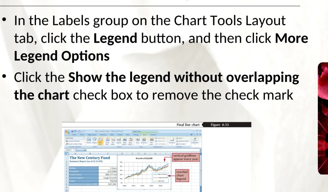
Overlaying a Legend
• In the Labels group on the Chart Tools Layout
tab, click the Legend button, and then click More Legend Options
• Click the Show the legend without overlapping
the chart check box to remove the check mark
XP XP
Adding a Data Series
to an Existing Chart
• Select the chart to which you want to add a data series
• In the Data group on the Chart Tools Design tab, click the Select Data button
• Click the Add button in the Select Data Source dialog box
• Select the range with the series name and series values you want for the new data series
• Click the OK button in each dialog box
XP XP
Adding a Data Series
to an Existing Chart
XP XP
Creating a Combination Chart
• Select a data series in an existing chart that you want to appear as another chart type
• In the Type group on the Chart Tools Design tab, click the Change Chart Type button, and then
click the chart type you want • Click the OK button
XP XP
Creating a Combination Chart
XP XP
Inserting a Shape
• Click the Insert tab on the Ribbon
• In the Illustrations group, click the Shapes button, and then choose the shape you want • Draw the shape in your worksheet
XP XP
Aligning and Grouping Shapes
• Hold down the Shift key and then click each shape to select it
• Click the Drawing Tools Format tab on the Ribbon
• In the Arrange group, click the Align button, and then click your alignment option
• To group several shapes into a single unit, select the shapes, and then click the Group button in the Arrange group on the Drawing Tools Format tab
XP XP