M E T H O D O L O G Y
Open Access
Visualisation of quadratic discriminant analysis
and its application in exploration of microbial
interactions
Sugnet Gardner-Lubbe
1*and Felix S Dube
2* Correspondence: [email protected]
1Department of Statistical Sciences,
University of Cape Town, Rondebosch, 7701 Cape Town, South Africa
Full list of author information is available at the end of the article
Abstract
Background:When comparing diseased and non-diseased patients in order to discriminate between the aspects associated with the specific disease, it is often observed that the diseased patients have more variability than the non-diseased patients. In such cases Quadratic discriminant analysis is required which is based on the estimation of different covariance structures for the different groups. Having different covariance matrices means the Canonical variate transformation cannot be used to obtain a visual representation of the discrimination and group separation.
Results:In this paper an alternative method is proposed: combining the different transformations for the different groups into a single representation of the sample points with classification regions. In order to associate the differences in variables with group discrimination, a biplot is produced which include information on the variables, samples and their relationship.
Keywords:Quadratic discriminant analysis, Canonical variate analysis, Biplots
Background
The biplot is a useful graphical method of exploring relationships in data. As the prefix
‘bi-’suggests, both the samples and variables of a data matrix is represented in a biplot. The simplest form of a biplot is the Principal component analysis (PCA) biplot which optimally represents the variation in a data matrix [1]. By representing the variables on a calibrated axes [2], sample values can be read-off the axes to reveal relationships between samples and variables.
Another popular plot is a Canonical variate analysis (CVA) plot representing the op-timal linear discrimination between samples from different groups, based on the assumption of equal within group variance [3]. By ensuring an aspect ratio of 1:1 is maintained and adding the original variables as calibrated biplot axes, rather than representing the canonical variates which are a mixture of the original variables, a CVA biplot is obtained. The assumption of equal within class variance allows for a sin-gle canonical transformation of all samples in all groups to a sinsin-gle canonical space in which the CVA biplot is constructed.
When different groups of observations have different covariance structures, the ca-nonical transformation is not optimal for group separation. For normally distributed
data, the theoretical equivalent of Linear discriminant analysis (LDA) in the presence of different group covariance matrices is Quadratic discriminant analysis (QDA).
Varying covariance structures is often found when comparing diseased to healthy tients. The variables affected by the disease have certain typical values in healthy pa-tients. When disease sets in, the values change and change in different ways for different patients and to a different extent depending on the severity of the disease. The result is that a lot more variability is observed for the diseased patients. In an effort to understand the effect of the disease, the differences in groups are analysed by dis-criminant analysis. Since the covariance matrices differ, QDA can be used, but a visual representation can shed more light on the exact relationships contributing to the differ-ences between health and disease.
In this paper a QDA biplot is suggested to visually represent the optimal separation based on respiratory pathogens in a cohort of children with suspicion of Pulmonary Tuberculosis (TB) infection. In section 2 the known and established methodology of LDA and Canonical Variate Analysis (CVA) biplots is reviewed. Section 3 deals with QDA and the QDA biplot is introduced in section 4. An example is given in section 5 before, the QDA biplot is applied to the data set of respiratory pathogens in children with TB in section 6.
Linear discriminant analysis
We observe a set ofn samples or observations onpvariables, represented in the data matrix X:n × p which we can assume without loss of generality is centred around the origin so that 1 'X= 0 '. Of these observations,njbelong to classj, with a total ofJ
clas-ses observed and X J
j¼1
nj¼n. The class membership can be represented in a matrix
G:n×Jwithgij= 1 if sampleibelongs to classjand 0 otherwise.
Fisher [4] defined LDA as a transformation that maximises the between class variance relative to the within class variance. This is closely related to CVA and multivariate analysis of variance (MANOVA) where the total variance is decomposed into a between class variance and within class variance part:T=B+W, whereT=X'X,W=X' [I−G (G'G)−1G']X,B=X'G'GX and X= (G'G)−1G'X. Fisher’s transformation to the canonical space is given by the vectors m:p× 1 which successively maximise the ra-tio(m'Bm) / (m'Wm). The vectorsmform the columns of a matrixMwhich defines the transformation to canonical variates U = X M where M is the eigenvector solution to the equation BM=WMΛ subject toM'WM = Iso that M'BM=Λ and
W= (MM')−1.
The CVA biplot is constructed from the first r, usually r= 2, sometimesr = 3, col-umns of M, denoted by Mr and the sample points is given by Z = XMr with class
means Z=XMr. For more detail on the construction of the CVA biplot and fitting the
biplot axes, see Gower and Hand [2] or Gower, Lubbe and le Roux [5].
Note that no assumption on the distribution of the data is made to derive the canon-ical transformation. However, if the data is normally distributed, such that X|G=j~
normal(p,μj,ΣW), the discrimination function derived at based on equal prior
class j, prior to observing the p variables in X, is denoted by πj=P(G=j)s where the
discrete random variableGshould not be confused with the indicator matrixG. It is shown in Appendix A that classification of a sample is to the nearest canonical mean in the CVA biplot when the prior probabilities are equal and for unequal prior probabilities, a quantity of log(πj) is simply added to the distance to the j-th class
mean.
Quadratic discriminant analysis
It is assumed that the samples are random realisations from the underlying probability distributions X|G=j~normal(p,μj, Σj) where the common within class covariance
matrixΣWis now replaced withJcovariance matricesΣj.
Where in LDA a sample is classified to classkwhere
k¼argmax
j
log πj −
1
2ðn−JÞ u−uj
0 u−u
j
it is shown inAppendix Bthat classification of a sample is now to classkwhere
k¼ arg max
j log πj −
1 2 x−xj
0
S−1
p x−xj
þlog Sj
h i
¼ arg max
j log πj −
1 2ϕ
2
jð Þx
Where classification for LDA was in terms of Euclidean distance in the canonical space, (u−uj) ' (u−uj), in QDA the classification function is of a similar structure, but
now in terms of a functionϕ2jð Þ.x
QDA biplot
First a simplified version is considered. Let J = 2 groups and the prior probabilities be equal π1¼π2 ¼12. In LDA an observation x is transformed to the canonical space,
u' =x'Mrand will be classified to class 1 if (u−u1) ' (u−u1) < (u−u2) ' (u−u2) and to
class 2 otherwise. The equivalent QDA classification rule will be: classify to class 1 if
ϕ2 1ð Þx <ϕ
2
2ð Þx . Making two different transformations x→ϕ 2
1ð Þx and x→ϕ 2
2ð Þx yields representations in two different one-dimensional spaces. However, plotting ϕ22ð Þx vs ϕ21
x
ð Þgives a two-dimensional scatter plot with the classification boundary defined by the line y =x. Since QDA is specifically applicable in cases with very different covariance structures, it will often be a feature of this plot that one group is spread out while the other is extremely concentrated, typically close to the decision boundary. A better rep-resentation can be obtained by scaling each vector ϕ2jð Þx to unit standard deviation.
The different dimensions for plotting is already obtained by different transformations, therefore a scaling factor unique to each dimension will not add to the complexity of the representation.
Returning to the problem of J different classes, a different transformation is
per-formed for each group. This creates J ‘new’variables ϕ^2 jð Þx −φj
two principal components’scores in the biplot. To construct the classification regions,
each pointz: 2 × 1 in the biplot space is classified to classkifϕ^2kð Þx <ϕ^2hð Þx forh= 1,
…,J;h≠k. The values ϕ^0¼ ϕ^2
1ð Þx … ϕ^2Jð Þx
h i
is obtained through back projection
as described in Appendix C.
Now the plot provides a representation of the samples and classification regions. The term biplot refers to the simultaneous representation of two features of a data set, usu-ally the samples and the variables. The plot can be enhanced to form a biplot, by add-ing information on the variables. Already in 1978 Kruskal and Wish [6] suggested a regression method for adding linear relationships between the samples and variables in a two dimensional display. The construction ofp>2 variables in the display with biplot axes, rather than vectors is discussed in detail in Gower and Hand [2], Greenacre [7] and Gower, Lubbe and le Roux [5].
An example
To illustrate the QDA biplot a simulated data set will be used. In section 3 it was men-tioned that QDA is derived for data fromJdifferent normal distributions. Here we will use J=3 groups with different means and covariance matrices and 50 samples in each group.
μ0
1¼½1 1 1 1; μ02¼½−1 2 3 4; μ03¼½1 1 5 5
Σ1¼
1 0 0 0
0 1 0 0
0 0 1 0
0 0 0 1
2 6 6 4
3 7 7 5; Σ2¼
2 0 0 0
0 2 0 0
0 0 2 0
0 0 0 2
2 6 6 4
3 7 7 5; Σ3¼
1 0:7 0:7 0:7 0:7 1 0:7 0:7 0:7 0:7 1 0:7 0:7 0:7 0:7 1
2 6 6 4
3 7 7 5
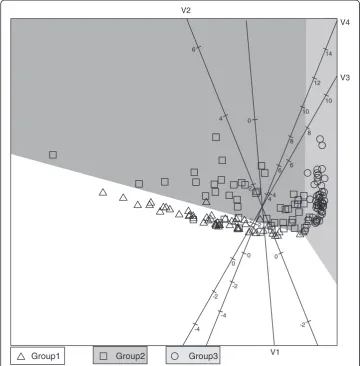
The QDA biplot is given in Figure 1. Since simulated data was used, the features of the data are known and it is clear that these features are well represented in the QDA biplot. We have μ01¼½1 1 1 1 which has the lowest values for variables 2, 3 and 4 than Groups 2 and 3. From the biplot we see that group 1 has lower values for all variables except variable 1. Group 2 has more variation that the other two groups which is consistent with the diagonal values of Σ2, and lies between Groups 1 and 3. Orthogonally projecting onto the axes of variables 3 and 4, it is clear that Group 3 has the highest values, consistent withμ33=μ34= 5.
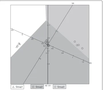
In the example above, the data was simulated from a normal distribution so it is known that the QDA methodology is applicable to the specific data set. However, the application of respiratory pathogens contains only indicator variables with 0 = absence and 1 = presence of the pathogen. Before applying the QDA biplot on this data set, the simulated data set is converted into indicator variables with all values less than the me-dian zero and all values larger than or equal to the meme-dian being made one. Categoris-ing the data will lead to a loss of information, but we expect some degree of similarity in location and spread between the normally distributed data set and the indicator vari-able data set. The degree to which the QDA biplots of the two data sets represent the same location, spread and separation features will give an indication of how well the QDA biplot performs in cases where the data does not follow a normal distribution.
different response patterns possible. In the simulated data set, 15 of the 16 patterns oc-curred at least once. All identical patterns will be on the same point in the biplot. For each point the symbol displayed is found by majority vote. The same problem with dif-ferent response patterns does not occur in the application in section 6 since a total of 15 pathogens yields 16,384 different response patterns.
In the QDA biplot in Figure 2 it is clear that the majority of the samples appear in their correct classification regions. This was also the case in Figure 1. The small dif-ferences in variable 2 disappear with the course coding and the three groups appear to be similar on variables 1 and 2. Group 1 has the lowest values (most zero’s) for variables 3 and 4 while Group 3 has the highest values (most one’s) for variables 3 and 4. Again Group 2 appears to be located between Groups 1 and 3. It is comfort-ing to see that the primary location, spread and separation features of the data set did not change between Figures 1 and 2, although converting the data to indicator variables did lead to a loss of information. Moore [8] evaluates discrimination pro-cedures for binary data. Here the focus is on obtaining a visualisation of how the variables relate to the different groups when separating groups with differences in
V1 0 V2
6
4
2
0
-2
V3
10
8
6
4
2
0
-2
-4
V4
14
12
10
8
6
4
2
0
-2
-4
Group1 Group2 Group3
covariance structure. The comparison of Figures 1 and 2 shows that the biplot re-mains a useful tool for exploring the variables contributing to differences between groups with unequal covariance matrices.
Application: Distribution of respiratory pathogens in a cohort of children with suspicion of pulmonary tuberculosis infection
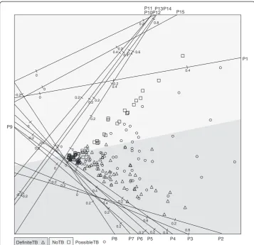
In this section the QDA biplot will be illustrated with the data set that inspired the development of the plot. Medical researchers were interested in examining the distribution of respiratory pathogens detected in respiratory specimens from chil-dren presenting for care with symptoms suggestive of pulmonary tuberculosis. The children are classified into one of three groups: definite-TB (microbiologically confirmed), non-TB (microbiologically confirmed) and possible-TB (microbiologic-ally excluded). Detailed microbiological methods are published elsewhere (In Press). Among other analyses, QDA was performed on the definite and no-TB groups since the possible-TB patients are actually unclassified members of the former two groups. The principal interest of the researchers is to associate some pathogens with the clinical manifestation of definite-TB and some with no-TB. The QDA biplot is given in Figure 3. The method of orthogonal parallel translation of the biplot axes as detailed in Gower, Lubbe and le Roux [5] was applied to move the biplot axes out of the way of the samples to obtain a clearer plot.
V1 2 1
V2 2 1
V3 1.2 1
0.8 0.6
0.4 0.2
0 -0.2
V4
1
0 0 -1
0 -1
Group1 Group2 Group3
Since the primary interest of this analysis is not classification, the biplot is a useful tool to visualize how the variables relate to the definite and no-TB groups. Pathogens 2 to 9 are all associated with TB while pathogens 10, 11, 13 and 14 are associated with the no-TB group. Pathogens 1, 12 and 15 seem to have a mixture of definite and no-TB patients. The spread of the sample points from zero on the left towards higher pathogen values in a triangle shape show that for the definite-TB group some patients have little, if any, of the pathogens while some others have some combination of pathogens 2 to 8. Pathogen 9 is the exception which seems to be negatively correlated with pathogens 2 to 8. Similarly, some no-TB patients have few or no of pathogens 10, 11, 13 or 14 while others have a combin-ation of these.
In a pilot study, the visual aid of the biplot provides an easily understandable aid to which pathogens relate to which of the two groups. Actually a total of 33 pathogens were measured, but those not really contributing to the discrimin-ation between definite-TB and no-TB are not shown here.
0
0.8
0.6
0.4
0.2
-0.2
0.2 0
0.2 0
0.2 0
0.6
0.4
0.2 0.4 0.2
0 -0.2
0.8 0.6
0.4 0.2
0.2 0
0.2 0
-0.2
0.4
0.2
-0.2
0
0.4
0.2
-0.2
0.4
0.2
0
0.2
0
0.2
0
0.4
0.2
0
P1
P2 P3
P4 P5 P6 P7 P8
P10 P11
P12P13P14
P9
P15
DefiniteTB NoTB PossibleTB
Conclusion
In cases where the variance between groups differs, QDA should be applied with the estimation of different covariance matrices for different groups. A transformation based on the optimal classification of samples from normal distributions is suggested to con-struct a QDA biplot. In the biplot both the samples, with classification regions, and ori-ginal variables are represented, showing the relationships between different groups and the various variables.
Through a simple simulation, it was verified that the main characteristics of the plot remains intact, even if the assumption of normality is not justified.
The QDA biplot is not designed in the first place for optimal classification of sam-ples, as this can be performed algebraically with many software programmes. The main purpose of the QDA biplot is to provide a visual representation of the relationships be-tween samples in a specific group and the variables measured.
Appendix A: Linear Discriminant Analysis
For classification of an object the posterior probability of belonging to each of the
J groups is calculated, πj|x= πjfX|G(x|G=j), and the sample is classified to the
group with largest posterior probability, arg maxjπjjx. The posterior probabilities needs to be estimated from the observed data and for the methodology applied in sections 3 and 4, it is important to look at the log odds of the estimated posterior probabilities. Using the estimates xj and pooled sample covariance matrix Sp a
sample is classified to
class J if log π^jjx ^
πJjx
<0; j¼1; …; J−1
class k if log π^jjx ^
πJjx
<log π^kjx ^
πJjx
; j¼1; …; J−1;j≠k
where the log odds can be written as
g
^
πjjx ^
πJjx ¼log
πj πJ þlog 2π ð Þ− p 2 Sp −
1 2exp −1
2 x−xj
0S−1
p x−xj
2π ð Þ−
p 2 Sp −
1 2exp −1
2ðx−xJÞ 0S−1
p ðx−xJÞ
0 B B B B B @ 1 C C C C C A
¼log πj
πJ
−1
2 δ
2 x; x
j; Sp
−δ2 x; x
J; Sp
withδ2 x; xj; Sp
¼ x−xj
0
S−1
p x−xj
.
This means that a sample is classified to groupkwhere
Sp¼
X
j nj−1
Sj
X
j nj−1
¼X
0
X−X0G G0 G
−1
G0X
X
j nj−1
¼¼X 1
j nj−1
and
k¼argmax j
logπj − 1 2δ
2 x; x
j; Sp
¼argmax j
logπj − 1
2ðn−JÞx−xj
0
W−1 x−x
j
¼argmax j
log πj − 1
2ðn−JÞ x−xj
0
MM0 x−x j
¼argmax j
log πj − 1
2ðn−JÞu−uj
0
u−uj
so that classification is to the nearest canonical mean in the CVA biplot, barring an additive factor depending on the prior probability. Should the prior probabilities all be equal, classification is simply to the nearest class mean in the CVA biplot.
Appendix B
For classification a sample is classified to the group with largest posterior probability where a sample is classified to
class J if log π^jjx ^
πJjx
<0; j¼1; …; J−1
class k if log π^jjx ^
πJjx <log ^
πkjx ^
πJjx
; j¼1; …; J−1;j≠k
where the log odds can be written as
log
^
πjjx ^
πJjx ¼log
πj πJ þlog 2π ð Þ− p 2 Sj−
1 2exp −1
2 x−xj
0S−1
j x−xj
2π ð Þ−
p 2j jSJ −
1 2exp −1
2ðx−xJÞS −1
J ðx−xJÞ
0 B B B B B @ 1 C C C C C A
¼log πj
πJ −1 2 log Sj SJ j j
þδ2 x; x j; Sj
−δ2 x; x
J; SJ
ð Þ
withδ2 x; xj; Sj
¼ x−xj
0S−1
j x−xj
. Defineϕ2jð Þ ¼x δ2 x; xj; Sj
þlog Sj, then
log πjjx
πJjx
¼log πj
πJ
−1
2 ϕ
2
jð Þx −ϕ2Jð Þx
n o
and the sample x is classified to the group with largest posterior probability, arg maxj log πj −12ϕ
2
jð Þx
n o
.
Appendix C: Back projection in PCA
Although PCA is always performed on a centred data matrix, it was argued in section 4
that the values in the matrix
ϕ2 1 xð Þ1
… ϕ2
J xð Þ1
⋮ ⋱ ⋮
ϕ2
1xð Þn … ϕ2Jxð Þn 2
4
3
5:nJ should also be
Φ¼ ϕ
2 1 xð Þ1
… ϕ2
J xð Þ1
⋮ ⋱ ⋮
ϕ2
1xð Þn … ϕ2Jxð Þn
2 4
3
5−1 φ1 … φJ
0 @
1
A s
−1
1 0 … 0
⋮ ⋱ … 0
0 0 … s−1 J
2 4
3 5
with singular value decomposition
Φ¼UDV0
The principal component scores for the first two dimensions is obtained from the first two columns of the matrixV,½v1 v2 ¼V2:J2:
Z:n2¼ΦV2
and the back projections is given by
^
Φ¼ZV0
2¼ΦV2V02
as shown in Gower and Hand [2]. To obtain the back projected value for the unscaled, uncentredϕ2j xð Þi -value, the operations are reversed to give
^
ϕ2
j xð Þi ¼ϕ^ijsjþφj
whereϕ^ijis theij-th element of the matrixΦ^.z’V2’diag(s1,…,sJ) +φ
Competing interests
The authors declare that they have no competing interests.
Authors’contributions
SGL conceived and designed the visualisation of quadratic discriminant analysis statistical methodology. FSD conceived and performed the laboratory experiments on microbial interations. Microbial data analysis and manuscript preparation: SGL and FSD. Both authors read and approved the final manuscript.
Acknowledgements
The authors would like to thank the following colleagues from the Faculty of Health Sciences, University of Cape Town, for the use of the data in section 5: Mamadou Kaba, Lourens Robberts, Lemese Ah Tow, Samantha Africa, Heather Zar and Mark Nicol.
This work is based upon research supported by the National Research Foundation of South Africa. Any opinions, findings and conclusions, or recommendations expressed in this material are those of the authors and therefore the NRF does not accept any liability in regard thereof.
Financial support
The clinical data reported in this manuscript was funded in part by grants from the National Institutes of Health, USA (1R01HD058971-01), the Medical Research Council of South Africa and the Wellcome Trust. The funders had no role in the study design, data collection and analysis, decision to publish, or preparation of the manuscript.
Felix S. Dube and Sugnet Lubbe are supported by the National Research Foundation of South Africa.
Author details
1Department of Statistical Sciences, University of Cape Town, Rondebosch, 7701 Cape Town, South Africa.2Division of
Medical Microbiology, Faculty of Health Sciences, University of Cape Town, Cape Town, South Africa.
Received: 11 October 2014 Accepted: 31 January 2015
References
1. Hotelling H. Analysis of a complex of statistical variables into principal components. J Educ Psychol. 1933;24:417–41. 2. Gower JC, Hand DJ. Biplots. Comput Stat Data Anal. 1996;22:655.
3. Braak CT. Interpreting canonical correlation analysis through biplots of structure correlations and weights. Psychometrika. 1990;55:519–31.
4. Fisher R. The statistical utilization of multiple measurements. Ann Eugen. 1938;7:179–88. 5. Gower JC, Lubbe S, Le Roux NJ. Understanding Biplots. John Wiley & Sons; 2011. 6. Kruskal JB, Wish M. Multidimensional scaling. Sage; 1978, 11.
7. Greenacre MJ. Biplots in Practice. Barcelona: Foundacion BBVA; 2010.