This guide contains proprietary information protected by copyright. The software described in this guide is furnished under a software license or nondisclosure agreement. This software may be used or copied only in accordance with the terms of the applicable agreement. No part of this guide may be repro-duced or transmitted in any form or by any means, electronic or mechanical, including photocopying and recording for any purpose other than the purchaser’s personal use without the written permission of Quest Software, Inc.
The information in this document is provided in connection with Quest products. No license, express or implied, by estoppel or otherwise, to any intellectual property right is granted by this document or in connection with the sale of Quest products. EXCEPT AS SET FORTH IN QUEST'S TERMS AND CONDI-TIONS AS SPECIFIED IN THE LICENSE AGREEMENT FOR THIS PRODUCT, QUEST ASSUMES NO LIABIL-ITY WHATSOEVER AND DISCLAIMS ANY EXPRESS, IMPLIED OR STATUTORY WARRANTY RELATING TO ITS PRODUCTS INCLUDING, BUT NOT LIMITED TO, THE IMPLIED WARRANTY OF MERCHANTABILITY, FITNESS FOR A PARTICULAR PURPOSE, OR NON-INFRINGEMENT. IN NO EVENT SHALL QUEST BE LIA-BLE FOR ANY DIRECT, INDIRECT, CONSEQUENTIAL, PUNITIVE, SPECIAL OR INCIDENTAL DAMAGES (INCLUDING, WITHOUT LIMITATION, DAMAGES FOR LOSS OF PROFITS, BUSINESS INTERRUPTION OR LOSS OF INFORMATION) ARISING OUT OF THE USE OR INABILITY TO USE THIS DOCUMENT, EVEN IF QUEST HAS BEEN ADVISED OF THE POSSIBILITY OF SUCH DAMAGES. Quest makes no representations or warranties with respect to the accuracy or completeness of the contents of this document and re-serves the right to make changes to specifications and product descriptions at any time without notice. Quest does not make any commitment to update the information contained in this document.
If you have any questions regarding your potential use of this material, contact: Quest Software World Headquarters
LEGAL Dept 5 Polaris Way
Aliso Viejo, CA 92656 email: [email protected]
Refer to our Web site (www.quest.com) for regional and international office information.
Patents
This product includes patent pending technology.
Trademarks
Quest, Quest Software, the Quest Software logo and Quest One Identity Manager are trademarks and registered trademarks of Quest Software, Inc in the United States of America and other countries. For a complete list of Quest Software’s trademarks, please see
Quest One Identity Manager - Web Designer Reference Manual Updated - 21.10.11
Software Version - 5.0.2
COMPONENT LICENSE OR ACKNOWLEDGEMENT
ExplorerCanvas Release 3 Copyright © 2006 Google Inc. Apache 2.0 License.
MochiKit 1.4.2 Copyright © 2005 Bob Ippolito. All rights reserved. MIT License. Mono.Security 2.0.3600.1 Copyright © 2004 Novell, Inc. (http://www.novell.com). MIT License. Novell.Directory.LDAP 2.1.9.0 Copyright © 2003 Novell, Inc. (http://www.novell.com). MIT License. PlotKit 0.9.1 Copyright © 2006 Alastair Tse. BSD Simple License.
5
CHAPTER 1
ABOUTTHIS GUIDE
QUEST
®
ONE IDENTITY MANAGER . . . 10INTENDED AUDIENCE. . . 10
DOCUMENTATION MANUALS. . . 10
CONVENTIONS. . . 12
ABOUT QUEST SOFTWARE, INC. . . . 12
CONTACTING QUEST SOFTWARE, INC. . . . 12
CONTACTING QUEST SUPPORT . . . 13
CHAPTER 2 BEFORE STARTING GLOSSARY . . . 16
FILES NEEDEDBY WEB DESIGNER . . . 19
FILES GENERATEDBY WEB DESIGNER. . . 19
CHAPTER 3 THE WEB DESIGNER GUI START MASK. . . 22
TITLE BAR . . . 22
STATUS BAR. . . 23
MENU BAR . . . 23
CONNECT. . . 24
EDIT. . . 26
VIEW . . . 28
TOOLBAR . . . 29
CHANGE LABEL . . . 29
OTHER TOOLBAR FUNCTIONS . . . 30
NAVIGATION WINDOW . . . 31
MODULES; SESSION MODULES. . . 32
COMPONENTS . . . 33
WEB PROJECTS . . . 34
PROJECT FILES . . . 35
LAYOUT DEFINITIONS. . . 36
TEST SCRIPTS . . . 36
PREVIEW MODE; PROJECT BROWSER; OBJECT STATE . . . 37
PREVIEW WINDOW . . . 37
PROJECT BROWSER. . . 40
OBJECT STATE. . . 43
NODE EDITING; TASKS; PROPERTIES; QUERIES . . . 45
NODE EDITOR . . . 45
TASKS . . . 47
PROPERTIES . . . 48
QUERY . . . 49
ADDITIONAL FUNCTIONS. . . 51
6
THREAD OVERVIEW. . . 53
CALL STACK . . . 54
COMMAND LIST . . . 55
DEFINITION TREE WINDOW . . . 56
SCRIPTINGINTHE WEB DESIGNER. . . 58
SYSTEM PREREQUISITES. . . 58
RECORDINGAND EXECUTING A SCRIPTIN THE WEB DESIGNER. . . 59
EXECUTABILITYOF A SCRIPT . . . 60
USING SCRIPTSWITH THE SCRIPT SERVER. . . 61
DEFINITION TREE . . . 61
CONTEXT MENU FUNCTIONS . . . 62
CHAPTER 4 PROJECT CONFIGURATION CONFIGURATION PARAMETER . . . 66
WEB PROJECT TAB . . . 66
CONFIGURATION SETTINGS . . . 70
CUSTOMIZATIONS TAB . . . 70
SEARCH FIELDS TABS. . . 70
COLUMN-DEPENDENT REFERENCES TAB . . . 71
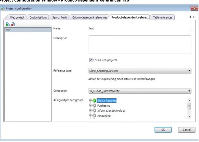
PRODUCT-DEPENDENT REFERENCES TAB . . . 72
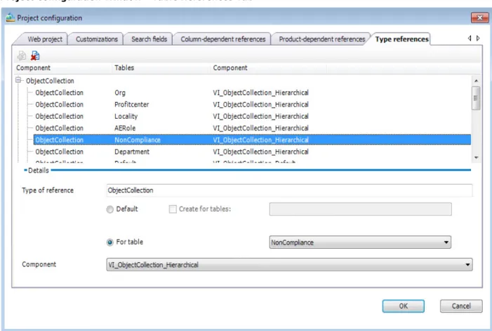
TABLE REFERENCES TAB . . . 73
CHAPTER 5 DIALOGS PROJECT APPROVAL DIALOG . . . 76
SEARCH AND REPLACE DIALOG. . . 76
CAPTIONS DIALOG . . . 78
CLEAN LANGUAGE-DEPENDENT TEXT DIALOG. . . 80
OBJECT PROPERTIES DIALOG . . . 81
CHANGE LABELFOR WEB PROJECT DIALOG. . . 82
CHAPTER 6 WIZARDS NEW PROJECT WIZARD. . . 86
COPY OBJECTS WIZARD . . . 87
NEW MODULE WIZARD. . . 88
DATA DISPLAY WIZARD . . . 90
CREATINGAN OBJECT SEARCH FORM . . . 91
DISPLAYING SINGLE OBJECTS. . . 96
GRID DISPLAYFOR COLLECTION DATA . . . 98
HYPER VIEW WIZARD . . . .103
REPORT EMBEDDING WIZARD. . . .106
MAPPING GENERATOR WIZARD. . . .108
CHAPTER 7 DATA OPERATIONS SQL SERVER VERSUS WEB SERVER . . . .110
7
MONITORING FUNCTIONALITY
MONITORING. . . .116
STATUS. . . .116
SESSIONS . . . .118
ASSEMBLIES . . . .119
LOG FILES . . . .120
EXCEPTIONS . . . .121
CHAPTER 9 HELPFUL HINTS EDITING CAPTIONS . . . .124
ADDING FUNCTIONS . . . .126
PASTING IN TEXTSOR CAPTIONS . . . .128
1
About this Guide
• Quest
®
One Identity Manager
• Intended Audience
• Conventions
10
Quest
®
One Identity Manager
Quest One Identity Manager streamlines the process of managing user identities, access privileges and security enterprise wide. It empowers IAM to be driven by business needs, not IT capabilities. Quest One Identity Manager is based on an automation-optimized architecture that addresses major IAM challenges at a fraction of the complexity, time, or expense of “traditional” solutions.
Intended Audience
This manual explains the functionality of the Web Designer tool to you. The Web Designer is used to configure and extend the Web Portal. This browser based interface primarily enables employees to the request company resources that they require to complete their tasks.
You will discover how you can customize the operational processes from the Web Portal installation ver-sion and implement more operational processes. To do this, you will be introduced to the interface and each of the Web Designer functions.
This manual is intended for system administrators, consultants, analysts, and any other IT profession-als using the product.
Documentation Manuals
Identity Manager documentation includes the following manuals as well as the ”Web Designer Refer-ence Manual“ Manual. They can be found on the distribution CD in the directory ...\Quest One Identity Manager\Documentation.
Getting Started
The main components of the Getting Started Manual are: • Installation prerequisites
• Installation and updates of Identity Manager administration tools • Identity Manager database setup
• Configuration of administration workdesks
• Configuration of server for accessing the database
• Overview of Identity Manager administration and configuration tools • User interface for the main Identity Manager tools
Identity Management
The main components of the Identity Management Manual are:
This manual describes the default user functionality of the Web Designer. It is possible that not all the functions described here are available to you. This depends on your system config-uration and permissions.
11
• Identity Management and User Provisioning with Identity Manager
• Complying to and monitoring regulatory requirements using Identity Audit Process Orchestration
The main components of the Process Orchestration Manual are: • Monitoring process handling
• Controlling process handling • Troubleshooting
Configuration
The main components of the Configuration manual are: • Identity Manager software architecture
• Configuration of Identity Manager data models • System permissions configuration
• User interface configuration • Script processing
• Creating reports • Data transport
• System configuration parameters
• Identity Manager inheritance mechanism
• Service provisioning using Service Provisioning Markup Language (SPML) • Provider mode
IT Shop
The main components of the IT Shop manual are:
• IT Shop for authorized employees to supply themselves with company resources. • Development of approval policies and workflows
Web Designer Reference
The main sections in the Web Designer References are:
12
Conventions
In order to help you get the most out of this guide, we have used specific formatting conventions. These conventions apply to procedures, icons, keystrokes and cross-references.
About Quest Software, Inc.
Quest Software simplifies and reduces the cost of managing IT for more than 100,000 customers worldwide. Our innovative solutions make solving the toughest IT management problems easier, en-abling customers to save time and money across physical, virtual and cloud environments. For more in-formation about Quest go to www.quest.com.
Contacting Quest Software, Inc.
Please refer to our Web site for regional and international office information.
ELEMENT CONVENTION
<> Identifies the user interface buttons and menu entries or key-strokes on the keyboard.
Blue Text Indicates a cross-reference.
Used to highlight additional information pertinent to the process being described.
Used to provide Best Practice information. A best practice details the recommended course of action for the best result.
Used to highlight processes that should be performed with care. + A plus sign between two keystrokes means that you must press
them at the same time.
Email [email protected]
Mail Quest Software, Inc.
World Headquarters 5 Polaris Way
Aliso Viejo, CA 92656 USA
13
Contacting Quest Support
Quest Support is available to customers who have a trial version of a Quest product or who have pur-chased a Quest product and have a valid maintenance contract. Quest Support provides unlimited 24x7 access to SupportLink, our self-service portal. Visit SupportLink at http://support.quest.com/.
From SupportLink, you can do the following:
• Quickly find thousands of solutions (Knowledgebase articles/documents). • Download patches and upgrades.
• Seek help from a Support engineer.
• Log and update your case, and check its status.
View the Global Support Guide for a detailed explanation of support programs, online services, contact information, and policy and procedures. The guide is available at http://support.quest.com/pdfs/Global Support Guide.pdf.
2
Before Starting
• Glossary
• Files needed by Web Designer
• Files generated by Web Designer
16
Glossary
The Web Designer tool is the one that is used to configure and extend the Identity Manager standard web portal within the Quest One Identity Manager Suite.
The browser supported standard web portal makes it possible for users with the appropriate permis-sions to query data in the Identity Manager database and to save it there. These queries and saving data take place within the framework of the implemented operational processes and is set up in such a way that even inexperienced users cannot create any invalid data. The necessarily restrictive user guid-ance resulting from this approach can be customized in the main areas. If the configuration options are not sufficient to customize the default processes as required to meet company requirements, custom operational processes have to be implemented. The Web Designer is the tool that is used to solve these tasks within the Quest One Identity Manager Suite.
To this end, Web Designer is based on Model-View-Controller (MVC) architecture, whose model layer contains the data that is to be visualized, whose view layer allows for the display of data from the model layer and the receipt of user interactions, and whose controller layer receives user actions, as-sesses them, and acts accordingly; it also decides on the basis of user actions in the view layer which model layer data needs to be modified. The controller layer contains additional mechanisms that re-strict user interactions in the view layer.
Web Designer also integrates an extensive GUI where the web application functions can be “clicked to-gether.”
In the interest of helping you to better understand the sections that follow, you should first familiarize yourself with the terms and definitions that arise in working with Web Designer.
Glossary
TERM DEFINITION
Web application A web application is a productive web site that is published on a web server and that interacts with the Identity Manager database, thus mak-ing available functions such as processmak-ing and savmak-ing employee or order data. Each web application has a dedicated intranet or internet address. Web project A web project is a programming phase that precedes a web application, where each web application relates to a specific web project. Web projects are independent of each other in respect to their design and functions. A series of web projects can be created and worked on concurrently in the Identity Manager database.
Definition tree Each web project has a dedicated node tree. This tree is edited and its nodes configured using the Web Designer GUI. While a specific web appli-cation is in use, the user is always located at a defined position on the definition tree.
17
Nodes A definition tree is composed of nodes. Accordingly, each node has one superordinate node and an unlimited number of subordinate nodes. There are various types of nodes. Data, display and action nodes corre-spond to the MVC architecture of Web Designer. There are also helper nodes, which are needed in order to create an optimally clearly structured definition tree.
All non-helper nodes are associated with a function such as displaying browser data, querying data in the SQL server and so on. The function that a node executes is determined by its type (e.g. label node, collection node and so on). In this context, it is necessary for each node to be con-figured exactly in accordance with its specific task. A series of properties are available for these configurations (see section Node Editing; Tasks; Properties; Queries on page 45).
Control “Control” in this document refers to a display node that is rendered by a browser.
Module Modules are self contained elements of a web project (and thus part of a definition tree) that normally represent a workflow or an otherwise delim-ited work domain such as “processing employee data” or “home page”. Subdividing a web project into various modules enhances transparency during the programming phase and allows for the reuse of specific mod-ules in various web projects (n module can be part of a number of web projects at the same time). Modules can contain an unlimited number of web pages.
Session module Each web project needs a dedicated module that is known as a session module, whose main distinguishing feature relative to other modules is its so-called lifecycle. Session module data can be called up at any time dur-ing a valid web server session. Data from other modules can be called up while a web page that is defined in the relevant module is being dis-played.
Component A component is an element of the definition tree that can be regarded as having been “dispatched” from the actual tree, whereas the tree itself contains a reference to the component. Components can be referenced from an unlimited number of positions on the definition tree. Thus a com-ponent that is referenced two or more times is to all intents and purposes reused. This reduces programming and support workloads, while at the same enhancing quality by virtue of the fact that “similar” positions func-tion the same way.
Local components Local components are essentially the same as components, except that local components are defined within a module and are only found there. Hence a reference to a local component can only be set in the module in which the local component has also been defined. This is an advantage in that it allows for simpler referencing of local components.
Component type Inasmuch as each specific type of node only admits certain other types of node, component referencing must also follow this logic. Hence when a component is defined, it is necessary to indicate which type of component it is. Then, depending on the component’s position in the definition tree, only specific types of components can be referenced.
Database object A database object, an object stored in a database, can contain structural information such as files generated by Web Designer, as well as utility data such as personal objects.
Glossary
18
“VI” prefix This prefix is used to indicate that a module, component or other element is part of the standard delivery. This prefix cannot be changed in the cus-tomer installation.
“Customer” prefix This prefix is used to indicate that a module, component or other element is not part of our standard delivery. This prefix can be changed in the cus-tomer installation. “Cuscus-tomer” here is a placeholder for the cuscus-tomer pre-fix that is defined in a delivery.
Collection A collection is a compilation of specific data from the Identity Manager database on the web server. This data is called up (loaded) from the data-base using a specific rule (“where clause”). A loaded collection contains data sets which may, but do not necessarily have to, represent a database object.
For example: A “Database object” collection can only ever access one Identity Manager database table whose data sets thus also always repre-sent database objects. A “Database SQL-query” collection can load data fields from a series of tables via various SQL commands such as “union” or “join”. In such cases, the data sets do not represent a database object. Property “Property” in this document refers to a collection property such as all
UID_Persons of the Collection Person. A property can, but does not neces-sarily have to, correspond to a database table column.
Web SQL In some Web Designer domains it is necessary to enter textually formu-lated programming instructions (“expressions”). In order to meet all web programming requirements, a dedicated programming language known as Web SQL was developed and implemented for Web Designer. The syn-tax of Web SQL is largely based on MS SQL synsyn-tax.
One of the great advantages of Web SQL is that it allows for the formula-tion of very concrete runtime expressions such as SQL statements that are executed by the SQL server.
Expression There are two Web Designer domains that necessitate textually formu-lated programming instructions (expressions). One such domain selects or manipulates collection data, whereas the other relates to css rule entries. In both domains, expressions must be entered using Web SQL syntax. In the first domain, the Web SQL expression assessment results must be consistent with standard SQL syntax, and in the second domain they must be consistent with css syntax.
Condition A condition is a special form of an SQL expression. In Web Designer there are visibility, execution and activity conditions for all of which the antici-pated result of an expression is “True” or “False”.
If the condition of a visibility condition is met in a container, the display nodes that are defined under the container are visible in the browser. If the condition of an execution condition is met in an action node, the action defined under this node is implemented.
If the condition of an activity condition is met at a button, the button changes to an active state.
Filter A filter is a special form of an SQL expression. Filters select a defined number of data sets from among all the data sets in a collection.
Glossary
19
Files needed by Web Designer
To start Web Designer, launch the WebDesigner.exe file, which is located in the binary directory once Identity Manager has successfully been installed.
In order for Web Designer to work properly, it needs a series of additional files, which are also located in the binary directory. Apart from these files, which are used by other Identity Manager applications as well, there are files that are used solely by Web Designer. These files are as follows:
• WebDesigner.Base.dll
• WebDesigner.ImageLibrary.dll
• AE.WebDesigner.Template.Standard.dll
When WebDesigner.exe is started, this must be notified to the database. For further information in this regard, see the Logging into Identity Manager tools section in the “Getting Started” manual.
Files generated by Web Designer
The xml files generated by Web Designer are stored in the DialogAEDS table in the Identity Manager database. Inasmuch as a published web application directly accesses the xml files in the Identity Man-ager database, the web server directory structure needs no updating. In order for changes that have been implemented and saved using Web Designer to also be available in the web application, these changes must be accepted (see section Project Approval Dialog on page 76). This function allows you to save interim states (i.e. states that cannot be compiled in Web Designer) without interfering with the published web application.
3
The Web Designer GUI
• Start Mask
• Title Bar
• Status Bar
• Menu Bar
• Toolbar
• Navigation Window
• Preview Mode; Project Browser; Object State
• Node Editing; Tasks; Properties; Queries
• Additional Functions
22
Start Mask
The Web Designer GUI can be navigated using a mouse and keyboard shortcuts. For optimum graphics display, a minimum screen resolution of 1280 x 1024 pixels with 16 colors is recommended.
As with all of Identity Manager tools, normal view can be customized by dragging, closing or hiding the various windows. To do this, use auto-hide mode through the <Pin> icon in the upper right hand corner of the window.
After you log on, a start mask, which is empty for the most part, will be displayed. It contains a title bar, status bar, menu bar, toolbar, and various editing areas. All of these elements are discussed in the sections that follow.
Title Bar
The title bar contains the program icon, program name, and the name of the linked database; these el-ements are shown in the following form: <user>@<database server>\<database (description)> .
Web Designer Start Mask
23
Status Bar
The status bar shows the linked database in the following notation: <server>\<database (descrip-tion)> and the connected user or system user.
When Web Designer launches a database activity such as loading or saving a database object, the sta-tus icon is activated in the left corner of the stasta-tus bar. A gray icon means “no activity.”
Menu Bar
The items in the menu bar allow you to call up virtually all Web Designer functions.
Status Bar
24
Connect
The global settings dialog has two tabs. The functions of the <General> tab are described in the follow-ing table. The <Hotkeys> tab allows you to restore the standard keyboard layout or customize it.
Functions of the Connect Tab on the Menu Bar
MENU MENU ITEM FUNCTION
Settings Opens the global settings dialog.
Exit Close the database connection and shuts down Web Designer.
Global Settings Dialog
Functions in the Global Settings Dialog
MENU ITEM FUNCTION
Use colors to distinguish data,
display and action nodes When this option is activated, Web Designer provides a color-coded display of the nodes in the definition tree window, as follows: data: red; display: green; actions: blue; other elements: black.
Display property categories When this option is activated, the properties of the marked nodes are grouped according to category.
25
Ask for change label if none is
selected When this option is activated, before changes are saved, the pro-gram asks you whether you wish to select a name under which the changes are to be saved. If this is not the case, a message to this effect will be displayed.
Shorten long property values When this option is activated, expressions entered in the node editor window are displayed in an abbreviated form insofar as a specific length is exceeded. However, the full expression is always shown in the definition tree window.
Hide optional identifiers in
defi-nition tree When this option is activated, any optional identifiers in the defini-tion tree display are replaced by standard identifiers. Keep backup of unsaved objects
on the local machine
When this option is activated, a backup copy of all modified and non-saved objects is saved on the local computer. This backup copy can be recovered if the program crashes.
Suppress timed jobs When this option is activated, time-controlled actions such as updat-ing pendupdat-ing decisions in the menu bar are not executed in Web Desi-gner. This is a particularly useful feature in Web Designer debug mode.
Check cursor data before saving When this option is activated, is checked when saving components, whether the existing collections required a cursor. If the request is confirmed, the market collections are listed and after saving auto-matically added a cursor.
Profiling mode When this option is activated, a detailed logging mechanism for all activities in the preview window is activated. This mode is useful for troubleshooting errors, but is very resource-intensive owing to the level of detail involved, and should only be used on request from Identity Manager support.
Show website without javascript This option activates the javascript-free display mode in the preview window. This option allows you to display web pages as they would appear in a web browser without javascript.
Language The language selection box enables you to change the Web Designer display language. To implement such a change, you need to restart Web Designer.
Resolution The value shown here determines the size of the preview window after it has been undocked. Normally, web applications are devel-oped for a customer-defined screen resolution. The Web Designer resolution function helps you to make optimum use of the software’s display areas.
Functions in the Global Settings Dialog
26
Edit
Functions of the Edit Tab on the Menu Bar
MENU MENU ITEM FUNCTION
Compile project Starts the compiler, which checks the current definition for errors. For this process, you need not to save the development state beforehand. For information concerning Ccompiler error han-dling, see section Tasks on page 47.
Publish project Opens the publish project dialog, see section Project Approval Dialog on page 76.
Configure project Opens the project configuration window (also called configurator for short). See section Project Configuration on page 65 for a descrip-tion of configurator funcdescrip-tions.
Copy objects Opens the copy objects window. The process is realized by a wizard, see section Copy Objects Wizard on page 87.
Create new module Opens the create new module window. The pro-cess is realized by a wizard, see section New Module Wizard on page 88.
Create new project Opens the create new project window. The pro-cess is realized by a wizard, see section New Project Wizard on page 86.
Search Opens the find dialog, see section Search and Replace Dialog on page 76.
Search next Executes a search using the current search set-tings without opening the find mask.
Captions Opens the captions dialog, where you can insert, delete and edit captions, see section Captions Dialog on page 78.
27
Clean
language-depen-dent text Opens the clean language-dependent text dia-log, where you can enter missing translations and delete unused captions, see section Clean Language-Dependent Text Dialog on page 80. Import object This function allows you to import complete
modules or components to Web Designer using the standard Windows file import dialog. The function recognises alone whether complete modules or components are being dealt with and imports them as such. In all other cases the selected file is loaded as a project file.
Related applications Opens the related application dialog, where you can insert, delete and edit applications, which are shown in the web portal‘s menu bar. For any application you have to define a clear name, the display name, the description, the basis URL, the parent application (for a direct entry in subforms of one main application) and a picture (optio-nal).
Start recording a test
script Starts recording a test script, see section Scripts on page 36 and Scripting in the Web Test Designer on page 58.
Stop recording Stops recording a test script.
Check model integrity Checks references, function calls and other details of the current web project. Any errors found do not result in compiler errors but should be corrected for the sake of the web applica-tions‘s stability.
Check accessibility This function determines whether a web project meets the basic requirements for a readily accessible web application in accordance with the current standard. Examples of deficiencies in this regard include missing alternative texts for images or the use of mouse click actions that cannot be realized using a keyboard shortcut. Insofar as the web project contains the function for such items, the attendant list will appear in the output window along with the relevant warn-ing. Breaches of accessibility rules do not engen-der compilation errors.
Functions of the Edit Tab on the Menu Bar
28
View
Functions of the View Tab on the Menu Bar.
MENU MENU ITEM FUNCTION
Restore layout Restores Web Designer’s initial window size and views.
Save Layout Saves your own window size and views.
Object state Brings up the object status window and places it in the foreground (see section Object State on page 43).
Project browser Brings up the project browser window and places it in the foreground (see section Project Browser on page 40).
Preview Brings up the preview window and places it in the foreground (see section Preview Window on page 37).
Node editor Brings up the node editor window and places it in the foreground (see section Node Editor on page 45).
Tasks Brings up the tasks window and places it in the foreground (see section Tasks on page 47).
Properties Brings up the properties window and places it in the foreground (see section Properties on page 48). Query Brings up the query window and places it in the
29
You can also toggle between windows using the tab bar tabs insofar as the various windows are dis-played and share the same frame.
Toolbar
The Web Designer toolbar is currently non-configurable.
Change Label
All changes that are effected in Web Designer can be saved under a change label, which makes it easy to export modified web projects to another database (for example from the development environment to the QS environment database). For information on how to use change labels, see section Change La-bel for Web Project Dialog on page 82 and section “Working With Change Labels” of the “Configuration” Log output Brings up the log output window and places it in the
foreground (see section Log Output on page 51). Thread overview Brings up the thread list window and places it in the
foreground (see section Thread Overview on page 53).
Call stack Brings up the call stack window and places it in the foreground (see section Call Stack on page 54). Command list Brings up the command list window and places it in
the foreground (see section Command List on page 55).
Compiled objects Brings up the compiled objects window and places it in the foreground. All compiled web projects are shown in the window. A double click on a web pro-ject, component or module represents the selected object in the definition tree window and can be edi-ted.
Navigation Brings up the navigation window and places it in the foreground (see section Navigation Window on page 31).
Tab Bar
Web Designer Toolbar
Functions of the View Tab on the Menu Bar.
30
manual. For further information concerning database exporter, see the tool “Database Transporter”, section of the “Getting Started” manual.
Other Toolbar Functions
Change Label Functions in the Toolbar
ICON FUNCTION
Selection of a change label
Changes in the Identity Manager database are stored under the change labels that are selected here.
Change label administration
This function opens the standard dialog for inserting, editing, or deleting change labels. For information on how to use change label, see section “Working With Change Labels” of the “Configuration” manual.
This function sets the currently selected change label as a default label that will be selected automatically when Web Designer is restarted. The selection is client-specific and has no impact on other Identity Manager database users.
Opens a dialog that allows you to assign a selectable change label to all current web project-referenced Web Designer and/or caption objects. This function also allows for the export of complete web projects, regardless of any previously assigned change label (see section Change Label for Web Project Dialog on page 82).
Other Toolbar Functions
ICON FUNCTION
Opens the captions dialog, where you can insert, delete and edit captions (see section Captions Dialog on page 78).
or
When you modify a database object, the <Save> button is acti-vated. Changes are only saved for the database object that is shown in the currently active tab. If you wish to also save changes in other database objects, it is necessary to re-launch the saving process for each such object.
or
The <Save all> button save any database objects with changes. The drop-down list displays all web projects in the relevant Identity Manager database for selection purposes. Only the modules that are part of the web project selected here are compiled for the pre-view window.
Opens the preview window. The preview will be calculated for the currently selected person.
Clicking the <Preview> button opens a drop-down menu, where a person must first be selected. The permissions of the selected per-son form the basis for preview window rendering.
To close the current session and launch a new one, click <Start new session for...> in the menu. This action has the same effect as the current user logging off and then logging on again.
31
Navigation Window
In normal view, the navigation window is on the left edge of the screen and is subdivided into the fol-lowing areas: <Modules>, <Components>, <Web projects>, <Project files>, <Layout definitions>, and <Test scripts>. The basic procedure here is to select in navigation window the database objects that you wish to work on using Web Designer. Various functions are available in the definition tree win-dow, depending on the area selected.
Database objects are displayed in a tree view that integrates two root nodes under which the Quest-de-fined database objects are grouped. These objects cannot be edited in an Identity Manager customer installation, but they can be copied using a wizard (see section New Project Wizard on page 86). Each second root node has a custom prefix, under which all customer-specific objects are grouped. Hence on initial installation of the program, these root nodes have no subordinate objects. Any modules or other elements that are added to a customer installation are automatically grouped under these root nodes.
Navigation Window Toolbar
Functions in the Navigation Window Toolbar
ICON FUNCTION
Adds new modules, components, project files or layout definitions. Clicking the arrow button opens a context-sensitive dialog. New web projects cannot be added using this function. The adding of new modules can be done using the relevant wizard (see section New Module Wizard on page 88).
Files can be exported to the database through the <Import files> option and can be exported from the database through the <Export files> option. These options open a standard Windows dialog to upload and save files.
or
Selecting a database object in the navigation window activates the <Delete> button. To delete a selected database object from the database, click the button and the confirmation prompt. Deletions can not be undone.
Reloads database objects from the relevant area. This is a particu-larly useful function for situations where two or more developers are using the same database.
or
Opens the object properties dialog, which displays key properties of the database object that is marked in the navigation window (see section Object Properties Dialog on page 81).
32
Modules; Session Modules
Proprietary user groups concerning elements such as a user’s affiliation with an organizational unit can be defined for the web application. This affiliation, which must be notified once to the web application in the session module after the user logs on, remains available throughout the session for toggling menu items or form sections on and off. Modules contain the definitions of the nodes that are visible in the browser, in addition to other important information. However, session module content is never rendered in the browser. Hence Form nodes are also hidden in cases where a module is marked as a session module.
A module can be regarded as a logically self-enclosed unit within a web project. Hence a module can only contain one web page such as a home page, with a brief introductory text, but a module can also integrate an extensive workflow that extends across a number of web pages (for example for product orders).
Well structured and carefully planned architecture of the desired functional scope of a web application in a module reduces the extent of any debugging that may be necessary later on and makes it easier to implement add-on functions. Although there is no limit on module size or number, you need to define a session module for each web project. A module becomes a web project session module insofar as the relevant option is set in the module’s root node and the mod-ule is defined as a session modmod-ule in the web project. When a session is opened, a session module is loaded and the mod-ule and its data remain in existence throughout the session lifecycle. The session module must contain information con-cerning the logged on user. It is also crucial that a session module contain collections named User, UserRuntimeModule, UserMenu and UserLanguage.
33
Components
Components are module elements that have been exported from a module, which, to this end, contains a reference to a component at the relevant place.
A component can be referenced at any place in a module as well as in an unlimited number of places across a series of modules. By the same token, a component can also be ren-dered iteratively in the browser. In the interest of ensuring that the various instances of an iteratively rendered com-ponent can be reliably differentiated from each other, each instance is given an automatically generated suffix as at runtime “R”. In such cases, all nodes of the same instance have the same suffix.
Thus components keep the definition tree free of redundan-cies. This in turn reduces programming work and ensures that the web application will exhibit a uniform appearance and functionality.
A distinction is made between various types of compo-nents. Component position in the definition tree determines which type of component can be referenced at any given time.
34
Web Projects
Multiple web projects can be defined in the Identity Man-ager database.
To assign a web project to a web application that is on the web server, use the web application configuration file (see manual “Web Portal Installation Guide”).
It is necessary to manage/update a series of specific data in the definition tree window (see section Definition Tree Window on page 56).
New web projects cannot be added through the naviga-tion window menu bar. Such projects are created through the <Create New Project> wizard (see section New Pro-ject Wizard on page 86).
35
Project Files
Project files are any type of files that are needed for a web project and thus should also be created in the Identity Man-ager database (for example additional icons).
All relevant files that have already been uploaded to the Identity Manager database are shown in the <Project files> area.
36
Layout Definitions
Test Scripts
Layout definitions describe how rendered dis-play nodes are visualized in the browser (node of type “view”).
There is at least one layout defined for each of the display node types that can be provided with layout information. Layouts with the ending “default” are used by the associated node type without having to be entered on individual nodes.
Every object in the layout definition list corre-sponds to a css class. Any number of new layout definitions can be set up. Each layout definition is linked to a node type. This layout definition is therefore available for each node of the corre-sponding type.
If a default layout definition should replaced by a custom layout definition then a wizard is used (see section Copy Objects Wizard on page 87).
Test scripts are displayed under the heading <Test scripts> in the navigation window. Test scripts are recorded using the <Edit> / <Start recording test script> option.
Test scripts can be used for testing web projects after they have been changed or for load tests on the web server. It is necessary to use a par-ticular tool for running load tests. If a test script is going to be run repeatedly automatically, recording must be started from the web project home page. For further information see section Scripting in the Web Designer on page 58.
37
Preview Mode; Project Browser; Object State
Normal view integrates a frame (on the right edge of the screen) containing the <Preview> and <Proj-ect browser> functions, whose dialogs you can toggle between using the tabs at the bottom of the frame. These two dialogs can only be displayed following the successful compilation of the selected web project.
Clicking in the menu bar <View> / <Object state> displays the object state dialog in the aforemen-tioned frame as well.
Preview Window
The preview window shows how a specific web application will look and respond in the browser. This means that the preview window can be used to test out the entire functionality of all buttons, links and so on. The displayed view is rendered using Internet Explorer, which is installed in the current client. However, please note that other browsers or other versions of the same browser may generate views that differ from the preview. Hence it is advisable to perform an extensive layout test of the web appli-cation with the previously predefined browser versions.
A preview window can only be generated insofar as (a) the user does not log on to Web Designer through a system account; or (b) a person is selected following log on through a system account. This is necessary due to the fact that when a view is rendered, Web Designer assesses person-related de-pendencies (for example which person is allowed to view which menu item) and displays the results of
38
this assessment. This means that a realistic function test can only be realized in the preview window using such a person-related display.
The preview function also writes data to the database or deletes database objects if this function is ac-tivated by the user. Hence caution should be exercised when testing this function.
The preview window integrates a toolbar of its own, most of whose functions are used to manage de-bugging mode. When the debugger is activated, program functions are realized step by step rather than dynamically, thus enabling you to see which program step is actually being realized and the results yielded by the step. In addition, with the debugger activated, you can navigate at will to the query or data schema window.
Preview Window Toolbar
Functions of the Toolbar in the Preview Window
ICON FUNCTION or or
Demomode
The preview window switches to full screen mode; and all other Web Designer windows are covered. The resolution defined for the pre-view window is disregarded here. This button is only active with the window in a docked state.
or
View html source
This button, which is activated following successful compilation, opens a popup window containing the html source code generated by Web Designer. This function allows for debugging directly in the source code.
or
Recompile
This button, which is activated following successful compilation, allows for recompilation (for example after a change has been made in the definition tree window) without the need to select a person beforehand. The preview window is generated for the previously selected person.
In this process, the Compiler factors in all module and component changes that have been effected thus far in connection with the selected web project. Such changes need not be saved beforehand. or
Suppress execution
This function, which prevents any action from being executed in the preview window, is useful in cases where a specific definition tree node has been found in the properties window using the <Show def-inition object> function. When the function is activated, the object is underlined in blue.
or
Enable debugger
This field allows you to toggle the debugger on and off. “Debugger” is underlined in blue when the function is activated. All actions are executed in succession (for example one node at a time) when the debugger is deactivated.
If the debugger status is deactivated in “Paused” state, click the <Re-sume execution> button to re<Re-sume debugging.
39
In addition to a toolbar, the preview window also has a foot bar. Apart from the functions shown in the following figure, the currently displayed Web Designer form is indicated on the left side of the status bar.
or or
Single step
The <Single step> button is only activated when the debugger is activated. When single step mode is activated (a state indicated by blue underlining), each time an action is realized the program stops at each executed step in the definition tree. When single step mode is deactivated, the action is realized until the next break point (break points are inserted in the definition tree at action nodes above the context menu).
or
Resume execution
This button is activated with the debugger deactivated insofar as any program steps remain to be carried out, for example no user entries are anticipated. Clicking this button launches realization of the next program step.
or or
“Slow Motion”-Debugging
If this button is enabled, the program is automatically run through a step at a time. This mode can be switched on or off during execu-tion. This saves the user from having to click so often.
or
Abort execution
This button is activated with the debugger deactivated insofar as any program steps remain to be carried out, for example no user entries are anticipated. Clicking this button cancels realization of the current program step.
or
Debug - step into
The debugger realizes all steps until the next action node.
Portion of the Preview Window Status Bar
Functions in the Preview Window Status Bar
ICON FUNCTION Status
Done here means that compilation and rendering of the current project state have been completed and that entries can be made in the relevant pages. Pixel lines
The pixel line count indicates the dimensions of the window area that are available for the display of rendered html code. This information obviates the need for scrollbars during programming in cases where the amount of avail-able browser space is known. This in turn is affected by the screen resolution and the number of menu bars displayed in the browser.
Functions of the Toolbar in the Preview Window
40
Project Browser
The project browser window contains essential information concerning the interrelationships of the var-ious database objects. The project browser view contains the selected object (for example the object whose information and dependencies are displayed) in the center of the window. One of the key project browser-related informational elements here is the reference list indicating, for example, which mod-ules reference a specific component. After a module or component has been modified, this list allows you to find all places in the web application workflow that are affected by the change.
The display is realized through bubble sheets. The view in the project browser can be launched from a web project, module or component by (a) selecting a relevant object in the definition tree window (tab is activated) and (b) calling the function through <View> / <Project browser> in the menu bar or acti-vating the button. Each bubble entry is rendered as a link. Depending on the type of object referenced, one of two things happens next: the object in question is marked and displayed in the definition tree window (for example for nodes with buttons or labels, or also for components); or the project browser navigates to the selected object (for example for collections of modules). The bubble lists can be opened or closed using the button in the upper right hand corner. The screenshot below shows charac-teristic object type results.
The project browser view contains the following web project information:
• Referenced components: list of components that are being used for the web project, for ex-ample components that are referenced in any way.
• Modules: list of modules that are being used for the web project, for example modules that are referenced in any way.
• Unreferenced objects: list of modules and components that are not being used for the web project, for example that are not referenced.
• Menu items: list of all web project menu items.
• Configuration parameters: list of all configuration parameters that are being used for the web project.
41
• Layout objects: lists the layout objects that are used in the web project.
The following information is indicated for each module:
• Web project: list of web projects that reference the module (a module can be used by more than one web project).
• Collections: list of all collections that are defined in the module.
• Display nodes with actions: list of all components that are defined in the module and the ref-erenced components and that are associated with an executable action.
• Referenced components: list of all components that are directly referenced by the module. • Elements referenced by a node: list of all menu items and redirecting elements that point to
the module.
42
• Functions: list of all functions that are defined in the module.
The following information is provided for a component, insofar as the information is available:
• Display nodes with actions: list of all components that are defined in the module and the ref-erenced components and that are associated with an executable action.
• Referenced components: list of all components that are directly referenced by the compo-nent.
• Collections: list of all collections that are defined in the component.
• Actions in collections: list of all actions (insert, update, delete, fill, load, save) that are real-ized in these collections.
• Referenced by nodes: list of all nodes that directly call up the component.
43
• Indirectly referenced by nodes: list of nodes that call up the component indirectly, for exam-ple through an intermediate step realized by at least one other node.
The following information is indicated for a collection: • Module: module in which the collection is defined. • Filters: list of all nodes that query this collection.
• Properties of the collection: list of all properties of a “Data base object” collection that are used in the module; or a list of all properties that have been defined for this collection (ap-plies to all other collections).
• Database accesses: list of all nodes that can be loaded using this collection.
• Operations: list of all operations (insert, update, delete, save) that relate to this collection.
Object State
The object state window contains a list of all modules, components and web projects that are currently in the computer’s memory. The “Object identifier” column contains the name of each relevant object. The “Don‘t Compile” column contains a checkbox for each “Module” object. Checked modules in this column will be disregarded by the Compiler. This option should be used in cases where only a handful of
44
modules is to be processed, since this will reduce computing time. The status shown is local only and is only available during the session.
The “DB status” column shows the results of the comparison of the status of the objects stored in the database and the locally loaded objects. “Up to date” status indicates that there is no difference be-tween the two versions. The “Changed by ...” status indicates that a modified version is available in the database. The checkbox in the “Reload” column is used to define whether the new development state should be exported to the local version. To begin the loading process per se, click the <reload> button; the local version will then be overwritten.
The “Local Status” column indicates whether the loaded objects have been modified. If modified objects are saved and the object state window view is then updated, these objects will revert to being marked as unchanged. Objects whose status is changed can likewise be reloaded from the database. In such a case, the changes that were realized locally will be discarded.
Objects whose status is “Changed by ...” and that were modified locally can no longer be saved. This database function prevents saved changes from being overwritten by re-saving of an old version of the object.
45
The object state window integrates an icon bar of its own containing three buttons.
Node Editing; Tasks; Properties; Queries
At the bottom of normal view is a window for node processing and related functions, which you can tog-gle between using the tabs at the bottom of the window.
Node Editor
The node editor window allows for editing of the properties of a node that is selected in the definition tree window. Each type of node integrates a specific set of properties, which are listed in the node edi-tor window. Hence the items on this list change in accordance with the type of node selected.
Normally, the properties listed first are those that are specific to the selected type of node (for example for labels such as text). A description of these properties can be found in Web Designer’s context-sensi-tive help files (button in the menu bar at definition tree window). Following this, you have the option to enter a condition (insofar as one is available for the type of node selected), which normally is a visibility condition. However, there are other types of conditions which in some cases are available for one type of node only (for example “Active state condition” at the button node). These conditions must be for-mulated using Web SQL syntax, and the value True or False must be entered.
Object State Window Toolbar
Functions in the Object State Window Toolbar
ICON FUNCTION Refresh list
Clicking this button updates the list in the object status window. This list is not updated automatically.
Reload selected objects
Clicking this button reloads the object whose checkbox is activated in the “Reload” column.
Select all changed objects for reload
Clicking this button activates all checkboxes in the “Reload” column.
46
The conditions have differing effects depending on the type of node selected. Inasmuch as nodes can be subordinated to each other, the conditions are also hierarchical. Thus a display node will only be shown if all conditions for the superordinate container are True.
The lower portion of the list contains the properties that may potentially affect the browser display of the relevant node. Hence properties are only available in this area for display nodes. In addition, no dis-play node contains the complete list of properties that is shown in the following table.
Types of Conditions
TYPE OF CONDITION DESCRIPTION
Visibility condition Visibility conditions occur only in certain display nodes such as con-tainers, tabular columns, and tabular cells.
These elements are only displayed if the result of the SQL expres-sion is True.
Execution condition Execution conditions occur solely at action nodes such as intializer and action.
The action is only carried out if the result of the SQL expression is True.
Activate state An active-state condition only occurs at button nodes.
A button is only activated if the result of the SQL expression is True. Inactive buttons are grayed out and actions that are associated with the button are not performed, regardless of their execution condi-tions.
Condition for skipping this level This condition is implemented at level nodes, which means that hierarchical levels can be foregone if they are not absolutely neces-sary.
Example: Levels A, B and C are defined for a grid. If only one level B data set exists under a level A, the level C data sets are displayed directly below level A. In order for this to occur, the result of the entered condition must be True.
Node Processing and Display Properties
TYPE OF CONDITION DESCRIPTION
Identifier The entry in the identifier (optional) field is displayed at the relevant node if the hidden optional identifier in definition tree option is acti-vated in the “Global Settings” dialog (see section Connect on page 24). If an optional identifier is selected, it is helpful for orien-tation and for finding specific definition tree sections.
At the same time, identifiers allow for unambiguous identification of a node and must therefore be unique within a document. This unique identification is necessary in cases where the web applica-tion is to be controlled solely through keyboard shortcuts. For more information in this regard, see the help files.
Layout A defined layout object for the nodes can be selected here. The lay-out definitions that can be selected must be created first in the nav-igation window in the “Layout definitions” view. If no entry is made here, the default layout is used for the corresponding node. The default layout for a node type contains the name of the node type and the ending “default”.
47
Tasks
The task window contains a list of compiler errors as well as warnings. Compiler errors preclude suc-cessful web project compiling and must be eliminated. Non-compilable development states are not to be approved under any circumstances (see section Edit on page 26) since no functional web applica-tions are available in them. Compiler warnings relate to missing capapplica-tions, or to messages concerning accessibility. If compiler warnings are the only type of message that is generated, the development state will be successfully compiled nonetheless.
If individual messages are displayed hierarchically, it means that the errors indicated occur at various places in the web project. This can happen, for example, in connection with a missing caption that is referenced by a number of nodes. In such cases, the error need only be eliminated once. To call up the relevant node in the definition tree window, double-click a table entry. Web Designer will then automat-ically go to the node editor window.
This output window has its own tool bar with one button. This is only enabled if an error has been marked in the task list. A detailed error description is displayed by clicking on the button.
Style rules Here, style rules can be defined for individual nodes. These rules overwrite the entries for the configured layouts – but with one exception. If “Inline element” is defined as container layout, the browser cannot implement the defined style elements owing to the properties of the CSS programming language.
Any CSS rules can be applied in <css rule>; <css rule> syntax. Tooltip text The browser will display the texts entered here insofar as the
mouse pointer is in the environs of the relevant control.
Alternative text This property is available for image only. The texts entered here are read out by suitable software if the relevant image cannot be loaded.
Tasks
Toolbar of Task Window
Node Processing and Display Properties
48
Properties
The functions in the properties window enable you to call up key information regarding specific nodes. In order for the properties window to be used, the web project in question must first be successfully compiled, whereupon the properties window can be used in standard mode or debug mode. The prop-erties of the nodes currently marked in the definition tree window are shown when the debugger is ac-tivated, as well as when it is in “Paused” state. When the debugger is deacac-tivated, the properties of the node that is currently selected in the preview window are shown. However, this is only possible with display nodes, since only they are displayed in the preview window. For display nodes that are associ-ated with an action, <Suppress execution> must also be clicked. Data and action node properties are only displayed in debug mode.
The bubble of the currently selected node shows the node compiling number (a sequential number de-fined by the Compiler) and the results of all expressions that are dede-fined in the node. The bubble of the currently selected node also contains the following functions:
• Show definition object: To mark the relevant node in the definition tree window, click in the upper portion of the bubble.
• Copy to query window: To copy an expression to the query window, click the relevant ex-pression, which will then be copied to the window automatically.
The Properties window also integrates a small toolbar of its own.
Detailed Error Description
49
Query
Web SQL statements can be formulated and implemented in the query window. However, in order for this to occur the compilation must be successfully completed. This window integrates a toolbar of its own, which is divided into the following three sections:
• On the left, the currently available session collections are shown, in such a way that the col-lections are bundled under the modules or components in which they were originally defined. To view the contents of a collection, right-click on collection and then select <Show collection data>. Collections are available for the following: the module currently shown in the preview window; the components referenced by this module; and for the session module, which re-mains in existence throughout the session lifecycle. Collections that have not been loaded or filled are listed but have no content.
Right-click on objects opens a context menu with the following additional options: <Show definition object>, <Show last used WHERE clause> and <Show in project browser>. • The area at the upper right is used to enter a statement that is to be implemented. • The area at the lower right is used to display query results.
Functions in the Properties Window Toolbar
ICON FUNCTION
or
Go to parent node
Clicking this button will display the properties of the node that is directly superordinate to the current node. To also mark this node in the definition tree window, click the node bubble.
Properties
50
Web SQL syntax is to be used when entering statements that are slated for implementation. The follow-ing application domains come into play here:
• Direct querying of the database; syntax example: exists("person“, variable(isnull(getcon-fig(„VI_Dashboard_Shop_Filter“), „1=1“))) – Output: true or false
• Computing of the effective Where clause (for example the Where clause that is to be imple-mented by the SQL server); syntax example: format("select salutation from person
uid_person = '{0}'", select uid_person from user) – Output: select salutation from person where uid_person = '923b9a92-beb5-4cc9-8f1f-7e6e4159debe'
• Querying of the effective Where clause of a collection (valid solely for database object collec-tions); syntax: whereclause(<collection name>) – Output: select salutation from person where uid_person = '923b9a92-beb5-4cc9-8f1f-7e6e4159debe'
• Querying data set collections; syntax example: select uid_person from user – Output: 923b9a92-beb5-4cc9-8f1f-7e6e4159debe
If the queried collection is a part of a component, the suffix displayed on the left side of the query win-dow must be added to the collection name.
Web SQL syntax supports queries that are based on a “current” data set (select current ...), which is in-dicated by a cursor. In order for such queries to be realized correctly in this window, the cursor must be defined through the Usingcursor () function. Following this, export a cursor name from the properties window by clicking a relevant node in the preview window; the cursor name may also be entered (or edited) manually. In this context, the hexadecimal characters to the left of the tilde represent the col-lection, and the characters to the right of the tilde represent the line. Two or more cursors can be at-tributed to one line. This means that a line in the third level of a grid has three cursors, which are sep-arated by commas in the text field. A query can be carried out without using all cursors.
If an asterisk is inserted in a statement as a placeholder for the columns that are to be displayed, only those columns will be displayed in the module that are needed for (for example referenced by) the module.
Functions in the Query Window Toolbar
ICON FUNCTION Send request
Clicking this button implements a Web SQL statement that has been entered. If more than one such statement has been formulated, mark the statement that is to be implemented (it will turn blue). Inasmuch as the exact marked area will be implemented, be sure that each valid statement is marked in its entirety. Only one state-ment at a time can be implestate-mented.
51
If the dispatched SQL statement yields a result, it will appear in the lower part of the window.
Additional Functions
The functions described in this section support debugging. The debugging window is not opened in nor-mal view for reasons of space, but it can be opened by clicking <View> in the menu bar.
Log Output
The log output window lists all current session log entries. Session logs are available solely in the client memory on the web server it was started on. They are discarded once the Web Designer is closed. The entries that are to appear in this window can be defined though the log output window menu bar. Note: The log file on the web server, which is saved as a text file, is referred to as an application log. For further information in this regard, see section Log Files on page 120.
Simple Query in the Query Window
Two-Cursor Query in the Query Window